Setting up R Packages
Plot Theme
Show the Code
# https://stackoverflow.com/questions/74491138/ggplot-custom-fonts-not-working-in-quarto

# Chunk options
knitr::opts_chunk$set(
  fig.width = 7,
  fig.asp = 0.618, # Golden Ratio
  # out.width = "80%",
  fig.align = "center"
)
### Ggplot Theme
### https://rpubs.com/mclaire19/ggplot2-custom-themes

theme_custom <- function() {
  font <- "Roboto Condensed" # assign font family up front

  theme_classic(base_size = 14) %+replace% # replace elements we want to change

    theme(
      panel.grid.minor = element_blank(), # strip minor gridlines
      text = element_text(family = font),
      # text elements
      plot.title = element_text( # title
        family = font, # set font family
        size = 16, # set font size
        face = "bold", # bold typeface
        hjust = 0, # left align
        # vjust = 2                #raise slightly
        margin = margin(0, 0, 10, 0)
      ),
      plot.subtitle = element_text( # subtitle
        family = font, # font family
        size = 14, # font size
        hjust = 0,
        margin = margin(2, 0, 5, 0)
      ),
      plot.caption = element_text( # caption
        family = font, # font family
        size = 8, # font size
        hjust = 1
      ), # right align

      axis.title = element_text( # axis titles
        family = font, # font family
        size = 10 # font size
      ),
      axis.text = element_text( # axis text
        family = font, # axis family
        size = 8
      ) # font size
    )
}

# Set graph theme
theme_set(new = theme_custom())
#
Introduction
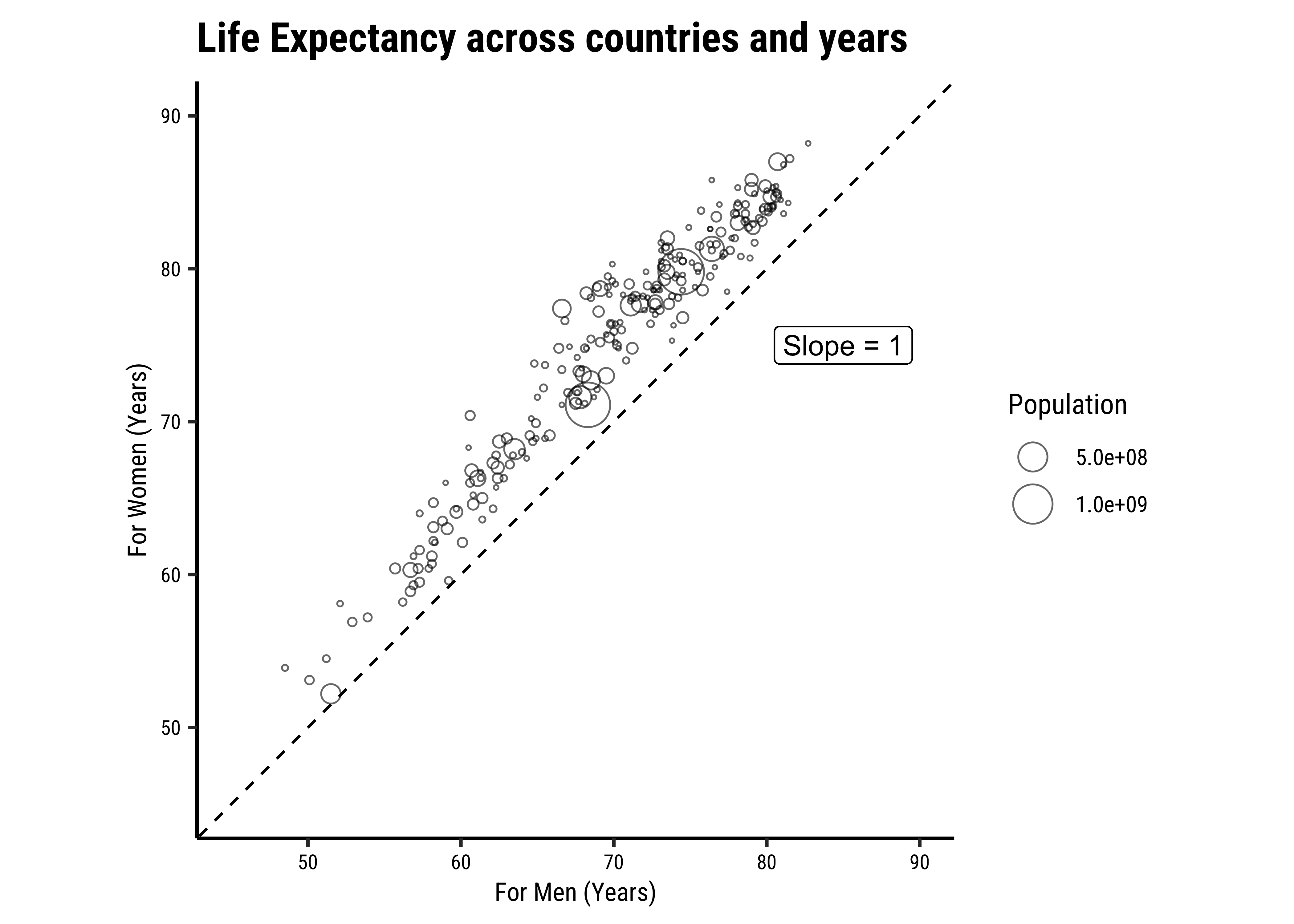
This dataset pertains to survival ages in different countries across the world. Women survival ages are compared to those of men.
Read the Data
Rows: 18,408
Columns: 7
$ Entity                                                               <chr> "…
$ Code                                                                 <chr> "…
$ Year                                                                 <dbl> 2…
$ `Life expectancy - Sex: female - Age: at birth - Variant: estimates` <dbl> N…
$ `Life expectancy - Sex: male - Age: at birth - Variant: estimates`   <dbl> N…
$ `Population - Sex: all - Age: all - Variant: estimates`              <dbl> N…
$ Continent <chr> "…Entity <chr> | Code <chr> | Year <dbl> | Life expectancy - Sex: female - Age: at birth - Variant: estimates <dbl> | |
|---|---|---|---|---|
| Abkhazia | OWID_ABK | 2015 | NA | |
| Afghanistan | AFG | 1950 | 28.4 | |
| Afghanistan | AFG | 1951 | 28.6 | |
| Afghanistan | AFG | 1952 | 29.1 | |
| Afghanistan | AFG | 1953 | 29.6 | |
| Afghanistan | AFG | 1954 | 29.9 |
Data Dictionary
Quantitative Variables
Write in.
Qualitative Variables
Write in.
Observations
Write in.
Analyse/Transform the Data
```{r}
#| label: data-preprocessing
#
# Write in your code here
# to prepare this data as shown below
# to generate the plot that follows
# Rename Variables if needed
# Change data to factors etc.
# Set up Counts, histograms etc
```Entity <chr> | Code <chr> | Year <dbl> | LifeExpFemale <dbl> | LifeExpMale <dbl> | Population <dbl> | Continent <chr> |
|---|---|---|---|---|---|---|
| Afghanistan | AFG | 2015 | 64.6 | 60.8 | 33753500 | Asia |
| Albania | ALB | 2015 | 81.2 | 76.4 | 2882482 | Europe |
| Algeria | DZA | 2015 | 76.8 | 74.5 | 39543148 | Africa |
| American Samoa | ASM | 2015 | 74.8 | 70.3 | 51391 | Oceania |
| Andorra | AND | 2015 | 85.4 | 80.6 | 71766 | Europe |
| Angola | AGO | 2015 | 63.1 | 58.2 | 28127724 | Africa |
| Anguilla | AIA | 2015 | 80.8 | 73.7 | 14554 | North America |
| Antigua and Barbuda | ATG | 2015 | 80.4 | 75.1 | 89958 | North America |
| Argentina | ARG | 2015 | 80.2 | 73.3 | 43257064 | South America |
| Armenia | ARM | 2015 | 78.8 | 69.6 | 2878598 | Asia |
Research Question
Note
Write in!! Look at the Chart!
Plot the Data
Task and Discussion
- Complete the Data Dictionary.
- Select and Transform the variables as shown.
- Create the graphs shown and discuss the following questions:
- Identify the type of charts
- Identify the variables used for various geometrical aspects (x, y, fill…). Name the variables appropriately.
- What research activity might have been carried out to obtain the data graphed here? Provide some details.
- What pre-processing of the data was required to create the chart?
- What might be the Hypothesis / Research Question, based on the Chart?
- What does the dashed line in the chart represent?
- Write a 2-line story based on the chart, describing your inference/surprise.
Reference
In order to obtain that floating text note slope = 1 in the chart, you need to use gf_refine(annotate(....)). Look at the vignette/help here. https://ggplot2.tidyverse.org/reference/annotate.html