library(crosstable) # Fast stats for multiple variables in table form
library(tidyplots) # Easily Produced Publication-Ready Plots
library(tinyplot) # Plots with Base R
library(tinytable) # Elegant Tables for our data
library(mosaic)
library(ggformula)
library(skimr)
library(tidyverse) # Most important the last
How many of this and that?
Quant Variables
Histograms
Mean
Abstract
Quant and Qual Variable Graphs and their Siblings
Slides and Tutorials
| R (Static Viz) | Radiant Tutorial | Datasets |
“The fear of death follows from the fear of life. A man who lives fully is prepared to die at any time.”
— Mark Twain
Plot Fonts and Theme
Show the Code
library(systemfonts)
library(showtext)
## Clean the slate
systemfonts::clear_local_fonts()
systemfonts::clear_registry()
##
showtext_opts(dpi = 96) # set DPI for showtext
sysfonts::font_add(
  family = "Alegreya",
  regular = "../../../../../../fonts/Alegreya-Regular.ttf",
  bold = "../../../../../../fonts/Alegreya-Bold.ttf",
  italic = "../../../../../../fonts/Alegreya-Italic.ttf",
  bolditalic = "../../../../../../fonts/Alegreya-BoldItalic.ttf"
)
Error in check_font_path(bold, "bold"): font file not found for 'bold' typeShow the Code
sysfonts::font_add(
  family = "Roboto Condensed",
  regular = "../../../../../../fonts/RobotoCondensed-Regular.ttf",
  bold = "../../../../../../fonts/RobotoCondensed-Bold.ttf",
  italic = "../../../../../../fonts/RobotoCondensed-Italic.ttf",
  bolditalic = "../../../../../../fonts/RobotoCondensed-BoldItalic.ttf"
)
showtext_auto(enable = TRUE) # enable showtext
##
theme_custom <- function() {
  font <- "Alegreya" # assign font family up front

  theme_classic(base_size = 14, base_family = font) %+replace% # replace elements we want to change

    theme(
      text = element_text(family = font), # set base font family

      # text elements
      plot.title = element_text( # title
        family = font, # set font family
        size = 24, # set font size
        face = "bold", # bold typeface
        hjust = 0, # left align
        margin = margin(t = 5, r = 0, b = 5, l = 0)
      ), # margin
      plot.title.position = "plot",
      plot.subtitle = element_text( # subtitle
        family = font, # font family
        size = 14, # font size
        hjust = 0, # left align
        margin = margin(t = 5, r = 0, b = 10, l = 0)
      ), # margin

      plot.caption = element_text( # caption
        family = font, # font family
        size = 9, # font size
        hjust = 1
      ), # right align

      plot.caption.position = "plot", # right align

      axis.title = element_text( # axis titles
        family = "Roboto Condensed", # font family
        size = 12
      ), # font size

      axis.text = element_text( # axis text
        family = "Roboto Condensed", # font family
        size = 9
      ), # font size

      axis.text.x = element_text( # margin for axis text
        margin = margin(5, b = 10)
      )

      # since the legend often requires manual tweaking
      # based on plot content, don't define it here
    )
}
Show the Code
```{r}
#| cache: false
#| code-fold: true
## Set the theme
theme_set(new = theme_custom())

## Use available fonts in ggplot text geoms too!
update_geom_defaults(geom = "text", new = list(
  family = "Roboto Condensed",
  face = "plain",
  size = 3.5,
  color = "#2b2b2b"
))
```
| Variable #1 | Variable #2 | Chart Names | Chart Shape | |
|---|---|---|---|---|
| Quant | None | Histogram |
| No | Pronoun | Answer | Variable/Scale | Example | What Operations? |
|---|---|---|---|---|---|
| 1 | How Many / Much / Heavy? Few? Seldom? Often? When? | Quantities, with Scale and a Zero Value.Differences and Ratios /Products are meaningful. | Quantitative/Ratio | Length,Height,Temperature in Kelvin,Activity,Dose Amount,Reaction Rate,Flow Rate,Concentration,Pulse,Survival Rate | Correlation |
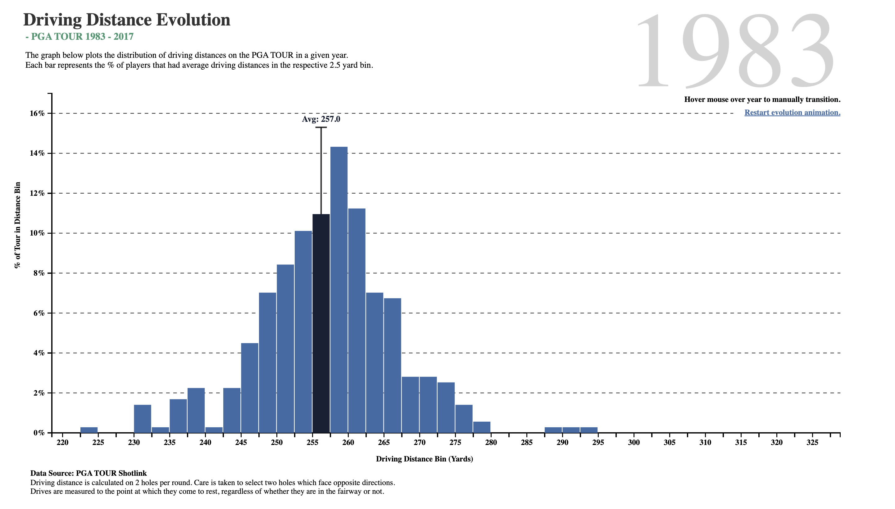
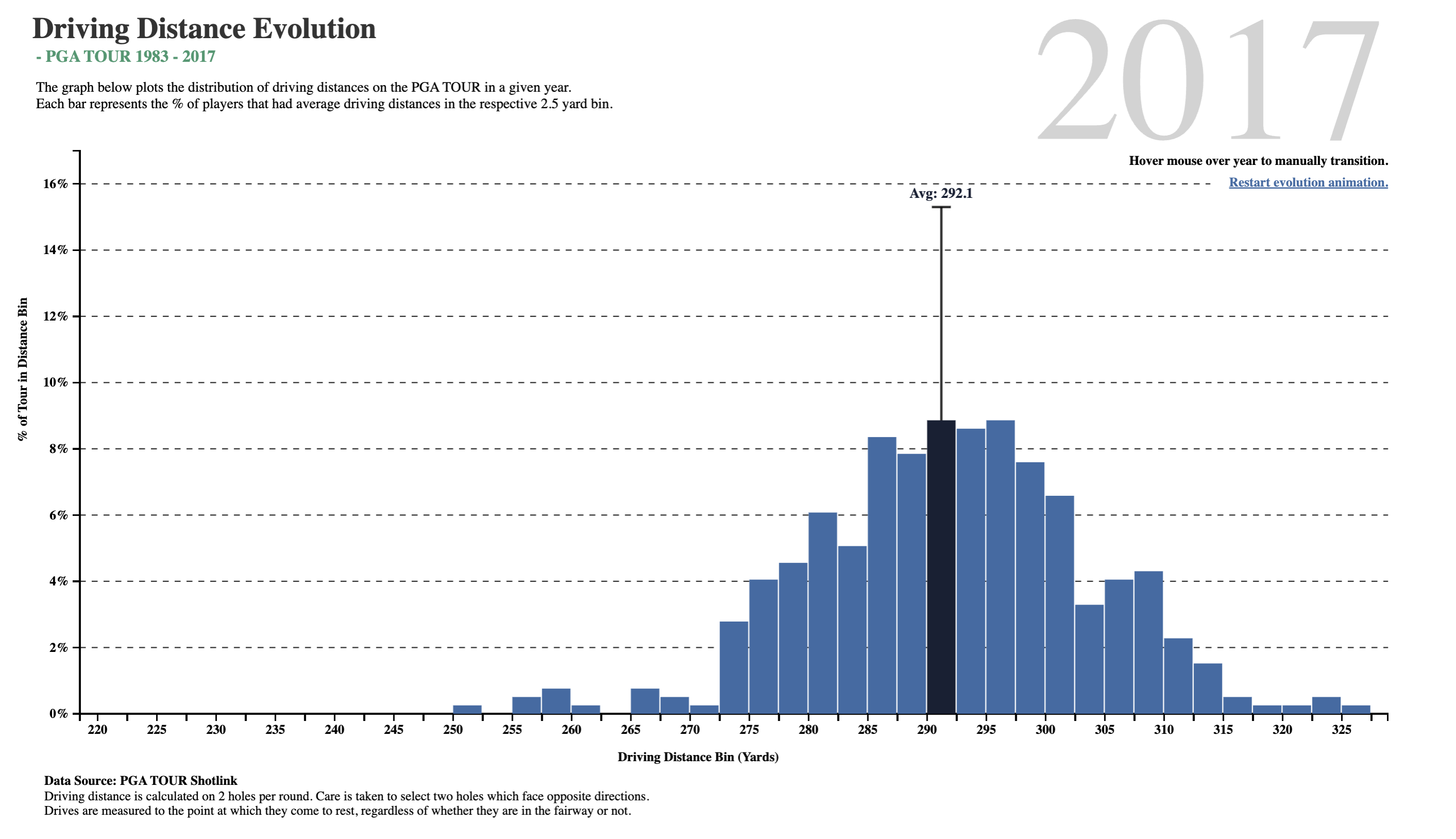
What do we see here? In about two-and-a-half decades, golf drive distances have increased, on the average, by 35 yards. The maximum distance has also gone up by 30 yards, and the minimum is now at 250 yards, which was close to average in 1983! What was a decent average in 1983 is just the bare minimum in 2017!!
Is it the dimples that the golf balls have? But these have been around a long time…or is it the clubs, and the swing technique invented by more recent players?
Now, let us listen to the late great Hans Rosling from the Gapminder Project, which aims at telling stories of the world with data, to remove systemic biases about poverty, income and gender related issues.
Histograms are best to show the distribution of raw Quantitative data, by displaying the number of values that fall within defined ranges, often called buckets or bins. We use a Quant variable on the x-axis and the histogram shows us how frequently different values occur for that variable by showing counts/frequencies on the y-axis. The x-axis is typically broken up into “buckets” or ranges for the x-variable. And usually you can adjust the bucket ranges to explore frequency patterns. For example, you can widen histogram buckets from 0-1, 1-2, 2-3, etc. to 0-2, 2-4, etc.
Although Bar Charts may look similar to Histograms, the two are different. Bar Charts show counts of observations with respect to a Qualitative variable. For instance, bar charts show categorical data with multiple levels, such as fruits, clothing, household products in an inventory. Each bar has a height proportional to the count per shirt-size, in this example.
Histograms do not usually show spaces between buckets because the buckets represent contiguous ranges, while bar charts show spaces to separate each (unconnected) category/level within a Qual variable.
diamonds dataset
We will first look at at a dataset that is directly available in R, the diamonds dataset.
As per our Workflow, we will look at the data using all the three methods we have seen.
glimpse(diamonds)Rows: 53,940
Columns: 10
$ carat <dbl> 0.23, 0.21, 0.23, 0.29, 0.31, 0.24, 0.24, 0.26, 0.22, 0.23, 0.…
$ cut <ord> Ideal, Premium, Good, Premium, Good, Very Good, Very Good, Ver…
$ color <ord> E, E, E, I, J, J, I, H, E, H, J, J, F, J, E, E, I, J, J, J, I,…
$ clarity <ord> SI2, SI1, VS1, VS2, SI2, VVS2, VVS1, SI1, VS2, VS1, SI1, VS1, …
$ depth <dbl> 61.5, 59.8, 56.9, 62.4, 63.3, 62.8, 62.3, 61.9, 65.1, 59.4, 64…
$ table <dbl> 55, 61, 65, 58, 58, 57, 57, 55, 61, 61, 55, 56, 61, 54, 62, 58…
$ price <int> 326, 326, 327, 334, 335, 336, 336, 337, 337, 338, 339, 340, 34…
$ x <dbl> 3.95, 3.89, 4.05, 4.20, 4.34, 3.94, 3.95, 4.07, 3.87, 4.00, 4.…
$ y <dbl> 3.98, 3.84, 4.07, 4.23, 4.35, 3.96, 3.98, 4.11, 3.78, 4.05, 4.…
$ z <dbl> 2.43, 2.31, 2.31, 2.63, 2.75, 2.48, 2.47, 2.53, 2.49, 2.39, 2.…skim(diamonds)| Name | diamonds |
| Number of rows | 53940 |
| Number of columns | 10 |
| _______________________ | |
| Column type frequency: | |
| factor | 3 |
| numeric | 7 |
| ________________________ | |
| Group variables | None |
Variable type: factor
| skim_variable | n_missing | complete_rate | ordered | n_unique | top_counts |
|---|---|---|---|---|---|
| cut | 0 | 1 | TRUE | 5 | Ide: 21551, Pre: 13791, Ver: 12082, Goo: 4906 |
| color | 0 | 1 | TRUE | 7 | G: 11292, E: 9797, F: 9542, H: 8304 |
| clarity | 0 | 1 | TRUE | 8 | SI1: 13065, VS2: 12258, SI2: 9194, VS1: 8171 |
Variable type: numeric
| skim_variable | n_missing | complete_rate | mean | sd | p0 | p25 | p50 | p75 | p100 | hist |
|---|---|---|---|---|---|---|---|---|---|---|
| carat | 0 | 1 | 0.80 | 0.47 | 0.2 | 0.40 | 0.70 | 1.04 | 5.01 | ▇▂▁▁▁ |
| depth | 0 | 1 | 61.75 | 1.43 | 43.0 | 61.00 | 61.80 | 62.50 | 79.00 | ▁▁▇▁▁ |
| table | 0 | 1 | 57.46 | 2.23 | 43.0 | 56.00 | 57.00 | 59.00 | 95.00 | ▁▇▁▁▁ |
| price | 0 | 1 | 3932.80 | 3989.44 | 326.0 | 950.00 | 2401.00 | 5324.25 | 18823.00 | ▇▂▁▁▁ |
| x | 0 | 1 | 5.73 | 1.12 | 0.0 | 4.71 | 5.70 | 6.54 | 10.74 | ▁▁▇▃▁ |
| y | 0 | 1 | 5.73 | 1.14 | 0.0 | 4.72 | 5.71 | 6.54 | 58.90 | ▇▁▁▁▁ |
| z | 0 | 1 | 3.54 | 0.71 | 0.0 | 2.91 | 3.53 | 4.04 | 31.80 | ▇▁▁▁▁ |
inspect(diamonds)
categorical variables:
     name   class levels     n missing
1     cut ordered      5 53940       0
2   color ordered      7 53940       0
3 clarity ordered      8 53940       0
                                   distribution
1 Ideal (40%), Premium (25.6%) ...
2 G (20.9%), E (18.2%), F (17.7%) ...
3 SI1 (24.2%), VS2 (22.7%), SI2 (17%) ...

quantitative variables:
   name   class   min     Q1  median      Q3      max         mean           sd
1 carat numeric   0.2   0.40    0.70    1.04     5.01    0.7979397    0.4740112
2 depth numeric  43.0  61.00   61.80   62.50    79.00   61.7494049    1.4326213
3 table numeric  43.0  56.00   57.00   59.00    95.00   57.4571839    2.2344906
4 price integer 326.0 950.00 2401.00 5324.25 18823.00 3932.7997219 3989.4397381
5     x numeric   0.0   4.71    5.70    6.54    10.74    5.7311572    1.1217607
6     y numeric   0.0   4.72    5.71    6.54    58.90    5.7345260    1.1421347
7     z numeric   0.0   2.91    3.53    4.04    31.80    3.5387338    0.7056988
      n missing
1 53940       0
2 53940       0
3 53940       0
4 53940       0
5 53940       0
6 53940       0
7 53940       0
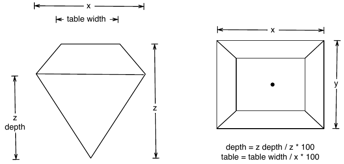
Quantitative Data
-
carat(dbl): weight of the diamond 0.2-5.01 -
depth(dbl): depth total depth percentage 43-79 -
table(dbl): width of top of diamond relative to widest point 43-95 -
price(dbl): price in US dollars $326-$18,823 -
x(dbl): length in mm 0-10.74 -
y(dbl): width in mm 0-58.9 -
z(dbl): depth in mm 0-31.8
Qualitative Data
-
cut: diamond cut Fair, Good, Very Good, Premium, Ideal -
color: diamond color J (worst) to D (best). (7 levels) -
clarity. measurement of how clear the diamond is I1 (worst), SI2, SI1, VS2, VS1, VVS2, VVS1, IF (best).
These have 5, 7, and 8 levels respectively. The fact that the class for these is ordered suggests that these are factors and that the levels have a sequence/order.
Business Insights on Examining the
diamonds dataset
- This is a large dataset (54K rows).
- There are several Qualitative variables:
-
carat,price,x,y,z,depthandtableare Quantitative variables. - There are no missing values for any variable, all are complete with 54K entries.
We will not do any data munging for this dataset, as it is already clean and ready to use.
Let us formulate a few Questions about this dataset. At some point, we might develop a hunch or two, and these would become our hypotheses to investigate. This is an iterative process!
Hypothesis and Research Questions
- The
target variablefor an experiment that resulted in this data might be thepricevariable. Which is a numerical Quant variable.
- There are also
predictor variablessuch ascarat(Quant),color(Qual),cut(Qual), andclarity(Qual).
- Other
predictor variablesmight bex, y, depth, table(all Quant)
- Research Questions:
- What is the distribution of the target variable
price? - What is the distribution of the predictor variable
carat? - Does a
pricedistribution vary based upon type ofcut,clarity, andcolor?
- What is the distribution of the target variable
These should do for now. Try and think of more Questions!
Let’s plot some histograms to answer each of the Hypothesis questions above.
price?
Question-1: What is the distribution of the target variable
price?
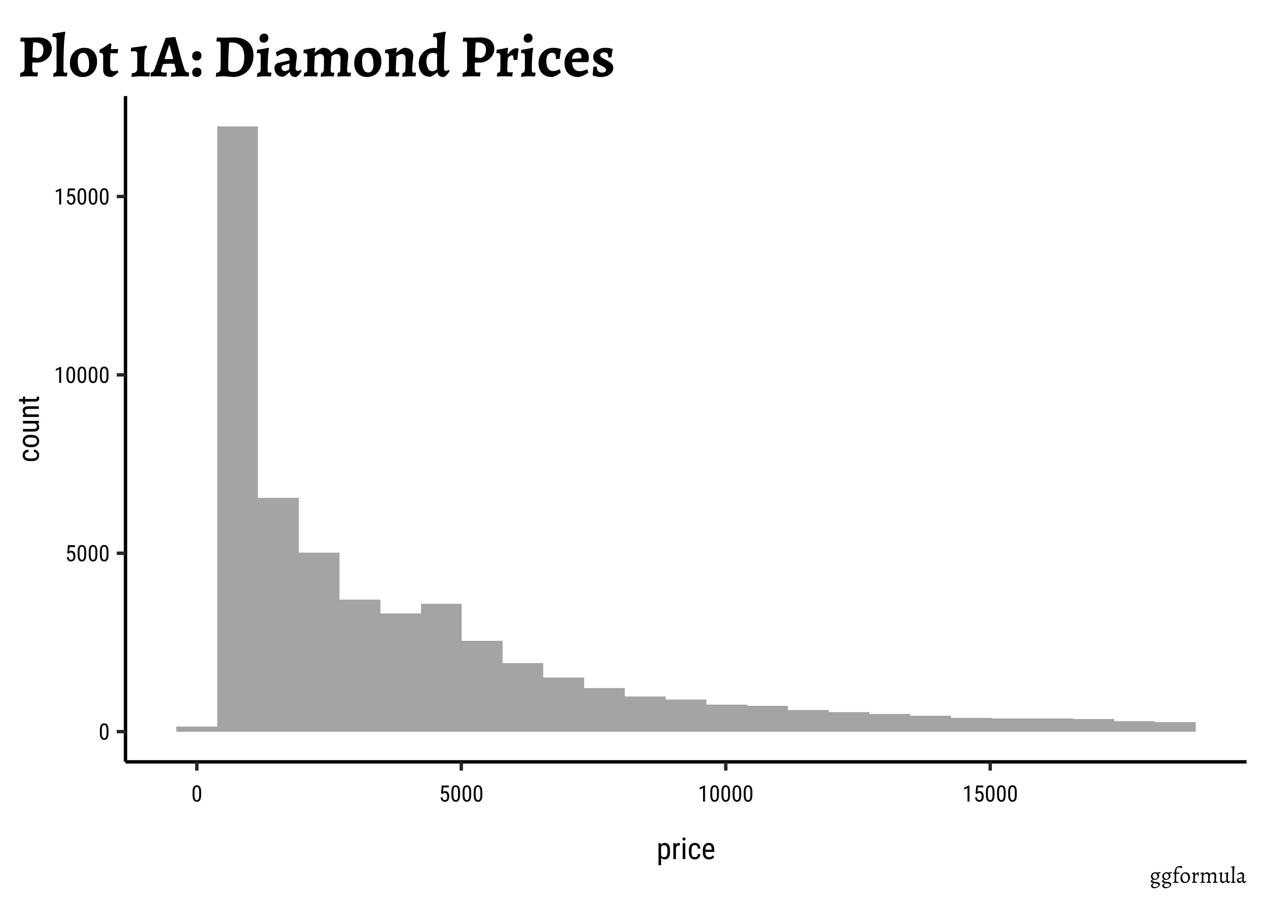
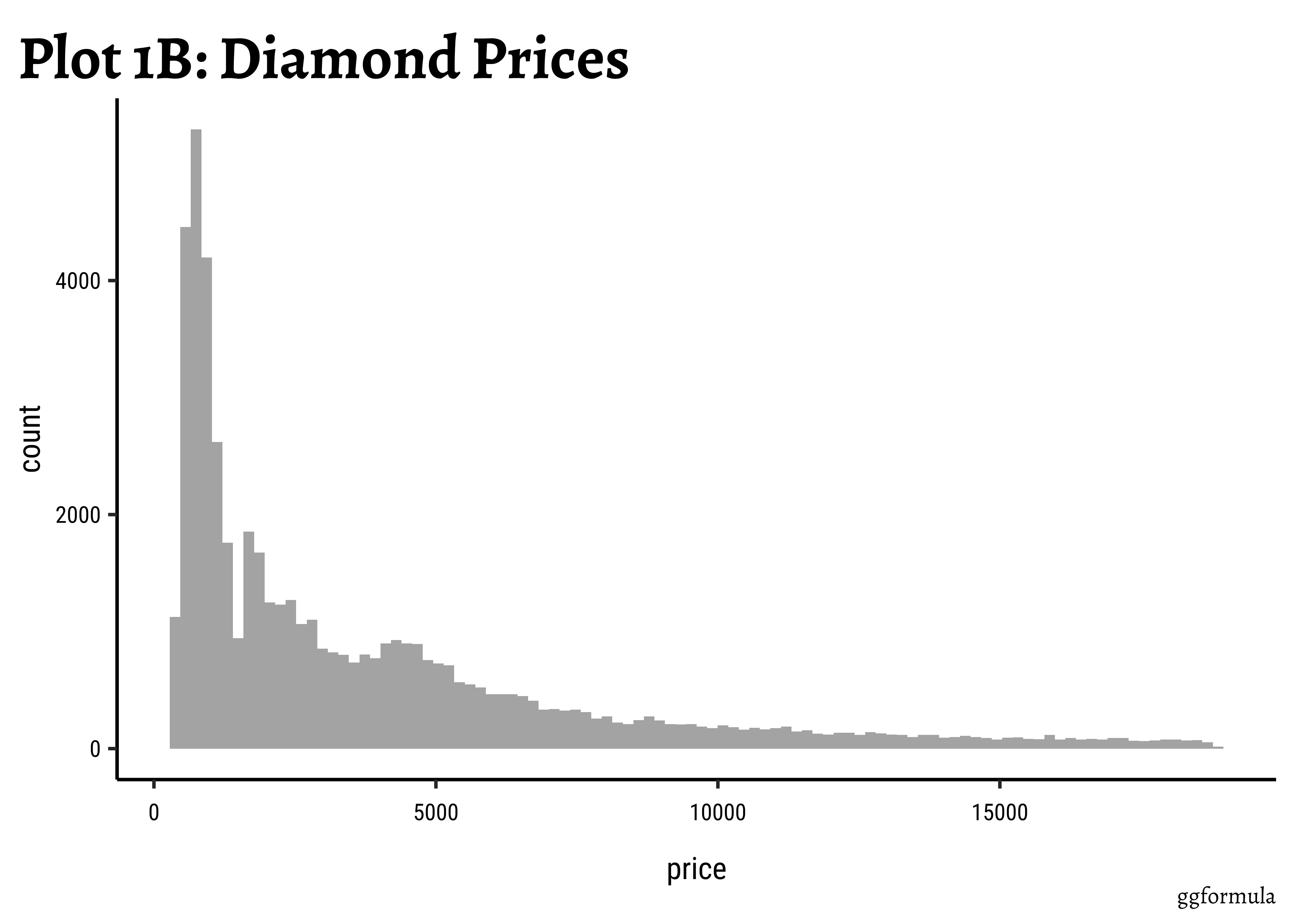
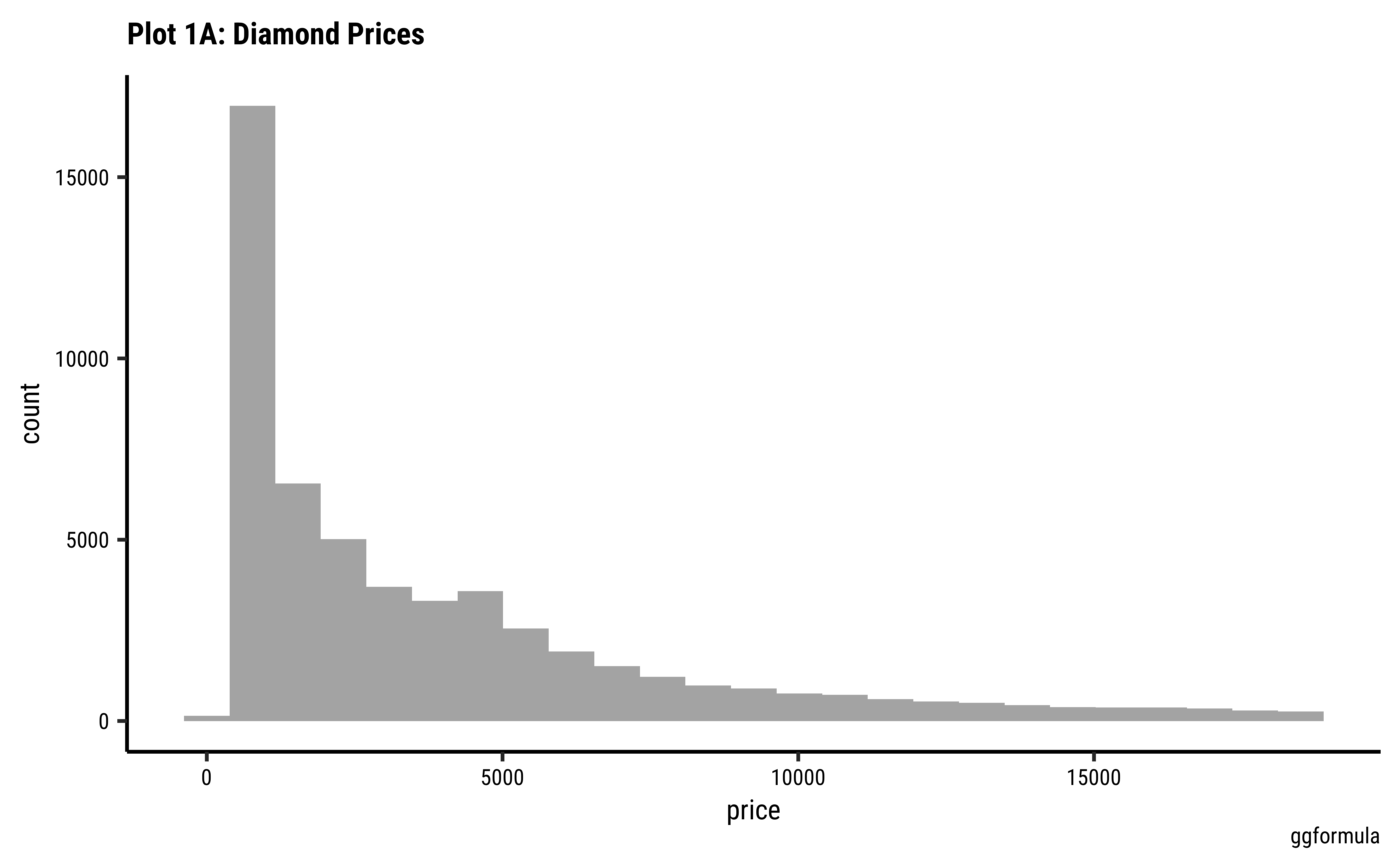
gf_histogram(~price, data = diamonds) %>%
  gf_labs(
    title = "Plot 1A: Diamond Prices",
    caption = "ggformula"
  )
## More bins
gf_histogram(~price,
  data = diamonds,
  bins = 100
) %>%
  gf_labs(
    title = "Plot 1B: Diamond Prices",
    caption = "ggformula"
  )
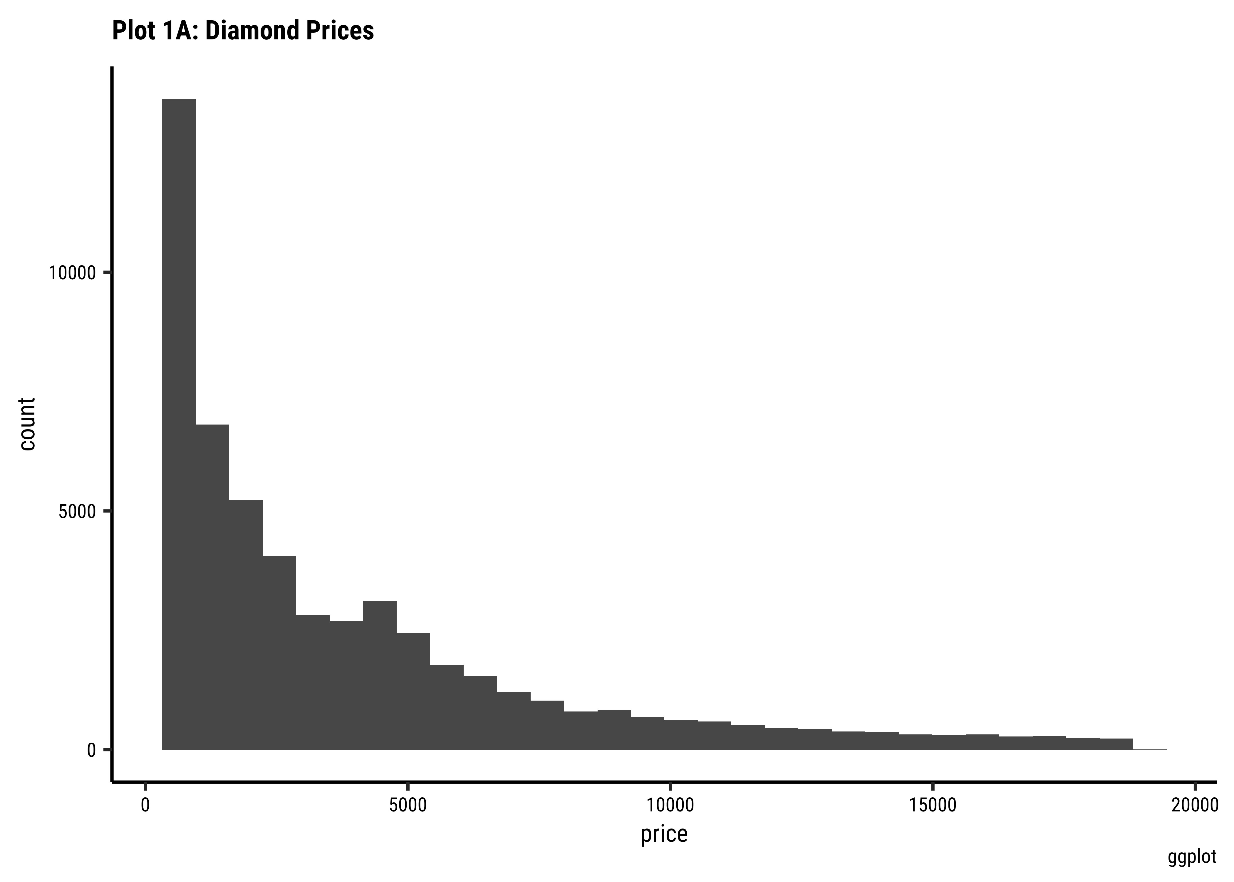
ggplot(data = diamonds) +
  geom_histogram(aes(x = price)) +
  labs(
    title = "Plot 1A: Diamond Prices",
    caption = "ggplot"
  )
## More bins
ggplot(data = diamonds) +
  geom_histogram(aes(x = price), bins = 100) +
  labs(
    title = "Plot 1B: Diamond Prices",
    caption = "ggplot"
  )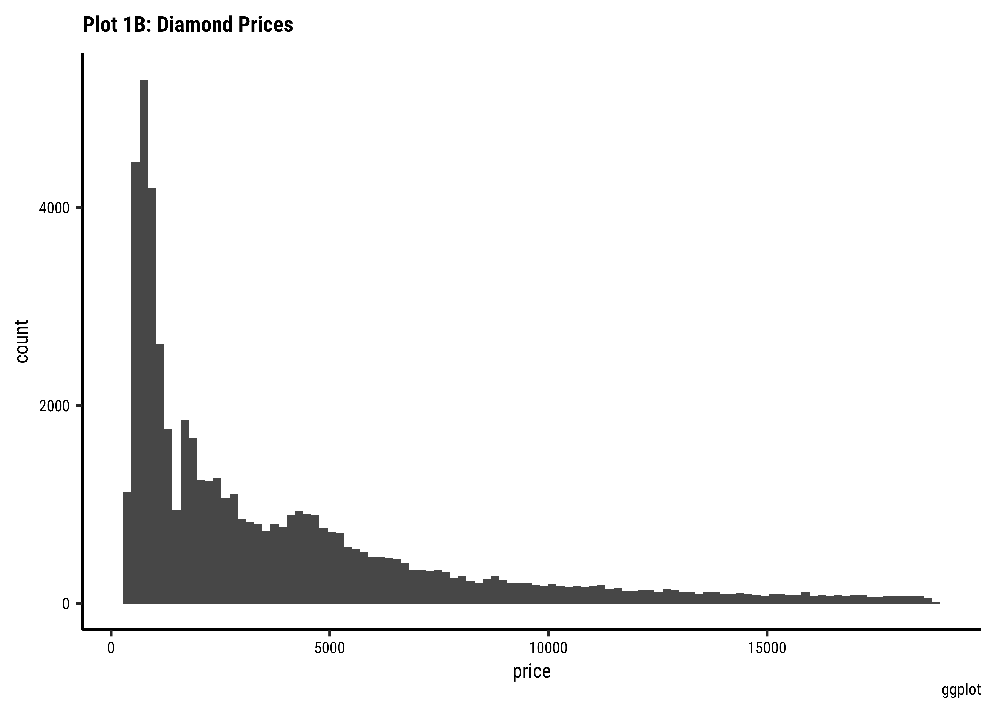
Business Insights-1
- The
pricedistribution is heavily skewed to the right.
- There are a great many diamonds at relatively low prices, but there are a good few diamonds at very high prices too.
- Using a high number of bins does not materially change the view of the histogram.
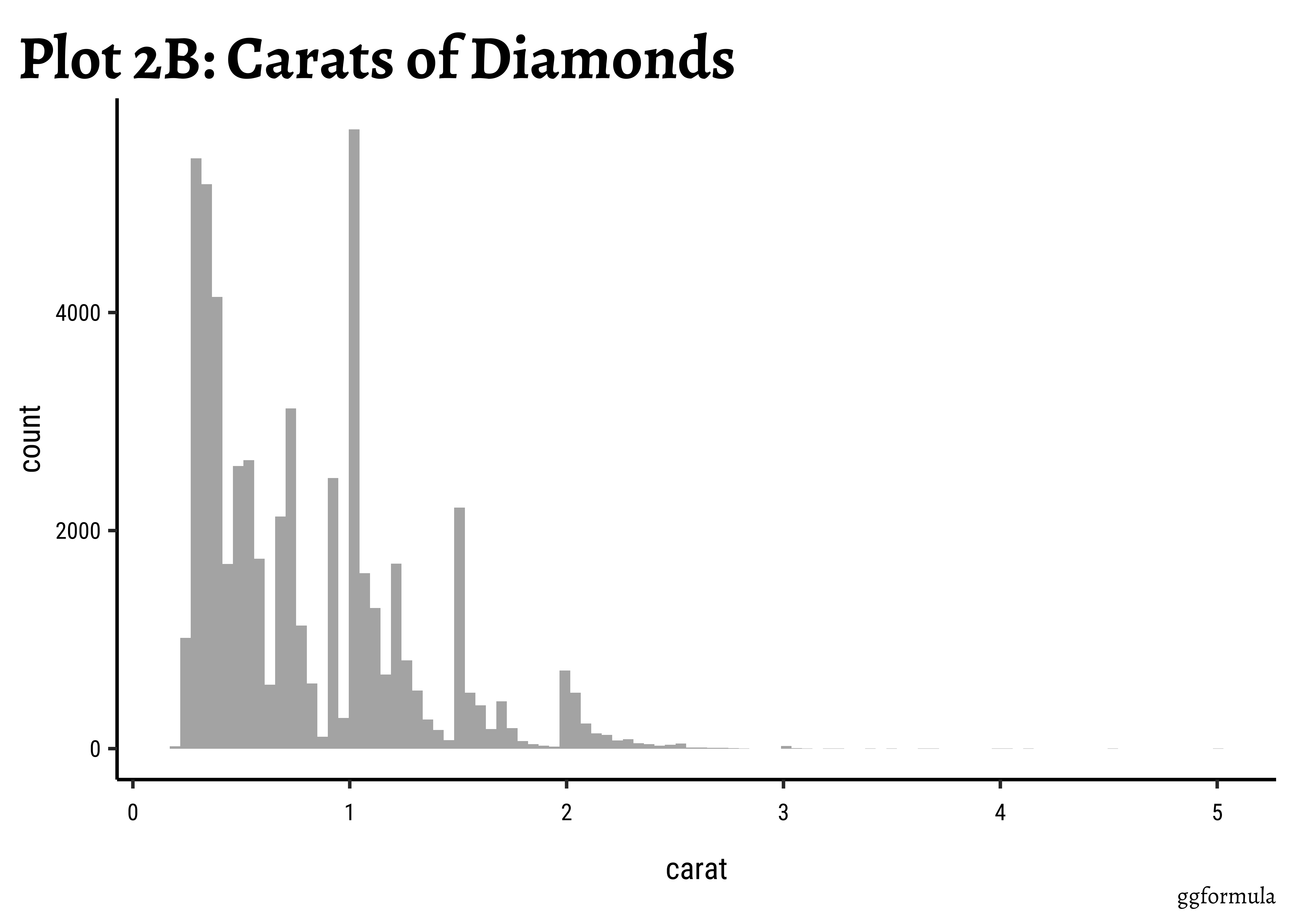
carat?
Question-1: Question-2: What is the distribution of the predictor variable
carat?
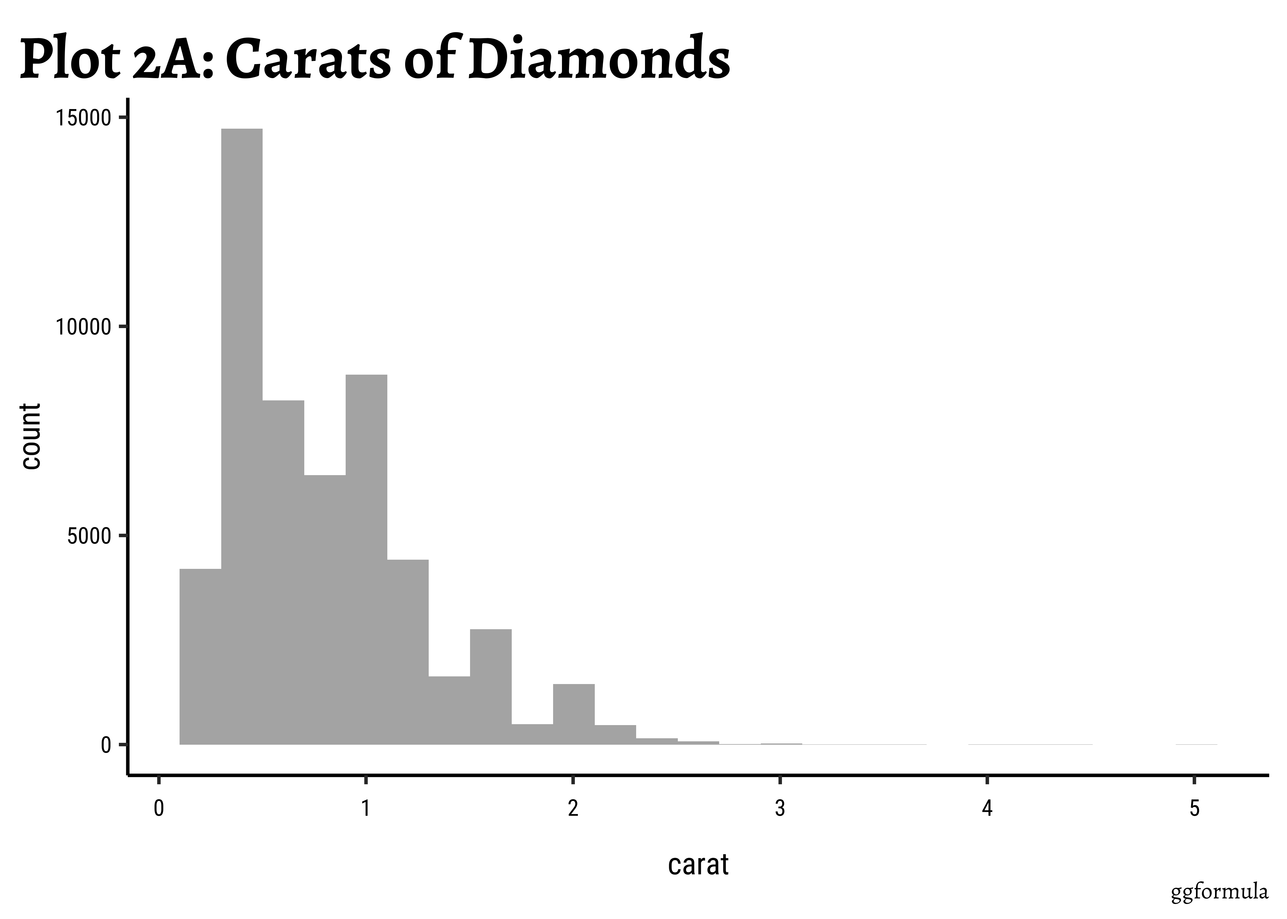
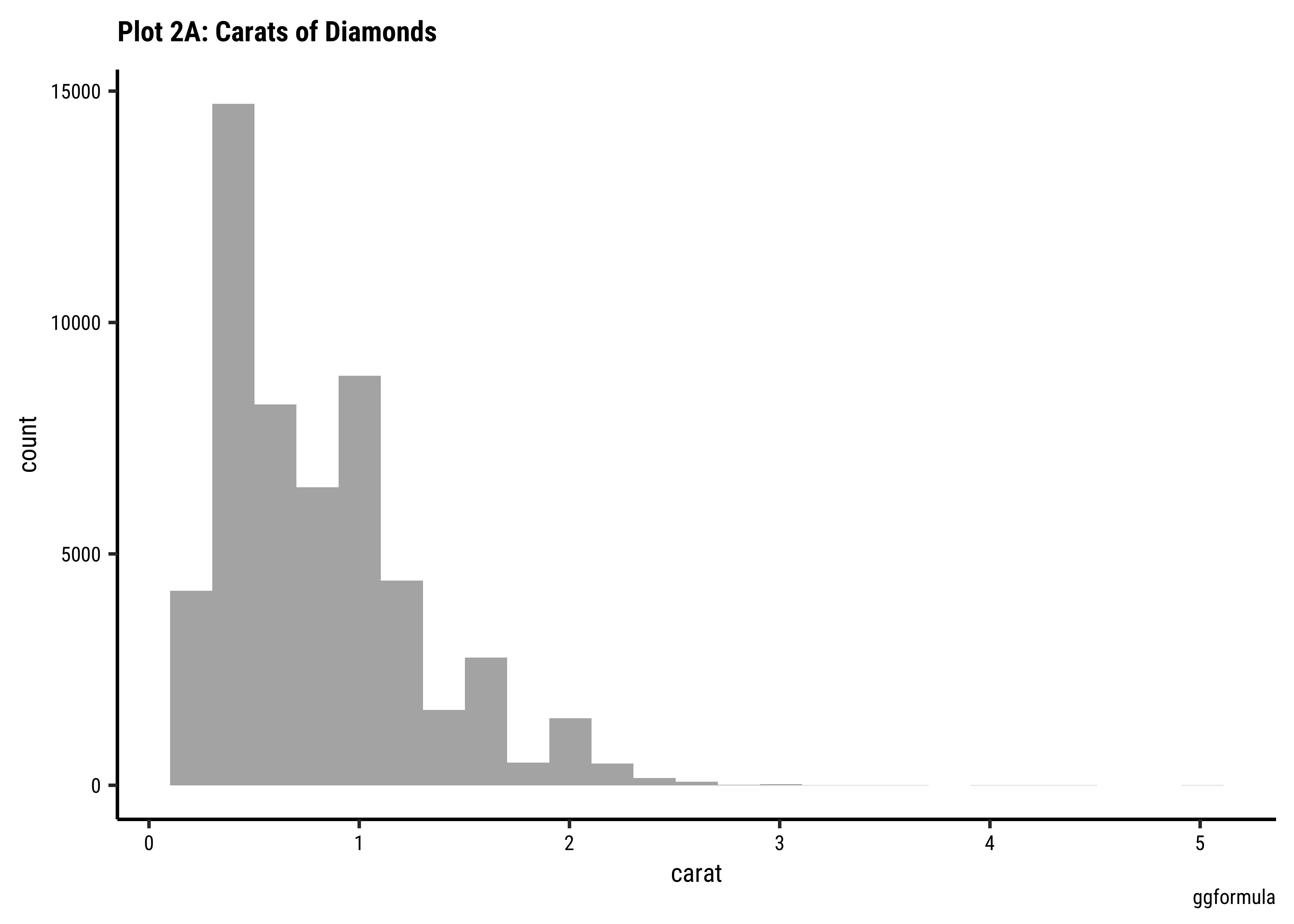
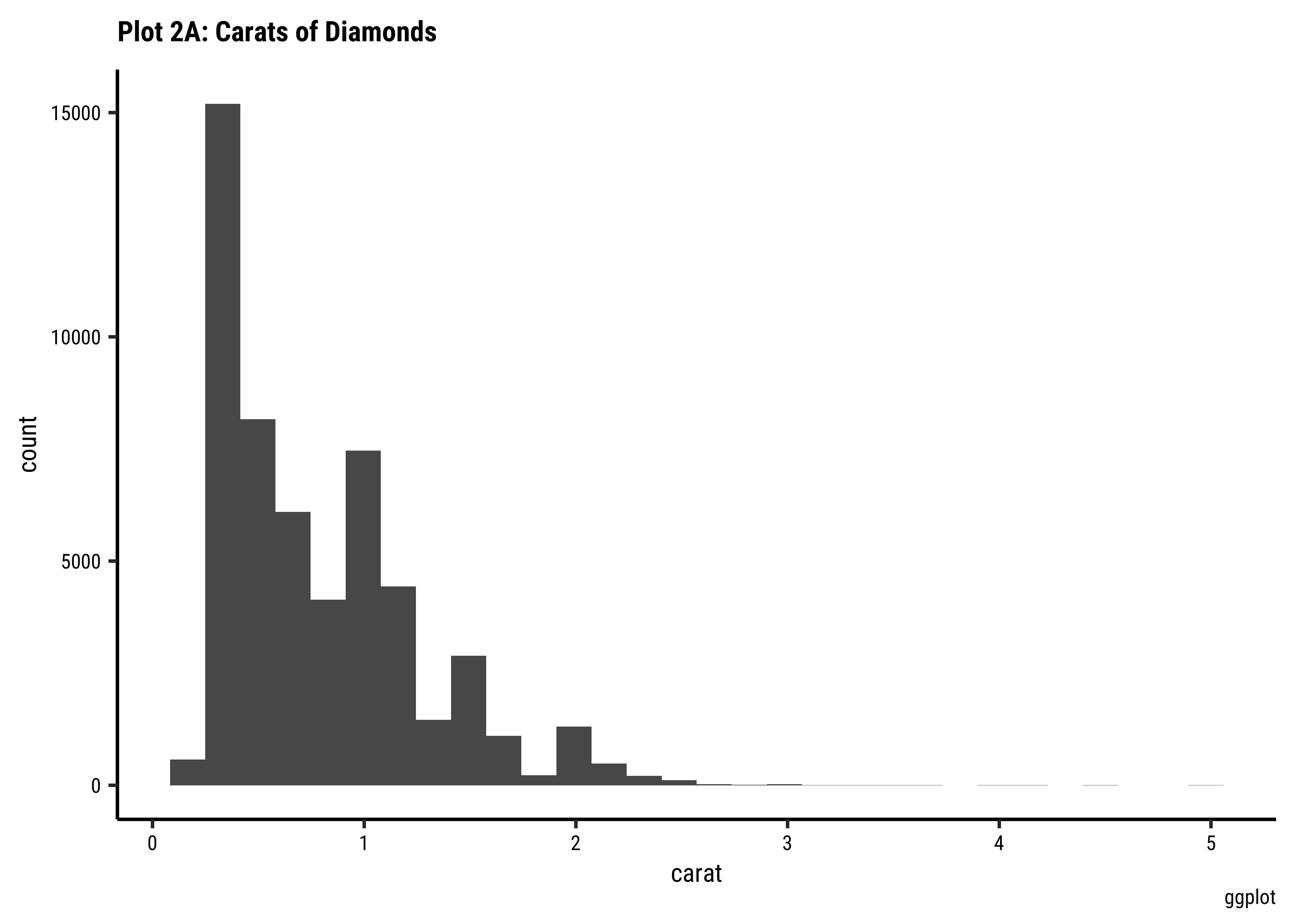
diamonds %>%
  gf_histogram(~carat) %>%
  gf_labs(
    title = "Plot 2A: Carats of Diamonds",
    caption = "ggformula"
  )
## More bins
diamonds %>%
  gf_histogram(~carat,
    bins = 100
  ) %>%
  gf_labs(
    title = "Plot 2B: Carats of Diamonds",
    caption = "ggformula"
  )
diamonds %>%
  ggplot() +
  geom_histogram(aes(x = carat)) +
  labs(
    title = "Plot 2A: Carats of Diamonds",
    caption = "ggplot"
  )
## More bins
diamonds %>%
  ggplot() +
  geom_histogram(aes(x = carat), bins = 100) +
  labs(
    title = "Plot 2A: Carats of Diamonds",
    caption = "ggplot"
  )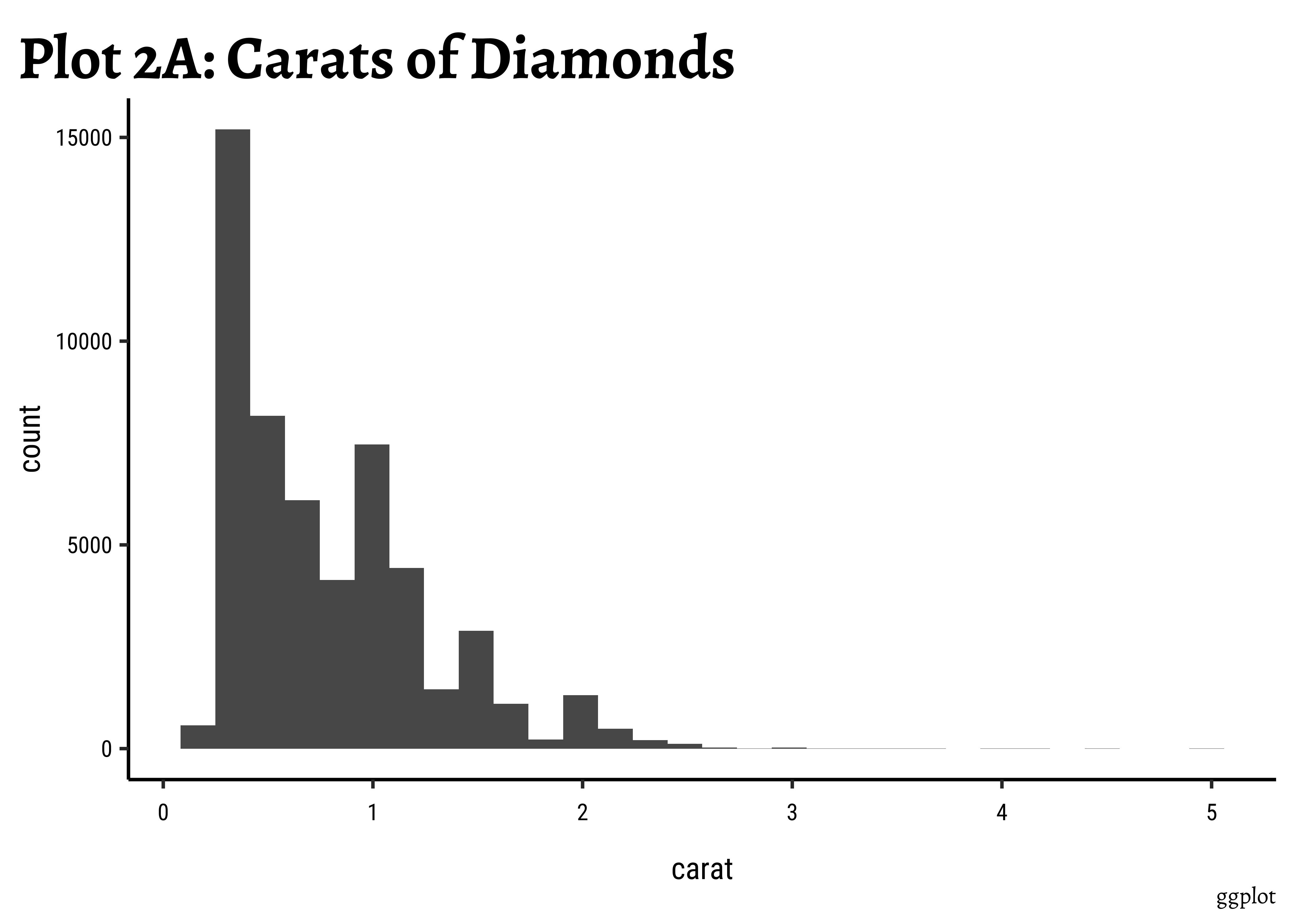
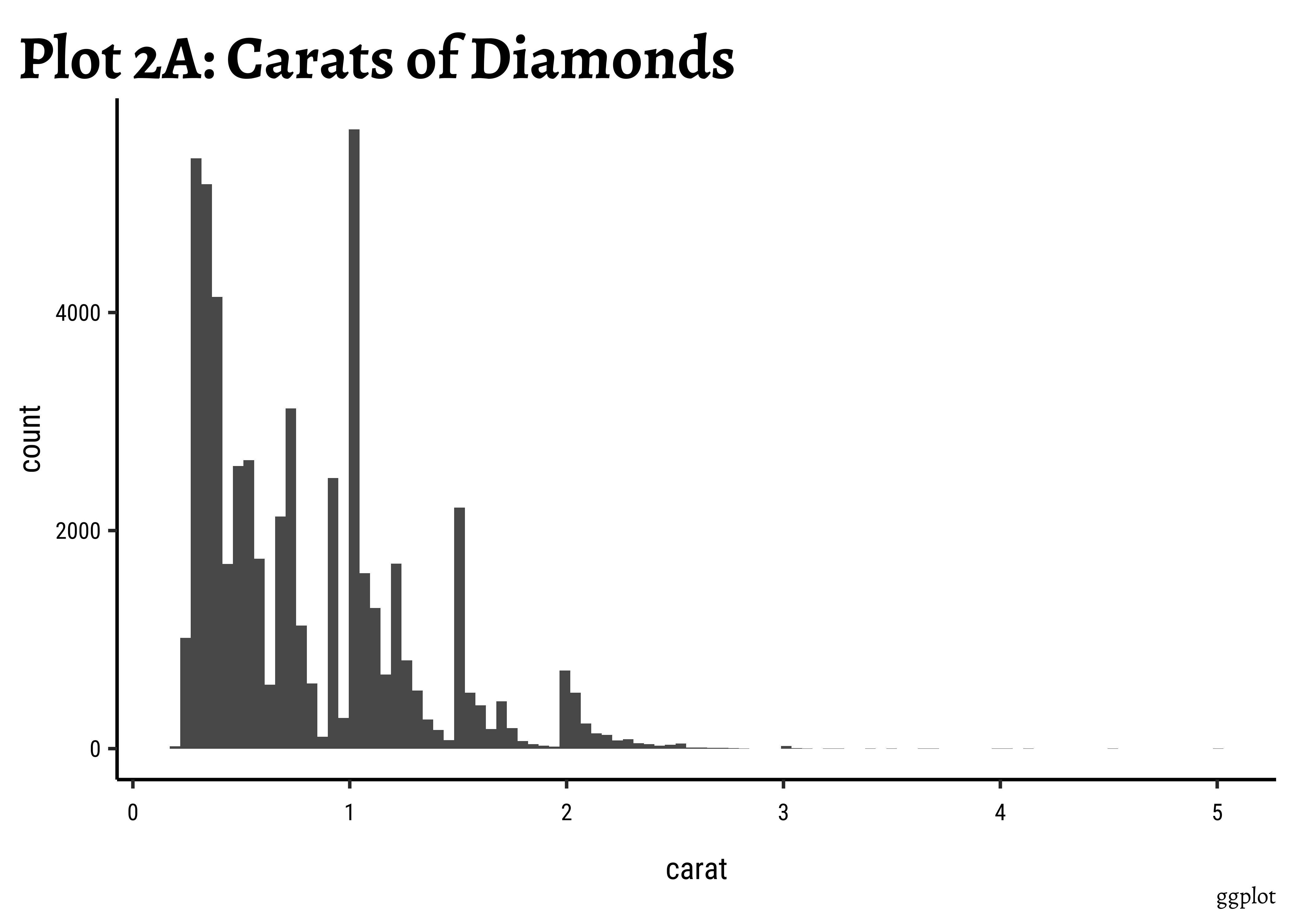
Business Insights-2
-
caratalso has a heavily right-skewed distribution.
- However, there is a marked “discreteness” to the distribution. Some values of carat are far more common than others. For example, 1, 1.5, and 2 carat diamonds are large in number.
- Why does the X-axis extend up to 5 carats? There must be some, very few, diamonds of very high carat value!
price distribution vary based upon type of cut, clarity, and color?
Does a
price distribution vary based upon type of cut, clarity, and color?
gf_histogram(~price, fill = ~cut, data = diamonds) %>%
  gf_labs(title = "Plot 3A: Diamond Prices", caption = "ggformula")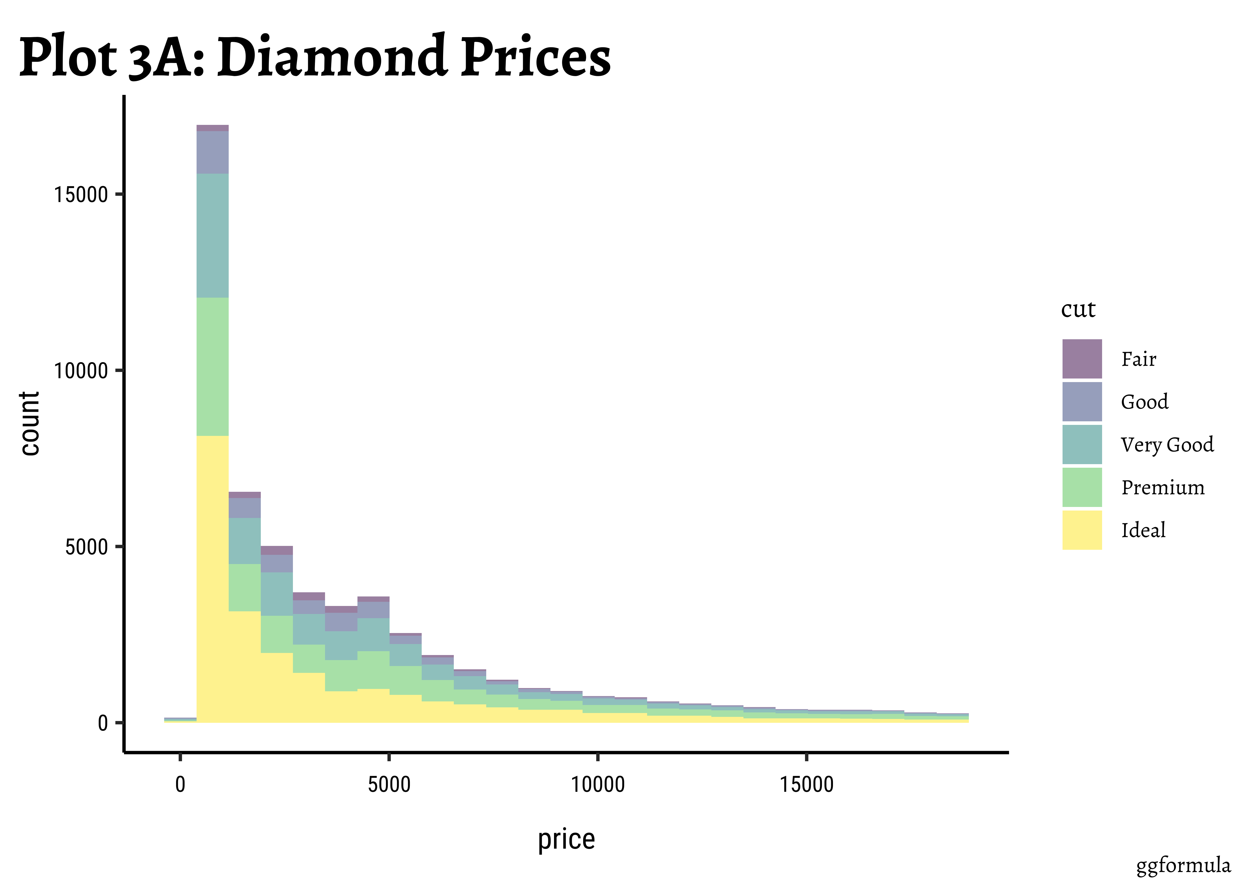
diamonds %>%
  gf_histogram(~price, fill = ~cut, color = "black", alpha = 0.3) %>%
  gf_labs(
    title = "Plot 3B: Prices by Cut",
    caption = "ggformula"
  )
diamonds %>%
  gf_histogram(~price, fill = ~cut, color = "black", alpha = 0.3) %>%
  gf_facet_wrap(~cut) %>%
  gf_labs(
    title = "Plot 3C: Prices by Filled and Facetted by Cut",
    caption = "ggformula"
  ) %>%
  gf_theme(theme(
    axis.text.x = element_text(
      angle = 45,
      hjust = 1
    )
  ))
diamonds %>%
  gf_histogram(~price, fill = ~cut, color = "black", alpha = 0.3) %>%
  gf_facet_wrap(~cut, scales = "free_y", nrow = 2) %>%
  gf_labs(
    title = "Plot 3D: Prices Filled and Facetted by Cut",
    subtitle = "Free y-scale",
    caption = "ggformula"
  ) %>%
  gf_theme(theme(
    axis.text.x =
      element_text(
        angle = 45,
        hjust = 1
      )
  ))
diamonds %>% ggplot() +
  geom_histogram(aes(x = price, fill = cut), alpha = 0.3) +
  labs(title = "Plot 3A: Prices by Cut", caption = "ggplot")
##
diamonds %>%
  ggplot() +
  geom_histogram(aes(x = price, fill = cut),
    colour = "black", alpha = 0.3
  ) +
  labs(title = "Plot 3B: Prices filled by Cut", caption = "ggplot")
##
diamonds %>% ggplot() +
  geom_histogram(aes(price, fill = cut),
    colour = "black", alpha = 0.3
  ) +
  facet_wrap(facets = vars(cut)) +
  labs(
    title = "Plot 3C: Prices by Filled and Facetted by Cut",
    caption = "ggplot"
  ) +
  theme(axis.text.x = element_text(angle = 45, hjust = 1))
##
diamonds %>% ggplot() +
  geom_histogram(aes(price, fill = cut),
    colour = "black", alpha = 0.3
  ) +
  facet_wrap(facets = vars(cut), scales = "free_y") +
  labs(
    title = "Plot D: Prices by Filled and Facetted by Cut",
    subtitle = "Free y-scale",
    caption = "ggplot"
  ) +
  theme(axis.text.x = element_text(angle = 45, hjust = 1))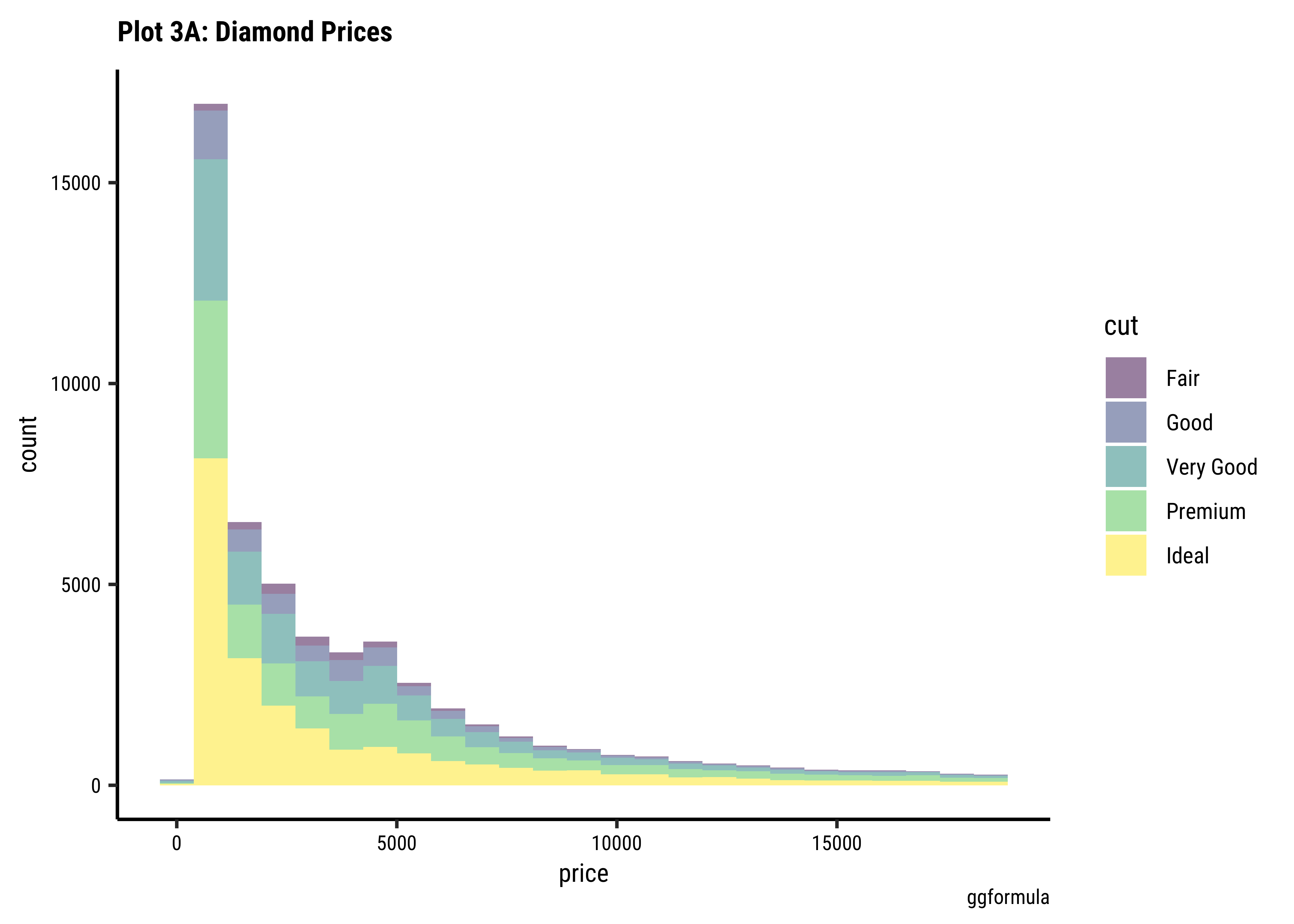
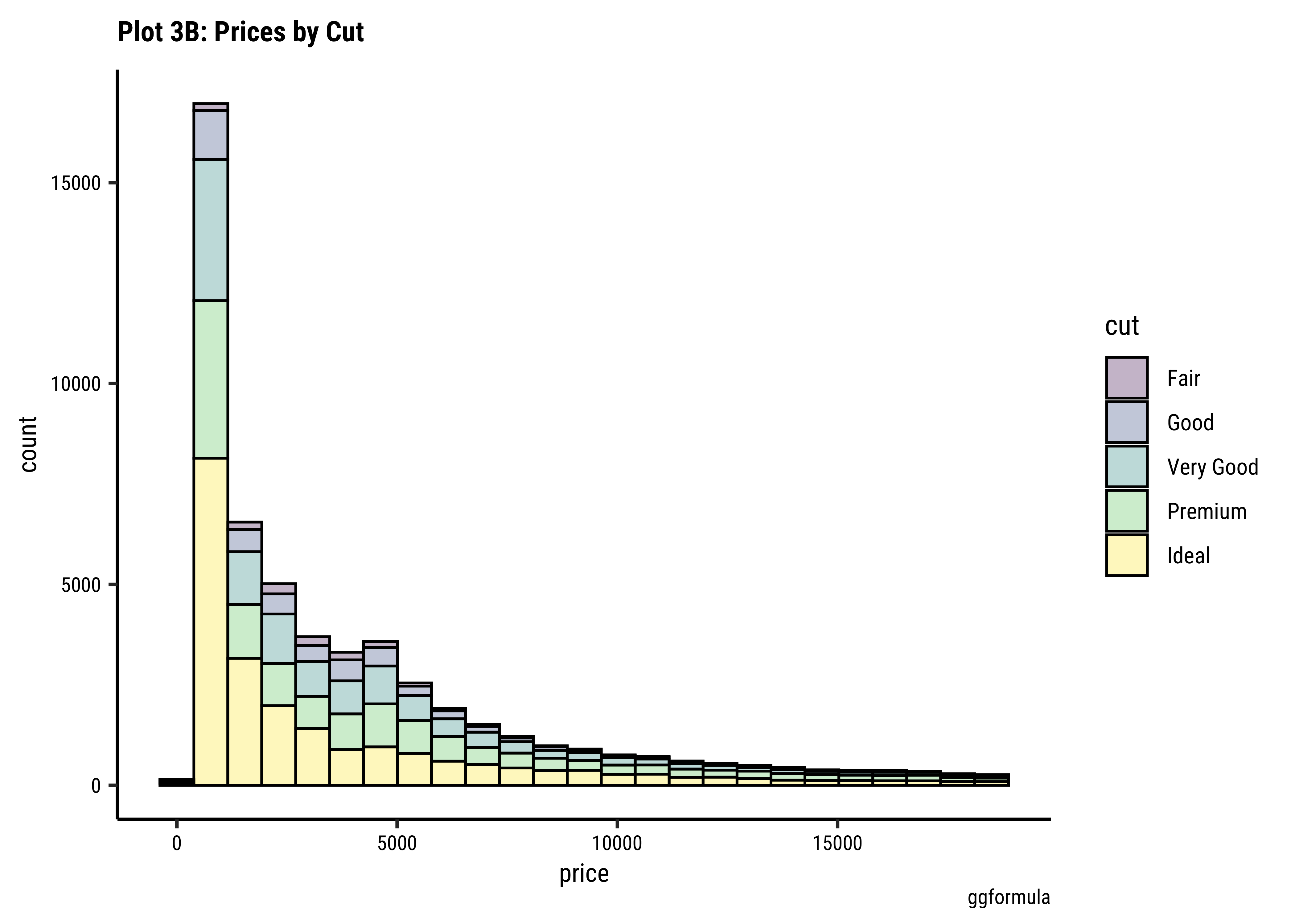
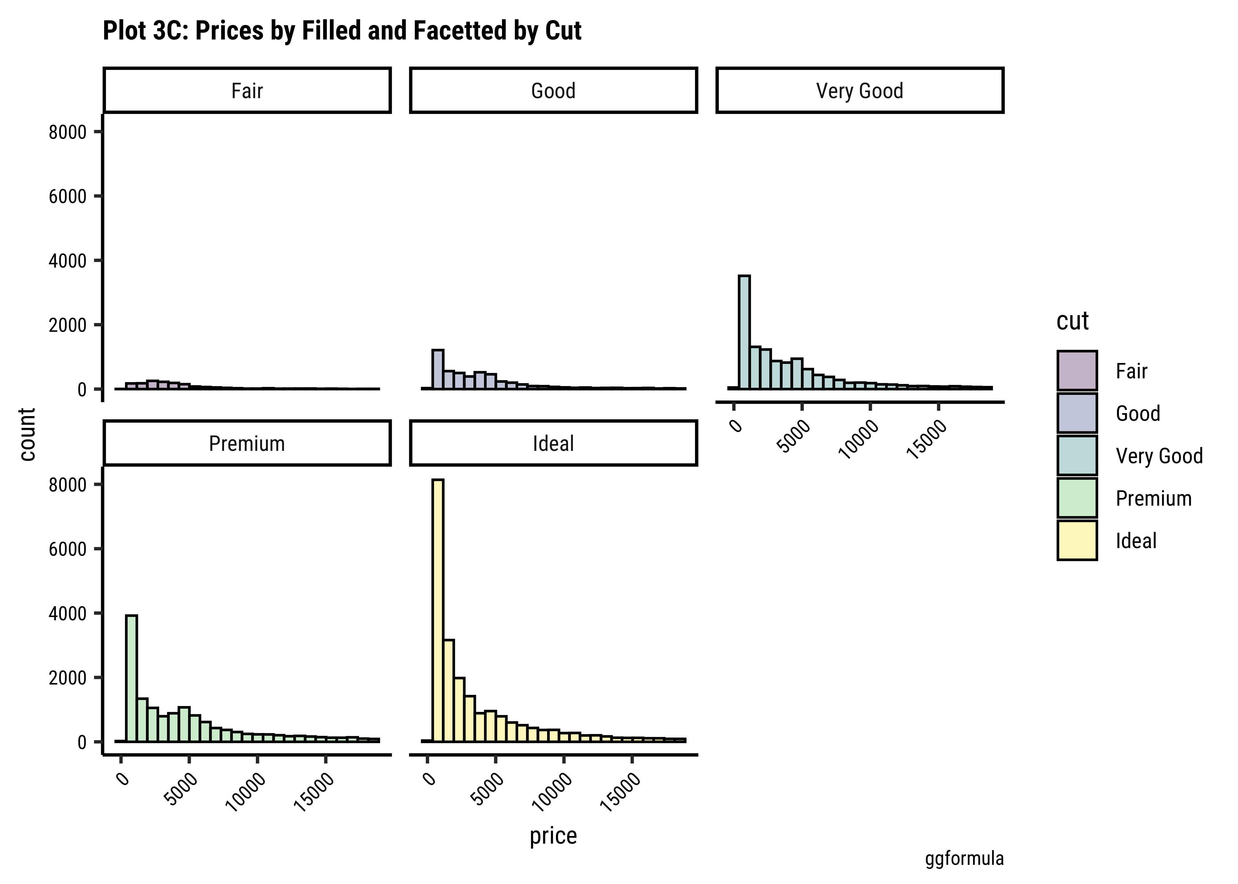
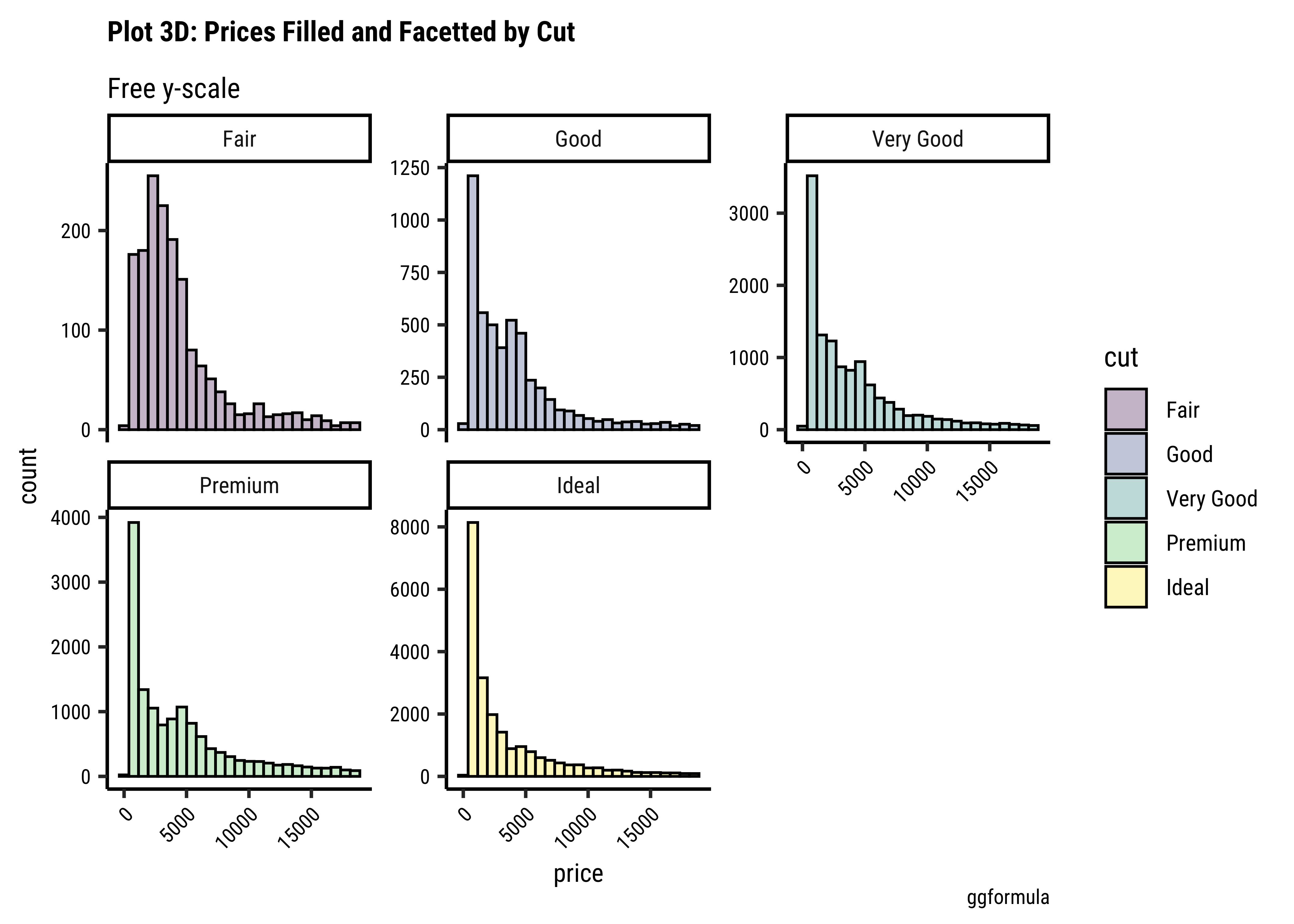
Business Insights-3
- The price distribution is heavily skewed to the right AND This
long-tailednature of the histogram holds true regardless of thecutof the diamond. - See the x-axis range for each plot in Plot D! Price ranges are the same regardless of cut !! Very surprising! So
cutis perhaps not the only thing that determines price… - Facetting the plot into small multiples helps look at patterns better: overlapping histograms are hard to decipher. Adding
colordefines the bars in the histogram very well.
A Hypothesis
The surprise insight above should lead you to make a Hypothesis! You should decide whether you want to investigate this question further, making more graphs, as we will see. Here, we are making a Hypothesis that more than just cut determines the price of a diamond.
An Interactive App for Histograms
Type in your Console:
```{r}
#| eval: false
install.packages("shiny")
library(shiny)
runExample("01_hello") # an interactive histogram
```
race dataset
These data come from the TidyTuesday, project, a weekly social learning project dedicated to gaining practical experience with R and data science. In this case the TidyTuesday data are based on International Trail Running Association (ITRA) data but inspired by Benjamin Nowak. We will use the TidyTuesday data that are on GitHub. Nowak’s data are also available on GitHub.
The data has automatically been read into the webr session, so you can continue on to the next code chunk!
Loading webR...
Let us look at the dataset using all our three methods:
glimpse(race_df)Rows: 1,207
Columns: 13
$ race_year_id <dbl> 68140, 72496, 69855, 67856, 70469, 66887, 67851, 68241,…
$ event <chr> "Peak District Ultras", "UTMB®", "Grand Raid des Pyréné…
$ race <chr> "Millstone 100", "UTMB®", "Ultra Tour 160", "PERSENK UL…
$ city <chr> "Castleton", "Chamonix", "vielle-Aure", "Asenovgrad", "…
$ country <chr> "United Kingdom", "France", "France", "Bulgaria", "Turk…
$ date <date> 2021-09-03, 2021-08-27, 2021-08-20, 2021-08-20, 2021-0…
$ start_time <time> 19:00:00, 17:00:00, 05:00:00, 18:00:00, 18:00:00, 17:0…
$ participation <chr> "solo", "Solo", "solo", "solo", "solo", "solo", "solo",…
$ distance <dbl> 166.9, 170.7, 167.0, 164.0, 159.9, 159.9, 163.8, 163.9,…
$ elevation_gain <dbl> 4520, 9930, 9980, 7490, 100, 9850, 5460, 4630, 6410, 31…
$ elevation_loss <dbl> -4520, -9930, -9980, -7500, -100, -9850, -5460, -4660, …
$ aid_stations <dbl> 10, 11, 13, 13, 12, 15, 5, 8, 13, 23, 13, 5, 12, 15, 0,…
$ participants <dbl> 150, 2300, 600, 150, 0, 300, 0, 200, 120, 100, 300, 50,…glimpse(rank_df)Rows: 137,803
Columns: 8
$ race_year_id <dbl> 68140, 68140, 68140, 68140, 68140, 68140, 68140, 68140…
$ rank <dbl> 1, 2, 3, 4, 5, 6, 7, 8, 9, 10, 11, 12, 13, NA, NA, NA,…
$ runner <chr> "VERHEUL Jasper", "MOULDING JON", "RICHARDSON Phill", …
$ time <chr> "26H 35M 25S", "27H 0M 29S", "28H 49M 7S", "30H 53M 37…
$ age <dbl> 30, 43, 38, 55, 48, 31, 55, 40, 47, 29, 48, 47, 52, 49…
$ gender <chr> "M", "M", "M", "W", "W", "M", "W", "W", "M", "M", "M",…
$ nationality <chr> "GBR", "GBR", "GBR", "GBR", "GBR", "GBR", "GBR", "GBR"…
$ time_in_seconds <dbl> 95725, 97229, 103747, 111217, 117981, 118000, 120601, …skim(race_df)| Name | race_df |
| Number of rows | 1207 |
| Number of columns | 13 |
| _______________________ | |
| Column type frequency: | |
| character | 5 |
| Date | 1 |
| difftime | 1 |
| numeric | 6 |
| ________________________ | |
| Group variables | None |
Variable type: character
| skim_variable | n_missing | complete_rate | min | max | empty | n_unique | whitespace |
|---|---|---|---|---|---|---|---|
| event | 0 | 1.00 | 4 | 57 | 0 | 435 | 0 |
| race | 0 | 1.00 | 3 | 63 | 0 | 371 | 0 |
| city | 172 | 0.86 | 2 | 30 | 0 | 308 | 0 |
| country | 4 | 1.00 | 4 | 17 | 0 | 60 | 0 |
| participation | 0 | 1.00 | 4 | 5 | 0 | 4 | 0 |
Variable type: Date
| skim_variable | n_missing | complete_rate | min | max | median | n_unique |
|---|---|---|---|---|---|---|
| date | 0 | 1 | 2012-01-14 | 2021-09-03 | 2017-09-30 | 711 |
Variable type: difftime
| skim_variable | n_missing | complete_rate | min | max | median | n_unique |
|---|---|---|---|---|---|---|
| start_time | 0 | 1 | 0 secs | 82800 secs | 05:00:00 | 39 |
Variable type: numeric
| skim_variable | n_missing | complete_rate | mean | sd | p0 | p25 | p50 | p75 | p100 | hist |
|---|---|---|---|---|---|---|---|---|---|---|
| race_year_id | 0 | 1 | 27889.65 | 20689.90 | 2320 | 9813.5 | 23565.0 | 42686.00 | 72496.0 | ▇▃▃▂▂ |
| distance | 0 | 1 | 152.62 | 39.88 | 0 | 160.1 | 161.5 | 165.15 | 179.1 | ▁▁▁▁▇ |
| elevation_gain | 0 | 1 | 5294.79 | 2872.29 | 0 | 3210.0 | 5420.0 | 7145.00 | 14430.0 | ▅▇▇▂▁ |
| elevation_loss | 0 | 1 | -5317.01 | 2899.12 | -14440 | -7206.5 | -5420.0 | -3220.00 | 0.0 | ▁▂▇▇▅ |
| aid_stations | 0 | 1 | 8.63 | 7.63 | 0 | 0.0 | 9.0 | 14.00 | 56.0 | ▇▆▁▁▁ |
| participants | 0 | 1 | 120.49 | 281.83 | 0 | 0.0 | 21.0 | 150.00 | 2900.0 | ▇▁▁▁▁ |
skim(rank_df)| Name | rank_df |
| Number of rows | 137803 |
| Number of columns | 8 |
| _______________________ | |
| Column type frequency: | |
| character | 4 |
| numeric | 4 |
| ________________________ | |
| Group variables | None |
Variable type: character
| skim_variable | n_missing | complete_rate | min | max | empty | n_unique | whitespace |
|---|---|---|---|---|---|---|---|
| runner | 0 | 1.00 | 3 | 52 | 0 | 73629 | 0 |
| time | 17791 | 0.87 | 8 | 11 | 0 | 72840 | 0 |
| gender | 30 | 1.00 | 1 | 1 | 0 | 2 | 0 |
| nationality | 0 | 1.00 | 3 | 3 | 0 | 133 | 0 |
Variable type: numeric
| skim_variable | n_missing | complete_rate | mean | sd | p0 | p25 | p50 | p75 | p100 | hist |
|---|---|---|---|---|---|---|---|---|---|---|
| race_year_id | 0 | 1.00 | 26678.70 | 20156.18 | 2320 | 8670 | 21795 | 40621 | 72496 | ▇▃▃▂▂ |
| rank | 17791 | 0.87 | 253.56 | 390.80 | 1 | 31 | 87 | 235 | 1962 | ▇▁▁▁▁ |
| age | 0 | 1.00 | 46.25 | 10.11 | 0 | 40 | 46 | 53 | 133 | ▁▇▂▁▁ |
| time_in_seconds | 17791 | 0.87 | 122358.26 | 37234.38 | 3600 | 96566 | 114167 | 148020 | 296806 | ▁▇▆▁▁ |
We can also try our new friend mosaic::favstats:
min <dbl> | Q1 <dbl> | median <dbl> | Q3 <dbl> | max <dbl> | mean <dbl> | sd <dbl> | n <int> | missing <int> | |
|---|---|---|---|---|---|---|---|---|---|
| 0 | 160.1 | 161.5 | 165.15 | 179.1 | 152.6187 | 39.87864 | 1207 | 0 |
min <dbl> | Q1 <dbl> | median <dbl> | Q3 <dbl> | max <dbl> | mean <dbl> | sd <dbl> | n <int> | missing <int> | |
|---|---|---|---|---|---|---|---|---|---|
| 0 | 0 | 21 | 150 | 2900 | 120.4872 | 281.8337 | 1207 | 0 |
gender <chr> | min <dbl> | Q1 <dbl> | median <dbl> | Q3 <dbl> | max <dbl> | mean <dbl> | sd <dbl> | n <int> | missing <int> |
|---|---|---|---|---|---|---|---|---|---|
| M | 3600 | 96536.5 | 115845 | 149761.5 | 288000 | 123271.1 | 37615.42 | 101643 | 0 |
| W | 9191 | 96695.0 | 107062 | 131464.0 | 296806 | 117296.5 | 34604.26 | 18341 | 0 |
Introducing
crosstable
mosaic::favstats allows to summarise just one variable at a time. On occasion we may need to see summaries of several Quant variables, over levels of Qual variables. This is where the package crosstable is so effective: note how crosstable also conveniently uses the formula interface that we are getting accustomed to.
We will find occasion to meet crosstable again when we do Inference.
## library(crosstable)
crosstable(time_in_seconds + age ~ gender, data = rank_df) %>%
  crosstable::as_flextable()
(The as_flextable command from the crosstable package helped to render this elegant HTML table we see. It should be possible to do Word/PDF also, which we might see later.)
Quantitative Data
From race_df, we have the following Quantitative variables:
-
race_year_id: A number uniquely identifying the race event -
distance: Race Distance (miles?) -
elevation_gain: Gain in Elevation along the route (feet?) -
elevation_loss: Loss in Elevation along the route (feet?) -
particants: No. of participants -
aid_stations: No. of aid stations along the race route.
And from rank_df we have the following Quantitative variables:
-
rank: Placement Rank of the Athlete -
time: Race completion time ( h:m:s) -
time_in_seconds: Race Completion Time in seconds -
age: Age of the athlete in years;
Qualitative Data
-
country: Country of the Race -
city: Location -
gender: Of the Athlete -
participation: Solo / solo, relay, team. Badly coded?.
Business Insights from
race data
- We have two datasets, one for races (
race_df) and one for the ranking of athletes (rank_df). - There is atleast one common column between the two, the
race_year_idvariable. - Overall, there are Qualitative variables such as
country,city,gender, andparticipation. This last variables seems badly coded, with entries showingsoloandSolo. -
Quantitative variables are
rank,time,time_in_seconds,agefromrank_df; anddistance,elevation_gain,elevation_loss,particants, andaid_stationsfromrace_df. - We have 1207 races and over 130K participants! But some races do show zero participants!! Is that an error in data entry?
race datasets
Since this dataset is somewhat complex, we may for now just have a detailed set of Questions, that helps us get better acquainted with it. On the way, we may get surprised by some finding then want to go deeper, with a hunch or hypothesis.
Question #1
Which countries host the maximum number of races? Which countries send the maximum number of participants??
The top three locations for races were the USA, UK, and France. These are also the countries that send the maximum number of participants, naturally!
Question #2
Which countries have the maximum number of winners (top 3 ranks)?
1240 Participants from the USA have been top 3 finishers. Across all races…
Question #3
Which countries have had the most top-3 finishes in the longest distance race?
Here we see we have ranks in one dataset, and race details in another! How do we do this now? We have to join the two data frames into one data frame, using a common variable that uniquely identifies observations in both datasets.
Show the Code
longest_races <- race_df %>%
  slice_max(n = 5, order_by = distance) %>% # Longest distance races
  select(race_year_id, country, distance) # Select only relevant columns)
longest_races
### Now join this with the `rank_df` dataset
longest_races %>%
  left_join(., rank_df, by = "race_year_id") %>% # total participants in longest 4 races
  filter(rank %in% c(1:10)) %>% # Top 10 ranks
  count(nationality) %>%
arrange(desc(n))race_year_id <dbl> | country <chr> | distance <dbl> | ||
|---|---|---|---|---|
| 68776 | France | 179.1 | ||
| 55551 | Thailand | 175.0 | ||
| 7484 | Chad | 175.0 | ||
| 7594 | Australia | 175.0 | ||
| 71066 | France | 174.9 | ||
| 23565 | Portugal | 174.9 |
nationality <chr> | n <int> | |||
|---|---|---|---|---|
| FRA | 26 | |||
| AUS | 9 | |||
| POR | 8 | |||
| THA | 8 | |||
| BEL | 1 | |||
| BRA | 1 | |||
| ESP | 1 | |||
| MAS | 1 | |||
| RUS | 1 |
Wow….France has one the top 10 positions 26 times in the longest races… which take place in France, Thailand, Chad, Australia, and Portugal. So although the USA has the greatest number of top 10 finishes, when it comes to the longest races, it is 🇫🇷 vive la France!
Question #4
What is the distribution of the finishing times, across all races and all ranks?
rank_df %>%
  gf_histogram(~time_in_seconds, bins = 75) %>%
  gf_labs(title = "Histogram of Race Times")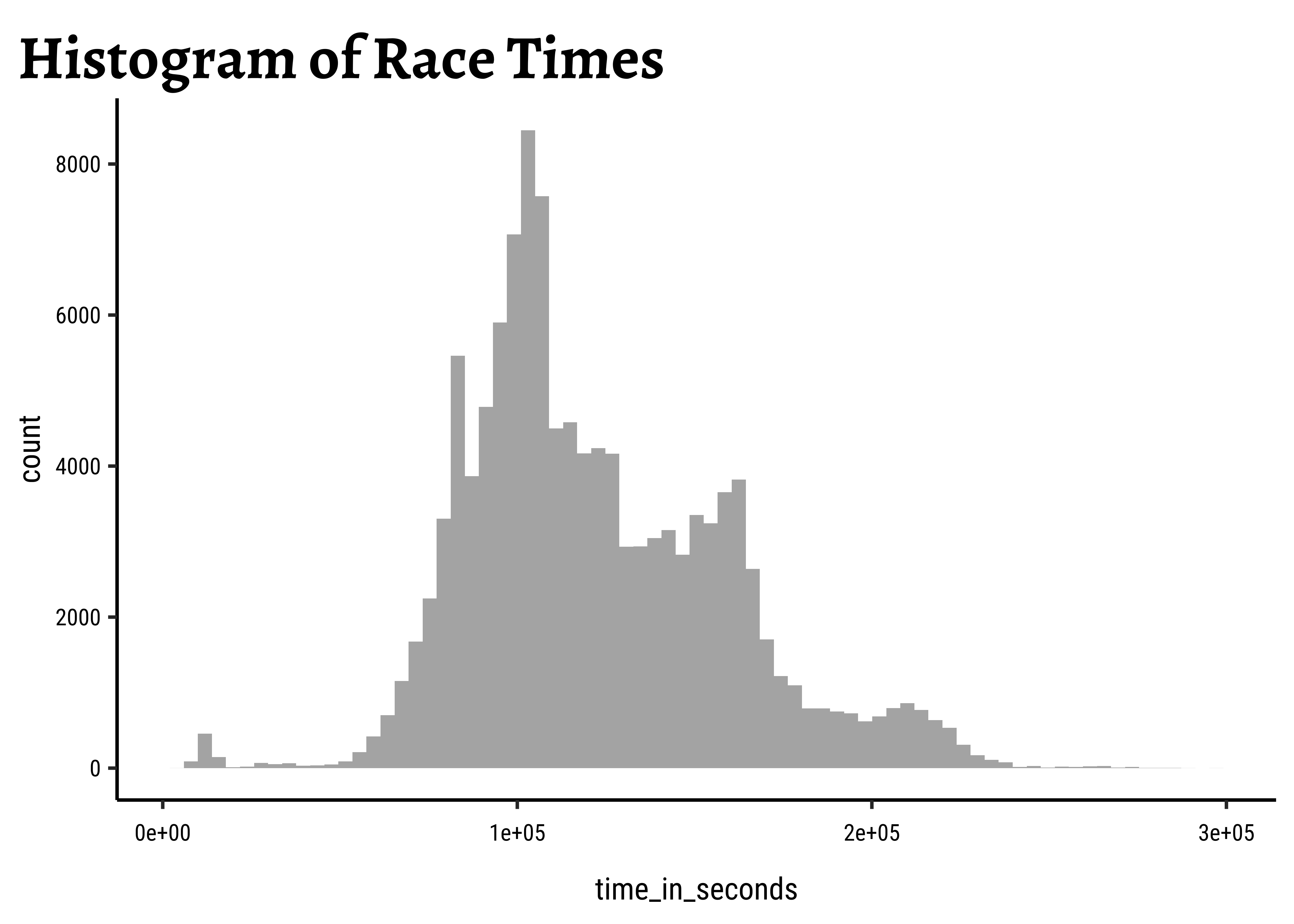
So the distribution is (very) roughly bell-shaped, spread over a 2X range. And some people may have dropped out of the race very early and hence we have a small bump close to zero time! The histogram shows three bumps…at least one reason is that the distances to be covered are not the same…but could there be other reasons? Like altitude_gained for example?
Question #5
What is the distribution of race distances?
race_df %>%
  gf_histogram(~distance, bins = 50) %>%
  gf_labs(title = "Histogram of Race Distances")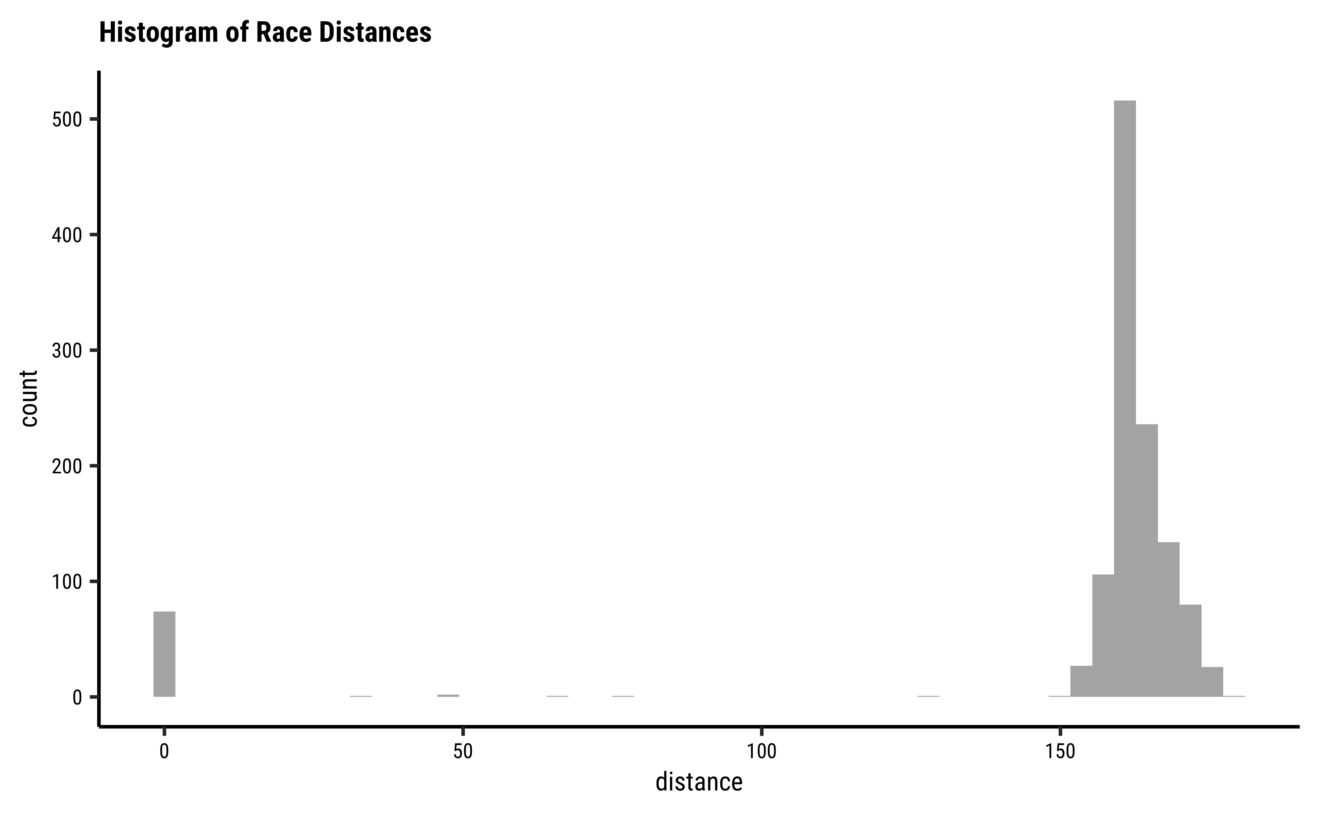
Hmm…a closely clumped set of race distances, with some entries in between [0-150], but some are zero? Which are these?
race_year_id <dbl> | event <chr> | race <chr> | city <chr> | country <chr> | date <date> | |
|---|---|---|---|---|---|---|
| 64771 | The Old Forest Hanmer 100 | 100mile | HanmerSprings | New Zealand | 2021-05-14 | |
| 71220 | Run Lovit | 100M | NA | United States | 2021-02-26 | |
| 67160 | IDAHO MOUNTAIN TRAIL ULTRA FESTIVAL | 100 Mile | NA | United States | 2020-09-12 | |
| 67713 | Pine creek challenge | 100Miles | Wellsboro | PA, United States | 2020-09-12 | |
| 51777 | Chiemgauer 100 | 100 Mile | Bergen | Germany | 2020-07-31 | |
| 66413 | Palisades Ultra Trail Series | Moose 100 Mile | Irwin | United States | 2020-07-17 | |
| 62593 | Run Lovit | 100M | NA | United States | 2020-02-28 | |
| 50097 | The Great Southern Alps Miler | The Great Southern Alps Miler | HanmerSprings | New Zealand | 2020-01-17 | |
| 65861 | Loup Garou 100 Mile Trail Run | 100M | VillePlatte | LA, United States | 2019-12-14 | |
| 59415 | RIO DEL LAGO 100 | 100 MILES | NA | United States | 2019-11-07 |
Hmm…a closely clumped set of race distances, with some entries in between [0-150], but some are zero? Which are these?
Curious…some of these zero-distance races have had participants too! Perhaps these were cancelled events…all of them are stated to be 100 mile events…
Question #6
For all races that have a distance around 150, what is the distribution of finishing times? Can these be split/facetted using start_time of the race (i.e. morning / evening) ?
Let’s make a count of start times:
start_time <time> | n <int> | |||
|---|---|---|---|---|
| 00:00:00 | 513 | |||
| 06:00:00 | 114 | |||
| 08:00:00 | 63 | |||
| 10:00:00 | 60 | |||
| 07:00:00 | 58 | |||
| 18:00:00 | 50 | |||
| 05:00:00 | 48 | |||
| 12:00:00 | 38 | |||
| 04:00:00 | 30 | |||
| 09:00:00 | 27 |
Let’s convert start_time into a factor with levels: early_morning(0200:0600), late_morning(0600:1000), midday(1000:1400), afternoon(1400: 1800), evening(1800:2200), and night(2200:0200)
# Demo purposes only!

race_start_factor <- race_df %>%
  filter(distance == 0) %>% # Races that actually took place
  mutate(
    start_day_time =
      case_when(
        start_time > hms("02:00:00") &
          start_time <= hms("06:00:00") ~ "early_morning",
        start_time > hms("06:00:01") &
          start_time <= hms("10:00:00") ~ "late_morning",
        start_time > hms("10:00:01") &
          start_time <= hms("14:00:00") ~ "mid_day",
        start_time > hms("14:00:01") &
          start_time <= hms("18:00:00") ~ "afternoon",
        start_time > hms("18:00:01") &
          start_time <= hms("22:00:00") ~ "evening",
        start_time > hms("22:00:01") &
          start_time <= hms("23:59:59") ~ "night",
        start_time >= hms("00:00:00") &
          start_time <= hms("02:00:00") ~ "postmidnight",
        .default = "other"
      )
  ) %>%
  mutate(
    start_day_time =
      as_factor(start_day_time) %>%
        fct_collapse(
          .f = .,
          night = c("night", "postmidnight")
        )
  )
##
# Join with rank_df
race_start_factor %>%
  left_join(rank_df, by = "race_year_id") %>%
  drop_na(time_in_seconds) %>%
  gf_histogram(
    ~time_in_seconds,
    bins = 75,
    fill = ~start_day_time,
    color = ~start_day_time,
    alpha = 0.5
  ) %>%
  gf_facet_wrap(vars(start_day_time), ncol = 2, scales = "free_y") %>%
  gf_labs(title = "Race Times by Start-Time")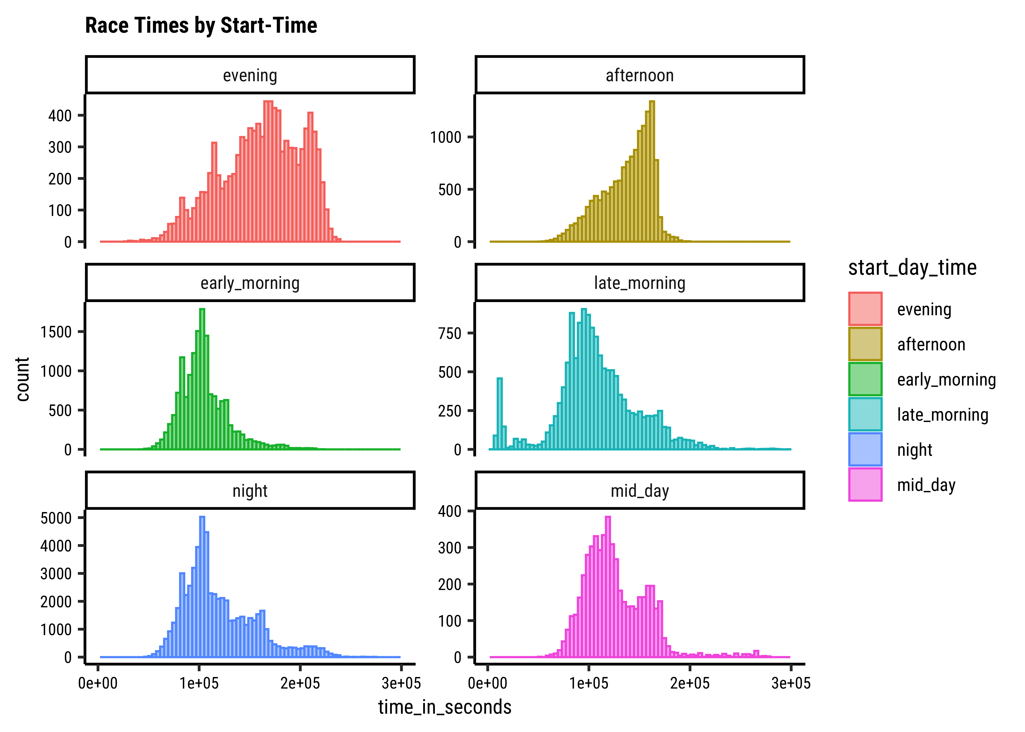
Let’s make a count of start times:
Let’s convert start_time into a factor with levels: early_morning(0200:0600), late_morning(0600:1000), midday(1000:1400), afternoon(1400: 1800), evening(1800:2200), and night(2200:0200)
We see that finish times tend to be longer for afternoon and evening start races; these are lower for early morning and night time starts. Mid-day starts show a curious double hump in finish times that should be studied.
Before we conclude, let us look at a real world dataset: populations of countries. This dataset was taken from Kaggle https://www.kaggle.com/datasets/ulrikthygepedersen/populations. Click on the icon below to save the file into a subfolder called data in your project folder:
country_code <chr> | country_name <chr> | year <dbl> | value <dbl> | |
|---|---|---|---|---|
| ABW | Aruba | 1960 | 54608 | |
| ABW | Aruba | 1961 | 55811 | |
| ABW | Aruba | 1962 | 56682 | |
| ABW | Aruba | 1963 | 57475 | |
| ABW | Aruba | 1964 | 58178 | |
| ABW | Aruba | 1965 | 58782 | |
| ABW | Aruba | 1966 | 59291 | |
| ABW | Aruba | 1967 | 59522 | |
| ABW | Aruba | 1968 | 59471 | |
| ABW | Aruba | 1969 | 59330 |
categorical variables:
          name     class levels     n missing
1 country_code character    265 16400       0
2 country_name character    265 16400       0
                                   distribution
1 ABW (0.4%), AFE (0.4%), AFG (0.4%) ...
2 Afghanistan (0.4%) ...

quantitative variables:
   name   class  min       Q1  median       Q3        max         mean
1  year numeric 1960   1975.0    1991     2006       2021 1.990529e+03
2 value numeric 2646 986302.5 6731400 46024452 7888408686 2.140804e+08
            sd     n missing
1 1.789551e+01 16400       0
2 7.040554e+08 16400       0
Let us plot densities/histograms for value:
gf_histogram(~value, data = pop, title = "Long Tailed Histogram")
gf_density(~value, data = pop, title = "Long Tailed Density")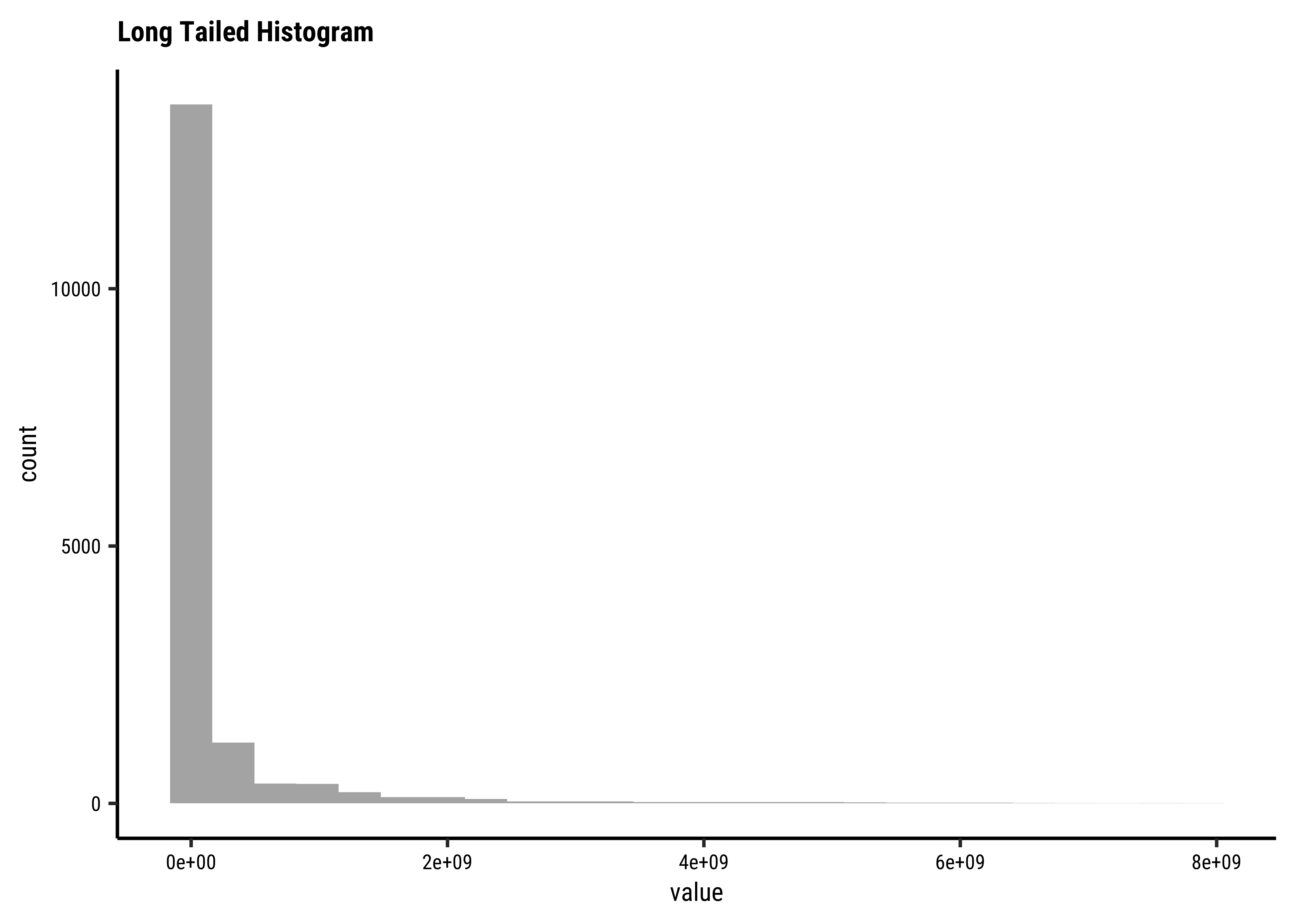
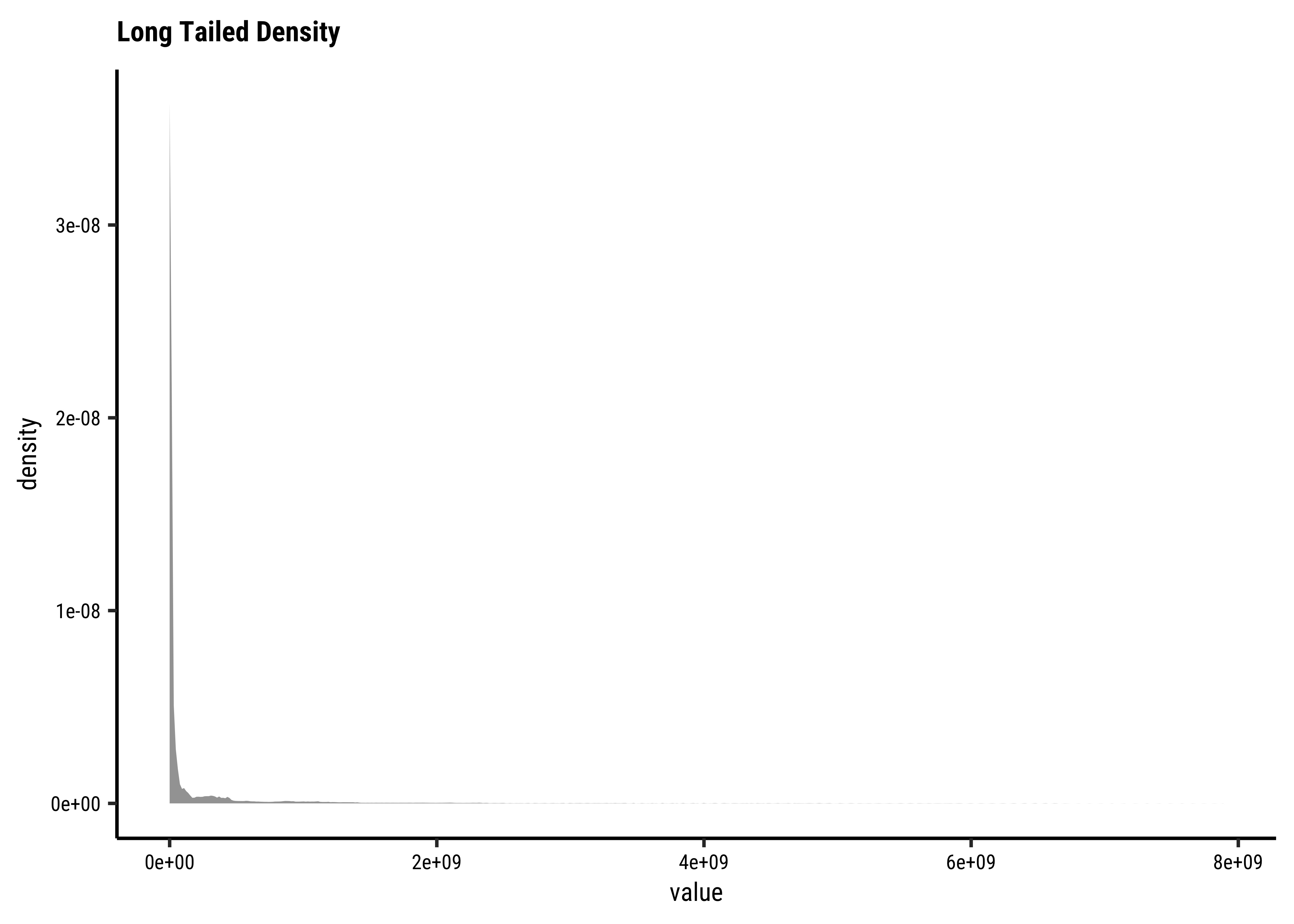
These graphs convey very little to us: the data is very heavily skewed to the right and much of the chart is empty. There are many countries with small populations and a few countries with very large populations. Such distributions are also called “long tailed” distributions. To develop better insights with this data, we should transform the variable concerned, using say a “log” transformation:
gf_histogram(~ log10(value), data = pop, title = "Histogram with Log transformed x-variable")
gf_density(~ log10(value), data = pop, title = "Density with Log transformed x-variable")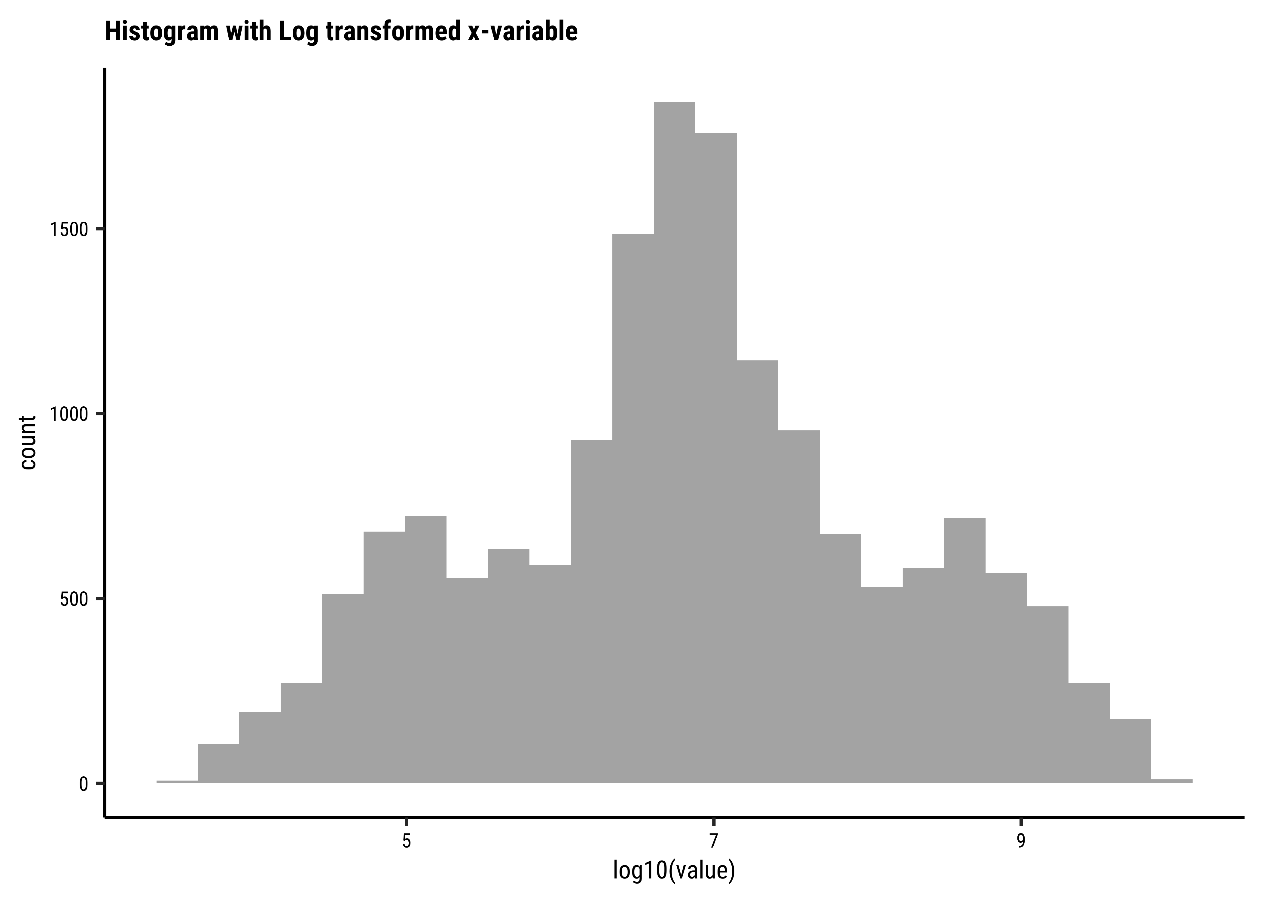
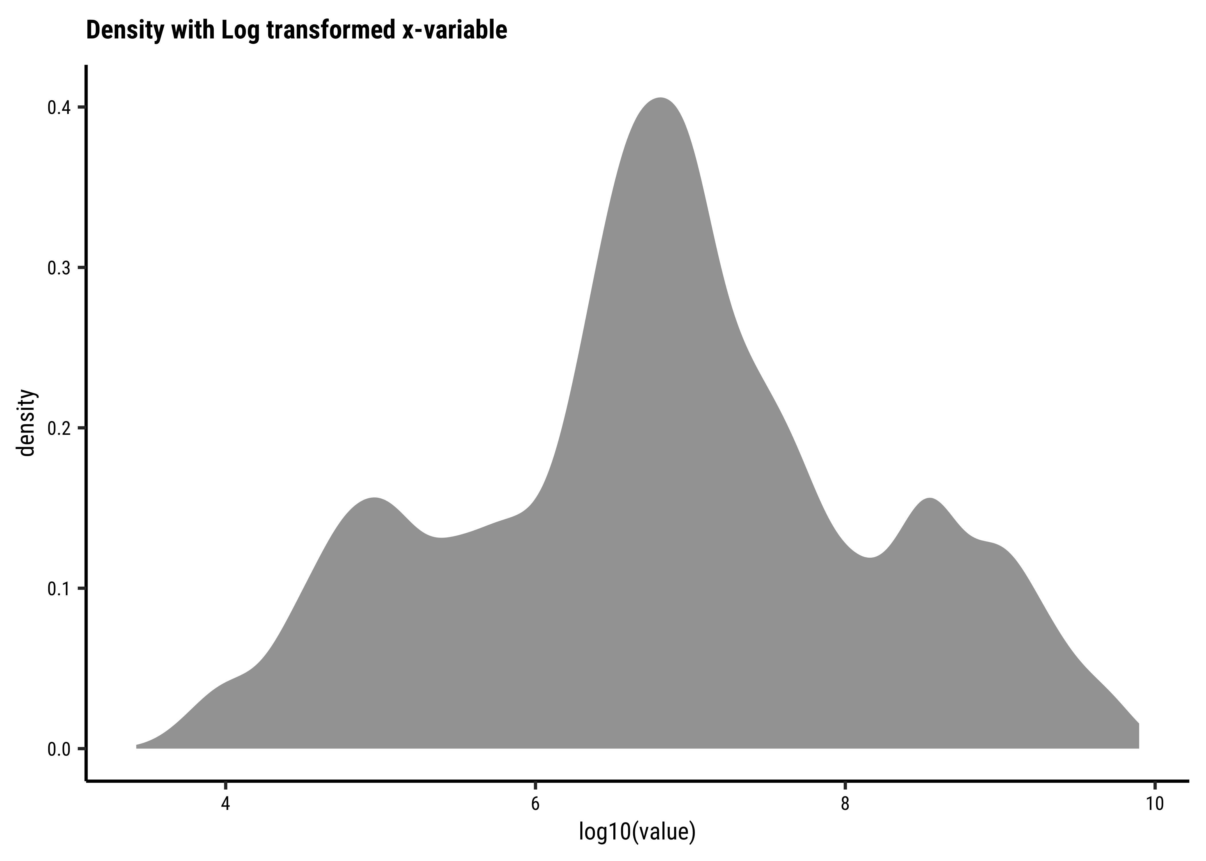
Be prepared to transform your data with log or sqrt transformations when you see skewed distributions!
City Populations, Sales across product categories, Salaries, Instagram connections, number of customers vs Companies, net worth / valuation of Companies, extreme events on stock markets….all of these could have highly skewed distributions. In such a case, the standard statistics of mean/median/sd may not convey too much information. With such distributions, one additional observation on say net worth, like say Mr Gates’, will change these measures completely. (More when we discuss Sampling)
Since very large observations are indeed possible, if not highly probable, one needs to look at the result of such an observation and its impact on a situation rather than its (mere) probability. Classical statistical measures and analysis cannot apply with long-tailed distributions. More on this later in the Module on Statistical Inference, but for now, here is a video that talks in detail about fat-tailed distributions, and how one should use them and get used to them:
Several distribution shapes exist, here is an illustration of the 6 most common ones:
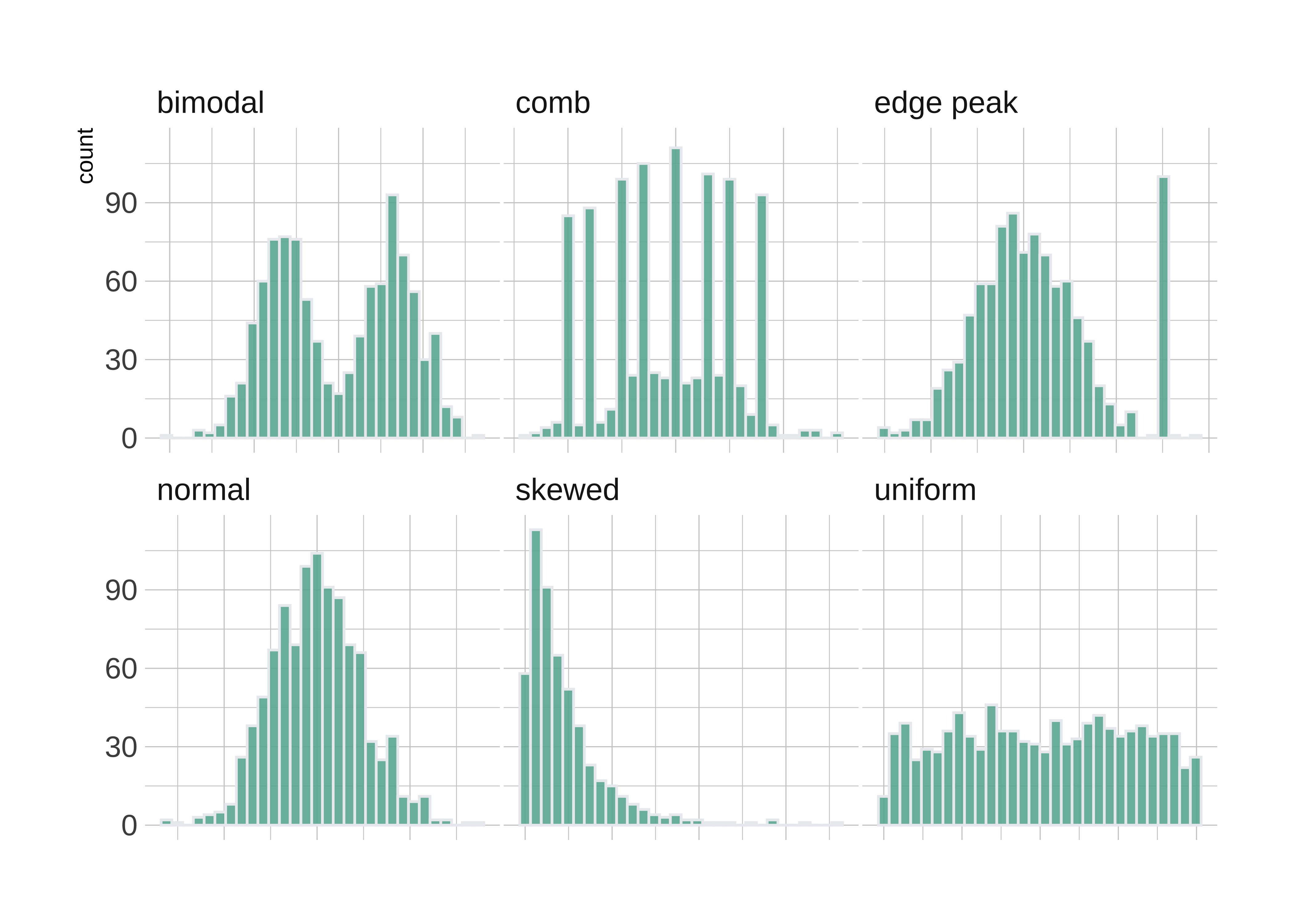
What insights could you develop based on these distribution shapes?
-
Bimodal: Maybe two different systems or phenomena or regimes under which the data unfolds. Like our geyser above. Or a machine that works differently when cold and when hot. Intermittent faulty behaviour…
-
Comb: Some specific Observations occur predominantly, in an otherwise even spread or observations. In a survey many respondents round off numbers to nearest 100 or 1000. Check the distribution of the diamonds dataset for carat values which are suspiciously integer numbers in too many cases.
-
Edge Peak: Could even be a data entry artifact!! All unknown / unrecorded observations are recorded as
-
Normal: Just what it says! Course Marks in a Univ cohort…
-
Skewed: Income, or friends count in a set of people. Do UI/UX peasants have more followers on Insta than say CAP people?
-
Uniform: The World is
notflat. Anything can happen within a range. But not much happens outside! Sharp limits…
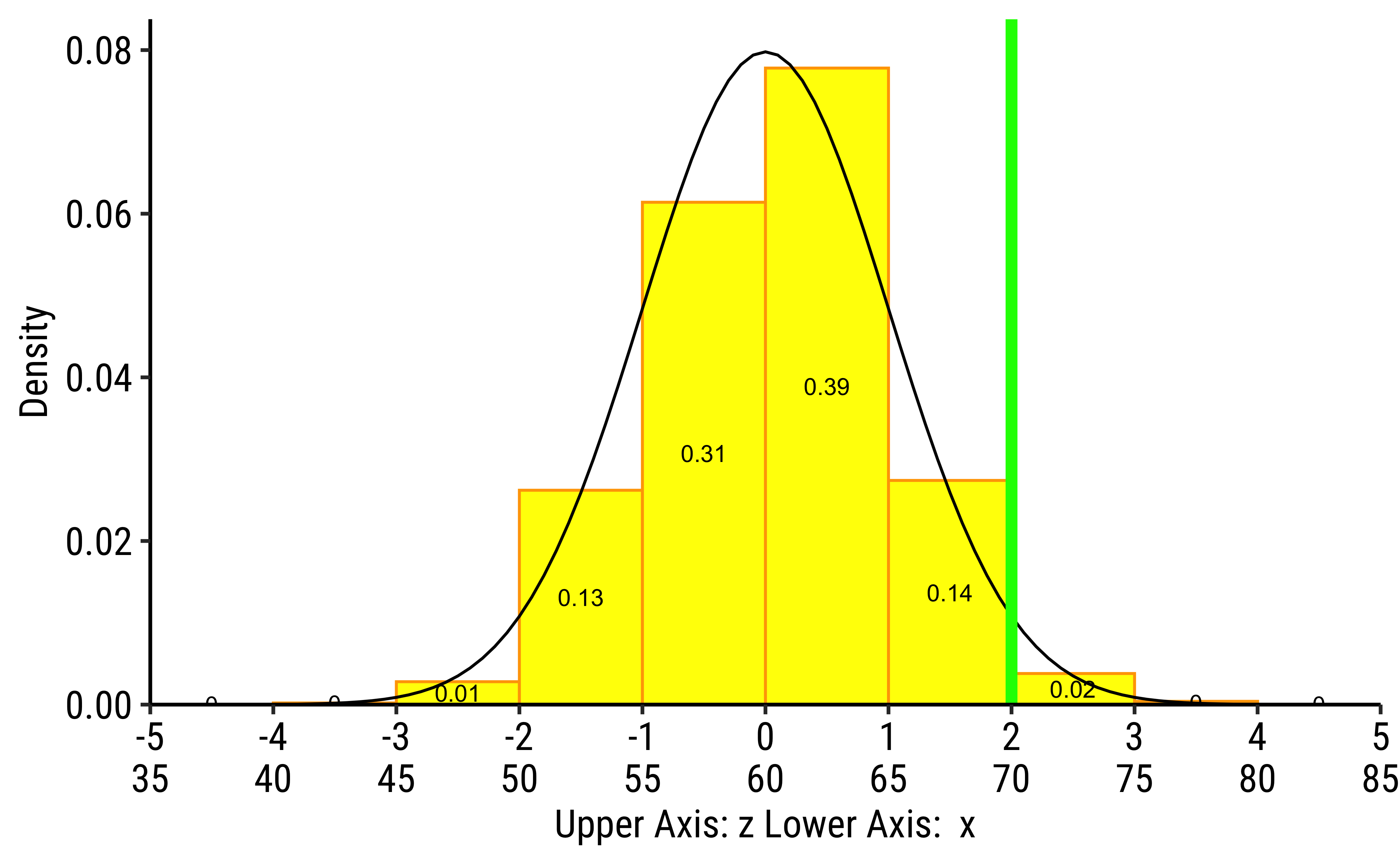
Often when we compute wish to compare distributions with different values for means and standard deviations, we resort to a scaling of the variables that are plotted in the respective distributions.
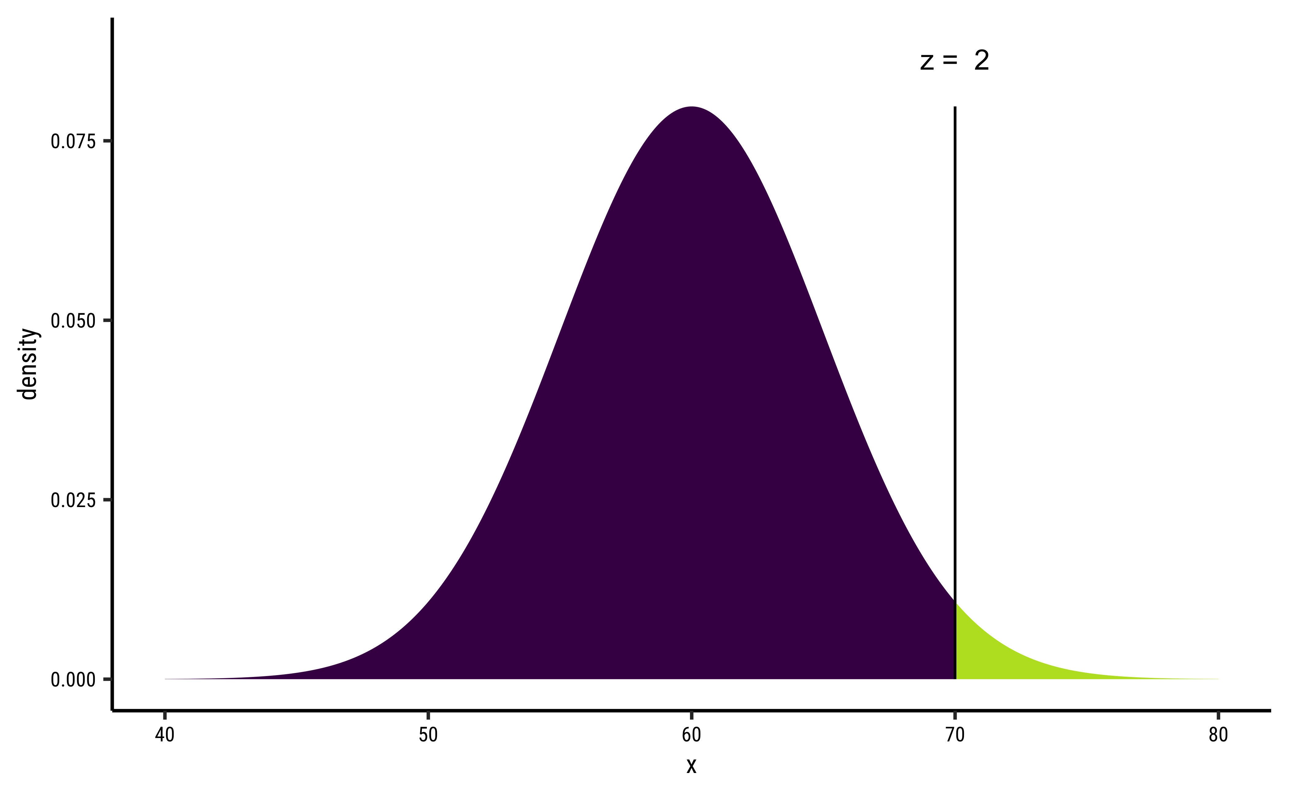
[1] 0.9772499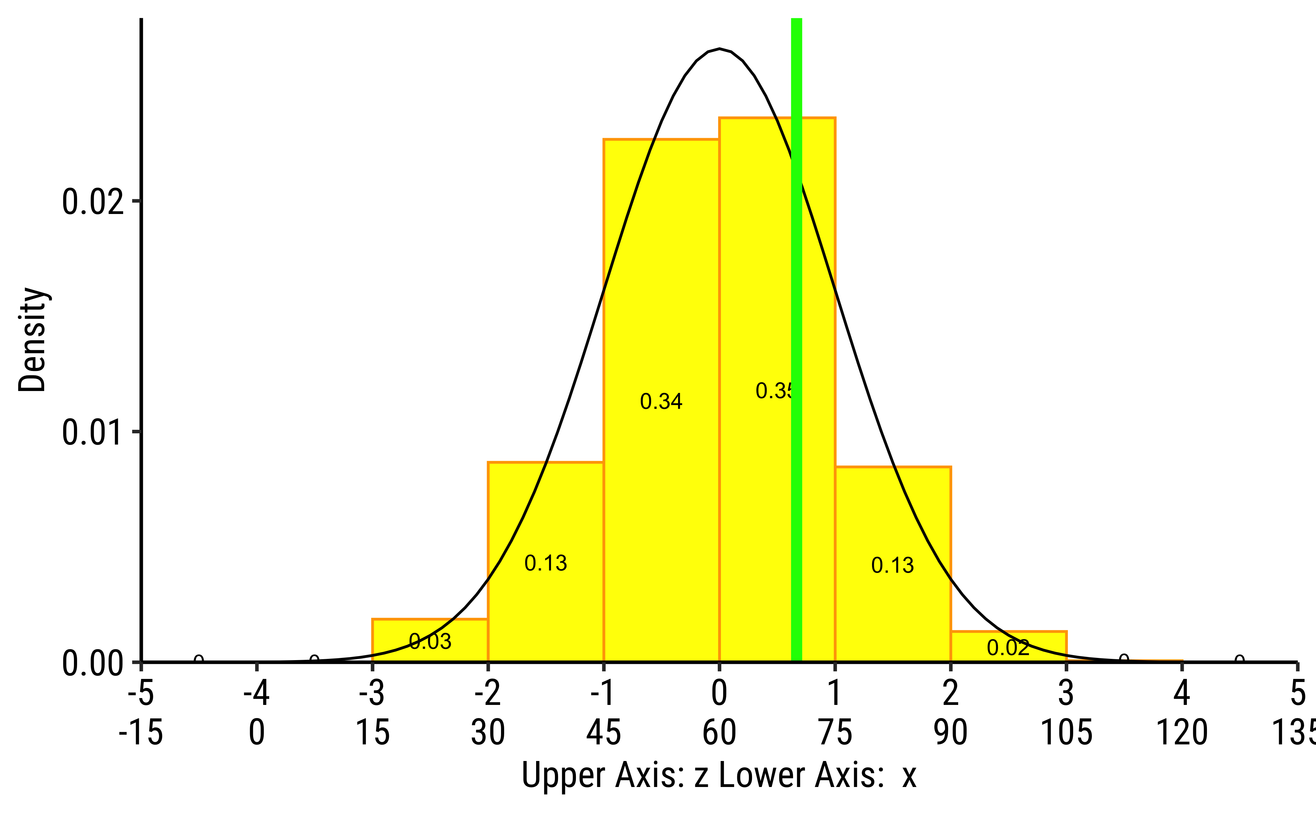
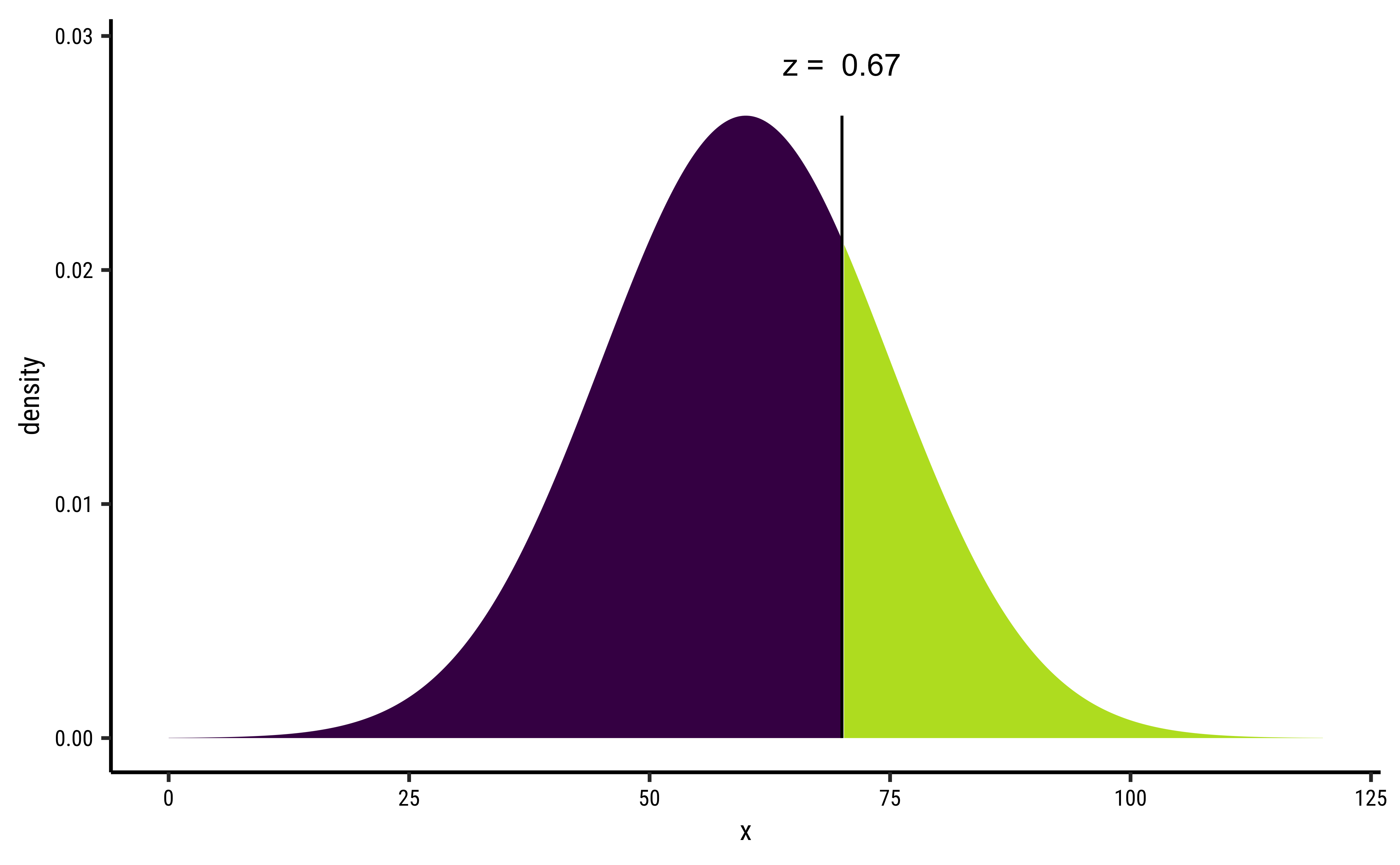
[1] 0.7475075Although the densities all look the same, they are are quite different! The x-axis in each case has two scales: one is the actual value of the x-variable, and the other is the z-score which is calculated as:
With similar distributions (i.e. normal distributions), we see that the variation in density is the same at the same values of z-score for each variable. However since the z-score is different for each variable. In the first plot (from the top left),
Our comparisons are done easily when we compare differences in probabilities at identical z-scores, or differences in z-scores at identical probabilities.
- Histograms are used to study the distribution of one or a few Quant variables.
- Checking the distribution of your variables one by one is probably the first task you should do when you get a new dataset.
- It delivers a good quantity of information about spread, how frequent the observations are, and if there are some outlandish ones.
- Comparing histograms side-by-side helps to provide insight about whether a Quant measurement varies with situation (a Qual variable). We will see this properly in a statistical way soon.
To complicate matters: Having said all that, the histogram is really a bar chart in disguise! You probably suspect that the “bucketing” of the Quant variable is tantamount to creating a Qual variable! Each bucket is a level in this fictitious bucketed Quant variable.
- Histograms, Frequency Distributions, and Box Plots are used for Quantitative data variables
- Histograms “dwell upon” counts, ranges, means and standard deviations
- We can split histograms on the basis of another Qualitative variable.
- Long tailed distributions need care in visualization and in inference making!
- Old Faithful Data in R (Find it!)
3. Time taken to Open or Close Packages
inspect the dataset in each case and develop a set of Questions, that can be answered by appropriate stat measures, or by using a chart to show the distribution.
Tip
Note: reading xlsx files into R may need the the readxl package. Install it!!
This module is an excerpt from a guide on learning statistical analysis using metaphors. The text focuses on the concept of quantitative variables and how histograms can be used to visualize their distribution. The author illustrates these concepts through real-world examples using datasets such as diamond prices, ultramarathon race times, and global population figures. By analyzing these datasets with histograms, the author explores various aspects of data distributions, including skewness, bimodality, and the presence of outliers. The guide also introduces additional tools like the crosstable package and z-scores to enhance data analysis. Finally, the author encourages readers to apply these concepts to real-world datasets, developing questions and insights through the use of histograms and statistical measures.
What patterns emerge from the distributions of quantitative variables in each dataset, and what insights can we gain about the relationships between these variables?
How do different qualitative variables impact the distribution of quantitative variables in the datasets, and what are the implications of these findings for understanding the underlying phenomena?
Based on the distributions and relationships between variables, what are the most relevant questions to ask about the datasets, and what further analyses could be conducted
- Winston Chang (2024). R Graphics Cookbook. https://r-graphics.org
- See the scrolly animation for a histogram at this website: Exploring Histograms, an essay by Aran Lunzer and Amelia McNamara https://tinlizzie.org/histograms/?s=09
- Minimal R using
mosaic.https://cran.r-project.org/web/packages/mosaic/vignettes/MinimalRgg.pdf
- Sebastian Sauer, Plotting multiple plots using purrr::map and ggplot
Balamuta, James. 2023. visualize: Graph Probability Distributions with User Supplied Parameters and Statistics. https://doi.org/10.32614/CRAN.package.visualize.
Chaltiel, Dan. 2024. crosstable: Crosstables for Descriptive Analyses. https://doi.org/10.32614/CRAN.package.crosstable.
Lange, Carsten. 2023. TeachHist: A Collection of Amended Histograms Designed for Teaching Statistics. https://doi.org/10.32614/CRAN.package.TeachHist.
Pruim, Randall. 2015. NHANES: Data from the US National Health and Nutrition Examination Study. https://doi.org/10.32614/CRAN.package.NHANES.
Snow, Greg. 2024. TeachingDemos: Demonstrations for Teaching and Learning. https://doi.org/10.32614/CRAN.package.TeachingDemos.
Wilke, Claus O. 2024. ggridges: Ridgeline Plots in “ggplot2”. https://doi.org/10.32614/CRAN.package.ggridges.
Citation
BibTeX citation:
@online{v.2022,
  author = {V., Arvind},
  title = {\textless Iconify-Icon Icon=“fluent-Mdl2:quantity”
    Width=“1.2em”
    Height=“1.2em”\textgreater\textless/Iconify-Icon\textgreater{}
    {Quantities}},
  date = {2022-11-15},
  url = {https://av-quarto.netlify.app/content/courses/Analytics/Descriptive/Modules/22-Histograms/},
  langid = {en},
  abstract = {Quant and Qual Variable Graphs and their Siblings}
}
For attribution, please cite this work as:
V., Arvind. 2022. “<Iconify-Icon
Icon=‘fluent-Mdl2:quantity’ Width=‘1.2em’
Height=‘1.2em’></Iconify-Icon> Quantities.”
November 15, 2022. https://av-quarto.netlify.app/content/courses/Analytics/Descriptive/Modules/22-Histograms/.