library(tidyverse)
library(mosaic)
library(ggformula)
library(plotrix) # Fan, Pyramid Chart
# devtools::install_github("zmeers/ggparliament")
library(ggparliament) # Parliament Chart
library(ggpol) # Parliament, Arc-Bar and other interesting charts
library(data.tree) # Many plots related to heirarchical data
# install.packages("waffle", repos = "https://cinc.rud.is")
library(waffle)
library(tidygraph) # Trees, Dendros, and Circle Packings
library(ggraph) # Trees, Dendros, and Circle Packings
library(echarts4r) # Interactive Charts

library(patchwork) # Arrange your plots

##
library(tidyplots) # Easily Produced Publication-Ready Plots
library(tinyplot) # Plots with Base R
library(tinytable) # Elegant Tables for our data
Parts of a Whole
Pie Charts
Fan Charts
Donut Charts
Grouping
Stacking
Circular Bar Charts
Dot Plots
Mosaic Charts
Parliament Charts
Waffle Charts
Abstract
Slices, Portions, Counts, and Aggregates of Data
“There is no such thing as a”self-made” man. We are made up of thousands of others. Everyone who has ever done a kind deed for us, or spoken one word of encouragement to us, has entered into the make-up of our character and of our thoughts.”
— George Matthew Adams, newspaper columnist (23 Aug 1878-1962)
Plot Fonts and Theme
Show the Code
library(systemfonts)
library(showtext)
## Clean the slate
systemfonts::clear_local_fonts()
systemfonts::clear_registry()
##
showtext_opts(dpi = 96) # set DPI for showtext
sysfonts::font_add(
  family = "Alegreya",
  regular = "../../../../../../fonts/Alegreya-Regular.ttf",
  bold = "../../../../../../fonts/Alegreya-Bold.ttf",
  italic = "../../../../../../fonts/Alegreya-Italic.ttf",
  bolditalic = "../../../../../../fonts/Alegreya-BoldItalic.ttf"
)

sysfonts::font_add(
  family = "Roboto Condensed",
  regular = "../../../../../../fonts/RobotoCondensed-Regular.ttf",
  bold = "../../../../../../fonts/RobotoCondensed-Bold.ttf",
  italic = "../../../../../../fonts/RobotoCondensed-Italic.ttf",
  bolditalic = "../../../../../../fonts/RobotoCondensed-BoldItalic.ttf"
)
showtext_auto(enable = TRUE) # enable showtext
##
theme_custom <- function() {
  font <- "Alegreya" # assign font family up front

  theme_classic(base_size = 14, base_family = font) %+replace% # replace elements we want to change

    theme(
      text = element_text(family = font), # set base font family

      # text elements
      plot.title = element_text( # title
        family = font, # set font family
        size = 24, # set font size
        face = "bold", # bold typeface
        hjust = 0, # left align
        margin = margin(t = 5, r = 0, b = 5, l = 0)
      ), # margin
      plot.title.position = "plot",
      plot.subtitle = element_text( # subtitle
        family = font, # font family
        size = 14, # font size
        hjust = 0, # left align
        margin = margin(t = 5, r = 0, b = 10, l = 0)
      ), # margin

      plot.caption = element_text( # caption
        family = font, # font family
        size = 9, # font size
        hjust = 1
      ), # right align

      plot.caption.position = "plot", # right align

      axis.title = element_text( # axis titles
        family = "Roboto Condensed", # font family
        size = 12
      ), # font size

      axis.text = element_text( # axis text
        family = "Roboto Condensed", # font family
        size = 9
      ), # font size

      axis.text.x = element_text( # margin for axis text
        margin = margin(5, b = 10)
      )

      # since the legend often requires manual tweaking
      # based on plot content, don't define it here
    )
}

## Use available fonts in ggplot text geoms too!
update_geom_defaults(geom = "text", new = list(
  family = "Roboto Condensed",
  face = "plain",
  size = 3.5,
  color = "#2b2b2b"
))

## Set the theme
theme_set(new = theme_custom())
There are a good few charts available to depict things that constitute other bigger things. We will discuss a few of these: Pie, Fan, and Donuts; Waffle and Parliament charts; Trees, Dendrograms, and Circle Packings. (The last three visuals we will explore along with network diagrams in a later module.)
So let us start with “eating humble pie”: discussing a Pie chart first.
A pie chart is a circle divided into sectors that each represent a proportion of the whole. It is often used to show percentage, where the sum of the sectors equals 100%.
The problem is that humans are pretty bad at reading angles. This ubiquitous chart is much vilified in the industry and bar charts that we have seen earlier, are viewed as better options. On the other hand, pie charts are ubiquitous in business circles, and are very much accepted! Do also read this spirited defense of pie charts here. https://speakingppt.com/why-tufte-is-flat-out-wrong-about-pie-charts/
And we will also see that there is an attractive, and similar-looking alternative, called a fan chart which we will explore here.
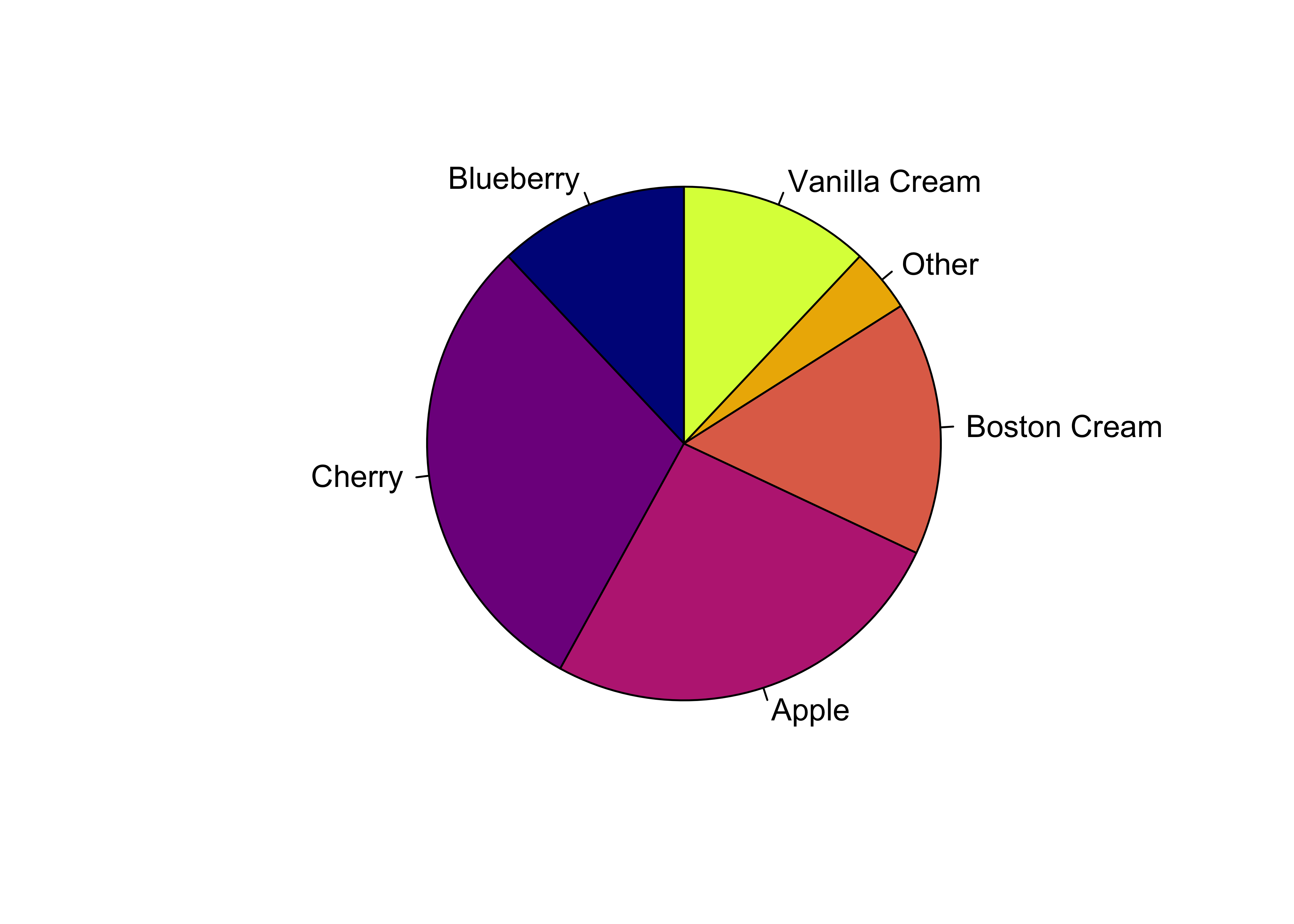
Base R has a simple pie command that does the job. Let’s create some toy data first:
pie_data <- tibble(
  sales = c(0.12, 0.3, 0.26, 0.16, 0.04, 0.12),

  # Labels MUST be character entries for `pie` to work
  labels = c(
    "Blueberry", "Cherry", "Apple", "Boston Cream",
    "Other", "Vanilla Cream"
  )
)
pie_datasales <dbl> | labels <chr> | |||
|---|---|---|---|---|
| 0.12 | Blueberry | |||
| 0.30 | Cherry | |||
| 0.26 | Apple | |||
| 0.16 | Boston Cream | |||
| 0.04 | Other | |||
| 0.12 | Vanilla Cream |
pie(
  x = pie_data$sales,
  labels = pie_data$labels, # Character Vector is a MUST

  # Pie is within a square of 1 X 1 units
  # Reduce radius if needed to see labels properly
  radius = 0.95,
  init.angle = 90, # First slice starts at 12 o'clock position

  # Change the default colours. Comment this and see what happens.
  col = grDevices::hcl.colors(palette = "Plasma", n = 6)
)
sales <dbl> | labels <chr> | |||
|---|---|---|---|---|
| 0.12 | Blueberry | |||
| 0.30 | Cherry | |||
| 0.26 | Apple | |||
| 0.16 | Boston Cream | |||
| 0.04 | Other | |||
| 0.12 | Vanilla Cream |
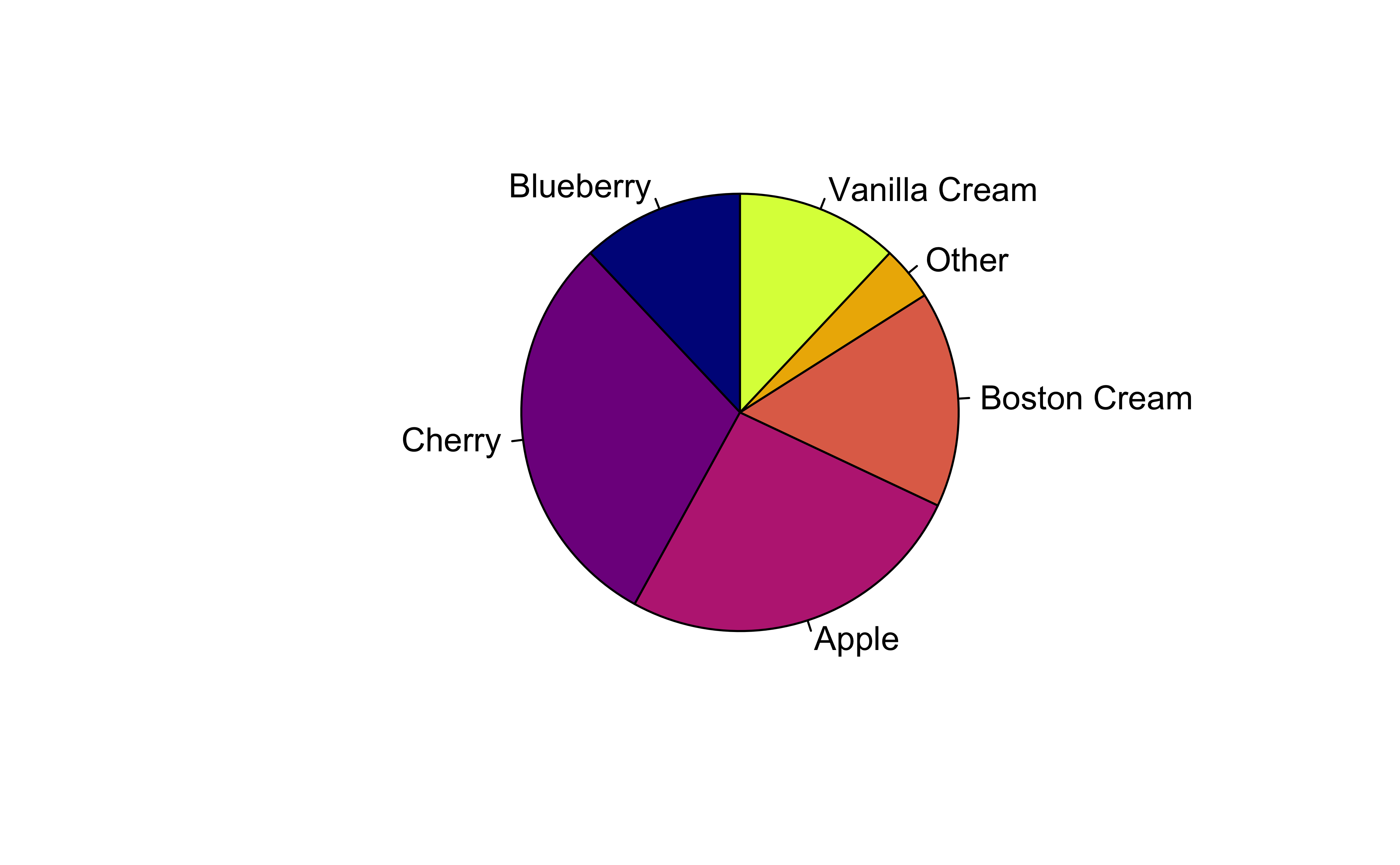
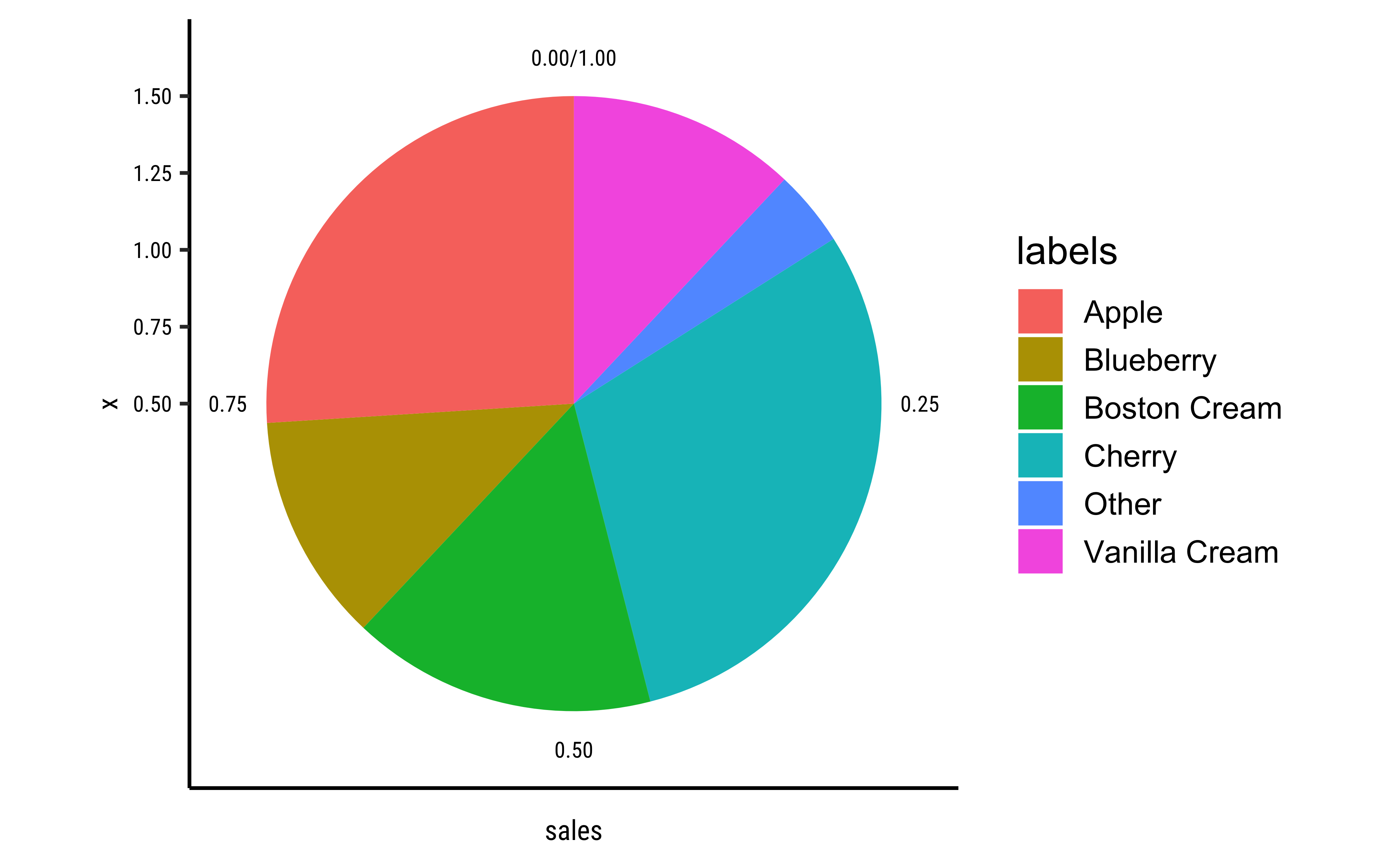
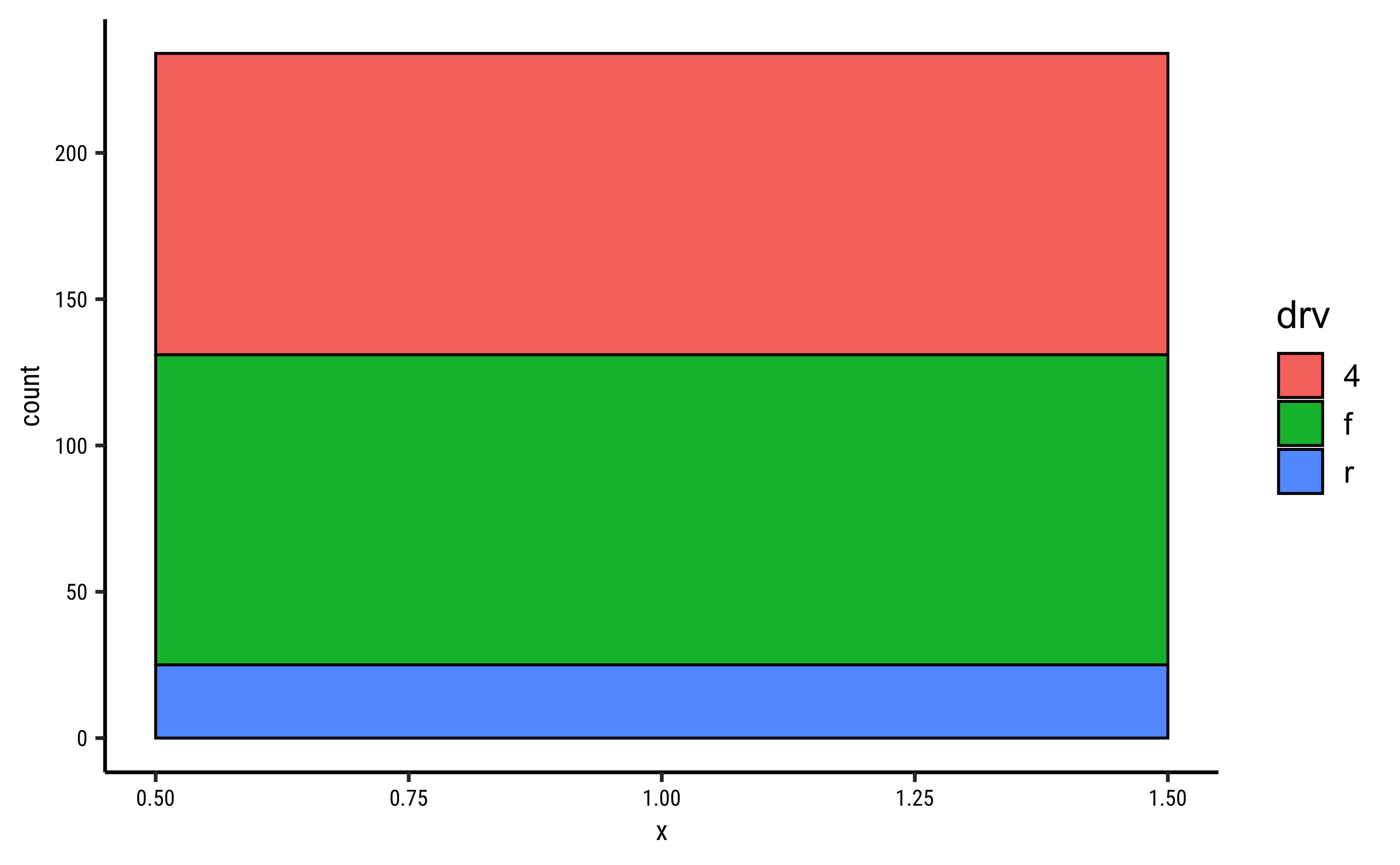
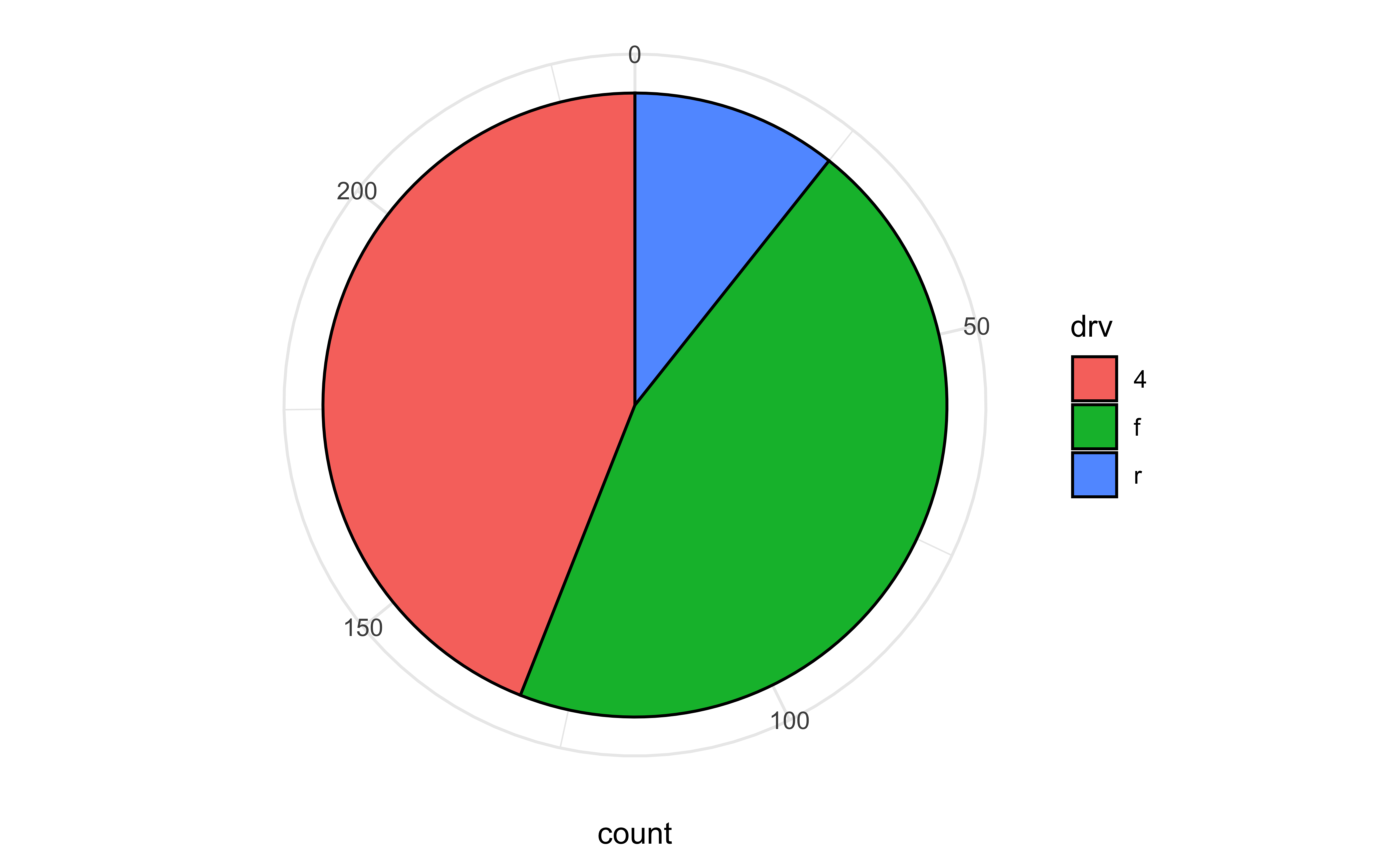
We create a bar chart or a column chart as appropriate, with bars filled by category. The width parameter is set to 1 so that the bars touch. The bars have a fixed width along the x-axis; the height of the bar varies based on the number we wish to show. Then the coord_polar(theta = "y") converts the bar plot into a pie.
# Using gf_col since we have a count/value column already
pie_data %>%
  gf_col(sales ~ 1, fill = ~labels, width = 1, color = "black") %>%
  gf_refine(scale_fill_brewer(palette = "Set1"))
pie_data %>%
  gf_col(sales ~ 1, fill = ~labels, width = 1, color = "black") %>%
  gf_refine(coord_polar(theta = "y")) %>%
  gf_refine(scale_fill_brewer(palette = "Set1"))
# Using gf_bar since we don't have ready made counts
gf_bar(
  data = mpg,
  ~1,
  fill = ~drv,
  color = "black", # border for the bars/slices
  width = 1
) %>%
  gf_refine(scale_fill_brewer(palette = "Set1"))
gf_bar(
  data = mpg,
  ~0.5,
  fill = ~drv,
  color = "black", # border for the bars/slices
  width = 1
) %>%
  gf_refine(coord_polar(theta = "y")) %>%
  gf_refine(scale_fill_brewer(palette = "Set1"))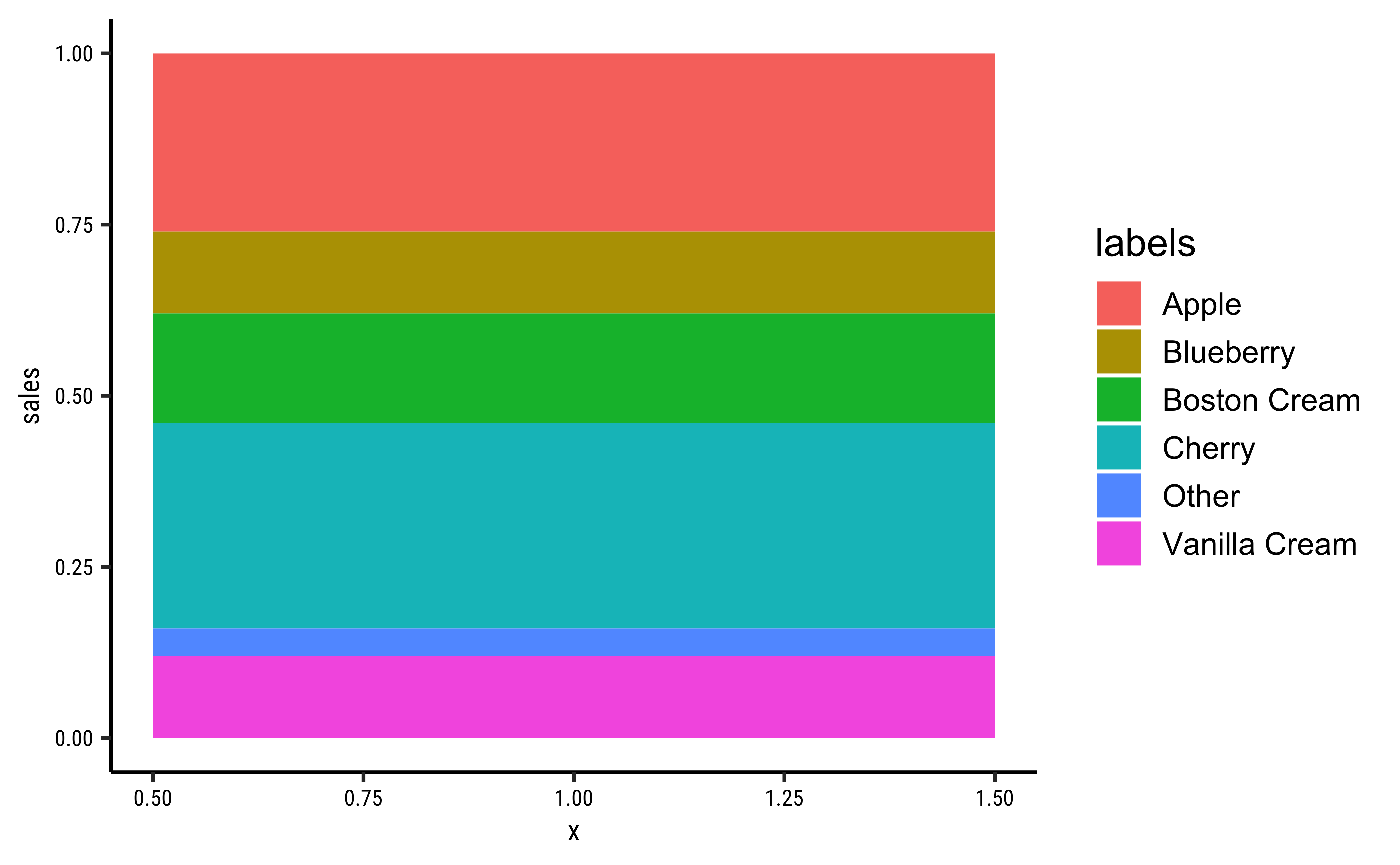
Here is a basic interactive pie chart withecharts4r:
pie_data <- tibble(
  sales = c(0.12, 0.3, 0.26, 0.16, 0.04, 0.12),
  labels = c(
    "Blueberry", "Cherry", "Apple", "Boston Cream", "Other",
    "Vanilla Cream"
  )
)
pie_data %>%
  e_charts(x = labels) %>%
  e_pie(
    serie = sales, clockwise = TRUE,
    startAngle = 90
  ) %>%
  e_legend(list(
    orient = "vertical",
    left = "right"
  )) %>%
  e_tooltip()
We can add more bells and whistles to the humble-pie chart, and make a Nightingale rosechart out of it:
pie_data <- tibble(
  sales = c(0.12, 0.3, 0.26, 0.16, 0.04, 0.12),
  labels = c(
    "Blueberry", "Cherry", "Apple", "Boston Cream", "Other",
    "Vanilla Cream"
  )
)
pie_data %>%
  e_charts(x = labels) %>%
  e_pie(
    serie = sales, clockwise = TRUE,
    startAngle = 90,
    roseType = "area"
  ) %>% # try "radius"

  # Lets move the legend
  e_legend(left = "right", orient = "vertical") %>%
  e_tooltip()
pie_data %>%
  e_charts(x = labels) %>%
  e_pie(
    serie = sales, clockwise = TRUE,
    startAngle = 90,
    roseType = "radius"
  ) %>%
  # Lets move the legend
  e_legend(left = "right", orient = "vertical") %>%
  e_tooltip()
For more information and customization look at https://echarts.apache.org/en/option.html#series-pie
The fan Plot
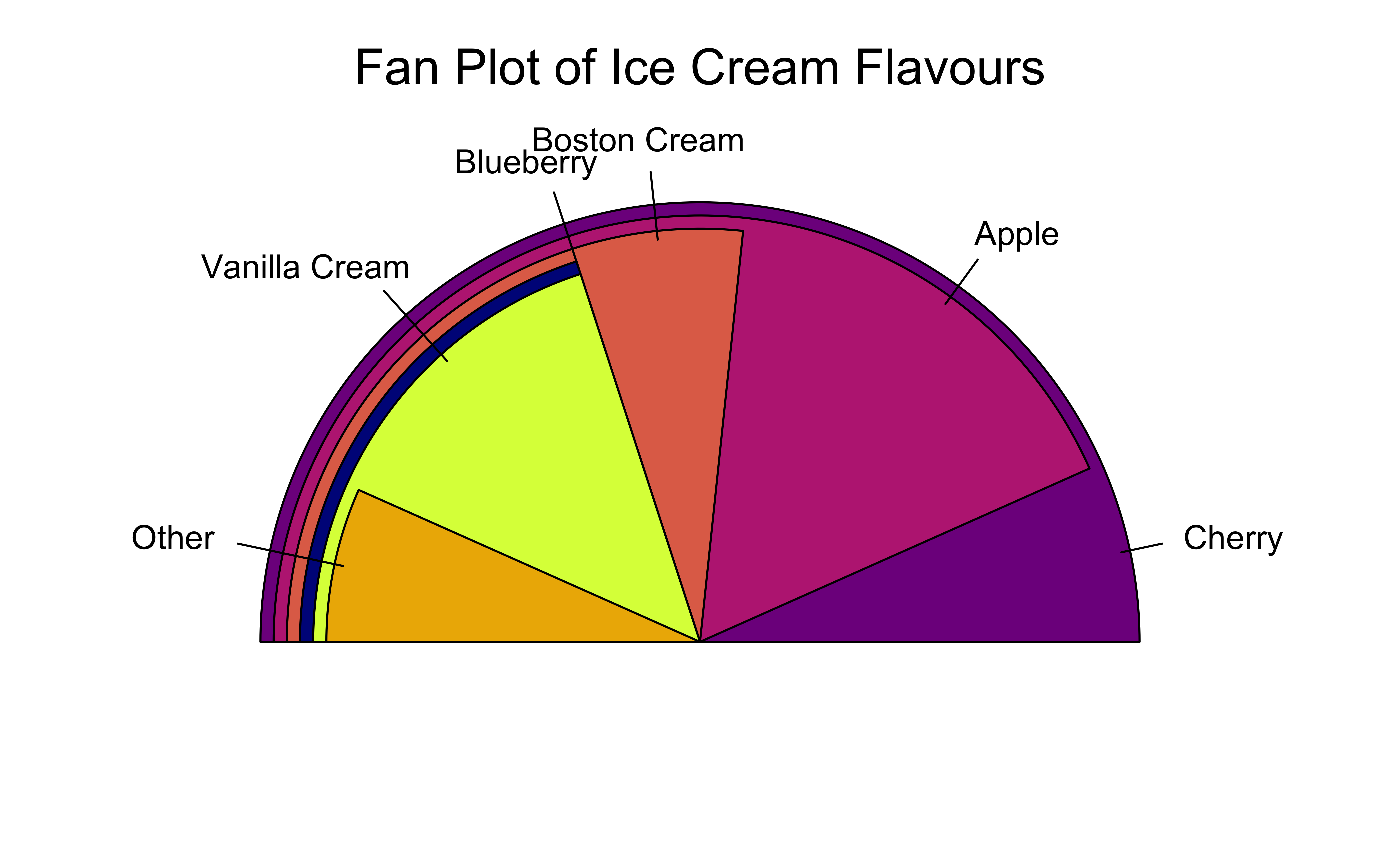
The fan plot (from the plotrix package) displays numerical values as arcs of overlapping sectors. This allows for more effective comparison:
plotrix::fan.plot(
  x = pie_data$sales,
  labels = pie_data$labels,
  col = grDevices::hcl.colors(palette = "Lajolla", n = 6), # Try hcl.pals()
  shrink = 0.03,
  # How much to shrink each successive sector

  label.radius = 1.15,
  main = "Fan Plot of Ice Cream Flavours",
  # ticks = 360,
  # if we want tick marks on the circumference

  max.span = pi
)
There is no fan plot possible with echarts4r, as far as I know.
The Donut Chart
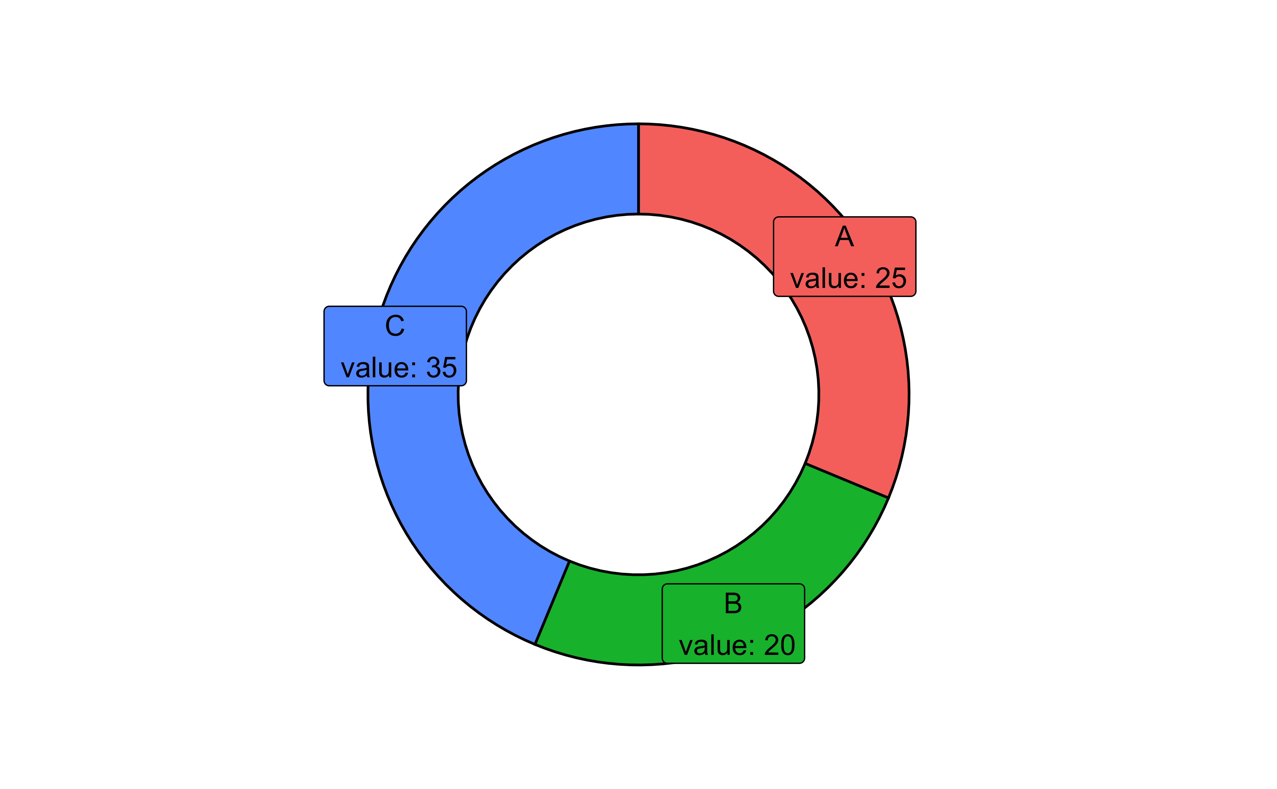
The donut chart suffers from the same defects as the pie, so should be used with discretion. The donut chart is essentially a gf_rect from ggformula, plotted on a polar coordinate set of of axes:
Let us make some toy data:
# Data
df <- tibble(
  group = LETTERS[1:3],
  value = c(25, 20, 35)
)

df <-
  df %>%
  dplyr::mutate(
    fraction = value / sum(value), # percentages
    ymax = cumsum(fraction), # cumulative percentages
    ymin = lag(ymax, 1, default = 0),
    # bottom edge of each
    label = paste0(group, "\n value: ", value),
    labelPosition = (ymax + ymin) / 2 # labels midway on arcs
  )

df
df %>%
  # gf_rect() formula: ymin + ymax ~ xmin + xmax
  # Bars with varying thickness (y) proportional to data
  # Fixed length x (2 to 4)
  gf_rect(ymin + ymax ~ 2 + 4,
    fill = ~group, colour = "black"
  ) %>%
  gf_label(labelPosition ~ 3.5,
    label = ~label, colour = "black",
    size = 4
  ) %>%
  # When switching to polar coords:
  # x maps to radius
  # y maps to angle theta
  # so we create a "hole" in the radius, in x
  gf_refine(coord_polar(
    theta = "y",
    direction = 1
  )) %>%
  # Up to here will give us a pie chart

  # Now to create the hole
  # try to play with the "0"
  # Recall x = [2,4]
  gf_refine(xlim(c(-2, 5)), scale_fill_brewer(palette = "Spectral")) %>%
  gf_theme(theme = theme_void()) %>%
gf_theme(legend.position = "none")group <chr> | value <dbl> | fraction <dbl> | ymax <dbl> | ymin <dbl> | label <chr> | labelPosition <dbl> |
|---|---|---|---|---|---|---|
| A | 25 | 0.3125 | 0.3125 | 0.0000 | A\n value: 25 | 0.15625 |
| B | 20 | 0.2500 | 0.5625 | 0.3125 | B\n value: 20 | 0.43750 |
| C | 35 | 0.4375 | 1.0000 | 0.5625 | C\n value: 35 | 0.78125 |
The donut chart is simply a variant of the pie chart in echarts4r:
df <- tibble(
  group = LETTERS[1:3],
  value = c(25, 20, 35)
)

df <-
  df %>%
  dplyr::mutate(
    fraction = value / sum(value), # percentages
    ymax = cumsum(fraction), # cumulative percentages
    ymin = lag(ymax, 1, default = 0),
    # bottom edge of each
    label = paste0(group, "\n value: ", value),
    labelPosition = (ymax + ymin) / 2 # labels midway on arcs
  )
df
df %>%
  e_charts(x = group, width = 400) %>%
  e_pie(
    serie = value,
    clockwise = TRUE,
    startAngle = 90,
    radius = c("50%", "70%")
  ) %>%
  e_legend(left = "right", orient = "vertical") %>%
e_tooltip()group <chr> | value <dbl> | fraction <dbl> | ymax <dbl> | ymin <dbl> | label <chr> | labelPosition <dbl> |
|---|---|---|---|---|---|---|
| A | 25 | 0.3125 | 0.3125 | 0.0000 | A\n value: 25 | 0.15625 |
| B | 20 | 0.2500 | 0.5625 | 0.3125 | B\n value: 20 | 0.43750 |
| C | 35 | 0.4375 | 1.0000 | 0.5625 | C\n value: 35 | 0.78125 |
Waffle charts are often called “square pie charts” !
Here we will need to step outside of ggformula and get into ggplot itself momentarily. (Always remember that ggformula is a simplified and intuitive method that runs on top of ggplot.) We will use the waffle package.
group <chr> | value <dbl> | |||
|---|---|---|---|---|
| A | 25 | |||
| B | 20 | |||
| C | 35 |
# Waffle plot
# Using ggplot, sadly not yet ggformula


ggplot(df, aes(fill = group, values = value)) +
  geom_waffle(
    n_rows = 8,
    size = 0.33,
    colour = "white",
    na.rm = TRUE
  ) +
  scale_fill_manual(
    name = NULL,
    values = c("#BA182A", "#FF8288", "#FFDBDD"),
    labels = c("A", "B", "C")
  ) +
  labs(
    title = "Waffle Chart",
    subtitle = "A square pie chart",
    caption = "Source: Toy Data"
  ) +
  coord_equal()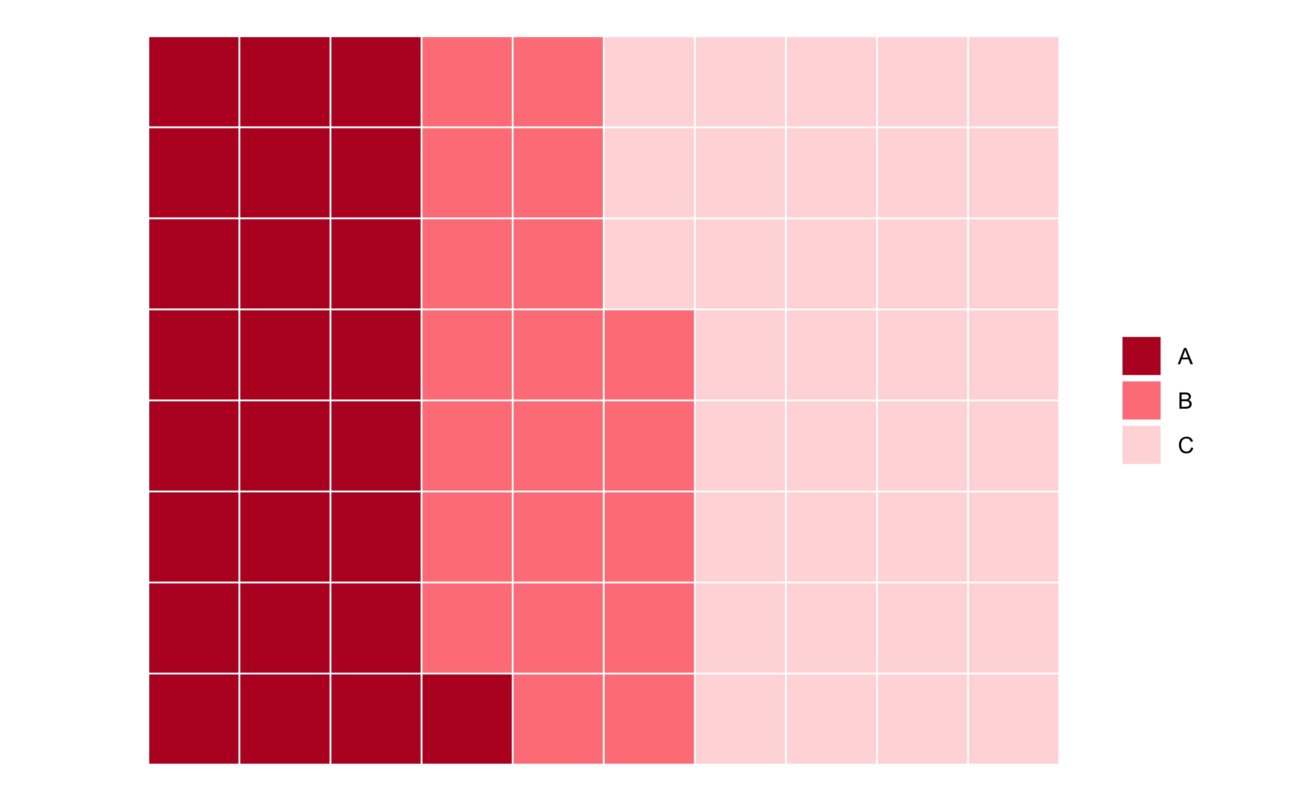
The package ggpol offers an interesting visualization in the shape of a array of “seats” in a parliament. (There is also a package called ggparliament which in my opinion is a bit cumbersome, having a two-step procedure to convert data into “parliament form” etc. )
# Same toy dataset
# df <- tibble(group = LETTERS[1:3],
#                  value = c(25, 20, 35))
#
# Parliament Plot
ggplot(df) +
  ggpol::geom_parliament(
    aes(
      seats = value,
      fill = group
    ),
    r0 = 2, # inner radius
    r1 = 4 # Outer radius
  ) +
  scale_fill_manual(
    name = NULL,
    values = c("#BA182A", "#FF8288", "#FFDBDD"),
    labels = c("A", "B", "C")
  ) +
  labs(
    title = "Parliament Chart",
    subtitle = "A circular array of seats",
    caption = "Source: Toy Data"
  ) +
  coord_equal()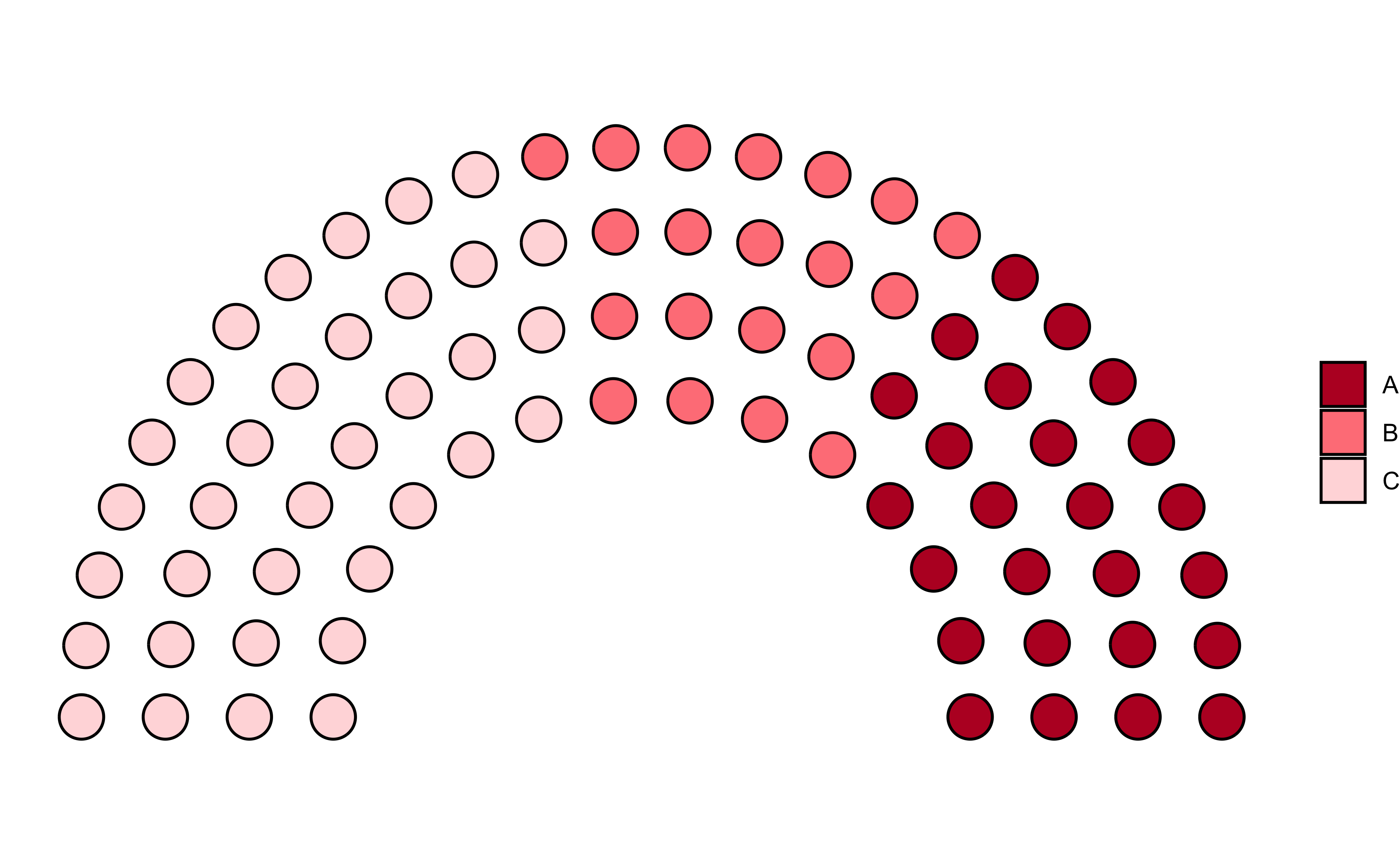
Trees, Dendrograms, and Circle Packings
There are still more esoteric plots to explore, if you are hell-bent on startling people ! There is an R package called ggraph, that can do these charts, and many more:
ggraph is an extension of
ggplot2aimed at supporting relational data structures such as networks, graphs, and trees. While it builds upon the foundation ofggplot2and its API it comes with its own self-contained set of geoms, facets, etc., as well as adding the concept of layouts to the grammar.
We will explore these charts when we examine network diagrams. For now, we can quickly see what these diagrams look like. Although the R-code is visible to you, it may not make sense at the moment!
From the R Graph Gallery Website :
Dendrograms can be built from:
Hierarchical dataset: think about a CEO managing team leads managing employees and so on.
Clustering result: clustering divides a set of individuals in group according to their similarity. Its result can be visualized as a tree.
from <chr> | to <chr> | ||
|---|---|---|---|
| origin | group1 | ||
| origin | group2 | ||
| origin | group3 | ||
| origin | group4 | ||
| origin | group5 | ||
| group1 | subgroup_1 | ||
| group1 | subgroup_2 | ||
| group1 | subgroup_3 | ||
| group1 | subgroup_4 | ||
| group1 | subgroup_5 |
# Create a graph object
mygraph1 <- tidygraph::as_tbl_graph(edges)
mygraph1
# A tbl_graph: 31 nodes and 30 edges
#
# A rooted tree
#
# Node Data: 31 × 1 (active)
name
<chr>
1 origin
2 group1
3 group2
4 group3
5 group4
6 group5
7 subgroup_1
8 subgroup_2
9 subgroup_3
10 subgroup_4
# ℹ 21 more rows
#
# Edge Data: 30 × 2
from to
<int> <int>
1 1 2
2 1 3
3 1 4
# ℹ 27 more rows# Basic tree
ggraph(mygraph1,
layout = "dendrogram",
circular = TRUE
) +
geom_edge_diagonal() +
geom_node_point(size = 3) +
geom_node_label(aes(label = name),
size = 3, repel = TRUE
) +
theme(aspect.ratio = 1)
# create a data frame
data <- tibble(
  level1 = "CEO",
  level2 = c(rep("boss1", 4), rep("boss2", 4)),
  level3 = paste0("mister_", letters[1:8])
)

# transform it to a edge list!
edges_level1_2 <- data %>%
  select(level1, level2) %>%
  unique() %>%
  rename(from = level1, to = level2)

edges_level2_3 <- data %>%
  select(level2, level3) %>%
  unique() %>%
  rename(from = level2, to = level3)

edge_list <- rbind(edges_level1_2, edges_level2_3)
edge_listfrom <chr> | to <chr> | |||
|---|---|---|---|---|
| CEO | boss1 | |||
| CEO | boss2 | |||
| boss1 | mister_a | |||
| boss1 | mister_b | |||
| boss1 | mister_c | |||
| boss1 | mister_d | |||
| boss2 | mister_e | |||
| boss2 | mister_f | |||
| boss2 | mister_g | |||
| boss2 | mister_h |
mygraph2 <- as_tbl_graph(edge_list)
mygraph2
# A tbl_graph: 11 nodes and 10 edges
#
# A rooted tree
#
# Node Data: 11 × 1 (active)
name
<chr>
1 CEO
2 boss1
3 boss2
4 mister_a
5 mister_b
6 mister_c
7 mister_d
8 mister_e
9 mister_f
10 mister_g
11 mister_h
#
# Edge Data: 10 × 2
from to
<int> <int>
1 1 2
2 1 3
3 2 4
# ℹ 7 more rows# Now we can plot that
ggraph(mygraph2, layout = "dendrogram", circular = FALSE) +
geom_edge_diagonal() +
geom_node_point(size = 3) +
geom_node_label(aes(label = name), repel = TRUE) +
theme_void()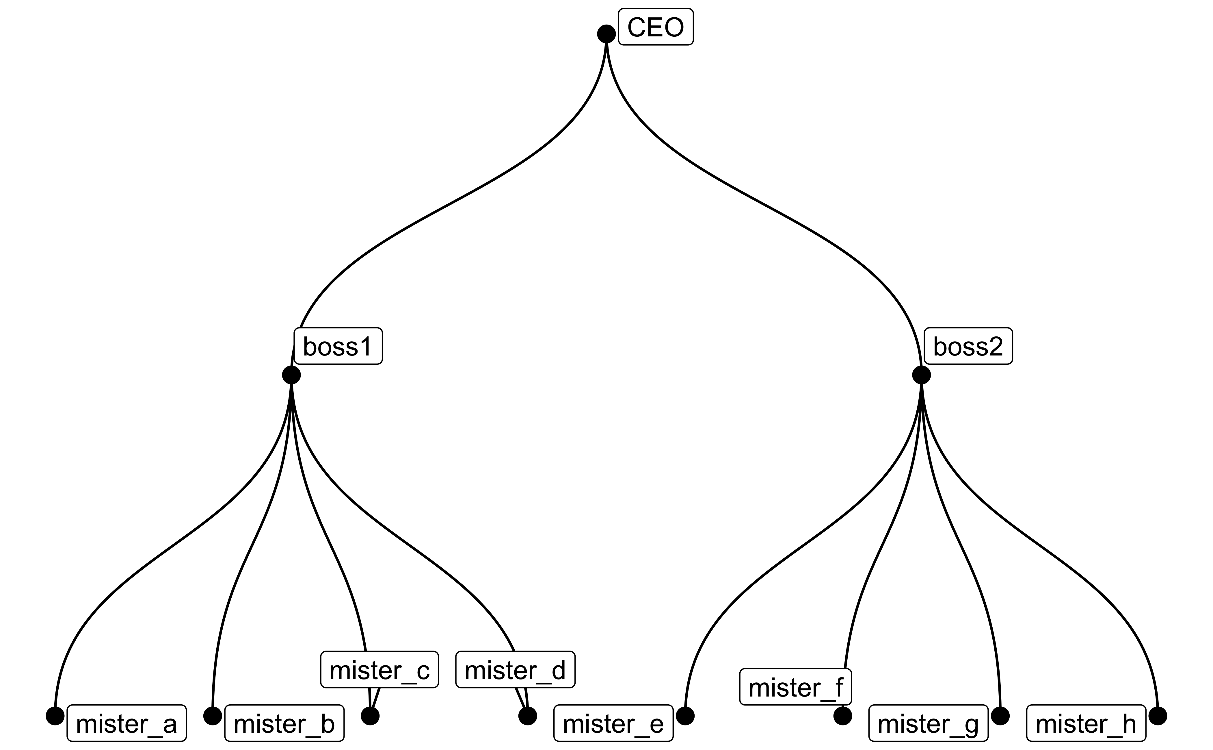
Circle Packing
graph_flare <- tbl_graph(flare$vertices, flare$edges)
graph_flare
# A tbl_graph: 252 nodes and 251 edges
#
# A rooted tree
#
# Node Data: 252 × 3 (active)
name size shortName
<chr> <dbl> <chr>
1 flare.analytics.cluster.AgglomerativeCluster 3938 AgglomerativeCluster
2 flare.analytics.cluster.CommunityStructure 3812 CommunityStructure
3 flare.analytics.cluster.HierarchicalCluster 6714 HierarchicalCluster
4 flare.analytics.cluster.MergeEdge 743 MergeEdge
5 flare.analytics.graph.BetweennessCentrality 3534 BetweennessCentrality
6 flare.analytics.graph.LinkDistance 5731 LinkDistance
7 flare.analytics.graph.MaxFlowMinCut 7840 MaxFlowMinCut
8 flare.analytics.graph.ShortestPaths 5914 ShortestPaths
9 flare.analytics.graph.SpanningTree 3416 SpanningTree
10 flare.analytics.optimization.AspectRatioBanker 7074 AspectRatioBanker
# ℹ 242 more rows
#
# Edge Data: 251 × 2
from to
<int> <int>
1 221 1
2 221 2
3 221 3
# ℹ 248 more rowsset.seed(1)
ggraph(graph_flare, "circlepack", weight = size) +
geom_node_circle(aes(fill = as_factor(depth)), size = 0.25, n = 50) +
coord_fixed() +
scale_fill_brewer(name = "Depth", palette = "Set1")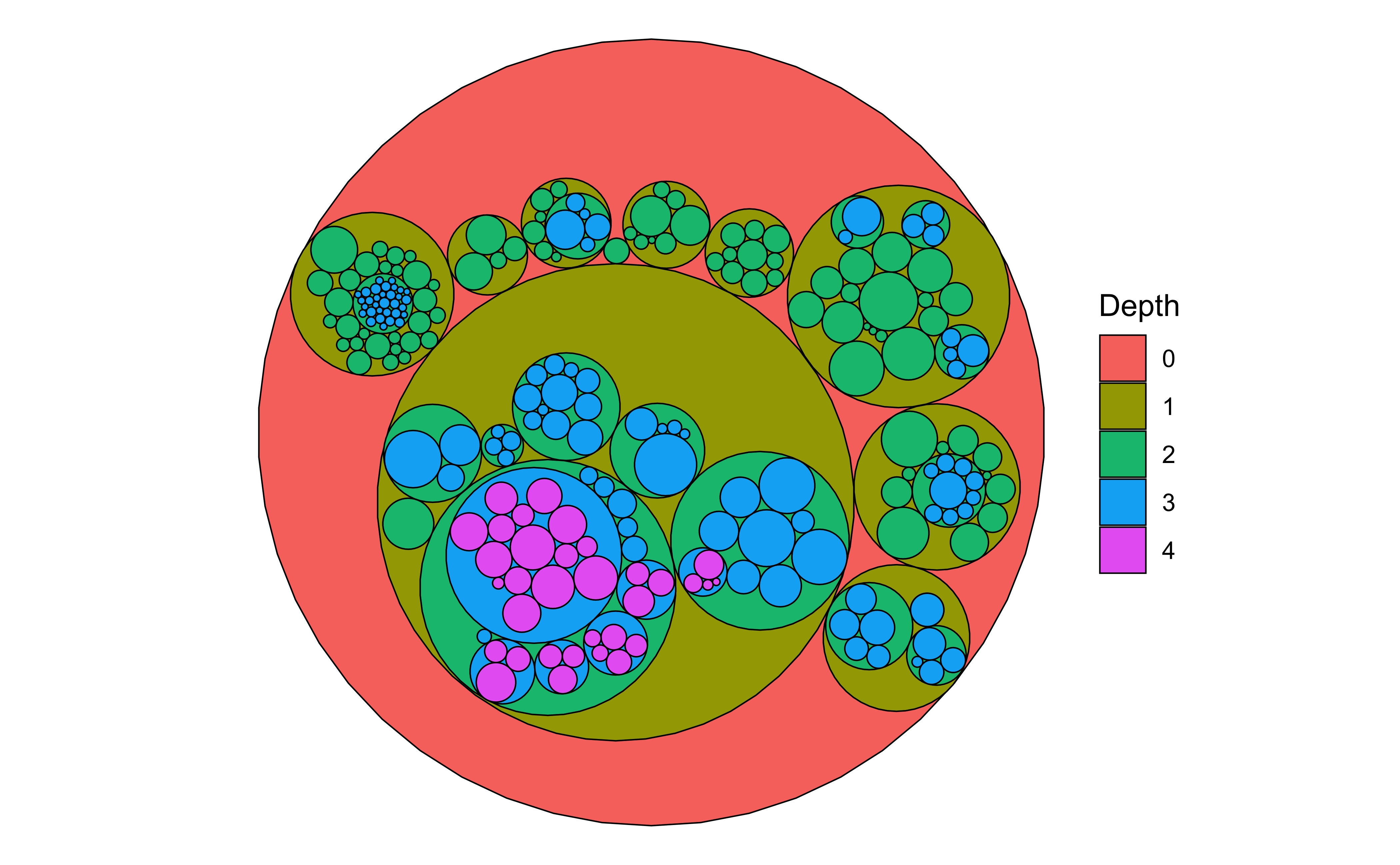
- Use the
penguinsdataset from thepalmerpenguinspackage and plot pies, fans, and donuts as appropriate. - Look at the
whigsandhighschooldatasets in the packageggraph. Plot Pies, Fans and if you are feeling confident, Trees, Dendrograms, and Circle Packings as appropriate for these.
- Iaroslava.2020. A Parliament Diagram in R, https://datavizstory.com/a-parliament-diagram-in-r/
- Venn Diagrams in R, Venn diagram in ggplot2 | R CHARTS (r-charts.com)
- Generate icon-array charts without code! https://iconarray.com
Coene, John. 2023. Echarts4r: Create Interactive Graphs with “Echarts JavaScript” Version 5. https://doi.org/10.32614/CRAN.package.echarts4r.
Glur, Christoph. 2023. data.tree: General Purpose Hierarchical Data Structure. https://doi.org/10.32614/CRAN.package.data.tree.
Hickman, Robert, Zoe Meers, and Thomas J. Leeper. 2024. ggparliament: Parliament Plots. https://github.com/zmeers/ggparliament.
J, Lemon. 2006. “Plotrix: A Package in the Red Light District of r.” R-News 6 (4): 8–12.
Pedersen, Thomas Lin. 2024a. ggraph: An Implementation of Grammar of Graphics for Graphs and Networks. https://doi.org/10.32614/CRAN.package.ggraph.
———. 2024b. tidygraph: A Tidy API for Graph Manipulation. https://doi.org/10.32614/CRAN.package.tidygraph.
Rudis, Bob, and Dave Gandy. 2023. waffle: Create Waffle Chart Visualizations. https://doi.org/10.32614/CRAN.package.waffle.
Tiedemann, Frederik. 2020. ggpol: Visualizing Social Science Data with “ggplot2”. https://doi.org/10.32614/CRAN.package.ggpol.
Citation
BibTeX citation:
@online{v.2022,
  author = {V., Arvind},
  title = {\textless Iconify-Icon
    Icon=“ic:round-Pie-Chart-Outline”\textgreater\textless/Iconify-Icon\textgreater{}
    {Parts} of a {Whole}},
  date = {2022-11-25},
  url = {https://av-quarto.netlify.app/content/courses/Analytics/Descriptive/Modules/60-PartWhole/},
  langid = {en},
  abstract = {Slices, Portions, Counts, and Aggregates of Data}
}
For attribution, please cite this work as:
V., Arvind. 2022. “<Iconify-Icon
Icon=‘ic:round-Pie-Chart-Outline’></Iconify-Icon>
Parts of a Whole.” November 25, 2022. https://av-quarto.netlify.app/content/courses/Analytics/Descriptive/Modules/60-PartWhole/.