
library(mosaic)
library(ggformula)
library(RColorBrewer) # colour palettes

library(ggbump) # Bump Charts
library(ggiraphExtra) # Radar, Spine, Donut and Donut-Pie combo charts !!
library(ggalt) # New geometries, coordinate systems, statistical transformations, scales and fonts

# install.packages("devtools")
# devtools::install_github("ricardo-bion/ggradar")
library(ggradar) # Radar Plots

##
library(tidyplots) # Easily Produced Publication-Ready Plots
library(tinyplot) # Plots with Base R
library(tinytable) # Elegant Tables for our data

library(tidyverse) # includes ggplot for plotting
Better than All the Rest
Bar Charts
Lollipop Charts
Dumbbell Charts
Radar Charts
Bump Charts
Word Clouds
Abstract
Comparisons between observations and between variables
“I have no respect for people who deliberately try to be weird to attract attention, but if that’s who you honestly are, you shouldn’t try to”normalize” yourself.”
— Alicia Witt, actress, singer-songwriter, and pianist (b. 21 Aug 1975)
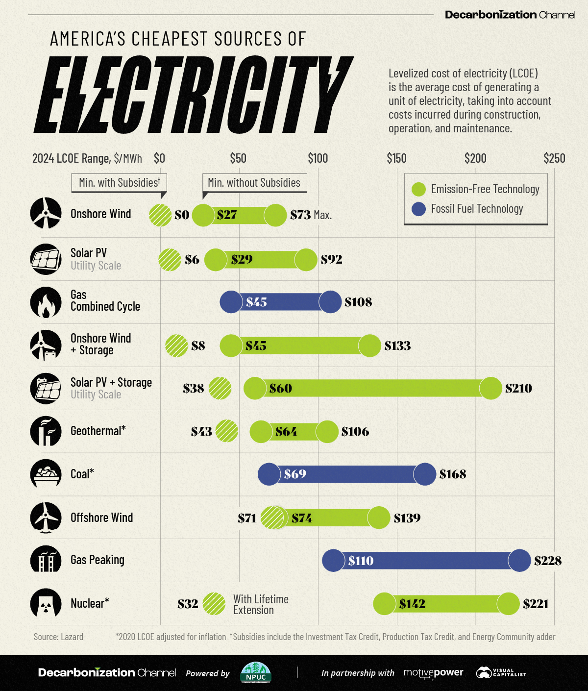
What do we see here? From https://www.visualcapitalist.com/sp/americas-cheapest-sources-of-electricity-in-2024/ :
From Figure 1 (a):
-
Onshore wind powereffectively costs USD0 per megawatt-hour (MWh) when subsidies are included!
- Demand for storage solutions is rising quickly. If storage is included, the minimum cost for
onshore windincreases to $8 per MWh.
- Solar photovoltaics (PV) have similarly attractive economics. With subsidies, the minimum cost is USD6 per MWh. When including storage, USD38 per MWh. Notably, the maximum cost of solar PV with storage has significantly increased from USD102 in 2023 to USD 210 in 2024.
- For gas-combined cycle plants, which combine natural gas and steam turbines for efficient electricity generation, the maximum price has climbed $7 year-over-year to $108 per MWh.
And from From Figure 1 (b)?
- There is a clear difference in the capabilities of the three players compared, though all of them are classified as “5 tools” players.
- Each player is better than the others at one unique skill: Betts at
Throwing, Judge atHit_power, and Trout atHit_avg.
Plot Fonts and Theme
Show the Code
library(systemfonts)
library(showtext)
## Clean the slate
systemfonts::clear_local_fonts()
systemfonts::clear_registry()
##
showtext_opts(dpi = 96) # set DPI for showtext
sysfonts::font_add(
  family = "Alegreya",
  regular = "../../../../../../fonts/Alegreya-Regular.ttf",
  bold = "../../../../../../fonts/Alegreya-Bold.ttf",
  italic = "../../../../../../fonts/Alegreya-Italic.ttf",
  bolditalic = "../../../../../../fonts/Alegreya-BoldItalic.ttf"
)

sysfonts::font_add(
  family = "Roboto Condensed",
  regular = "../../../../../../fonts/RobotoCondensed-Regular.ttf",
  bold = "../../../../../../fonts/RobotoCondensed-Bold.ttf",
  italic = "../../../../../../fonts/RobotoCondensed-Italic.ttf",
  bolditalic = "../../../../../../fonts/RobotoCondensed-BoldItalic.ttf"
)
showtext_auto(enable = TRUE) # enable showtext
##
theme_custom <- function() {
  font <- "Alegreya" # assign font family up front

  theme_classic(base_size = 14, base_family = font) %+replace% # replace elements we want to change

    theme(
      text = element_text(family = font), # set base font family

      # text elements
      plot.title = element_text( # title
        family = font, # set font family
        size = 24, # set font size
        face = "bold", # bold typeface
        hjust = 0, # left align
        margin = margin(t = 5, r = 0, b = 5, l = 0)
      ), # margin
      plot.title.position = "plot",
      plot.subtitle = element_text( # subtitle
        family = font, # font family
        size = 14, # font size
        hjust = 0, # left align
        margin = margin(t = 5, r = 0, b = 10, l = 0)
      ), # margin

      plot.caption = element_text( # caption
        family = font, # font family
        size = 9, # font size
        hjust = 1
      ), # right align

      plot.caption.position = "plot", # right align

      axis.title = element_text( # axis titles
        family = "Roboto Condensed", # font family
        size = 12
      ), # font size

      axis.text = element_text( # axis text
        family = "Roboto Condensed", # font family
        size = 9
      ), # font size

      axis.text.x = element_text( # margin for axis text
        margin = margin(5, b = 10)
      )

      # since the legend often requires manual tweaking
      # based on plot content, don't define it here
    )
}
Show the Code
```{r}
#| cache: false
#| code-fold: true
## Set the theme
theme_set(new = theme_custom())
```
Error in theme_set(new = theme_custom()): could not find function "theme_set"Show the Code
```{r}
#| cache: false
#| code-fold: true
## Use available fonts in ggplot text geoms too!
update_geom_defaults(geom = "text", new = list(
  family = "Roboto Condensed",
  face = "plain",
  size = 3.5,
  color = "#2b2b2b"
))
```
Error in update_geom_defaults(geom = "text", new = list(family = "Roboto Condensed", : could not find function "update_geom_defaults"
When we wish to compare the size of things and rank them, there are quite a few ways to do it.
Bar Charts and Lollipop Charts are immediately obvious when we wish to rank things on one aspect or parameter, e.g. mean income vs education. We can also put two lollipop charts back-to-back to make a Dumbbell Chart to show comparisons/ranks across two datasets based on one aspect, e.g change in mean income over two years, across gender.
When we wish to rank the multiple objects against multiple aspects or parameters, then we can use Bump Charts and Radar Charts, e.g performance of one or more products against multiple criteria (cost, size, performance…)s.
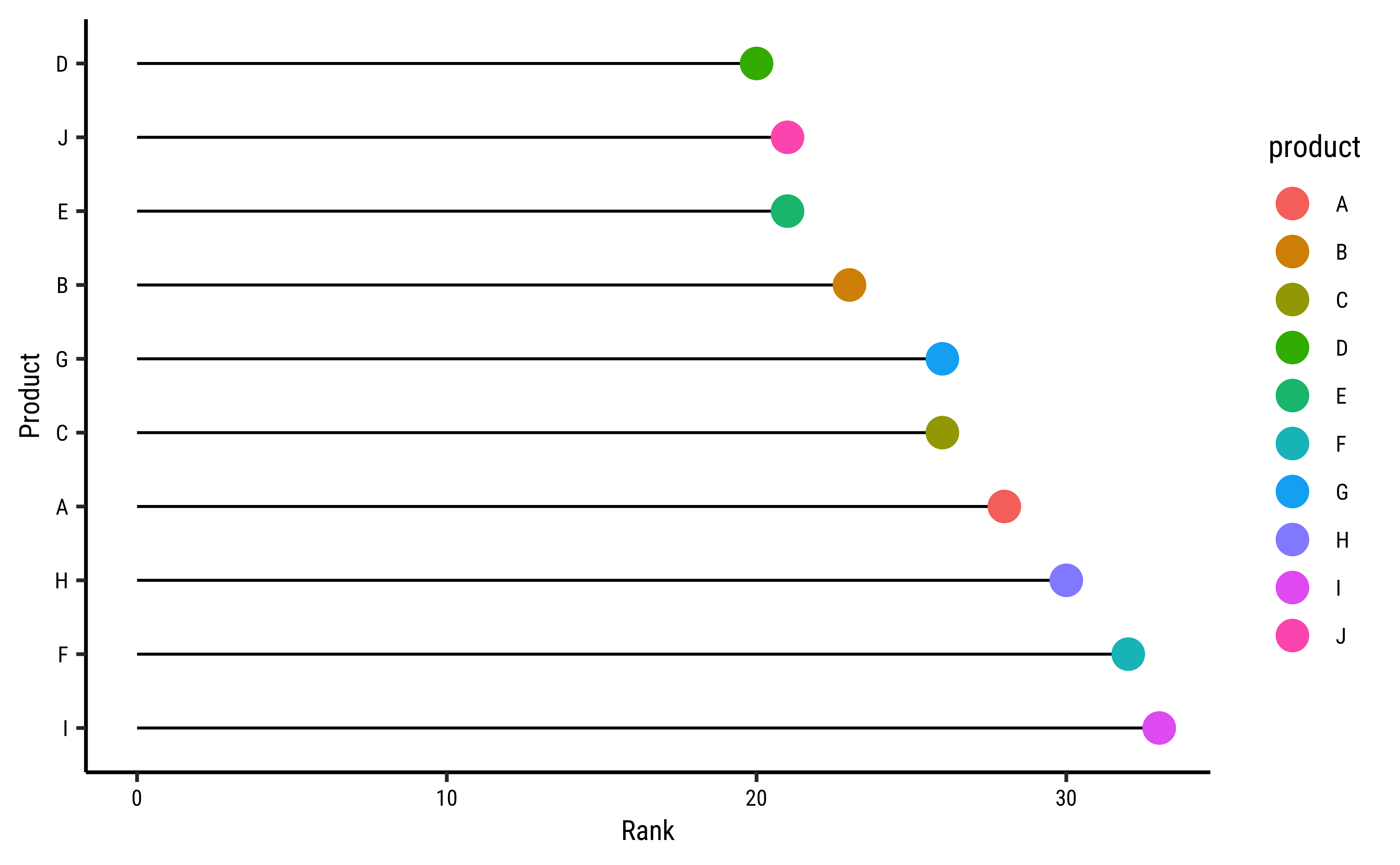
Let’s make a toy dataset of Products and Ratings:
# Sample data set
set.seed(1)
df1 <- tibble(
  product = LETTERS[1:10],
  rank = sample(20:35, 10, replace = TRUE)
)
df1product <chr> | rank <int> | |||
|---|---|---|---|---|
| A | 28 | |||
| B | 23 | |||
| C | 26 | |||
| D | 20 | |||
| E | 21 | |||
| F | 32 | |||
| G | 26 | |||
| H | 30 | |||
| I | 33 | |||
| J | 21 |
## Set the theme
theme_set(new = theme_custom())

gf_segment(
  0 + rank ~ fct_reorder(product, -rank) +
    fct_reorder(product, -rank),
  data = df1
) %>%
  # A formula with shape y + yend ~ x + xend.

  gf_point(rank ~ product, colour = ~product, size = 5) %>%
  gf_refine(coord_flip()) %>%
  gf_labs(x = "Product", y = "Rank", title = "Product Ratings")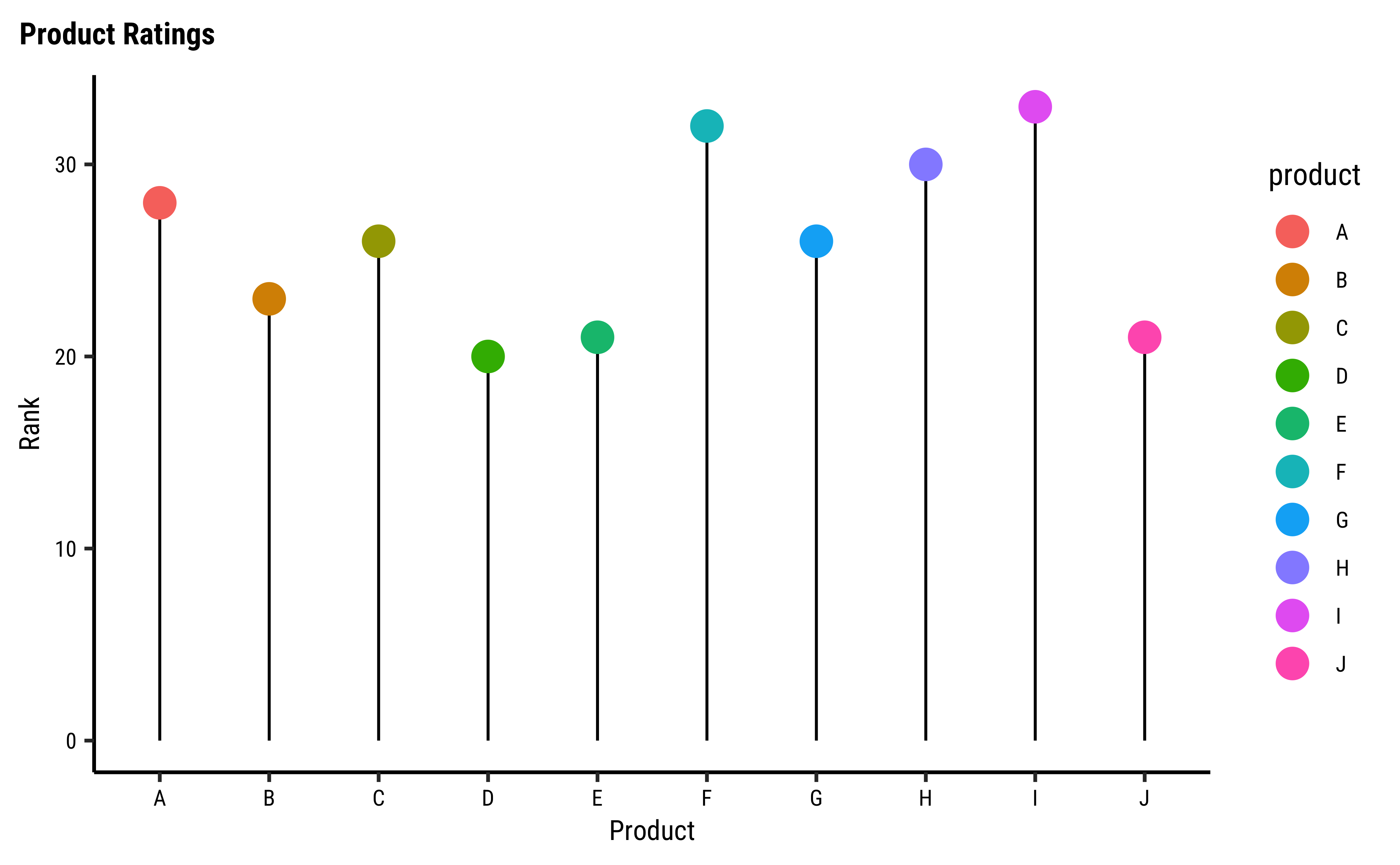
We have flipped the chart horizontally and reordered the forcats::fct_reorder.
## Set the theme
theme_set(new = theme_custom())

ggplot(df1) +
  geom_segment(aes(
    y = 0, yend = rank,
    x = product,
    xend = product
  )) +
  geom_point(aes(y = rank, x = product, colour = product), size = 5) +
  labs(title = "Product Ratings", x = "Product", y = "Rank")
###
ggplot(df1) +
  geom_segment(aes(
    y = 0, yend = rank,
    x = fct_reorder(product, -rank),
    xend = fct_reorder(product, -rank)
  )) +
  geom_point(aes(x = product, y = rank, colour = product), size = 5) +
  labs(title = "Product Ratings", x = "Product", y = "Rank") +
  coord_flip()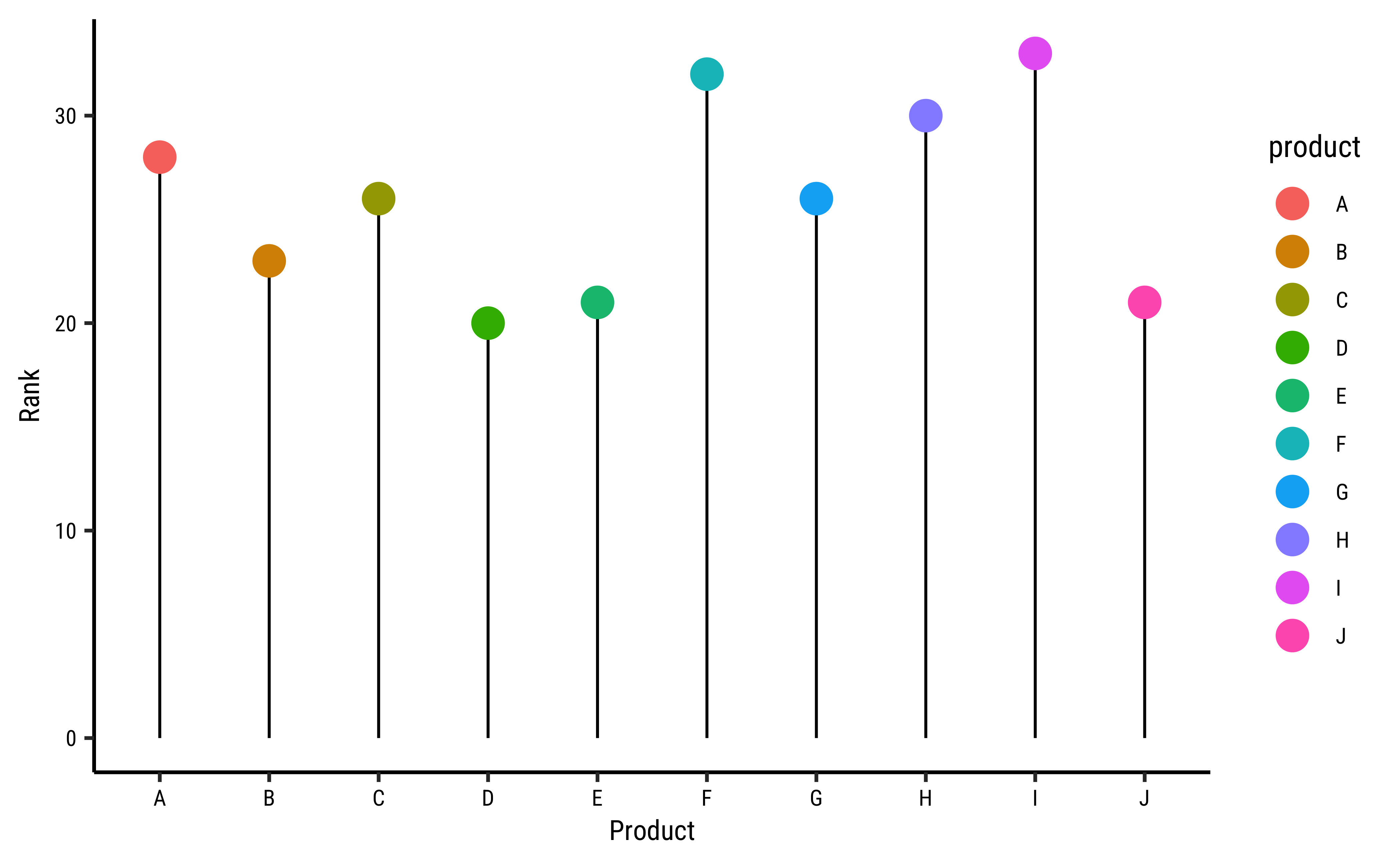

Yes, R has ( nearly) everything, including a geom_lollipop command: Here!
## Set the theme
theme_set(new = theme_custom())

ggplot(df1) +
  geom_lollipop(aes(x = rank, y = product),
    point.size = 3, horizontal = F
  ) +
  labs(title = "What is this BS chart?")
## Set the theme
theme_set(new = theme_custom())

ggplot(df1) +
  geom_lollipop(aes(y = rank, x = product),
    point.size = 3, horizontal = T
  ) +
  labs(title = "This also looks like BS")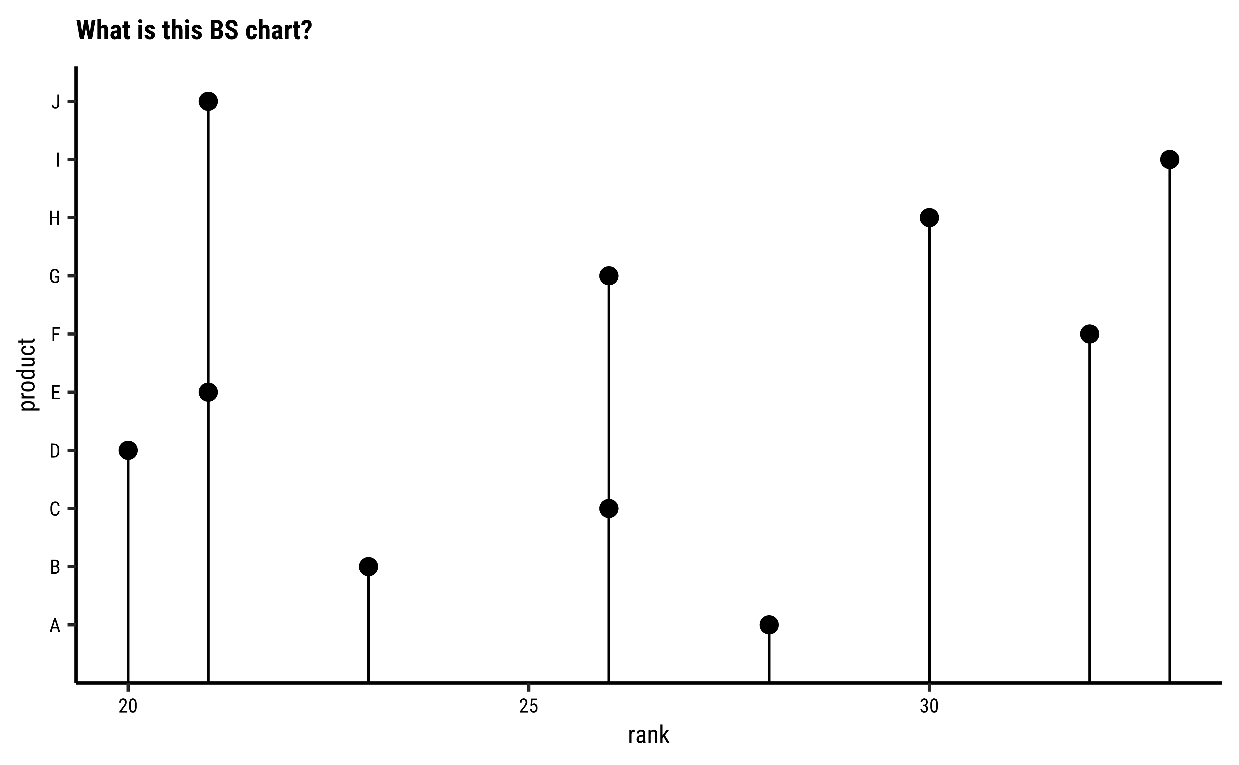
## Set the theme
theme_set(new = theme_custom())

ggplot(df1) +
  geom_lollipop(aes(y = rank, x = product),
    point.size = 3, , horizontal = F
  ) +
  labs(
    title = "Yeah, but I want this horizontal...",
    subtitle = "And with colour and sorted and...",
    caption = "Peasants...they want everything..."
  )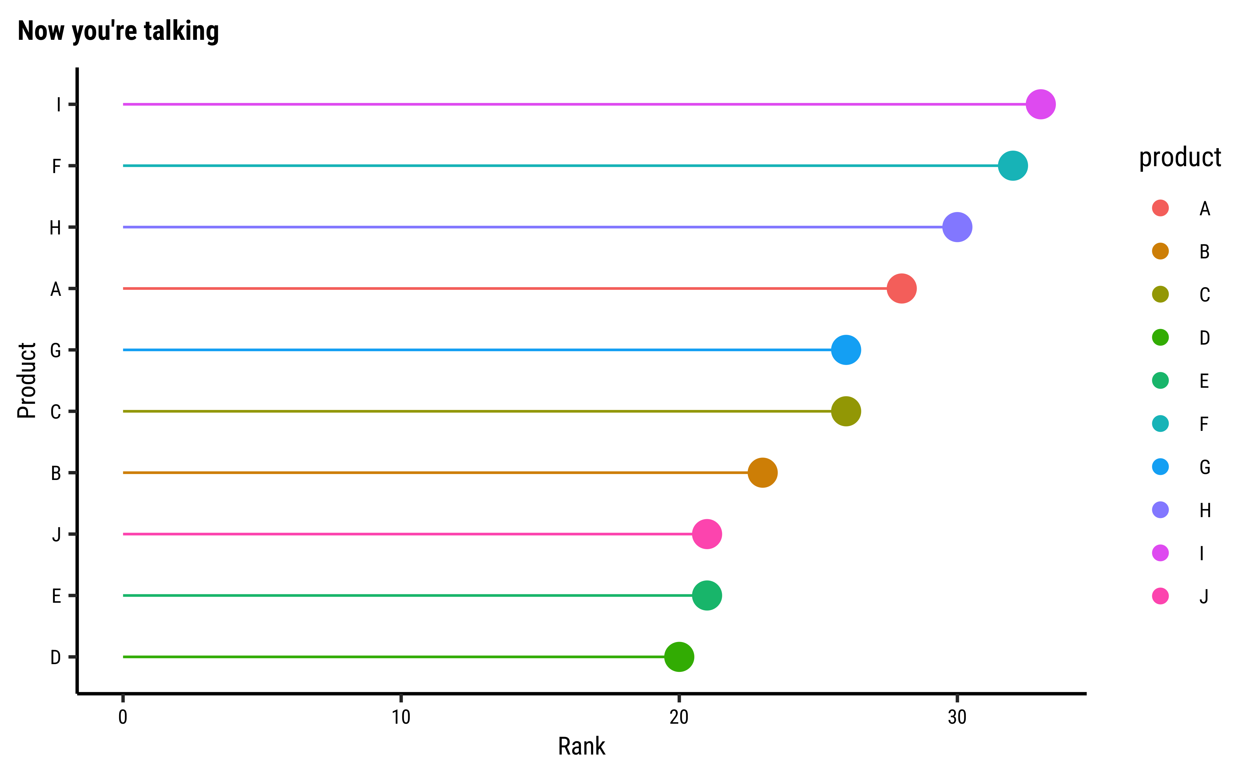
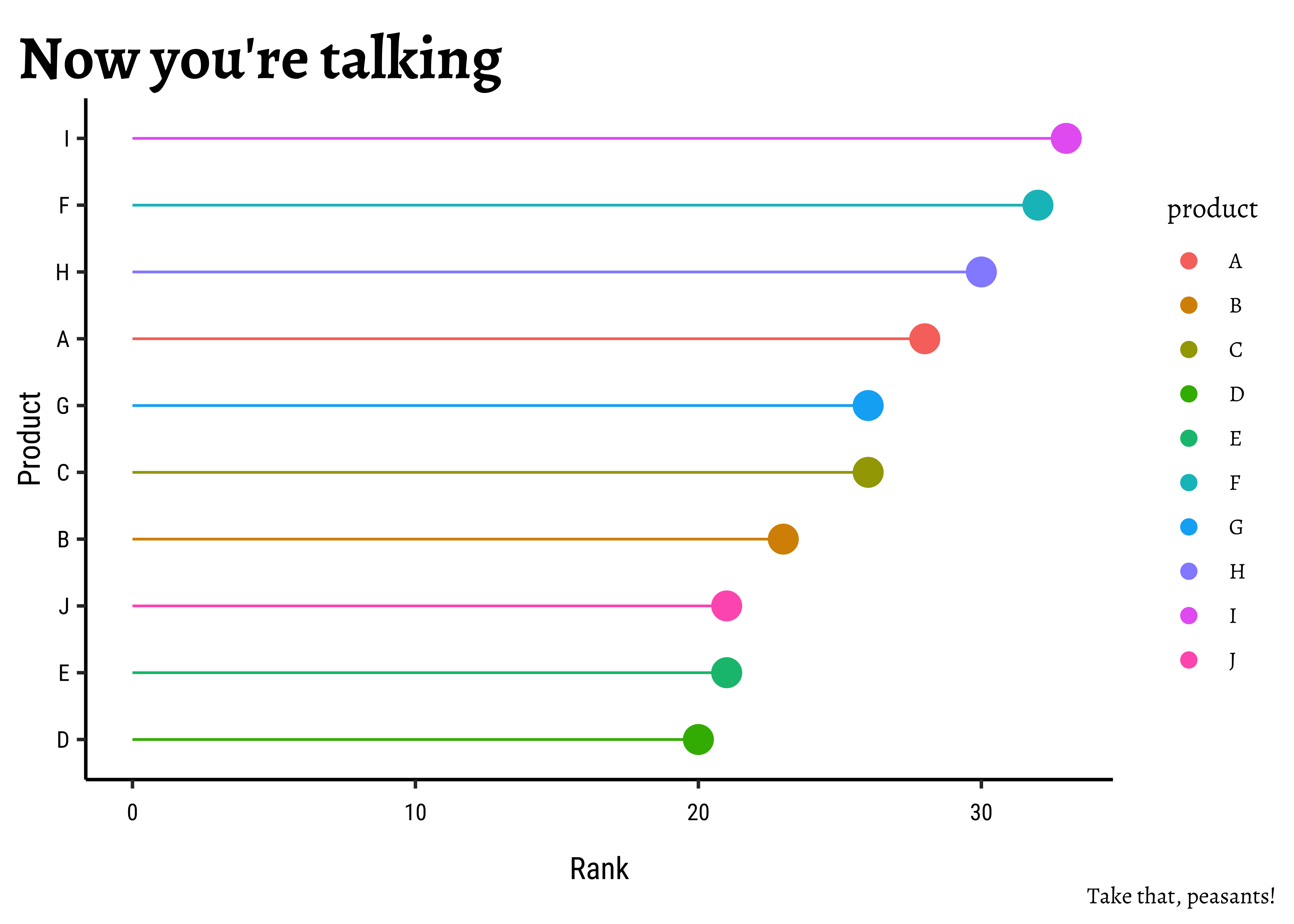
Business Insights from Lollipop Plots
- Very simple chart, almost like a bar chart
- Differences between the same set of data across one aspect (i.e. rank) is very quickly apparent
- Ordering the dataset by the attribute (i.e ordering product by rank) makes the message very clear.
- Even a large number of data can safely be visualized and understood
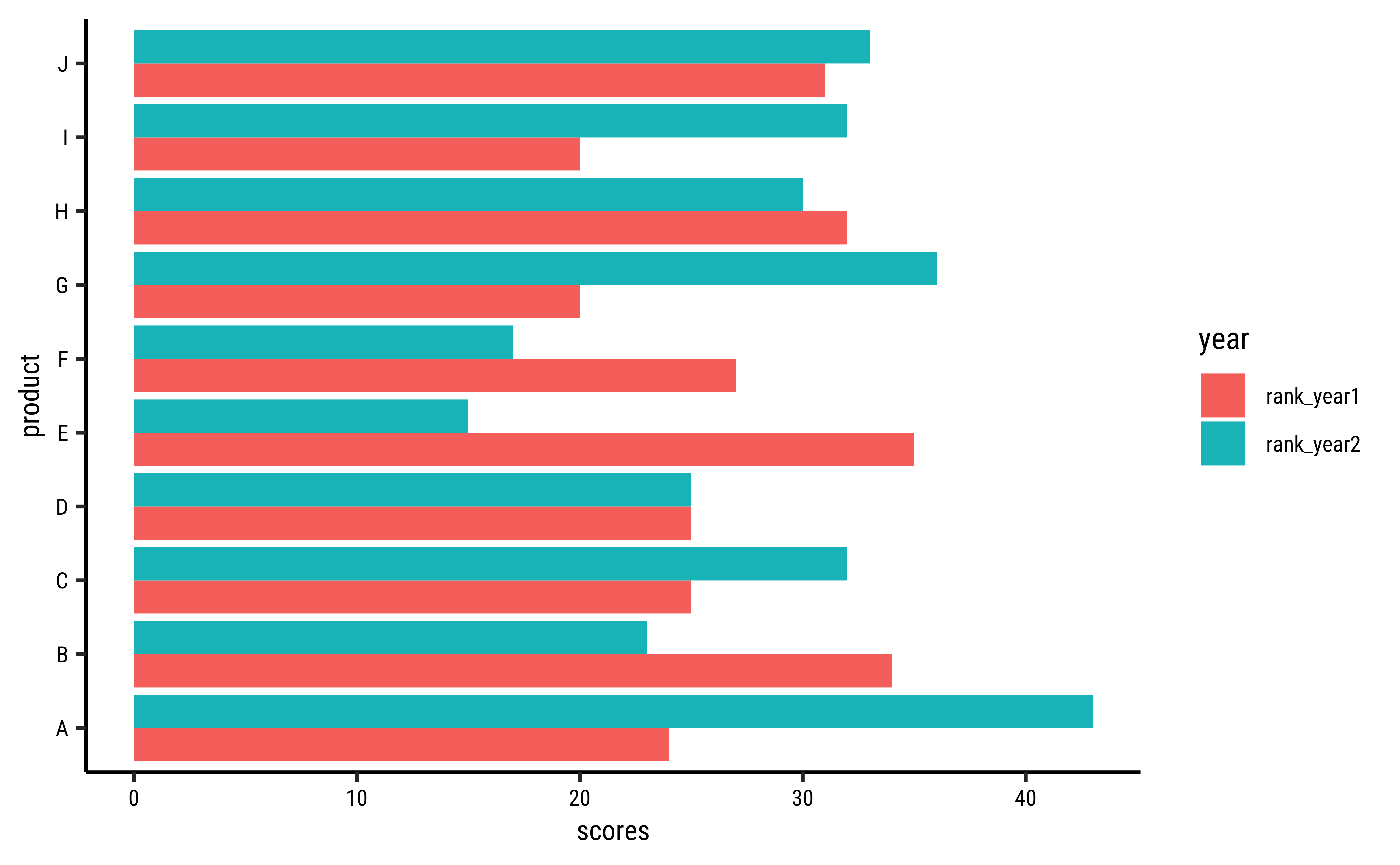
A lollipop chart compares a set of data against one aspect. What if we have more than one? Say sales in many product lines across two years?
Let us once again construct a very similar looking toy dataset, but with two columns for ratings, one for each of two years:
# Sample data set
# Wide Format data!
set.seed(2)
df2 <- tibble(
  product = LETTERS[1:10],
  rank_year1 = sample(20:35, 10, replace = TRUE),
  rank_year2 = sample(15:45, 10, replace = TRUE)
)
df2product <chr> | rank_year1 <int> | rank_year2 <int> | ||
|---|---|---|---|---|
| A | 24 | 43 | ||
| B | 34 | 23 | ||
| C | 25 | 32 | ||
| D | 25 | 25 | ||
| E | 35 | 15 | ||
| F | 27 | 17 | ||
| G | 20 | 36 | ||
| H | 32 | 30 | ||
| I | 20 | 32 | ||
| J | 31 | 33 |
A short diversion: we can also make this data into long form: this will become useful very shortly!
Look at the data: this is wide form data. The columns pertaining to each of the Product-Features would normally be stacked into two columns, one with the Feature and the other with the score. Note the trio: Qual(product) + Qual(year) + Quant(scores):
# With Long Format Data
df2_long <- df2 %>%
  pivot_longer(
    cols = c(dplyr::starts_with("rank")),
    names_to = "year", values_to = "scores"
  )
df2_longproduct <chr> | year <chr> | scores <int> | ||
|---|---|---|---|---|
| A | rank_year1 | 24 | ||
| A | rank_year2 | 43 | ||
| B | rank_year1 | 34 | ||
| B | rank_year2 | 23 | ||
| C | rank_year1 | 25 | ||
| C | rank_year2 | 32 | ||
| D | rank_year1 | 25 | ||
| D | rank_year2 | 25 | ||
| E | rank_year1 | 35 | ||
| E | rank_year2 | 15 |
A cool visualization of this operation was created by Garrick Aden-Buie:

## Set the theme
theme_set(new = theme_custom())

## With Wide Form Data
##
df2 %>%
  gf_segment(product + product ~ rank_year1 + rank_year2,
    size = 3, color = "grey60",
    arrow = arrow(
      angle = 30,
      length = unit(0.25, "inches"),
      ends = "last", type = "open"
    )
  ) %>%
  gf_point(product ~ rank_year1,
    size = 3,
    colour = "#123456"
  ) %>%
  gf_point(product ~ rank_year2,
    size = 3,
    colour = "#bad744"
  ) %>%
  gf_labs(x = "Rank", y = "Product", title = "Product Ranks in Year1 and Year2")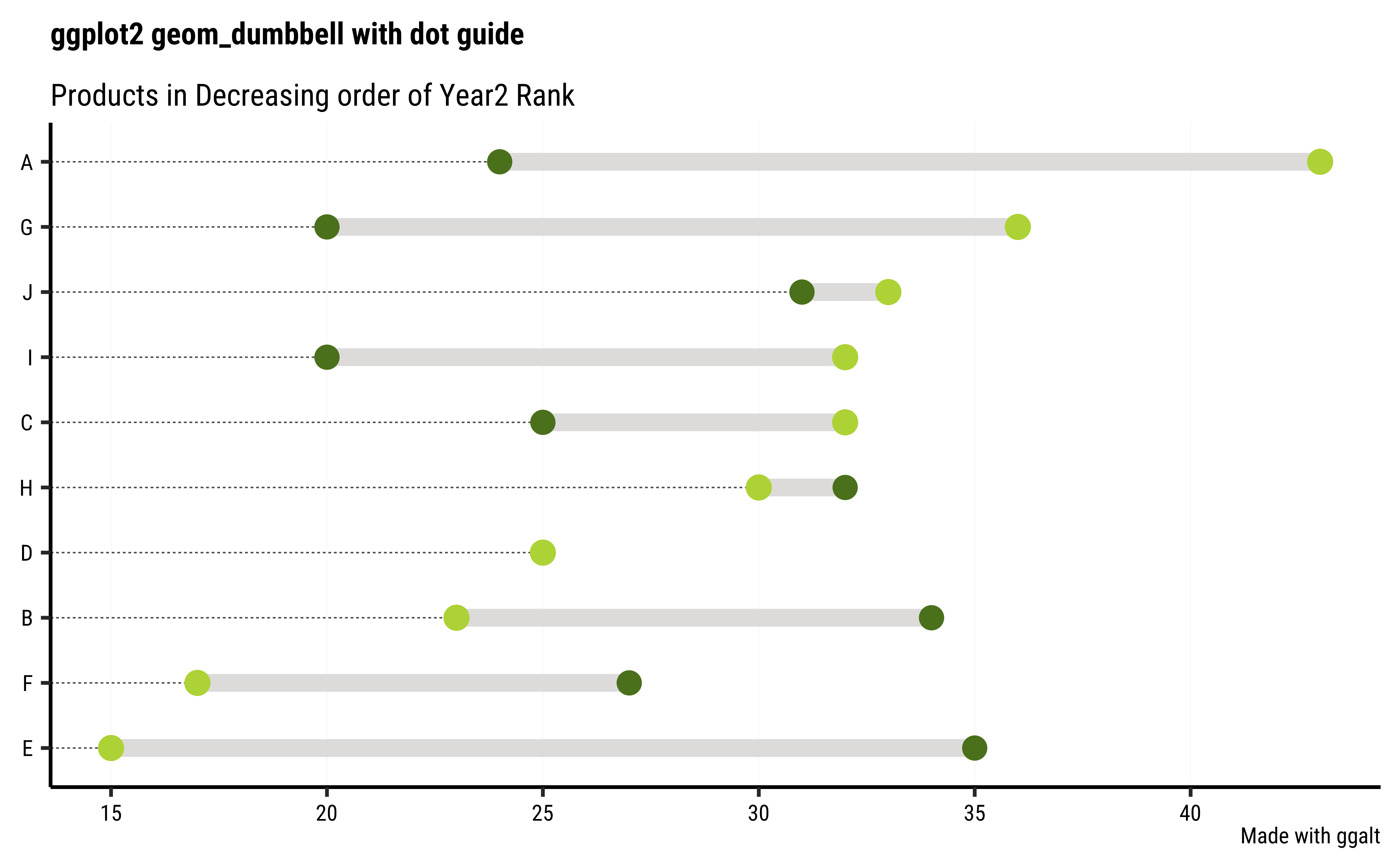
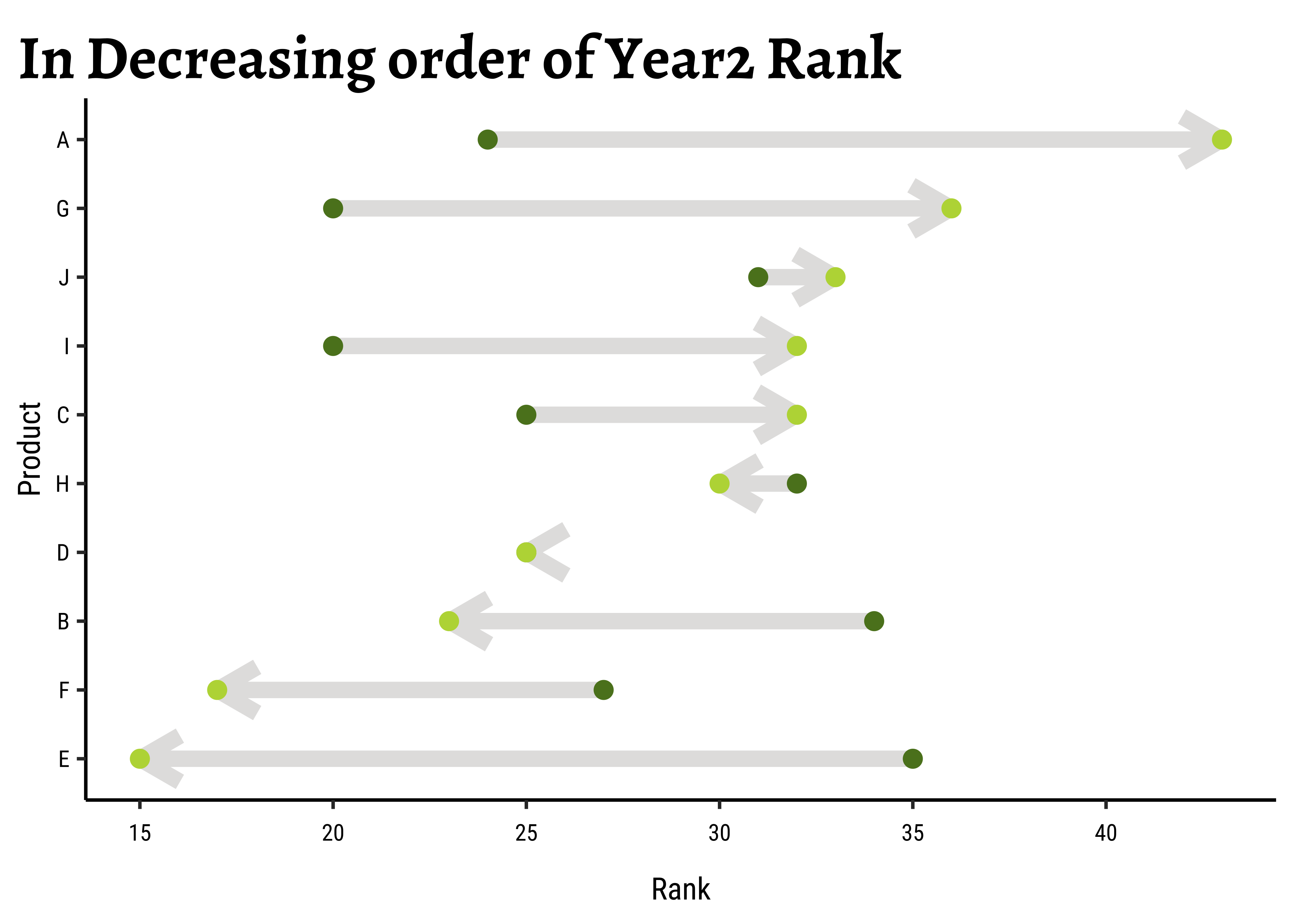
## Set the theme
theme_set(new = theme_custom())

## Rearranging `product` in order of rank_year2
df2 %>%
  gf_segment(
    reorder(product, rank_year2) +
      reorder(product, rank_year2) ~
      rank_year1 + rank_year2,
    size = 3, color = "grey60",
    arrow = arrow(
      angle = 30,
      length = unit(0.25, "inches")
    )
  ) %>%
  gf_point(product ~ rank_year1,
    size = 3,
    colour = "#123456"
  ) %>%
  gf_point(product ~ rank_year2,
    size = 3,
    colour = "#bad744"
  ) %>%
  gf_labs(
    x = "Rank", y = "Product",
    title = "In Decreasing order of Year2 Rank"
  )
## Set the theme
theme_set(new = theme_custom())

## With Wide Format Data
ggplot(df2, aes(y = product, yend = product, x = rank_year1, xend = rank_year2)) +
  geom_segment(
    size = 3, color = "#e3e2e1",
    arrow = arrow(
      angle = 30,
      length = unit(0.25, "inches")
    )
  ) +
  geom_point(aes(rank_year1, product),
    colour = "#5b8124", size = 3
  ) +
  geom_point(aes(rank_year2, product),
    colour = "#bad744", size = 3
  ) +
  labs(x = "Rank", y = "Product")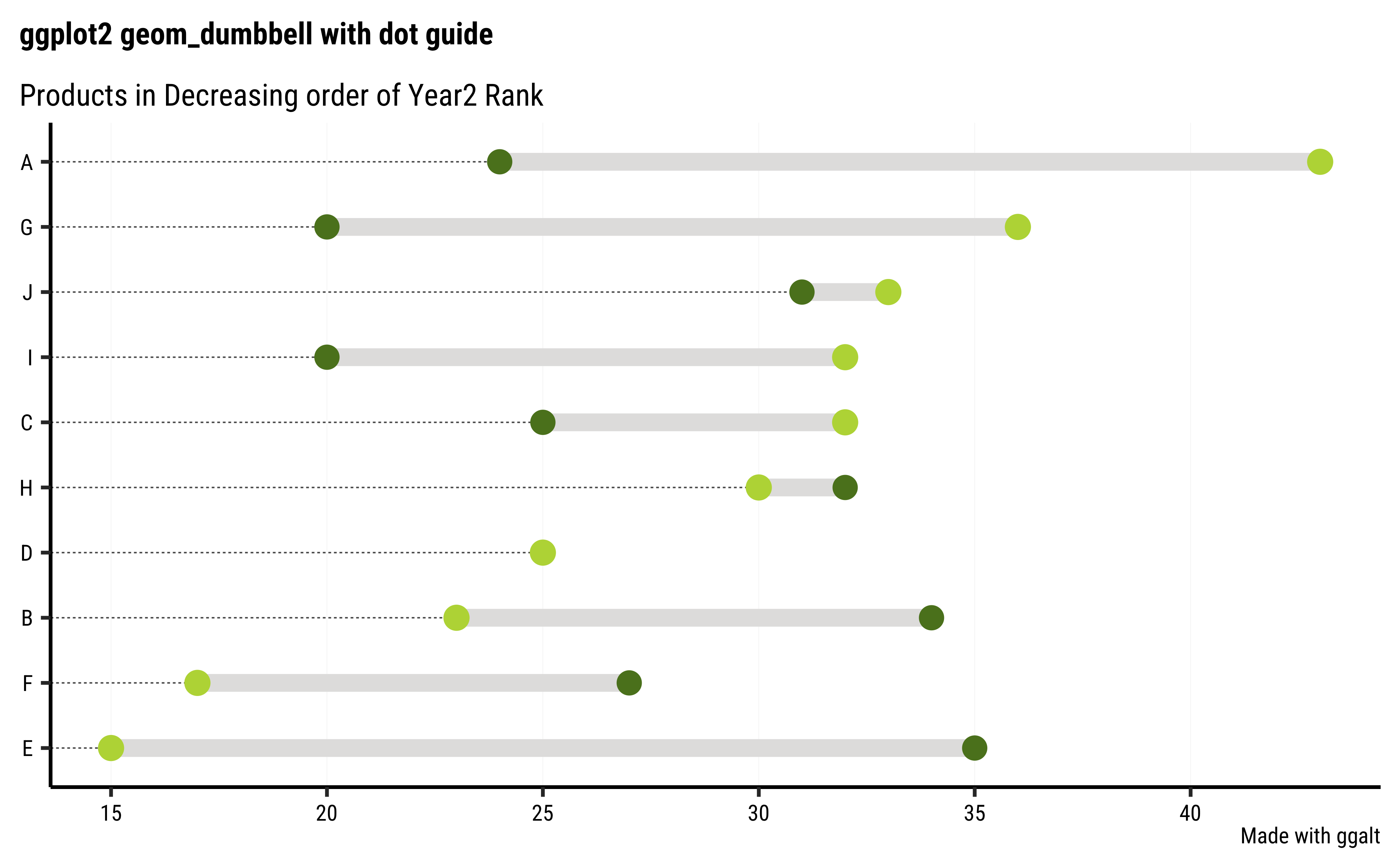
## Rearranging `product` in order of rank_year2
ggplot(df2, aes(y = reorder(product, rank_year2), yend = reorder(product, rank_year2), x = rank_year1, xend = rank_year2)) +
  geom_segment(
    size = 3, color = "#e3e2e1",
    arrow = arrow(
      angle = 30,
      length = unit(0.25, "inches")
    )
  ) +
  geom_point(aes(rank_year1, product),
    colour = "#5b8124", size = 3
  ) +
  geom_point(aes(rank_year2, product),
    colour = "#bad744", size = 3
  ) +
  labs(
    x = "Rank", y = "Product",
    title = "In Decreasing order of Year2 Rank"
  )
## Set the theme
theme_set(new = theme_custom())

df2 %>% ggplot() +
  geom_dumbbell(
    aes(
      y = reorder(product, rank_year2),
      x = rank_year1,
      xend = rank_year2
    ),
    size = 3, color = "grey60",
    colour_x = "#5b8124",
    colour_xend = "#bad744",
    dot_guide = TRUE, # Try FALSE
    dot_guide_size = 0.25
  ) +
  labs(
    x = NULL, y = NULL,
    title = "ggplot2 geom_dumbbell with dot guide",
    subtitle = "Products in Decreasing order of Year2 Rank",
    caption = "Made with ggalt"
  ) +
  theme(panel.grid.major.x = element_line(size = 0.05)) +
  theme(panel.grid.major.y = element_blank())
Business Insights from Dumbbell Plots
- Dumbbell Plots are clearly they are more intuitive and clear than the bar chart
- Differences between the same set of data at two different aspects is very quickly apparent
- Differences in differences(DID) are also quite easily apparent. Experiments do use these metrics and these plots would be very useful there.
-
ggaltworks nicely with additional visible guides rendered in the chart
Bump Charts track the ranking of several objects based on other parameters, such as time/month or even category. For instance, what is the opinion score of a set of products across various categories of users?
year <- rep(2019:2021, 4)
position <- c(4, 2, 2, 3, 1, 4, 2, 3, 1, 1, 4, 3)
product <- c(
  "A", "A", "A",
  "B", "B", "B",
  "C", "C", "C",
  "D", "D", "D"
)

df3 <- tibble(year, position, product) %>%
  mutate(product = as_factor(product))

df3year <int> | position <dbl> | product <fct> | ||
|---|---|---|---|---|
| 2019 | 4 | A | ||
| 2020 | 2 | A | ||
| 2021 | 2 | A | ||
| 2019 | 3 | B | ||
| 2020 | 1 | B | ||
| 2021 | 4 | B | ||
| 2019 | 2 | C | ||
| 2020 | 3 | C | ||
| 2021 | 1 | C | ||
| 2019 | 1 | D |
ggbump uses ggplot syntax
We need to use a new package called, what else, ggbump to create our Bump Charts: Here again we do not yet have a ggformula equivalent. ( Though it may be possible with a combination of gf_point and gf_polygon, and pre-computing the coordinates. Seems long-winded.)
Note the + syntax with ggplot code!!
## Set the theme
theme_set(new = theme_custom())

df3 %>%
  ggplot() +
  geom_bump(aes(x = year, y = position, color = product)) +
  geom_point(aes(x = year, y = position, color = product),
    size = 6
  ) +
  labs(title = "Bump Chart: Product Ranks over Time") +
  xlab("Year") +
  ylab("Rank") +
  scale_color_brewer(palette = "Set1") + # Change Colour Scale
  scale_x_continuous(breaks = c(2019:2021), labels = c(2019:2021))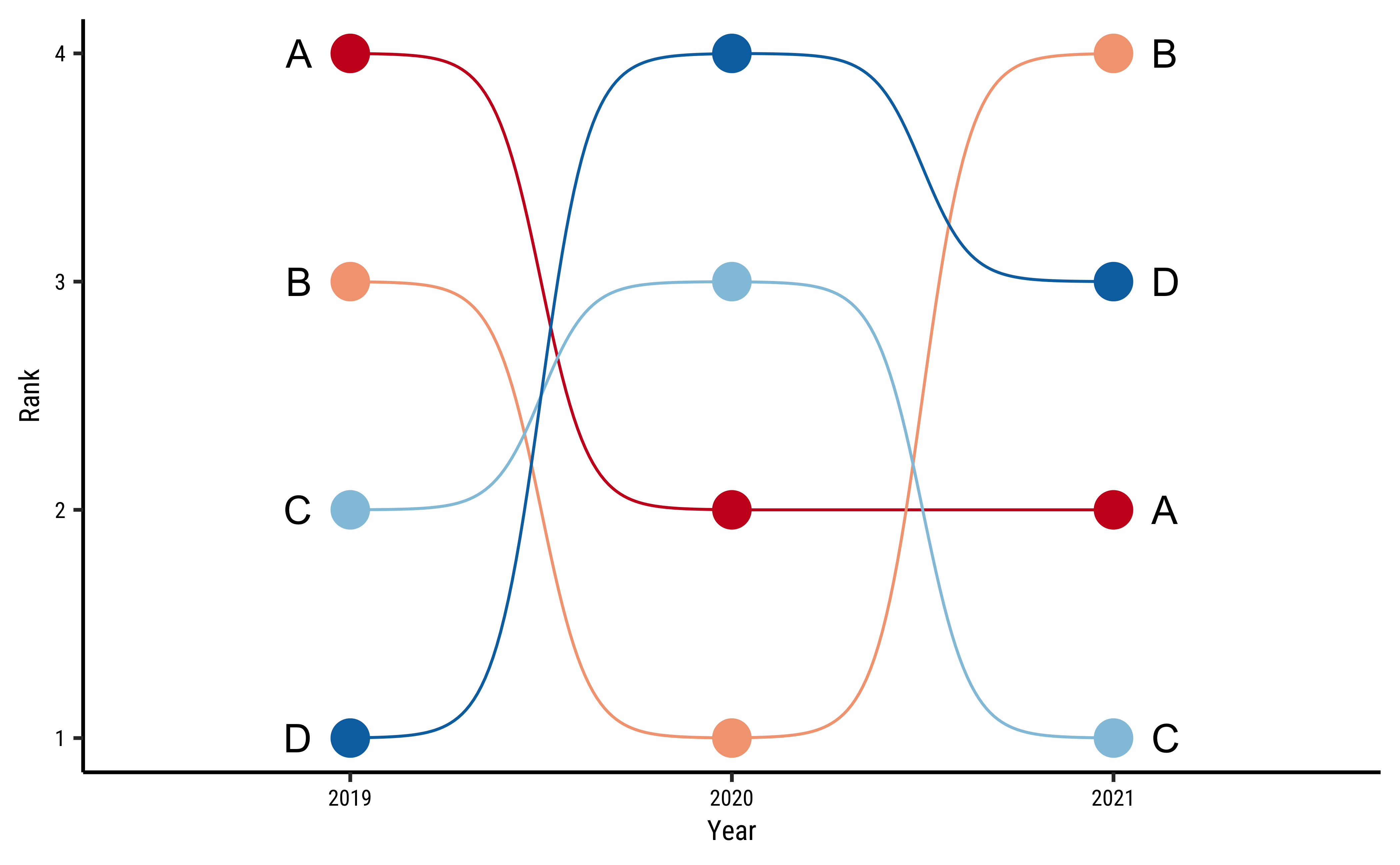
We can add labels along the “bump lines” and remove the legend altogether:
## Set the theme
theme_set(new = theme_custom())

ggplot(df3) +
  geom_bump(aes(x = year, y = position, color = product)) +
  geom_point(aes(x = year, y = position, color = product),
    size = 6
  ) +
  scale_color_brewer(palette = "RdBu") + # Change Colour Scale
  # Same as before up to here
  # Add the labels at start and finish

  geom_text(
    data = df3 %>% filter(year == min(year)),
    aes(
      x = year - 0.1, label = product,
      y = position
    ),
    size = 5, hjust = 1
  ) +
  geom_text(
    data = df3 %>% filter(year == max(year)),
    aes(
      x = year + 0.1, label = product,
      y = position
    ),
    size = 5, hjust = 0
  ) +
  labs(
    title = "Bump Chart: Product Ranks over Time",
    subtitle = "Note the Labels!"
  ) +
  xlab("Year") +
  ylab("Rank") +
  scale_x_continuous(breaks = c(2019:2021), labels = c(2019:2021)) +
  theme(legend.position = "")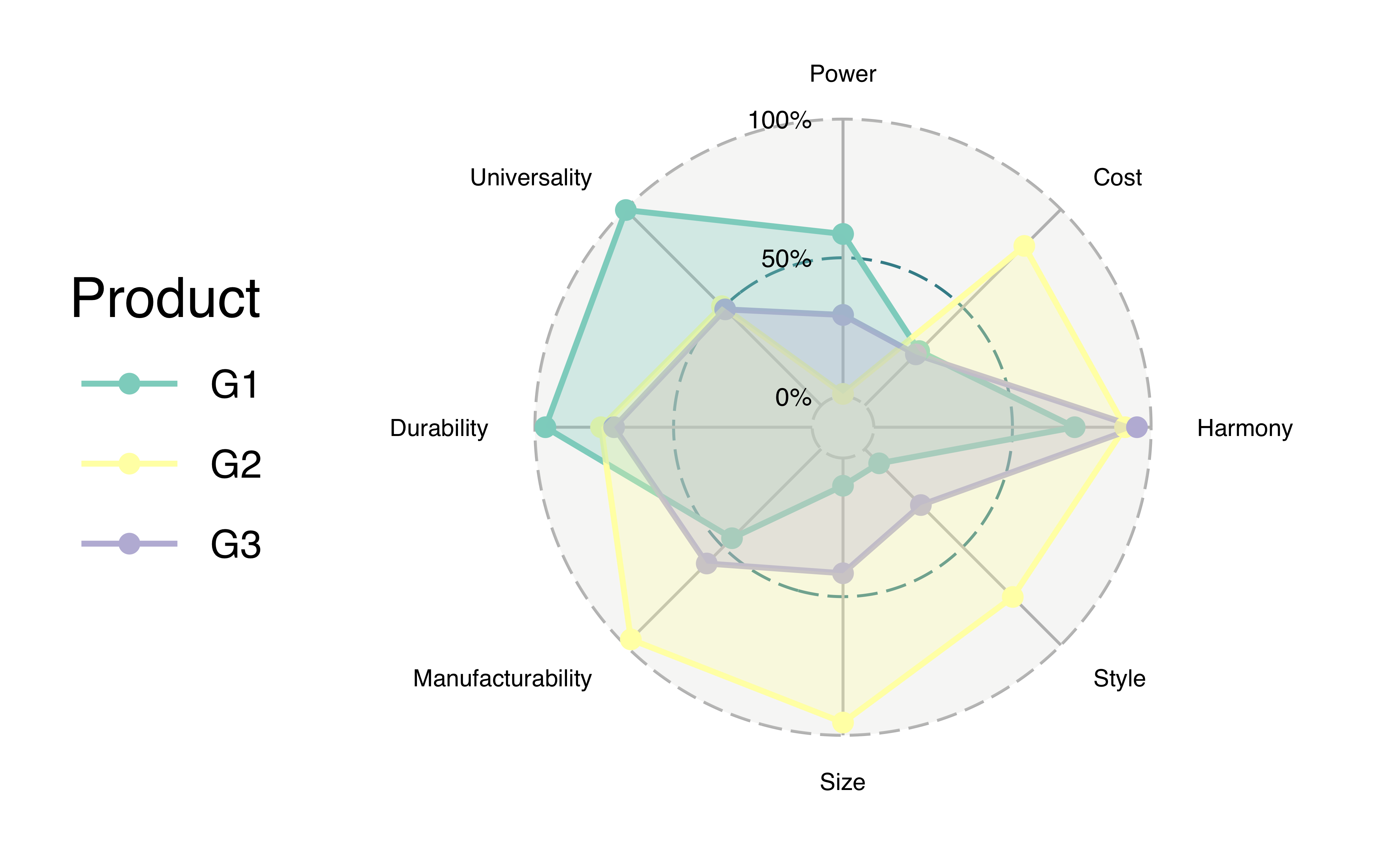
Business Insights from Bump Charts
- Bump charts are good for depicting Ranks/Scores pertaining to a set of data, as they vary over another aspect, for a set of products
- Cannot have too many levels in the aspect parameter, else the graph gets too hard to make sense with.
- For instance if we had 10 years in the data above, we would have lost the plot, literally! Perhaps better to use a Sankey in that case!!
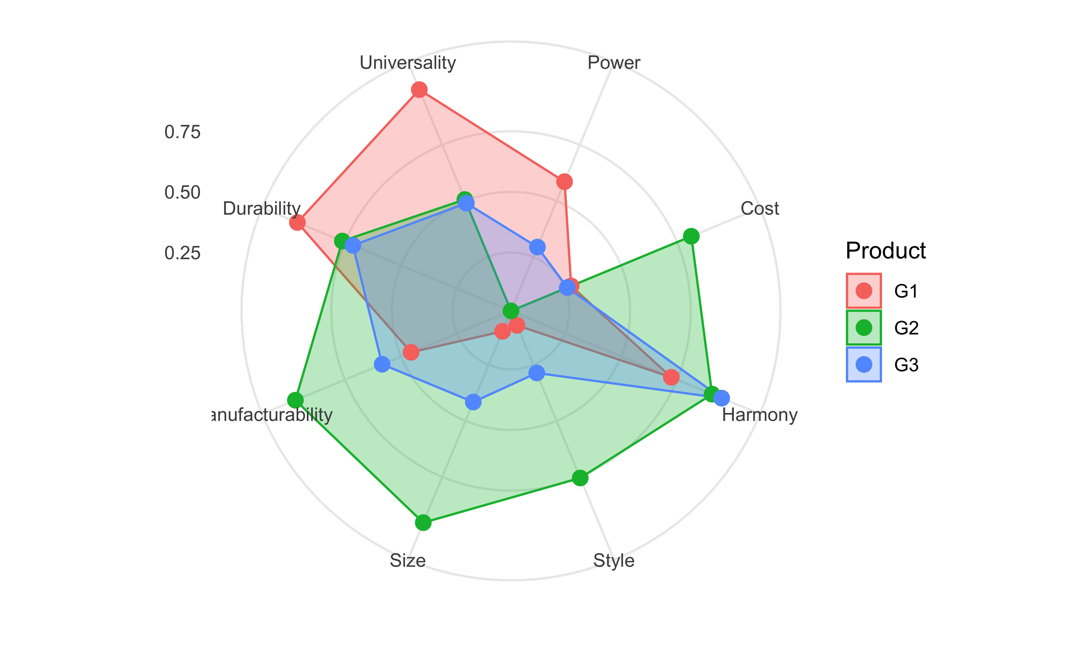
What if your marketing folks had rated some products along several different desirable criteria? Such data, where a certain set of items (Qualitative!!) are rated (Quantitative!) against another set (Qualitative again!!) can be plotted on a roughly circular set of axes, with the radial distance defining the rank against each axes. Such a plot is called a radar plot.
Of course, we will use the aptly named ggradar, which is at this time (Feb 2023) a development version and not yet part of CRAN. We will still try it, and another package ggiraphExtra which IS a part of CRAN (and has some other capabilities too, which are worth exploring!)
Let us generate some toy data first:
set.seed(4)
df4 <- tibble(
  Product = c("G1", "G2", "G3"),
  Power = runif(3),
  Cost = runif(3),
  Harmony = runif(3),
  Style = runif(3),
  Size = runif(3),
  Manufacturability = runif(3),
  Durability = runif(3),
  Universality = runif(3)
)
df4Product <chr> | Power <dbl> | Cost <dbl> | Harmony <dbl> | Style <dbl> | Size <dbl> | Manufacturability <dbl> | Durability <dbl> | Universality <dbl> |
|---|---|---|---|---|---|---|---|---|
| G1 | 0.585800305 | 0.2773750 | 0.7244059 | 0.07314447 | 0.1000535 | 0.4551024 | 0.9622046 | 0.9966129 |
| G2 | 0.008945796 | 0.8135742 | 0.9060922 | 0.75467503 | 0.9540688 | 0.9710557 | 0.7617024 | 0.5062709 |
| G3 | 0.293739612 | 0.2604278 | 0.9490402 | 0.28600062 | 0.4156071 | 0.5839880 | 0.7145085 | 0.4899432 |
And now plot it with both packages.
ggradar::ggradar(
  plot.data = df4,
  plot.title = "Made with ggradar",
  axis.label.size = 3, # Titles of Params
  grid.label.size = 4, # Score Values/Circles
  group.point.size = 3, # Product Points Sizes
  group.line.width = 1, # Product Line Widths
  group.colours = c("#123456", "#fad744", "#03e2e1"), # Product Colours
  fill = TRUE, # fill the radar polygons
  fill.alpha = 0.3, # Not too dark, Arvind
  legend.title = "Product"
)
From the ggiraphExtra website:
Package
ggiraphExtracontains many useful functions for exploratory plots. These functions are made by both ‘ggplot2’ and ‘ggiraph’ packages. You can make a static ggplot or an interactive ggplot by setting the parameter interactive=TRUE.
ggiraphExtra::ggRadar(
  data = df4,
  aes(colour = Product),
  interactive = FALSE, # try TRUE
  rescale = F, # rescale = TRUE makes it look different...try!!
  title = "Using ggiraphExtra"
) +
  theme_minimal()
Business Insights from Radar Plots
- Differences in scores for a given item across several aspect or parameters are readily apparent.
- These can also be compared, parameter for parameter, with more than one item
- the same set of data at two different aspects is very quickly apparent
- Data is clearly in wide form
- Both
ggradarandggiraphExtrarender very similar-looking radar charts and the syntax is not too intimidating!!
- Bump Charts can show changes in Rating and Ranking over time, or some other Qual variable too!
- Lollipop Charts are useful in comparing multiple say products or services, with only one aspect for comparison, or which defines the rank
- Radar Charts are also useful in comparing multiple say products or services, but against several aspects or parameters for simultaneous comparisons.
- These are easy and simple charts to use and are easily understood too
- Bear in mind the data structure requirements for different charts/packages: Wide vs Long.
- Take the
HELPrctdataset from our well usedmosaicDatapackage. Plot ranking charts using each of the public health issues that you can see in that dataset. What choice will you make for the the axes? - Try the
SaratogaHousesdataset also frommosaicData.
- Highcharts Blog. Why you need to start using dumbbell charts
https://github.com/hrbrmstr/ggalt#lollipop-charts
- See this use of Radar Charts in Education. Choose the country/countries of choice and plot their ranks on various educational parameters in a radar chart. https://gpseducation.oecd.org/Home
Bion, Ricardo. 2025. ggradar: Create Radar Charts Using Ggplot2. https://github.com/ricardo-bion/ggradar.
Moon, Keon-Woong. 2020. ggiraphExtra: Make Interactive “ggplot2.” Extension to “ggplot2” and “ggiraph”. https://doi.org/10.32614/CRAN.package.ggiraphExtra.
Rudis, Bob, Ben Bolker, and Jan Schulz. 2017. ggalt: Extra Coordinate Systems, “Geoms,” Statistical Transformations, Scales and Fonts for “ggplot2”. https://doi.org/10.32614/CRAN.package.ggalt.
Sjoberg, David. 2020. ggbump: Bump Chart and Sigmoid Curves. https://doi.org/10.32614/CRAN.package.ggbump.
Citation
BibTeX citation:
@online{v.2023,
  author = {V., Arvind},
  title = {\textless Iconify-Icon Icon=“ph:ranking-Bold” Width=“1.2em”
    Height=“1.2em”\textgreater\textless/Iconify-Icon\textgreater{}
    {Ratings} and {Rankings}},
  date = {2023-02-10},
  url = {https://av-quarto.netlify.app/content/courses/Analytics/Descriptive/Modules/80-Ranking/},
  langid = {en},
  abstract = {Comparisons between observations and between variables}
}
For attribution, please cite this work as:
V., Arvind. 2023. “<Iconify-Icon
Icon=‘ph:ranking-Bold’ Width=‘1.2em’
Height=‘1.2em’></Iconify-Icon> Ratings and
Rankings.” February 10, 2023. https://av-quarto.netlify.app/content/courses/Analytics/Descriptive/Modules/80-Ranking/.