Show the Code
[1] 2.478419[1] 0.4971305Alert - I have split up this Huge website into smaller ones. Please check out the new site URLs on the Home page for the latest course content. This website will not be updated anymore. Thanks for your patience and support! 🙏
[1] 2.478419[1] 0.4971305Arsenic in wells in Bangladesh
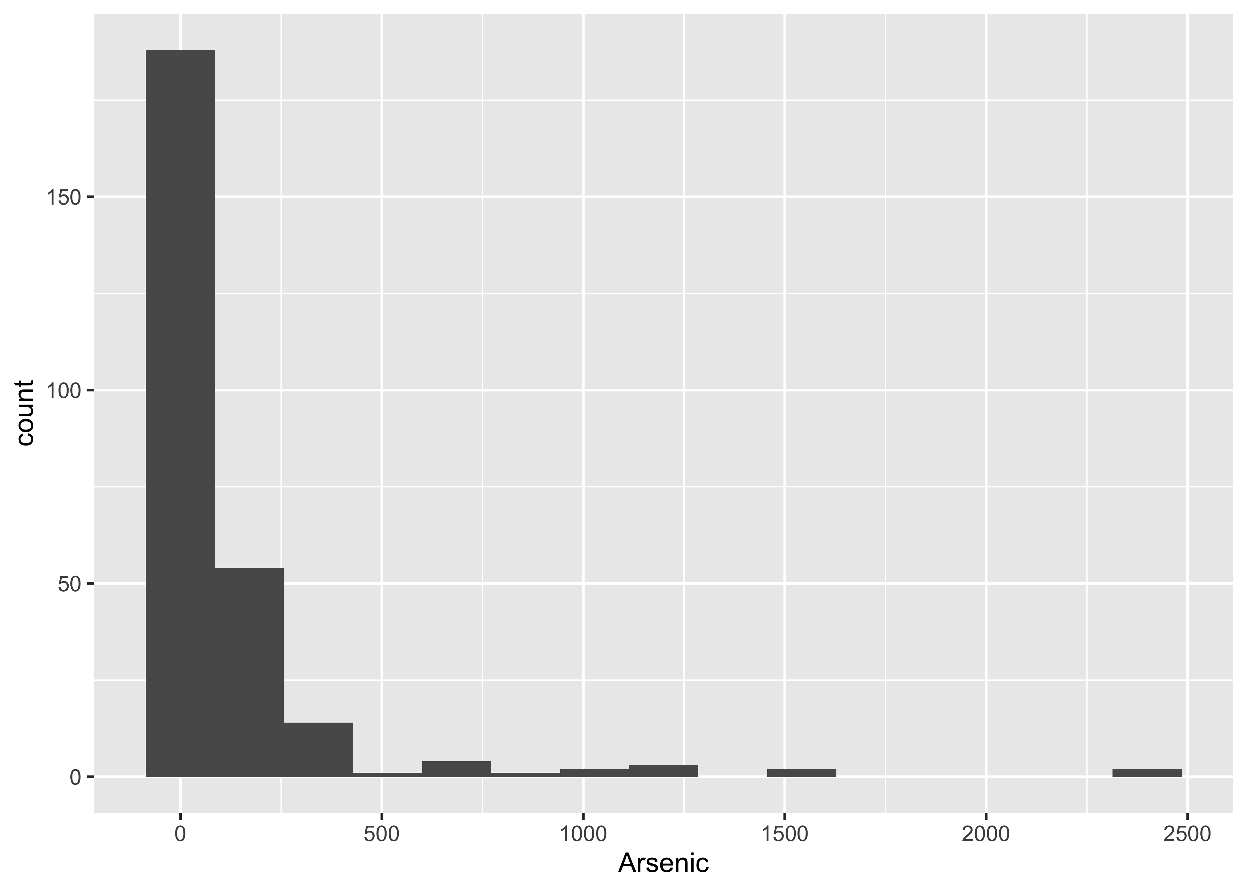
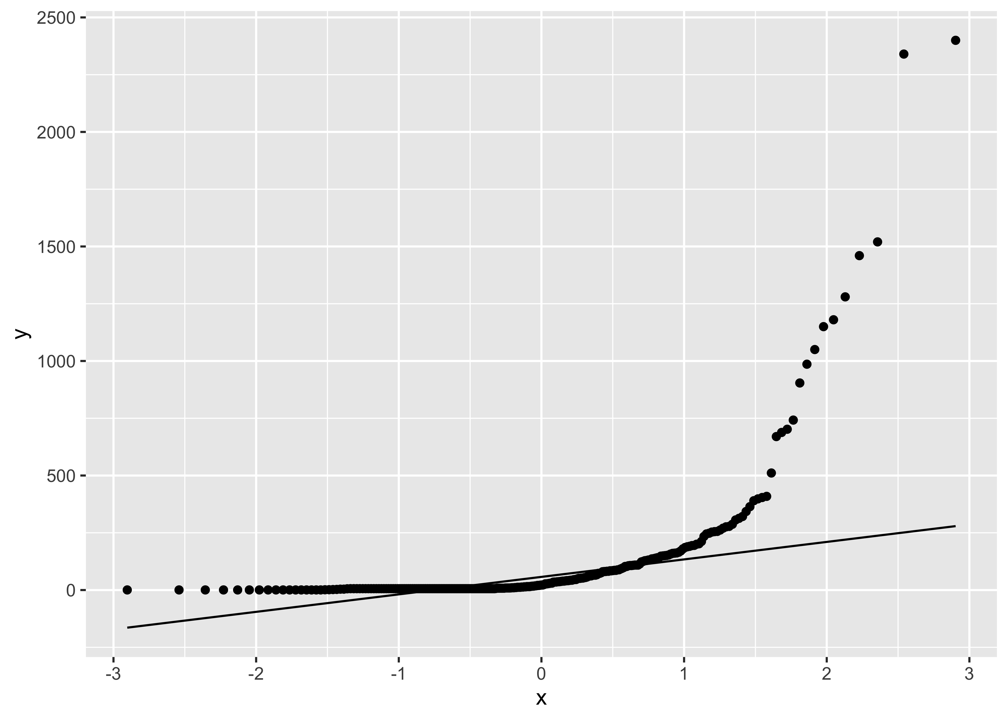
Arsenic <- pull(Bangladesh, Arsenic)
# Alternatively
# Arsenic <- Bangladesh$Arsenic

n <- length(Arsenic)
N <- 10^4

arsenic.mean <- numeric(N)

for (i in 1:N)
{
  x <- sample(Arsenic, n, replace = TRUE)
  arsenic.mean[i] <- mean(x)
}

ggplot() +
  geom_histogram(aes(arsenic.mean), bins = 15) +
  labs(title = "Bootstrap distribution of means") +
  geom_vline(xintercept = mean(Arsenic), colour = "blue")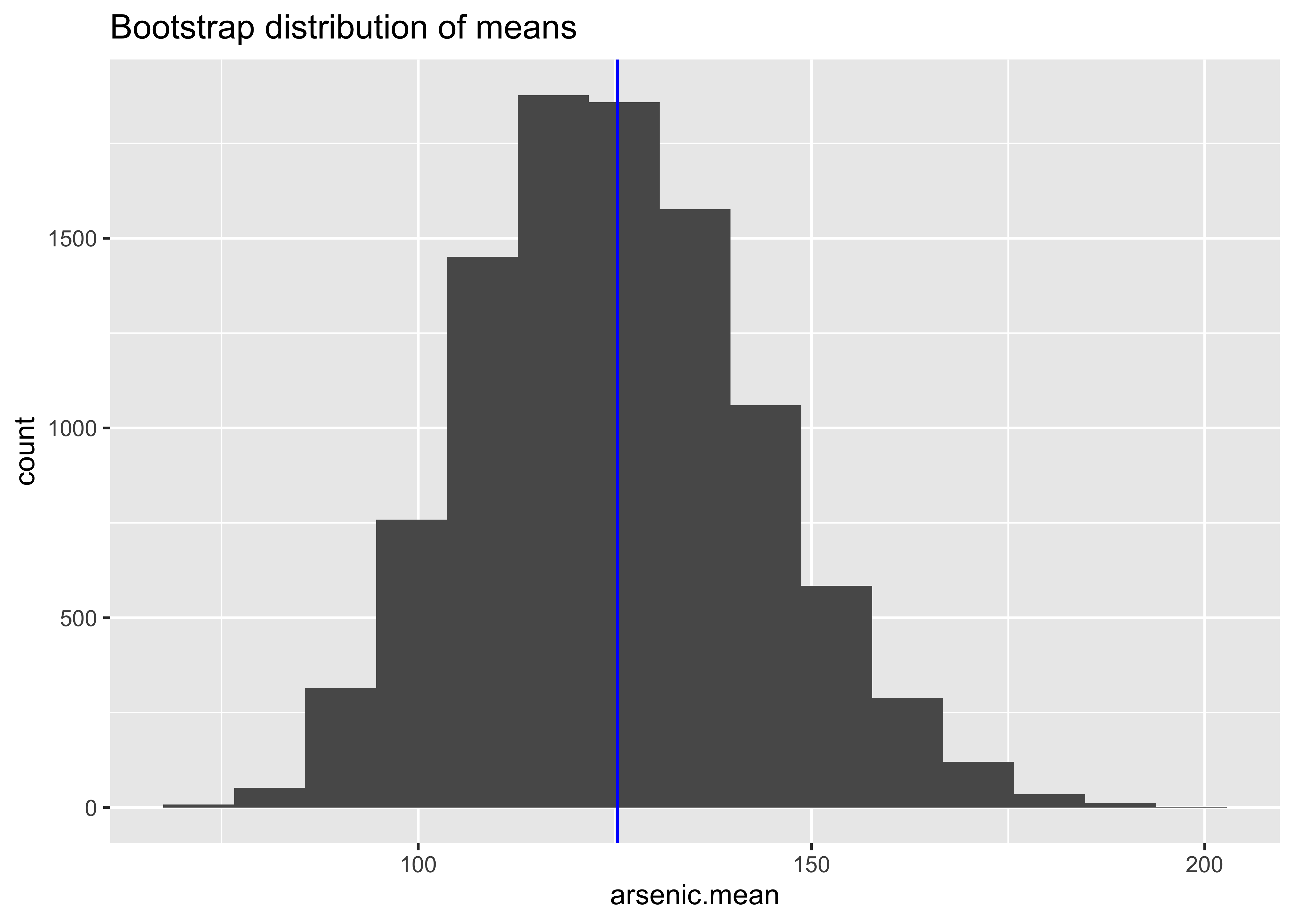

[1] 125.4157[1] 0.09572483[1] 18.31944[1] 0.0331[1] 0.0167Skateboard <- read.csv("../../../../../../materials/data/resampling/Skateboard.csv")
testF <- Skateboard %>%
filter(Experimenter == "Female") %>%
pull(Testosterone)
testM <- Skateboard %>%
filter(Experimenter == "Male") %>%
pull(Testosterone)
observed <- mean(testF) - mean(testM)
nf <- length(testF)
nm <- length(testM)
N <- 10^4
TestMean <- numeric(N)
for (i in 1:N)
{
sampleF <- sample(testF, nf, replace = TRUE)
sampleM <- sample(testM, nm, replace = TRUE)
TestMean[i] <- mean(sampleF) - mean(sampleM)
}
df <- data.frame(TestMean)
ggplot(df) +
geom_histogram(aes(TestMean), bins = 15) +
labs(title = "Bootstrap distribution of difference in means", xlab = "means") +
geom_vline(xintercept = observed, colour = "blue")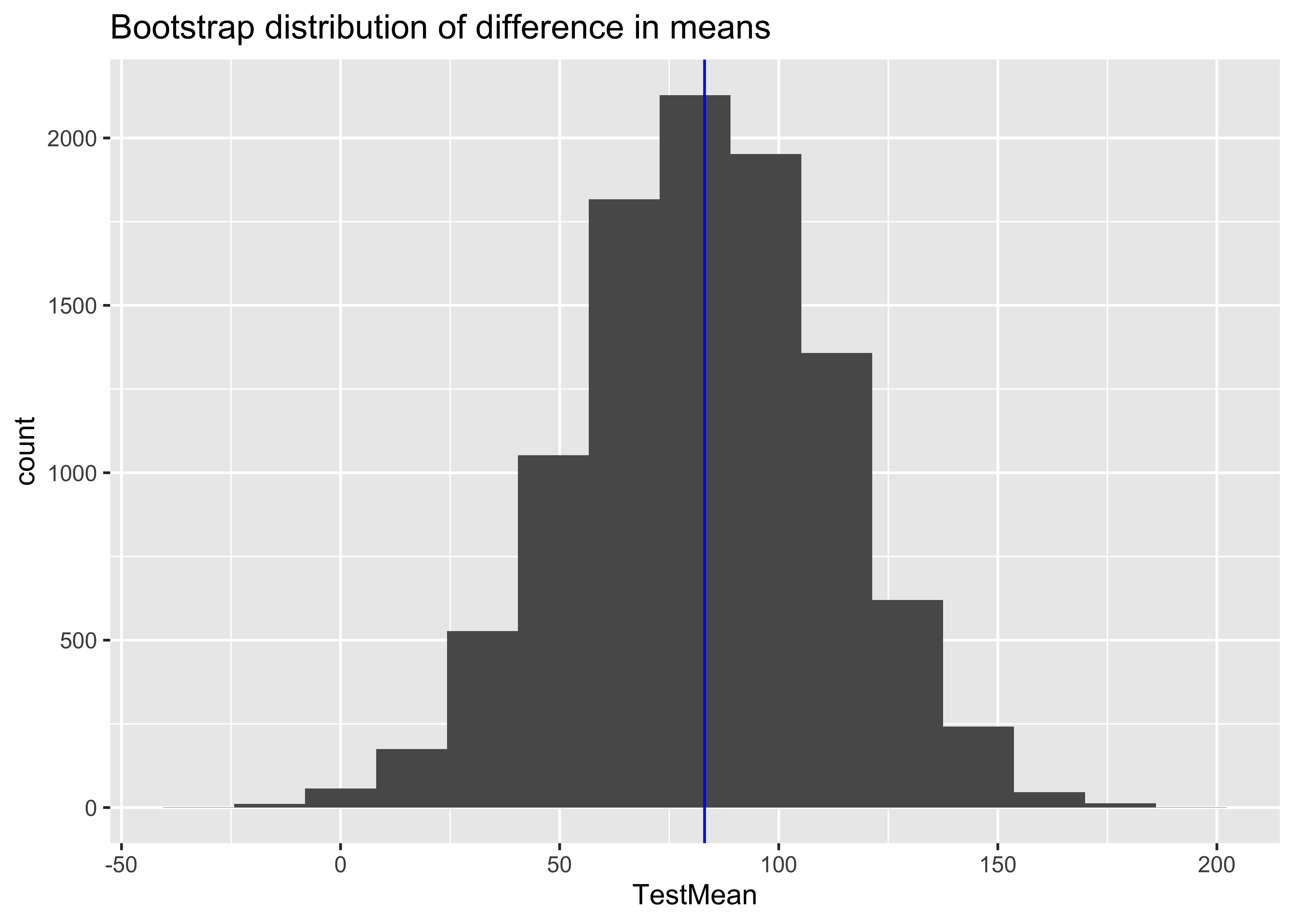
[1] 83.0692[1] 83.09999[1] 29.52567 2.5% 97.5%
25.18554 140.08922 [1] 0.03079212testAll <- pull(Skateboard, Testosterone)
# testAll <- Skateboard$Testosterone
N <- 10^4 - 1 # set number of times to repeat this process
# set.seed(99)
result <- numeric(N) # space to save the random differences
for (i in 1:N)
{
index <- sample(71, size = nf, replace = FALSE) # sample of numbers from 1:71
result[i] <- mean(testAll[index]) - mean(testAll[-index])
}
(sum(result >= observed) + 1) / (N + 1) # P-value[1] 0.0067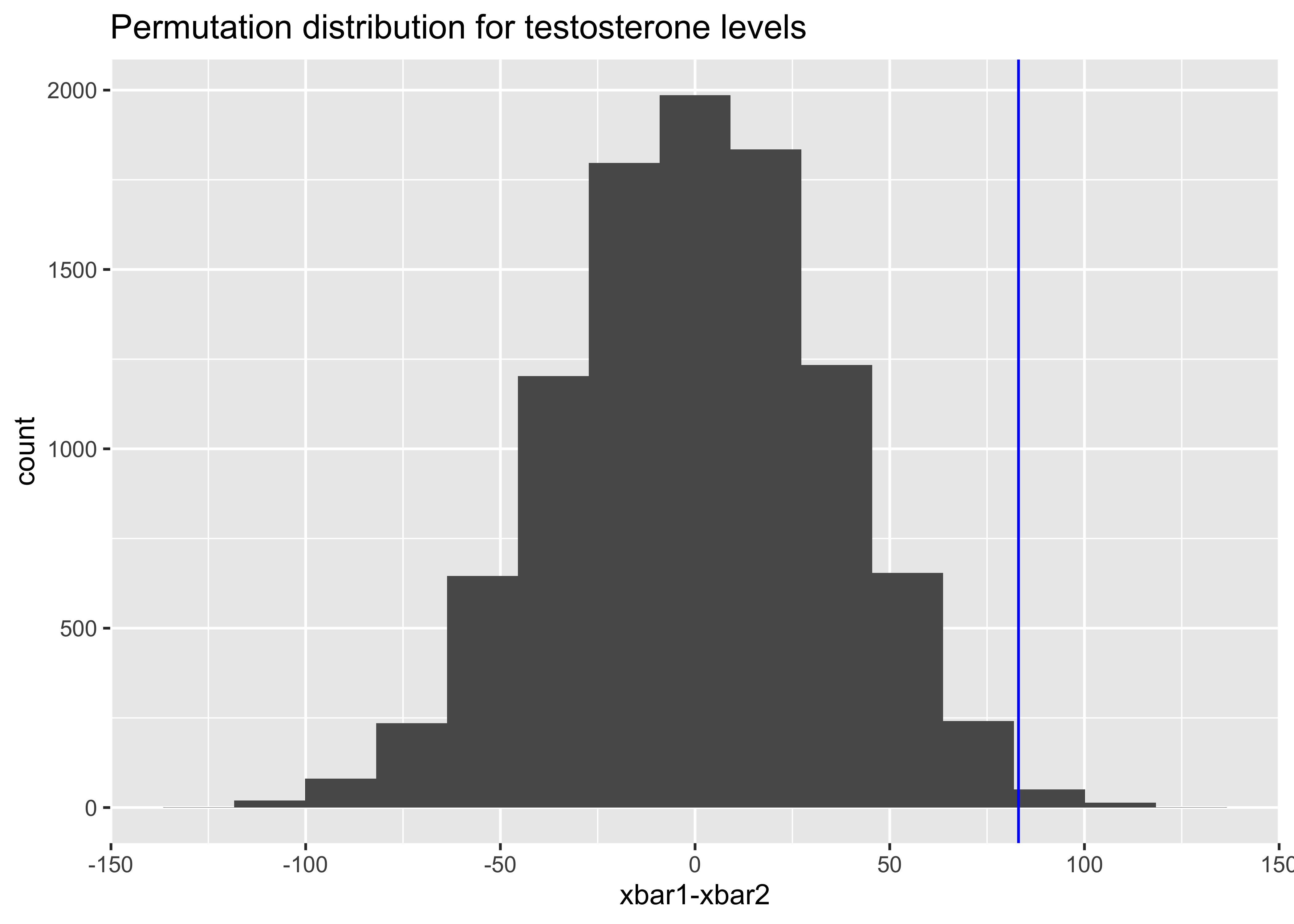
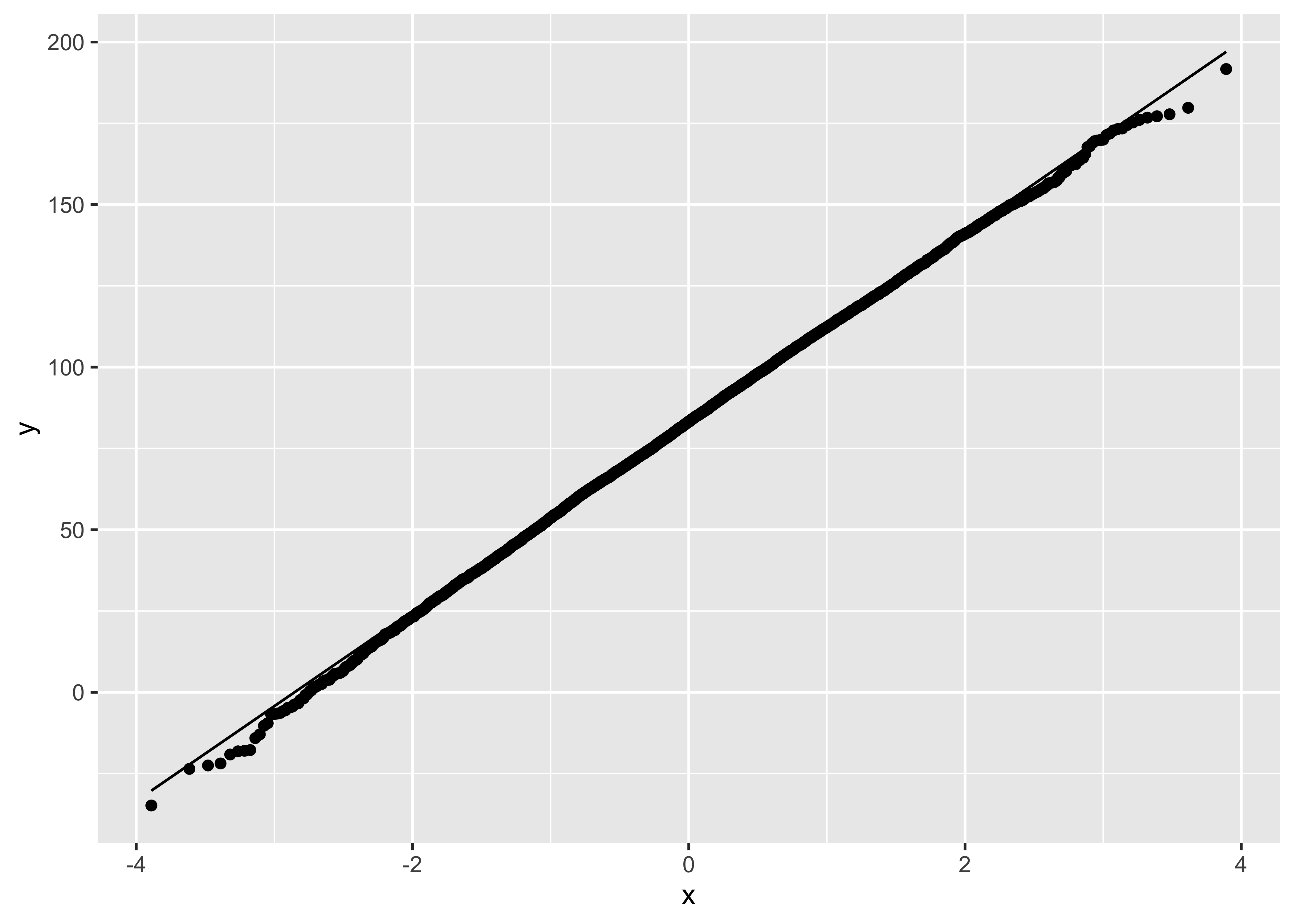
Diving2017 <- read.csv("../../../../../../materials/data/resampling/Diving2017.csv")
Diff <- Diving2017 %>%
  mutate(Diff = Final - Semifinal) %>%
  pull(Diff)
# alternatively
# Diff <- Diving2017$Final - Diving2017$Semifinal
n <- length(Diff)

N <- 10^5
result <- numeric(N)

for (i in 1:N)
{
  dive.sample <- sample(Diff, n, replace = TRUE)
  result[i] <- mean(dive.sample)
}

ggplot() +
  geom_histogram(aes(result), bins = 15)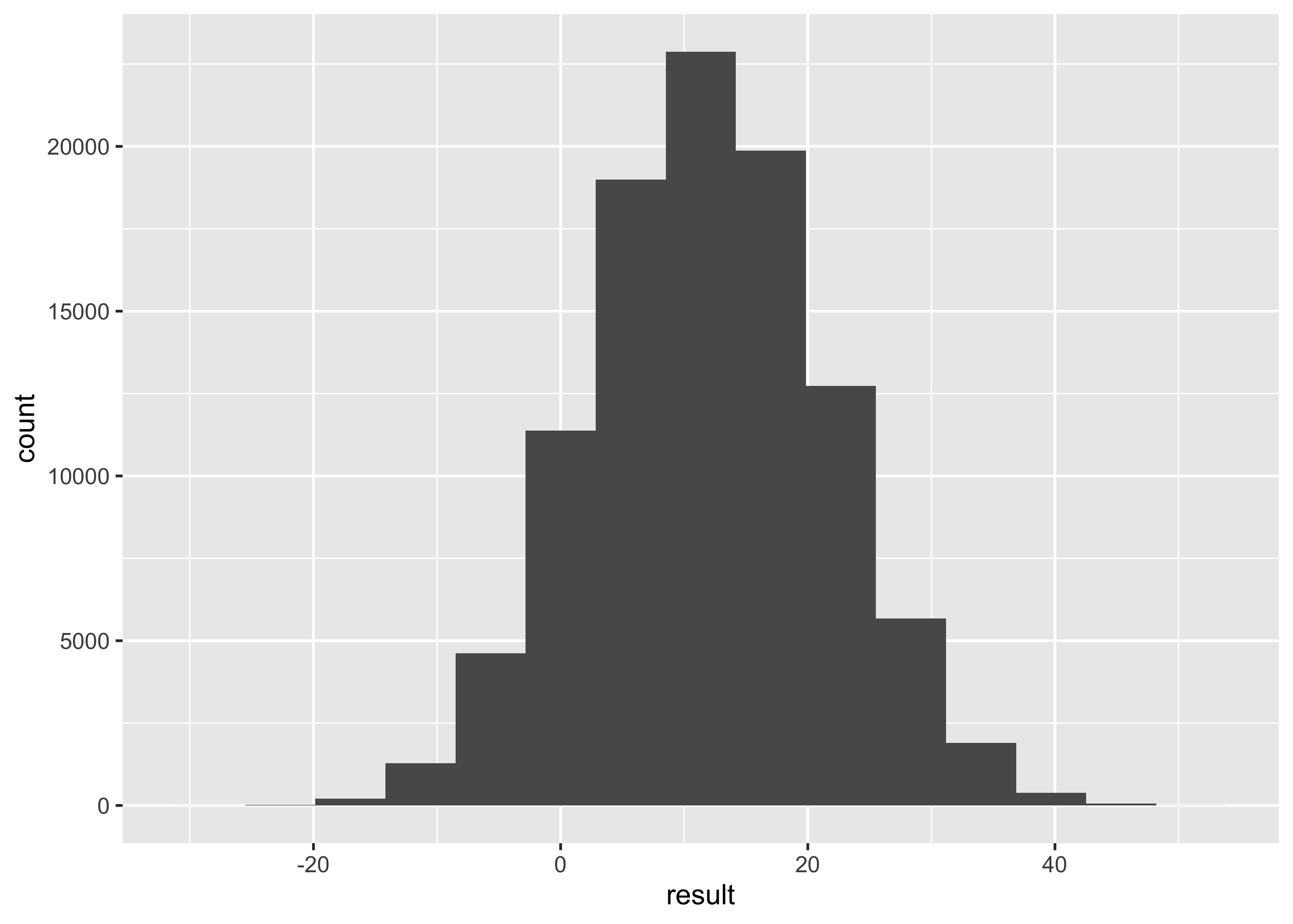
     2.5%     97.5%
-6.591771 31.020833 Bootstrap difference of means.
Verizon <- read.csv("../../../../../../materials/data/resampling/Verizon.csv")
Time.ILEC <- Verizon %>%
filter(Group == "ILEC") %>%
pull(Time)
Time.CLEC <- Verizon %>%
filter(Group == "CLEC") %>%
pull(Time)
observed <- mean(Time.ILEC) - mean(Time.CLEC)
n.ILEC <- length(Time.ILEC)
n.CLEC <- length(Time.CLEC)
N <- 10^4
time.ILEC.boot <- numeric(N)
time.CLEC.boot <- numeric(N)
time.diff.mean <- numeric(N)
set.seed(100)
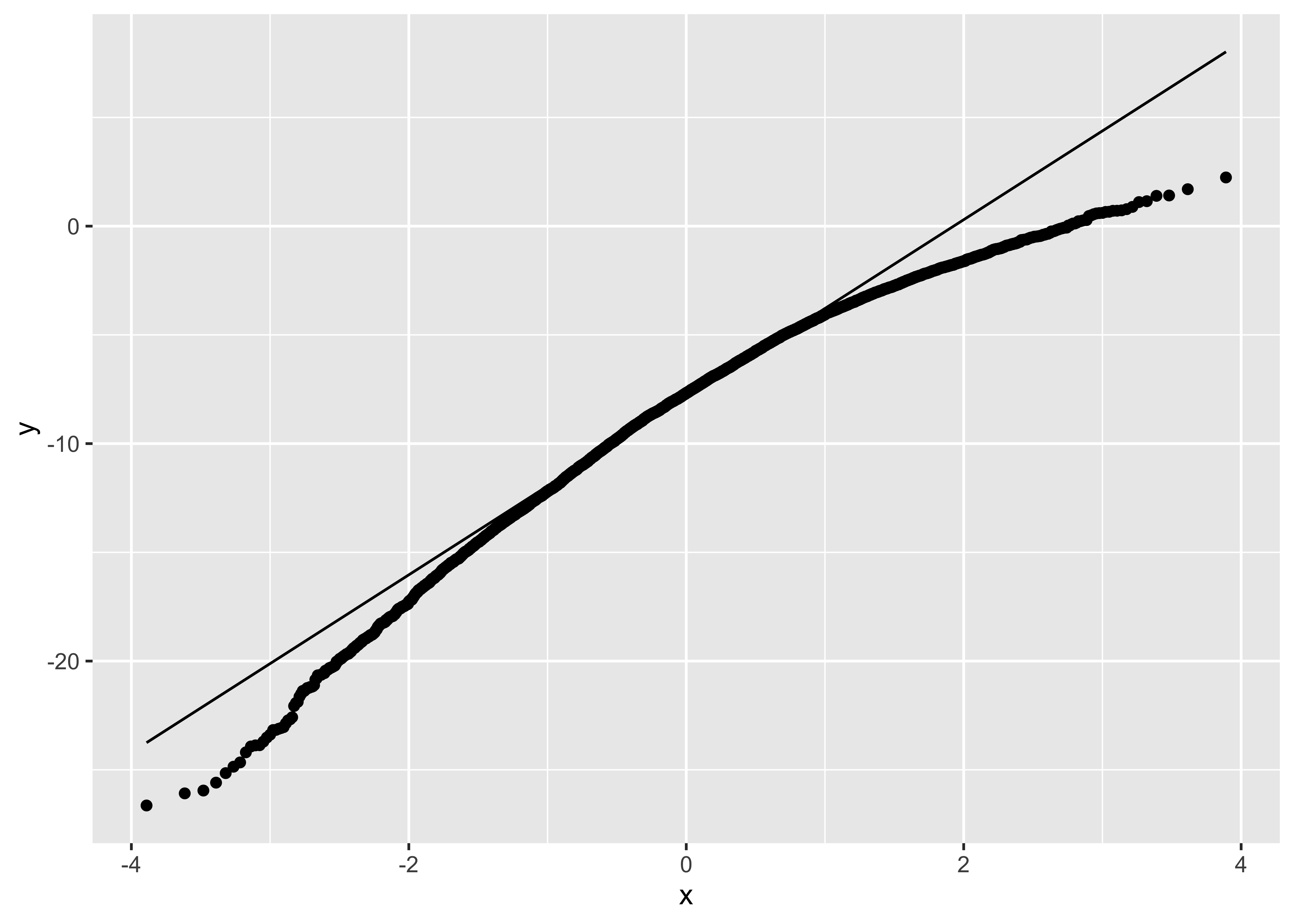
for (i in 1:N)
{
ILEC.sample <- sample(Time.ILEC, n.ILEC, replace = TRUE)
CLEC.sample <- sample(Time.CLEC, n.CLEC, replace = TRUE)
time.ILEC.boot[i] <- mean(ILEC.sample)
time.CLEC.boot[i] <- mean(CLEC.sample)
time.diff.mean[i] <- mean(ILEC.sample) - mean(CLEC.sample)
}
# bootstrap for ILEC
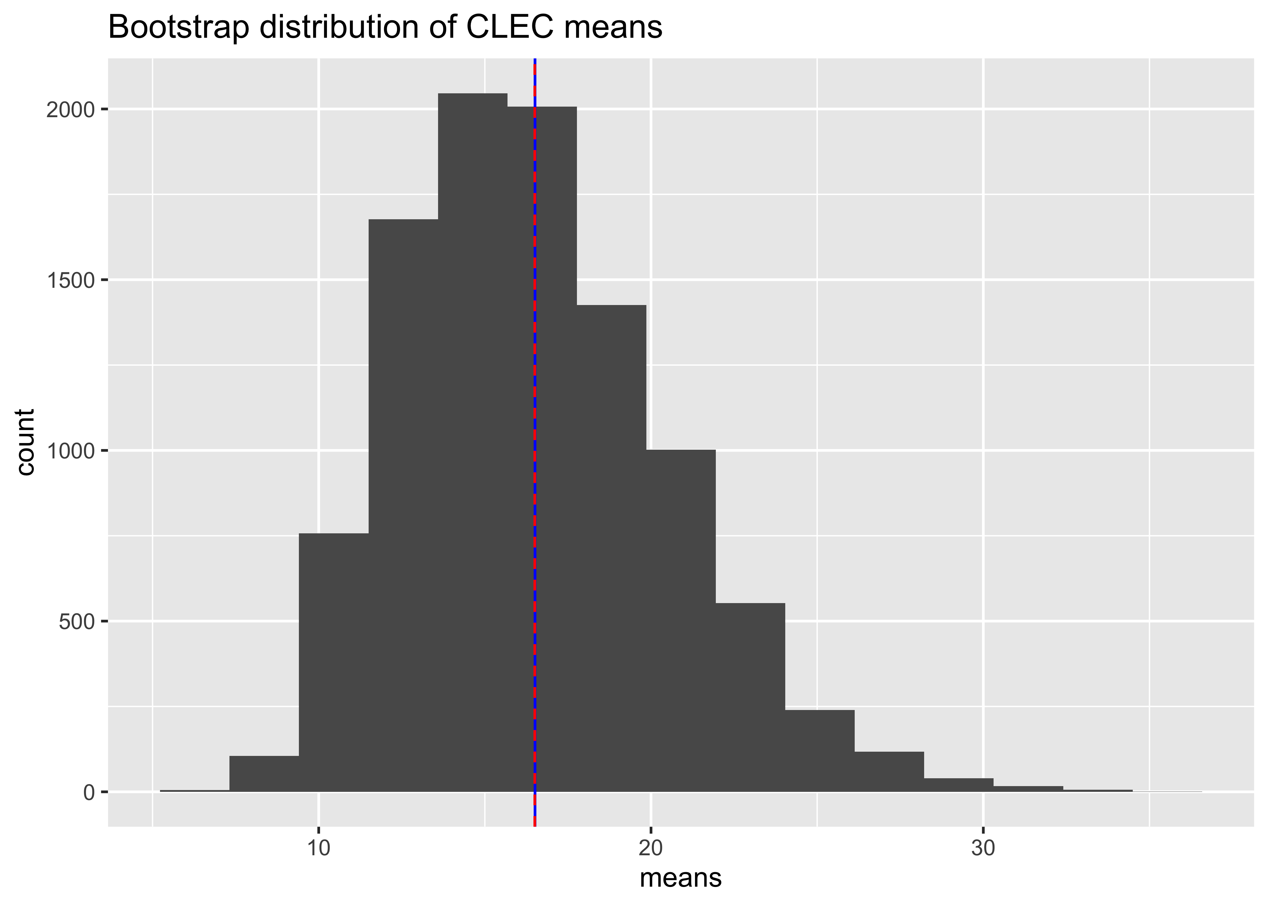
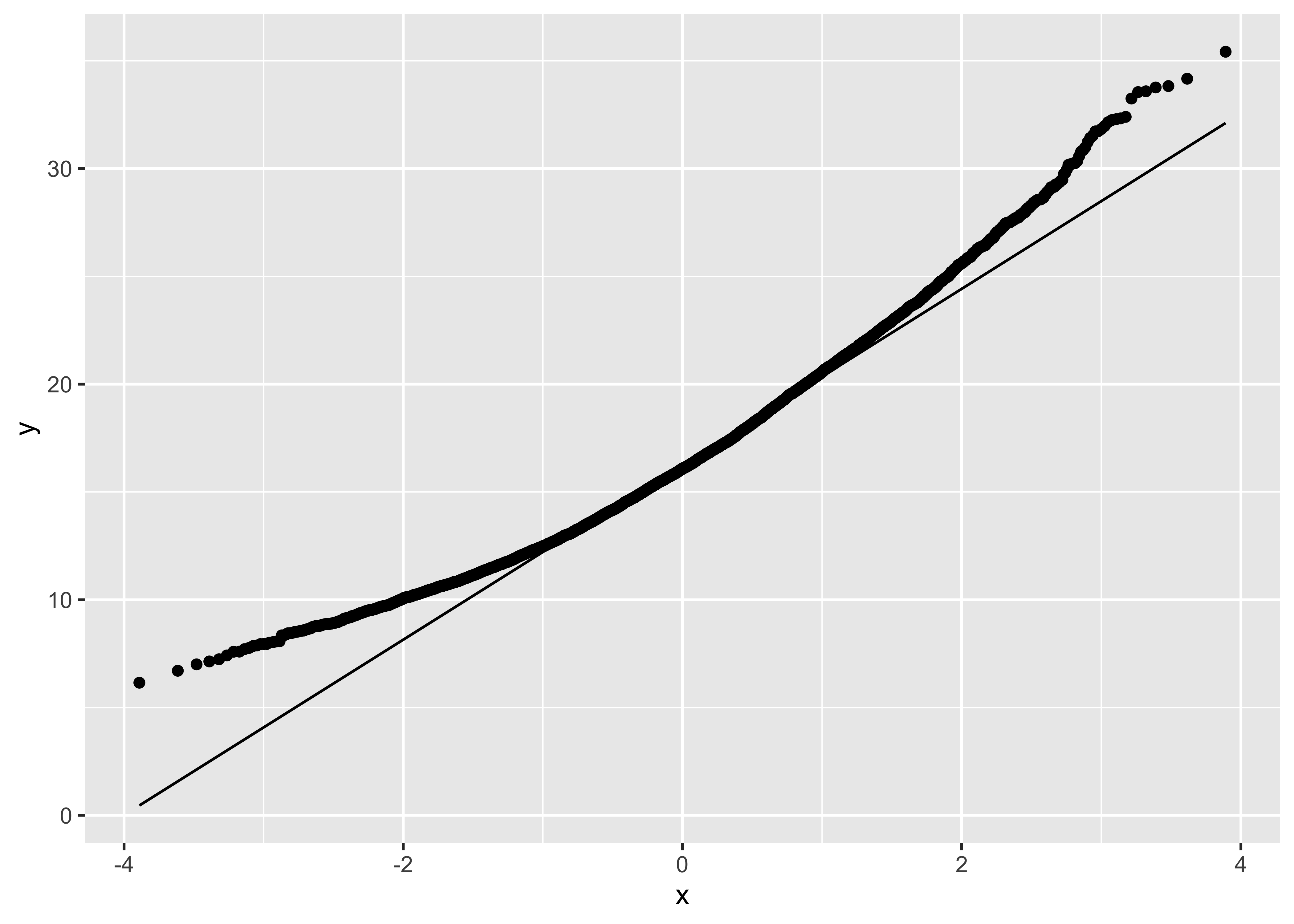
ggplot() +
geom_histogram(aes(time.ILEC.boot), bins = 15) +
labs(title = "Bootstrap distribution of ILEC means", x = "means") +
geom_vline(xintercept = mean(Time.ILEC), colour = "blue") +
geom_vline(xintercept = mean(time.ILEC.boot), colour = "red", lty = 2)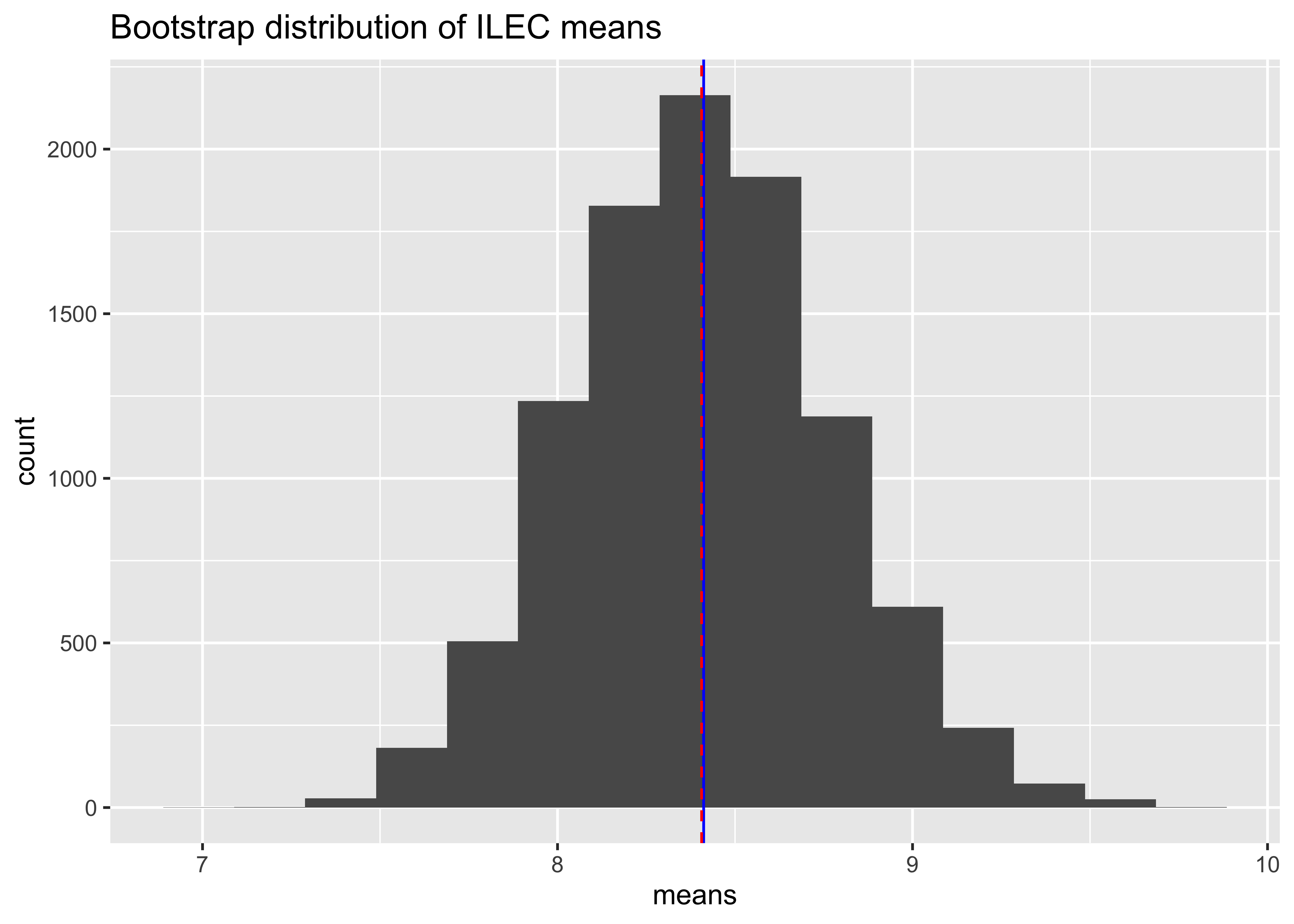
   Min. 1st Qu.  Median    Mean 3rd Qu.    Max.
7.036 8.156 8.400 8.406 8.642 9.832 
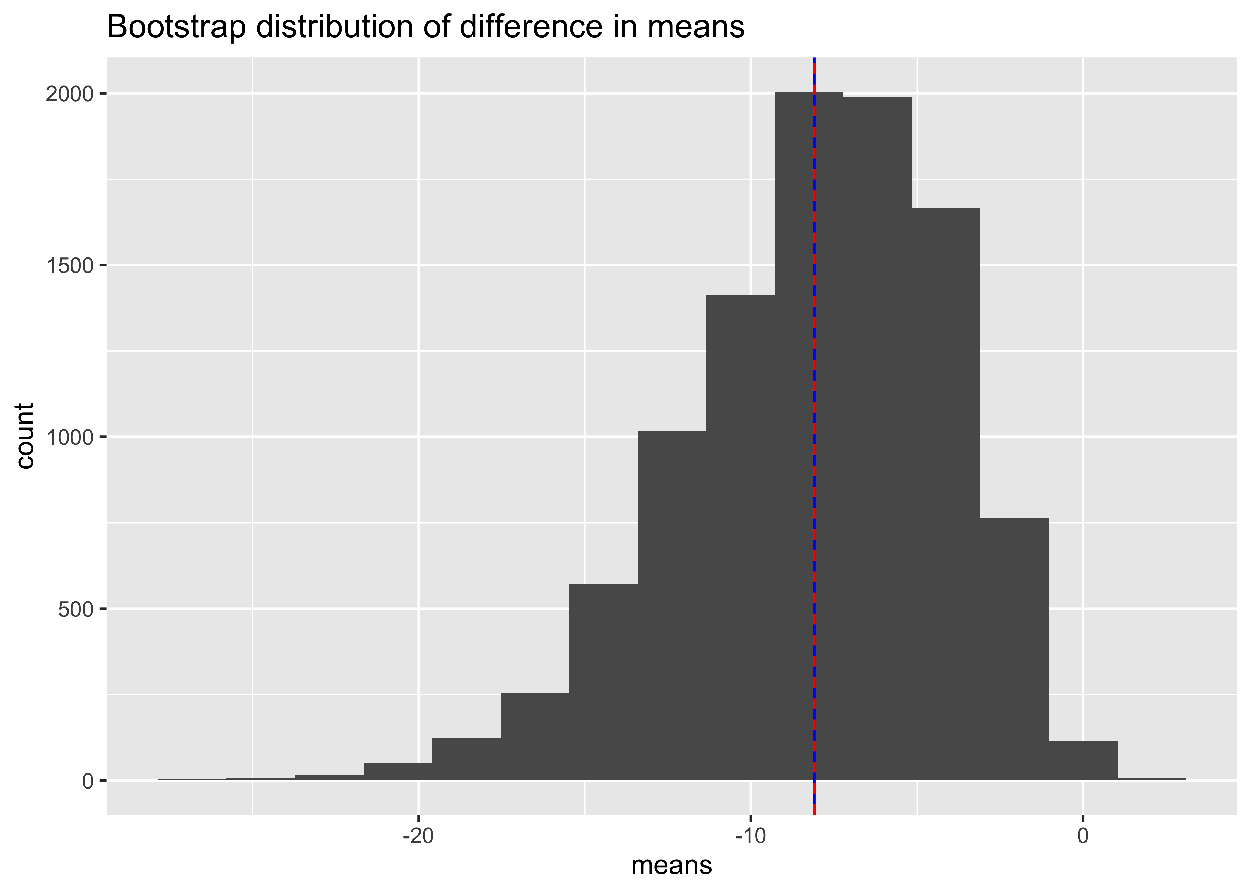
[1] -8.096489 2.5% 97.5%
-16.970068 -1.690859 Bootstrap difference in trimmed means
Time.ILEC <- Verizon %>%
  filter(Group == "ILEC") %>%
  pull(Time)
Time.CLEC <- Verizon %>%
  filter(Group == "CLEC") %>%
  pull(Time)
n.ILEC <- length(Time.ILEC)
n.CLEC <- length(Time.CLEC)

N <- 10^4
time.diff.trim <- numeric(N)

# set.seed(100)
for (i in 1:N)
{
  x.ILEC <- sample(Time.ILEC, n.ILEC, replace = TRUE)
  x.CLEC <- sample(Time.CLEC, n.CLEC, replace = TRUE)
  time.diff.trim[i] <- mean(x.ILEC, trim = .25) - mean(x.CLEC, trim = .25)
}

ggplot() +
  geom_histogram(aes(time.diff.trim), bins = 15) +
  labs(x = "difference in trimmed means") +
  geom_vline(xintercept = mean(time.diff.trim), colour = "blue") +
  geom_vline(xintercept = mean(Time.ILEC, trim = .25) - mean(Time.CLEC, trim = .25), colour = "red", lty = 2)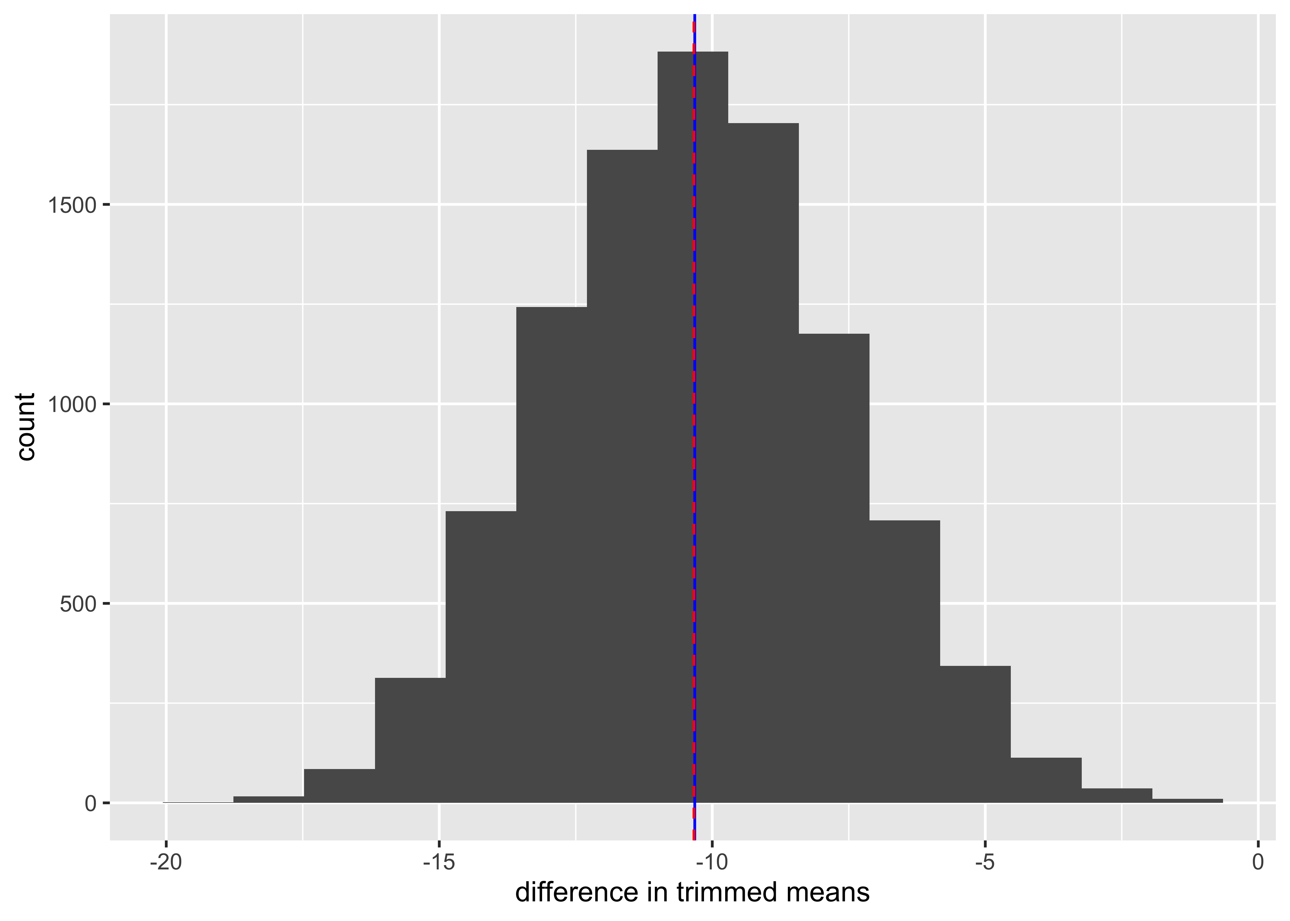
[1] -10.32079 2.5% 97.5%
-15.47049 -4.97130 Bootstrap of the ratio of means
Time.ILEC and Time.CLEC created above.
n.ILEC, n.CLEC created above
N <- 10^4
time.ratio.mean <- numeric(N)

# set.seed(100)
for (i in 1:N)
{
  ILEC.sample <- sample(Time.ILEC, n.ILEC, replace = TRUE)
  CLEC.sample <- sample(Time.CLEC, n.CLEC, replace = TRUE)
  time.ratio.mean[i] <- mean(ILEC.sample) / mean(CLEC.sample)
}

ggplot() +
  geom_histogram(aes(time.ratio.mean), bins = 12) +
  labs(title = "bootstrap distribution of ratio of means", x = "ratio of means") +
  geom_vline(xintercept = mean(time.ratio.mean), colour = "red", lty = 2) +
  geom_vline(xintercept = mean(Time.ILEC) / mean(Time.CLEC), col = "blue")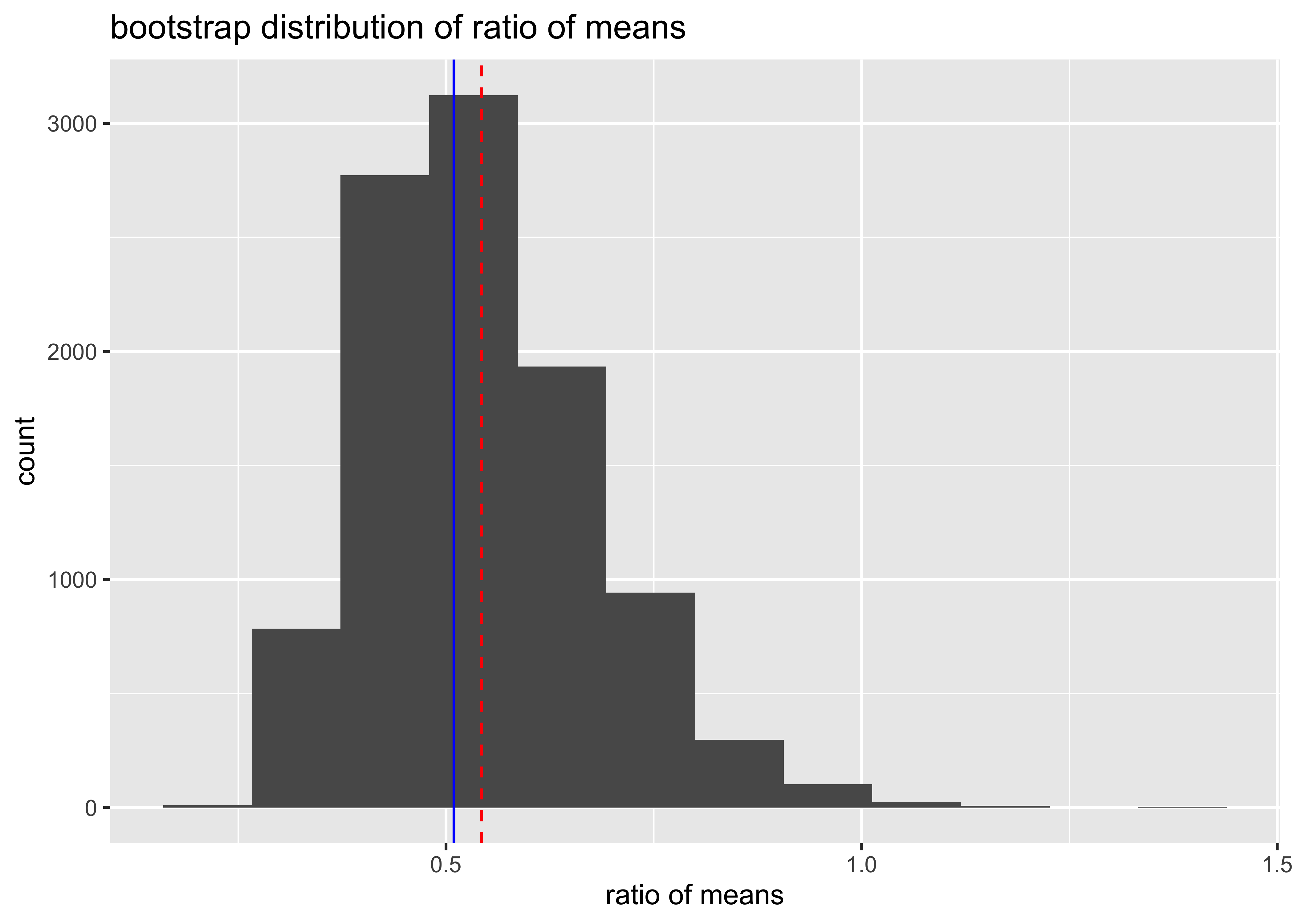
[1] 0.5429164[1] 0.1354238 2.5% 97.5%
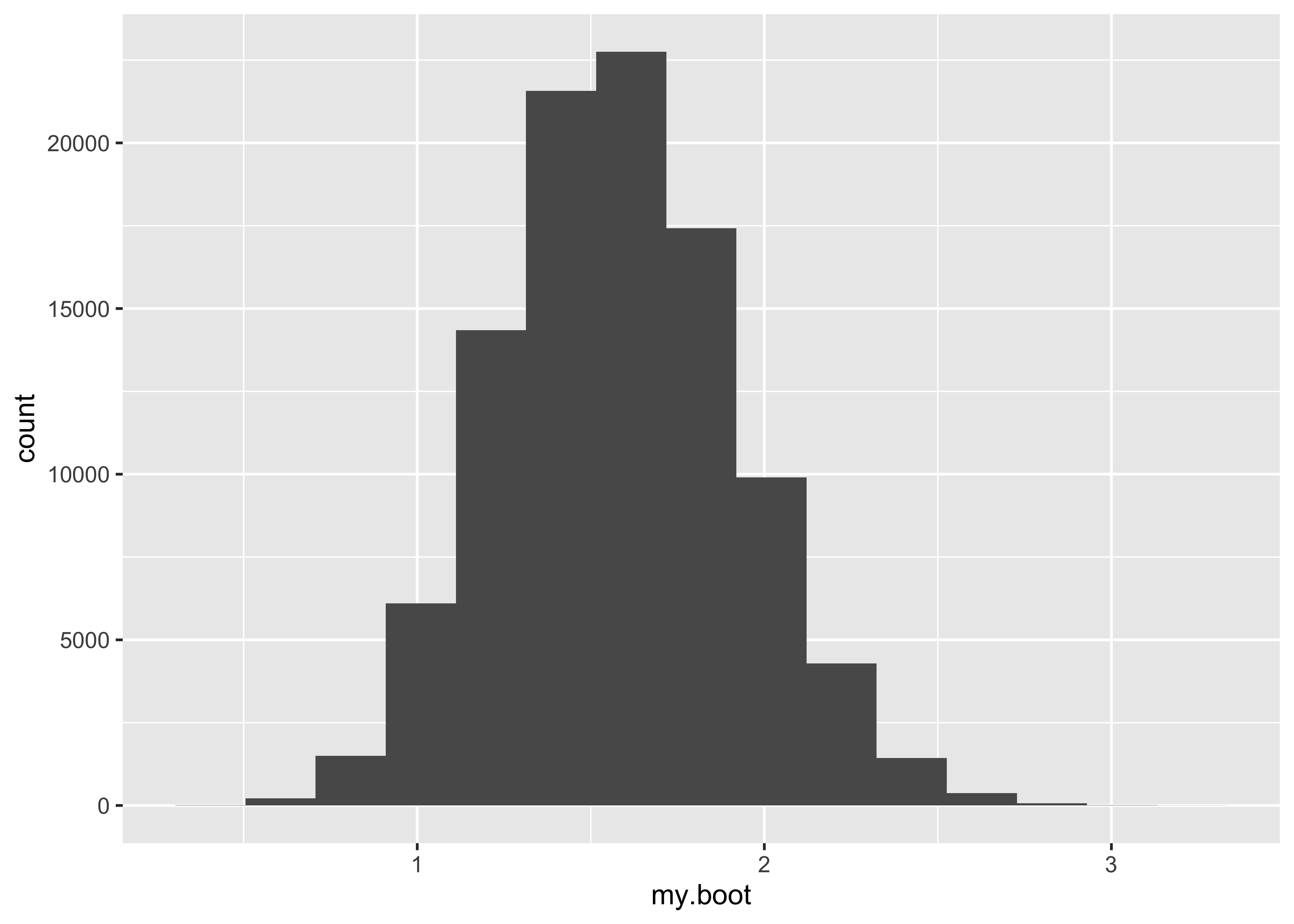
0.3283862 0.8517156 highbp <- rep(c(1, 0), c(55, 3283)) # high blood pressure
lowbp <- rep(c(1, 0), c(21, 2655)) # low blood pressure
N <- 10^4
boot.rr <- numeric(N)
high.prop <- numeric(N)
low.prop <- numeric(N)
for (i in 1:N)
{
x.high <- sample(highbp, 3338, replace = TRUE)
x.low <- sample(lowbp, 2676, replace = TRUE)
high.prop[i] <- sum(x.high) / 3338
low.prop[i] <- sum(x.low) / 2676
boot.rr[i] <- high.prop[i] / low.prop[i]
}
ci <- quantile(boot.rr, c(0.025, 0.975))
ggplot() +
geom_histogram(aes(boot.rr), bins = 15) +
labs(title = "Bootstrap distribution of relative risk", x = "relative risk") +
geom_vline(aes(xintercept = mean(boot.rr), colour = "mean of bootstrap")) +
geom_vline(aes(xintercept = 2.12, colour = "observed rr"), lty = 2) +
scale_colour_manual(name = "", values = c("mean of bootstrap" = "blue", "observed rr" = "red"))
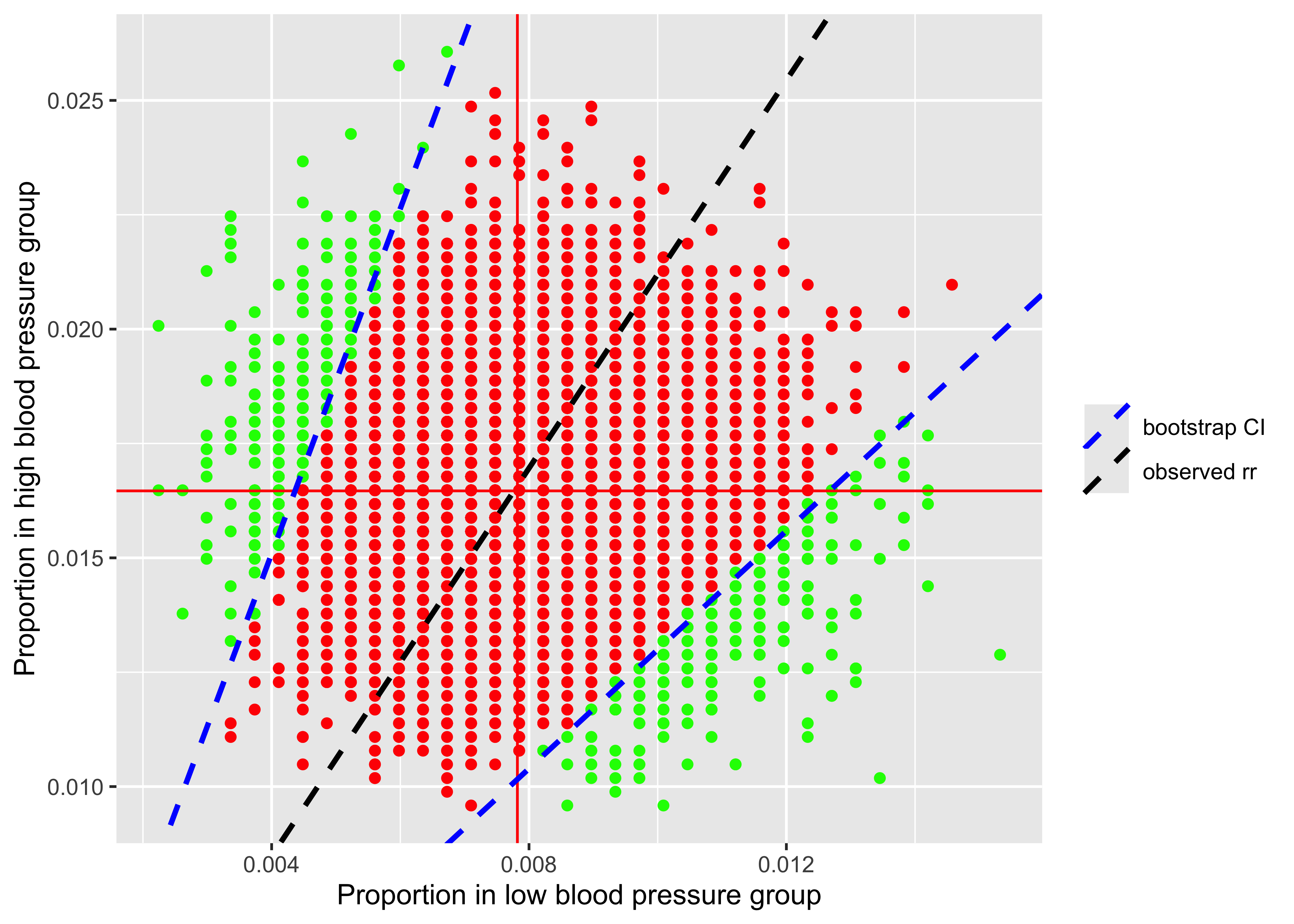
temp <- ifelse(high.prop < 1.31775 * low.prop, 1, 0)
temp2 <- ifelse(high.prop > 3.687 * low.prop, 1, 0)
temp3 <- temp + temp2

df <- data.frame(y = high.prop, x = low.prop, temp, temp2, temp3)
df1 <- df %>% filter(temp == 1)
df2 <- df %>% filter(temp2 == 1)
df3 <- df %>% filter(temp3 == 0)

ggplot(df, aes(x = x, y = y)) +
  geom_point(data = df1, aes(x = x, y = y), colour = "green") +
  geom_point(data = df2, aes(x = x, y = y), colour = "green") +
  geom_point(data = df3, aes(x = x, y = y), colour = "red") +
  geom_vline(aes(xintercept = mean(low.prop)), colour = "red") +
  geom_hline(yintercept = mean(high.prop), colour = "red") +
  geom_abline(aes(intercept = 0, slope = 2.12, colour = "observed rr"), lty = 2, lwd = 1) +
  geom_abline(aes(intercept = 0, slope = ci[1], colour = "bootstrap CI"), lty = 2, lwd = 1) +
  geom_abline(intercept = 0, slope = ci[2], colour = "blue", lty = 2, lwd = 1) +
  scale_colour_manual(name = "", values = c("observed rr" = "black", "bootstrap CI" = "blue")) +
  labs(x = "Proportion in low blood pressure group", y = "Proportion in high blood pressure group")