[1] 9 6 2 3 4 7 8 1 10 5Permutation Tests
Abstract
A bunch of case studies with Permutation Tests
Permutations tests using mosaic::shuffle()
The mosaic package provides the shuffle() function as a synonym for sample(). When used without additional arguments, this will permute its first argument.
Applying shuffle() to an explanatory variable in a model allows us to test the null hypothesis that the explanatory variable has, in fact, no explanatory power. This idea can be used to test
- the equivalence of two or more means,
- the equivalence of two or more proportions,
- whether a regression parameter is 0. (Correlations between two variables) For example:
Coupled with mosaic::do() we can repeat a shuffle many times, computing a desired statistic each time we shuffle. The distribution of this computed statistic is a NULL distribution, which can then be compared with the observed statistic to decide upon the Hypothesis Test and p-value.
Permutation Tests
Case Study-1: Hot Wings Orders vs Gender
A student conducted a study of hot wings and beer consumption at a Bar. She asked patrons at the bar to record their consumption of hot wings and beer over the course of several hours. She wanted to know if people who ate more hot wings would then drink more beer. In addition, she investigated whether or not gender had an impact on hot wings or beer consumption.
Show the Code
categorical variables:
name class levels n missing
1 Gender character 2 30 0
distribution
1 F (50%), M (50%)
quantitative variables:
name class min Q1 median Q3 max mean sd n missing
1 ID integer 1 8.25 15.5 22.75 30 15.50000 8.803408 30 0
2 Hotwings integer 4 8.00 12.5 15.50 21 11.93333 4.784554 30 0
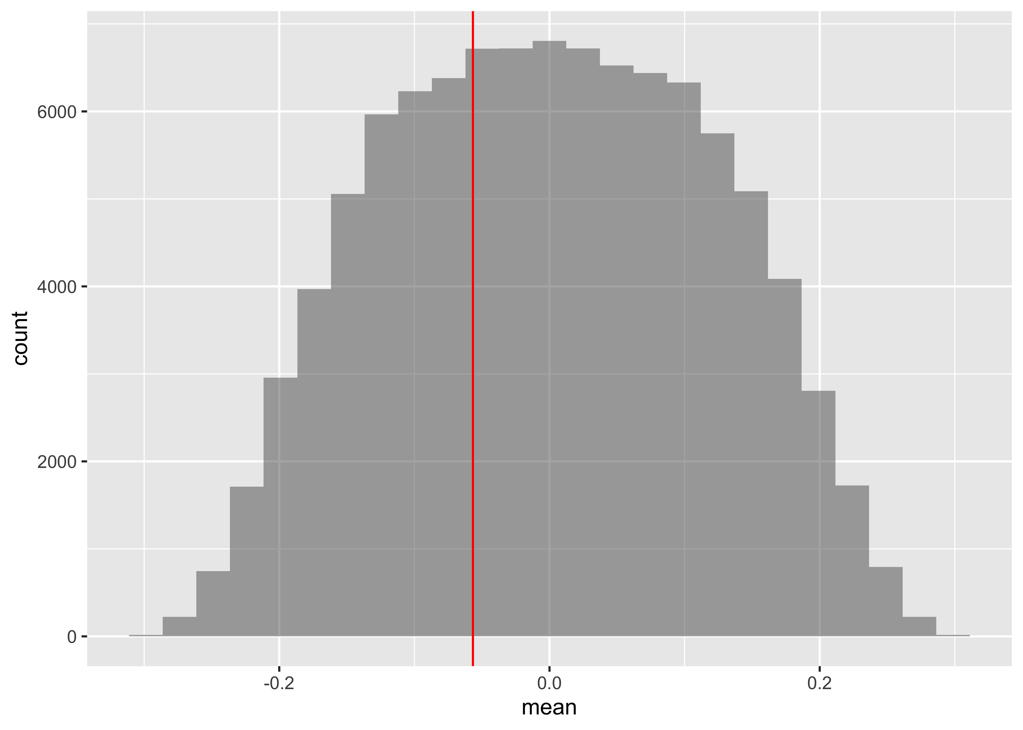
3 Beer integer 0 24.00 30.0 36.00 48 26.20000 11.842064 30 0Let us calculate the observed difference in Hotwings consumption between Males and Females ( Gender)
        F         M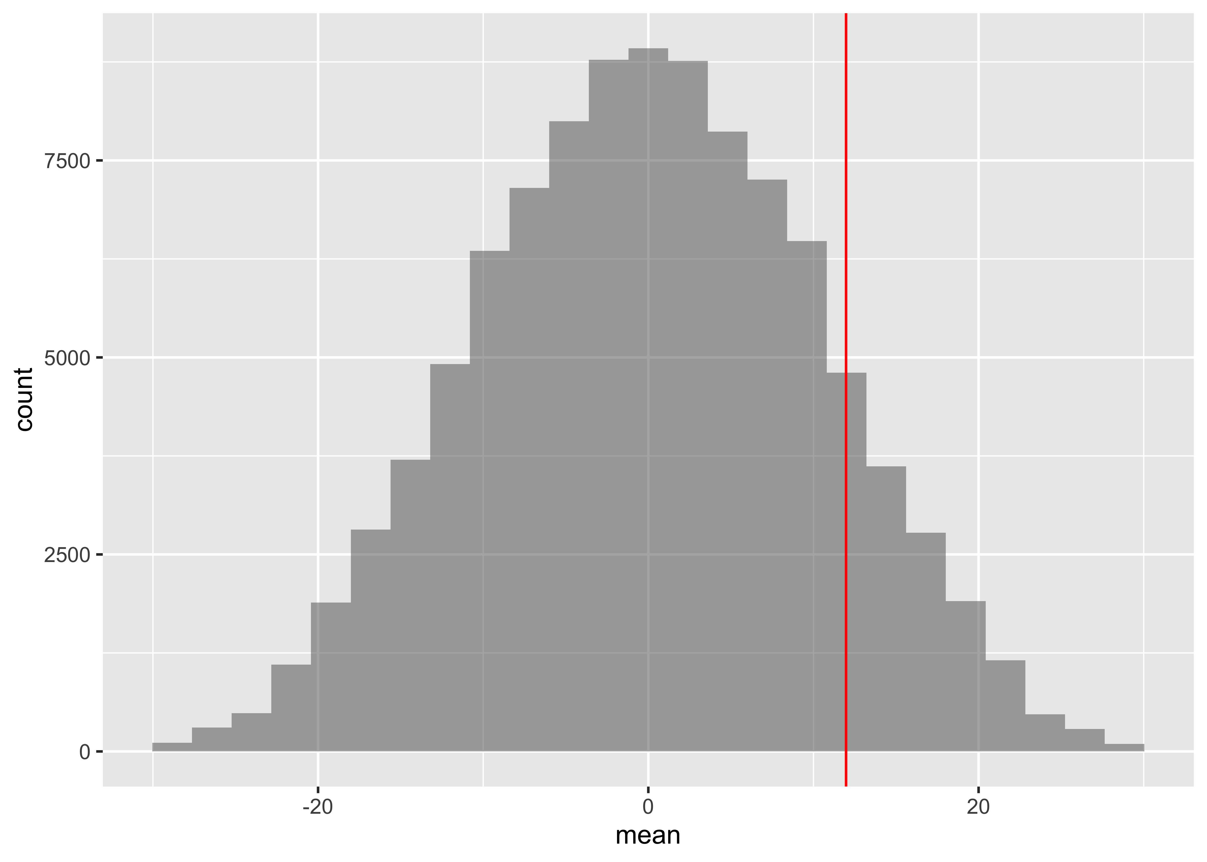
9.333333 14.533333 diffmean
5.2 Show the Code
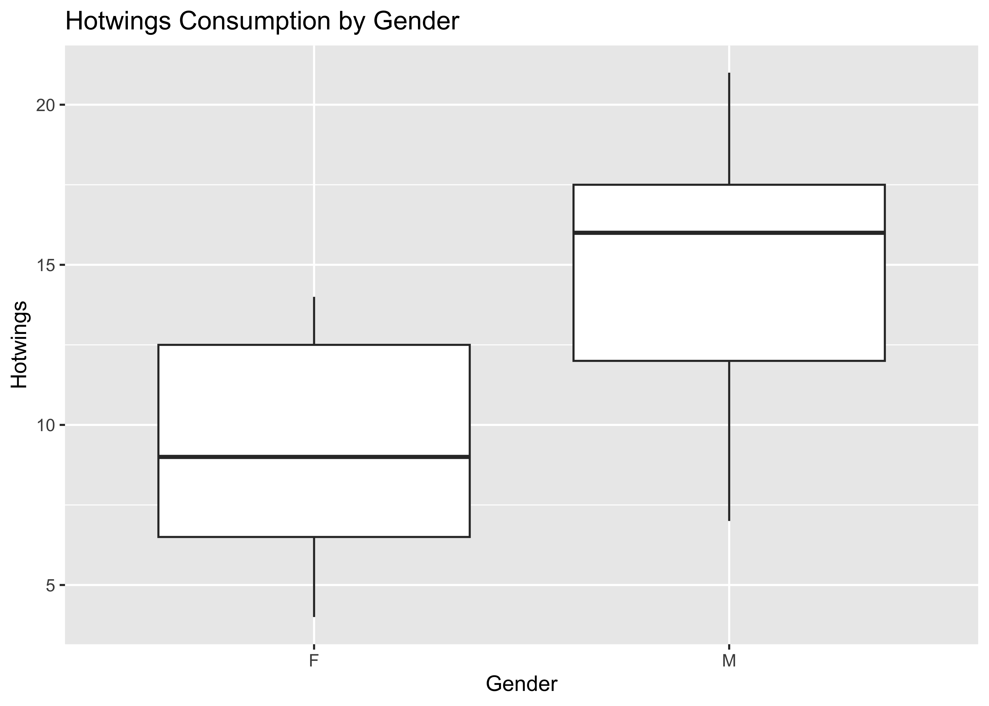
The observed difference in mean consumption of Hotwings between Males and Females is 5.2. Could this have occurred by chance? Here is our formulation of the Hypotheses:
So we perform a Permutation Test to check:
Show the Code
diffmean <dbl> | ||||
|---|---|---|---|---|
| 1 | 0.2666667 | |||
| 2 | -1.6000000 | |||
| 3 | 0.9333333 | |||
| 4 | -0.2666667 | |||
| 5 | -0.9333333 | |||
| 6 | 0.6666667 |
Show the Code
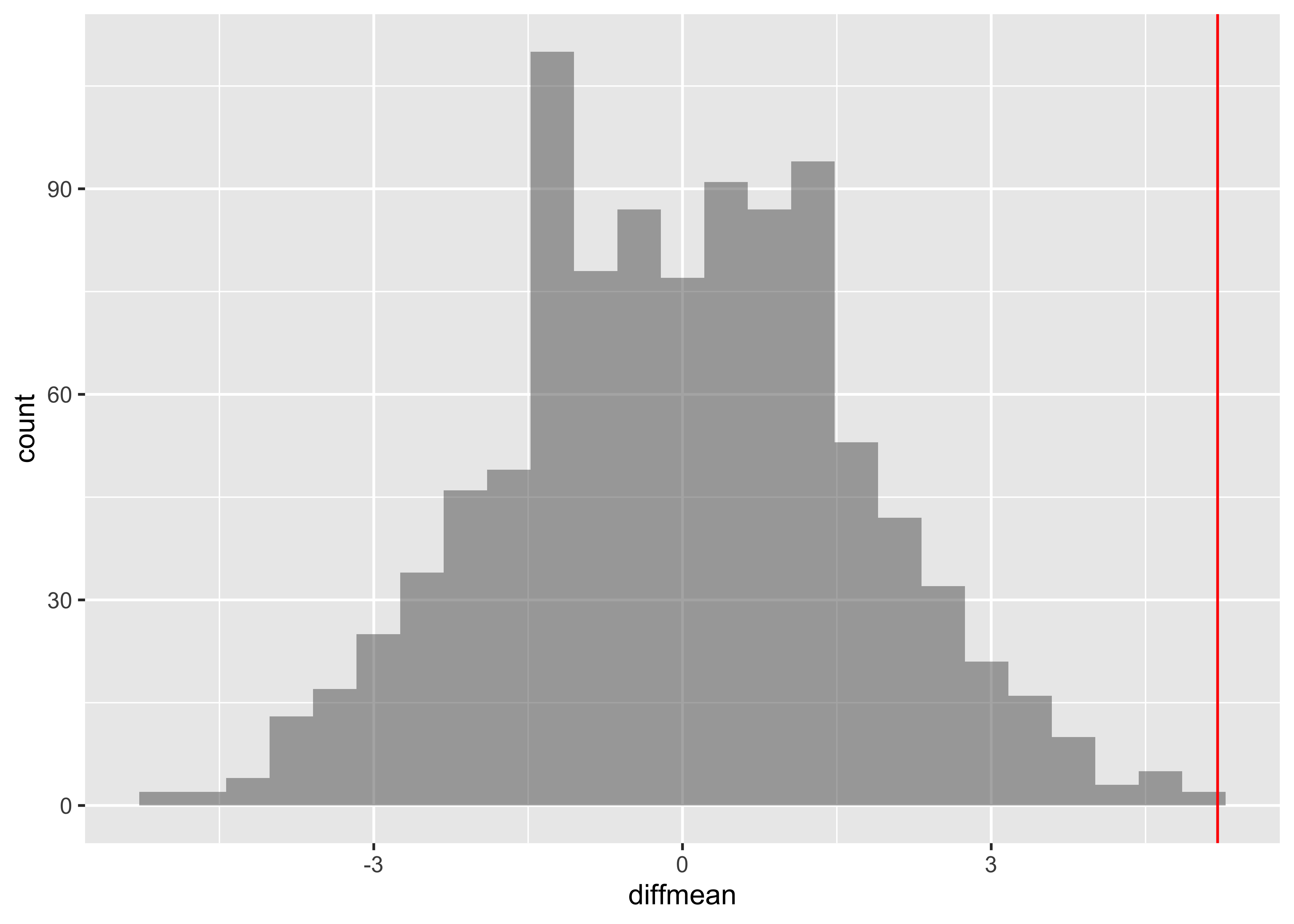
  prop_TRUE
0.000999001
The
To test whether eating more hotwings would lead to increased beer consumption, we need a regression model, which we can again test with a permutation test.
Case Study-2: Verizon
The following example is used throughout this article. Verizon was an Incumbent Local Exchange Carrier (ILEC), responsible for maintaining land-line phone service in certain areas. Verizon also sold long-distance service, as did a number of competitors, termed Competitive Local Exchange Carriers (CLEC). When something went wrong, Verizon was responsible for repairs, and was supposed to make repairs as quickly for CLEC long-distance customers as for their own. The New York Public Utilities Commission (PUC) monitored fairness by comparing repair times for Verizon and different CLECs, for different classes of repairs and time periods. In each case a hypothesis test was performed at the 1% significance level, to determine whether repairs for CLEC’s customers were significantly slower than for Verizon’s customers. There were hundreds of such tests. If substantially more than 1% of the tests were significant, then Verizon would pay large penalties. These tests were performed using t tests; Verizon proposed using permutation tests instead.
Show the Code
categorical variables:
   name     class levels    n missing
1 Group character      2 1687       0
                                   distribution
1 ILEC (98.6%), CLEC (1.4%)

quantitative variables:
  name   class min   Q1 median   Q3   max     mean       sd    n missing
1 Time numeric 0 0.75 3.63 7.35 191.6 8.522009 14.78848 1687 0 CLEC ILEC
16.509130 8.411611 diffmean
-8.09752 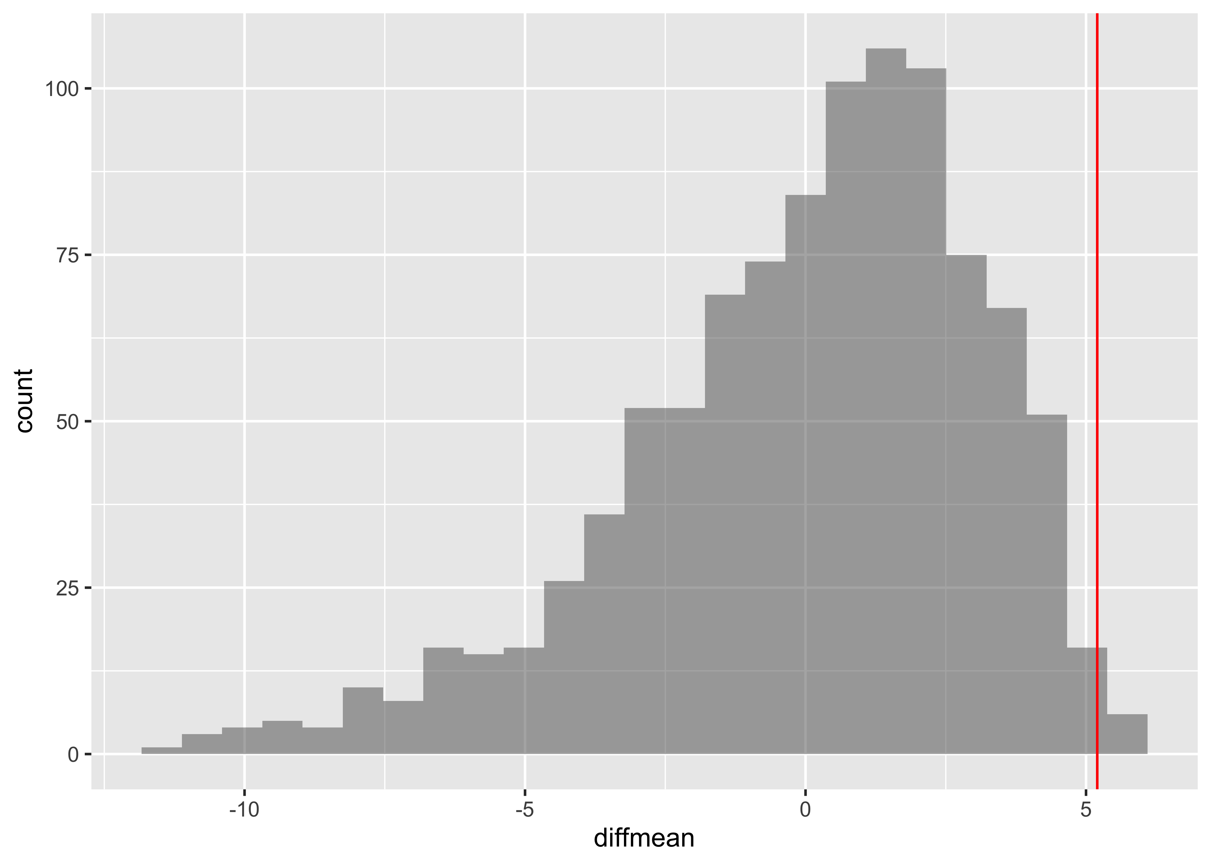
Case Story-3: Recidivism
Do criminals released after a jail term commit crimes again?
Show the Code
categorical variables:
name class levels n missing
1 Gender character 2 17019 3
2 Age character 5 17019 3
3 Age25 character 2 17019 3
4 Offense character 2 17022 0
5 Recid character 2 17022 0
6 Type character 3 17022 0
distribution
1 M (87.7%), F (12.3%)
2 25-34 (36.6%), 35-44 (23.7%) ...
3 Over 25 (81.9%), Under 25 (18.1%)
4 Felony (80.6%), Misdemeanor (19.4%)
5 No (68.4%), Yes (31.6%)
6 No Recidivism (68.4%), New (20.2%) ...
quantitative variables:
name class min Q1 median Q3 max mean sd n missing
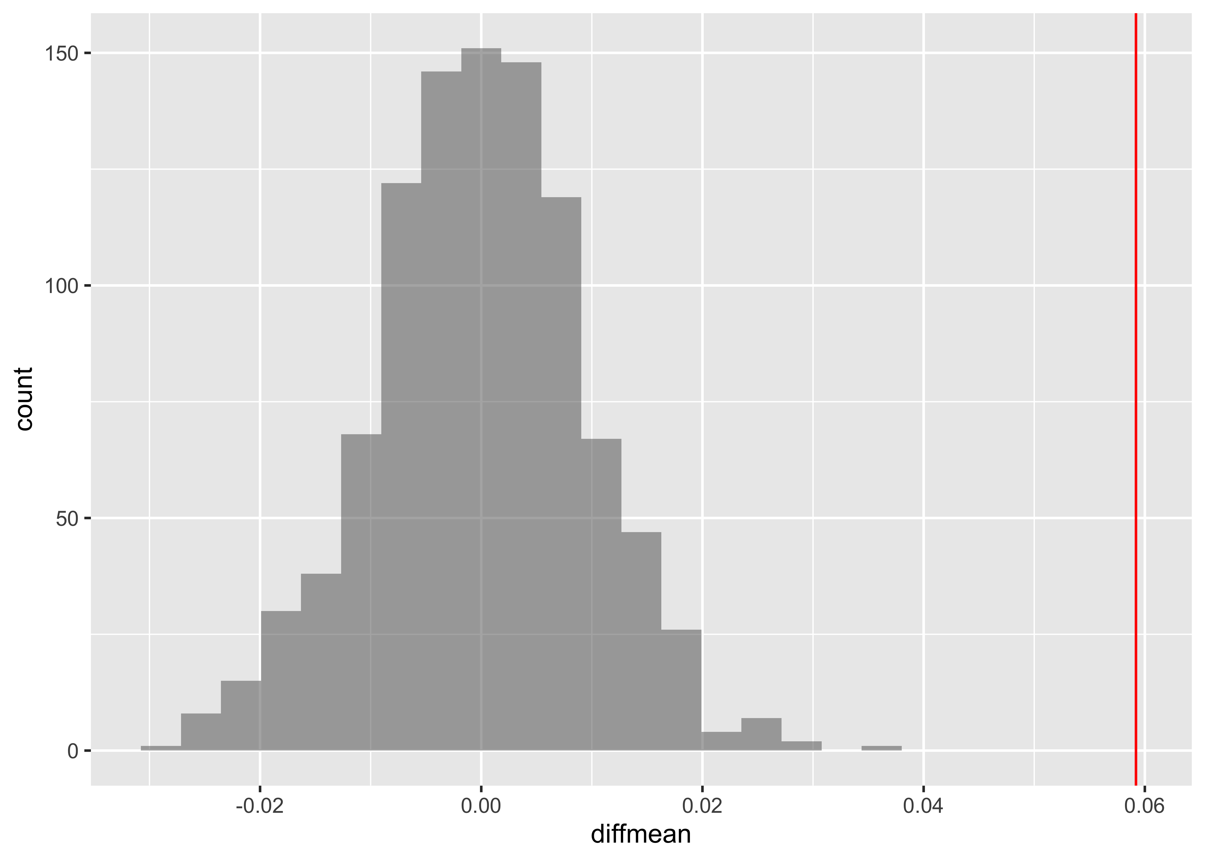
1 Days integer 0 241 418 687 1095 473.3275 283.1393 5386 11636There are some missing values in the variable Age25. The complete.cases command gives the row numbers where values are not missing. We create a new data frame omitting the rows where there is a missing value in the ‘Age25’ variable.
Also, the variable Recid is a factor variable coded “Yes” or “No”. We convert it to a numeric variable of 1’s and 0’s.
Show the Code
  diffmean
0.05919913
Show the Code
Case Study-4: Matched Pairs: Results from a diving championship.
Show the Code
Name <chr> | Country <chr> | Semifinal <dbl> | Final <dbl> | |
|---|---|---|---|---|
| 1 | CHEONG Jun Hoong | Malaysia | 325.50 | 397.50 |
| 2 | SI Yajie | China | 382.80 | 396.00 |
| 3 | REN Qian | China | 367.50 | 391.95 |
| 4 | KIM Mi Rae | North Korea | 346.00 | 385.55 |
| 5 | WU Melissa | Australia | 318.70 | 370.20 |
| 6 | KIM Kuk Hyang | North Korea | 360.85 | 360.00 |
categorical variables:
     name     class levels  n missing
1    Name character     12 12       0
2 Country character      8 12       0
                                   distribution
1  SI Yajie (8.3%) ...
2 Canada (16.7%), China (16.7%) ...

quantitative variables:
       name   class    min       Q1  median      Q3   max    mean       sd  n
1 Semifinal numeric 313.70 322.2000 325.625 356.575 382.8 338.500 22.94946 12
2     Final numeric 283.35 318.5875 358.925 387.150 397.5 350.475 40.02204 12
  missing
1       0
2       0
The data is made up of paired observations per swimmer. So we need to take the difference between the two swim records for each swimmer and then shuffle the differences to either polarity. Another way to look at this is to shuffle the records between Semifinal and Final on a per Swimmer basis.
Name <chr> | Country <chr> | Semifinal <dbl> | Final <dbl> | |
|---|---|---|---|---|
| CHEONG Jun Hoong | Malaysia | 325.50 | 397.50 | |
| SI Yajie | China | 382.80 | 396.00 | |
| REN Qian | China | 367.50 | 391.95 | |
| KIM Mi Rae | North Korea | 346.00 | 385.55 | |
| WU Melissa | Australia | 318.70 | 370.20 | |
| KIM Kuk Hyang | North Korea | 360.85 | 360.00 | |
| ITAHASHI Minami | Japan | 313.70 | 357.85 | |
| BENFEITO Meaghan | Canada | 355.15 | 331.40 | |
| PAMG Pandelela | Malaysia | 322.75 | 322.40 | |
| CHAMANDY Olivia | Canada | 320.55 | 307.15 |
  318.7-313.7  320.55-318.7 322.75-320.55  325.5-322.75  325.75-325.5
       12.350       -63.050         5.225        85.125      -114.150
   346-325.75    355.15-346 360.85-355.15  367.5-360.85   382.8-367.5
102.200 -54.150 28.600 31.950 4.050 [1] 11.975 [1] 1 1 1 1 1 1 -1 -1 -1 -1 -1 -1Show the Code
mean <dbl> | ||||
|---|---|---|---|---|
| 1 | 3.225000 | |||
| 2 | -12.941667 | |||
| 3 | -1.983333 | |||
| 4 | -4.641667 | |||
| 5 | -5.625000 | |||
| 6 | -13.291667 |
Show the Code
Case Study #5: Flight Delays
LaGuardia Airport (LGA) is one of three major airports that serves the New York City metropolitan area. In 2008, over 23 million passengers and over 375 000 planes flew in or out of LGA. United Airlines and America Airlines are two major airlines that schedule services at LGA. The data set FlightDelays contains information on all 4029 departures of these two airlines from LGA during May and June 2009.
Show the Code
categorical variables:
         name     class levels    n missing
1     Carrier character      2 4029       0
2 Destination character      7 4029       0
3  DepartTime character      5 4029       0
4         Day character      7 4029       0
5       Month character      2 4029       0
6   Delayed30 character      2 4029       0
                                   distribution
1 AA (72.1%), UA (27.9%)
2 ORD (44.3%), DFW (22.8%), MIA (15.1%) ...
3 8-Noon (26.1%), Noon-4pm (26%) ...
4 Fri (15.8%), Mon (15.6%), Tue (15.6%) ...
5 June (50.4%), May (49.6%)
6 No (85.2%), Yes (14.8%)

quantitative variables:
          name   class min   Q1 median   Q3  max      mean         sd    n
1           ID integer   1 1008   2015 3022 4029 2015.0000 1163.21645 4029
2     FlightNo integer  71  371    691  787 2255  827.1035  551.30939 4029
3 FlightLength integer  68  155    163  228  295  185.3011   41.78783 4029
4        Delay integer -19   -6     -3    5  693   11.7379   41.63050 4029
  missing
1       0
2       0
3       0
4       0
The variables in the flightDelays dataset are:
| Variable | Description |
|---|---|
| Carrier | UA=United Airlines, AA=American Airlines |
| FlightNo | Flight number |
| Destination | Airport code |
| DepartTime | Scheduled departure time in 4 h intervals |
| Day | Day of the Week |
| Month | May or June |
| Delay | Minutes flight delayed (negative indicates early departure) |
| Delayed30 | Departure delayed more than 30 min? Yes or No |
| FlightLength | Length of time of flight (minutes) |
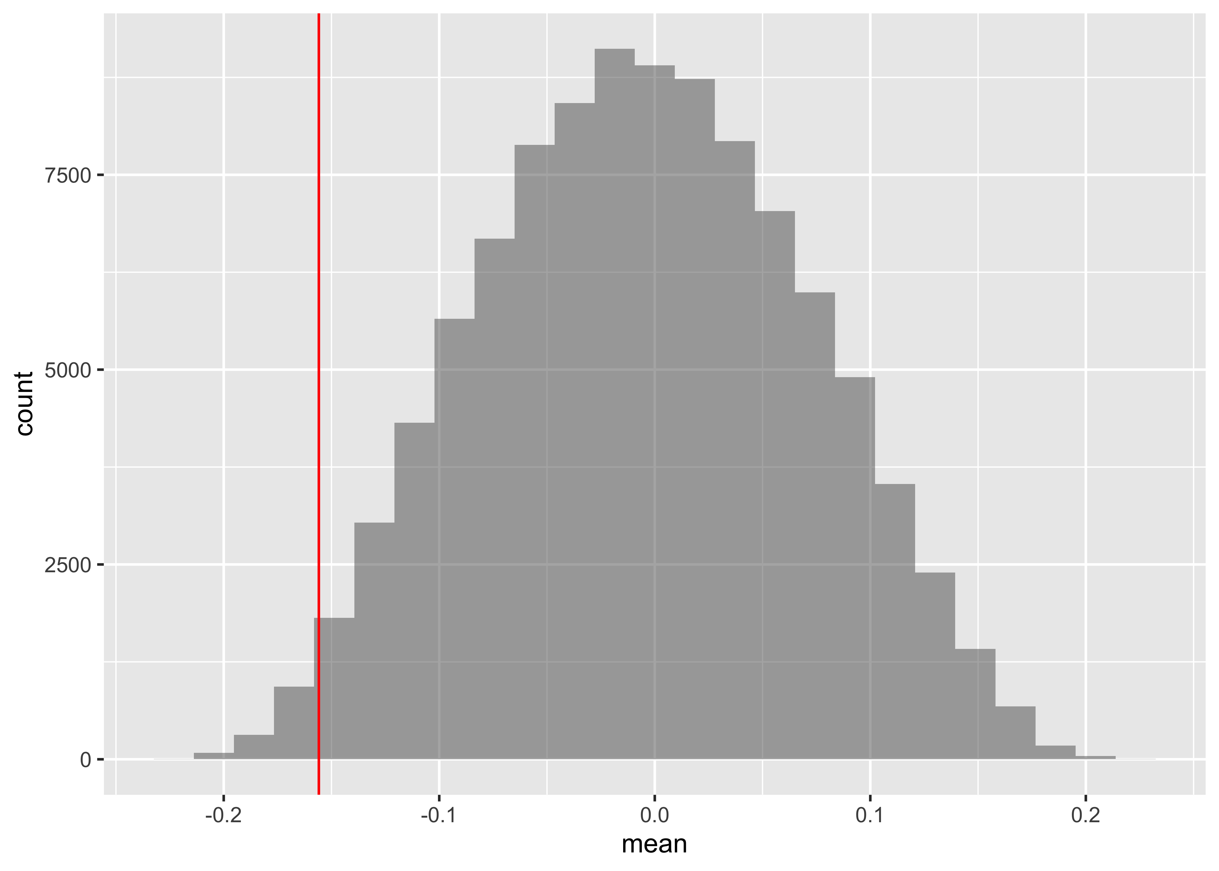
- Let us compute the proportion of times that each carrier’s flights was delayed more than 20 min. We will conduct a two-sided test to see if the difference in these proportions is statistically significant.
prop_TRUE.AA prop_TRUE.UA
0.1713696 0.2226180 diffprop
0.05124841 We see carrier AA has a 17.13% chance of delays>= 20, while UA has 22.26% chance. The difference is 5.12%. Is this statistically significant? We take the Delays for both Carriers and perform a permutation test by shuffle on the carrier variable:
Show the Code
diffprop <dbl> | ||||
|---|---|---|---|---|
| 1 | 0.004334080 | |||
| 2 | -0.008011796 | |||
| 3 | -0.010480971 | |||
| 4 | -0.012950146 | |||
| 5 | -0.019123084 | |||
| 6 | 0.009272430 |
Show the Code
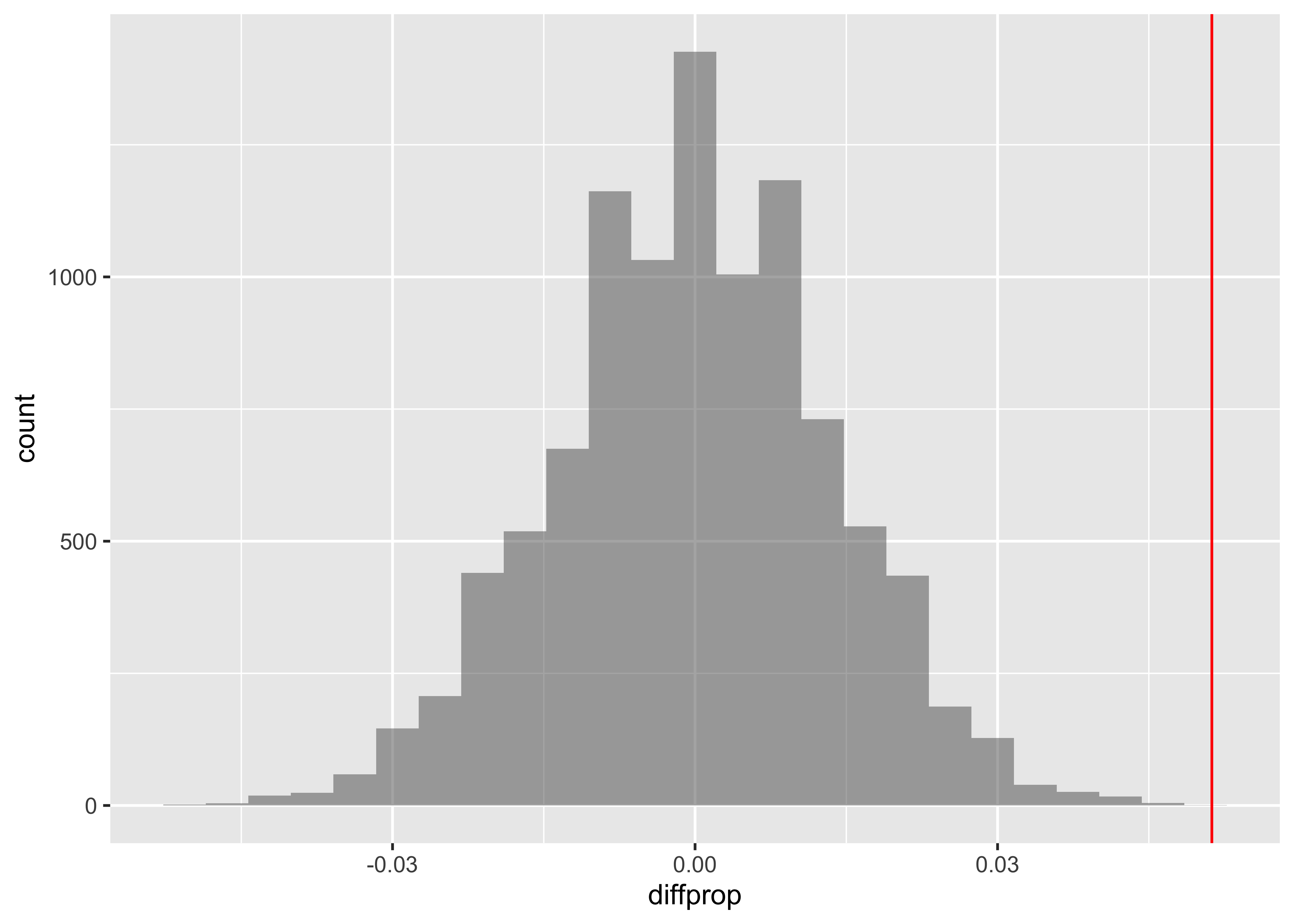
It appears that the difference indelay times is significant. We can compute the p-value based on this test:
which is very small. Hence we reject the null Hypothesis that there is no difference between carriers on delay times.
- Compute the variance in the flight delay lengths for each carrier. Conduct a test to see if the variance for United Airlines differs from that of American Airlines.
      AA       UA
1606.457 2037.525
Show the Code
      UA
431.0677
The difference in variances in Delay between the two carriers is shuffle the Carrier variable:
Show the Code
UA <dbl> | ||||
|---|---|---|---|---|
| 1 | -227.87234 | |||
| 2 | 457.59171 | |||
| 3 | 245.72245 | |||
| 4 | -64.84376 | |||
| 5 | -137.07124 | |||
| 6 | 591.88889 |
Show the Code
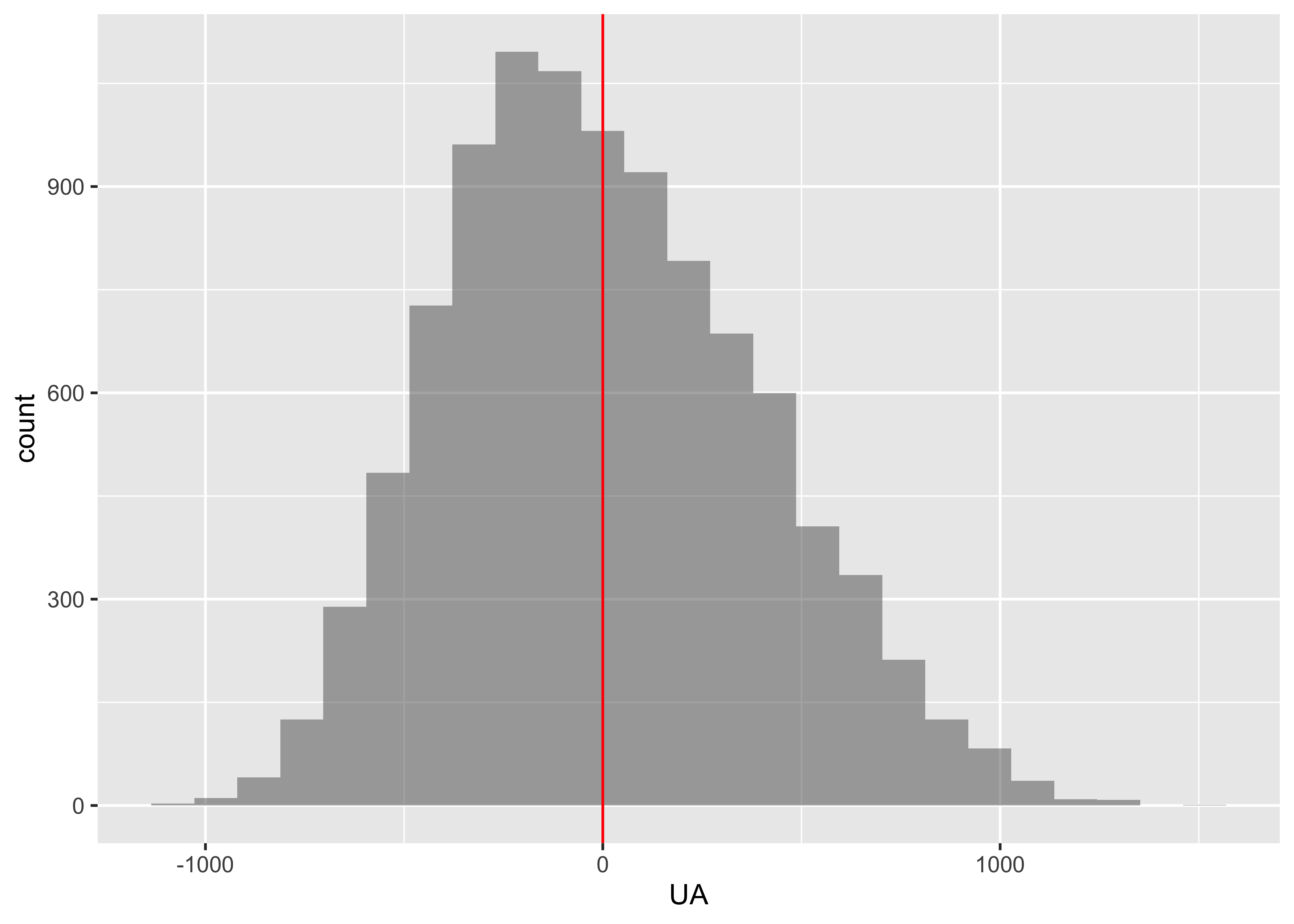
[1] 0.3032Clearly there is no case for a significant difference in variances!
Case Study #6: Walmart vs Target
Is there a difference in the price of groceries sold by the two retailers Target and Walmart? The data set Groceries contains a sample of grocery items and their prices advertised on their respective web sites on one specific day.
- Inspect the data set, then explain why this is an example of matched pairs data.
- Compute summary statistics of the prices for each store.
- Conduct a permutation test to determine whether or not there is a difference in the mean prices.
- Create a
histogrambar-chart of the difference in prices. What is unusual about Quaker Oats Life cereal? - Redo the hypothesis test without this observation. Do you reach the same conclusion?
Show the Code
Product <chr> | Size <chr> | Target <dbl> | Walmart <dbl> | |
|---|---|---|---|---|
| 1 | Kellogg NutriGrain Bars | 8 bars | 2.50 | 2.78 |
| 2 | Quaker Oats Life Cereal Original | 18oz | 3.19 | 6.01 |
| 3 | General Mills Lucky Charms | 11.50z | 3.19 | 2.98 |
| 4 | Quaker Oats Old Fashioned | 18oz | 2.82 | 2.68 |
| 5 | Nabisco Oreo Cookies | 14.3oz | 2.99 | 2.98 |
| 6 | Nabisco Chips Ahoy | 13oz | 2.64 | 1.98 |
categorical variables:
     name     class levels  n missing
1 Product character     30 30       0
2    Size character     24 30       0
                                   distribution
1 Annie's Macaroni & Cheese (3.3%) ...
2 18oz (10%), 12oz (6.7%) ...

quantitative variables:
     name   class  min     Q1 median    Q3  max     mean       sd  n missing
1  Target numeric 0.99 1.8275  2.545 3.140 7.99 2.762333 1.582128 30       0
2 Walmart numeric 1.00 1.7600  2.340 2.955 6.98 2.705667 1.560211 30       0
We see that the comparison is to be made between two prices for the same product, and hence this is one more example of paired data, as in Case Study #4. Let us plot the prices for the products:
Show the Code
gf_col(
  data = groceries,
  Target ~ Product,
  fill = "#0073C299",
  width = 0.5
) %>%
  gf_col(
    data = groceries,
    -Walmart ~ Product,
    fill = "#EFC00099",
    ylab = "Prices",
    width = 0.5
  ) %>%
  gf_col(
    data = groceries %>% filter(Product == "Quaker Oats Life Cereal Original"),
    -Walmart ~ Product,
    fill = "red",
    width = 0.5
  ) %>%
  gf_theme(theme_classic()) %>%
  gf_theme(ggplot2::theme(axis.text.x = element_text(
    size = 8,
    face = "bold",
    vjust = 0,
    hjust = 1
  ))) %>%
  gf_theme(ggplot2::coord_flip())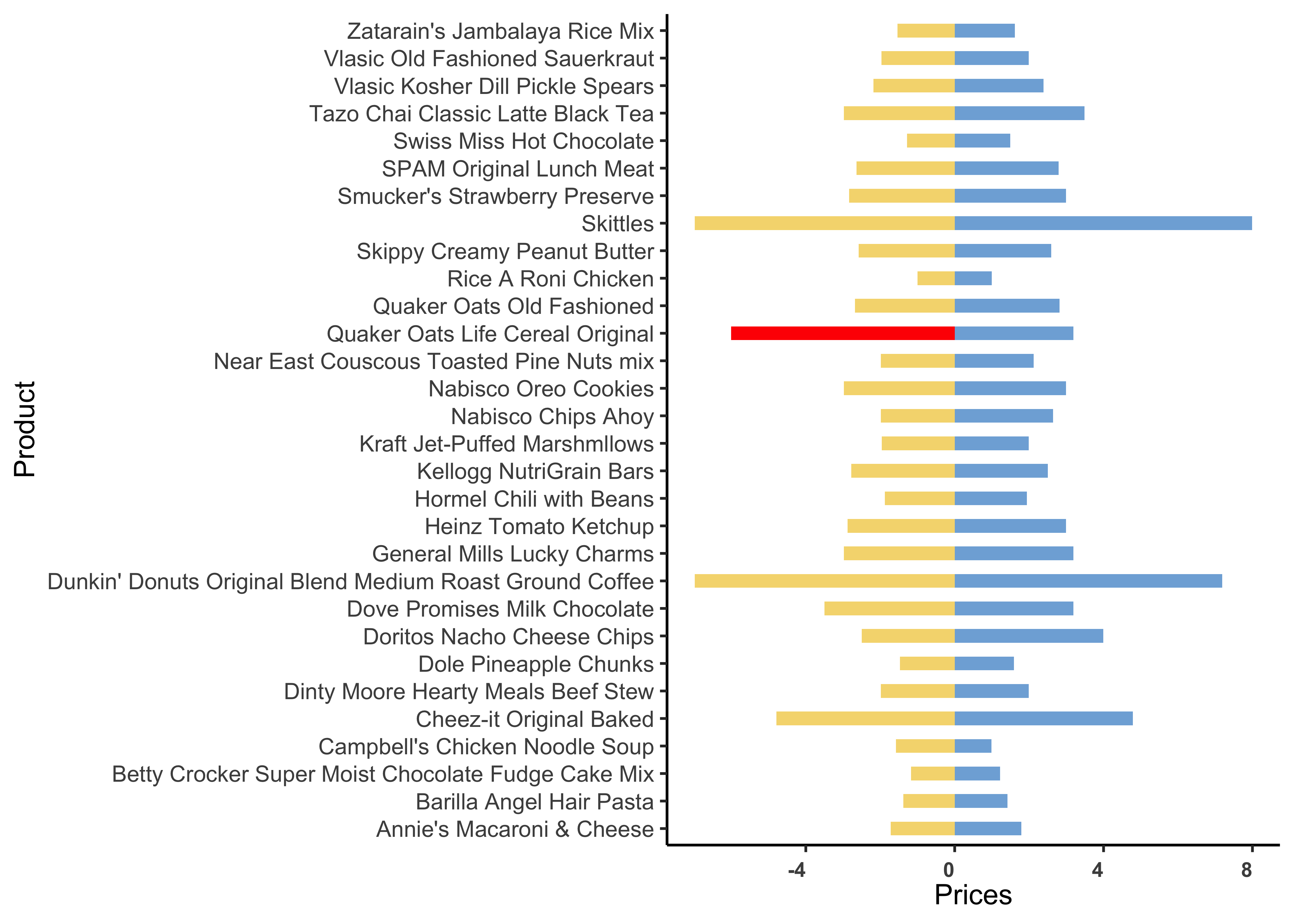
We see that the price difference between Walmart and Target prices is highest for the Product named Quaker Oats Life Cereal Original. Let us check the mean difference in prices:
   1-0.99    1.22-1 1.42-1.22 1.49-1.42 1.59-1.49 1.62-1.59 1.79-1.62 1.94-1.79
-0.580000  0.170000  0.210000 -0.100000  0.190000  0.070000  0.180000  0.160000
1.99-1.94 2.12-1.99 2.39-2.12  2.5-2.39  2.59-2.5 2.64-2.59 2.79-2.64 2.82-2.79
 0.090000  0.010000  0.200000  0.600000 -0.200000 -0.600000  0.660000  0.040000
2.99-2.82 3.19-2.99 3.49-3.19 3.99-3.49 4.79-3.99 7.19-4.79 7.99-7.19
0.220000 1.263333 -1.183333 -0.480000 2.290000 2.190000 0.000000 [1] -0.05666667Let us perform the pair-wise permutation test on prices, by shuffling the two store names:
 [1]  1  1  1  1  1  1  1  1  1  1  1  1  1  1  1 -1 -1 -1 -1 -1 -1 -1 -1 -1 -1
[26] -1 -1 -1 -1 -1
Show the Code
mean <dbl> | ||||
|---|---|---|---|---|
| 1 | 0.1173333333 | |||
| 2 | 0.0966666667 | |||
| 3 | 0.0113333333 | |||
| 4 | 0.0006666667 | |||
| 5 | -0.0973333333 | |||
| 6 | -0.1020000000 |
Show the Code
[1] 0Does not seem to be any significant difference in prices…
Suppose we knock off the Quaker Cereal data item…
[1] 2Product <chr> | Size <chr> | Target <dbl> | Walmart <dbl> | |
|---|---|---|---|---|
| 1 | Kellogg NutriGrain Bars | 8 bars | 2.50 | 2.78 |
| 3 | General Mills Lucky Charms | 11.50z | 3.19 | 2.98 |
| 4 | Quaker Oats Old Fashioned | 18oz | 2.82 | 2.68 |
| 5 | Nabisco Oreo Cookies | 14.3oz | 2.99 | 2.98 |
| 6 | Nabisco Chips Ahoy | 13oz | 2.64 | 1.98 |
| 7 | Doritos Nacho Cheese Chips | 10oz | 3.99 | 2.50 |
| 8 | Cheez-it Original Baked | 21oz | 4.79 | 4.79 |
| 9 | Swiss Miss Hot Chocolate | 10 count | 1.49 | 1.28 |
| 10 | Tazo Chai Classic Latte Black Tea | 32 oz | 3.49 | 2.98 |
| 11 | Annie's Macaroni & Cheese | 6oz | 1.79 | 1.72 |
Show the Code
[1] -0.1558621Show the Code
mean <dbl> | ||||
|---|---|---|---|---|
| 1 | -0.02344828 | |||
| 2 | -0.10068966 | |||
| 3 | -0.03655172 | |||
| 4 | 0.09862069 | |||
| 5 | -0.14068966 | |||
| 6 | -0.02068966 |
Show the Code
[1] 0.01499Case Study 7: Proportions between Categorical Variables
Let us try a dataset with Qualitative / Categorical data. This is a General Social Survey dataset, and we have people with different levels of Education stating their opinion on the Death Penalty. We want to know if these two Categorical variables have a correlation, i.e. can the opinions in favour of the Death Penalty be explained by the Education level?
Since data is Categorical, we need to take counts in a table, and then implement a chi-square test. In the test, we will permute the Education variable to see if we can see how significant its effect size is.
Show the Code
categorical variables:
            name     class levels    n missing
1         Region character      7 2765       0
2         Gender character      2 2765       0
3           Race character      3 2765       0
4      Education character      5 2760       5
5        Marital character      5 2765       0
6       Religion character     13 2746      19
7          Happy character      3 1369    1396
8         Income character     24 1875     890
9       PolParty character      8 2729      36
10      Politics character      7 1331    1434
11     Marijuana character      2  851    1914
12  DeathPenalty character      2 1308    1457
13        OwnGun character      3  924    1841
14        GunLaw character      2  916    1849
15 SpendMilitary character      3 1324    1441
16     SpendEduc character      3 1343    1422
17      SpendEnv character      3 1322    1443
18      SpendSci character      3 1266    1499
19        Pres00 character      5 1749    1016
20      Postlife character      2 1211    1554
                                    distribution
1  North Central (24.7%) ...
2  Female (55.6%), Male (44.4%)
3  White (79.1%), Black (14.8%) ...
4  HS (53.8%), Bachelors (16.1%) ...
5  Married (45.9%), Never Married (25.6%) ...
6  Protestant (53.2%), Catholic (24.5%) ...
7  Pretty happy (57.3%) ...
8  40000-49999 (9.1%) ...
9  Ind (19.3%), Not Str Dem (18.9%) ...
10 Moderate (39.2%), Conservative (15.8%) ...
11 Not legal (64%), Legal (36%)
12 Favor (68.7%), Oppose (31.3%)
13 No (65.5%), Yes (33.5%) ...
14 Favor (80.5%), Oppose (19.5%)
15 About right (46.5%) ...
16 Too little (73.9%) ...
17 Too little (60%) ...
18 About right (49.7%) ...
19 Bush (50.6%), Gore (44.7%) ...
20 Yes (80.5%), No (19.5%)

quantitative variables:
  name   class min  Q1 median   Q3  max mean       sd    n missing
1   ID integer   1 692   1383 2074 2765 1383 798.3311 2765       0
Note how all variables are Categorical !! Education has five levels:
Education <chr> | n <int> | |||
|---|---|---|---|---|
| Bachelors | 443 | |||
| Graduate | 230 | |||
| HS | 1485 | |||
| Jr Col | 202 | |||
| Left HS | 400 | |||
| NA | 5 |
DeathPenalty <chr> | n <int> | |||
|---|---|---|---|---|
| Favor | 899 | |||
| Oppose | 409 | |||
| NA | 1457 |
Let us drop NA entries in Education and Death Penalty. And set up a table for the chi-square test.
Show the Code
[1] 1307 2Show the Code
gss_summary <- gss2002 %>%
  mutate(
    Education = factor(
      Education,
      levels = c("Bachelors", "Graduate", "Jr Col", "HS", "Left HS"),
      labels = c("Bachelors", "Graduate", "Jr Col", "HS", "Left HS")
    ),
    DeathPenalty = as.factor(DeathPenalty)
  ) %>%
  group_by(Education, DeathPenalty) %>%
  summarise(count = n()) %>% # This is good for a chisq test

  # Add two more columns to faciltate mosaic/Marrimekko Plot
  #
  mutate(
    edu_count = sum(count),
    edu_prop = count / sum(count)
  ) %>%
  ungroup()

gss_summaryEducation <fct> | DeathPenalty <fct> | count <int> | edu_count <int> | edu_prop <dbl> |
|---|---|---|---|---|
| Bachelors | Favor | 135 | 206 | 0.6553398 |
| Bachelors | Oppose | 71 | 206 | 0.3446602 |
| Graduate | Favor | 64 | 114 | 0.5614035 |
| Graduate | Oppose | 50 | 114 | 0.4385965 |
| Jr Col | Favor | 71 | 87 | 0.8160920 |
| Jr Col | Oppose | 16 | 87 | 0.1839080 |
| HS | Favor | 511 | 711 | 0.7187060 |
| HS | Oppose | 200 | 711 | 0.2812940 |
| Left HS | Favor | 117 | 189 | 0.6190476 |
| Left HS | Oppose | 72 | 189 | 0.3809524 |
Show the Code
# We can plot a heatmap-like `mosaic chart` for this table, using `ggplot`:
# https://stackoverflow.com/questions/19233365/how-to-create-a-marimekko-mosaic-plot-in-ggplot2

ggplot(data = gss_summary, aes(x = Education, y = edu_prop)) +
  geom_bar(aes(width = edu_count, fill = DeathPenalty), stat = "identity", position = "fill", colour = "black") +
  geom_text(aes(label = scales::percent(edu_prop)), position = position_stack(vjust = 0.5)) +


  # if labels are desired
  facet_grid(~Education, scales = "free_x", space = "free_x") +
  theme(scale_fill_brewer(palette = "RdYlGn")) +
  # theme(panel.spacing.x = unit(0, "npc")) + # if no spacing preferred between bars
  theme_void()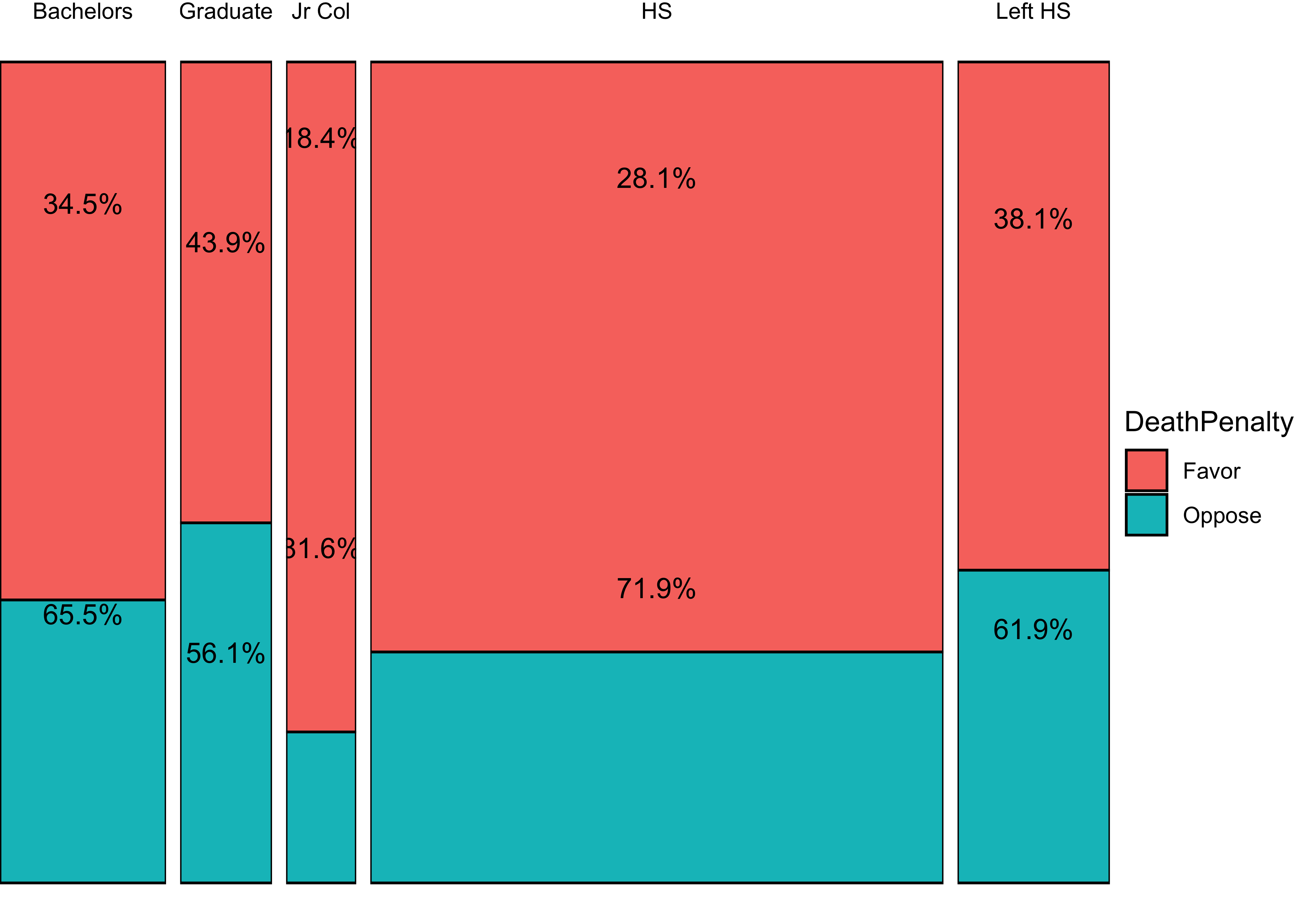
Let us now perform the base chisq test: We need a table and then the chisq test:
            Education
DeathPenalty Bachelors Graduate  HS Jr Col Left HS
      Favor        135       64 511     71     117
      Oppose        71       50 200     16      72
Show the Code
X.squared
 23.45093
Show the Code
    Pearson's Chi-squared test

data:  tally(DeathPenalty ~ Education, data = gss2002)
X-squared = 23.451, df = 4, p-value = 0.0001029
We should now repeat the test with permutations on Education:
Show the Code
X.squared <dbl> | df <int> | p.value <dbl> | method <chr> | alternative <lgl> | data <chr> | .row <int> | .index <dbl> | |
|---|---|---|---|---|---|---|---|---|
| X-squared...1 | 1.650073 | 4 | 0.79976563 | Pearson's Chi-squared test | NA | tally(DeathPenalty ~ shuffle(Education), data = gss2002) | 1 | 1 |
| X-squared...2 | 3.474383 | 4 | 0.48178407 | Pearson's Chi-squared test | NA | tally(DeathPenalty ~ shuffle(Education), data = gss2002) | 1 | 2 |
| X-squared...3 | 9.958848 | 4 | 0.04112662 | Pearson's Chi-squared test | NA | tally(DeathPenalty ~ shuffle(Education), data = gss2002) | 1 | 3 |
| X-squared...4 | 2.059001 | 4 | 0.72490775 | Pearson's Chi-squared test | NA | tally(DeathPenalty ~ shuffle(Education), data = gss2002) | 1 | 4 |
| X-squared...5 | 3.278128 | 4 | 0.51240509 | Pearson's Chi-squared test | NA | tally(DeathPenalty ~ shuffle(Education), data = gss2002) | 1 | 5 |
| X-squared...6 | 1.211568 | 4 | 0.87619044 | Pearson's Chi-squared test | NA | tally(DeathPenalty ~ shuffle(Education), data = gss2002) | 1 | 6 |
Show the Code
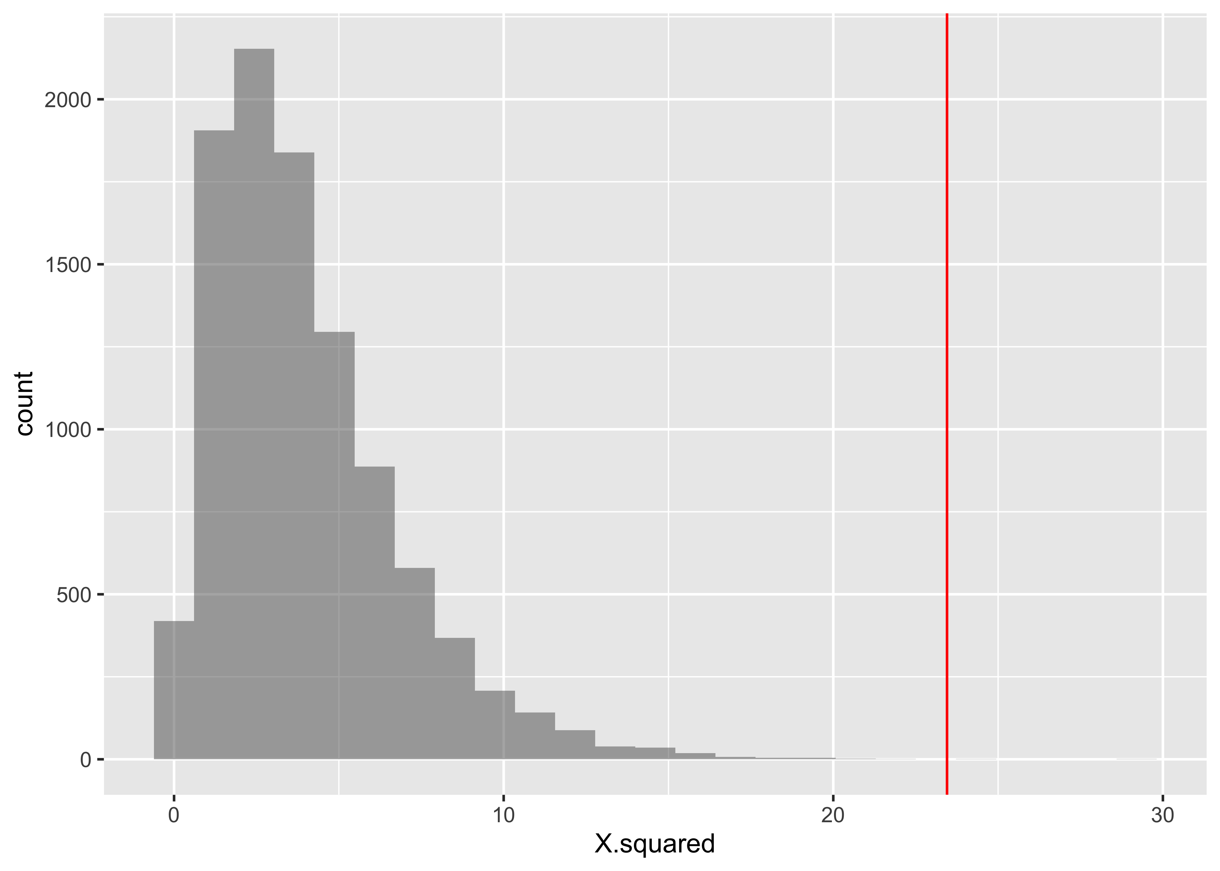
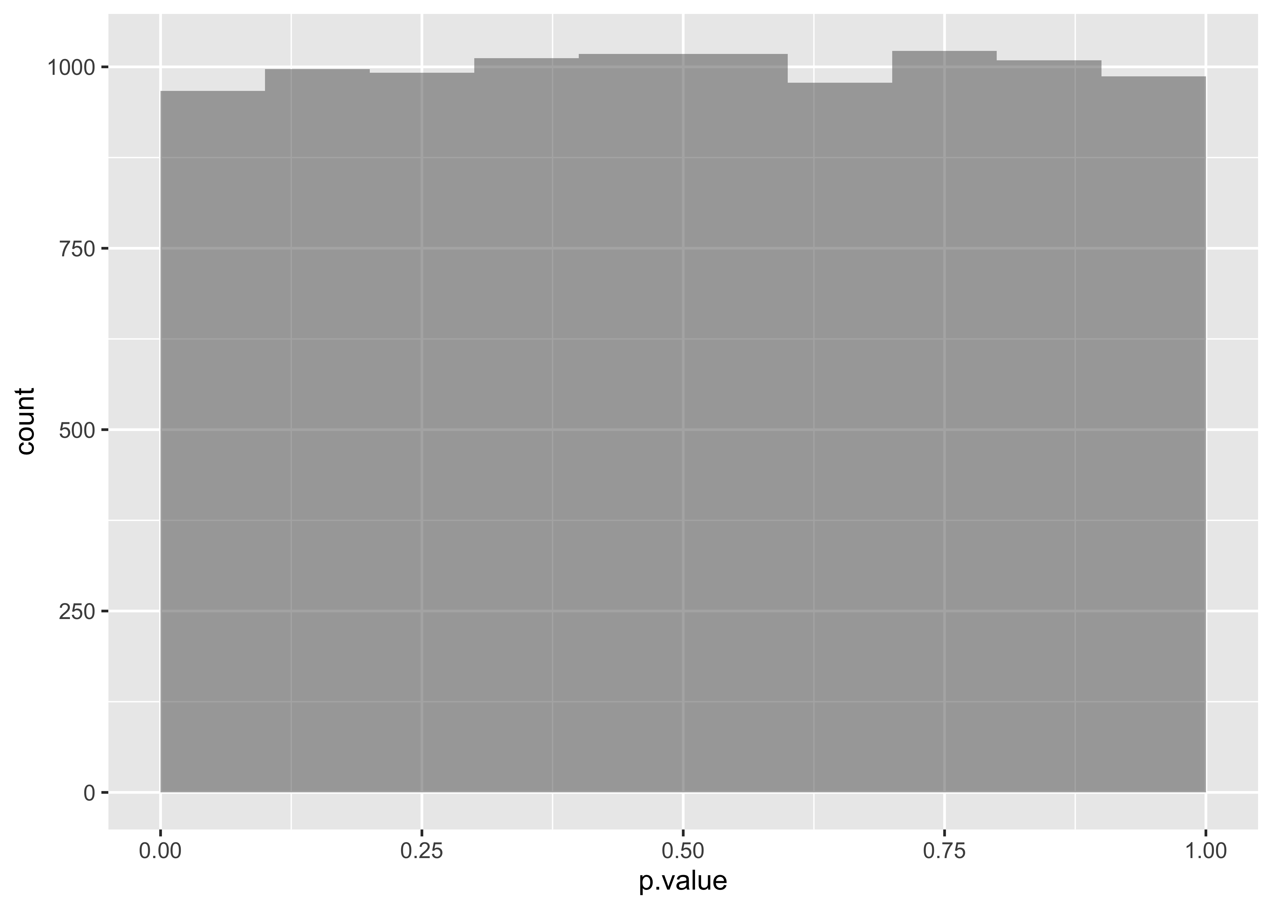
So we would conclude that Education has a significant effect on DeathPenalty opinion!