Where does Data come from, what does it look like
This tutorial uses web-r that allows you to run all code within your browser, on all devices. Most code chunks herein are formatted in a tabbed structure ( like in an old-fashioned library) with duplicated code. The tabs in front have regular R code that will work when copy-pasted in your RStudio session. The tab “behind” has the web-R code that can work directly in your browser, and can be modified as well. The R code is also there to make sure you have original code to go back to, when you have made several modifications to the code on the web-r tabs and need to compare your code with the original!
Keyboard Shortcuts
- Run selected code using either:
- macOS: ⌘ + ↩︎/Return
- Windows/Linux: Ctrl + ↩︎/Enter
- Run the entire code by clicking the “Run code” button or pressing Shift+↩︎.
All embedded figures are displayed full-screen when clicked.
“Difficulties strengthen the mind, as labor does the body.”
— Seneca
Plot Fonts and Theme
Show the Code
```{r}
#| label: plot-theme
#| code-fold: true
#| messages: false
#| warning: false

library(showtext)
font_add(family = "Alegreya", regular = "../../../../fonts/Alegreya/Alegreya-Regular.ttf")
font_add(family = "Roboto Condensed", regular = "../../../../fonts/RobotoCondensed-Regular.ttf")
showtext_auto(enable = TRUE) # enable showtext
##
theme_custom <- function() {
  font <- "Alegreya" # assign font family up front

  theme_classic(base_size = 14) %+replace% # replace elements we want to change

    theme(
      text = element_text(family = font), # set base font family

      # text elements
      plot.title = element_text( # title
        family = "Alegreya", # set font family
        size = 18, # set font size
        face = "bold", # bold typeface
        hjust = 0, # left align
        margin = margin(t = 5, r = 0, b = 5, l = 0)
      ), # margin
      plot.title.position = "plot",
      plot.subtitle = element_text( # subtitle
        family = "Alegreya", # font family
        size = 14, # font size
        hjust = 0, # left align
        margin = margin(t = 5, r = 0, b = 10, l = 0)
      ), # margin

      plot.caption = element_text( # caption
        family = "Alegreya", # font family
        size = 9, # font size
        hjust = 1
      ), # right align

      plot.caption.position = "plot", # right align

      axis.title = element_text( # axis titles
        family = "Roboto Condensed", # font family
        size = 12
      ), # font size

      axis.text = element_text( # axis text
        family = "Roboto Condensed", # font family
        size = 9
      ), # font size

      axis.text.x = element_text( # margin for axis text
        margin = margin(5, b = 10)
      )

      # since the legend often requires manual tweaking
      # based on plot content, don't define it here
    )
}

## Use available fonts in ggplot text geoms too!
update_geom_defaults(geom = "text", new = list(
  family = "Roboto Condensed",
  face = "plain",
  size = 3.5,
  color = "#2b2b2b"
))

## Set the theme
theme_set(new = theme_custom())
```
Where does Data come from?
We will need to form a basic understanding of basic scientific enterprise. Let us look at the slides. (Also embedded below!)
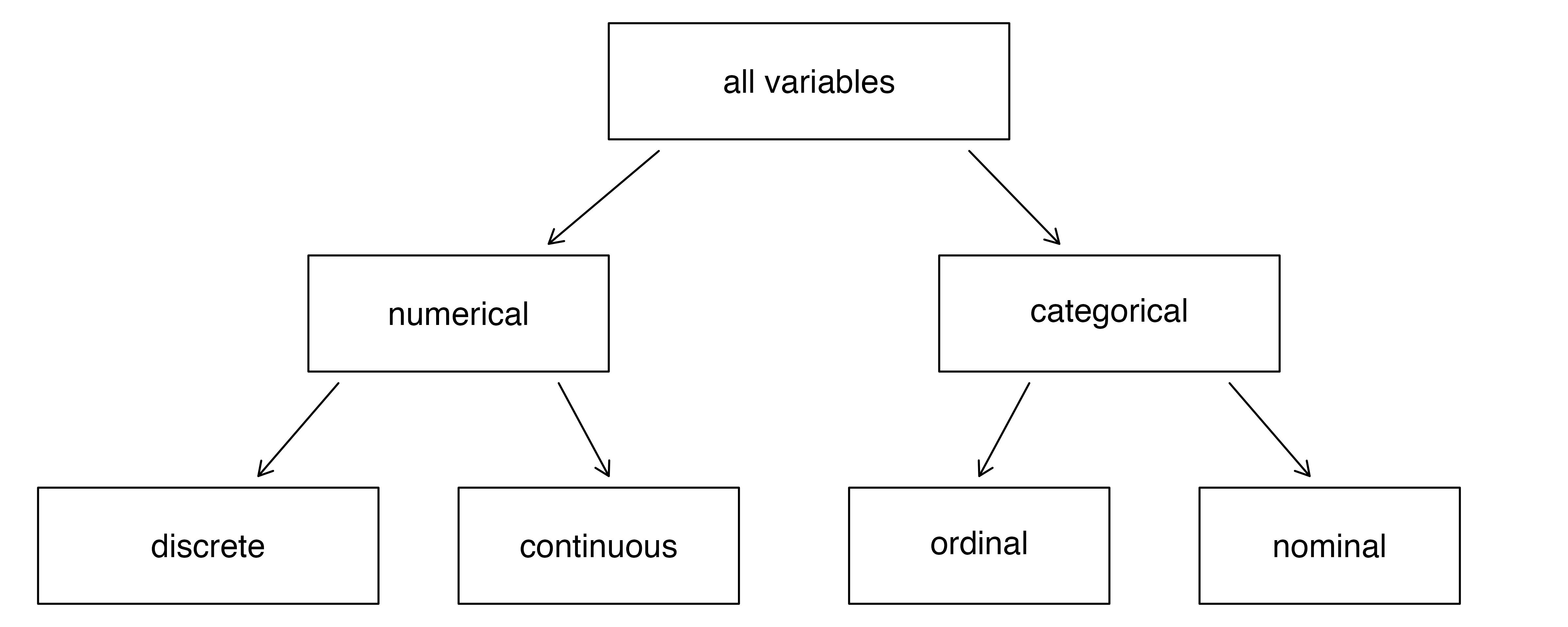
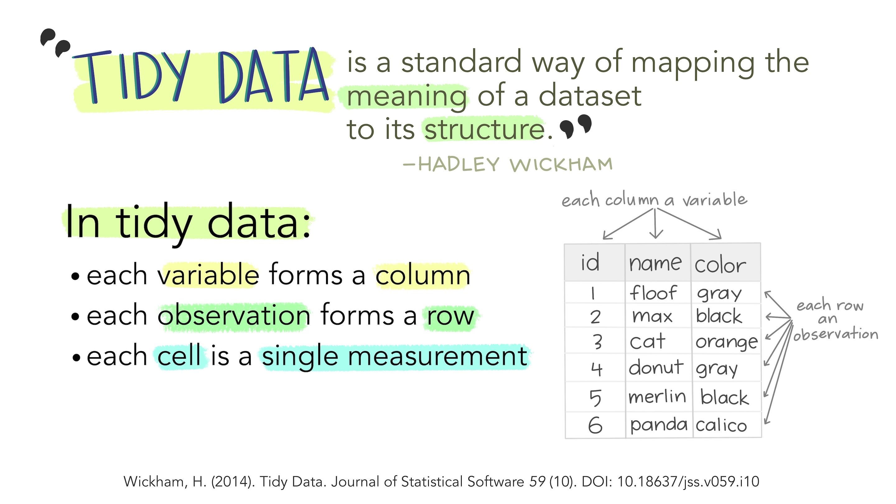
Each variable is a column; a column contains one kind of data. Each observation or case is a row.
How do we Spot Data Variable Types?
By asking questions! Shown below is a table of different kinds of questions you could use to query a dataset. The variable or variables that “answer” the question would be in the category indicated by the question.
| No | Pronoun | Answer | Variable/Scale | Example | What Operations? |
|---|---|---|---|---|---|
| 1 | How Many / Much / Heavy? Few? Seldom? Often? When? | Quantities, with Scale and a Zero Value.Differences and Ratios /Products are meaningful. | Quantitative/Ratio | Length,Height,Temperature in Kelvin,Activity,Dose Amount,Reaction Rate,Flow Rate,Concentration,Pulse,Survival Rate | Correlation |
| 2 | How Many / Much / Heavy? Few? Seldom? Often? When? | Quantities with Scale. Differences are meaningful, but not products or ratios | Quantitative/Interval | pH,SAT score(200-800),Credit score(300-850),SAT score(200-800),Year of Starting College | Mean,Standard Deviation |
| 3 | How, What Kind, What Sort | A Manner / Method, Type or Attribute from a list, with list items in some " order" ( e.g. good, better, improved, best..) | Qualitative/Ordinal | Socioeconomic status (Low income, Middle income, High income),Education level (HighSchool, BS, MS, PhD),Satisfaction rating(Very much Dislike, Dislike, Neutral, Like, Very Much Like) | Median,Percentile |
| 4 | What, Who, Where, Whom, Which | Name, Place, Animal, Thing | Qualitative/Nominal | Name | Count no. of cases,Mode |
As you go from Qualitative to Quantitative data types in the table, I hope you can detect a movement from fuzzy groups/categories to more and more crystallized numbers.
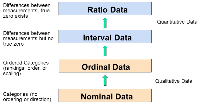
Each variable/scale can be subjected to the operations of the previous group. In the words of S.S. Stevens
the basic operations needed to create each type of scale is cumulative: to an operation listed opposite a particular scale must be added all those operations preceding it.
Some Examples of Data Variables
Example 1: AllCountries
Country <fct> | Code <fct> | LandArea <dbl> | Population <dbl> | Density <dbl> | GDP <int> | Rural <dbl> | CO2 <dbl> | PumpPrice <dbl> | Military <dbl> | |
|---|---|---|---|---|---|---|---|---|---|---|
| Andorra | AND | 0.47 | 0.077 | 163.8 | 42030 | 11.9 | 5.83 | NA | NA | |
| Albania | ALB | 27.40 | 2.866 | 104.6 | 5254 | 39.7 | 1.98 | 1.36 | 4.08 | |
| Algeria | DZA | 2381.74 | 42.228 | 17.7 | 4279 | 27.4 | 3.74 | 0.28 | 13.81 | |
| Afghanistan | AFG | 652.86 | 37.172 | 56.9 | 521 | 74.5 | 0.29 | 0.70 | 3.72 | |
| American Samoa | ASM | 0.20 | 0.055 | 277.3 | NA | 12.8 | NA | NA | NA |
Q1. How many people in Andorra have internet access?
A1. This leads to the Internet variable, which is a Quantitative variable, a proportion.1 The answer is
Example 2:StudentSurveys
head(StudentSurvey, 5)Year <fct> | Sex <fct> | Smoke <fct> | Award <fct> | HigherSAT <fct> | Exercise <dbl> | TV <int> | Height <int> | Weight <int> | ||
|---|---|---|---|---|---|---|---|---|---|---|
| 1 | Senior | M | No | Olympic | Math | 10 | 1 | 71 | 180 | |
| 2 | Sophomore | F | Yes | Academy | Math | 4 | 7 | 66 | 120 | |
| 3 | FirstYear | M | No | Nobel | Math | 14 | 5 | 72 | 208 | |
| 4 | Junior | M | No | Nobel | Math | 3 | 1 | 63 | 110 | |
| 5 | Sophomore | F | No | Nobel | Verbal | 3 | 3 | 65 | 150 |
Q.1. What kind of students are these?
A.1. The variables Gender, and Year both answer to this Question. And they are both Qualitative/Categorical variables, of course.
Q.2. What is their status in their respective families?
A.2. Hmm…they are either first-born, or second-born, or third…etc. While this is recorded as a number, it is still a Qualitative variable2! Think! Can you do math operations with BirthOrder? Like mean or median?
Q.3.How big are the families?
A.3. Clearly, the variable that answers is Siblings and since the question is synonymous with “how many”, this is a Quantitative variable.
Let us take a look at Wickham and Grolemund’s Data Science workflow picture:

So there we have it:
- We import and clean the data
-
Questions lead us to identify Types of Variables (Quant and Qual)
- Sometimes we may need to transform the data (long to wide, summarize, create new variables…)
- Further Questions lead to relationships between variables, which we describe using Data Visualizations
- Which is finally Communicated
You might think of all these Questions, Answers, Mapping as being equivalent to metaphors as a language in itself. And indeed, in R we use a philosophy called the Grammar of Graphics! We will use this grammar in the R graphics packages that we will encounter when we make Graphs next. Other parts of the Workflow (Transformation, Analysis and Modelling) are also following similar grammars, as we shall see.
This is a tutorial on data visualization using the R programming language. It introduces concepts such as data types, variables, and visualization techniques. The tutorial utilizes metaphors to explain these concepts, emphasizing the use of geometric aesthetics to represent data. It also highlights the importance of both visual and analytic approaches in understanding data. The tutorial then demonstrates basic chart types, including histograms, scatterplots, and bar charts, and discusses the “Grammar of Graphics” philosophy that guides data visualization in R. The text concludes with a workflow diagram for data science, emphasizing the iterative process of data import, cleaning, transformation, visualization, hypothesis generation, analysis, and communication.
- Randomized Trials:
- Martyn Shuttleworth, Lyndsay T Wilson (Jun 26, 2009). What is the Scientific Method? Retrieved Mar 12, 2024 from Explorable.com: https://explorable.com/what-is-the-scientific-method
- Adam E.M. Eltorai, Jeffrey A. Bakal, Paige C. Newell, Adena J. Osband (editors). (March 22, 2023) Translational Surgery: Handbook for Designing and Conducting Clinical and Translational Research. A very lucid and easily explained set of chapters. ( I have a copy. Yes.)
- Part III. Clinical: fundamentals
- Part IV: Statistical principles
- https://safetyculture.com/topics/design-of-experiments/
- Emi Tanaka. https://emitanaka.org/teaching/monash-wcd/2020/week09-DoE.html
- Open Intro Stats: Types of Variables
- Lock, Lock, Lock, Lock, and Lock. Statistics: Unlocking the Power of Data, Third Edition, Wiley, 2021. https://www.wiley.com/en-br/Statistics:+Unlocking+the+Power+of+Data,+3rd+Edition-p-9781119674160)
- Claus Wilke. Fundamentals of Data Visualization. https://clauswilke.com/dataviz/
- Tim C. Hesterberg (2015). What Teachers Should Know About the Bootstrap: Resampling in the Undergraduate Statistics Curriculum, The American Statistician, 69:4, 371-386, DOI:10.1080/00031305.2015.1089789. PDF here
- Albert Rapp. Adding images to ggplot. https://albert-rapp.de/posts/ggplot2-tips/27_images/27_images
Footnotes
Citation
@online{2021,
  author = {},
  title = {\textless Iconify-Icon Icon=“icon-Park-Twotone:data-User”
    Width=“1.2em”
    Height=“1.2em”\textgreater\textless/Iconify-Icon\textgreater{}
    {Data}},
  date = {2021-11-01},
  url = {https://av-quarto.netlify.app/content/courses/Analytics/Descriptive/Modules/05-NatureData/},
  langid = {en}
}