library(tidyverse) # Data processing with tidy principles
library(mosaic) # Our go-to package for almost everything
library(ggformula) # Our plotting package
library(tidyplots) # New package for publication quality graphs

# devtools::install_github("rpruim/Lock5withR")
library(Lock5withR)
library(Lock5Data) # Some neat little datasets from a lovely textbook
library(kableExtra)
Charts and How they are generated from Data
Data Variables
Geometry
Graph Types
Mappable Aesthetics
“Difficulties strengthen the mind, as labor does the body.”
— Seneca
Plot Fonts and Theme
Show the Code
library(systemfonts)
library(showtext)
## Clean the slate
systemfonts::clear_local_fonts()
systemfonts::clear_registry()
##
showtext_opts(dpi = 96) # set DPI for showtext
sysfonts::font_add(
  family = "Alegreya",
  regular = "../../../../../../fonts/Alegreya-Regular.ttf",
  bold = "../../../../../../fonts/Alegreya-Bold.ttf",
  italic = "../../../../../../fonts/Alegreya-Italic.ttf",
  bolditalic = "../../../../../../fonts/Alegreya-BoldItalic.ttf"
)
Error in check_font_path(bold, "bold"): font file not found for 'bold' typeShow the Code
sysfonts::font_add(
  family = "Roboto Condensed",
  regular = "../../../../../../fonts/RobotoCondensed-Regular.ttf",
  bold = "../../../../../../fonts/RobotoCondensed-Bold.ttf",
  italic = "../../../../../../fonts/RobotoCondensed-Italic.ttf",
  bolditalic = "../../../../../../fonts/RobotoCondensed-BoldItalic.ttf"
)
showtext_auto(enable = TRUE) # enable showtext
##
theme_custom <- function() {
  font <- "Alegreya" # assign font family up front

  theme_classic(base_size = 14, base_family = font) %+replace% # replace elements we want to change

    theme(
      text = element_text(family = font), # set base font family

      # text elements
      plot.title = element_text( # title
        family = font, # set font family
        size = 24, # set font size
        face = "bold", # bold typeface
        hjust = 0, # left align
        margin = margin(t = 5, r = 0, b = 5, l = 0)
      ), # margin
      plot.title.position = "plot",
      plot.subtitle = element_text( # subtitle
        family = font, # font family
        size = 14, # font size
        hjust = 0, # left align
        margin = margin(t = 5, r = 0, b = 10, l = 0)
      ), # margin

      plot.caption = element_text( # caption
        family = font, # font family
        size = 9, # font size
        hjust = 1
      ), # right align

      plot.caption.position = "plot", # right align

      axis.title = element_text( # axis titles
        family = "Roboto Condensed", # font family
        size = 12
      ), # font size

      axis.text = element_text( # axis text
        family = "Roboto Condensed", # font family
        size = 9
      ), # font size

      axis.text.x = element_text( # margin for axis text
        margin = margin(5, b = 10)
      )

      # since the legend often requires manual tweaking
      # based on plot content, don't define it here
    )
}

## Use available fonts in ggplot text geoms too!
update_geom_defaults(geom = "text", new = list(
  family = "Roboto Condensed",
  face = "plain",
  size = 3.5,
  color = "#2b2b2b"
))

## Set the theme
theme_set(new = theme_custom())
Why Visualize?
- We can digest information more easily when it is pictorial
- Our Working Memories are both short-term and limited in capacity. So a picture abstracts the details and presents us with an overall summary, an insight, or a story that is both easy to recall and easy on retention.
- Data Viz includes shapes that carry strong cultural memories; and impressions for us. These cultural memories help us to use data viz in a universal way to appeal to a wide variety of audiences. (Do humans have a gene for geometry?1);
- It helps sift facts from mere statements: for example:
- Visuals are a good starting point to make hypotheses of what may be happening in the situation represented by the data
- Merely looking at visualizations may not necessarily tell us the true magnitude or significance of things.
- We need analytic methods or statistics to assure ourselves, or otherwise, of what we might suspect is happening
- These methods also help to remove human bias and ensure that we are speaking with the assurance that our problem deserves.
- Analysis uses numbers, or metrics, that allow us to crystallize our ambiguous words/guesses into quantities that can be calculated with.
- These metrics are calculable from our data, of course, but are not directly visible, despite often being intuitive.
So both visuals and analytics. And as we will see, we will not be content with that: we will visualize our analytics, and analyze our visualizations!
Let us recall first what we meant by tidy data:
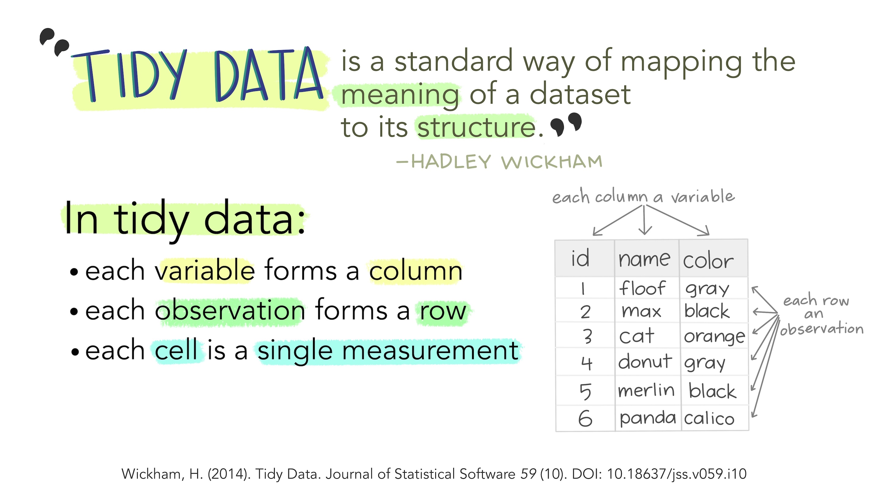
Tidy Data
- Each variable is a column;
- Each column contains one kind of data.
- Each observation or case is a row.
- Each observations contains one value for each variable.
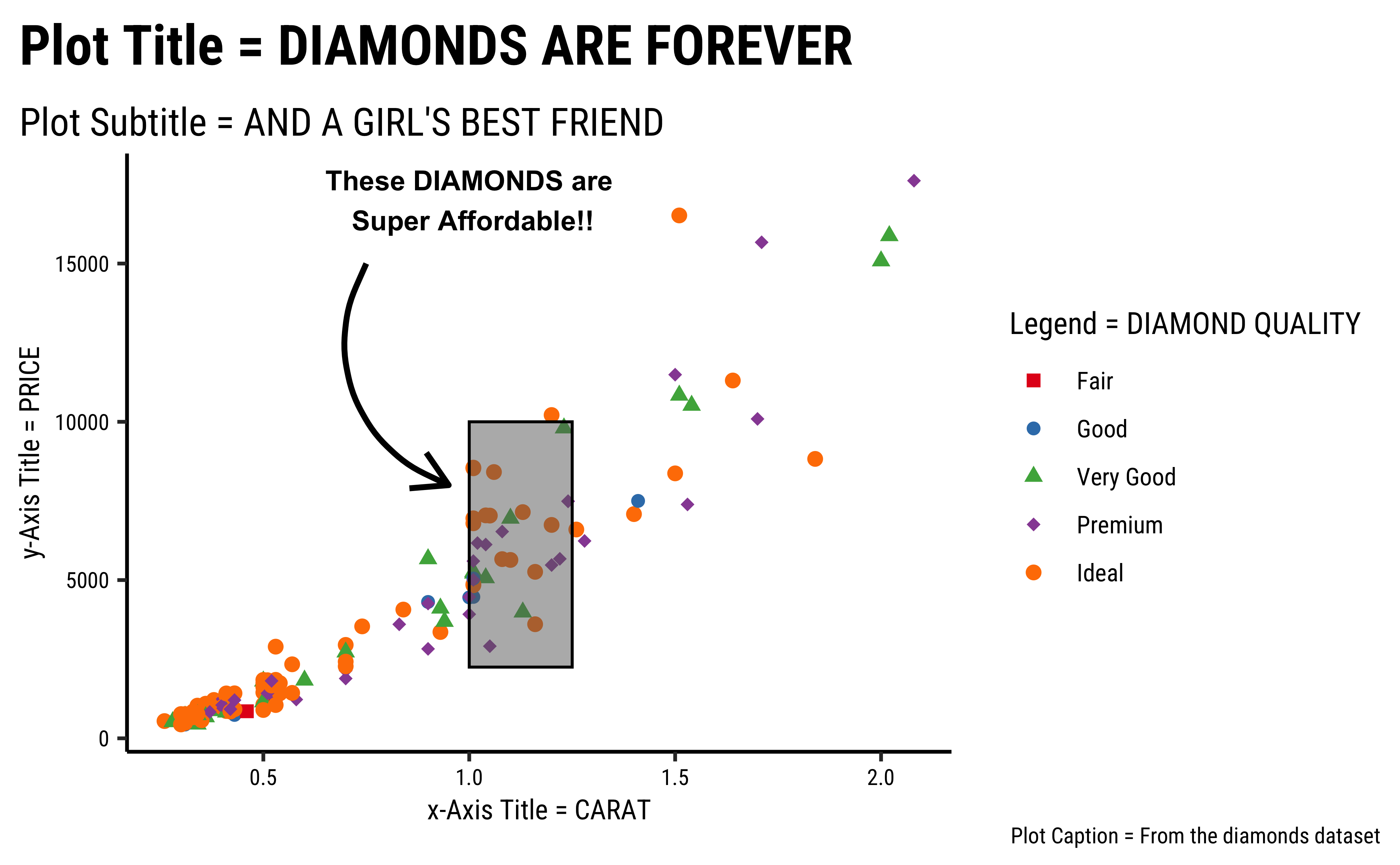
How many geometric things do we know? Shapes? Lines? Axes? Curves? Angles? Patterns? Textures? Colours? Sizes? Positions? Lengths? Heights? Breadths? Radii? Textures? All these are geometric aspects or aesthetics, each with a unique property. Some “geometric things” which we might consider are shown in the figure below.
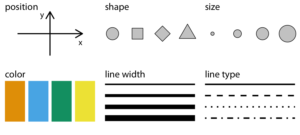
How can we manipulate these geometric aesthetics, perhaps like Kandinsky? The aesthetic has a property, an atribute, which we can manipulate in accordance with a data variable! This act of “mapping” a geometric thing to a variable and modifying its essential property is called Data Visualization
For instance:
-
lengthorheightof abarcan be made proportional to theageorincomeof a person -
Colourof points can be mapped togender, with a uniquecolourfor eachgender. -
Positionalong an X-axis can vary in accordance with aheightvariable, and -
Positionalong the Y-axis can vary with abodyWeightvariable.
A chart may use more than one aesthetic: position, shape, colour, height and angle, pattern or texture to name several. Usually, each aesthetic is mapped to just one variable to ensure there is no cognitive error. There is of course a choice and you should be able to map any kind of variable to any geometric aspect/aesthetic that may be available.
A Natural Mapping
Note that here is also a “natural” mapping between aesthetic and kind of variableQuantitative or Qualitative as seen in Figure 3. For instance, shape is rarely mapped to a Quantitative variable; we understand this because the nature of variation between the Quantitative variable and the shape aesthetic is not similar (i.e. not continuous). Bad choices may lead to bad, or worse, misleading charts!
In the above chart, it is pretty clear what kind of variable is plotted on the x-axis and the y-axis. What about colour? Could this be considered as another axis in the chart? There are also other aspects that you can choose (not explicitly shown here) such as the plot theme(colours, fonts, backgrounds etc), which may not be mapped to data, but are nonetheless choices to be made. We will get acquainted with this aspect as we build charts.
As we will see, Data Variables may be transformed before being mapped to some geometric aesthetic, e.g. we may perform counts with a Qual variable that contains only the entries {S, M, L, XL}. We may also transform the axes (make them logarithmic, or even polar ) to create precisely the shape-meaning we wish. This allows us considerable flexibility in making charts!!
We can therefore think of simple visualizations as combinations of aesthetics, mapped to combinations of variables. Some examples:
| Variable #1 | Variable #2 | Chart Names | Chart Shape |
|---|---|---|---|
| Quant | None | Histogram and Density |
|
| Qual | None | Bar Chart | |
| Quant | Quant | Scatter Plot, Line Chart, Bubble Plot, Area Chart |
|
| Quant | Qual | Pie Chart, Donut Chart, Column Chart, Box-Whisker Plot, Radar Chart, Bump Chart, Tree Diagram |
|
| Qual | Qual | Stacked Bar Chart, Mosaic Chart, Sankey, Chord Diagram, Network Diagram |
|
Let us take a look at Wickham and Grolemund’s Data Science workflow picture:

So there we have it:
- We import and clean the data
- Questions lead us to identify Types of Variables (Quant and Qual)
- Sometimes we may need to transform the data (long to wide, summarize, create new variables…)
- Further Questions lead to relationships between variables, which we describe using Data Visualizations
- Visualizations may lead to Hypotheses, which we Analyze or Model
- Data Visualizations are Data mapped onto Geometry
- Multiple Variable-to-Geometry Mappings = A Complete Data Visualization
- Which is finally Communicated
You might think of all these Questions, Answers, Mapping as being equivalent to metaphors as a language in itself. And indeed, in R we use a philosophy called the Grammar of Graphics! We will use this grammar in the R graphics packages that we will encounter. Other parts of the Workflow (Transformation, Analysis and Modelling) are also following similar grammars, as we shall see.
This is a tutorial on data visualization using the R programming language. It introduces concepts such as data types, variables, and visualization techniques. The tutorial utilizes metaphors to explain these concepts, emphasizing the use of geometric aesthetics to represent data. It also highlights the importance of both visual and analytic approaches in understanding data. The tutorial then demonstrates basic chart types, including histograms, scatterplots, and bar charts, and discusses the “Grammar of Graphics” philosophy that guides data visualization in R. The text concludes with a workflow diagram for data science, emphasizing the iterative process of data import, cleaning, transformation, visualization, hypothesis generation, analysis, and communication.
- Randomized Trials:
- Martyn Shuttleworth, Lyndsay T Wilson (Jun 26, 2009). What is the Scientific Method? Retrieved Mar 12, 2024 from Explorable.com: https://explorable.com/what-is-the-scientific-method
- Adam E.M. Eltorai, Jeffrey A. Bakal, Paige C. Newell, Adena J. Osband (editors). (March 22, 2023) Translational Surgery: Handbook for Designing and Conducting Clinical and Translational Research. A very lucid and easily explained set of chapters. ( I have a copy. Yes.)
- Part III. Clinical: fundamentals
- Part IV: Statistical principles
- https://safetyculture.com/topics/design-of-experiments/
- Emi Tanaka. https://emitanaka.org/teaching/monash-wcd/2020/week09-DoE.html
- Open Intro Stats: Types of Variables
- Lock, Lock, Lock, Lock, and Lock. Statistics: Unlocking the Power of Data, Third Edition, Wiley, 2021. https://www.wiley.com/en-br/Statistics:+Unlocking+the+Power+of+Data,+3rd+Edition-p-9781119674160)
- Claus Wilke. Fundamentals of Data Visualization. https://clauswilke.com/dataviz/
- Albert Rapp. Adding images to ggplot. https://albert-rapp.de/posts/ggplot2-tips/27_images/27_images
Kaplan, Daniel, and Randall Pruim. 2023. ggformula: Formula Interface to the Grammar of Graphics. https://doi.org/10.32614/CRAN.package.ggformula.
Lock, Robin. 2021. Lock5Data: Datasets for “Statistics: UnLocking the Power of Data”. https://doi.org/10.32614/CRAN.package.Lock5Data.
Pruim, Randall, Daniel T Kaplan, and Nicholas J Horton. 2017. “The Mosaic Package: Helping Students to ‘Think with Data’ Using r.” The R Journal 9 (1): 77–102. https://journal.r-project.org/archive/2017/RJ-2017-024/index.html.
Snow, Greg. 2024. TeachingDemos: Demonstrations for Teaching and Learning. https://doi.org/10.32614/CRAN.package.TeachingDemos.
Footnotes
Citation
BibTeX citation:
@online{2021,
  author = {},
  title = {\textless Iconify-Icon Icon=“carbon:chart-3d” Width=“1.2em”
    Height=“1.2em”\textgreater\textless/Iconify-Icon\textgreater{}
    {Graphs}},
  date = {2021-11-01},
  url = {https://av-quarto.netlify.app/content/courses/Analytics/Descriptive/Modules/07-Graphs/},
  langid = {en}
}
For attribution, please cite this work as:
“<Iconify-Icon Icon=‘carbon:chart-3d’
Width=‘1.2em’
Height=‘1.2em’></Iconify-Icon> Graphs.”
2021. November 1, 2021. https://av-quarto.netlify.app/content/courses/Analytics/Descriptive/Modules/07-Graphs/.