library(igraph) # Network Analysis Library (Handle data and Viz)
library(tidygraph) # For Network "Manipulation"
library(ggraph) # For Network Visualization
library(graphlayouts) # For Network Visualization, more layouts and themes
library(visNetwork) # For Interactive Network Visualization
library(igraphdata) # For "Network" Datasets
library(sand) # Statistical Analysis of Networks Data

library(tinytable) # Elegant Tables for our data

# For repeatable layouts, some can be random!!
set.seed(12345)

library(tidyverse)
Can you introduce me to Phoebe?
Abstract
How one thing connects to another
“The beginnings and endings of all human undertakings are untidy.”
— John Galsworthy, author, Nobel laureate (14 Aug 1867-1933)
Plot Fonts and Theme
Show the Code
library(systemfonts)
library(showtext)
## Clean the slate
systemfonts::clear_local_fonts()
systemfonts::clear_registry()
##
showtext_opts(dpi = 96) # set DPI for showtext
sysfonts::font_add(
  family = "Alegreya",
  regular = "../../../../../../fonts/Alegreya-Regular.ttf",
  bold = "../../../../../../fonts/Alegreya-Bold.ttf",
  italic = "../../../../../../fonts/Alegreya-Italic.ttf",
  bolditalic = "../../../../../../fonts/Alegreya-BoldItalic.ttf"
)

sysfonts::font_add(
  family = "Roboto Condensed",
  regular = "../../../../../../fonts/RobotoCondensed-Regular.ttf",
  bold = "../../../../../../fonts/RobotoCondensed-Bold.ttf",
  italic = "../../../../../../fonts/RobotoCondensed-Italic.ttf",
  bolditalic = "../../../../../../fonts/RobotoCondensed-BoldItalic.ttf"
)
showtext_auto(enable = TRUE) # enable showtext
##
theme_custom <- function() {
  font <- "Alegreya" # assign font family up front

  theme_classic(base_size = 14, base_family = font) %+replace% # replace elements we want to change

    theme(
      text = element_text(family = font), # set base font family

      # text elements
      plot.title = element_text( # title
        family = font, # set font family
        size = 24, # set font size
        face = "bold", # bold typeface
        hjust = 0, # left align
        margin = margin(t = 5, r = 0, b = 5, l = 0)
      ), # margin
      plot.title.position = "plot",
      plot.subtitle = element_text( # subtitle
        family = font, # font family
        size = 14, # font size
        hjust = 0, # left align
        margin = margin(t = 5, r = 0, b = 10, l = 0)
      ), # margin

      plot.caption = element_text( # caption
        family = font, # font family
        size = 9, # font size
        hjust = 1
      ), # right align

      plot.caption.position = "plot", # right align

      axis.title = element_text( # axis titles
        family = "Roboto Condensed", # font family
        size = 12
      ), # font size

      axis.text = element_text( # axis text
        family = "Roboto Condensed", # font family
        size = 9
      ), # font size

      axis.text.x = element_text( # margin for axis text
        margin = margin(5, b = 10)
      )

      # since the legend often requires manual tweaking
      # based on plot content, don't define it here
    )
}
Show the Code
```{r}
#| cache: false
#| code-fold: true
## Set the theme
theme_set(new = theme_custom())
```
Error in theme_set(new = theme_custom()): could not find function "theme_set"Show the Code
```{r}
#| cache: false
#| code-fold: true
## Use available fonts in ggplot text geoms too!
update_geom_defaults(geom = "text", new = list(
  family = "Roboto Condensed",
  face = "plain",
  size = 3.5,
  color = "#2b2b2b"
))
```
Error in update_geom_defaults(geom = "text", new = list(family = "Roboto Condensed", : could not find function "update_geom_defaults"
Network graphs show relationships between entities: what sort they are, how strong they are, and even of they change over time.
We will examine data structures pertaining both to the entities and the relationships between them and look at the data object that can combine these aspects together. Then we will see how these are plotted, what the structure of the plot looks like. There are also metrics that we can calculate for the network, based on its structure. We will of course examine geometric metaphors that can represent various classes of entities and their relationships.
Network graphs can be rendered both as static and interactive and we will examine R packages that render both kinds of plots.
There is a another kind of structure: one that combines spatial and network data in one. We will defer that for a future module !
What kind Network graphs will we make?
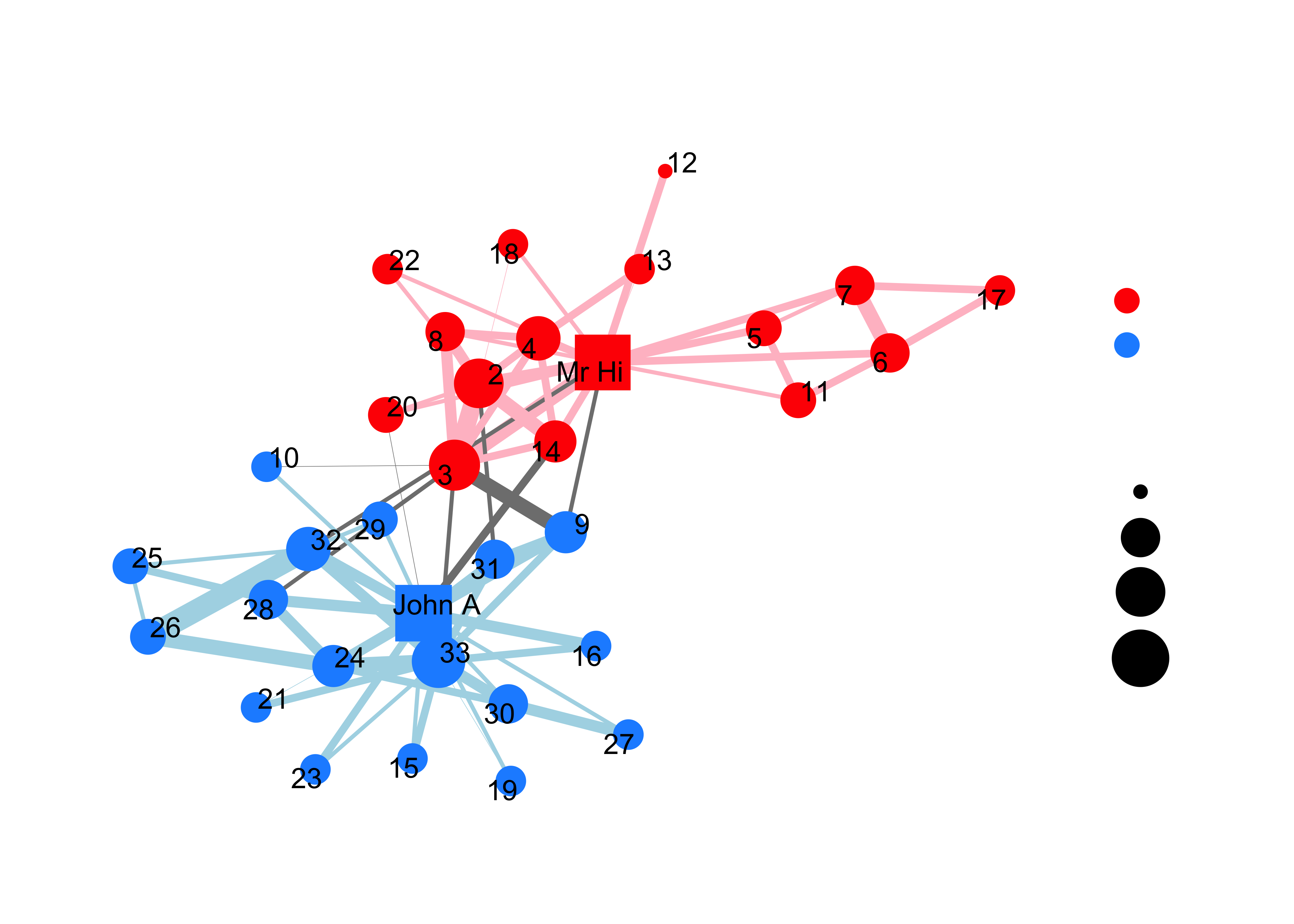
Here is a network map of the characters in Victor Hugo’s Les Miserables:
And this: the well known Zachary’s Karate Club dataset visualized as a network
At the end of this Lab session, we should:
- know the types and structures of
network dataand be able to work with them - understand the basics of modern network packages in R
- be able to create network visualizations using
tidygraph,ggraph( static visualizations ) andvisNetwork(interactive visualizations) - see directions for how the network metaphor applies in a variety of domains (e.g. biology/ecology, ideas/influence, technology, transportation, to name a few)
The method followed will be based on PRIMM:
- PREDICT Inspect the code and guess at what the code might do, write predictions
- RUN the code provided and check what happens
-
INFER what the
parametersof the code do and write comments to explain. What bells and whistles can you see? -
MODIFY the
parameterscode provided to understand theoptionsavailable. Write comments to show what you have aimed for and achieved. - MAKE : take an idea/concept of your own, and graph it.
Network graphs are characterized by two key terms: nodes and edges
-
Nodes: Entities- Metaphors: Individual People? Things? Ideas? Places? to be connected in the network.
- Synonyms:
vertices. Nodes haveIDs.
-
Edges: Connections- Metaphors: Interactions? Relationships? Influence? Letters sent and received? Dependence? between the entities.
- Synonyms:
links,ties.
In R, we create network representations using node and edge information. One way in which these could be organized are:
-
Node list: a data frame with a single column listing the node IDs found in the edge list. You can also add attribute columns to the data frame such as the names of the nodes or grouping variables. ( Type? Class? Family? Country? Subject? Race? )
| ID | Node Name | Attribute? Qualities?Categories? Family? Country?Planet? |
| 1 | Ned | Nursery School Teacher |
| 2 | Jaguar Paw | Main Character, Apocalypto |
| 3 | John Snow | Epidemiologist |
-
Edge list: data frame containing two columns: source node and destination node of anedge. Source and Destination havenode IDs. -
Weighted network graph: An edge list can also contain additional columns describing attributes of the edges such as a magnitude aspect for an edge. If the edges have a magnitude attribute the graph is considered weighted.
| From | To | Relationship | Weightage |
|---|---|---|---|
| 1 | 3 | Financial Dealings | 6 |
| 2 | 1 | History Lessons | 2 |
| 2 | 3 | Vaccination | 15 |
-
Layout: A geometric arrangement ofnodesandedges.- Metaphors: Location? Spacing? Distance? Coordinates? Colour? Shape? Size? Provides visual insight due to the
arrangement.
- Metaphors: Location? Spacing? Distance? Coordinates? Colour? Shape? Size? Provides visual insight due to the
-
Layout Algorithms:Methodto arrangesnodesandedgeswith the aim of optimizing somemetric.- Metaphors: Nodes are
massesand edges aresprings. The Layout algorithm minimizes the stretching and compressing of all springs.(BTW, are the Spring Constants K the same for all springs?…)
- Metaphors: Nodes are
Directed and undirected network graph: If the distinction between source and target is meaningful, the network is directed. If the distinction is not meaningful, the network is undirected. Directed edges represent an ordering of nodes, like a relationship extending from one node to another, where switching the direction would change the structure of the network. Undirected edges are simply links between nodes where order does not matter.
Examples
The World Wide Web is an example of a directed network because hyperlinks connect one Web page to another, but not necessarily the other way around.
Co-authorship networks represent examples of un-directed networks, where nodes are authors and they are connected by an edge if they have written a publication together
When people send e-mail to each other, the distinction between the sender (source) and the recipient (target) is clearly meaningful, therefore the network is directed.
-
ConnectedandDisconnectedgraphs: If there is some path from any node to any other node, the Networks is said to be Connected. Else, Disconnected.
Predict/Run/Infer-1
Using tidygraph and ggraph
tidygraph and ggraph are modern R packages for network data. Graph Data setup and manipulation is done in tidygraph and graph visualization with ggraph.
-
tidygraphData -> “Network Object” in R. -
ggraphNetwork Object -> Plots using a chosen layout/algo.
Both leverage the power of igraph, which is the Big Daddy of all network packages. We will be using the Grey’s Anatomy dataset in our first foray into networks.
Step1. Read the data
Download these two datasets into your current project-> data folder.
grey_nodes <- read_csv("files/data/grey_nodes.csv")
grey_edges <- read_csv("files/data/grey_edges.csv")

grey_nodes
grey_edgesname <chr> | sex <chr> | race <chr> | birthyear <dbl> | position <chr> | season <dbl> | sign <chr> |
|---|---|---|---|---|---|---|
| Addison Montgomery | F | White | 1967 | Attending | 1 | Libra |
| Adele Webber | F | Black | 1949 | Non-Staff | 2 | Leo |
| Teddy Altman | F | White | 1969 | Attending | 6 | Pisces |
| Amelia Shepherd | F | White | 1981 | Attending | 7 | Libra |
| Arizona Robbins | F | White | 1976 | Attending | 5 | Leo |
| Rebecca Pope | F | White | 1975 | Non-Staff | 3 | Gemini |
| Jackson Avery | M | Black | 1981 | Resident | 6 | Leo |
| Miranda Bailey | F | Black | 1969 | Attending | 1 | Virgo |
| Ben Warren | M | Black | 1972 | Other | 6 | Aquarius |
| Henry Burton | M | White | 1972 | Non-Staff | 7 | Cancer |
from <chr> | to <chr> | weight <dbl> | type <chr> | |
|---|---|---|---|---|
| Leah Murphy | Arizona Robbins | 2 | friends | |
| Leah Murphy | Alex Karev | 4 | benefits | |
| Lauren Boswell | Arizona Robbins | 1 | friends | |
| Arizona Robbins | Callie Torres | 1 | friends | |
| Callie Torres | Erica Hahn | 6 | friends | |
| Callie Torres | Alex Karev | 12 | benefits | |
| Callie Torres | Mark Sloan | 5 | professional | |
| Callie Torres | George O'Malley | 2 | professional | |
| George O'Malley | Izzie Stevens | 3 | professional | |
| George O'Malley | Meredith Grey | 4 | friends |
Questions and Inferences #1
Look at the output thumbnails. What attributes (i.e. extra information) are seen for Nodes and Edges?
Step 2.Create a network object using tidygraph:
Key function:
-
tbl_graph(): (aka “tibble graph”). Key arguments:nodes,edgesanddirected. Note this is a very versatile command and can take many input forms, such as data structures that result from other packages. Type?tbl_graphin the Console and see theUsagesection.
ga <- tbl_graph(
  nodes = grey_nodes,
  edges = grey_edges,
  directed = FALSE
)
ga
# A tbl_graph: 54 nodes and 57 edges
#
# An undirected simple graph with 4 components
#
# Node Data: 54 × 7 (active)
name sex race birthyear position season sign
<chr> <chr> <chr> <dbl> <chr> <dbl> <chr>
1 Addison Montgomery F White 1967 Attending 1 Libra
2 Adele Webber F Black 1949 Non-Staff 2 Leo
3 Teddy Altman F White 1969 Attending 6 Pisces
4 Amelia Shepherd F White 1981 Attending 7 Libra
5 Arizona Robbins F White 1976 Attending 5 Leo
6 Rebecca Pope F White 1975 Non-Staff 3 Gemini
7 Jackson Avery M Black 1981 Resident 6 Leo
8 Miranda Bailey F Black 1969 Attending 1 Virgo
9 Ben Warren M Black 1972 Other 6 Aquarius
10 Henry Burton M White 1972 Non-Staff 7 Cancer
# ℹ 44 more rows
#
# Edge Data: 57 × 4
from to weight type
<int> <int> <dbl> <chr>
1 5 47 2 friends
2 21 47 4 benefits
3 5 46 1 friends
# ℹ 54 more rows
Questions and Inferences #2
What information does the graph object contain? What attributes do the nodes have? What about the edges?
Step 3. Plot using ggraph
3a. Quick Plot: autograph() This is to check quickly is the data is imported properly and to decide upon going on to a more elaborate plotting.
autograph(ga)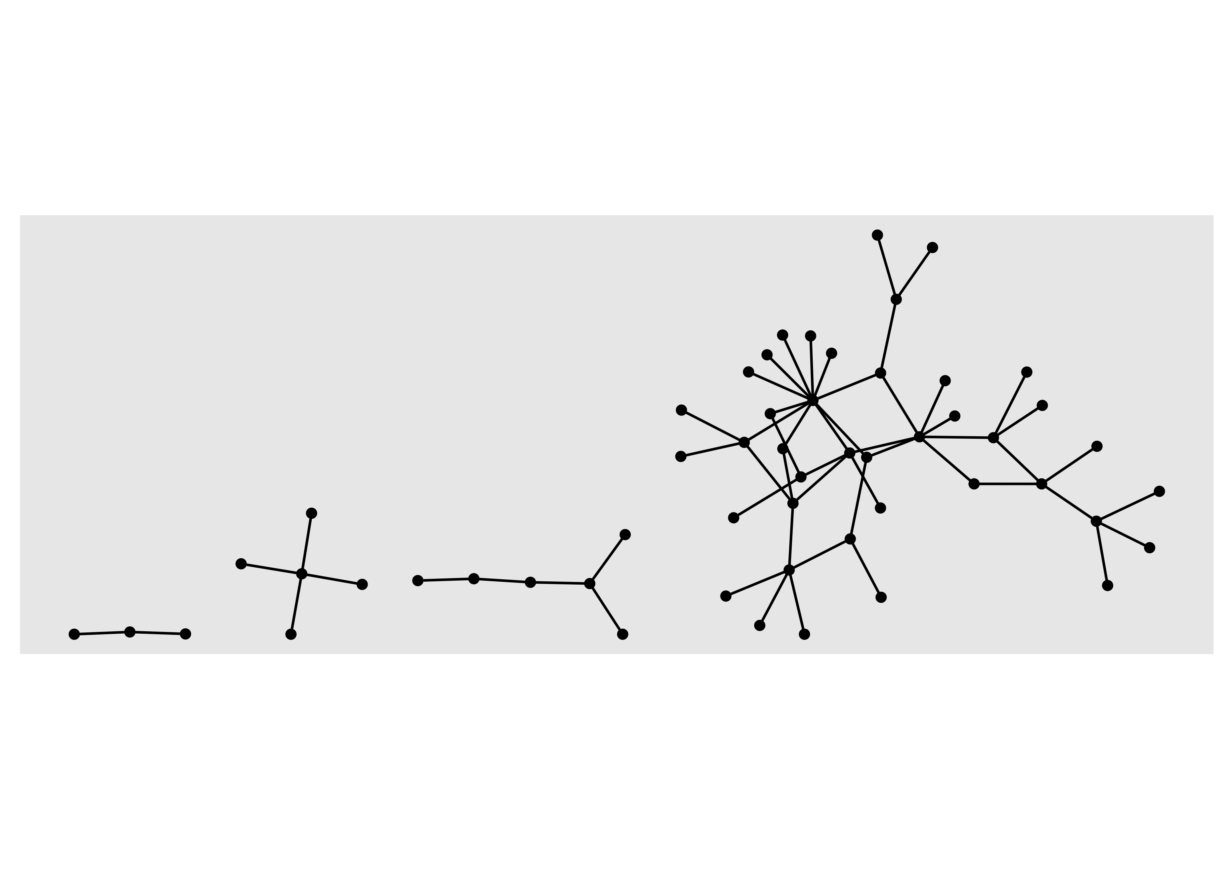
Questions and Inferences #3
Describe this graph, in simple words here. Try to use some of the new domain words we have just acquired: nodes/edges, connected/disconnected, directed/undirected.
3b. More elaborate plot
Key functions:
-
ggraph(layout = "......"): Create classic node-edge diagrams; i.e. Sets up the graph. Rather likeggplotfor networks!
Two kinds of geom: one set for nodes, and another for edges
geom_node_point(aes(.....)): Draws node as “points”. Alternatives arecircle / arc_bar / tile / voronoi. Remember thegeoms that we have seen before in Grammar of Graphics!geom_edge_link0(aes(.....)): Draws edges as “links”. Alternatives arearc / bend / elbow / hive / loop / parallel / diagonal / point / span /tile.geom_node_text(aes(label = ......), repel = TRUE): Adds text labels (non-overlapping). Alternatives arelabel /...labs(title = "....", subtitle = "....", caption = "...."): Change main titles, axis labels and legend titles. We know this from our work withggplot.
# Write Comments next to each line
# About what that line does for the overall graph

ggraph(graph = ga, layout = "kk") +
  #
  geom_edge_link0(width = 2, color = "pink") +
  #
  geom_node_point(
    shape = 21, size = 8,
    fill = "blue",
    color = "green",
    stroke = 2
  ) +

  labs(
    title = "Whoo Hoo! My First Silly Grey's Anatomy graph in R!",
    subtitle = "Why did I ever get in this course...",
    caption = "Bro, they are doing cool things in the other classes...\n And the show is even more cool!"
  ) +

  set_graph_style(family = "Roboto Condensed", size = 16)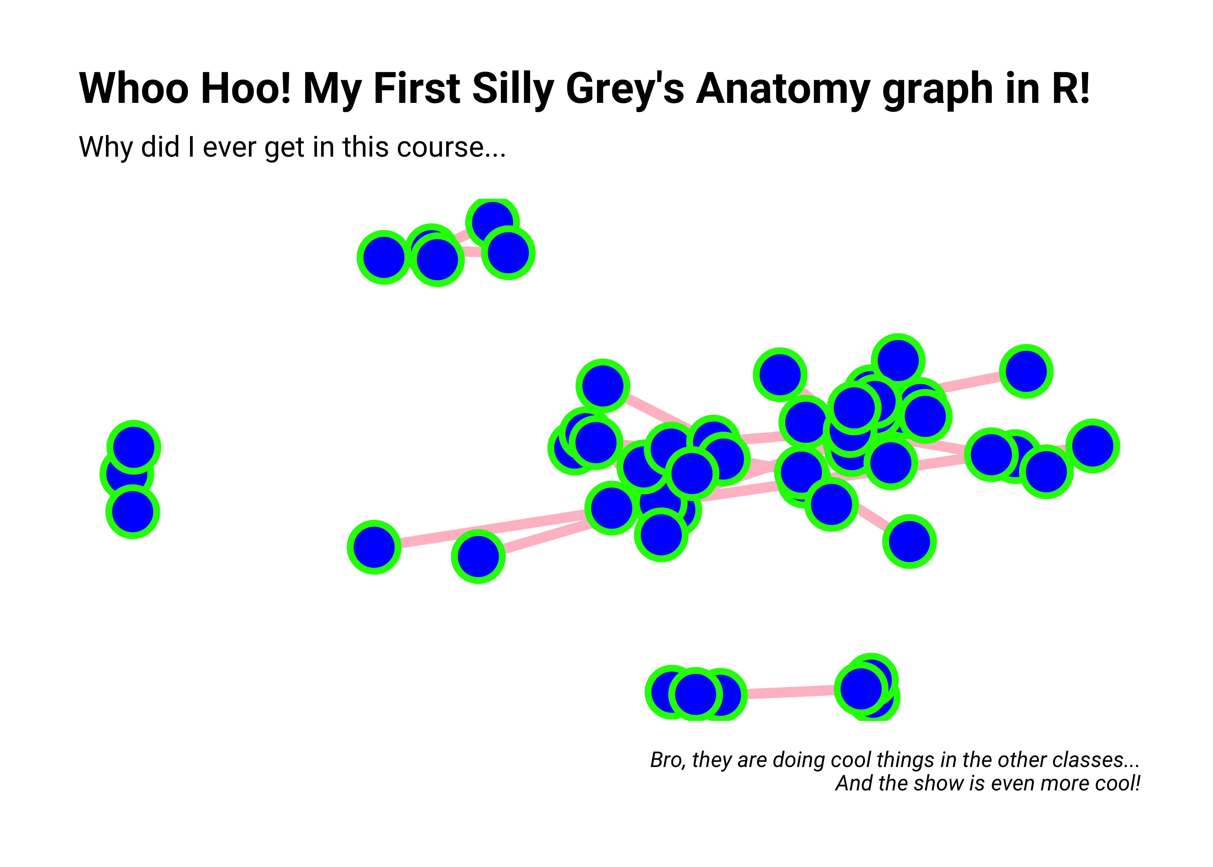
Questions and Inferences #4:
What parameters have been changed here, compared to the earlier graph? Where do you see these changes in the code above?
Let us Play with this graph and see if we can make some small changes. Colour? Fill? Width? Size? Stroke? Labs? Of course!
# Change the parameters in each of the commands here to new ones
# Use fixed values for colours or sizes...etc.

ggraph(graph = ga, layout = "kk") +
  geom_edge_link0(width = 2) +
  geom_node_point(
    shape = 21, size = 4,
    fill = "moccasin",
    color = "firebrick",
    stroke = 2
  ) +
  labs(
    title = "Whoo Hoo! My next silly Grey's Anatomy graph in R!",
    subtitle = "Why did I ever get in this course...",
    caption = "Bro, they are doing cool things in the other classes..."
  ) +
  set_graph_style(family = "Roboto Condensed", size = 16)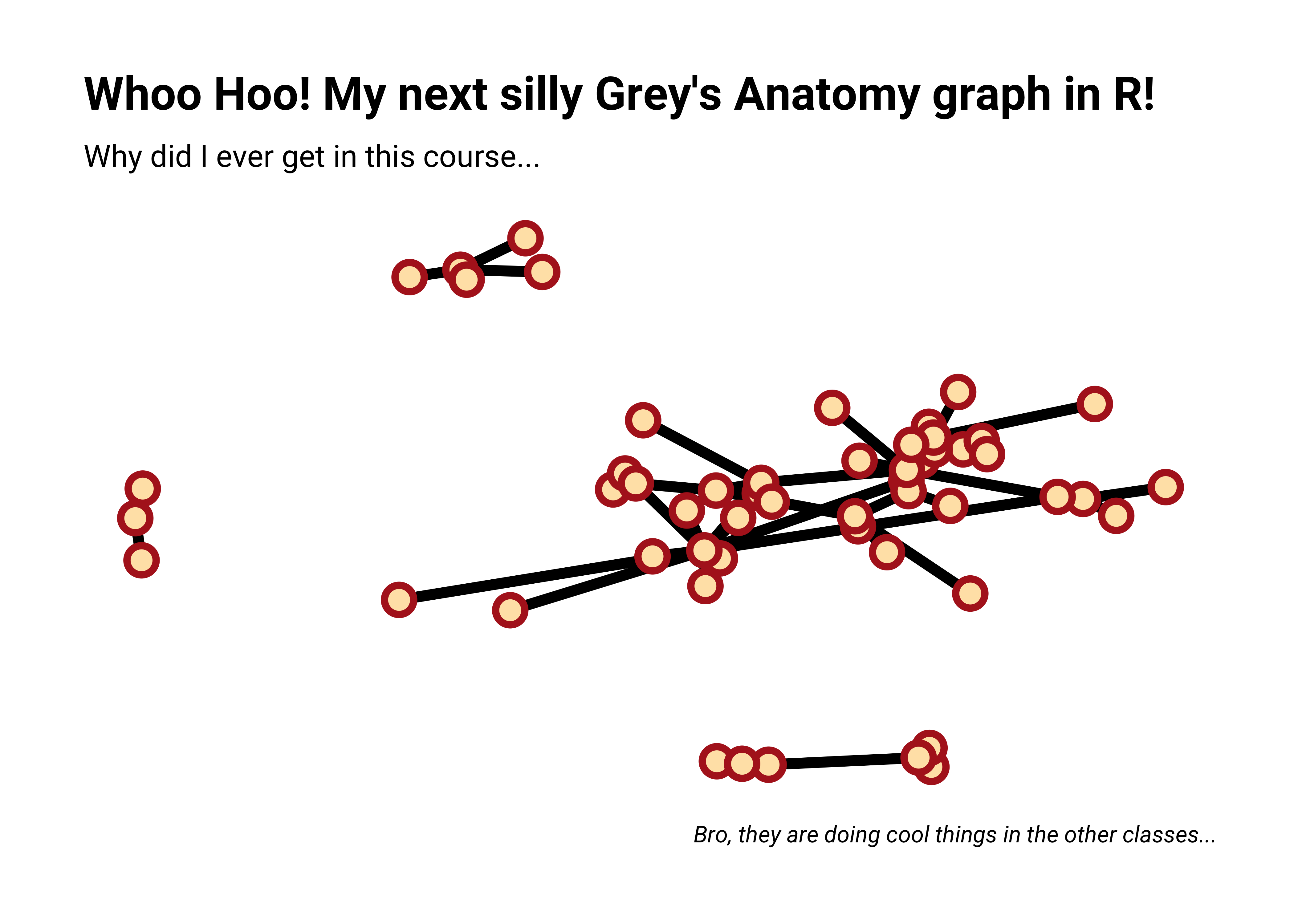
Questions and Inferences #5
What did the shape parameter achieve? What are the possibilities with shape? How about including alpha?
3c. Aesthetic Mapping from Node and Edge attribute columns
Up to now, we have assigned specific numbers to geometric aesthetics such as shape and size. Now we are ready ( maybe ?) change the meaning and significance of the entire graph and each element within it, and use aesthetics / metaphoric mappings to achieve new meanings or insights. Let us try using aes() inside each geom to map a variable to a geometric aspect.
Don’t try to use more than 2 aesthetic mappings simultaneously!!
The node elements we can tweak are:
- Types of Nodes:
geom_node_****()
- Node Parameters: inside
geom_node_****(aes(...............))
-aes(alpha = node-variable): opacity; a value between 0 and 1
-aes(shape = node-variable): node shape
-aes(colour = node-variable): node colour
-aes(fill = node-variable): fill colour for node
-aes(size = node-variable): size of node
The edge elements we can tweak are:
- Type of Edges”
geom_edge_****()
- Edge Parameters: inside
geom_edge_****(aes(...............))
-aes(colour = edge-variable): colour of the edge
-aes(width = edge-variable): width of the edge
-aes(label = some_variable): labels for the edge
Type ?geom_node_point and ?geom-edge_link in your Console for more information.
ggraph(graph = ga, layout = "fr") +
  geom_edge_link0(aes(width = weight)) + # change variable here

  geom_node_point(aes(fill = race),
    colour = "black",
    size = 4, shape = 21
  ) + # change variable here

  labs(
    title = "Whoo Hoo! Yet another Grey's Anatomy graph in R!",
    subtitle = "Colouring Nodes by Attribute",
    caption = "Grey's Anatomy"
  ) +

  scale_edge_width(range = c(0.2, 2)) +
  set_graph_style(family = "Roboto Condensed", size = 16)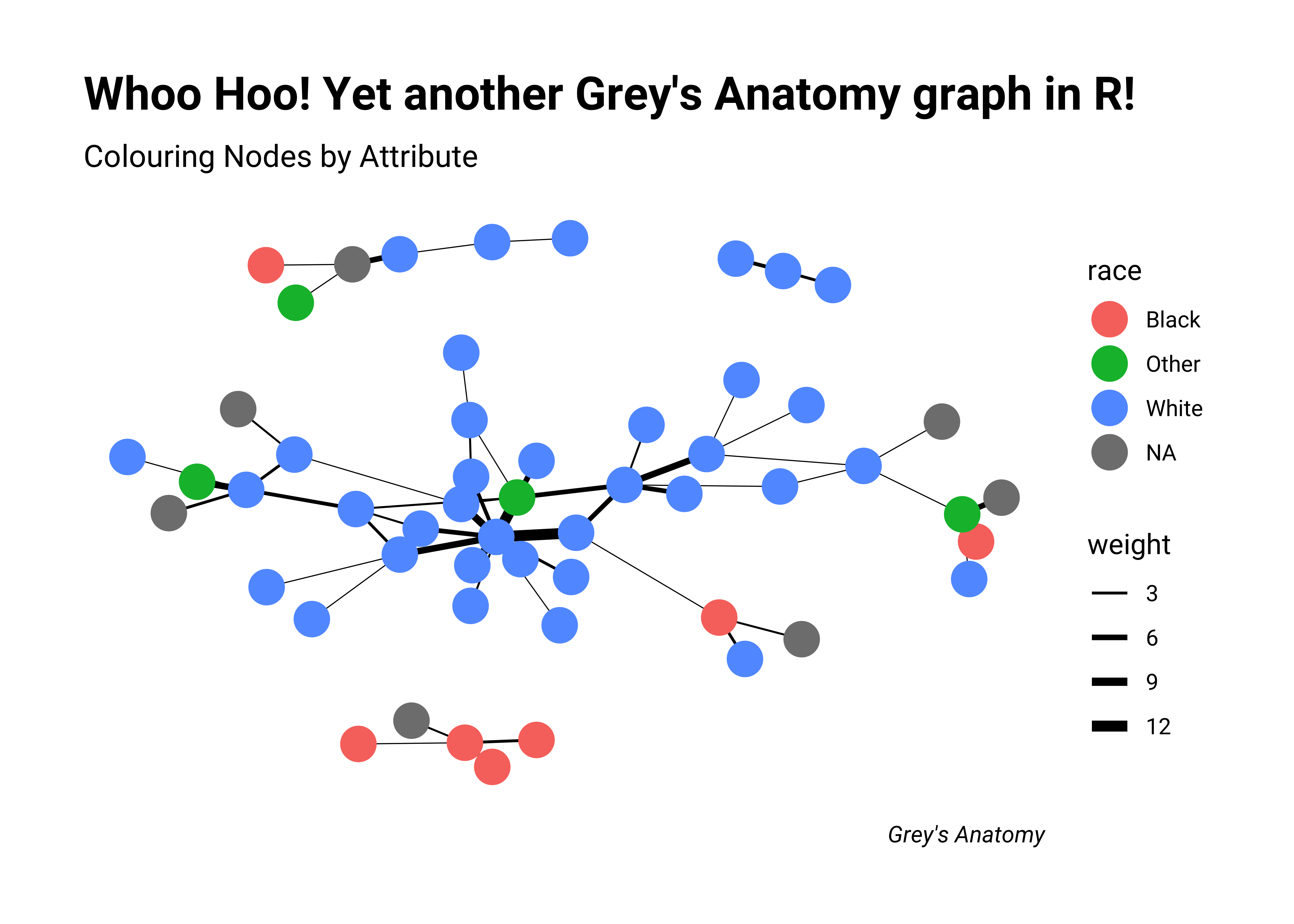
Questions and Inferences #6
Describe some of the changes here. What types of edges worked? Which variables were you able to use for nodes and edges and how? What did not work with either of the two?
# Arc diagram

ggraph(ga, layout = "linear") +
  geom_edge_arc0(aes(width = weight), alpha = 0.8) +
  scale_edge_width(range = c(0.2, 2)) +
  geom_node_point(size = 2, colour = "red") +
  labs(
    edge_width = "Weight", title = "Grey's Anatomy",
    subtitle = "Arc Layout"
  ) +
  set_graph_style(family = "Roboto Condensed", size = 16)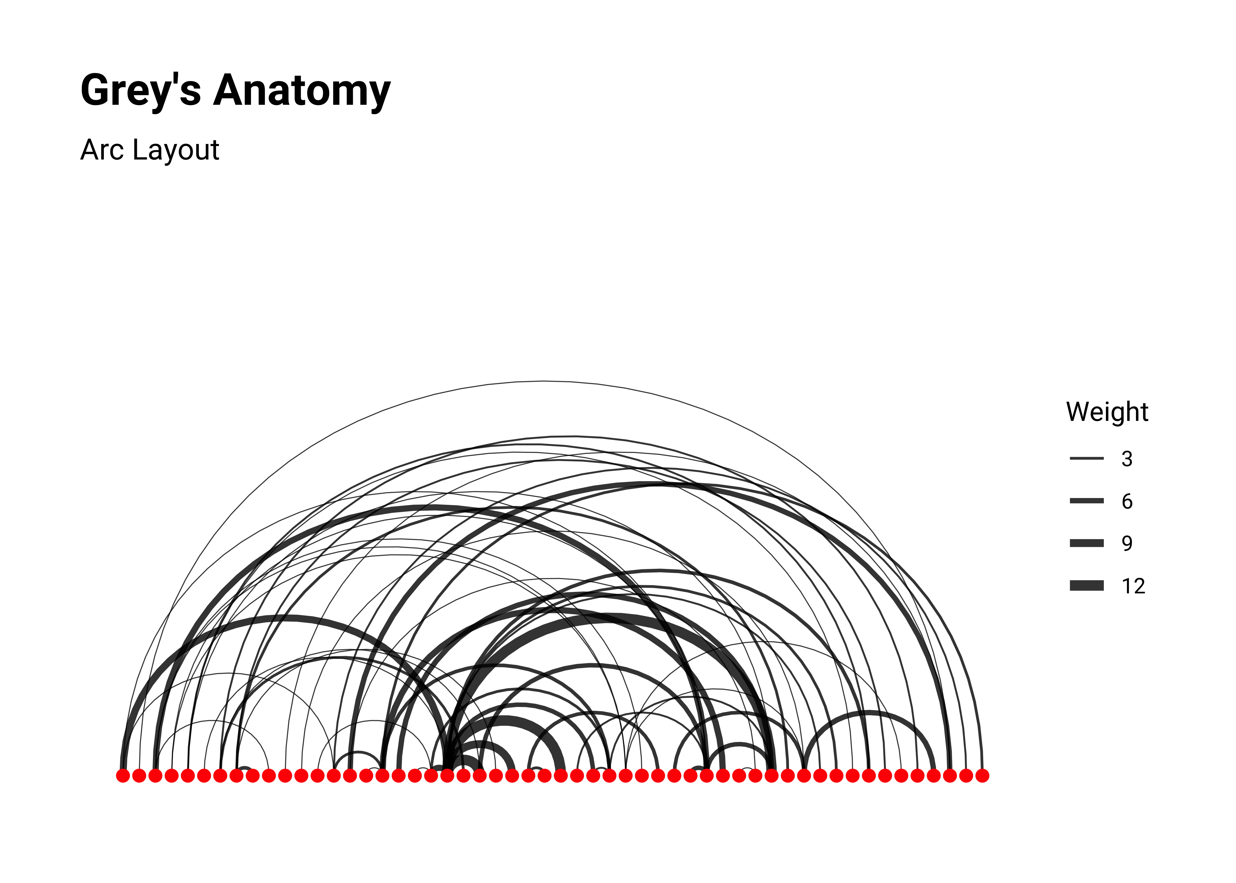
Questions and Inferences #7
How does this graph look “metaphorically” different? Do you see a difference in the relationships between people here? Why?
# Coord diagram, circular
ggraph(ga, layout = "linear", circular = TRUE) + # Note the layout!
  geom_edge_arc0(aes(width = weight), alpha = 0.8) +
  scale_edge_width(range = c(0.2, 2)) +

  geom_node_point(size = 3, colour = "red") +
  geom_node_text(aes(label = name),
    repel = TRUE, size = 2, check_overlap = TRUE,
    max.overlaps = 25
  ) +
  labs(
    edge_width = "Weight",
    title = "Grey's Anatomy",
    subtitle = "Arc Layout"
  ) +
  theme(aspect.ratio = 1) +
  set_graph_style(family = "Roboto Condensed", size = 16)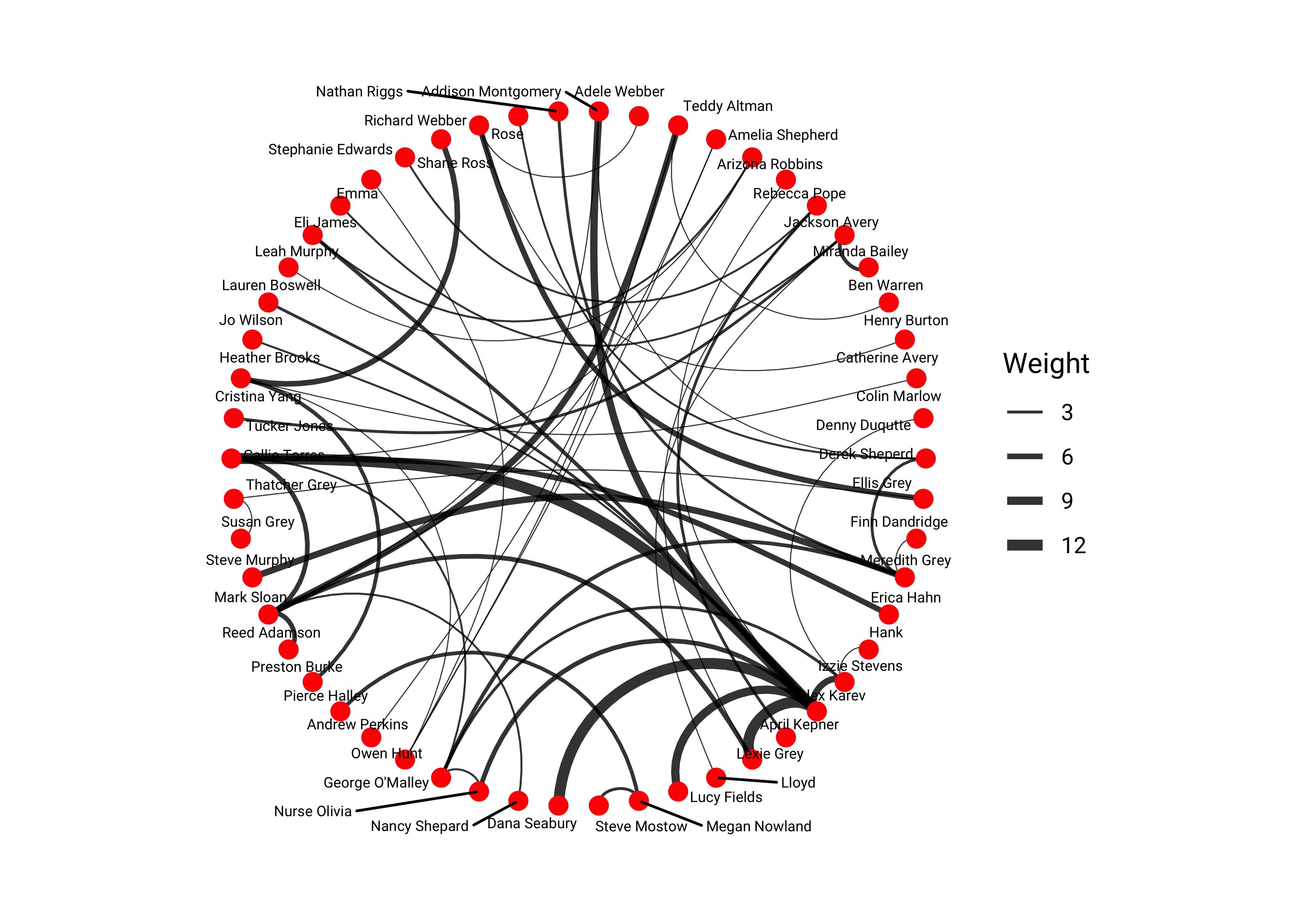
Questions and Inferences #8
How does this graph look “metaphorically” different? Do you see a difference in the relationships between people here? Why?
Hierarchical layouts
These provide for some alternative metaphorical views of networks. Note that not all layouts are possible for all datasets!!
# set_graph_style()

# This dataset contains the graph that describes the class
# hierarchy for the Flare visualization library.
# Type ?flare in your Console
head(flare$vertices)name <chr> | size <dbl> | shortName <chr> | ||
|---|---|---|---|---|
| 1 | flare.analytics.cluster.AgglomerativeCluster | 3938 | AgglomerativeCluster | |
| 2 | flare.analytics.cluster.CommunityStructure | 3812 | CommunityStructure | |
| 3 | flare.analytics.cluster.HierarchicalCluster | 6714 | HierarchicalCluster | |
| 4 | flare.analytics.cluster.MergeEdge | 743 | MergeEdge | |
| 5 | flare.analytics.graph.BetweennessCentrality | 3534 | BetweennessCentrality | |
| 6 | flare.analytics.graph.LinkDistance | 5731 | LinkDistance |
head(flare$edges)from <chr> | to <chr> | |||
|---|---|---|---|---|
| 1 | flare.analytics.cluster | flare.analytics.cluster.AgglomerativeCluster | ||
| 2 | flare.analytics.cluster | flare.analytics.cluster.CommunityStructure | ||
| 3 | flare.analytics.cluster | flare.analytics.cluster.HierarchicalCluster | ||
| 4 | flare.analytics.cluster | flare.analytics.cluster.MergeEdge | ||
| 5 | flare.analytics.graph | flare.analytics.graph.BetweennessCentrality | ||
| 6 | flare.analytics.graph | flare.analytics.graph.LinkDistance |
# flare class hierarchy
graph <- tbl_graph(edges = flare$edges, nodes = flare$vertices)
##
set_graph_style(family = "Roboto Condensed", size = 16)
##
# dendrogram
ggraph(graph, layout = "dendrogram") +
geom_edge_diagonal() +
labs(title = "Dendrogram")
# circular dendrogram
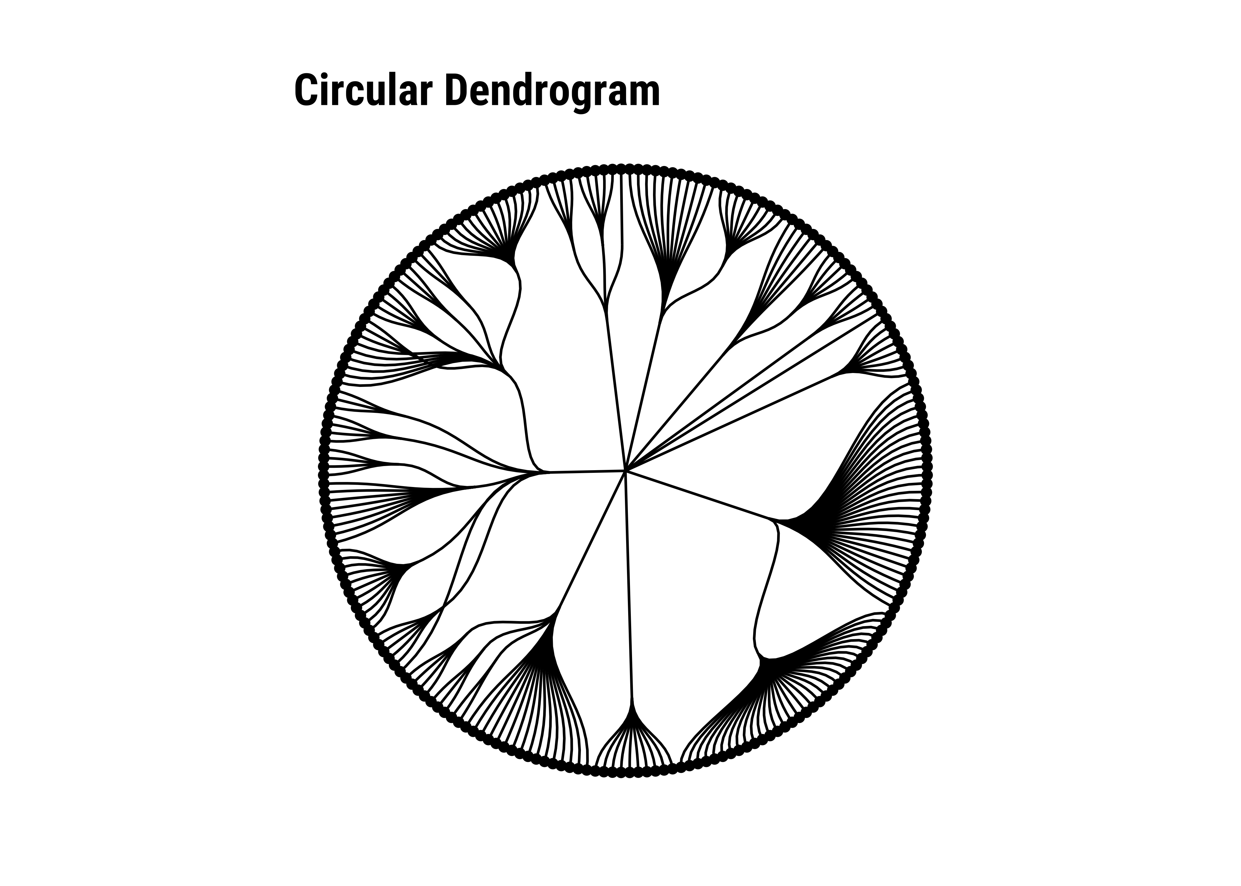
ggraph(graph, layout = "dendrogram", circular = TRUE) +
geom_edge_diagonal0() +
geom_node_point(aes(filter = leaf)) +
coord_fixed() +
labs(title = "Circular Dendrogram")
# rectangular tree map
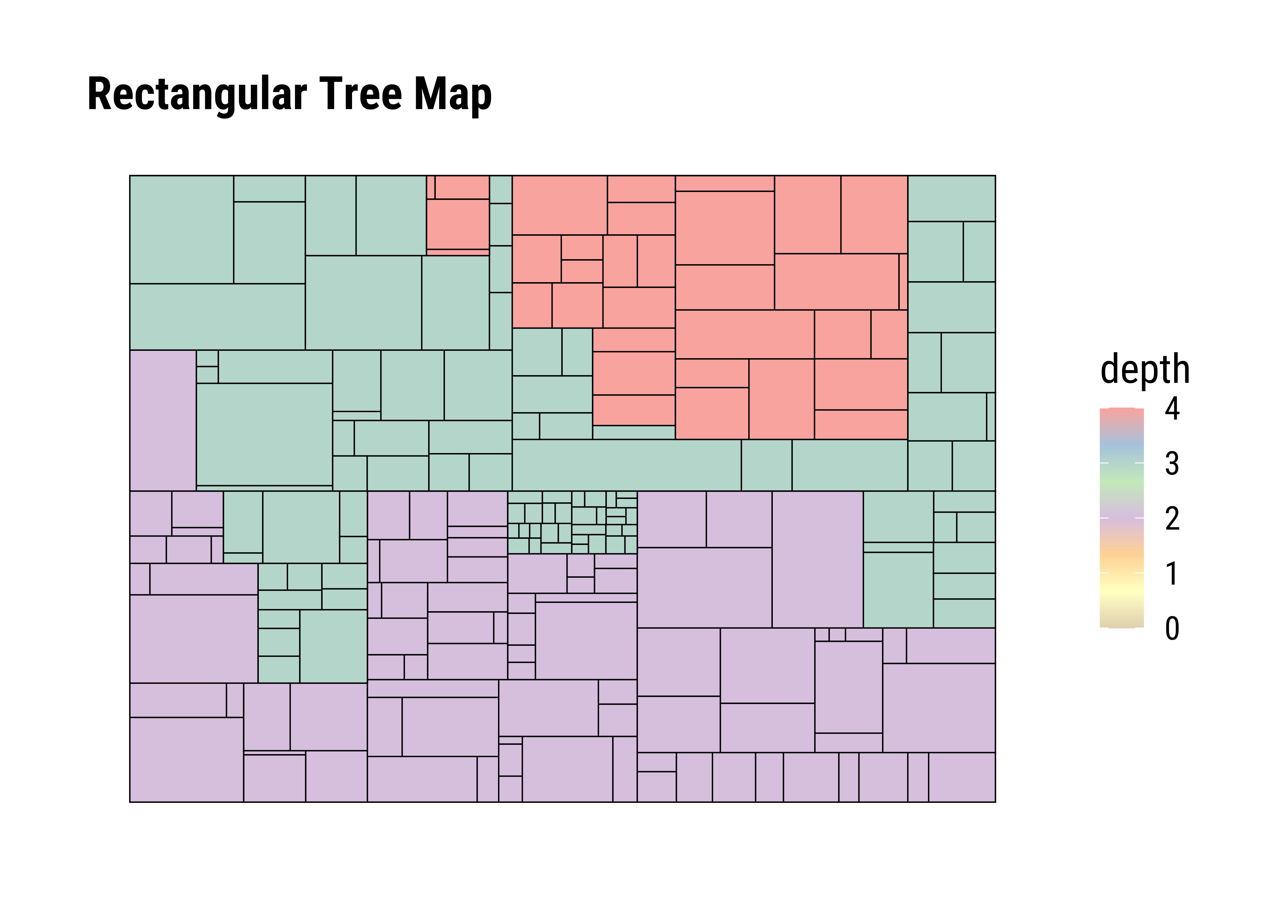
ggraph(graph, layout = "treemap", weight = size) +
geom_node_tile(aes(fill = depth), size = 0.25) +
scale_fill_distiller(palette = "Pastel1") +
labs(title = "Rectangular Tree Map")
# circular tree map
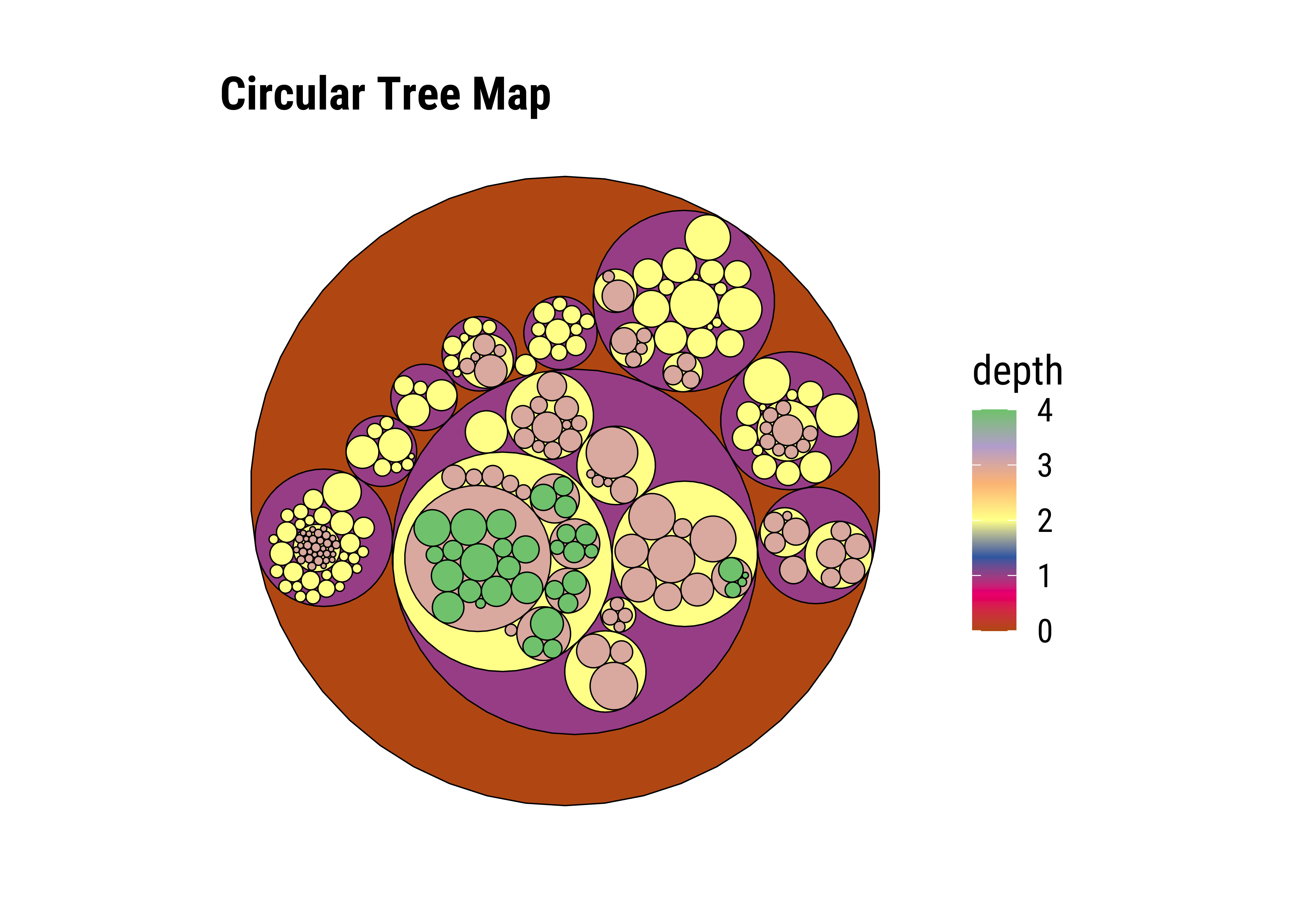
ggraph(graph, layout = "circlepack", weight = size) +
geom_node_circle(aes(fill = depth), size = 0.25, n = 50) +
scale_fill_distiller(palette = "Accent") +
coord_fixed() +
labs(title = "Circular Tree Map")
# icicle
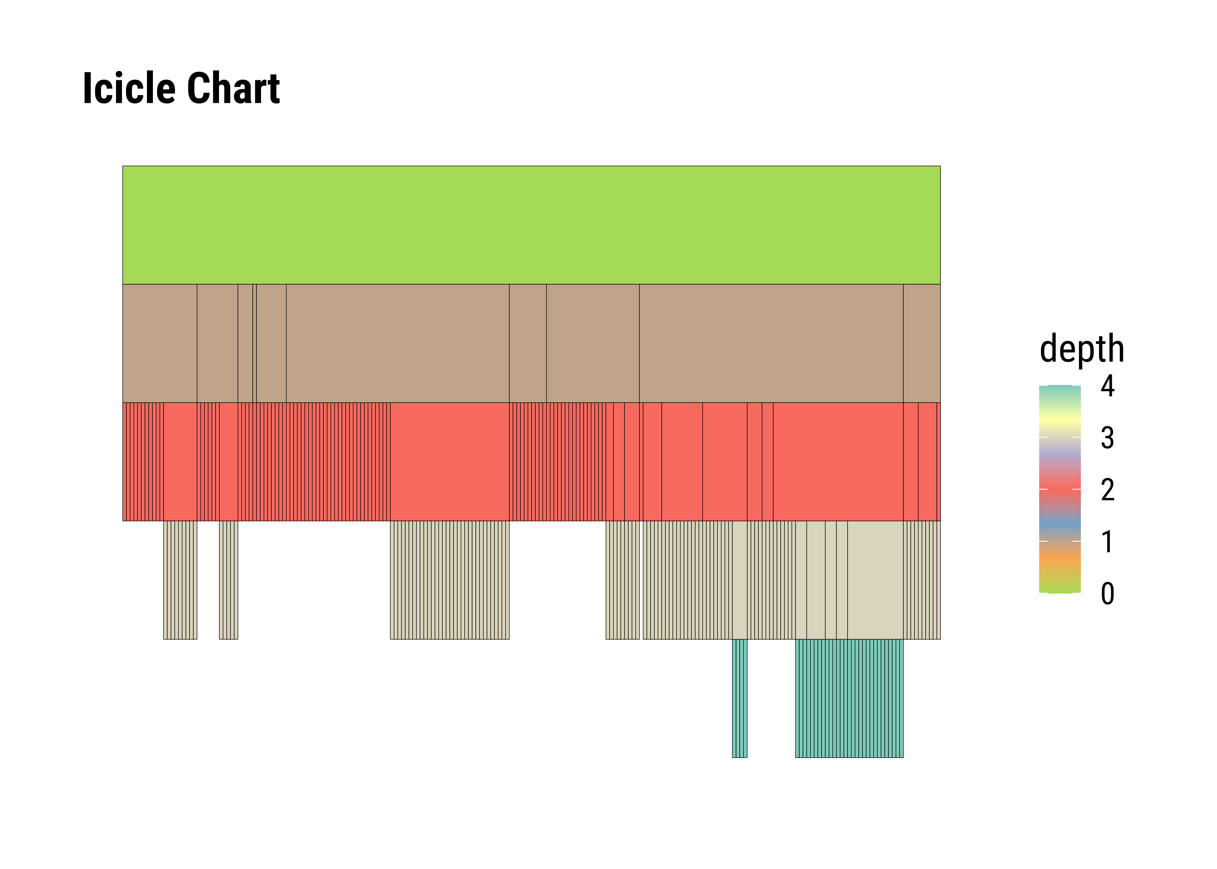
ggraph(graph, layout = "partition") +
geom_node_tile(aes(y = -y, fill = depth)) +
scale_fill_distiller(palette = "Set3") +
labs(title = "Icicle Chart")
# sunburst (circular icicle)
ggraph(graph, layout = "partition", circular = TRUE) +
geom_node_arc_bar(aes(fill = depth)) +
scale_fill_distiller(palette = "Spectral") +
coord_fixed() +
labs(title = "Circular Icicle")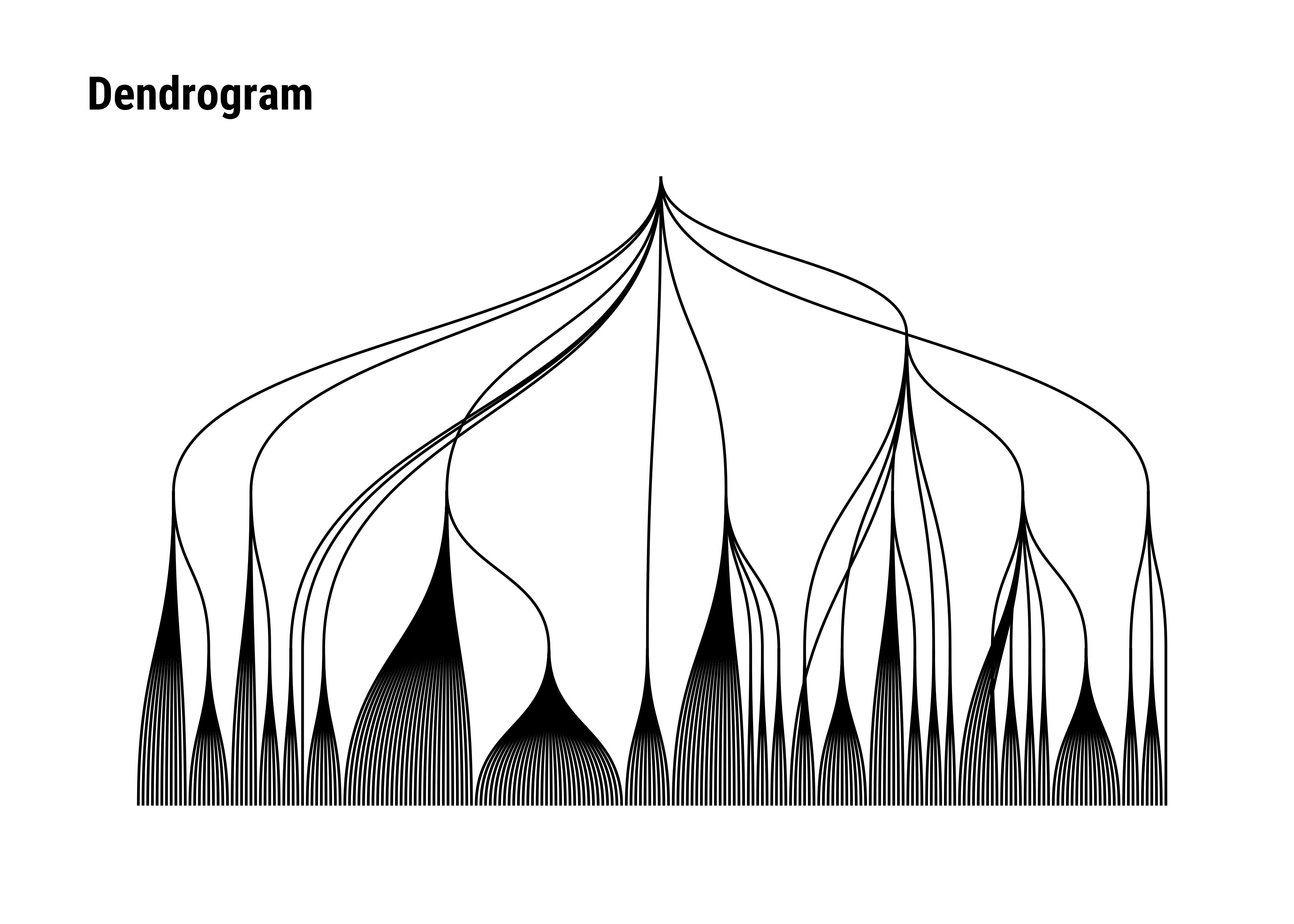
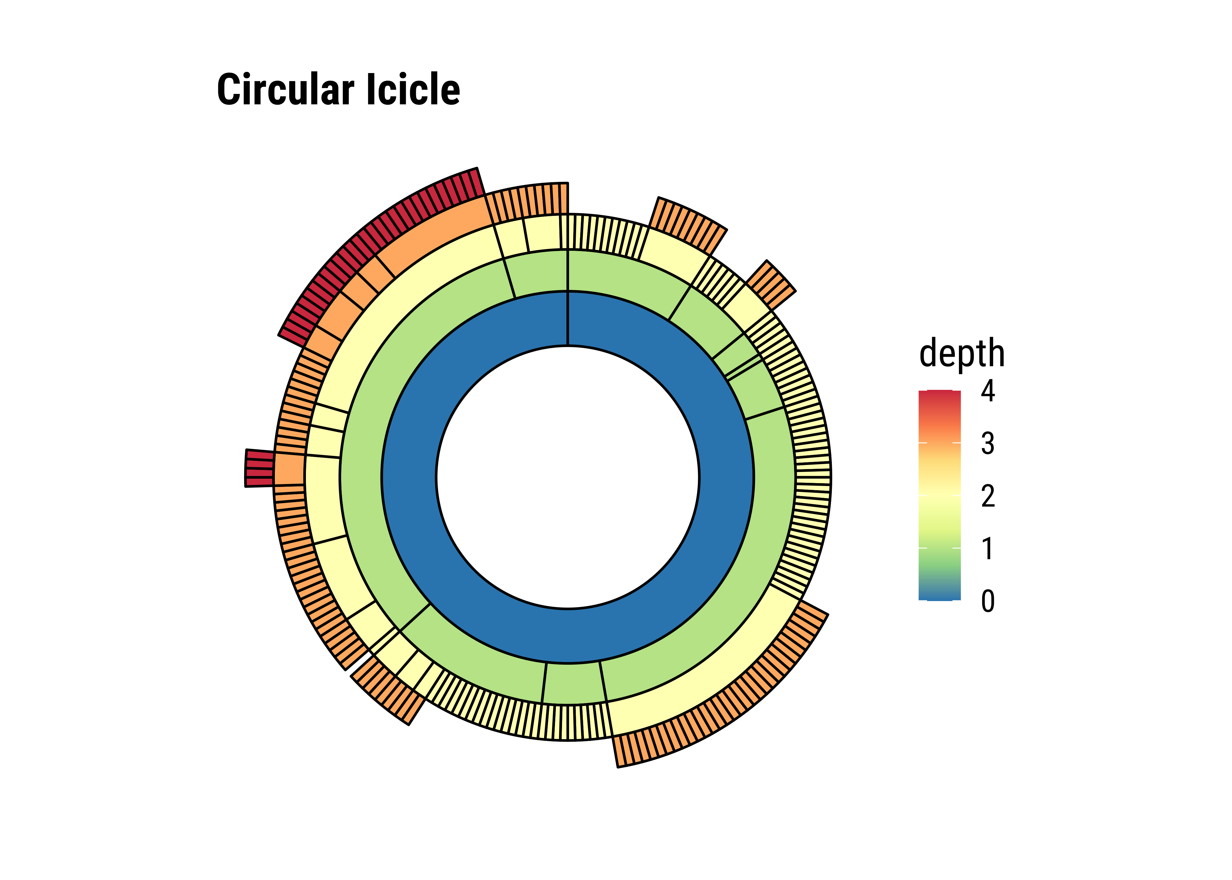
Questions and Inferences #9
How do graphs look “metaphorically” different? Do they reveal different aspects of the group? How?
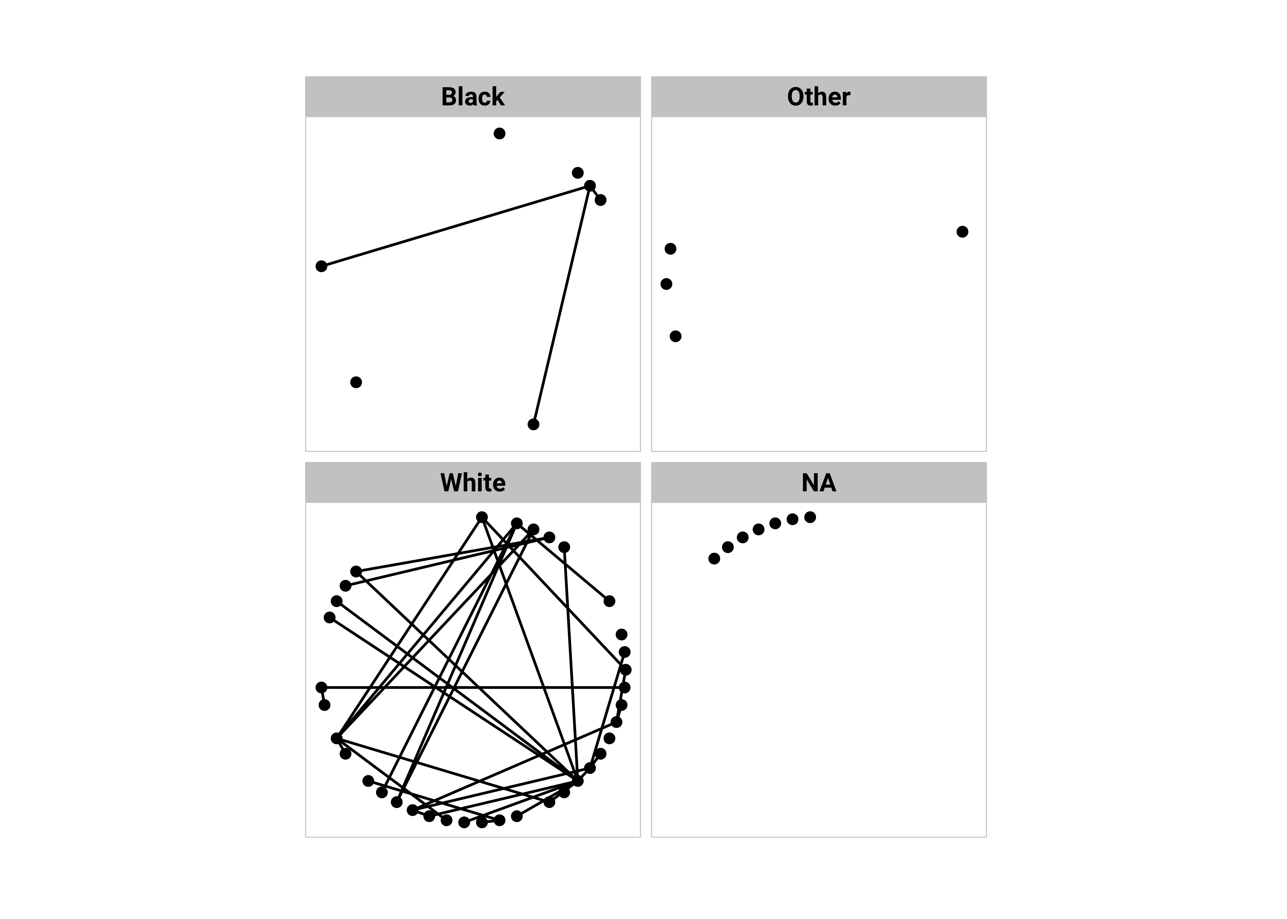
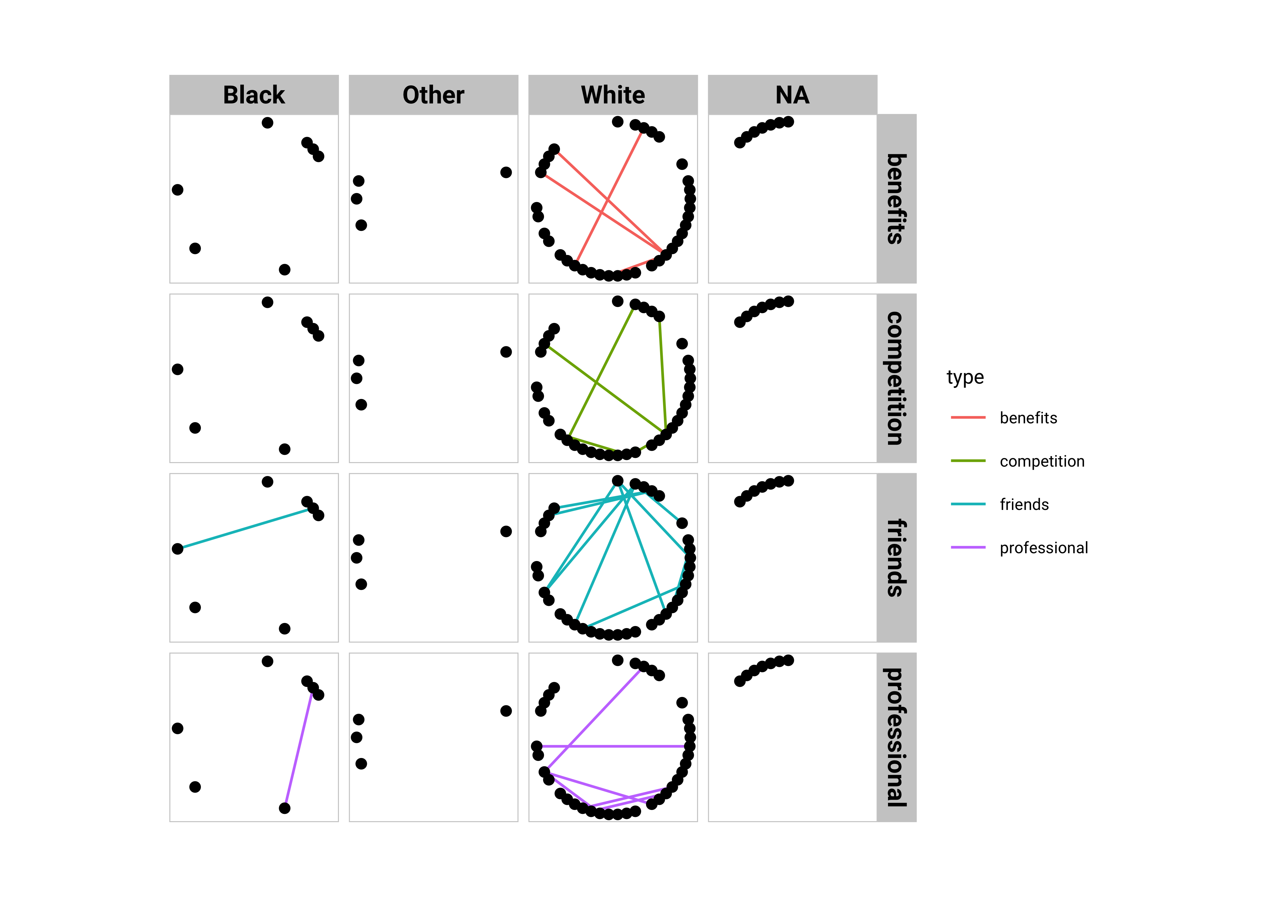
Faceting
Faceting allows to create sub-plots according to the values of a qualitative attribute on nodes or edges.
set_graph_style(family = "Roboto Condensed", size = 11)
##
# facet edges by type
ggraph(ga, layout = "linear", circular = TRUE) +
  geom_edge_link0(aes(color = type)) +
  geom_node_point() +
  facet_edges(~type) +
  th_foreground(border = TRUE) +
  theme(aspect.ratio = 1) +
  labs(
    title = "Grey's Anatomy Network",
    subtitle = "Types of Relationships"
  )

# facet nodes by sex
ggraph(ga, layout = "linear", circular = TRUE) +
  geom_edge_link0() +
  geom_node_point() +
  facet_nodes(~race) +
  th_foreground(border = TRUE) +
  theme(aspect.ratio = 1) +
  labs(
    title = "Grey's Anatomy Network",
    subtitle = "Race"
  )


# facet both nodes and edges
ggraph(ga, layout = "linear", circular = TRUE) +
  geom_edge_link0(aes(color = type)) +
  geom_node_point() +
  facet_graph(type ~ race) +
  th_foreground(border = TRUE) +
  theme(aspect.ratio = 1, legend.position = "right") +
  labs(
    title = "Grey's Anatomy Network",
    subtitle = "Race and Relationship"
  )

unset_graph_style()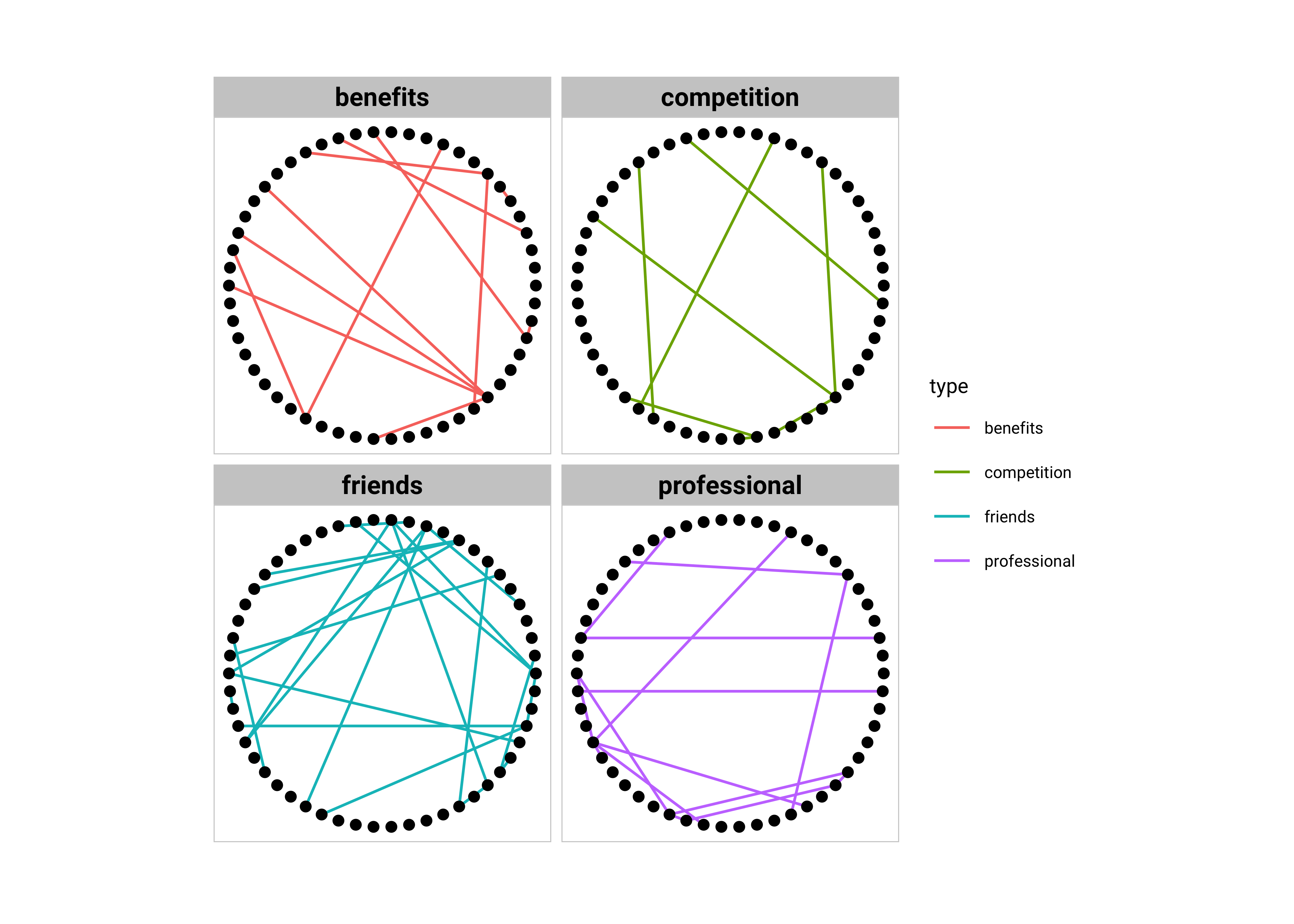
Questions and Inferences #10
Does splitting up the main graph into sub-networks give you more insight? Describe some of these.
Network analysis with tidygraph
The data frame graph representation can be easily augmented with metrics or statistics computed on the graph. Remember how we computed counts with the penguin dataset in Grammar of Graphics.
Before computing a metric on nodes or edges use the activate() function to activate either node or edge data frames. Use dplyr verbs (filter, arrange, mutate) to achieve your computation in the proper way.
Network Centrality: Go-To and Go-Through People!
Centrality is a an “ill-defined” metric of node and edge importance in a network. It is therefore calculated in many ways. Type ?centrality in your Console.
Let’s add a few columns to the nodes and edges based on network centrality measures:
ga %>%
  activate(nodes) %>%
  # Node with  the most connections?
  mutate(degree = centrality_degree(mode = c("in"))) %>%
  filter(degree > 0) %>%
  activate(edges) %>%
  # "Busiest" edge?
  mutate(betweenness = centrality_edge_betweenness())
# A tbl_graph: 54 nodes and 57 edges
#
# An undirected simple graph with 4 components
#
# Edge Data: 57 × 5 (active)
from to weight type betweenness
<int> <int> <dbl> <chr> <dbl>
1 5 47 2 friends 20.3
2 21 47 4 benefits 44.7
3 5 46 1 friends 39
4 5 41 1 friends 66.3
5 18 41 6 friends 39
6 21 41 12 benefits 91.5
7 37 41 5 professional 164.
8 31 41 2 professional 98.8
9 20 31 3 professional 47.2
10 17 31 4 friends 102.
# ℹ 47 more rows
#
# Node Data: 54 × 8
name sex race birthyear position season sign degree
<chr> <chr> <chr> <dbl> <chr> <dbl> <chr> <dbl>
1 Addison Montgomery F White 1967 Attending 1 Libra 3
2 Adele Webber F Black 1949 Non-Staff 2 Leo 1
3 Teddy Altman F White 1969 Attending 6 Pisces 4
# ℹ 51 more rowsPackages tidygraph and ggraph can be pipe-lined to perform analysis and visualization tasks in one go.
##
set_graph_style(family = "Roboto Condensed", size = 16)
##
ggraph(ga, layout = "nicely") +
  geom_edge_link0(aes(width = centrality_edge_betweenness())) +

  geom_node_point(aes(
    colour = centrality_degree(),
    size = centrality_degree()
  )) +

  geom_node_text(aes(label = name), repel = TRUE, size = 2.5) +

  scale_size(name = "Degree", range = c(2, 5)) +

  scale_color_fermenter(
    name = "Degree", # USE SAME NAME to Merge legends!!
    palette = "Set1",
    aesthetics = c("colour", "fill"),
    guide = guide_legend(reverse = FALSE)
  ) +

  scale_edge_width(name = "Betweenness", range = c(0.25, 1)) +
  labs(
    title = "Grey's Anatomy",
    subtitle = "Nodes Scaled by Degree, Edge-width scaled by Betweenness"
  )
Questions and Inferences #11
How do the Centrality Measures show up in the graph? Would you “agree” with the way we have done it? Try to modify the aesthetics by copy-pasting this chunk below and see how you can make an alternative representation.
Analysis and Visualizing Network Communities
Who is close to whom? Which are the groups you can see?
##
set_graph_style(family = "Roboto Condensed", size = 16)
##
# visualize communities of nodes
ga %>%
  activate(nodes) %>%
  mutate(community = as.factor(group_louvain())) %>%
  ggraph(layout = "graphopt") +
  geom_edge_link0() +
  geom_node_point(aes(fill = community), size = 3, shape = 21) +
  scale_fill_brewer(palette = "Set1") +
  labs(title = "Grey's Anatomy", subtitle = "Nodes Coloured by Community Detection Algorithm (Louvain)")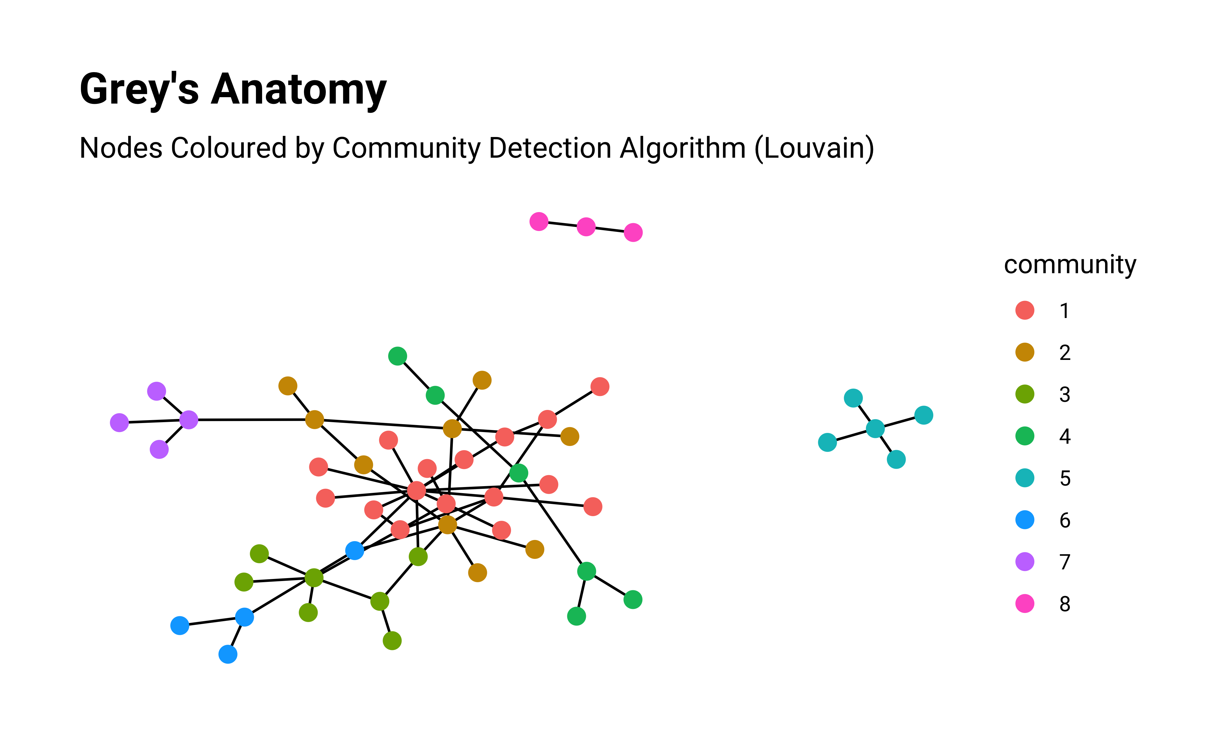
Questions and Inferences #12
Is the Community depiction clear? How would you do it, with which aesthetic? Copy Paste this chunk below and try.
Interactive Graphs with visNetwork
Exploring the VisNetwork package. Make graphs wiggle and shake using tidy commands! The package implements interactivity using the physical metaphor of weights and springs we discussed earlier.
The visNetwork() function uses a nodes list and edges list to create an interactive graph. The nodes list must include an “id” column, and the edge list must have “from” and “to” columns. The function also plots the labels for the nodes, using the names of the cities from the “label” column in the node list.
library(visNetwork)

# Prepare the data for plotting by visNetwork
grey_nodes
grey_edges
# Relabel greys anatomy nodes and edges for VisNetwork
grey_nodes_vis <- grey_nodes %>%
  rowid_to_column(var = "id") %>%
  rename("label" = name) %>%
  mutate(sex = case_when(
    sex == "F" ~ "Female",
    sex == "M" ~ "Male"
  )) %>%
  replace_na(., list(sex = "Transgender?")) %>%
  rename("group" = sex)
grey_nodes_vis
grey_edges_vis <- grey_edges %>%
  select(from, to) %>%
  left_join(., grey_nodes_vis,
    by = c("from" = "label")
  ) %>%
  left_join(., grey_nodes_vis,
    by = c("to" = "label")
  ) %>%
  select("from" = id.x, "to" = id.y)
grey_edges_visname <chr> | sex <chr> | race <chr> | birthyear <dbl> | position <chr> | season <dbl> | sign <chr> |
|---|---|---|---|---|---|---|
| Addison Montgomery | F | White | 1967 | Attending | 1 | Libra |
| Adele Webber | F | Black | 1949 | Non-Staff | 2 | Leo |
| Teddy Altman | F | White | 1969 | Attending | 6 | Pisces |
| Amelia Shepherd | F | White | 1981 | Attending | 7 | Libra |
| Arizona Robbins | F | White | 1976 | Attending | 5 | Leo |
| Rebecca Pope | F | White | 1975 | Non-Staff | 3 | Gemini |
| Jackson Avery | M | Black | 1981 | Resident | 6 | Leo |
| Miranda Bailey | F | Black | 1969 | Attending | 1 | Virgo |
| Ben Warren | M | Black | 1972 | Other | 6 | Aquarius |
| Henry Burton | M | White | 1972 | Non-Staff | 7 | Cancer |
from <chr> | to <chr> | weight <dbl> | type <chr> | |
|---|---|---|---|---|
| Leah Murphy | Arizona Robbins | 2 | friends | |
| Leah Murphy | Alex Karev | 4 | benefits | |
| Lauren Boswell | Arizona Robbins | 1 | friends | |
| Arizona Robbins | Callie Torres | 1 | friends | |
| Callie Torres | Erica Hahn | 6 | friends | |
| Callie Torres | Alex Karev | 12 | benefits | |
| Callie Torres | Mark Sloan | 5 | professional | |
| Callie Torres | George O'Malley | 2 | professional | |
| George O'Malley | Izzie Stevens | 3 | professional | |
| George O'Malley | Meredith Grey | 4 | friends |
id <int> | label <chr> | group <chr> | race <chr> | birthyear <dbl> | position <chr> | season <dbl> | sign <chr> |
|---|---|---|---|---|---|---|---|
| 1 | Addison Montgomery | Female | White | 1967 | Attending | 1 | Libra |
| 2 | Adele Webber | Female | Black | 1949 | Non-Staff | 2 | Leo |
| 3 | Teddy Altman | Female | White | 1969 | Attending | 6 | Pisces |
| 4 | Amelia Shepherd | Female | White | 1981 | Attending | 7 | Libra |
| 5 | Arizona Robbins | Female | White | 1976 | Attending | 5 | Leo |
| 6 | Rebecca Pope | Female | White | 1975 | Non-Staff | 3 | Gemini |
| 7 | Jackson Avery | Male | Black | 1981 | Resident | 6 | Leo |
| 8 | Miranda Bailey | Female | Black | 1969 | Attending | 1 | Virgo |
| 9 | Ben Warren | Male | Black | 1972 | Other | 6 | Aquarius |
| 10 | Henry Burton | Male | White | 1972 | Non-Staff | 7 | Cancer |
from <int> | to <int> | |||
|---|---|---|---|---|
| 47 | 5 | |||
| 47 | 21 | |||
| 46 | 5 | |||
| 5 | 41 | |||
| 41 | 18 | |||
| 41 | 21 | |||
| 41 | 37 | |||
| 41 | 31 | |||
| 31 | 20 | |||
| 31 | 17 |
Using fontawesome icons
grey_nodes_vis %>%
  visNetwork(nodes = ., edges = grey_edges_vis) %>%
  visNodes(font = list(size = 40)) %>%
  # Colour and icons for each of the gender-groups
  visGroups(
    groupname = "Female", shape = "icon",
    icon = list(code = "f182", size = 75, color = "tomato"),
    shadow = list(enabled = TRUE)
  ) %>%
  visGroups(
    groupname = "Male", shape = "icon",
    icon = list(code = "f183", size = 75, color = "slateblue"),
    shadow = list(enabled = TRUE)
  ) %>%
  visGroups(
    groupname = "Transgender?", shape = "icon",
    icon = list(code = "f22c", size = 75, color = "fuchsia"),
    shadow = list(enabled = TRUE)
  ) %>%
  # visLegend() %>%
  # Add the fontawesome icons!!
  addFontAwesome(version = "4.7.0") %>%
  # Add Interaction Controls
  visInteraction(
    navigationButtons = TRUE,
    hover = TRUE,
    selectConnectedEdges = TRUE,
    hoverConnectedEdges = TRUE,
    zoomView = TRUE
  )
There is another family of icons available in visNetwork, called ionicons. Let’s see how they look:
grey_nodes_vis %>%
  visNetwork(nodes = ., edges = grey_edges_vis, ) %>%
  visLayout(randomSeed = 12345) %>%
  visNodes(font = list(size = 50)) %>%
  visEdges(color = "green") %>%
  visGroups(
    groupname = "Female",
    shape = "icon",
    icon = list(
      face = "Ionicons",
      code = "f25d",
      color = "fuchsia",
      size = 125
    )
  ) %>%
  visGroups(
    groupname = "Male",
    shape = "icon",
    icon = list(
      face = "Ionicons",
      code = "f202",
      color = "green",
      size = 125
    )
  ) %>%
  visGroups(
    groupname = "Transgender?",
    shape = "icon",
    icon = list(
      face = "Ionicons",
      code = "f233",
      color = "dodgerblue",
      size = 125
    )
  ) %>%
  visLegend() %>%
  addIonicons() %>%
  visInteraction(
    navigationButtons = TRUE,
    hover = TRUE,
    selectConnectedEdges = TRUE,
    hoverConnectedEdges = TRUE,
    zoomView = TRUE
  )
Some idea of interactivity and controls with visNetwork:
# We need to rename starwars nodes dataframe and edge dataframe columns for visNetwork
starwars_nodes_vis <-
  starwars_nodes %>%
  rename("label" = name)

# Convert from and to columns to **node ids**
starwars_edges_vis <-
  starwars_edges %>%
  # Matching Source <- Source Node id ("id.x")
  left_join(., starwars_nodes_vis, by = c("source" = "label")) %>%
  # Matching Target <- Target Node id ("id.y")
  left_join(., starwars_nodes_vis, by = c("target" = "label")) %>%
  # Select "id.x" and "id.y" ONLY
  # Rename them as "from" and "to"
  # keep "weight" column for aesthetics of edges
  select("from" = id.x, "to" = id.y, "value" = weight)

# Check everything once
starwars_nodes_vis
starwars_edges_vislabel <chr> | id <dbl> | |||
|---|---|---|---|---|
| R2-D2 | 0 | |||
| CHEWBACCA | 1 | |||
| C-3PO | 2 | |||
| LUKE | 3 | |||
| DARTH VADER | 4 | |||
| CAMIE | 5 | |||
| BIGGS | 6 | |||
| LEIA | 7 | |||
| BERU | 8 | |||
| OWEN | 9 |
from <dbl> | to <dbl> | value <dbl> | ||
|---|---|---|---|---|
| 2 | 0 | 17 | ||
| 3 | 0 | 13 | ||
| 10 | 0 | 6 | ||
| 7 | 0 | 5 | ||
| 13 | 0 | 5 | ||
| 1 | 0 | 3 | ||
| 16 | 0 | 1 | ||
| 1 | 10 | 7 | ||
| 2 | 1 | 5 | ||
| 1 | 3 | 16 |
Ok, let’s make things move and shake!!
visNetwork(
  nodes = starwars_nodes_vis,
  edges = starwars_edges_vis
) %>%
  visNodes(font = list(size = 30)) %>%
visEdges(color = "red")visNetwork(
nodes = starwars_nodes_vis,
edges = starwars_edges_vis
) %>%
visNodes(
font = list(size = 30), shape = "icon",
icon = list(code = "f1e3", size = 75)
) %>%
visEdges(color = list(color = "red", hover = "green", highlight = "black")) %>%
visInteraction(
navigationButtons = TRUE,
hover = TRUE,
selectConnectedEdges = TRUE,
hoverConnectedEdges = TRUE,
zoomView = TRUE
) %>%
addFontAwesome(version = "4.7.0")
Airline Data:
Start with this bit of code in your second chunk, after set up
```{r}
#| label: start up code for Airlines
#| eval: false ## remove this!!
airline_nodes <-
  read_csv("./mydatafolder/AIRLINES-NODES.csv") %>%
  mutate(Id = Id + 1)

airline_edges <-
  read_csv("./mydatafolder/AIRLINES-EDGES.csv") %>%
  mutate(Source = Source + 1, Target = Target + 1)
```
The Famous Zachary Karate Club dataset
- Start with pulling this data into your Quarto:
```{r}
#| eval: false ## remove this!
data("karate", package = "igraphdata")
karate
```- Try
?karatein the console
- Note that this is not a set of nodes, nor edges, but already a graph-object!
- So no need to create a graph object using
tbl_graph.
- You will need to just go ahead and plot using
ggraph.
Game of Thrones:
- Start with pulling this data into your Rmarkdown:
```{r}
#| label: start-up code for GoT
#| eval: false ## remove this!!

GoT <- read_rds("data/GoT.RDS")
```- Note that this is a list of 7 graphs from Game of Thrones.
- Select one using
GoT[[index]]where index = 1…7 and then plot directly. - Try to access the nodes and edges and modify them using any attribute data
Other Datasets
- Choose any other graph dataset from
igraphdata
- (type
?igraphdatain console)
- Ask me for help if you need any
Make-2: Literary Network with TV Show / Book / Story / Play
You need to create a Network Graph for your favourite Book, play, TV serial or Show. (E.g. Friends, BBT, or LB or HIMYM, B99, TGP, JTV…or Hamlet, Little Women , Pride and Prejudice, or LoTR)
Step 1. Go to: Literary Networks for instructions.
-
Step 2. Make your data using the instructions.
- In the nodes excel, use
idandnamesas your columns. Any other details in other columns to the right.
- In your
edgesexcel, usefromandtoas your first columns.
- Entries in these columns can be
namesorids but be consistent and don’t mix.
- In the nodes excel, use
Step 3. Decide on 3 answers that you to seek and plan to make graphs for.
Step 4. Create graph objects. Say 3 visualizations.
Step 5. Write comments/answers in the code and narrative text. Add pictures from the web using Markdown syntax.
Step 6. Write Reflection ( ok, a short one!) inside your Quarto document. Make sure it renders !!
Step 7. Group Submission: Submit the render-able .qmd file AND the data. Quarto Markdown with joint authorship. Each person submits on their Assignments. All get the same grade on this one.
Ask me for clarifications on what to do after you have read the Instructions in your group.
-
Hadley Wickham, Danielle Navarro, and Thomas Lin Pedersen, ggplot2: Elegant Graphics for Data Analysis. https://ggplot2-book.org/networks
- Omar Lizardo and Isaac Jilbert, Social Networks: An Introduction. https://bookdown.org/omarlizardo/_main/
- Mark Hoffman, Methods for Network Analysis. https://bookdown.org/markhoff/social_network_analysis/
-
Statistical Analysis of Network Data with R, 2nd Edition.https://github.com/kolaczyk/sand
-
Thomas Lin Pedersen - 1 giraffe, 2 giraffe,GO!
- Tyner, Sam, François Briatte, and Heike Hofmann. 2017. “Network Visualization with ggplot2.” The R Journal 9 (1): 27–59. https://journal.r-project.org/archive/2017/RJ-2017-023/index.html
- Network Datasets https://icon.colorado.edu/#!/networks
- Yunran Chen, Introduction to Network Analysis Using R
| Package | Version | Citation |
|---|---|---|
| ggraph | 2.2.1 | Pedersen (2024a) |
| ggtext | 0.1.2 | Wilke and Wiernik (2022) |
| graphlayouts | 1.2.2 | David Schoch (2023) |
| igraph | 2.1.4 | Csardi and Nepusz (2006); Csárdi et al. (2025) |
| igraphdata | 1.0.1 | Csardi (2015) |
| sand | 2.0.0 | Kolaczyk and Csárdi (2020) |
| showtext | 0.9.7 | Qiu and See file AUTHORS for details. (2024) |
| tidygraph | 1.3.1 | Pedersen (2024b) |
| visNetwork | 2.1.2 | Almende B.V. and Contributors and Thieurmel (2022) |
Almende B.V. and Contributors, and Benoit Thieurmel. 2022. visNetwork: Network Visualization Using “vis.js” Library. https://doi.org/10.32614/CRAN.package.visNetwork.
Csardi, Gabor. 2015. igraphdata: A Collection of Network Data Sets for the “igraph” Package. https://doi.org/10.32614/CRAN.package.igraphdata.
Csardi, Gabor, and Tamas Nepusz. 2006. “The Igraph Software Package for Complex Network Research.” InterJournal Complex Systems: 1695. https://igraph.org.
Csárdi, Gábor, Tamás Nepusz, Vincent Traag, Szabolcs Horvát, Fabio Zanini, Daniel Noom, and Kirill Müller. 2025. igraph: Network Analysis and Visualization in r. https://doi.org/10.5281/zenodo.7682609.
David Schoch. 2023. “graphlayouts: Layout Algorithms for Network Visualizations in r.” Journal of Open Source Software 8 (84): 5238. https://doi.org/10.21105/joss.05238.
Kolaczyk, Eric, and Gábor Csárdi. 2020. sand: Statistical Analysis of Network Data with r, 2nd Edition. https://doi.org/10.32614/CRAN.package.sand.
Pedersen, Thomas Lin. 2024a. ggraph: An Implementation of Grammar of Graphics for Graphs and Networks. https://doi.org/10.32614/CRAN.package.ggraph.
———. 2024b. tidygraph: A Tidy API for Graph Manipulation. https://doi.org/10.32614/CRAN.package.tidygraph.
Qiu, Yixuan, and authors/contributors of the included software. See file AUTHORS for details. 2024. showtext: Using Fonts More Easily in r Graphs. https://doi.org/10.32614/CRAN.package.showtext.
Wilke, Claus O., and Brenton M. Wiernik. 2022. ggtext: Improved Text Rendering Support for “ggplot2”. https://doi.org/10.32614/CRAN.package.ggtext.
Citation
BibTeX citation:
@online{2022,
  author = {},
  title = {\textless Iconify-Icon Icon=“bx:network-Chart” Width=“1.2em”
    Height=“1.2em”\textgreater\textless/Iconify-Icon\textgreater{}
    {Networks}},
  date = {2022-06-21},
  url = {https://av-quarto.netlify.app/content/courses/Analytics/Descriptive/Modules/100-Networks/},
  langid = {en},
  abstract = {How one thing connects to another}
}
For attribution, please cite this work as:
“<Iconify-Icon Icon=‘bx:network-Chart’
Width=‘1.2em’
Height=‘1.2em’></Iconify-Icon> Networks.”
2022. June 21, 2022. https://av-quarto.netlify.app/content/courses/Analytics/Descriptive/Modules/100-Networks/.