Applied Metaphors: Learning TRIZ, Complexity, Data/Stats/ML using Metaphors
  1. Teaching
  2. Data Science with No Code
  3. Quantity
  • Teaching
    • Data Analytics for Managers and Creators
      • Tools
        • Introduction to R and RStudio
        • Introduction to Radiant
        • Introduction to Orange
      • Descriptive Analytics
        • Data
        • Summaries
        • Counts
        • Quantities
        • Groups
        • Densities
        • Groups and Densities
        • Change
        • Proportions
        • Parts of a Whole
        • Evolution and Flow
        • Ratings and Rankings
        • Surveys
        • Time
        • Space
        • Networks
        • Experiments
        • Miscellaneous Graphing Tools, and References
      • Statistical Inference
        • 🧭 Basics of Statistical Inference
        • 🎲 Samples, Populations, Statistics and Inference
        • Basics of Randomization Tests
        • 🃏 Inference for a Single Mean
        • 🃏 Inference for Two Independent Means
        • 🃏 Inference for Comparing Two Paired Means
        • Comparing Multiple Means with ANOVA
        • Inference for Correlation
        • 🃏 Testing a Single Proportion
        • 🃏 Inference Test for Two Proportions
      • Inferential Modelling
        • Modelling with Linear Regression
        • Modelling with Logistic Regression
        • 🕔 Modelling and Predicting Time Series
      • Predictive Modelling
        • 🐉 Intro to Orange
        • ML - Regression
        • ML - Classification
        • ML - Clustering
      • Prescriptive Modelling
        • 📐 Intro to Linear Programming
        • 💭 The Simplex Method - Intuitively
        • 📅 The Simplex Method - In Excel
      • Workflow
        • Facing the Abyss
        • I Publish, therefore I Am
      • Case Studies
        • Demo:Product Packaging and Elderly People
        • Ikea Furniture
        • Movie Profits
        • Gender at the Work Place
        • Heptathlon
        • School Scores
        • Children's Games
        • Valentine’s Day Spending
        • Women Live Longer?
        • Hearing Loss in Children
        • California Transit Payments
        • Seaweed Nutrients
        • Coffee Flavours
        • Legionnaire’s Disease in the USA
        • Antarctic Sea ice
        • William Farr's Observations on Cholera in London
    • R for Artists and Managers
      • 🕶 Lab-1: Science, Human Experience, Experiments, and Data
      • Lab-2: Down the R-abbit Hole…
      • Lab-3: Drink Me!
      • Lab-4: I say what I mean and I mean what I say
      • Lab-5: Twas brillig, and the slithy toves…
      • Lab-6: These Roses have been Painted !!
      • Lab-7: The Lobster Quadrille
      • Lab-8: Did you ever see such a thing as a drawing of a muchness?
      • Lab-9: If you please sir…which way to the Secret Garden?
      • Lab-10: An Invitation from the Queen…to play Croquet
      • Lab-11: The Queen of Hearts, She Made some Tarts
      • Lab-12: Time is a Him!!
      • Iteration: Learning to purrr
      • Lab-13: Old Tortoise Taught Us
      • Lab-14: You’re are Nothing but a Pack of Cards!!
    • ML for Artists and Managers
      • 🐉 Intro to Orange
      • ML - Regression
      • ML - Classification
      • ML - Clustering
      • 🕔 Modelling Time Series
    • TRIZ for Problem Solvers
      • I am Water
      • I am What I yam
      • Birds of Different Feathers
      • I Connect therefore I am
      • I Think, Therefore I am
      • The Art of Parallel Thinking
      • A Year of Metaphoric Thinking
      • TRIZ - Problems and Contradictions
      • TRIZ - The Unreasonable Effectiveness of Available Resources
      • TRIZ - The Ideal Final Result
      • TRIZ - A Contradictory Language
      • TRIZ - The Contradiction Matrix Workflow
      • TRIZ - The Laws of Evolution
      • TRIZ - Substance Field Analysis, and ARIZ
    • Math Models for Creative Coders
      • Maths Basics
        • Vectors
        • Matrix Algebra Whirlwind Tour
        • content/courses/MathModelsDesign/Modules/05-Maths/70-MultiDimensionGeometry/index.qmd
      • Tech
        • Tools and Installation
        • Adding Libraries to p5.js
        • Using Constructor Objects in p5.js
      • Geometry
        • Circles
        • Complex Numbers
        • Fractals
        • Affine Transformation Fractals
        • L-Systems
        • Kolams and Lusona
      • Media
        • Fourier Series
        • Additive Sound Synthesis
        • Making Noise Predictably
        • The Karplus-Strong Guitar Algorithm
      • AI
        • Working with Neural Nets
        • The Perceptron
        • The Multilayer Perceptron
        • MLPs and Backpropagation
        • Gradient Descent
      • Projects
        • Projects
    • Data Science with No Code
      • Data
      • Orange
      • Summaries
      • Counts
      • Quantity
      • 🕶 Happy Data are all Alike
      • Groups
      • Change
      • Rhythm
      • Proportions
      • Flow
      • Structure
      • Ranking
      • Space
      • Time
      • Networks
      • Surveys
      • Experiments
    • Tech for Creative Education
      • 🧭 Using Idyll
      • 🧭 Using Apparatus
      • 🧭 Using g9.js
    • Literary Jukebox: In Short, the World
      • Italy - Dino Buzzati
      • France - Guy de Maupassant
      • Japan - Hisaye Yamamoto
      • Peru - Ventura Garcia Calderon
      • Russia - Maxim Gorky
      • Egypt - Alifa Rifaat
      • Brazil - Clarice Lispector
      • England - V S Pritchett
      • Russia - Ivan Bunin
      • Czechia - Milan Kundera
      • Sweden - Lars Gustaffsson
      • Canada - John Cheever
      • Ireland - William Trevor
      • USA - Raymond Carver
      • Italy - Primo Levi
      • India - Ruth Prawer Jhabvala
      • USA - Carson McCullers
      • Zimbabwe - Petina Gappah
      • India - Bharati Mukherjee
      • USA - Lucia Berlin
      • USA - Grace Paley
      • England - Angela Carter
      • USA - Kurt Vonnegut
      • Spain-Merce Rodoreda
      • Israel - Ruth Calderon
      • Israel - Etgar Keret
  • Posts
  • Blogs and Talks

On this page

  • What graphs will we see today?
  • What kind of Data Variables will we choose?
  • Inspiration
  • How do these Chart(s) Work?
  • Plotting a Histograms
  • Dataset: Netflix Original Series
    • Examine the Data
    • Data Dictionary
    • Research Questions
    • What is the Story Here?
  • Dataset: the Old Faithful geyser in the USA
    • Examine the Data
    • Data Dictionary
    • Research Questions
    • What is the Story Here?
  • Your Turn
  • Wait, But Why?
    • Pareto, Power Laws, and Fat Tailed Distributions
  • Readings
  1. Teaching
  2. Data Science with No Code
  3. Quantity

Quantity

The clocks were striking thirteen.

Qual Variables and Quant Variables
Histograms and Density Plots
Published

April 16, 2024

Modified

June 25, 2025

What graphs will we see today?

Variable #1 Variable #2 Chart Names Chart Shape
Quant None Histogram

What kind of Data Variables will we choose?

No Pronoun Answer Variable/Scale Example What Operations?
1 How Many / Much / Heavy? Few? Seldom? Often? When? Quantities, with Scale and a Zero Value.Differences and Ratios /Products are meaningful. Quantitative/Ratio Length,Height,Temperature in Kelvin,Activity,Dose Amount,Reaction Rate,Flow Rate,Concentration,Pulse,Survival Rate Correlation

Inspiration

Figure 1: Golf Drive Distance over the years

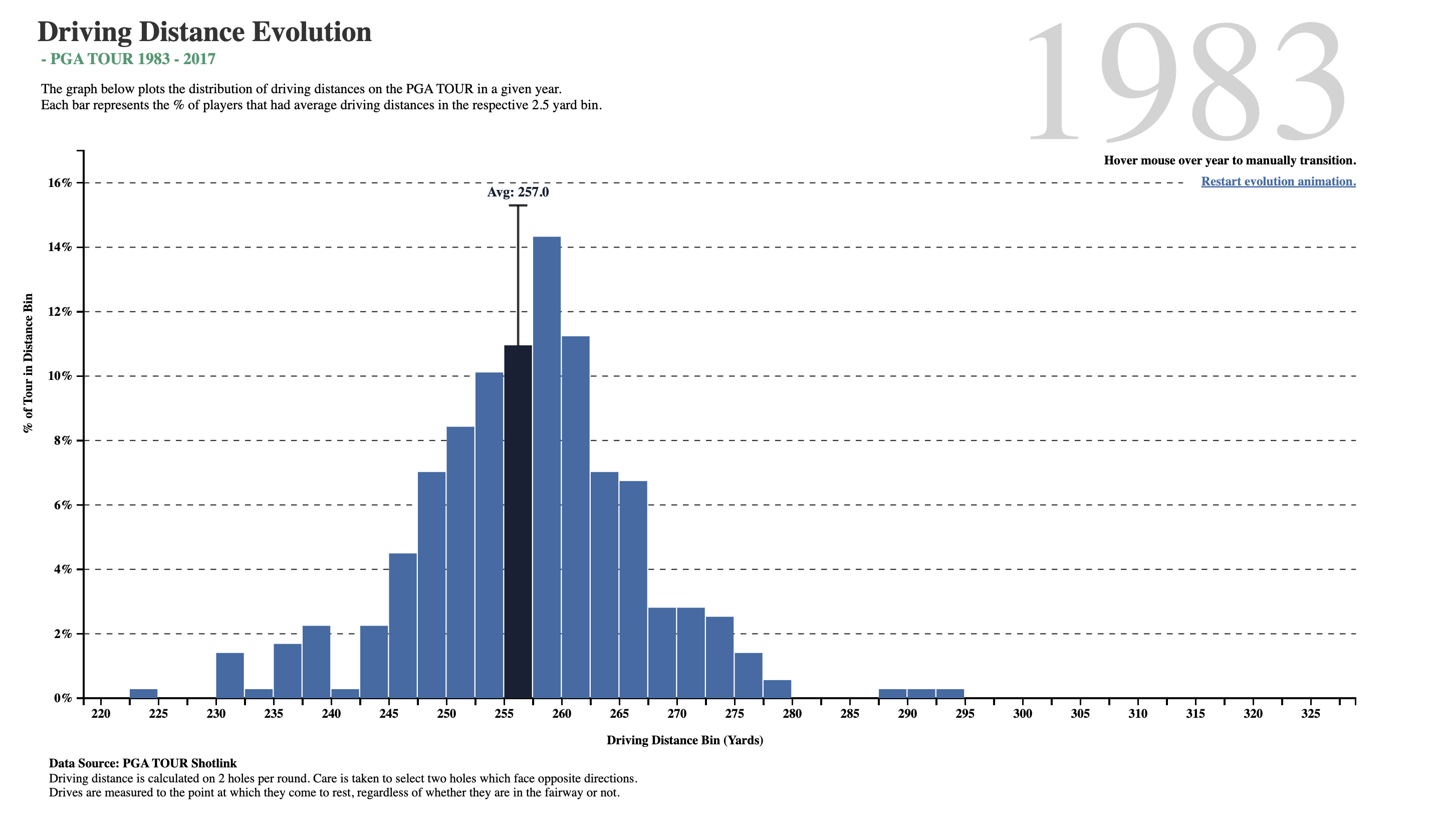
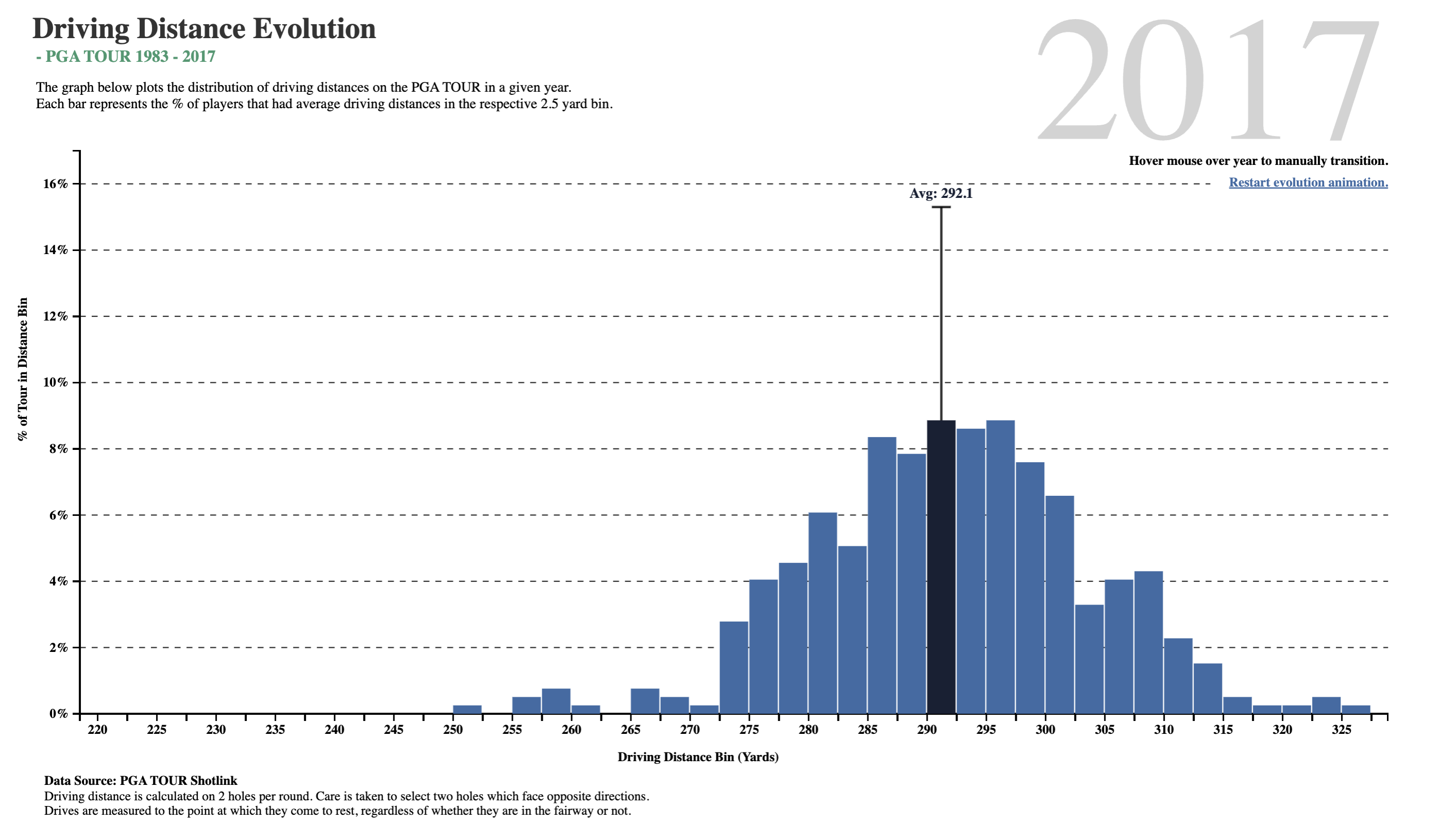
What do we see here? In about two-and-a-half decades, golf drive distances have increased, on the average, by 35 yards. The maximum distance has also gone up by 30 yards, and the minimum is now at 250 yards, which was close to average in 1983! What was a decent average in 1983 is just the bare minimum in 2017!!

Is it the dimples that the golf balls have? But these have been around a long time…or is it the clubs, and the swing technique invented by more recent players?

How do these Chart(s) Work?

Histograms are best to show the distribution of values of a quantitative variable. A distribution shows how often the variable in question lies within specific value ranges. We plot the histogram by displaying the how often vs defined ranges, often called buckets or bins. For example, in 2017, 8.5% of all drive distances were at the then average distance of 292.1 yards. One can create histogram buckets from Quant variables, such as 0-5, 6-10, 11-15…etc.

ImportantHistograms vs Bar/Column Charts

As we will see shortly, Bar/Column charts show categorical data, such as the number of apples, bananas, carrots, etc. Visually speaking, histograms do not usually show spaces between buckets because these are continuous values, while column charts must show spaces to separate each category. More later.

Plotting a Histograms

  • Using Orange
  • Using RAWgraphs
  • Using DataWrapper

Let us rapidly make some histograms in Orange, so that we know how the tool works here. We start with the iris dataset: Download this Orange workflow file and open it in Orange.

You can see the effect of modifying the bin widths, and of fitting a standard distribution for comparison.

RAWgraphs does not appear to have a histogram plotting tool…

https://academy.datawrapper.de/article/136-histogram-min-max-median-mean

DataWrapper also does not offer a separate histogram-making tool. Histograms in DataWrapper are available as a part of the data-inspection part of the work flow, as a small thumbnail-sized plot.

Dataset: Netflix Original Series

We are now ready for a more detailed example. Here is a look at this data on Netflix Original Series. Download it to your machine by clicking on the button below.

Examine the Data

Figure 2: Netflix Data Table

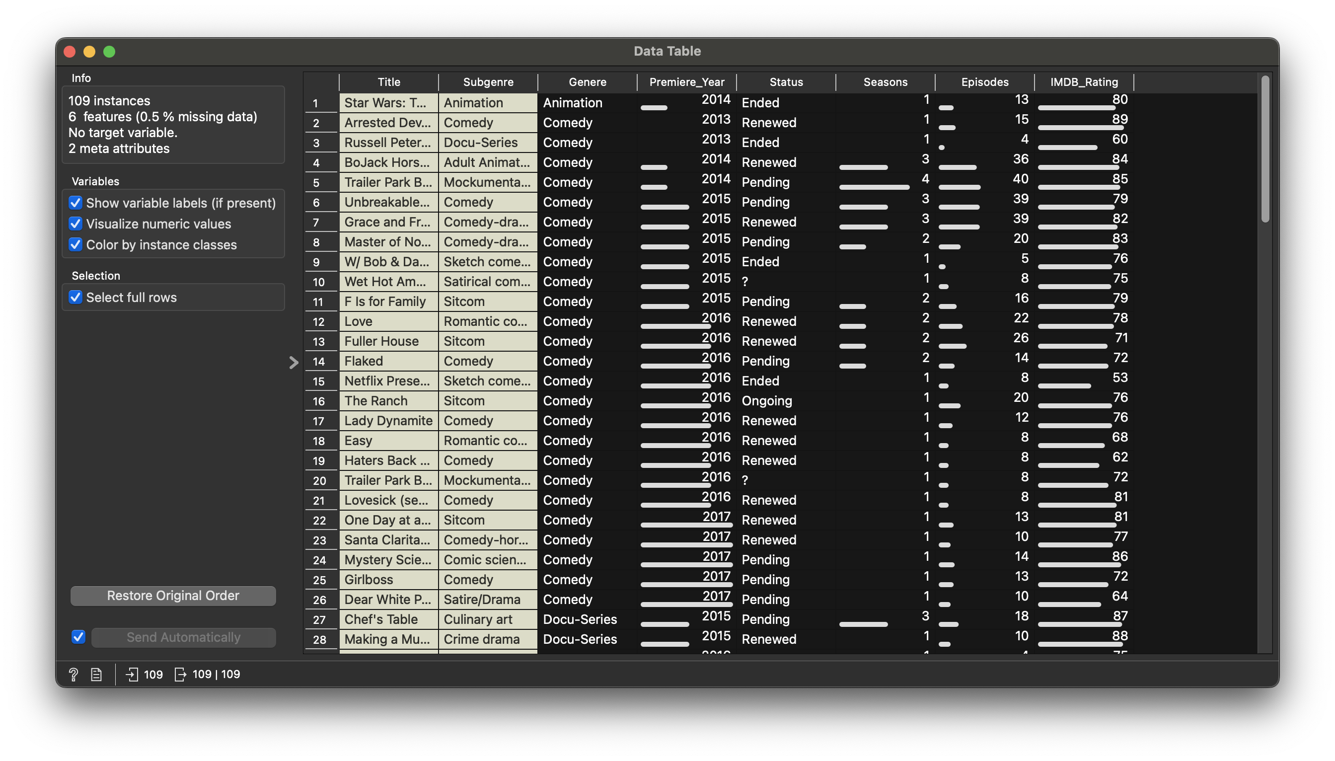
Figure 2 states that there are 109 movies, 6 variables in the dataset.

Data Dictionary

NoteQuantitative Data
  • Premiere_Year: (int) Year the movie premiered
  • Seasons: (int) No. of Seasons
  • Episodes: (int) No. of Episodes
  • IMDB_Rating: (int) IMDB Rating!!
NoteQualitative Data
  • Genere: (chr) types of Genres
  • Title: (chr) 109 titles
  • Subgenre: (chr) types of sub-Genres
  • Status: (chr) status on Netflix

Research Questions

Let’s try a few questions and see if they are answerable with Histograms.

Note

Q1. What is the distribution of IMDB_Rating? If we split/colour by movie Genere?

(a) IMDB Ratings Histogram
(b) IMDB Rating vs Genere
Figure 3: Netflix Data Histograms
Note

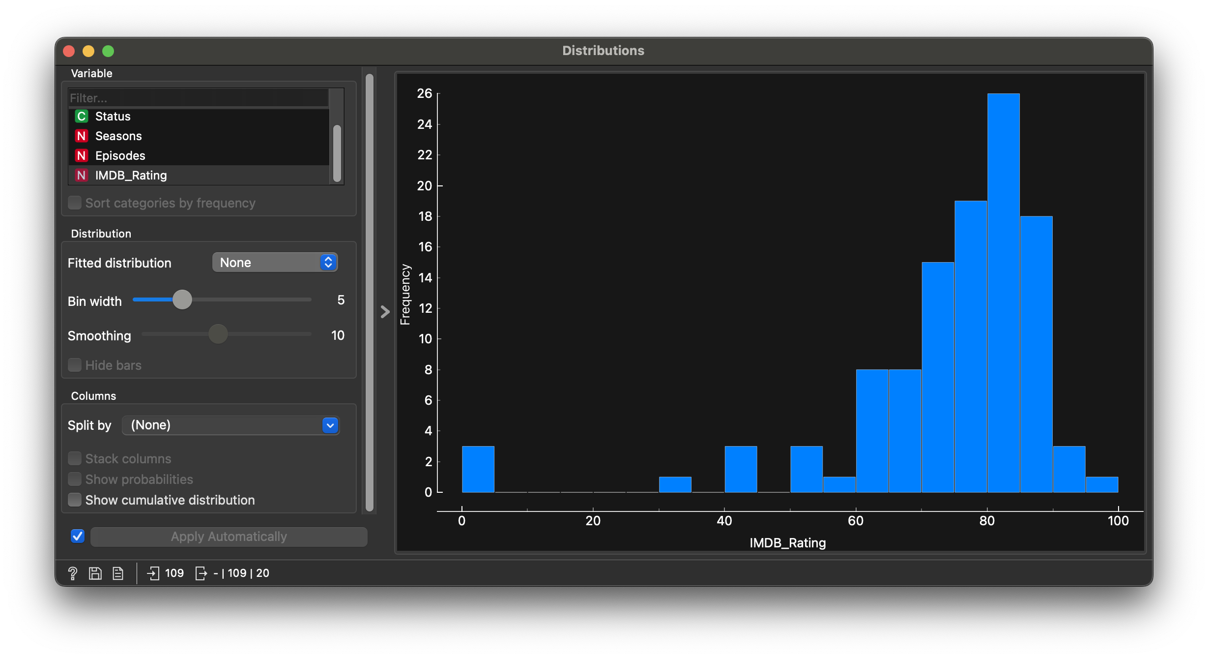
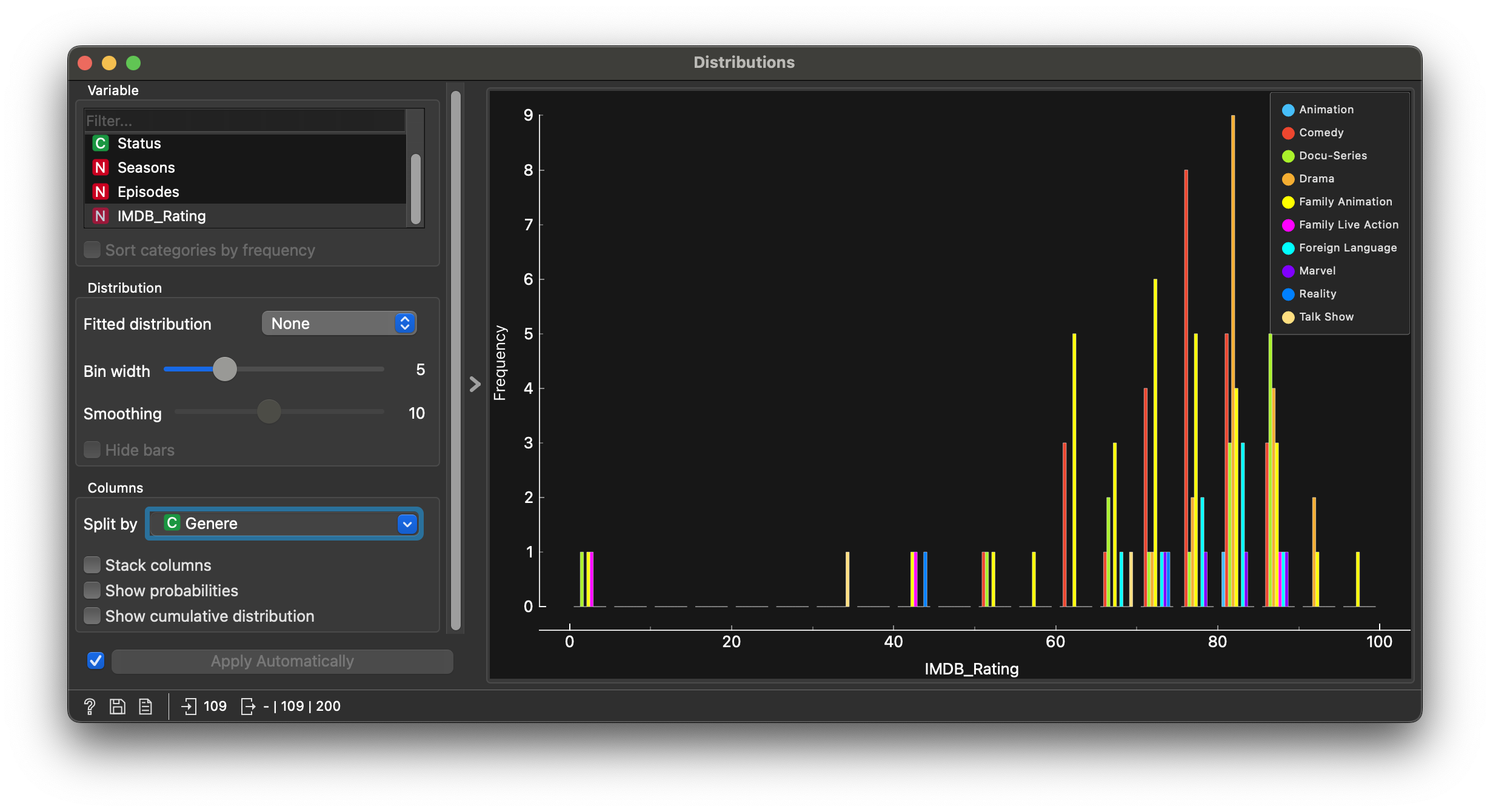
Q2. Are IMDB_Rating affected by the number of Seasons or Episodes?

(a) Reformatting “Seasons”
(b) IMDB Rating vs Seasons
Figure 4: Plotting with Seasons

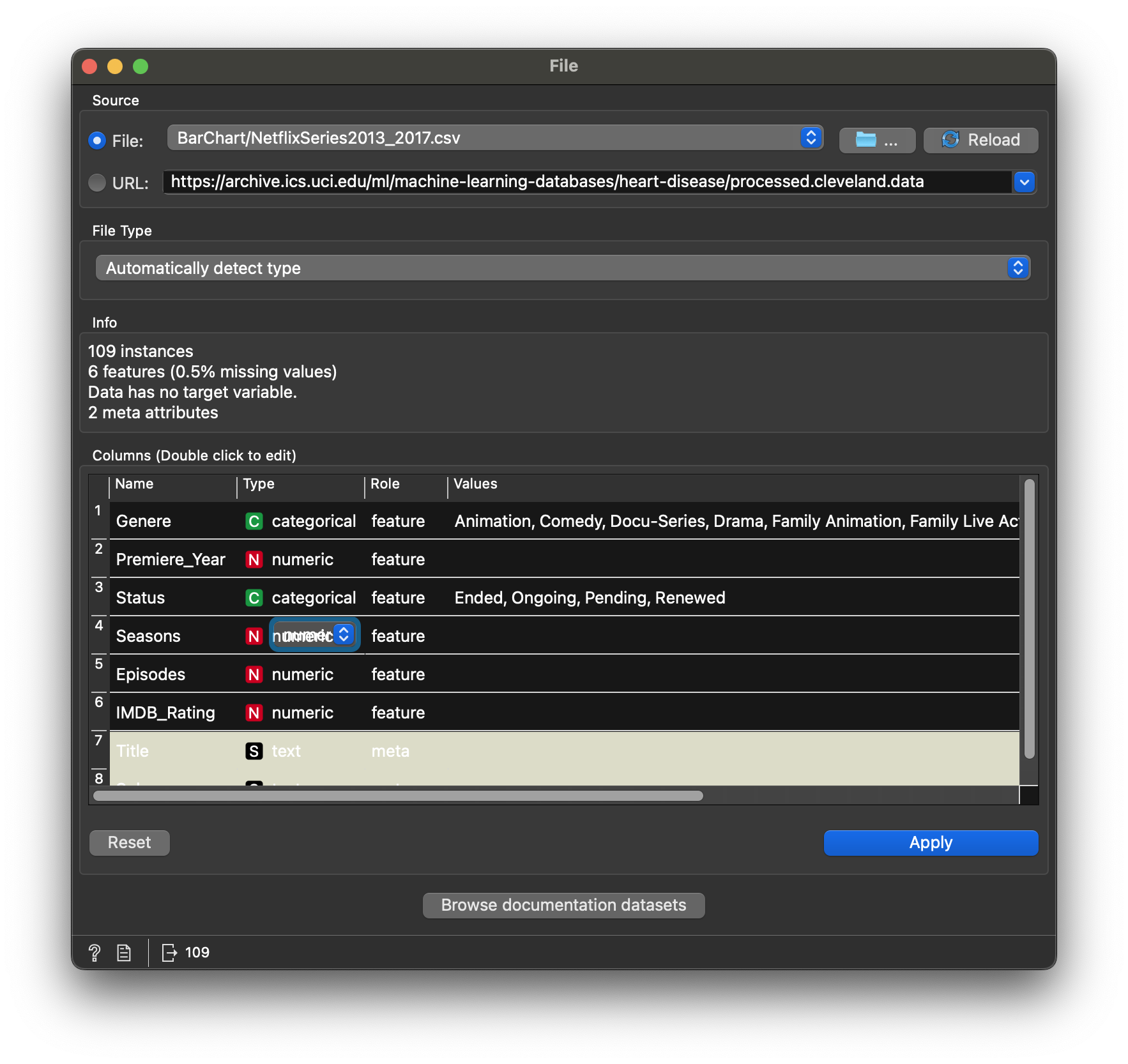
We first need to reformat the Seasons variable from N to C in the data file view. This converts it to Qual. Then we split the IMDB histogram by this new variable.

What is the Story Here?

Most movies have decent IMDB scores; the distribution is left-skewed. Some of course have been trashed!! Splitting IMDBRating by Genere is not too illuminating…

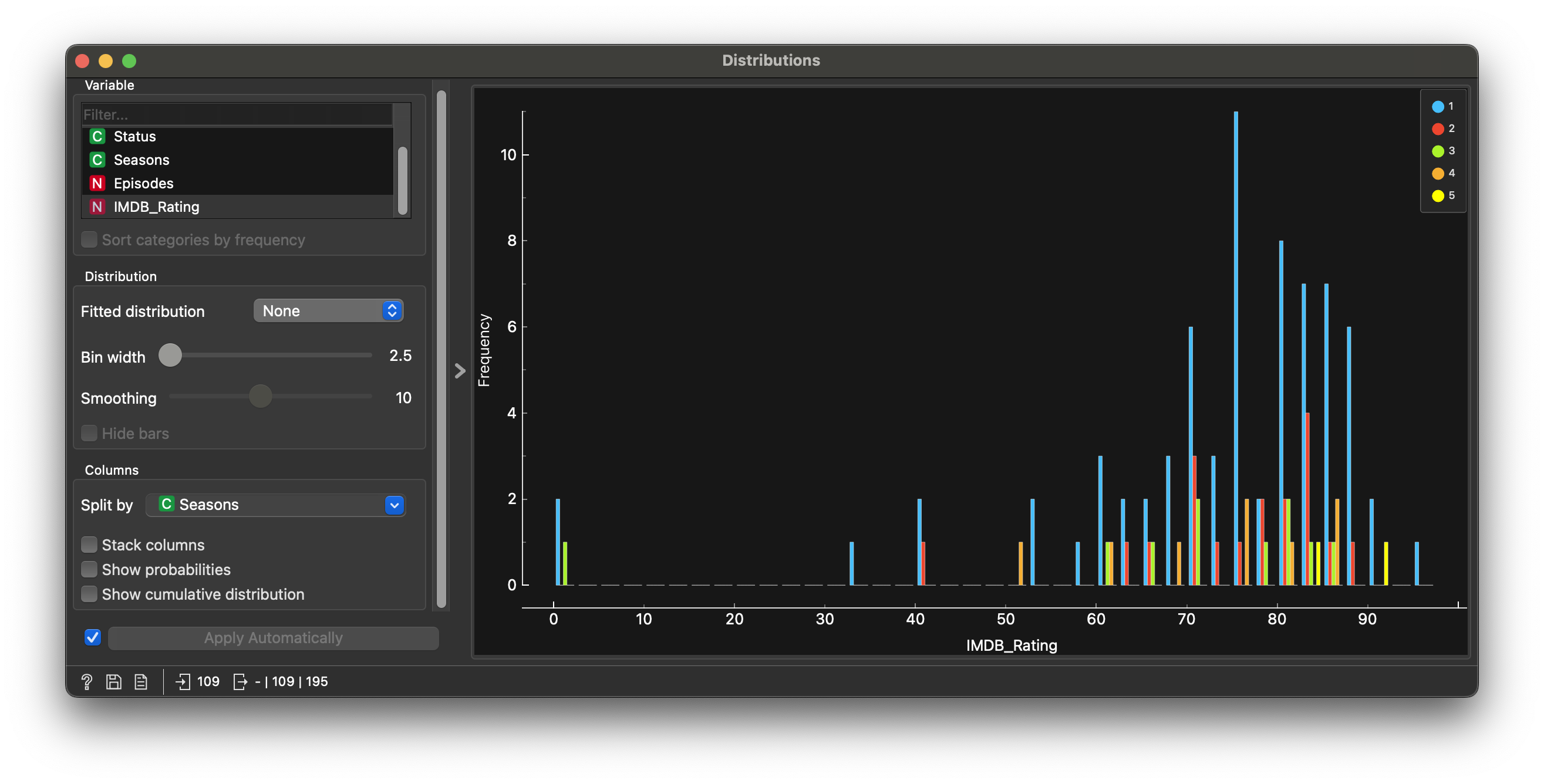
Not much wisdom to be gleaned either from splitting IMDBRating by Seasons…

Dataset: the Old Faithful geyser in the USA

Here is a dataset about the eruption durations, and wait times between eruptions of the Old Faithful geyser in Yellowstone National Park, USA.

Download this data to your machine and import it into Orange.

Examine the Data

Figure 5: Old Faithful Data Table

Figure 5 states that we have 272 data points, and three variables. All variables are Quantitative!

Data Dictionary

NoteQuantitative Data
  • eruptions: (dbl Duration Times of Eruptions
  • waiting: (dbl) Waiting Times between Eruptions
  • density: (dbl) (Ignore this for now)
NoteQualitative Data
  • No Qual variables!!

Research Questions

Note

Q1. How are eruptions (durations) and waiting (times) distributed?

(a) Eruption Durations Histogram
(b) Waiting Times Histogram
Figure 6: Old Faithful Data Histograms

What is the Story Here?

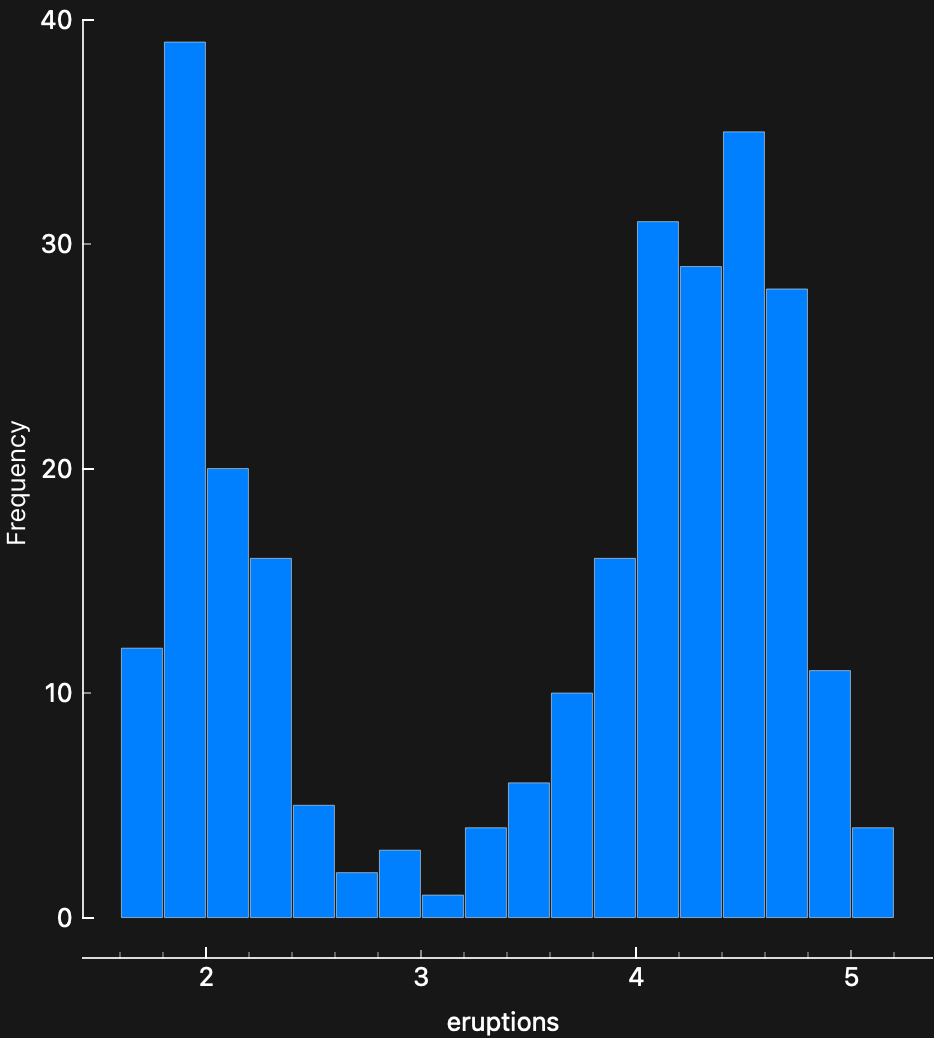
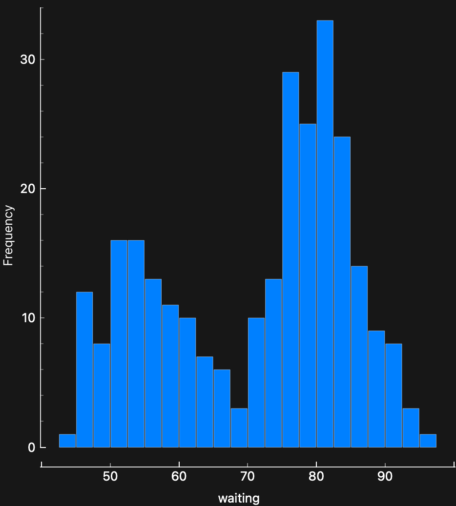
  • Both durations have a “double-humped” distribution…
  • There are therefore two distinct ranges for both durations.
  • Are there two different mechanisms at work in the geyser, that randomly kick in?

Your Turn

Try your hand at these datasets. Look at the data table, state the data dictionary, contemplate a few Research Questions and answer them with graphs in Orange!

NoteAirbnb Price Data on the French Riviera
NoteWage and Education Data from Canada

NoteTime taken to Open or Close Packages

Some HCD peasants tested Elderly people, some with and some without hand pain, and observed how long they took to open or close typical packages for milk, cheese, bottles etc.

Note

Orange can handle xlsx files directly. Try! How might you disregard the different package types and concentrate on “Opening/Closing Times” vs “Hand Pain or no Hand Pain”?

Wait, But Why?

  • Histograms are used to study the distribution of one or a few Quant variables.
  • Checking the distribution of your variables one by one is probably the first task you should do when you get a new dataset.
  • It delivers a good quantity of information about spread, how frequent the observations are, and if there are some outlandish ones.
  • Comparing histograms side-by-side helps to provide insight about whether a Quant measurement varies with situation (a Qual variable). We will see this properly in a statistical way soon.

Pareto, Power Laws, and Fat Tailed Distributions

City Populations, Sales across product categories, Salaries, Instagram connections, number of customers vs Companies, net worth / valuation of Companies, extreme events on stock markets….all of these could have highly skewed distributions. In such a case, the standard statistics of mean/median/sd may not convey too much information. With such distributions, one additional observation on say net worth, like say Mr Gates’, will change these measures completely.

Since very large observations are indeed possible, if not highly probable, one needs to look at the result of such an observation and its impact on a situation rather than its (mere) probability. Classical statistical measures and analysis cannot apply with long-tailed distributions. More on this later when we discuss Statistical Inference, but for now, here is a video that talks in detail about fat-tailed distributions, and how one should use them and get used to them:

Several distribution shapes exist, here is an illustration of the 6 most common ones:

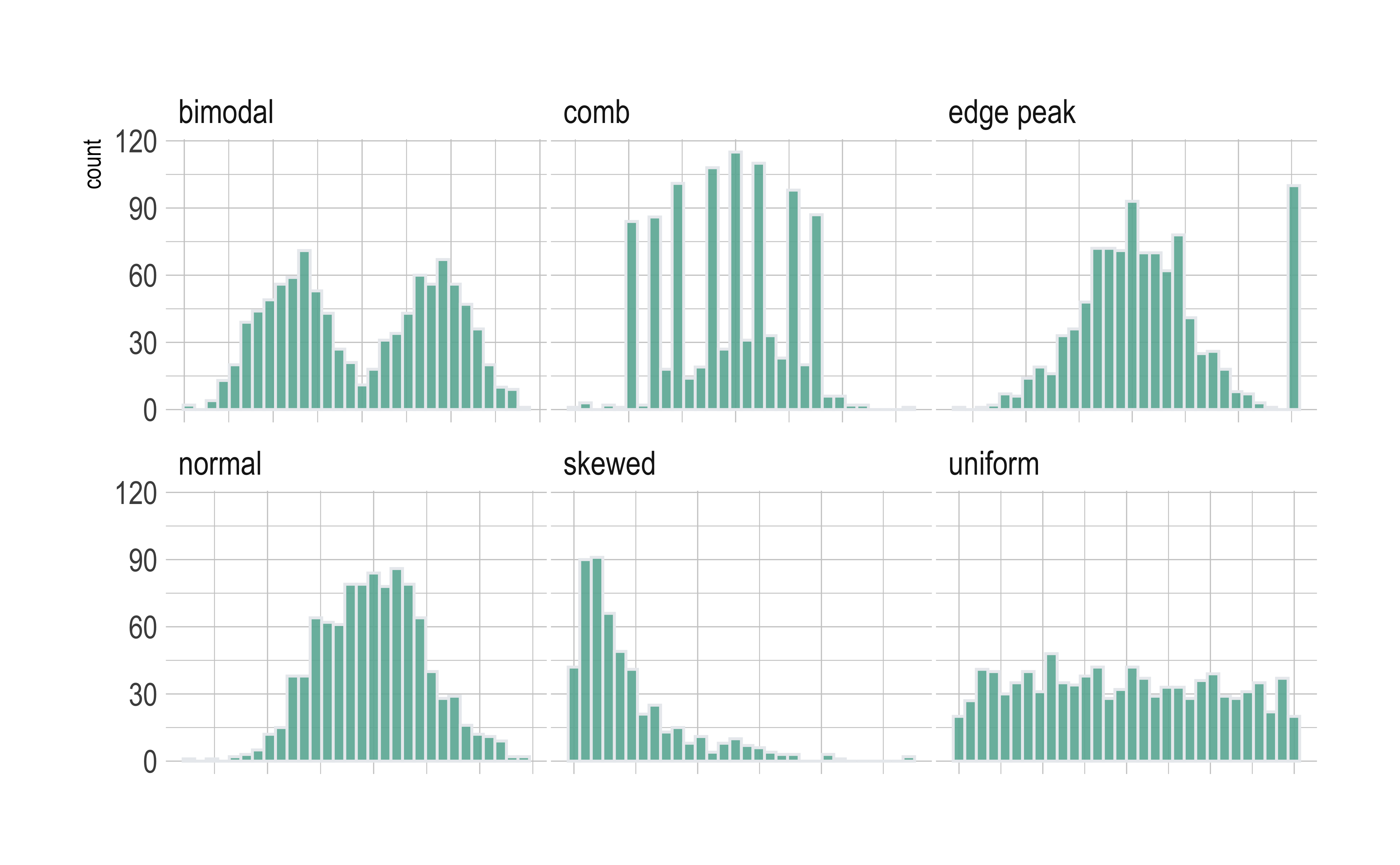
What insights could you develop based on these distribution shapes?

  • Bimodal: Maybe two different systems or phenomena or regimes under which the data unfolds. Like our geyser above. Or a machine that works differently when cold and when hot. Intermittent faulty behaviour…
  • Comb: Some specific Observations occur predominantly, in an otherwise even spread or observations. In a survey many respondents round off numbers to nearest 100 or 1000. Check the distribution of carat values for this diamonds dataset which are suspiciously integer numbers in too many cases.
  • Edge Peak: Could even be a data entry artifact!! All unknown / unrecorded observations are recorded as 999 !!🙀
  • Normal: Just what it says! Course Marks in a Univ cohort…
  • Skewed: Income, or friends count in a set of people. Do UI/UX peasants have more followers on Insta than say CAP people?
  • Uniform: The World is not flat. Anything can happen within a range. But not much happens outside! Sharp limits…

In your Design-Project-related research, you will collect data from or about your target audience. The Quantitative parts of that data may obtain with any of these distributions. Inspecting these may give you an insight into the population of your target audience, something that may likely be true, a hunch, which you could verify and convert into …design opportunity.

Readings

  1. See the scrolly animation for a histogram at this website: Exploring Histograms, an essay by Aran Lunzer and Amelia McNamara https://tinlizzie.org/histograms/?s=09

  2. https://www.data-to-viz.com/graph/histogram.html

Back to top
Counts
🕶 Happy Data are all Alike

License: CC BY-SA 2.0

Website made with ❤️ and Quarto, by Arvind V.

Hosted by Netlify .