library(tidyverse)
library(palmerpenguins)
library(ggformula)
library(ggstance)
# A collection of historical datasets
library(HistData)
library(sf)
library(sfheaders)Lab 06 - The Grammar of Graphics
Creating Graphs and Charts using ggplot
Abstract
Part of my R for Artists and Designers course using the idea of metaphors in written language.
Introduction
This RMarkdown document is part of my course on R for Artists and Designers. The material is based on A Layered Grammar of Graphics by Hadley Wickham. The intent of this Course is to build Skill in coding in R, and also appreciate R as a way to metaphorically visualize information of various kinds, using predominantly geometric figures and structures.
All RMarkdown files combine code, text, web-images, and figures developed using code. Everything is text; code chunks are enclosed in fences (```)
Goals
At the end of this Lab session, we should: - know the types and structures of tidy data and be able to work with them - be able to create data visualizations using ggplot - Understand aesthetics and scales in `ggplot
Pedagogical Note
The method followed will be based on PRIMM:
- PREDICT Inspect the code and guess at what the code might do, write predictions
- RUN the code provided and check what happens
- INFER what the
parametersof the code do and write comments to explain. What bells and whistles can you see? - MODIFY the
parameterscode provided to understand theoptionsavailable. Write comments to show what you have aimed for and achieved. - MAKE : take an idea/concept of your own, and graph it.
Set Up
The setup code chunk below brings into our coding session R packages that provide specific computational abilities and also datasets which we can use.
To reiterate: Packages and datasets are not the same thing !! Packages are (small) collections of programs. Datasets are just….information.
Review of Tidy Data
“Tidy Data” is an important way of thinking about what data typically look like in R. Let’s fetch a figure from the web to show the (preferred) structure of data in R. (The syntax to bring in a web-figure is )
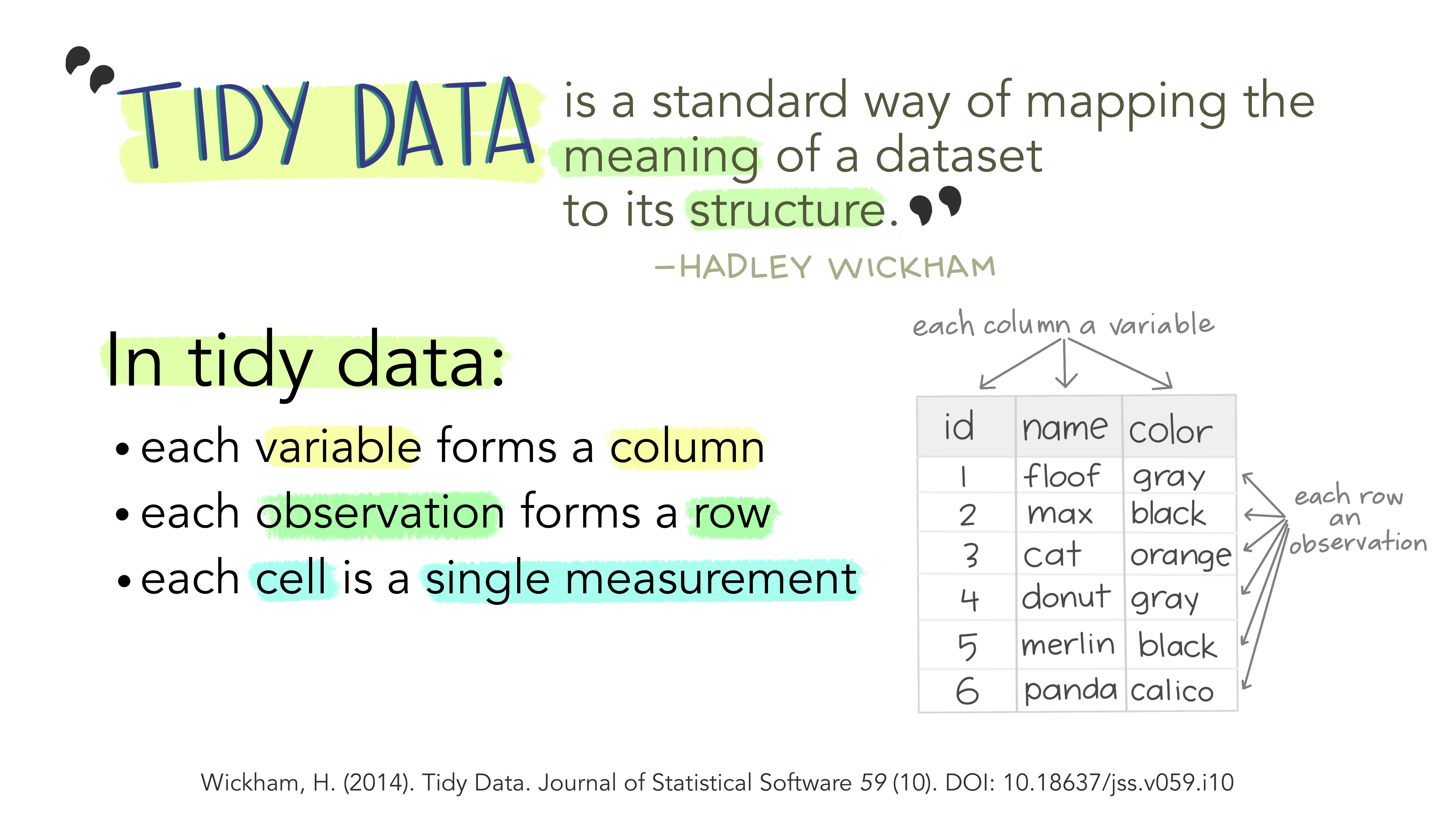 The three features described in the figure above define the nature of tidy data:
- Variables in Columns
- Observations in Rows and
- Measurements in Cells.
Data are imagined to be resulting from an experiment. Each variable represents a parameter/aspect in the experiment. Each row represents an additional datum of measurement. A cell is a single measurement on a single parameter(column) in a single observation(row).
Kinds of Variables
Kinds of Variable are defined by the kind of questions they answer to:
- What/Who/Where? -> Some kind of Name. Categorical variable
- What Kind? How? -> Some kind of “Type”. Factor variable
- How Many? How large? -> Some kind of Quantity. Numerical variable. Most Figures in R are computed with variables, and therefore, with columns.
Interrogations and Graphs
Creating graphs from data is an act of asking questions and viewing answers in a geometric way. Let us write some simple English descriptions of measures and visuals and see what commands they use in R.
Components of the layered grammar of graphics
Layers are used to create the objects on a plot. They are defined by five basic parts:
- Data (What dataset/spreadsheet am I using?)
- Mapping (What does each column do in my graph?)
- Statistical transformation (stat) (Do I have count something first?)
- Geometric object (geom) (What shape, colour, size…do I want?)
- Position adjustment (position) (Where do I want it on the graph?)
Data
We will use “real world” data. Let’s use the penguins dataset in the palmerpenguins package. Run ?penguins in the console to get more information about this dataset.
Head
head(penguins)species <fct> | island <fct> | bill_length_mm <dbl> | bill_depth_mm <dbl> | flipper_length_mm <int> | body_mass_g <int> | sex <fct> | year <int> |
|---|---|---|---|---|---|---|---|
| Adelie | Torgersen | 39.1 | 18.7 | 181 | 3750 | male | 2007 |
| Adelie | Torgersen | 39.5 | 17.4 | 186 | 3800 | female | 2007 |
| Adelie | Torgersen | 40.3 | 18.0 | 195 | 3250 | female | 2007 |
| Adelie | Torgersen | NA | NA | NA | NA | NA | 2007 |
| Adelie | Torgersen | 36.7 | 19.3 | 193 | 3450 | female | 2007 |
| Adelie | Torgersen | 39.3 | 20.6 | 190 | 3650 | male | 2007 |
Tail
tail(penguins)species <fct> | island <fct> | bill_length_mm <dbl> | bill_depth_mm <dbl> | flipper_length_mm <int> | body_mass_g <int> | sex <fct> | year <int> |
|---|---|---|---|---|---|---|---|
| Chinstrap | Dream | 45.7 | 17.0 | 195 | 3650 | female | 2009 |
| Chinstrap | Dream | 55.8 | 19.8 | 207 | 4000 | male | 2009 |
| Chinstrap | Dream | 43.5 | 18.1 | 202 | 3400 | female | 2009 |
| Chinstrap | Dream | 49.6 | 18.2 | 193 | 3775 | male | 2009 |
| Chinstrap | Dream | 50.8 | 19.0 | 210 | 4100 | male | 2009 |
| Chinstrap | Dream | 50.2 | 18.7 | 198 | 3775 | female | 2009 |
Dim
dim(penguins)[1] 344 8So we know what our data looks like. We pass this data to ggplot use to plot as follows: in R this creates an empty graph sheet!! Because we have not (yet) declared the geometric shapes we want to use to plot our information.
ggplot(data = penguins) # Creates an empty graphsheet, ready for plotting!!
Mapping
Now that we have told R what data to use, we need to state what variables to plot and how.
Aesthetic Mapping defines how the variables are applied to the plot, i.e. we take a variable from the data and “metaphorize” it into a geometric feature. We can map variables metaphorically to a variety of geometric things: coordinate, length, height, size, shape, colour, alpha(how dark?)….
The syntax uses: aes(some_geometric_thing = some_variable)
Remember variable = column.
So if we were graphing information from penguins, we might map a penguin’s flipper_length_mm column to the body_mass_g column to the
Mapping Example-1
We can try another example of aesthetic mapping with the same dataset:
Plot-1a
ggplot(data = penguins)
Plot-1b
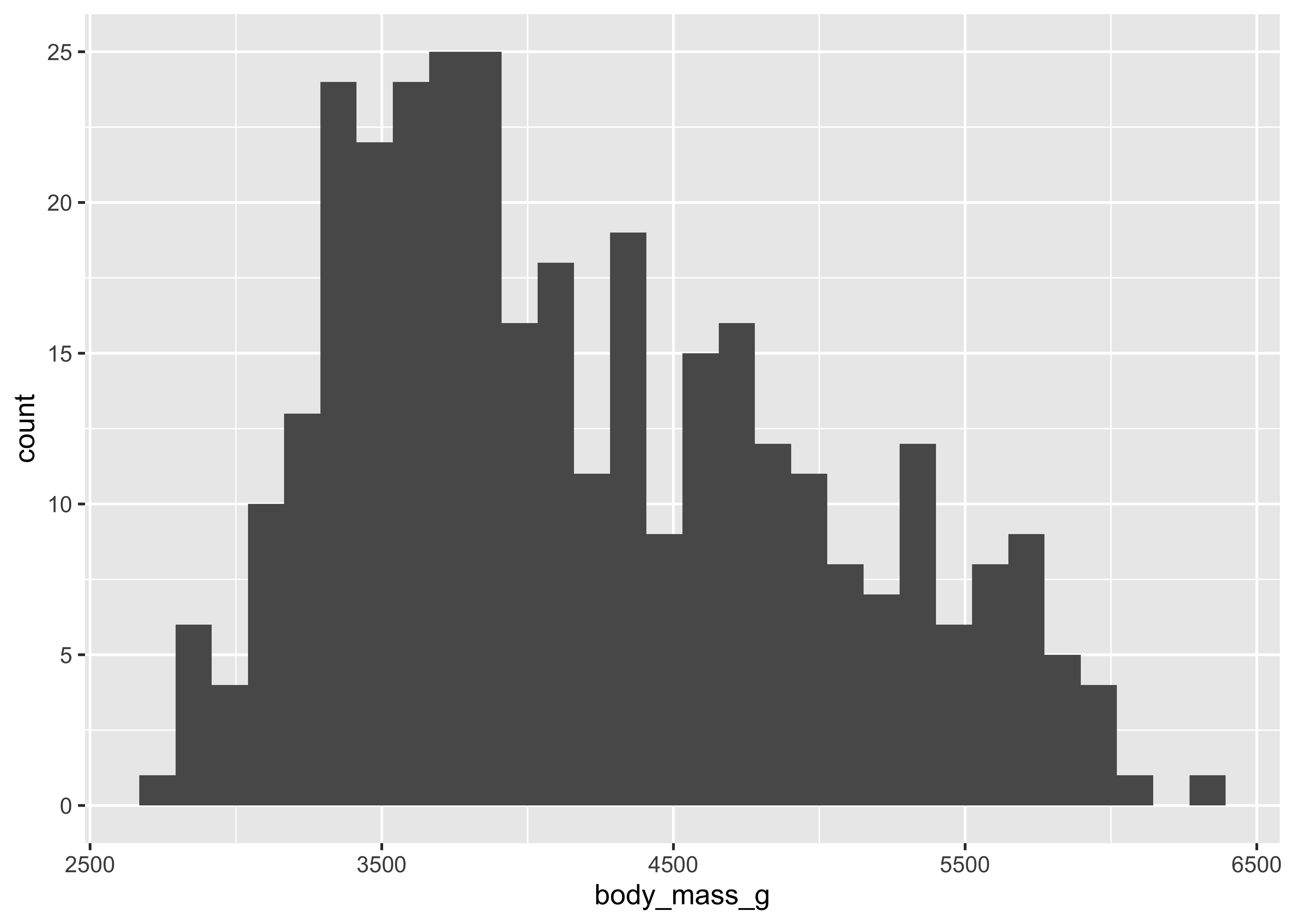
ggplot(penguins) +

  # Plot geom = histogram. So we need a quantity on the x
  geom_histogram(
    aes(x = body_mass_g)
  )
Plot-1c
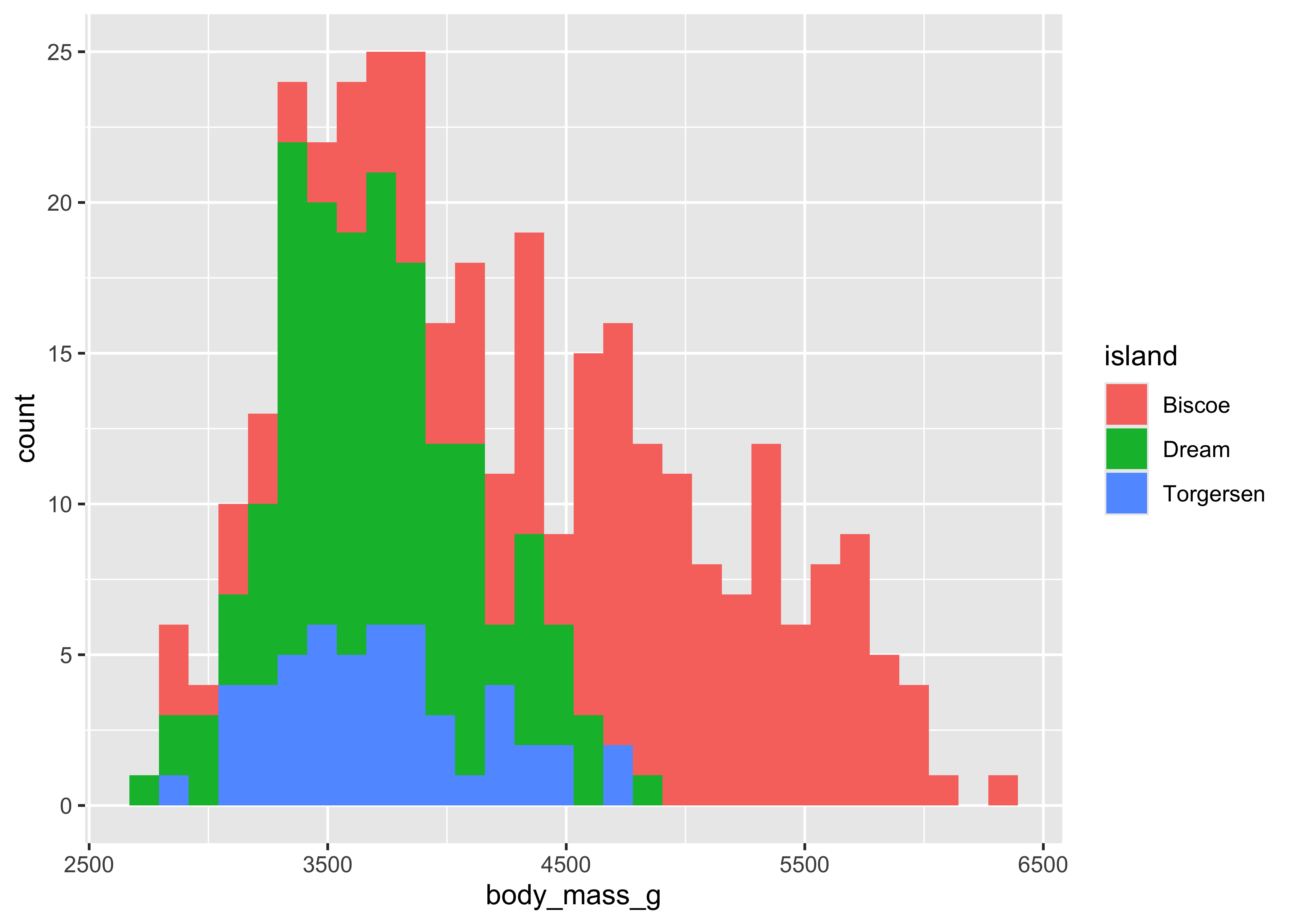
ggplot(penguins) +

  # Plot geom = histogram. So we need a quantity on the x
  geom_histogram(
    aes(
      x = body_mass_g,
      fill = island
    ) # color aesthetic = another variable
  )
Mapping Example-2
We can try another example of aesthetic mapping with the same dataset:
Plot-2a
ggplot(data = penguins)
Plot-2b
ggplot(penguins) +

  # Plot geom = histogram. So we need a quantity on the x
  geom_histogram(
    aes(x = body_mass_g)
) 
Plot-2c
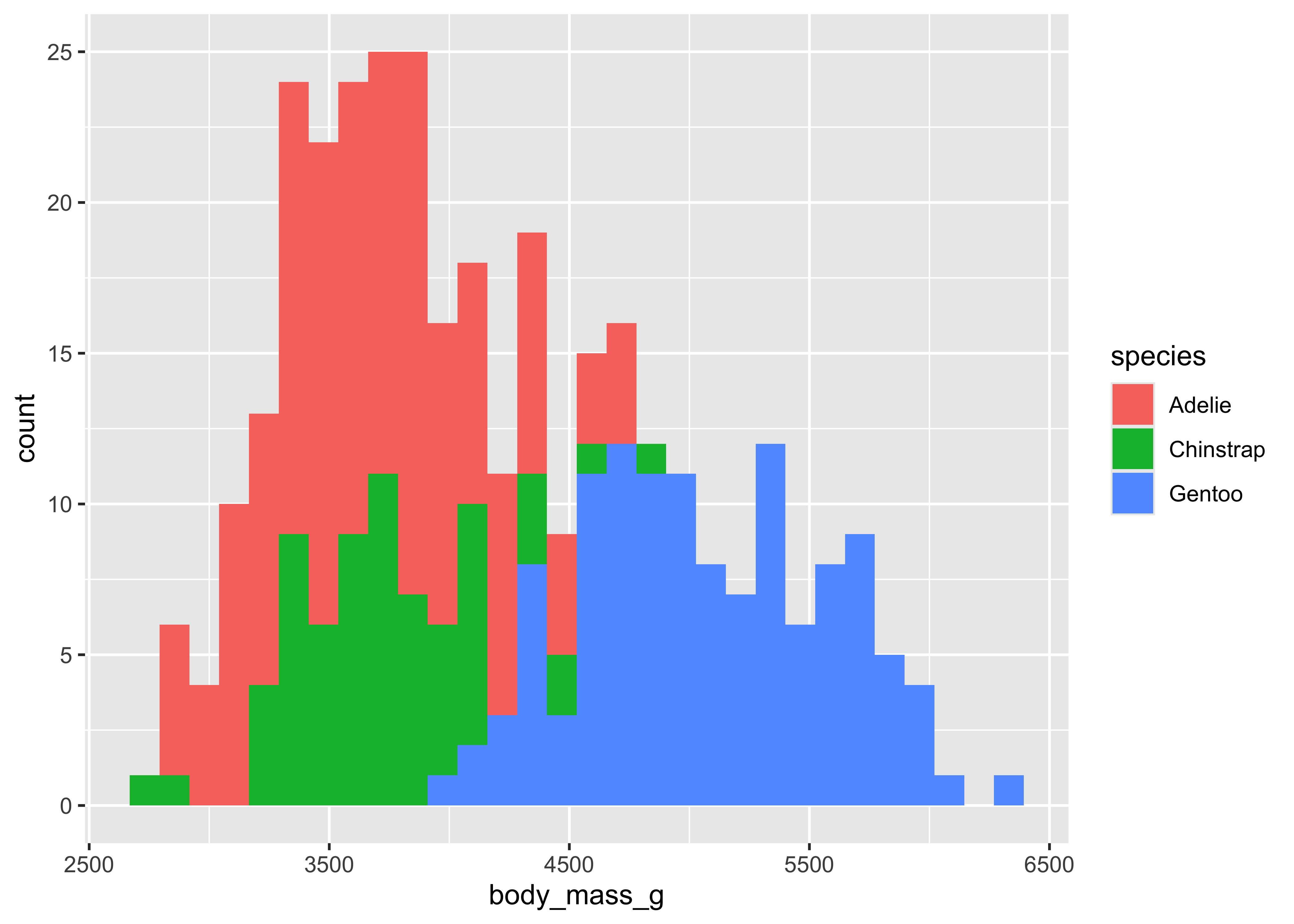
ggplot(penguins) +

  # Plot geom = histogram. So we need a quantity on the x
  geom_histogram(
    aes(
      x = body_mass_g,
      fill = species
    ) #<< # color aesthetic = another variable
  )
Geometric objects
Geometric objects (geoms) control the type of plot you create. Geoms are classified by their dimensionality:
- 0 dimensions - point, text
- 1 dimension - path, line
- 2 dimensions - polygon, interval
Each geom can only display certain aesthetics or visual attributes of the geom. For example, a point geom has position, color, shape, and size aesthetics.
We can also stack up geoms on top of one another to add layers to the graph.
Plot1
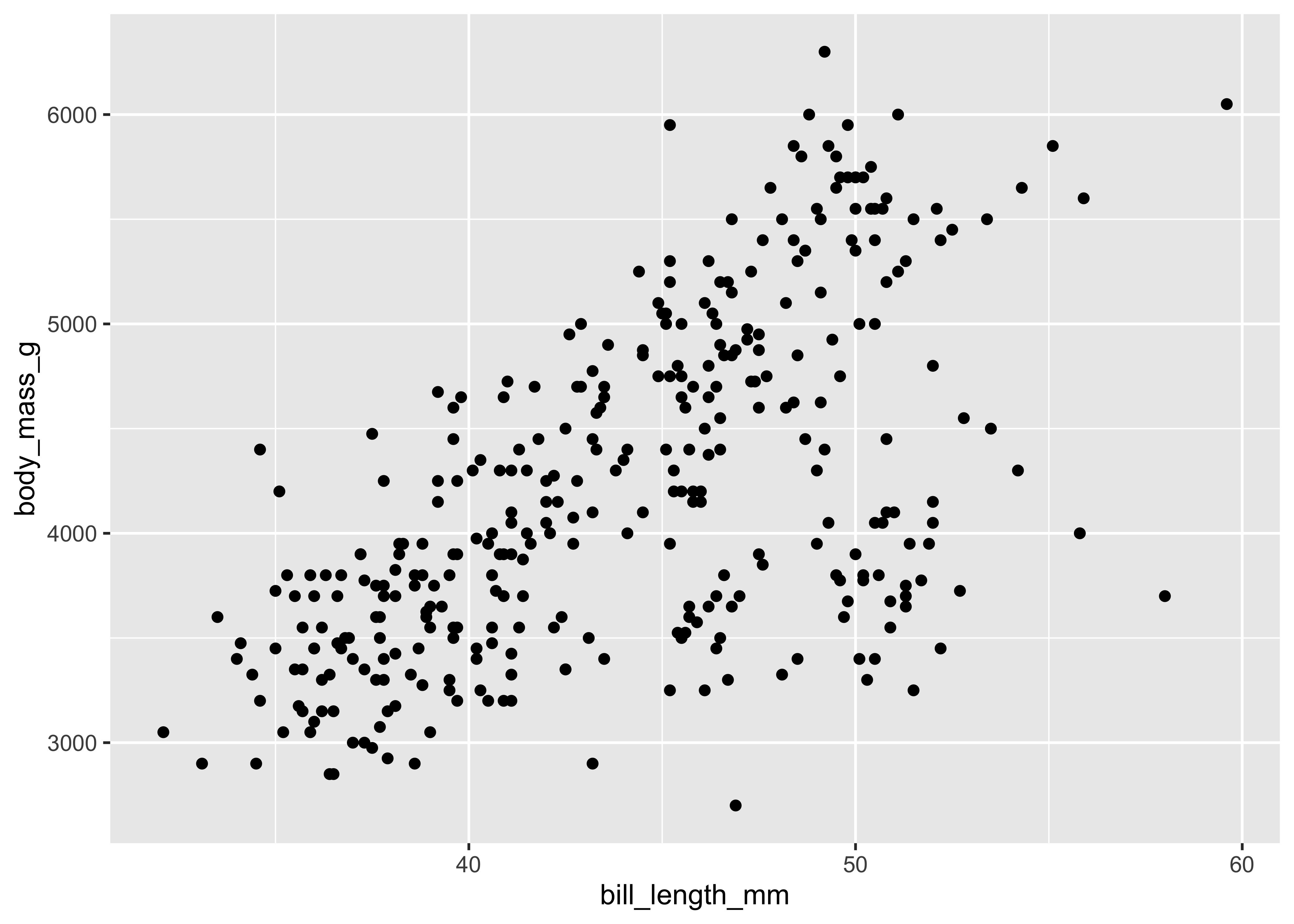
ggplot(penguins, aes(x = flipper_length_mm, y = body_mass_g)) +
  geom_line()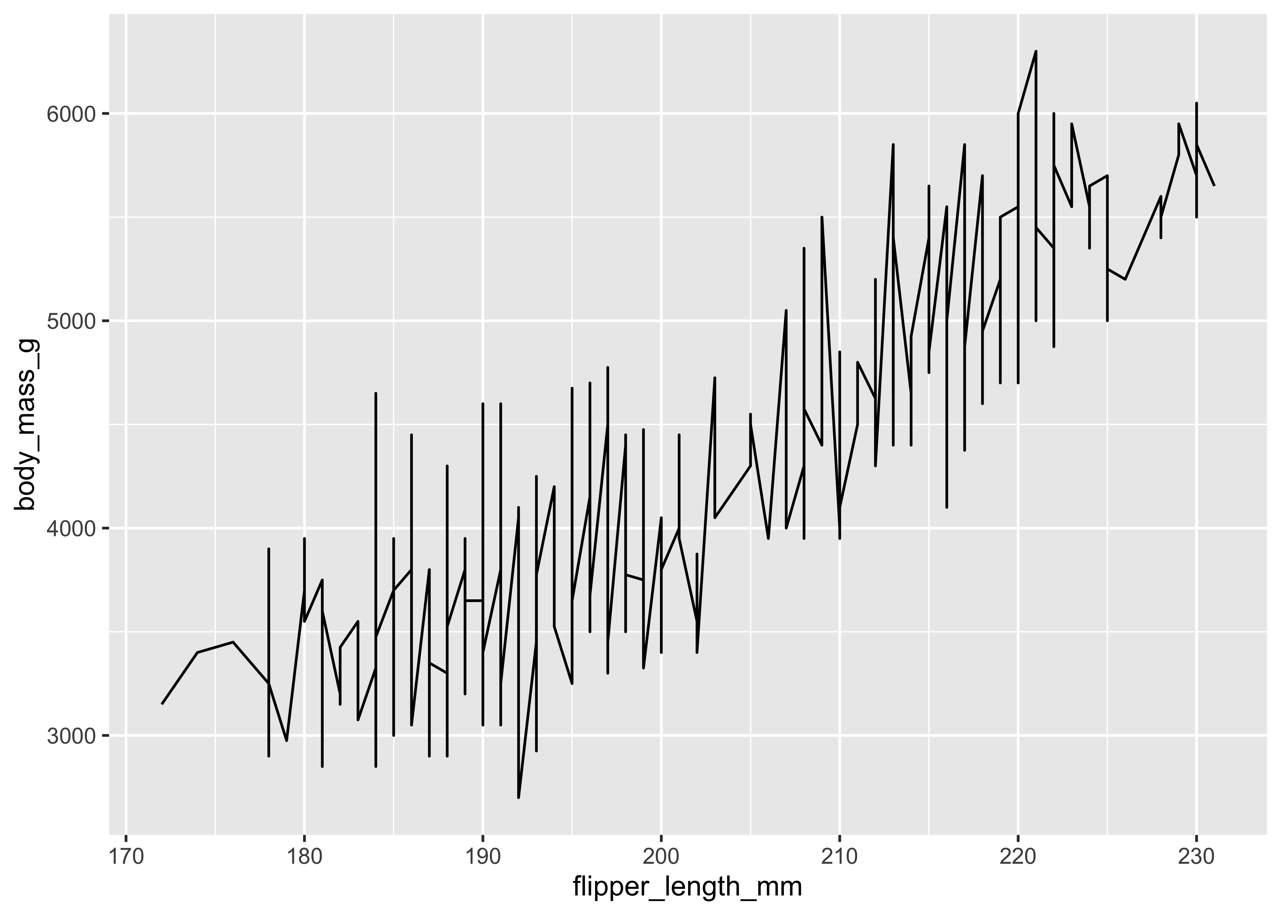
Plot2
ggplot(data = penguins) +
  geom_line(aes(
    x = bill_length_mm,
    y = body_mass_g
  ))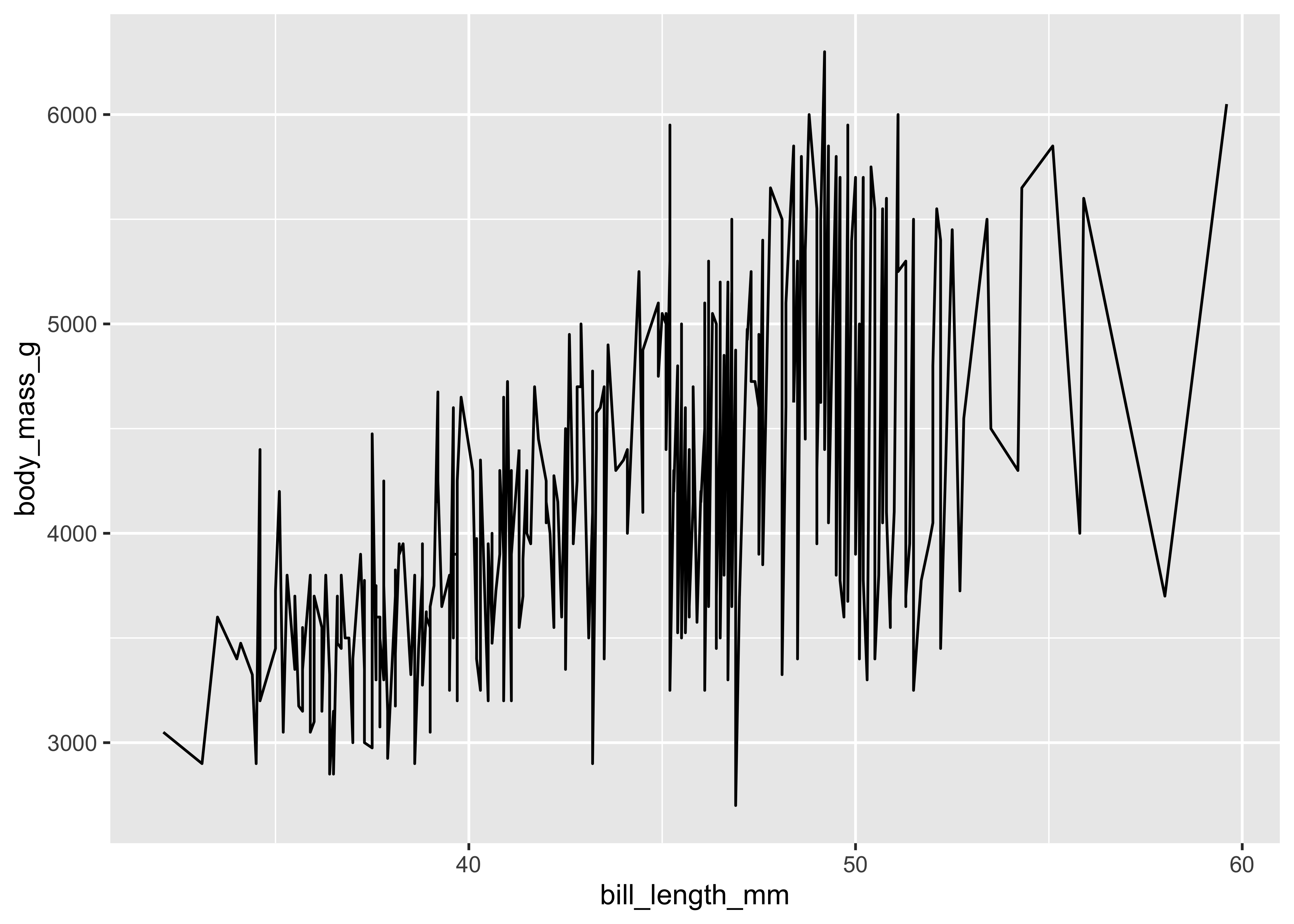
Plot3
ggplot(data = penguins) +
  geom_point(
    aes(
      x = bill_length_mm,
      y = body_mass_g,
      color = island,
      shape = species
    ),
    size = 3
  ) +
  ggtitle("A point geom with position and color and shape aesthetics")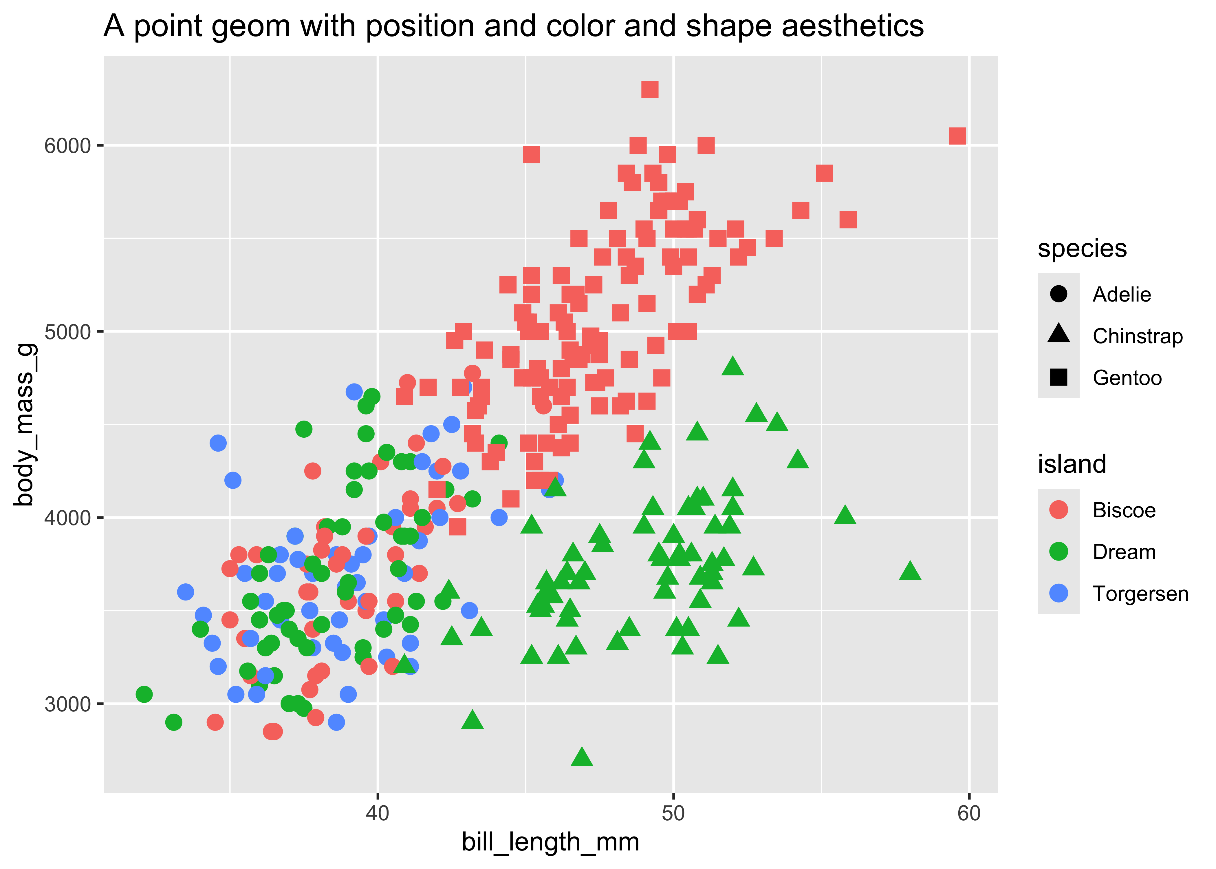
ggplot(
  data = penguins,
  aes(x = species)
) + # x position => ?
  # No need to type "mapping"...
  geom_bar() + # Where does the height come from?
  ggtitle("A bar geom with position and height aesthetics")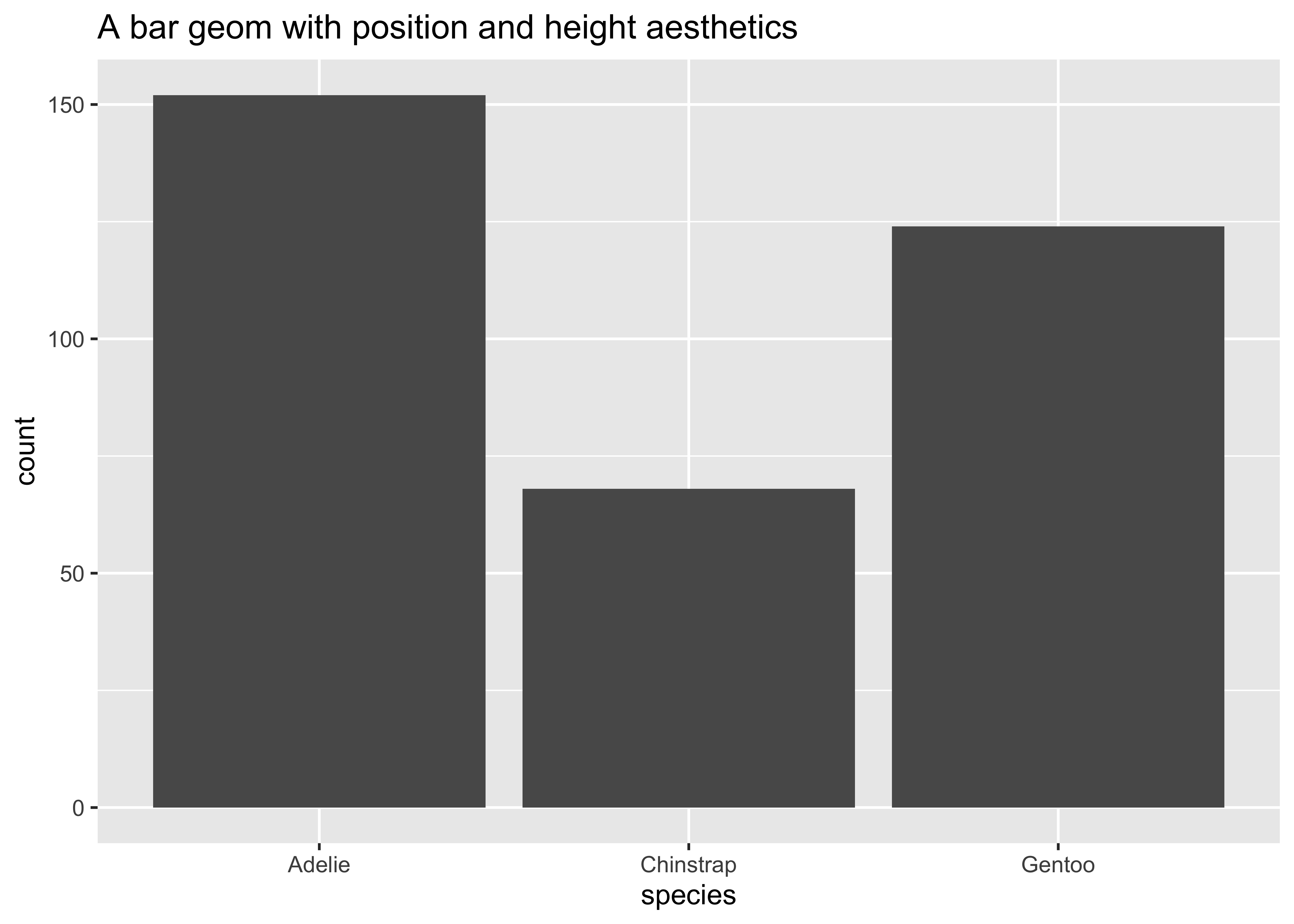
ggplot(data = penguins, aes(x = island)) +
  geom_bar() +
  ggtitle("A bar geom with position and height aesthetics")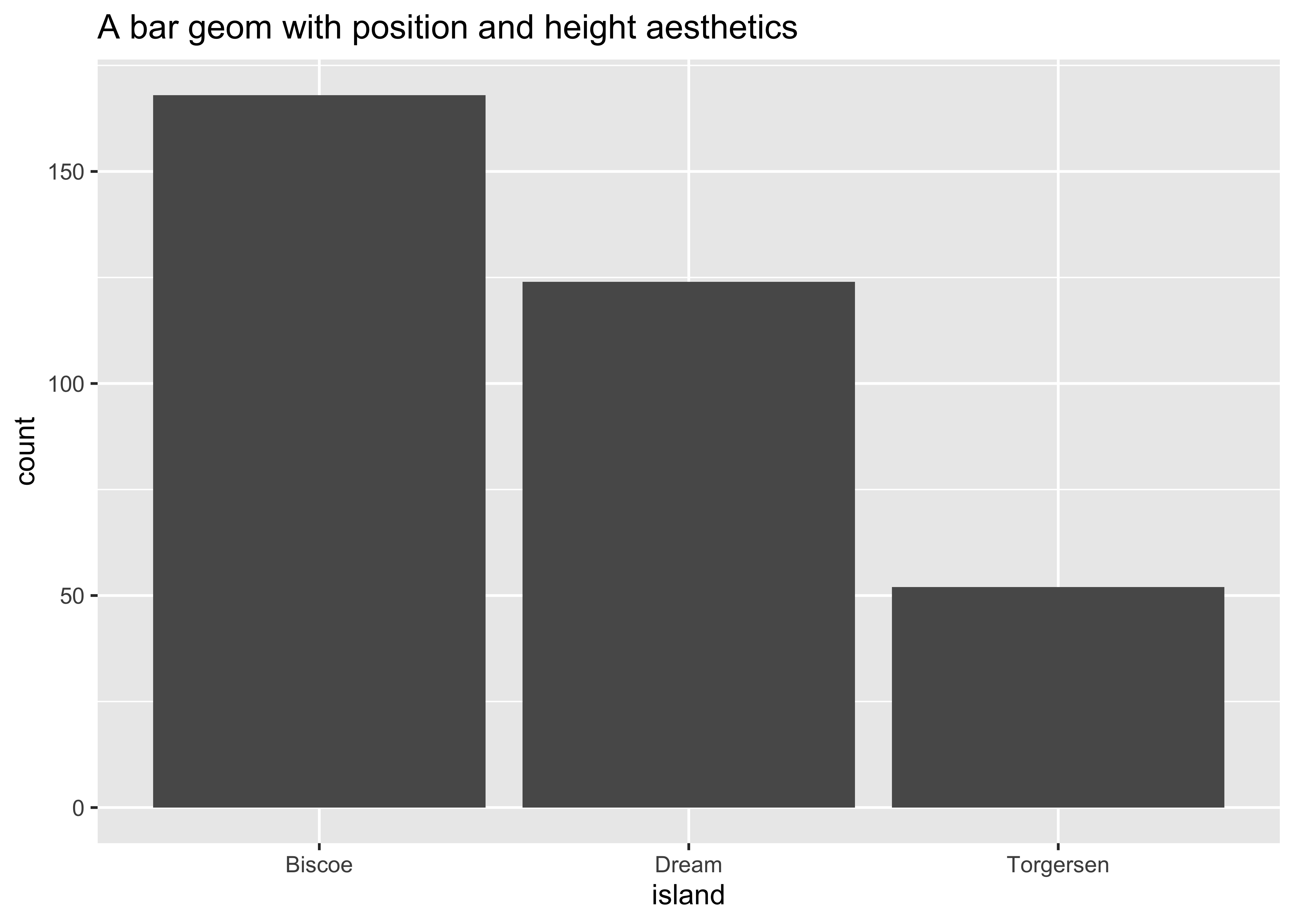
- Position determines the starting location (origin) of each bar
- Height determines how tall to draw the bar. Here the height is based on the number of observations in the dataset for each possible species.
Position adjustment
Sometimes with dense data we need to adjust the position of elements on the plot, otherwise data points might obscure one another. Bar plots frequently stack or dodge the bars to avoid overlap:
Sometimes scatterplots with few unique
ggplot(
  data = penguins,
  mapping = aes(
    x = species,
    y = body_mass_g
  )
) +
  geom_point() +
  ggtitle("A point geom with obscured data points")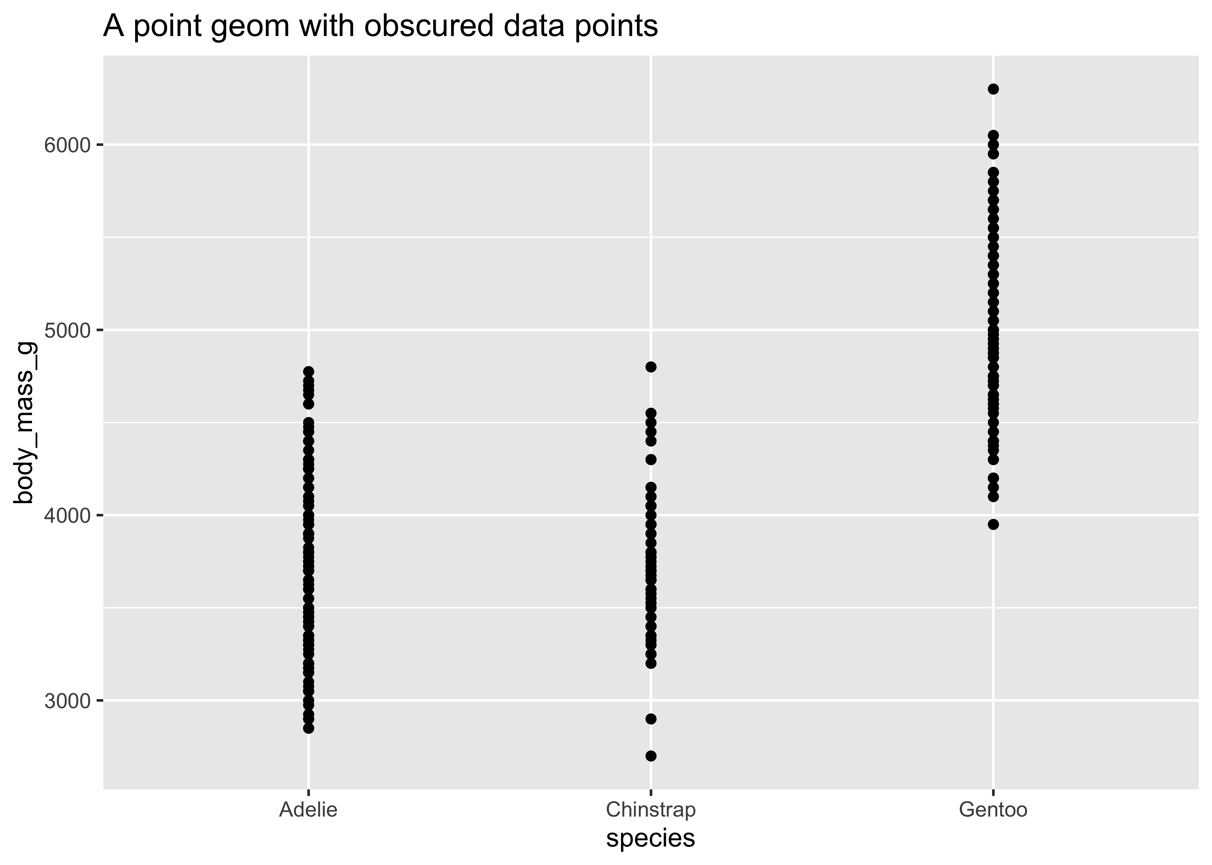
ggplot(
  data = penguins,
  mapping = aes(
    x = species,
    y = body_mass_g
  )
) +
  geom_jitter() +
  ggtitle("A point geom with jittered data points")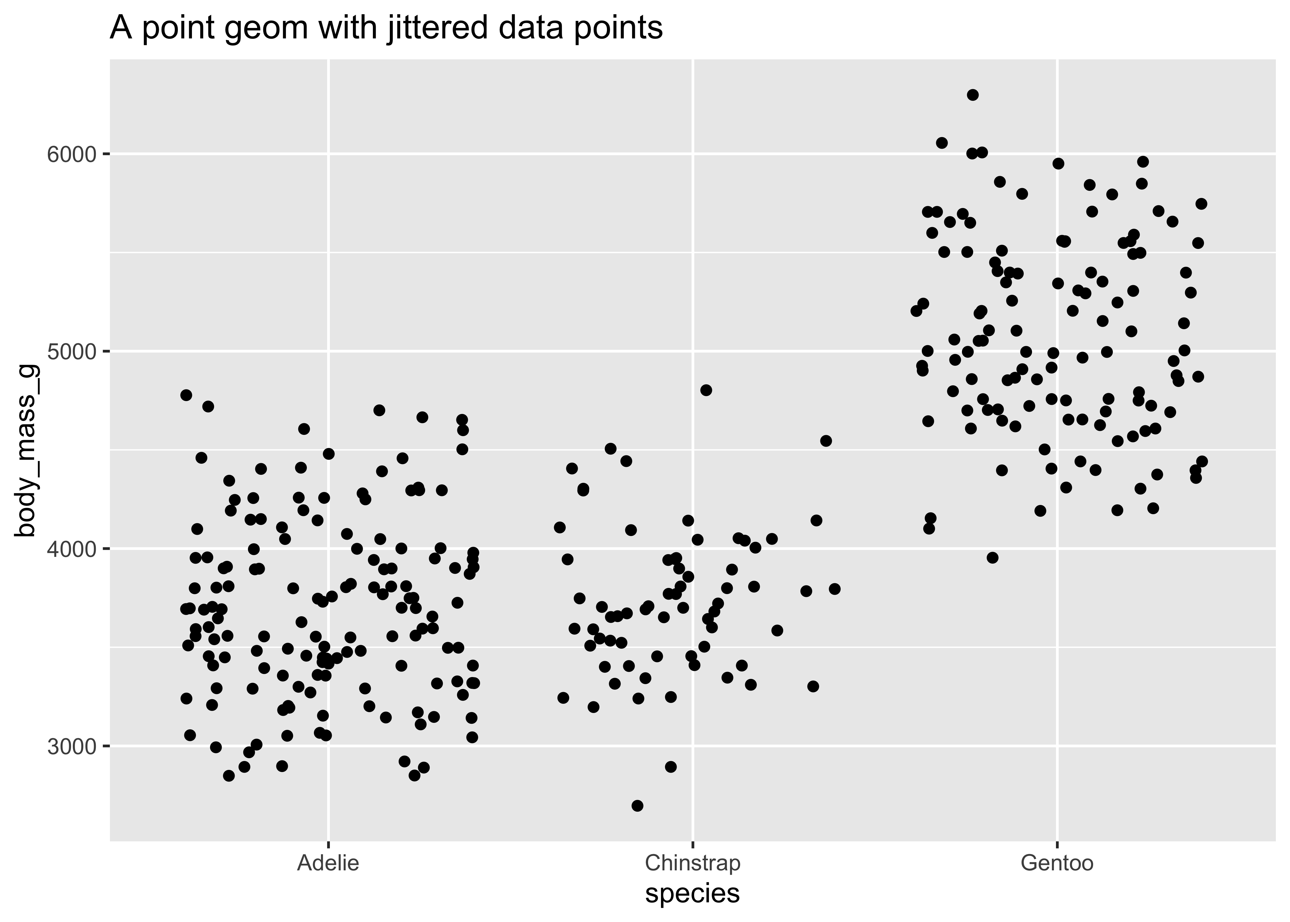
Statistical transformation
A statistical transformation (stat) pre-transforms the data, before plotting. For instance, in a bar graph you might summarize the data by counting the total number of observations within a set of categories, and then plotting the count.
Count
count(x = penguins, island)island <fct> | n <int> | |||
|---|---|---|---|---|
| Biscoe | 168 | |||
| Dream | 124 | |||
| Torgersen | 52 |
Count and Bar Graph
mydat <- count(penguins, island)

ggplot(data = mydat) +
geom_col(aes(x = island, y = n))![]()
Tidy Count and Bar Graph
![]()
Count inside the Plot
penguins %>% # Our pipe Operator

  ggplot(.) + # "." becomes the penguins dataset

geom_bar(aes(x = island)) # Note: geom_BAR !! y = count, and is computed internally!!![]()
Sometimes you don’t need to make a statistical transformation. For example, in a scatterplot you use the raw values for the
Scale
A scale controls how data is mapped to aesthetic attributes, so we need one scale for every aesthetic property employed in a layer. For example, this graph defines a scale for color:
ggplot(
  data = penguins,
  mapping = aes(
    x = bill_depth_mm,
    y = bill_length_mm,
    color = species
  )
) +
  geom_point()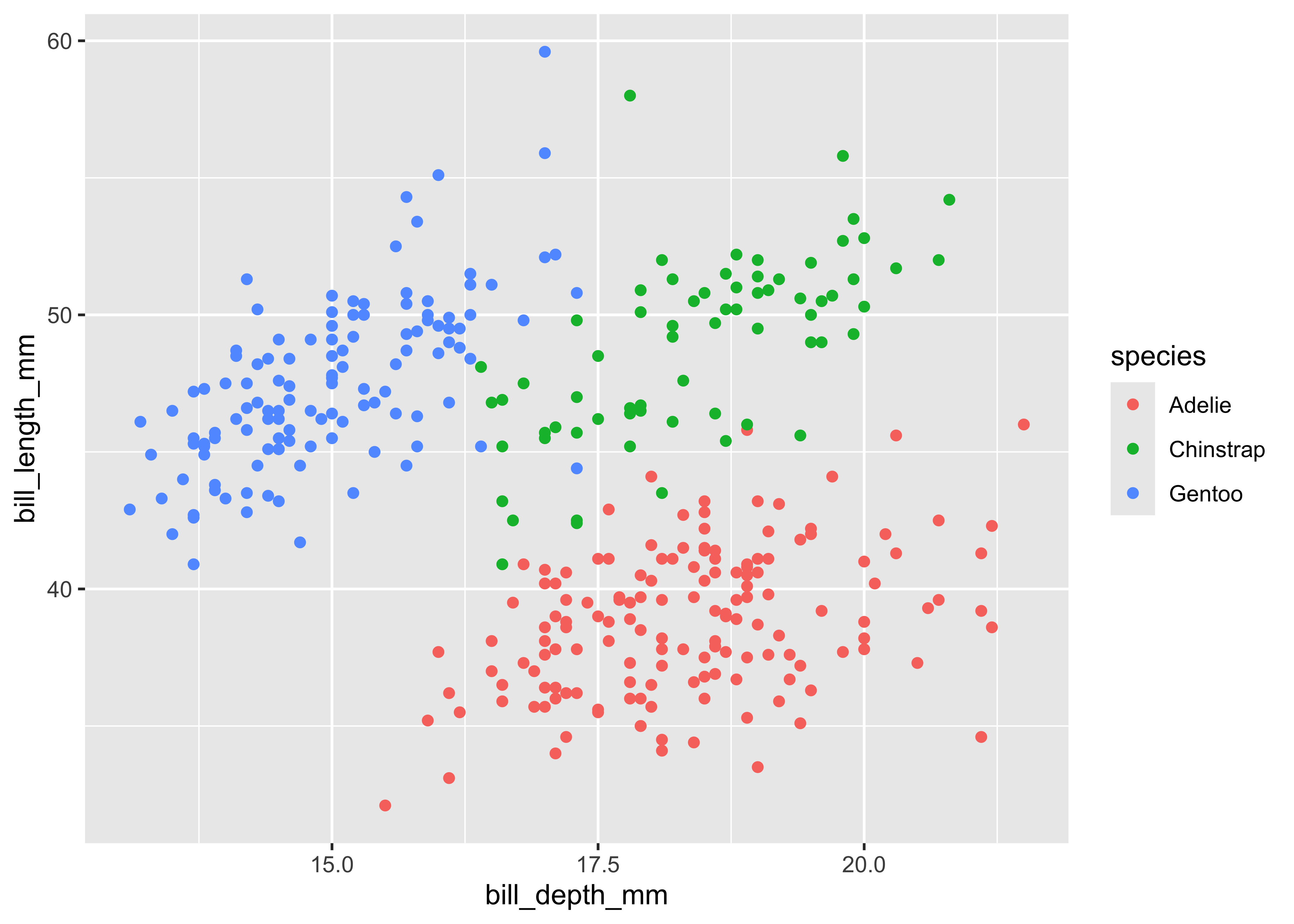
The scale can be changed to use a different color palette:
ggplot(
  data = penguins,
  mapping = aes(
    x = bill_length_mm,
    y = body_mass_g,
    color = species
  )
) +
  geom_point() +
  scale_color_brewer(palette = "Dark2", direction = -1)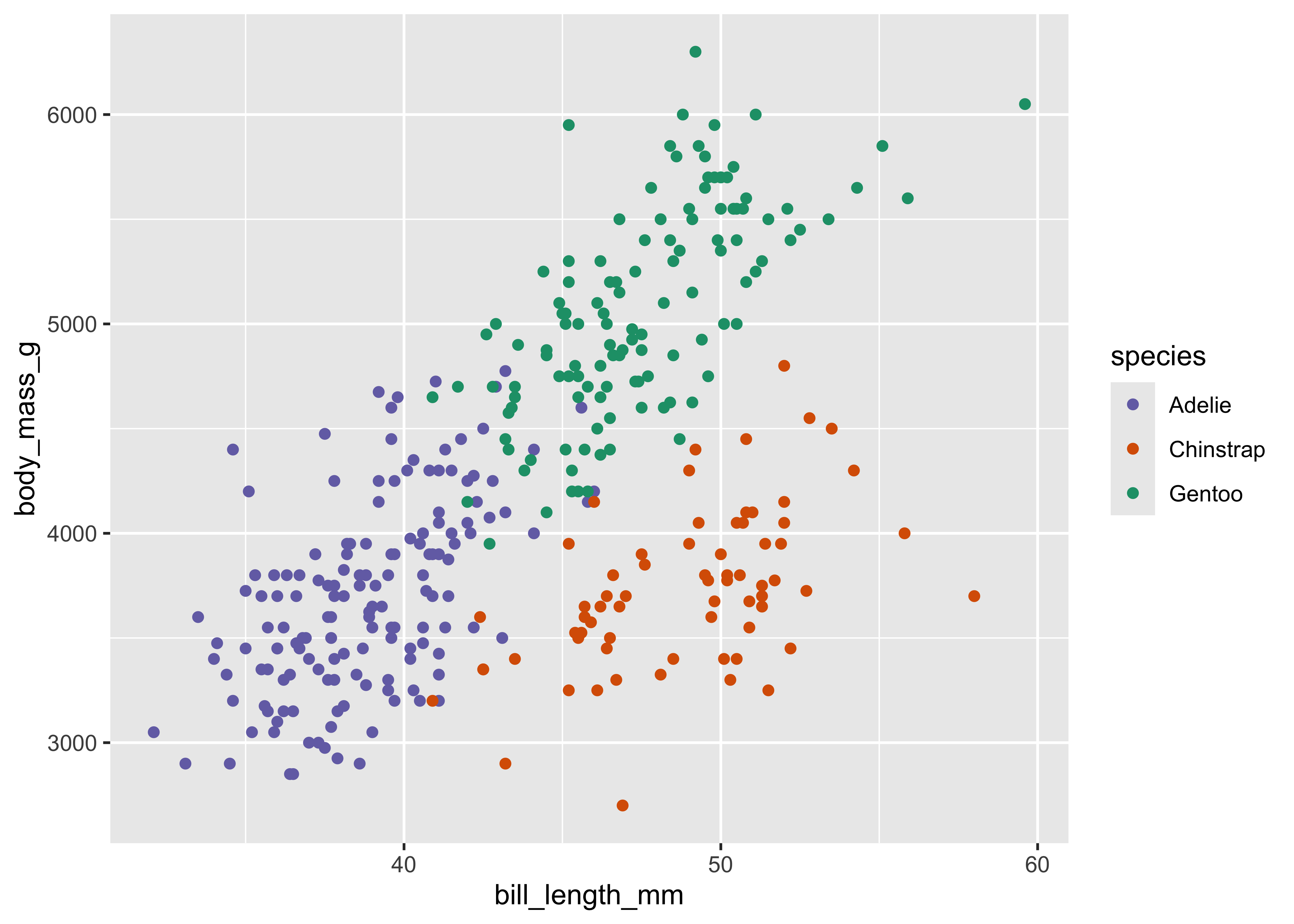
Now we are using a different palette, but the scale is still consistent: all Adelie penguins utilize the same color, whereas Chinstrap use a new color but each Adelie still uses the same, consistent color.
Coordinate system
A coordinate system (coord) maps the position of objects onto the plane of the plot, and controls how the axes and grid lines are drawn. Plots typically use two coordinates (
x1 <- c(1, 10)
y1 <- c(1, 5)
p <- qplot(
  x = x1, y = y1,
  geom = "point", # Quick Plot. Deprecated, don't use
  xlab = NULL, ylab = NULL
) +
  theme_bw()
p +
  ggtitle(label = "Cartesian coordinate system")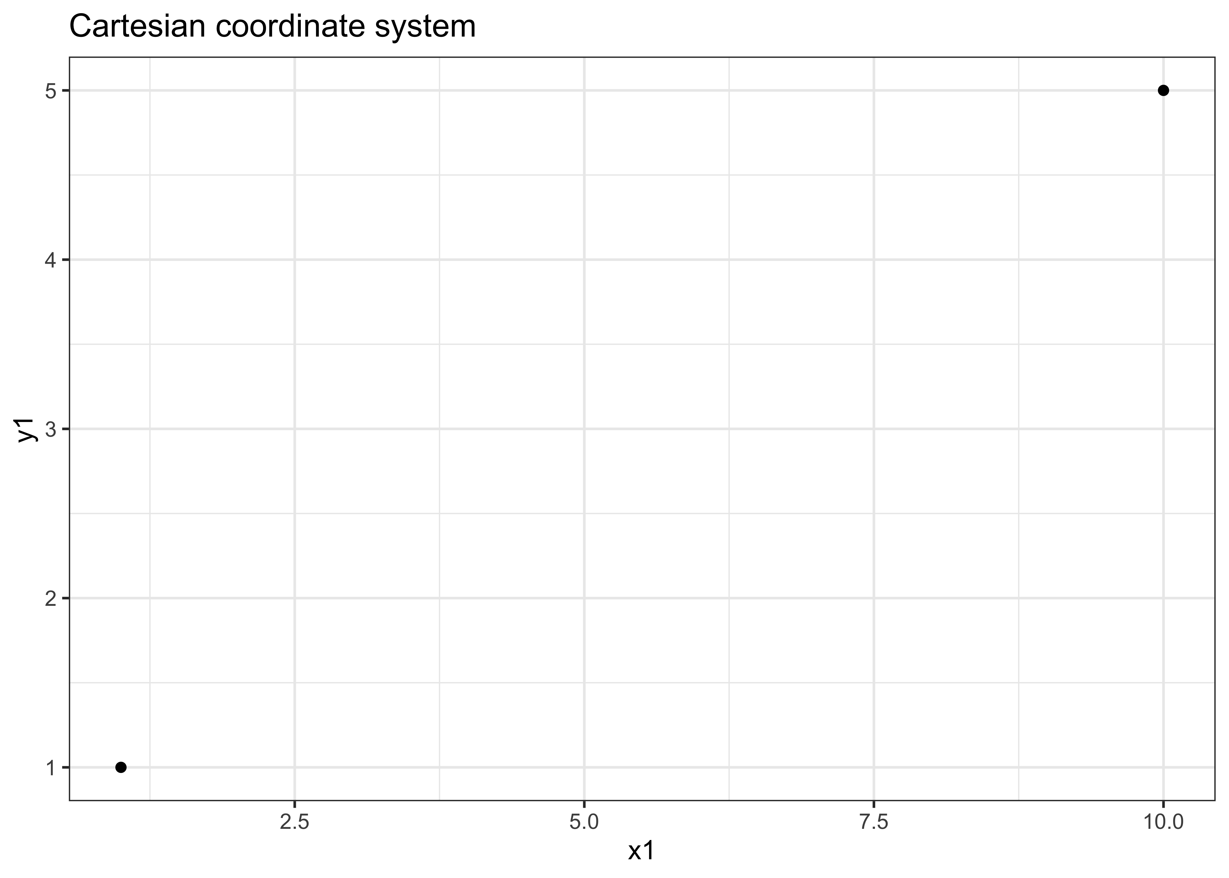
ggplot(penguins, aes(flipper_length_mm, body_mass_g)) +
  geom_point() +
  coord_polar()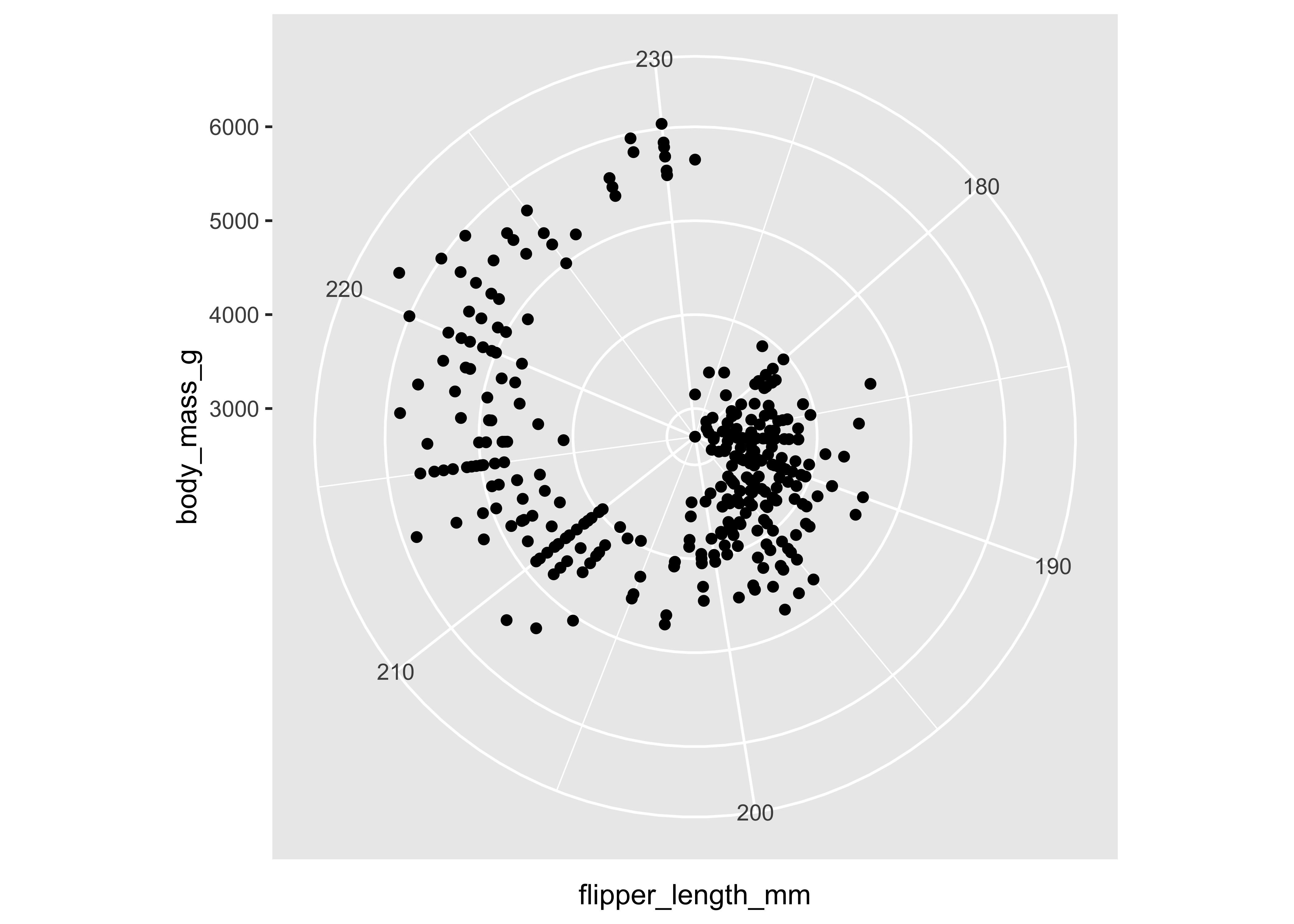
This system requires a fixed and equal spacing between values on the axes. That is, the graph draws the same distance between 1 and 2 as it does between 5 and 6. The graph could be drawn using a semi-log coordinate system which logarithmically compresses the distance on an axis:
p +
  coord_trans(y = "log10") +
  ggtitle(label = "Semi-log coordinate system")
Or could even be drawn using polar coordinates:
p +
  coord_polar() +
  ggtitle(label = "Polar coordinate system")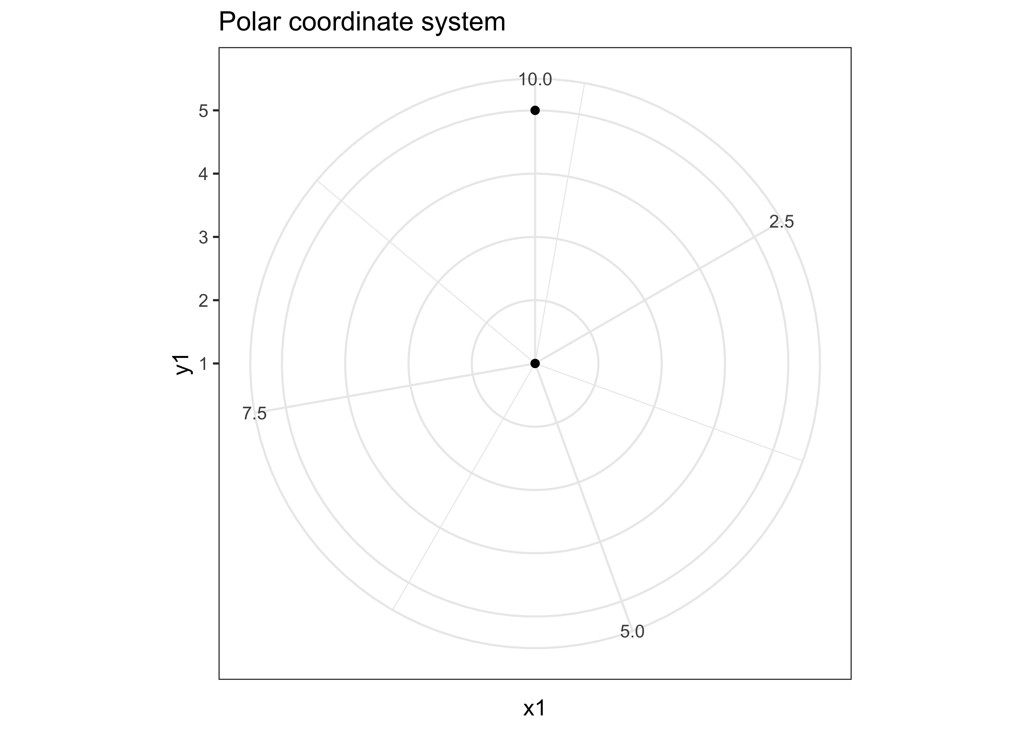
Faceting
Faceting can be used to split the data up into subsets of the entire dataset. This is a powerful tool when investigating whether patterns are the same or different across conditions, and allows the subsets to be visualized on the same plot (known as conditioned or trellis plots). The faceting specification describes which variables should be used to split up the data, and how they should be arranged.
ggplot(
  data = penguins,
  mapping = aes(
    x = bill_length_mm,
    y = body_mass_g
  )
) +
  geom_point() +
  facet_wrap(~island)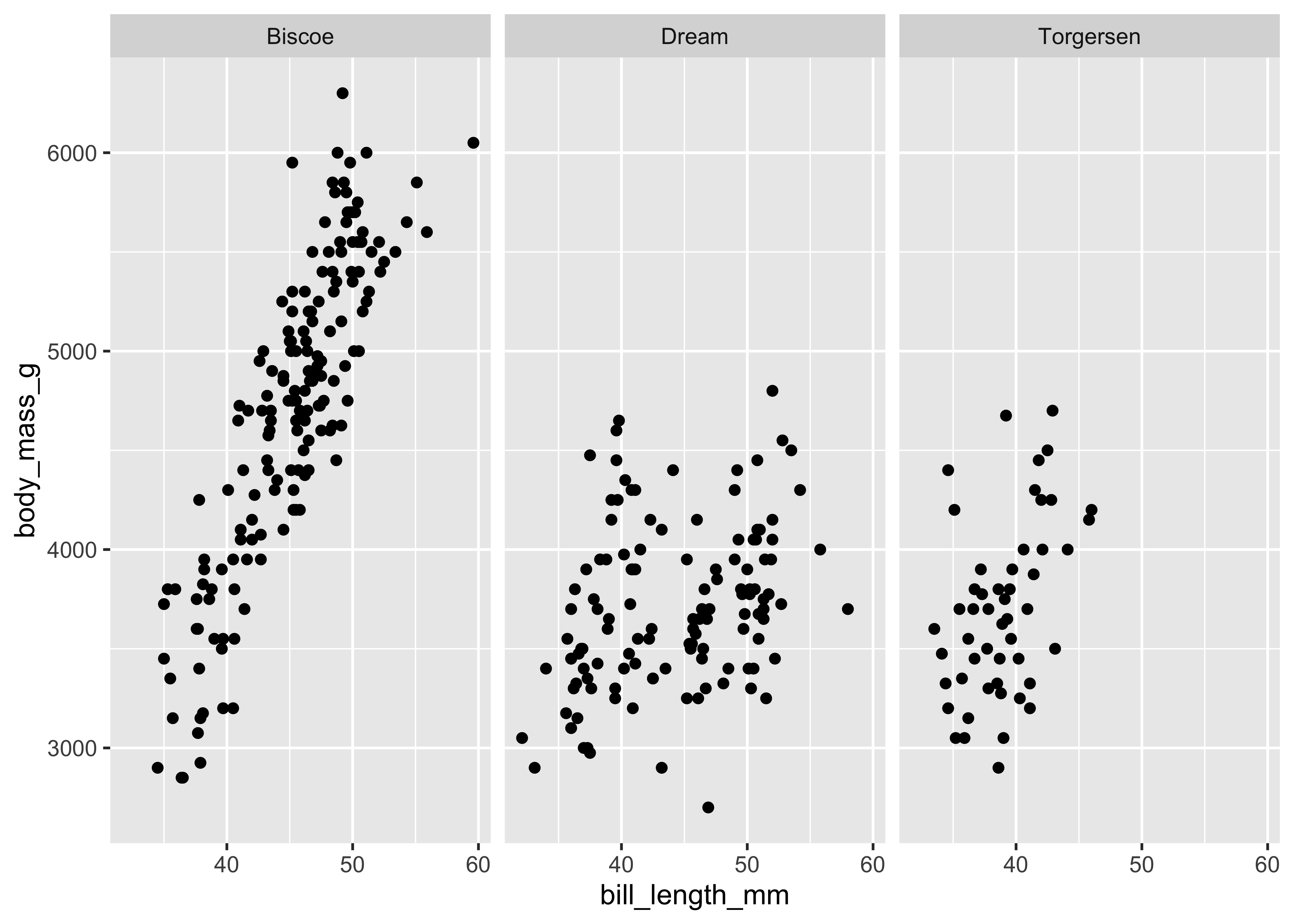
ggplot(
  data = penguins,
  mapping = aes(
    x = bill_length_mm,
    y = body_mass_g,
    color = sex
  )
) +
  geom_point() +
  facet_grid(species ~ island, scales = "free_y")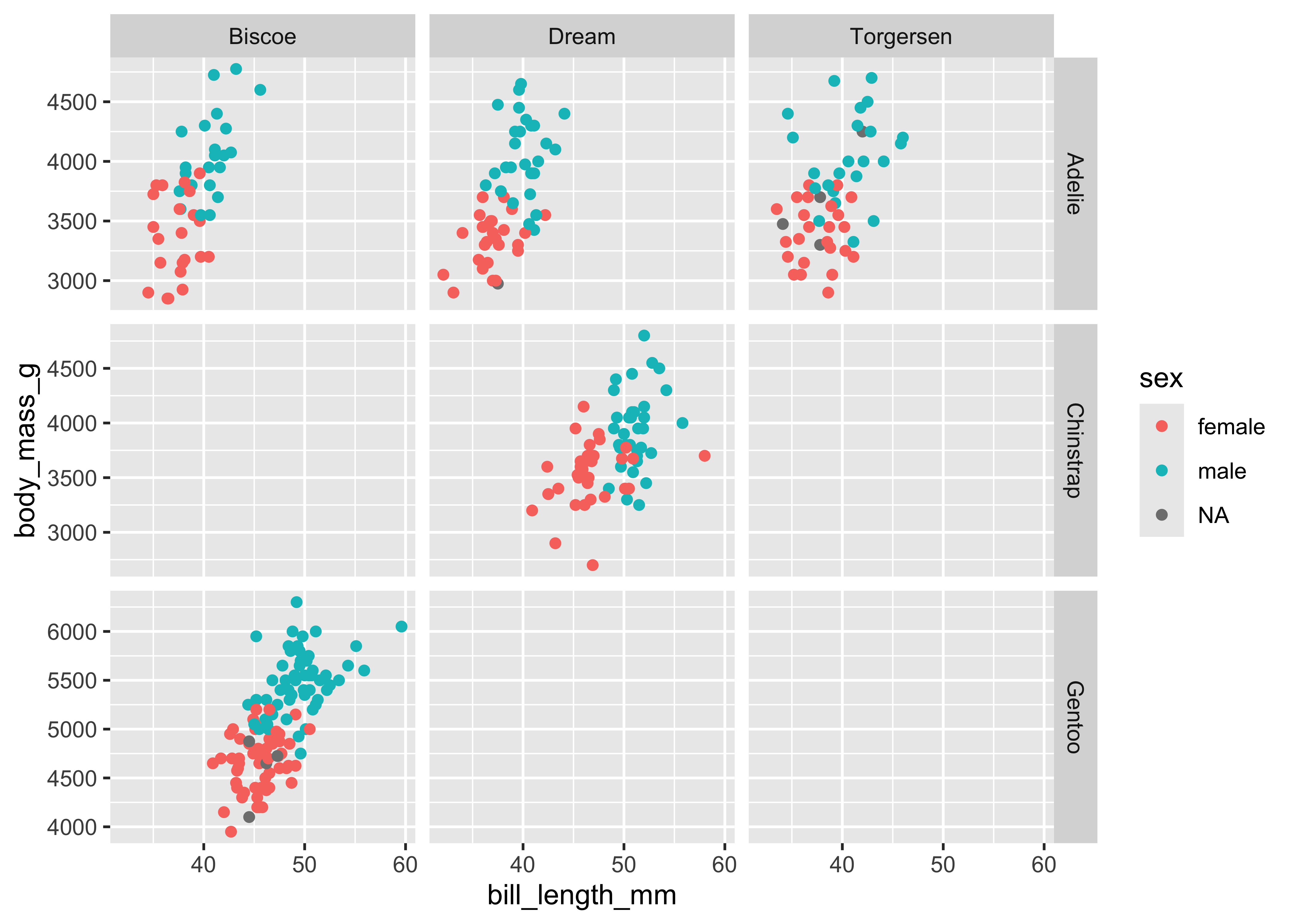
# Ria's explanation: This code did not work because....
#
Defaults
Rather than explicitly declaring each component of a layered graphic (which will use more code and introduces opportunities for errors), we can establish intelligent defaults for specific geoms and scales. For instance, whenever we want to use a bar geom, we can default to using a stat that counts the number of observations in each group of our variable in the
Consider the following scenario: you wish to generate a scatterplot visualizing the relationship between penguins’ bill_length and their body_mass. With no defaults, the code to generate this graph is:
ggplot() +
  layer(
    data = penguins,
    mapping = aes(
      x = bill_length_mm,
      y = body_mass_g
    ),
    geom = "point",
    stat = "identity",
    position = "identity"
  ) +
  scale_x_continuous() +
  scale_y_continuous() +
  coord_cartesian()
The above code:
Creates a new plot object (
ggplot)Adds a layer (
layer)- Specifies the data (
penguins) - Maps engine bill length to the
mapping) - Uses the point geometric transformation (
geom = "point") - Implements an identity transformation and position (
stat = "identity"andposition = "identity")
- Specifies the data (
Establishes two continuous position scales (
scale_x_continuousandscale_y_continuous)Declares a cartesian coordinate system (
coord_cartesian)
How can we simplify this using intelligent defaults?
We only need to specify one geom and stat, since each geom has a default stat.
Cartesian coordinate systems are most commonly used, so it should be the default.
Default scales can be added based on the aesthetic and type of variables.
- Continuous values are transformed with a linear scaling.
- Discrete values are mapped to integers.
- Scales for aesthetics such as color, fill, and size can also be intelligently defaulted.
Using these defaults, we can rewrite the above code as:
ggplot() +
  geom_point(
    data = penguins,
    mapping = aes(
      x = bill_length_mm,
      y = body_mass_g
    )
  )
This generates the exact same plot, but uses fewer lines of code. Because multiple layers can use the same components (data, mapping, etc.), we can also specify that information in the ggplot() function rather than in the layer() function:
ggplot(
  data = penguins,
  mapping = aes(
    x = bill_length_mm,
    y = body_mass_g
  )
) +
  geom_point()
And as we will learn, function arguments in R use specific ordering, so we can omit the explicit call to data and mapping:
ggplot(penguins, aes(bill_length_mm, body_mass_g)) +
  geom_point()