# options(tibble.print_min = 4L, tibble.print_max = 4L,digits = 3)
library(tidyverse)
library(mosaic) # package for stats, simulations, and basic plots
library(mosaicData) # package containing datasets
library(ggformula) # package for professional looking plots, that use the formula interface from mosaic
library(skimr) # Summary statistics about variables in data frames
library(NHANES) # survey data collected by the US National Center for Health Statistics (NCHS)

library(echarts4r) # Interactive graphs using Javascript in R
library(plotly) # An older more established package for interactive graphs using Javascript in REDA: Exploring Interactive Graphs for Data Distributions in R
Abstract
How to ask Questions of your Data and answer with Stats, and interactive Bar charts and Histograms with the echarts4r package
ggplot2::theme_set(new = theme_classic())
We will query our dataset, developing insights and new questions as each Table or Bar/Histogram chart yields new information. This process of exploration is iterative, structured, and intuitive. Intermediate results may on occasion be messy or not very insightful!
We will consistently use the Project Mosaic ecosystem of packages in R (mosaic, mosaicData and ggformula).
Formula Interface
Note the standard method for all commands from the mosaic package:goal( y ~ x | z, data = mydata, …) With ggformula, one can create any graph/chart using:gf_geometry(y ~ x | z, data = mydata)
ORmydata %>% gf_geometry( y ~ x | z)
The second method may be preferable, especially if you have done some data manipulation first! More later! ggformula supports many types of plots (using geometry), such as scatter, bar, histogram, density, boxplots, maps and many other statistical plots.
Interactive Graphs with
echarts4r
We will also start using echarts4r side by side for interactive graphs.
- Every function in the package starts with
e_. - You start coding a visualization by creating an echarts object with the
e_charts()function. That takes yourdata frameandx-axis columnas arguments. - Next, you add a function for the type of chart (
e_line(),e_bar(), etc.) with they-axis series column nameas an argument. - The rest is mostly customization!
echarts4rtakes some effort in getting used to, but it totally worth it!
The website for echarts4r is https://echarts4r.john-coene.com/articles/get_started.html. You should also quickly view this short introductory video on echarts4r:
mosaicData
Let us choose the famous Galton dataset:
skim(Galton)| Name | Galton |
| Number of rows | 898 |
| Number of columns | 6 |
| _______________________ | |
| Column type frequency: | |
| factor | 2 |
| numeric | 4 |
| ________________________ | |
| Group variables | None |
Variable type: factor
| skim_variable | n_missing | complete_rate | ordered | n_unique | top_counts |
|---|---|---|---|---|---|
| family | 0 | 1 | FALSE | 197 | 185: 15, 166: 11, 66: 11, 130: 10 |
| sex | 0 | 1 | FALSE | 2 | M: 465, F: 433 |
Variable type: numeric
| skim_variable | n_missing | complete_rate | mean | sd | p0 | p25 | p50 | p75 | p100 | hist |
|---|---|---|---|---|---|---|---|---|---|---|
| father | 0 | 1 | 69.23 | 2.47 | 62 | 68 | 69.0 | 71.0 | 78.5 | ▁▅▇▂▁ |
| mother | 0 | 1 | 64.08 | 2.31 | 58 | 63 | 64.0 | 65.5 | 70.5 | ▂▅▇▃▁ |
| height | 0 | 1 | 66.76 | 3.58 | 56 | 64 | 66.5 | 69.7 | 79.0 | ▁▇▇▅▁ |
| nkids | 0 | 1 | 6.14 | 2.69 | 1 | 4 | 6.0 | 8.0 | 15.0 | ▃▇▆▂▁ |
What can we say about the dataset and its variables? How big is the dataset? How many variables? What types are they, Quant or Qual? What are the means, medians and inter-quartile ranges for the Quant variables? If they are Qual, what are the levels? Are they ordered levels?
There is a lot of Description generated by the skimr::skim command (and equivalently by the mosaic::inspect() command)! Try both and see which output suits you. The first table above describes the Qual variables: family and sex. The second table describes the Quant variables, and gives us their statistical summaries as well and a neat little histogram to boot. The data are described as:
Type
help(Galton) in your ConsoleA data frame with 898 observations on the following variables.
familyan ID for each family, a factor with levels for each familyfatherthe father’s height (in inches)motherthe mother’s height (in inches)sexthe child’s sex: F or Mheightthe child’s height as an adult (in inches)nkidsthe number of adult children in the family, or, at least, the number whose heights Galton recorded.
Now that we know the variables, let us look at counts of data observations(rows). We know from our examination of variable types that counting of observations must be done on the basis of Qualitative variables. So let us count and plot the counts in bar charts.
Question
Q.1 How many families in the data for each value of nkids(i.e. Count of families by size)?
Galton_counts <- Galton %>%
  group_by(nkids) %>%
  summarise(children = n()) %>%
  # just to check
  mutate(
    No_of_families = as.integer(children / nkids),
    # Why do we divide

    running_count_of_children = cumsum(children),
    running_count_of_families = cumsum(No_of_families)
  )
Galton_countsnkids <int> | children <int> | No_of_families <int> | running_count_of_children <int> | running_count_of_families <int> |
|---|---|---|---|---|
| 1 | 32 | 32 | 32 | 32 |
| 2 | 40 | 20 | 72 | 52 |
| 3 | 66 | 22 | 138 | 74 |
| 4 | 116 | 29 | 254 | 103 |
| 5 | 140 | 28 | 394 | 131 |
| 6 | 114 | 19 | 508 | 150 |
| 7 | 112 | 16 | 620 | 166 |
| 8 | 128 | 16 | 748 | 182 |
| 9 | 63 | 7 | 811 | 189 |
| 10 | 40 | 4 | 851 | 193 |
Galton_counts %>%
  gf_col(No_of_families ~ nkids) %>%
  gf_theme(theme_classic())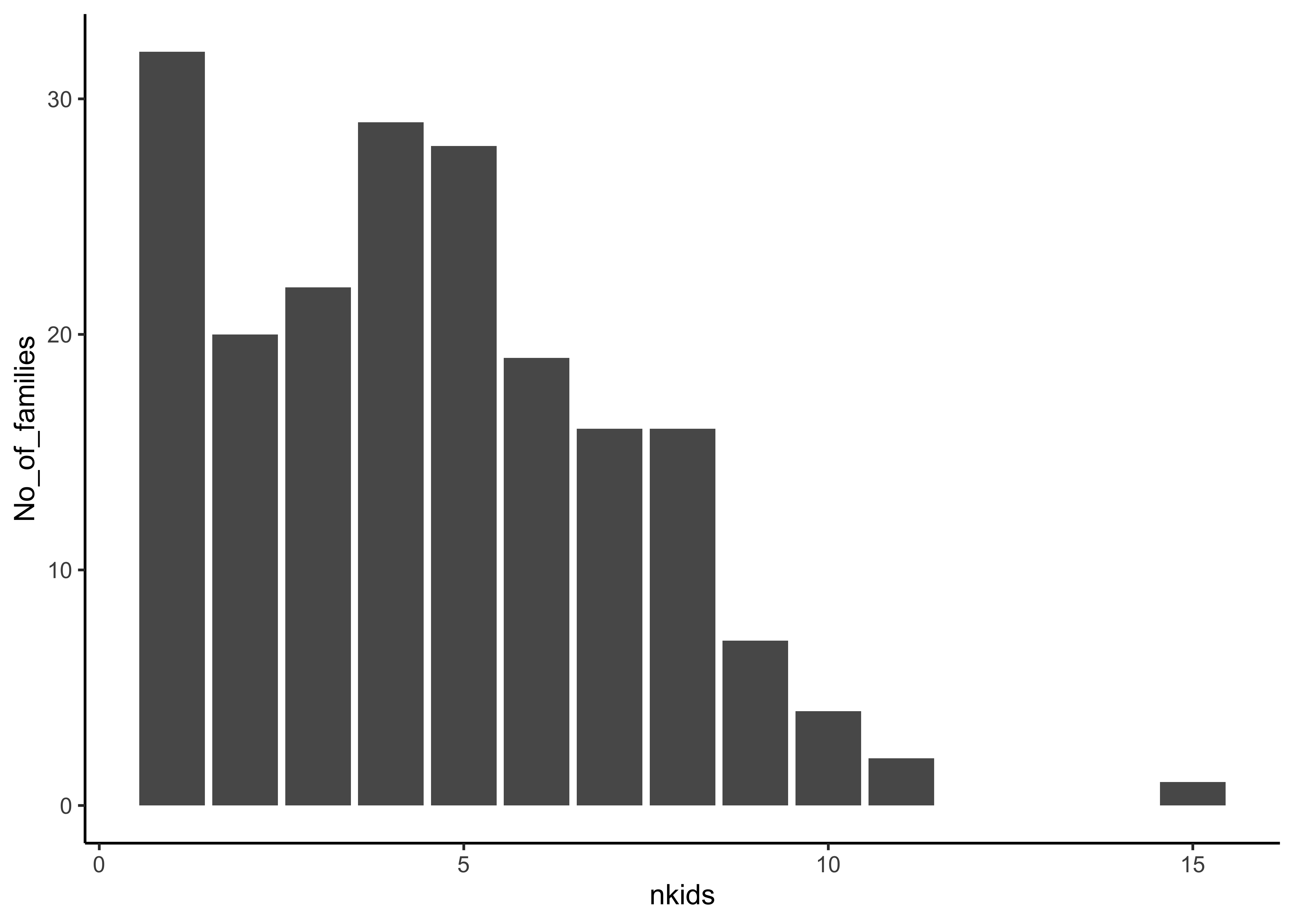
Galton_counts %>%
  e_charts(nkids) %>%
  e_bar(No_of_families,
    colorBy = "data",
    legend = FALSE
  ) %>% # Or "series"

  # https://echarts4r.john-coene.com/articles/grid.html
  # echarts4r does not "automatically" name the axes!
  # And look at the "categorical" x-axis below!

  e_x_axis(
    name = "Family Size", nameLocation = "center",
    nameGap = 25, type = "category"
  ) %>%
  e_y_axis(name = "Count", nameLocation = "center", nameGap = 25, ) %>%
  e_tooltip(trigger = "item") %>%
e_title("No of Families of each size")Insight: There are 32 1-kid families; and
Question
Q.2. What is the count of Children by sex of the child and by family size nkids?
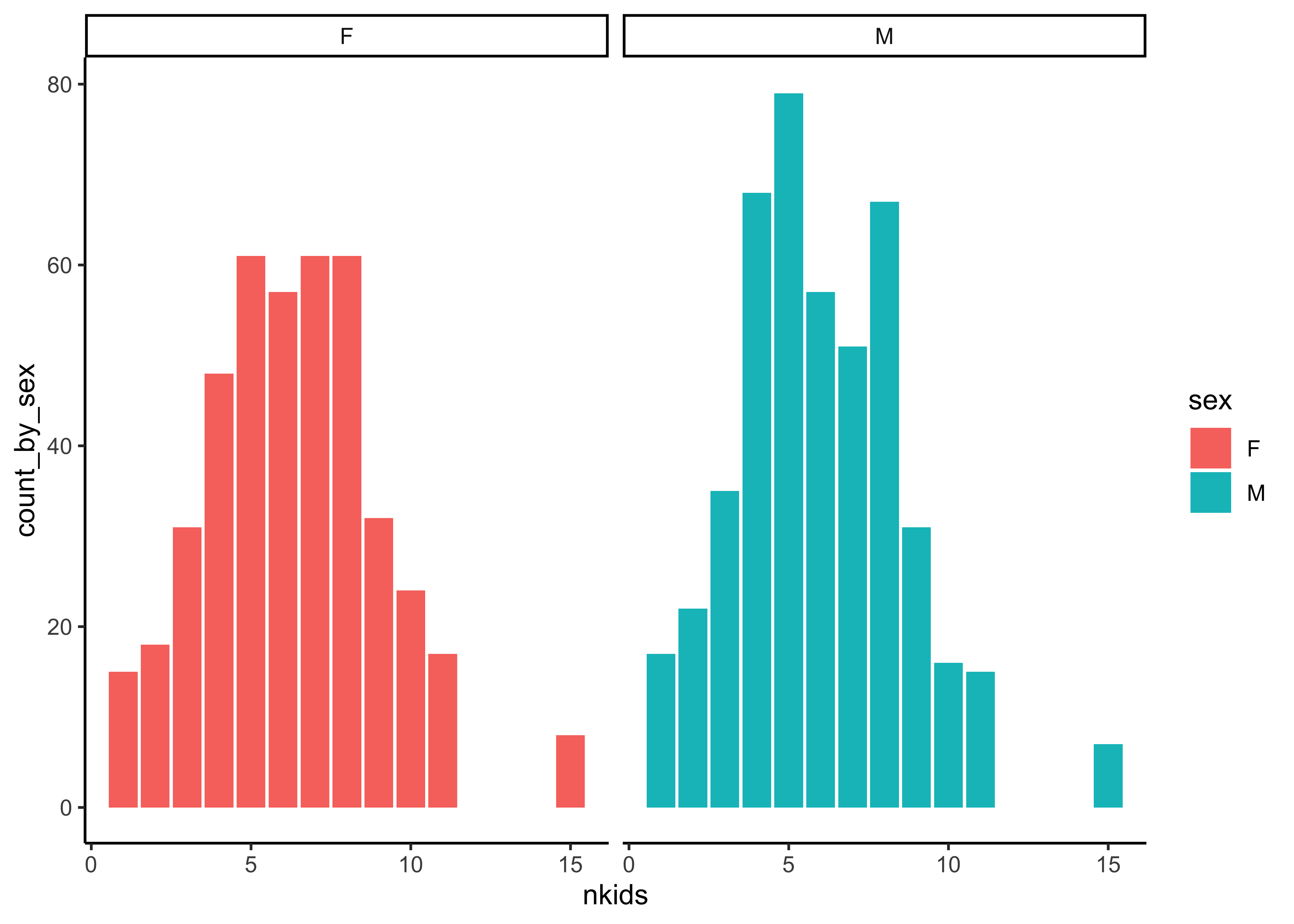
Galton_counts_by_sex <- Galton %>%
  mutate(family = as.integer(family)) %>%
  group_by(nkids, sex) %>%
  summarise(count_by_sex = n()) %>%
  ungroup() %>%
  group_by(sex)
Galton_counts_by_sexnkids <int> | sex <fct> | count_by_sex <int> | ||
|---|---|---|---|---|
| 1 | F | 15 | ||
| 1 | M | 17 | ||
| 2 | F | 18 | ||
| 2 | M | 22 | ||
| 3 | F | 31 | ||
| 3 | M | 35 | ||
| 4 | F | 48 | ||
| 4 | M | 68 | ||
| 5 | F | 61 | ||
| 5 | M | 79 |
Galton_counts_by_sex %>%
  e_charts(nkids) %>%
  e_bar(count_by_sex) %>%
  e_x_axis(
    name = "Family Size (nkids)", nameLocation = "center",
    nameGap = 20, type = "category"
  ) %>%
  e_y_axis(
    name = "How Many Children?",
    nameGap = 20,
    nameTextStyle = list(align = "center"),
    nameLocation = "center"
  ) %>%
  e_legend(right = 25, orient = "vertical") %>%
  e_facet(cols = 2, rows = 1) %>%
  e_tooltip(trigger = "item") %>%
e_title("Child Counts by Sex over Family Size")Insight: Hmm…decent gender balance overall, across family sizes nkids.
Follow-up Question
Follow up Question: How would we look for “gender balance” in individual families? Should we look at the family column ?
Galton %>%
  mutate(family = as.integer(family)) %>%
  group_by(family, sex) %>%
  summarise(count_by_sex = n()) %>%
  ungroup() %>%
  group_by(sex) %>%
  e_charts(family) %>%
  e_bar(count_by_sex) %>%
  e_x_axis(
    name = "nkids", nameLocation = "center",
    nameGap = 25, type = "category"
  ) %>%
  e_y_axis(
    name = "How Many Children?",
    nameGap = 25, nameLocation = "center"
  ) %>%
  e_legend(right = 5) %>%
  e_facet(cols = 2, rows = 1) %>%
  e_tooltip(trigger = "item") %>%
e_title("Child Counts by Sex over Family ID")Insight: The No of Children were distributed similarly across family sizenkids… However, this plot is too crowded and does not lead to any great insight. Using family ID was silly to plot against, wasn’t it? Not all exploratory plots will be “necessary” in the end. But they are part of the journey of getting better acquainted with the data!
OK, on to the Quantitative variables now! What Questions might we have, that could relate not to counts by Qual variables, but to the numbers in Quant variables. Stat measures, like their ranges, max and min? Means, medians, distributions? And how these vary on the basis of Qual variables? All this using histograms and densities.
Summary Stats
As Stigler(Stigler 2016) said, summaries are the first thing to look at in data. skimr::skim has already given us a lot summary data for Quant variables. We can now use mosaic::favstats to develop these further, by slicing / facetting these wrt other Qual variables. Let us tabulate some quick stat summaries of the important variables in Galton.
# summaries facetted by sex of child
measures <- favstats(~ height | sex, data = Galton)
measuressex <chr> | min <dbl> | Q1 <dbl> | median <dbl> | Q3 <dbl> | max <dbl> | mean <dbl> | sd <dbl> | n <int> | missing <int> |
|---|---|---|---|---|---|---|---|---|---|
| F | 56 | 62.5 | 64.0 | 65.5 | 70.5 | 64.11016 | 2.370320 | 433 | 0 |
| M | 60 | 67.5 | 69.2 | 71.0 | 79.0 | 69.22882 | 2.631594 | 465 | 0 |
Insight: We saw earlier that the mean height of the Children was 66 inches. However, are Sons taller than Daughters? Difference in mean height is 5 inches! AND…that was the same difference between fathers and mothers mean heights! Is it so simple then?
Question
Q.4 How are the heights of the children distributed? Here is where we need a e_histogram…
Galton %>%
  e_charts() %>%
  e_histogram(serie = height) %>%
  e_tooltip(trigger = "item") %>%
  e_mark_line(
    data = list(xAxis = mean(Galton$height)),
    label = list(
      label = "Mean Height",
      label.position = "end"
    ),
    lineStyle = list(
      color = "red", width = 1.5,
      type = "solid"
    )
  ) %>%
  # See https://echarts.apache.org/en/option.html#series-line.markLine

  e_x_axis(name = "Height", nameLocation = "center") %>%
  e_y_axis(name = "Counts", nameLocation = "center", nameGap = 30) %>%
e_title("Distribution of Heights in Galton")Insight: Fairly symmetric distribution…but there are a few very short and some very tall children! Try to change the no. of bins to check of we are missing some pattern. This is not completely easy with echarts4r which uses the “Sturges” algorithm to set the number of bins. Need to figure this out from the echarts Apache API docs.
Question
Q.5 Is there a difference in height distributions between Male and Female children?(Quant variable sliced by Qual variable)
We will use the raw Galton data and previously-computed measures:
Galton %>%
  group_by(sex) %>%
  e_charts(height = 300) %>%
  e_density(height) %>%
  e_mark_line(
    data = list(xAxis = measures %>% filter(sex == "M") %>%
      select(mean) %>% as.numeric()),
    # This code colours both v-lines red...how?
    lineStyle = list(
      color = "red", width = 1.5,
      type = "solid"
    )
  ) %>%
  # Upto here gives one line in red colour, correctly

  e_mark_line(
    data = list(xAxis = measures %>%
      filter(sex == "F") %>%
      select(mean) %>% as.numeric()),

    # This piece of code has no effect...wonder why not?
    # BOTH lines are in red ...why??
    lineStyle = list(
      color = "black", width = 1.5,
      type = "solid"
    )
  ) %>%
  e_title("Distributions of Height by Sex in Galton") %>%
  e_x_axis(name = "Height", nameLocation = "center") %>%
e_legend(right = 5)Insight: There is a visible difference in average heights between girls and boys. Is that significant, however? We will need a statistical inference test to figure that out!! Claus Wilke1 says comparisons of Quant variables across groups are best made between densities and not histograms…
Question
Q.6 Are Mothers generally shorter than fathers?
Galton %>%
  e_charts(height = 300) %>%
  e_density(father) %>%
  e_density(mother) %>%
  e_mark_line(
    data = list(xAxis = mean(Galton$mother)),
    lineStyle = list(
      color = "red", width = 1.5,
      type = "solid"
    )
  ) %>%
  e_mark_line(data = list(
    xAxis = mean(Galton$father),
    lineStyle = list(
      color = "black", width = 1.5,
      type = "solid"
    )
  )) %>%
e_legend(right = 10)Insight: Yes, moms are on average shorter than dads in this dataset. Again, is this difference statistically significant? We will find out in when we do Inference.
Question
Q.7a. Are heights of children different based on the number of kids in the family? And For Male and Female children?
Galton %>%
  group_by(nkids) %>%
  e_charts(height = 400) %>%
  e_boxplot(height,
    colorBy = "data",
    itemStyle = list(borderWidth = 3)
  ) %>%
  e_y_axis(
    max = 80, min = 50, name = "height", nameLocation = "center",
    nameGap = 25, margin = 5
  ) %>% # adds +/- 5 to y-axis limits

  e_x_axis(
    name = "Family Size",
    nameLocation = "center",
    nameGap = 25, type = "category"
  ) %>% # makes a category axis showing factors

  e_tooltip() %>%
  e_title("Heights over Family Size")
Question
Q.7b. Are heights of children different for Male and Female children?
# Can do better at colouring/filling and facetting...
Galton %>%
  group_by(nkids, sex) %>%
  e_charts(height = 400) %>% # no x-variable needed for boxplots
  e_boxplot(height,
    colorBy = "data",
    itemStyle = list(borderWidth = 3)
  ) %>%
  e_y_axis(
    max = 80, min = 50, name = "height", nameLocation = "center",
    nameGap = 25, margin = 5
  ) %>% # adds +/- 5 to y-axis limits

  e_x_axis(
    name = "Family Size",
    nameLocation = "center",
    nameGap = 25, type = "category"
  ) %>% # makes a category axis showing factors

  e_tooltip() %>%
e_title("Heights by Sex over Family Size")Insight: So, at all family “strengths”, the male children are taller than the female children. Box plots are used to show distributions of numeric data values and compare them between multiple groups (i.e Categorical Data, here sex and nkids).
Question
Q.8 Does the mean height of children in a family vary with the number of children in the family? (family size)?
Galton %>%
  group_by(nkids) %>%
  summarise(mean_height = mean(height)) %>%
  e_charts(nkids, height = 300) %>%
  e_bar(mean_height, colorBy = "data", legend = FALSE) %>%
  e_x_axis(
    name = "nkids", nameLocation = "center", nameGap = 25,
    type = "category"
  ) %>%
  e_y_axis(name = "mean height", nameLocation = "center", nameGap = 25) %>%
e_tooltip(trigger = "item")Insight: Hmm…The graph shows that mean heights do not vary much with family size nkids. We saw this with the box plots earlier. This would be useful information in a Modelling and Prediction exercise.
Follow-up Question
Q. 8a. Is height difference between sons and daughters related to height difference between father and mother?
Differences between father and mother heights influencing height…this would be like height ~ (father-mother). This would be a relationship between two Quant variables. A histogram would not serve here and we plot this as a Scatter Plot:
Galton %>%
  group_by(family, sex) %>%
  # Parental Height Difference
  mutate(diff_height = father - mother) %>%
  select(family, sex, height, diff_height) %>%
  ungroup() %>%
  group_by(sex) %>%
  e_charts(diff_height, height = 300) %>%
  e_scatter(height, symbol_size = 8) %>%
  # Fit a trend line
  e_lm(height ~ diff_height,
    name = c("Female", "Male")
  ) %>%
  e_x_axis(
    max = 18, min = -5,
    name = "Father - Mother Height",
    nameLocation = "center", nameGap = 25
  ) %>%
  e_y_axis(
    max = 80, min = 50,
    name = "Children's Heights",
    nameLocation = "center", nameGap = 25
  ) %>%
e_tooltip(axisPointer = list(type = "cross"))Insight: There seems no relationship, or a very small one, between children’s heights on the y-axis and the difference in parental height differences on the x-axis…
And so on…..we can proceed from simple visualizations based on Questions to larger questions that demand inference and modelling. We hinted briefly on these in the above Case Study.
NHANES
Let us try the NHANES dataset.
Try
help(NHANES) in your Console.data("NHANES")
skim(NHANES)| Name | NHANES |
| Number of rows | 10000 |
| Number of columns | 76 |
| _______________________ | |
| Column type frequency: | |
| factor | 31 |
| numeric | 45 |
| ________________________ | |
| Group variables | None |
Variable type: factor
| skim_variable | n_missing | complete_rate | ordered | n_unique | top_counts |
|---|---|---|---|---|---|
| SurveyYr | 0 | 1.00 | FALSE | 2 | 200: 5000, 201: 5000 |
| Gender | 0 | 1.00 | FALSE | 2 | fem: 5020, mal: 4980 |
| AgeDecade | 333 | 0.97 | FALSE | 8 | 40: 1398, 0-: 1391, 10: 1374, 20: 1356 |
| Race1 | 0 | 1.00 | FALSE | 5 | Whi: 6372, Bla: 1197, Mex: 1015, Oth: 806 |
| Race3 | 5000 | 0.50 | FALSE | 6 | Whi: 3135, Bla: 589, Mex: 480, His: 350 |
| Education | 2779 | 0.72 | FALSE | 5 | Som: 2267, Col: 2098, Hig: 1517, 9 -: 888 |
| MaritalStatus | 2769 | 0.72 | FALSE | 6 | Mar: 3945, Nev: 1380, Div: 707, Liv: 560 |
| HHIncome | 811 | 0.92 | FALSE | 12 | mor: 2220, 750: 1084, 250: 958, 350: 863 |
| HomeOwn | 63 | 0.99 | FALSE | 3 | Own: 6425, Ren: 3287, Oth: 225 |
| Work | 2229 | 0.78 | FALSE | 3 | Wor: 4613, Not: 2847, Loo: 311 |
| BMICatUnder20yrs | 8726 | 0.13 | FALSE | 4 | Nor: 805, Obe: 221, Ove: 193, Und: 55 |
| BMI_WHO | 397 | 0.96 | FALSE | 4 | 18.: 2911, 30.: 2751, 25.: 2664, 12.: 1277 |
| Diabetes | 142 | 0.99 | FALSE | 2 | No: 9098, Yes: 760 |
| HealthGen | 2461 | 0.75 | FALSE | 5 | Goo: 2956, Vgo: 2508, Fai: 1010, Exc: 878 |
| LittleInterest | 3333 | 0.67 | FALSE | 3 | Non: 5103, Sev: 1130, Mos: 434 |
| Depressed | 3327 | 0.67 | FALSE | 3 | Non: 5246, Sev: 1009, Mos: 418 |
| SleepTrouble | 2228 | 0.78 | FALSE | 2 | No: 5799, Yes: 1973 |
| PhysActive | 1674 | 0.83 | FALSE | 2 | Yes: 4649, No: 3677 |
| TVHrsDay | 5141 | 0.49 | FALSE | 7 | 2_h: 1275, 1_h: 884, 3_h: 836, 0_t: 638 |
| CompHrsDay | 5137 | 0.49 | FALSE | 7 | 0_t: 1409, 0_h: 1073, 1_h: 1030, 2_h: 589 |
| Alcohol12PlusYr | 3420 | 0.66 | FALSE | 2 | Yes: 5212, No: 1368 |
| SmokeNow | 6789 | 0.32 | FALSE | 2 | No: 1745, Yes: 1466 |
| Smoke100 | 2765 | 0.72 | FALSE | 2 | No: 4024, Yes: 3211 |
| Smoke100n | 2765 | 0.72 | FALSE | 2 | Non: 4024, Smo: 3211 |
| Marijuana | 5059 | 0.49 | FALSE | 2 | Yes: 2892, No: 2049 |
| RegularMarij | 5059 | 0.49 | FALSE | 2 | No: 3575, Yes: 1366 |
| HardDrugs | 4235 | 0.58 | FALSE | 2 | No: 4700, Yes: 1065 |
| SexEver | 4233 | 0.58 | FALSE | 2 | Yes: 5544, No: 223 |
| SameSex | 4232 | 0.58 | FALSE | 2 | No: 5353, Yes: 415 |
| SexOrientation | 5158 | 0.48 | FALSE | 3 | Het: 4638, Bis: 119, Hom: 85 |
| PregnantNow | 8304 | 0.17 | FALSE | 3 | No: 1573, Yes: 72, Unk: 51 |
Variable type: numeric
| skim_variable | n_missing | complete_rate | mean | sd | p0 | p25 | p50 | p75 | p100 | hist |
|---|---|---|---|---|---|---|---|---|---|---|
| ID | 0 | 1.00 | 61944.64 | 5871.17 | 51624.00 | 56904.50 | 62159.50 | 67039.00 | 71915.00 | ▇▇▇▇▇ |
| Age | 0 | 1.00 | 36.74 | 22.40 | 0.00 | 17.00 | 36.00 | 54.00 | 80.00 | ▇▇▇▆▅ |
| AgeMonths | 5038 | 0.50 | 420.12 | 259.04 | 0.00 | 199.00 | 418.00 | 624.00 | 959.00 | ▇▇▇▆▃ |
| HHIncomeMid | 811 | 0.92 | 57206.17 | 33020.28 | 2500.00 | 30000.00 | 50000.00 | 87500.00 | 100000.00 | ▃▆▃▁▇ |
| Poverty | 726 | 0.93 | 2.80 | 1.68 | 0.00 | 1.24 | 2.70 | 4.71 | 5.00 | ▅▅▃▃▇ |
| HomeRooms | 69 | 0.99 | 6.25 | 2.28 | 1.00 | 5.00 | 6.00 | 8.00 | 13.00 | ▂▆▇▂▁ |
| Weight | 78 | 0.99 | 70.98 | 29.13 | 2.80 | 56.10 | 72.70 | 88.90 | 230.70 | ▂▇▂▁▁ |
| Length | 9457 | 0.05 | 85.02 | 13.71 | 47.10 | 75.70 | 87.00 | 96.10 | 112.20 | ▁▃▆▇▃ |
| HeadCirc | 9912 | 0.01 | 41.18 | 2.31 | 34.20 | 39.58 | 41.45 | 42.92 | 45.40 | ▁▂▇▇▅ |
| Height | 353 | 0.96 | 161.88 | 20.19 | 83.60 | 156.80 | 166.00 | 174.50 | 200.40 | ▁▁▁▇▂ |
| BMI | 366 | 0.96 | 26.66 | 7.38 | 12.88 | 21.58 | 25.98 | 30.89 | 81.25 | ▇▆▁▁▁ |
| Pulse | 1437 | 0.86 | 73.56 | 12.16 | 40.00 | 64.00 | 72.00 | 82.00 | 136.00 | ▂▇▃▁▁ |
| BPSysAve | 1449 | 0.86 | 118.15 | 17.25 | 76.00 | 106.00 | 116.00 | 127.00 | 226.00 | ▃▇▂▁▁ |
| BPDiaAve | 1449 | 0.86 | 67.48 | 14.35 | 0.00 | 61.00 | 69.00 | 76.00 | 116.00 | ▁▁▇▇▁ |
| BPSys1 | 1763 | 0.82 | 119.09 | 17.50 | 72.00 | 106.00 | 116.00 | 128.00 | 232.00 | ▂▇▂▁▁ |
| BPDia1 | 1763 | 0.82 | 68.28 | 13.78 | 0.00 | 62.00 | 70.00 | 76.00 | 118.00 | ▁▁▇▆▁ |
| BPSys2 | 1647 | 0.84 | 118.48 | 17.49 | 76.00 | 106.00 | 116.00 | 128.00 | 226.00 | ▃▇▂▁▁ |
| BPDia2 | 1647 | 0.84 | 67.66 | 14.42 | 0.00 | 60.00 | 68.00 | 76.00 | 118.00 | ▁▁▇▆▁ |
| BPSys3 | 1635 | 0.84 | 117.93 | 17.18 | 76.00 | 106.00 | 116.00 | 126.00 | 226.00 | ▃▇▂▁▁ |
| BPDia3 | 1635 | 0.84 | 67.30 | 14.96 | 0.00 | 60.00 | 68.00 | 76.00 | 116.00 | ▁▁▇▇▁ |
| Testosterone | 5874 | 0.41 | 197.90 | 226.50 | 0.25 | 17.70 | 43.82 | 362.41 | 1795.60 | ▇▂▁▁▁ |
| DirectChol | 1526 | 0.85 | 1.36 | 0.40 | 0.39 | 1.09 | 1.29 | 1.58 | 4.03 | ▅▇▂▁▁ |
| TotChol | 1526 | 0.85 | 4.88 | 1.08 | 1.53 | 4.11 | 4.78 | 5.53 | 13.65 | ▂▇▁▁▁ |
| UrineVol1 | 987 | 0.90 | 118.52 | 90.34 | 0.00 | 50.00 | 94.00 | 164.00 | 510.00 | ▇▅▂▁▁ |
| UrineFlow1 | 1603 | 0.84 | 0.98 | 0.95 | 0.00 | 0.40 | 0.70 | 1.22 | 17.17 | ▇▁▁▁▁ |
| UrineVol2 | 8522 | 0.15 | 119.68 | 90.16 | 0.00 | 52.00 | 95.00 | 171.75 | 409.00 | ▇▆▃▂▁ |
| UrineFlow2 | 8524 | 0.15 | 1.15 | 1.07 | 0.00 | 0.48 | 0.76 | 1.51 | 13.69 | ▇▁▁▁▁ |
| DiabetesAge | 9371 | 0.06 | 48.42 | 15.68 | 1.00 | 40.00 | 50.00 | 58.00 | 80.00 | ▁▂▆▇▂ |
| DaysPhysHlthBad | 2468 | 0.75 | 3.33 | 7.40 | 0.00 | 0.00 | 0.00 | 3.00 | 30.00 | ▇▁▁▁▁ |
| DaysMentHlthBad | 2466 | 0.75 | 4.13 | 7.83 | 0.00 | 0.00 | 0.00 | 4.00 | 30.00 | ▇▁▁▁▁ |
| nPregnancies | 7396 | 0.26 | 3.03 | 1.80 | 1.00 | 2.00 | 3.00 | 4.00 | 32.00 | ▇▁▁▁▁ |
| nBabies | 7584 | 0.24 | 2.46 | 1.32 | 0.00 | 2.00 | 2.00 | 3.00 | 12.00 | ▇▅▁▁▁ |
| Age1stBaby | 8116 | 0.19 | 22.65 | 4.77 | 14.00 | 19.00 | 22.00 | 26.00 | 39.00 | ▆▇▅▂▁ |
| SleepHrsNight | 2245 | 0.78 | 6.93 | 1.35 | 2.00 | 6.00 | 7.00 | 8.00 | 12.00 | ▁▅▇▁▁ |
| PhysActiveDays | 5337 | 0.47 | 3.74 | 1.84 | 1.00 | 2.00 | 3.00 | 5.00 | 7.00 | ▇▇▃▅▅ |
| TVHrsDayChild | 9347 | 0.07 | 1.94 | 1.43 | 0.00 | 1.00 | 2.00 | 3.00 | 6.00 | ▇▆▂▂▂ |
| CompHrsDayChild | 9347 | 0.07 | 2.20 | 2.52 | 0.00 | 0.00 | 1.00 | 6.00 | 6.00 | ▇▁▁▁▃ |
| AlcoholDay | 5086 | 0.49 | 2.91 | 3.18 | 1.00 | 1.00 | 2.00 | 3.00 | 82.00 | ▇▁▁▁▁ |
| AlcoholYear | 4078 | 0.59 | 75.10 | 103.03 | 0.00 | 3.00 | 24.00 | 104.00 | 364.00 | ▇▁▁▁▁ |
| SmokeAge | 6920 | 0.31 | 17.83 | 5.33 | 6.00 | 15.00 | 17.00 | 19.00 | 72.00 | ▇▂▁▁▁ |
| AgeFirstMarij | 7109 | 0.29 | 17.02 | 3.90 | 1.00 | 15.00 | 16.00 | 19.00 | 48.00 | ▁▇▂▁▁ |
| AgeRegMarij | 8634 | 0.14 | 17.69 | 4.81 | 5.00 | 15.00 | 17.00 | 19.00 | 52.00 | ▂▇▁▁▁ |
| SexAge | 4460 | 0.55 | 17.43 | 3.72 | 9.00 | 15.00 | 17.00 | 19.00 | 50.00 | ▇▅▁▁▁ |
| SexNumPartnLife | 4275 | 0.57 | 15.09 | 57.85 | 0.00 | 2.00 | 5.00 | 12.00 | 2000.00 | ▇▁▁▁▁ |
| SexNumPartYear | 5072 | 0.49 | 1.34 | 2.78 | 0.00 | 1.00 | 1.00 | 1.00 | 69.00 | ▇▁▁▁▁ |
Again, lots of data from skim, about the Quant and Qual variables. Spend a little time looking through this output.
- Which variables could have been data that was given/stated by each respondent?
- And which ones could have been measured dependent data variables? Why do you think so?
- Why is there so much missing data? Which variable are the most affected by this?
Question
Q.1 What are the Education levels and the counts of people with those levels?
Education <fct> | total <int> | |||
|---|---|---|---|---|
| 8th Grade | 451 | |||
| 9 - 11th Grade | 888 | |||
| High School | 1517 | |||
| Some College | 2267 | |||
| College Grad | 2098 | |||
| NA | 2779 |
# This also works
# tally(~Education, data = NHANES) %>% as_tibble()Insight: The count goes up as we go from lower Education levels to higher. Need to keep that in mind. How do we understand the large number of NA entries?
Question
Q.2 How do counts of Education vs Work-status look like?
NHANES %>%
  mutate(Education = as.factor(Education)) %>%
  group_by(Work, Education) %>%
  summarise(count = n())
NHANES %>%
  group_by(Work, Education) %>%
  summarise(count = n()) %>%
  e_charts(Education, height = 300) %>%
  e_bar(count) %>%
  e_y_axis(max = 1750) %>%
  e_x_axis(type = "category") %>%
e_tooltip()Work <fct> | Education <fct> | count <int> | ||
|---|---|---|---|---|
| Looking | 8th Grade | 13 | ||
| Looking | 9 - 11th Grade | 39 | ||
| Looking | High School | 52 | ||
| Looking | Some College | 88 | ||
| Looking | College Grad | 72 | ||
| Looking | NA | 47 | ||
| NotWorking | 8th Grade | 249 | ||
| NotWorking | 9 - 11th Grade | 438 | ||
| NotWorking | High School | 579 | ||
| NotWorking | Some College | 792 |
Insight: Clear increase in the number of Working people as Education goes from 8th Grade to College. No surprise. Are the NotWorking counts a surprise?
Question
Q.3. What is the distribution of Physical Activity Days, across Gender? Across Education?
# NHANES %>% gf_histogram( ~ PhysActiveDays | Education, fill = ~ Education)
NHANES %>%
  group_by(Gender) %>%
  e_charts(PhysActiveDays, height = 350) %>%
  e_histogram(PhysActiveDays) %>%
  e_x_axis(max = 8) %>%
  e_facet(cols = 2, rows = 1) %>%
  e_tooltip()
NHANES %>%
  group_by(Education) %>%
  e_charts(PhysActiveDays, height = 350) %>%
  e_histogram(PhysActiveDays) %>%
  e_x_axis(max = 8) %>%
  e_facet(rows = 1, cols = 3) %>%
e_tooltip()Insight: Can we conclude anything here? The populations in each category are different, as indicated by the different y-axis scales, so what do we need to do? Take percentages or ratios of course, per-capita! How would one do that?
Question
Q.3a. What is the distribution of Physical Activity Days, across Education and Sex, per capita?
NHANES %>%
  group_by(Gender) %>%
  summarize(mean_active = mean(PhysActiveDays, na.rm = TRUE))
NHANES %>%
  group_by(Education) %>%
summarize(mean_active = mean(PhysActiveDays, na.rm = TRUE))Gender <fct> | mean_active <dbl> | |||
|---|---|---|---|---|
| female | 3.813687 | |||
| male | 3.677231 |
Education <fct> | mean_active <dbl> | |||
|---|---|---|---|---|
| 8th Grade | 3.844311 | |||
| 9 - 11th Grade | 3.581197 | |||
| High School | 3.676800 | |||
| Some College | 3.514706 | |||
| College Grad | 3.856916 | |||
| NA | 3.927667 |
Insight: Hmm..no great differences in per-capita physical activity. Females are marginally more active than males. No need to even plot this.
Question
Q.4. How are people Ages distributed across levels of Education?
# Recall there are missing data
# gf_boxplot(Age ~ Education,
#            fill = ~ Education, # Always a good idea to fill boxes
#            data = NHANES) %>%
#   gf_theme(theme_classic()) %>% plotly::ggplotly()

NHANES %>%
  mutate(Education = as.factor(Education)) %>%
  group_by(Education) %>%
  e_charts(height = 300) %>% # Should not mention x-variable!!!
  e_boxplot(Age,
    colorBy = "data",
    itemStyle = list(borderWidth = 3)
  ) %>%
  e_y_axis(name = "Age", nameLocation = "middle", max = 100, min = 0, nameGap = 25) %>%
  e_x_axis(
    type = "category", axisTick = list(alignWithLabel = TRUE),
    axisLabel = list(interval = 0)
  ) %>% # ensures all tick labels on x-axis
e_tooltip()Insight: Older age groups are somewhat more heavily represented in groups with lower educational status. But College Graduates also have slightly older age distributions…So do College Educated people live longer? That is a nice Question for some Inferential Modelling. And how to interpret the NA group?
Question
Q.5. How is Education distributed over Race?
NHANES_by_Race1 <- NHANES %>%
  group_by(Race1) %>%
  summarize(population = n())
NHANES_by_Race1
NHANES %>%
  group_by(Education, Race1) %>%
  summarize(n = n()) %>%
  left_join(NHANES_by_Race1, by = c("Race1" = "Race1")) %>%
  mutate(percapita_educated = (n / population) * 100) %>%
  ungroup() %>%
  group_by(Race1) %>% # Aesthetic 1
  e_charts(Education, height = 350) %>% # Aesthetic #2
  e_bar(percapita_educated) %>% # Aesthetic #3

  e_x_axis(
    type = "category", axisTick = list(alignWithLabel = TRUE),
    axisLabel = list(interval = 0)
  ) %>%
  e_y_axis(max = 35) %>%
  e_facet(rows = 2, cols = 3) %>%
e_flip_coords()Race1 <fct> | population <int> | |||
|---|---|---|---|---|
| Black | 1197 | |||
| Hispanic | 610 | |||
| Mexican | 1015 | |||
| White | 6372 | |||
| Other | 806 |
Insight: Blacks, Hispanics, and Mexicans tend to have fewer people with college degrees, as a percentage of their population. Asians and other immigrants have a significant tendency towards higher education!
Question
Q.6. What is the distribution of people’s BMI, split by Gender? By Race1?
# One can also plot both histograms and densities in an overlay fashion,

NHANES %>%
  group_by(Gender) %>%
  e_charts(height = 300) %>%
  e_density(BMI)
NHANES %>%
  group_by(Race1) %>%
  e_charts(height = 350) %>%
  e_density(BMI) %>%
e_facet(rows = 2, cols = 3)Insight: Non-white races tend to have larger portions of their populations with larger BMI. So these races perhaps tend to obesity. By and large BMI distributions are normal.
Question
Q.7. What is the distribution of people’s Testosterone level vs BMI? Split By Race1?
NHANES %>%
  gf_density2d(Testosterone ~ BMI | Race1) %>%
  gf_theme(theme_classic()) %>%
plotly::ggplotly()Insight: Low testosterone levels exist across all BMI values, but healthy levels of T exists only over a smaller range of BMI.
Note: echarts4r does not seem to provide a 2D-density plot…yet!!
Here is a dataset from Jeremy Singer-Vine’s blog, Data Is Plural. This is a list of all books banned in schools across the US.
banned <- readxl::read_xlsx(
  path = "../data/banned.xlsx",
  sheet = "Sorted by Author & Title"
)
skim(banned)| Name | banned |
| Number of rows | 1586 |
| Number of columns | 10 |
| _______________________ | |
| Column type frequency: | |
| character | 10 |
| ________________________ | |
| Group variables | None |
Variable type: character
| skim_variable | n_missing | complete_rate | min | max | empty | n_unique | whitespace |
|---|---|---|---|---|---|---|---|
| Author | 0 | 1.00 | 7 | 29 | 0 | 797 | 0 |
| Title | 0 | 1.00 | 2 | 155 | 0 | 1145 | 0 |
| Type of Ban | 0 | 1.00 | 21 | 36 | 0 | 4 | 0 |
| Secondary Author(s) | 1488 | 0.06 | 9 | 187 | 0 | 61 | 0 |
| Illustrator(s) | 1222 | 0.23 | 8 | 35 | 0 | 192 | 0 |
| Translator(s) | 1576 | 0.01 | 14 | 25 | 0 | 9 | 0 |
| State | 0 | 1.00 | 4 | 14 | 0 | 26 | 0 |
| District | 0 | 1.00 | 4 | 40 | 0 | 86 | 0 |
| Date of Challenge/Removal | 0 | 1.00 | 5 | 15 | 0 | 15 | 0 |
| Origin of Challenge | 0 | 1.00 | 13 | 16 | 0 | 2 | 0 |
Insight: Clearly the variables are all Qualitative, except perhaps for Date of Challenge/Removal, (which in this case has been badly mangled by Excel) So we need to make counts based on the* levels* of the Qual variables and plot Bar/Column charts. We will not find a use for histograms or densities.
Let us try to answer this question, about counts:
Question
What is the count of banned books by type and by US state?
banned_by_state <-
  banned %>%
  group_by(State) %>%
  summarise(total = n()) %>%
  ungroup()
banned_by_stateState <chr> | total <int> | |||
|---|---|---|---|---|
| Alaska | 1 | |||
| Arkansas | 1 | |||
| Florida | 204 | |||
| Georgia | 13 | |||
| Illinois | 4 | |||
| Indiana | 18 | |||
| Iowa | 4 | |||
| Kansas | 30 | |||
| Maryland | 1 | |||
| Michigan | 2 |
banned %>%
  group_by(State, `Type of Ban`) %>%
  summarise(count = n()) %>%
  ungroup() %>%
  left_join(., banned_by_state, by = c("State" = "State")) %>%
  #  pivot_wider(.,id_cols = State,
  #              names_from = `Type of Ban`,
  #              values_from = count) %>% janitor::clean_names() %>%
  #  replace_na(list(banned_from_libraries_and_classrooms = 0,
  #                  banned_from_libraries = 0,
  #                  banned_pending_investigation = 0,
  #                  banned_from_classrooms = 0)) %>%
  # mutate(total = sum(across(where(is.integer)))) %>%
  gf_col(count ~ reorder(State, total),
    fill = ~`Type of Ban`
  ) %>%
  gf_labs(
    x = "Count of Banned Books",
    y = "State"
  ) %>%
  gf_refine(coord_flip()) %>%
  gf_theme(theme = theme_minimal())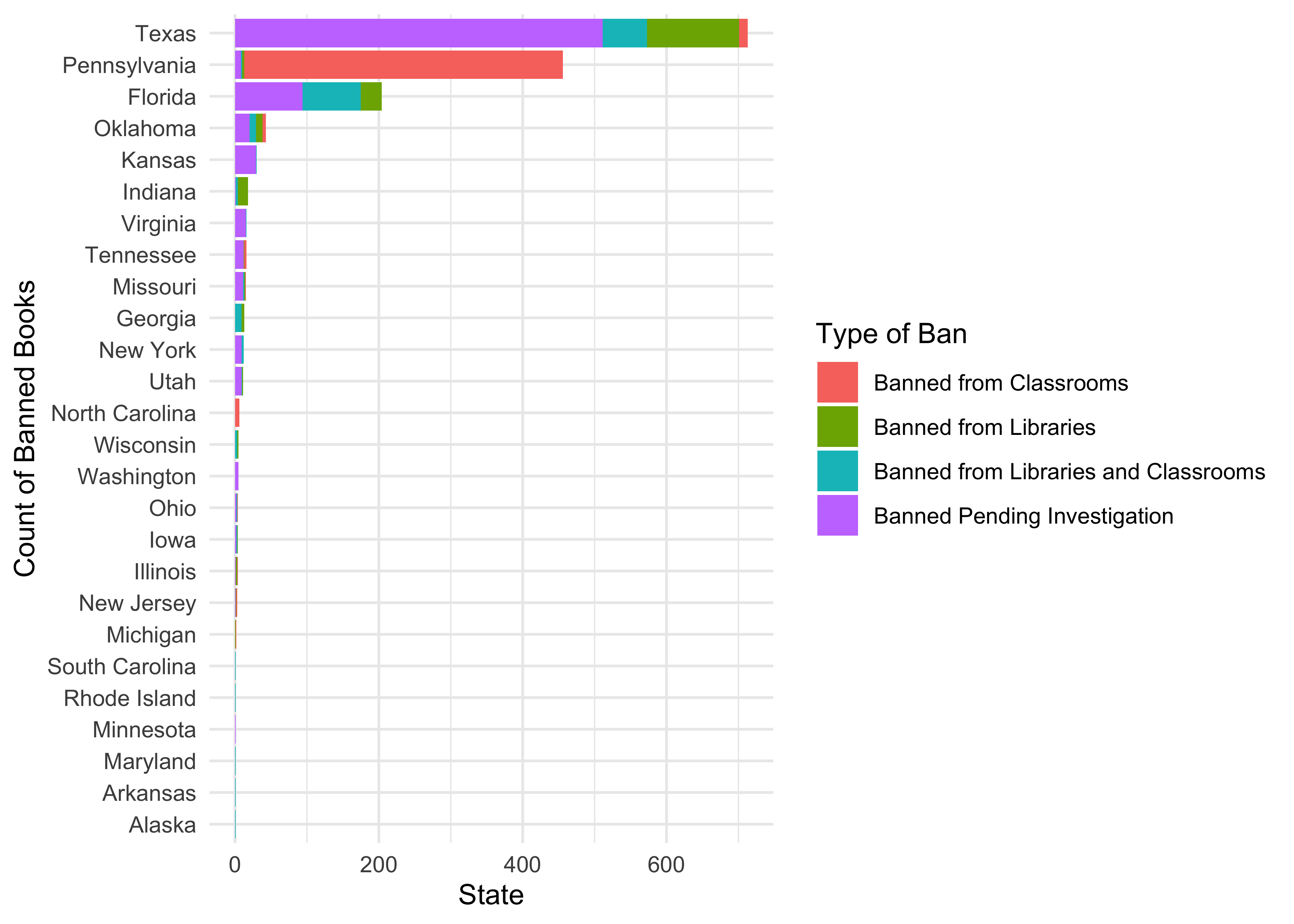
Insight: Do you want to live in Texas? If you are both illiterate and interested in horses, perhaps.
And that is a wrap!! Try to work with this procedure:
- Inspect the data using
skimorinspect - Identify Qualitative and Quantitative variables
- Notice variables that have missing data
- Develop Counts of Observations for combinations of Qualitative variables (factors)
- Develop Histograms and Densities, and slice them by Qualitative variables to develop facetted plots as needed
- At each step record the insight and additional questions!!
- Continue with other Descriptive Graphs as needed
- And then on the inference and modelling!!
- Sharon Machlis, Plot in R with echarts4r, InfoWorld https://www.infoworld.com/article/3607068/plot-in-r-with-echarts4r.html
- A detailed analysis of the NHANES dataset, https://awagaman.people.amherst.edu/stat230/Stat230CodeCompilationExampleCodeUsingNHANES.pdf
References
Stigler, Stephen M. 2016. “The Seven Pillars of Statistical Wisdom,” March. https://doi.org/10.4159/9780674970199.
Footnotes
Fundamentals of Data Visualization (clauswilke.com)↩︎