19 min
Alert - I have split up this Huge website into smaller ones. Please check out the new site URLs on the Home page for the latest course content. This website will not be updated anymore. Thanks for your patience and support! 🙏
Data Visualization, Analysis, and Inference…with no Code!

It is a truth universally acknowledged, that a Srishti Art and Design student, in possession of a good Mac, must be terrified of coding.
-Code and Prejudice, Jane Austen, 1813
This Unit takes SMI peasants students on a journey of using data to tell stories, make decisions, and maybe startle a few people. Without doing an iota of work writing one byte of code. Bah.
Datasets from various domains of human enterprise and activity are introduced. The human contexts from these datasets are used to appreciate the specifics of data formats, the nature of variables within the data, and their significance in Art and Design.
The stuff within the datasets are motivated from the point of view of the Types of Information they contain: Quantities, Attributes, Changes, Portions, Rankings, Relations, Hierarchies, and related to Space, and Time, for example. Student will relate the data variables to Data/Information Visualizations, making decisions on how geometric shapes and other aspects of different Data Types and Visualizations can be metaphorically matched to the contexts. These information-to-geometry metaphors will lead us to Insights, Questions, and eventually to Stories and good Decisions.
Statistical tests will be introduced at appropriate moments to help appreciate how large and significant our insights are.
Students will then be prompted to work in groups, or as a whole, to conduct (one or more) complete data gathering experiments on campus, visualize the data, and tell a Story that pertains to their immediate surroundings.
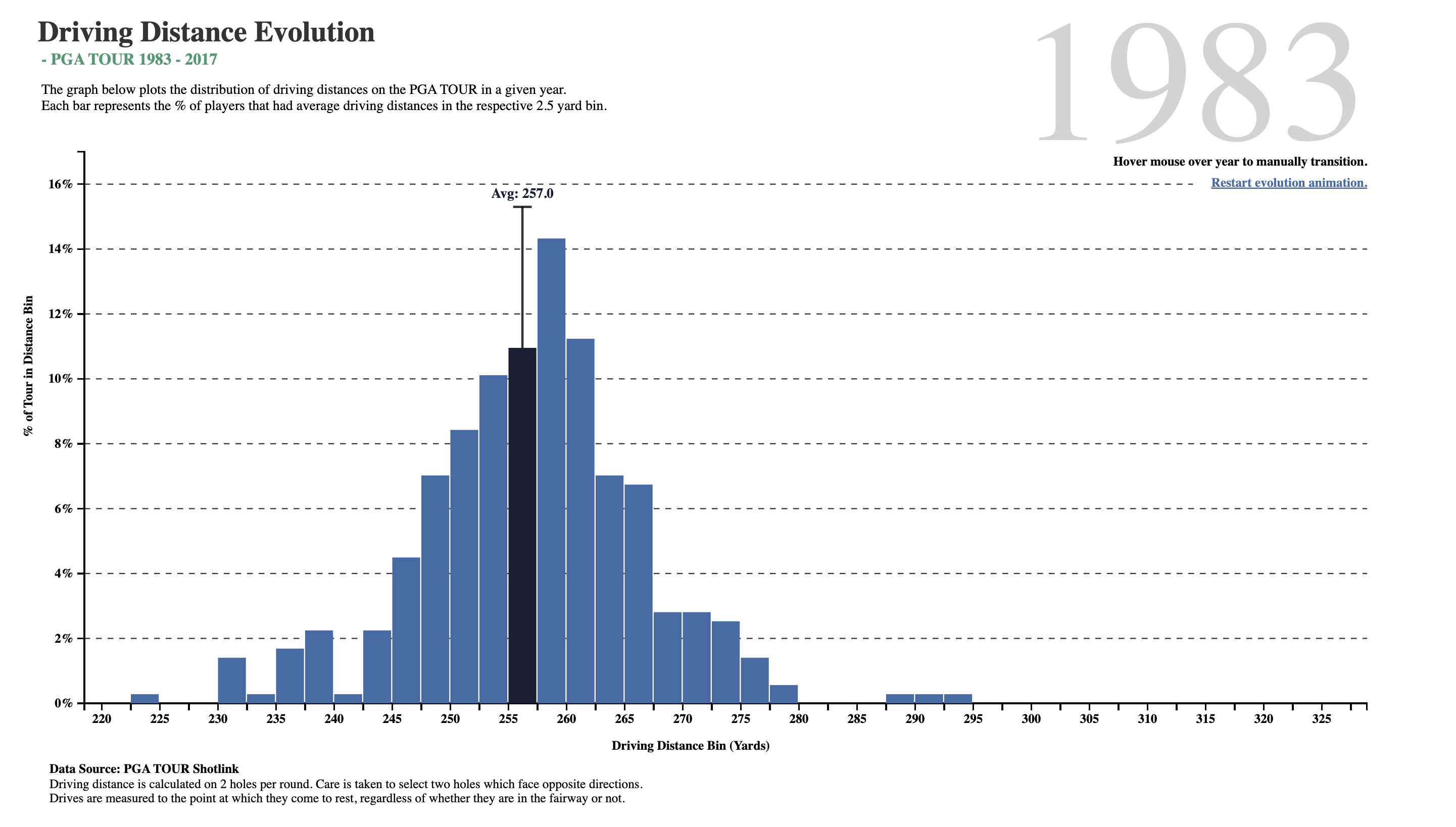
Take a look at the graph visualization below:
We will form our intuition about shapes and data and learn to create some evocative information graphics that tell stories.
The Elevate DataViz Blog: The Genres of Data Stories https://blog.elevatedataviz.com/the-types-of-data-stories/
Dear Data Science. https://users.dimi.uniud.it/~massimo.franceschet/ds/syllabus/syllabus.html
Jack Dougherty and Ilya Ilyankou, Hands-On Data Visualization: Interactive Storytelling from Spreadsheets to Code, https://handsondataviz.org/. Available free Online.
Claus O. Wilke, Fundamentals of Data Visualization, https://clauswilke.com/dataviz/. Available free Online.
Jonathan Schwabish, Better Data Visualizations: A Guide for Scholars, Researchers, and Wonks, Columbia University Press, 2021.
Alberto Cairo, The Functional Art:An introduction to information graphics and visualization, New Riders. 2013. ISBN-9780133041361.
Cole Nussbaumer Knaflic, Storytelling With Data: A Data Visualization Guide for Business Professionals, Wiley 2015. ISBN-9781119002253.
Stat Literacy. http://www.statlit.org
Data Vis Project https://datavizproject.com/ Allows you to match data types and data-vis types!! Perfect!!
Data Viz Catalogue https://datavizcatalogue.com/ Another good place to look for graphs that match your data!
Data-to-Viz https://www.data-to-viz.com/#explore
Financial Times Visual Vocabulary Chart. A great chart to match data to data-viz. PDF here and Web version https://ft-interactive.github.io/visual-vocabulary/
Gramener Blog. 72 types of Visualization for Data Stories. https://blog.gramener.com/types-of-data-visualization-for-data-stories/
R Charts https://r-charts.com/
R Graph Gallery https://r-graph-gallery.com/index.html
A wide variety of graphics and datasets on global issues at Our World in Data https://ourworldindata.org/
Datasets at calmcode.io https://calmcode.io/datasets.html. Simple datasets that you should begin with.
Data.World https://data.world. A very well organized easily searchable database of datasets and visualizations!
The Harvard Dataverse https://dataverse.harvard.edu/. A very large searchable database of datasets on a very wode set of topics.
IPUMS https://www.ipums.org/ The Integrated Public Use Microdata Series (IPUMS) is the world’s largest individual-level population database. IPUMS consists of microdata samples from United States (IPUMS-USA) and international (IPUMS-International) census records, as well as data from U.S. and international surveys. Data provided is integrated across time and space. Health, Economics, Higher Education, Historical Data and much more.
Kaggle Datasets https://www.kaggle.com/datasets E.g. Netflix Shows
Data Is Plural https://www.data-is-plural.com/. This a weekly newsletter of useful/curious datasets by Jeremy Singer-Vine. And a web archive of datasets too.
Information is Beautiful https://informationisbeautiful.net/ David McCandless’ terrific information visualization site. All datasets used here are also available for download.
India Data by Sector https://data.gov.in/sector
The FBI’s Crime Data Explorer (very US-centric) https://crime-data-explorer.app.cloud.gov/pages/home
Datasets at Nate Silver’s website 538 ( very US-centric) https://data.fivethirtyeight.com/
Open Data Network ( again very US-centric) https://www.opendatanetwork.com/
311-data.org https://www.311-data.org/. Data about 311 calls in different parts of the US. (#311 is a complaints service that deals with non-crime / non-emergency related neighbourhood issues in the US)
Google Dataset Search https://datasetsearch.research.google.com/
Github dataset search https://github.com/search?q=datasets
World Inequality Database, https://wid.world/. Global data on income and wealth inequality. India specific data also available.
World Bank Open Data https://data.worldbank.org/. A global collection of economic development data .
Jonathan Schwabish’s PolicyViz DataViz Catalogue. https://policyviz.com/resources/policyviz-data-visualization-catalog/ This is a spreadsheet that has links to data and images of visualizations that have been achieved with each of the datasets. Over 800 entries…see the embedded table below! (US centric, but very inspirational visualizations!).
Work With Data. https://www.workwithdata.com/data A good selection of datasets on a wide set of topics. Check the neat network diagram there!
Vincent Arel-Bundock’s RDatasets webpage: https://vincentarelbundock.github.io/Rdatasets/index.html
OECD Data Explorer. https://data-explorer.oecd.org
Orange Data Mining https://orangedatamining.com/ Free software. Very intuitive, point-and-click, goes all the way from simple data-viz to ML!
Datawrapper https://academy.datawrapper.de/ A free browser-based tool, requires registration and login.
RAWGraphs https://app.rawgraphs.io/ Another Free browser-based tool, no registration, no login. Simple interface too.
Observable Plot: https://observablehq.com/plot/ The JavaScript library for exploratory data visualization that can create expressive charts with concise (Javascript) code. There is also a #NoCode method available there. Ugh.
Flourish Studio https://flourish.studio/ Beautiful and easy data visualization and storytelling
Infogram https://infogram.com/ Create engaging infographics and reports in minutes
Visme https://www.visme.co/ Yet another…
And of course, there is this:
https://openai.com/index/improvements-to-data-analysis-in-chatgpt/