library("vcd")
library("scatterplot3d")
library(colorspace)
## random seed
myseed <- 1071
set.seed(myseed)Mosaic Chart Step by Step Tutorial
Data
Inference
set.seed(myseed)
art_max <- coindep_test(art, n = 5000)

set.seed(myseed)
ucb_max <- coindep_test(aperm(UCBAdmissions, c(3, 2, 1)), margin = "Department", n = 5000)set.seed(myseed)
art_chisq <- coindep_test(art, n = 5000, indepfun = function(x) sum(x^2))set.seed(myseed)
hos_chisq <- coindep_test(Hospital, n = 5000, indepfun = function(x) sum(x^2))Figures
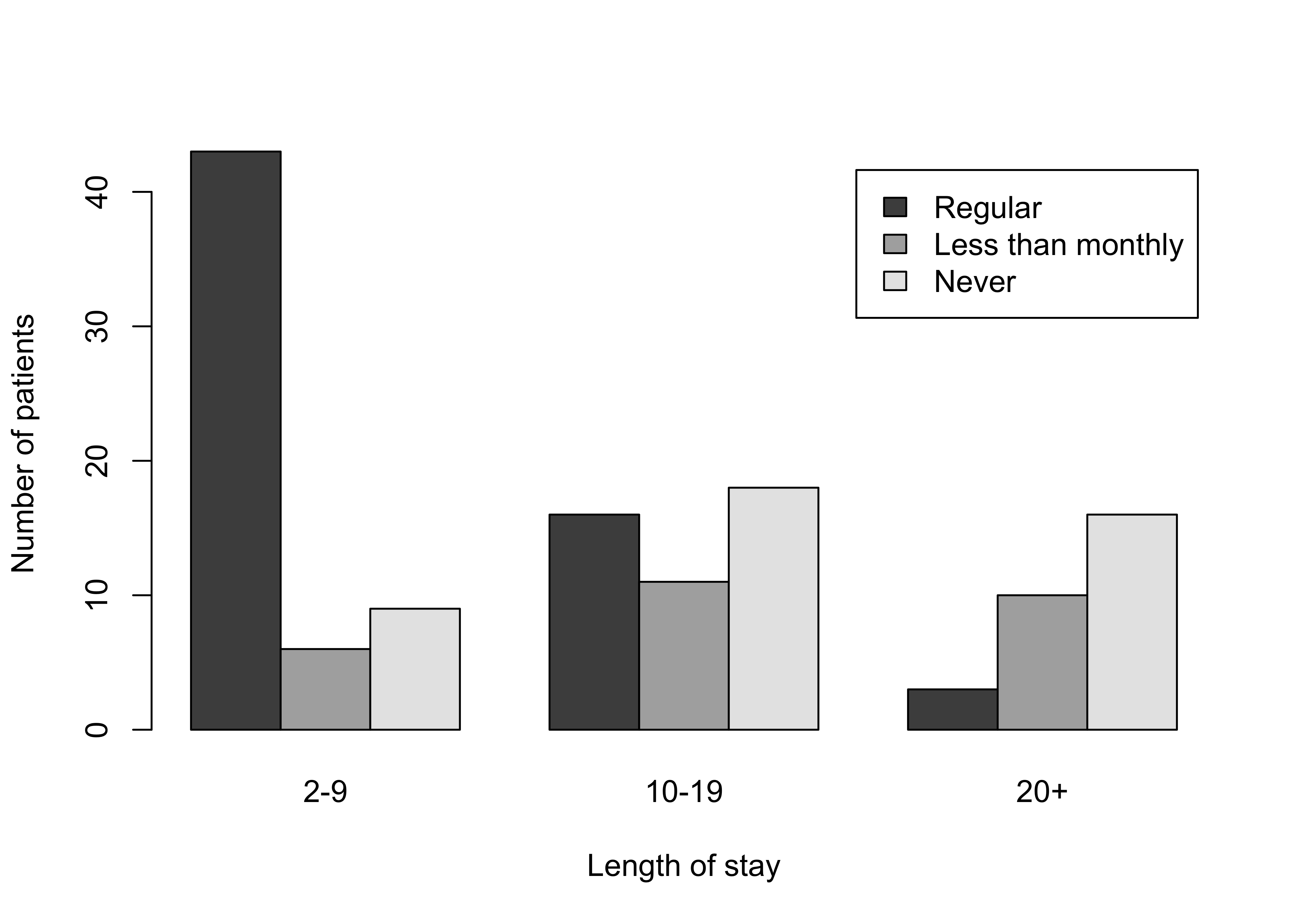
Figure 12.1: Grouped bar chart for the hospital data
barplot(Hospital,
  legend = rownames(Hospital), beside = TRUE,
  xlab = "Length of stay", ylab = "Number of patients"
)
###################################################
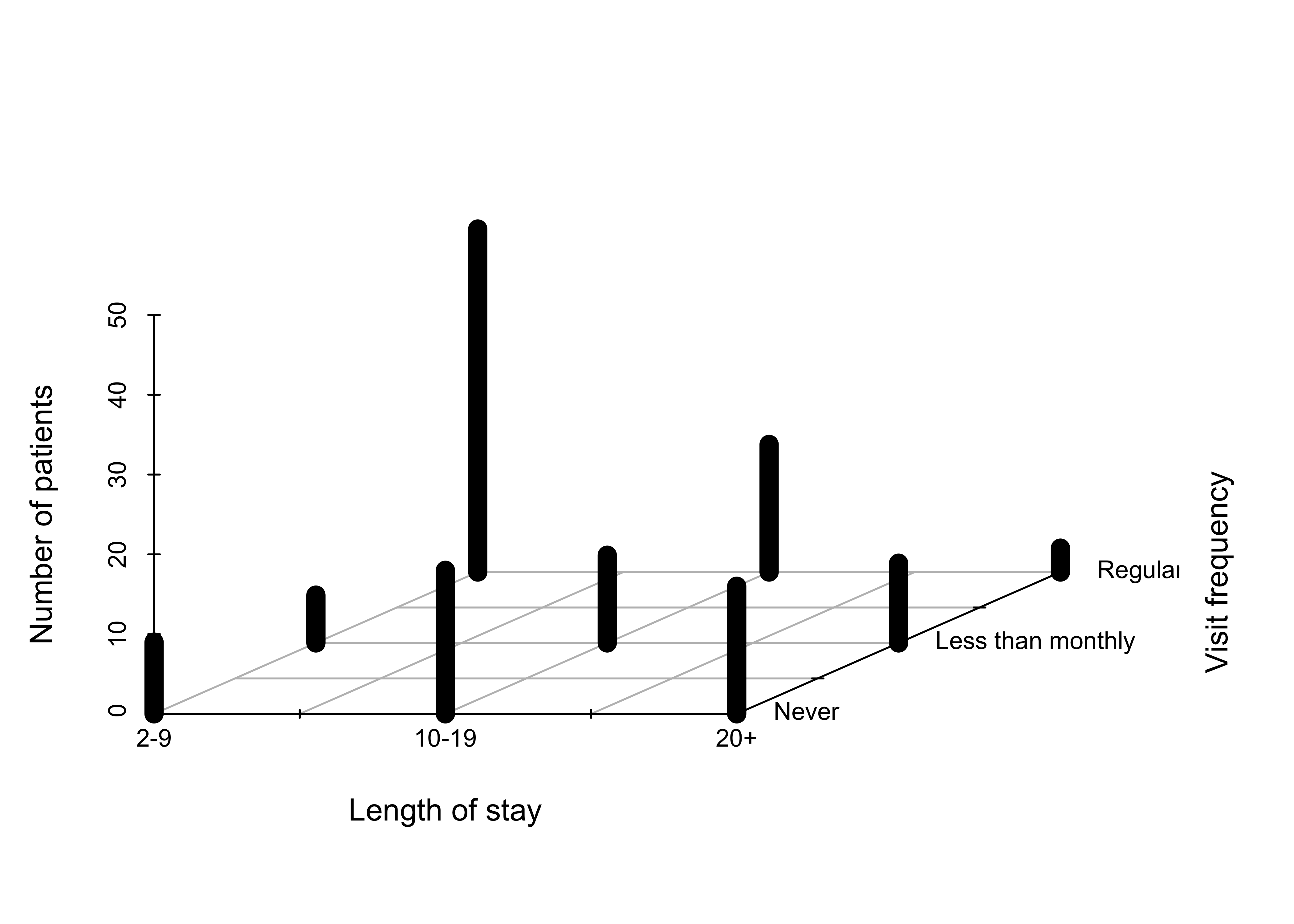
### Figure 12.2: 3D bar chart for the hospital data
###################################################
myHospital <- t(Hospital)[, 3:1]
mydat <- data.frame(
"Length of stay" = as.vector(row(myHospital)),
"Visit frequency" = as.vector(col(myHospital)),
"Number of patients" = as.vector(myHospital)
)
scatterplot3d(mydat,
type = "h", pch = " ", lwd = 10,
x.ticklabs = c("2-9", "", "10-19", "", "20+"),
y.ticklabs = c("Never", "", "Less than monthly", "", "Regular"),
xlab = "Length of stay", ylab = "Visit frequency", zlab = "Number of patients",
y.margin.add = 0.2,
color = "black", box = FALSE
)
############################################################################
### Figure 12.3: Construction of a mosaic plot for the hospital data, step 1
############################################################################
mosaic(margin.table(Hospital, 2), split = TRUE)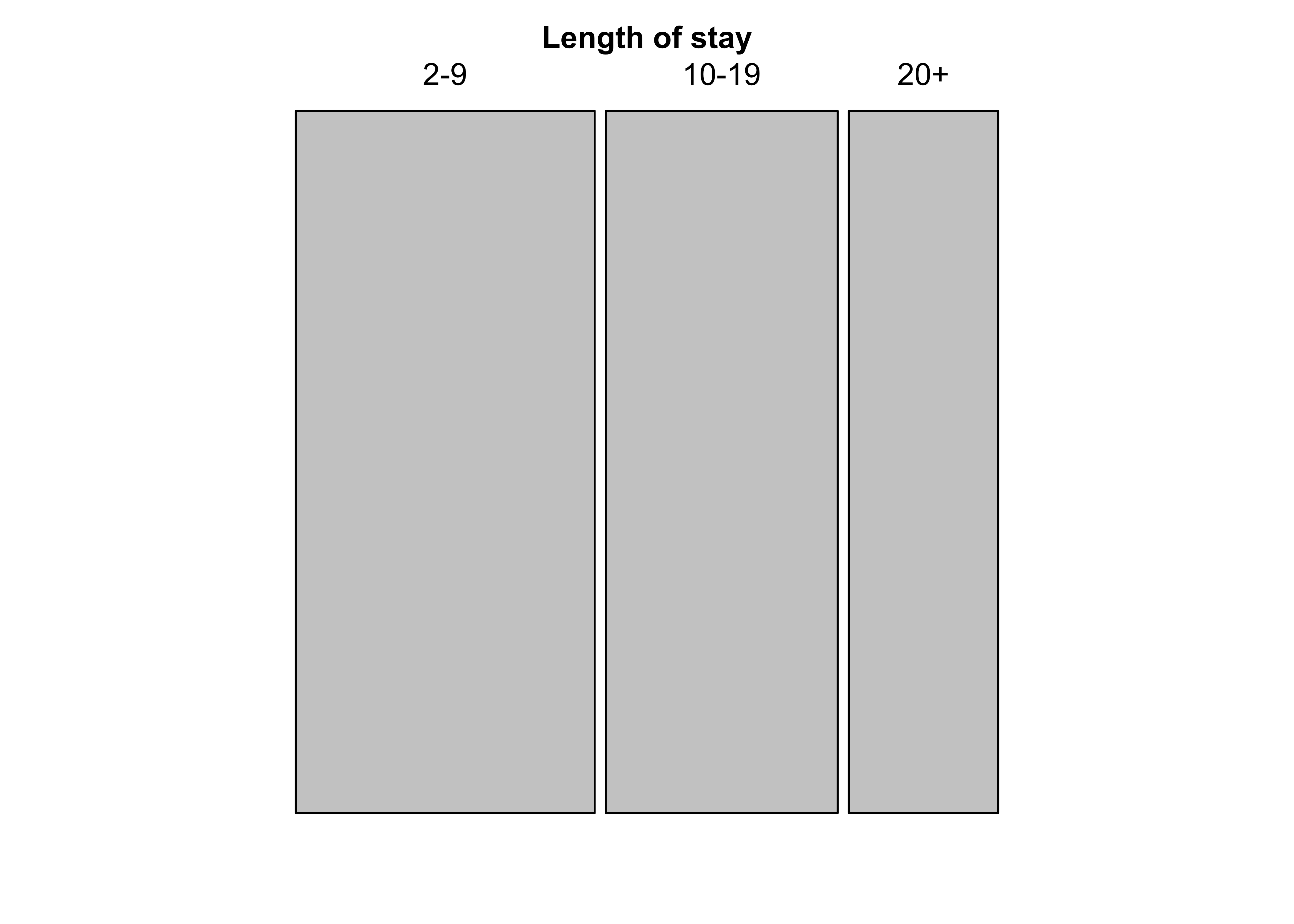
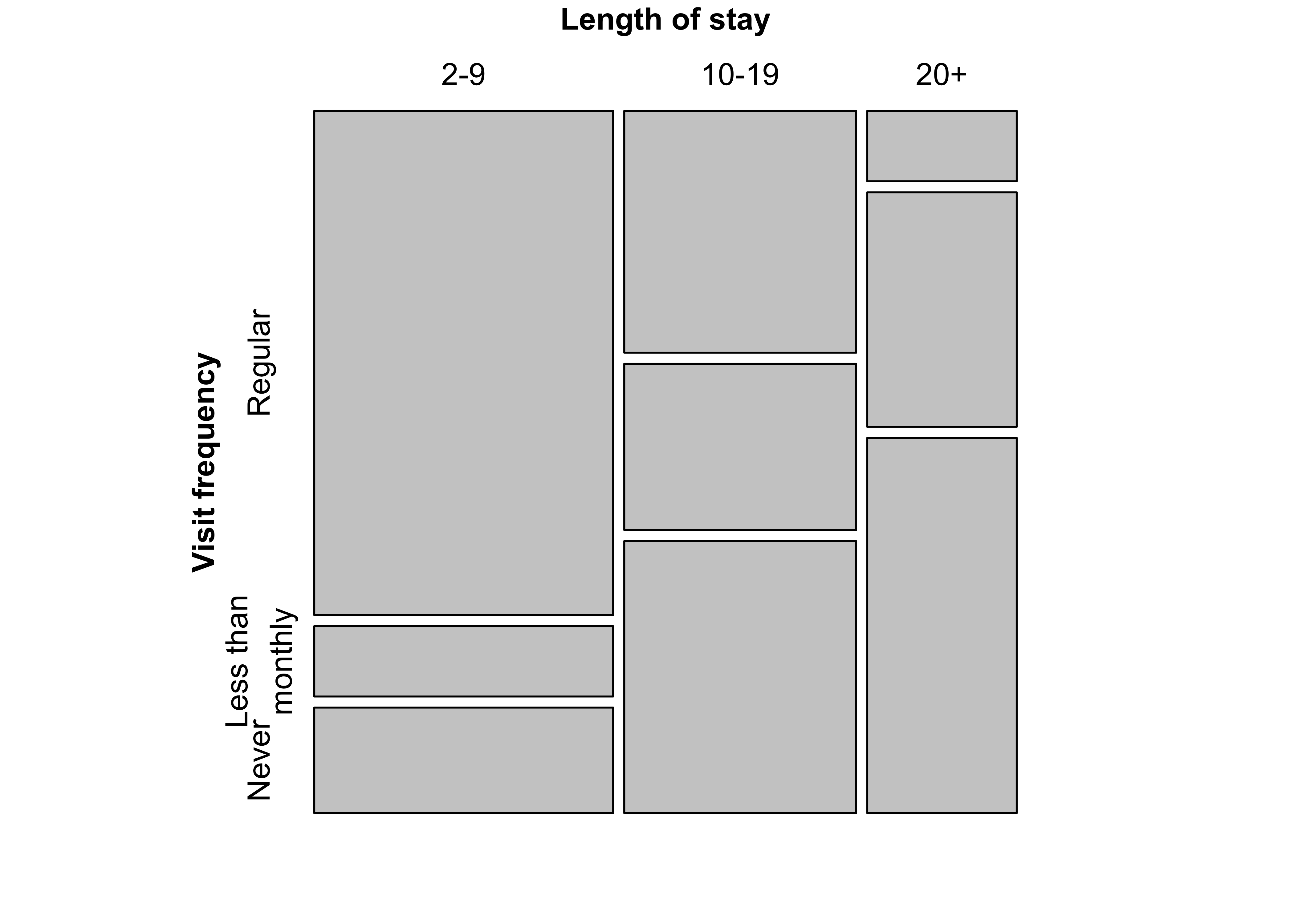
Figure 12.4: Construction of a mosaic plot for the hospital data, step 2
mosaic(t(Hospital),
  split = TRUE, mar = c(left = 3.5),
  labeling_args = list(
    offset_labels = c(left = 0.5),
    offset_varnames = c(left = 1, top = 0.5), set_labels =
      list("Visit frequency" = c("Regular", "Less than\nmonthly", "Never"))
  )
)
###
### Figure 12.5: Mosaic plot for the Hospital data, alternative splitting

mosaic(Hospital)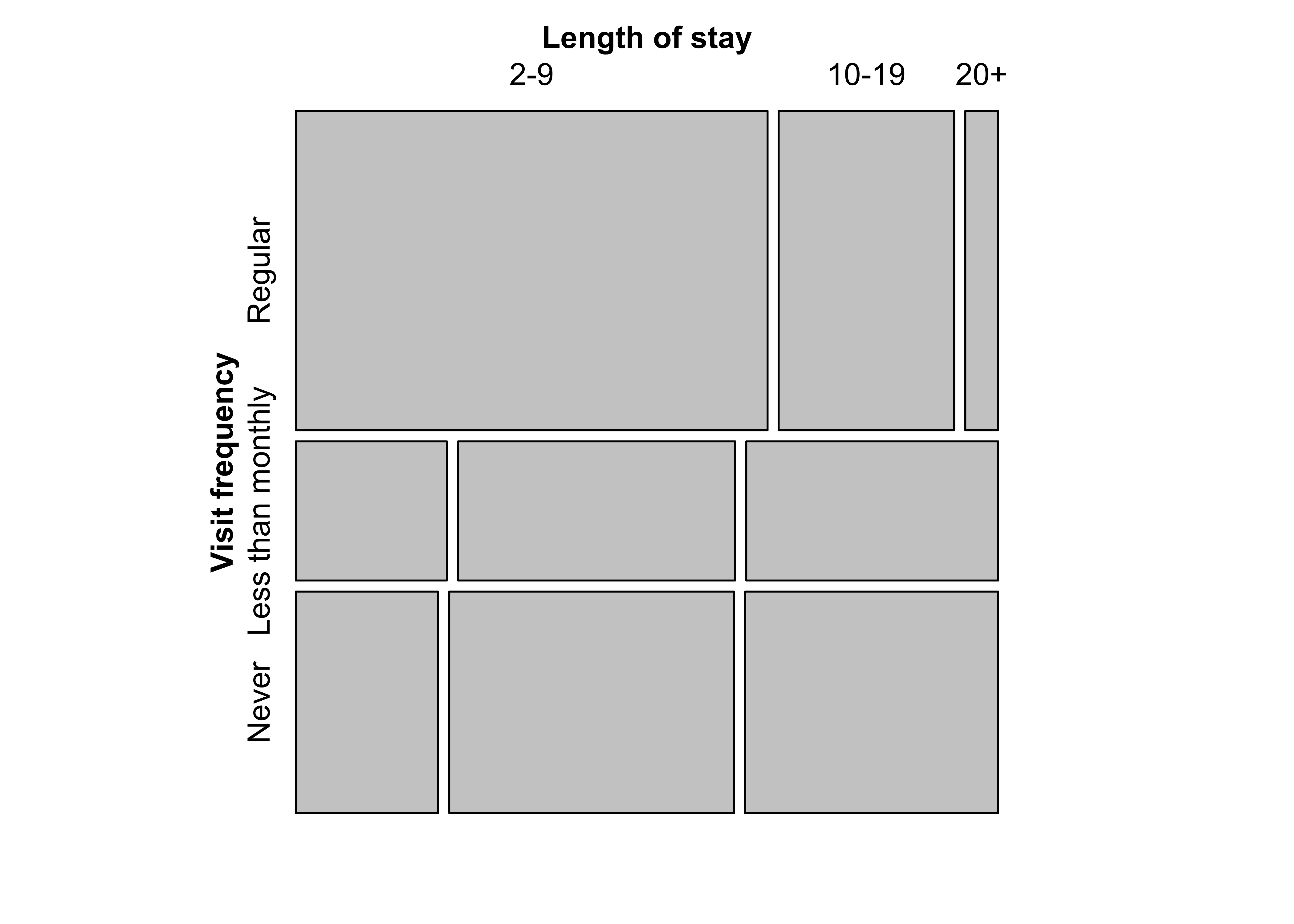
Figure 12.6: Sieve plot for the hospital data
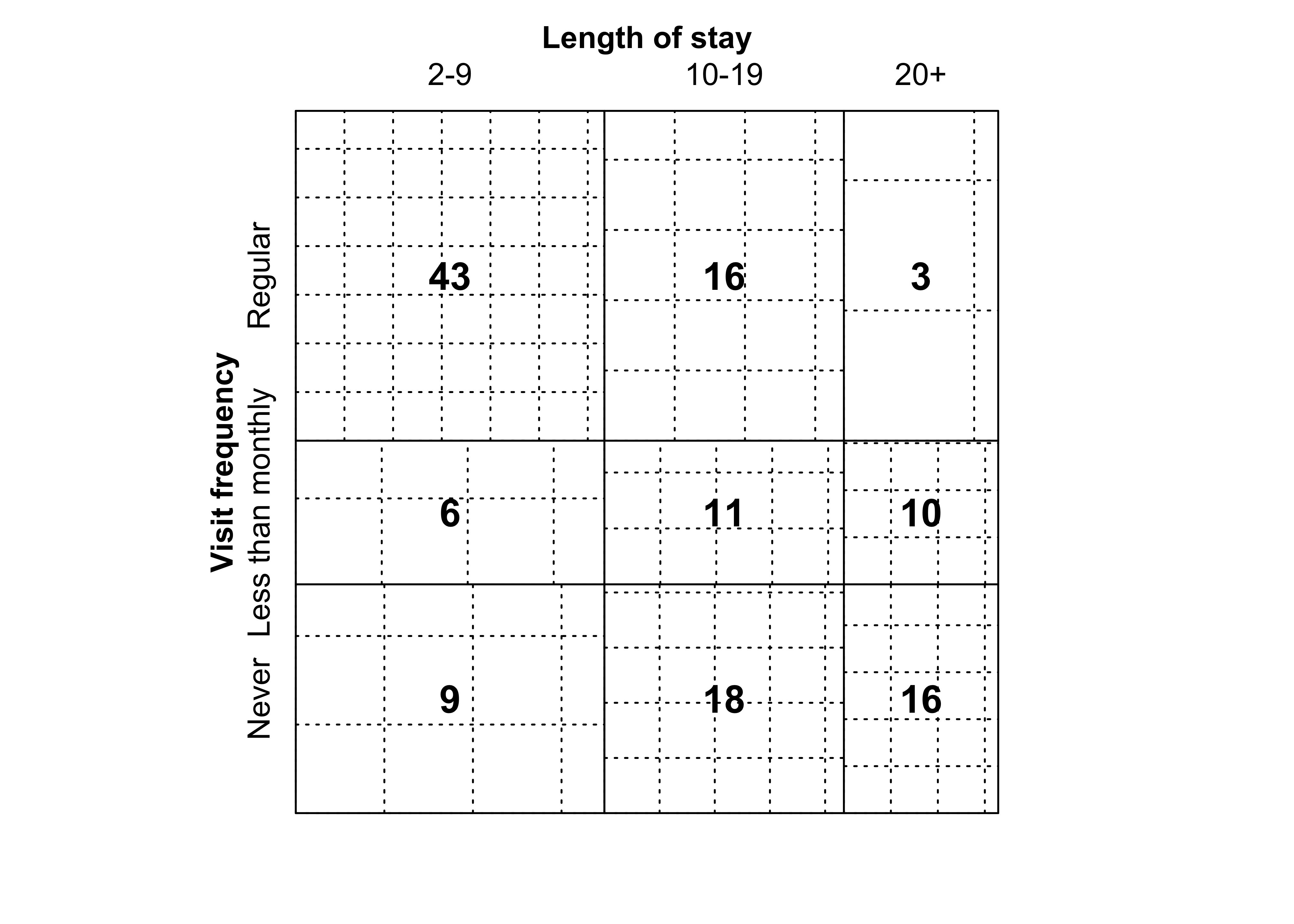
Figure 12.7: Association plot for the hospital data
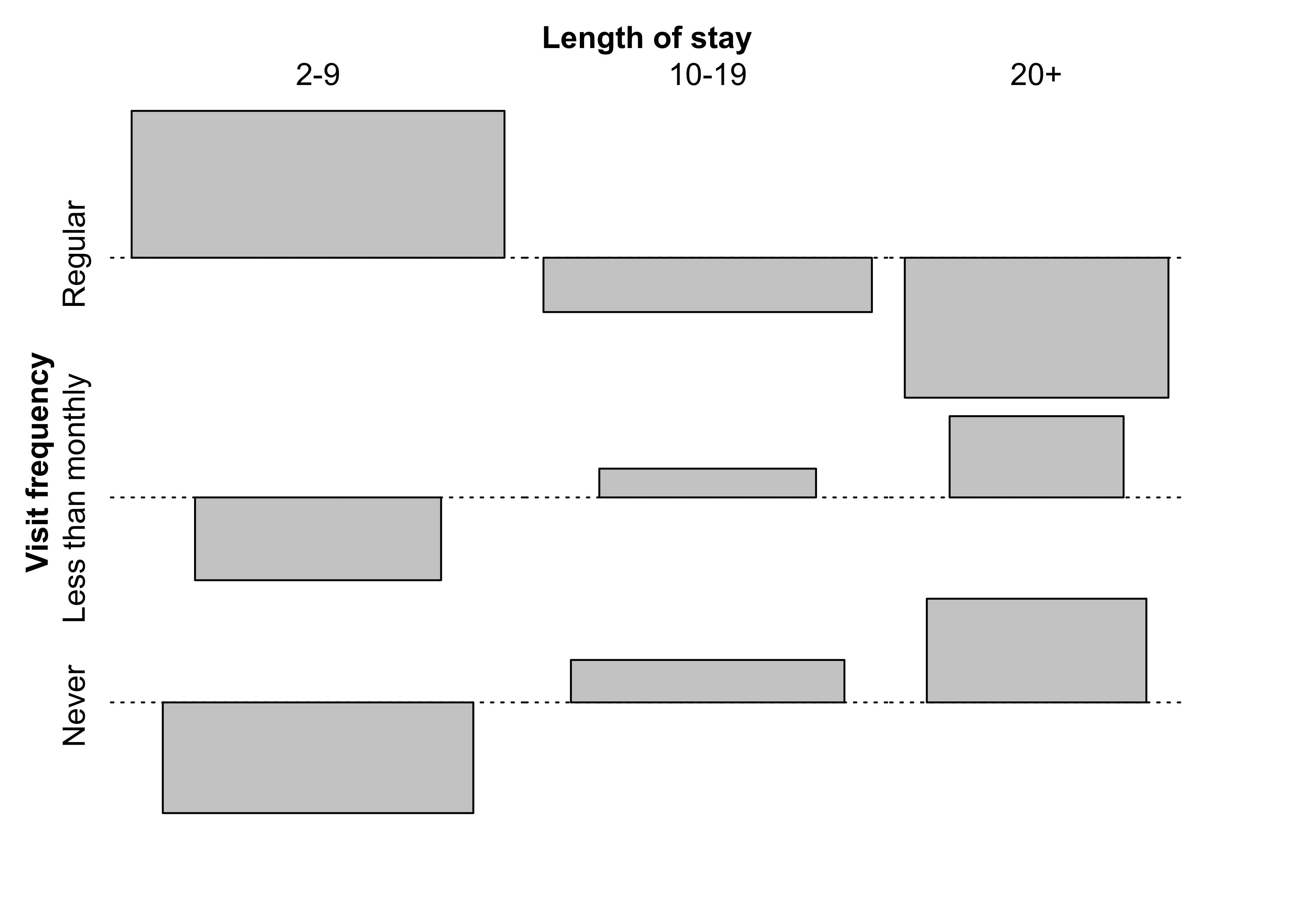
Figure 12.8: Qualitative color palette for HSV and HCL space
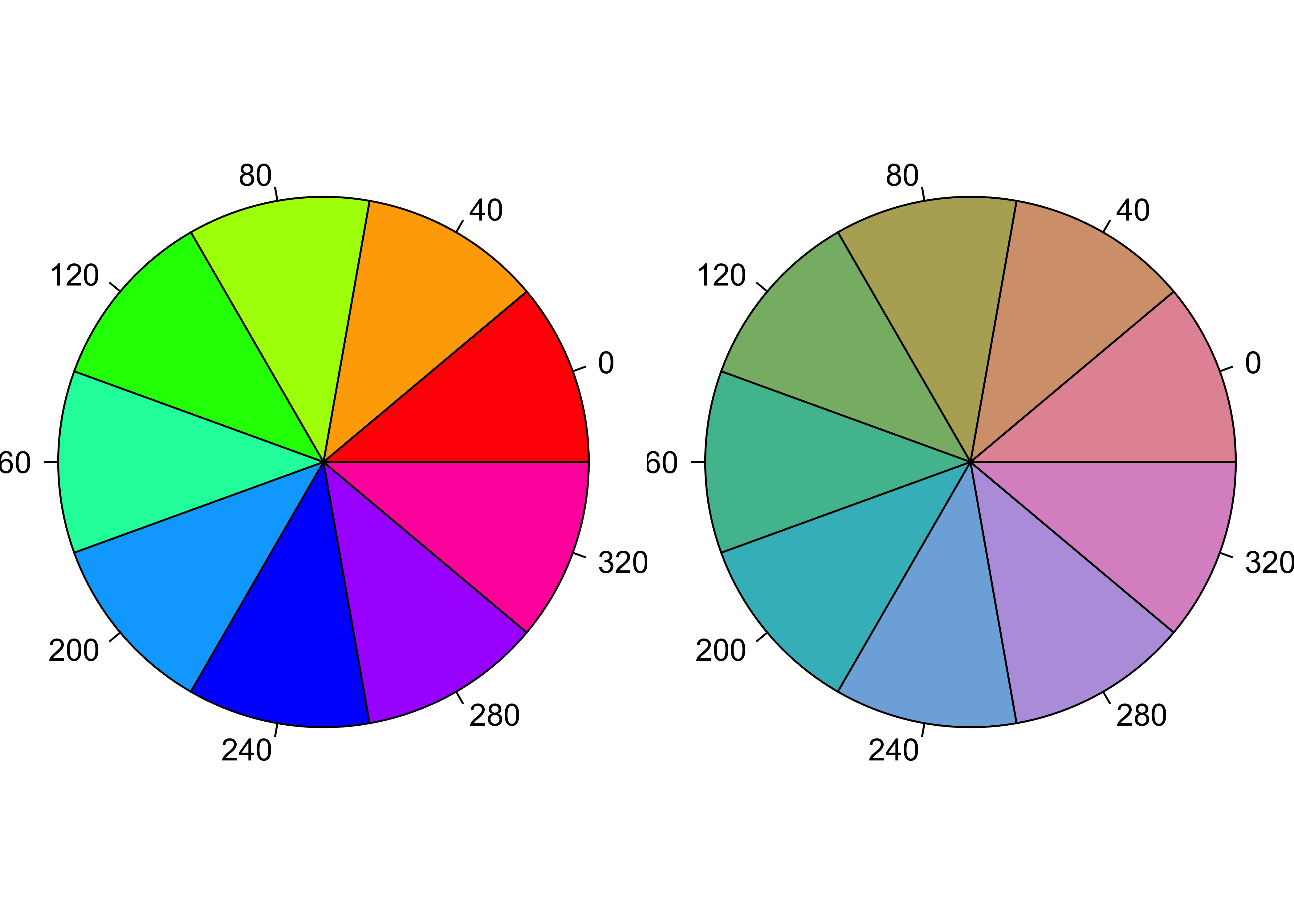
Figure 12.9: Diverging color palettes for HSV and HCL space
par(mfrow = c(1, 1), mar = c(1, 1, 1, 1), oma = c(0, 0, 0, 0))
plot.new()
rect(0:4 / 5, 0.2, 1:5 / 5, 0.5, border = 0, col = diverge_hcl(5))
rect(0, 0.2, 1, 0.5, border = 1, col = NULL)
rect(0:4 / 5, 0.55, 1:5 / 5, 0.85, border = 0, col = diverge_hsv(5))
rect(0, 0.55, 1, 0.85, border = 1, col = NULL)
text(c(1:5 / 5 - 0.1), 0.11, c("(260, 100, 50)", "(260, 50, 70)", "(H, 0, 90)", "(0, 50, 70)", "(0, 100, 50)"))
text(c(1:5 / 5 - 0.1), 0.91, c("(240, 100, 100)", "(240, 50, 100)", "(H, 0, 100)", "(0, 50, 100)", "(0, 100, 100)"))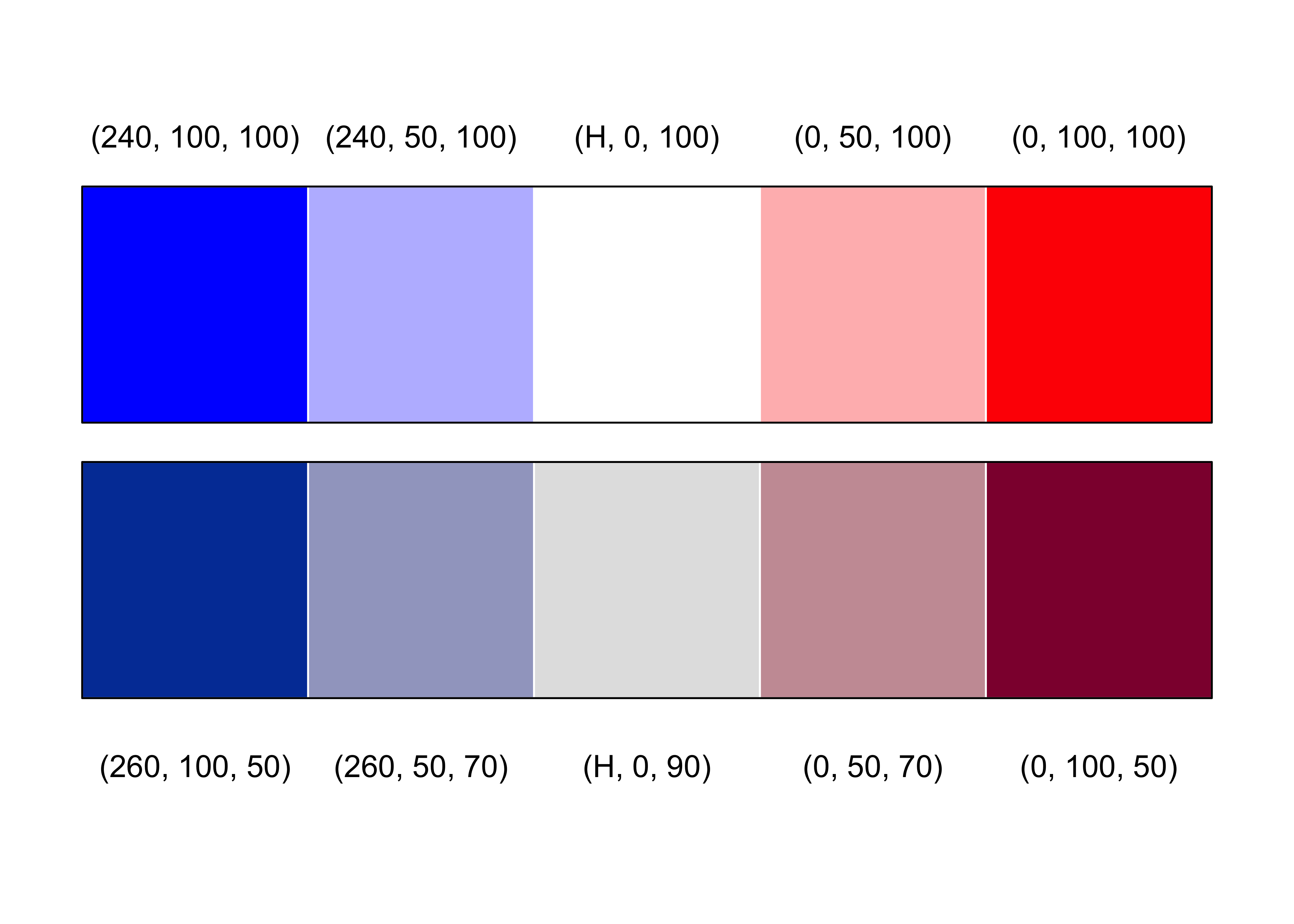
Figure 12.10: Spine plot with highlighting for the hospital data
mycol <- rep(grey.colors(2)[2:1], 1:2)
mosaic(t(Hospital),
  mar = c(left = 3.5),
  labeling_args = list(
    offset_labels = c(left = 0.5),
    offset_varnames = c(left = 1, top = 0.5), set_labels =
      list("Visit frequency" = c("Regular", "Less than\nmonthly", "Never"))
  ),
  split = TRUE, highlighting = 2, gp = gpar(fill = mycol, col = mycol)
)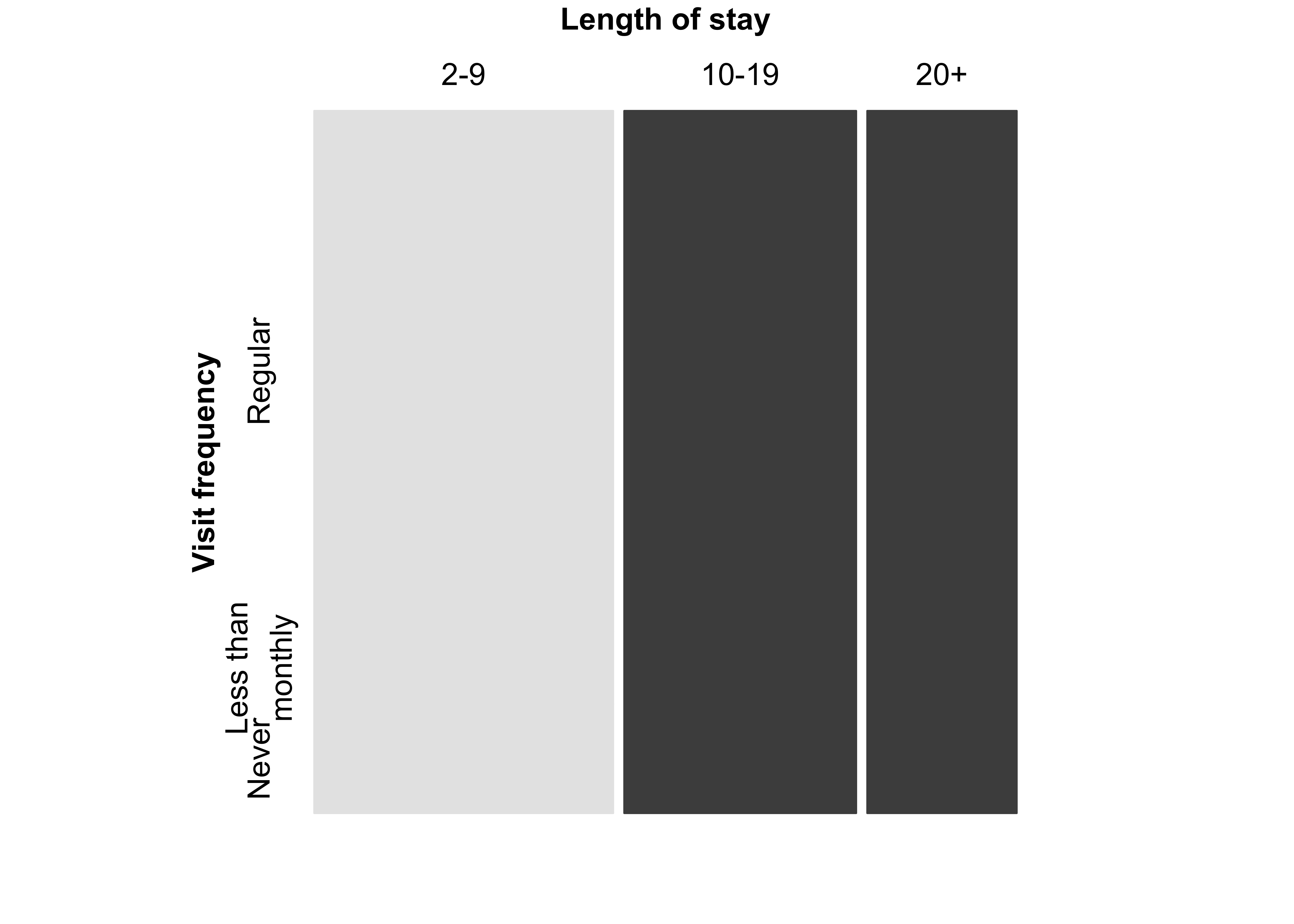
Figure 12.11: Mosaic display of the hospital data with Friendly-like
### color coding of the residuals

mosaic(t(Hospital),
  split = TRUE, shade = TRUE,
  mar = c(left = 3.5),
  gp_args = list(p.value = hos_chisq$p.value),
  labeling_args = list(
    offset_labels = c(left = 0.5),
    offset_varnames = c(left = 1, top = 0.5), set_labels =
      list("Visit frequency" = c("Regular", "Less than\nmonthly", "Never"))
  )
)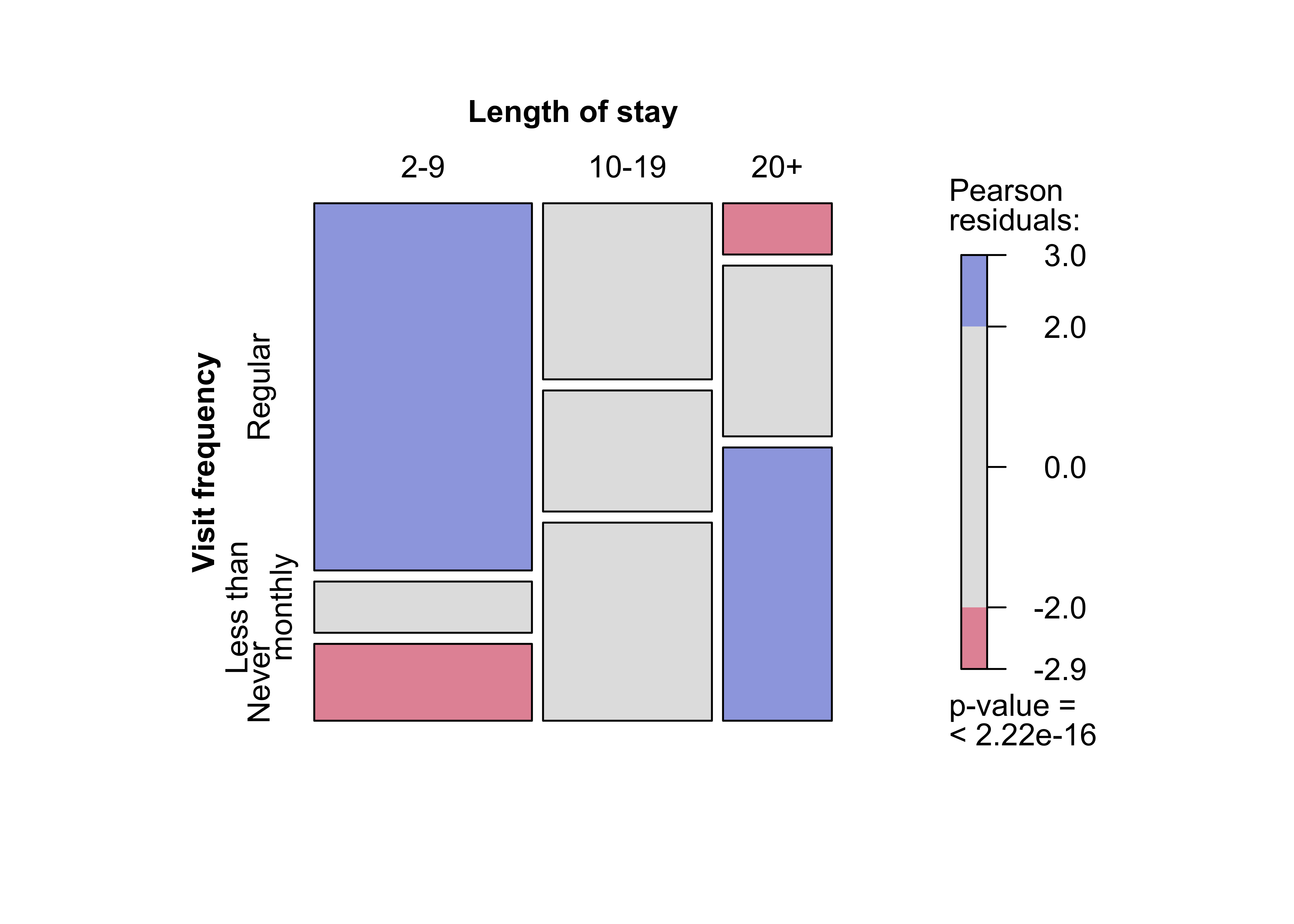
Figure 12.12: Association plot of the hospital data with
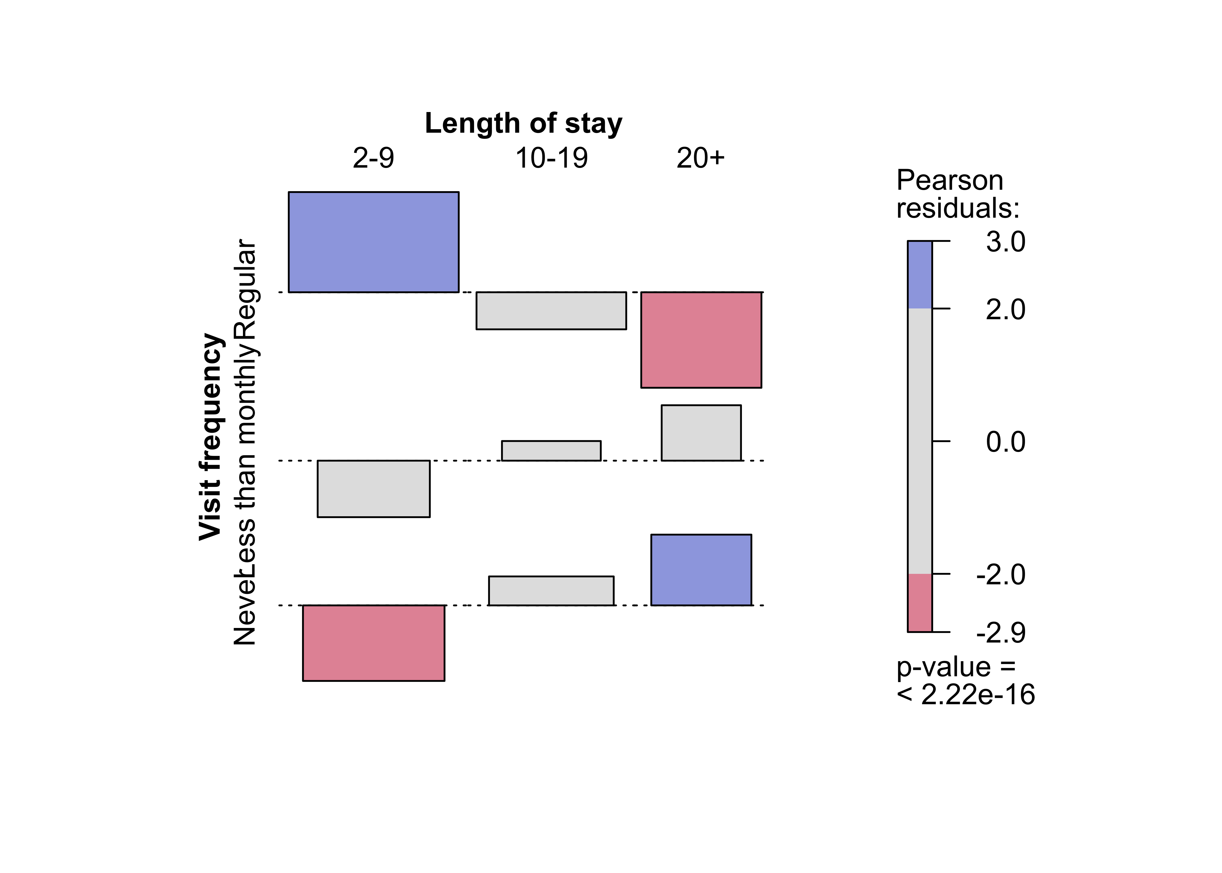
Figure 12.13: Mosaic plot for the arthritis data, using the chi-squared test and fixed cut-off points for the shading
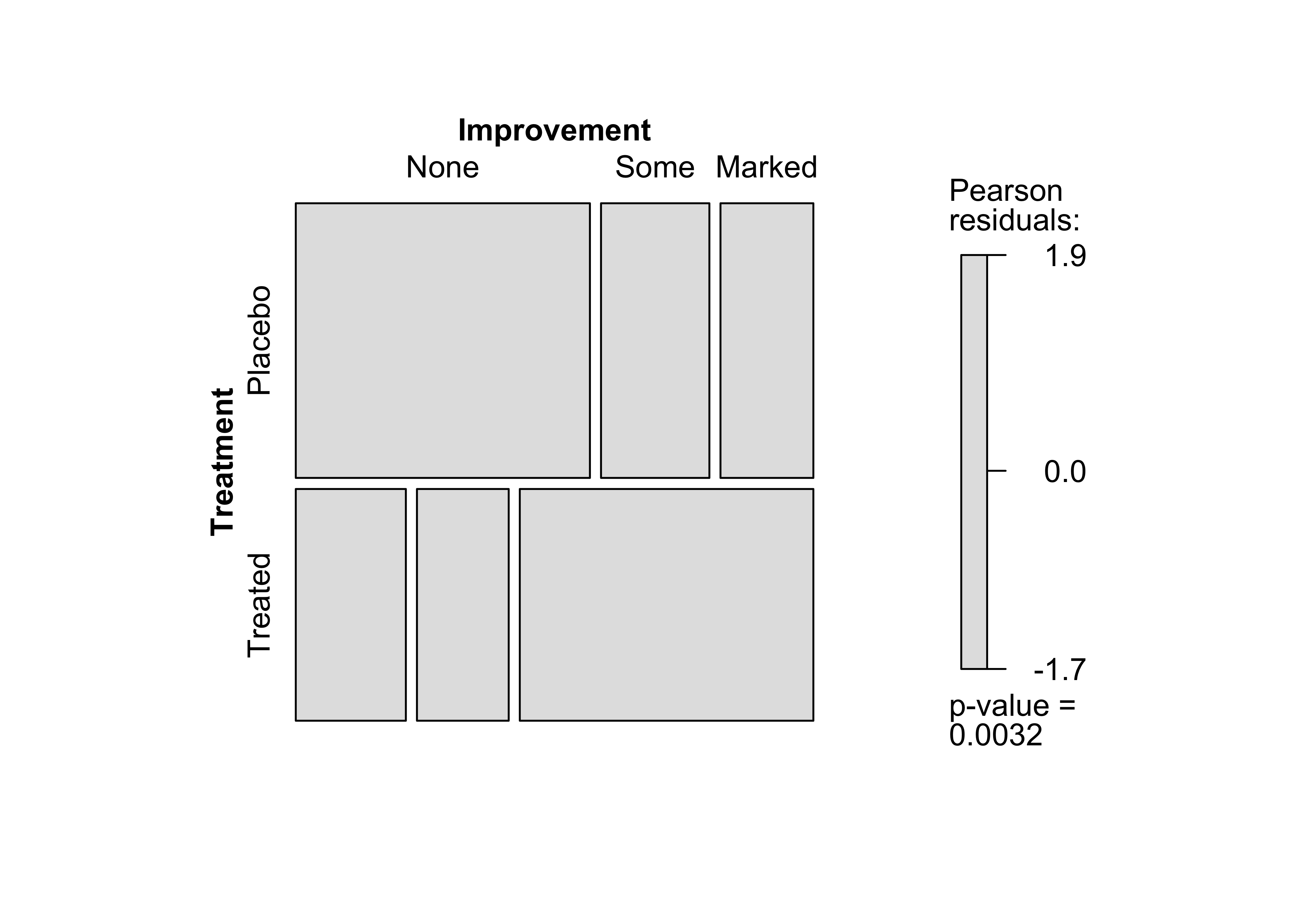
Figure 12.14: Mosaic plot for the arthritis data, using the maximum test and data-driven cut-off points for the residuals
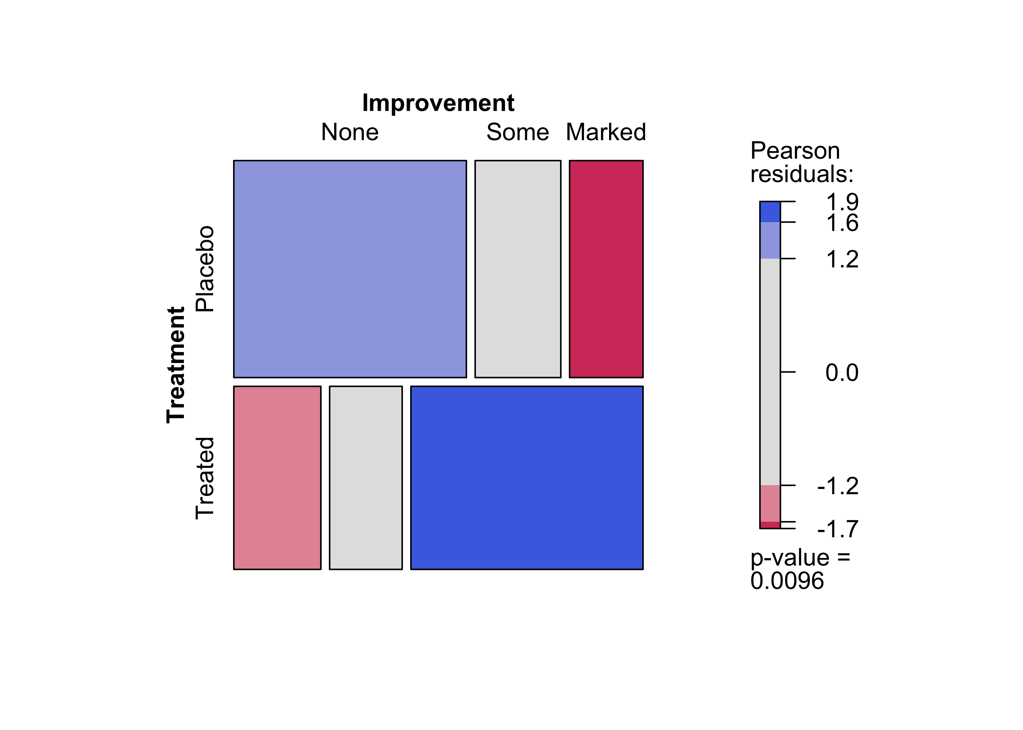
Figure 12.15: Pairs-plot for the UCB admissions data
pairs(UCBAdmissions)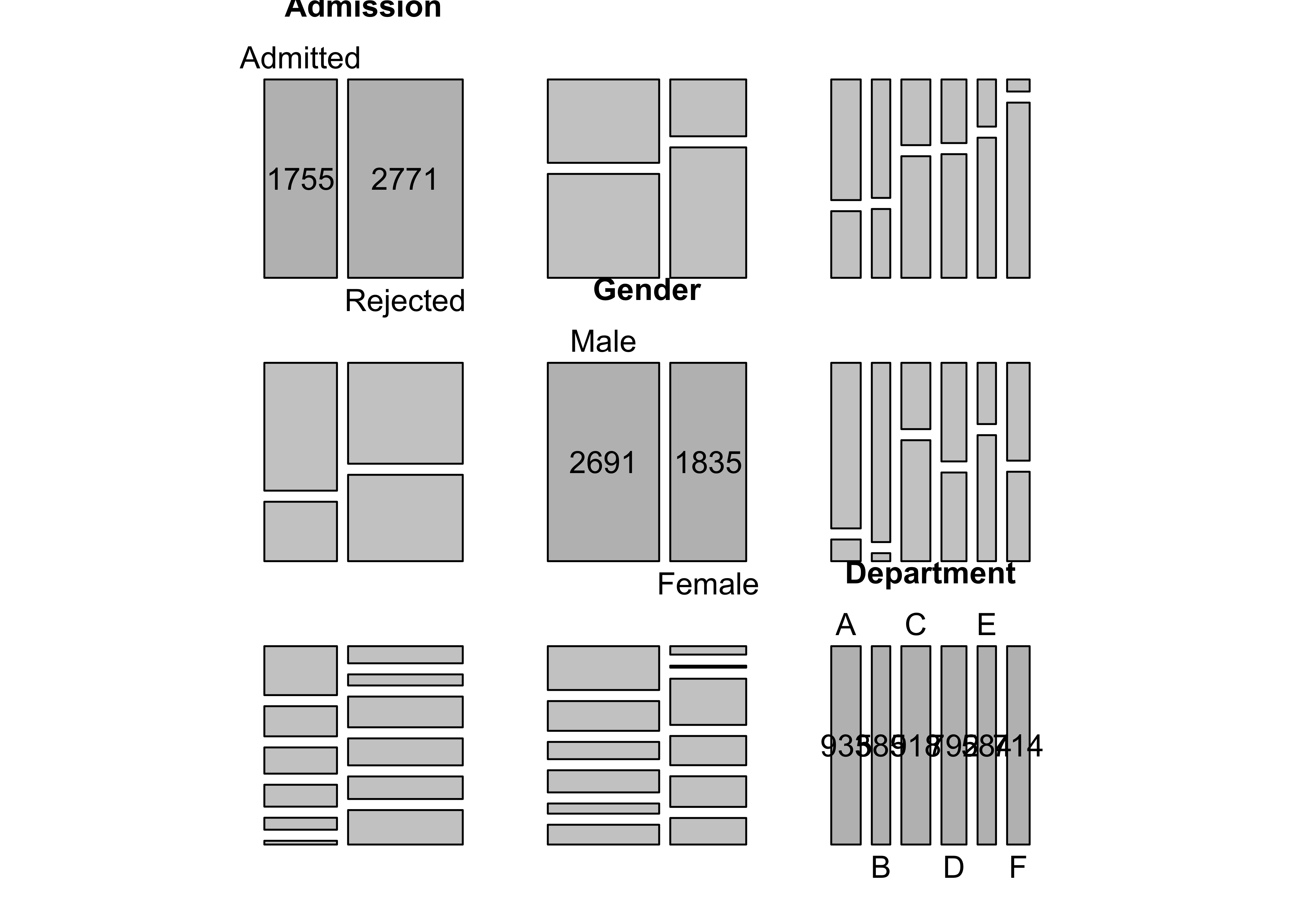
Figure 12.16: Doubledecker plot for the UCB admissions data
doubledecker(aperm(aperm(UCBAdmissions, c(1, 3, 2))[2:1, , ], c(2, 3, 1)),
  margins = c(left = 0, right = 5), col = rev(grey.colors(2))
)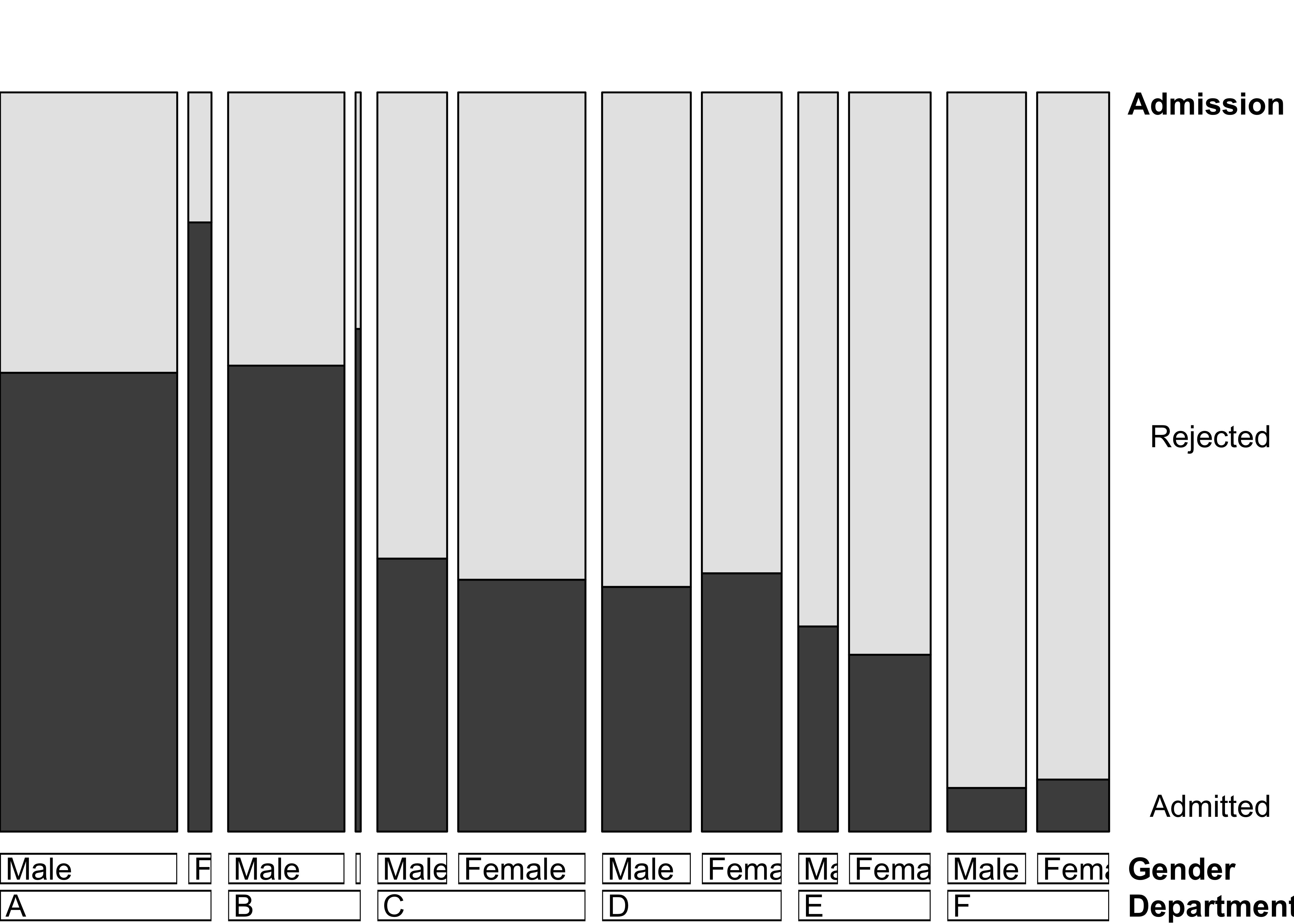
Figure 12.17: Mosic plot for the UCB admissions data
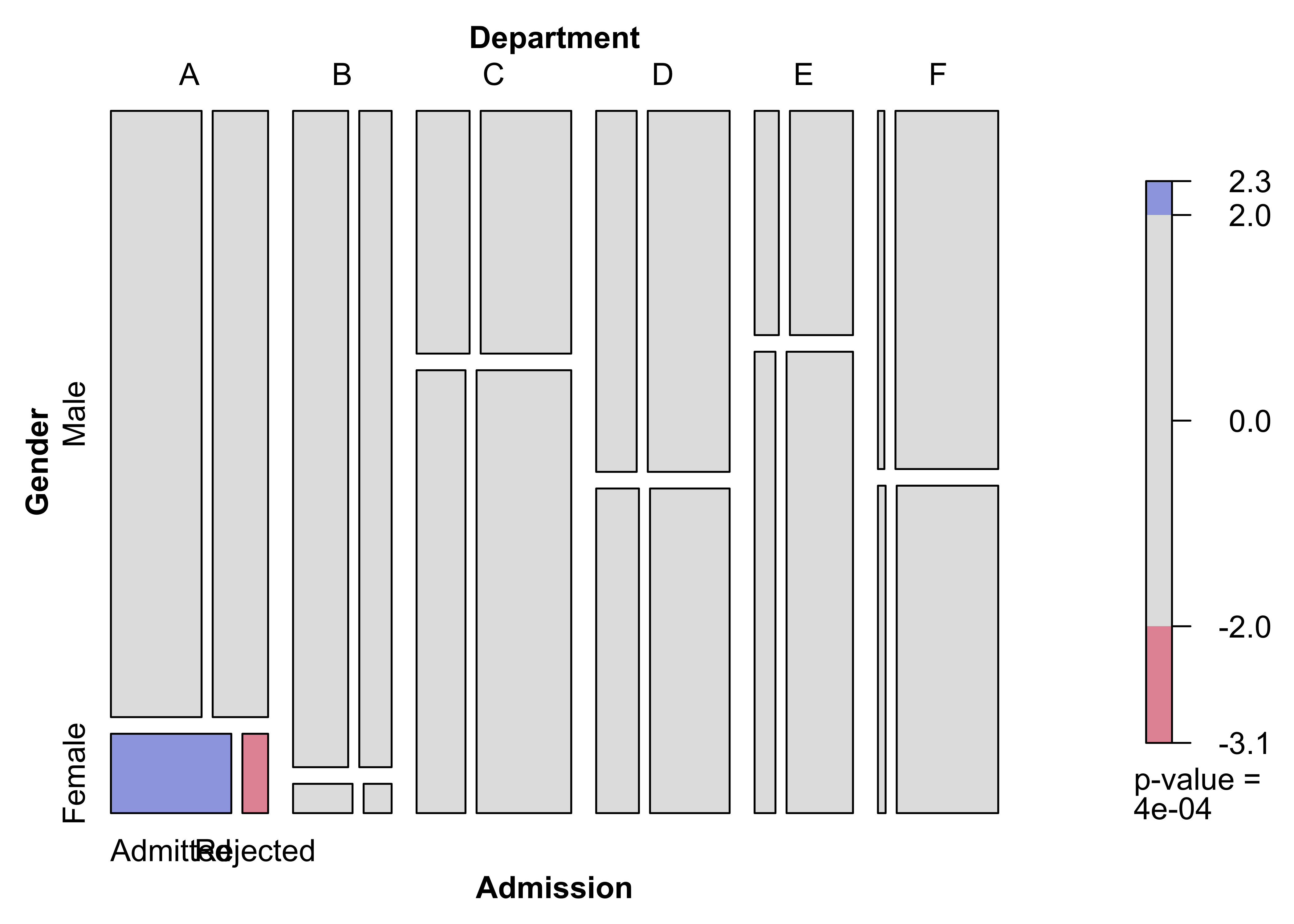
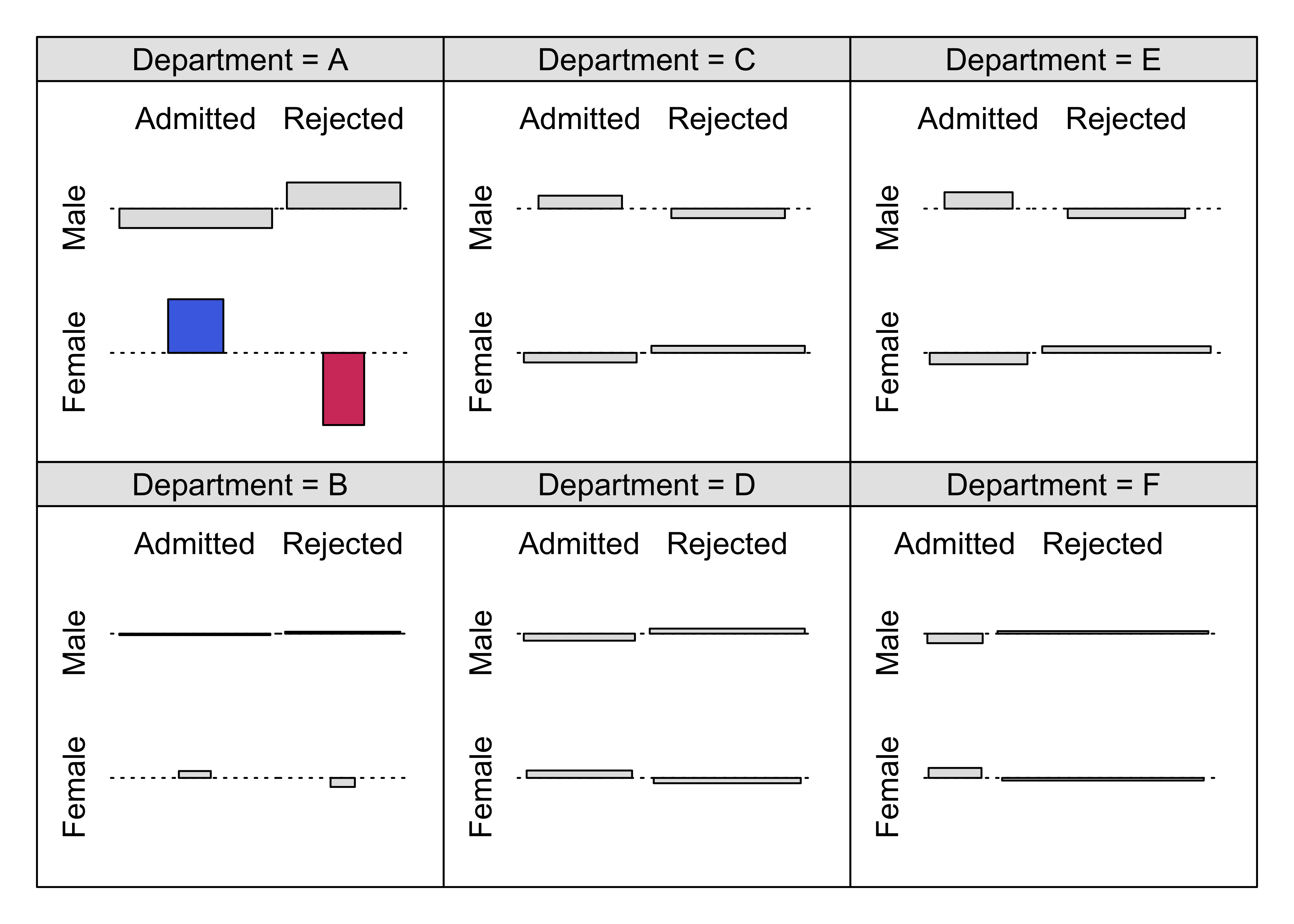
Figure 12.18: Association plot for the UCB admissions data
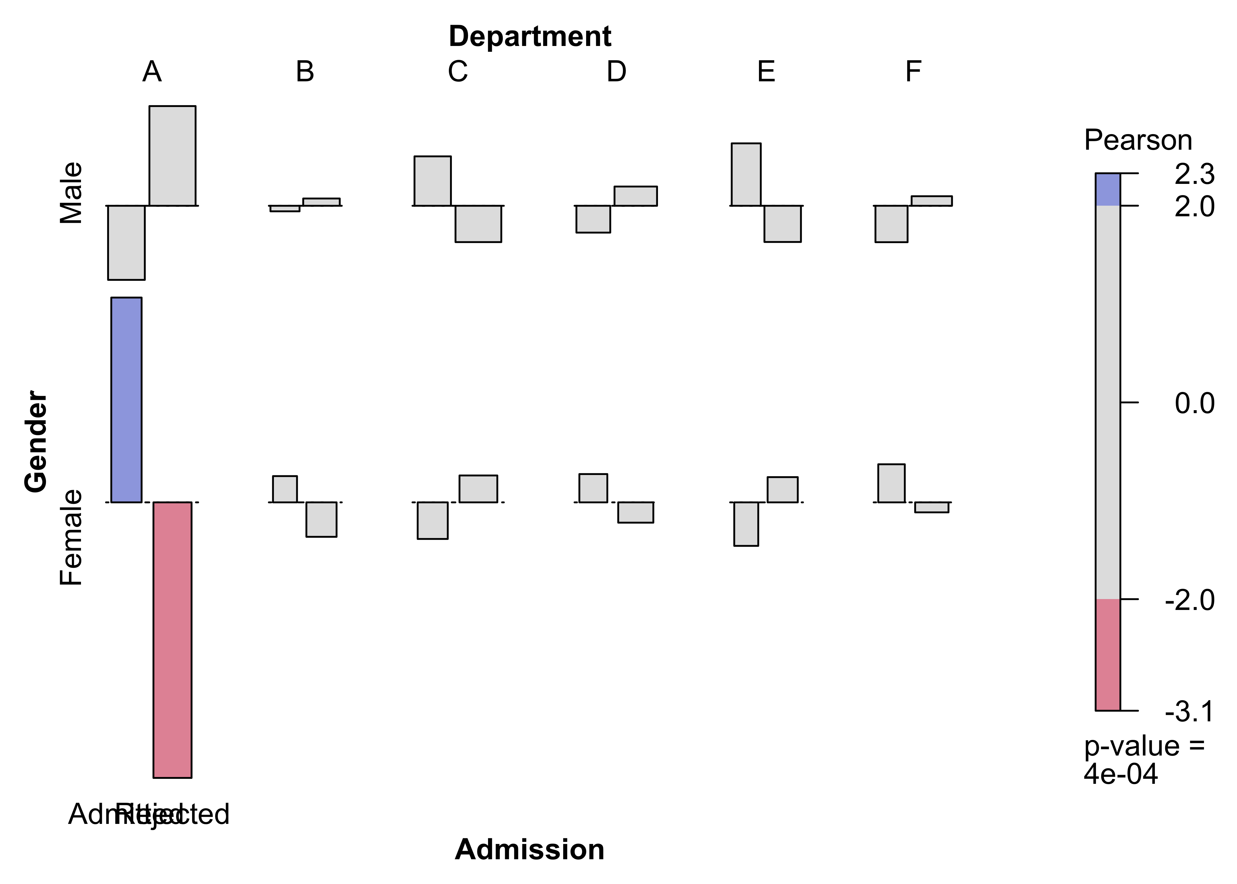
Figure 12.19: Conditional association plot for the UCB admissions data
cotabplot(aperm(UCBAdmissions, c(2, 1, 3)),
  panel = cotab_coindep, shade = TRUE,
  legend = FALSE,
  panel_args = list(type = "assoc", margins = c(2, 1, 1, 2), varnames = FALSE)
)
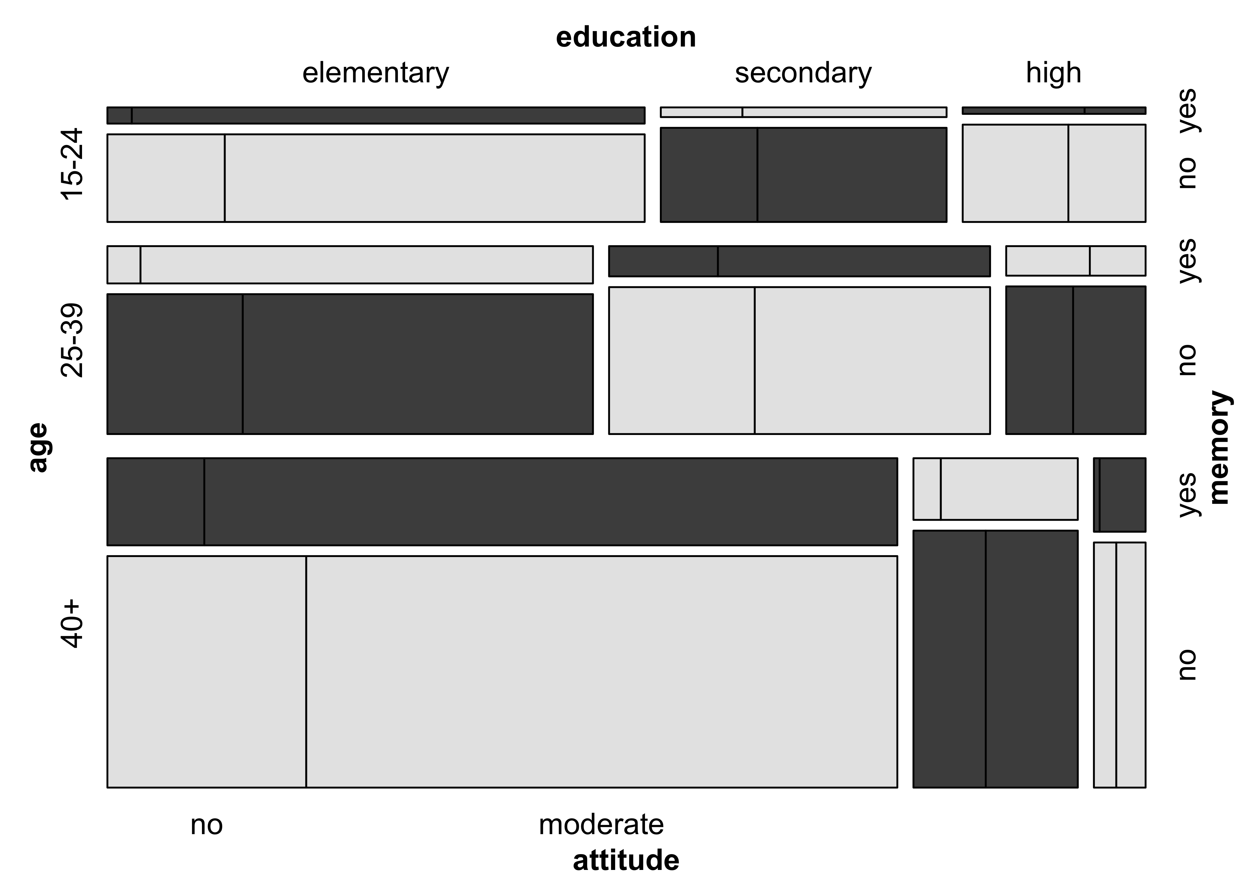
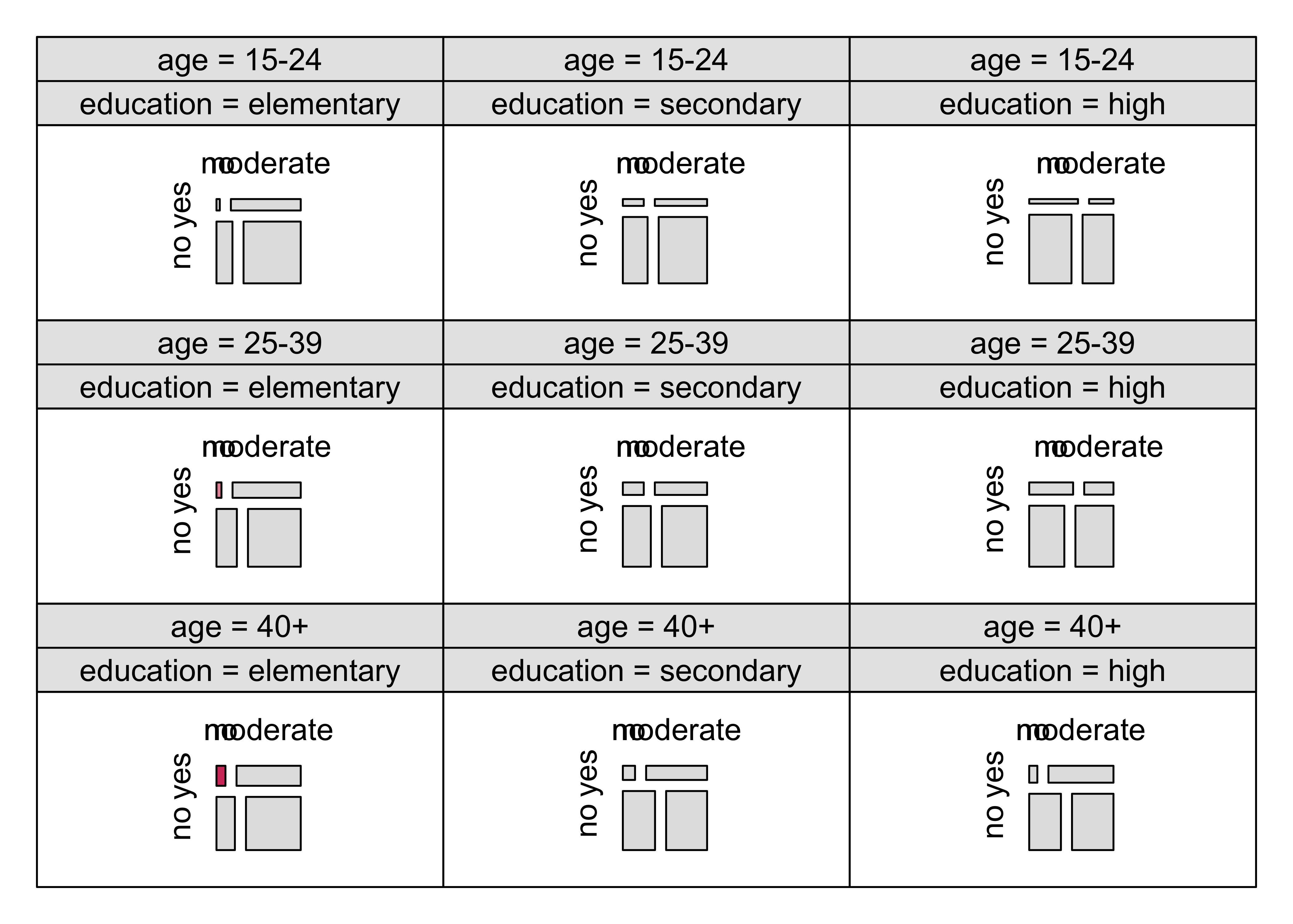
### Figure 12.20: Mosic plot with highlighting for the punishment datamosaic(~ age + education + memory + attitude,
data = punish, keep = FALSE,
gp = gpar(fill = grey.colors(2)), spacing = spacing_highlighting,
rep = c(attitude = FALSE)
)