## packages
library(tidyverse) ## data science package collection (incl. the ggplot2 package)
library(systemfonts) ## use custom fonts (need to be installed on your OS)
library(paletteer) ## scico  and many other colour palettes palettes(http://www.fabiocrameri.ch/colourmaps.php) in R
library(ggtext) ## add improved text rendering to ggplot2
library(ggforce) ## add missing functionality to ggplot2
library(ggdist) ## add uncertainty visualizations to ggplot2
library(ggformula) ## Formula interface to ggplot
library(magick) ## load images into R
library(patchwork) ## combine outputs from ggplot2
library(palmerpenguins)

library(showtext) ## add google fonts to plots

knitr::opts_chunk$set(
  error = TRUE,
  comment = NA,
  warning = FALSE,
  errors = FALSE,
  message = FALSE,
  tidy = FALSE,
  cache = FALSE,
  echo = TRUE,
  warning = FALSE,
  # from the vignette for the showtext package
  fig.showtext = TRUE,
  fig.retina = 1,
  fig.width = 9,
  fig.height = 8,
  fig.path = "06a-figs/"
)Fonts, Themes, and other Wizardy in ggplot
Fonts, Themes, and other Wizardy in ggplot
This Quarto document is part of my Course, R for Artists and Managers. The material is based on A Layered Grammar of Graphics by Hadley Wickham.
The intent of this Tutorial is to build Skill in coding in R, and also appreciate R as a way to metaphorically visualize information of various kinds, using predominantly geometric figures and structures.
All RMarkdown files combine code, text, web-images, and figures developed using code. Everything is text; code chunks are enclosed in fences (```)
Goals
- Appreciate that a publication-worth graphic takes a lot of work!!
- Adding annotations, pictures and references to graphs is necessary for good understanding
- Judicious use of colour and scales can enhance comprehension.
Pedagogical Note
The method followed will be based on PRIMM:
- PREDICT Inspect the code and guess at what the code might do, write predictions
- RUN the code provided and check what happens
-
INFER what the
parametersof the code do and write comments to explain. What bells and whistles can you see? -
MODIFY the
parameterscode provided to understand theoptionsavailable. Write comments to show what you have aimed for and achieved. - MAKE : take an idea/concept of your own, and graph it.
Let’s load up a few packages that we need to start.
Plot Fonts and Theme
Show the Code
```{r}
#| label: plot-theme
#| code-fold: true
#| messages: false
#| warning: false

library(sysfonts)
library(showtext)
font_add(family = "Alegreya", regular = "../../../gfonts/fonts/Alegreya/Alegreya-Regular.ttf")
font_add(family = "Roboto Condensed", regular = "../../../gfonts/fonts/RobotoCondensed-Regular.ttf")
showtext_auto(enable = TRUE) # enable showtext
##
theme_custom <- function() {
  font <- "Alegreya" # assign font family up front

  theme_classic(base_size = 14) %+replace% # replace elements we want to change

    theme(
      text = element_text(family = font), # set base font family

      # text elements
      plot.title = element_text( # title
        family = "Alegreya", # set font family
        size = 18, # set font size
        face = "bold", # bold typeface
        hjust = 0, # left align
        margin = margin(t = 5, r = 0, b = 5, l = 0)
      ), # margin
      plot.title.position = "plot",
      plot.subtitle = element_text( # subtitle
        family = "Alegreya", # font family
        size = 14, # font size
        hjust = 0, # left align
        margin = margin(t = 5, r = 0, b = 10, l = 0)
      ), # margin

      plot.caption = element_text( # caption
        family = "Alegreya", # font family
        size = 9, # font size
        hjust = 1
      ), # right align

      plot.caption.position = "plot", # right align

      axis.title = element_text( # axis titles
        family = "Roboto Condensed", # font family
        size = 12
      ), # font size

      axis.text = element_text( # axis text
        family = "Roboto Condensed", # font family
        size = 9
      ), # font size

      axis.text.x = element_text( # margin for axis text
        margin = margin(5, b = 10)
      )

      # since the legend often requires manual tweaking
      # based on plot content, don't define it here
    )
}
```
Show the Code
## Use available fonts in ggplot text geoms too!
update_geom_defaults(geom = "text", new = list(
  family = "Roboto Condensed",
  face = "plain",
  size = 3.5,
  color = "#2b2b2b"
))
Error in update_geom_defaults(geom = "text", new = list(family = "Roboto Condensed", : could not find function "update_geom_defaults"Show the Code
## Set the theme
theme_set(new = theme_custom())
Error in theme_set(new = theme_custom()): could not find function "theme_set"Using Google Fonts
We will want to add a few new fonts to our graphs. The best way (currently) is to use the showtext package ( which we loaded above) to bring into our work fonts from Google. To view and select the fonts you might want to work with, spend some time looking over:
Show the Code
sysfonts::font_add_google("Gochi Hand", "gochi")
font_add_google("Schoolbell", "bell")
font_add_google("Galada", "galada")
font_add_google("Schoolbell", "bell")
font_add_google("Roboto", "roboto")
font_add_google("Noto Sans", "noto")
font_add_google("Uchen", "uchen")
font_add_google("Ibarra Real Nova", "ibarra")
font_add_google("Open Sans", "open")
font_add_google("Anton", "anton")
font_add_google("Tangerine", "tangerine")

# set the google fonts as default
showtext::showtext_auto()
We will work with a familiar dataset, so that we can concentrate on the chart aesthetics, without having to spend time getting used to the data: the penguins dataset again, from the palmerpenguins package.
ggformula and ggplot worlds
It seems we can mix `ggformula` code with `ggtext` code, using the `+` sign!! What joy !!! Need to find out if this works for other `ggplot` extensions as well !!!
Data
Always start your work with a table of the data:
species <fct> | island <fct> | bill_length_mm <dbl> | bill_depth_mm <dbl> | flipper_length_mm <int> | body_mass_g <int> | sex <fct> | year <int> |
|---|---|---|---|---|---|---|---|
| Adelie | Torgersen | 39.1 | 18.7 | 181 | 3750 | male | 2007 |
| Adelie | Torgersen | 39.5 | 17.4 | 186 | 3800 | female | 2007 |
| Adelie | Torgersen | 40.3 | 18.0 | 195 | 3250 | female | 2007 |
| Adelie | Torgersen | 36.7 | 19.3 | 193 | 3450 | female | 2007 |
| Adelie | Torgersen | 39.3 | 20.6 | 190 | 3650 | male | 2007 |
| Adelie | Torgersen | 38.9 | 17.8 | 181 | 3625 | female | 2007 |
| Adelie | Torgersen | 39.2 | 19.6 | 195 | 4675 | male | 2007 |
| Adelie | Torgersen | 41.1 | 17.6 | 182 | 3200 | female | 2007 |
| Adelie | Torgersen | 38.6 | 21.2 | 191 | 3800 | male | 2007 |
| Adelie | Torgersen | 34.6 | 21.1 | 198 | 4400 | male | 2007 |
Basic Plot
A basic scatter plot, which we will progressively dress up.
## simple plot: data + mappings + geometry
## no colour or fill yet
gf <- gf_point(bill_depth_mm ~ bill_length_mm,
  data = penguins,
  alpha = 0.6, size = 3.5
)
gf
## simple plot: data + mappings + geometry
## no colour or fill yet
gg <- ggplot(penguins, aes(
  x = bill_length_mm,
  y = bill_depth_mm
)) +
  geom_point(alpha = .6, size = 3.5)
gg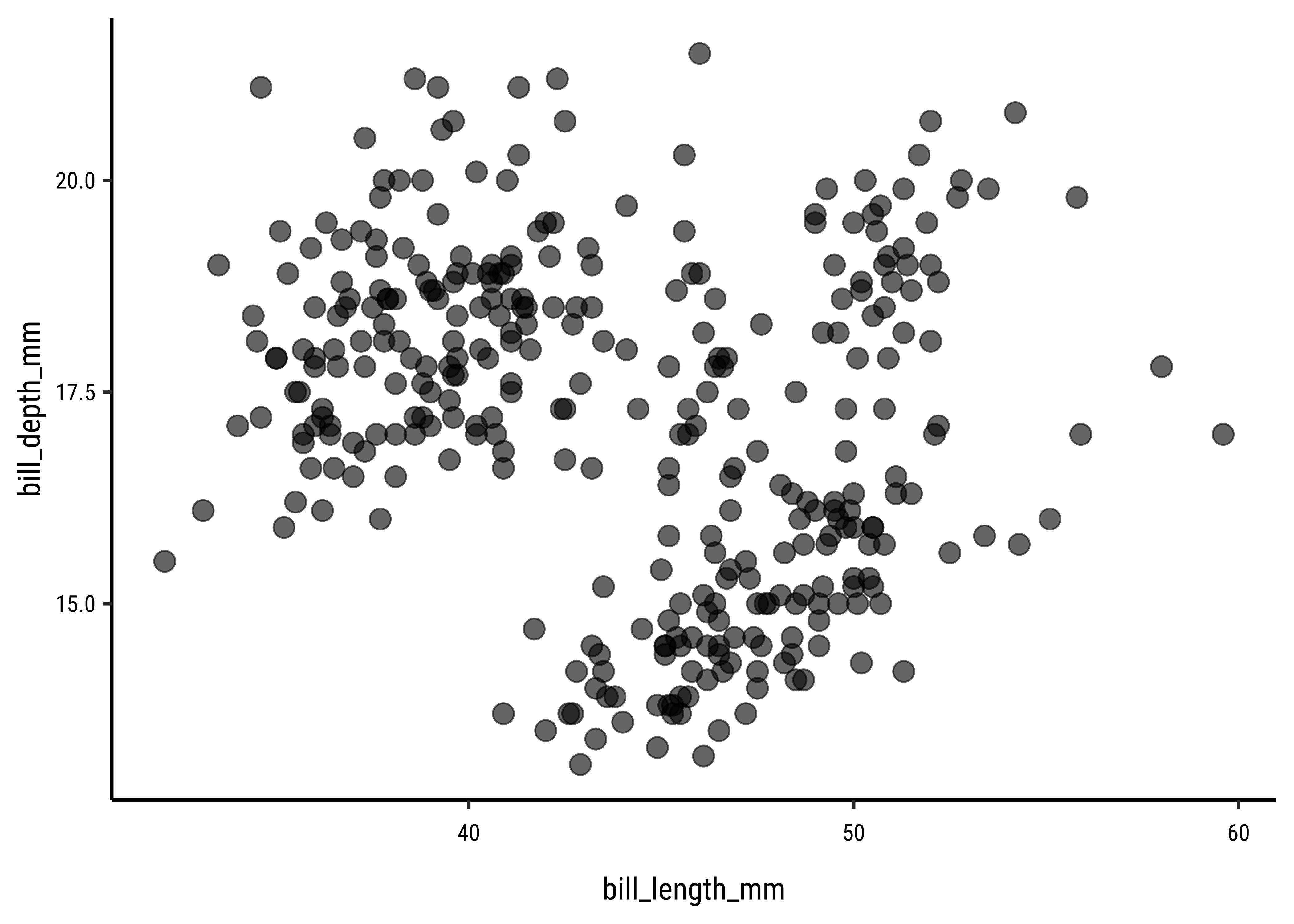
Customized Plot
Let us set some ggplot theme aspects now!! Here is a handy picture showing (most of) the theme-able aspects of a ggplot plot.
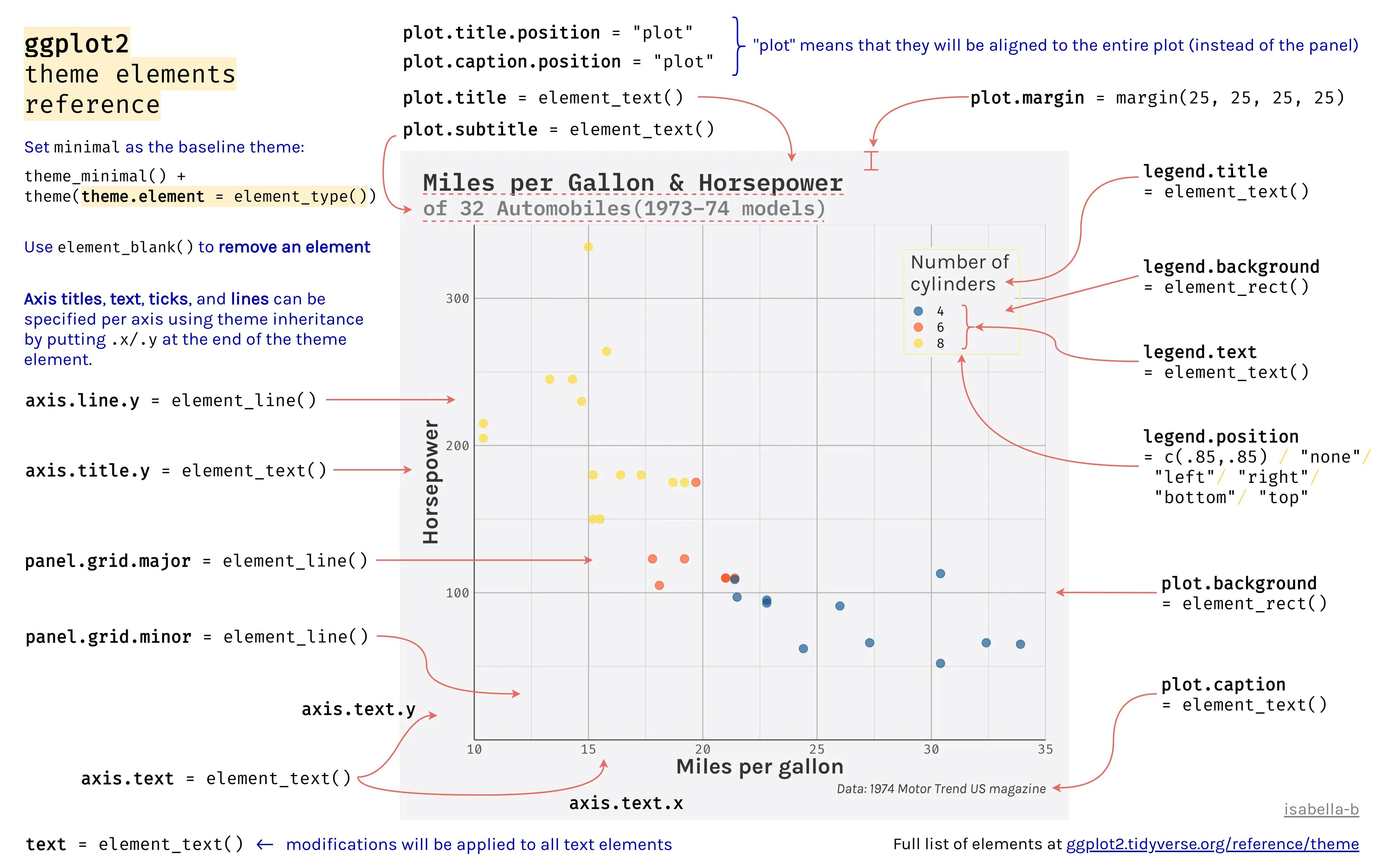
For more info, type ?theme in your console.
## change global theme settings (for all following plots)
theme_set(theme_minimal(base_size = 12, base_family = "open"))

## modify plot elements globally (for all following plots)
theme_update(
  axis.ticks = element_line(color = "grey92"),
  axis.ticks.length = unit(.5, "lines"),
  panel.grid.minor = element_blank(),
  legend.title = element_text(size = 12),
  legend.text = element_text(color = "grey30"),
  plot.title = element_text(size = 18, face = "bold"),
  plot.subtitle = element_text(size = 12, color = "grey30"),
  plot.caption = element_text(size = 9, margin = margin(t = 15))
)
Since we know what the basic plot looks like, let’s add titles, labels and colours. We will also set limits and scales.
gf1 <- penguins %>%
  gf_point(bill_depth_mm ~ bill_length_mm,

    # colour by continuous variable
    color = ~body_mass_g,
    alpha = .6, size = 3.5
  ) %>%
  ## custom axes scaling
  gf_refine(
    scale_x_continuous(breaks = 3:6 * 10, limits = c(30, 60)),
    scale_y_continuous(
      breaks = seq(12.5, 22.5, by = 2.5),
      limits = c(12.5, 22.5)
    ),

    ## custom colors from the scico package
    ## using the paletteer super package
    paletteer::scale_color_paletteer_c(`"scico::bamako"`, direction = -1),

    ## custom labels
    labs(
      title = "Bill Dimensions of Brush-Tailed Penguins (Pygoscelis)",
      subtitle = "A scatter plot of bill depth versus bill length.",
      caption = "Data: Gorman, Williams & Fraser (2014) PLoS ONE",
      x = "Bill Length (mm)",
      y = "Bill Depth (mm)",
      color = "Body mass (g)" # Neat Way of naming a scale and legend
    )
  )

gf1
gg1 <- penguins %>%
  ggplot(aes(y = bill_depth_mm, x = bill_length_mm),
    alpha = .6,
    size = 3.5
  ) +
  geom_point(aes(colour = body_mass_g)) +


  ## custom axes scaling
  scale_x_continuous(breaks = 3:6 * 10, limits = c(30, 60)) +
  scale_y_continuous(
    breaks = seq(12.5, 22.5, by = 2.5),
    limits = c(12.5, 22.5)
  ) +

  ## custom colors from the scico package
  paletteer::scale_color_paletteer_c(`"scico::bamako"`,
    direction = -1
  ) +

  ## custom labels
  labs(
    title = "Bill Dimensions of Brush-Tailed Penguins (Pygoscelis)",
    subtitle = "A scatter plot of bill depth versus bill length.",
    caption = "Data: Gorman, Williams & Fraser (2014) PLoS ONE",
    x = "Bill Length (mm)",
    y = "Bill Depth (mm)",
    color = "Body mass (g)"
  )
gg1
Using {ggtext}
From Claus Wilke’s website → www.wilkelab.org/ggtext
The
ggtextpackage provides simple Markdown and HTML rendering for ggplot2. Under the hood, the package uses thegridtextpackage for the actual rendering, and consequently it is limited to the feature set provided bygridtext.
Support is provided for Markdown both in theme elements (plot titles, subtitles, captions, axis labels, legends, etc.) and in geoms (similar togeom_text()). In both cases, there are two alternatives, one for creating simple text labels and one for creating text boxes with word wrapping.
Working with
ggtext
NOTE: on some machines, the ggtext package may not work as expected. In this case, please do as follows, using your Console:
- remove gridtext:
remove.packages(gridtext). - Install development version of
gridtext:remotes::install_github("wilkelab/gridtext")
Using element_markdown()
We can use our familiar markdown syntax right inside the titles and captions of the plot. element_markdown() is a theme-ing command made available by the ggtext package.
element_markdown() → formatted text elements, e.g. titles, caption, axis text, striptext
gf2 <- penguins %>%
  gf_point(bill_depth_mm ~ bill_length_mm,
    color = ~body_mass_g,
    alpha = 0.6, size = 3.5
  ) %>%
  gf_refine(
    scale_x_continuous(breaks = 3:6 * 10, limits = c(30, 60)),
    scale_y_continuous(
      breaks = seq(12.5, 22.5, by = 2.5),
      limits = c(12.5, 22.5)
    ),

    ## custom colors from the scico package
    paletteer::scale_color_paletteer_c("scico::bamako",
      direction = -1
    ),

    ## custom labels using element_markdown()
    labs(
      title = "Bill Dimensions of Brush-Tailed Penguins (*Pygoscelis*)",
      subtitle = "A scatter plot of bill depth versus bill length.",
      caption = "Data: Gorman, Williams & Fraser (2014) *PLoS ONE*",
      x = "**Bill Length** (mm)",
      y = "**Bill Depth** (mm)",
      color = "Body mass (g)"
    )
  ) %>%
  # New code from here
  # Enables markdown titles, captions and labels
  gf_theme(theme(
    plot.title = ggtext::element_markdown(),
    plot.caption = ggtext::element_markdown(),
    axis.title.x = ggtext::element_markdown(),
    axis.title.y = ggtext::element_markdown()
  ))

gf2
gg2 <- ggplot(penguins, aes(x = bill_length_mm, y = bill_depth_mm)) +
  geom_point(aes(color = body_mass_g), alpha = .6, size = 3.5) +
  scale_x_continuous(breaks = 3:6 * 10, limits = c(30, 60)) +
  scale_y_continuous(
    breaks = seq(12.5, 22.5, by = 2.5),
    limits = c(12.5, 22.5)
  ) +
  paletteer::scale_color_paletteer_c(`"scico::bamako"`, direction = -1) +

  ## New code starts here: Two Step Procedure with ggtext
  ## 1. Markdown formatting of labels and title, using asterisks
  labs(
    title = "Bill Dimensions of Brush-Tailed Penguins (*Pygoscelis*)",
    subtitle = "A scatter plot of bill depth versus bill length.",
    caption = "Data: Gorman, Williams & Fraser (2014) *PLoS ONE*",
    x = "**Bill Length** (mm)",
    y = "**Bill Depth** (mm)",
    color = "Body mass (g)"
  ) +

  ## 2. Add theme related commands from ggtext
  ## render respective text elements
  theme(
    plot.title = ggtext::element_markdown(),
    plot.caption = ggtext::element_markdown(),
    axis.title.x = ggtext::element_markdown(),
    axis.title.y = ggtext::element_markdown()
  )
gg2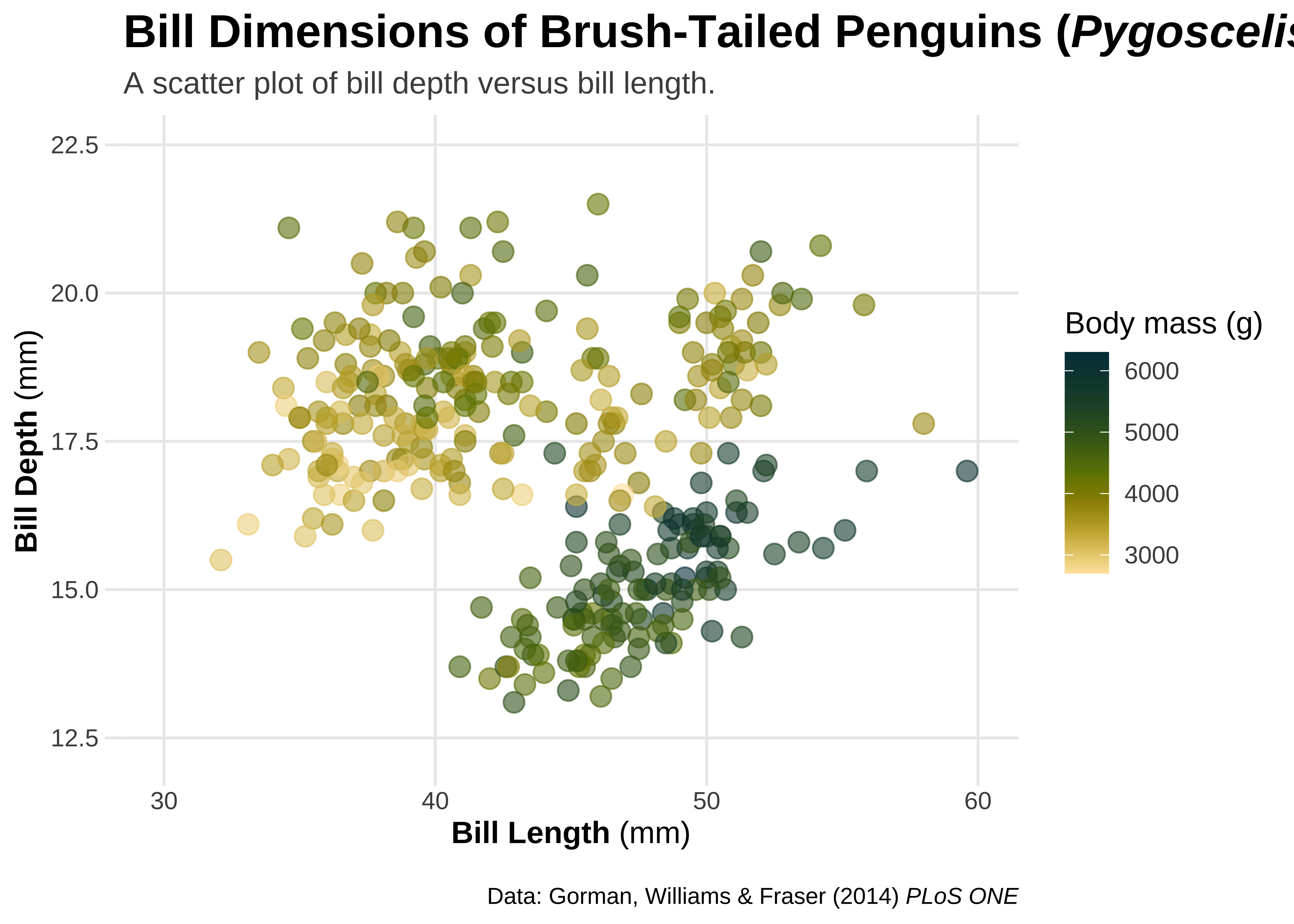
element_markdown() in combination with HTML
This allows us to change fonts in titles, labels, and captions.
## use HTML syntax to change text color
##
gf2 %>%
  # html in labels
  gf_labs(title = 'Bill Dimensions of Brush-Tailed Penguins
          <i style = "color:#28A87D;">Pygoscelis </i>')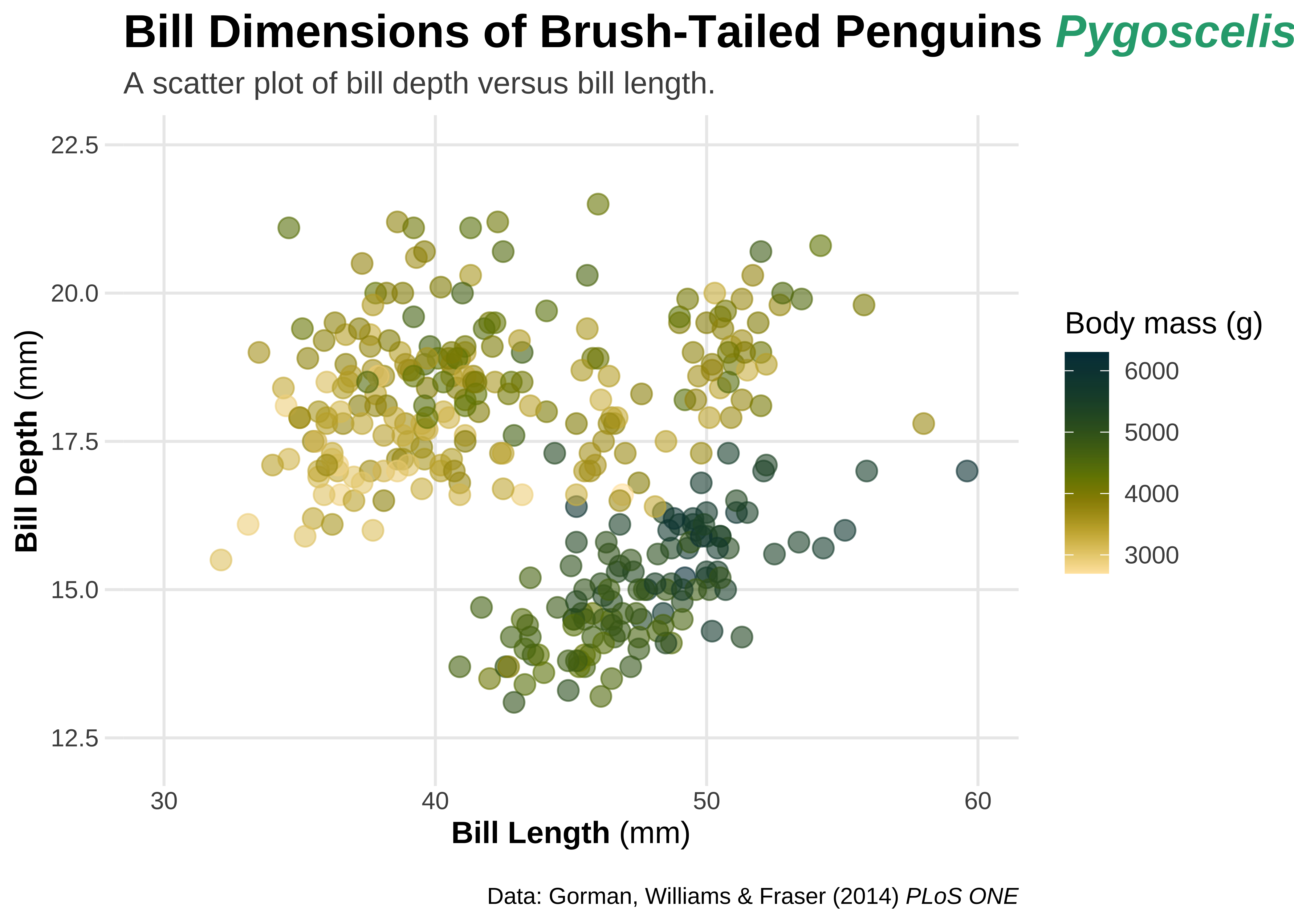
## use HTML syntax to change font and text size
gf2 %>%
  gf_labs(title = 'Bill Dimensions of Brush-Tailed Penguins <b style="font-size:32pt;font-family:tangerine;">Pygoscelis</b>')
## use HTML syntax to change text color
gg2 +
  labs(title = 'Bill Dimensions of Brush-Tailed Penguins <i style="color:#28A87D;">Pygoscelis</i>') +
  theme(plot.margin = margin(t = 25))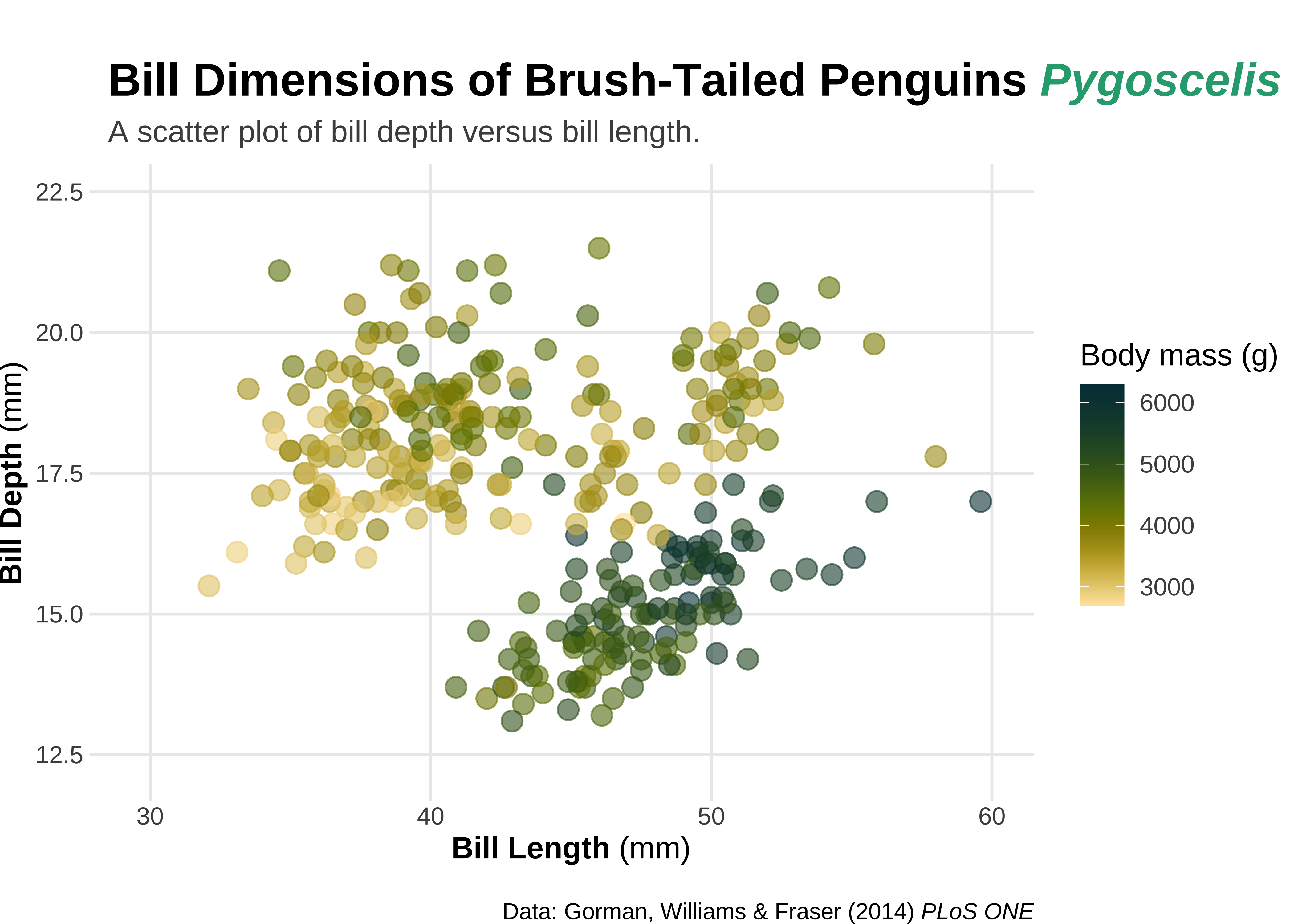
## use HTML syntax to change font and text size
gg2 +
  labs(title = 'Bill Dimensions of Brush-Tailed Penguins <b style="font-size:32pt;font-family:tangerine;">Pygoscelis</b>')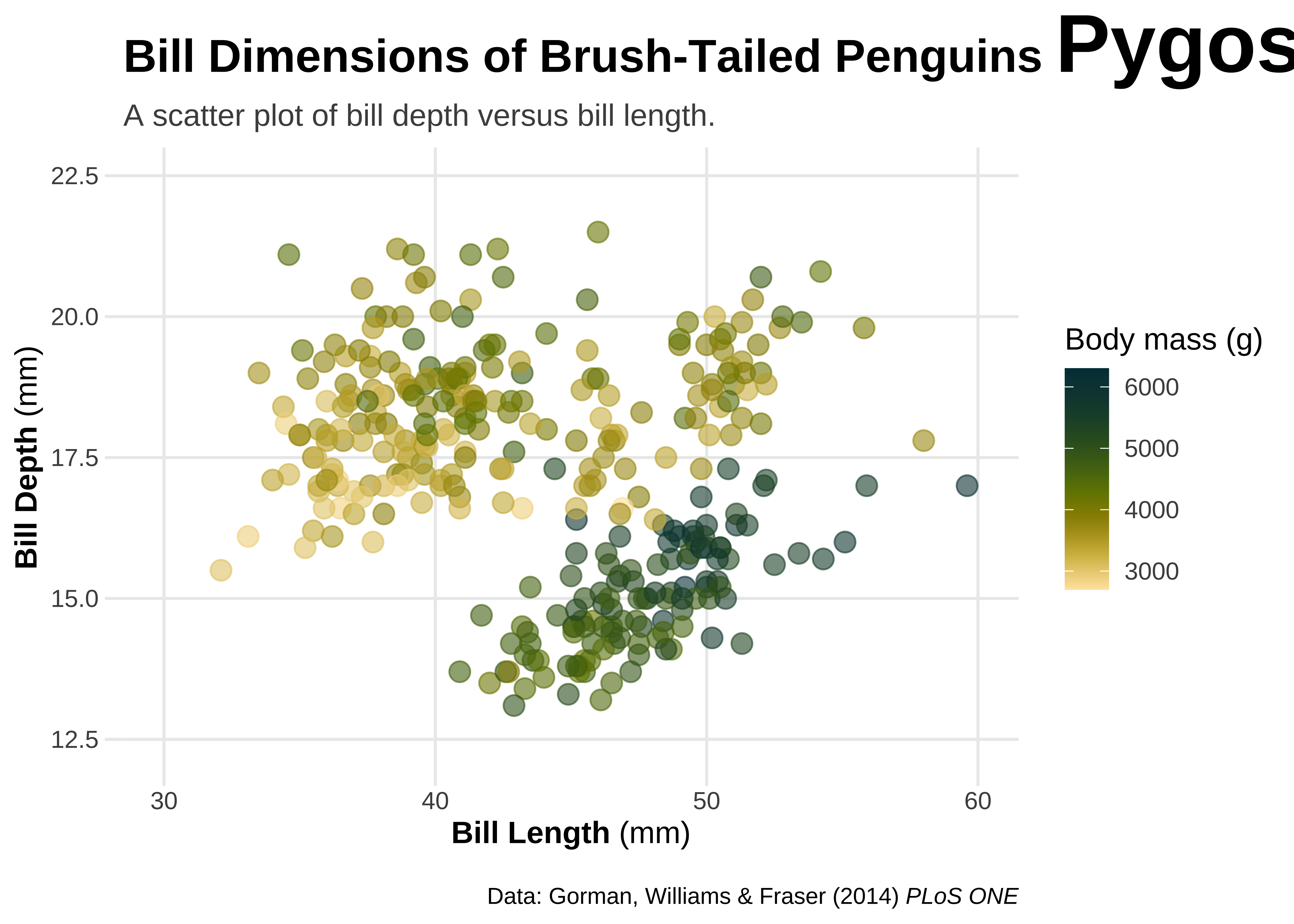
Adding images to ggplot
Save an image from the web in the same folder as your RMarkdown. Use html tags to include it, say as part of your plot title, as shown below.
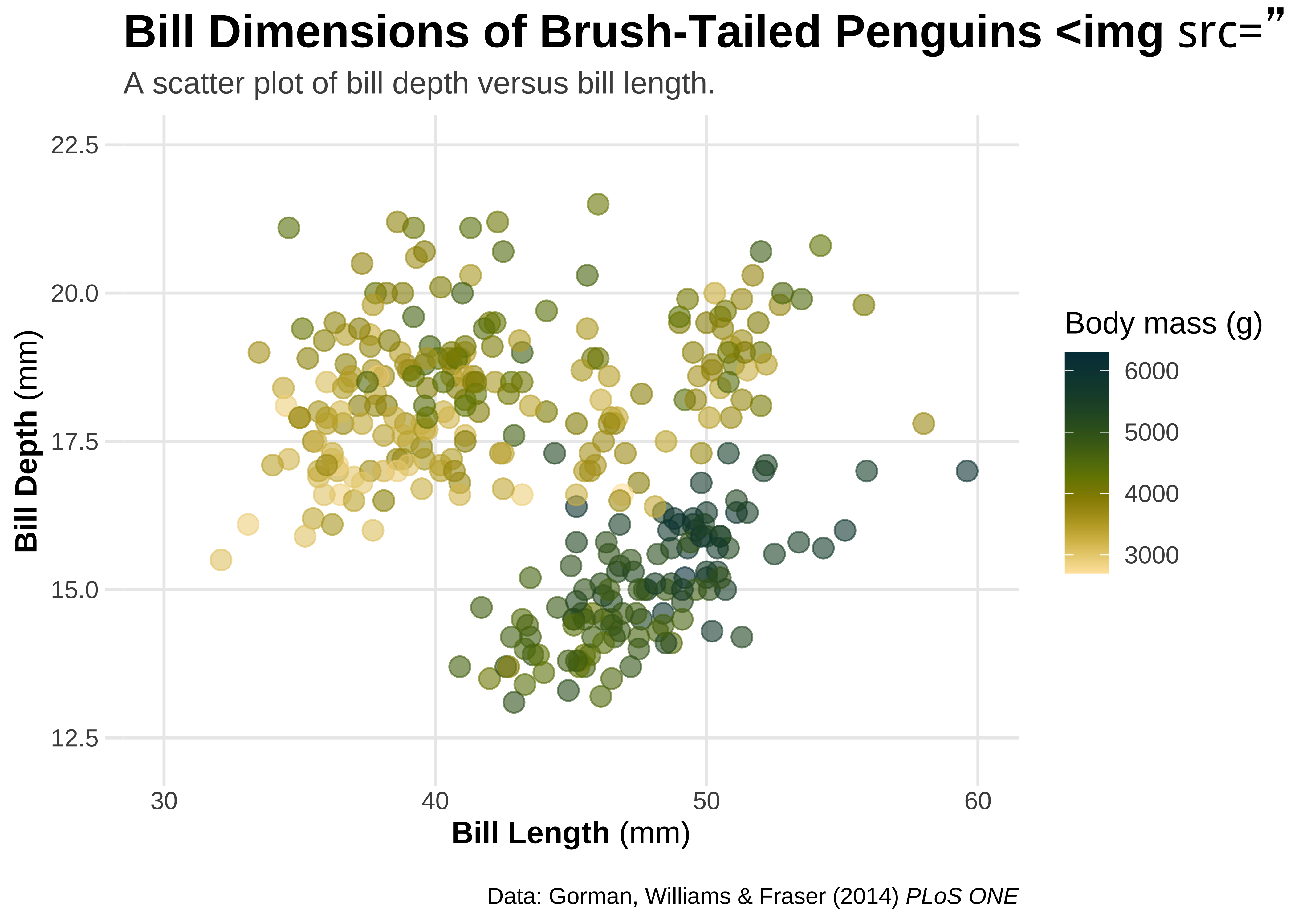
## use HTML syntax to add images to text elements
gg2 +
labs(title = 'Bill Dimensions of Brush-Tailed Penguins <img src="../images/culmen_depth.png"‚ width="480"/>')
Annotations with geom_richtext() and geom_textbox()
Further ggplot annotations can be achieved using geom_richtext() and geom_textbox(). geom_richtext() also allows formatted text labels with 360° rotation. One needs to pass a dataframe to geom_richtext() giving the location, colour, rotation etc of the label annotation.
# Create a label tibble
# Three rich text labels,
# so three sets of locations x and y, and angle of rotation
labels <- tibble(
  x = c(34, 56, 54),
  y = c(20, 18.5, 14.5),
  angle = c(12, 20, 335),
  species = c("Adelie", "Chinstrap", "Gentoo"),
  lab = c(
    "<b style='font-family:anton;font-size:24pt;'>Adélie</b><br><i style='color:darkgrey;'>P. adéliae</i>",
    "<b style='font-family:anton;font-size:24pt;'>Chinstrap</b><br><i style='color:darkgrey;'>P. antarctica</i>",
    "<b style='font-family:anton;font-size:24pt;'>Gentoo</b><br><i style='color:darkgrey;'>P. papua</i>"
  )
)
labelsx <dbl> | y <dbl> | angle <dbl> | species <chr> | lab <chr> |
|---|---|---|---|---|
| 34 | 20.0 | 12 | Adelie | <b style='font-family:anton;font-size:24pt;'>Adélie</b><br><i style='color:darkgrey;'>P. adéliae</i> |
| 56 | 18.5 | 20 | Chinstrap | <b style='font-family:anton;font-size:24pt;'>Chinstrap</b><br><i style='color:darkgrey;'>P. antarctica</i> |
| 54 | 14.5 | 335 | Gentoo | <b style='font-family:anton;font-size:24pt;'>Gentoo</b><br><i style='color:darkgrey;'>P. papua</i> |
gf_rich <- penguins %>%
  gf_point(bill_depth_mm ~ bill_length_mm,
    color = ~species,
    alpha = 0.6, size = 3.5, data = penguins
  ) +


  ## add text annotations for each species
  ggtext::geom_richtext(
    data = labels,
    # Now pass the data variables as aesthetics
    aes(x, y, label = lab, color = species, angle = angle),
    size = 4, fill = NA, label.color = NA,
    lineheight = .3
  ) +
  # show.legend = FALSE else we get some unusual legends!
  # fill = NA makes the labels' fill transparent


  scale_x_continuous(breaks = 3:6 * 10, limits = c(30, 60)) +
  scale_y_continuous(
    breaks = seq(12.5, 22.5, by = 2.5),
    limits = c(12.5, 22.5)
  ) +
  scale_colour_paletteer_d(palette = `"rcartocolor::Bold"`, guide = "none") +

  labs(
    title = "Bill Dimensions of Brush-Tailed Penguins (*Pygoscelis*)",
    subtitle = "A scatter plot of bill depth versus bill length.",
    caption = "Data: Gorman, Williams & Fraser (2014) *PLoS ONE*",
    x = "**Bill Length** (mm)",
    y = "**Bill Depth** (mm)",
    color = "Body mass (g)"
  ) +

  # Use theme and element_markdown() to format axes and titles as usual
  theme(
    plot.title = ggtext::element_markdown(),
    plot.caption = ggtext::element_markdown(),
    axis.title.x = ggtext::element_markdown(),
    axis.title.y = ggtext::element_markdown(),
    plot.margin = margin(25, 6, 15, 6)
  )


gf_rich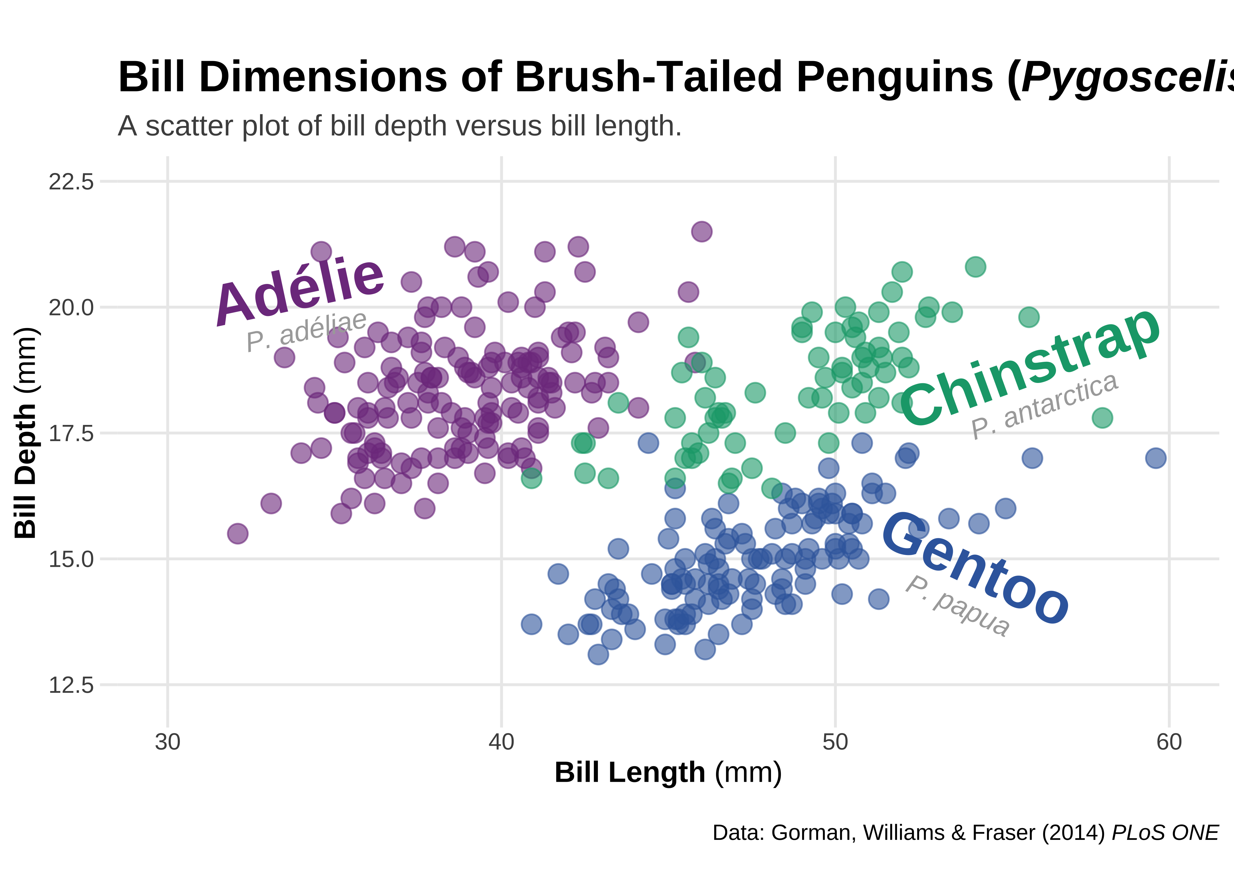
Note
Note the plus sign usage here!!We are combining the ggformula and ggplot syntax, and it works!
gg_rich <- ggplot(penguins, aes(
  x = bill_length_mm,
  y = bill_depth_mm
)) +
  geom_point(aes(color = species), alpha = .6, size = 3.5) +

  ## add text annotations for each species
  ggtext::geom_richtext(
    data = labels,
    # Now pass the data variables as aesthetics
    aes(x, y, label = lab, color = species, angle = angle),
    size = 4, fill = NA, label.color = NA,
    lineheight = .3
  ) +
  scale_x_continuous(breaks = 3:6 * 10, limits = c(30, 60)) +
  scale_y_continuous(
    breaks = seq(12.5, 22.5, by = 2.5),
    limits = c(12.5, 22.5)
  ) +
  scale_colour_paletteer_d(`"rcartocolor::Bold"`, guide = "none") +
  labs(
    title = "Bill Dimensions of Brush-Tailed Penguins (*Pygoscelis*)",
    subtitle = "A scatter plot of bill depth versus bill length.",
    caption = "Data: Gorman, Williams & Fraser (2014) *PLoS ONE*",
    x = "**Bill Length** (mm)",
    y = "**Bill Depth** (mm)",
    color = "Body mass (g)"
  ) +

  # Use theme and element_markdown() to format axes and titles as usual
  theme(
    plot.title = ggtext::element_markdown(),
    plot.caption = ggtext::element_markdown(),
    axis.title.x = ggtext::element_markdown(),
    axis.title.y = ggtext::element_markdown(),
    plot.margin = margin(25, 6, 15, 6)
  )

gg_rich
Formatted Text boxes on plots
element_textbox() and element_textbox_simple() → formatted text boxes with word wrapping.
gf_box <- penguins %>%
  gf_point(bill_depth_mm ~ bill_length_mm,
    color = ~species,
    alpha = 0.6, size = 3.5, data = penguins
  ) +


  ## add text annotations for each species
  ggtext::geom_richtext(
    data = labels,
    # Now pass the data variables as aesthetics
    aes(x, y, label = lab, color = species, angle = angle),
    size = 4, fill = NA, label.color = NA,
    lineheight = .3
  ) +
  # show.legend = FALSE else we get some unusual legends!
  # fill = NA makes the labels' fill transparent


  scale_x_continuous(breaks = 3:6 * 10, limits = c(30, 60)) +
  scale_y_continuous(
    breaks = seq(12.5, 22.5, by = 2.5),
    limits = c(12.5, 22.5)
  ) +
  scale_colour_paletteer_d(palette = `"rcartocolor::Bold"`, guide = "none") +


  # Now for the Plot Titles and Labels, as before
  labs(
    title = "Bill Dimensions of Brush-Tailed Penguins (*Pygoscelis*)",
    subtitle = "A scatter plot of bill depth versus bill length.",
    caption = "Data: Gorman, Williams & Fraser (2014) *PLoS ONE*",
    x = "**Bill Length** (mm)",
    y = "**Bill Depth** (mm)",
    color = "Body mass (g)"
  ) +

  # Add the ggtext theme related commands
  theme(
    ## turn title into filled textbox
    plot.title = ggtext::element_textbox_simple(
      color = "white",
      fill = "#28A78D",
      size = 32,
      padding = margin(8, 4, 8, 4),
      margin = margin(b = 5),
      lineheight = .9
    ),
    plot.subtitle = ggtext::element_textbox_simple(
      size = 10,
      padding = margin(5.5, 5.5, 5.5, 5.5),
      margin = margin(0, 0, 5.5, 0),
      fill = "orange1"
    ),

    ## add round outline to caption
    plot.caption = ggtext::element_textbox_simple(
      width = NULL,
      linetype = 1,
      fill = "grey",
      padding = margin(4, 8, 4, 8),
      margin = margin(t = 15),
      r = grid::unit(8, "pt")
    ),
    axis.title.x = ggtext::element_markdown(),
    axis.title.y = ggtext::element_markdown(),
    plot.margin = margin(25, 6, 15, 6)
  )

gf_box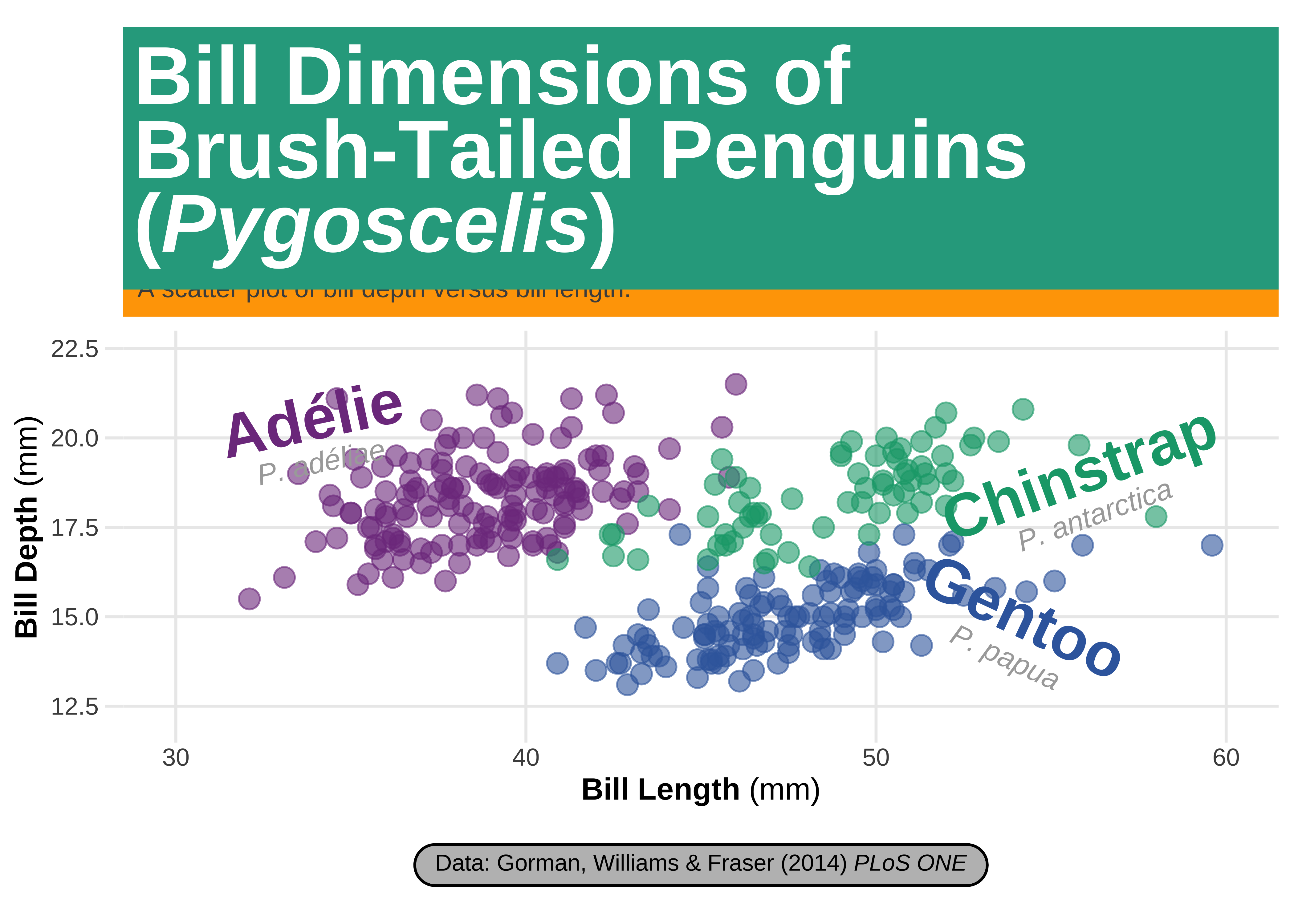
Note again the use of the plus sign with ggformula. This works!
gg_box <- ggplot(penguins, aes(x = bill_length_mm, y = bill_depth_mm)) +
  geom_point(aes(color = species), alpha = .6, size = 3.5) +

  ## add text annotations for each species
  ggtext::geom_richtext(
    data = labels,
    # Now pass the data variables as aesthetics
    aes(x, y, label = lab, color = species, angle = angle),
    size = 4, fill = NA, label.color = NA,
    lineheight = .3
  ) +
  # show.legend = FALSE else we get some unusual legends!
  # fill = NA makes the labels' fill transparent


  scale_x_continuous(breaks = 3:6 * 10, limits = c(30, 60)) +
  scale_y_continuous(
    breaks = seq(12.5, 22.5, by = 2.5),
    limits = c(12.5, 22.5)
  ) +
  scale_colour_paletteer_d(palette = `"rcartocolor::Bold"`, guide = "none") +


  # Now for the Plot Titles and Labels, as before
  labs(
    title = "Bill Dimensions of Brush-Tailed Penguins (*Pygoscelis*)",
    subtitle = "A scatter plot of bill depth versus bill length.",
    caption = "Data: Gorman, Williams & Fraser (2014) *PLoS ONE*",
    x = "**Bill Length** (mm)",
    y = "**Bill Depth** (mm)",
    color = "Body mass (g)"
  ) +

  # Add the ggtext theme related commands
  theme(
    ## turn title into filled textbox
    plot.title = ggtext::element_textbox_simple(
      color = "white",
      fill = "#28A78D",
      size = 32,
      padding = margin(8, 4, 8, 4),
      margin = margin(b = 5),
      lineheight = .9
    ),
    plot.subtitle = ggtext::element_textbox_simple(
      size = 10,
      padding = margin(5.5, 5.5, 5.5, 5.5),
      margin = margin(0, 0, 5.5, 0),
      fill = "orange1"
    ),

    ## add round outline to caption
    plot.caption = ggtext::element_textbox_simple(
      width = NULL,
      linetype = 1,
      fill = "grey",
      padding = margin(4, 8, 4, 8),
      margin = margin(t = 15),
      r = grid::unit(8, "pt")
    ),
    axis.title.x = ggtext::element_markdown(),
    axis.title.y = ggtext::element_markdown(),
    plot.margin = margin(25, 6, 15, 6)
  )

gg_box
Using geom_texbox() for formatted text boxes with word wrapping
text_box <- tibble(x = 34, y = 13.7, label = "<span style='font-size:12pt;font-family:anton;'>Lorem Ipsum Dolor Sit Amet</span><br><br>Lorem ipsum dolor sit amet, consectetur adipiscing elit, sed do eiusmod tempor incididunt ut labore et dolore magna aliqua. Ut enim ad minim veniam, quis nostrud exercitation ullamco laboris nisi ut aliquip ex ea commodo consequat. Duis aute irure dolor in reprehenderit in voluptate velit esse cillum dolore eu fugiat nulla pariatur. Excepteur sint occaecat cupidatat non proident, sunt in culpa qui officia deserunt mollit anim id est laborum.")


gf_box +
  ## add textbox with long paragraphs
  ggtext::geom_textbox(
    data = text_box,
    aes(x, y,
      label = label
    ),
    size = 2.2, family = "sans",
    fill = "cornsilk",
    colour = "black",
    # This is ESSENTIAL !!!
    # It appears that the original colour aesthetic mapping in `gf_box` and a possible colour aesthetic with `geom_textbox` have a clash, *only* with ggformula. No such issues below with the ggplot.
    # So declaring a colour here is essential

    box.color = "cornsilk3",
    # box.padding = c(2,2,2,2),
    width = unit(11, "lines")
  ) +
  coord_cartesian(clip = "off") # ensure no clipping of labels near the edge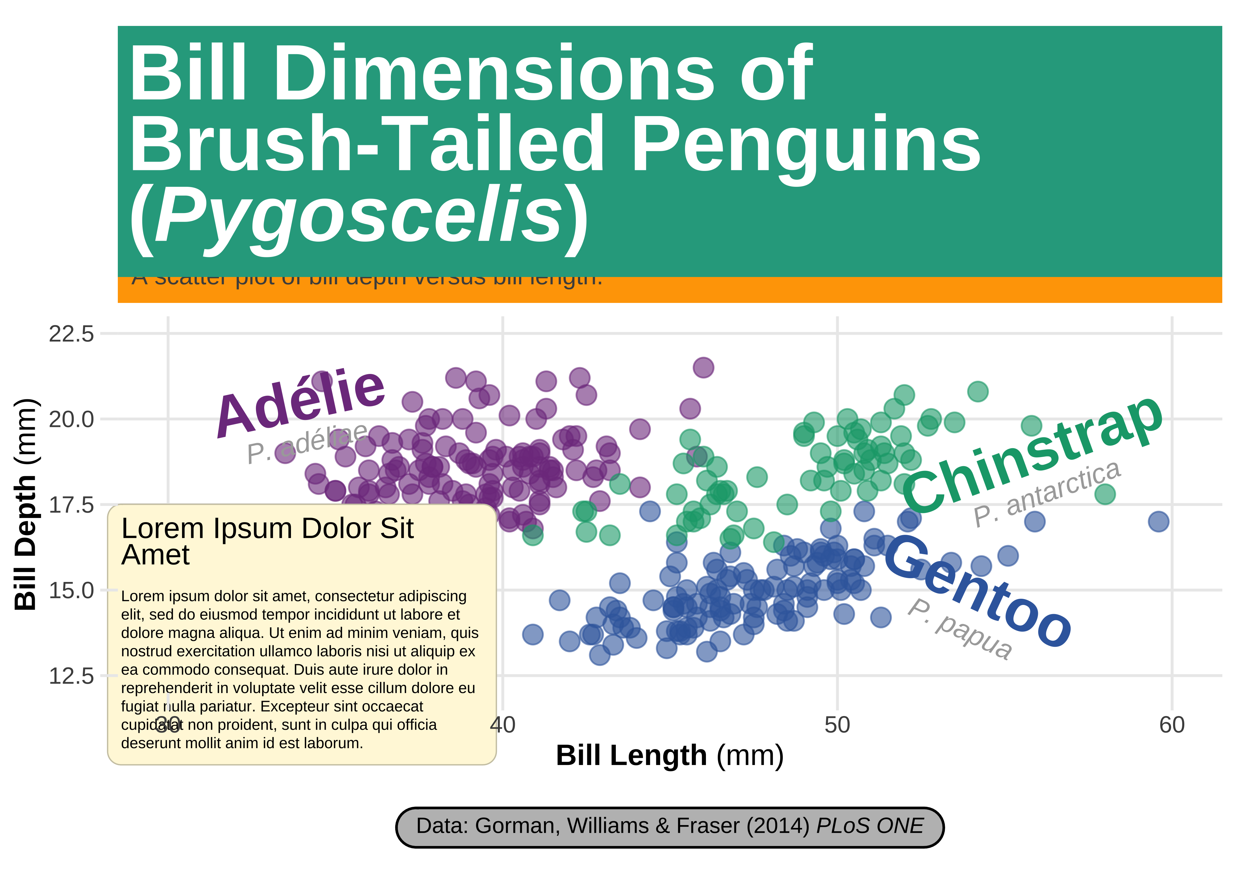
gg_box +
  ## add textbox with long paragraphs
  ggtext::geom_textbox(
    data = text_box,
    aes(x, y, label = label),
    size = 2.2, family = "sans",
    fill = "cornsilk", box.color = "cornsilk3",
    width = unit(11, "lines")
  ) +
  coord_cartesian(clip = "off") # ensure no clipping of labels near the edge
Using {ggforce}
From Thomas Lin Pedersen’s website → www.ggforce.data-imaginist.com
ggforceis a package aimed at providing missing functionality toggplot2through the extension system introduced withggplot2v2.0.0. Broadly speakingggplot2has been aimed primarily at explorative data visualization in order to investigate the data at hand, and less at providing utilities for composing custom plots a laD3.js.ggforceis mainly an attempt to address these “shortcoming” (design choices might be a better description). The goal is to provide a repository of geoms, stats, etc. that are as well documented and implemented as the official ones found inggplot2.
We will start with the basic plot, with the ggtext related work done up to now:
## use ggtext rendering for the following plots
theme_update(
  plot.title = ggtext::element_markdown(),
  plot.caption = ggtext::element_markdown(),
  axis.title.x = ggtext::element_markdown(),
  axis.title.y = ggtext::element_markdown()
)## plot that we will annotate with ggforce afterwards
gf3 <- penguins %>%
gf_point(bill_depth_mm ~ bill_length_mm,
color = ~body_mass_g,
alpha = .6,
size = 3.5
) +
coord_cartesian(xlim = c(25, 65), ylim = c(10, 25)) +
# Add Colour scales
scale_color_paletteer_c(`"grDevices::Lajolla"`, direction = -1) +
# Add labels
labs(
title = "Bill Dimensions of Brush-Tailed Penguins (*Pygoscelis*)",
subtitle = "A scatter plot of bill depth versus bill length.",
caption = "Data: Gorman, Williams & Fraser (2014) *PLoS ONE*",
x = "**Bill Length** (mm)",
y = "**Bill Depth** (mm)",
color = "Body mass (g)",
fill = "Species"
)
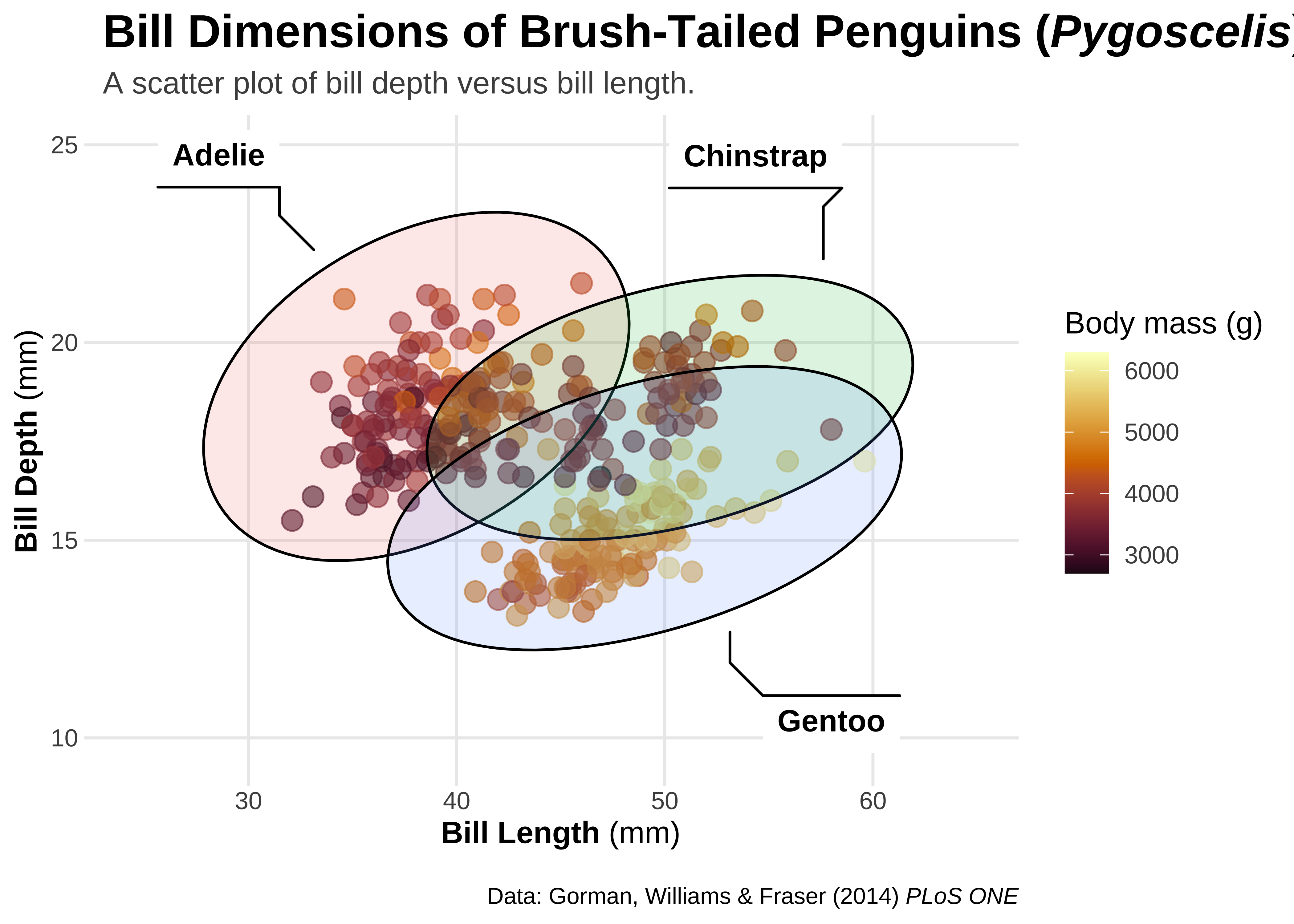
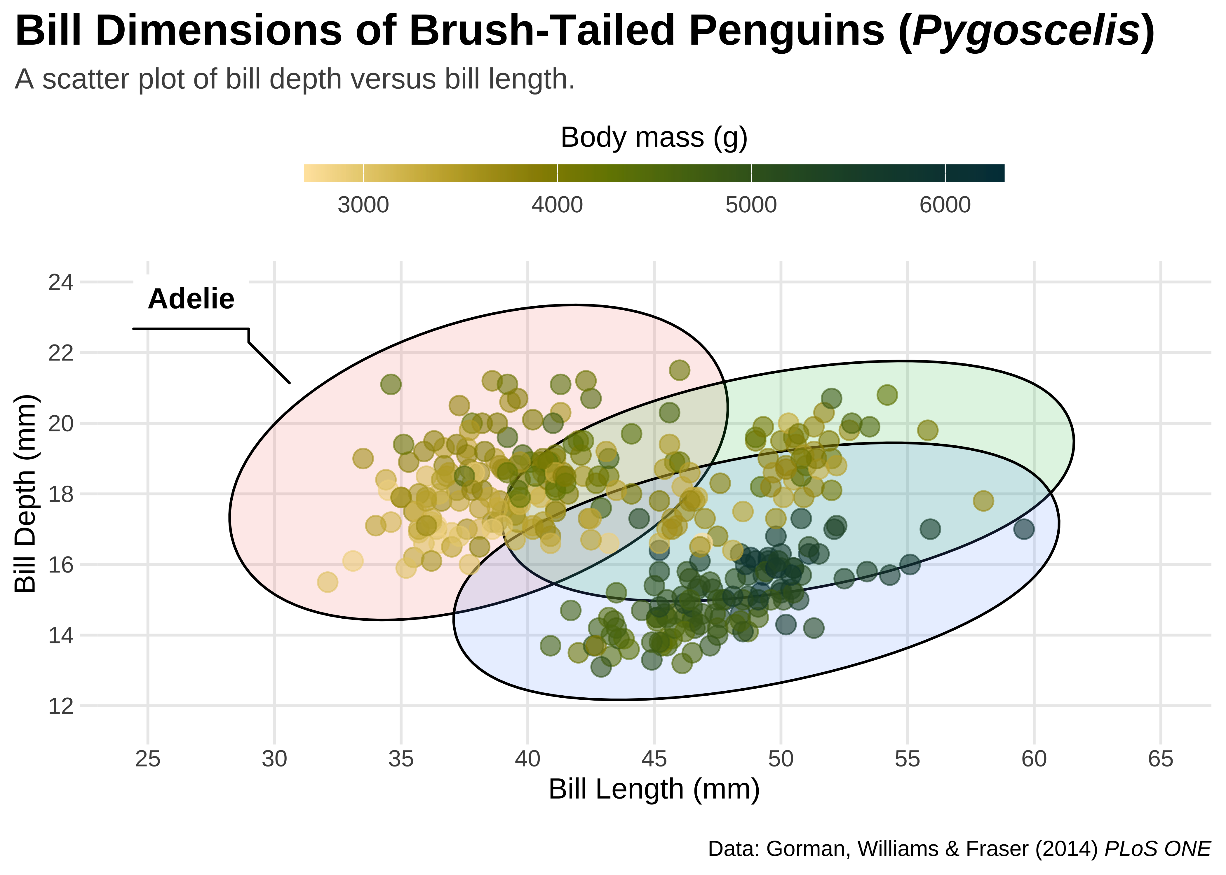
## ellipsoids for all groups
gf3 +
ggforce::geom_mark_ellipse(
aes(
fill = species,
label = species
),
color = "black",
# This is good to include
# Else ellipses get coloured too
alpha = .15,
show.legend = FALSE
)
## plot that we will annotate with ggforce afterwards
gg3 <- ggplot(penguins, aes(x = bill_length_mm, y = bill_depth_mm)) +
  geom_point(aes(color = body_mass_g),
    alpha = .6,
    size = 3.5
  ) +
  coord_cartesian(xlim = c(25, 65), ylim = c(10, 25)) +

  # Add Colour scales
  scale_color_paletteer_c(`"grDevices::Lajolla"`, direction = -1) +
  # rcartocolor::scale_fill_carto_d(palette = "Bold") +

  # Add labels
  labs(
    title = "Bill Dimensions of Brush-Tailed Penguins (*Pygoscelis*)",
    subtitle = "A scatter plot of bill depth versus bill length.",
    caption = "Data: Gorman, Williams & Fraser (2014) *PLoS ONE*",
    x = "**Bill Length** (mm)",
    y = "**Bill Depth** (mm)",
    color = "Body mass (g)",
    fill = "Species"
  )


## ellipsoids for all groups
gg3 +
  ggforce::geom_mark_ellipse(
    aes(
      fill = species,
      label = species
    ),
    alpha = .15,
    show.legend = FALSE
  )
## ellipsoids for specific subset
gg3 +
  ggforce::geom_mark_ellipse(
    aes(fill = species, label = species, filter = species == "Gentoo"),
    alpha = 0, show.legend = FALSE
  ) +
  geom_point(aes(color = body_mass_g), alpha = .6, size = 3.5)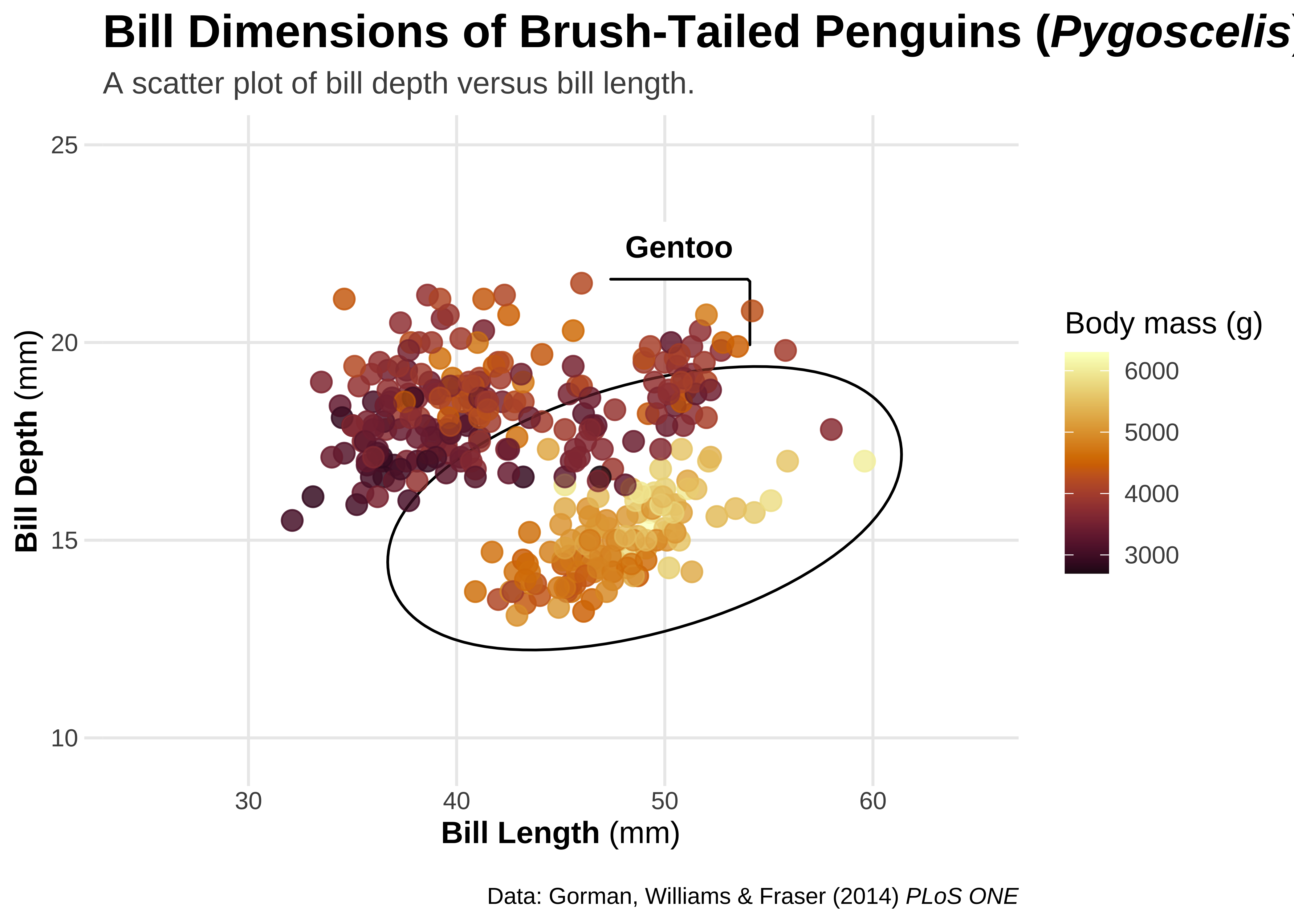
## circles
gg3 +
  ggforce::geom_mark_circle(
    aes(fill = species, label = species, filter = species == "Gentoo"),
    alpha = 0, show.legend = FALSE
  ) +
  geom_point(aes(color = body_mass_g), alpha = .6, size = 3.5)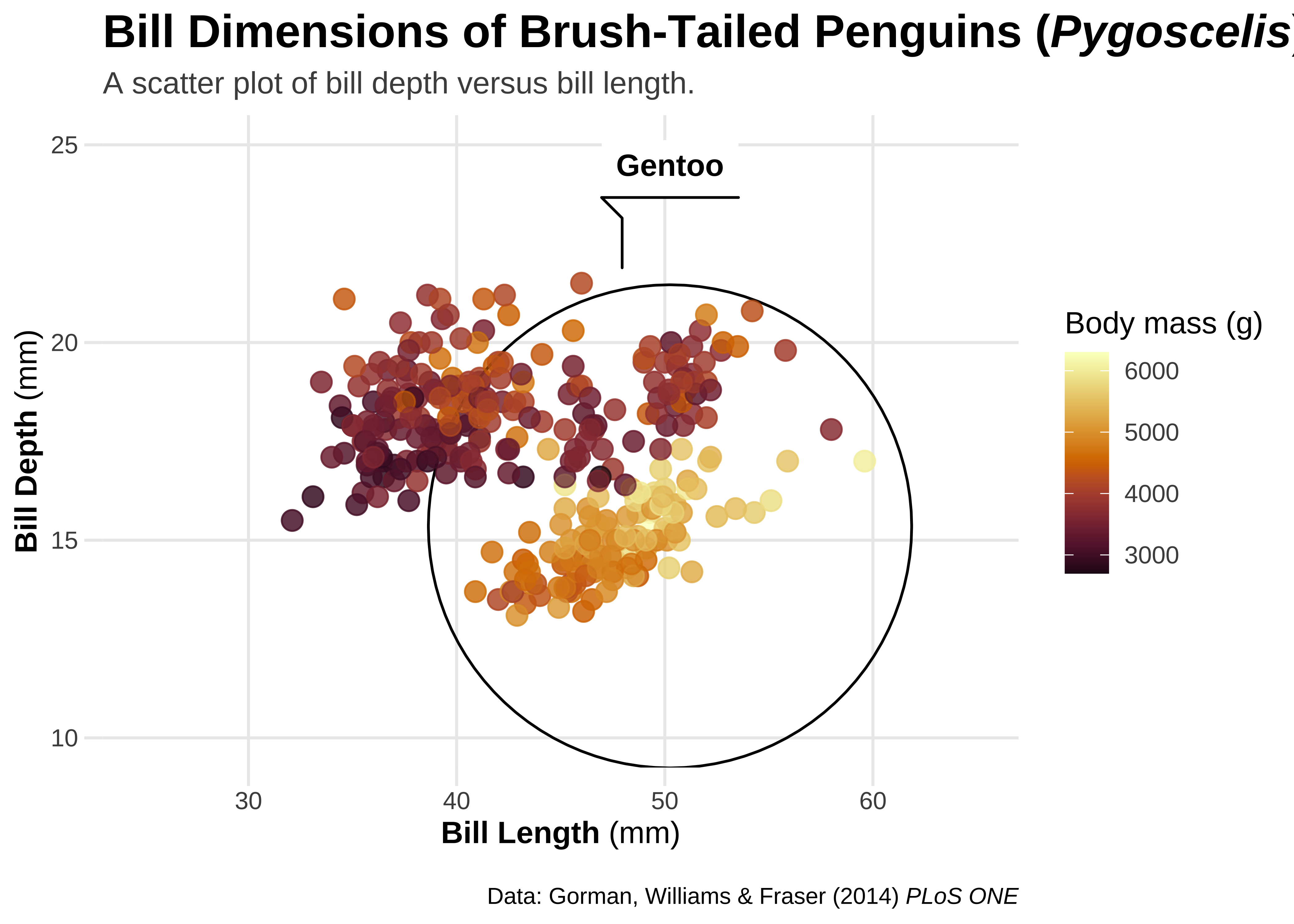
## rectangles
gg3 +
  ggforce::geom_mark_rect(
    aes(fill = species, label = species, filter = species == "Gentoo"),
    alpha = 0, show.legend = FALSE
  ) +
  geom_point(aes(color = body_mass_g), alpha = .6, size = 3.5)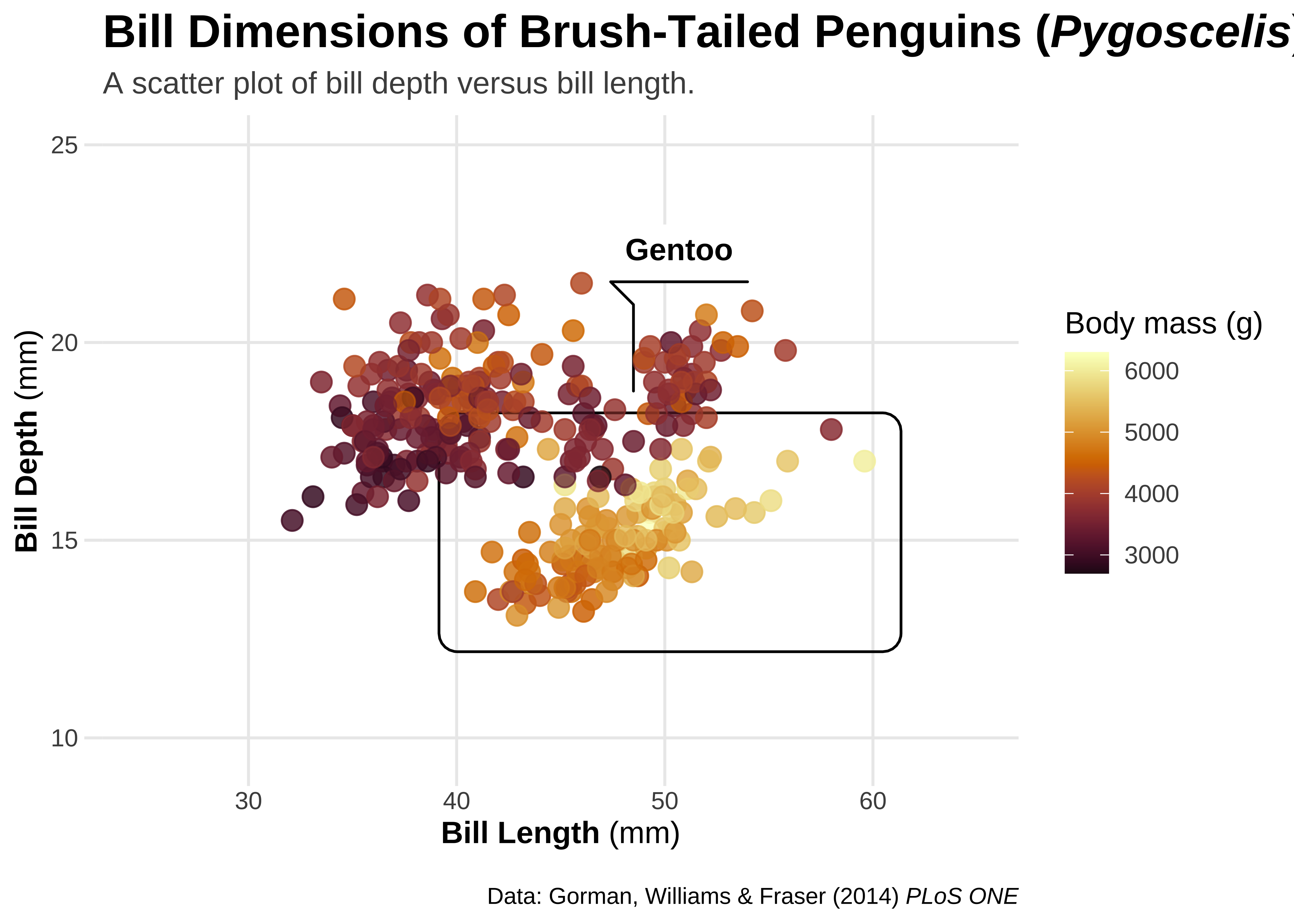
library(concaveman)
## hull
gg3 +
  ggforce::geom_mark_hull(
    aes(fill = species, label = species, filter = species == "Gentoo"),
    alpha = 0, show.legend = FALSE
  ) +
  geom_point(aes(color = body_mass_g), alpha = .6, size = 3.5)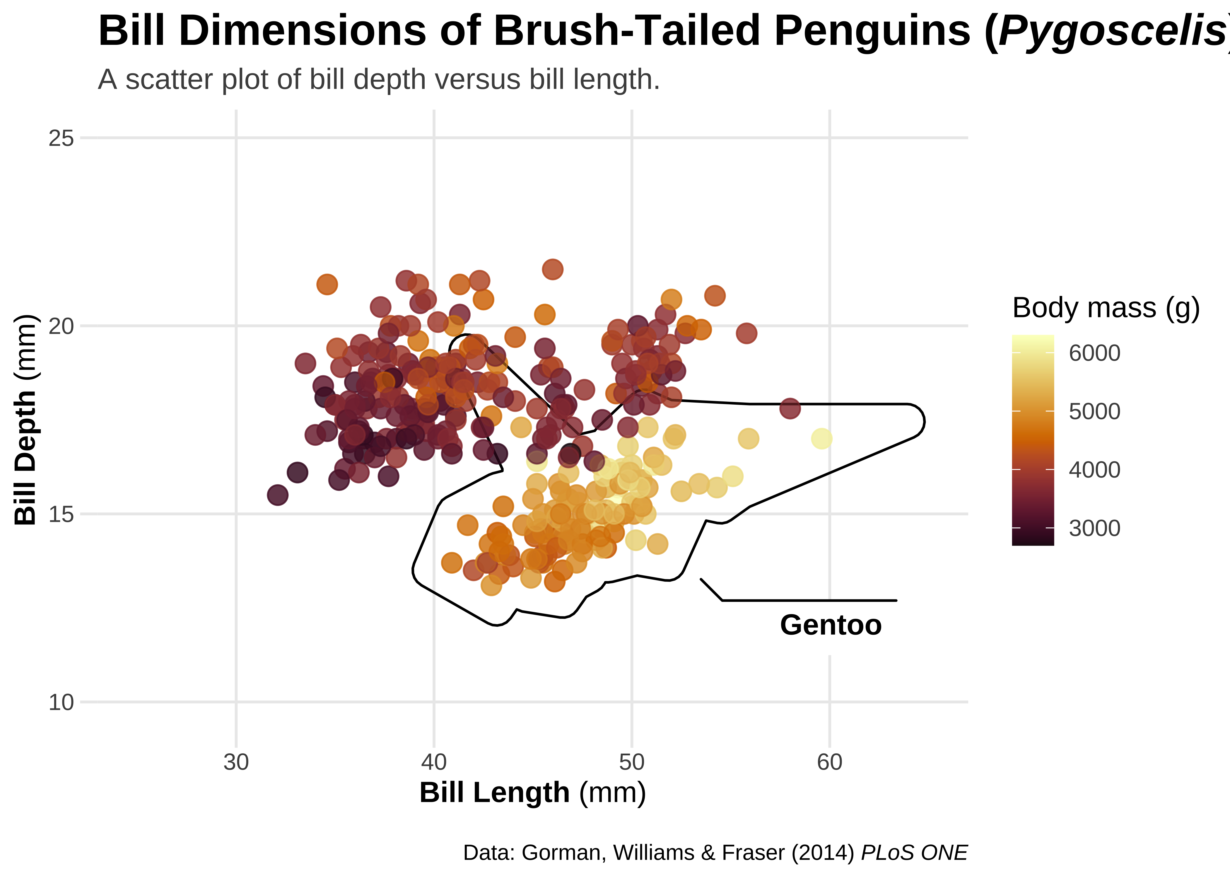
ggplot tricks
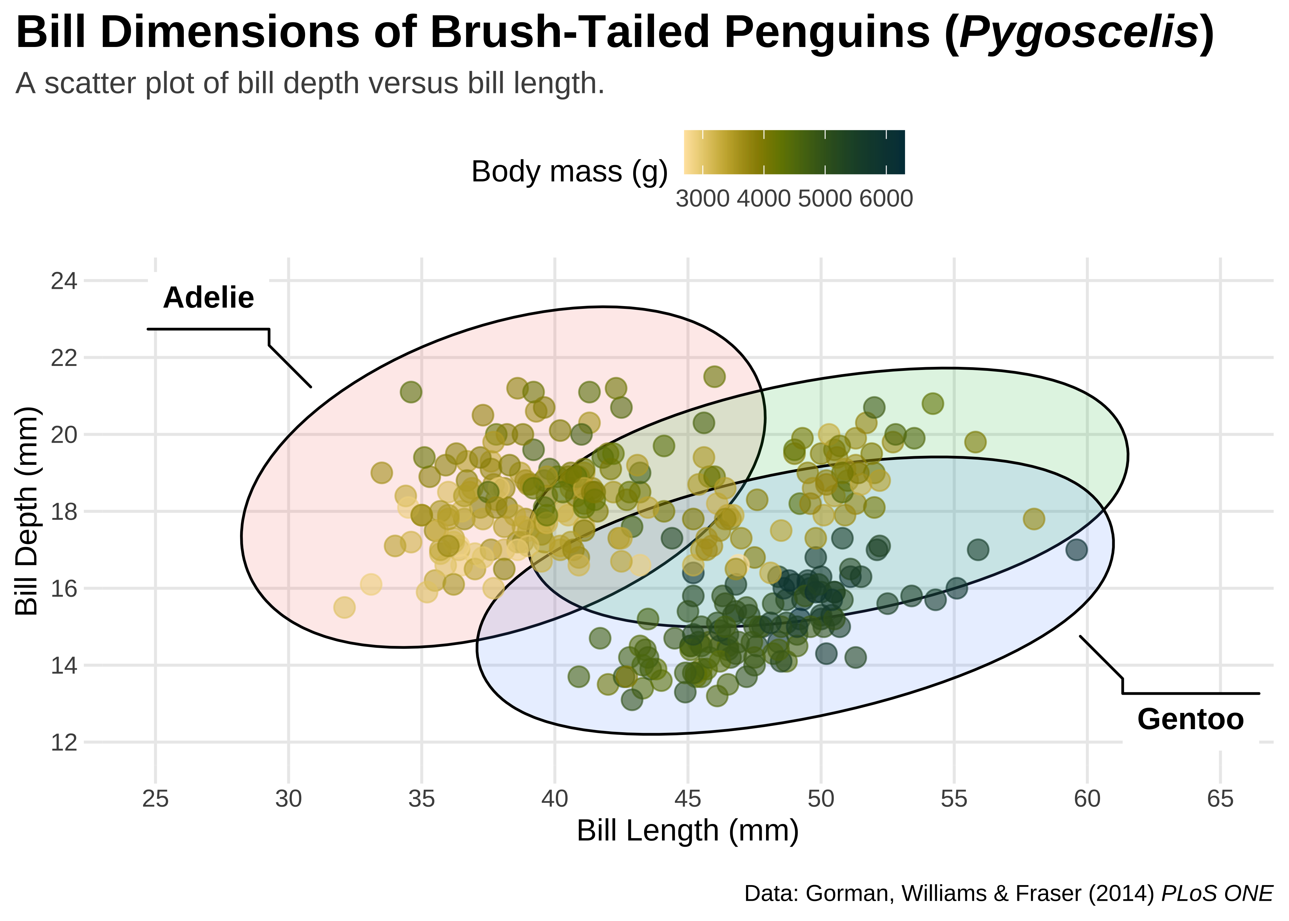
gg0 <-
  ggplot(penguins, aes(x = bill_length_mm, y = bill_depth_mm)) +
  ggforce::geom_mark_ellipse(
    aes(
      fill = species,
      label = species
    ),
    alpha = .15,
    show.legend = FALSE
  ) +
  geom_point(aes(color = body_mass_g), alpha = .6, size = 3.5) +
  scale_x_continuous(breaks = seq(25, 65, by = 5), limits = c(25, 65)) +
  scale_y_continuous(breaks = seq(12, 24, by = 2), limits = c(12, 24)) +
  scico::scale_color_scico(palette = "bamako", direction = -1) +
  labs(
    title = "Bill Dimensions of Brush-Tailed Penguins (*Pygoscelis*)",
    subtitle = "A scatter plot of bill depth versus bill length.",
    caption = "Data: Gorman, Williams & Fraser (2014) *PLoS ONE*",
    x = "Bill Length (mm)",
    y = "Bill Depth (mm)",
    color = "Body mass (g)"
  )
gg0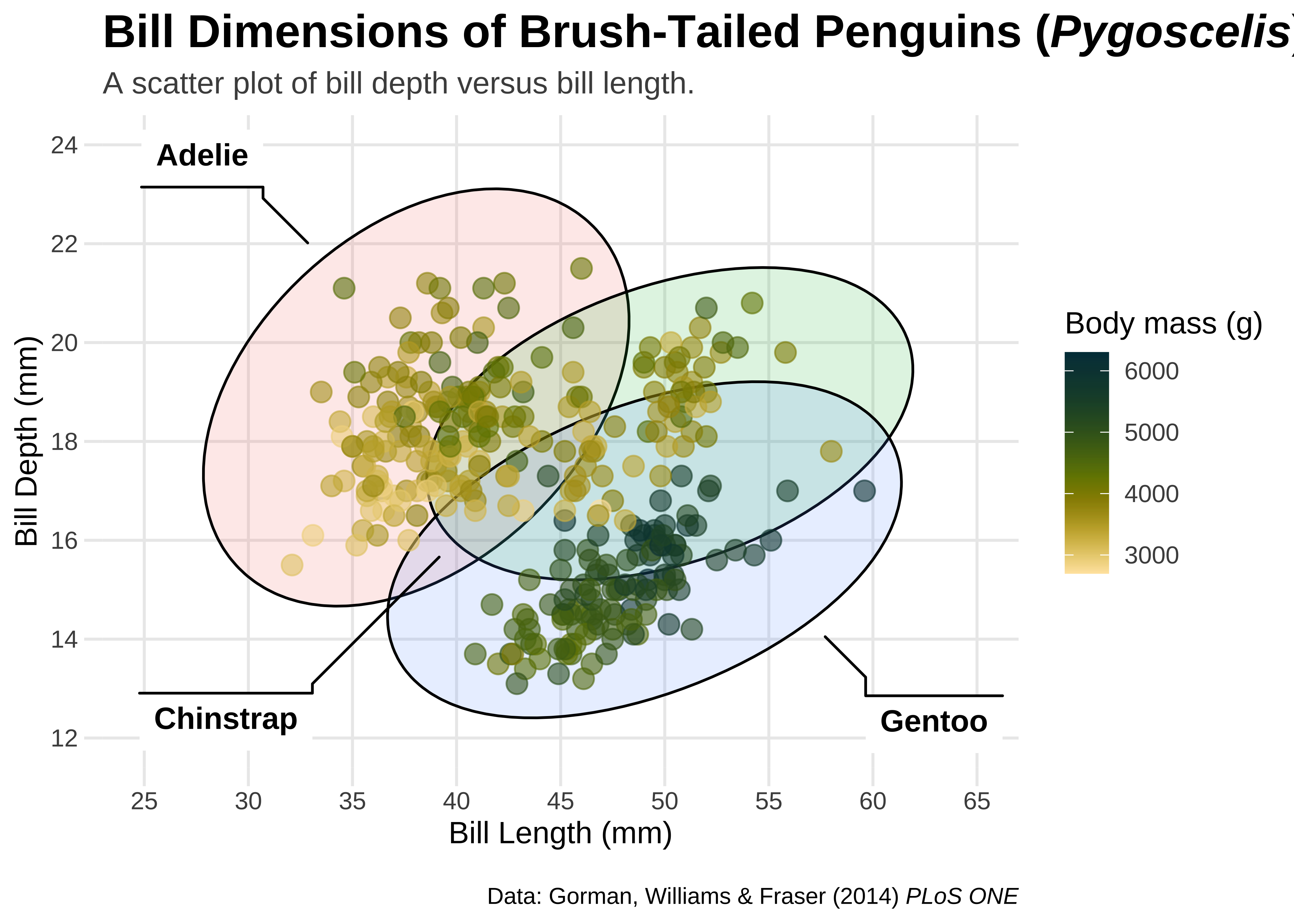
Left-Aligned Title
(gg1 <- gg0 + theme(plot.title.position = "plot"))
Right-Aligned Caption
gg1b <- gg1 + theme(plot.caption.position = "panel")
gg1b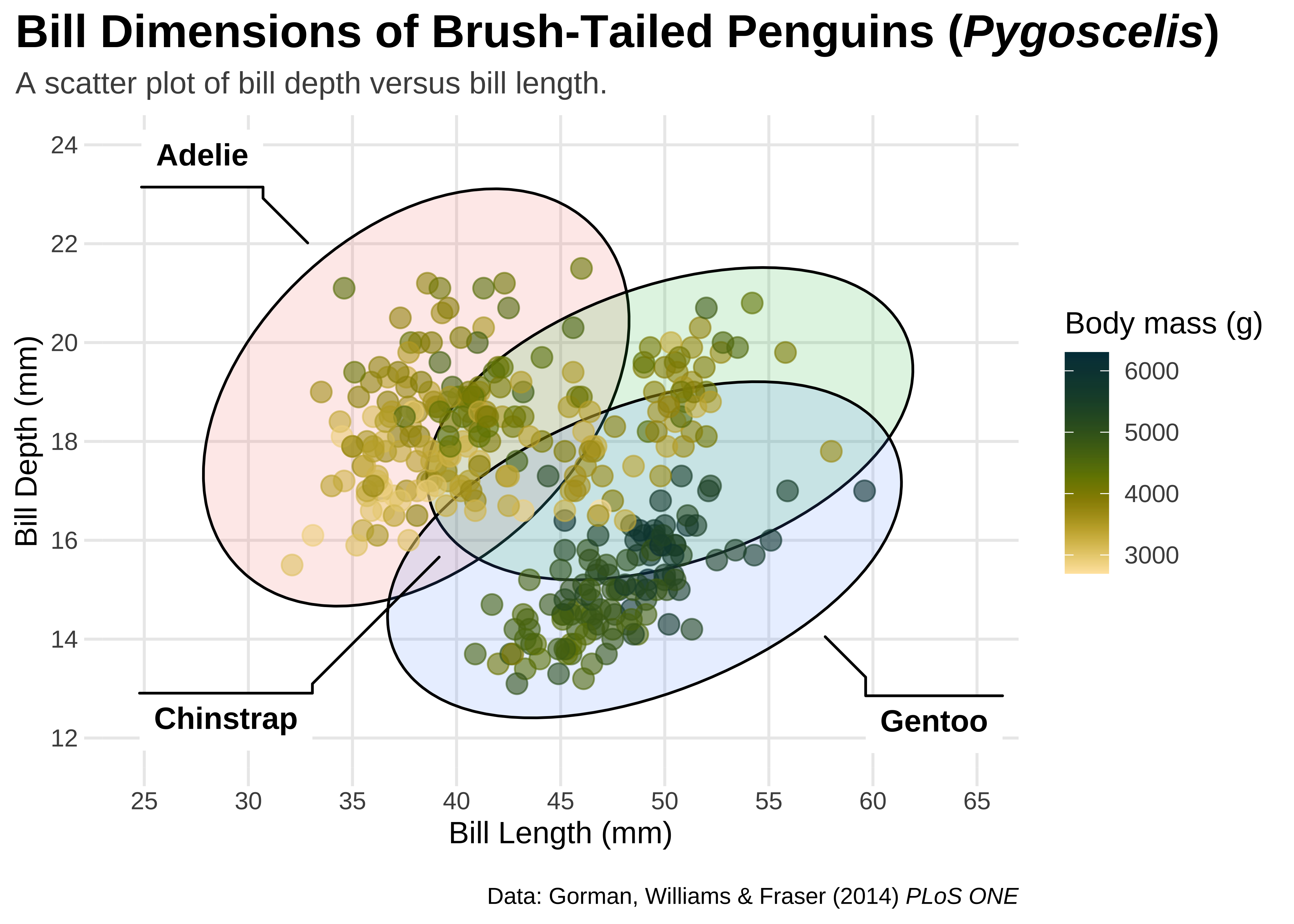
Legend Design
Add Images
## read PNG file from web
png <- magick::image_read("../images/culmen_depth.png")
## turn image into `rasterGrob`
img <- grid::rasterGrob(png, interpolate = TRUE)
gg5 <- gg2 +
annotation_custom(img, ymin = 18, ymax = 28, xmin = 58, xmax = 65) +
labs(caption = "Data: Gorman, Williams & Fraser (2014) *PLoS ONE* • Illustration: Allison Horst")
gg5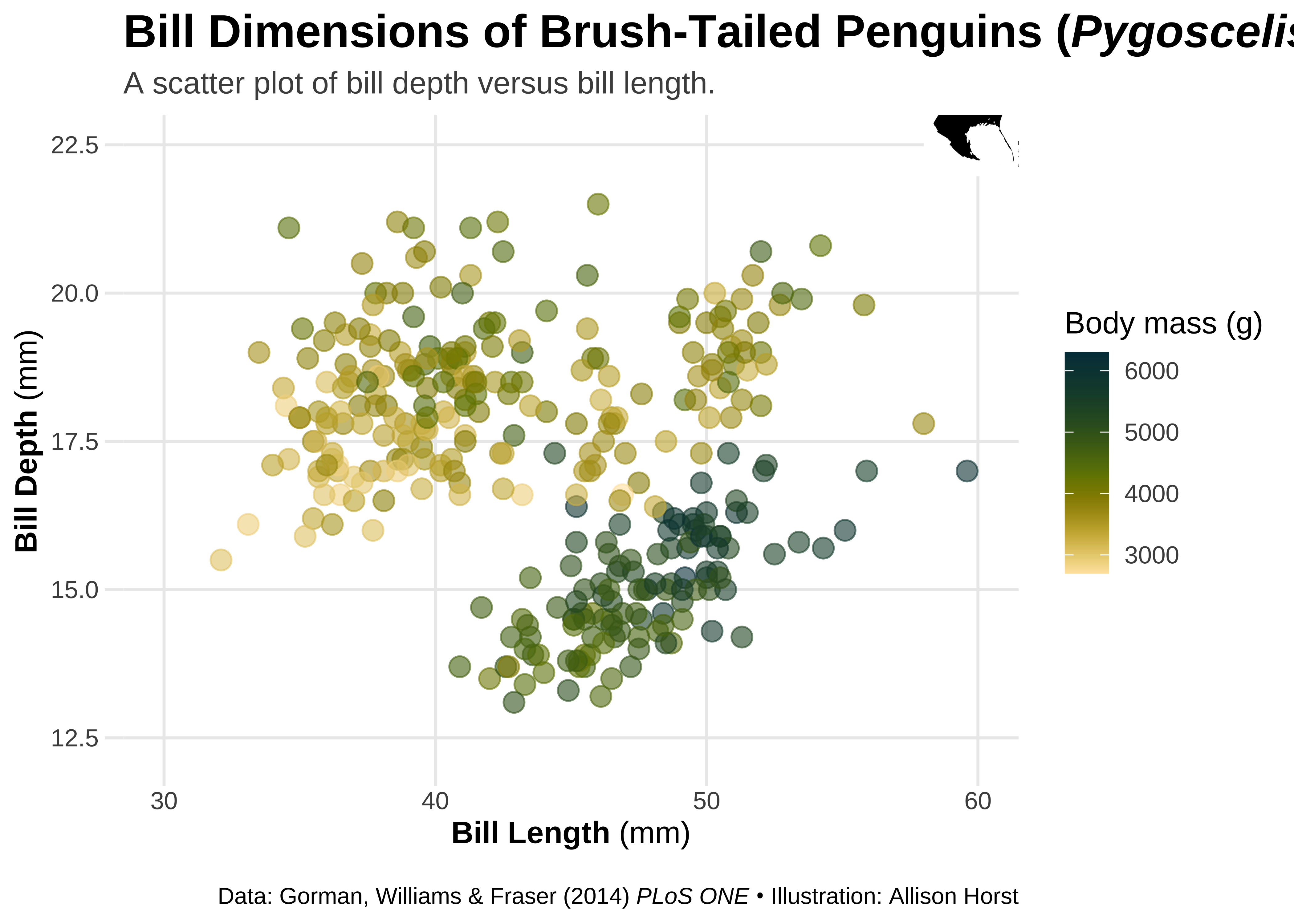
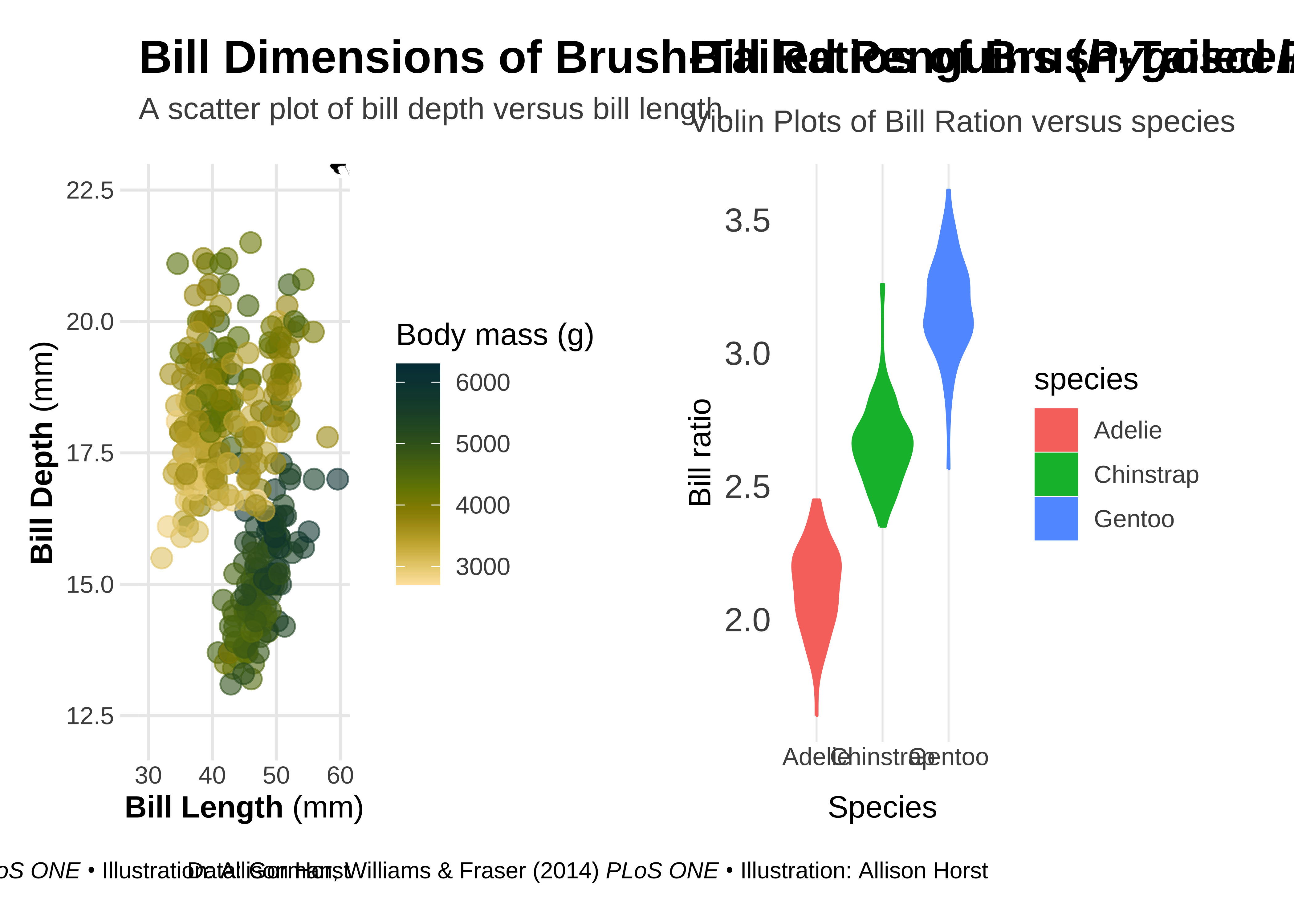
Using {patchwork}
The goal of
patchworkis to make it ridiculously simple to combine separate ggplots into the same graphic. As such it tries to solve the same problem asgridExtra::grid.arrange()andcowplot::plot_gridbut using an API that incites exploration and iteration, and scales to arbitrily complex layouts.
→ https://patchwork.data-imaginist.com/
Let us make two plots and combine them into a single patchwork plot.
## calculate bill ratio
penguins_stats <- penguins %>%
mutate(bill_ratio = bill_length_mm / bill_depth_mm) %>%
filter(!is.na(bill_ratio))
## create a second chart
gg6 <- ggplot(penguins_stats, aes(y = bill_ratio, x = species, fill = species, color = species)) +
geom_violin() +
labs(
y = "Bill ratio",
x = "Species",
subtitle = "",
caption = "Data: Gorman, Williams & Fraser (2014) *PLoS ONE* • Illustration: Allison Horst"
) +
theme(
panel.grid.major.x = element_line(size = .35),
panel.grid.major.y = element_blank(),
axis.text.y = element_text(size = 13),
axis.ticks.length = unit(0, "lines"),
plot.title.position = "plot",
plot.subtitle = element_text(margin = margin(t = 5, b = 10)),
plot.margin = margin(10, 25, 10, 25)
)Now to combine both plots into one using simple operators:
For the special case of putting plots besides each other or on top of each other patchwork provides 2 shortcut operators.
|will place plots next to each other while/will place them on top of each other.
First we stack up the graphs side by side:
## combine both plots
gg5 | (gg6 + labs(
  title = "Bill Ratios of Brush-Tailed Penguins",
  subtitle = "Violin Plots of Bill Ration versus species"
))
We can place them in one column:
gg5 / (gg6 + labs(
  title = "Bill Ratios of Brush-Tailed Penguins",
  subtitle = "Violin Plots of Bill Ration versus species"
)) +
  plot_layout(heights = c(0.4, 0.4))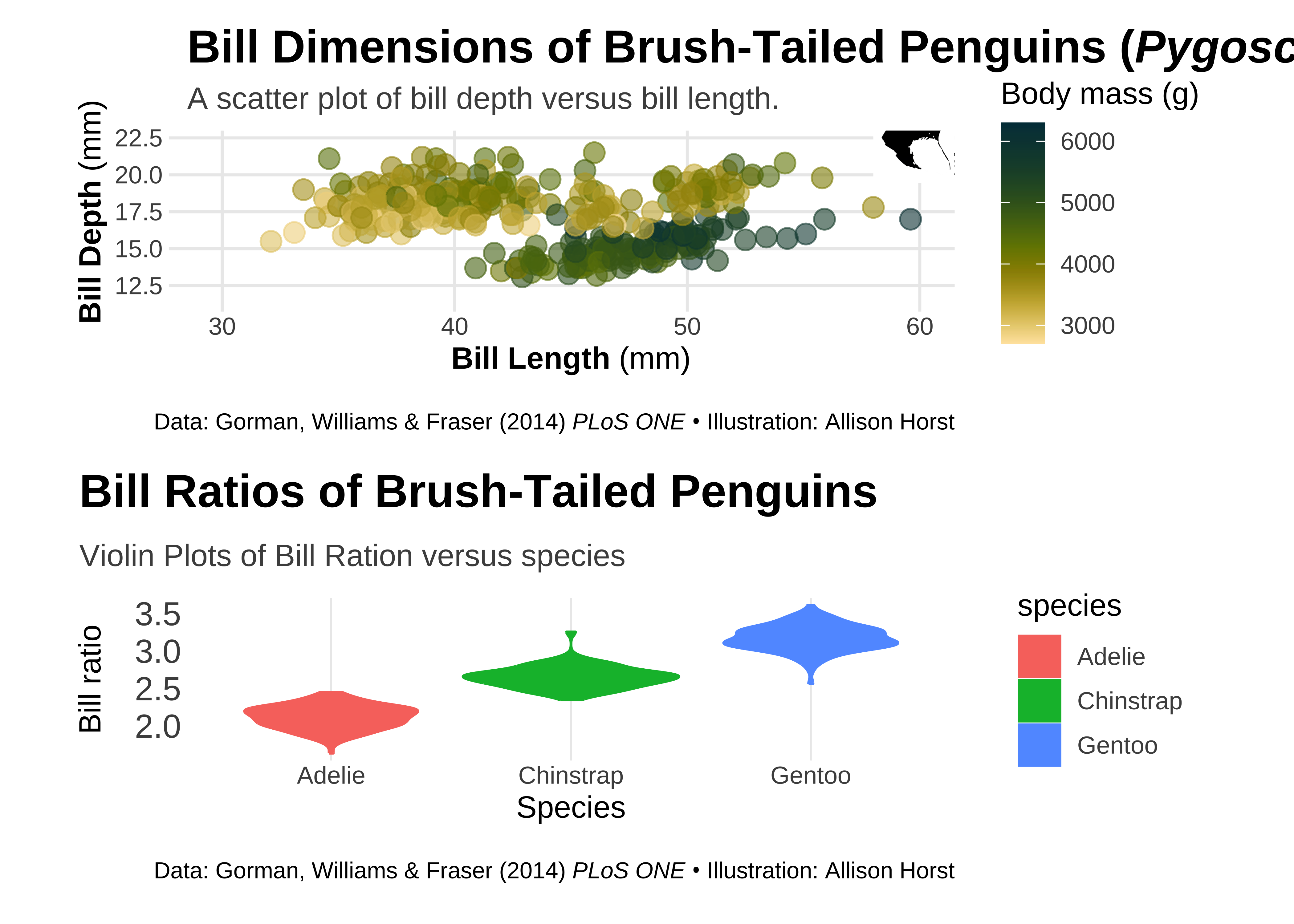
Resources
- Intro to R (one of many good online tutorials)
- “R for Data Science” book (open-access)
- ggplot2 Book (open-access)
- R Graph Gallery
- Slides of Cedric Scherer’s talk
- Extensive ggplot2 tutorial
- “Evolution of a ggplot” blog post by Cedric Scherer
- #TidyTuesday project (#TidyTuesday on Twitter)
- #TidyTuesday Contributions by Cedric Scherer incl. all codes
- R4DS learning community (huge Slack community for people learning R incl. a mentoring program)
- Illustrations by Allison Horst (more general about data and stats + R-related)
- R Packages: