This is the YAML at the top of this Quarto document. Use order to sequence your blog posts, and df_print to tidily print your dataframes in the final HTML.
title: <iconify-icon icon="healthicons:elderly-outline" width="1.2em" height="1.2em"></iconify-icon> Demo:Product Packaging and Elderly People
order: 10
df-print: paged
toc: true
editor:
  markdown:
    wrap: sentence
Plot Fonts and Theme
Show the Code
library(systemfonts)
library(showtext)
## Clean the slate
systemfonts::clear_local_fonts()
systemfonts::clear_registry()
##
showtext_opts(dpi = 96) # set DPI for showtext
sysfonts::font_add(
  family = "Alegreya",
  regular = "../../../../../../fonts/Alegreya-Regular.ttf",
  bold = "../../../../../../fonts/Alegreya-Bold.ttf",
  italic = "../../../../../../fonts/Alegreya-Italic.ttf",
  bolditalic = "../../../../../../fonts/Alegreya-BoldItalic.ttf"
)

sysfonts::font_add(
  family = "Roboto Condensed",
  regular = "../../../../../../fonts/RobotoCondensed-Regular.ttf",
  bold = "../../../../../../fonts/RobotoCondensed-Bold.ttf",
  italic = "../../../../../../fonts/RobotoCondensed-Italic.ttf",
  bolditalic = "../../../../../../fonts/RobotoCondensed-BoldItalic.ttf"
)
showtext_auto(enable = TRUE) # enable showtext
##
theme_custom <- function() {
  font <- "Alegreya" # assign font family up front

  theme_classic(base_size = 14, base_family = font) %+replace% # replace elements we want to change

    theme(
      text = element_text(family = font), # set base font family

      # text elements
      plot.title = element_text( # title
        family = font, # set font family
        size = 24, # set font size
        face = "bold", # bold typeface
        hjust = 0, # left align
        margin = margin(t = 5, r = 0, b = 5, l = 0)
      ), # margin
      plot.title.position = "plot",
      plot.subtitle = element_text( # subtitle
        family = font, # font family
        size = 14, # font size
        hjust = 0, # left align
        margin = margin(t = 5, r = 0, b = 10, l = 0)
      ), # margin

      plot.caption = element_text( # caption
        family = font, # font family
        size = 9, # font size
        hjust = 1
      ), # right align

      plot.caption.position = "plot", # right align

      axis.title = element_text( # axis titles
        family = "Roboto Condensed", # font family
        size = 12
      ), # font size

      axis.text = element_text( # axis text
        family = "Roboto Condensed", # font family
        size = 9
      ), # font size

      axis.text.x = element_text( # margin for axis text
        margin = margin(5, b = 10)
      )

      # since the legend often requires manual tweaking
      # based on plot content, don't define it here
    )
}

## Use available fonts in ggplot text geoms too!
update_geom_defaults(geom = "text", new = list(
  family = "Roboto Condensed",
  face = "plain",
  size = 3.5,
  color = "#2b2b2b"
))

## Set the theme
theme_set(new = theme_custom())
As a demonstration Data Analysis flow, I will take a dataset and show the various steps involved in the workflow: data inspection, cleaning, setting up a hypothesis, plotting a chart, and responding to the hypothesis.
I will repeat the entire code in every chunk, so that the whole process is visible in one shot at the end. This is not something you should do as a practice.
This is a dataset pertaining to packaging of groceries, and the difficulty that elderly people face with opening or closing those packages. The study also included people who were experiencing hand pain due to ailments such as arthritis.
The data is available here: Juliá-Nehme, Begoña (2023). Usability of Food Packaging in Older Adults. Figshare Dataset. https://doi.org/10.6084/m9.figshare.22637656.v1
And, for you peasants, here too:
opening <- opening %>% janitor::clean_names()
glimpse(opening)
inspect(opening)
Rows: 17
Columns: 17
$ group <dbl> 1, 1, 1, 1, 1, 1, 1, 1, 1, 1, 2, 2, 2, 2, 2, 2, 2
$ age <dbl> 70, 71, 73, 73, 70, 67, 73, 72, 67, 66, 75, 81, 77, 78,…
$ sex <dbl> 1, 0, 1, 0, 0, 1, 1, 1, 1, 1, 1, 0, 0, 1, 1, 1, 0
$ hand_pain <dbl> 1, 0, 1, 1, 1, 0, 0, 0, 0, 1, 1, 0, 0, 1, 0, 1, 1
$ hand_illness <dbl> 0, 0, 0, 0, 0, 0, 1, 1, 1, 1, 1, 1, 0, 0, 0, 0, 0
$ hand_strength <dbl> 21.0, 37.0, 21.0, 30.0, 21.0, 23.0, 18.0, 12.0, 20.0, 6…
$ pinch_strength <dbl> 6.0, 6.5, 5.5, 7.5, 7.5, 6.3, 4.3, 2.5, 4.7, 1.7, 6.0, …
$ time_jar <chr> "11", "9", "20", "7", "8", "62", "26", "25", "21", "5",…
$ time_beverage <dbl> 5, 7, 21, 5, 4, 4, 3, 9, 9, 13, 3, 6, 6, 17, 6, 5, 2
$ time_suace <chr> "17", "11", "14", "6", "7", "18", "8", "38", "11", "25"…
$ time_juice <dbl> 15, 8, 13, 6, 7, 8, 6, 18, 10, 6, 9, 8, 17, 27, 11, 17,…
$ time_milk <dbl> 21, 3, 8, 5, 5, 52, 17, 48, 8, 2, 8, 6, 6, 34, 26, 14, …
$ time_crackers <dbl> 56, 46, 52, 7, 6, 47, 14, 49, 29, 25, 13, 19, 61, 33, 2…
$ time_cheese <dbl> 14, 35, 23, 29, 25, 9, 13, 12, 9, 36, 43, 19, 31, 18, 4…
$ time_chickpeas <dbl> 35, 20, 69, 28, 29, 30, 29, 76, 20, 25, 27, 16, 39, 55,…
$ time_bottle <dbl> 10, 4, 18, 5, 4, 6, 6, 8, 11, 6, 8, 4, 6, 7, 8, 7, 6
$ time_soup <dbl> 6, 23, 23, 6, 3, 6, 2, 30, 23, 3, 4, 6, 9, 4, 6, 8, 12
categorical variables:
name class levels n missing
1 time_jar character 14 17 0
2 time_suace character 14 17 0
distribution
1 7 (17.6%), 11 (11.8%), 12 (5.9%) ...
2 11 (11.8%), 6 (11.8%), 8 (11.8%) ...
quantitative variables:
name class min Q1 median Q3 max mean sd n
1 group numeric 1.0 1.0 1.0 2.0 2.0 1.4117647 0.5072997 17
2 age numeric 66.0 70.0 73.0 78.0 91.0 74.5294118 6.6437720 17
3 sex numeric 0.0 0.0 1.0 1.0 1.0 0.6470588 0.4925922 17
4 hand_pain numeric 0.0 0.0 1.0 1.0 1.0 0.5294118 0.5144958 17
5 hand_illness numeric 0.0 0.0 0.0 1.0 1.0 0.3529412 0.4925922 17
6 hand_strength numeric 6.0 14.0 20.0 23.0 37.0 19.4529412 7.5407325 17
7 pinch_strength numeric 1.7 4.5 5.5 6.5 9.5 5.4941176 2.0464819 17
8 time_beverage numeric 2.0 4.0 6.0 9.0 21.0 7.3529412 5.1713293 17
9 time_juice numeric 6.0 8.0 10.0 15.0 27.0 11.5294118 5.6802030 17
10 time_milk numeric 2.0 6.0 8.0 21.0 52.0 16.2941176 15.3613342 17
11 time_crackers numeric 6.0 19.0 31.0 47.0 61.0 32.5882353 17.2665096 17
12 time_cheese numeric 9.0 14.0 25.0 35.0 80.0 28.0000000 17.8815547 17
13 time_chickpeas numeric 16.0 27.0 30.0 62.0 128.0 45.8823529 30.6061316 17
14 time_bottle numeric 4.0 6.0 6.0 8.0 18.0 7.2941176 3.3868257 17
15 time_soup numeric 2.0 4.0 6.0 12.0 30.0 10.2352941 8.7644838 17
missing
1 0
2 0
3 0
4 0
5 0
6 0
7 0
8 0
9 0
10 0
11 0
12 0
13 0
14 0
15 0## janitor is a good package to make clean names out of weird column names
##
closing <- closing %>% janitor::clean_names()
glimpse(closing)
inspect(closing)Rows: 17
Columns: 17
$ group <dbl> 1, 1, 1, 1, 1, 1, 1, 1, 1, 1, 2, 2, 2, 2, 2, 2, 2
$ age <dbl> 70, 71, 73, 73, 70, 67, 73, 72, 67, 66, 75, 81, 77, 78,…
$ sex <dbl> 1, 0, 1, 0, 0, 1, 1, 1, 1, 1, 1, 0, 0, 1, 1, 1, 0
$ hand_pain <dbl> 1, 0, 1, 1, 1, 0, 0, 0, 0, 1, 1, 0, 0, 1, 0, 1, 1
$ hand_illness <dbl> 0, 0, 0, 0, 0, 0, 1, 1, 1, 1, 1, 1, 0, 0, 0, 0, 0
$ hand_strength <dbl> 21.0, 37.0, 21.0, 30.0, 21.0, 23.0, 18.0, 12.0, 20.0, 6…
$ pinch_strength <dbl> 6.0, 6.5, 5.5, 7.5, 7.5, 6.3, 4.3, 2.5, 4.7, 1.7, 6.0, …
$ time_jar <chr> "11", "9", "20", "7", "8", "62", "26", "25", "21", "5",…
$ time_beverage <dbl> 5, 7, 21, 5, 4, 4, 3, 9, 9, 13, 3, 6, 6, 17, 6, 5, 2
$ time_suace <chr> "17", "11", "14", "6", "7", "18", "8", "38", "11", "25"…
$ time_juice <dbl> 15, 8, 13, 6, 7, 8, 6, 18, 10, 6, 9, 8, 17, 27, 11, 17,…
$ time_milk <dbl> 21, 3, 8, 5, 5, 52, 17, 48, 8, 2, 8, 6, 6, 34, 26, 14, …
$ time_crackers <dbl> 56, 46, 52, 7, 6, 47, 14, 49, 29, 25, 13, 19, 61, 33, 2…
$ time_cheese <dbl> 14, 35, 23, 29, 25, 9, 13, 12, 9, 36, 43, 19, 31, 18, 4…
$ time_chickpeas <dbl> 35, 20, 69, 28, 29, 30, 29, 76, 20, 25, 27, 16, 39, 55,…
$ time_bottle <dbl> 10, 4, 18, 5, 4, 6, 6, 8, 11, 6, 8, 4, 6, 7, 8, 7, 6
$ time_soup <dbl> 6, 23, 23, 6, 3, 6, 2, 30, 23, 3, 4, 6, 9, 4, 6, 8, 12
categorical variables:
name class levels n missing
1 time_jar character 14 17 0
2 time_suace character 14 17 0
distribution
1 7 (17.6%), 11 (11.8%), 12 (5.9%) ...
2 11 (11.8%), 6 (11.8%), 8 (11.8%) ...
quantitative variables:
name class min Q1 median Q3 max mean sd n
1 group numeric 1.0 1.0 1.0 2.0 2.0 1.4117647 0.5072997 17
2 age numeric 66.0 70.0 73.0 78.0 91.0 74.5294118 6.6437720 17
3 sex numeric 0.0 0.0 1.0 1.0 1.0 0.6470588 0.4925922 17
4 hand_pain numeric 0.0 0.0 1.0 1.0 1.0 0.5294118 0.5144958 17
5 hand_illness numeric 0.0 0.0 0.0 1.0 1.0 0.3529412 0.4925922 17
6 hand_strength numeric 6.0 14.0 20.0 23.0 37.0 19.4529412 7.5407325 17
7 pinch_strength numeric 1.7 4.5 5.5 6.5 9.5 5.4941176 2.0464819 17
8 time_beverage numeric 2.0 4.0 6.0 9.0 21.0 7.3529412 5.1713293 17
9 time_juice numeric 6.0 8.0 10.0 15.0 27.0 11.5294118 5.6802030 17
10 time_milk numeric 2.0 6.0 8.0 21.0 52.0 16.2941176 15.3613342 17
11 time_crackers numeric 6.0 19.0 31.0 47.0 61.0 32.5882353 17.2665096 17
12 time_cheese numeric 9.0 14.0 25.0 35.0 80.0 28.0000000 17.8815547 17
13 time_chickpeas numeric 16.0 27.0 30.0 62.0 128.0 45.8823529 30.6061316 17
14 time_bottle numeric 4.0 6.0 6.0 8.0 18.0 7.2941176 3.3868257 17
15 time_soup numeric 2.0 4.0 6.0 12.0 30.0 10.2352941 8.7644838 17
missing
1 0
2 0
3 0
4 0
5 0
6 0
7 0
8 0
9 0
10 0
11 0
12 0
13 0
14 0
15 0
Several variables are wrongly encoded here, as can be seen. For instance group, and sex are encoded as <dbl> and need to be converted to factors before analysis. We will write our Data Dictionary based on this understanding, and then convert the variables appropriately. (The full workflow will be shown here for the opening dataset; it follows in identical fashion for the closing dataset.)
-
hand_strength(dbl): Hand Strength, numerical -
pinch_strength(dbl): Pinch Strength, numerical -
time_jar(chr) Time to open a jar. Needs to be (dbl) -
time_beverage(dbl)Time to open a beverage -
time_suace(chr) Time to open sauce -
time_juice(dbl) Time to open juice -
time_milk(dbl) Time to open milk carton -
time_crackers(dbl)Time to open crackers pack -
time_cheese(dbl) Time to open cheese packet -
time_chickpeas(dbl) Time to open chickpeas packet -
time_bottle(dbl) Time to open a bottle -
time_soup(dbl) Time to open a a can of soup
-
group(dbl): Groups in the study. Two. Make into (fct). -
sex(dbl): sex of the participant. Make into (fct). -
hand_pain: Did they suffer from hand pain or not? Binary. Make into (fct). -
hand_illness: How different fromhand_pain? Make into (fct).
Small dataset of 17 rows. Several time values have been measured across the same set of subjects, resulting is what is called a “repeat measures” experiment. Subjects seem to be in two groups, and with or without hand-pain. Are these the two groups? What is the difference between hand_pain and hand_illness?
We need to first convert all the obvious Qual variables into, well, Qual factors! A few variables are also obviously Quant, and need to be transformed. We can also perform counts based on hand_pain and hand_illness to decide how to deal with them. And we will not modify the original data !!
opening_modified <- opening %>%
  # correct spelling mistake
  rename("time_sauce" = time_suace) %>%
  # If you want to do this fast!
  mutate(across(contains("time"), as.numeric)) %>%
  # Two "NA" entries exist

  mutate(
    hand_pain = as_factor(hand_pain),
    hand_illness = as_factor(hand_illness),
    group = as_factor(group),
    sex = as_factor(sex)
  )

opening_modifiedgroup <fct> | age <dbl> | sex <fct> | hand_pain <fct> | hand_illness <fct> | hand_strength <dbl> | pinch_strength <dbl> | time_jar <dbl> | time_beverage <dbl> | time_sauce <dbl> | |
|---|---|---|---|---|---|---|---|---|---|---|
| 1 | 70 | 1 | 1 | 0 | 21.0 | 6.0 | 11 | 5 | 17 | |
| 1 | 71 | 0 | 0 | 0 | 37.0 | 6.5 | 9 | 7 | 11 | |
| 1 | 73 | 1 | 1 | 0 | 21.0 | 5.5 | 20 | 21 | 14 | |
| 1 | 73 | 0 | 1 | 0 | 30.0 | 7.5 | 7 | 5 | 6 | |
| 1 | 70 | 0 | 1 | 0 | 21.0 | 7.5 | 8 | 4 | 7 | |
| 1 | 67 | 1 | 0 | 0 | 23.0 | 6.3 | 62 | 4 | 18 | |
| 1 | 73 | 1 | 0 | 1 | 18.0 | 4.3 | 26 | 3 | 8 | |
| 1 | 72 | 1 | 0 | 1 | 12.0 | 2.5 | 25 | 9 | 38 | |
| 1 | 67 | 1 | 0 | 1 | 20.0 | 4.7 | 21 | 9 | 11 | |
| 1 | 66 | 1 | 1 | 1 | 6.0 | 1.7 | 5 | 13 | 25 |
glimpse(opening_modified)Rows: 17
Columns: 17
$ group <fct> 1, 1, 1, 1, 1, 1, 1, 1, 1, 1, 2, 2, 2, 2, 2, 2, 2
$ age <dbl> 70, 71, 73, 73, 70, 67, 73, 72, 67, 66, 75, 81, 77, 78,…
$ sex <fct> 1, 0, 1, 0, 0, 1, 1, 1, 1, 1, 1, 0, 0, 1, 1, 1, 0
$ hand_pain <fct> 1, 0, 1, 1, 1, 0, 0, 0, 0, 1, 1, 0, 0, 1, 0, 1, 1
$ hand_illness <fct> 0, 0, 0, 0, 0, 0, 1, 1, 1, 1, 1, 1, 0, 0, 0, 0, 0
$ hand_strength <dbl> 21.0, 37.0, 21.0, 30.0, 21.0, 23.0, 18.0, 12.0, 20.0, 6…
$ pinch_strength <dbl> 6.0, 6.5, 5.5, 7.5, 7.5, 6.3, 4.3, 2.5, 4.7, 1.7, 6.0, …
$ time_jar <dbl> 11, 9, 20, 7, 8, 62, 26, 25, 21, 5, 7, 7, 13, 11, 12, 2…
$ time_beverage <dbl> 5, 7, 21, 5, 4, 4, 3, 9, 9, 13, 3, 6, 6, 17, 6, 5, 2
$ time_sauce <dbl> 17, 11, 14, 6, 7, 18, 8, 38, 11, 25, 8, 6, 16, 29, 21, …
$ time_juice <dbl> 15, 8, 13, 6, 7, 8, 6, 18, 10, 6, 9, 8, 17, 27, 11, 17,…
$ time_milk <dbl> 21, 3, 8, 5, 5, 52, 17, 48, 8, 2, 8, 6, 6, 34, 26, 14, …
$ time_crackers <dbl> 56, 46, 52, 7, 6, 47, 14, 49, 29, 25, 13, 19, 61, 33, 2…
$ time_cheese <dbl> 14, 35, 23, 29, 25, 9, 13, 12, 9, 36, 43, 19, 31, 18, 4…
$ time_chickpeas <dbl> 35, 20, 69, 28, 29, 30, 29, 76, 20, 25, 27, 16, 39, 55,…
$ time_bottle <dbl> 10, 4, 18, 5, 4, 6, 6, 8, 11, 6, 8, 4, 6, 7, 8, 7, 6
$ time_soup <dbl> 6, 23, 23, 6, 3, 6, 2, 30, 23, 3, 4, 6, 9, 4, 6, 8, 12Ab theek hai. Haan, ab theek hai
Analyse the Data
Let us make some counts wrt Qual variables, and histograms of Quant variables and get used to our data.
sex <fct> | n <int> | |||
|---|---|---|---|---|
| 0 | 6 | |||
| 1 | 11 |
hand_pain <fct> | n <int> | |||
|---|---|---|---|---|
| 0 | 8 | |||
| 1 | 9 |
hand_pain <fct> | hand_illness <fct> | n <int> | ||
|---|---|---|---|---|
| 0 | 0 | 4 | ||
| 0 | 1 | 4 | ||
| 1 | 0 | 7 | ||
| 1 | 1 | 2 |
Reasonably balanced groups. Hand_pain and Hand_illness are not the same thing, as seen from the 4-fold counts above.
theme_set(theme_custom())
##
opening_modified %>%
  gf_histogram(~hand_strength, title = "Hand Strength")
opening_modified %>%
  gf_histogram(~pinch_strength, title = "Pinch Strength")
opening_modified %>%
  gf_histogram(~time_jar, "Time to open a Jar")
opening_modified %>%
  gf_histogram(~time_bottle, title = "Time to open a Bottle")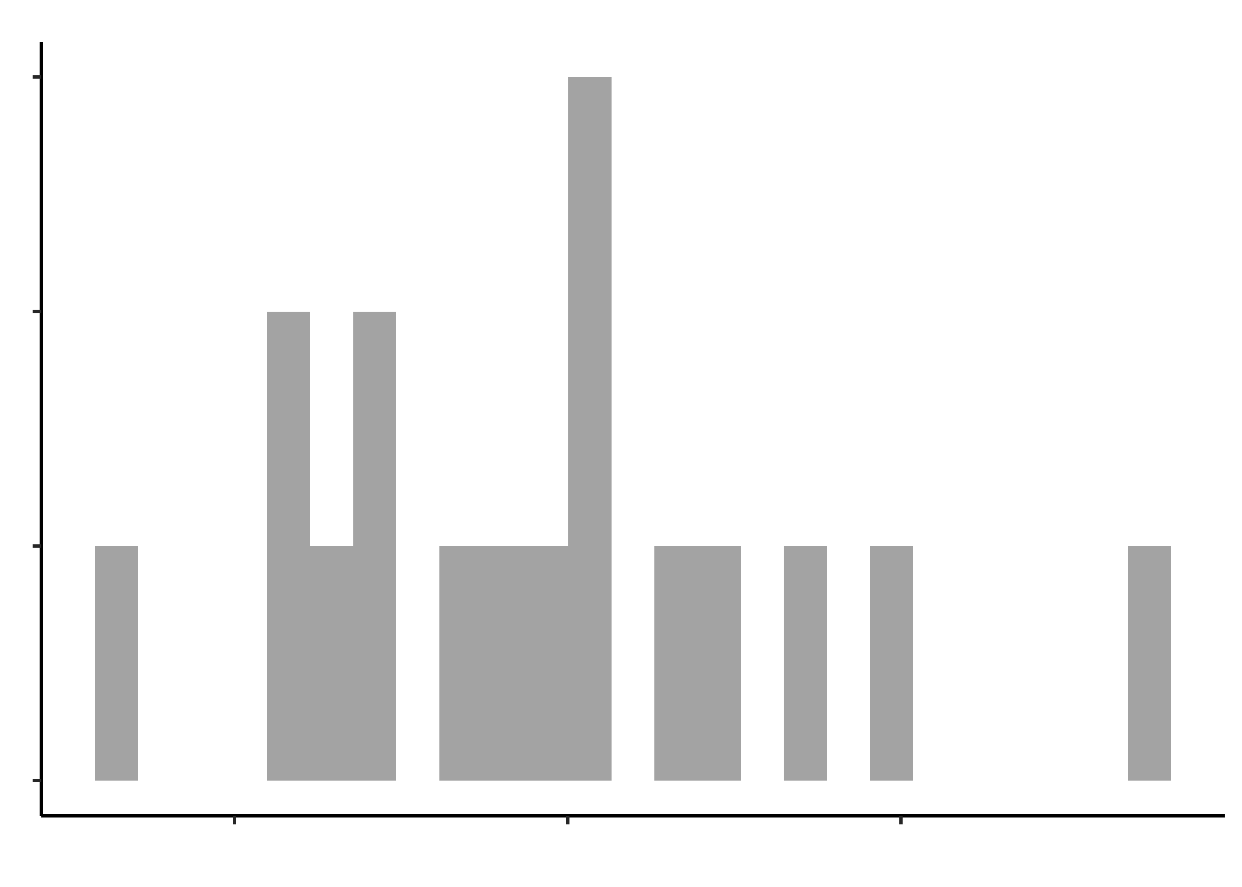
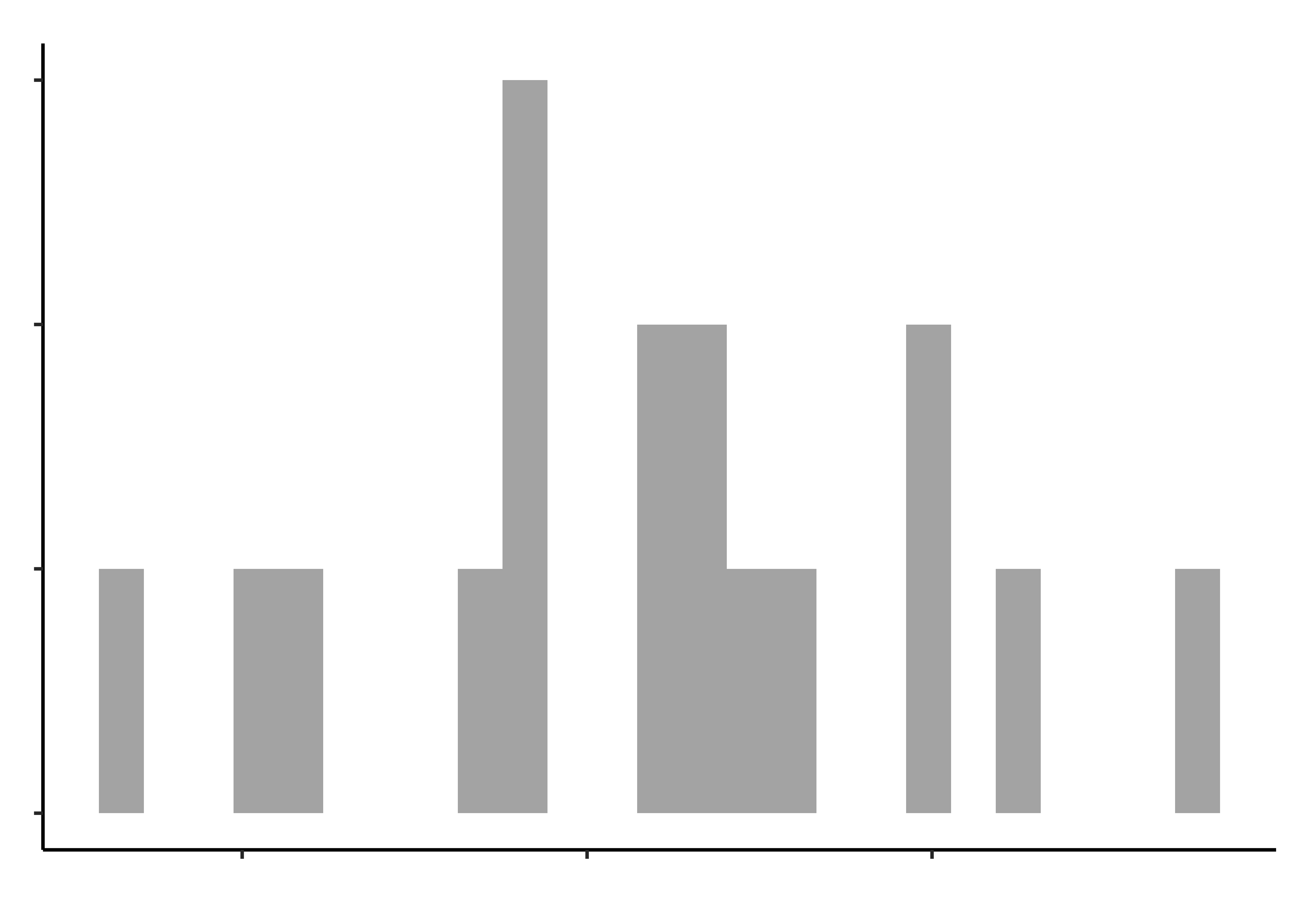
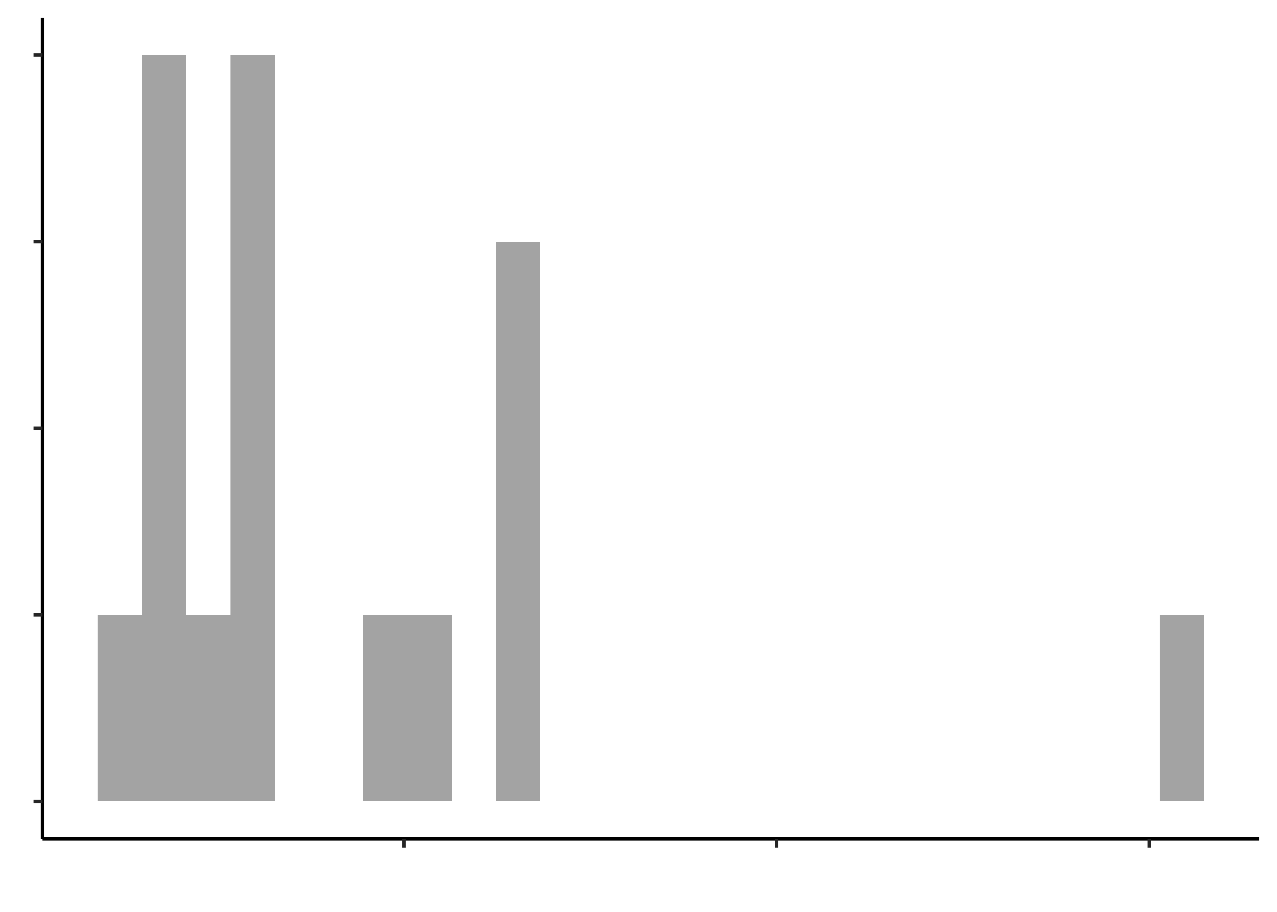
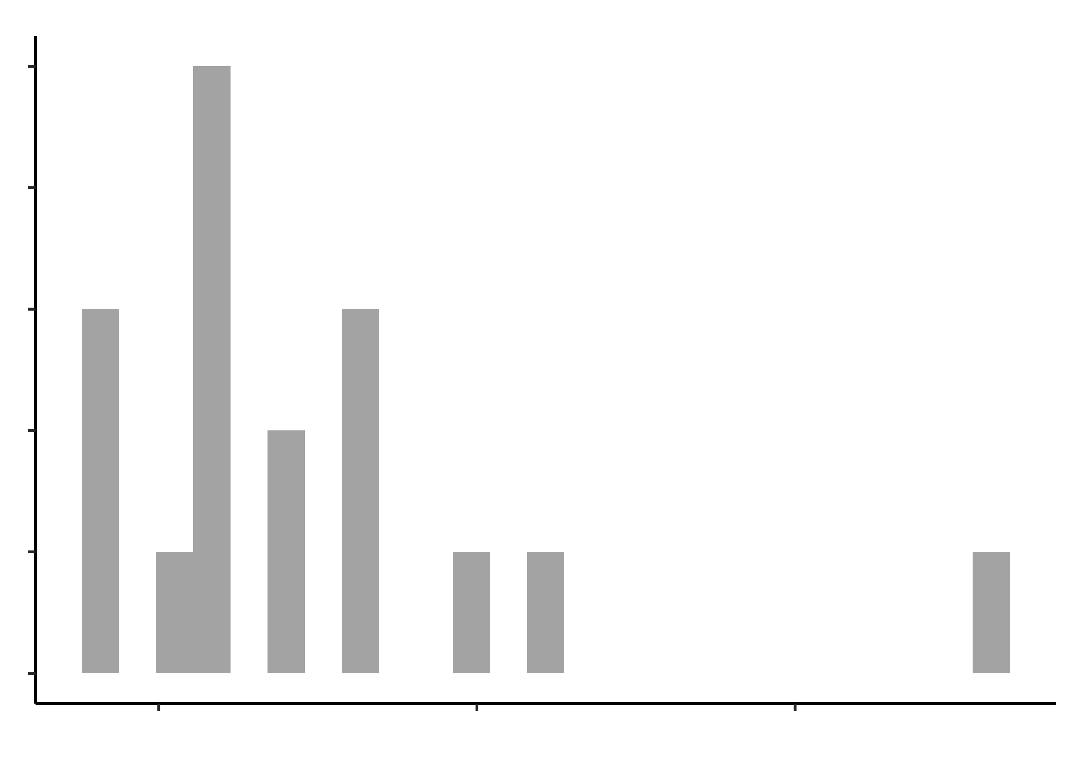
Histograms do not look symmetric, but then we have only 17 observations anyway. Elderly people can’t very well be expected to be normal, bless them.
We can create more than one too, and even iteratively, after we have answered the first one and so on. Let us write two:
Q1. Do opening times for groceries vary between people with hand_pain and those without?
Q1. Do opening times for groceries vary between people of different sex?
As seen, this data is in untidy form: there are several numerical columns that have some “Qual” information embedded in their column names, such as the the kind of package that is being opened. We should transform the data into long form so that all the time numbers are stacked up in one column, and the types of packages are in another column, called grocery. For more info see https://www.garrickadenbuie.com/project/tidyexplain/.
opening_modified %>%
  pivot_longer(
    cols = -c(1:7), # Choose columns to stack (by negation)
    names_to = "operation", # Name of stack column
    values_to = "times" # Name of values column
)group <fct> | age <dbl> | sex <fct> | hand_pain <fct> | hand_illness <fct> | hand_strength <dbl> | pinch_strength <dbl> | operation <chr> | times <dbl> |
|---|---|---|---|---|---|---|---|---|
| 1 | 70 | 1 | 1 | 0 | 21.0 | 6.0 | time_jar | 11 |
| 1 | 70 | 1 | 1 | 0 | 21.0 | 6.0 | time_beverage | 5 |
| 1 | 70 | 1 | 1 | 0 | 21.0 | 6.0 | time_sauce | 17 |
| 1 | 70 | 1 | 1 | 0 | 21.0 | 6.0 | time_juice | 15 |
| 1 | 70 | 1 | 1 | 0 | 21.0 | 6.0 | time_milk | 21 |
| 1 | 70 | 1 | 1 | 0 | 21.0 | 6.0 | time_crackers | 56 |
| 1 | 70 | 1 | 1 | 0 | 21.0 | 6.0 | time_cheese | 14 |
| 1 | 70 | 1 | 1 | 0 | 21.0 | 6.0 | time_chickpeas | 35 |
| 1 | 70 | 1 | 1 | 0 | 21.0 | 6.0 | time_bottle | 10 |
| 1 | 70 | 1 | 1 | 0 | 21.0 | 6.0 | time_soup | 6 |
Once we do this, we realize that the word “time” in the column operation adds no value, since we want only the grocery involved.
opening_modified %>%
  pivot_longer(
    cols = -c(1:7),
    names_to = "operation",
    values_to = "times"
  ) %>%
  # knock off that "time" word
  tidyr::separate_wider_delim(
    cols = operation,
    delim = "time_",
    # Rename "operation" column as "grocery", drop the silly column now containing only "_time"
    names = c(NA, "grocery")
)group <fct> | age <dbl> | sex <fct> | hand_pain <fct> | hand_illness <fct> | hand_strength <dbl> | pinch_strength <dbl> | grocery <chr> | times <dbl> |
|---|---|---|---|---|---|---|---|---|
| 1 | 70 | 1 | 1 | 0 | 21.0 | 6.0 | jar | 11 |
| 1 | 70 | 1 | 1 | 0 | 21.0 | 6.0 | beverage | 5 |
| 1 | 70 | 1 | 1 | 0 | 21.0 | 6.0 | sauce | 17 |
| 1 | 70 | 1 | 1 | 0 | 21.0 | 6.0 | juice | 15 |
| 1 | 70 | 1 | 1 | 0 | 21.0 | 6.0 | milk | 21 |
| 1 | 70 | 1 | 1 | 0 | 21.0 | 6.0 | crackers | 56 |
| 1 | 70 | 1 | 1 | 0 | 21.0 | 6.0 | cheese | 14 |
| 1 | 70 | 1 | 1 | 0 | 21.0 | 6.0 | chickpeas | 35 |
| 1 | 70 | 1 | 1 | 0 | 21.0 | 6.0 | bottle | 10 |
| 1 | 70 | 1 | 1 | 0 | 21.0 | 6.0 | soup | 6 |
OK, looking better! Now if we plot times, we can colour or facet by grocery.
First Plot
theme_set(theme_custom())
##
opening_modified %>%
pivot_longer(
cols = -c(1:7),
names_to = "operation",
values_to = "times"
) %>%
# knock off that "time" word
tidyr::separate_wider_delim(operation,
delim = "time_",
names = c(NA, "grocery")
) %>%
## First Plot
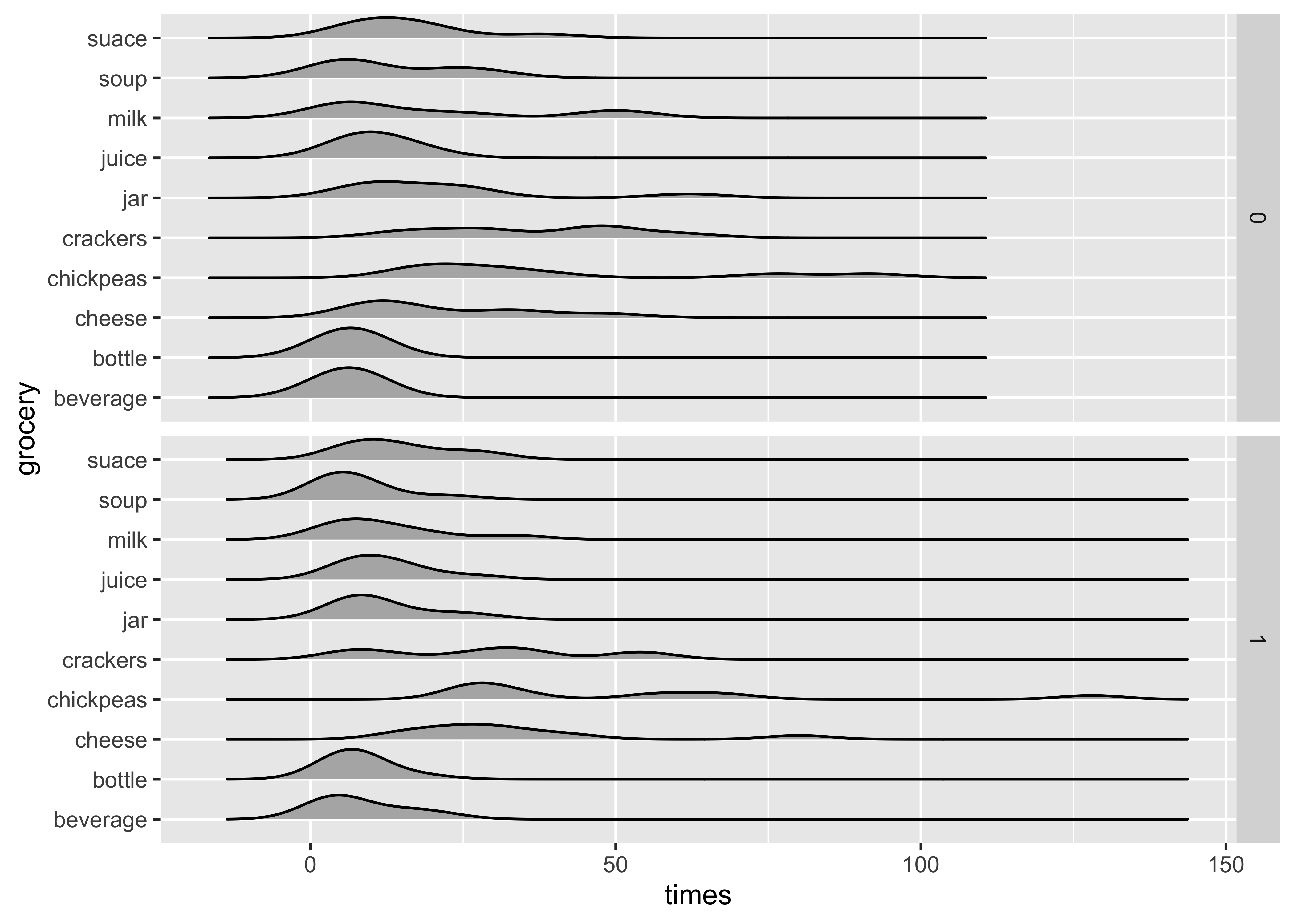
gf_density_ridges(grocery ~ times,
fill = "grey70", scale = 0.75
) %>%
gf_facet_grid(hand_pain ~ .) %>%
gf_labs(
title = "Distribution of Opening and Closing Times",
subtitle = "For Various Grocery Packagings"
)
Ok! Not bad! We now want to label to do two things:
- label facets
0and1as “Pain” and “No Pain”. - Reorder the
groceriesso that they are in decreasing order of me(di)an(times). - In two steps!!
# Set graph theme
theme_set(new = theme_custom())
#
opening_modified %>%
  pivot_longer(
    cols = -c(1:7),
    names_to = "operation",
    values_to = "times"
  ) %>%
  # knock off that "time" word
  tidyr::separate_wider_delim(operation,
    delim = "time_",
    names = c(NA, "grocery")
  ) %>%
  # Re-label the factor hand_pain
  # Use base::factor() as this command is more clear to me
  mutate(
    hand_pain =
      base::factor(hand_pain,
        levels = c(0, 1),
        labels = c("No Hand Pain", "Hand Pain")
      )
  ) %>%
  ## First Plot
  gf_density_ridges(grocery ~ times,
    fill = "grey70", scale = 0.75
  ) %>%
  gf_facet_grid(hand_pain ~ .) %>%
  gf_labs(
    title = "Distribution of Opening and Closing Times",
    subtitle = "For Various Grocery Packagings"
  )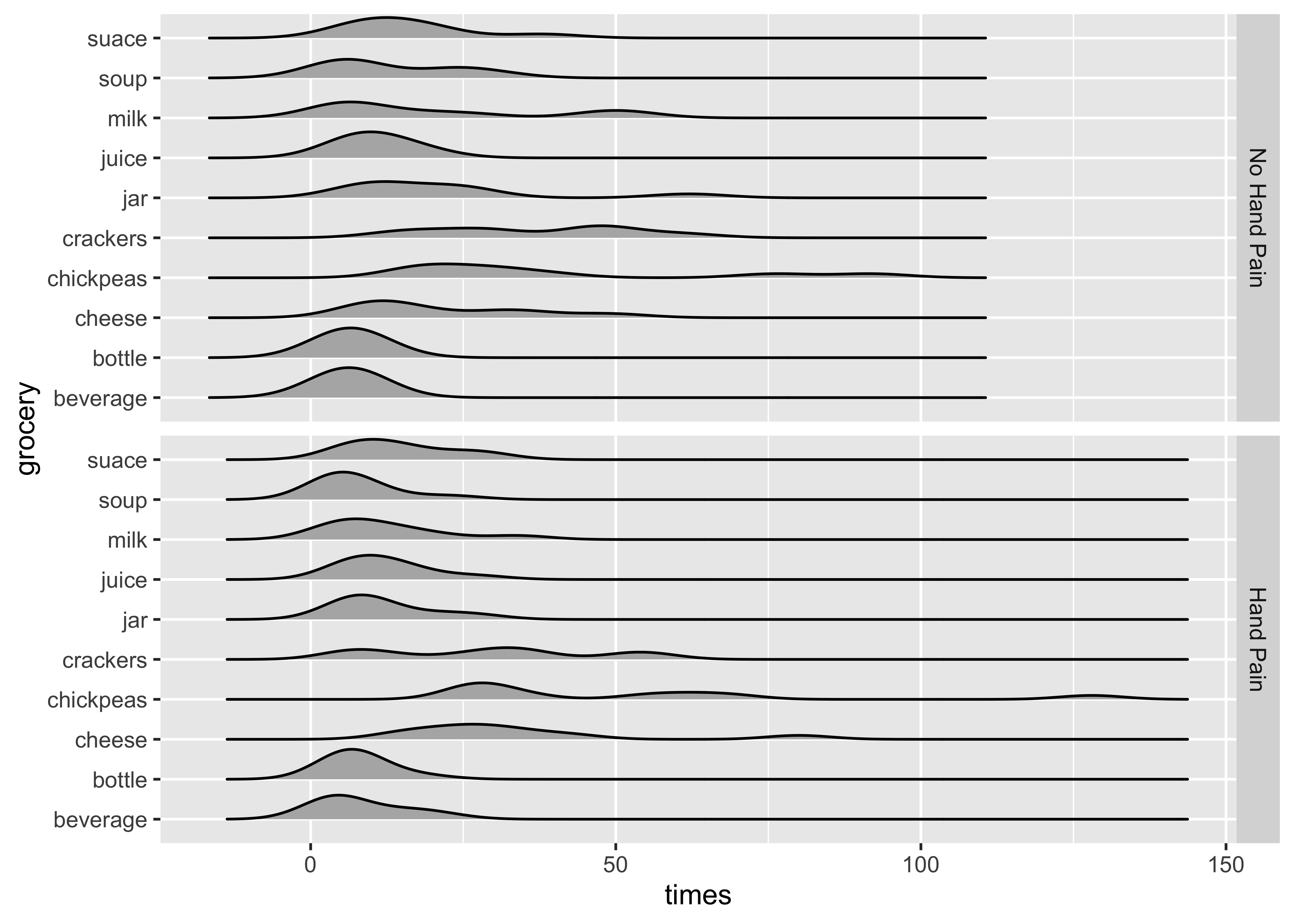
And to reorder the groceries in decreasing order of me(di)an (times):
This does not seem to be happening at this time. Needs to be checked! Wonder what this chart is thinking…
# Set graph theme
theme_set(new = theme_custom())
#
opening_modified %>%
  pivot_longer(
    cols = -c(1:7),
    names_to = "operation",
    values_to = "times"
  ) %>%
  # knock off that "time" word
  tidyr::separate_wider_delim(operation,
    delim = "time_",
    names = c(NA, "grocery")
  ) %>%
  # Re-label the factor hand_pain
  # Use base::factor() as this command is more clear to me
  mutate(
    hand_pain =
      base::factor(hand_pain,
        levels = c(0, 1),
        labels = c("No Hand Pain", "Hand Pain")
      )
  ) %>%
  ## First Plot modified

  gf_density_ridges(
    reorder(
      grocery, # reorder the grocery var
      times, # based on times variable
      FUN = median
    ) # taking the median times
    ~ times,
    fill = "grey70", scale = 0.75
  ) %>%
  gf_facet_grid(hand_pain ~ .) %>%
  gf_labs(
    title = "Distribution of Opening and Closing Times",
    subtitle = "For Various Grocery Packagings"
  )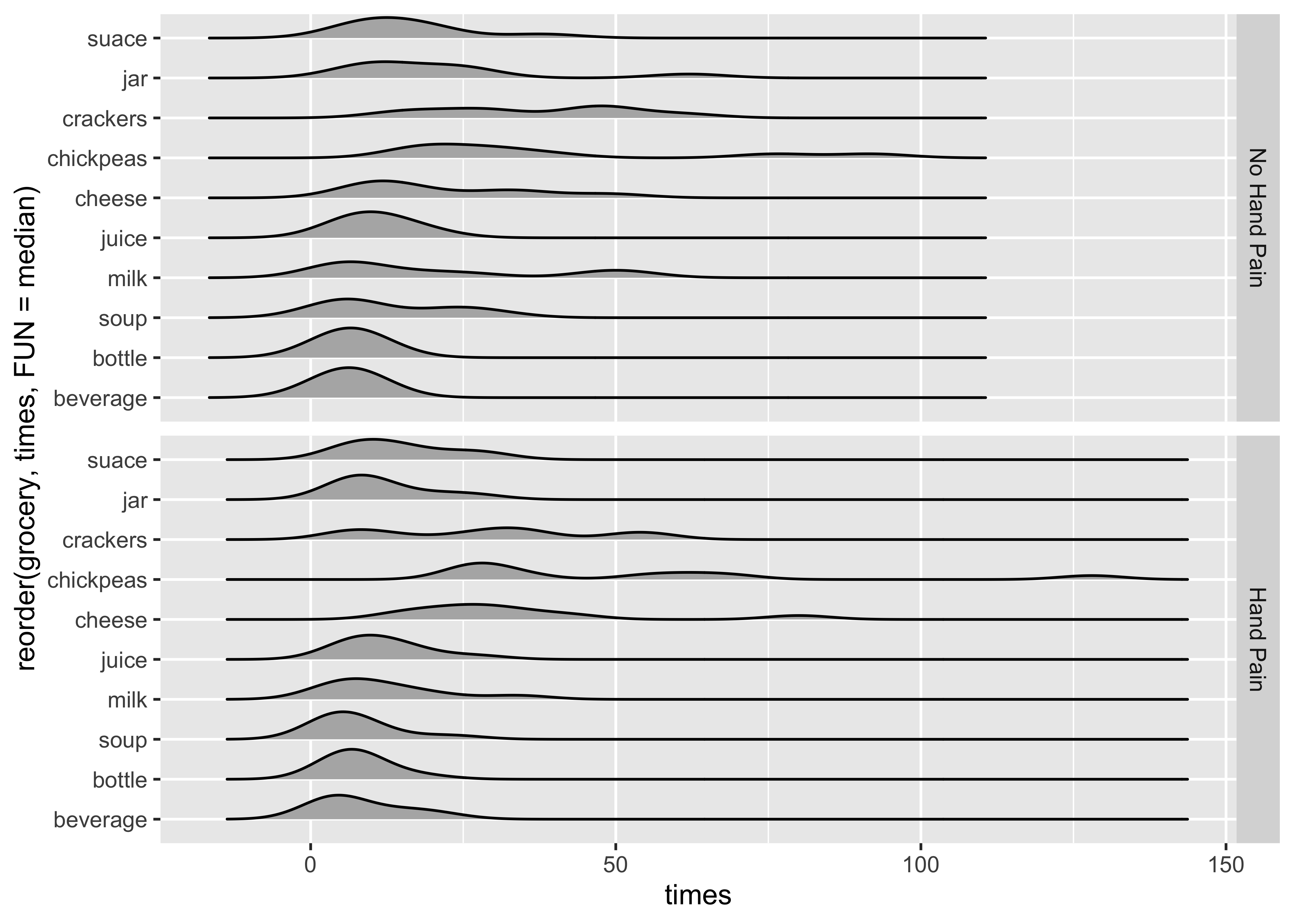
Almost done! We need to relabel the y-axis name and also add some title and subtitles to our plot. And maybe add a point on each sub-plot to show the median opening times?
theme_set(theme_custom())
##
opening_modified %>%
pivot_longer(
cols = -c(1:7),
names_to = "operation",
values_to = "times"
) %>%
# knock off that "time" word
tidyr::separate_wider_delim(operation,
delim = "time_",
names = c(NA, "grocery")
) %>%
# Re-label the factor hand_pain
# Use base::factor() as this command is more clear to me
mutate(
hand_pain =
base::factor(hand_pain,
levels = c(0, 1),
labels = c("No Hand Pain", "Hand Pain")
)
) %>%
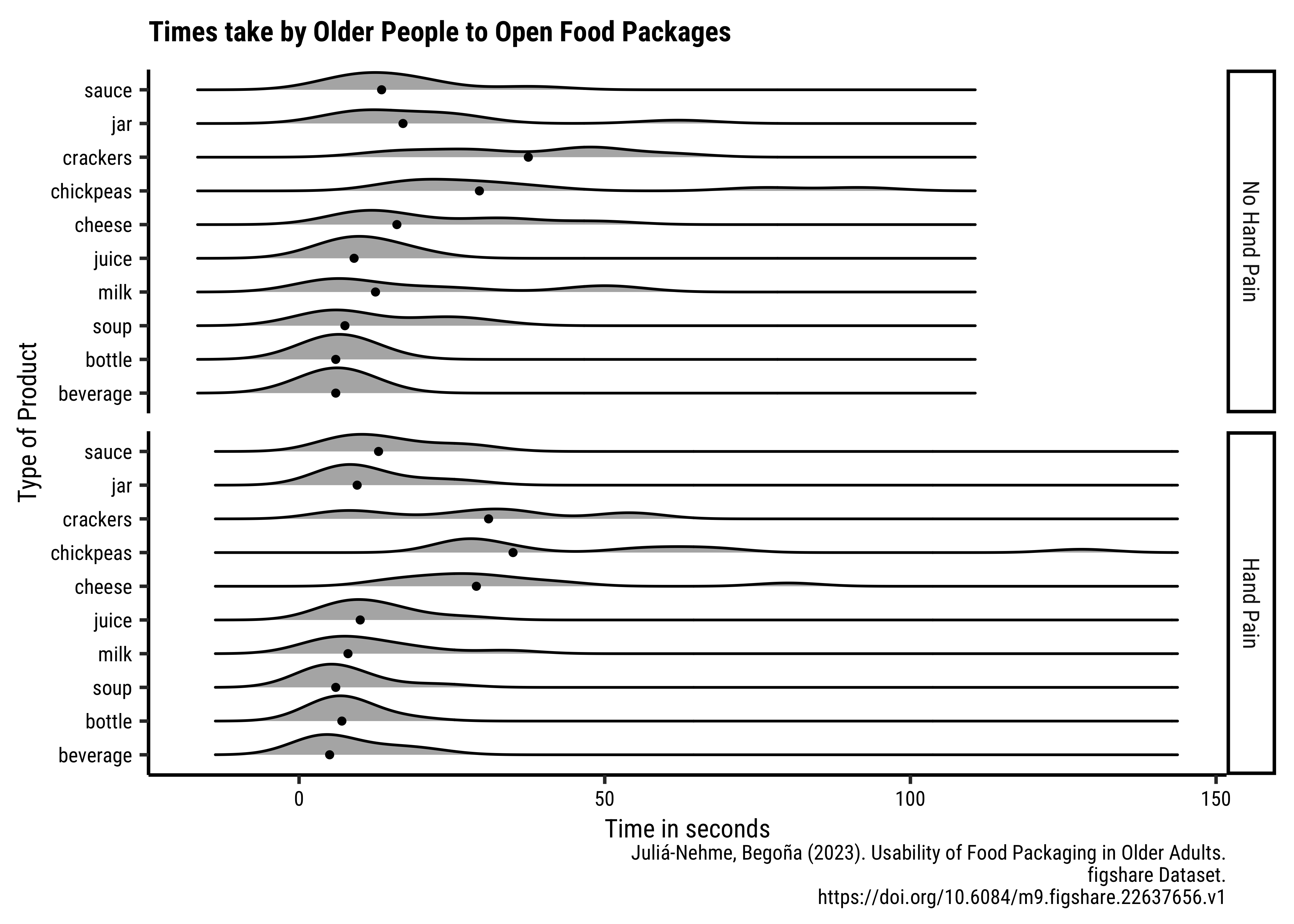
group_by(grocery, hand_pain) %>%
## First Plot modified
gf_density_ridges(
reorder(
grocery, # reorder the grocery var
times, # based on times variable
FUN = median
) # taking the median times
~ times,
fill = "grey70", scale = 0.75
) %>%
## Add the median points
gf_summary(
fun = "median", color = "black",
size = 1,
geom = "point"
) %>%
## Facet by hand_pain
gf_facet_grid(hand_pain ~ .) %>%
## Add titles and labels
gf_labs(
title = "Times take by Older People to Open Food Packages",
x = "Time in seconds",
y = "Type of Product",
caption = "Juliá-Nehme, Begoña (2023). Usability of Food Packaging in Older Adults.\n figshare Dataset.\n https://doi.org/10.6084/m9.figshare.22637656.v1"
)
# %>% gf_theme(theme_custom())Closing Times Analysis
Since the as.numeric did not work for us in the analysis of opening data, I have found and used another function as_numeric from the sjlabelled package. Sigh.
theme_set(theme_custom())
##
closing %>%
  mutate(across(starts_with("time"), sjlabelled::as_numeric)) %>%
  pivot_longer(
    cols = -c(1:7), names_to = "operation",
    values_to = "times"
  ) %>%
  separate_wider_delim(operation,
    delim = "time_",
    names = c(NA, "operation")
  ) %>%
  mutate(
    operation = str_replace(string = operation, pattern = "suace", replacement = "sauce"),
    hand_pain = factor(hand_pain,
      levels = c(0, 1),
      labels = c("No Hand Pain", "Hand Pain")
    )
  ) %>%
  group_by(operation, hand_pain) %>%
  gf_density_ridges(reorder(operation, times, FUN = mean) ~ times,
    fill = "grey70", scale = 0.75
  ) %>%
  gf_summary(fun = "mean", color = "black", size = 1, geom = "point") %>%
  gf_facet_grid(hand_pain ~ .) %>%
  gf_labs(
    title = "Times take by Older People to Close Food Packages",
    x = "Time in seconds", y = "Type of Product",
    caption = "Juliá-Nehme, Begoña (2023). Usability of Food Packaging in Older Adults.\n figshare Dataset.\n https://doi.org/10.6084/m9.figshare.22637656.v1"
  )
# %>%
#   gf_theme(theme_custom())
Task and Discussion
- Complete the Data Dictionary.
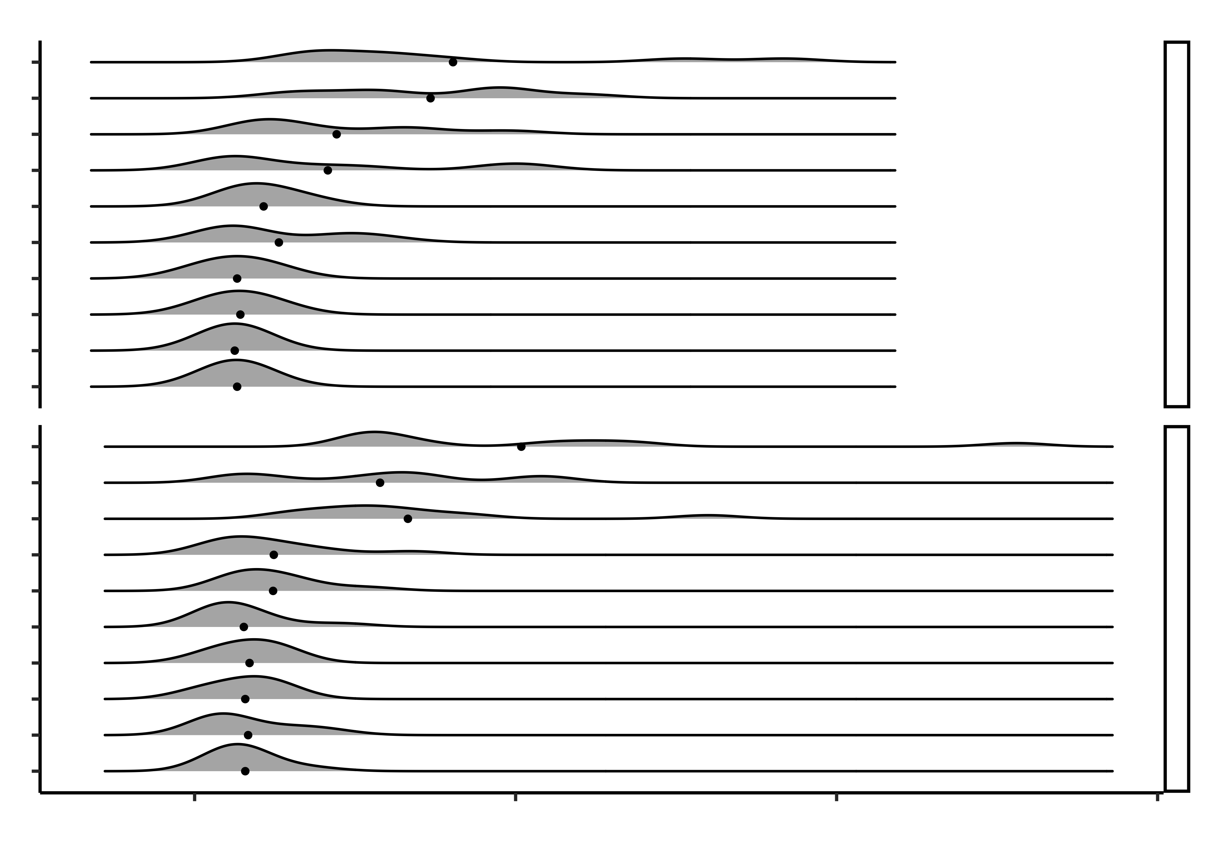
- Create the graph shown and discuss the following questions:
- What is the kind of plot used in the chart? A facetted ridge plot with medians marked using points
- What variables have been used in the chart?
- Time on X; Grocery Item on Y; Density on the ridges; Hand Pain for faceting
- Q1. Do opening times for groceries vary between people with hand_pain and those without?
- Yes; the people with hand pain take longer to open the packages (meh, but all right!) While medians are not too different across the two groups, the distribution tails extend longer in the case of hand_pain = YES.
- Why do that lines abruptly stop towards the right side of the upper half of the chart?
- Because the extreme times are shorter across the board for closing, as compared to opening.
References
- Colour in R: https://r-for-artists.netlify.app/labs/04-graphics/04-colors
- The
paletteerpackage Over 2500 colour palettes are available in thepaletteerpackage. Can you findtayloRswift?wesanderson?harrypotter?timburton?
Here are the Qualitative Palettes (searchable):
And the Quantitative/Continuous palettes (searchable):
Use the commands:
Qual variable-> colour/fill:
scale_colour_paletteer_d(name = "Legend Name", palette = "package::palette", dynamic = TRUE/FALSE)Quant variable-> colour/fill:
scale_colour_paletteer_c(name = "Legend Name", palette = "package::palette", dynamic = TRUE/FALSE)
- If you want those funky icons at the Section Headers, install this Quarto Extension, and then choosing the icons you want from https://iconify.design and using the
iconifyshortcode syntax shown below.
{{< iconify fluent-emoji exploding-head >}}
{{< iconify fa6-brands apple width=50px height=10px rotate=90deg flip=vertical >}}
{{< iconify simple-icons:quarto >}}