Iteration: Learning to purrr
Performing Iterations in R

Often we want to perform the same operation on several different sets of data. Rather than repeat the operation for each instance of data, it is faster, more intuitive, and less error-prone if we create a data structure that holds all the data, and use the map-* series functions from the purrr package to perform all the repeated operations in one shot.
This requires getting used to. We need to understand:
- the data structure
- the iteration mechanism using
mapfunctions - the form of the results
gapminder
We will start with a complete case study and then work backwards to understand the various pieces of code that make it up.
Let us look at the gapminder dataset:
skimr::skim(gapminder)| Name | gapminder |
| Number of rows | 1704 |
| Number of columns | 6 |
| _______________________ | |
| Column type frequency: | |
| factor | 2 |
| numeric | 4 |
| ________________________ | |
| Group variables | None |
Variable type: factor
| skim_variable | n_missing | complete_rate | ordered | n_unique | top_counts |
|---|---|---|---|---|---|
| country | 0 | 1 | FALSE | 142 | Afg: 12, Alb: 12, Alg: 12, Ang: 12 |
| continent | 0 | 1 | FALSE | 5 | Afr: 624, Asi: 396, Eur: 360, Ame: 300 |
Variable type: numeric
| skim_variable | n_missing | complete_rate | mean | sd | p0 | p25 | p50 | p75 | p100 | hist |
|---|---|---|---|---|---|---|---|---|---|---|
| year | 0 | 1 | 1979.50 | 17.27 | 1952.00 | 1965.75 | 1979.50 | 1993.25 | 2007.0 | ▇▅▅▅▇ |
| lifeExp | 0 | 1 | 59.47 | 12.92 | 23.60 | 48.20 | 60.71 | 70.85 | 82.6 | ▁▆▇▇▇ |
| pop | 0 | 1 | 29601212.32 | 106157896.74 | 60011.00 | 2793664.00 | 7023595.50 | 19585221.75 | 1318683096.0 | ▇▁▁▁▁ |
| gdpPercap | 0 | 1 | 7215.33 | 9857.45 | 241.17 | 1202.06 | 3531.85 | 9325.46 | 113523.1 | ▇▁▁▁▁ |
We have lifeExp, gdpPerCap, and pop as Quant variables over time (year) for each country in the world. Suppose now that we wish to create Linear Regression Models predicting lifeExp using year, for each country. ( We will leave out gdpPercap and pop for now) The straightforward by laborious and naive way would be to use the lm command after filtering the dataset for each country, creating 140+ Linear Models manually! This would be horribly tedious!
There is a better way with purrr, and also more recently, with dplyr itself. Let us see both methods, the established purrr method first, and the new dplyr based method thereafter.
We can first plot lifeExp over year, grouped by country:
ggplot(gapminder, aes(x = year, y = lifeExp, colour = country)) +
  geom_line(show.legend = FALSE) +
  theme_classic()
ggplot(gapminder, aes(x = year, y = lifeExp, colour = country)) +
  geom_line(show.legend = FALSE) +
  facet_wrap(~continent) +
  theme_classic()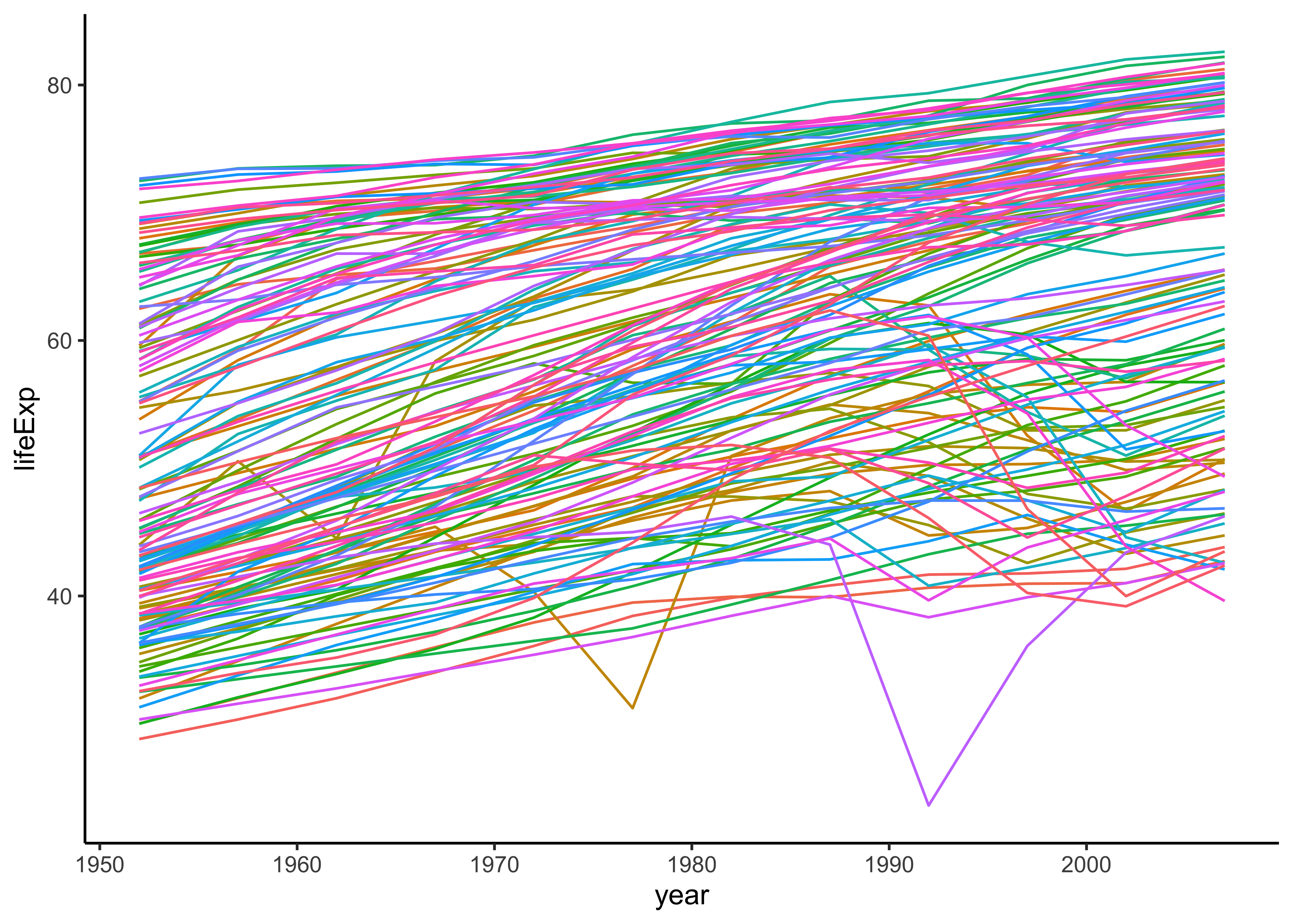
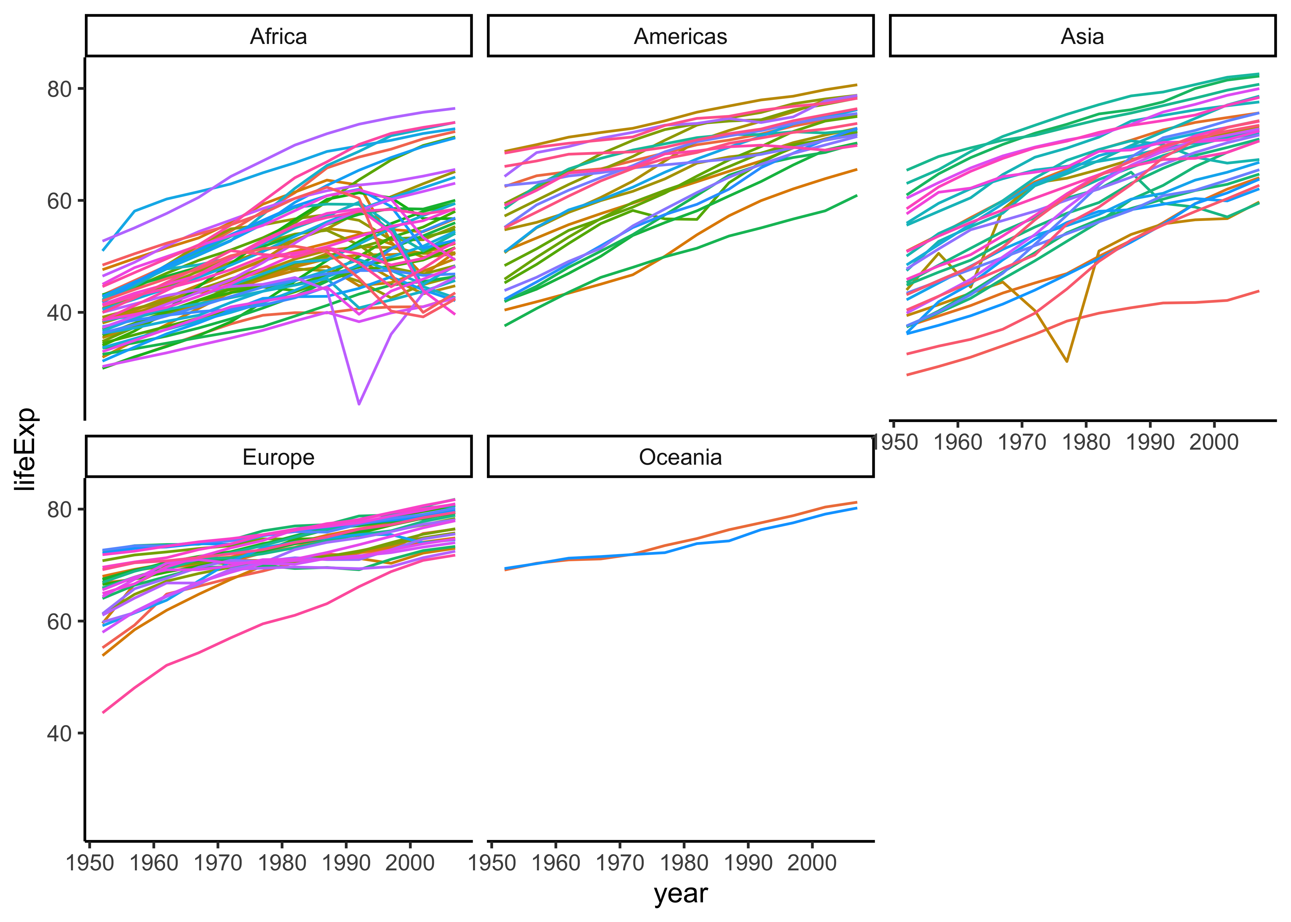
By and large we see positive slopes, but some countries do show non-linear behaviour.
Constructing a Linear Model
Let us take lifeExp using year1950 across all countries together:
gapminder <- gapminder %>%
  mutate(year1950 = year - 1950) # baseline year
model <- lm(lifeExp ~ year1950, data = gapminder)
summary(model)
Call:
lm(formula = lifeExp ~ year1950, data = gapminder)

Residuals:
    Min      1Q  Median      3Q     Max
-39.949  -9.651   1.697  10.335  22.158

Coefficients:
            Estimate Std. Error t value Pr(>|t|)
(Intercept) 49.86028    0.55792   89.37   <2e-16 ***
year1950     0.32590    0.01632   19.96   <2e-16 ***
---
Signif. codes:  0 '***' 0.001 '**' 0.01 '*' 0.05 '.' 0.1 ' ' 1

Residual standard error: 11.63 on 1702 degrees of freedom
Multiple R-squared:  0.1898,    Adjusted R-squared:  0.1893
F-statistic: 398.6 on 1 and 1702 DF,  p-value: < 2.2e-16
model %>% broom::tidy() # Parameters of the Model
model %>% broom::glance() # Statistics of the Modelterm <chr> | estimate <dbl> | std.error <dbl> | statistic <dbl> | p.value <dbl> |
|---|---|---|---|---|
| (Intercept) | 49.8602765 | 0.55791833 | 89.36841 | 0.000000e+00 |
| year1950 | 0.3259038 | 0.01632369 | 19.96509 | 7.546795e-80 |
r.squared <dbl> | adj.r.squared <dbl> | sigma <dbl> | statistic <dbl> | p.value <dbl> | df <dbl> | logLik <dbl> | AIC <dbl> | BIC <dbl> | deviance <dbl> | |
|---|---|---|---|---|---|---|---|---|---|---|
| 0.1897571 | 0.1892811 | 11.63055 | 398.6047 | 7.546795e-80 | 1 | -6597.866 | 13201.73 | 13218.05 | 230229.2 |
Since the slope 0.3259038 is positive, life expectancy has been increasing over the years, across all countries. (But r.squared 0.1897571 is low, so this model does not explain much).
How do we do this for each country? We need to use the split-apply-combine method to achieve this. The combination of group_by and summarise is a example of the split > apply > combine method. For example, we could (split) the data by country, calculate the linear model each group (apply), and (combine) the results in a data frame.
However, this first-attempt code for a per-country linear model does not work:
```{r}
#| eval: false
gapminder %>%
  group_by(country) %>%
  summarise(linmod = lm(lifeExp ~ year1950, data = .))
```
This is because the linmod variable is a list variable and cannot be accommodated in a simple column, which is what summarize will try to create. So we need to be able to create “list” columns in a data frame…how do we do that? Before we contemplate that, let us understand the capabilities of the purrr package in R.
The purrr package
The purrr package contains a new class of functions, that can take vectors/tibbles/lists as input, and perform an identical function over each component of these, and generate vectors/tibbles/lists as output. These are the map_* functions that are part of the purrr package. The * in the map_* function defines what kind of output (vector/tibble/list) the function generates.
Let us look at a few short examples.
Using map_* functions from purrr
The basic structure of the map_* functions is:
```{r}
#| eval: false
map_typeOfResult(
  .x = what_to_iterate_with,
  .f = function_to_apply
)

map_typeOfResult(
  .x = what_to_iterate_with,
  .f = \(x) function_to_apply(x, additional_parameters)
)
```
Two examples:
# Example 1: Input: vector, Output: vector
diamonds %>%
  select(where(is.numeric)) %>%
  # We need dbl-type numbers in output **vector**
  map_dbl(
    .x = .,
    .f = mean
  )
carat depth table price x y
0.7979397 61.7494049 57.4571839 3932.7997219 5.7311572 5.7345260
z
3.5387338 # Example 2: Input: vector, Output: tibble
diamonds %>%
select(where(is.numeric)) %>%
# We need dbl-type numbers in output **vector**
map_df(
.x = .,
.f = mean
)carat <dbl> | depth <dbl> | table <dbl> | price <dbl> | x <dbl> | y <dbl> | z <dbl> |
|---|---|---|---|---|---|---|
| 0.7979397 | 61.7494 | 57.45718 | 3932.8 | 5.731157 | 5.734526 | 3.538734 |
Note map_dbl outputs a (numeric) vector, and map_df outputs a tibble.
In each of the above examples, each vector in the diamonds dataset was passed to the respective map_* function as the parameter.x.
Sometimes the function .f may need some additional parameters to be specified, and these may not come from the input .x:
# Example 3, with additional parameters to .f
palmerpenguins::penguins %>%
  select(where(is.numeric)) %>%
  map_dbl(
    .x = .,
    .f = \(x) mean(x, na.rm = TRUE)
  )
bill_length_mm bill_depth_mm flipper_length_mm body_mass_g
43.92193 17.15117 200.91520 4201.75439
year
2008.02907 # penguins has two rows of NA entries which need to be dropped
# Hence this additional parameter for the `mean` function
# Example 4: if we want a tibble output
palmerpenguins::penguins %>%
select(where(is.numeric)) %>%
map_df(
.x = .,
.f = \(x) mean(x, na.rm = TRUE)
)bill_length_mm <dbl> | bill_depth_mm <dbl> | flipper_length_mm <dbl> | body_mass_g <dbl> | year <dbl> |
|---|---|---|---|---|
| 43.92193 | 17.15117 | 200.9152 | 4201.754 | 2008.029 |
The .f function can be anything, even a ggformula plot command; in this case the output will not be a vector or a tibble, but a list:
# library(ggformula)
palmerpenguins::penguins %>%
  select(where(is.numeric)) %>%
  select(-year) %>%
  drop_na() %>%
  # `map` gives a list output
  map(
    .x = .,
    .f = \(x) gf_histogram(~x, bins = 30) %>%
      gf_theme(theme_classic())
  )
$bill_length_mm
$bill_depth_mm
$flipper_length_mm
$body_mass_g
OK, so we can get vectors/tibbles/lists as output using vectors as inputs. Why would it be desirable to provide tibble/list as an input to a map_* function?
purrr to create multiple models
Now that we have some handle on purrr’s map functions, we can see how to develop a linear regression model for every country in the gapminder dataset. It should be clear from the command for a linear model:
```{r}
#| eval: false
model <- lm(target ~ predictor(s),
  data = tibble_containing_target_and_predictors_columns
)
```
that we need to specify three things: target, predictors, and the data tibble for the development of a linear model. To do this for each country in gapminder, here is the process:
- Group the
gapminderdata bycountry(andcontinent) - Create a column containing unique per-country
datafor each country. This column would hence contain atibblein each cell. This is alistcolumn! - Use
mapwhich would takecountryand thedatacolumns created above to create anlmobject for each country (in another list column) - Use
mapagain withbroom::tidyas the function to give us clean columns for the model per country. - Use that multi-model tibble to plot graphs for each country.
Let us do this now!
gapminder_models <- gapminder %>%
  group_by(continent, country) %>%
  # Create a per-country tibble in a new column called "data_list"
  nest(.key = "data_list")
gapminder_modelscountry <fct> | continent <fct> | data_list <list> | ||
|---|---|---|---|---|
| Afghanistan | Asia | <tibble[,5]> | ||
| Albania | Europe | <tibble[,5]> | ||
| Algeria | Africa | <tibble[,5]> | ||
| Angola | Africa | <tibble[,5]> | ||
| Argentina | Americas | <tibble[,5]> | ||
| Australia | Oceania | <tibble[,5]> | ||
| Austria | Europe | <tibble[,5]> | ||
| Bahrain | Asia | <tibble[,5]> | ||
| Bangladesh | Asia | <tibble[,5]> | ||
| Belgium | Europe | <tibble[,5]> |
gapminder_models <- gapminder_models %>%
  # We use mutate + map to add a list column containing linear models
  mutate(model = map(
    .x = data_list,

    # One column .x to iterate over
    # The .x list column contains data frames
    # So we access individual columns for target and predictors
    # within these individual data frames
    .f = \(.x) lm(lifeExp ~ year1950, data = .x)
  )) %>%
  # Use mutate + map again to expose the columns of the models
  # Use broom:: tidy, broom::glance(), and
  # Use broom::augment for separate columns
  mutate(
    model_params = map(
      .x = model,
      .f = \(.x) broom::tidy(.x,
        conf.int = TRUE,
        conf.lvel = 0.95
      )
    ),
    model_metrics = map(
      .x = model,
      .f = \(.x) broom::glance(.x)
    ),
    model_augment = map(
      .x = model,
      .f = \(.x) broom::augment(.x)
    )
  )
gapminder_modelscountry <fct> | continent <fct> | data_list <list> | model <list> | model_params <list> | model_metrics <list> | model_augment <list> |
|---|---|---|---|---|---|---|
| Afghanistan | Asia | <tibble[,5]> | <S3: lm> | <tibble[,7]> | <tibble[,12]> | <tibble[,8]> |
| Albania | Europe | <tibble[,5]> | <S3: lm> | <tibble[,7]> | <tibble[,12]> | <tibble[,8]> |
| Algeria | Africa | <tibble[,5]> | <S3: lm> | <tibble[,7]> | <tibble[,12]> | <tibble[,8]> |
| Angola | Africa | <tibble[,5]> | <S3: lm> | <tibble[,7]> | <tibble[,12]> | <tibble[,8]> |
| Argentina | Americas | <tibble[,5]> | <S3: lm> | <tibble[,7]> | <tibble[,12]> | <tibble[,8]> |
| Australia | Oceania | <tibble[,5]> | <S3: lm> | <tibble[,7]> | <tibble[,12]> | <tibble[,8]> |
| Austria | Europe | <tibble[,5]> | <S3: lm> | <tibble[,7]> | <tibble[,12]> | <tibble[,8]> |
| Bahrain | Asia | <tibble[,5]> | <S3: lm> | <tibble[,7]> | <tibble[,12]> | <tibble[,8]> |
| Bangladesh | Asia | <tibble[,5]> | <S3: lm> | <tibble[,7]> | <tibble[,12]> | <tibble[,8]> |
| Belgium | Europe | <tibble[,5]> | <S3: lm> | <tibble[,7]> | <tibble[,12]> | <tibble[,8]> |
We can now take this tibble with multiple models and use broom to tidy, to glance at, and to augment the models:
params <- gapminder_models %>%
  select(continent, country, model_params, model_metrics) %>%
  ungroup() %>%
  # Now unpack the linear model parameters into columns
  unnest(cols = model_params)
paramscontinent <fct> | country <fct> | term <chr> | estimate <dbl> | std.error <dbl> | statistic <dbl> | p.value <dbl> | conf.low <dbl> | conf.high <dbl> | model_metrics <list> |
|---|---|---|---|---|---|---|---|---|---|
| Asia | Afghanistan | (Intercept) | 29.35663753 | 0.698981278 | 41.9991758 | 1.404235e-12 | 27.799210188 | 30.9140649 | <tibble[,12]> |
| Asia | Afghanistan | year1950 | 0.27532867 | 0.020450934 | 13.4628901 | 9.835213e-08 | 0.229761152 | 0.3208962 | <tibble[,12]> |
| Europe | Albania | (Intercept) | 58.55976177 | 1.133575812 | 51.6593254 | 1.787180e-13 | 56.033997463 | 61.0855261 | <tibble[,12]> |
| Europe | Albania | year1950 | 0.33468322 | 0.033166387 | 10.0910363 | 1.462763e-06 | 0.260783901 | 0.4085825 | <tibble[,12]> |
| Africa | Algeria | (Intercept) | 42.23641492 | 0.756269040 | 55.8483987 | 8.215265e-14 | 40.551342487 | 43.9214873 | <tibble[,12]> |
| Africa | Algeria | year1950 | 0.56927972 | 0.022127070 | 25.7277493 | 1.808143e-10 | 0.519977535 | 0.6185819 | <tibble[,12]> |
| Africa | Angola | (Intercept) | 31.70797413 | 0.804287463 | 39.4236832 | 2.634887e-12 | 29.915909982 | 33.5000383 | <tibble[,12]> |
| Africa | Angola | year1950 | 0.20933986 | 0.023532003 | 8.8959644 | 4.593498e-06 | 0.156907290 | 0.2617724 | <tibble[,12]> |
| Americas | Argentina | (Intercept) | 62.22501911 | 0.167091314 | 372.4012788 | 4.795627e-22 | 61.852716465 | 62.5973218 | <tibble[,12]> |
| Americas | Argentina | year1950 | 0.23170839 | 0.004888791 | 47.3958474 | 4.215567e-13 | 0.220815486 | 0.2426013 | <tibble[,12]> |
###
metrics <- gapminder_models %>%
  select(continent, country, model_metrics) %>%
  ungroup() %>%
  # Now unpack the linear model parameters into columns
  unnest(cols = model_metrics)
metricscontinent <fct> | country <fct> | r.squared <dbl> | adj.r.squared <dbl> | sigma <dbl> | statistic <dbl> | p.value <dbl> | df <dbl> | logLik <dbl> | AIC <dbl> | |
|---|---|---|---|---|---|---|---|---|---|---|
| Asia | Afghanistan | 0.94771226 | 0.942483483 | 1.2227880 | 181.2494098 | 9.835213e-08 | 1 | -18.3469348 | 42.6938697 | |
| Europe | Albania | 0.91057777 | 0.901635545 | 1.9830615 | 101.8290138 | 1.462763e-06 | 1 | -24.1490356 | 54.2980711 | |
| Africa | Algeria | 0.98511721 | 0.983628932 | 1.3230064 | 661.9170864 | 1.808143e-10 | 1 | -19.2922136 | 44.5844272 | |
| Africa | Angola | 0.88781463 | 0.876596093 | 1.4070091 | 79.1381823 | 4.593498e-06 | 1 | -20.0309283 | 46.0618566 | |
| Americas | Argentina | 0.99556810 | 0.995124905 | 0.2923072 | 2246.3663487 | 4.215567e-13 | 1 | -1.1739328 | 8.3478656 | |
| Oceania | Australia | 0.97964774 | 0.977612511 | 0.6206086 | 481.3458627 | 8.667222e-10 | 1 | -10.2086767 | 26.4173534 | |
| Europe | Austria | 0.99213401 | 0.991347414 | 0.4074094 | 1261.2962902 | 7.435240e-12 | 1 | -5.1580921 | 16.3161841 | |
| Asia | Bahrain | 0.96673981 | 0.963413791 | 1.6395865 | 290.6597394 | 1.015855e-08 | 1 | -21.8666623 | 49.7333245 | |
| Asia | Bangladesh | 0.98936087 | 0.988296956 | 0.9766908 | 929.9263688 | 3.369501e-11 | 1 | -15.6503116 | 37.3006231 | |
| Europe | Belgium | 0.99454056 | 0.993994612 | 0.2929025 | 1821.6883955 | 1.196280e-12 | 1 | -1.1983465 | 8.3966931 |
###
augments <- gapminder_models %>%
  select(continent, country, model_augment) %>%
  ungroup() %>%
  # Now unpack the linear model parameters into columns
  unnest(cols = model_augment)
augmentscontinent <fct> | country <fct> | lifeExp <dbl> | year1950 <dbl> | .fitted <dbl> | .resid <dbl> | .hat <dbl> | .sigma <dbl> | .cooksd <dbl> | .std.resid <dbl> |
|---|---|---|---|---|---|---|---|---|---|
| Asia | Afghanistan | 28.80100 | 2 | 29.90729 | -1.106295e+00 | 0.29487179 | 1.2118126 | 2.427205e-01 | -1.0774216406 |
| Asia | Afghanistan | 30.33200 | 7 | 31.28394 | -9.519382e-01 | 0.22494172 | 1.2375118 | 1.134714e-01 | -0.8842812726 |
| Asia | Afghanistan | 31.99700 | 12 | 32.66058 | -6.635816e-01 | 0.16899767 | 1.2658863 | 3.603567e-02 | -0.5953084444 |
| Asia | Afghanistan | 34.02000 | 17 | 34.03722 | -1.722494e-02 | 0.12703963 | 1.2889171 | 1.653992e-05 | -0.0150768056 |
| Asia | Afghanistan | 36.08800 | 22 | 35.41387 | 6.741317e-01 | 0.09906760 | 1.2670034 | 1.854831e-02 | 0.5808279223 |
| Asia | Afghanistan | 38.43800 | 27 | 36.79051 | 1.647488e+00 | 0.08508159 | 1.1540018 | 9.225358e-02 | 1.4085750936 |
| Asia | Afghanistan | 39.85400 | 32 | 38.16716 | 1.686845e+00 | 0.08508159 | 1.1470760 | 9.671389e-02 | 1.4422243681 |
| Asia | Afghanistan | 40.82200 | 37 | 39.54380 | 1.278202e+00 | 0.09906760 | 1.2082426 | 6.668277e-02 | 1.1012910329 |
| Asia | Afghanistan | 41.67400 | 42 | 40.92044 | 7.535583e-01 | 0.12703963 | 1.2605826 | 3.165567e-02 | 0.6595814254 |
| Asia | Afghanistan | 41.76300 | 47 | 42.29709 | -5.340851e-01 | 0.16899767 | 1.2740508 | 2.334344e-02 | -0.4791352958 |
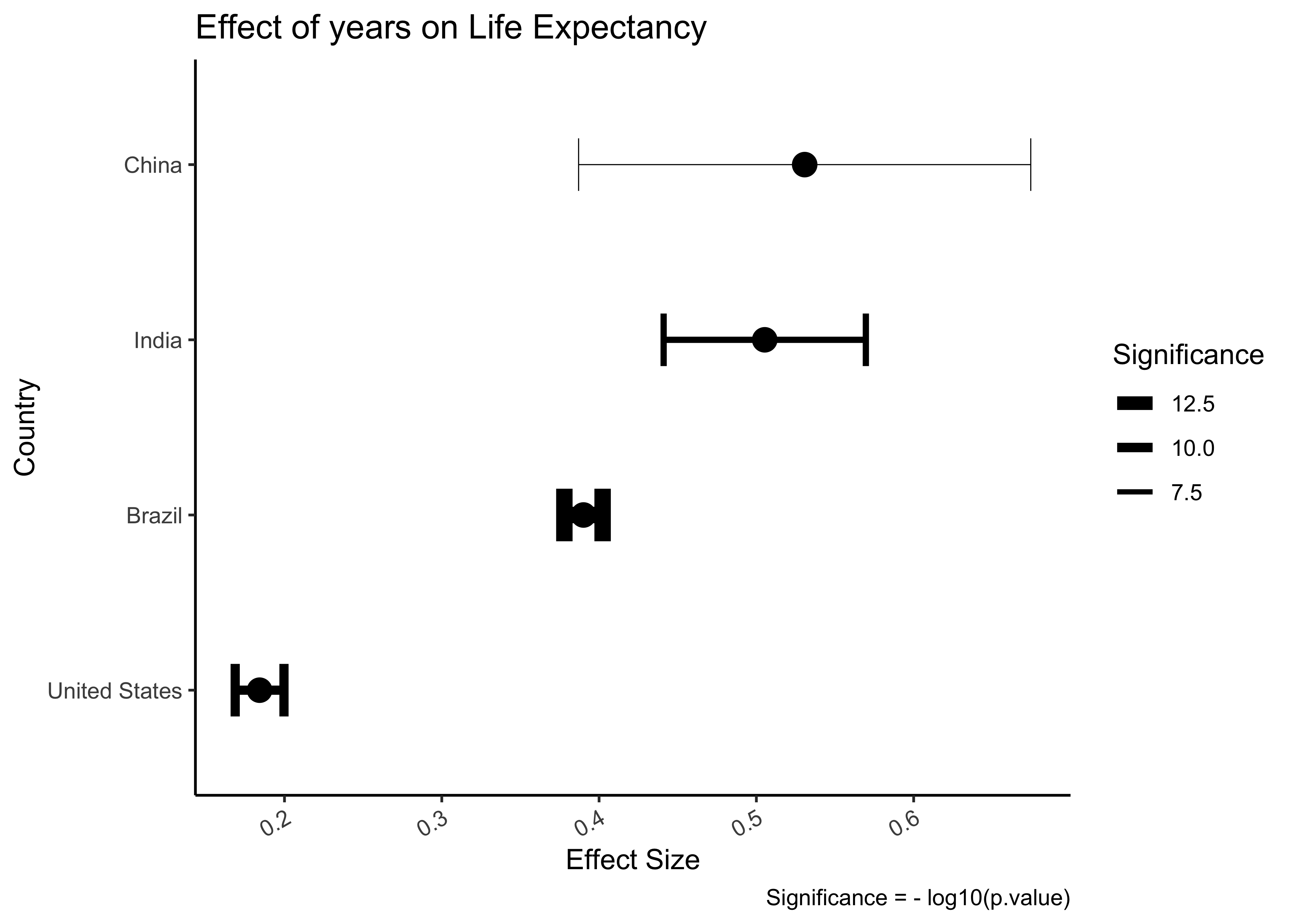
We can now plot these models and their uncertainty (i.e Confidence Intervals). We can select a few of the countries and plot:
params_filtered <- params %>%
  filter(
    country %in% c("India", "United States", "Brazil", "China"),
    term == "year1950"
  ) %>%
  select(country, estimate, conf.low, conf.high, p.value) %>%
  arrange(estimate)
params_filtered
###
params_filtered %>%
  gf_errorbar(conf.high + conf.low ~ reorder(country, estimate),
    linewidth = ~ -log10(p.value), width = 0.3,
    ylab = "Effect Size",
    xlab = "Country",
    title = "Effect of years on Life Expectancy",
    caption = "Significance = - log10(p.value)"
  ) %>%
  gf_point(estimate ~ reorder(country, estimate),
    colour = "black", size = 4
  ) %>%
  gf_theme(theme_classic()) %>%
  gf_refine(
    coord_flip(),
    scale_linewidth_continuous("Significance",
      range = c(0.2, 3)
    )
  ) %>%
  gf_refine(
    guides(linewidth = guide_legend(reverse = TRUE)),
    theme(axis.text.x = element_text(angle = 30, hjust = 1))
)country <fct> | estimate <dbl> | conf.low <dbl> | conf.high <dbl> | p.value <dbl> |
|---|---|---|---|---|
| United States | 0.1841692 | 0.1686619 | 0.1996766 | 1.369788e-10 |
| Brazil | 0.3900895 | 0.3779322 | 0.4022468 | 6.990433e-15 |
| India | 0.5053210 | 0.4410424 | 0.5695996 | 7.812981e-09 |
| China | 0.5307149 | 0.3869831 | 0.6744466 | 9.206217e-06 |
But we can do better: visualize all models at once. What we will do is to plot the r.squared on the x-axis and the model term year1950 on the y-axis. We will need to combine params and metrics to do this:
params_combo <- params %>%
  select(continent, country, term, estimate) %>%
  filter(term == "year1950") %>%
  left_join(metrics %>% select(continent, country, r.squared))
params_combo
###
params_combo %>%
  gf_point(reorder(country, r.squared) ~ r.squared,
    color = "grey70"
  ) %>%
  gf_point(reorder(country, r.squared) ~ r.squared,
    data = params_combo %>% filter(continent == "Africa"),
    shape = 21, size = 3,
    fill = "salmon",
    ylab = "Country",
    title = "African Countries are Hard to Model"
  ) %>%
  gf_label(60 ~ 0.25,
    label = "African Countries",
    fill = "salmon",
    color = "black",
    inherit = FALSE
  ) %>%
  gf_theme(theme_classic()) %>%
  gf_refine(theme(axis.text.y = element_text(size = 3, face = "bold")))
###
params_combo %>%
  gf_point(estimate ~ r.squared, color = "grey70") %>%
  gf_point(estimate ~ r.squared,
    data = params_combo %>%
      filter(continent == "Africa"),
    shape = 21, size = 3,
    fill = "salmon",
    ylab = "Slope Estimate for Linear Model",
    title = "African Countries are Hard to Model",
    show.legend = FALSE
  ) %>%
  gf_label(0.3 ~ 0.25,
    label = "African Countries",
    fill = "salmon",
    color = "black",
    inherit = FALSE
  ) %>%
gf_theme(theme_minimal())continent <fct> | country <fct> | term <chr> | estimate <dbl> | r.squared <dbl> |
|---|---|---|---|---|
| Asia | Afghanistan | year1950 | 0.27532867 | 0.94771226 |
| Europe | Albania | year1950 | 0.33468322 | 0.91057777 |
| Africa | Algeria | year1950 | 0.56927972 | 0.98511721 |
| Africa | Angola | year1950 | 0.20933986 | 0.88781463 |
| Americas | Argentina | year1950 | 0.23170839 | 0.99556810 |
| Oceania | Australia | year1950 | 0.22772378 | 0.97964774 |
| Europe | Austria | year1950 | 0.24199231 | 0.99213401 |
| Asia | Bahrain | year1950 | 0.46750769 | 0.96673981 |
| Asia | Bangladesh | year1950 | 0.49813077 | 0.98936087 |
| Europe | Belgium | year1950 | 0.20908462 | 0.99454056 |
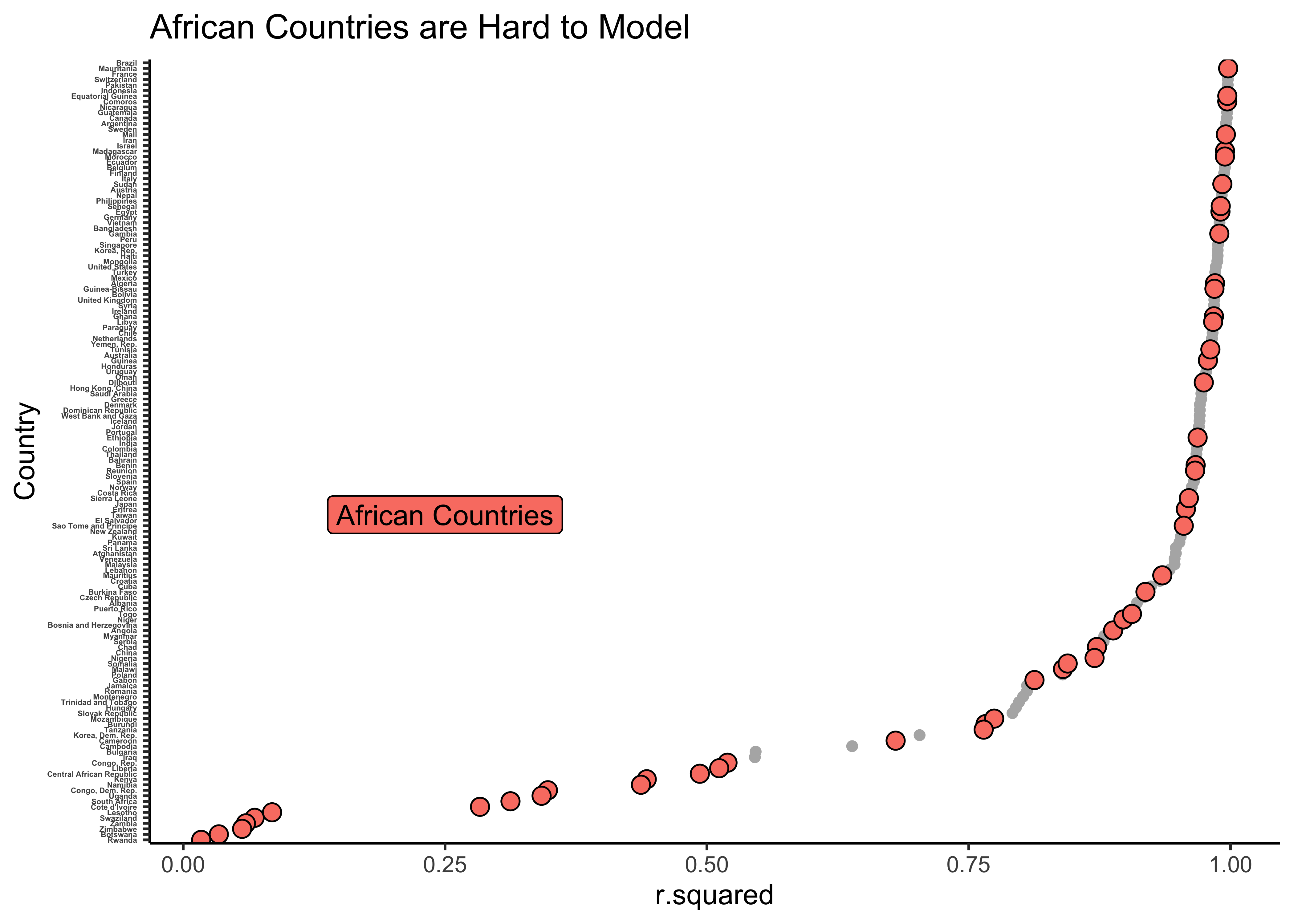
As can be seen, there are many models with low values of r.squared and these are sadly all about countries in Africa. The linear model fares badly for these countries, since there are other factors (not just year) that affects lifeExp in these countries.
We can look at the model metrics and see for which (African) countries the model fares the worst. We will reverse sort on r.squared and choose the 5 worst models:
continent <fct> | country <fct> | r.squared <dbl> | adj.r.squared <dbl> | sigma <dbl> | statistic <dbl> | p.value <dbl> | df <dbl> | logLik <dbl> | AIC <dbl> | |
|---|---|---|---|---|---|---|---|---|---|---|
| Africa | Rwanda | 0.01715964 | -0.08112440 | 6.558269 | 0.1745923 | 0.6848927 | 1 | -38.50205 | 83.00411 | |
| Africa | Botswana | 0.03402340 | -0.06257426 | 6.112177 | 0.3522177 | 0.5660414 | 1 | -37.65673 | 81.31346 | |
| Africa | Zimbabwe | 0.05623196 | -0.03814484 | 7.205431 | 0.5958240 | 0.4580290 | 1 | -39.63135 | 85.26271 | |
| Africa | Zambia | 0.05983644 | -0.03417992 | 4.528713 | 0.6364471 | 0.4435318 | 1 | -34.05859 | 74.11717 | |
| Africa | Swaziland | 0.06821087 | -0.02496805 | 6.644091 | 0.7320419 | 0.4122530 | 1 | -38.65807 | 83.31614 |
There are of course reasons for this: genocide in Rwanda, and hyper-inflation in Zimbabwe, and of course the HIV-AIDS pandemic. These reasons are not captured in the original gapminder data!
One last plot! We can plot the model intercept on the x-axis and the slope year term on the y-axis to see where countries were in the beginning (1950) and at what rate they have improved in lifeExp:
params %>%
  select(continent, country, term, estimate) %>%
  pivot_wider(
    id_cols = c(continent, country),
    names_from = term,
    values_from = estimate
  ) %>%
  left_join(metrics %>% select(continent, country, r.squared)) %>%
  gf_point(
    year1950 ~ `(Intercept)`,
    color = ~continent,
    size = ~r.squared,
    xlab = "Baseline at 1950",
    ylab = "Rate of Improvement",
    title = "Asian Countries Show Improvement in Life Expectancy",
    subtitle = "African Countries still struggling",
    caption = "Data from Gapminder"
  ) %>%
  gf_refine(
    scale_size(range = c(0.1, 4)),
    scale_color_manual(
      values =
        c(
          "Africa" = "salmon",
          "Asia" = "limegreen",
          "Americas" = "grey90",
          "Europe" = "grey90",
          "Oceania" = "grey90"
        )
    )
  ) %>%
  gf_refine(guides(size = guide_legend(reverse = TRUE))) %>%
  gf_theme(theme_classic())
Many Asian countries were low in lifeExp in 1950 and have shown good rates of improvement; r.squared is also decent. Sadly African countries had low lifeExp in 1950 and have not shown good rates of improvement.
dplyr
In recent times, the familiar dplyr package also has experimental functions that are syntactically easier and offer pretty much purrr-like capability, and without introducing the complexity of the list columns or list output.
Look the code below and decipher how it works:
# Using group_modify
gapminder_model_dplyr <- gapminder %>%
  group_by(continent, country) %>%
  # Here is the new function in dplyr!
  # No need to use `mutate`
  dplyr::group_modify(
    .data = .,

    # .f MUST generate a tibble here and *not* a list
    # Hence broom::tidy is essential!
    # glance/tidy is part of the group_map's .f variable.
    # Applies to each model

    .f = ~ lm(lifeExp ~ year, data = .) %>%
      broom::glance(
        conf.int = TRUE, # try `tidy()` and `augment()`
        conf.lvel = 0.95
      )
  ) %>%
  # We already have a grouped tibble from `group_modify()`
  # So just ungroup()
  ungroup()

gapminder_model_dplyrcontinent <fct> | country <fct> | r.squared <dbl> | adj.r.squared <dbl> | sigma <dbl> | statistic <dbl> | p.value <dbl> | df <dbl> | logLik <dbl> | AIC <dbl> | |
|---|---|---|---|---|---|---|---|---|---|---|
| Africa | Algeria | 0.98511721 | 0.983628932 | 1.3230064 | 661.9170864 | 1.808143e-10 | 1 | -19.2922136 | 44.5844272 | |
| Africa | Angola | 0.88781463 | 0.876596093 | 1.4070091 | 79.1381823 | 4.593498e-06 | 1 | -20.0309283 | 46.0618566 | |
| Africa | Benin | 0.96660199 | 0.963262188 | 1.1746910 | 289.4190308 | 1.037138e-08 | 1 | -17.8653945 | 41.7307890 | |
| Africa | Botswana | 0.03402340 | -0.062574259 | 6.1121773 | 0.3522177 | 5.660414e-01 | 1 | -37.6567298 | 81.3134597 | |
| Africa | Burkina Faso | 0.91871050 | 0.910581551 | 2.0470915 | 113.0171190 | 9.047506e-07 | 1 | -24.5303731 | 55.0607461 | |
| Africa | Burundi | 0.76599597 | 0.742595570 | 1.6107778 | 32.7343072 | 1.925677e-04 | 1 | -21.6539393 | 49.3078786 | |
| Africa | Cameroon | 0.68017839 | 0.648196233 | 3.2432136 | 21.2674310 | 9.627817e-04 | 1 | -30.0521093 | 66.1042186 | |
| Africa | Central African Republic | 0.49324448 | 0.442568926 | 3.5245290 | 9.7333814 | 1.087700e-02 | 1 | -31.0502949 | 68.1005898 | |
| Africa | Chad | 0.87237550 | 0.859613054 | 1.8314395 | 68.3548634 | 8.815616e-06 | 1 | -23.1945602 | 52.3891204 | |
| Africa | Comoros | 0.99685076 | 0.996535840 | 0.4786468 | 3165.3729709 | 7.633040e-14 | 1 | -7.0918261 | 20.1836523 |
There is no nesting and un-nesting; the data is the familiar tibble throughout! This seems like a simple and elegant method.
dplyr::group_modify
Note: group_modify is new experimental function in dplyr (June 2023), as are group_map, list_cbind and list_rbind. group_modify requires that the operation in .fgenerates a tibble, not a list, and we can retain the grouping variable easily too. We can remove the groups with ungroup.
group_modify() looks very clear and crisp, in my opinion. And very learner-friendly!
We have seen how purrr simplifies the application of functions iteratively to large groups of data, in a faster, replicable, and less error-prone manner. The basic idea (see video below) is:
- Use tidyr::nest to create a grouped data frame with a nested list column
- Use purrr::map_* to create a model for each of these data frames in the list column. The model will also be a column(usually) containing a list
- Use broom::tidy to convert the list model-column into a data frame for visualization
Rebecca Barter, Learn to purrr. https://www.rebeccabarter.com/blog/2019-08-19_purrr
Emorie Beck, Introduction to purrr. https://emoriebeck.github.io/R-tutorials/purrr/#
Sander Wuyts, purrr Tutorial. https://sanderwuyts.com/en/blog/purrr-tutorial/
Jared Wilber, Using the tidyverse for Machine Learning. https://www.jwilber.me/nest/
Dan Ovando,Data Wrangling and Model Fitting using purrr
Cormac Nolan, Modelling with Nested Data frames. https://github.com/cormac85/modelling_practice/blob/master/nested_data_frames.Rmd