Applied Metaphors: Learning TRIZ, Complexity, Data/Stats/ML using Metaphors
  1. Teaching
  2. Data Analytics for Managers and Creators
  3. Descriptive Analytics
  4. Data
  • Teaching
    • Data Analytics for Managers and Creators
      • Tools
        • Introduction to R and RStudio
        • Introduction to Radiant
        • Introduction to Orange
      • Descriptive Analytics
        • Data
        • Summaries
        • Counts
        • Quantities
        • Groups
        • Densities
        • Groups and Densities
        • Change
        • Proportions
        • Parts of a Whole
        • Evolution and Flow
        • Ratings and Rankings
        • Surveys
        • Time
        • Space
        • Networks
        • Experiments
        • Miscellaneous Graphing Tools, and References
      • Statistical Inference
        • 🧭 Basics of Statistical Inference
        • 🎲 Samples, Populations, Statistics and Inference
        • Basics of Randomization Tests
        • 🃏 Inference for a Single Mean
        • 🃏 Inference for Two Independent Means
        • 🃏 Inference for Comparing Two Paired Means
        • Comparing Multiple Means with ANOVA
        • Inference for Correlation
        • 🃏 Testing a Single Proportion
        • 🃏 Inference Test for Two Proportions
      • Inferential Modelling
        • Modelling with Linear Regression
        • Modelling with Logistic Regression
        • 🕔 Modelling and Predicting Time Series
      • Predictive Modelling
        • 🐉 Intro to Orange
        • ML - Regression
        • ML - Classification
        • ML - Clustering
      • Prescriptive Modelling
        • 📐 Intro to Linear Programming
        • 💭 The Simplex Method - Intuitively
        • 📅 The Simplex Method - In Excel
      • Workflow
        • Facing the Abyss
        • I Publish, therefore I Am
      • Case Studies
        • Demo:Product Packaging and Elderly People
        • Ikea Furniture
        • Movie Profits
        • Gender at the Work Place
        • Heptathlon
        • School Scores
        • Children's Games
        • Valentine’s Day Spending
        • Women Live Longer?
        • Hearing Loss in Children
        • California Transit Payments
        • Seaweed Nutrients
        • Coffee Flavours
        • Legionnaire’s Disease in the USA
        • Antarctic Sea ice
        • William Farr's Observations on Cholera in London
    • R for Artists and Managers
      • 🕶 Lab-1: Science, Human Experience, Experiments, and Data
      • Lab-2: Down the R-abbit Hole…
      • Lab-3: Drink Me!
      • Lab-4: I say what I mean and I mean what I say
      • Lab-5: Twas brillig, and the slithy toves…
      • Lab-6: These Roses have been Painted !!
      • Lab-7: The Lobster Quadrille
      • Lab-8: Did you ever see such a thing as a drawing of a muchness?
      • Lab-9: If you please sir…which way to the Secret Garden?
      • Lab-10: An Invitation from the Queen…to play Croquet
      • Lab-11: The Queen of Hearts, She Made some Tarts
      • Lab-12: Time is a Him!!
      • Iteration: Learning to purrr
      • Lab-13: Old Tortoise Taught Us
      • Lab-14: You’re are Nothing but a Pack of Cards!!
    • ML for Artists and Managers
      • 🐉 Intro to Orange
      • ML - Regression
      • ML - Classification
      • ML - Clustering
      • 🕔 Modelling Time Series
    • TRIZ for Problem Solvers
      • I am Water
      • I am What I yam
      • Birds of Different Feathers
      • I Connect therefore I am
      • I Think, Therefore I am
      • The Art of Parallel Thinking
      • A Year of Metaphoric Thinking
      • TRIZ - Problems and Contradictions
      • TRIZ - The Unreasonable Effectiveness of Available Resources
      • TRIZ - The Ideal Final Result
      • TRIZ - A Contradictory Language
      • TRIZ - The Contradiction Matrix Workflow
      • TRIZ - The Laws of Evolution
      • TRIZ - Substance Field Analysis, and ARIZ
    • Math Models for Creative Coders
      • Maths Basics
        • Vectors
        • Matrix Algebra Whirlwind Tour
        • content/courses/MathModelsDesign/Modules/05-Maths/70-MultiDimensionGeometry/index.qmd
      • Tech
        • Tools and Installation
        • Adding Libraries to p5.js
        • Using Constructor Objects in p5.js
      • Geometry
        • Circles
        • Complex Numbers
        • Fractals
        • Affine Transformation Fractals
        • L-Systems
        • Kolams and Lusona
      • Media
        • Fourier Series
        • Additive Sound Synthesis
        • Making Noise Predictably
        • The Karplus-Strong Guitar Algorithm
      • AI
        • Working with Neural Nets
        • The Perceptron
        • The Multilayer Perceptron
        • MLPs and Backpropagation
        • Gradient Descent
      • Projects
        • Projects
    • Data Science with No Code
      • Data
      • Orange
      • Summaries
      • Counts
      • Quantity
      • 🕶 Happy Data are all Alike
      • Groups
      • Change
      • Rhythm
      • Proportions
      • Flow
      • Structure
      • Ranking
      • Space
      • Time
      • Networks
      • Surveys
      • Experiments
    • Tech for Creative Education
      • 🧭 Using Idyll
      • 🧭 Using Apparatus
      • 🧭 Using g9.js
    • Literary Jukebox: In Short, the World
      • Italy - Dino Buzzati
      • France - Guy de Maupassant
      • Japan - Hisaye Yamamoto
      • Peru - Ventura Garcia Calderon
      • Russia - Maxim Gorky
      • Egypt - Alifa Rifaat
      • Brazil - Clarice Lispector
      • England - V S Pritchett
      • Russia - Ivan Bunin
      • Czechia - Milan Kundera
      • Sweden - Lars Gustaffsson
      • Canada - John Cheever
      • Ireland - William Trevor
      • USA - Raymond Carver
      • Italy - Primo Levi
      • India - Ruth Prawer Jhabvala
      • USA - Carson McCullers
      • Zimbabwe - Petina Gappah
      • India - Bharati Mukherjee
      • USA - Lucia Berlin
      • USA - Grace Paley
      • England - Angela Carter
      • USA - Kurt Vonnegut
      • Spain-Merce Rodoreda
      • Israel - Ruth Calderon
      • Israel - Etgar Keret
  • Posts
  • Blogs and Talks

On this page

  • Using web-R
  • Setting up R Packages
  • Where does Data come from?
  • Why Visualize?
  • Why Analyze?
  • What are Data Types?
  • How do we Spot Data Variable Types?
  • Some Examples of Data Variables
    • Example 1: AllCountries
    • Example 2:StudentSurveys
  • What is a Data Visualization?
    • Data Viz = Data + Geometry
  • Basic Types of Charts
  • Conclusion
  • AI Generated Summary and Podcast
  • References
  1. Teaching
  2. Data Analytics for Managers and Creators
  3. Descriptive Analytics
  4. Data

Data

Where does Data come from, and Why do we visualize it

Scientific Inquiry
Experiments
Observations
Nature of Data
Experience
Measurement
Published

November 1, 2021

Modified

June 19, 2025

WebR Status

Loading package 3 out of 7: mosaic

Using web-R

This tutorial uses web-r that allows you to run all code within your browser, on all devices. Most code chunks herein are formatted in a tabbed structure ( like in an old-fashioned library) with duplicated code. The tabs in front have regular R code that will work when copy-pasted in your RStudio session. The tab “behind” has the web-R code that can work directly in your browser, and can be modified as well. The R code is also there to make sure you have original code to go back to, when you have made several modifications to the code on the web-r tabs and need to compare your code with the original!

Keyboard Shortcuts

  • Run selected code using either:
    • macOS: ⌘ + ↩︎/Return
    • Windows/Linux: Ctrl + ↩︎/Enter
  • Run the entire code by clicking the “Run code” button or pressing Shift+↩︎.
ImportantClick on any Picture to Zoom

All embedded figures are displayed full-screen when clicked.

“Difficulties strengthen the mind, as labor does the body.”

— Seneca

Setting up R Packages

library(tidyverse) # Data processing with tidy principles
library(mosaic) # Our go-to package for almost everything
library(ggformula) # Our plotting package
# devtools::install_github("rpruim/Lock5withR")
library(Lock5withR)
library(Lock5Data) # Some neat little datasets from a lovely textbook
library(kableExtra)

Plot Themes

Show the Code
# https://stackoverflow.com/questions/74491138/ggplot-custom-fonts-not-working-in-quarto

# Chunk options
knitr::opts_chunk$set(
  fig.width = 7,
  fig.asp = 0.618, # Golden Ratio
  # out.width = "80%",
  fig.align = "center"
)
### Ggplot Theme
### https://rpubs.com/mclaire19/ggplot2-custom-themes

theme_custom <- function() {
  font <- "Roboto Condensed" # assign font family up front

  theme_classic(base_size = 14) %+replace% # replace elements we want to change

    theme(
      panel.grid.minor = element_blank(), # strip minor gridlines
      text = element_text(family = font),
      # text elements
      plot.title = element_text( # title
        family = font, # set font family
        size = 20, # set font size
        face = "bold", # bold typeface
        hjust = 0, # left align
        # vjust = 2                #raise slightly
        margin = margin(0, 0, 10, 0)
      ), plot.title.position = "plot",
      plot.subtitle = element_text( # subtitle
        family = font, # font family
        size = 14, # font size
        hjust = 0,
        margin = margin(2, 0, 5, 0)
      ),
      plot.caption = element_text( # caption
        family = font, # font family
        size = 8, # font size
        hjust = 1
      ), # right align

      axis.title = element_text( # axis titles
        family = font, # font family
        size = 10 # font size
      ),
      axis.text = element_text( # axis text
        family = font, # axis family
        size = 8
      ) # font size
    )
}

# Set graph theme
theme_set(new = theme_custom())
#
(a) Composition VIII
(b) Blue
Figure 1: Kandinsky: Abstract Paintings, or Data Visualizations?

Where does Data come from?

We will need to form a basic understanding of basic scientific enterprise. Let us look at the slides. (Also embedded below!)

View slides in full screen

Why Visualize?

  • We can digest information more easily when it is pictorial
  • Our Working Memories are both short-term and limited in capacity. So a picture abstracts the details and presents us with an overall summary, an insight, or a story that is both easy to recall and easy on retention.
  • Data Viz includes shapes that carry strong cultural memories; and impressions for us. These cultural memories help us to use data viz in a universal way to appeal to a wide variety of audiences. (Do humans have a gene for geometry?1);
  • It helps sift facts and mere statements: for example:
Figure 2: Rape Capital
Figure 3: Data Reveals Crime
  • Visuals are a good starting point to make hypotheses of what may be happening in the situation represented by the data

Why Analyze?

  • Merely looking at visualizations may not necessarily tell us the true magnitude or significance of things.
  • We need analytic methods or statistics to assure ourselves, or otherwise, of what we might suspect is happening
  • These methods also help to remove human bias and ensure that we are speaking with the assurance that our problem deserves.
  • Analysis uses numbers, or metrics, that allow us to crystallize our ambiguous words/guesses into quantities that can be calculated with.
  • These metrics are calculable from our data, of course, but are not directly visible, despite often being intuitive

So both visuals and analytics.

What are Data Types?


ImportantTidy Data

Each variable is a column; a column contains one kind of data. Each observation or case is a row.

How do we Spot Data Variable Types?

By asking questions! Shown below is a table of different kinds of questions you could use to query a dataset. The variable or variables that “answer” the question would be in the category indicated by the question.

No Pronoun Answer Variable/Scale Example What Operations?
1 How Many / Much / Heavy? Few? Seldom? Often? When? Quantities, with Scale and a Zero Value.Differences and Ratios /Products are meaningful. Quantitative/Ratio Length,Height,Temperature in Kelvin,Activity,Dose Amount,Reaction Rate,Flow Rate,Concentration,Pulse,Survival Rate Correlation
2 How Many / Much / Heavy? Few? Seldom? Often? When? Quantities with Scale. Differences are meaningful, but not products or ratios Quantitative/Interval pH,SAT score(200-800),Credit score(300-850),SAT score(200-800),Year of Starting College Mean,Standard Deviation
3 How, What Kind, What Sort A Manner / Method, Type or Attribute from a list, with list items in some " order" ( e.g. good, better, improved, best..) Qualitative/Ordinal Socioeconomic status (Low income, Middle income, High income),Education level (HighSchool, BS, MS, PhD),Satisfaction rating(Very much Dislike, Dislike, Neutral, Like, Very Much Like) Median,Percentile
4 What, Who, Where, Whom, Which Name, Place, Animal, Thing Qualitative/Nominal Name Count no. of cases,Mode

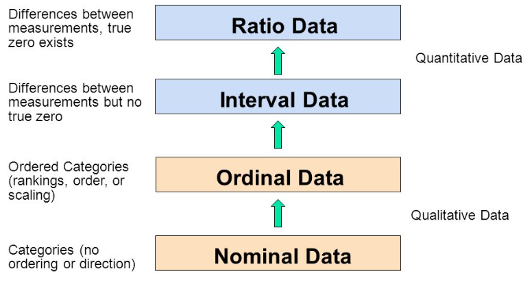
As you go from Qualitative to Quantitative data types in the table, I hope you can detect a movement from fuzzy groups/categories to more and more crystallized numbers.

Type of Variables

Type of Variables

Each variable/scale can be subjected to the operations of the previous group. In the words of S.S. Stevens

the basic operations needed to create each type of scale is cumulative: to an operation listed opposite a particular scale must be added all those operations preceding it.

Some Examples of Data Variables

Example 1: AllCountries

  • Base R
  • web-r
head(AllCountries, 5) %>% arrange(desc(Internet))
ABCDEFGHIJ0123456789
Country
<fct>
Code
<fct>
LandArea
<dbl>
Population
<dbl>
Density
<dbl>
GDP
<int>
Rural
<dbl>
CO2
<dbl>
PumpPrice
<dbl>
Military
<dbl>
AndorraAND0.470.077163.84203011.95.83NANA
AlbaniaALB27.402.866104.6525439.71.981.364.08
AlgeriaDZA2381.7442.22817.7427927.43.740.2813.81
AfghanistanAFG652.8637.17256.952174.50.290.703.72
American SamoaASM0.200.055277.3NA12.8NANANA
5 rows | 1-10 of 26 columns
1
head(AllCountries,5) %>% arrange(desc(Internet))
NoteQuestions

Q1. How many people in Andorra have internet access?
A1. This leads to the Internet variable, which is a Quantitative variable, a proportion.2 The answer is 70.5%.

Example 2:StudentSurveys

  • Base R
  • web-r
head(StudentSurvey, 5)
ABCDEFGHIJ0123456789
 
 
Year
<fct>
Sex
<fct>
Smoke
<fct>
Award
<fct>
HigherSAT
<fct>
Exercise
<dbl>
TV
<int>
Height
<int>
Weight
<int>
1SeniorMNoOlympicMath10171180
2SophomoreFYesAcademyMath4766120
3FirstYearMNoNobelMath14572208
4JuniorMNoNobelMath3163110
5SophomoreFNoNobelVerbal3365150
5 rows | 1-10 of 18 columns
1
head(StudentSurvey,5)
NoteQuestions

Q.1. What kind of students are these?
A.1. The variables Gender, and Year both answer to this Question. And they are both Qualitative/Categorical variables, of course.
Q.2. What is their status in their respective families?
A.2. Hmm…they are either first-born, or second-born, or third…etc. While this is recorded as a number, it is still a Qualitative variable3! Think! Can you do math operations with BirthOrder? Like mean or median?
Q.3.How big are the families?
A.3. Clearly, the variable that answers is Siblings and since the question is synonymous with “how many”, this is a Quantitative variable.

What is a Data Visualization?

Data Viz = Data + Geometry

Shapes

Data Visualization is the act of “mapping” a geometric aspect/aesthetic to a variable in data. The aesthetic then varies in accordance with the data variable, creating (part of) a chart.

What might be the geometric aesthetics available to us? An aesthetic is a geometric property, such as x-coordinate, y-coordinate, length/breadth/height,radius,shape,size, linewidth, linetype, and even colour…

Common Geometric Aesthetics in Charts

Common Geometric Aesthetics in Charts

Mapping

What does this “mapping” mean? That the geometric aesthetics are used to represent qualitative or quantitative variables from your data, by varying in accordance to the data variable.

For instance, length or height of a bar can be made proportional to theage or income of a person. Colour of points can be mapped to gender, with a unique colour for each gender. Position along an axis x can vary in accordance with a height variable and position along the y axis can vary with a bodyWeight variable.

Data Vis using R

Data Vis using R

A chart may use more than one aesthetic: position, shape, colour, height and angle,pattern or texture to name several. Usually, each aesthetic is mapped to just one variable to ensure there is no cognitive error. There is of course a choice and you should be able to map any kind of variable to any geometric aspect/aesthetic that may be available.

NoteA Natural Mapping

Note that here is also a “natural” mapping between aesthetic and [kind of variable] Section 7, Quantitative or Qualitative. For instance, shape is rarely mapped to a Quantitative variable; we understand this because the nature of variation between the Quantitative variable and the shape aesthetic is not similar (i.e. not continuous). Bad choices may lead to bad, or worse, misleading charts!

In the above chart, it is pretty clear what kind of variable is plotted on the x-axis and the y-axis. What about colour? Could this be considered a z-axis in the chart? There are also other aspects that you can choose (not explicitly shown here) such as the plot theme(colours, fonts, backgrounds etc), which may not be mapped to data, but are nonetheless choices to be made. We will get acquainted with this aspect as we build charts.

Some essential concepts to master when working with charts in R are:

  • geoms & aesthetics,
  • scales,
  • statistical transformations,
  • coordinate transformations.
  • the group aesthetic,
  • position adjustments,
  • facets,
  • themes.

Basic Types of Charts

We can think of simple visualizations as combinations of aesthetics, mapped to combinations of variables. Some examples:

Geometries , Combinations, and Graphs
Variable #1 Variable #2 Chart Names Chart Shape
Quant None Histogram and Density
Qual None Bar Chart

Quant Quant Scatter Plot, Line Chart, Bubble Plot, Area Chart
Quant Qual Pie Chart, Donut Chart, Column Chart, Box-Whisker Plot, Radar Chart, Bump Chart, Tree Diagram
Qual Qual Stacked Bar Chart, Mosaic Chart, Sankey, Chord Diagram, Network Diagram

Conclusion

Let us take a look at Wickham and Grolemund’s Data Science workflow picture:

Figure 4: Data Science Workflow

So there we have it:

  • We import and clean the data
  • Questions lead us to identify Types of Variables (Quant and Qual)
  • Sometimes we may need to transform the data (long to wide, summarize, create new variables…)
  • Further Questions lead to relationships between variables, which we describe using Data Visualizations
  • Visualizations may lead to Hypotheses, which we Analyze or Model
  • Data Visualizations are Data mapped onto Geometry 
  • Multiple Variable-to-Geometry Mappings = A Complete Data Visualization
  • Which is finally Communicated

You might think of all these Questions, Answers, Mapping as being equivalent to metaphors as a language in itself. And indeed, in R we use a philosophy called the Grammar of Graphics! We will use this grammar in the R graphics packages that we will encounter. Other parts of the Workflow (Transformation, Analysis and Modelling) are also following similar grammars, as we shall see.

AI Generated Summary and Podcast

This is a tutorial on data visualization using the R programming language. It introduces concepts such as data types, variables, and visualization techniques. The tutorial utilizes metaphors to explain these concepts, emphasizing the use of geometric aesthetics to represent data. It also highlights the importance of both visual and analytic approaches in understanding data. The tutorial then demonstrates basic chart types, including histograms, scatterplots, and bar charts, and discusses the “Grammar of Graphics” philosophy that guides data visualization in R. The text concludes with a workflow diagram for data science, emphasizing the iterative process of data import, cleaning, transformation, visualization, hypothesis generation, analysis, and communication.

Your browser does not support the audio tag; for browser support, please see: https://www.w3schools.com/tags/tag_audio.asp

References

  1. Randomized Trials:


  1. Martyn Shuttleworth, Lyndsay T Wilson (Jun 26, 2009). What is the Scientific Method? Retrieved Mar 12, 2024 from Explorable.com: https://explorable.com/what-is-the-scientific-method
  2. Adam E.M. Eltorai, Jeffrey A. Bakal, Paige C. Newell, Adena J. Osband (editors). (March 22, 2023) Translational Surgery: Handbook for Designing and Conducting Clinical and Translational Research. A very lucid and easily explained set of chapters. ( I have a copy. Yes.)
    • Part III. Clinical: fundamentals
    • Part IV: Statistical principles
  3. https://safetyculture.com/topics/design-of-experiments/
  4. Emi Tanaka. https://emitanaka.org/teaching/monash-wcd/2020/week09-DoE.html
  5. Open Intro Stats: Types of Variables
  6. Lock, Lock, Lock, Lock, and Lock. Statistics: Unlocking the Power of Data, Third Edition, Wiley, 2021. https://www.wiley.com/en-br/Statistics:+Unlocking+the+Power+of+Data,+3rd+Edition-p-9781119674160)
  7. Claus Wilke. Fundamentals of Data Visualization. https://clauswilke.com/dataviz/
  8. Tim C. Hesterberg (2015). What Teachers Should Know About the Bootstrap: Resampling in the Undergraduate Statistics Curriculum, The American Statistician, 69:4, 371-386, DOI:10.1080/00031305.2015.1089789. PDF here
  9. Albert Rapp. Adding images to ggplot. https://albert-rapp.de/posts/ggplot2-tips/27_images/27_images
R Package Citations
Package Version Citation
ggformula 0.12.0 Kaplan and Pruim (2023)
Lock5Data 3.0.0 Lock (2021)
mosaic 1.9.1 Pruim, Kaplan, and Horton (2017)
TeachingDemos 2.13 Snow (2024)
Kaplan, Daniel, and Randall Pruim. 2023. ggformula: Formula Interface to the Grammar of Graphics. https://doi.org/10.32614/CRAN.package.ggformula.
Lock, Robin. 2021. Lock5Data: Datasets for “Statistics: UnLocking the Power of Data”. https://doi.org/10.32614/CRAN.package.Lock5Data.
Pruim, Randall, Daniel T Kaplan, and Nicholas J Horton. 2017. “The Mosaic Package: Helping Students to ‘Think with Data’ Using r.” The R Journal 9 (1): 77–102. https://journal.r-project.org/archive/2017/RJ-2017-024/index.html.
Snow, Greg. 2024. TeachingDemos: Demonstrations for Teaching and Learning. https://doi.org/10.32614/CRAN.package.TeachingDemos.
Back to top

Footnotes

  1. https://www.xcode.in/genes-and-personality/how-genes-influence-your-math-ability/↩︎

  2. How might this data have been obtained? By asking people in a survey and getting Yes/No answers!↩︎

  3. Qualitative variables are called Factor variables in R, and are stored, internally, as numeric variables together with their levels. The actual values of the numeric variable are 1, 2, and so on.↩︎

Citation

BibTeX citation:
@online{2021,
  author = {},
  title = {\textless Iconify-Icon Icon=“icon-Park-Twotone:data-User”
    Width=“1.2em”
    Height=“1.2em”\textgreater\textless/Iconify-Icon\textgreater{}
    {Data}},
  date = {2021-11-01},
  url = {https://av-quarto.netlify.app/content/courses/Analytics/Descriptive/Modules/05-NatureData/},
  langid = {en}
}
For attribution, please cite this work as:
“<Iconify-Icon Icon=‘icon-Park-Twotone:data-User’ Width=‘1.2em’ Height=‘1.2em’></Iconify-Icon> Data.” 2021. November 1, 2021. https://av-quarto.netlify.app/content/courses/Analytics/Descriptive/Modules/05-NatureData/.
Descriptive Analytics
Summaries

License: CC BY-SA 2.0

Website made with ❤️ and Quarto, by Arvind V.

Hosted by Netlify .