Slides and Tutorials
| R (Static Viz) | Radiant Tutorial | Datasets |
“Keep away from people who try to belittle your ambitions. Small people always do that, but the really great make you feel that you, too, can become great.”
— Mark Twain
Plot Fonts and Theme
Show the Code
library(systemfonts)
library(showtext)
## Clean the slate
systemfonts::clear_local_fonts()
systemfonts::clear_registry()
##
showtext_opts(dpi = 96) # set DPI for showtext
sysfonts::font_add(
  family = "Alegreya",
  regular = "../../../../../../fonts/Alegreya-Regular.ttf",
  bold = "../../../../../../fonts/Alegreya-Bold.ttf",
  italic = "../../../../../../fonts/Alegreya-Italic.ttf",
  bolditalic = "../../../../../../fonts/Alegreya-BoldItalic.ttf"
)

sysfonts::font_add(
  family = "Roboto Condensed",
  regular = "../../../../../../fonts/RobotoCondensed-Regular.ttf",
  bold = "../../../../../../fonts/RobotoCondensed-Bold.ttf",
  italic = "../../../../../../fonts/RobotoCondensed-Italic.ttf",
  bolditalic = "../../../../../../fonts/RobotoCondensed-BoldItalic.ttf"
)
showtext_auto(enable = TRUE) # enable showtext
##
theme_custom <- function() {
  font <- "Alegreya" # assign font family up front

  theme_classic(base_size = 14, base_family = font) %+replace% # replace elements we want to change

    theme(
      text = element_text(family = font), # set base font family

      # text elements
      plot.title = element_text( # title
        family = font, # set font family
        size = 24, # set font size
        face = "bold", # bold typeface
        hjust = 0, # left align
        margin = margin(t = 5, r = 0, b = 5, l = 0)
      ), # margin
      plot.title.position = "plot",
      plot.subtitle = element_text( # subtitle
        family = font, # font family
        size = 14, # font size
        hjust = 0, # left align
        margin = margin(t = 5, r = 0, b = 10, l = 0)
      ), # margin

      plot.caption = element_text( # caption
        family = font, # font family
        size = 9, # font size
        hjust = 1
      ), # right align

      plot.caption.position = "plot", # right align

      axis.title = element_text( # axis titles
        family = "Roboto Condensed", # font family
        size = 12
      ), # font size

      axis.text = element_text( # axis text
        family = "Roboto Condensed", # font family
        size = 9
      ), # font size

      axis.text.x = element_text( # margin for axis text
        margin = margin(5, b = 10)
      )

      # since the legend often requires manual tweaking
      # based on plot content, don't define it here
    )
}
Show the Code
```{r}
#| cache: false
#| code-fold: true
## Set the theme
theme_set(new = theme_custom())
```
Error in theme_set(new = theme_custom()): could not find function "theme_set"Show the Code
```{r}
#| cache: false
#| code-fold: true
## Use available fonts in ggplot text geoms too!
update_geom_defaults(geom = "text", new = list(
  family = "Roboto Condensed",
  face = "plain",
  size = 3.5,
  color = "#2b2b2b"
))
```
Error in update_geom_defaults(geom = "text", new = list(family = "Roboto Condensed", : could not find function "update_geom_defaults"
| Variable #1 | Variable #2 | Chart Names | Chart Shape | |
|---|---|---|---|---|
| Quant | (Qual) | Violin Plot |
| No | Pronoun | Answer | Variable/Scale | Example | What Operations? |
|---|---|---|---|---|---|
| 1 | How Many / Much / Heavy? Few? Seldom? Often? When? | Quantities, with Scale and a Zero Value.Differences and Ratios /Products are meaningful. | Quantitative/Ratio | Length,Height,Temperature in Kelvin,Activity,Dose Amount,Reaction Rate,Flow Rate,Concentration,Pulse,Survival Rate | Correlation |
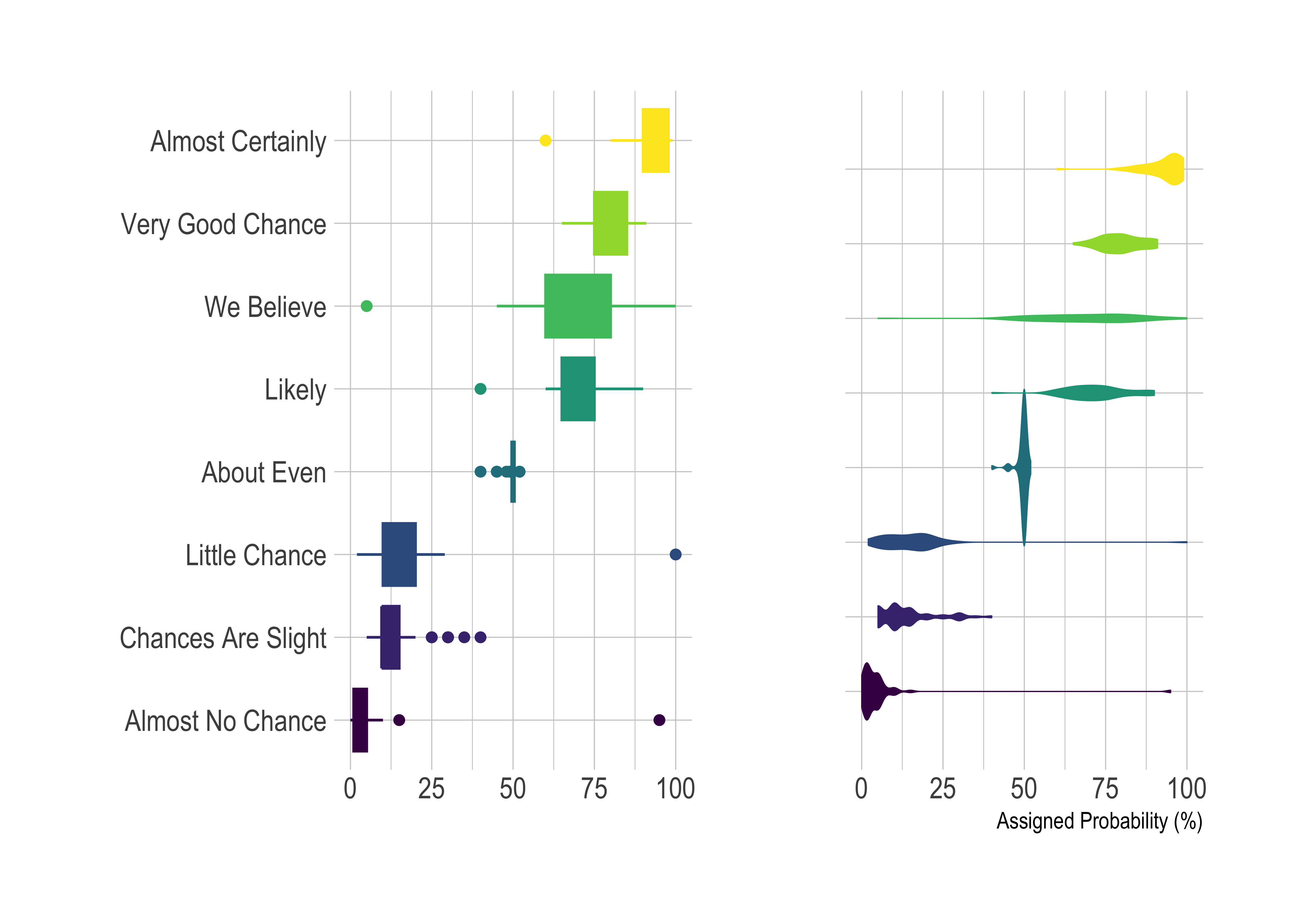
Which is the plots above is more evocative of the underlying data? The violin plots, which looks like a combo box-plot + density, is probably giving us a greater sense of the spread of the data than the good old box plot.
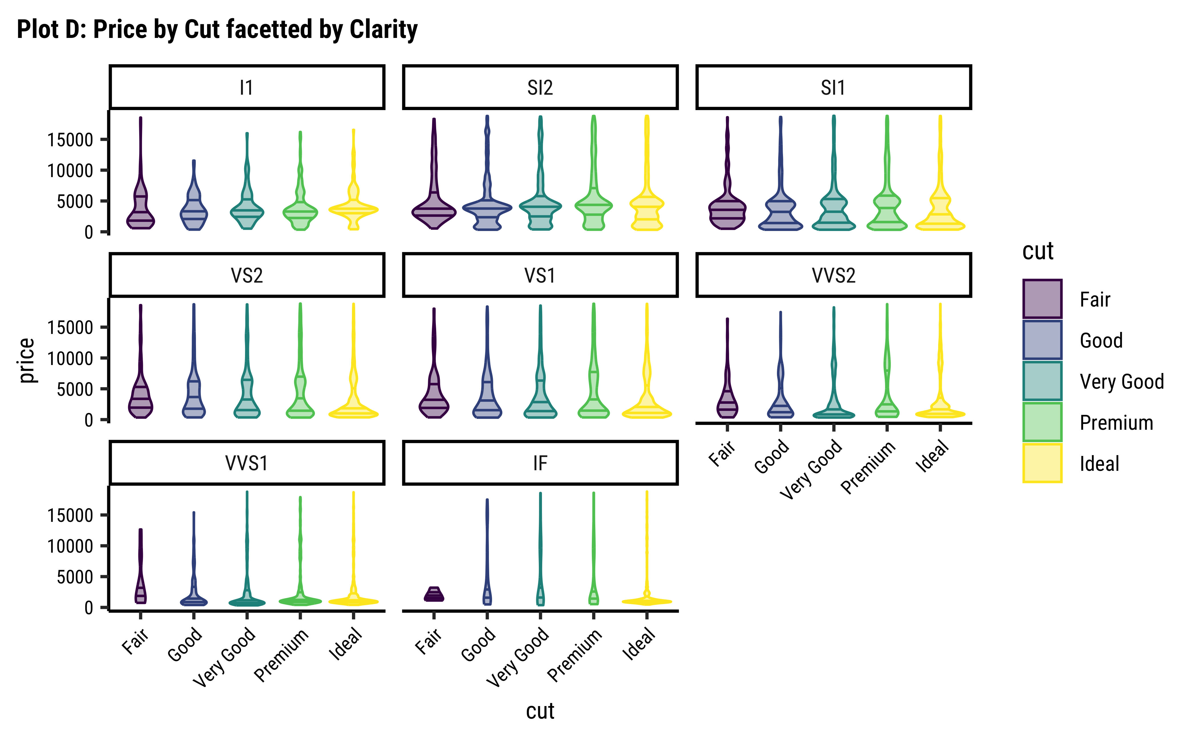
Often one needs to view multiple densities at the same time. Ridge plots of course give us one option, where we get densities of a Quant variable split by a Qual variable. Another option is to generate a density plot facetted into small multiples using a Qual variable.
Yet another plot that allows comparison of multiple densities side by side is a violin plot. The violin plot combines the aspects of a boxplot(ranking of values, median, quantiles…) with a superimposed density plot. This allows us to look at medians, means, densities, and quantiles of a Quant variable with respect to another Qual variable. Let us see what this looks like!
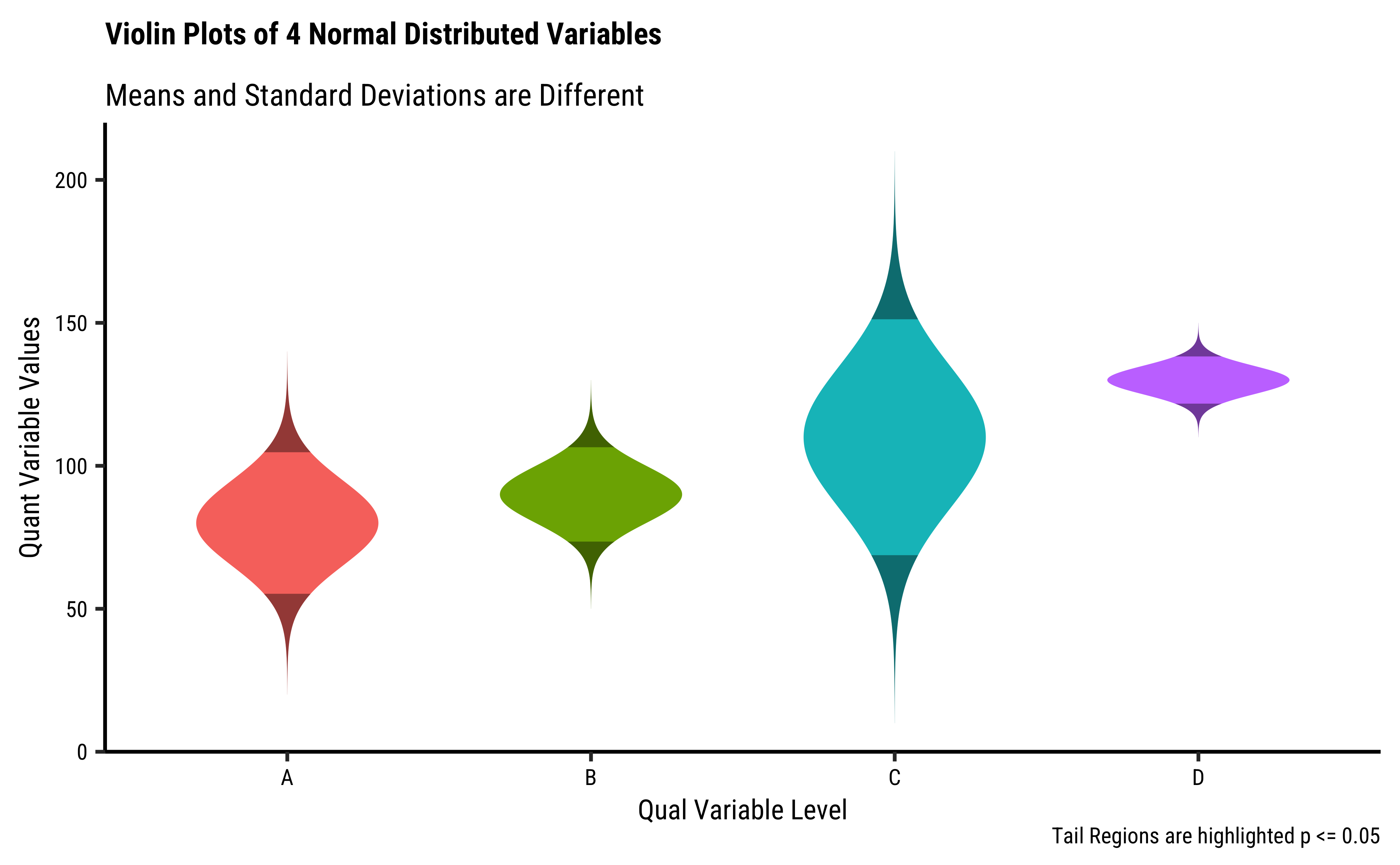
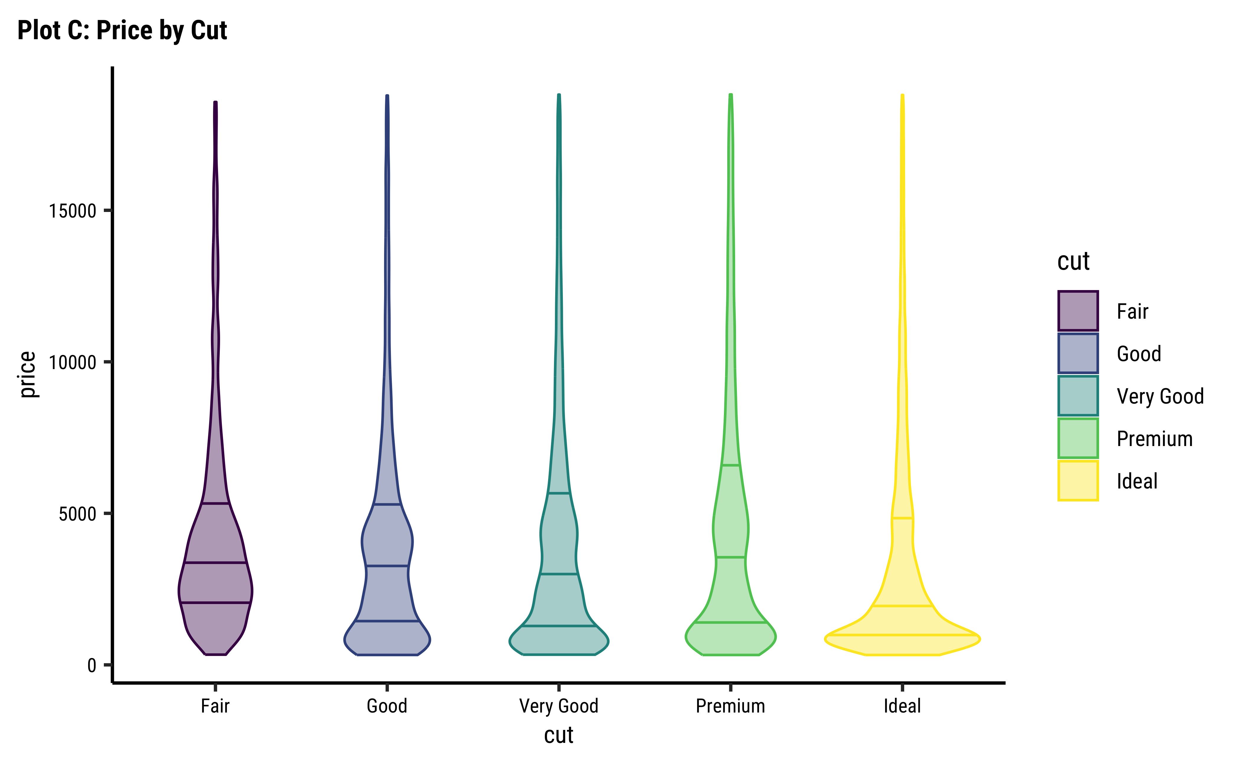
In Figure 1, the plots show (very artificial!) distributions of a single Quant variable across levels of another Qual variable. At each level of the Qual variable along the X-axis, we have a violin plot showing the density.
diamonds dataset
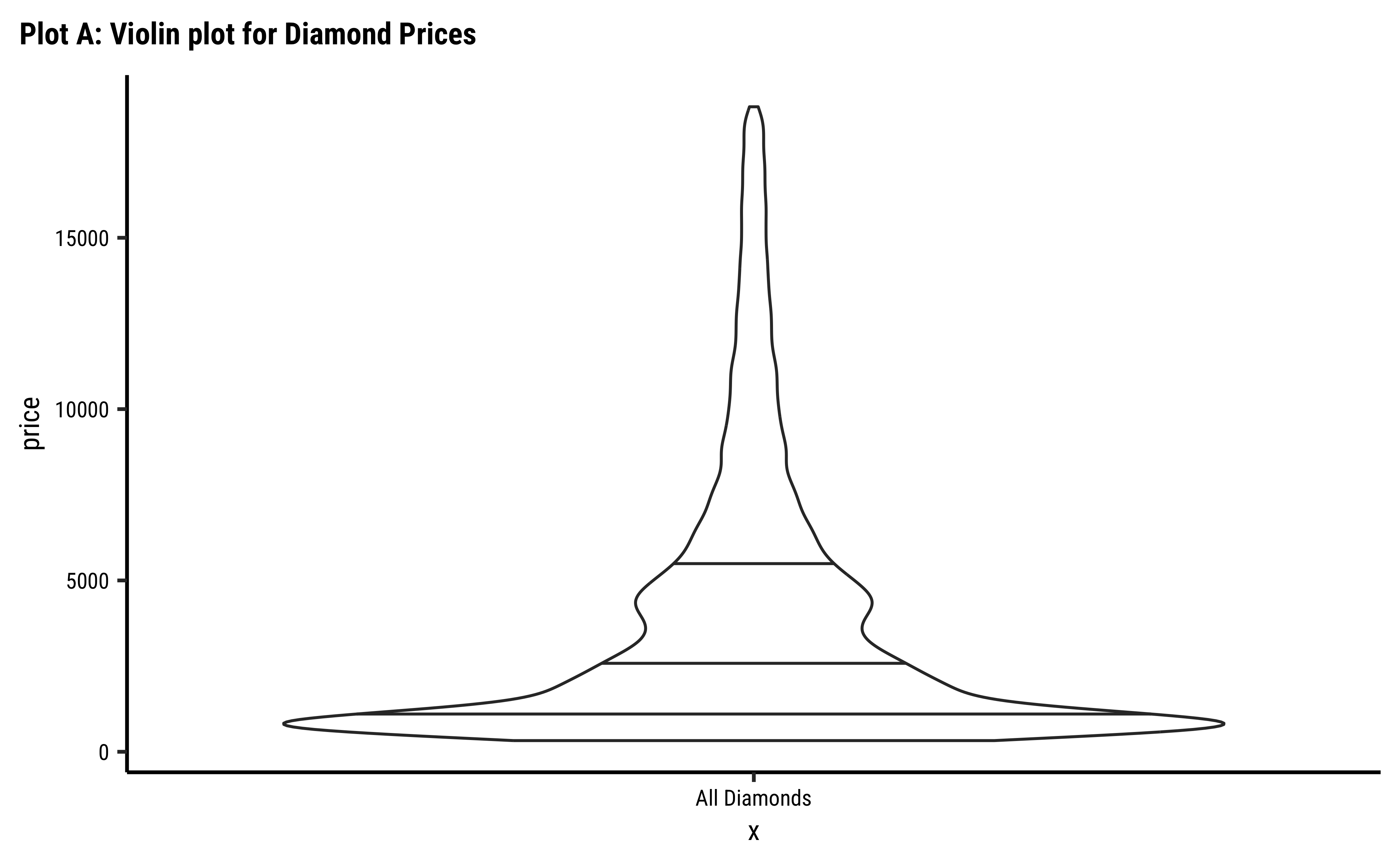
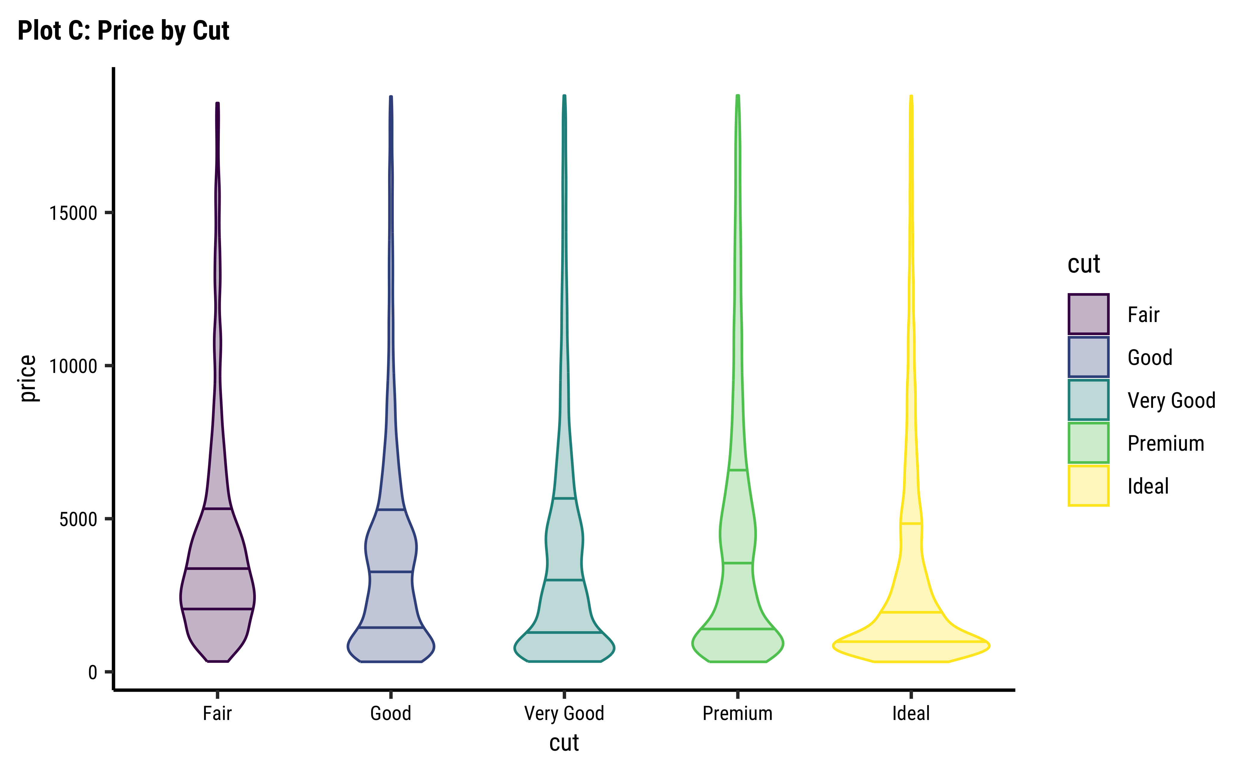

diamonds %>% ggplot() +
geom_violin(aes(y = price, x = ""),
draw_quantiles = c(0, .25, .50, .75)
) + # note: y, not x
labs(title = "Plot A: violin for Diamond Prices")
###
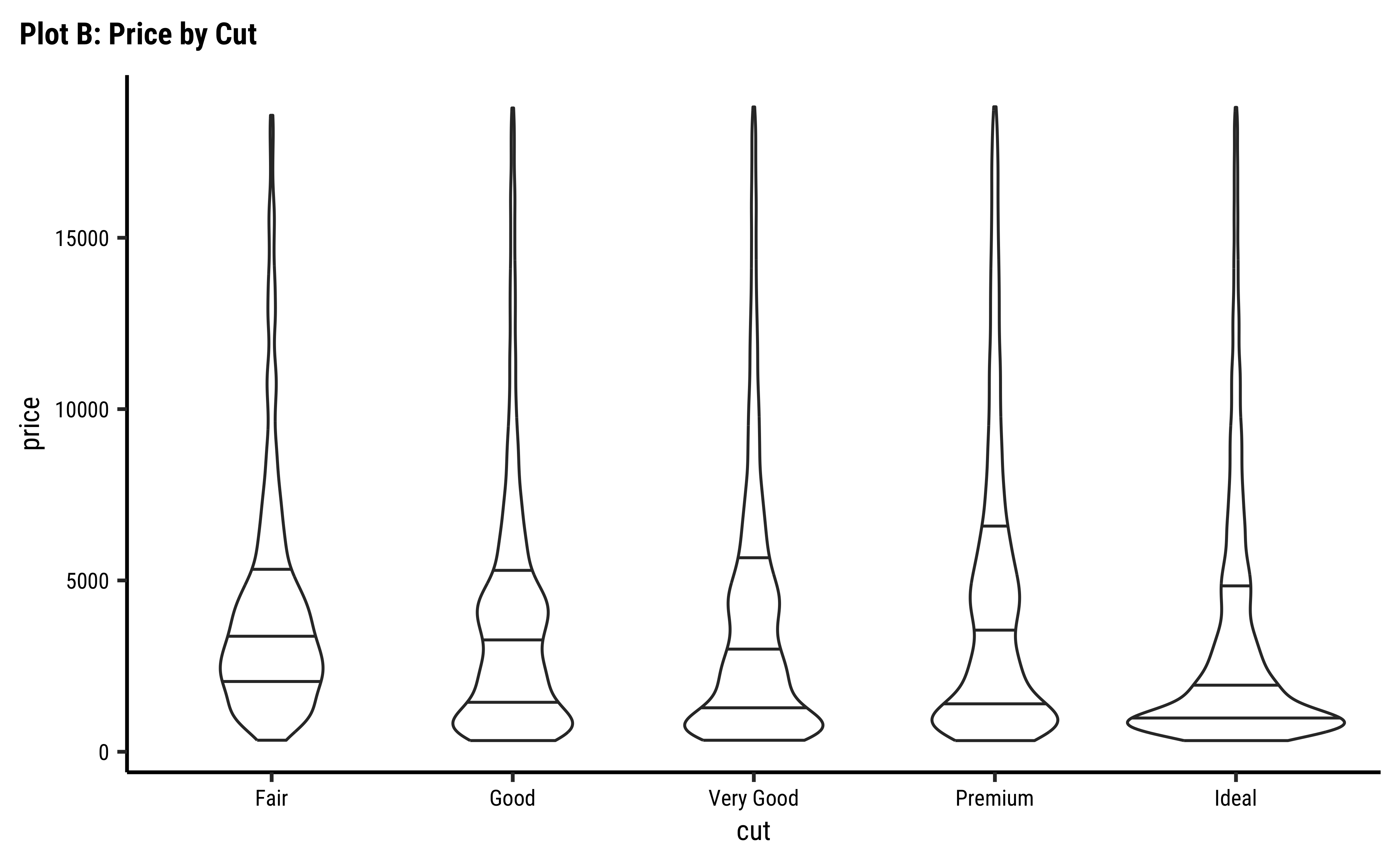
diamonds %>% ggplot() +
geom_violin(aes(cut, price),
draw_quantiles = c(0, .25, .50, .75)
) +
labs(title = "Plot B: Price by Cut")
###
diamonds %>% ggplot() +
geom_violin(
aes(cut, price,
color = cut, fill = cut
),
draw_quantiles = c(0, .25, .50, .75),
alpha = 0.4
) +
labs(title = "Plot C: Price by Cut")
###
diamonds %>% ggplot() +
geom_violin(
aes(cut,
price,
color = cut, fill = cut
),
draw_quantiles = c(0, .25, .50, .75),
alpha = 0.4
) +
facet_wrap(vars(clarity)) +
labs(title = "Plot D: Price by Cut facetted by Clarity") +
theme(axis.text.x = element_text(angle = 45, hjust = 1))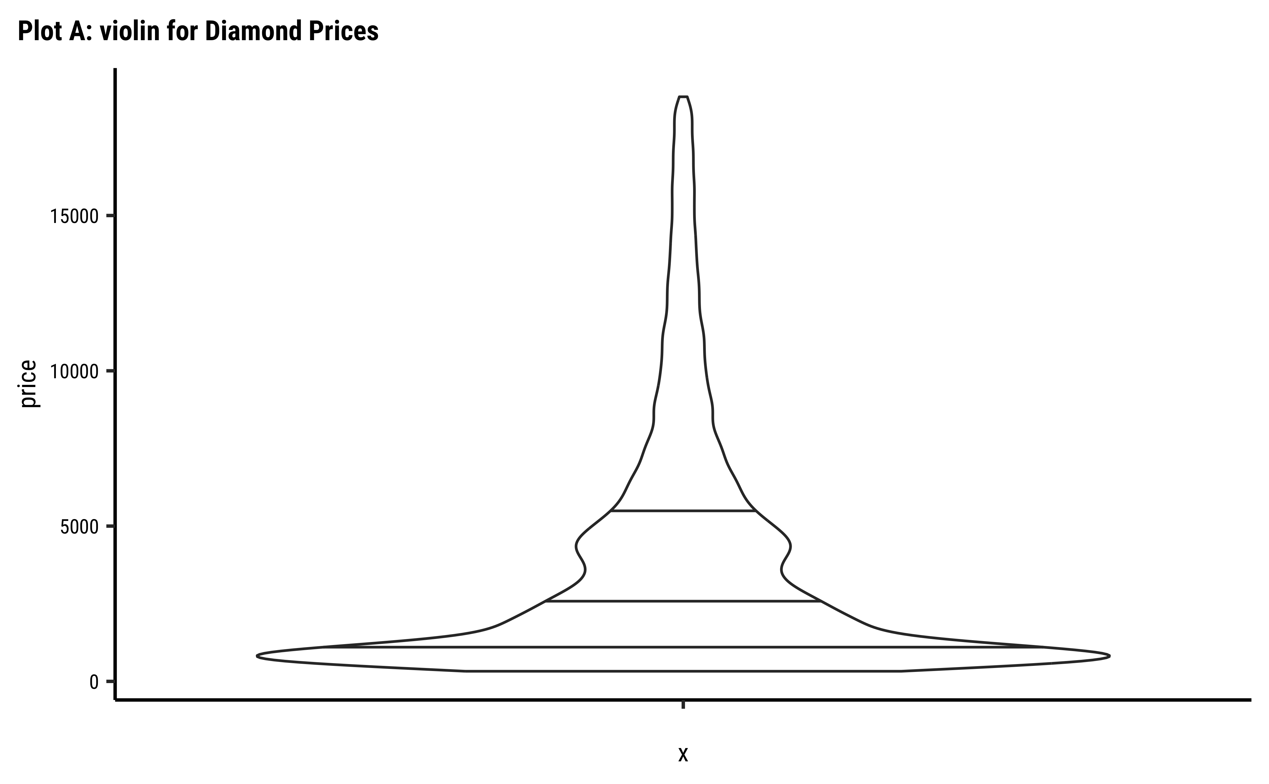

diamond Violin Plots
The distribution for price is clearly long-tailed (skewed). The distributions also vary considerably based on both cut and clarity. These Qual variables clearly have a large effect on the prices of individual diamonds.
- Box plots give us an idea of
medians,IQRranges, andoutliers. The shape of the density is not apparent from the box. - Densities give us shapes of distributions, but do not provide visual indication of other metrics like
meansormedians( at least not without some effort) - Violins help us do both!
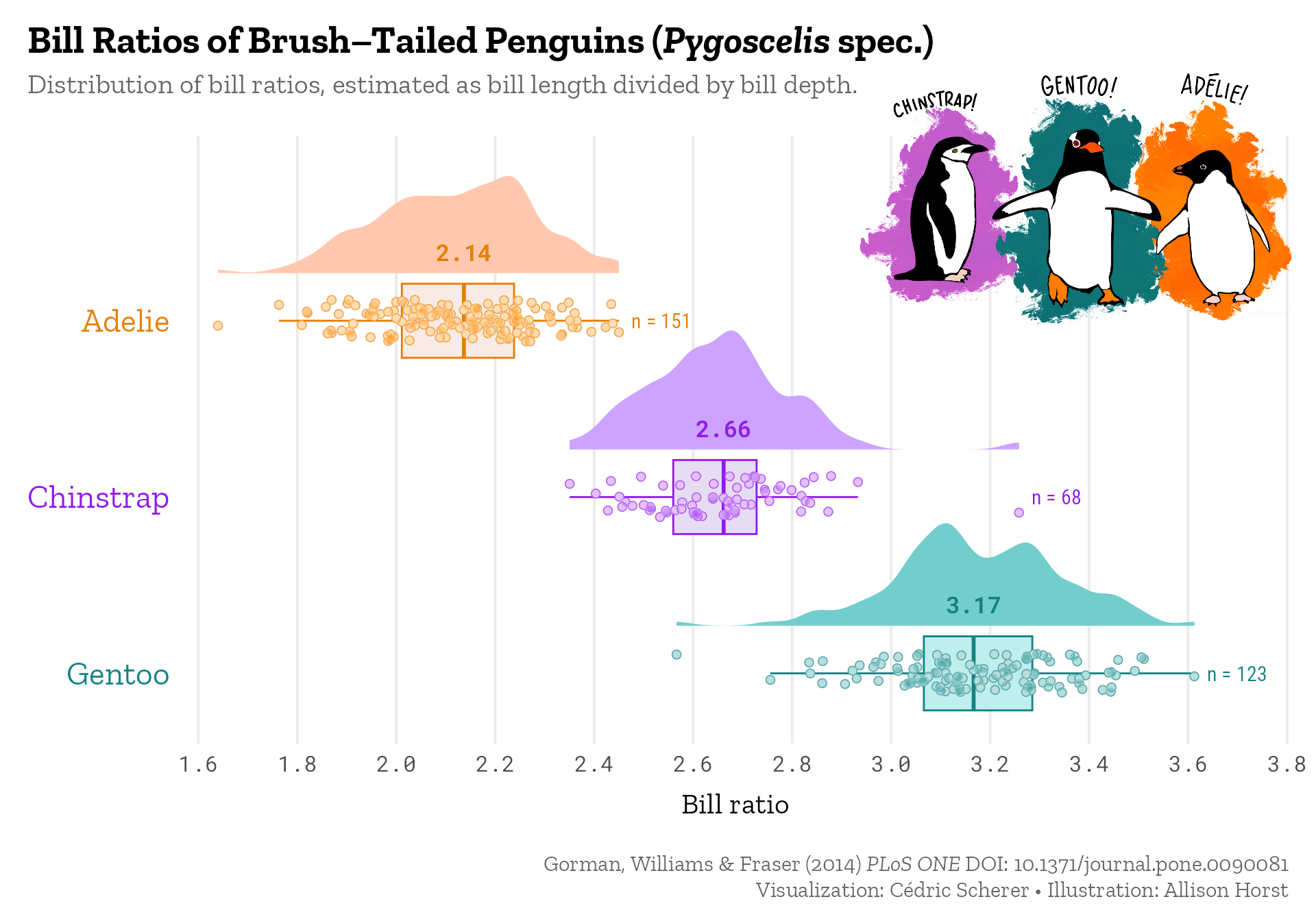
- Violins can also be cut in half (since they are symmetric, like Buddhist Prayer Wheels), then placed horizontally, and combined with both a
boxplotand adot-plotto give usraincloud plotsthat look like this. (Yes, there is code over there, which you can reuse.)
- Histograms, Frequency Distributions, and Box Plots are used for Quantitative data variables
- Histograms “dwell upon” counts, ranges, means and standard deviations
- Frequency Density plots “dwell upon” probabilities and densities
- Box Plots “dwell upon” medians and Quartiles
- Qualitative data variables can be plotted as counts, using Bar Charts, or using Heat Maps
- Violin Plots help us to visualize multiple distributions at the same time, as when we split a Quant variable wrt to the levels of a Qual variable.
- Ridge Plots are density plots used for describing one Quant and one Qual variable (by inherent splitting)
- We can split all these plots on the basis of another Qualitative variable.(Ridge Plots are already split)
- Long tailed distributions need care in visualization and in inference making!
- Click on the Dataset Icon above, and unzip that archive. Try to make distribution plots with each of the three tools.
- A dataset from calmcode.io https://calmcode.io/datasets.html
inspect the dataset in each case and develop a set of Questions, that can be answered by appropriate stat measures, or by using a chart to show the distribution.
- Winston Chang (2024). R Graphics Cookbook. https://r-graphics.org
- See the scrolly animation for a histogram at this website: Exploring Histograms, an essay by Aran Lunzer and Amelia McNamara https://tinlizzie.org/histograms/?s=09
- Minimal R using
mosaic.https://cran.r-project.org/web/packages/mosaic/vignettes/MinimalRgg.pdf
- Sebastian Sauer, Plotting multiple plots using purrr::map and ggplot
| Package | Version | Citation |
|---|---|---|
| ggnormalviolin | 0.2.1 | Schneider (2025) |
| ggridges | 0.5.6 | Wilke (2024) |
| NHANES | 2.1.0 | Pruim (2015) |
| TeachHist | 0.2.1 | Lange (2023) |
| TeachingDemos | 2.13 | Snow (2024) |
| tidyplots | 0.3.1 | Engler (2025) |
| tinyplot | 0.4.1 | McDermott, Arel-Bundock, and Zeileis (2025) |
| tinytable | 0.10.0 | Arel-Bundock (2025) |
| visualize | 4.5.0 | Balamuta (2023) |
Citation
@online{v.2022,
  author = {V., Arvind},
  title = {\textless Iconify-Icon
    Icon=“material-Symbols:light-Group-Rounded” Width=“1.2em”
    Height=“1.2em”\textgreater\textless/Iconify-Icon\textgreater{}
    {Groups} and {Densities}},
  date = {2022-11-15},
  url = {https://av-quarto.netlify.app/content/courses/Analytics/Descriptive/Modules/28-Violins/},
  langid = {en},
  abstract = {Quant and Qual Variable Graphs and their Siblings}
}