
library(vcd) # Michael Friendly's package, Visualizing Categorical Data
library(vcdExtra) # Categorical Data Sets
library(resampledata) # More datasets

library(ggstats) # Likert Scale Plots
library(labelled) # Creating Labelled Data for Likert Plots
library(sjPlot) # Another package for Likert Plots

## Making Tables
library(kableExtra) # html styled tables
library(tinytable) # Elegant Tables for our data
library(tidyplots) # Easily Produced Publication-Ready Plots
library(tinyplot) # Plots with Base R
#
library(mosaic) # Our trusted friend
library(skimr)
library(tidyverse)
Extra Cheese with my 5-insect pizza, please!
Proportions
Likert Scale data
Abstract
Surveys, Questions, and Responses
“It is not that we have so little time but that we lose so much…The life we receive is not short but we make it so; we are not ill provided but use what we have wastefully.”
— Seneca
To be Found !!
Plot Fonts and Theme
Show the Code
library(systemfonts)
library(showtext)
## Clean the slate
systemfonts::clear_local_fonts()
systemfonts::clear_registry()
##
showtext_opts(dpi = 96) # set DPI for showtext
sysfonts::font_add(
  family = "Alegreya",
  regular = "../../../../../../fonts/Alegreya-Regular.ttf",
  bold = "../../../../../../fonts/Alegreya-Bold.ttf",
  italic = "../../../../../../fonts/Alegreya-Italic.ttf",
  bolditalic = "../../../../../../fonts/Alegreya-BoldItalic.ttf"
)
Error in check_font_path(bold, "bold"): font file not found for 'bold' typeShow the Code
sysfonts::font_add(
  family = "Roboto Condensed",
  regular = "../../../../../../fonts/RobotoCondensed-Regular.ttf",
  bold = "../../../../../../fonts/RobotoCondensed-Bold.ttf",
  italic = "../../../../../../fonts/RobotoCondensed-Italic.ttf",
  bolditalic = "../../../../../../fonts/RobotoCondensed-BoldItalic.ttf"
)
showtext_auto(enable = TRUE) # enable showtext
##
theme_custom <- function() {
  font <- "Alegreya" # assign font family up front

  theme_classic(base_size = 14, base_family = font) %+replace% # replace elements we want to change

    theme(
      text = element_text(family = font), # set base font family

      # text elements
      plot.title = element_text( # title
        family = font, # set font family
        size = 24, # set font size
        face = "bold", # bold typeface
        hjust = 0, # left align
        margin = margin(t = 5, r = 0, b = 5, l = 0)
      ), # margin
      plot.title.position = "plot",
      plot.subtitle = element_text( # subtitle
        family = font, # font family
        size = 14, # font size
        hjust = 0, # left align
        margin = margin(t = 5, r = 0, b = 10, l = 0)
      ), # margin

      plot.caption = element_text( # caption
        family = font, # font family
        size = 9, # font size
        hjust = 1
      ), # right align

      plot.caption.position = "plot", # right align

      axis.title = element_text( # axis titles
        family = "Roboto Condensed", # font family
        size = 12
      ), # font size

      axis.text = element_text( # axis text
        family = "Roboto Condensed", # font family
        size = 9
      ), # font size

      axis.text.x = element_text( # margin for axis text
        margin = margin(5, b = 10)
      )

      # since the legend often requires manual tweaking
      # based on plot content, don't define it here
    )
}
Show the Code
```{r}
#| cache: false
#| code-fold: true
## Set the theme
theme_set(new = theme_custom())

## Use available fonts in ggplot text geoms too!
update_geom_defaults(geom = "text", new = list(
  family = "Roboto Condensed",
  face = "plain",
  size = 3.5,
  color = "#2b2b2b"
))
```
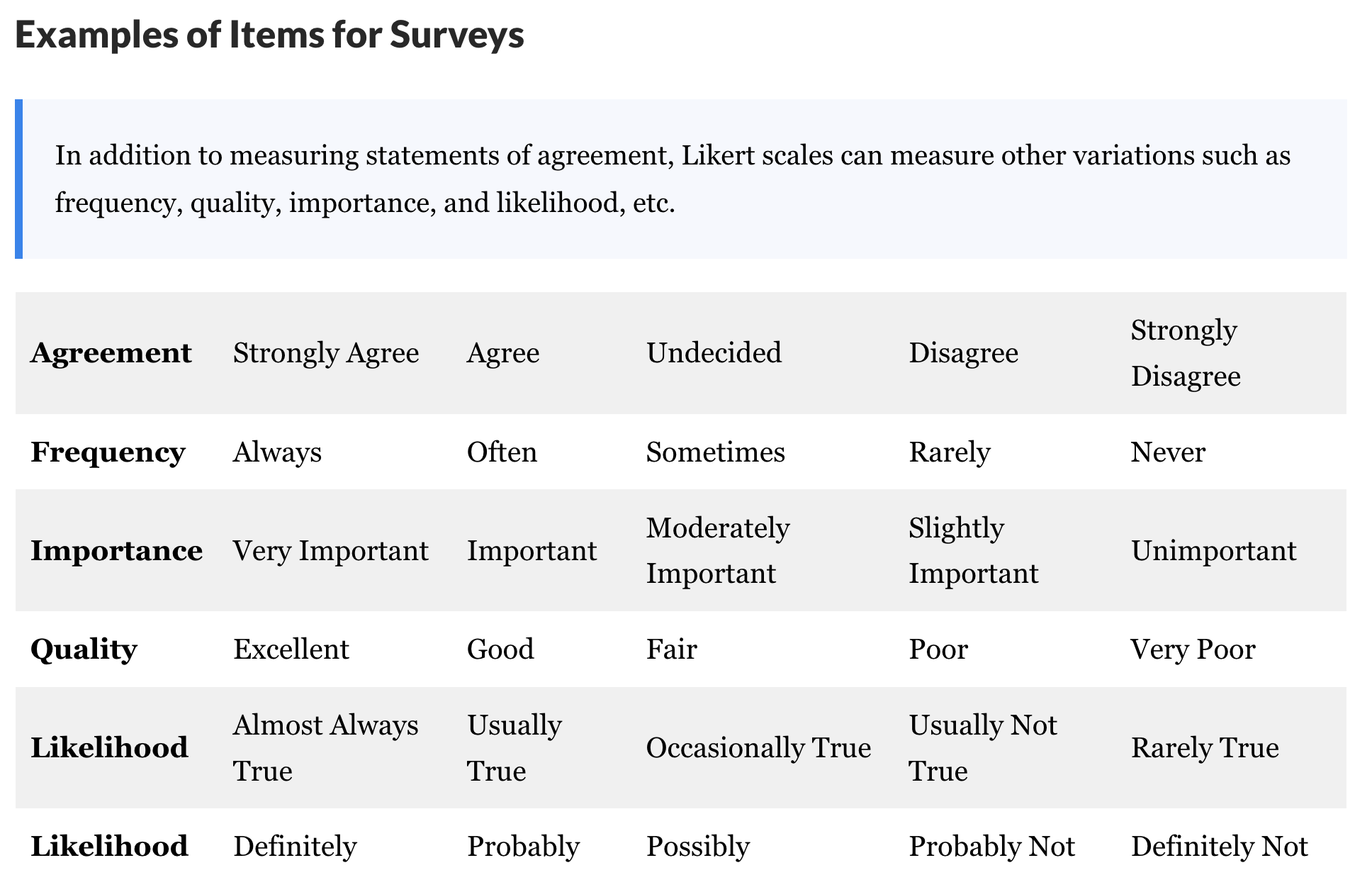
| Variable #1 | Variable #2 | Chart Names | “Chart Shape” |
|---|---|---|---|
| Qual | Qual | Likert Plots |  |
| No | Pronoun | Answer | Variable/Scale | Example | What Operations? |
|---|---|---|---|---|---|
| 3 | How, What Kind, What Sort | A Manner / Method, Type or Attribute from a list, with list items in some " order" ( e.g. good, better, improved, best..) | Qualitative/Ordinal | Socioeconomic status (Low income, Middle income, High income),Education level (HighSchool, BS, MS, PhD),Satisfaction rating(Very much Dislike, Dislike, Neutral, Like, Very Much Like) | Median,Percentile |
In many business and design situations, we perform say customer surveys to get Likert Scale data, where several respondents rate a product or a service on a scale of Very much like, somewhat like, neutral, Dislike and Very much dislike, for example. These are then plotted in a chart to get a distribution of opinions for each question in the survey. Some examples of Likert Scales are shown below.
As seen, we can use Likert Scale based questionnaire for a variety of aspects in our survey instruments.
How does this data look like, and how does one plot it? Let us consider a fictitious example, followed by a real world dataset.
A fictitious QuickEZ app
We are a start-up that has an app called QuickEZ for delivery of groceries. We conduct a survey of 200 people at a local store, with the following questions,
- “Have your heard of the QuickEZ app?”
- “Do you use the QuickEZ app?”
- “Do you find it easy to use the QuickEZ app?”
- “Will you continue to use the QuickEZ app?”
where each questions is to be answered on a scale of : “always”, “often”, “sometimes”,“rarely”, “never”.
Such data may look for example as follows:
| q1 | q2 | q3 | q4 |
|---|---|---|---|
| never | rarely | always | always |
| never | always | always | never |
| often | rarely | never | rarely |
| never | always | always | never |
| always | never | often | always |
| rarely | always | always | always |
| always | rarely | rarely | rarely |
| often | always | always | never |
| always | never | always | always |
| always | never | always | always |
tibble [200 × 4] (S3: tbl_df/tbl/data.frame)
 $ q1: Factor w/ 4 levels "never","rarely",..: 1 1 3 1 4 2 4 3 4 4 ...
  ..- attr(*, "label")= chr "Have your heard of the QuickEZ app?"
 $ q2: Factor w/ 4 levels "never","rarely",..: 2 4 2 4 1 4 2 4 1 1 ...
  ..- attr(*, "label")= chr "Do you use the QuickEZ app?"
 $ q3: Factor w/ 4 levels "never","rarely",..: 4 4 1 4 3 4 2 4 4 4 ...
  ..- attr(*, "label")= chr "Do you find it easy to use the QuickEZ app?"
 $ q4: Factor w/ 4 levels "never","rarely",..: 4 1 2 1 4 4 2 1 4 4 ...
  ..- attr(*, "label")= chr "Will you continue to use the QuickEZ app?"
The columns here correspond to the 4 questions (q1-q4) and the rows contain the 200 responses, which have been coded as (1:4). Such data is also a form of Categorical data and we need to count and plot counts for each of the survey questions. Such a plot is called a Likert plot and it looks like this:

Based on this chart, since it looks like about 40% the survey respondents have not heard of our app, we need more publicity, and many do not find it easy to use 😿, so we have serious re-design and user testing to do !! But at least those who have managed to get past the hurdles are stating they will continue to use the app, so it does the job, but we can make it easier to use.
Here is another example of Likert data from the healthcare industry.
efc is a German data set from a European study titled EUROFAM study, on family care of older people. Following a common protocol, data were collected from national samples of approximately 1,000 family carers (i.e. caregivers) per country and clustered into comparable subgroups to facilitate cross-national analysis. The research questions in this EUROFAM study were:
To what extent do family carers of older people use support services or receive financial allowances across Europe? What kind of supports and allowances do they mainly use?
What are the main difficulties carers experience accessing the services used? What prevents carers from accessing unused supports that they need? What causes them to stop using still-needed services?
In order to improve support provision, what can be understood about the service characteristics considered crucial by carers, and how far are these needs met? and,
Which channels or actors can provide the greatest help in underpinning future policy efforts to improve access to services/supports?
We will select the variables from the efc data set that related to coping (on part of care-givers) and plot their responses after inspecting them:
Rows: 908
Columns: 26
$ c12hour  <dbl> 16, 148, 70, 168, 168, 16, 161, 110, 28, 40, 100, 25, 25, 24,…
$ e15relat <dbl> 2, 2, 1, 1, 2, 2, 1, 4, 2, 2, 1, 8, 2, 1, 2, 2, 1, 1, 2, 1, 2…
$ e16sex   <dbl> 2, 2, 2, 2, 2, 2, 1, 2, 2, 2, 1, 2, 2, 2, 2, 2, 1, 1, 1, 1, 2…
$ e17age   <dbl> 83, 88, 82, 67, 84, 85, 74, 87, 79, 83, 68, 97, 80, 75, 82, 8…
$ e42dep   <dbl> 3, 3, 3, 4, 4, 4, 4, 4, 4, 4, 4, 3, 4, 3, 3, 3, 1, 3, 3, 4, 4…
$ c82cop1  <dbl> 3, 3, 2, 4, 3, 2, 4, 3, 3, 3, 3, 3, 3, 3, 2, 4, 3, 4, 3, 3, 3…
$ c83cop2  <dbl> 2, 3, 2, 1, 2, 2, 2, 2, 2, 2, 4, 3, 2, 2, 3, 2, 2, 2, 2, 2, 2…
$ c84cop3  <dbl> 2, 3, 1, 3, 1, 3, 4, 2, 3, 1, 4, 3, 2, 4, 3, 1, 1, 1, 1, 4, 3…
$ c85cop4  <dbl> 2, 3, 4, 1, 2, 3, 1, 1, 2, 2, 4, 1, 2, 4, 3, 3, 2, 2, 2, 2, 2…
$ c86cop5  <dbl> 1, 4, 1, 1, 2, 3, 1, 1, 2, 1, 4, 3, 2, 1, 2, 3, 1, 1, 2, 1, 1…
$ c87cop6  <dbl> 1, 1, 1, 1, 2, 2, 2, 1, 1, 1, 4, 1, 1, 1, 2, 1, 1, 1, 1, 3, 1…
$ c88cop7  <dbl> 2, 3, 1, 1, 1, 2, 4, 2, 3, 1, 4, 4, 2, 2, 1, 2, 2, 2, 3, 3, 1…
$ c89cop8  <dbl> 3, 2, 4, 2, 4, 1, 1, 3, 1, 1, 1, 3, 4, 4, 1, 1, 4, 3, 1, 2, 1…
$ c90cop9  <dbl> 3, 2, 3, 4, 4, 1, 4, 3, 3, 3, 1, 1, 4, 4, 1, 3, 4, 3, 4, 2, 3…
$ c160age  <dbl> 56, 54, 80, 69, 47, 56, 61, 67, 59, 49, 66, 47, 58, 75, 49, 5…
$ c161sex  <dbl> 2, 2, 1, 1, 2, 1, 2, 2, 2, 2, 2, 2, 2, 1, 2, 2, 2, 2, 1, 2, 2…
$ c172code <dbl> 2, 2, 1, 2, 2, 2, 2, 2, NA, 2, 2, 2, 3, 1, 3, 2, 2, 2, 3, 3, …
$ c175empl <dbl> 1, 1, 0, 0, 0, 1, 0, 0, 0, 0, 0, 1, 0, 0, 1, 0, 0, 0, 1, 1, 1…
$ barthtot <dbl> 75, 75, 35, 0, 25, 60, 5, 35, 15, 0, 25, 85, 15, 70, NA, 0, 9…
$ neg_c_7  <dbl> 12, 20, 11, 10, 12, 19, 15, 11, 15, 10, 28, 18, 13, 18, 16, 1…
$ pos_v_4  <dbl> 12, 11, 13, 15, 15, 9, 13, 14, 13, 13, 9, 8, 14, 14, 9, 14, 1…
$ quol_5   <dbl> 14, 10, 7, 12, 19, 8, 20, 20, 8, 15, 1, 19, 12, 8, 8, 6, 16, …
$ resttotn <dbl> 0, 4, 0, 2, 2, 1, 0, 0, 0, 1, 1, 1, 0, 0, 3, 0, 0, 0, 3, 0, 1…
$ tot_sc_e <dbl> 4, 0, 1, 0, 1, 3, 0, 1, 2, 1, 1, 1, 3, 0, 3, 2, 2, 0, 1, 7, 1…
$ n4pstu   <dbl> 0, 0, 2, 3, 2, 2, 3, 1, 3, 3, 3, 1, 3, 1, 0, 0, 0, 2, 1, 2, 4…
$ nur_pst  <dbl> NA, NA, 2, 3, 2, 2, 3, 1, 3, 3, 3, 1, 3, 1, NA, NA, NA, 2, 1,…
efc %>%
select(dplyr::contains("cop")) %>%
head(20)
##
efc %>%
select(dplyr::contains("cop")) %>%
str()c82cop1 <dbl> | c83cop2 <dbl> | c84cop3 <dbl> | c85cop4 <dbl> | c86cop5 <dbl> | c87cop6 <dbl> | c88cop7 <dbl> | c89cop8 <dbl> | c90cop9 <dbl> | |
|---|---|---|---|---|---|---|---|---|---|
| 1 | 3 | 2 | 2 | 2 | 1 | 1 | 2 | 3 | 3 |
| 2 | 3 | 3 | 3 | 3 | 4 | 1 | 3 | 2 | 2 |
| 3 | 2 | 2 | 1 | 4 | 1 | 1 | 1 | 4 | 3 |
| 4 | 4 | 1 | 3 | 1 | 1 | 1 | 1 | 2 | 4 |
| 5 | 3 | 2 | 1 | 2 | 2 | 2 | 1 | 4 | 4 |
| 6 | 2 | 2 | 3 | 3 | 3 | 2 | 2 | 1 | 1 |
| 7 | 4 | 2 | 4 | 1 | 1 | 2 | 4 | 1 | 4 |
| 8 | 3 | 2 | 2 | 1 | 1 | 1 | 2 | 3 | 3 |
| 9 | 3 | 2 | 3 | 2 | 2 | 1 | 3 | 1 | 3 |
| 10 | 3 | 2 | 1 | 2 | 1 | 1 | 1 | 1 | 3 |
'data.frame':   908 obs. of  9 variables:
 $ c82cop1: num  3 3 2 4 3 2 4 3 3 3 ...
  ..- attr(*, "label")= chr "do you feel you cope well as caregiver?"
  ..- attr(*, "labels")= Named num [1:4] 1 2 3 4
  .. ..- attr(*, "names")= chr [1:4] "never" "sometimes" "often" "always"
 $ c83cop2: num  2 3 2 1 2 2 2 2 2 2 ...
  ..- attr(*, "label")= chr "do you find caregiving too demanding?"
  ..- attr(*, "labels")= Named num [1:4] 1 2 3 4
  .. ..- attr(*, "names")= chr [1:4] "Never" "Sometimes" "Often" "Always"
 $ c84cop3: num  2 3 1 3 1 3 4 2 3 1 ...
  ..- attr(*, "label")= chr "does caregiving cause difficulties in your relationship with your friends?"
  ..- attr(*, "labels")= Named num [1:4] 1 2 3 4
  .. ..- attr(*, "names")= chr [1:4] "Never" "Sometimes" "Often" "Always"
 $ c85cop4: num  2 3 4 1 2 3 1 1 2 2 ...
  ..- attr(*, "label")= chr "does caregiving have negative effect on your physical health?"
  ..- attr(*, "labels")= Named num [1:4] 1 2 3 4
  .. ..- attr(*, "names")= chr [1:4] "Never" "Sometimes" "Often" "Always"
 $ c86cop5: num  1 4 1 1 2 3 1 1 2 1 ...
  ..- attr(*, "label")= chr "does caregiving cause difficulties in your relationship with your family?"
  ..- attr(*, "labels")= Named num [1:4] 1 2 3 4
  .. ..- attr(*, "names")= chr [1:4] "Never" "Sometimes" "Often" "Always"
 $ c87cop6: num  1 1 1 1 2 2 2 1 1 1 ...
  ..- attr(*, "label")= chr "does caregiving cause financial difficulties?"
  ..- attr(*, "labels")= Named num [1:4] 1 2 3 4
  .. ..- attr(*, "names")= chr [1:4] "Never" "Sometimes" "Often" "Always"
 $ c88cop7: num  2 3 1 1 1 2 4 2 3 1 ...
  ..- attr(*, "label")= chr "do you feel trapped in your role as caregiver?"
  ..- attr(*, "labels")= Named num [1:4] 1 2 3 4
  .. ..- attr(*, "names")= chr [1:4] "Never" "Sometimes" "Often" "Always"
 $ c89cop8: num  3 2 4 2 4 1 1 3 1 1 ...
  ..- attr(*, "label")= chr "do you feel supported by friends/neighbours?"
  ..- attr(*, "labels")= Named num [1:4] 1 2 3 4
  .. ..- attr(*, "names")= chr [1:4] "never" "sometimes" "often" "always"
 $ c90cop9: num  3 2 3 4 4 1 4 3 3 3 ...
  ..- attr(*, "label")= chr "do you feel caregiving worthwhile?"
  ..- attr(*, "labels")= Named num [1:4] 1 2 3 4
  .. ..- attr(*, "names")= chr [1:4] "never" "sometimes" "often" "always"
The coping related variables have responses on the Likert Scale (1,2,3,4) which correspond to (never, sometimes, often, always), and each variable also has a label defining each variable. The labels are actually ( and perhaps usually ) the questions in the survey.
We can plot this data using the gglikert function from package ggstats:
efc %>%
  select(dplyr::contains("cop")) %>%
  gglikert(labels_size = 3, width = 0.75) +
  labs(title = "Caregiver Survey from EUROFAM") +
  scale_fill_brewer(
    name = "Responses",
    labels = c("never", "sometimes", "often", "always"),
    palette = "Set3", direction = -1
  ) +
  theme(legend.position = "bottom") + theme_custom()
Many questions here have strong negative responses. This may indicate that policy and publicity related efforts may be required.
Note how the y-axis has been populated with Survey Questions: this is an example of a labelled dataset, where not only do the variables have names i.e. column names, but also have longish text labels that add information to the data variables. The data values ( i.e scores) in the columns is also labelled as per the the Likert scale (Like/Dislike/Strongly Dislike OR never/sometimes/often/always) etc. These Likert scores are usually a set of contiguous integers.
Variable Labels and Value Labels
Variable label is human readable description of the variable. R supports rather long variable names and these names can contain even spaces and punctuation but short variables names make coding easier. Variable label can give a nice, long description of variable. With this description it is easier to remember what those variable names refer to.
Value labels are similar to variable labels, but value labels are descriptions of the values a variable can take. Labeling values means we don’t have to remember if 1=Extremely poor and 7=Excellent or vice-versa. We can easily get dataset description and variables summary with info function.
Let us manually create one such dataset, since this is a common-enough situation1 that we have survey data and then have to label the variables and the values before plotting. We will use the R package labelled to label our data.2.
It is also possible to label the tibble, the columns, and the values in similar fashion using the sjlabelled package3 and the labelr package4.
set.seed(42)
# ggplot2::theme_set(new = theme_classic(base_family = "Roboto Condensed")) # Set consistent graph theme

variable_labels <- c(
  "Do you practice Analytics?",
  "Do you code in R?",
  "Have you published your R Code?",
  "Do you use Quarto as your Workflow in R?",
  "Will you use R at Work?"
)
##
value_labels <- c("never", "sometimes", "often", "always")
##
my_survey_data <-
  # Create toy survey data
  # 200 responses to 5 questions
  # responses on Likert Scale
  # 1:4 = "never", "sometimes","often","always")

  tibble(
    q1 = mosaic::sample(value_labels,
      replace = TRUE, size = 200,
      prob = c(0.2, 0.2, 0.5, 0.1)
    ),
    q2 = mosaic::sample(value_labels,
      replace = TRUE, size = 200,
      prob = c(0.3, 0.3, 0.3, 0.1)
    ),
    q3 = mosaic::sample(value_labels,
      replace = TRUE, size = 200,
      prob = c(0.2, 0.1, 0.1, 0.6)
    ),
    q4 = mosaic::sample(value_labels,
      replace = TRUE, size = 200,
      prob = c(0.4, 0.2, 0.1, 0.3)
    ),
    q5 = mosaic::sample(value_labels,
      replace = TRUE, size = 200,
      prob = c(0.1, 0.2, 0.5, 0.2)
    )
  ) %>%
  # Set VARIABLE labels
  labelled::set_variable_labels(
    .data = .,
    q1 = variable_labels[1],
    q2 = variable_labels[2],
    q3 = variable_labels[3],
    q4 = variable_labels[4],
    q5 = variable_labels[5]
  )
# Values within the variables are already labelled
###
head(my_survey_data, 6)q1 <chr> | q2 <chr> | q3 <chr> | q4 <chr> | q5 <chr> |
|---|---|---|---|---|
| always | sometimes | always | always | never |
| always | often | always | never | always |
| often | sometimes | never | sometimes | often |
| sometimes | often | always | never | sometimes |
| never | never | often | always | sometimes |
| never | often | always | always | often |
###
str(my_survey_data)
tibble [200 × 5] (S3: tbl_df/tbl/data.frame)
$ q1: chr [1:200] "always" "always" "often" "sometimes" ...
..- attr(*, "label")= chr "Do you practice Analytics?"
$ q2: chr [1:200] "sometimes" "often" "sometimes" "often" ...
..- attr(*, "label")= chr "Do you code in R?"
$ q3: chr [1:200] "always" "always" "never" "always" ...
..- attr(*, "label")= chr "Have you published your R Code?"
$ q4: chr [1:200] "always" "never" "sometimes" "never" ...
..- attr(*, "label")= chr "Do you use Quarto as your Workflow in R?"
$ q5: chr [1:200] "never" "always" "often" "sometimes" ...
..- attr(*, "label")= chr "Will you use R at Work?"##
my_survey_data %>%
gglikert(labels_size = 3, width = 0.5) +
labs(
title = "Do you use R Survey",
subtitle = "Creating and Using Labelled Data",
caption = "Using gglikert from ggstats package"
) +
scale_fill_brewer(
palette = "Spectral",
name = "Responses",
labels = c("never", "sometimes", "often", "always"),
) +
geom_vline(xintercept = 0) +
theme_custom() +
theme(legend.position = "bottom")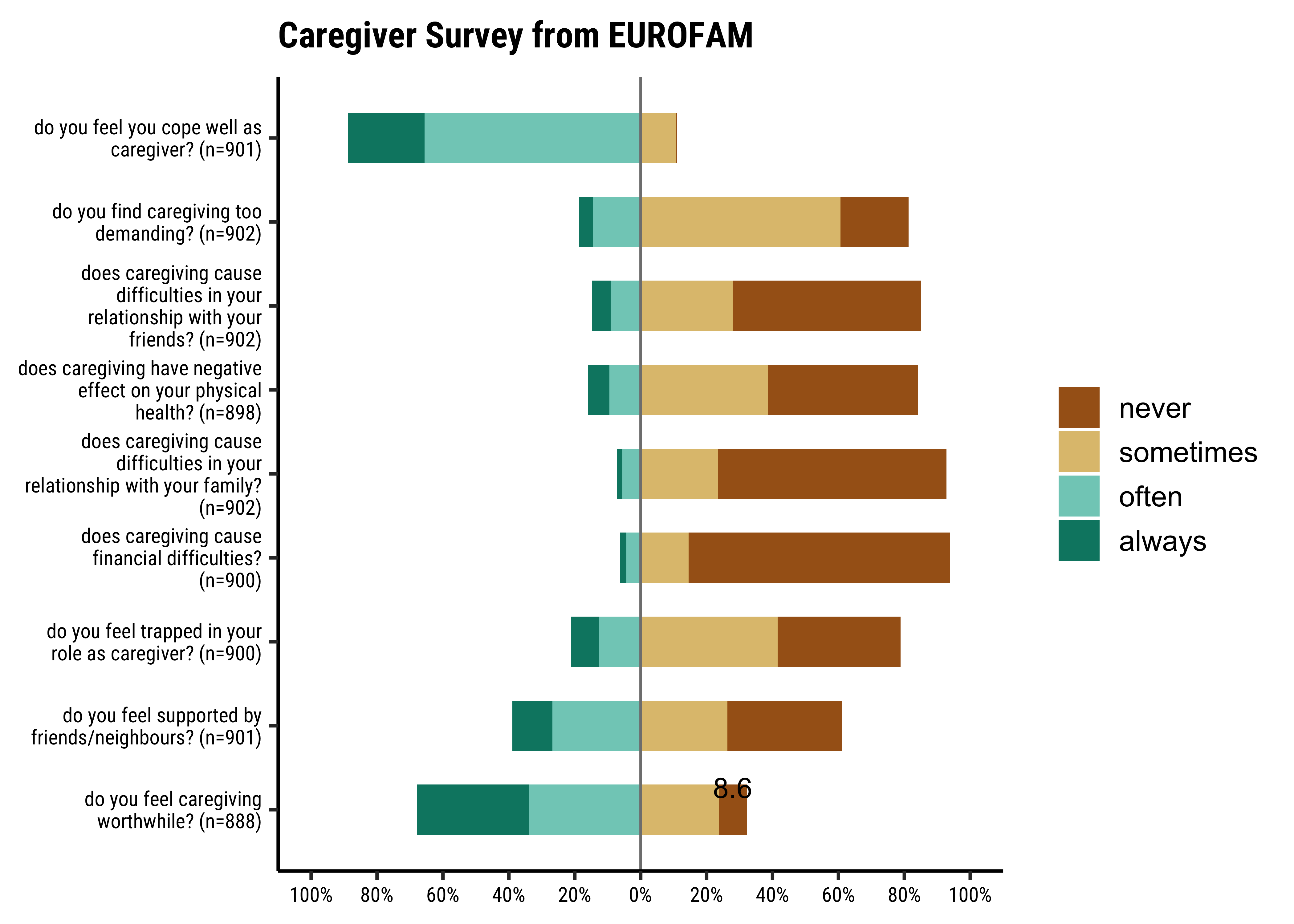
It seems many people in the survey plan to use R at work!! And have published R code as well. But Quarto seems to have mixed results! But of course this is a toy dataset!!
So there we are with Survey data analysis and plots!
There are a few other plots with this type of data, which are useful in very specialized circumstances. One example of this is the agreement plot5 which captures the agreement between two (sets) of evaluators, on ratings given on a shared ordinal scale to a set of items. An example from the field of medical diagnosis is the opinions of two specialists on a common set of patients. However, that is for a more advanced course!
- Likert plots are like stacked bar-charts aligned horizontally, back to back
. They are useful to indicate aspects like opinion, belief, and habits. - The scale for Likert data is ordinal: it should not be assumed that the points on the Likert scale (“never”, “sometimes”, “often”, “always”) are separated by the same distance.
Likert Plots for Survey data are not too different from Bar Plots; we can view the Likert Charts as a set of stacked bar charts, based on Likert-scale response counts. At a pinch we can make a Likert Plot with vanilla bar graphs, but the elegance and power of the ggstat package is undeniable. The packages sjPlot and sjlabelled also feature a plot_likert graphing function which is very elegant too.
Take some of the categorical datasets from the
vcdandvcdExtrapackages and recreate the plots from this module. Go to https://vincentarelbundock.github.io/Rdatasets/articles/data.html and type “vcd” in thesearchbox. You can directly load CSV files from there, usingread_csv("url-to-csv").Including Edible Insects in our Diet!
There are several questions here for each “area” of preference for edible insects: experience, fear, concern for the environment, etc. Take all the columns marked as average as your data for your Likert Plot.
- Winston Chang (2024). R Graphics Cookbook. https://r-graphics.org
- Shelomi. (2022). Dataset for: Factors Affecting Willingness and Future Intention to Eat Insects in Students of an Edible Insect Course. [Data set]. Zenodo. https://doi.org/10.5281/zenodo.7379294
- What is a Likert Scale? https://www.surveymonkey.com/mp/likert-scale/
- Rickards, G., Magee, C., & Artino, A. R., Jr (2012). You Can’t Fix by Analysis What You’ve Spoiled by Design: Developing Survey Instruments and Collecting Validity Evidence. Journal of graduate medical education, 4(4), 407–410. https://doi.org/10.4300/JGME-D-12-00239.1
- Jamieson, S. (2004). Likert scales: how to (ab)use them. Medical Education, 38(12), 1217–1218. https://doi:10.1111/j.1365-2929.2004.02012.x
- Mark Bounthavong. (May 16, 2019). Communicating data effectively with data visualization – Part 15 (Diverging Stacked Bar Chart for Likert scales). https://mbounthavong.com/blog/2019/5/16/communicating-data-effectively-with-data-visualization-part-15-divergent-stacked-bar-chart-for-likert-scales
- Anthony R. Artino Jr., Jeffrey S. La Rochelle, Kent J. Dezee & Hunter Gehlbach (2014). Developing questionnaires for educational research: AMEE Guide. No. 87, Medical Teacher, 36:6, 463-474, DOI:10.3109/0142159X.2014.889814 To link to this article: https://doi.org/10.3109/0142159X.2014.889814
- Naomi B. Robbins, Richard M. Heiberger. Plotting Likert and Other Rating Scales. Section on Survey Research Methods – JSM 2011. PDF Available here
- Daniel Lüdecke. (2024-05-13). Plotting Likert Scales with sjPlot. https://cran.r-project.org/web/packages/sjPlot/vignettes/plot_likert_scales.html
- Joseph Larmarange. Plot Likert-type items with gglikert(). https://cran.r-project.org/web/packages/ggstats/vignettes/gglikert.html
- Piping Hot Data. Leveraging Labelled Data in R. https://www.pipinghotdata.com/posts/2020-12-23-leveraging-labelled-data-in-r/\
- Bangdiwala, S.I., Shankar, V. The agreement chart. BMC Med Res Methodol 13, 97 (2013). https://doi.org/10.1186/1471-2288-13-97. Open Access.
Larmarange, Joseph. 2025a. ggstats: Extension to “ggplot2” for Plotting Stats. https://doi.org/10.32614/CRAN.package.ggstats.
———. 2025b. labelled: Manipulating Labelled Data. https://doi.org/10.32614/CRAN.package.labelled.
Lüdecke, Daniel. 2024. sjPlot: Data Visualization for Statistics in Social Science. https://CRAN.R-project.org/package=sjPlot.
Footnotes
Piping Hot Data: Leveraging Labelled Data in R, https://www.pipinghotdata.com/posts/2020-12-23-leveraging-labelled-data-in-r/↩︎
Introduction to
labelled:https://larmarange.github.io/labelled/articles/intro_labelled.html#using-labelled-with-dplyrmagrittr↩︎Label Support in R:https://cran.r-project.org/web/packages/sjlabelled/index.html↩︎
Using the
labelrpackage: https://cran.r-project.org/web/packages/labelr/vignettes/labelr-introduction.html↩︎Bangdiwala, S.I., Shankar, V. The agreement chart. BMC Med Res Methodol 13, 97 (2013). https://doi.org/10.1186/1471-2288-13-97↩︎
Citation
BibTeX citation:
@online{v.2022,
  author = {V., Arvind},
  title = {\textless Iconify-Icon Icon=“wpf:survey” Width=“1.2em”
    Height=“1.2em”\textgreater\textless/Iconify-Icon\textgreater{}
    {Surveys}},
  date = {2022-12-27},
  url = {https://av-quarto.netlify.app/content/courses/Analytics/Descriptive/Modules/45-SurveyData/},
  langid = {en},
  abstract = {Surveys, Questions, and Responses}
}
For attribution, please cite this work as:
V., Arvind. 2022. “<Iconify-Icon Icon=‘wpf:survey’
Width=‘1.2em’
Height=‘1.2em’></Iconify-Icon> Surveys.”
December 27, 2022. https://av-quarto.netlify.app/content/courses/Analytics/Descriptive/Modules/45-SurveyData/.