# CRAN Packages
library(mosaic)
library(ggformula)
library(broom)
library(mosaicCore)
library(mosaicData)
library(crosstable) # tabulated summary stats

library(openintro) # datasets and methods
library(resampledata3) # datasets
library(statsExpressions) # datasets and methods
library(ggstatsplot) # special stats plots
library(ggExtra)

# Non-CRAN Packages
# remotes::install_github("easystats/easystats")
library(easystats)


library(tidyverse) # Tidy Data ProcessingInference for Correlation
Abstract
Statistical Significance Tests for Correlations between two Variables
Keywords
Statistics ; Tests; p-value
Plot Fonts and Theme
Show the Code
library(systemfonts)
library(showtext)
## Clean the slate
systemfonts::clear_local_fonts()
systemfonts::clear_registry()
##
showtext_opts(dpi = 96) # set DPI for showtext
sysfonts::font_add(
  family = "Alegreya",
  regular = "../../../../../../fonts/Alegreya-Regular.ttf",
  bold = "../../../../../../fonts/Alegreya-Bold.ttf",
  italic = "../../../../../../fonts/Alegreya-Italic.ttf",
  bolditalic = "../../../../../../fonts/Alegreya-BoldItalic.ttf"
)

sysfonts::font_add(
  family = "Roboto Condensed",
  regular = "../../../../../../fonts/RobotoCondensed-Regular.ttf",
  bold = "../../../../../../fonts/RobotoCondensed-Bold.ttf",
  italic = "../../../../../../fonts/RobotoCondensed-Italic.ttf",
  bolditalic = "../../../../../../fonts/RobotoCondensed-BoldItalic.ttf"
)
showtext_auto(enable = TRUE) # enable showtext
##
theme_custom <- function() {
  font <- "Alegreya" # assign font family up front

  theme_classic(base_size = 14, base_family = font) %+replace% # replace elements we want to change

    theme(
      text = element_text(family = font), # set base font family

      # text elements
      plot.title = element_text( # title
        family = font, # set font family
        size = 24, # set font size
        face = "bold", # bold typeface
        hjust = 0, # left align
        margin = margin(t = 5, r = 0, b = 5, l = 0)
      ), # margin
      plot.title.position = "plot",
      plot.subtitle = element_text( # subtitle
        family = font, # font family
        size = 14, # font size
        hjust = 0, # left align
        margin = margin(t = 5, r = 0, b = 10, l = 0)
      ), # margin

      plot.caption = element_text( # caption
        family = font, # font family
        size = 9, # font size
        hjust = 1
      ), # right align

      plot.caption.position = "plot", # right align

      axis.title = element_text( # axis titles
        family = "Roboto Condensed", # font family
        size = 12
      ), # font size

      axis.text = element_text( # axis text
        family = "Roboto Condensed", # font family
        size = 9
      ), # font size

      axis.text.x = element_text( # margin for axis text
        margin = margin(5, b = 10)
      )

      # since the legend often requires manual tweaking
      # based on plot content, don't define it here
    )
}
Show the Code
```{r}
#| cache: false
#| code-fold: true
## Set the theme
theme_set(new = theme_custom())
```
Error in theme_set(new = theme_custom()): could not find function "theme_set"Show the Code
```{r}
#| cache: false
#| code-fold: true
## Use available fonts in ggplot text geoms too!
update_geom_defaults(geom = "text", new = list(
  family = "Roboto Condensed",
  face = "plain",
  size = 3.5,
  color = "#2b2b2b"
))
```
Error in update_geom_defaults(geom = "text", new = list(family = "Roboto Condensed", : could not find function "update_geom_defaults"
Correlations define how one variables varies with another. One of the basic Questions we would have of our data is: Does some variable have a significant correlation score with another in some way? Does
Before we begin, let us recap a few basic definitions:
We have already encountered the variance of a variable:
Hence covariance is the expectation of the product minus the product of the expectations of the two variables.
Covariance uses z-scores!
Note that in both cases we are dealing with z-scores: variable minus its mean,
So, finally, the coefficient of correlation between two variables is defined as:
Thus correlation coefficient is the covariance scaled by the geometric mean of the variances.
How can we start, except by using the famous Galton dataset, now part of the mosaicData package?
data("Galton", package = "mosaicData")
Galtonfamily <fct> | father <dbl> | mother <dbl> | sex <fct> | height <dbl> | nkids <int> |
|---|---|---|---|---|---|
| 1 | 78.5 | 67.0 | M | 73.2 | 4 |
| 1 | 78.5 | 67.0 | F | 69.2 | 4 |
| 1 | 78.5 | 67.0 | F | 69.0 | 4 |
| 1 | 78.5 | 67.0 | F | 69.0 | 4 |
| 2 | 75.5 | 66.5 | M | 73.5 | 4 |
| 2 | 75.5 | 66.5 | M | 72.5 | 4 |
| 2 | 75.5 | 66.5 | F | 65.5 | 4 |
| 2 | 75.5 | 66.5 | F | 65.5 | 4 |
| 3 | 75.0 | 64.0 | M | 71.0 | 2 |
| 3 | 75.0 | 64.0 | F | 68.0 | 2 |
The variables in this dataset are:
Qualitative Variables
-
sex(char): sex of the child -
family(int): an ID for each family
Quantitative Variables
-
father(dbl): father’s height in inches -
mother(dbl): mother’s height in inches -
height(dbl): Child’s height in inches -
nkids(int): Number of children in each family
inspect(Galton)
categorical variables:
    name  class levels   n missing
1 family factor    197 898       0
2    sex factor      2 898       0
                                   distribution
1 185 (1.7%), 166 (1.2%), 66 (1.2%) ...
2 M (51.8%), F (48.2%)

quantitative variables:
    name   class min Q1 median   Q3  max      mean       sd   n missing
1 father numeric  62 68   69.0 71.0 78.5 69.232851 2.470256 898       0
2 mother numeric  58 63   64.0 65.5 70.5 64.084410 2.307025 898       0
3 height numeric  56 64   66.5 69.7 79.0 66.760690 3.582918 898       0
4  nkids integer   1  4    6.0  8.0 15.0  6.135857 2.685156 898       0
So there are several correlations we can explore here: Children’s height vs that of father or mother, based on sex. In essence we are replicating Francis Galton’s famous study.
Question 1
- Based on this sample, what can we say about the correlation between a son’s height and a father’s height in the population?
Question 2
- Based on this sample, what can we say about the correlation between a daughter’s height and a father’s height in the population?
Of course we can formulate more questions, but these are good for now! And since we are going to infer correlations by sex, let us split the dataset into two parts, one for the sons and one for the daughters, and quickly summarise them too:
Galton_sons <- Galton %>%
  dplyr::filter(sex == "M") %>%
  rename("son" = height)
Galton_daughters <- Galton %>%
  dplyr::filter(sex == "F") %>%
  rename("daughter" = height)
dim(Galton_sons)
[1] 465 6dim(Galton_daughters)[1] 433 6
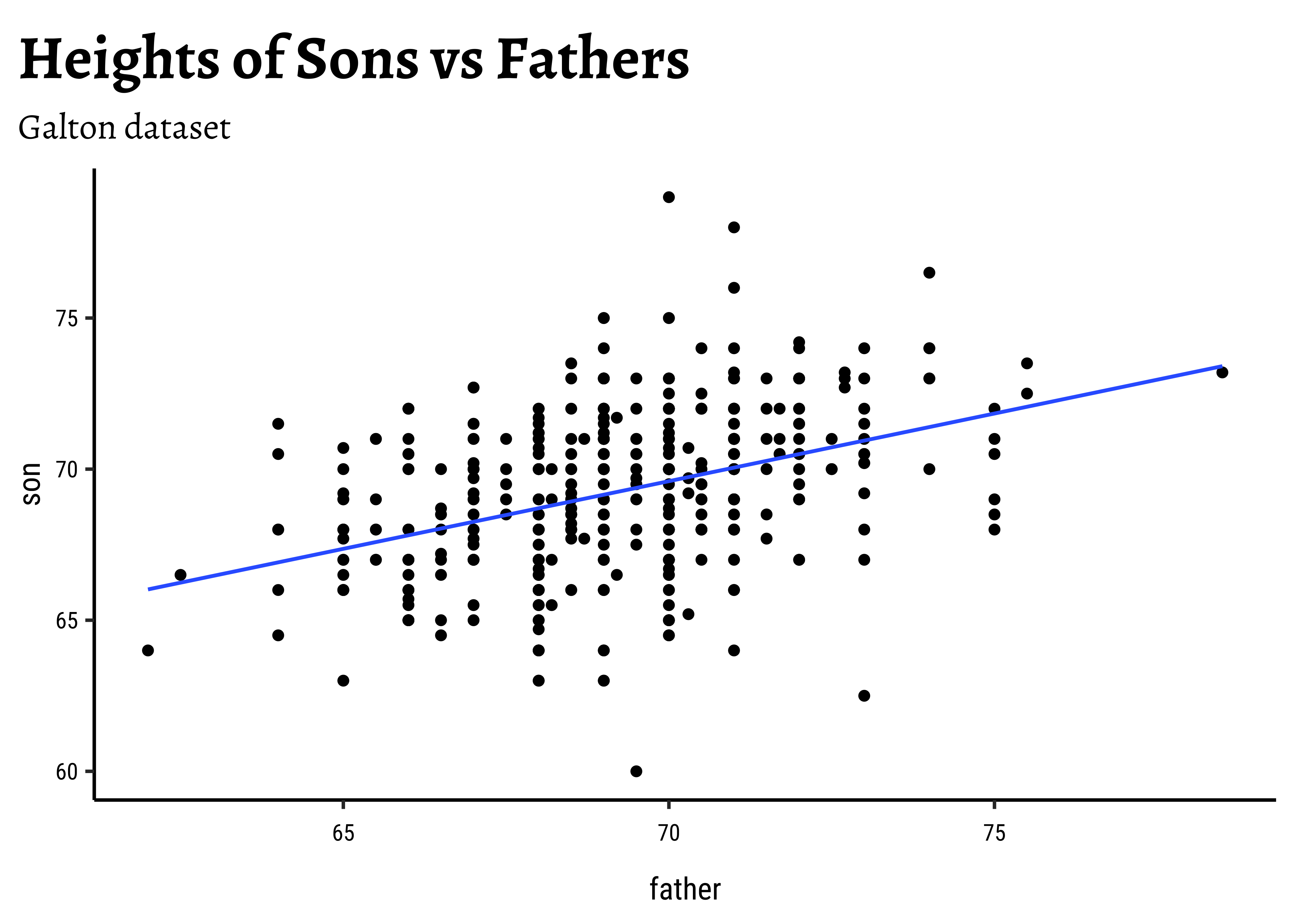
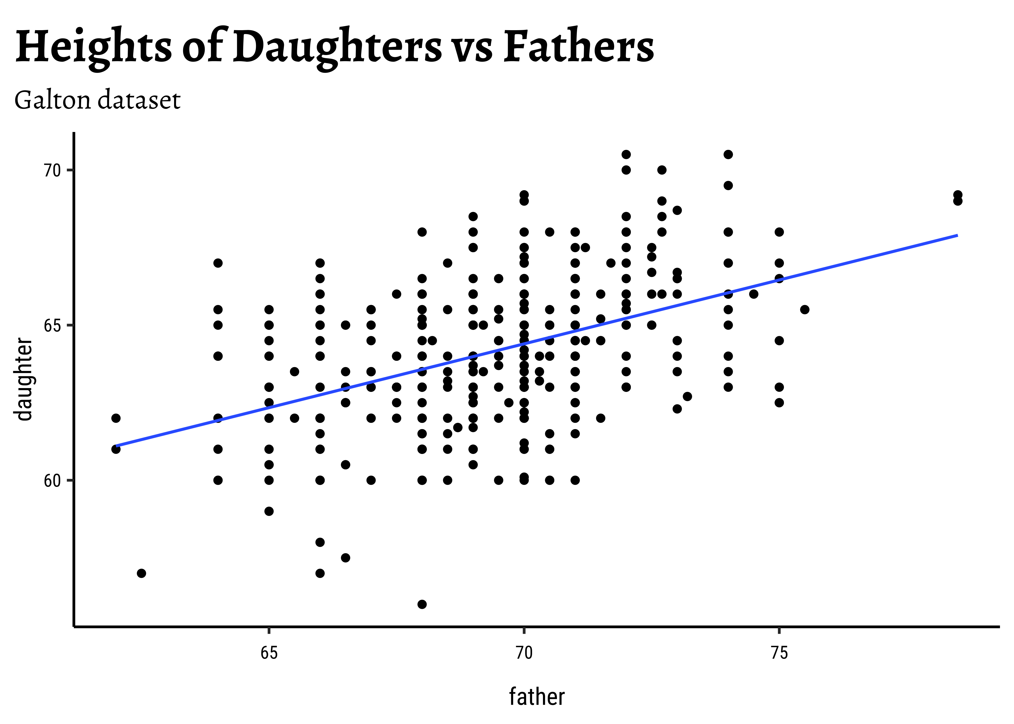
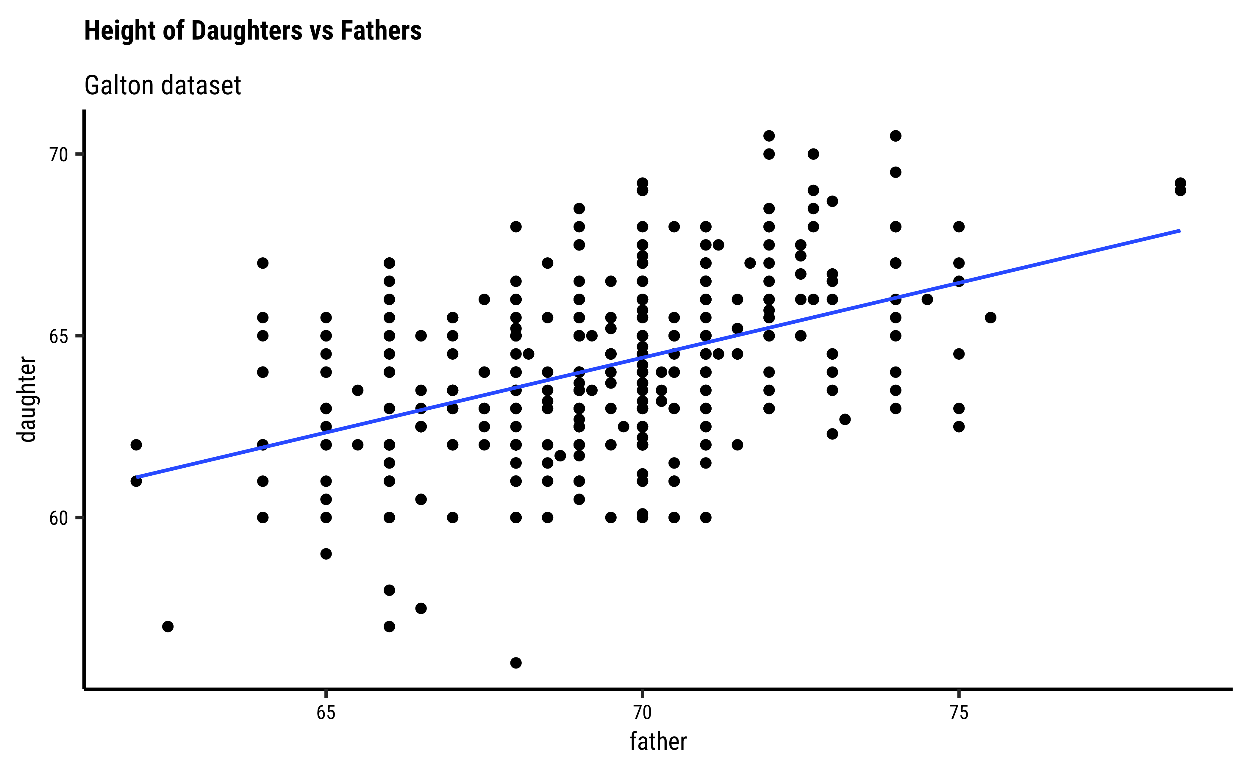
Let us first quickly plot a graph that is relevant to each of the two research questions.
# Set graph theme
theme_set(new = theme_custom())
#
Galton_sons %>%
  gf_point(son ~ father) %>%
  gf_lm() %>%
  gf_labs(
    title = "Heights of Sons vs Fathers",
    subtitle = "Galton dataset"
  )
##
Galton_daughters %>%
  gf_point(daughter ~ father) %>%
  gf_lm() %>%
  gf_labs(
    title = "Heights of Daughters vs Fathers",
    subtitle = "Galton dataset"
  )
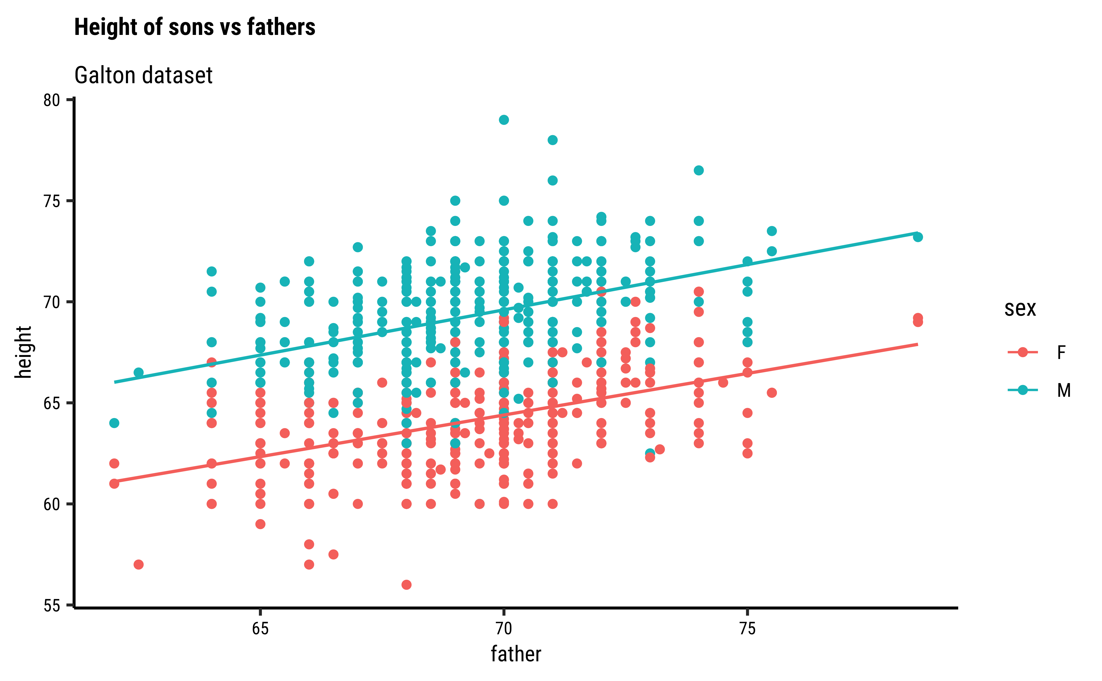
We might even plot the overall heights together and colour by sex of the child:
# Set graph theme
theme_set(new = theme_custom())
#
Galton %>%
  gf_point(height ~ father,
    group = ~sex, colour = ~sex
  ) %>%
  gf_lm() %>%
  gf_refine(scale_color_brewer(palette = "Set1")) %>%
  gf_labs(
    title = "Heights of Children vs Fathers",
    subtitle = "Galton dataset"
  )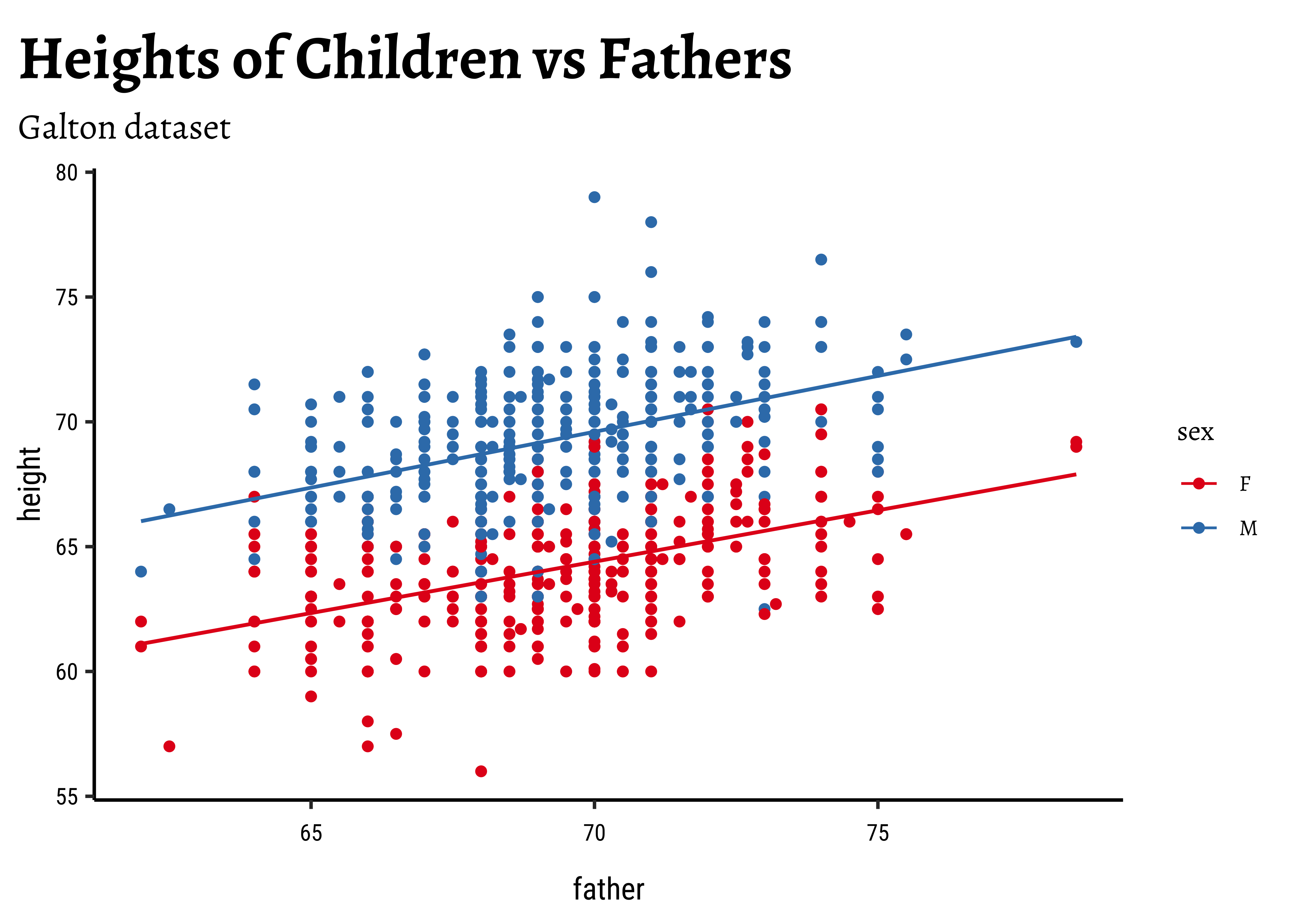
So daughters are shorter than sons, generally speaking, and both heights seem related to that of the father.
What did filtering do?
When we filtered the dataset into two, the filtering by sex of the child also effectively filtered the heights of the father (and mother). This is proper and desired; but think!
For the classical correlation tests, we need that the variables are normally distributed. As before we check this with the shapiro.test:
shapiro.test(Galton_sons$father)
shapiro.test(Galton_sons$son)
##
shapiro.test(Galton_daughters$father)
shapiro.test(Galton_daughters$daughter)
    Shapiro-Wilk normality test

data:  Galton_sons$father
W = 0.98529, p-value = 0.0001191
    Shapiro-Wilk normality test

data:  Galton_sons$son
W = 0.99135, p-value = 0.008133
    Shapiro-Wilk normality test

data:  Galton_daughters$father
W = 0.98438, p-value = 0.0001297
Shapiro-Wilk normality test
data: Galton_daughters$daughter
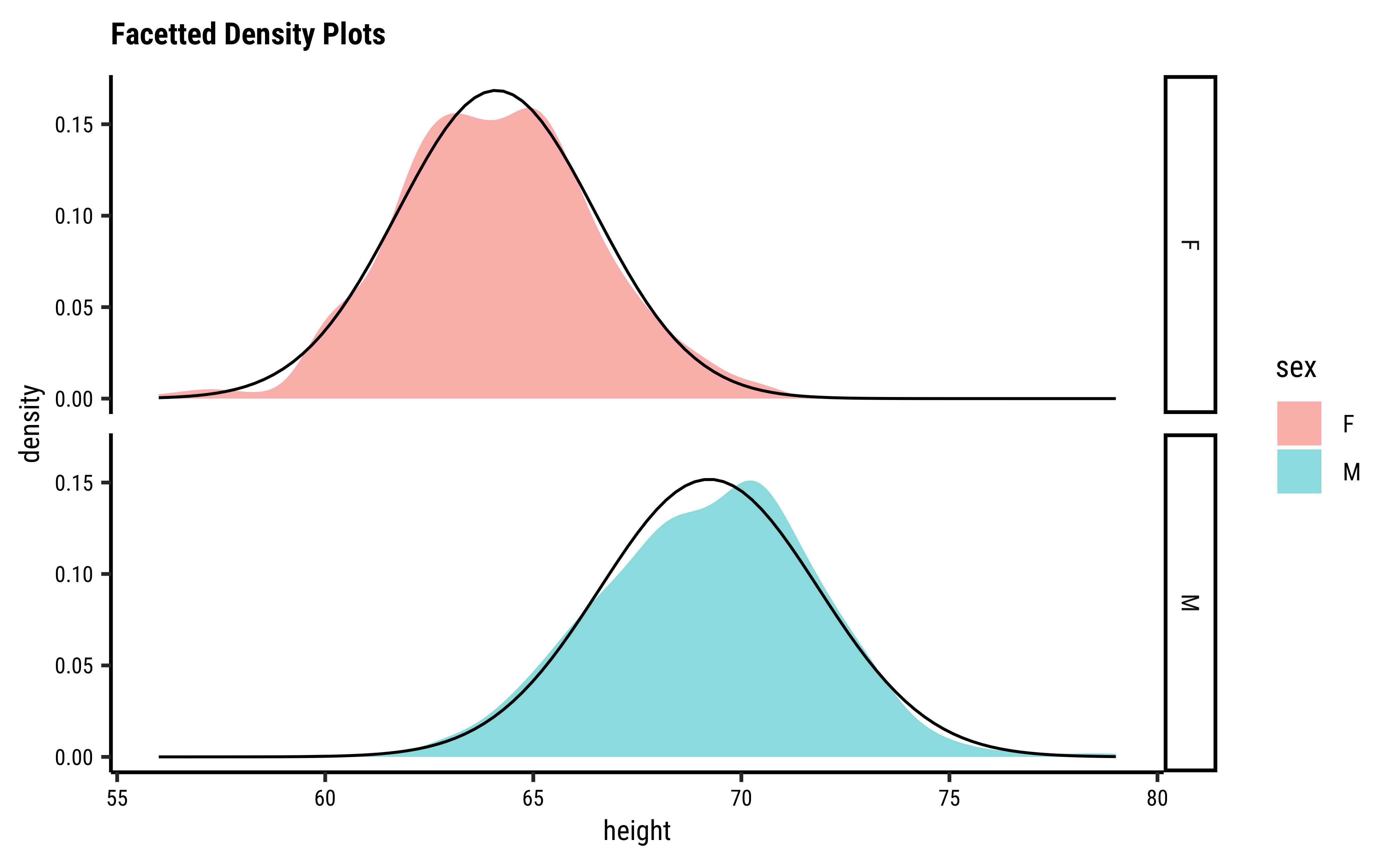
W = 0.99113, p-value = 0.01071Let us also check the densities and quartile plots of the heights the dataset:
# Set graph theme
theme_set(new = theme_custom())
#
Galton %>%
  group_by(sex) %>%
  gf_density(~height,
    group = ~sex,
    fill = ~sex
  ) %>%
  gf_fitdistr(dist = "dnorm") %>%
  gf_refine(scale_fill_brewer(palette = "Set1")) %>%
  gf_facet_grid(vars(sex)) %>%
  gf_labs(title = "Facetted Density Plots")
##
Galton %>%
  group_by(sex) %>%
  gf_qq(~height,
    group = ~sex,
    colour = ~sex, size = 0.5
  ) %>%
  gf_qqline(colour = "black") %>%
  gf_refine(scale_color_brewer(palette = "Set1")) %>%
  gf_facet_grid(vars(sex)) %>%
  gf_labs(
    title = "Facetted QQ Plots",
    x = "Theoretical quartiles",
    y = "Actual Data"
  )
and the father’s heights:
# Set graph theme
theme_set(new = theme_custom())
#
##
Galton %>%
  group_by(sex) %>%
  gf_density(~father,
    group = ~sex, # no this is not weird
    fill = ~sex
  ) %>%
  gf_fitdistr(dist = "dnorm") %>%
  gf_refine(scale_fill_brewer(name = "Sex of Child", palette = "Set1")) %>%
  gf_facet_grid(vars(sex)) %>%
  gf_labs(
    title = "Fathers: Facetted Density Plots",
    subtitle = "By Sex of Child"
  )
Galton %>%
  group_by(sex) %>%
  gf_qq(~father,
    group = ~sex, # no this is not weird
    colour = ~sex, size = 0.5
  ) %>%
  gf_qqline(colour = "black") %>%
  gf_facet_grid(vars(sex)) %>%
  gf_refine(scale_colour_brewer(name = "Sex of Child", palette = "Set1")) %>%
  gf_labs(
    title = "Fathers Heights: Facetted QQ Plots",
    subtitle = "By Sex of Child",
    x = "Theoretical quartiles",
    y = "Actual Data"
  )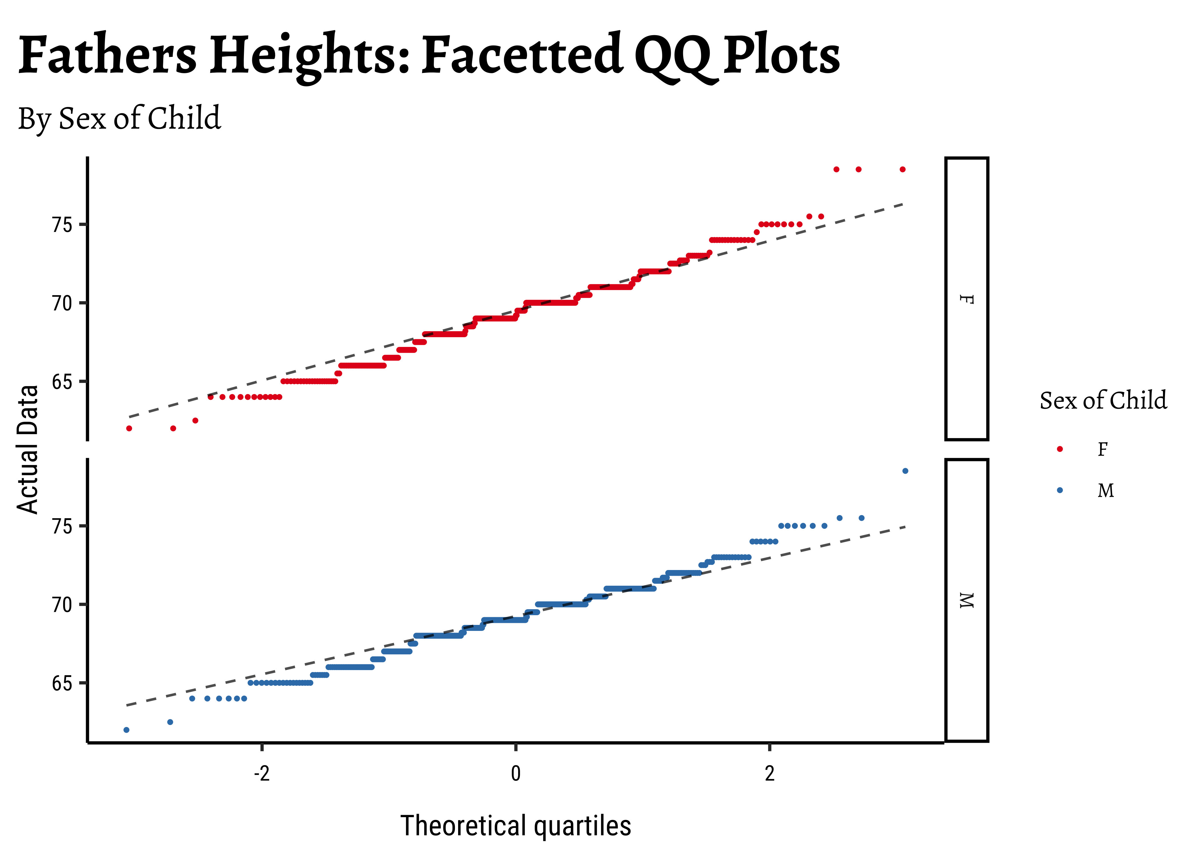
The shapiro.test informs us that the child-related height variables are not normally distributed; though visually there seems nothing much to complain about. Hmmm…
Dads are weird anyway, so we must not expect father heights to be normally distributed.
Let us now see how Correlation Tests can be performed based on this dataset, to infer patterns in the population from which this dataset/sample was drawn.
We will go with classical tests first, and then set up a permutation test that does not need any assumptions.
We perform the Pearson correlation test first: the data is not normal so we cannot really use this. We should use a non-parametric correlation test as well, using a Spearman correlation.
# Pearson (built-in test)
cor_son_pearson <- cor.test(son ~ father,
  method = "pearson",
  data = Galton_sons
) %>%
  broom::tidy() %>%
  mutate(term = "Pearson Correlation r")
cor_son_pearsonestimate <dbl> | statistic <dbl> | p.value <dbl> | parameter <int> | conf.low <dbl> | conf.high <dbl> | method <chr> | alternative <chr> | term <chr> |
|---|---|---|---|---|---|---|---|---|
| 0.3913174 | 9.149788 | 1.824016e-18 | 463 | 0.3114667 | 0.4656805 | Pearson's product-moment correlation | two.sided | Pearson Correlation r |
cor_son_spearman <- cor.test(son ~ father, method = "spearman", data = Galton_sons) %>%
  broom::tidy() %>%
  mutate(term = "Spearman Correlation r")
cor_son_spearmanestimate <dbl> | statistic <dbl> | p.value <dbl> | method <chr> | alternative <chr> | term <chr> |
|---|---|---|---|---|---|
| 0.4063241 | 9948441 | 6.51485e-20 | Spearman's rank correlation rho | two.sided | Spearman Correlation r |
Both tests state that the correlation between son and father is significant.
# Pearson (built-in test)
cor_daughter_pearson <- cor.test(daughter ~ father,
  method = "pearson",
  data = Galton_daughters
) %>%
  broom::tidy() %>%
  mutate(term = "Pearson Correlation r")
cor_daughter_pearsonestimate <dbl> | statistic <dbl> | p.value <dbl> | parameter <int> | conf.low <dbl> | conf.high <dbl> | method <chr> | alternative <chr> | term <chr> |
|---|---|---|---|---|---|---|---|---|
| 0.4587605 | 10.7186 | 6.355655e-24 | 431 | 0.3809944 | 0.5300812 | Pearson's product-moment correlation | two.sided | Pearson Correlation r |
##
cor_daughter_spearman <- cor.test(daughter ~ father, method = "spearman", data = Galton_daughters) %>%
  broom::tidy() %>%
  mutate(term = "Spearman Correlation r")
cor_daughter_spearmanestimate <dbl> | statistic <dbl> | p.value <dbl> | method <chr> | alternative <chr> | term <chr> |
|---|---|---|---|---|---|
| 0.43337 | 7666721 | 2.982817e-21 | Spearman's rank correlation rho | two.sided | Spearman Correlation r |
Again both tests state that the correlation between daughter and father is significant.
What is happening under the hood in cor.test?
To be Written Up! But when?
We can of course use a randomization based test for correlation. How would we mechanize this, what aspect would be randomize?
Correlation is calculated on a vector-basis: each individual observation of variable#1 is multiplied by the corresponding observation of variable#2. Look at Equation 1! So we might be able to randomize the order of this multiplication to see how uncommon this particular set of multiplications are. That would give us a p-value to decide if the observed correlation is close to the truth. So, onwards with our friend mosaic:
obs_daughter_corr <- cor(Galton_daughters$father, Galton_daughters$daughter)
obs_daughter_corr
[1] 0.4587605corr_daughter_null <- do(4999) * cor.test(daughter ~ shuffle(father),
data = Galton_daughters
) %>%
broom::tidy()
corr_daughter_nullestimate <dbl> | statistic <dbl> | p.value <dbl> | parameter <int> | conf.low <dbl> | conf.high <dbl> | method <chr> | alternative <chr> | .row <int> | .index <dbl> |
|---|---|---|---|---|---|---|---|---|---|
| 3.913872e-02 | 0.8131639499 | 0.4165730294 | 431 | -0.0553026530 | 1.328860e-01 | Pearson's product-moment correlation | two.sided | 1 | 1 |
| -6.073446e-03 | -0.1260903366 | 0.8997192136 | 431 | -0.1002534623 | 8.821444e-02 | Pearson's product-moment correlation | two.sided | 1 | 2 |
| -1.652351e-02 | -0.3430839064 | 0.7317026136 | 431 | -0.1105887089 | 7.783508e-02 | Pearson's product-moment correlation | two.sided | 1 | 3 |
| 1.354030e-02 | 0.2811297296 | 0.7787458108 | 431 | -0.0808001962 | 1.076403e-01 | Pearson's product-moment correlation | two.sided | 1 | 4 |
| -2.576536e-03 | -0.0534904498 | 0.9573659237 | 431 | -0.0967904306 | 9.168312e-02 | Pearson's product-moment correlation | two.sided | 1 | 5 |
| -8.213732e-03 | -0.1705272633 | 0.8646755160 | 431 | -0.1023718883 | 8.609030e-02 | Pearson's product-moment correlation | two.sided | 1 | 6 |
| -7.858073e-02 | -1.6364386067 | 0.1024777819 | 431 | -0.1715477725 | 1.577347e-02 | Pearson's product-moment correlation | two.sided | 1 | 7 |
| -1.701146e-02 | -0.3532180973 | 0.7240976348 | 431 | -0.1110707919 | 7.734994e-02 | Pearson's product-moment correlation | two.sided | 1 | 8 |
| 7.708721e-02 | 1.6051485231 | 0.1091935524 | 431 | -0.0172756804 | 1.700890e-01 | Pearson's product-moment correlation | two.sided | 1 | 9 |
| -7.880252e-02 | -1.6410862172 | 0.1015090114 | 431 | -0.1717643698 | 1.555035e-02 | Pearson's product-moment correlation | two.sided | 1 | 10 |
corr_daughter_null %>%
  gf_histogram(~estimate, bins = 50) %>%
  gf_vline(
    xintercept = obs_daughter_corr,
    color = "red", linewidth = 1
  ) %>%
  gf_labs(
    title = "Permutation Null Distribution",
    subtitle = "Daughter Heights vs Father Heights"
  )
##
p_value_null <- 2.0 * mean(corr_daughter_null$estimate >= obs_daughter_corr)
p_value_null
[1] 0We see that will all permutations of father, we are never able to hit the actual obs_daughter_corr! Hence there is a definite correlation between father height and daughter height.
The premise here is that many common statistical tests are special cases of the linear model. A linear model estimates the relationship between dependent variable or
“response” variable height and an explanatory variable or “predictor”, father. It is assumed that the relationship is linear. height based the value of father.
Using the linear model method we get:
# Linear Model
lin_son <- lm(son ~ father, data = Galton_sons) %>%
  broom::tidy() %>%
  mutate(term = c("beta_0", "beta_1")) %>%
  select(term, estimate, p.value)
lin_sonterm <chr> | estimate <dbl> | p.value <dbl> | ||
|---|---|---|---|---|
| beta_0 | 38.2589122 | 2.642076e-26 | ||
| beta_1 | 0.4477479 | 1.824016e-18 |
##
lin_daughter <- lm(daughter ~ father, data = Galton_daughters) %>%
  broom::tidy() %>%
  mutate(term = c("beta_0", "beta_1")) %>%
  select(term, estimate, p.value)
lin_daughterterm <chr> | estimate <dbl> | p.value <dbl> | ||
|---|---|---|---|---|
| beta_0 | 35.5852284 | 2.573249e-34 | ||
| beta_1 | 0.4116015 | 6.355655e-24 |
Why are the respective p-value-s is suspiciously the same!? Did we miss a factor of
Let us scale the variables to within {-1, +1} : (subtract the mean and divide by sd) and re-do the Linear Model with scaled versions of height and father:
# Scaled linear model
lin_scaled_galton_daughters <- lm(scale(daughter) ~ 1 + scale(father), data = Galton_daughters) %>%
  broom::tidy() %>%
  mutate(term = c("beta_0", "beta_1"))
lin_scaled_galton_daughtersterm <chr> | estimate <dbl> | std.error <dbl> | statistic <dbl> | p.value <dbl> |
|---|---|---|---|---|
| beta_0 | -1.532454e-14 | 0.04275097 | -3.584606e-13 | 1.000000e+00 |
| beta_1 | 4.587605e-01 | 0.04280043 | 1.071860e+01 | 6.355655e-24 |
Now you’re talking!! The estimate is the same in both the classical test and the linear model! So we conclude:
When both target and predictor have the same standard deviation, the slope from the linear model and the Pearson correlation are the same.
There is this relationship between the slope in the linear model and Pearson correlation:
The slope is usually much more interpretable and informative than the correlation coefficient.
- Hence a linear model using
scale()for both variables will show slope = r.
Slope_Scaled: 0.4587605 = Correlation: 0.4587605
- Finally, the p-value for Pearson Correlation and that for the slope in the linear model is the same (
daughter-s andfather-s heights.
Can you complete this for the sons?
Correlation tests are useful to understand the relationship between two variables, but they do not imply causation. A high correlation does not mean that one variable causes the other to change. It is essential to consider the context and other factors that may influence the relationship.
Correlation tests are a powerful way to understand the relationship between two variables. They can be performed using classical methods like Pearson and Spearman correlation, or using more robust methods like permutation tests. The linear model approach provides a deeper understanding of the relationship, especially when the assumptions of normality and homoscedasticity are met.
Try the datasets in the
inferpackage. Usedata(package = "infer")in your Console to list out the data packages. Then simply type the name of the dataset in a Quarto chunk ( e.g.babynames) to read it.Same with the
resampledataandresampledata3packages.
-
Common statistical tests are linear models (or: how to teach stats) by Jonas Kristoffer Lindeløv
CheatSheet
-
Common statistical tests are linear models: a work through by Steve Doogue
-
Jeffrey Walker “Elements of Statistical Modeling for Experimental Biology”
- Diez, David M & Barr, Christopher D & Çetinkaya-Rundel, Mine: OpenIntro Statistics
- Modern Statistics with R: From wrangling and exploring data to inference and predictive modelling by Måns Thulin
- Jeffrey Walker “A linear-model-can-be-fit-to-data-with-continuous-discrete-or-categorical-x-variables”
Attali, Dean, and Christopher Baker. 2023. ggExtra: Add Marginal Histograms to “ggplot2,” and More “ggplot2” Enhancements. https://doi.org/10.32614/CRAN.package.ggExtra.
Çetinkaya-Rundel, Mine, David Diez, Andrew Bray, Albert Y. Kim, Ben Baumer, Chester Ismay, Nick Paterno, and Christopher Barr. 2024. openintro: Datasets and Supplemental Functions from “OpenIntro” Textbooks and Labs. https://doi.org/10.32614/CRAN.package.openintro.
Chihara, Laura, and Tim Hesterberg. 2022. Resampledata3: Data Sets for “Mathematical Statistics with Resampling and R” (3rd Ed). https://doi.org/10.32614/CRAN.package.resampledata3.
Lüdecke, Daniel, Mattan S. Ben-Shachar, Indrajeet Patil, Brenton M. Wiernik, Etienne Bacher, Rémi Thériault, and Dominique Makowski. 2022. “easystats: Framework for Easy Statistical Modeling, Visualization, and Reporting.” CRAN. https://doi.org/10.32614/CRAN.package.easystats.
Patil, Indrajeet. 2021a. “statsExpressions: R Package for Tidy Dataframes and Expressions with Statistical Details.” Journal of Open Source Software 6 (61): 3236. https://doi.org/10.21105/joss.03236.
———. 2021b. “Visualizations with statistical details: The ‘ggstatsplot’ approach.” Journal of Open Source Software 6 (61): 3167. https://doi.org/10.21105/joss.03167.
Citation
BibTeX citation:
@online{v.2022,
  author = {V., Arvind},
  title = {Inference for {Correlation}},
  date = {2022-11-25},
  url = {https://av-quarto.netlify.app/content/courses/Analytics/Inference/Modules/150-Correlation/},
  langid = {en},
  abstract = {Statistical Significance Tests for Correlations between
    two Variables}
}
For attribution, please cite this work as:
V., Arvind. 2022. “Inference for Correlation.” November 25,
2022. https://av-quarto.netlify.app/content/courses/Analytics/Inference/Modules/150-Correlation/.