Applied Metaphors: Learning TRIZ, Complexity, Data/Stats/ML using Metaphors
  1. Teaching
  2. Data Science with No Code
  3. Counts
  • Teaching
    • Data Analytics for Managers and Creators
      • Tools
        • Introduction to R and RStudio
        • Introduction to Radiant
        • Introduction to Orange
      • Descriptive Analytics
        • Data
        • Summaries
        • Counts
        • Quantities
        • Groups
        • Densities
        • Groups and Densities
        • Change
        • Proportions
        • Parts of a Whole
        • Evolution and Flow
        • Ratings and Rankings
        • Surveys
        • Time
        • Space
        • Networks
        • Experiments
        • Miscellaneous Graphing Tools, and References
      • Statistical Inference
        • 🧭 Basics of Statistical Inference
        • 🎲 Samples, Populations, Statistics and Inference
        • Basics of Randomization Tests
        • 🃏 Inference for a Single Mean
        • 🃏 Inference for Two Independent Means
        • 🃏 Inference for Comparing Two Paired Means
        • Comparing Multiple Means with ANOVA
        • Inference for Correlation
        • 🃏 Testing a Single Proportion
        • 🃏 Inference Test for Two Proportions
      • Inferential Modelling
        • Modelling with Linear Regression
        • Modelling with Logistic Regression
        • 🕔 Modelling and Predicting Time Series
      • Predictive Modelling
        • 🐉 Intro to Orange
        • ML - Regression
        • ML - Classification
        • ML - Clustering
      • Prescriptive Modelling
        • 📐 Intro to Linear Programming
        • 💭 The Simplex Method - Intuitively
        • 📅 The Simplex Method - In Excel
      • Workflow
        • Facing the Abyss
        • I Publish, therefore I Am
      • Case Studies
        • Demo:Product Packaging and Elderly People
        • Ikea Furniture
        • Movie Profits
        • Gender at the Work Place
        • Heptathlon
        • School Scores
        • Children's Games
        • Valentine’s Day Spending
        • Women Live Longer?
        • Hearing Loss in Children
        • California Transit Payments
        • Seaweed Nutrients
        • Coffee Flavours
        • Legionnaire’s Disease in the USA
        • Antarctic Sea ice
        • William Farr's Observations on Cholera in London
    • R for Artists and Managers
      • 🕶 Lab-1: Science, Human Experience, Experiments, and Data
      • Lab-2: Down the R-abbit Hole…
      • Lab-3: Drink Me!
      • Lab-4: I say what I mean and I mean what I say
      • Lab-5: Twas brillig, and the slithy toves…
      • Lab-6: These Roses have been Painted !!
      • Lab-7: The Lobster Quadrille
      • Lab-8: Did you ever see such a thing as a drawing of a muchness?
      • Lab-9: If you please sir…which way to the Secret Garden?
      • Lab-10: An Invitation from the Queen…to play Croquet
      • Lab-11: The Queen of Hearts, She Made some Tarts
      • Lab-12: Time is a Him!!
      • Iteration: Learning to purrr
      • Lab-13: Old Tortoise Taught Us
      • Lab-14: You’re are Nothing but a Pack of Cards!!
    • ML for Artists and Managers
      • 🐉 Intro to Orange
      • ML - Regression
      • ML - Classification
      • ML - Clustering
      • 🕔 Modelling Time Series
    • TRIZ for Problem Solvers
      • I am Water
      • I am What I yam
      • Birds of Different Feathers
      • I Connect therefore I am
      • I Think, Therefore I am
      • The Art of Parallel Thinking
      • A Year of Metaphoric Thinking
      • TRIZ - Problems and Contradictions
      • TRIZ - The Unreasonable Effectiveness of Available Resources
      • TRIZ - The Ideal Final Result
      • TRIZ - A Contradictory Language
      • TRIZ - The Contradiction Matrix Workflow
      • TRIZ - The Laws of Evolution
      • TRIZ - Substance Field Analysis, and ARIZ
    • Math Models for Creative Coders
      • Maths Basics
        • Vectors
        • Matrix Algebra Whirlwind Tour
        • content/courses/MathModelsDesign/Modules/05-Maths/70-MultiDimensionGeometry/index.qmd
      • Tech
        • Tools and Installation
        • Adding Libraries to p5.js
        • Using Constructor Objects in p5.js
      • Geometry
        • Circles
        • Complex Numbers
        • Fractals
        • Affine Transformation Fractals
        • L-Systems
        • Kolams and Lusona
      • Media
        • Fourier Series
        • Additive Sound Synthesis
        • Making Noise Predictably
        • The Karplus-Strong Guitar Algorithm
      • AI
        • Working with Neural Nets
        • The Perceptron
        • The Multilayer Perceptron
        • MLPs and Backpropagation
        • Gradient Descent
      • Projects
        • Projects
    • Data Science with No Code
      • Data
      • Orange
      • Summaries
      • Counts
      • Quantity
      • 🕶 Happy Data are all Alike
      • Groups
      • Change
      • Rhythm
      • Proportions
      • Flow
      • Structure
      • Ranking
      • Space
      • Time
      • Networks
      • Surveys
      • Experiments
    • Tech for Creative Education
      • 🧭 Using Idyll
      • 🧭 Using Apparatus
      • 🧭 Using g9.js
    • Literary Jukebox: In Short, the World
      • Italy - Dino Buzzati
      • France - Guy de Maupassant
      • Japan - Hisaye Yamamoto
      • Peru - Ventura Garcia Calderon
      • Russia - Maxim Gorky
      • Egypt - Alifa Rifaat
      • Brazil - Clarice Lispector
      • England - V S Pritchett
      • Russia - Ivan Bunin
      • Czechia - Milan Kundera
      • Sweden - Lars Gustaffsson
      • Canada - John Cheever
      • Ireland - William Trevor
      • USA - Raymond Carver
      • Italy - Primo Levi
      • India - Ruth Prawer Jhabvala
      • USA - Carson McCullers
      • Zimbabwe - Petina Gappah
      • India - Bharati Mukherjee
      • USA - Lucia Berlin
      • USA - Grace Paley
      • England - Angela Carter
      • USA - Kurt Vonnegut
      • Spain-Merce Rodoreda
      • Israel - Ruth Calderon
      • Israel - Etgar Keret
  • Posts
  • Blogs and Talks

On this page

  • What graphs will we see today?
  • What kind of Data Variables will we choose?
  • Inspiration
  • How do these Chart(s) Work?
  • Plotting a Bar Chart
  • Dataset: Banned Books in the USA
    • Examine the Data
    • Data Dictionary
    • Research Questions
    • What is the Story Here?
  • Your Turn
  • Wait, But Why?
  • Readings
  1. Teaching
  2. Data Science with No Code
  3. Counts

Counts

Happy Families are All Alike

Qual Variables
Bar Charts
Column Charts
Published

April 16, 2024

Modified

July 28, 2024

Abstract
Visualizing Single Qual Variables

What graphs will we see today?

Variable #1 Variable #2 Chart Names Chart Shape
Qual None Bar Chart

What kind of Data Variables will we choose?

No Pronoun Answer Variable/Scale Example What Operations?
3 How, What Kind, What Sort A Manner / Method, Type or Attribute from a list, with list items in some " order" ( e.g. good, better, improved, best..) Qualitative/Ordinal Socioeconomic status (Low income, Middle income, High income),Education level (HighSchool, BS, MS, PhD),Satisfaction rating(Very much Dislike, Dislike, Neutral, Like, Very Much Like) Median,Percentile

Inspiration

Figure 1: Capital Cities

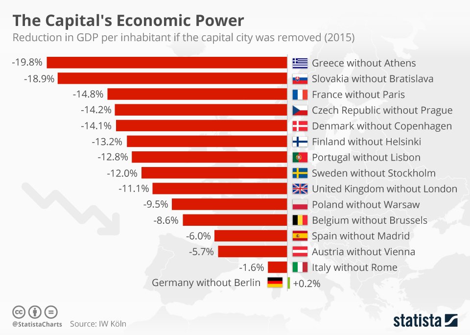
How much does the (financial) capital of a country contribute to its GDP? Which would be India’s city? What would be the reduction in percentage?

And these Germans are crazy.(Toc, toc, toc.toc!)

How do these Chart(s) Work?

Bar are used to show “counts” and “tallies” with respect to Qual variables. For instance, in a survey, how many people vs Gender? In a Target Audience survey on Weekly Consumption, how many low, medium, or high expenditure people?

Each Qual variable potentially has many levels as we saw in the Nature of Data. For instance, in the above example on Weekly Expenditure, low, medium and high were levels for the Qual variable Expenditure. Bar charts perform internal counts for each level of the Qual variable under consideration. The Bar Plot is then a set of disjoint bars representing these counts; see the icon above, and then that for histograms!! The X-axis is the set of levels in the Qual variable, and the Y-axis represents the counts for each level.

NoteBar Charts and Column Charts

And Column charts just plot numbers over categories. No internal counting. As you can see in the Figure 1 above.

Though in many places, these two names are used interchangeably! But be aware of what the tool may be doing!

Plotting a Bar Chart

  • Using Orange
  • Using RAWgraphs
  • Using DataWrapper

The Bar Plot widget in Orange is described here. https://orangedatamining.com/widget-catalog/visualize/barplot/

And download the Bar Chart workflow file for this data:

https://academy.datawrapper.de/category/74-bar-charts

Dataset: Banned Books in the USA

Here is a dataset from Jeremy Singer-Vine’s blog, Data Is Plural. This is a list of all books banned in schools across the US.

Download this data to your machine and use it in Orange.

Examine the Data

Figure 2: Banned Books Data Table
Figure 3: Banned Books Data Summary

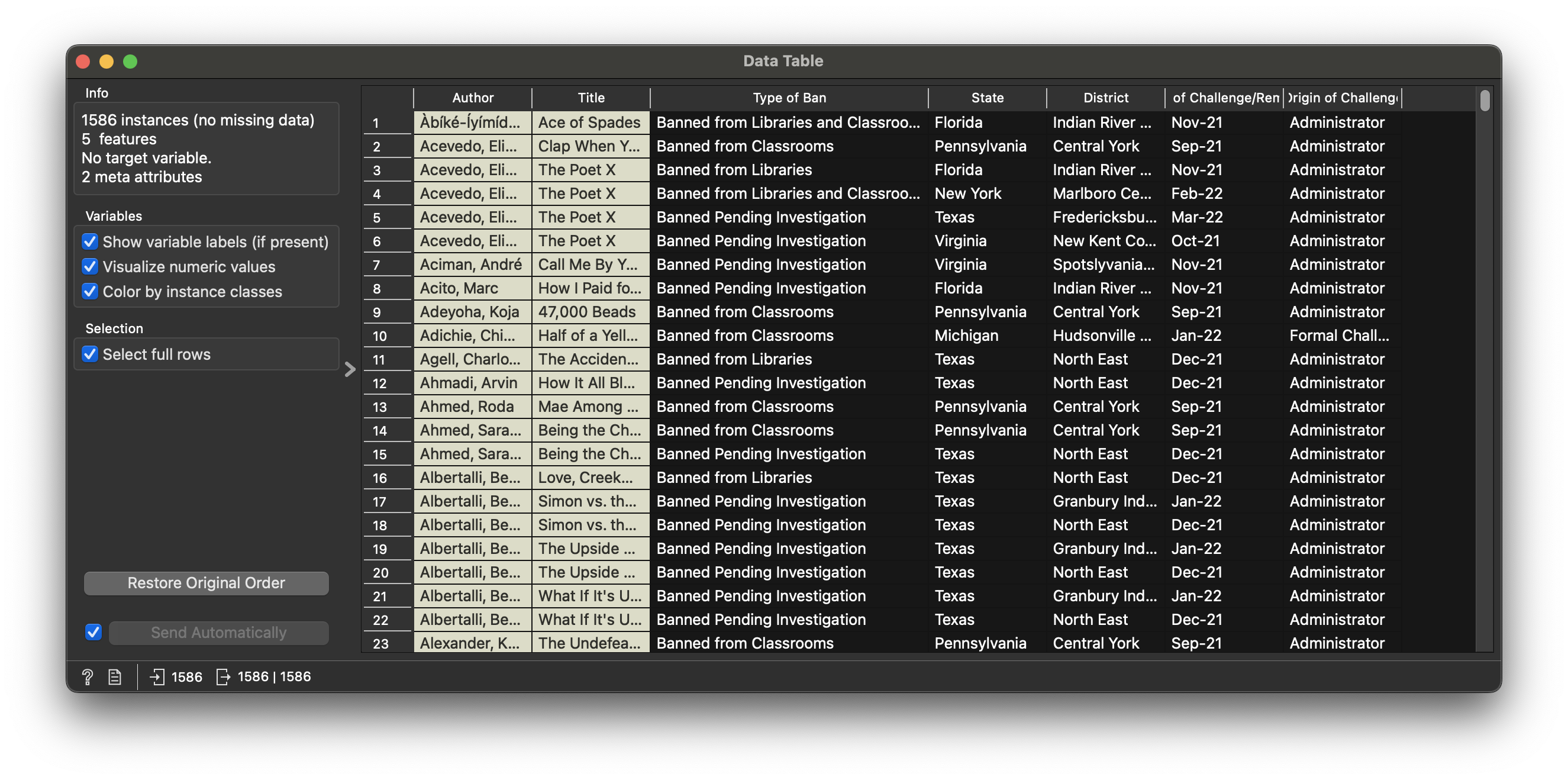
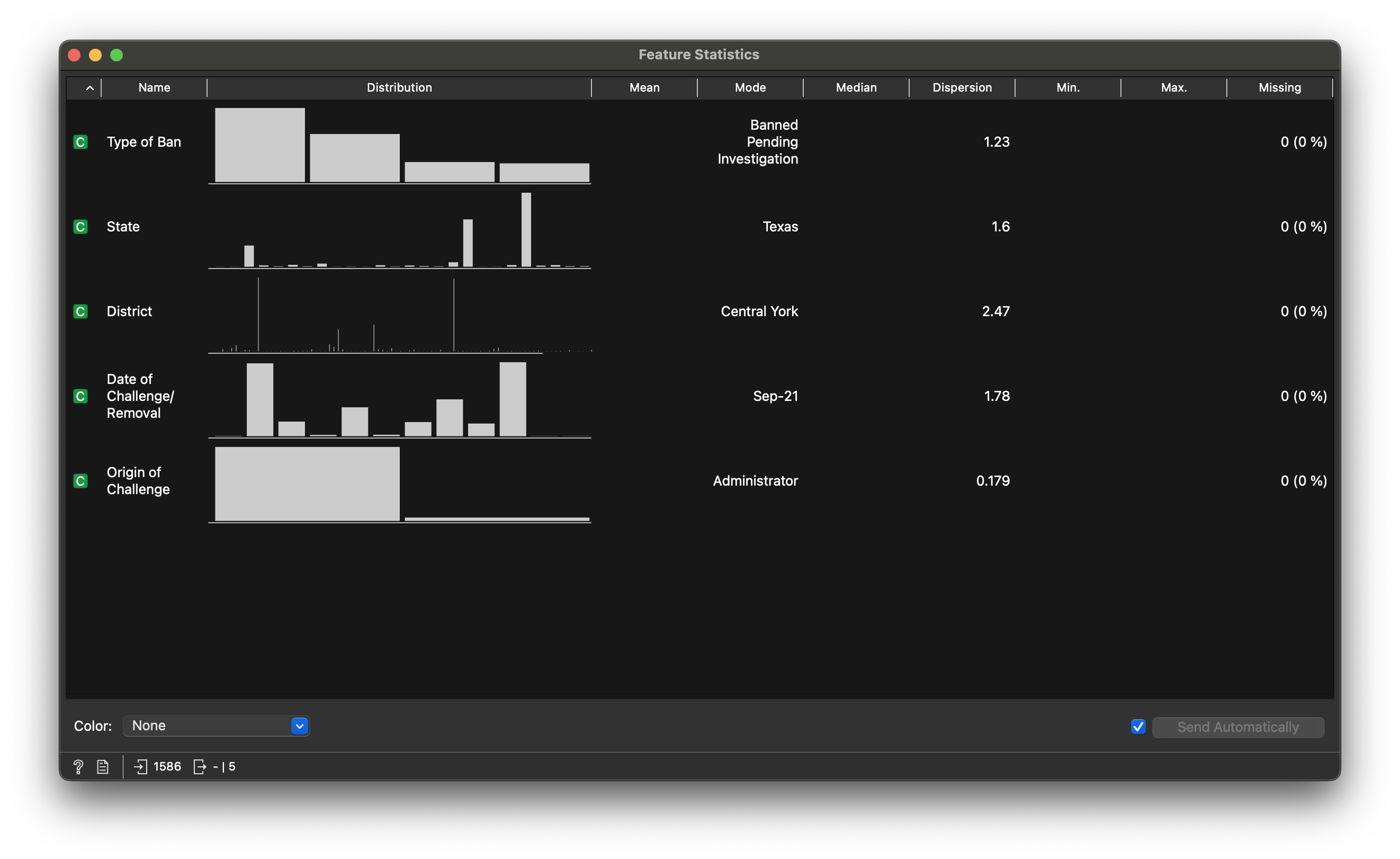
Figure 2 states that we have 1586 rows, 7 columns. So 1586 banned books are on this list! 🙀 🙀 🙀

The Figure 3 already has a thumbnail-like bar chart. We will still make a “proper” one with the appropriate widget.

Warning

In the workflow below, note how it is still the Distributions widget that gives the Bar Chart. This is unfortunate, since we have been at pains to state how a Bar Chart and the Histogram deal with different types of variables (Qual and Quant respectively). Just one of those things we need to get used to!!

Data Dictionary

NoteQuantitative Data
  • Date of Challenge: Date the book was (selected to be?) banned
NoteQualitative Data
  • Author: (text) Meta Data. Can be treated as Qual
  • Title: (text) Meta Data. Can be treated as Qual
  • State: (text) Qual factor
  • District: (text) Qual factor
  • Type of Ban: (text) Qual factor
  • Origin of Challenge: (text) Who requested the Ban?

How many levels in each?? Find out in Orange!!

Research Questions

Note

Q1. Which is the US state that bans the most? Which state is least involved in banning books? What can you say of the “geography of book banning” based on your understanding of the US of A? 🤣

Figure 4: Banned Books Count by State
Note

Q2. Create Bar charts of the count of banned books by Reason for Banning!!

Try!!

What is the Story Here?

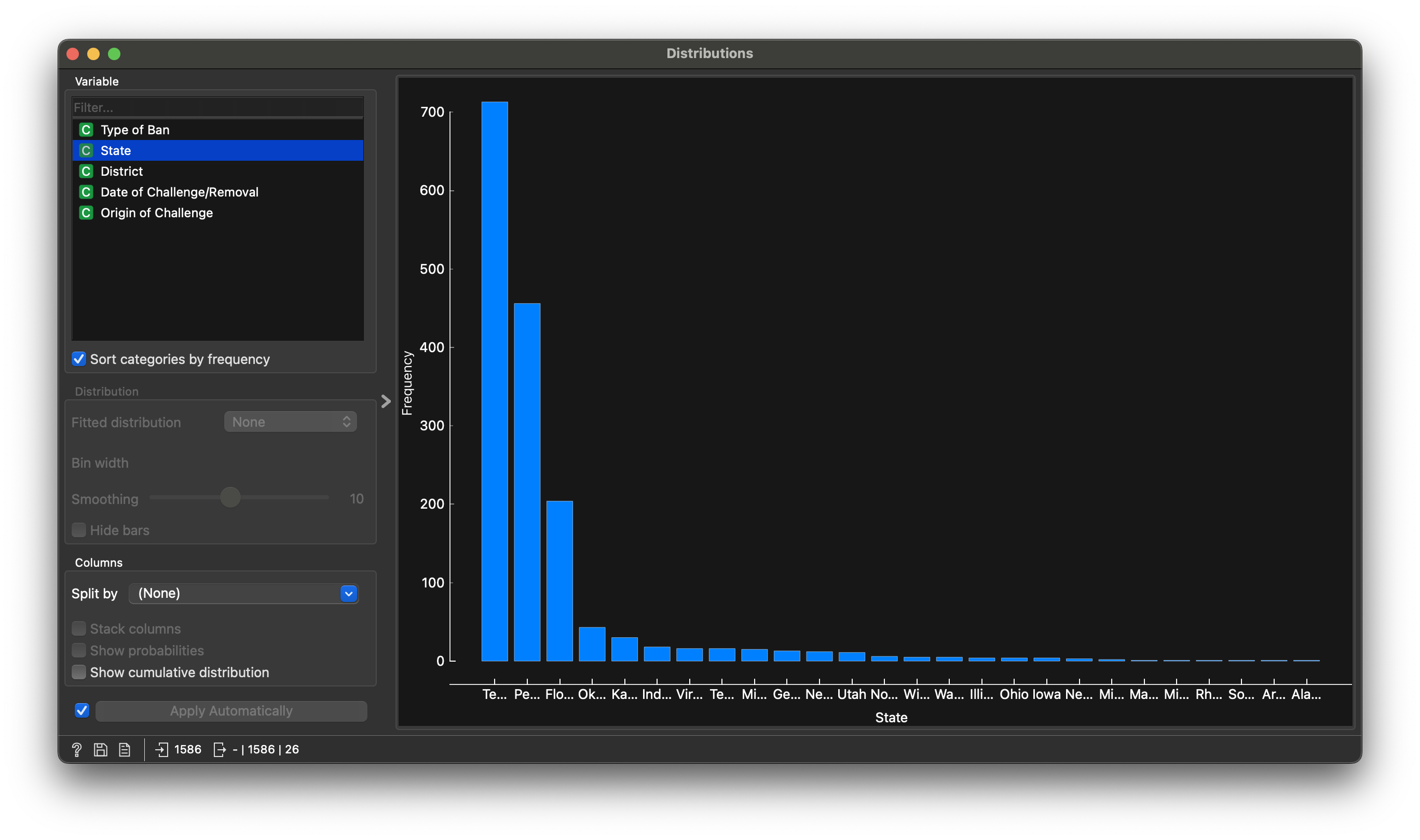
  • Figure 4 says that Texas is the worst at book banning!
  • Texas, Florida, Oklahoma, Kansas, Indiana,..are next in line
  • Is there a “Bible Belt” story here?
Figure 5: Bible Belt
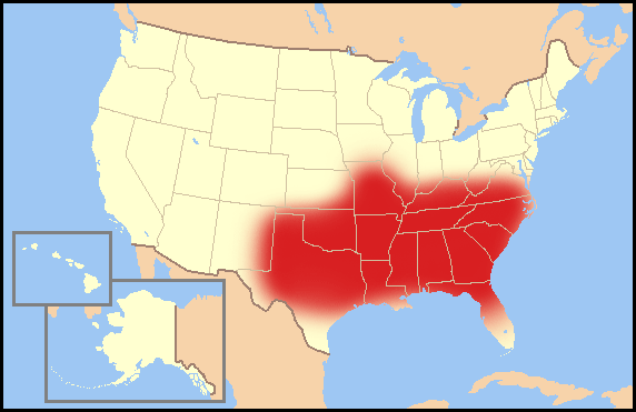
  • And what, Californians are too busy making money to care about book-banning!!! The state does not even show up in the chart! 😆

  • What does the second bar chart say?

Your Turn

  1. AiRbnb Price Data on the French Riviera:
  1. Apartment price vs ground living area:
  1. Fertility: This rather large and interesting Fertility related dataset from https://vincentarelbundock.github.io/Rdatasets/csv/AER/Fertility.csv

Wait, But Why?

  • Always count your chickens count your data before you model or infer!
  • Counts first give you an absolute sense of how much data you have.
  • Counts by different Qual variables give you a sense of the combinations you have in your data: (Male/Female)∗(Income−Status)∗(Old/Young)∗(Urban/Rural) (Say 2 * 3 * 2 * 2 = 24 combinations of data)
  • Counts then give an idea whether your data is lop-sided: do you have too many observations of one category(level) and too few of another category(level) in a given Qual variable?
  • Balance is important in order to draw decent inferences
  • And for ML algorithms, to train them properly.
  • Since the X-axis in bar charts is Qualitative (the bars don’t touch, remember!) it is possible to sort the bars at will, based on the levels within the Qualitative variables. See the approx Zipf’s Law distribution for the English alphabet below:
Figure 6: Zipf’s Law

In Figure 6, the letters of the alphabet are “levels” within a Qualitative variable, and these levels have been sorted based on the frequency or count!

Readings

Back to top
Summaries
Quantity

License: CC BY-SA 2.0

Website made with ❤️ and Quarto, by Arvind V.

Hosted by Netlify .