| No | Pronoun | Answer | Variable/Scale | Example | What Operations? |
|---|---|---|---|---|---|
| 2 | How Many / Much / Heavy? Few? Seldom? Often? When? | Quantities with Scale. Differences are meaningful, but not products or ratios | Quantitative/Interval | pH,SAT score(200-800),Credit score(300-850),SAT score(200-800),Year of Starting College | Mean,Standard Deviation |
| 3 | How, What Kind, What Sort | A Manner / Method, Type or Attribute from a list, with list items in some " order" ( e.g. good, better, improved, best..) | Qualitative/Ordinal | Socioeconomic status (Low income, Middle income, High income),Education level (HighSchool, BS, MS, PhD),Satisfaction rating(Very much Dislike, Dislike, Neutral, Like, Very Much Like) | Median,Percentile |
The further off from England the nearer is to France.
What graphs will we see today?
| Variable #1 | Variable #2 | Chart Names | Chart Shape |
|---|---|---|---|
| Quant | None | Box-Whisker Plots and Violin Plots |
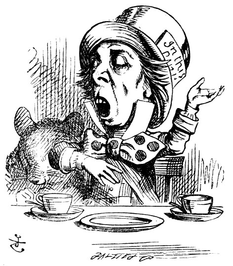
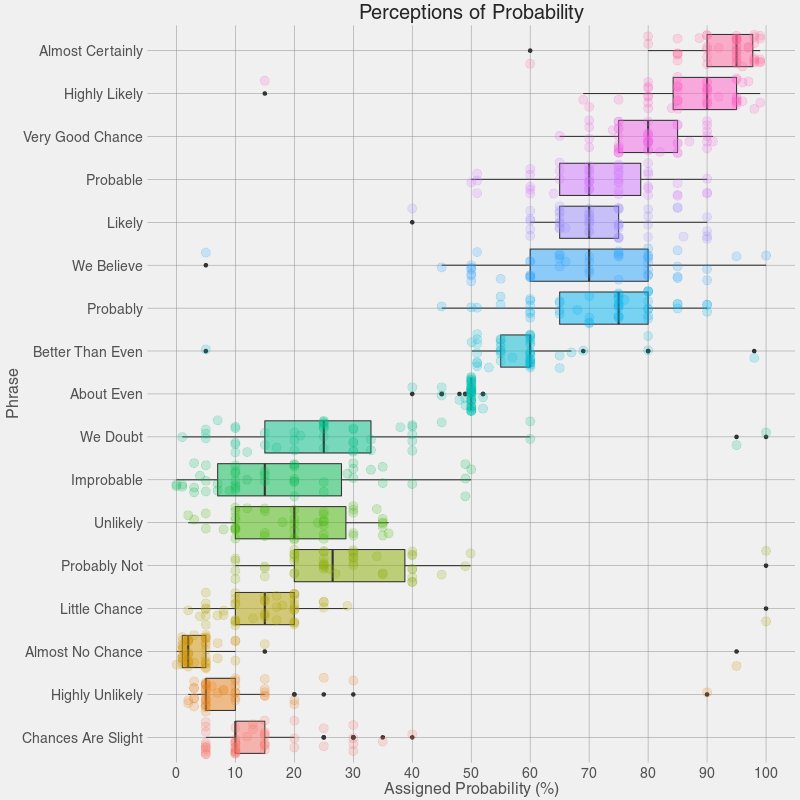
Alice said, “I say what I mean and I mean what I say!” Are the rest of us so sure? What do we mean when we use any of the phrases above? How definite are we? There is a range of “sureness” and “unsureness”…and this is where we can use box plots like Figure 1 to show that range of opinion.
Maybe it is time for a box plot on uh, shades1 of meaning for Jane Austen Gen-Z phrases! Bah.
Box Plots are an extremely useful data visualization that gives us an idea of the distribution of a Quant variable, for each level of another Qual variable. The internal process of this plot is as follows:
- make groups of the Quant variable for each level of the Qual
- in each group, rank the Quant variable values in increasing order
- Calculate:
median,IQR,outliers - plot these as a vertical or horizontal box structure
The box can also be asymmetric “half plots” if needed…
Note how the histogram that dwells upon the mean and standard deviation, whereas the boxplot focuses on the median and quartiles. The former uses the values of the Quant variable, whereas the latter uses their sequence number or ranks.
Box plots are often used for example in HR operations to understand Salary distributions across grades of employees. Marks of students in competitive exams are also declared using Quartiles.
In the Figure 2, the boxplot is the one on the top. The box part represents the middle 50% of the data, in order of magnitude, and the two halves of the box are defined by the median line.
The boxplot in the figure compared with a density plot, which shows a symmetric normal density. Since the latter is symmetric, the median and the mean are identical, as seen by the correspondence with the boxplot in the figure above.
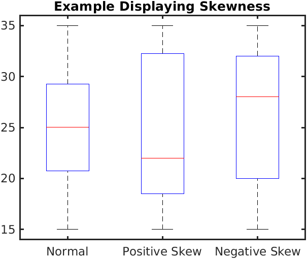
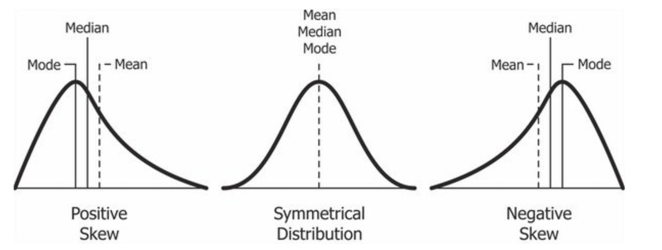
In the Figure 3 (a), we see the difference between boxplots that show symmetric and skewed distributions. The “lid” and the “bottom” of the box are not of similar width in distributions with significant skewness.
Compare these with the corresponding Figure 3 (b).
Here is the BoxPlot Widget description.
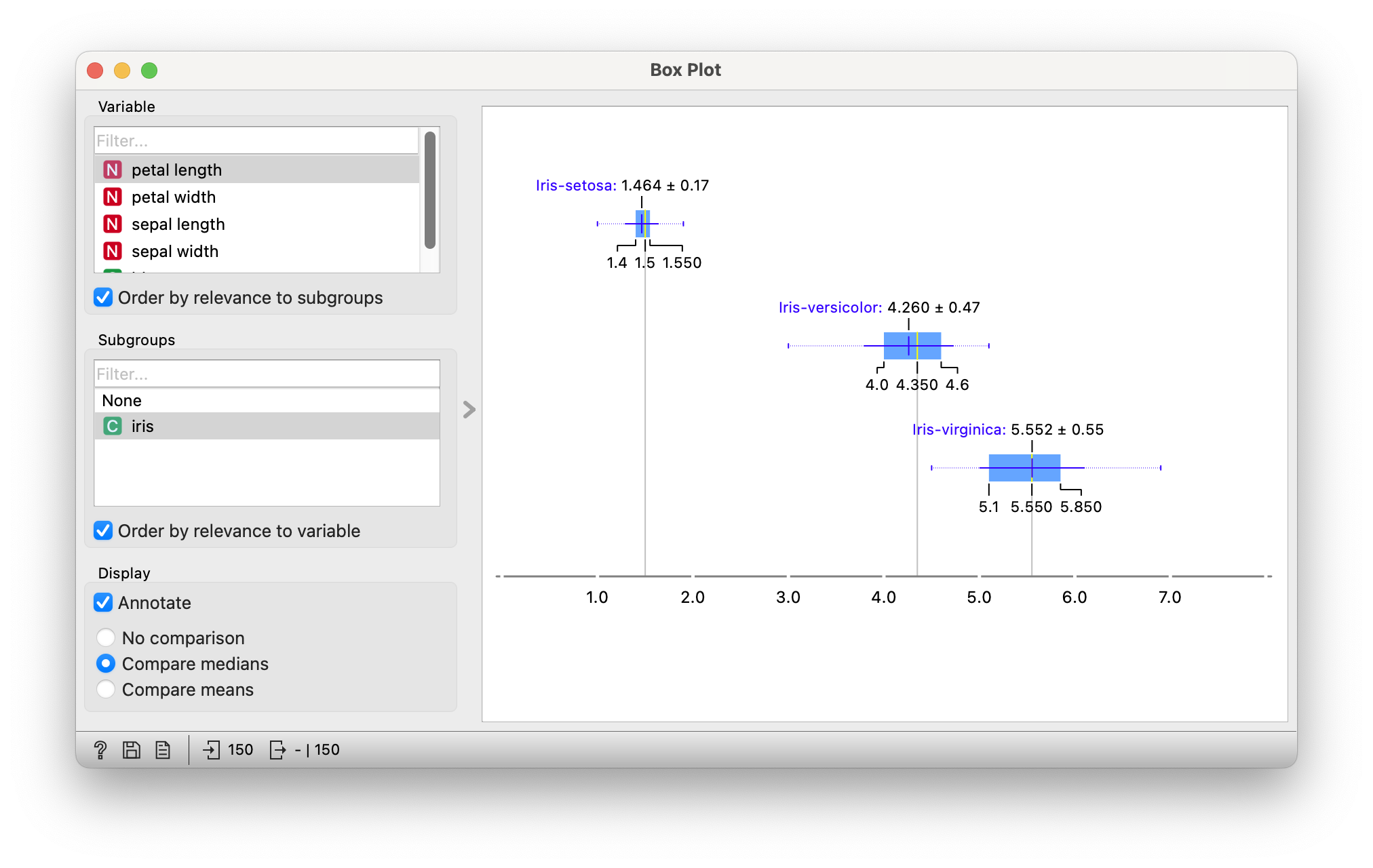
Let us first plot a set of boxplots for the familiar iris dataset and then investigate other datasets using the same Orange workflow.
Figure 4 shows the three horizontal box-plots for the chosen Quant variable, one for each level of iris(species). The IQR is also shown for each fo the groups. One can selectively compare either medians or means across these groups of measurements.
There does not seem to be a way of creating Box Plots in DataWrapper .
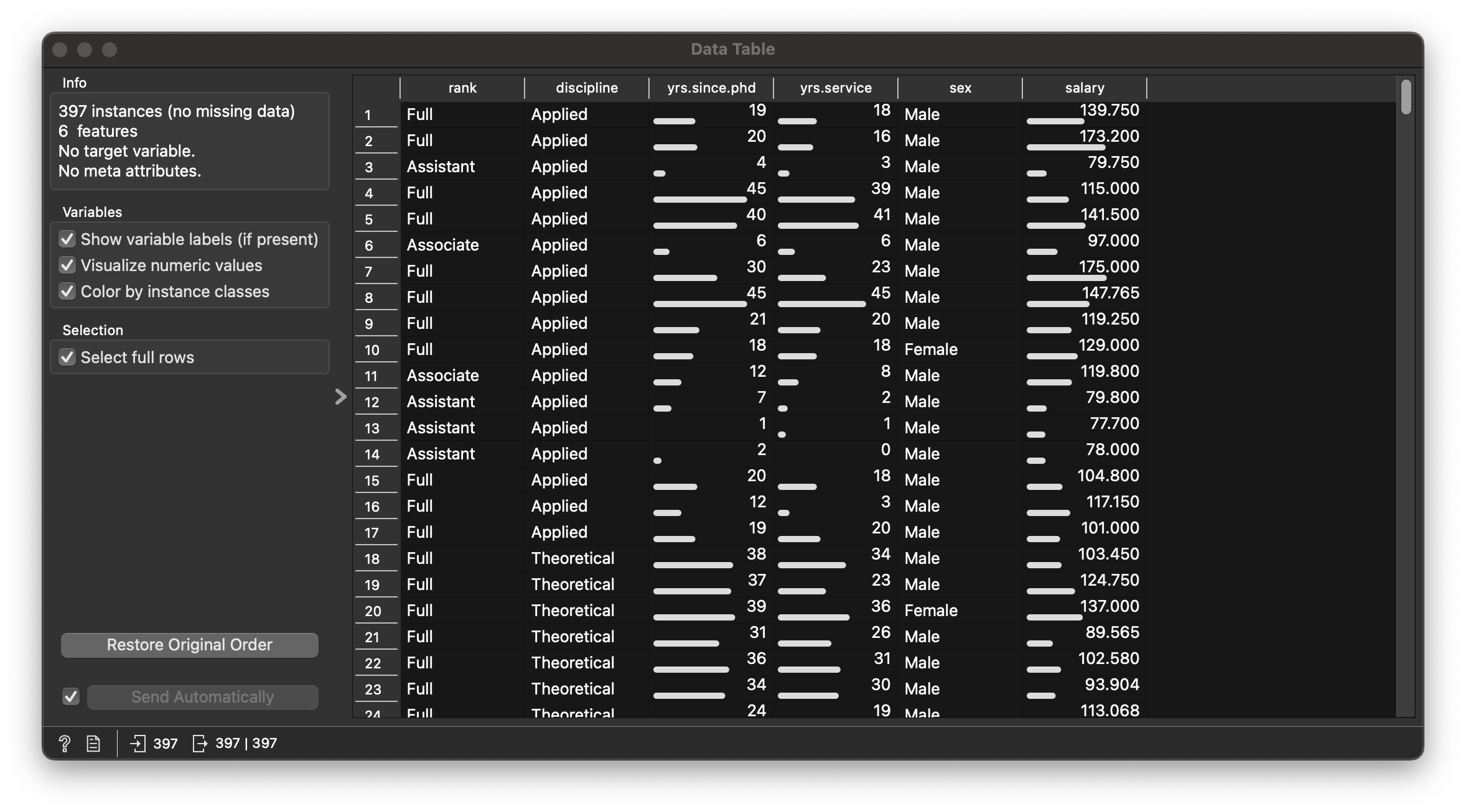
Let us examine this dataset in Orange.
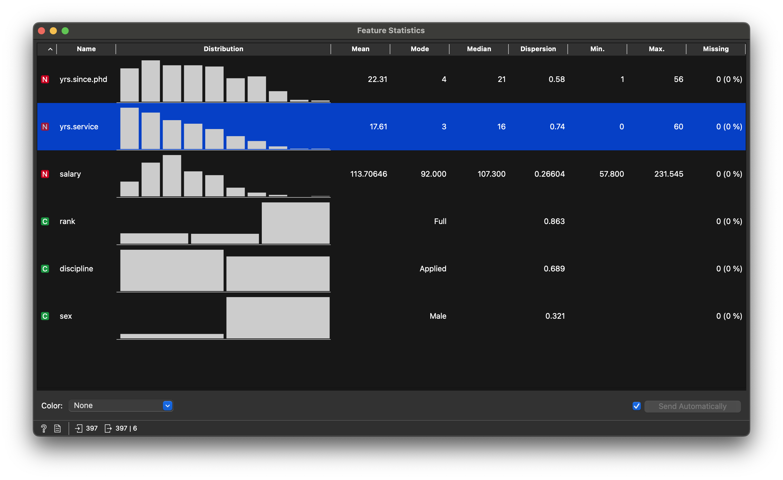
Figure 5 states that there are 397 teachers, with 6 variables in the dataset.
-
salary: (int) (Annual) Salary! -
yrs_service: (int) No. of Years they have served as teachers -
yrs_since_phd: (int) No. of Years after their PhD. (sigh)
-
discipline: (chr) Nature of Expertise -
rank: (chr) Nature of Appointment -
sex: (chr) Male / Female. Note the imbalance in the counts!!
Can any of the Quant variables be thought of as Quant variables? When, under what circumstances?
Let’s try a few questions and see if they are answerable with Box Plots and Violins
Salaries have quite a wide distribution with some very highly paid individuals ( ~ $240K), while the median is still $107K. So some people are paid than 2X the median!
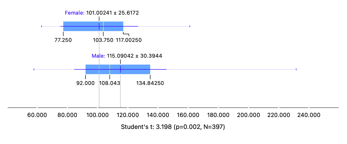
When split by sex, we get two box plots that show the differences between group salaries. The means and medians are quite different between the two groups, an important inference that needs to be completely verified by a statistical t-test.
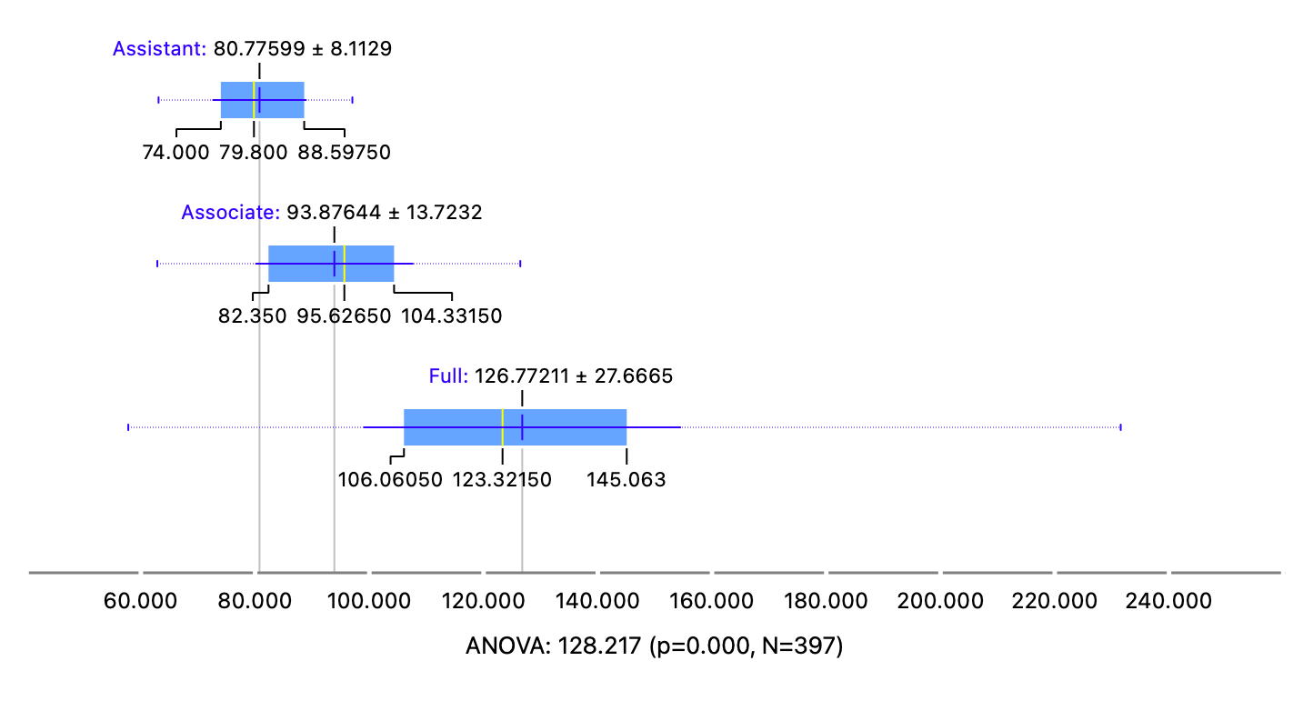
When split by rank, we get three box plots that show the differences between group salaries, again an important inference that needs to be completely verified by a statistical ANOVA test.
In data analysis, we always want to know2, as in life, how important things are, whether they matter. To do this, we make up hunches, or more precisely, Hypotheses. We make two in fact:
We then pretend that
This is a very important idea of Hypothesis Testing which helps you justify your hunch. Try to do this for the Package Opening and Closing Times.
When comparing mean salaries vs sex in Figure 7 (b), note the annotation below the graph. This is the result of the t-test:
This indicates several things:
- That the
t-statisticis 3.198; - If we assume
sexmakes no difference tosalary, then the probability that this difference could arise merely by chance is low - And of course that there
The test states that this difference is statistically significant and could be used to justify further actions based upon it. Look at the references below to get a fascinating history of statistical testing and its origins in …beer.
Now observe the boxplots and annotations in Figure 8, where again we compare mean salaries vs rank. This is the result of the ANOVA-test:
This indicates several things:
- That the ANOVA
F-statisticis 128.217; - If we assume
rankmakes no difference tosalary, then the probability that this difference could arise merely by chance is negligible - And again that there
The ANOVA test states that the (multiple) differences are statistically significant and could be used to justify further actions based upon it.
For the intrepid, here is a brief, diagrammed, hand-calculated, and intuitive walk-through of ANOVA. Note that the t-test and ANOVA are identical tests, the former being used for 2-level comparisons of means, and the latter for comparisons of more than 2 means. Again, means, not medians.
Here are a couple of datasets that you might want to analyze with box plots, and even perform t-tests and ANOVA-tests:
