| No | Pronoun | Answer | Variable/Scale | Example | What Operations? |
|---|---|---|---|---|---|
| 1 | How Many / Much / Heavy? Few? Seldom? Often? When? | Quantities, with Scale and a Zero Value.Differences and Ratios /Products are meaningful. | Quantitative/Ratio | Length,Height,Temperature in Kelvin,Activity,Dose Amount,Reaction Rate,Flow Rate,Concentration,Pulse,Survival Rate | Correlation |
If you wish to go anywhere, you must run twice as fast as that.
Correlations
Scatter and Bubble Plots
Regression Lines
Abstract
How one variable changes with another
| Variable #1 | Variable #2 | Chart Names | Chart Shape |
|---|---|---|---|
| Quant | Quant | Scatter Plot |
|
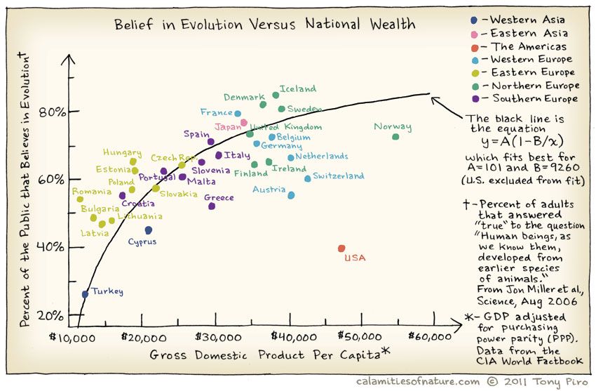
Does belief in Evolution depend upon the GSP of of the country? Where is the US in all of this? Does the Bible Belt tip the scales here?
And India?
Scatter Plots take two separate Quant variables as inputs. Each of the variables is mapped to a position, or coordinate: one for the X-axis, and the other for the Y-axis, like an ordered pair. Each pair of observations from the two Quant variables ( which would be in one row!) thus gives us a point in the Scatter Plot.
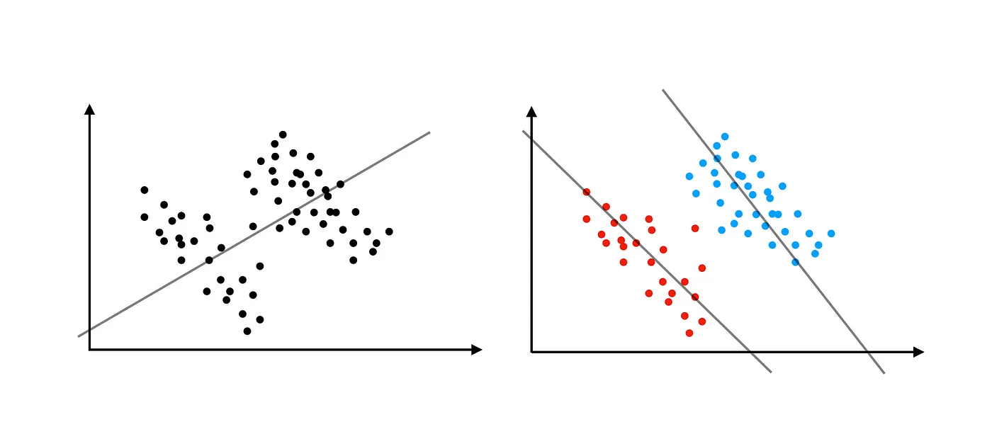
Looking at these clouds of points gives us an intuitive sense of the relationship between the two Quant variables, how one varies with the other. A cloud that slopes upward to the right indicates a positive relationship between the two; a cloud that slopes down to the right indicates a negative one. An amorphous cloud that does not discernibly slope in either way would lead us to infer that there is little or no relationship between the variables.
Slope and the Correlation Coefficient are Related
Under the assumption of a linear relationship between the two Quant variables, we plot a straight trend line, or regression line through the cloud of points, as a line that best represents that linear relationship. The slope of the regression line is directly linked to the Pearson Correlation Coefficient between the two variables.
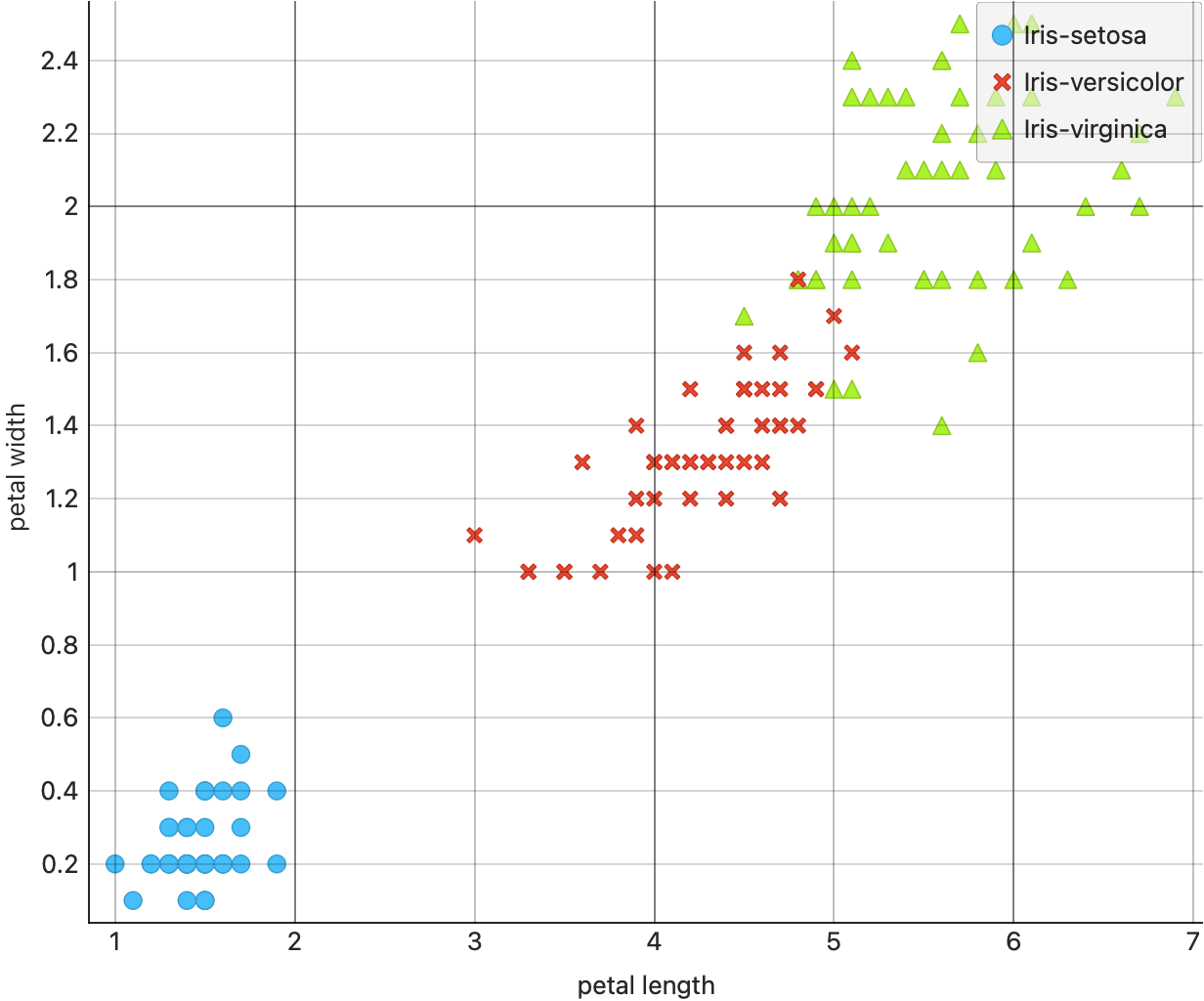
We can use the now (overly) familiar iris dataset to plot our first scatter plot. Download the workflow file below:
- Try setting shapes and colours, and try plotting a “regression line”. Do you get one line, or several? Why, or why not? How can you switch between the two “methods”?
- Try other pairs of Quant variables in the dataset.
- Which plot is the most informative? Why?
We can also add the correlations widget to evaluate correlations between all pairs of numerical/Quant variables. Then keeping that widget open along with the Scatter Plot widget we can visualize the relationship between the plot and the correlation score.
When we do this, we might get a setup as shown below.
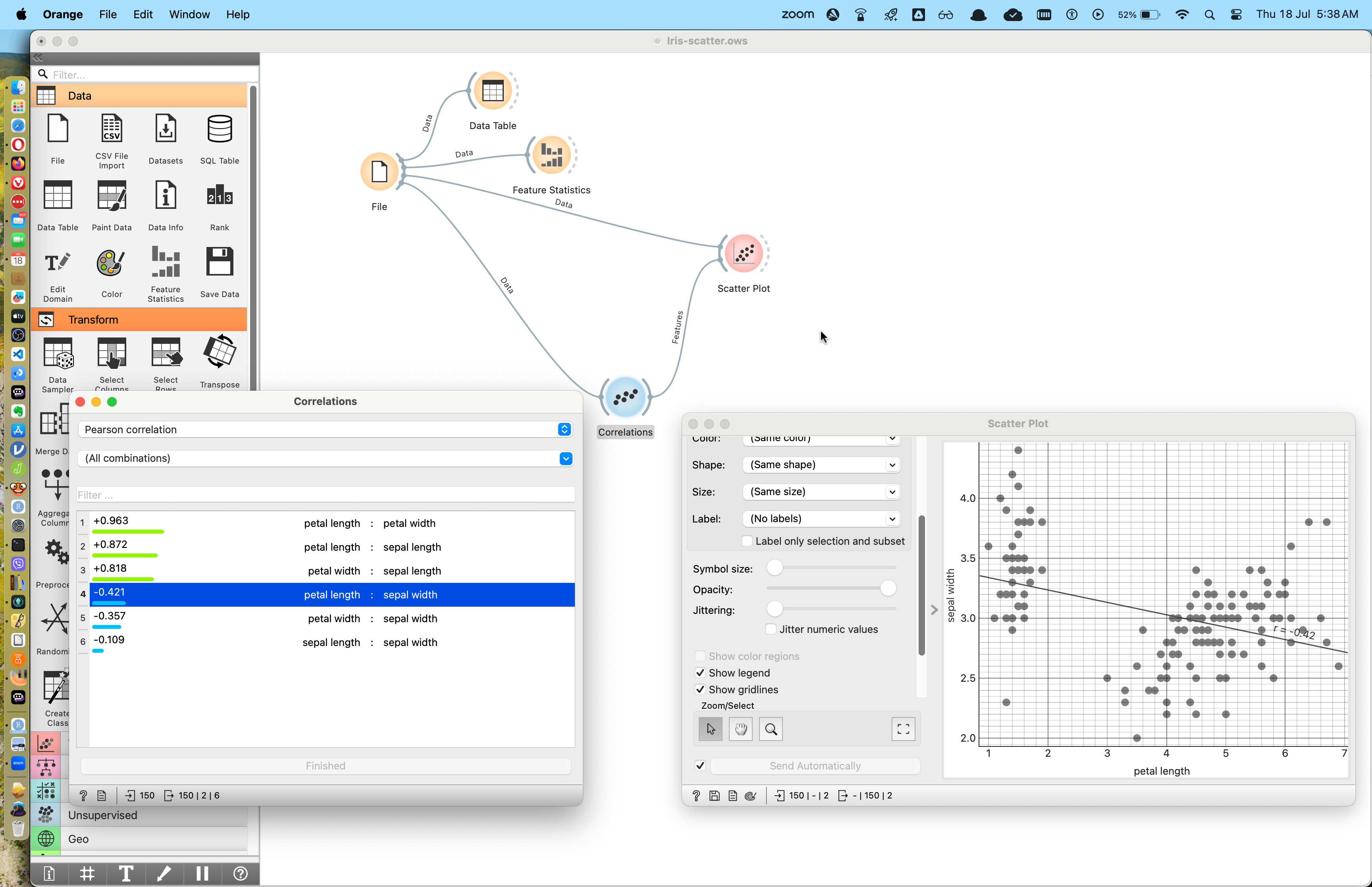
Here we can choose which correlation score we want to visualize in the correlations widget window and see the plot change in the scatter plot window.
Can you spot Simpson’s Paradox here? More on that further below.
What is the Story here?
- There are three species of iris flowers and they are “separable” based on combinations of their quantitative measurements.
- Some pairs of Quant variables create Scatter Plots that are quite disjoint and allow easy identification of the
speciesvariable. - In a ML model for this dataset, the
speciesvariable is most likely to be thetarget variablewhile the rest arepredictors.
Let us examine a fairly complex dataset pertaining to cancer, and analyze that with scatter plots.
We can use the same Workflow as before.
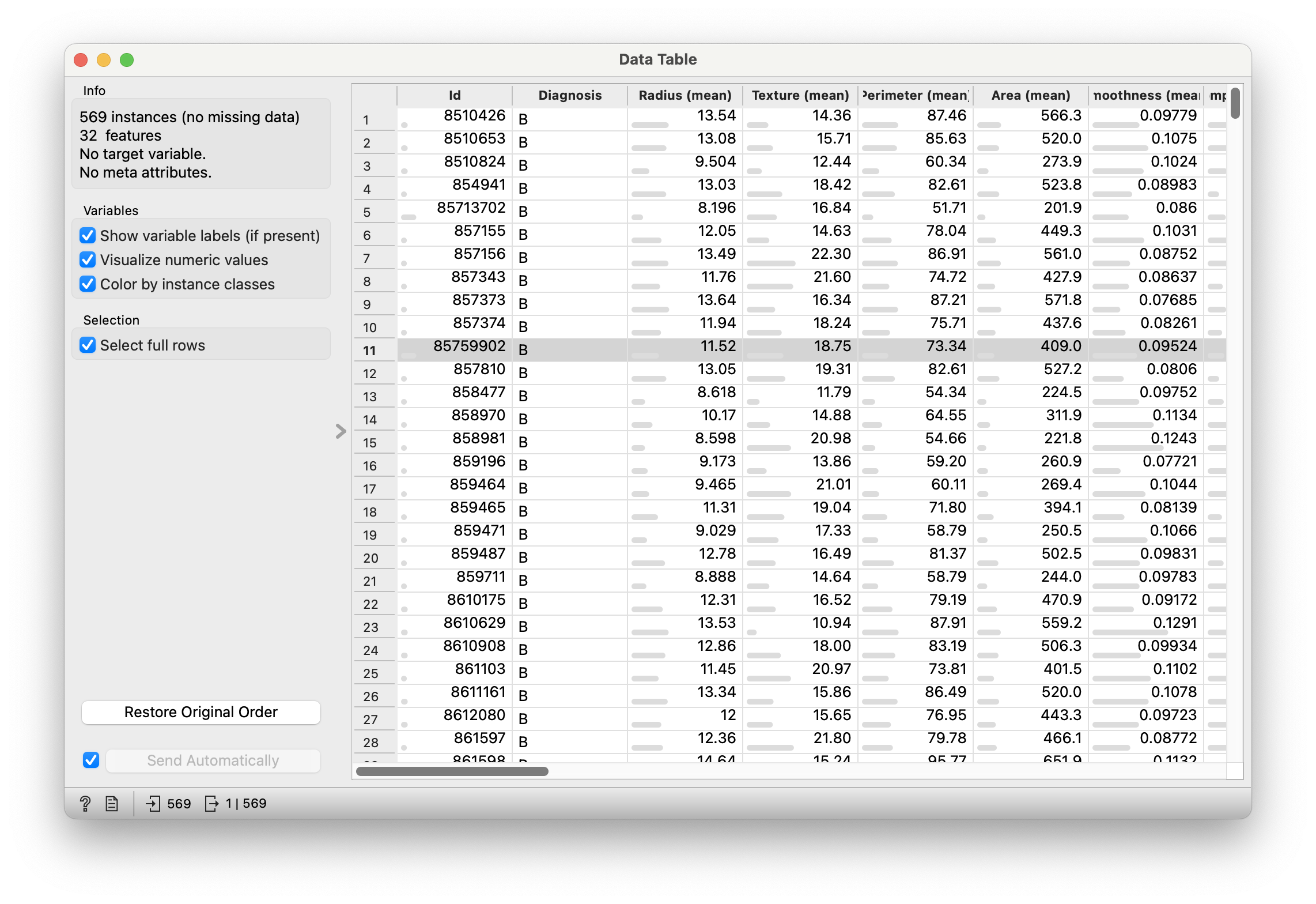
From Figure 4, we see that there is one Qual column Diagnosis, and all the remaining 31 columns seem to be some Quant measurements of a total of 569 tumours. (Not all columns are visible)
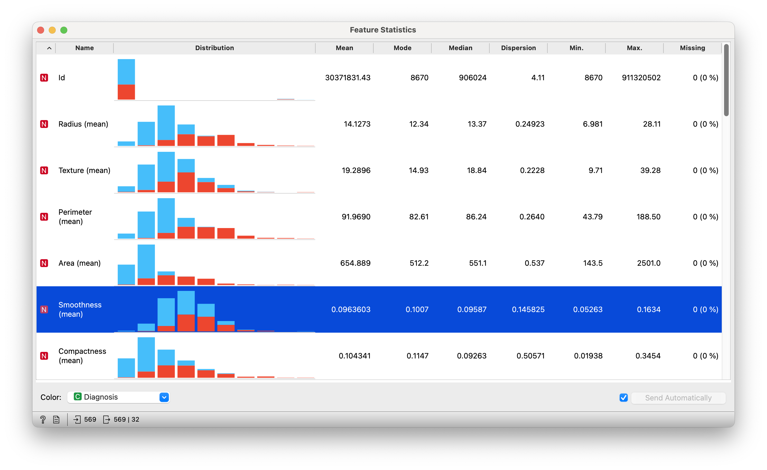
Figure 5 gives is histograms and statistics of all the 32 columns. Most histograms seem roughly symmetric, but a detailed look must be taken.

In Figure 6, we see that there is some imbalance between the counts for the one Qual variable, Diagnosis.
Quantitative Data
| “Id” | |
| “Radius (mean)” | “Texture (mean)” |
| “Perimeter (mean)” | “Area (mean)” |
| “Smoothness (mean)” | “Compactness (mean)” |
| “Concavity (mean)” | “Concave points (mean)” |
| “Symmetry (mean)” | “Fractal dimension (mean)” |
| “Radius (se)” | “Texture (se)” |
| “Perimeter (se)” | “Area (se)” |
| “Smoothness (se)” | “Compactness (se)” |
| “Concavity (se)” | “Concave points (se)” |
| “Symmetry (se)” | “Fractal dimension (se)” |
| “Radius (worst)” | “Texture (worst)” |
| “Perimeter (worst)” | “Area (worst)” |
| “Smoothness (worst)” | “Compactness (worst)” |
| “Concavity (worst)” | “Concave points (worst)” |
| “Symmetry (worst)” | “Fractal dimension (worst)” |
- Many of the Quant variables seem to be
meanmeasurements, with the mean presumably taken over several “sites” within the same tumour. - Along with the
mean, there are also measurements ofseor standard error which is, roughly speaking, a measure of thestandard deviationof the multiple measurements made. So for instance,Area(mean)andArea(se)are pairs of measurements created using multiple “sites” or “cross-sections” on one tumour. - Some other variables are labelled as worst, which may be either the
maxorminof such a set of “multi-site” tumour measurements.
May the (data) Source be with you
It is important to note that these are (educated?) guesses; one is best off connecting with the person/agency that provided the data for a precise understanding of variables. This will prevent nonsensical plots/models and inferences from showing up in your work.
Qualitative Data
-
Diagnosis: (text) (B)enign, or (M)alignant
Do use the joint view of correlation score and scatter plot to answer these, and possibly other Research Questions.
Question
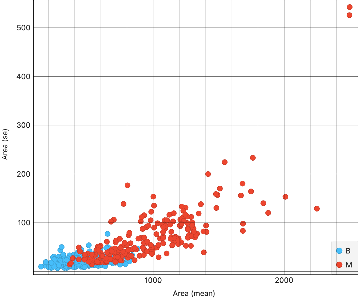
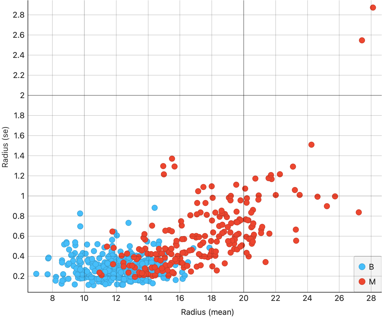
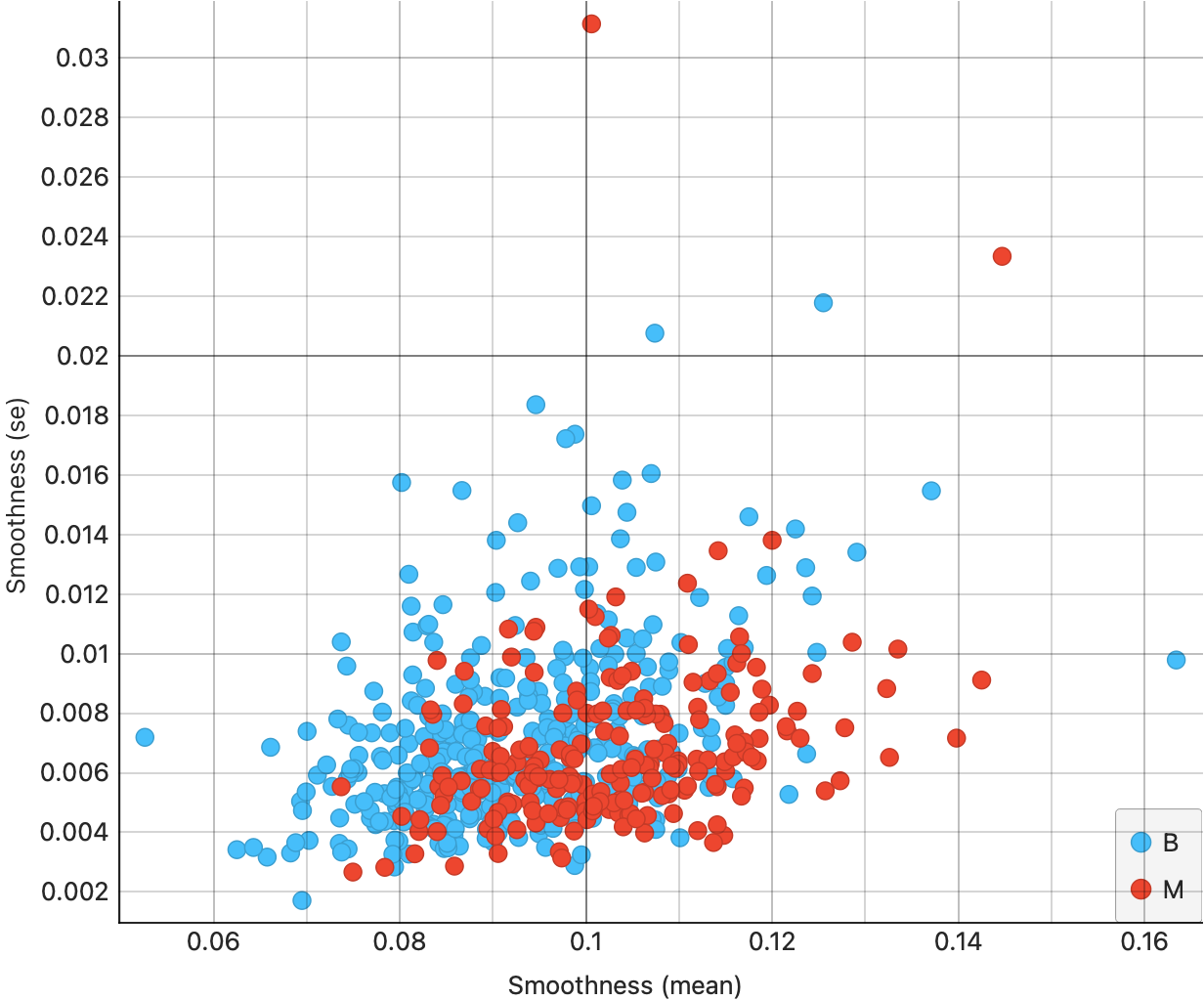
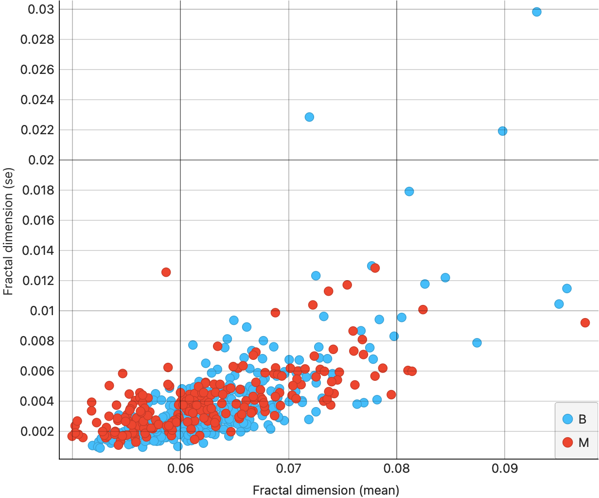
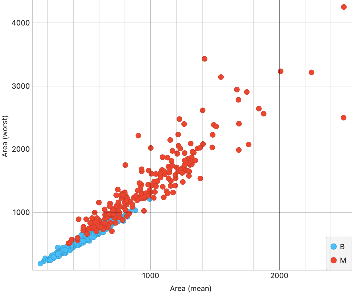

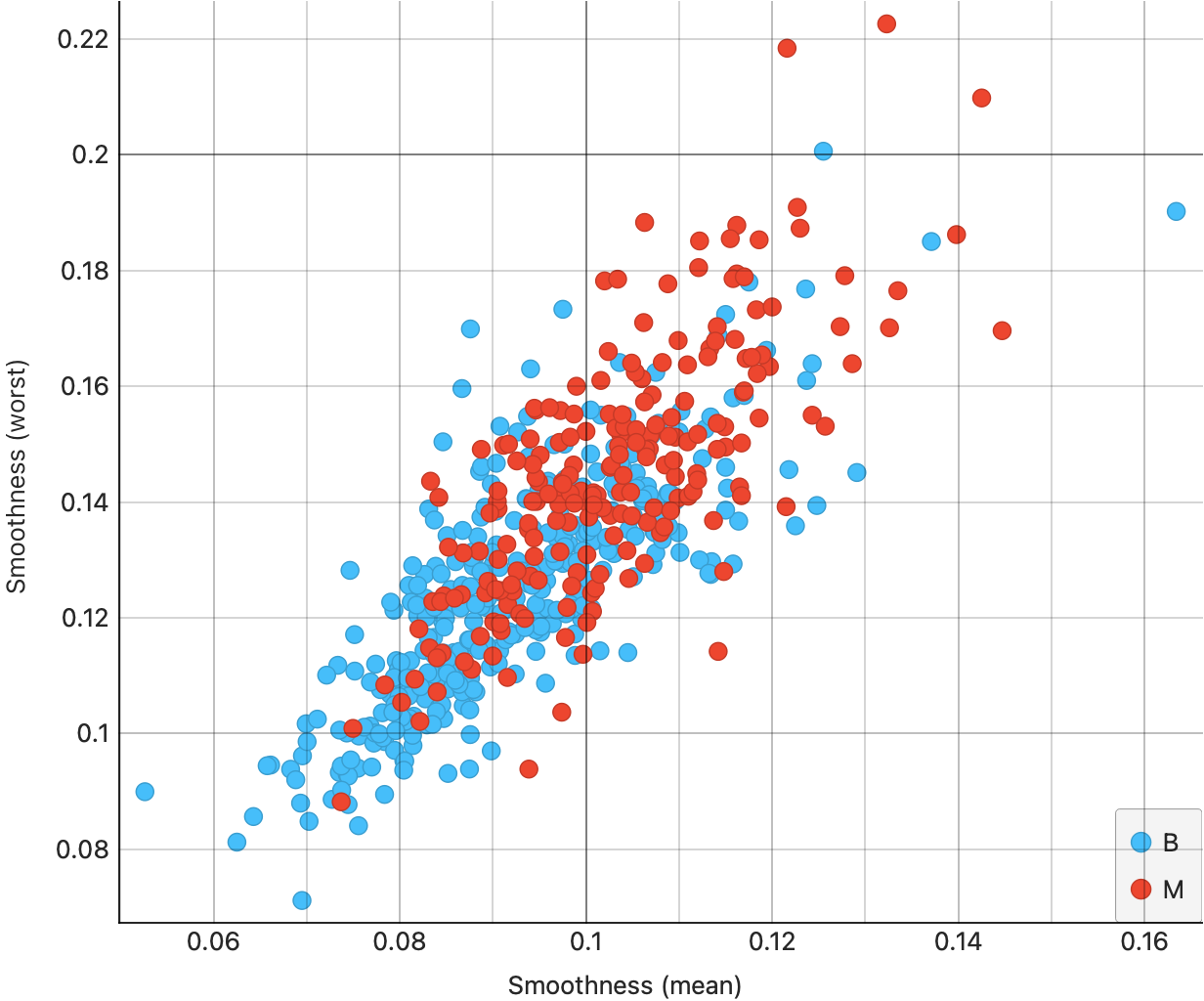

From Figure 7 (a), we see that the area(mean) and area(se) are somewhat correlated; moreover the correlation is slightly higher for the malignant tumours ( red dots, appropriately…). This trend shows up also for radius in Figure 7 (b), and for fractaldimension in Figure 7 (d). However, for smoothness, we see much lower correlation {#fig-cancer-smoothness-mean-se}.
For the mean vs worst scatter plots, we see decent correlations all around, with each of the graphs showing clouds tilted upward to the right.
Simpson’s Paradox
Try to remove colours and then plot a regression line. This usually gives a more clear idea of the correlation, without running into problems such as the Simpson’s Paradox:
And see also this:
- Try to play this online Correlation Game.
3. Gas Prices and Consumption
As described here. Note the log-transformed Quant data…why do you reckon this was done in the data set itself?
4. Horror Movies (Bah.You awful people..)
- Scatter Plots, when they show “linear” clouds, tell us that there is some relationship between two Quant variables we have just plotted
- If so, then if one is the target variable you are trying to design for, then the other independent, or controllable, variable is something you might want to design with.
Important
Target variables are usually plotted on the Y-axis, while Predictor variables are on the X-Axis, in a Scatter Plot. Why? Because
- Correlation scores are good indicators of things that are, well, related. While one variable may not necessarily cause another, a good correlation score may indicate how to chose a good predictor.
- Always, always, plot and test your data! Both numerical summaries and graphical summaries are necessary! See below!!
And How about these datasets?
| dataset | mean_x | mean_y | std_dev_x | std_dev_y | corr_x_y |
|---|---|---|---|---|---|
| away | 54.26610 | 47.83472 | 16.76983 | 26.93974 | -0.0641284 |
| bullseye | 54.26873 | 47.83082 | 16.76924 | 26.93573 | -0.0685864 |
| circle | 54.26732 | 47.83772 | 16.76001 | 26.93004 | -0.0683434 |
| dino | 54.26327 | 47.83225 | 16.76514 | 26.93540 | -0.0644719 |
| dots | 54.26030 | 47.83983 | 16.76774 | 26.93019 | -0.0603414 |
| h_lines | 54.26144 | 47.83025 | 16.76590 | 26.93988 | -0.0617148 |
| high_lines | 54.26881 | 47.83545 | 16.76670 | 26.94000 | -0.0685042 |
| slant_down | 54.26785 | 47.83590 | 16.76676 | 26.93610 | -0.0689797 |
| slant_up | 54.26588 | 47.83150 | 16.76885 | 26.93861 | -0.0686092 |
| star | 54.26734 | 47.83955 | 16.76896 | 26.93027 | -0.0629611 |
| v_lines | 54.26993 | 47.83699 | 16.76996 | 26.93768 | -0.0694456 |
| wide_lines | 54.26692 | 47.83160 | 16.77000 | 26.93790 | -0.0665752 |
| x_shape | 54.26015 | 47.83972 | 16.76996 | 26.93000 | -0.0655833 |
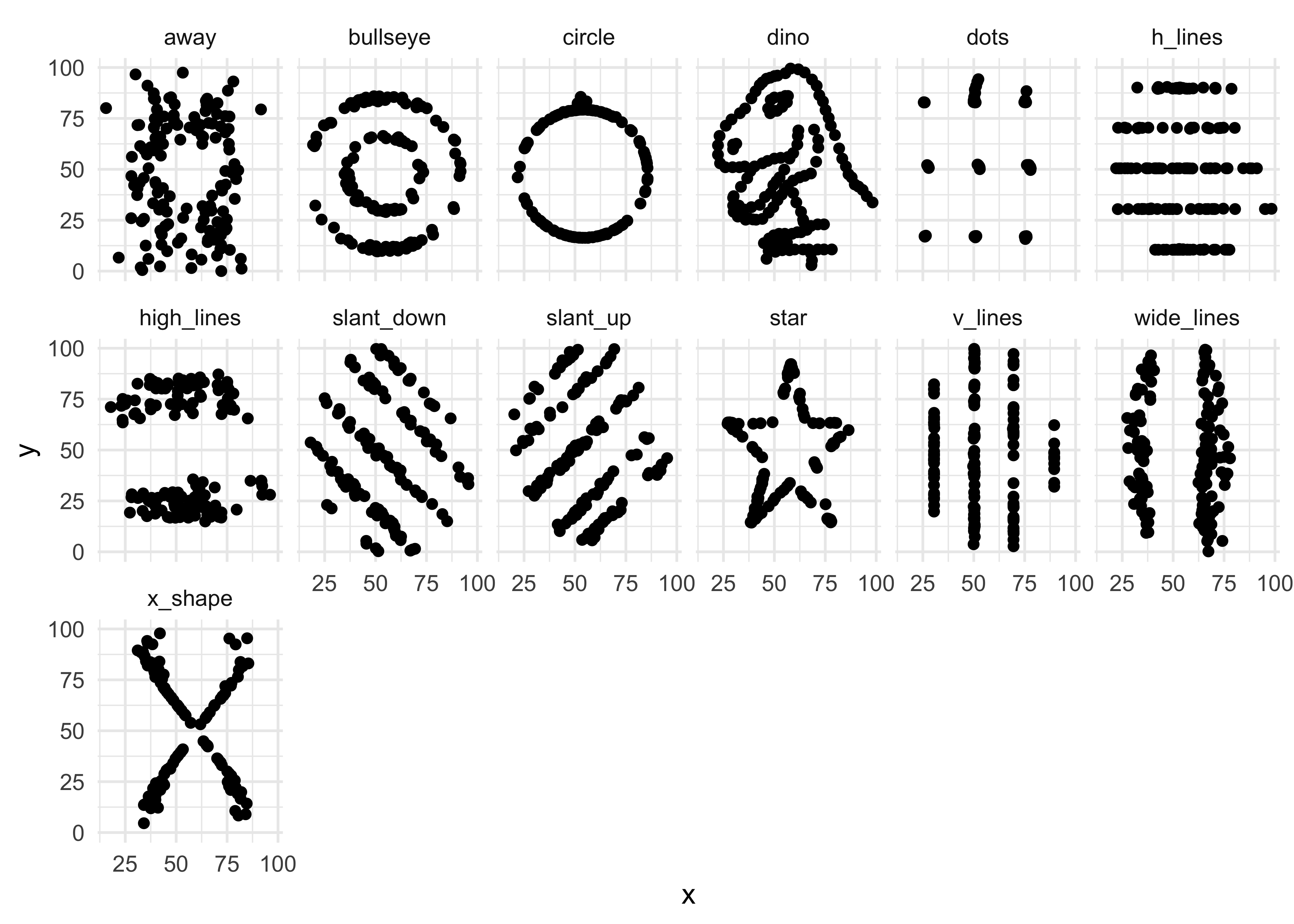
Yes, you did want to plot that cute T-Rex in Orange, didn’t you? Here is the data then!!
Warning
- Can selling more ice-cream make people drown?
- Use your head about pairs of variables. Do not fall into this trap)
Rohrer JM. Thinking Clearly About Correlations and Causation: Graphical Causal Models for Observational Data. Advances in Methods and Practices in Psychological Science. 2018;1(1):27-42. https://doi.org/10.1177/2515245917745629 PDF
Case Study on Horror Movies. (Arvind: Bah.) https://notawfulandboring.blogspot.com/2024/04/using-pulse-rates-to-determine-scariest.html
The Datasaurus Package: https://cran.r-project.org/web/packages/datasauRus/vignettes/Datasaurus.html
A superb web-scrolly on Sustainable Development Goals (SDGs)s! Go and see! https://datatopics.worldbank.org/sdgatlas/goal-1-no-poverty?lang=en
Hunter, W. G. (1981). Six Statistical Tales. The Statistician, 30(2), 107. doi:10.2307/2987563. https://sci-hub.ru/10.2307/2987563
A cartoon+interactive explanation of Simpson’s Paradox. Real fun! https://pwacker.com/simpson.html
Futility Closet blog. (December 12, 2014). English by Degrees. https://www.futilitycloset.com/2014/12/12/english-by-degrees/ A short article that seems to speak of LLMs/ChatGPT…in 1948!!