| No | Pronoun | Answer | Variable/Scale | Example | What Operations? |
|---|---|---|---|---|---|
| 3 | How, What Kind, What Sort | A Manner / Method, Type or Attribute from a list, with list items in some " order" ( e.g. good, better, improved, best..) | Qualitative/Ordinal | Socioeconomic status (Low income, Middle income, High income),Education level (HighSchool, BS, MS, PhD),Satisfaction rating(Very much Dislike, Dislike, Neutral, Like, Very Much Like) | Median,Percentile |
Rescuing Jack
Abstract
Associations between Qual variables
| Variable #1 | Variable #2 | Chart Names | Chart Shape |
|---|---|---|---|
| Qual | Qual | Mosaic Charts |

According to World Bank, six countries (India, Russia, Indonesia, United States, Brazil, and Mexico) accounted for over 60 percent of the total additional deaths in the first two years of the pandemic.
We saw with Bar Charts that when we deal with single Qual variables, we perform counts for each level of the variable. What is there are two Quals? Or even more?
The answer is to take them pair-wise and make all combinations of levels for both and calculate counts for these. This is called a Contingency Table.
What is a Contingency Table?
From Wolfram Alpha:
A contingency table, sometimes called a two-way frequency table, is a tabular mechanism with at least two rows and two columns used in statistics to present categorical data in terms of frequency counts.
More precisely, an \(r \times c\) contingency table shows the observed frequency of two variables the observed frequencies of which are arranged into \(r\) rows and \(c\) columns. The intersection of a row and a column of a contingency table is called a cell.
The Contingency Table is then plotted in a chart called the Mosaic Chart.
Let us first construct a Contingency Table from this dataset, and then plot the mosaic chart for it.
Quantitative Data
-
IDis the only Quant data variable!
Qualitative Data
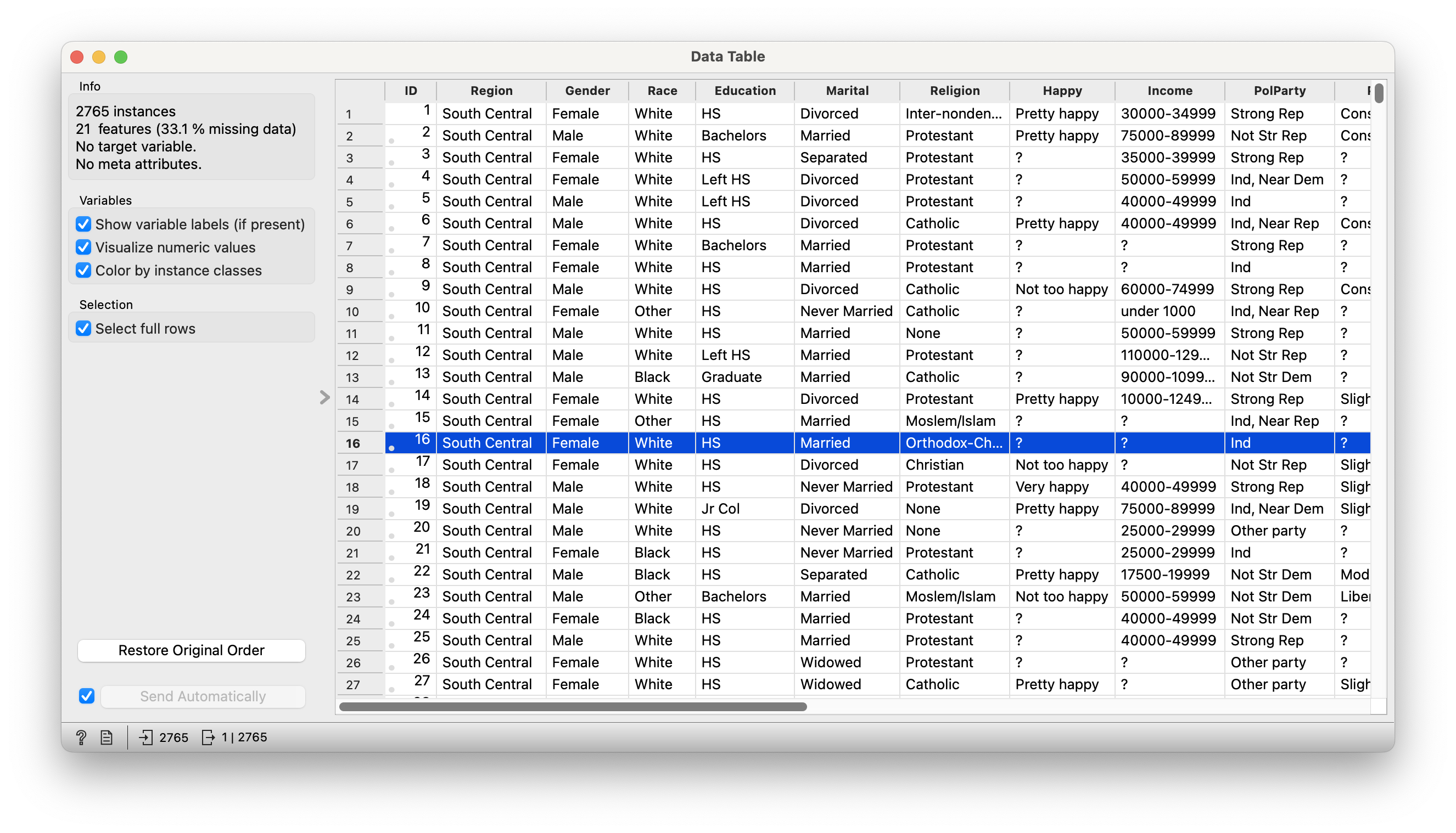
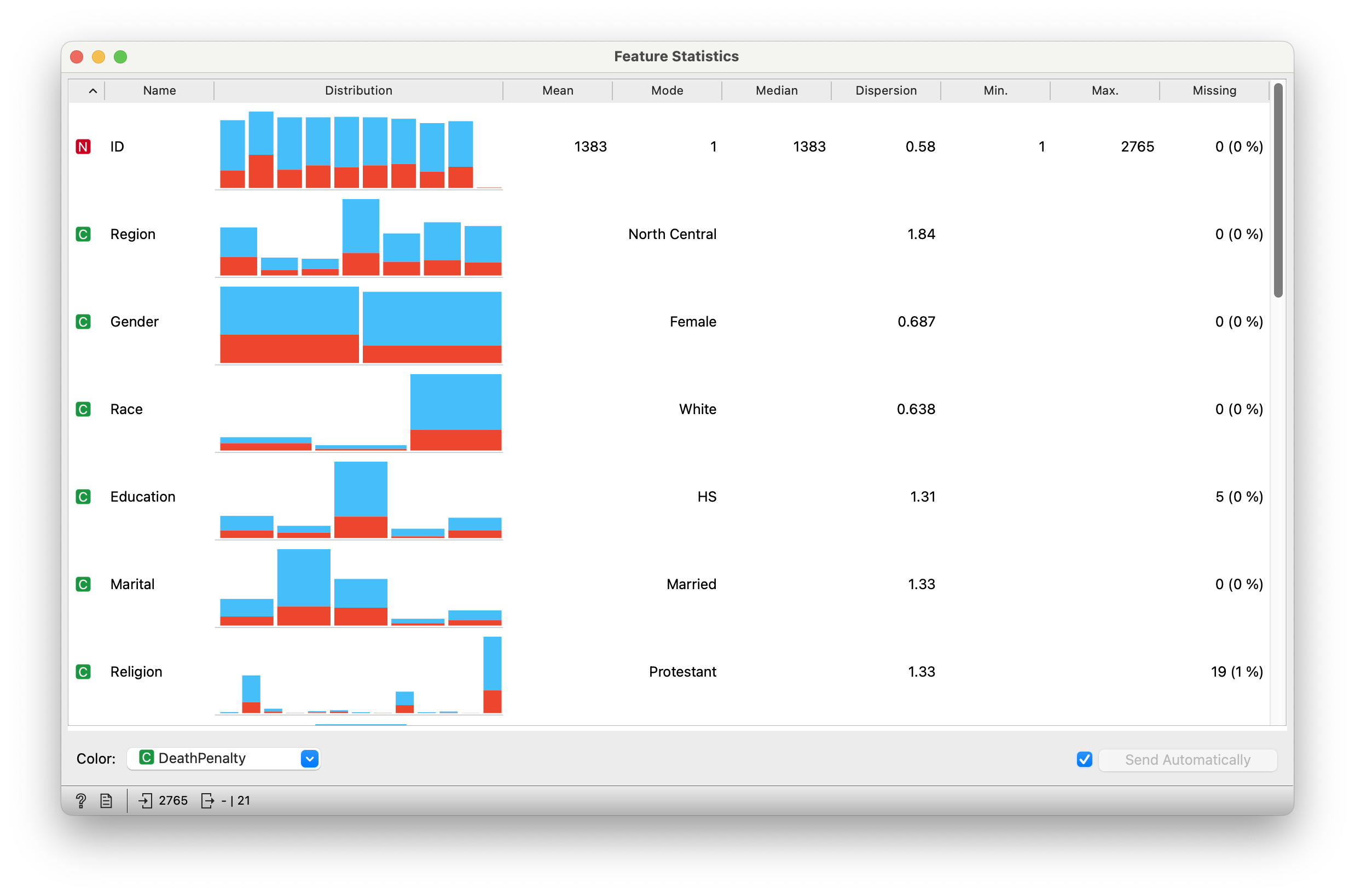
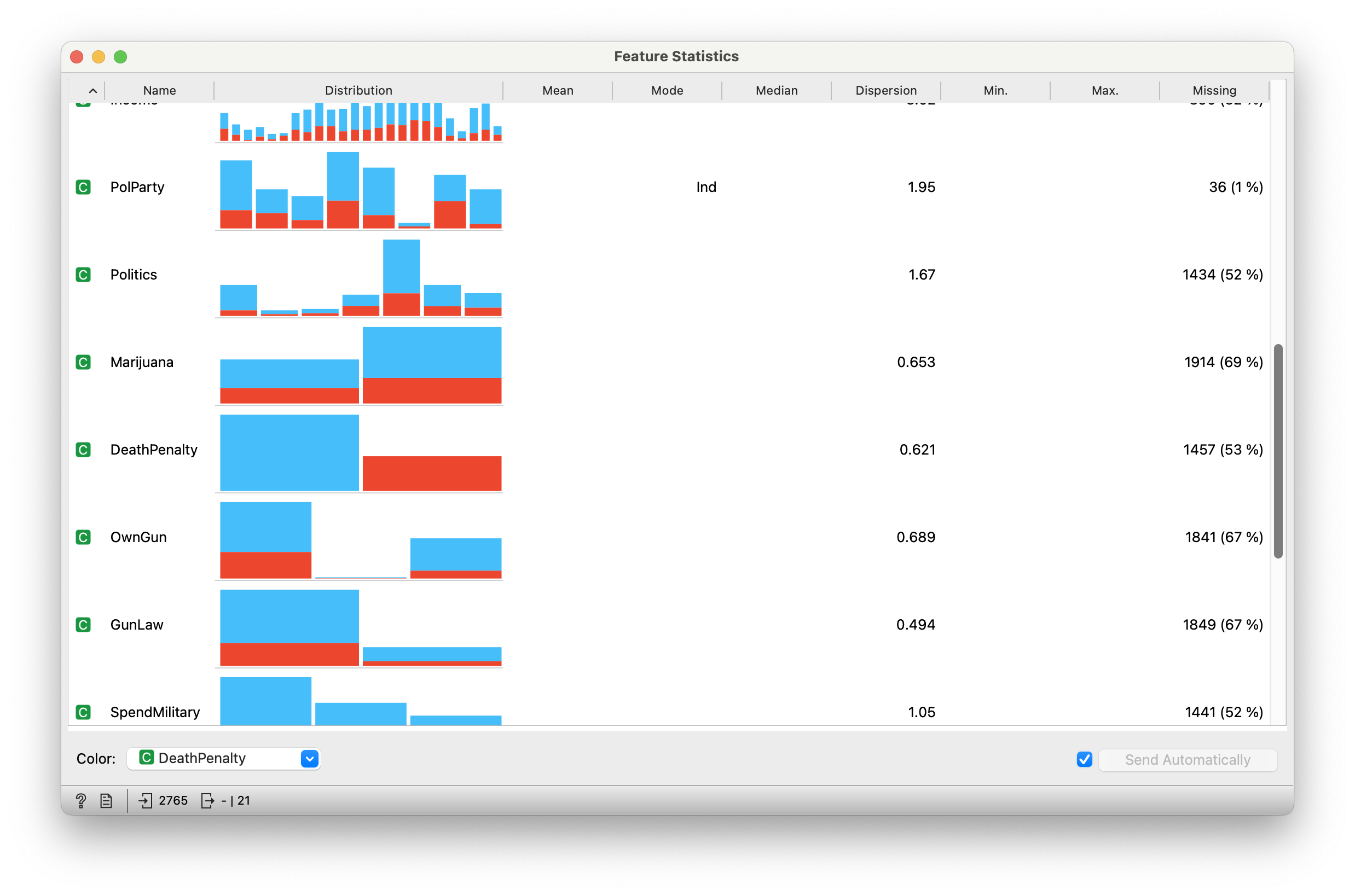
“ID” “Region” “Gender” “Race”
“Education” “Marital” “Religion” “Happy”
“Income” “PolParty” “Politics” “Marijuana”
“DeathPenalty” “OwnGun” “GunLaw” “SpendMilitary” “SpendEduc” “SpendEnv” “SpendSci” “Pres00”
“Postlife”
are all Qual variables! Let us choose just two Qual variables from this dataset, DeathPenalty and Education.
-
DeathPenalty: (chr) Opinion as to whether they favour or oppose the death penalty -
Education: (chr) Education among respondents, 5 levels (Left HS, HS, Jr Col, Bachelors, Graduate).
A Contingency table with these two Qual variables looks like Figure 4:
| Left HS | HS | Jr Col | Bachelors | Graduate | Sum | |
|---|---|---|---|---|---|---|
| Favor | 117 | 511 | 71 | 135 | 64 | 898 |
| Oppose | 72 | 200 | 16 | 71 | 50 | 409 |
| Sum | 189 | 711 | 87 | 206 | 114 | 1307 |
Now then, how does one plot a set of data that looks like this, a matrix? No column is a single variable, nor is each row a single observation, which is what we understand with the idea of tidy data.
The answer is provided in the very shape of the data: we plot this as a set of tiles, where \[ \pmb{area~of~tile \sim count} \] In this way we recursively partition off a (usually) square area into vertical and horizontal pieces whose area is proportional to the count at a specific combination of levels of the two Qual variables.
Question
Q1. Are Education and DeathPenalty associated?
Let us plot the mosaic chart in two steps: we now choose Qual variables Education and DeathPenalty, in that order to plot the mosaic chart. Here are the two steps in the recursion:
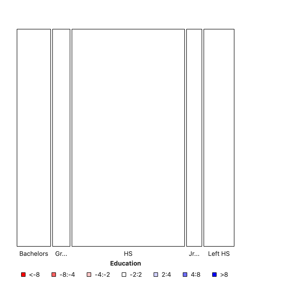
This first split shows the various levels of Education and their counts as widths. This splitting corresponds to the bottom ROW of the Figure 4. HS is clearly the larget subgroup in Education .
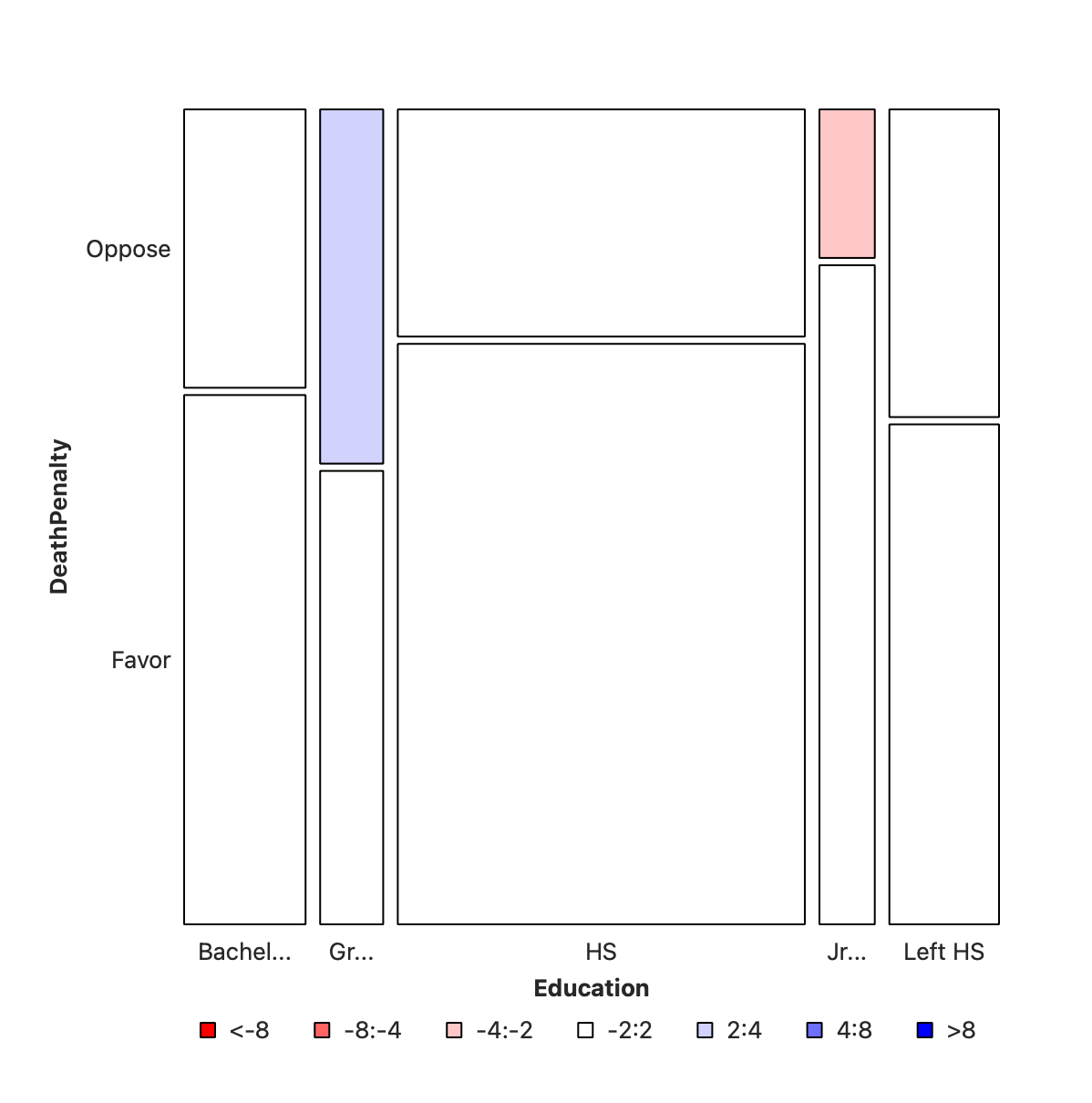
In this second step, the columns from step #1 are sliced horizontally into tiles, in proportion to the number of people in each Education category/level who support/do not support DeathPenalty. This is done in proportion to all the entries in each COLUMN.
Important
Note that the order in which we choose the variables matters, since the mosaic plot is fundamentally asymmetric. More on this in a bit.
Colouring by Pearson Residuals
Mosaic Charts generated by Orange can be coloured based on “Pearson Residuals”. What this means is that the mosaic plot calculates what might be the “expected counts” (see below) in the Contingency Table and calculates the differences (i.e. “residuals” ) between Observed/Actual and Expected values. If the errors are negative (Obs < Exp) then the tile is coloured red. And blue if the error is positive (Obs > Exp).
In Figure 5 (b) we see that there is a small positive and a small negative residual at two locations in the mosaic chart. By and large the chart is white, showing very little association between Education and DeathPenalty. However, we should verify this using a statistical “chi-square” \(X^2\) test.
More on “expected counts” and the “chi-square” \(X^2\) test below.
The description of the Orange widget for mosaic charts is here.
Let us take a very sadly famous data set (no, not iris again 🙀), but titanic and examine it in Orange.
Not a mosaic plot, but a Matrix Plot.
Download this RAWGraphs workflow file and import there and see.
Does not seem to have a mosaic diagram capability.
Ok, let us see if we can rescue Jack. Here is the titanic data.
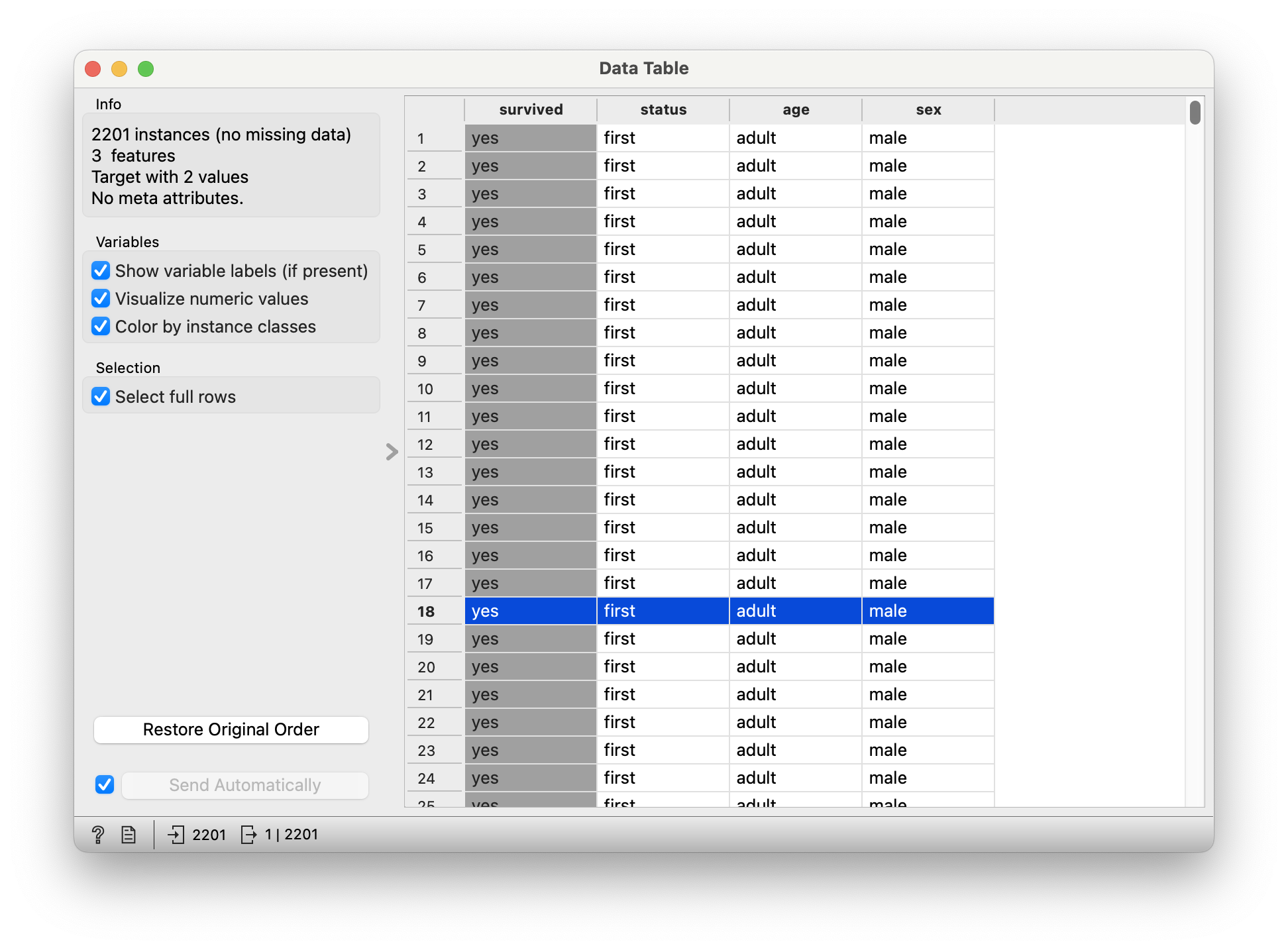

There were 2201 passengers, as per this dataset.
Quantitative Data
None.
Qualitative Data
-
survived: (chr) yes or no -
status: (chr) Class of Travel, else “crew” -
age: (chr) Adult, Child -
sex: (chr) Male / Female.
Q.1. What is the dependence of
survived upon sex?

Note the huge imbalance in survived with sex: men have clearly perished in larger numbers than women. Which is why the colouring by the Pearson Residuals show large positive residuals for men who died, and large negative residuals for women who died.
So sadly Jack is far more likely to have died than Rose.
Q.2. How does
survived depend upon status?
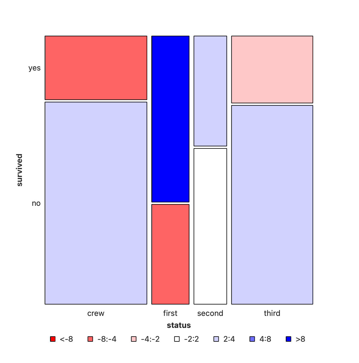
Crew has seen deaths in large numbers, as seen by the large negative residual for crew-survivals. First Class passengers have had speedy access to the boats and have survived in larger proportions than say second or third class. There is a large positive residual for first-class survivals.
Rose travelled first class and Jack was third class. So again the odds are stacked against him.
In Figure 8, we have plotted sex vs status, and coloured by whether the (subset of) people survived or not. (Red is YES, Blue is NO!). As can be seen the areas are very dissimilar across both variables. More deaths occurred among the crew than among the passengers; and more first class passengers have survived than third class passengers. And of course, more men died than women.
So we can state that:
-
StatusandSurvivedare not un-associated -
SexandSurvivedare not un-associated - Does ticking the
Compare with Totalbox in Orange help to arrive at this inference? How so? Or does it confuse?
It remains to figure out just how serious this association is. For that we need the statistical “chi-square” \(X^2\) test.
Actual and “Expected” Counts
The mosaic chart is a visualization of the obtained counts, based on which the tiles are constructed.
It is also possible to compute a per-cell expected count, if the categorical variables are assumed independent, that is, not correlated. This is the NULL Hypothesis. The test for whether they are independent or not, as any inferential test, is based on comparing the observed counts with these expected counts under the null hypothesis. So, what might the expected frequency of a cell be in cross-tabulation table for cell \(i,j\) given no relationship between the variables of interest?
Represent the sum of row \(i\) with \(n_{+i}\), the sum of column \(j\) with \(n_{j+}\), and the grand total of all the observations with \(n\). And independence of variables means that their joint probability is the product of their probabilities. Therefore, the Expected Cell Frequency/Count is given by:
\[ \begin{array}{lcl} ~Expected~Count~ e_{i,j} &=& \frac{rowSum ~\times~colSum}{n}\\ &=& \frac{(n_{+i})(n_{j+})}{n}\\ \end{array} \]
The comparison of what occurred to what is expected is based on their difference, scaled by the square root of the expected, the Pearson Residual:
\[ \begin{array}{lcl} r_{i,j} &=& \frac{(Actual - Expected)}{\sqrt{\displaystyle Expected}}\\ &=& \frac{(o_{i,j}- e_{i,j})}{\sqrt{\displaystyle e_{i,j}}} \end{array} \]
The sum of all the squared Pearson residuals is the chi-square statistic, χ2, upon which the inferential analysis follows.
For the intrepid and insatiably curious, there is an intuitive explanation, and some hand-calculations and walk-through of the Contingency table and the χ2-test here.
Let us take this dataset on household tasks, and who does them. Download this dataset and import in into your Mosaic Chart workflow.
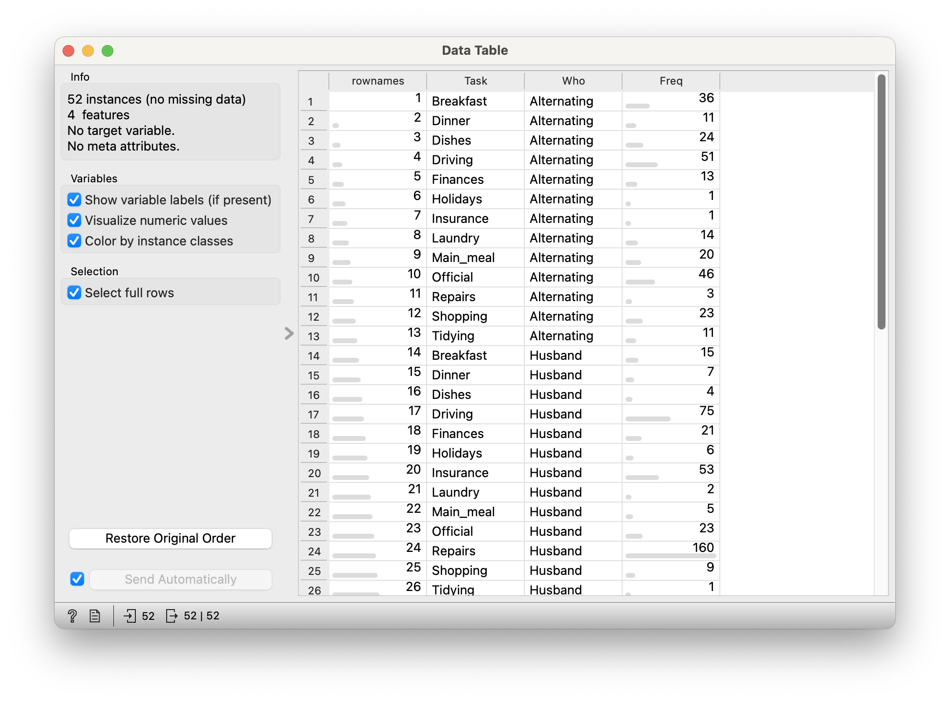
52 observations.
Quantitative Data
-
Freq: (int) No of times a task was carried out by specific people
Qualitative Data
-
Who: (chr) Who carried out the task? -
Task: (chr) Task? Which task? Can’t you see I’m tired?
Let us plot the mosaic chart:

This data looks fine all right, but this mosaic plot looks bewildering, dumbfounding, and is of course wrong. The reason for this is that the basic HouseTasks.csv data is pre-aggregated: we have a neat column of counts already in the Freq data. And why is this a problem? Orange expects data to be purely categorical for the Mosaic Chart and does it own counting internally. It is not able to sensibly use this Freq column. Orange simply counts categories here, which are of course utterly symmetric and unique and of no use.
Stat Figures and Stats
Most, if not all, statistical graphs do some internal computation. For instance the bar chart performs counts vs Qual variables; a Histogram both bins the Quant variable, and counts for entries in each bin. This is a good thing, people, but it does mean that the data needs to be in specific format before using it for plots.
So now what? We need to (wait for it):
-
uncountthe data 🙀 🙀 🙀 - How? Take each combination of Quals
WhoandTask - Repeat ( i.e copy-paste) that combo line as many times as the value in
Freq - (optionally) Deleting the
Freqcolumn, or at least not using it further
All this is (to the best of my ability) not possible in any of these trifling tools that we are using here, and can be done in a jiffy in R or Python. Didn’t I tell you coding was far far far far simpler? Peasants.
So following this ashtavakra procedure of jumping to another tool and coming back here, good things can be somehow made to happen, and so here is the “un-aggregated” data for you:
Import this into Orange.
Q.1 Is there association between
Who carries out the task, and the Task itself?

The Mosaic plot in Figure 11 is seriously coloured, showing that there are Pearson Residuals/Errors in both directions (positive and negative). The χ2-value is large (not visible here, check in Orange) and the p-value is zero. This indicates that it is very very unlikely that this data happened by chance, assuming the two Qual variables are un-related. Hence, we are likely to conclude that our assumption that they are un-related can be rejected. (Note this complex wording here. We don’t say they are related.)
Why is this unsurprising? Men don’t do housework, it would seem.
In general, if you want to spot association, look for serious amounts of colour in the mosaic chart.
- Clothing and Intelligence Rating of Children!! Are well-dressed actually smarter? Is that the exact reverse with SMI faculty? Or …?
- We can detect correlation between Quant variables using the scatter plots and regression lines
- And we can detect association between Qual variables using mosaics and sieves (which we did not see here, but is possible in Orange)
- Your project primary research data may be pure Qualitative too, as with a Questionnaire / Survey instrument.
- One such Qual variable therein will be your target variable
- You will need to justify whether the target variable is dependent upon the other Quals, and then to decide what to do about that.
Survey Data and Likert Plots
Often times, the primary research questionnaire is in the form of Questions whose answer is on a Likert Scale data, where several respondents rate a product, or a service, on a scale of Very much like, somewhat like, neutral, Dislike and Very much dislike, for example. The data are again categorical; but a Contingency Table / Mosaic Chart would be quite complex to behold and understand. A Likert Plot is what is constructed at such times. Here is a sample Likert Plot for a fictitious app called “QuickEZ”:

Yeah, this is possible in R and Python. But not in these barbarian tools that we are using. There are some websites that offer free apps for these plots too.
For more tutorial information, head off to Visualizing Survey Data (in R).
References
Michael friendly. A Brief History of the Mosaic Display. https://www.datavis.ca/papers/moshist.pdf
David Meyer, Achim Zeileis, Kurt Hornik. Visualizing Contingency Tables. Some very clear and simple pictures at https://statmath.wu.ac.at/projects/vcd/
Nice Chi-square interactive story at https://statisticalstories.xyz/chi-square
A different graph on Housework Inequality,but the same story! https://datatopics.worldbank.org/sdgatlas/goal-5-gender-equality?lang=en#c4