| No | Pronoun | Answer | Variable/Scale | Example | What Operations? |
|---|---|---|---|---|---|
| 2 | How Many / Much / Heavy? Few? Seldom? Often? When? | Quantities with Scale. Differences are meaningful, but not products or ratios | Quantitative/Interval | pH,SAT score(200-800),Credit score(300-850),SAT score(200-800),Year of Starting College | Mean,Standard Deviation |
| 3 | How, What Kind, What Sort | A Manner / Method, Type or Attribute from a list, with list items in some " order" ( e.g. good, better, improved, best..) | Qualitative/Ordinal | Socioeconomic status (Low income, Middle income, High income),Education level (HighSchool, BS, MS, PhD),Satisfaction rating(Very much Dislike, Dislike, Neutral, Like, Very Much Like) | Median,Percentile |
Yes…On the River, In the River, With the River, By the River…
What graphs will we see today?
| Variable #1 | Variable #2 | Chart Names | Chart Shape |
|---|---|---|---|
| Quant | None | Sankey Plot |
|
Sometimes Qual data can itself vary over, or depend upon, over a bunch of independent Qual data categories. For instance we can contemplate enrollment at a University, and show how students move from course to course in a University. Or how customers drift from one category of products or brands to another….or the movement of cricket players from one IPL Team to another !!
At such times, the Mosaic Chart becomes a limited and unwieldy, and we need to turn to a new visualization.
As can be surmised, the independent categories can be interpreted both as time ( e.g semesters / cycles / years) and space (teams / courses / departments). And we can chart another Quant or Qual variable that moves across levels of the first chosen Qual variable.
- The Qualitative variables being connected are mapped to
stages/axes - Each level within a Qual variable is mapped to
nodes / strata / lodes; - And the connections between the
strataof theaxesare calledflows / links / alluvia.
Such diagrams are best used when you want to show a many-to-many mapping between two domains or multiple paths through a set of stages E.g Students going through multiple courses during a semester of study.
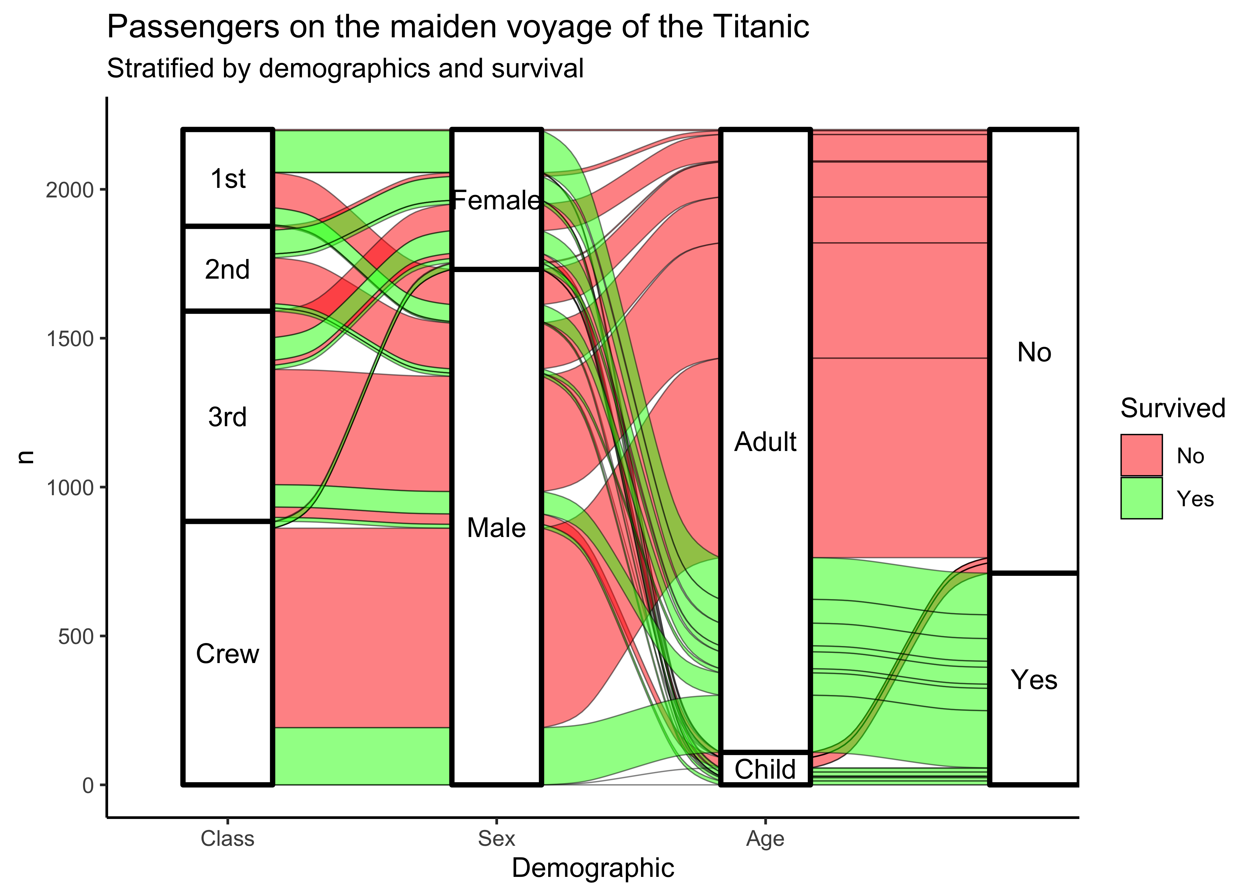
Here is an example of a Sankey Diagram for the Titanic dataset:
It is seen from Figure 1 that the x-axis has Qual variables stages shown as “pillars” and these are split into nodes based on the levels for each Qual variable stage respectively. Flows with variable thickness connect one node at one stage to another node and another stage.
Here is what Thomas Lin Pedersen says:
A parallel sets diagram is a type of visualisation showing the interaction between multiple categorical variables.
If the variables have an intrinsic order the representation can be thought of as a Sankey Diagram.
If each variable is a point in time it will resemble an Alluvial diagram.
It does not seem possible to create an Alluvial Diagram in Orange. 😢
Download this file and upload to https://app.rawgraphs.io/.
Let us however examine this data in Orange:
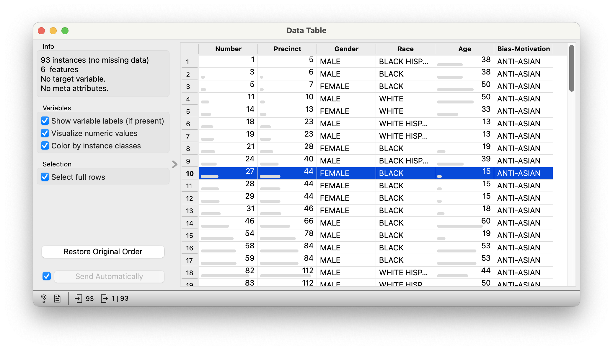
From the Figure 2, We see that the data is all Qualitative, except for Age. The Precinct, while apparently an integer, is really a Qual variable! Why?
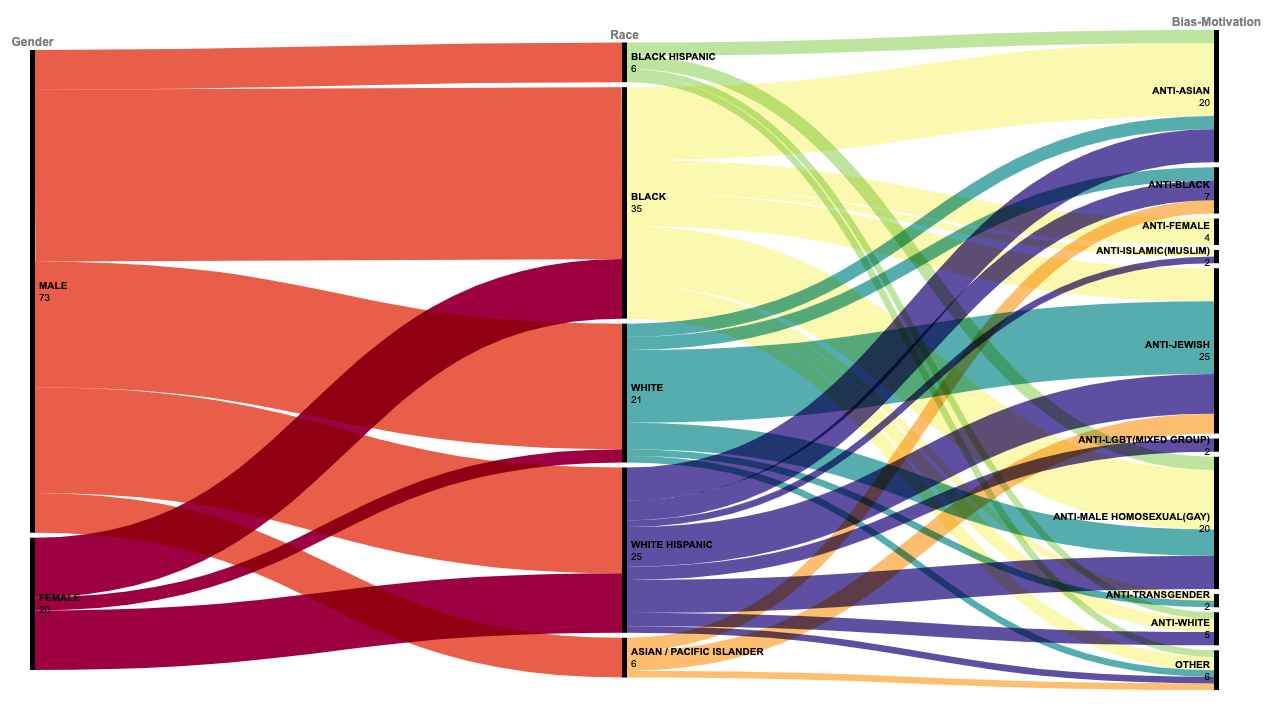
And here is the Sankey Diagram:
In the Figure 3, we have three Qual variables along the x-axis: Gender, Race and Bias-Motivation. The chart counts the crime episodes at each stage/node and portrays them as flows with varying thickness leading to the next stage/node.
What trends do you detect from this diagram?
It does not seem possible to create an Alluvial Diagram in DataWrapper.
Let us try one more dataset:
Let us still import into Orange and see the data anyway!
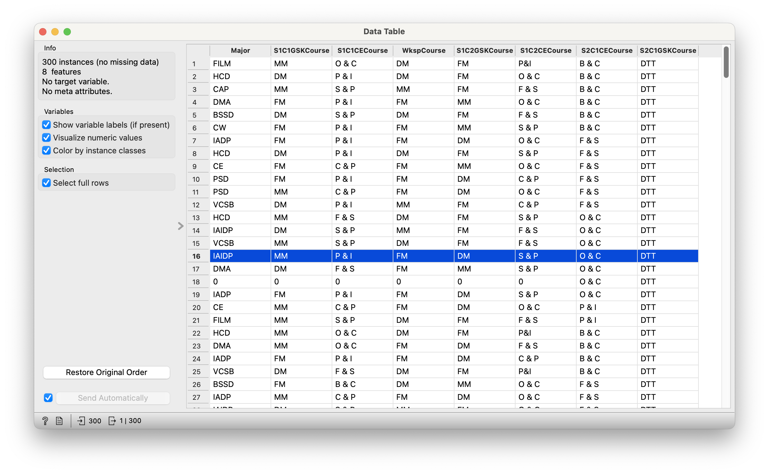
From Figure 4, we see that we have 300 students and their course allocations over one Foundation year at SMI. (The data is anonymized but accurate; no staff or students were harmed in the collection of this data, which is a pity of course)!
- None!!
-
Major(chr): Student Major - All other columns: Courses they were allocated to during the course of the year.
- MM = Mark Making; DM = Digital Making; FM = Form Making;
- DTT = Digital Thinking Tools; VTT = Visual Thinking Tools;
- O&C = Order and Chaos; P&I = Play and Invent; S&P = Space and Place; C&P = Communities and Practices; F&S = Form and Structure; B&C = Body and Context;
L&L = Layers and Lenses;E&C = Everything’s Connected;P&P = Patterns and Paradigms;F&F = Faculty and Fools(Oh all right, all right.)
Let’s try a few questions and see if they are answerable with Sankey/Alluvial Plots.
Q1. Do all DMA/Film/CAP students take at least one B&C course?
Q2. Do all IADP, HCD, and PSD students take one P&I course?
Write in!!
- Within the
ggalluvialpackage from R, are two datasets,majorsandvaccinations. Plot alluvial charts for both of these, and write their stories.
Go to the American Life Panel Website where you will find many public datasets. Try to take one and make charts from it that we have learned in this Module.
Try this from Vincent Arel-Bundock’s website: Cybersecurity breaches reported to the US Department of Health and Human Services. The dataset is downloadable here CSV. NOTE: data may require some cleaning beforehand in Excel!
- Mosaic Charts gave us a view of counts of data across level-combinations of Qual variables.
- Sankey/Alluvial Charts give us a sense of flow: how did different observations flow from one Qual variable to another? So in a sense, a Sankey/Alluvial is a concatenation of several mosaics: at each axis pillar in a Sankey/Alluvial, we can flatten that out into a Mosaic.
- This is very valuable if these Qual variables and their levels have a natural sequence. E.g. Choices made in purchases, Attitudes over time and situation, Affiliations and Friendships over time etc.
- The sequence may even be conceptualized as a consequence, provided you have adequate insight into the situations involved.
- You get a sense of the sub-populations in each combo of Qual variables and can decide what to do about both plenitude and rarity!
A good pictorial introduction to different parts of a Sankey Chart. https://github.com/davidsjoberg/ggsankey
Minard’s famous Alluvial Plot of Napoleon’s Invasion of Russia. https://www.andrewheiss.com/blog/2017/08/10/exploring-minards-1812-plot-with-ggplot2/?utm_content=buffer70e4b&utm_medium=social&utm_source=twitter.com&utm_campaign=buffer
Minard Revisited. https://www.masswerk.at/nowgobang/2020/minard-revisited
100+ years of the Titanic data. https://www.datavis.ca/papers/titanic/
