| No | Pronoun | Answer | Variable/Scale | Example | What Operations? |
|---|---|---|---|---|---|
| 2 | How Many / Much / Heavy? Few? Seldom? Often? When? | Quantities with Scale. Differences are meaningful, but not products or ratios | Quantitative/Interval | pH,SAT score(200-800),Credit score(300-850),SAT score(200-800),Year of Starting College | Mean,Standard Deviation |
| 3 | How, What Kind, What Sort | A Manner / Method, Type or Attribute from a list, with list items in some " order" ( e.g. good, better, improved, best..) | Qualitative/Ordinal | Socioeconomic status (Low income, Middle income, High income),Education level (HighSchool, BS, MS, PhD),Satisfaction rating(Very much Dislike, Dislike, Neutral, Like, Very Much Like) | Median,Percentile |
Gryffindor beats Slytherin to the House Cup
What graphs will we see today?
| Variable #1 | Variable #2 | Chart Names | Chart Shape |
|---|---|---|---|
| Quant | None | Dumbbell and Radar Charts |
|
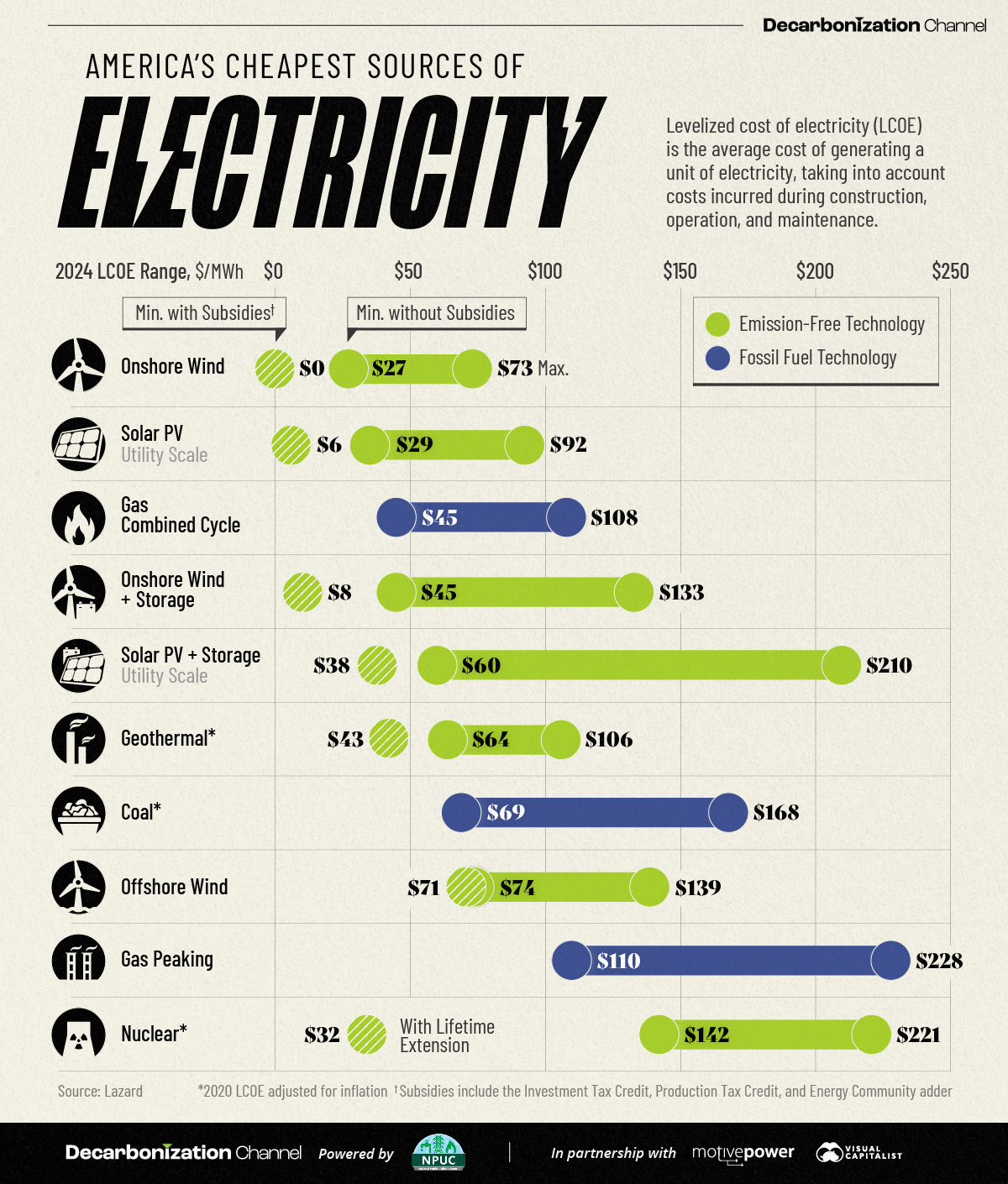
What do we see here? From https://www.visualcapitalist.com/sp/americas-cheapest-sources-of-electricity-in-2024/ :
From Figure 1 (a):
-
Onshore wind powereffectively costs $0 per megawatt-hour (MWh) when subsidies are included!
- Demand for storage solutions is rising quickly. If storage is included, the minimum cost for
onshore windincreases to $8 per MWh.
- Solar photovoltaics (PV) have similarly attractive economics. With subsidies, the minimum cost is $6 per MWh. When including storage, $38 per MWh. Notably, the maximum cost of solar PV with storage has significantly increased from $102 in 2023 to $210 in 2024.
- For gas-combined cycle plants, which combine natural gas and steam turbines for efficient electricity generation, the maximum price has climbed $7 year-over-year to $108 per MWh.
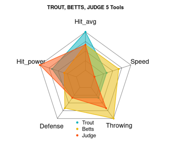
And from From Figure 1 (b)?
- There is a clear difference in the capabilities of the three players compared, though all of them are classified as “5 tools” players.
- Each player is better than the others at one unique skill: Betts at
Throwing, Judge atHit_power, and Trout atHit_avg.
Dumbbell charts show changes in rank/attainment/performance of several entities over two “instants in time” or two “points of interest”. ( Note these two prepositions!! ) The chart is usually sorted to show the entity with the largest change at the very top, or the very bottom. The Y-axis is the “entity” variable (Qual!) and the X-axis is a SINGLE rank or measure of attainment/performance (Quant!). In the above chart, we saw different energy sources as “entities” and their cost as the performance measure, and the energy sources were (roughly) ranked in order of the change in cost. The shape is of course, a bar/dumbbell with endpoints. The length of the bar is proportional to the change.
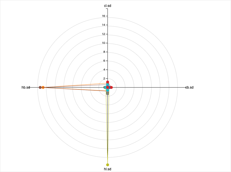
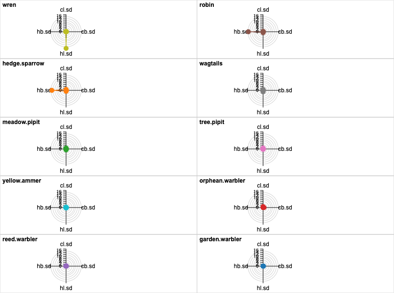
A Radar chart does not show change; it simply plots a set of static performance measures or ranks. However these measures or ranks are not a single performance measure but MULTIPLE. So how do we have multiple X-axes then? We use angle and create as many axes as we need depending upon the number of measures we wish to show, all axes diverging from a single point. The performance measure us marked off along each such angled axis, usually with the same scale (though that may require external pre-processing). The final shape is of course a polygon, and we can plot many “entities” as overlapping, semi-transparent polygons. In the plot above, the entities are the players, and the performance measures are the so-called 5 tools of baseball.
There does not appear to be a way of plotting dumbbell charts in Orange. 😢.
There does not appear to be a way of plotting dumbbell charts in RAWgraphs. 😢.
In DataWrapper, a dumbbell plot is referred to as a range plot, which is also quite an appropriate name:
https://academy.datawrapper.de/article/111-how-to-create-a-range-plot
Another rather similar and evocative plot on DataWrapper is the arrow plot: https://academy.datawrapper.de/article/123-how-to-create-an-arrow-plot
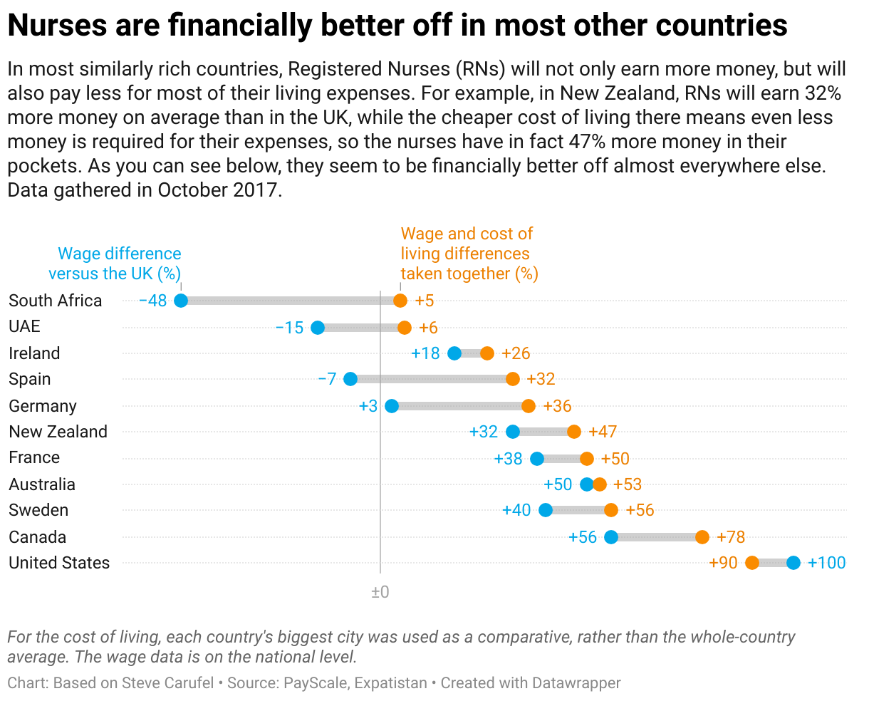
Here is an example of a dumbbell chart/range chart created in DataWrapper. This chart ranks different countries on how much better off the nursing profession is in those countries. (The comparison is with the UK).
Hit the Get the data button, and then upload it into https://app.datawrapper.de/ and see if you can recreate this chart:
The direct link to this dataviz is https://www.datawrapper.de/_/9q1tJ/
Nopes.
Download this RAWgraphs project file to your machine and then upload to https://app.rawgraphs.io/:
Nopes.
Cuckoo birds drop their eggs into other birds’ nests, where they hatch and are looked after by the unwitting host-parent bird, often at the cost of their own babies, a phenomenon known as brood parasitism.
The data is available at Vincent Arel-Bundock’s website: https://vincentarelbundock.github.io/Rdatasets/csv/DAAG/cuckoohosts.csv. Use this URL to directly import into Orange.
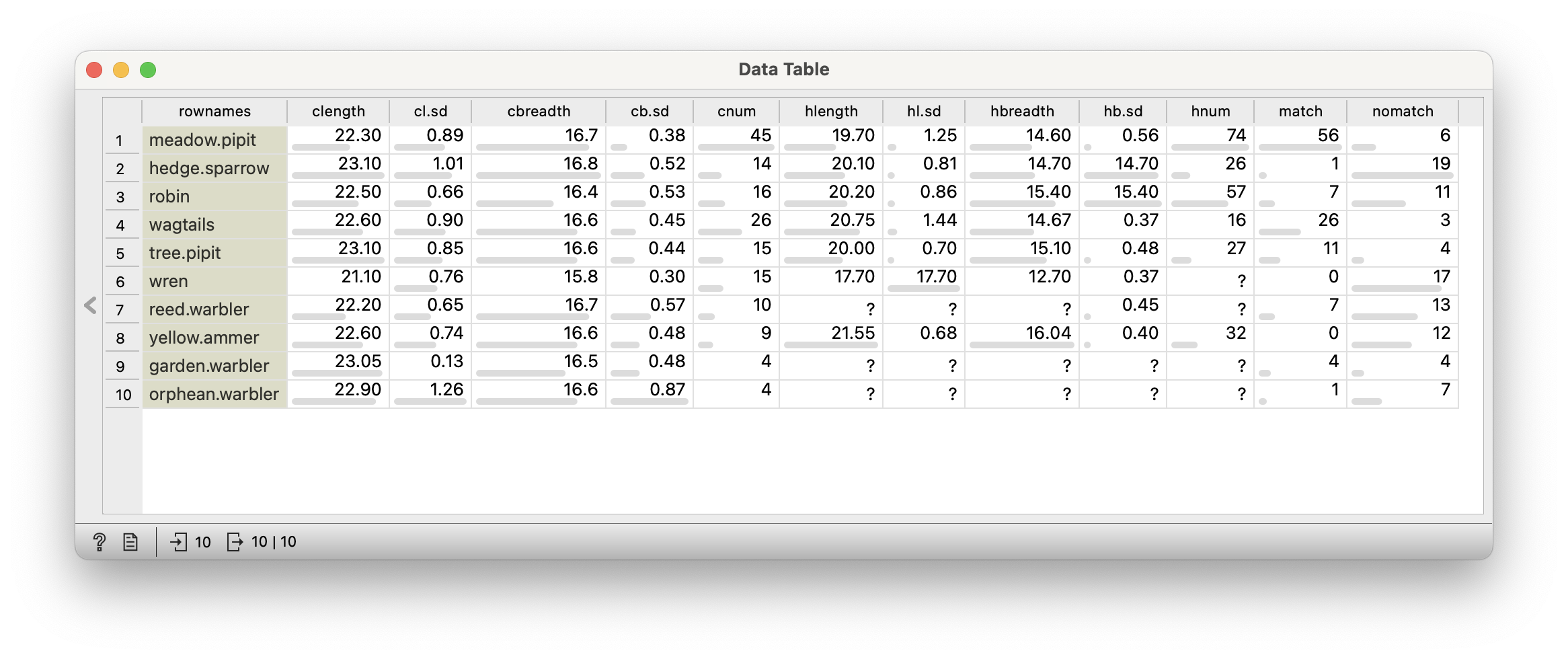
The dataset contains dimensions of the eggs of the host birds and compares them to that of the cuckoo. Import this dataset into Orange and look at the variables, their nature, and their summaries.
A data frame with 10 observations on the following 12 variables. Each row corresponds to a host species bird.
Warning
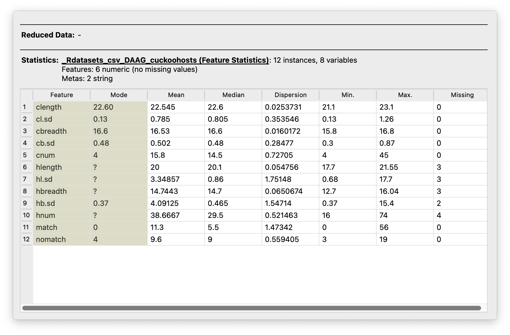
Don’t be confused with Figure 2 (b) showing means and sds, and the very variable names having means and sds! The table shows computed measures in these variables!
Quantitative Data
-
rownames: Not aptly named, but contains the names of the host bird species.
Qualitative Data
-
clength: mean length of cuckoo eggs in given host’s nest -
cl.sd: standard deviation of cuckoo egg lengths -
cbreadth: mean breadth of cuckoo eggs in given host’s nest -
cb.sd: standard deviation of cuckoo egg breadths -
cnum: number of cuckoo eggs -
hlength: length of host eggs -
hl.sd: standard deviation of host egg lengths -
hbreadth: breadth of host eggs -
hb.sd: standard deviation of host egg breadths -
hnum: number of host eggs -
match: number of eggs where color matched -
nomatch: number where color did not match
Question #1
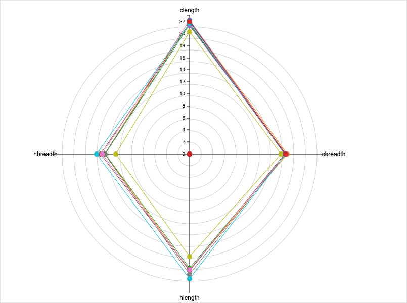
- The Figure 3 shows that both mean-lengths and mean-breadths of the eggs are nearly the same between those of the host and the cuckoo! 😮. The poor host bird has little chance of detecting the parasite egg purely by dimensions….
- From Figure 4, the statistical variations are also nearly the same, except for a few host species where the variation (sd) in the host-egg-length is much larger.
- This aspect is seen better in Figure 5, where for the Wren, the Robin, and the Hedge Sparrow, ….s-o-m-e.. times, the parasite cuckoo egg may be much smaller and perhaps detectable..but again small size may render it inconspicous!
- But..is this over time? Are all the eggs the same age?…Ummm…
Who was it who said:
काकः कृष्णः पिकः कृष्णः को भेदः पिककाकयोः ।
वसन्तकाले संप्राप्ते काकः काकः पिकः पिकः ॥
- कुवलयानन्द
This is a dataset from Our World in Data. Download this data and import into Orange to take a look at it. We might then decide what we wish to see by way of a chart and pre-process the data and saving it with Orange. Then we will send this data to RAWGraphs/DataWrapper to plot our charts.
We will as usual examine the data in Orange, filter and process as needed, and then use the other tools to plot charts to answer our Questions. The workflow for Orange is downloadable with the button below:
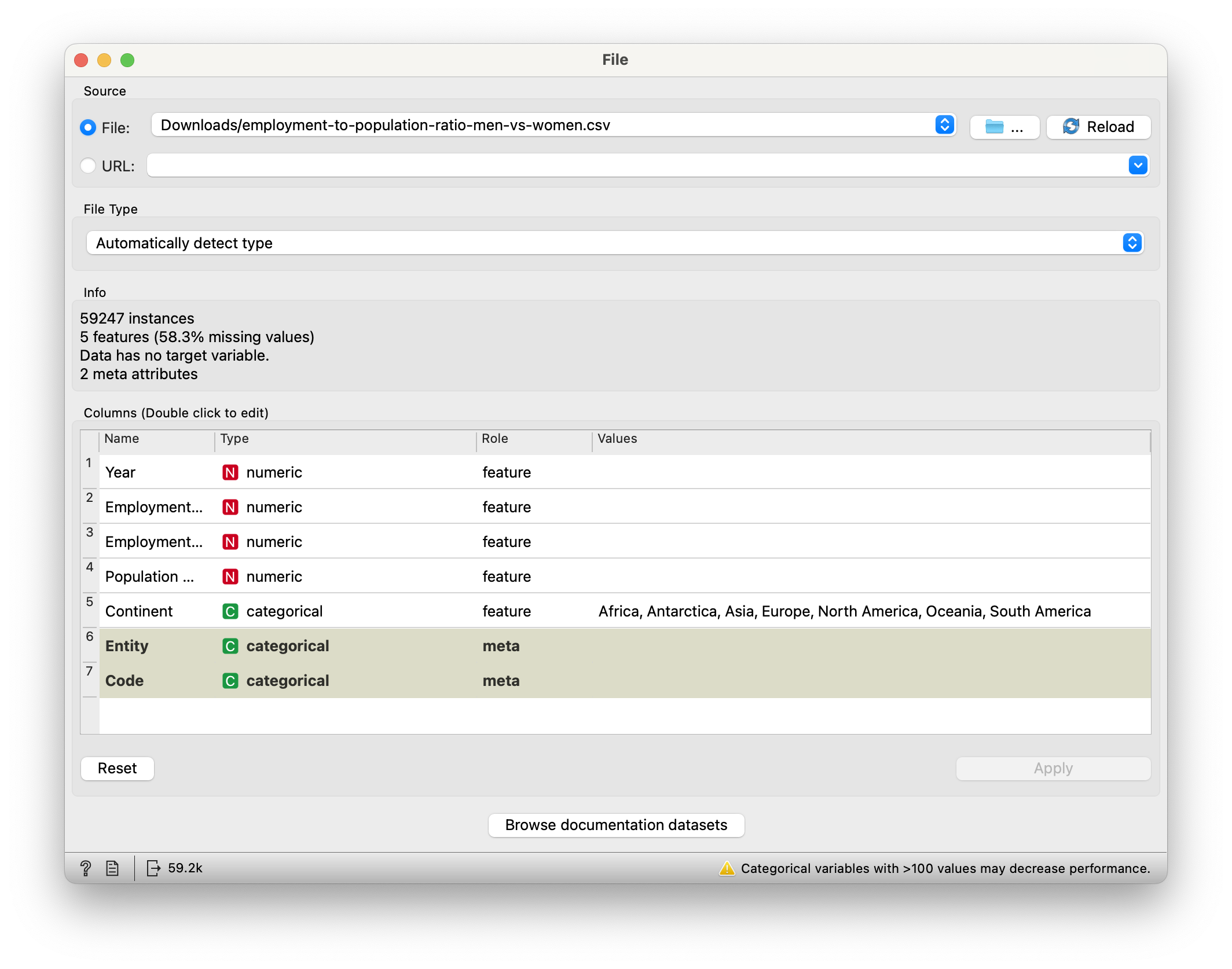
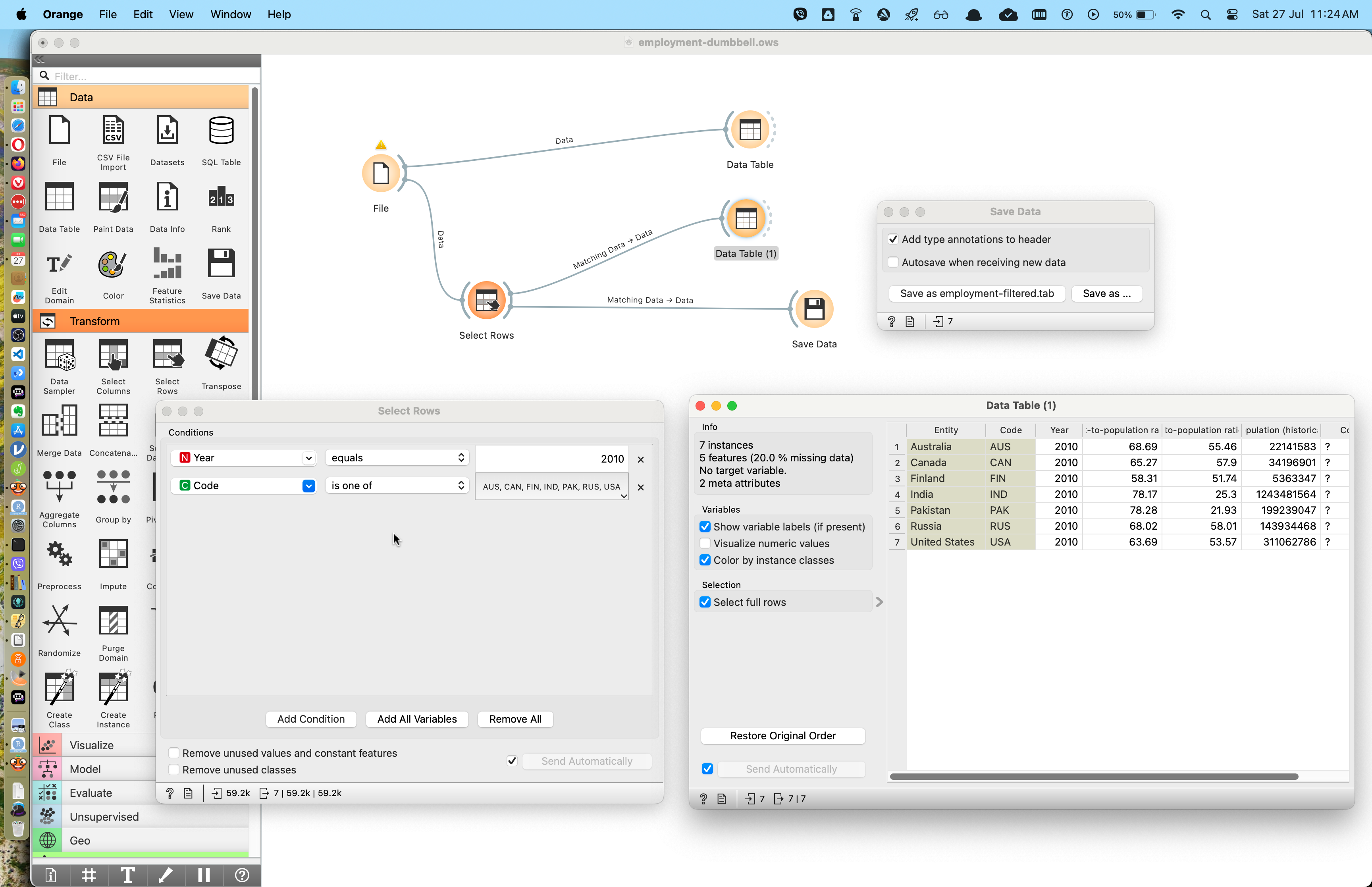
- We have converted the
EntityandCodevariable to Qual - We have used the
Select Rowwidget to select just 7 rows from the 53K rows
A dataframe with 7 rows and 5 columns.
Quantitative Data
-
employment-to-population-ratio, men(%): Population of men employed -
employment-to-population-ratio, women(%): Population of women employed -
Year: year( = 2010)
Qualitative Data
-
entity: country -
code: code for the country -
continent: continent
Use the Orange Save Data widget to save the filtered file as a new CSV and then upload into DataWrapper! Here is the dumbbell chart from DataWrapper. You can head off to DataWrapper here and edit a copy of this chart.
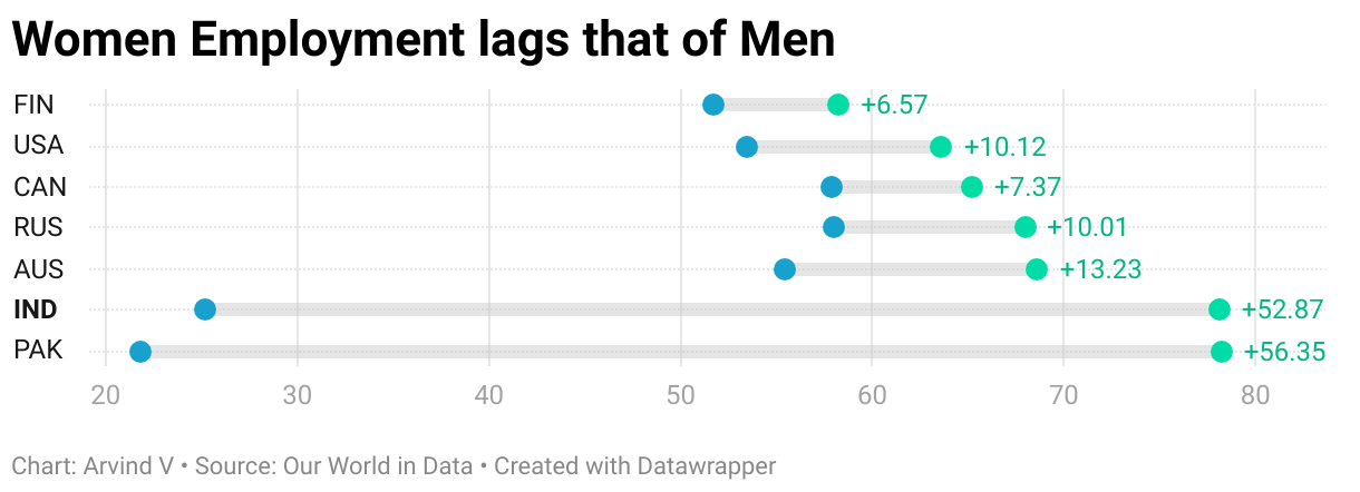
With a simple but effective chart like this, we can tell the story pretty quickly:
- India and Pakistan have huge differences between the employment percentages of women and men.
- All countries shown in the chart have a higher percentage of men employed than women.
DataWrapper does offer a way of creating bump charts for ranking, that look like this:
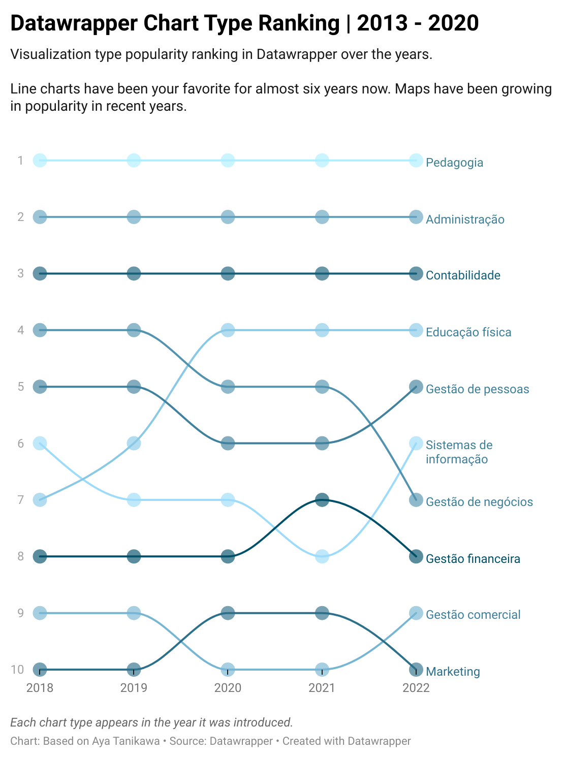
The chart shows the ranking of different chart types over the years. The procedure on DataWrapper is here: https://academy.datawrapper.de/article/347-how-to-create-a-bump-chart
However, I think this procedure is not worth it and creating the plot with R code is far easier and more intuitive.
Note
- Try the Bird Eggs dataset with normalization and see if the story changes!
Note
- Japanese Sake Wines Find this dataset about the grading of Japanese Sake wines: https://vincentarelbundock.github.io/Rdatasets/csv/heplots/Sake.csv" You should be able to use this URL directly in RAWGraphs/DataWrapper.
Note
- Sea Weed Nutrition Choose the right sheet in the xls! You may need to use Orange to pre-process this data using the Orange Widgets
Select Columns,Select Rows, andPreprocess. With thePreprocesswidget, you may wish to normalize each column into the range [0,1] for your Radar Charts.
- We can measure some Performance metric about entities such as Products, Brands, Shops, Companies, Stock Prices/Earnings and see how it changes over two instances of measurement, with a dumbbell chart.
- The length of the dumbbells tells a very clear story.
- Dumbbell Plots are clearly are more intuitive and clear than the corresponding bar chart:
- Differences between the same set of data at two different aspects is very quickly apparent
- Differences in differences(DID) are also quite easily apparent. Experiments do use these metrics and these plots would be very useful there.
- If entities have their performance or quality measured over several different “aspects”, a radar chart would serve you well. Do you think Dumbledore could have used a Radar Chart to decide who could have won the House Trophy at Hogwarts?
- The area(s) and non-overlapping parts of the (overlaid) radar chart are very evocative of superior performance.
Highcharts Blog. Why you need to start using dumbbell charts
https://github.com/hrbrmstr/ggalt#lollipop-chartsSee this use of Radar Charts in Education. Choose the country/countries of choice and plot their ranks on various educational parameters in a radar chart. https://gpseducation.oecd.org/Home