library(tidyverse)
library(mosaic)
library(ggformula)
library(skimr)
library(visStatistics) # All in one plot + stats test package
library(palmerpenguins) # Our new favourite dataset
##
library(tidyplots) # Easily Produced Publication-Ready Plots
library(tinyplot) # Plots with Base R
library(tinytable) # Elegant Tables for our data
Plotting Distributions over Categories
Qual Variables
Quant Variables
Box Plots
Violin Plots
Abstract
Quant and Qual Variable Graphs and their Siblings
Slides and Tutorials
| R (Static Viz) | Radiant Tutorial | Datasets |
“In keeping silent about evil, in burying it so deep within us that no sign of it appears on the surface, we are implanting it, and it will rise up a thousand fold in the future.”
— Aleksandr Solzhenitsyn
Plot Fonts and Theme
Show the Code
library(systemfonts)
library(showtext)
## Clean the slate
systemfonts::clear_local_fonts()
systemfonts::clear_registry()
##
showtext_opts(dpi = 96) # set DPI for showtext
sysfonts::font_add(
family = "Alegreya",
regular = "../../../../../../fonts/Alegreya-Regular.ttf",
bold = "../../../../../../fonts/Alegreya-Bold.ttf",
italic = "../../../../../../fonts/Alegreya-Italic.ttf",
bolditalic = "../../../../../../fonts/Alegreya-BoldItalic.ttf"
)
sysfonts::font_add(
family = "Roboto Condensed",
regular = "../../../../../../fonts/RobotoCondensed-Regular.ttf",
bold = "../../../../../../fonts/RobotoCondensed-Bold.ttf",
italic = "../../../../../../fonts/RobotoCondensed-Italic.ttf",
bolditalic = "../../../../../../fonts/RobotoCondensed-BoldItalic.ttf"
)
showtext_auto(enable = TRUE) # enable showtext
##
theme_custom <- function() {
font <- "Alegreya" # assign font family up front
theme_classic(base_size = 14, base_family = font) %+replace% # replace elements we want to change
theme(
text = element_text(family = font), # set base font family
# text elements
plot.title = element_text( # title
family = font, # set font family
size = 24, # set font size
face = "bold", # bold typeface
hjust = 0, # left align
margin = margin(t = 5, r = 0, b = 5, l = 0)
), # margin
plot.title.position = "plot",
plot.subtitle = element_text( # subtitle
family = font, # font family
size = 14, # font size
hjust = 0, # left align
margin = margin(t = 5, r = 0, b = 10, l = 0)
), # margin
plot.caption = element_text( # caption
family = font, # font family
size = 9, # font size
hjust = 1
), # right align
plot.caption.position = "plot", # right align
axis.title = element_text( # axis titles
family = "Roboto Condensed", # font family
size = 12
), # font size
axis.text = element_text( # axis text
family = "Roboto Condensed", # font family
size = 9
), # font size
axis.text.x = element_text( # margin for axis text
margin = margin(5, b = 10)
)
# since the legend often requires manual tweaking
# based on plot content, don't define it here
)
}Show the Code
```{r}
#| cache: false
#| code-fold: true
## Set the theme
theme_set(new = theme_custom())
```Error in theme_set(new = theme_custom()): could not find function "theme_set"Show the Code
```{r}
#| cache: false
#| code-fold: true
## Use available fonts in ggplot text geoms too!
update_geom_defaults(geom = "text", new = list(
family = "Roboto Condensed",
face = "plain",
size = 3.5,
color = "#2b2b2b"
))
```Error in update_geom_defaults(geom = "text", new = list(family = "Roboto Condensed", : could not find function "update_geom_defaults"
| Variable #1 | Variable #2 | Chart Names | Chart Shape | |
|---|---|---|---|---|
| Quant | Qual | Box Plot |
| No | Pronoun | Answer | Variable/Scale | Example | What Operations? |
|---|---|---|---|---|---|
| 1 | How Many / Much / Heavy? Few? Seldom? Often? When? | Quantities, with Scale and a Zero Value.Differences and Ratios /Products are meaningful. | Quantitative/Ratio | Length,Height,Temperature in Kelvin,Activity,Dose Amount,Reaction Rate,Flow Rate,Concentration,Pulse,Survival Rate | Correlation |
| 4 | What, Who, Where, Whom, Which | Name, Place, Animal, Thing | Qualitative/Nominal | Name | Count no. of cases,Mode |
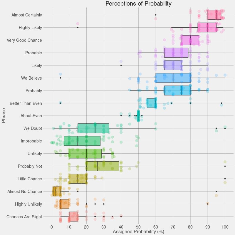
Alice said, “I say what I mean and I mean what I say!” Are the rest of us so sure? What do we mean when we use any of the phrases above? How definite are we? There is a range of “sureness” and “unsureness”…and this is where we can use box plots like Figure 1 to show that range of opinion.
Maybe it is time for a box plot on uh, shades1 of meaning for Jane Austen Gen-Z phrases! Bah.
Box Plots are an extremely useful data visualization that gives us an idea of the distribution of a Quant variable, for each level of another Qual variable.
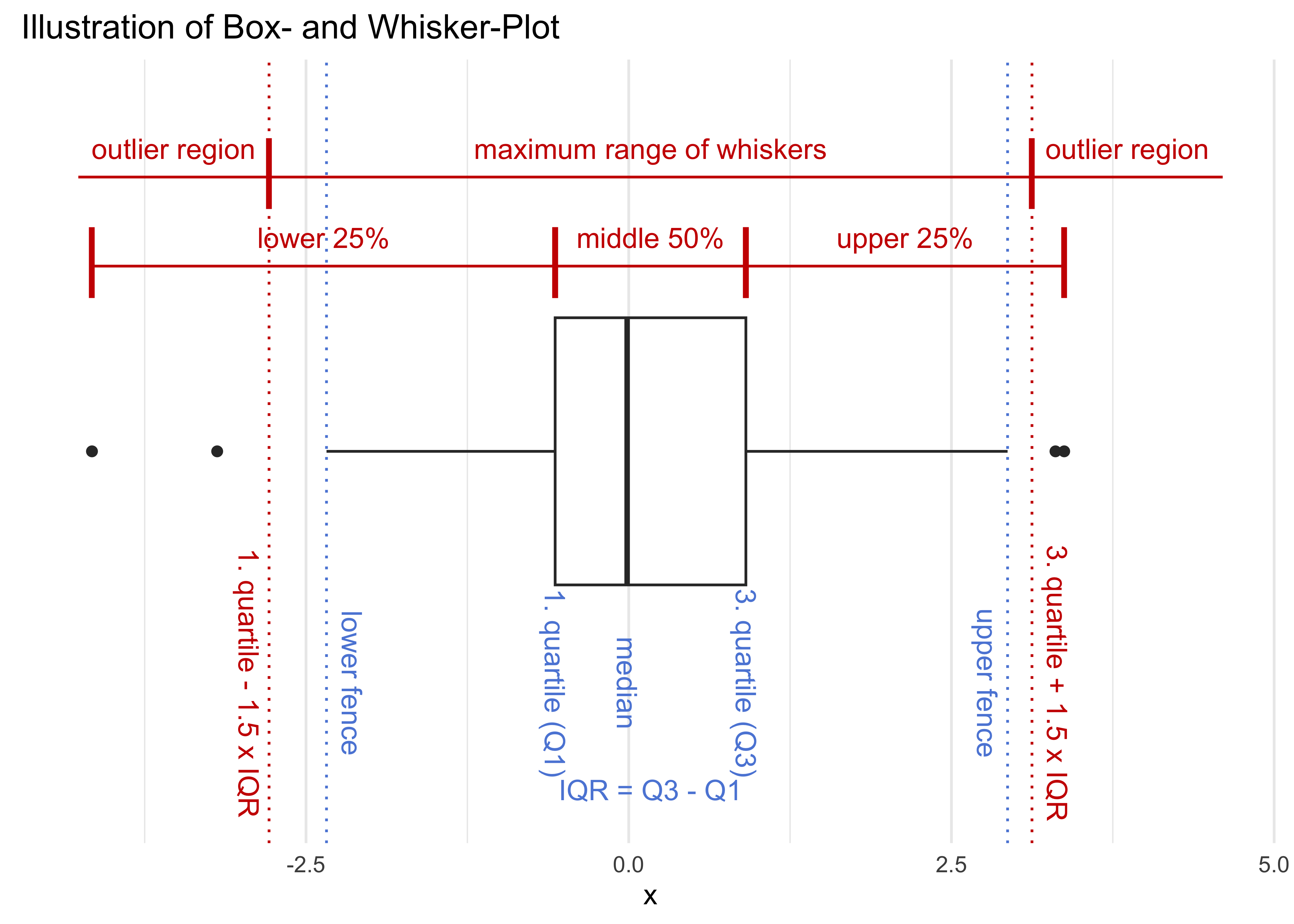
The internal process of this plot is as follows:
(Hat tip to student Tanya Michelle Justin for a good question on outlier calculation)
- Make groups of the Quant variable for each level of the Qual
- In each group, rank the Quant variable values in increasing order
- Calculate:
-
Quartiles: The values for
median = Q2, Q1, and Q3 based on rank!! -
Values for
min,max, and thenIQR = Q1 - Q3 - Calculate
outlierlimits: -
Whiskers: All values within -
Outliers: All values outside of
-
Quartiles: The values for
- Plot these as a vertical or horizontal box structure, as shown.
As a result of this, while the box-part of the boxplot always shows 2 full quartiles, the whiskers may not stretch through their quartiles, since some values may be outliers on either side.
Ranks and Values
The Quant variable is ordered based on the values from min to max. So you could imagine that each value has a rank or sequence number. The min value has max value has
Histograms and Box Plots
Note how the histogram that dwells upon the mean and standard deviation, whereas the boxplot focuses on the median and quartiles. The former uses the values of the Quant variable, whereas the latter uses their sequence number or ranks.
Box plots are often used for example in HR operations to understand Salary distributions across grades of employees. Marks of students in competitive exams are also declared using Quartiles.
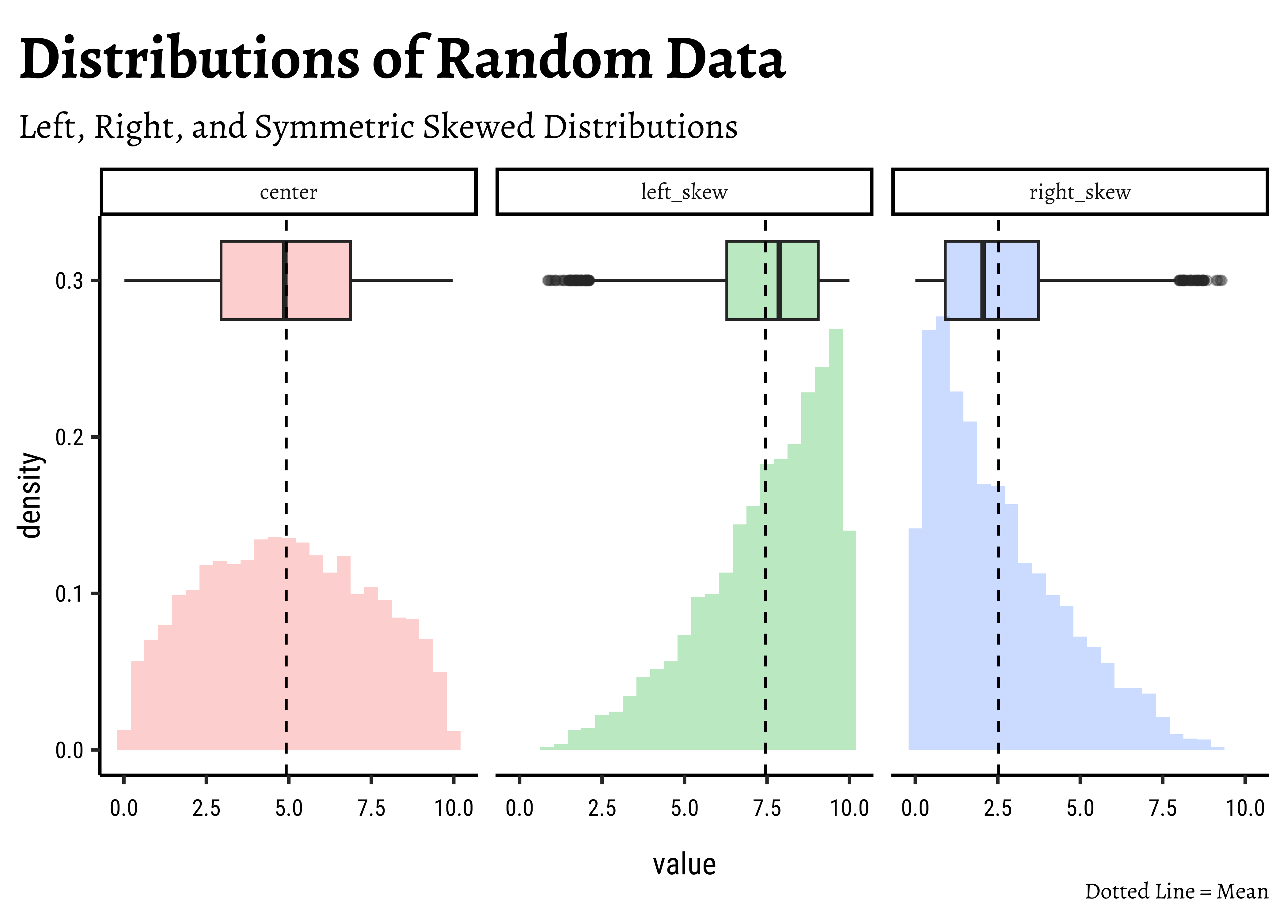
Box plots can show skew in distributions, with a large number of outliers on one side, as in Figure 3.
In other cases, there may be no ouliers, but the “bottom” and the “lid” of the box may not be the same size!
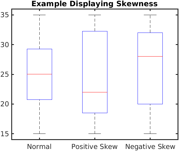
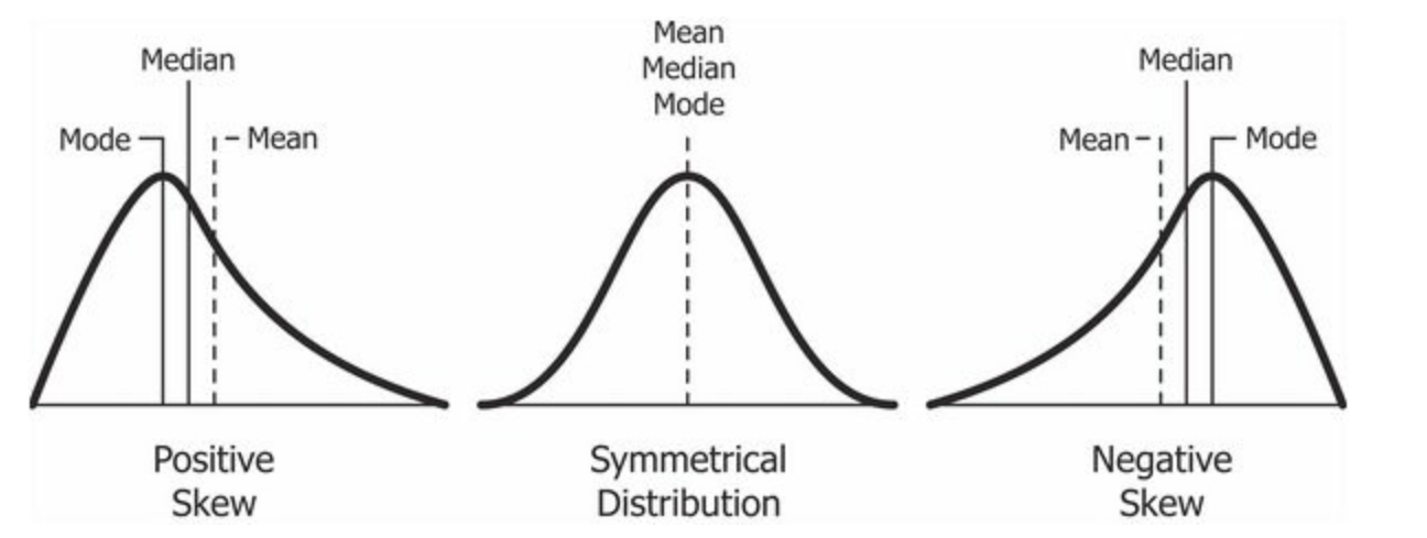
In the Figure 4, we see the difference between boxplots that show symmetric and skewed distributions. The “lid” and the “bottom” of the box are not of similar width in distributions with significant skewness.
Compare these with the corresponding Figure 4 (b).
gss_wages dataset
We will first look at Wage data from the General Social Survey (1974-2018) conducted in the USA, which is used to illustrate wage discrepancies by gender (while also considering respondent occupation, age, and education). This is available on Vincent Arel-Bundock’s superb repository of datasets. Let us read into R directly from the website.
wages <- read_csv("https://vincentarelbundock.github.io/Rdatasets/csv/stevedata/gss_wages.csv")The data has automatically been read into the webr session, so you can continue on to the next code chunk!
Loading webR...
As per our Workflow, we will look at the data using all the three methods we have seen.
glimpse(wages)Rows: 61,697
Columns: 12
$ rownames <dbl> 1, 2, 3, 4, 5, 6, 7, 8, 9, 10, 11, 12, 13, 14, 15, 16, 17, …
$ year <dbl> 1974, 1974, 1974, 1974, 1974, 1974, 1974, 1974, 1974, 1974,…
$ realrinc <dbl> 4935, 43178, NA, NA, 18505, 22206, 55515, NA, NA, 4935, NA,…
$ age <dbl> 21, 41, 83, 69, 58, 30, 48, 67, 51, 54, 89, 71, 27, 30, 22,…
$ occ10 <dbl> 5620, 2040, NA, NA, 5820, 910, 230, 6355, 4720, 3940, 4810,…
$ occrecode <chr> "Office and Administrative Support", "Professional", NA, NA…
$ prestg10 <dbl> 25, 66, NA, NA, 37, 45, 59, 49, 28, 38, 47, 45, 50, 29, 33,…
$ childs <dbl> 0, 3, 2, 2, 0, 0, 2, 1, 2, 2, 3, 1, 4, 3, 0, 1, 2, 3, 4, 8,…
$ wrkstat <chr> "School", "Full-Time", "Housekeeper", "Housekeeper", "Full-…
$ gender <chr> "Male", "Male", "Female", "Female", "Female", "Male", "Male…
$ educcat <chr> "High School", "Bachelor", "Less Than High School", "Less T…
$ maritalcat <chr> "Married", "Married", "Widowed", "Widowed", "Never Married"…skim(wages)| Name | wages |
| Number of rows | 61697 |
| Number of columns | 12 |
| _______________________ | |
| Column type frequency: | |
| character | 5 |
| numeric | 7 |
| ________________________ | |
| Group variables | None |
Variable type: character
| skim_variable | n_missing | complete_rate | min | max | empty | n_unique | whitespace |
|---|---|---|---|---|---|---|---|
| occrecode | 3561 | 0.94 | 5 | 37 | 0 | 11 | 0 |
| wrkstat | 21 | 1.00 | 5 | 23 | 0 | 8 | 0 |
| gender | 0 | 1.00 | 4 | 6 | 0 | 2 | 0 |
| educcat | 135 | 1.00 | 8 | 21 | 0 | 5 | 0 |
| maritalcat | 27 | 1.00 | 7 | 13 | 0 | 5 | 0 |
Variable type: numeric
| skim_variable | n_missing | complete_rate | mean | sd | p0 | p25 | p50 | p75 | p100 | hist |
|---|---|---|---|---|---|---|---|---|---|---|
| rownames | 0 | 1.00 | 30849.00 | 17810.53 | 1 | 15425 | 30849 | 46273 | 61697.0 | ▇▇▇▇▇ |
| year | 0 | 1.00 | 1996.07 | 12.79 | 1974 | 1985 | 1996 | 2006 | 2018.0 | ▆▇▇▇▇ |
| realrinc | 23810 | 0.61 | 22326.36 | 28581.79 | 227 | 8156 | 16563 | 27171 | 480144.5 | ▇▁▁▁▁ |
| age | 219 | 1.00 | 46.18 | 17.56 | 18 | 32 | 44 | 59 | 89.0 | ▇▇▆▅▂ |
| occ10 | 3561 | 0.94 | 4695.77 | 2627.72 | 10 | 2710 | 4720 | 6230 | 9997.0 | ▃▅▇▂▃ |
| prestg10 | 4186 | 0.93 | 43.06 | 12.99 | 16 | 33 | 42 | 50 | 80.0 | ▃▇▇▃▁ |
| childs | 189 | 1.00 | 1.92 | 1.76 | 0 | 0 | 2 | 3 | 8.0 | ▇▇▂▁▁ |
inspect(wages)
categorical variables:
name class levels n missing
1 occrecode character 11 58136 3561
2 wrkstat character 8 61676 21
3 gender character 2 61697 0
4 educcat character 5 61562 135
5 maritalcat character 5 61670 27
distribution
1 Professional (19%), Service (16.9%) ...
2 Full-Time (49.4%), Housekeeper (15.1%) ...
3 Female (56.1%), Male (43.9%)
4 High School (51.5%) ...
5 Married (51.7%), Never Married (21.8%) ...
quantitative variables:
name class min Q1 median Q3 max mean sd
1 rownames numeric 1 15425 30849 46273 61697.0 30849.000000 17810.534116
2 year numeric 1974 1985 1996 2006 2018.0 1996.073715 12.794470
3 realrinc numeric 227 8156 16563 27171 480144.5 22326.359234 28581.794499
4 age numeric 18 32 44 59 89.0 46.176177 17.561065
5 occ10 numeric 10 2710 4720 6230 9997.0 4695.774081 2627.724076
6 prestg10 numeric 16 33 42 50 80.0 43.060701 12.987526
7 childs numeric 0 0 2 3 8.0 1.923457 1.763569
n missing
1 61697 0
2 61697 0
3 37887 23810
4 61478 219
5 58136 3561
6 57511 4186
7 61508 189
From the dataset documentation page, we note that this is a large dataset (61K rows), with 11 variables:
Quantitative Data
-
year(dbl): the survey year -
realrinc(dbl): the respondent’s base income (in constant 1986 USD -
age(dbl): the respondent’s age in years -
occ10(dbl): respondent’s occupation code (2010) -
prestg10(dbl): respondent’s occupational prestige score (2010) -
childs(dbl): number of children (0-8)
Qualitative Data
-
occrecode(chr): recode of the occupation code into one of 11 main categories
-
wrkstat(chr): the work status of the respondent (full-time, part-time, temporarily not working, unemployed (laid off), retired, school, housekeeper, other). 8 levels. -
gender(chr): respondent’s gender (male or female). 2 levels.
-
educcat(chr): respondent’s degree level (Less Than High School, High School, Junior College, Bachelor, or Graduate). 5 levels.
-
maritalcat(chr): respondent’s marital status (Married, Widowed, Divorced, Separated, Never Married). 5 levels.
Business Insights based on
wages dataset
- Fair amount of missing data; however with 61K rows, we can for the present simply neglect the missing data.
- Good mix of Qual and Quant variables
- The target variable for an experiment that resulted in this data might be the
realincvariable, the resultant income of the individual. Which is numerical variable.
Research Questions:
- What is the basic distribution of
realrinc? - Is
realrincaffected bygender? - By
educcat? Bymaritalcat? - Is
realrincaffected bychild? - Do combinations of these factors have an effect on the target variable?
These should do for now! But we should make more questions when have seen some plots!
Since there are so many missing data in the target variable realinc and there is still enough data leftover, let us remove the rows containing missing data in that variable.
Important
NOTE: This is not advised at all as a general procedure!! Data is valuable and there are better ways to manage this problem!
realrinc?
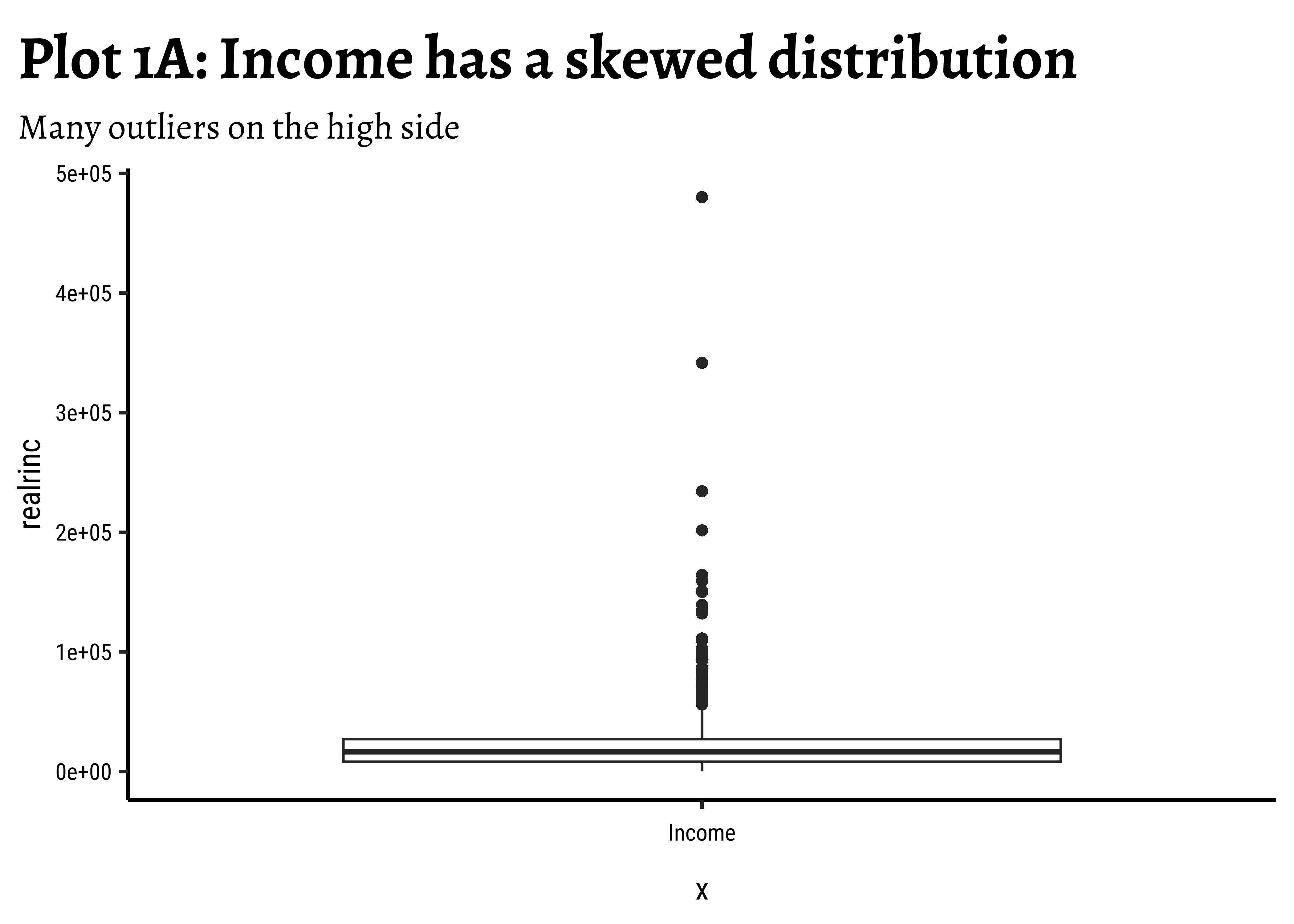
Question-1: What is the basic distribution of
realrinc?
wages_clean %>%
gf_boxplot(realrinc ~ "Income") %>% # Dummy X-axis "variable"
gf_labs(
title = "Plot 1A: Income has a skewed distribution",
subtitle = "Many outliers on the high side"
)
wages_clean %>%
ggplot() +
geom_boxplot(aes(y = realrinc, x = "Income")) + # Dummy X-axis "variable"
labs(
title = "Plot 1A: Income has a skewed distribution",
subtitle = "Many outliers on the high side"
)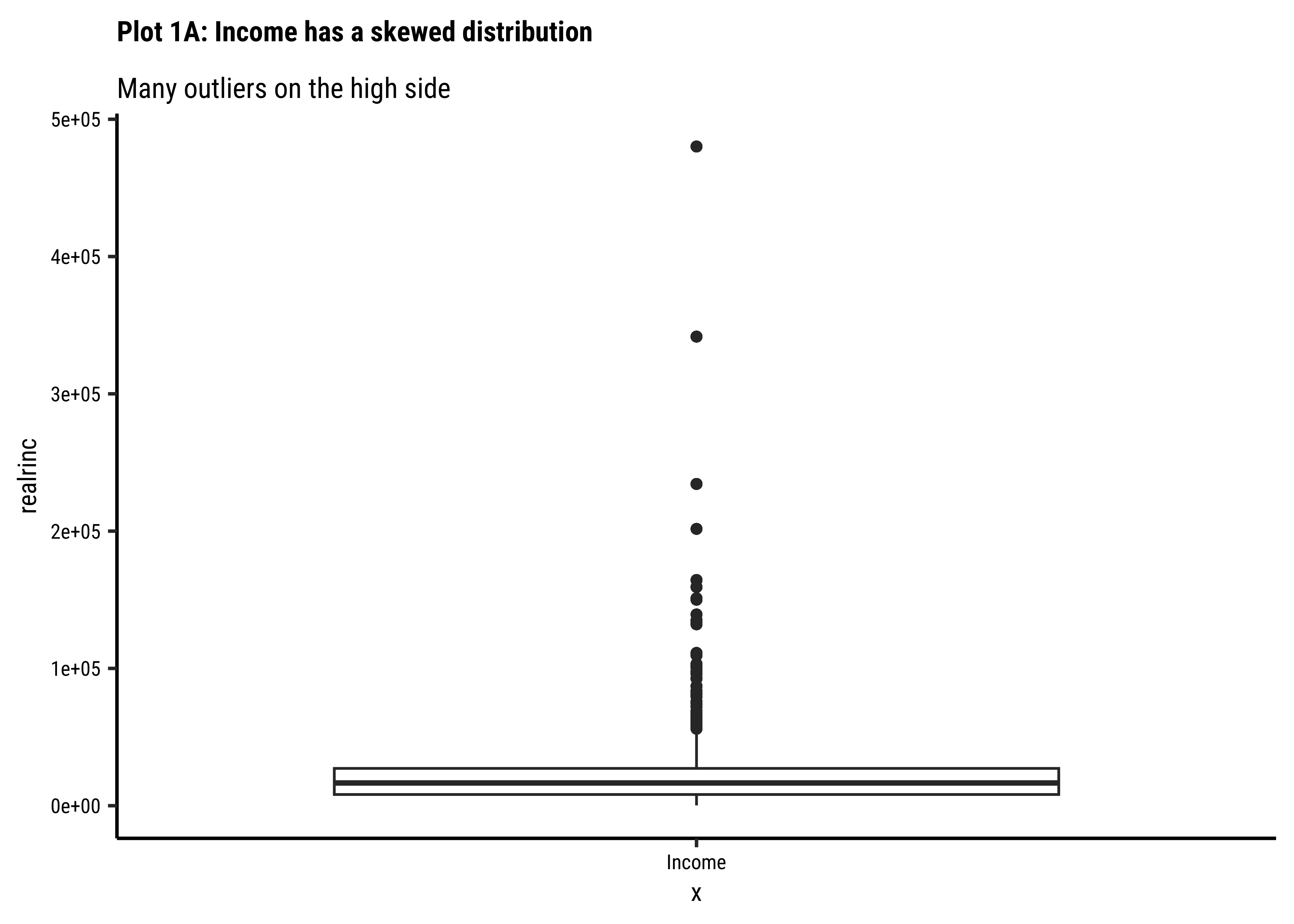
Business Insights-1
- Income is a very skewed distribution, as might be expected.
- Presence of many higher-side outliers is noted.
realrinc affected by gender?
Question-2: Is
realrinc affected by gender?
wages_clean %>%
gf_boxplot(gender ~ realrinc) %>%
gf_labs(title = "Plot 2A: Income by Gender")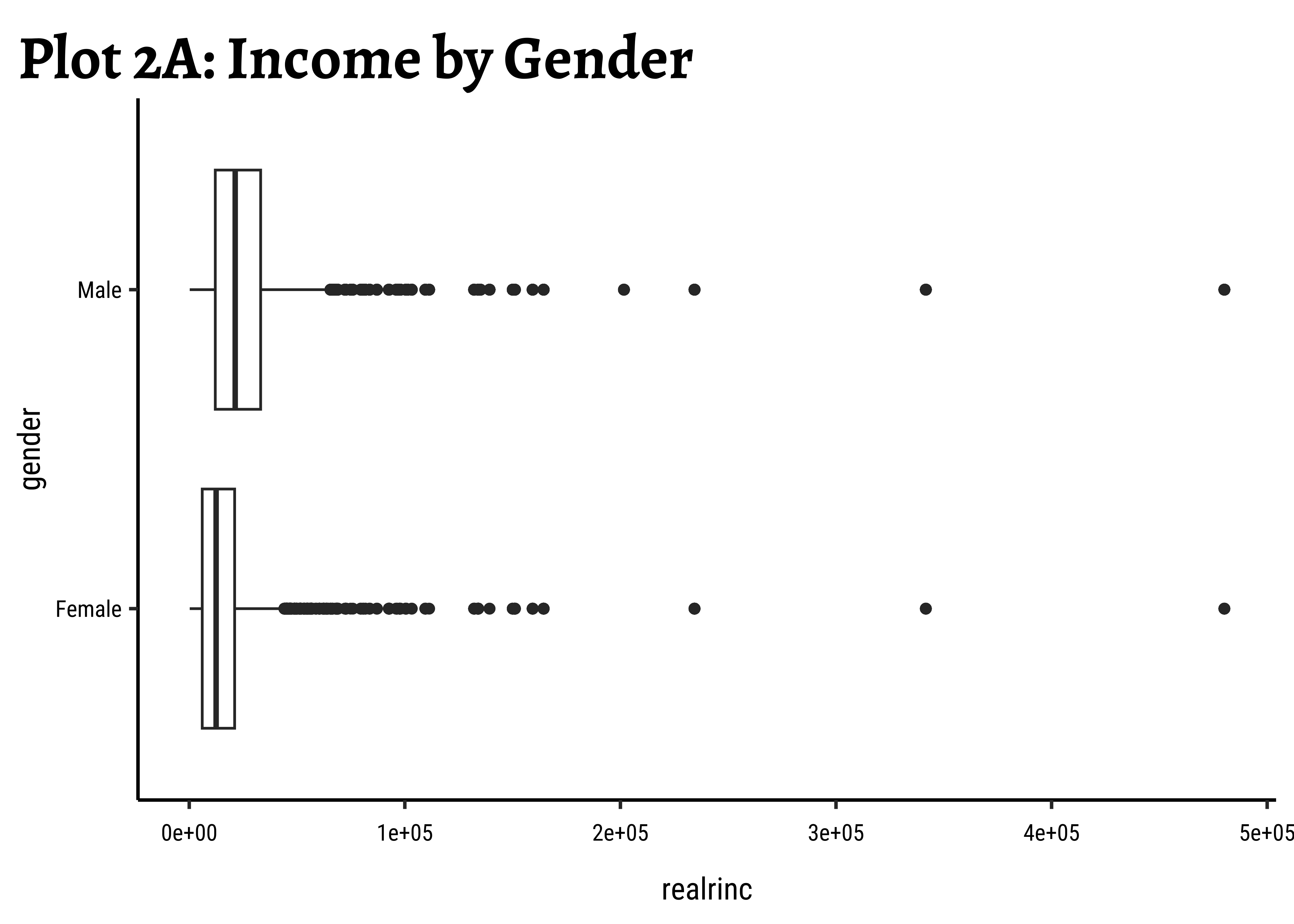
wages_clean %>%
gf_boxplot(gender ~ log10(realrinc)) %>%
gf_labs(title = "Plot 2B: Log(Income) by Gender")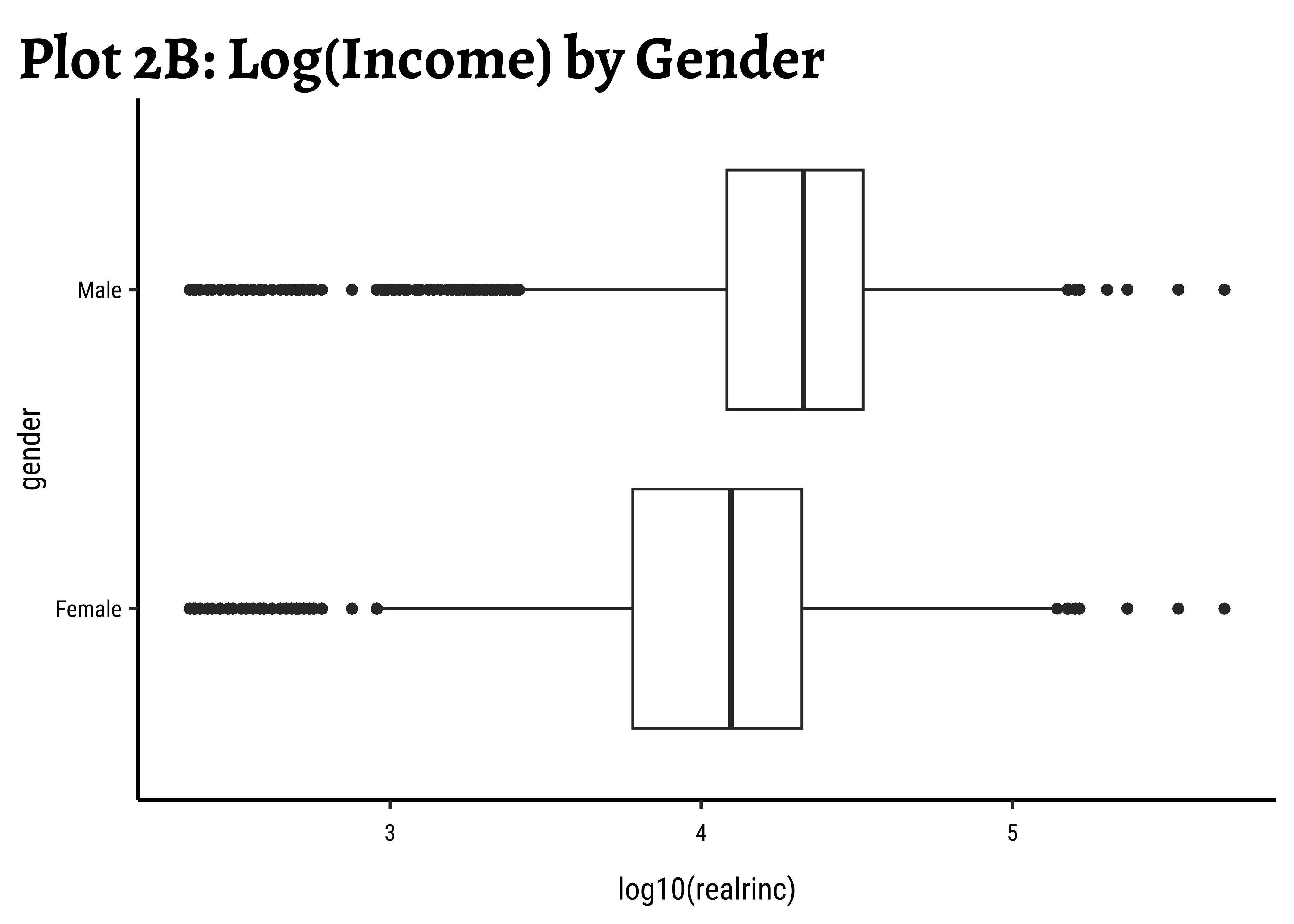
wages_clean %>%
gf_boxplot(gender ~ realrinc, fill = ~gender) %>%
gf_refine(scale_x_log10(), scale_fill_brewer(palette = "Set1")) %>%
gf_labs(title = "Plot 2C: Income filled by Gender, log scale")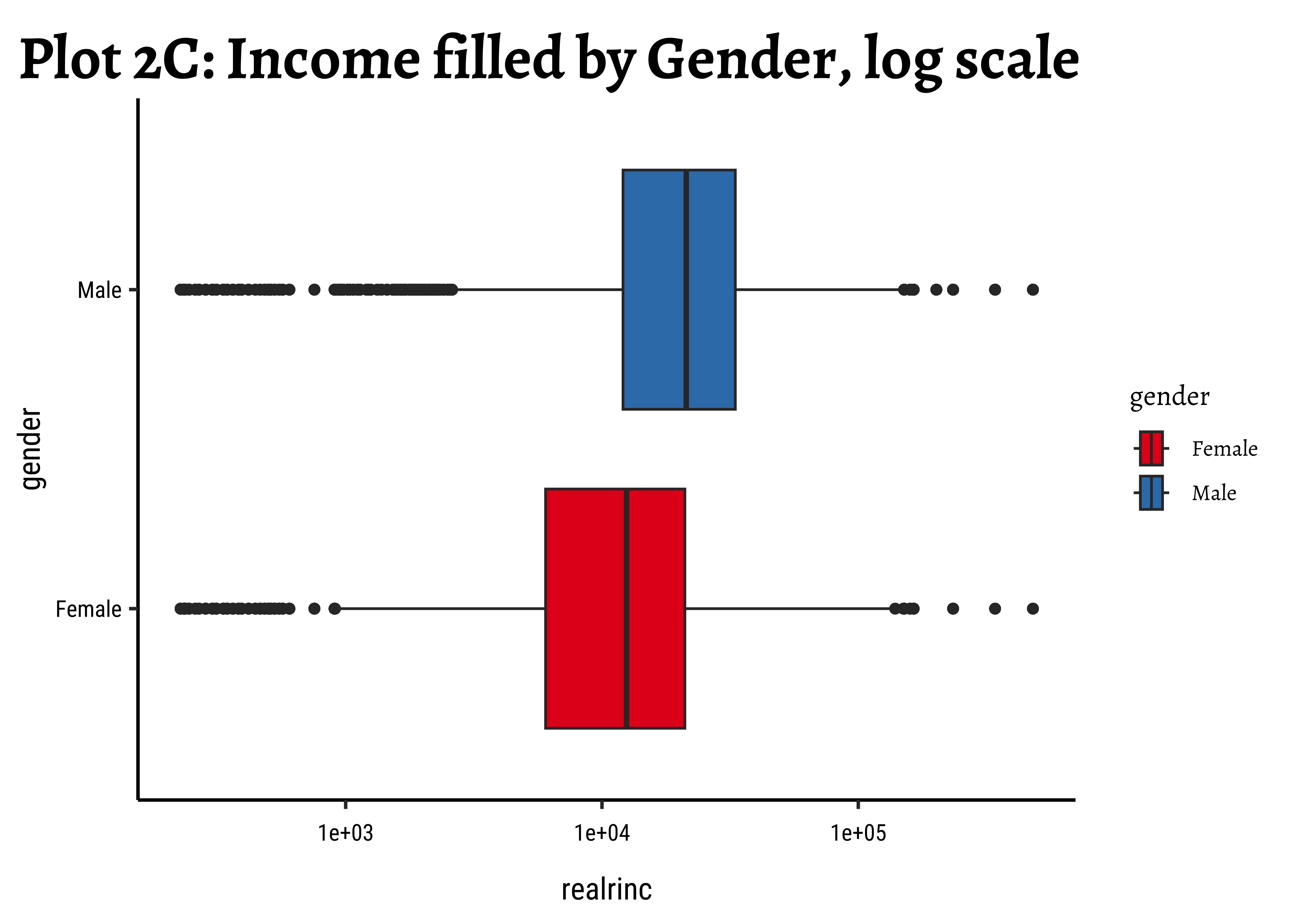
wages_clean %>%
ggplot() +
geom_boxplot(aes(y = gender, x = realrinc)) +
labs(title = "Plot 2A: Income by Gender")
##
wages_clean %>%
ggplot() +
geom_boxplot(aes(y = gender, x = log10(realrinc))) +
labs(title = "Plot 2B: Log(Income) by Gender")
##
wages_clean %>%
ggplot() +
geom_boxplot(aes(y = gender, x = realrinc, fill = gender)) +
scale_x_log10() +
scale_fill_brewer(palette = "Set1") +
labs(title = "Plot 2C: Income filled by Gender, log scale")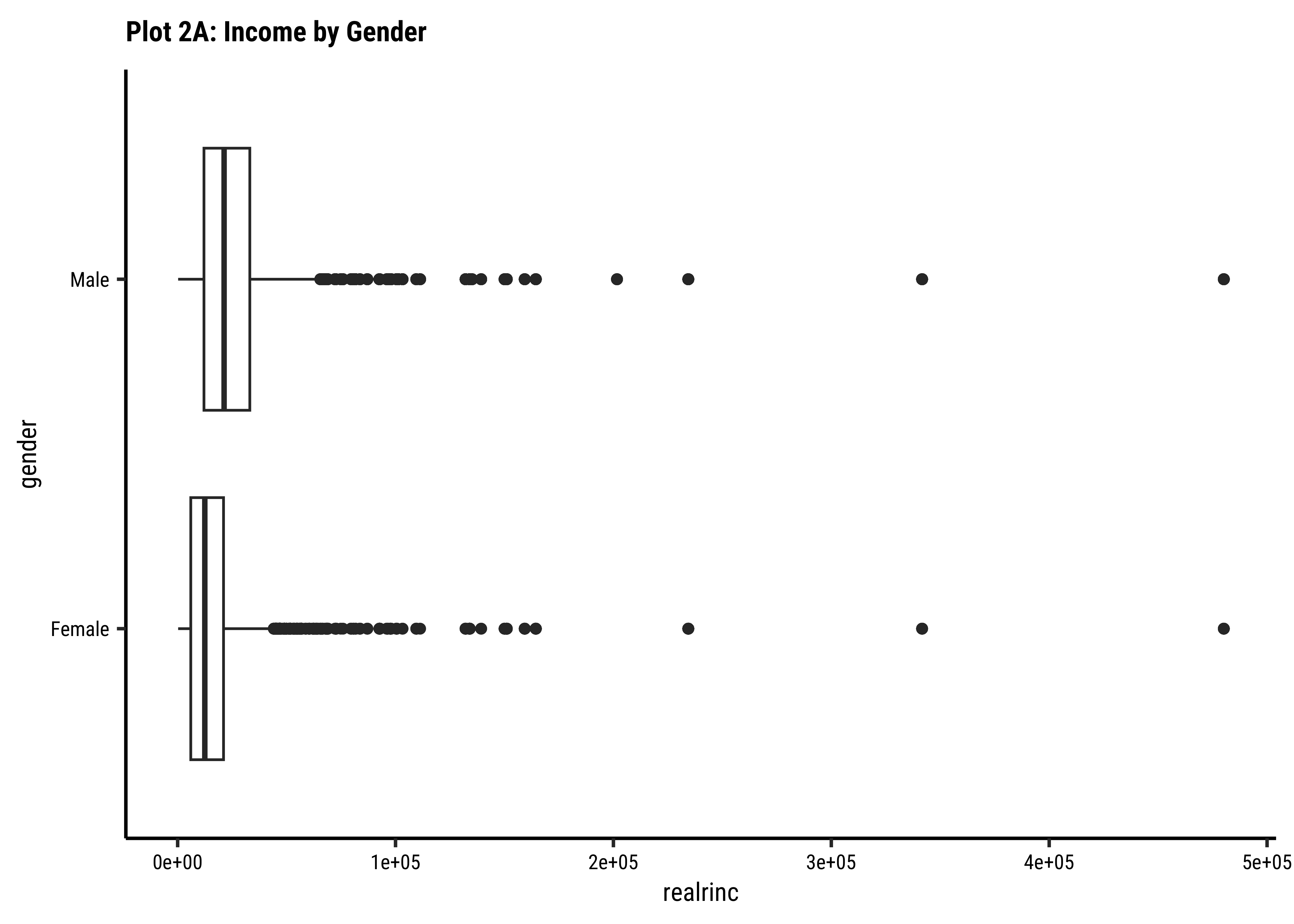
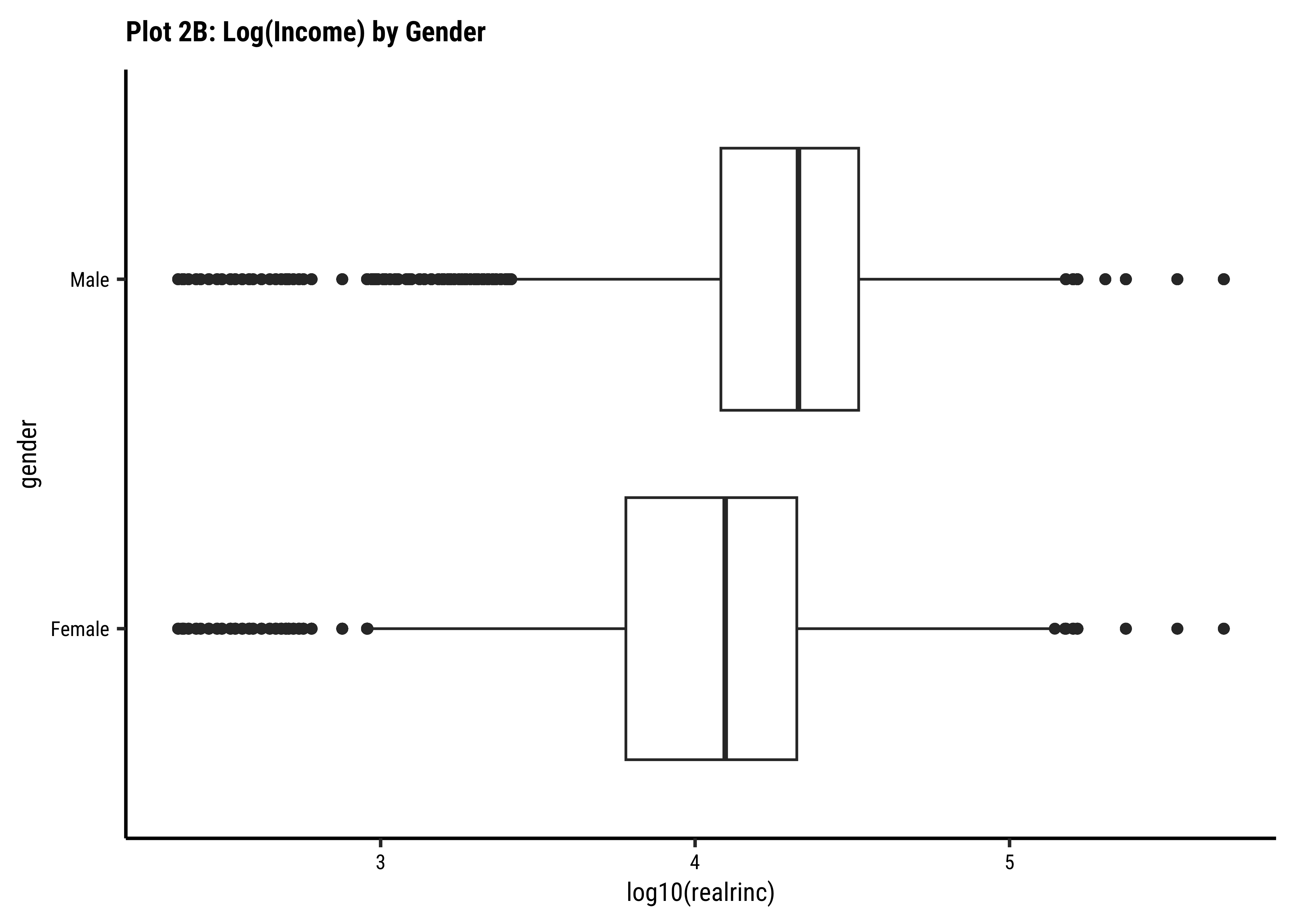
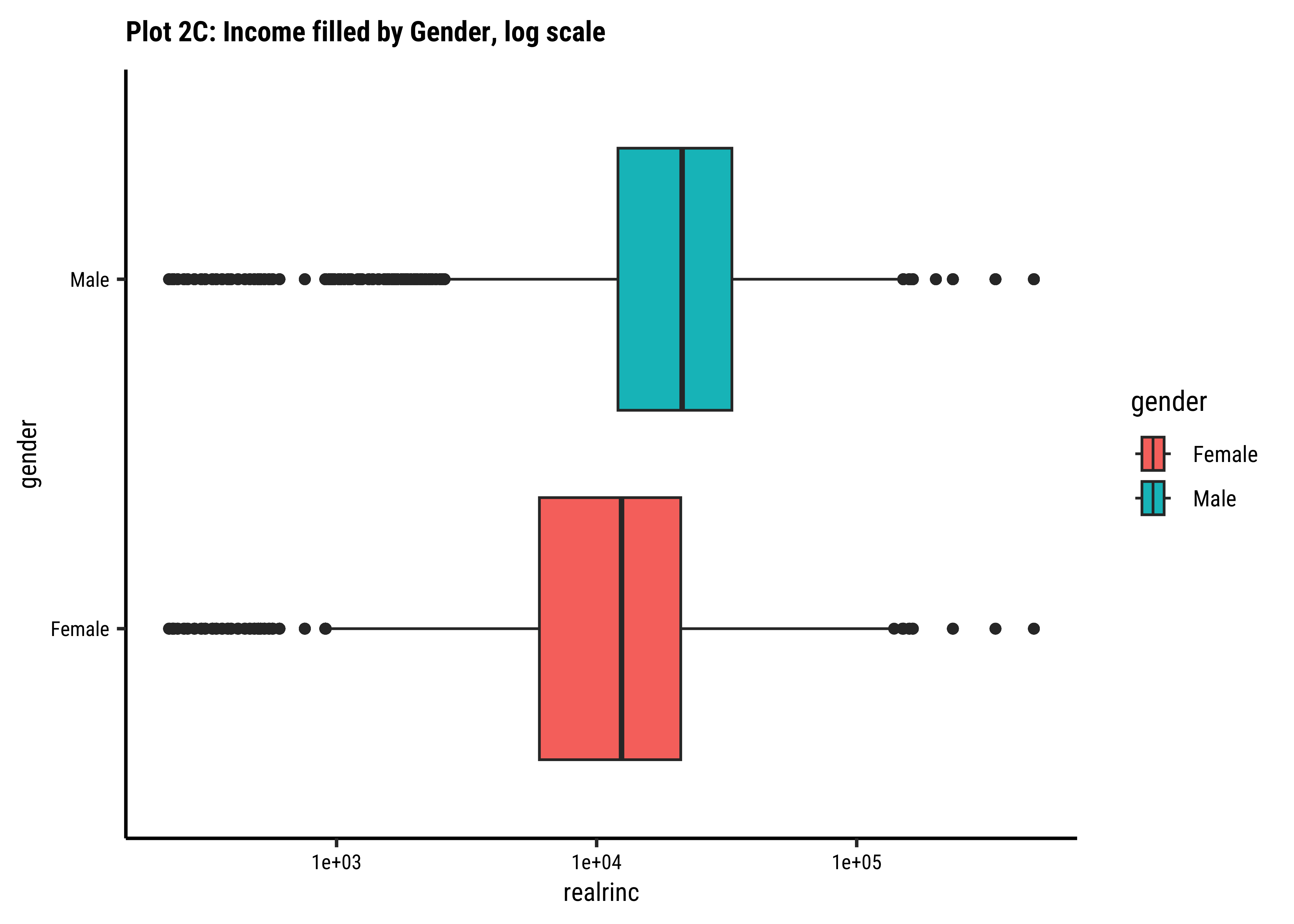
Business Insights-2
- Even when split by
gender,realincomepresents a skewed set of distributions. - The IQR for
males is smaller than the IQR forfemales. There is less variation in the middle ranges ofrealrincfor men. - log10 transformation helps to view and understand the regions of low
realrinc. - There are outliers on both sides, indicating that there may be many people who make very small amounts of money and large amounts of money in both
genders.
realrinc affected by educcat?
Question-3: Is
realrinc affected by educcat?
# ggplot2::theme_set(new = theme_classic(base_family = "Roboto Condensed")) # Set consistent graph theme
wages_clean %>%
gf_boxplot(educcat ~ realrinc) %>%
gf_labs(title = "Plot 3A: Income by Education Category")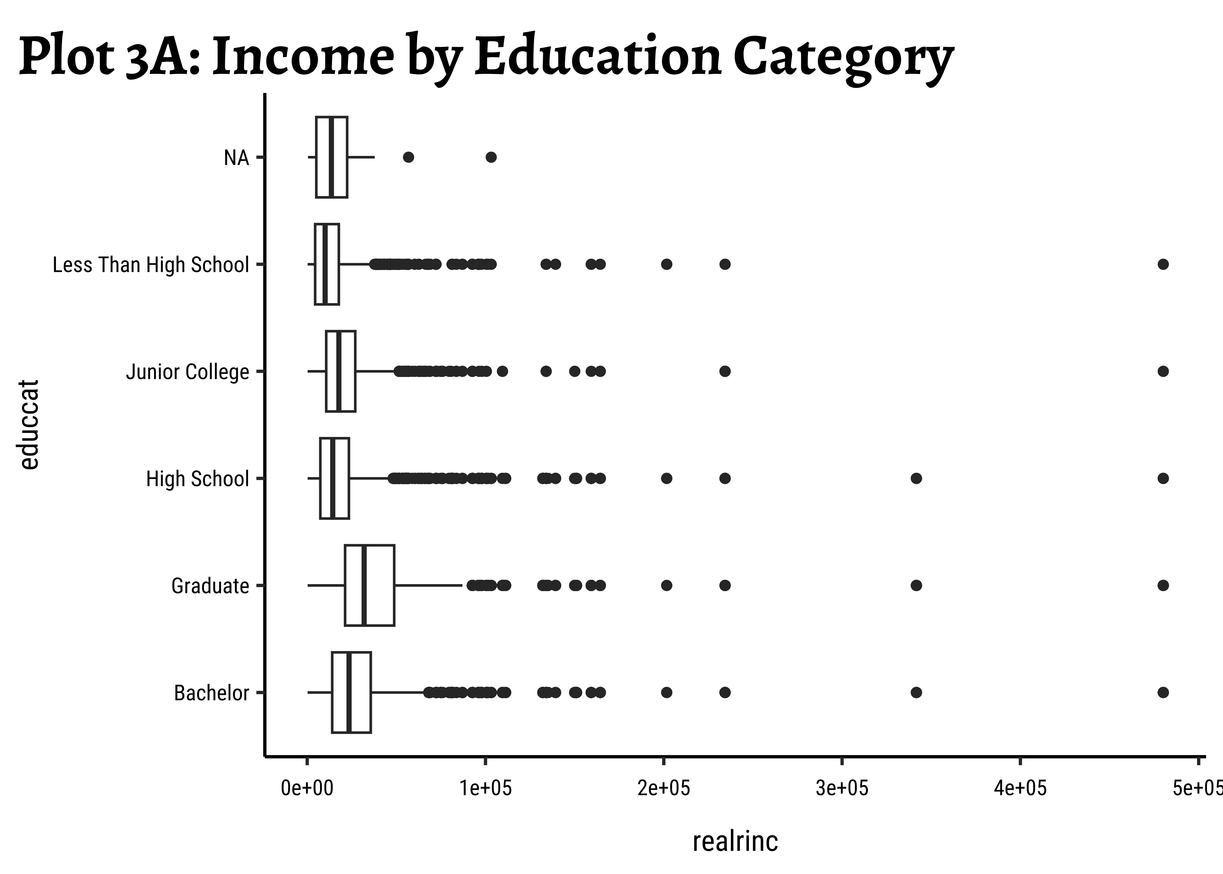
# ggplot2::theme_set(new = theme_classic(base_family = "Roboto Condensed")) # Set consistent graph theme
wages_clean %>%
gf_boxplot(educcat ~ log10(realrinc)) %>%
gf_labs(title = "Plot 3B: Log(Income) by Education Category")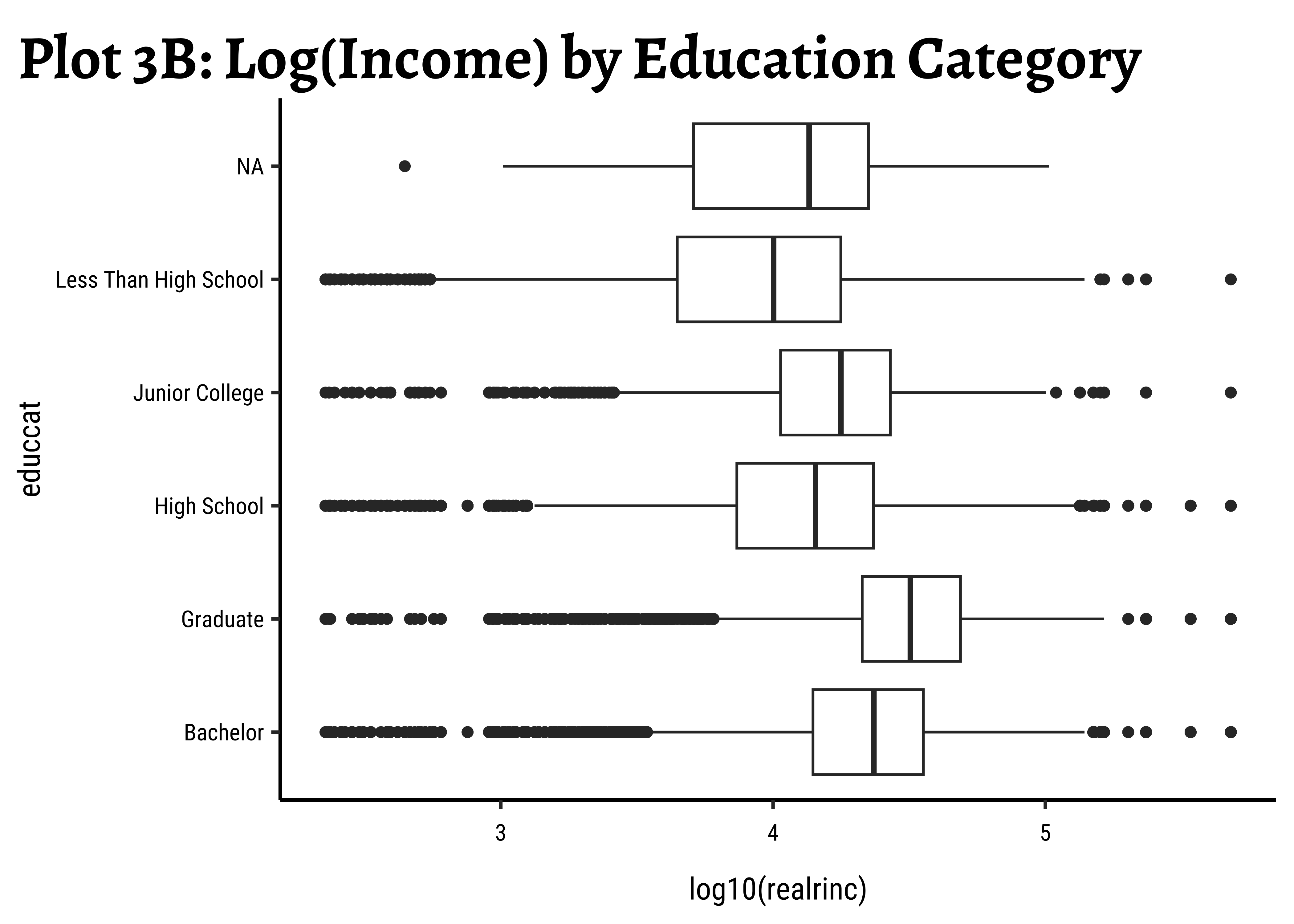
wages_clean %>%
gf_boxplot(
reorder(educcat, realrinc, FUN = median) ~ log(realrinc),
fill = ~educcat,
alpha = 0.5
) %>%
gf_labs(
title = "Plot 3C: Log(Income) by Education Category, sorted",
x = "Log Income",
y = "Education Category"
) %>%
gf_refine(scale_fill_brewer(palette = "Set1"))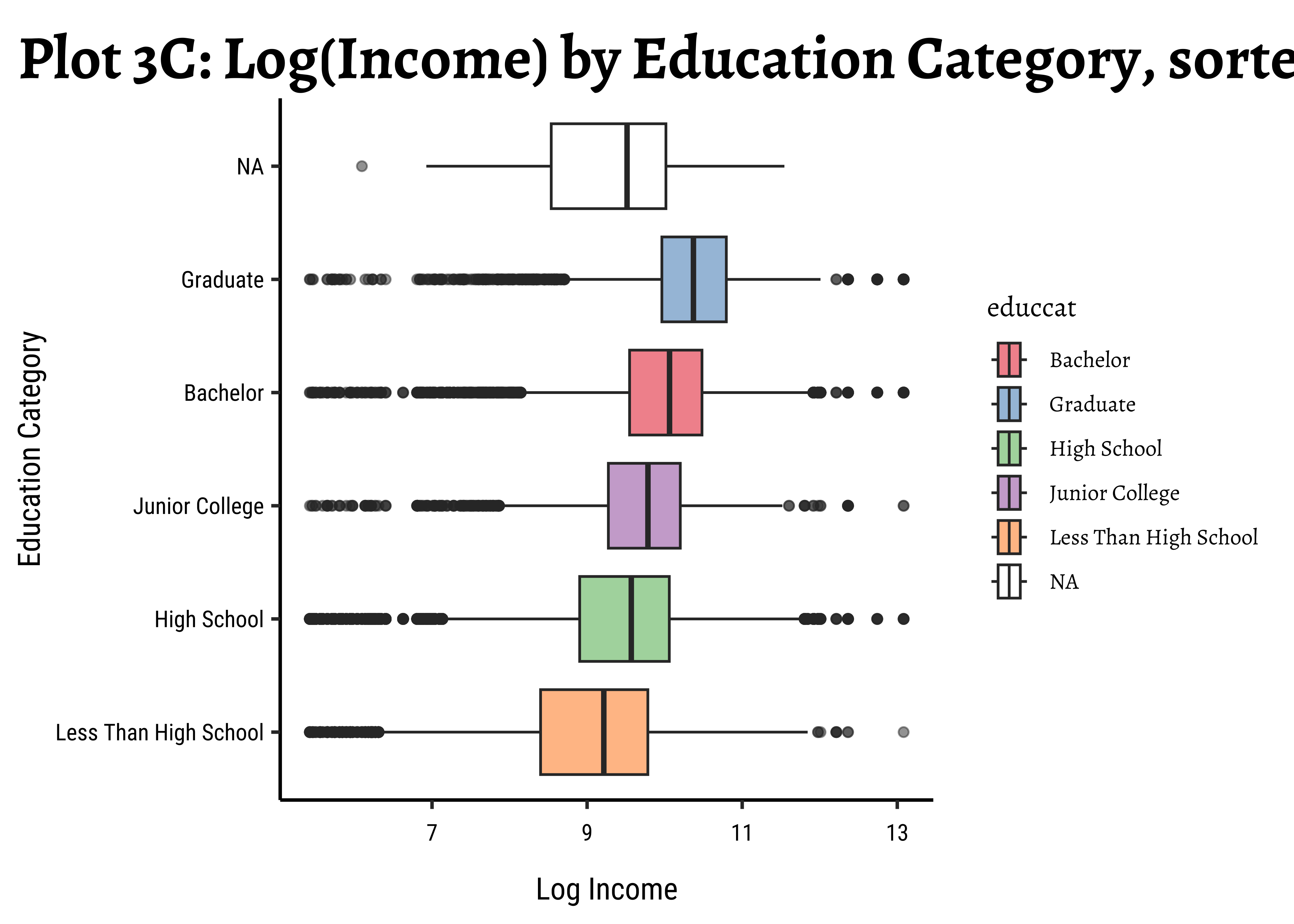
# ggplot2::theme_set(new = theme_classic(base_family = "Roboto Condensed")) # Set consistent graph theme
wages_clean %>%
gf_boxplot(reorder(educcat, realrinc, FUN = median) ~ realrinc,
fill = ~educcat,
alpha = 0.5
) %>%
gf_refine(scale_x_log10()) %>%
gf_labs(
title = "Plot 3D: Income by Education Category, sorted",
subtitle = "Log Income",
x = "Income",
y = "Education Category"
) %>%
gf_refine(scale_fill_brewer(palette = "Set1"))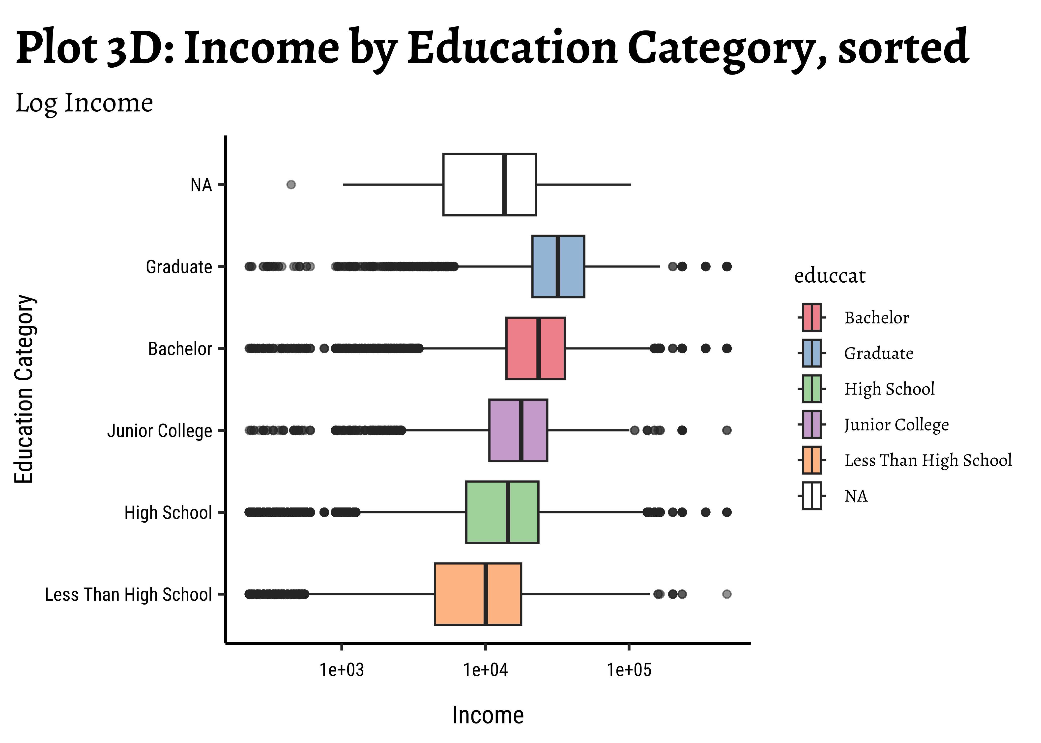
wages_clean %>%
ggplot() +
geom_boxplot(aes(realrinc, educcat)) + # (x,y) format
labs(title = "Plot 3A: Income by Education Category")
##
wages_clean %>%
ggplot() +
geom_boxplot(aes(log10(realrinc), educcat)) +
labs(title = "Plot 3B: Log(Income) by Education Category")
##
wages_clean %>%
ggplot() +
geom_boxplot(
aes(log(realrinc),
reorder(educcat, realrinc, FUN = median),
fill = educcat
),
alpha = 0.5
) +
labs(
title = "Plot 3C: Log(Income) by Education Category, sorted",
x = "Log Income", y = "Education Category"
)
##
wages_clean %>%
ggplot() +
geom_boxplot(
aes(realrinc,
reorder(educcat, realrinc, FUN = median),
fill = educcat
),
alpha = 0.5
) +
scale_x_log10() +
labs(
title = "Plot 3D: Income by Education Category, sorted",
subtitle = "Log Income Scale",
x = "Income", y = "Education Category"
)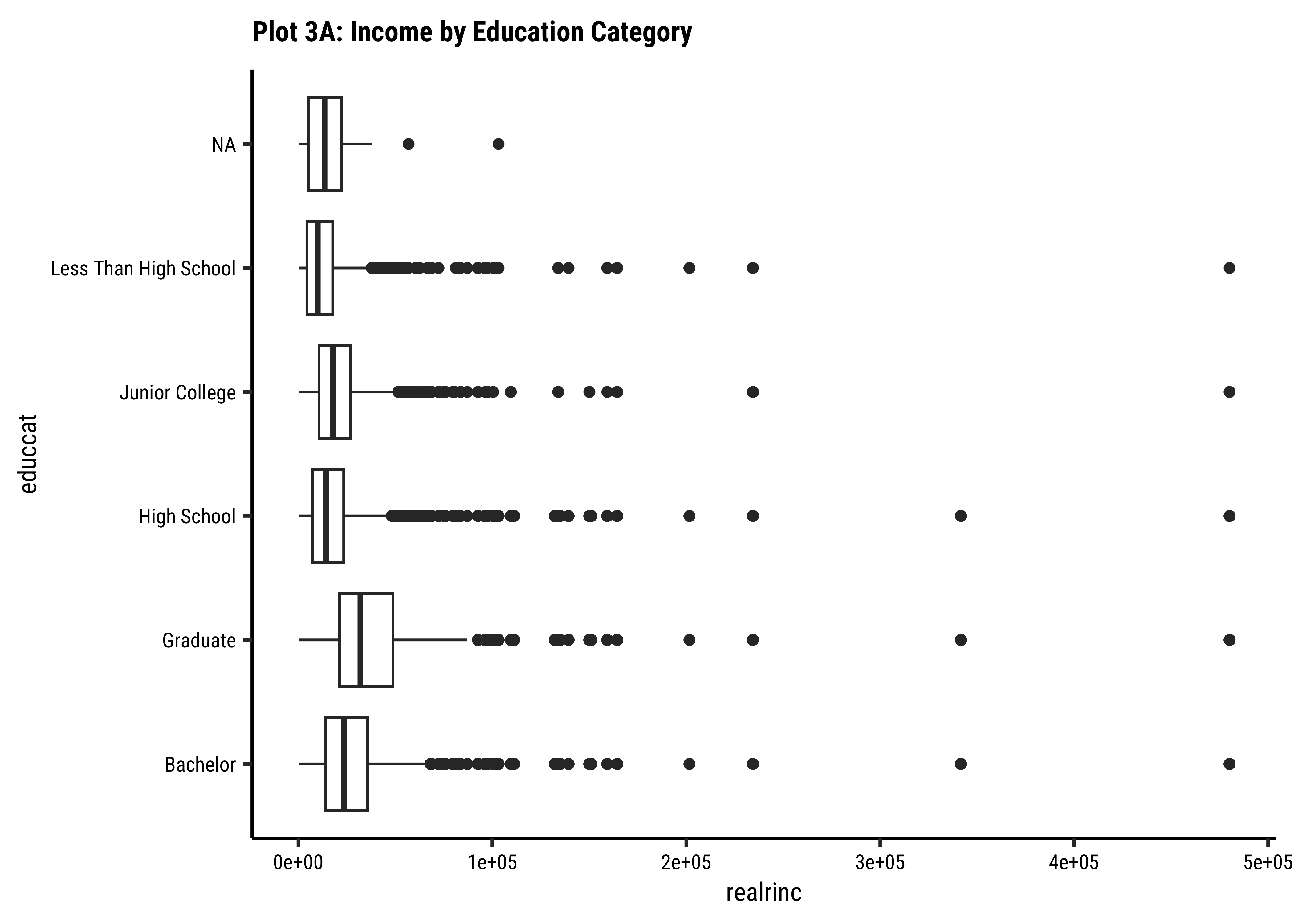
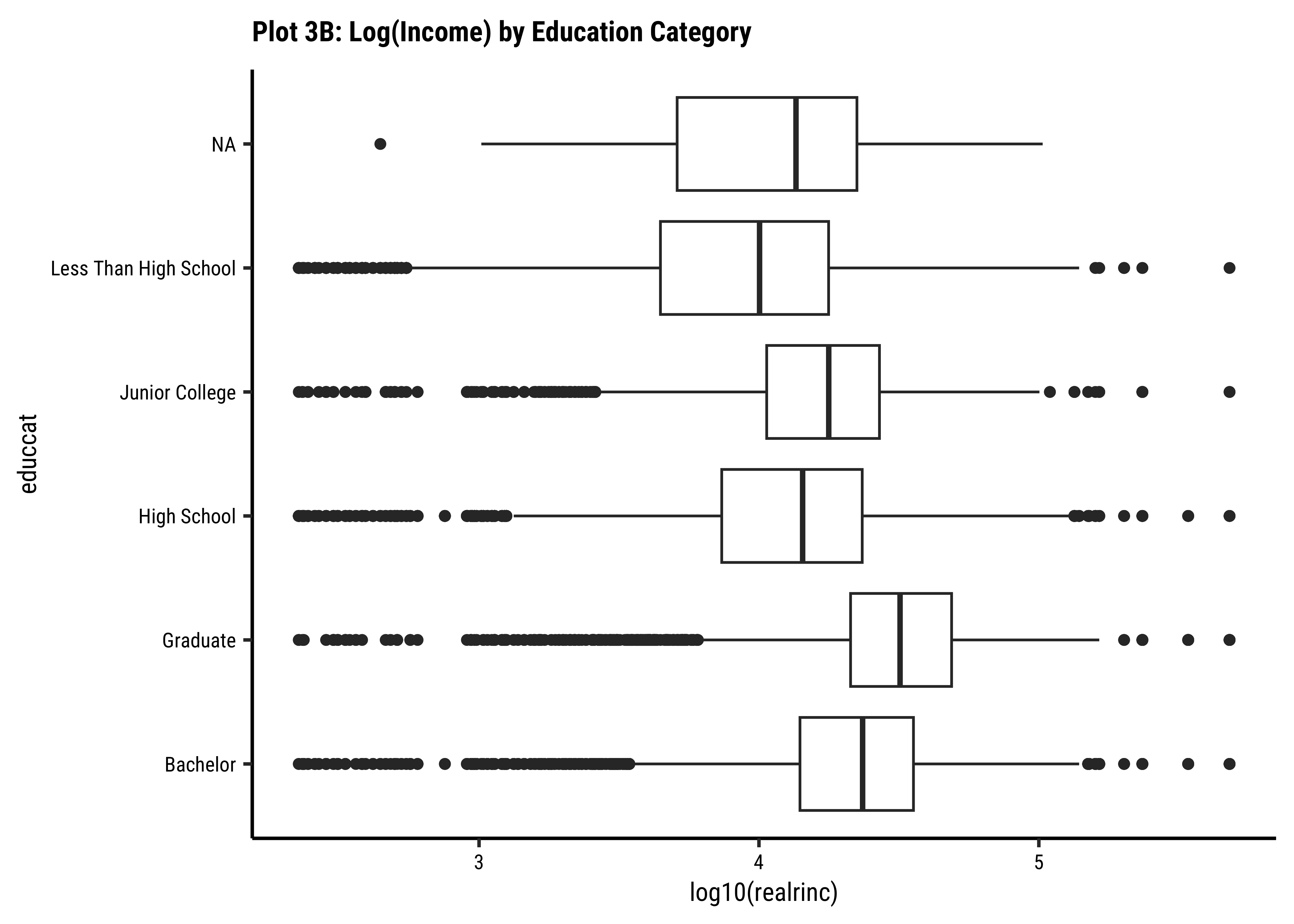
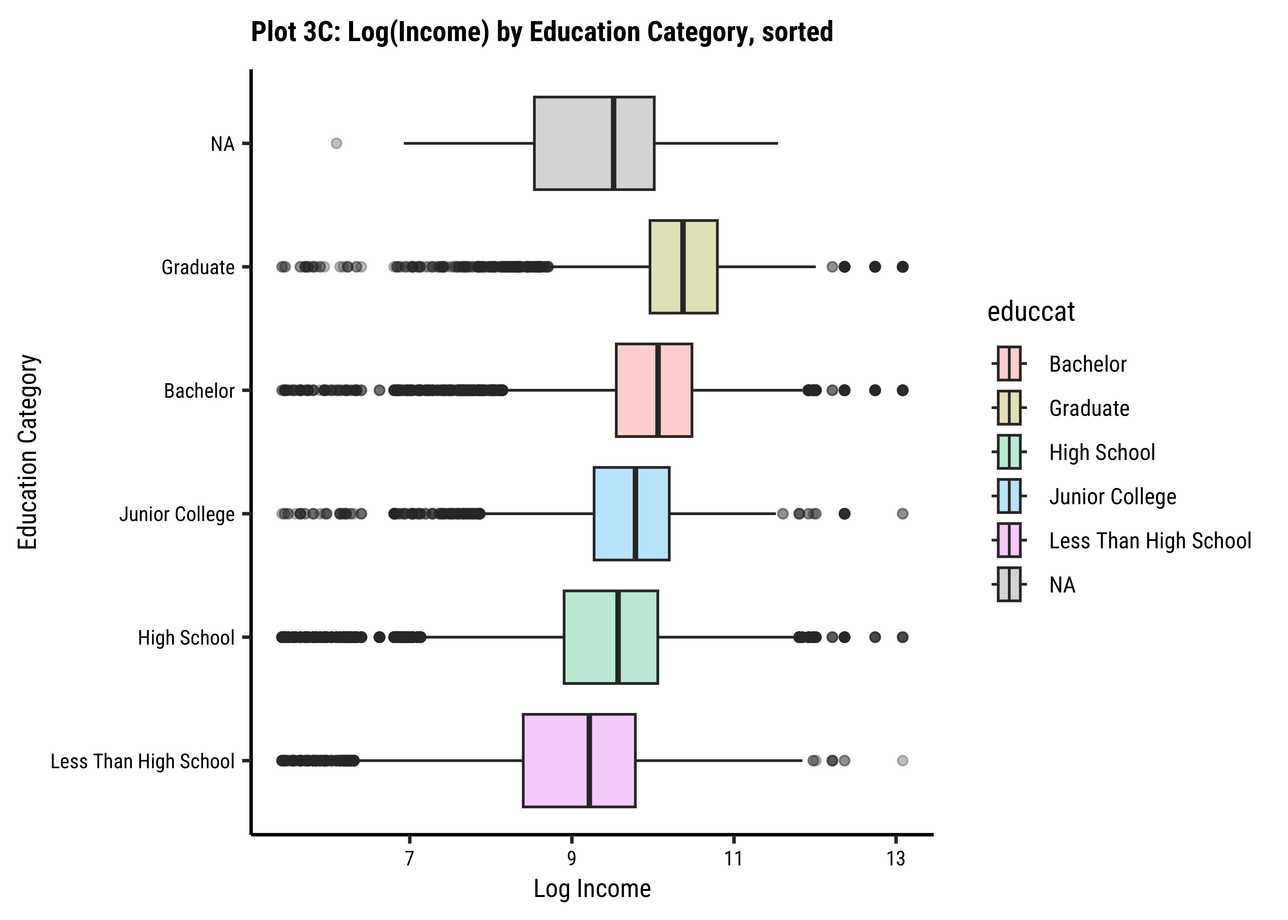
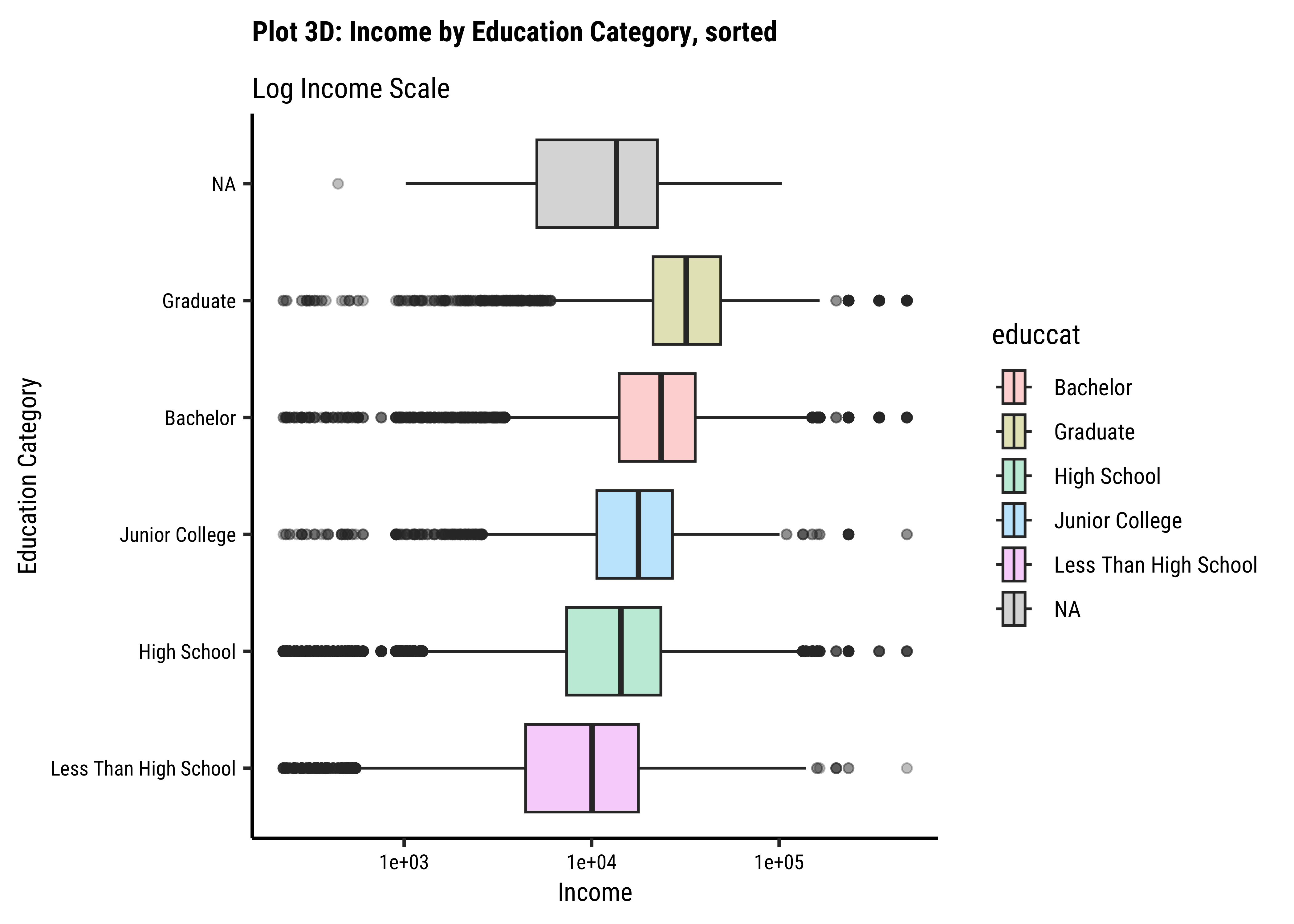
Business Insights-3
-
realrincrises witheduccat, which is to be expected. - However, there are people with very low and very high income in all categories of
educcat - Hence
educcatalone may not be a good predictor forrealrinc.
We can do similar work with the other Qual variables. Let us now see how we can use more than one Qual variable and answer the last hypothesis, Question 4.
realrinc affected by combinations of Qual factors gender, educcat, maritalcat and childs?
Important
This is a rather complex question and could take us deep into Modelling. Ideally we ought to:
- take each Qual variable, explain its effect on the target variable
-
remove that effect and model the remainder ( i.e. residual) with the next Qual variable
- Proceed in this way until we have a good model.
if we are going to do this manually.
There are more modern Modelling Workflows, that can do things much faster and without such manual tweaking.
So will simply plot box plots showing effects on the target variable of combinations of Qual variables taken two at a time. (We will of course use facetted box plots!)
We will also drop NA values all around this time, to avoid seeing boxplots for undocumented categories.
Question-4: Is
realrinc affected by combinations of factors?
wages %>%
drop_na() %>%
gf_boxplot(reorder(educcat, realrinc) ~ log10(realrinc),
fill = ~educcat,
alpha = 0.5
) %>%
gf_facet_wrap(vars(childs)) %>%
gf_refine(scale_fill_brewer(type = "qual", palette = "Dark2")) %>%
gf_labs(
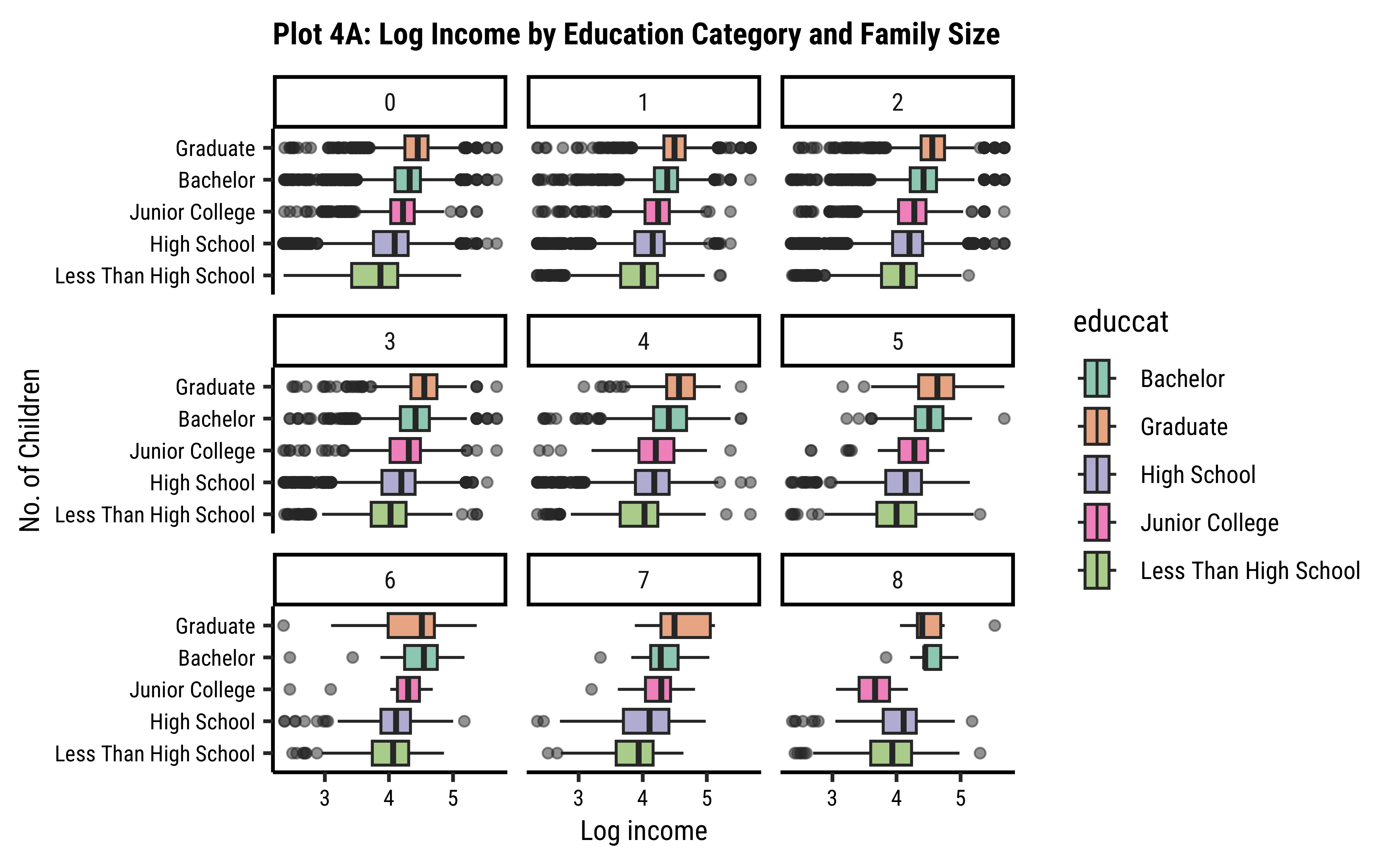
title = "Plot 4A: Log Income by Education Category and Family Size",
x = "Log income",
y = "No. of Children"
)
# ggplot2::theme_set(new = theme_classic(base_family = "Roboto Condensed")) # Set consistent graph theme
wages %>%
drop_na() %>%
mutate(childs = as_factor(childs)) %>%
gf_boxplot(childs ~ log10(realrinc),
group = ~childs,
fill = ~childs,
alpha = 0.5
) %>%
gf_facet_wrap(~gender) %>%
gf_refine(scale_fill_brewer(type = "qual", palette = "Set3")) %>%
gf_labs(
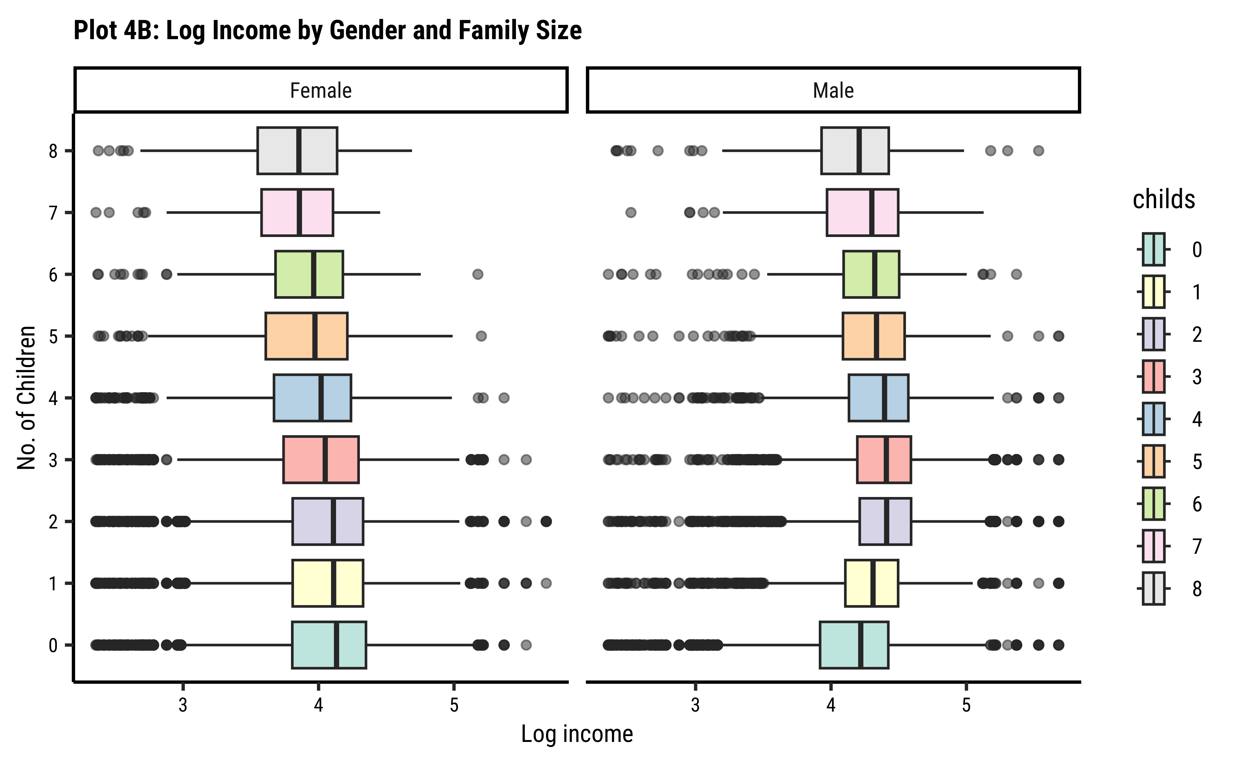
title = "Plot 4B: Log Income by Gender and Family Size",
x = "Log income",
y = "No. of Children"
)
wages %>%
drop_na() %>%
ggplot() +
geom_boxplot(
aes(log10(realrinc), reorder(educcat, realrinc),
fill = educcat
), # aes() closes here
alpha = 0.5
) +
facet_wrap(vars(childs)) +
scale_fill_brewer(type = "qual", palette = "Dark2") +
labs(title = "Plot 4A: Log Income by Education Category and Family Size", x = "Log income", y = "No. of Children")
##
wages %>%
drop_na() %>%
mutate(childs = as_factor(childs)) %>%
ggplot() +
geom_boxplot(
aes(log10(realrinc), childs,
group = childs,
fill = childs
), # aes() closes here
alpha = 0.5
) +
facet_wrap(vars(gender)) +
scale_fill_brewer(type = "qual", palette = "Set3") +
labs(
title = "Plot 4B: Log Income by Gender and Family Size",
x = "Log income",
y = "No. of Children"
)
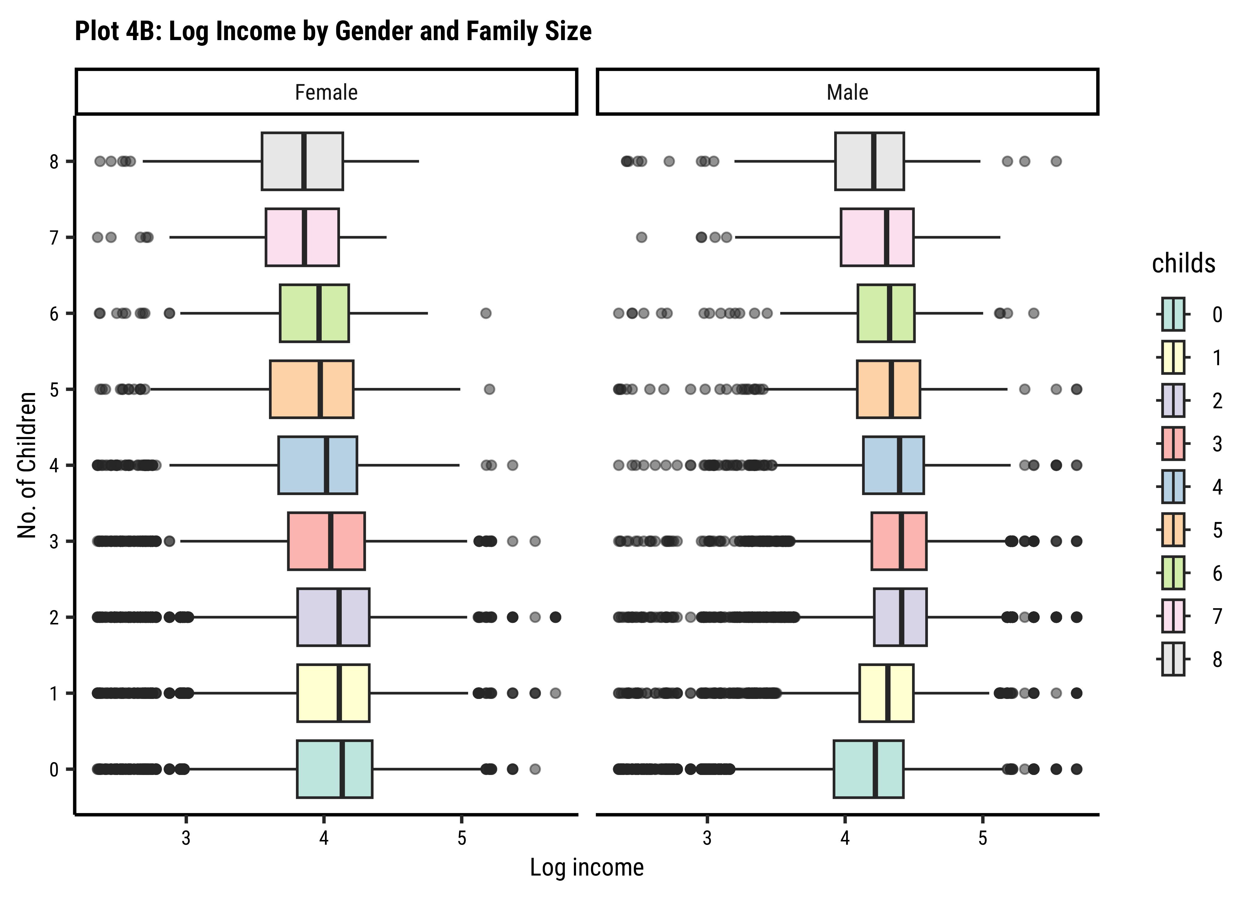
Business Insights-4
- From Figure 7, we see that
realrincincreases witheduccat, across (almost) all family sizeschilds. - However, this trend breaks a little when family sizes
childsis large, say >= 7. Be aware that the data observations for such large families may be sparse and this inference may not be necessarily valid. - From Figure 8, we see that the effect of
childsonrealrincis different for eachgender! For females, the income steadily drops with the number of children, whereas for males it actually increases up to a certain family size before decreasing again.
Hunches and Hypotheses
In data analysis, we always want to know2, as in life, how important things are, whether they matter. To do this, we make up hunches, or more precisely, Hypotheses. We make two in fact:
We then pretend that
This is a very important idea of Hypothesis Testing which helps you justify your hunch. We will study this when we do Stats Tests for differences between two means(t-tests), and those between more than two means(ANOVA).
- Box plots are a powerful statistical graphic that give us a combined view of data ranges, quartiles, medians, and outliers.
- Box plots can compare
groupswithin our Quant variable, based onlevelsof a Qual variable. This is a very common and important task in research! - In your design research, you would have numerical Quant data that is accompanied by categorical Qual data pertaining to groups within your target audience.
- Analyzing for differences in the Quant across levels of the Qual (e.g household expenditure across groups of people) is a vital step in justifying time, effort, and money for further actions in your project. Don’t faff this.
- Box plots are ideal for visualizing statistical tests for difference in mean values across groups (t-test and ANOVA). (Even though they plot medians)
- Box Plots “dwell upon” medians and Quartiles
- Box Plots can show distributions of a Quant variable over levels of a Qual variable
- This allows a comparison of box plots side by side to visibly detect differences in medians and IQRs across such levels.
Here are a couple of datasets that you might want to analyze with box plots:
UFO Encounters