options(digits = 3)
library(tidyverse)
library(mosaic) # package for stats, simulations, and basic plots
library(mosaicData) # package containing datasets
library(ggformula) # package for professional looking plots, that use the formula interface from mosaic
library(skimr) # Summary statistics about variables in data frames
library(NHANES) # survey data collected by the US National Center for Health Statistics (NCHS)EDA: Exploring Static Graphs for Distributions in R
Abstract
How to ask Questions of your Data and answer with Stats, and interactive Bar charts and Histograms with the ggformula package
We will create Distributions for data in R. As always, we will consistently use the Project Mosaic ecosystem of packages in R (mosaic, mosaicData and ggformula).
Tip
Note the standard method for all commands from the mosaic package: goal( y ~ x | z, data = mydata, …)
With ggformula, one can create any graph/chart using: gf_geometry(y ~ x | z, data = mydata) OR mydata %>% gf_geometry( y ~ x | z)
The second method may be preferable, especially if you have done some data manipulation first! More later!
mosaicData
Let us inspect what datasets are available in the package mosaicData. Type data(package = "mosaicData") in your Console to see what datasets are available.
Let us choose the famous Galton dataset:
categorical variables:
    name  class levels   n missing
1 family factor    197 898       0
2    sex factor      2 898       0
                                   distribution
1 185 (1.7%), 166 (1.2%), 66 (1.2%) ...
2 M (51.8%), F (48.2%)

quantitative variables:
    name   class min Q1 median   Q3  max  mean   sd   n missing
1 father numeric  62 68   69.0 71.0 78.5 69.23 2.47 898       0
2 mother numeric  58 63   64.0 65.5 70.5 64.08 2.31 898       0
3 height numeric  56 64   66.5 69.7 79.0 66.76 3.58 898       0
4  nkids integer   1  4    6.0  8.0 15.0  6.14 2.69 898       0
The data is described as:
A data frame with 898 observations on the following variables.
familya factor with levels for each familyfatherthe father’s height (in inches)motherthe mother’s height (in inches)sexthe child’s sex: F or Mheightthe child’s height as an adult (in inches)nkidsthe number of adult children in the family, or, at least, the number whose heights Galton recorded.
There is a lot of Description generated by the mosaic::inspect() command ! What can we say about the dataset and its variables? How big is the dataset? How many variables? What types are they, Quant or Qual? If they are Qual, what are the levels? Are they ordered levels? Discuss!
Now that we know the variables, let us look at counts of data observations(rows). We know from our examination of variable types that counting of observations must be done on the basis of Qualitative variables. So let us count and plot the counts in bar charts.
Question
Q.1 How many families in the data for each value of nkids(i.e. Count of families by size)?
Galton_counts <- Galton %>%
  group_by(nkids) %>%
  summarise(children = n()) %>%
  # just to check
  mutate(
    No_of_families = as.integer(children/nkids),
    # Why do we divide

    running_count_of_children = cumsum(children),
    running_count_of_families = cumsum(No_of_families))
Galton_counts
Galton_counts %>%
  gf_col(No_of_families ~ nkids) %>%
  gf_theme(theme_classic())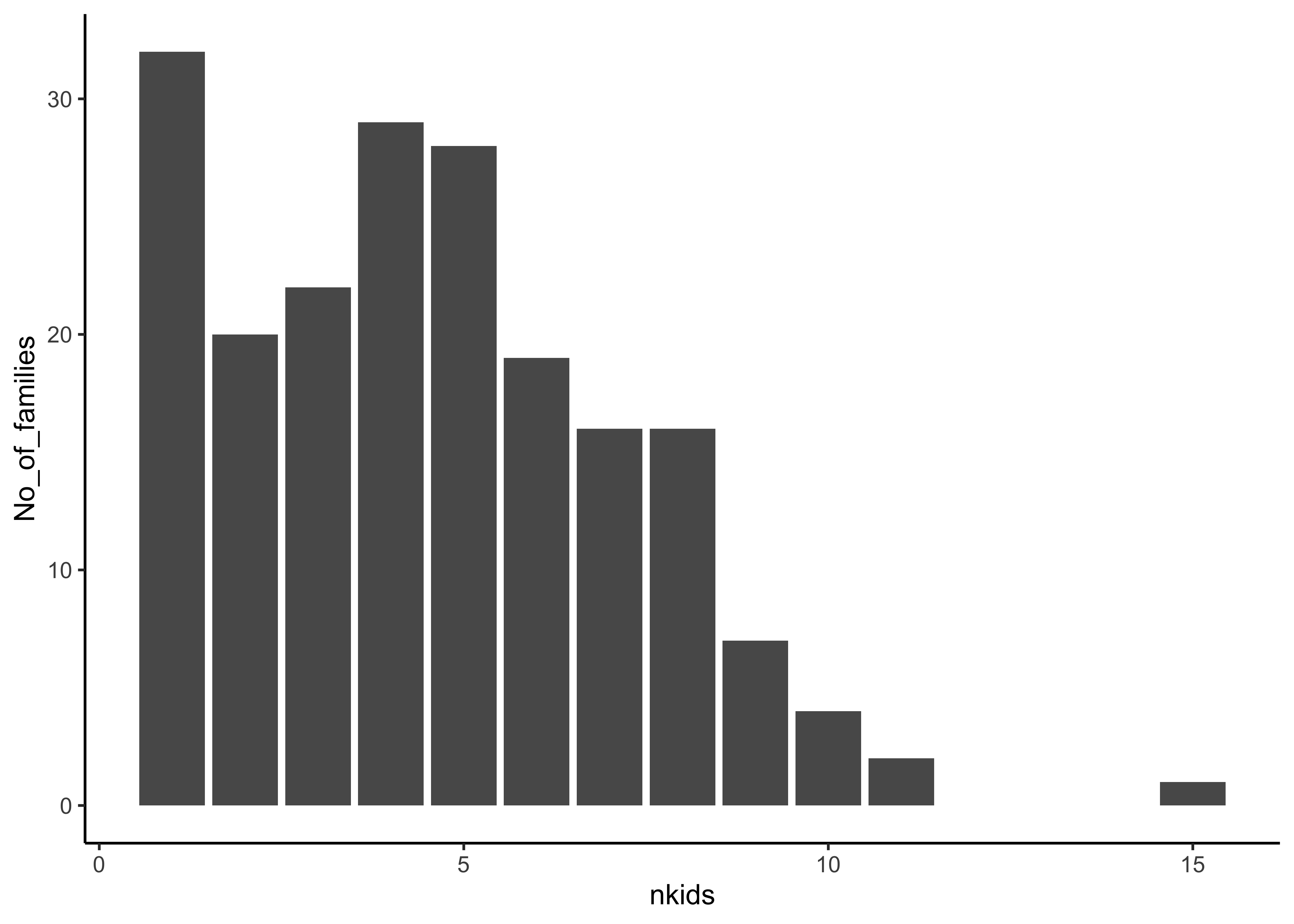
Insight: There are 32 1-kid families; and \(128/8 = 16\) 8-kid families! There is one great great 15-kid family. (Did you get the idea behind why we divide here?)
Question
Q.2. What is the count of Children by sex of the child and by family size nkids?
Galton_counts_by_sex <- Galton %>%
  mutate(family = as.integer(family)) %>%
  group_by(nkids, sex) %>%
  summarise(count_by_sex = n()) %>%
  ungroup() %>%
  group_by(sex)
Galton_counts_by_sex
Galton_counts_by_sex %>%
  gf_col(count_by_sex ~ nkids | sex, fill = ~sex) %>%
  gf_theme(theme_classic())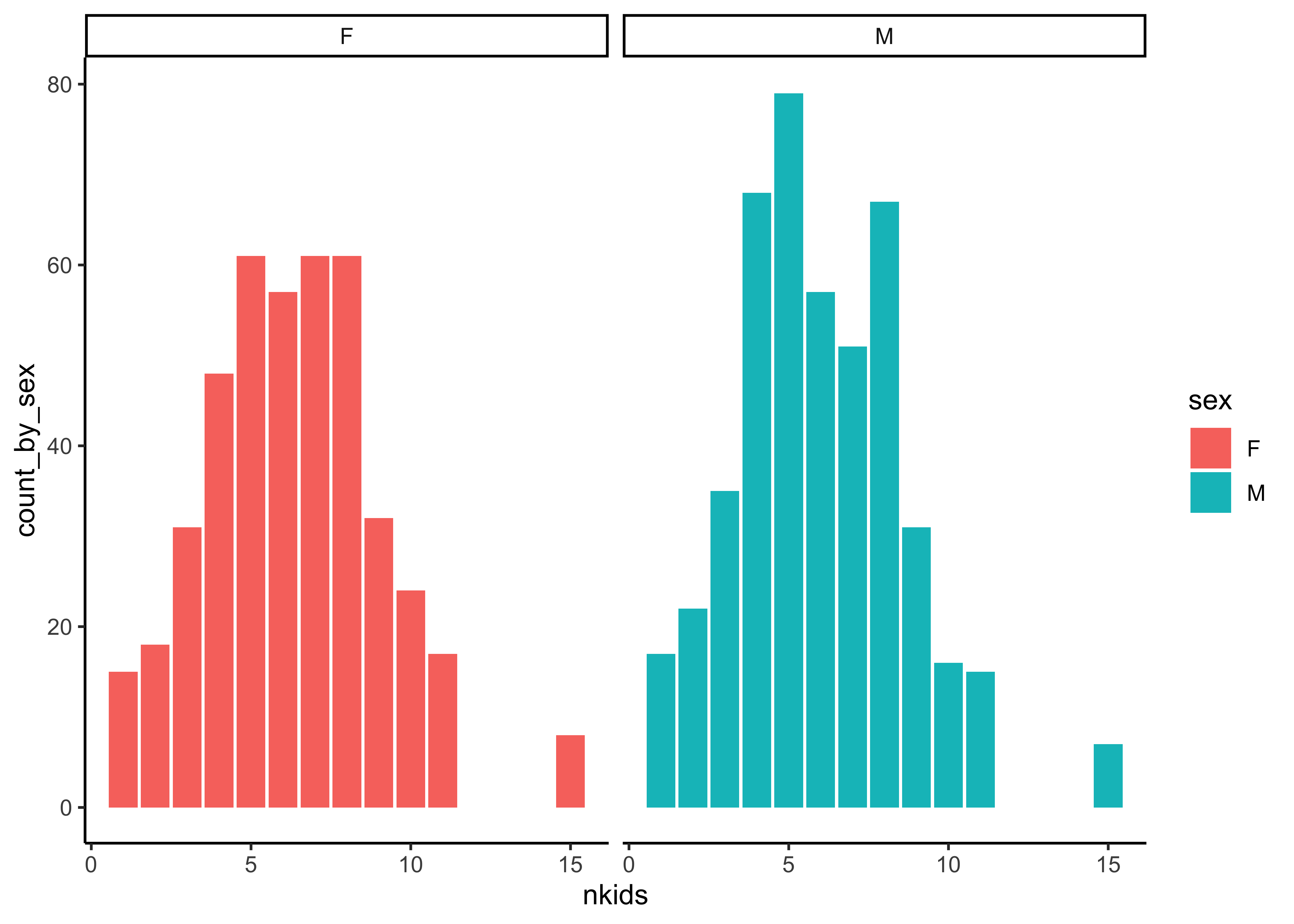
Insight: Hmm…decent gender balance overall, across family sizes nkids.
Follow-up Question
Follow up Question: How would we look for “gender balance” in individual families? Should we look at the family column ?
Galton_gender_family <- Galton %>%
  mutate(family = as.integer(family)) %>%
  group_by(family, sex) %>%
  summarise(count_by_sex = n()) %>%
  ungroup() %>%
  group_by(sex)
Galton_gender_family
Galton_gender_family %>%
  gf_col(count_by_sex ~ family | sex, fill = ~ sex) %>%
  gf_theme(theme_minimal())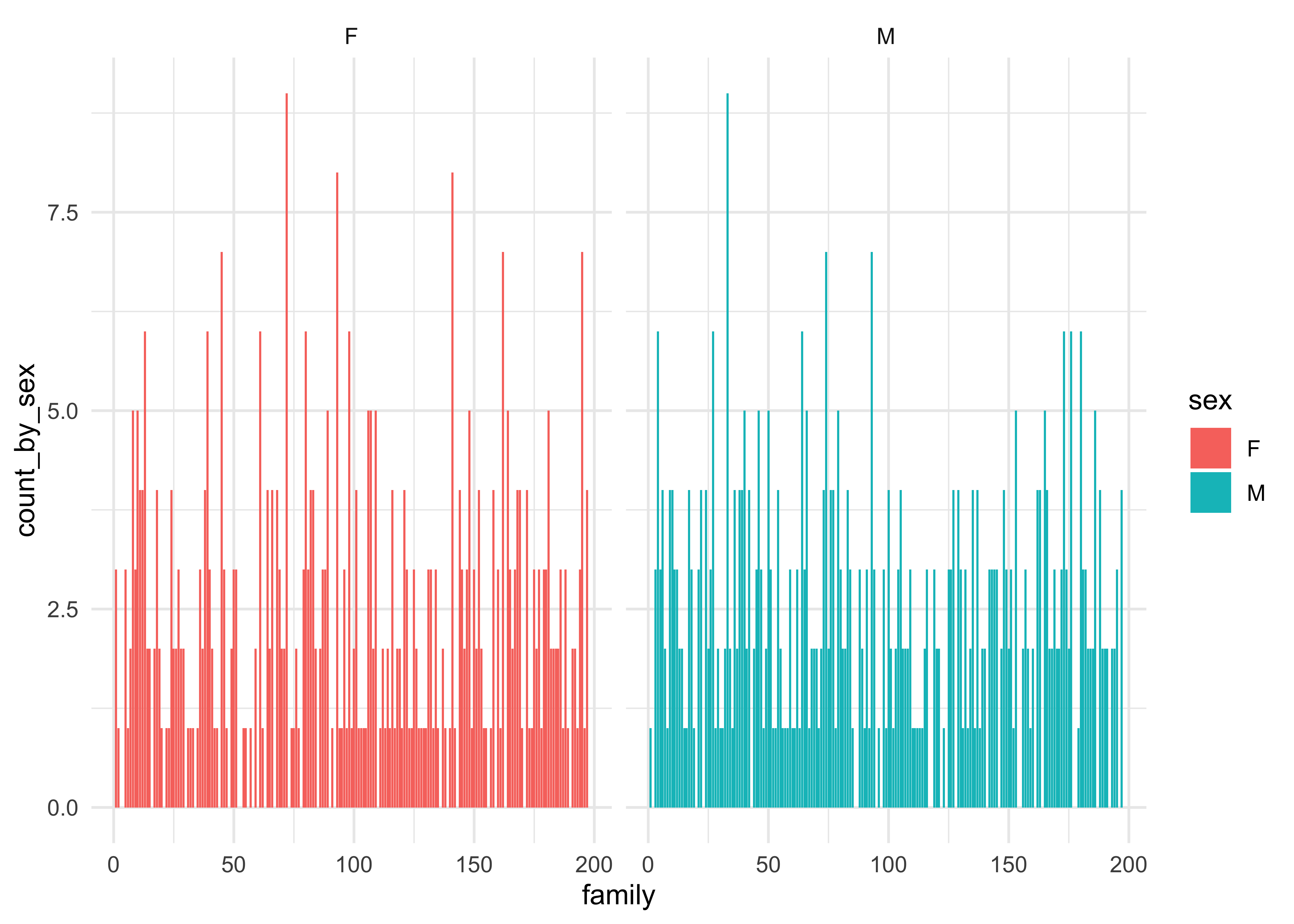
Insight: The No of Children were distributed similarly across family sizenkids… However, this plot is too crowded and does not lead to any great insight. Using family ID was silly to plot against, wasn’t it? Not all exploratory plots will be “necessary” in the end. But they are part of the journey of getting better acquainted with the data!
OK, on to the Quantitative variables now! What Questions might we have, that could relate not to counts by Qual variables, but to the numbers in Quant variables. Stat measures, like their ranges, max and min? Means, medians, distributions? And how these vary on the basis of Qual variables? All this using histograms and densities.
Summary Stats
As Stigler[@stigler2016] said, summaries are the first thing to look at in data. skimr::skim has already given us a lot summary data for Quant variables. We can now use mosaic::favstats to develop these further, by slicing / facetting these wrt other Qual variables. Let us tabulate some quick stat summaries of the important variables in Galton.
# summaries facetted by sex of child
Galton_measures <- favstats(~ height | sex, data = Galton)
Galton_measuresInsight: We saw earlier that the mean height of the Children was 66 inches. However, are Sons taller than Daughters? Difference in mean height is 5 inches! AND…that was the same difference between fathers and mothers mean heights! Is it so simple then?
Question
Q.4 How are the heights of the children distributed? Here is where we need a gf_histogram…
Galton %>%
  gf_histogram(~ height,bins = 30) %>% # ALWAYS try several settings for "bins"
  gf_vline(xintercept = mean(Galton$height), color = "red") %>%
  gf_label(label = glue::glue("Mean Value\n {mean(Galton$height)}"),
           gformula = 85 ~ 70) %>% # Where do we want the label (y ~ x) %>%
  gf_labs(title = "Galton Dataset",
          subtitle = "",
          x = "Heights of Children",
          y = "Counts",
          caption = "Using `ggformula` and Classic Theme") %>%
  gf_theme(theme_classic())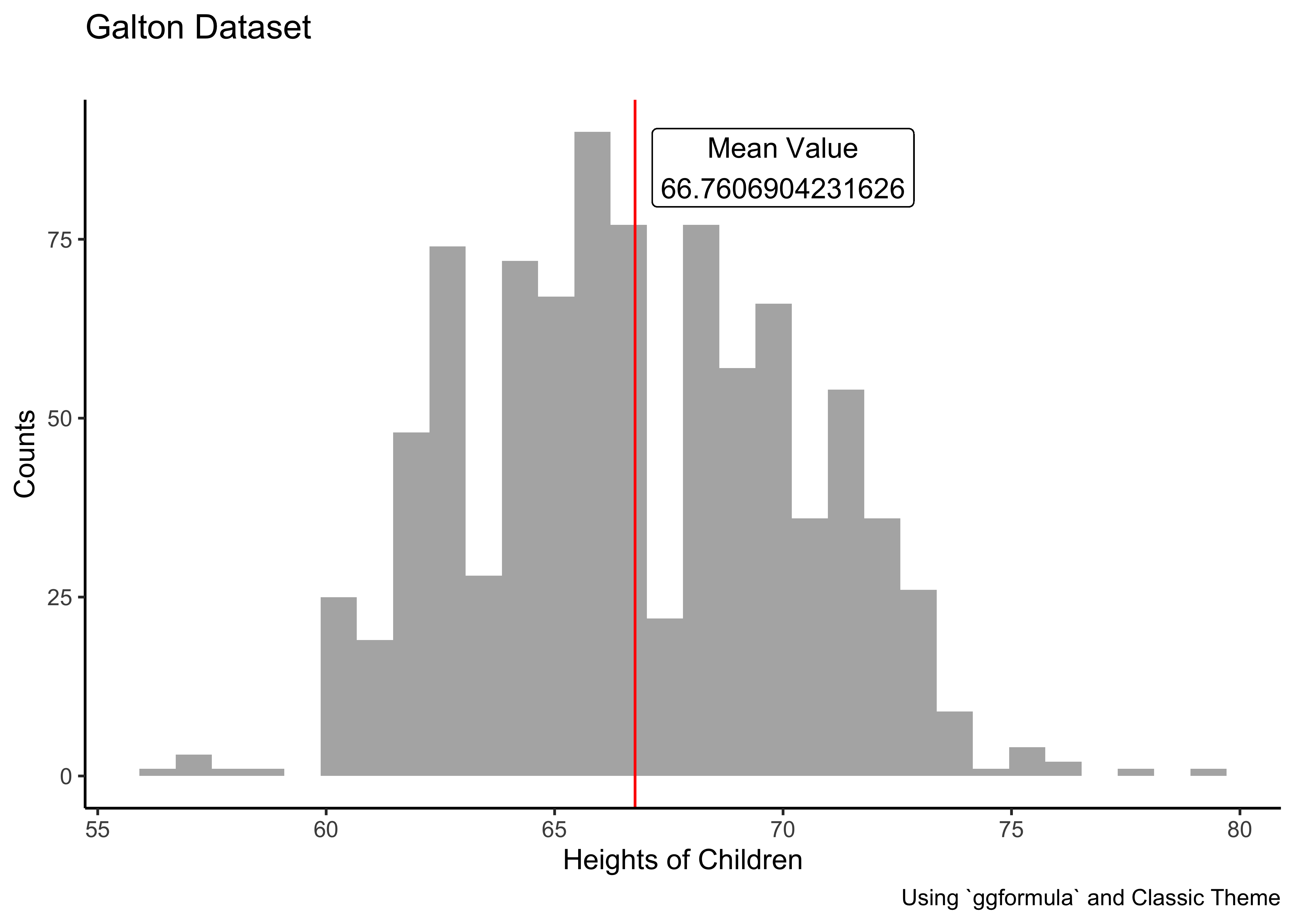
Insight: Fairly symmetric distribution…but there are a few very short and some very tall children! Always try to change the no. of bins to check of we are missing some pattern.
#| '!! shinylive warning !!': |
#|   shinylive does not work in self-contained HTML documents.
#|   Please set `embed-resources: false` in your metadata.
#| standalone: true
#| viewerHeight: 800

library(shiny)

ui <- fluidPage(
  titlePanel("Interactive Histogram!"),
  sidebarLayout(
    sidebarPanel(
      sliderInput(
        inputId = "bins",
        label = "Number of bins:",
        min = 1,
        max = 50,
        value = 30
      )
    ),
    mainPanel(
      plotOutput(outputId = "distPlot")
    )
  )
)

server <- function(input, output) {
  output$distPlot <- renderPlot({
    x <- faithful$waiting
    bins <- seq(min(x), max(x), length.out = input$bins + 1)
    hist(x,
         breaks = bins, col = "#75AADB", border = "white",
         xlab = "Waiting time to next eruption (in mins)",
         main = "Histogram of waiting times"
    )
  })
}

shinyApp(ui = ui, server = server)
Question
Q.5 Is there a difference in height distributions between Male and Female children?(Quant variable sliced by Qual variable)
mean_daughters <- Galton_measures %>%
             filter(sex == "F") %>% select(mean) %>% as.numeric()
mean_sons <- Galton_measures %>%
             filter(sex == "M") %>% select(mean) %>% as.numeric()
Galton %>%
  gf_density(~ height, group = ~sex, fill = ~ sex, alpha = 0.5) %>%
  gf_vline(xintercept = mean_daughters) %>%
  gf_vline(xintercept = mean_sons) %>%

   gf_label(label = glue::glue("Average Daughters\n {mean_daughters}"),
           gformula = 0.15 ~ 60, # Where do we want the label (y ~ x)
           show.legend = FALSE,
           fill = "white") %>%

   gf_label(label = glue::glue("Average Sons\n {mean_sons}"),
           gformula = 0.15 ~ 75,  # Where do we want the label (y ~ x)
           show.legend = FALSE,
           fill = "white") %>%
  gf_theme(theme_classic())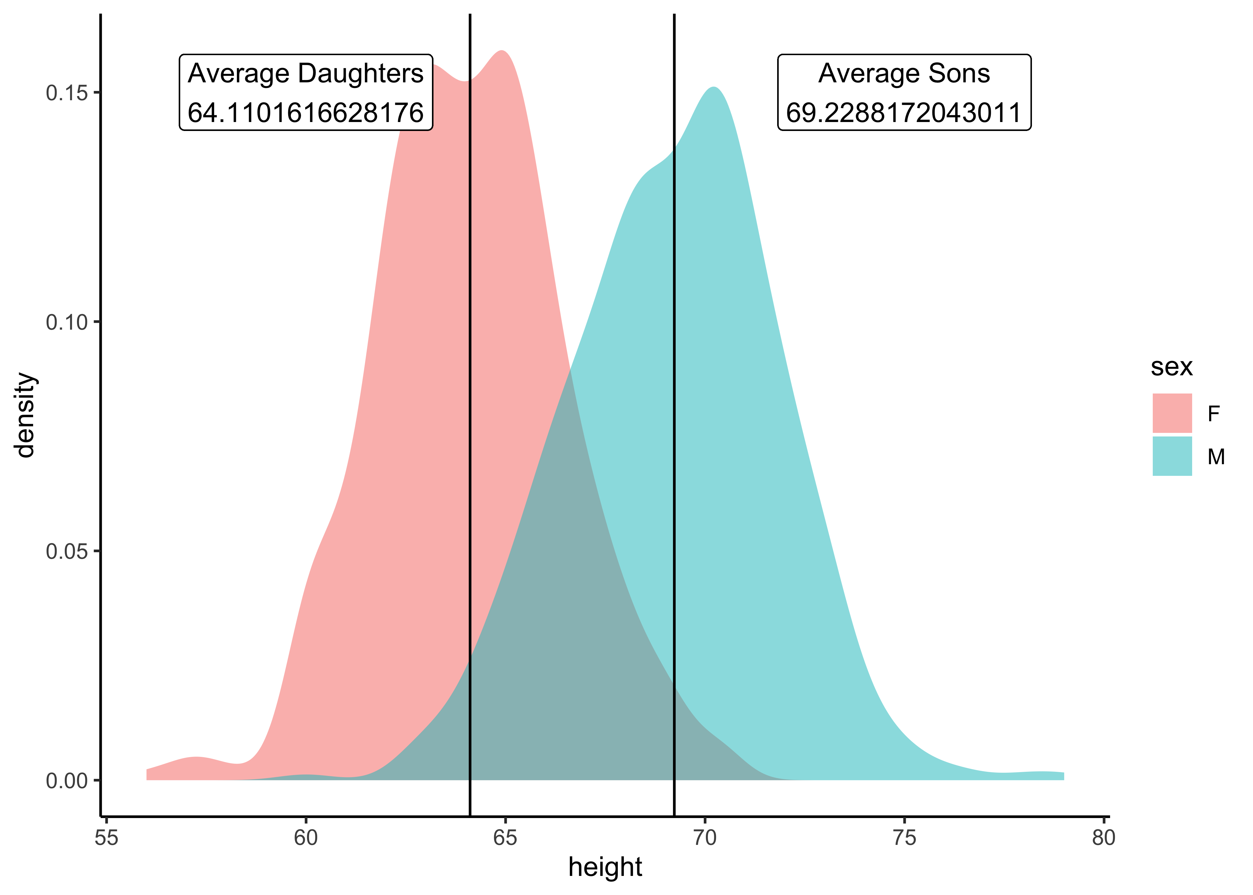
Insight: There is a visible difference in average heights between girls and boys. Is that significant, however? We will need a statistical inference test to figure that out!! Claus Wilke1 says comparisons of Quant variables across groups are best made between densities and not histograms…
Question
Q.6 Are Mothers generally shorter than fathers?
mean_fathers <- Galton %>% mosaic::mean(~ father, data = .) %>% as.numeric()

mean_mothers <- Galton%>% mean(~ mother, data = .) %>% as.numeric()

Galton %>%
  gf_density(~ father, fill = "dodgerblue", alpha = 0.3) %>%
  gf_density(~ mother, fill = "red", alpha = 0.3) %>%
    gf_vline(xintercept = mean_mothers) %>%
  gf_vline(xintercept = mean_fathers) %>%
  gf_labs(x = "Parents' Heights") %>%

   gf_label(label = glue::glue(" Average Mother \n {mean_mothers}"),
           gformula = 0.15 ~ 60, # Where do we want the label (y ~ x)
           show.legend = FALSE,
           fill = "white") %>%

   gf_label(label = glue::glue("Average Father\n {mean_fathers}"),
           gformula = 0.15 ~ 75,  # Where do we want the label (y ~ x)
           show.legend = FALSE,
           fill = "white") %>%

  gf_theme(theme_classic())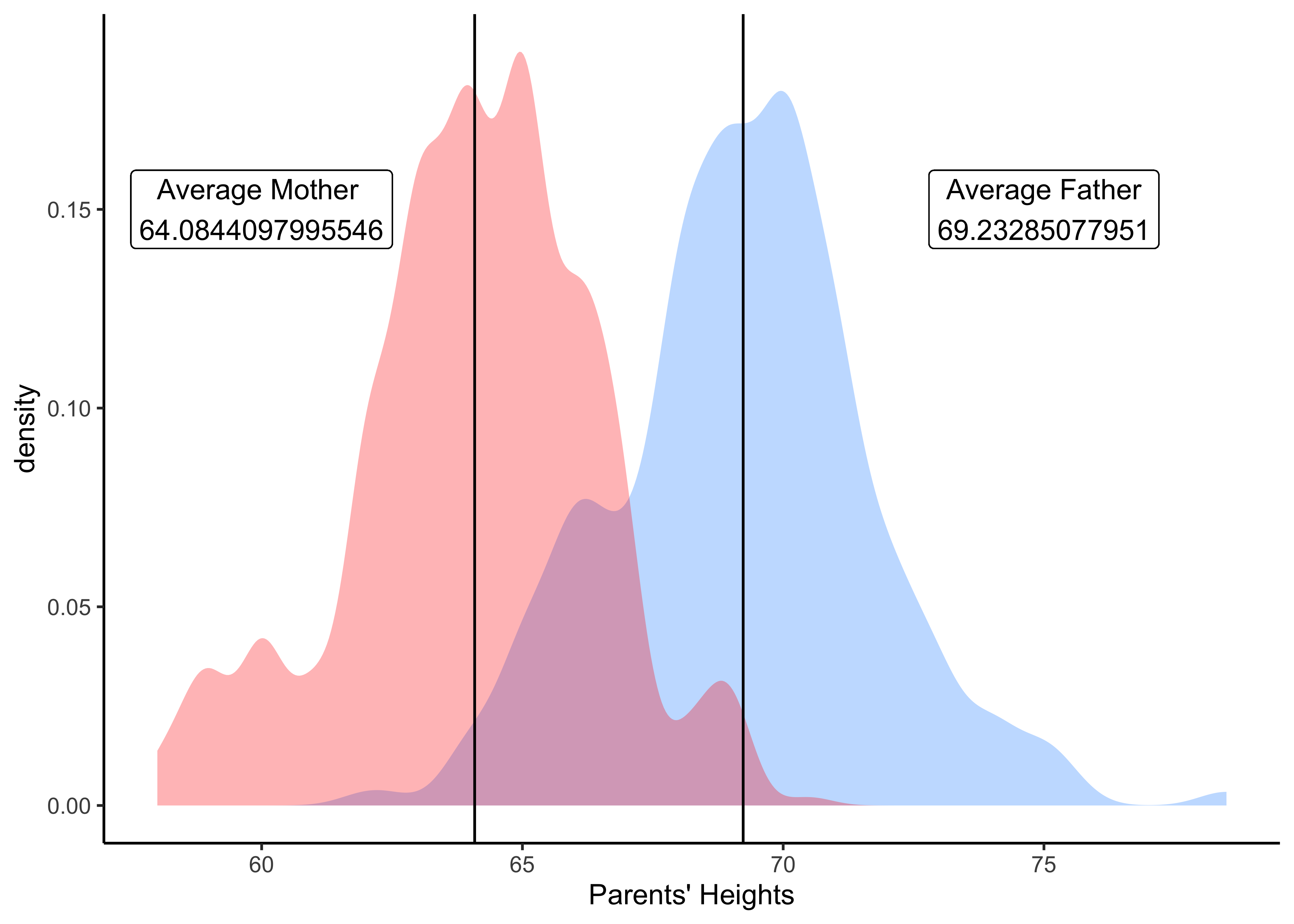
Insight: Yes, moms are on average shorter than dads in this dataset. Again, is this difference statistically significant? We will find out in when we do Inference.
Question
Q.7a. Are heights of children different based on the number of kids in the family? And For Male and Female children?
# Boxplot series for daughters
gf_boxplot(height ~ nkids, group = ~ nkids, fill = ~ sex,
           data = Galton %>% filter(sex == "F")) %>%
# Boxplot series for sons
  gf_boxplot(height ~ nkids, group = ~ nkids, fill = ~ sex,
             data = Galton %>% filter(sex == "M")) %>%
  gf_labs(title = "Daughters vs Sons: Who is Taller?",
          subtitle = "Family Size does not change height disparity ;-D",
          x = "Family Size", y = "Heights of Children",
          caption = "Made with `ggformula` and Classic Theme") %>%

  gf_theme(theme_classic())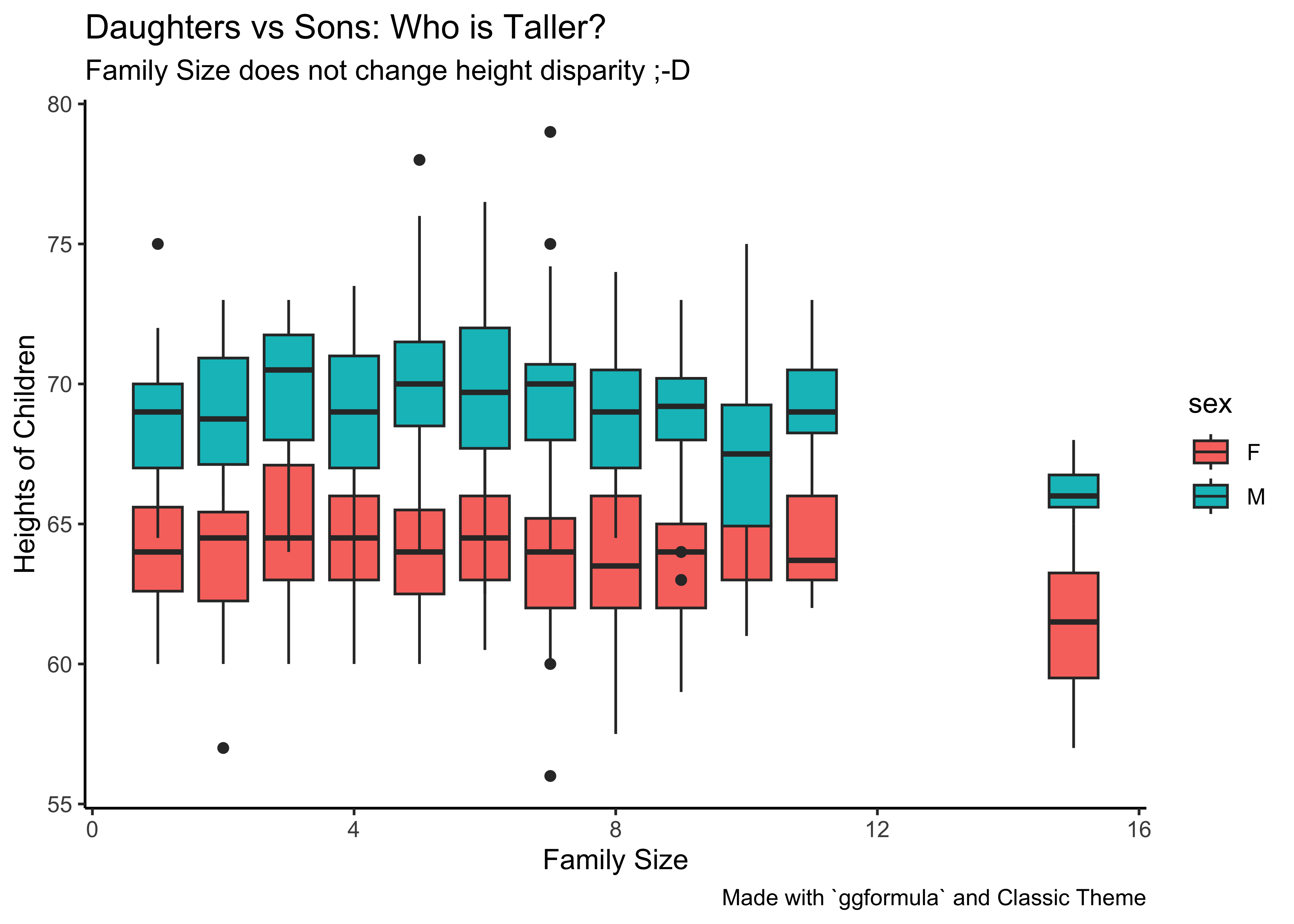
Insight: So, at all family “strengths” (nkids), the sons are taller than the daughters, based on distributions. Box plots are used to show distributions of numeric data values and compare them between multiple groups (i.e Categorical Data, here sex and nkids).
Follow-up Question
Q. 8a. Is height difference between sons and daughters related to height difference between father and mother?
Differences between father and mother heights influencing height…this would be like height ~ (father-mother). This would be a relationship between two Quant variables. A histogram would not serve here and we plot this as a Scatter Plot:
Galton_parents_diff <- Galton %>%
  group_by(family,sex) %>%

  # Parental Height Difference
  mutate(diff_height = father - mother) %>%
  select(family, sex, height, diff_height) %>%
  ungroup() %>%
  group_by(sex)
Galton_parents_diff
Galton_parents_diff %>%
  gf_point(height ~ diff_height, color = ~ sex, data = Galton_parents_diff) %>%
  gf_lims(y = c(55,82)) %>% # note: Y-AXIS does not go to zero!!

  gf_rect(55 + 80 ~ 0 + 18, fill = "grey80",
          color = "white", alpha = 0.02) %>%
  gf_rect(55 + 80 ~ -5 + 0, fill = "moccasin",
          color = "white", alpha = 0.02) %>%

  # Note the repetition!
  gf_point(height ~ diff_height, color = ~ sex, data = Galton_parents_diff) %>%
  gf_smooth(method = "lm", se = FALSE) %>%
  gf_labs(x = "Parental Height Difference",
          y = "Children's Heights") %>%

  gf_label(label = glue::glue("Taller Mothers"),
           gformula = 75 ~ -2.5, # Where do we want the label (y ~ x)
           show.legend = FALSE,
           fill = "white") %>%

  gf_label(label = glue::glue("Taller Fathers"),
           gformula = 75 ~ 15,  # Where do we want the label (y ~ x)
           show.legend = FALSE,
           fill = "white") %>%

  gf_vline(xintercept = 0, linewidth = 2,
           title = "Does Parental Height Difference affect
                    Children's Height?",
           caption = "Note Y-axis does not go to zero") %>%

  gf_theme(theme_classic())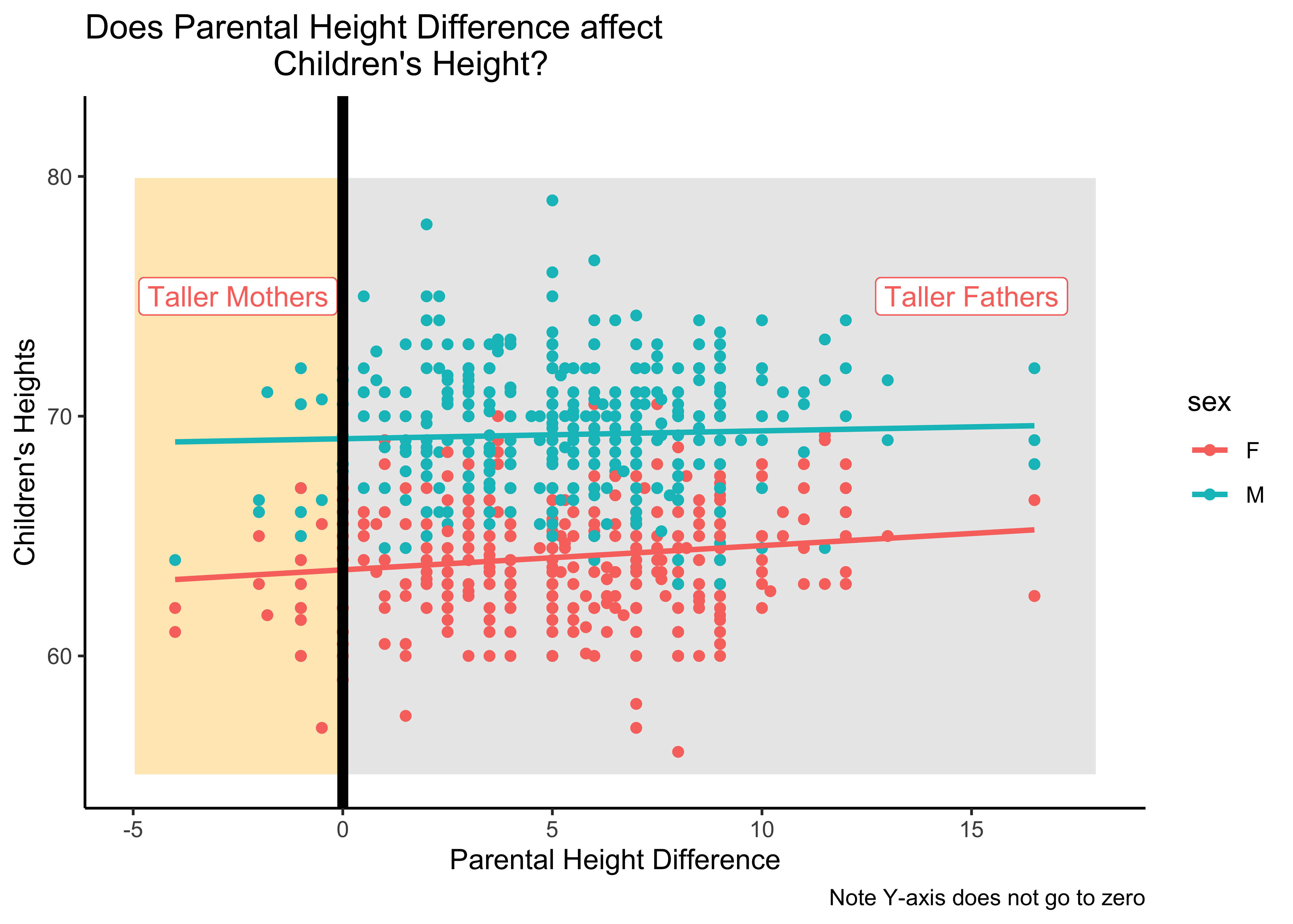
Insight: There seems no relationship, or a very small one, between children’s heights on the y-axis and the difference in parental height differences (father - mother) on the x-axis…
And so on…..we can proceed from simple visualizations based on Questions to larger questions that demand inference and modelling. We hinted briefly on these in the above Case Study.
NHANES
Let us try the NHANES dataset.
Try
help(NHANES) in your Console.data("NHANES")
skimr::skim(NHANES)| Name | NHANES |
| Number of rows | 10000 |
| Number of columns | 76 |
| _______________________ | |
| Column type frequency: | |
| factor | 31 |
| numeric | 45 |
| ________________________ | |
| Group variables | None |
Variable type: factor
| skim_variable | n_missing | complete_rate | ordered | n_unique | top_counts |
|---|---|---|---|---|---|
| SurveyYr | 0 | 1.00 | FALSE | 2 | 200: 5000, 201: 5000 |
| Gender | 0 | 1.00 | FALSE | 2 | fem: 5020, mal: 4980 |
| AgeDecade | 333 | 0.97 | FALSE | 8 | 40: 1398, 0-: 1391, 10: 1374, 20: 1356 |
| Race1 | 0 | 1.00 | FALSE | 5 | Whi: 6372, Bla: 1197, Mex: 1015, Oth: 806 |
| Race3 | 5000 | 0.50 | FALSE | 6 | Whi: 3135, Bla: 589, Mex: 480, His: 350 |
| Education | 2779 | 0.72 | FALSE | 5 | Som: 2267, Col: 2098, Hig: 1517, 9 -: 888 |
| MaritalStatus | 2769 | 0.72 | FALSE | 6 | Mar: 3945, Nev: 1380, Div: 707, Liv: 560 |
| HHIncome | 811 | 0.92 | FALSE | 12 | mor: 2220, 750: 1084, 250: 958, 350: 863 |
| HomeOwn | 63 | 0.99 | FALSE | 3 | Own: 6425, Ren: 3287, Oth: 225 |
| Work | 2229 | 0.78 | FALSE | 3 | Wor: 4613, Not: 2847, Loo: 311 |
| BMICatUnder20yrs | 8726 | 0.13 | FALSE | 4 | Nor: 805, Obe: 221, Ove: 193, Und: 55 |
| BMI_WHO | 397 | 0.96 | FALSE | 4 | 18.: 2911, 30.: 2751, 25.: 2664, 12.: 1277 |
| Diabetes | 142 | 0.99 | FALSE | 2 | No: 9098, Yes: 760 |
| HealthGen | 2461 | 0.75 | FALSE | 5 | Goo: 2956, Vgo: 2508, Fai: 1010, Exc: 878 |
| LittleInterest | 3333 | 0.67 | FALSE | 3 | Non: 5103, Sev: 1130, Mos: 434 |
| Depressed | 3327 | 0.67 | FALSE | 3 | Non: 5246, Sev: 1009, Mos: 418 |
| SleepTrouble | 2228 | 0.78 | FALSE | 2 | No: 5799, Yes: 1973 |
| PhysActive | 1674 | 0.83 | FALSE | 2 | Yes: 4649, No: 3677 |
| TVHrsDay | 5141 | 0.49 | FALSE | 7 | 2_h: 1275, 1_h: 884, 3_h: 836, 0_t: 638 |
| CompHrsDay | 5137 | 0.49 | FALSE | 7 | 0_t: 1409, 0_h: 1073, 1_h: 1030, 2_h: 589 |
| Alcohol12PlusYr | 3420 | 0.66 | FALSE | 2 | Yes: 5212, No: 1368 |
| SmokeNow | 6789 | 0.32 | FALSE | 2 | No: 1745, Yes: 1466 |
| Smoke100 | 2765 | 0.72 | FALSE | 2 | No: 4024, Yes: 3211 |
| Smoke100n | 2765 | 0.72 | FALSE | 2 | Non: 4024, Smo: 3211 |
| Marijuana | 5059 | 0.49 | FALSE | 2 | Yes: 2892, No: 2049 |
| RegularMarij | 5059 | 0.49 | FALSE | 2 | No: 3575, Yes: 1366 |
| HardDrugs | 4235 | 0.58 | FALSE | 2 | No: 4700, Yes: 1065 |
| SexEver | 4233 | 0.58 | FALSE | 2 | Yes: 5544, No: 223 |
| SameSex | 4232 | 0.58 | FALSE | 2 | No: 5353, Yes: 415 |
| SexOrientation | 5158 | 0.48 | FALSE | 3 | Het: 4638, Bis: 119, Hom: 85 |
| PregnantNow | 8304 | 0.17 | FALSE | 3 | No: 1573, Yes: 72, Unk: 51 |
Variable type: numeric
| skim_variable | n_missing | complete_rate | mean | sd | p0 | p25 | p50 | p75 | p100 | hist |
|---|---|---|---|---|---|---|---|---|---|---|
| ID | 0 | 1.00 | 61944.64 | 5871.17 | 51624.00 | 56904.50 | 62159.50 | 67039.00 | 7.19e+04 | ▇▇▇▇▇ |
| Age | 0 | 1.00 | 36.74 | 22.40 | 0.00 | 17.00 | 36.00 | 54.00 | 8.00e+01 | ▇▇▇▆▅ |
| AgeMonths | 5038 | 0.50 | 420.12 | 259.04 | 0.00 | 199.00 | 418.00 | 624.00 | 9.59e+02 | ▇▇▇▆▃ |
| HHIncomeMid | 811 | 0.92 | 57206.17 | 33020.28 | 2500.00 | 30000.00 | 50000.00 | 87500.00 | 1.00e+05 | ▃▆▃▁▇ |
| Poverty | 726 | 0.93 | 2.80 | 1.68 | 0.00 | 1.24 | 2.70 | 4.71 | 5.00e+00 | ▅▅▃▃▇ |
| HomeRooms | 69 | 0.99 | 6.25 | 2.28 | 1.00 | 5.00 | 6.00 | 8.00 | 1.30e+01 | ▂▆▇▂▁ |
| Weight | 78 | 0.99 | 70.98 | 29.13 | 2.80 | 56.10 | 72.70 | 88.90 | 2.31e+02 | ▂▇▂▁▁ |
| Length | 9457 | 0.05 | 85.02 | 13.71 | 47.10 | 75.70 | 87.00 | 96.10 | 1.12e+02 | ▁▃▆▇▃ |
| HeadCirc | 9912 | 0.01 | 41.18 | 2.31 | 34.20 | 39.58 | 41.45 | 42.92 | 4.54e+01 | ▁▂▇▇▅ |
| Height | 353 | 0.96 | 161.88 | 20.19 | 83.60 | 156.80 | 166.00 | 174.50 | 2.00e+02 | ▁▁▁▇▂ |
| BMI | 366 | 0.96 | 26.66 | 7.38 | 12.88 | 21.58 | 25.98 | 30.89 | 8.12e+01 | ▇▆▁▁▁ |
| Pulse | 1437 | 0.86 | 73.56 | 12.16 | 40.00 | 64.00 | 72.00 | 82.00 | 1.36e+02 | ▂▇▃▁▁ |
| BPSysAve | 1449 | 0.86 | 118.15 | 17.25 | 76.00 | 106.00 | 116.00 | 127.00 | 2.26e+02 | ▃▇▂▁▁ |
| BPDiaAve | 1449 | 0.86 | 67.48 | 14.35 | 0.00 | 61.00 | 69.00 | 76.00 | 1.16e+02 | ▁▁▇▇▁ |
| BPSys1 | 1763 | 0.82 | 119.09 | 17.50 | 72.00 | 106.00 | 116.00 | 128.00 | 2.32e+02 | ▂▇▂▁▁ |
| BPDia1 | 1763 | 0.82 | 68.28 | 13.78 | 0.00 | 62.00 | 70.00 | 76.00 | 1.18e+02 | ▁▁▇▆▁ |
| BPSys2 | 1647 | 0.84 | 118.48 | 17.49 | 76.00 | 106.00 | 116.00 | 128.00 | 2.26e+02 | ▃▇▂▁▁ |
| BPDia2 | 1647 | 0.84 | 67.66 | 14.42 | 0.00 | 60.00 | 68.00 | 76.00 | 1.18e+02 | ▁▁▇▆▁ |
| BPSys3 | 1635 | 0.84 | 117.93 | 17.18 | 76.00 | 106.00 | 116.00 | 126.00 | 2.26e+02 | ▃▇▂▁▁ |
| BPDia3 | 1635 | 0.84 | 67.30 | 14.96 | 0.00 | 60.00 | 68.00 | 76.00 | 1.16e+02 | ▁▁▇▇▁ |
| Testosterone | 5874 | 0.41 | 197.90 | 226.50 | 0.25 | 17.70 | 43.82 | 362.41 | 1.80e+03 | ▇▂▁▁▁ |
| DirectChol | 1526 | 0.85 | 1.36 | 0.40 | 0.39 | 1.09 | 1.29 | 1.58 | 4.03e+00 | ▅▇▂▁▁ |
| TotChol | 1526 | 0.85 | 4.88 | 1.08 | 1.53 | 4.11 | 4.78 | 5.53 | 1.37e+01 | ▂▇▁▁▁ |
| UrineVol1 | 987 | 0.90 | 118.52 | 90.34 | 0.00 | 50.00 | 94.00 | 164.00 | 5.10e+02 | ▇▅▂▁▁ |
| UrineFlow1 | 1603 | 0.84 | 0.98 | 0.95 | 0.00 | 0.40 | 0.70 | 1.22 | 1.72e+01 | ▇▁▁▁▁ |
| UrineVol2 | 8522 | 0.15 | 119.68 | 90.16 | 0.00 | 52.00 | 95.00 | 171.75 | 4.09e+02 | ▇▆▃▂▁ |
| UrineFlow2 | 8524 | 0.15 | 1.15 | 1.07 | 0.00 | 0.48 | 0.76 | 1.51 | 1.37e+01 | ▇▁▁▁▁ |
| DiabetesAge | 9371 | 0.06 | 48.42 | 15.68 | 1.00 | 40.00 | 50.00 | 58.00 | 8.00e+01 | ▁▂▆▇▂ |
| DaysPhysHlthBad | 2468 | 0.75 | 3.33 | 7.40 | 0.00 | 0.00 | 0.00 | 3.00 | 3.00e+01 | ▇▁▁▁▁ |
| DaysMentHlthBad | 2466 | 0.75 | 4.13 | 7.83 | 0.00 | 0.00 | 0.00 | 4.00 | 3.00e+01 | ▇▁▁▁▁ |
| nPregnancies | 7396 | 0.26 | 3.03 | 1.80 | 1.00 | 2.00 | 3.00 | 4.00 | 3.20e+01 | ▇▁▁▁▁ |
| nBabies | 7584 | 0.24 | 2.46 | 1.32 | 0.00 | 2.00 | 2.00 | 3.00 | 1.20e+01 | ▇▅▁▁▁ |
| Age1stBaby | 8116 | 0.19 | 22.65 | 4.77 | 14.00 | 19.00 | 22.00 | 26.00 | 3.90e+01 | ▆▇▅▂▁ |
| SleepHrsNight | 2245 | 0.78 | 6.93 | 1.35 | 2.00 | 6.00 | 7.00 | 8.00 | 1.20e+01 | ▁▅▇▁▁ |
| PhysActiveDays | 5337 | 0.47 | 3.74 | 1.84 | 1.00 | 2.00 | 3.00 | 5.00 | 7.00e+00 | ▇▇▃▅▅ |
| TVHrsDayChild | 9347 | 0.07 | 1.94 | 1.43 | 0.00 | 1.00 | 2.00 | 3.00 | 6.00e+00 | ▇▆▂▂▂ |
| CompHrsDayChild | 9347 | 0.07 | 2.20 | 2.52 | 0.00 | 0.00 | 1.00 | 6.00 | 6.00e+00 | ▇▁▁▁▃ |
| AlcoholDay | 5086 | 0.49 | 2.91 | 3.18 | 1.00 | 1.00 | 2.00 | 3.00 | 8.20e+01 | ▇▁▁▁▁ |
| AlcoholYear | 4078 | 0.59 | 75.10 | 103.03 | 0.00 | 3.00 | 24.00 | 104.00 | 3.64e+02 | ▇▁▁▁▁ |
| SmokeAge | 6920 | 0.31 | 17.83 | 5.33 | 6.00 | 15.00 | 17.00 | 19.00 | 7.20e+01 | ▇▂▁▁▁ |
| AgeFirstMarij | 7109 | 0.29 | 17.02 | 3.90 | 1.00 | 15.00 | 16.00 | 19.00 | 4.80e+01 | ▁▇▂▁▁ |
| AgeRegMarij | 8634 | 0.14 | 17.69 | 4.81 | 5.00 | 15.00 | 17.00 | 19.00 | 5.20e+01 | ▂▇▁▁▁ |
| SexAge | 4460 | 0.55 | 17.43 | 3.72 | 9.00 | 15.00 | 17.00 | 19.00 | 5.00e+01 | ▇▅▁▁▁ |
| SexNumPartnLife | 4275 | 0.57 | 15.09 | 57.85 | 0.00 | 2.00 | 5.00 | 12.00 | 2.00e+03 | ▇▁▁▁▁ |
| SexNumPartYear | 5072 | 0.49 | 1.34 | 2.78 | 0.00 | 1.00 | 1.00 | 1.00 | 6.90e+01 | ▇▁▁▁▁ |
Again, lots of data from skim, about the Quant and Qual variables. Spend a little time looking through this output.
- Which variables could have been data that was given/stated by each respondent?
- And which ones could have been measured dependent data variables? Why do you think so?
- Why is there so much missing data? Which variable are the most affected by this?
Question
Q.1 What are the Education levels and the counts of people with those levels?
# This also works
# tally(~Education, data = NHANES) %>% as_tibble()Insight: The count goes up as we go from lower Education levels to higher. Need to keep that in mind. How do we understand the large number of NA entries? What could have led to these entries?
Question
Q.2 How do counts of Education vs Work-status look like?
NHANES %>%
  mutate(Education = as.factor(Education)) %>%
  group_by(Work,Education) %>%
  summarise(count = n())
NHANES %>%
  group_by(Work, Education) %>%
  summarise(count = n()) %>%
  gf_col(count ~ Education, fill = ~ Work, position = "dodge") %>%
  gf_theme(theme_classic())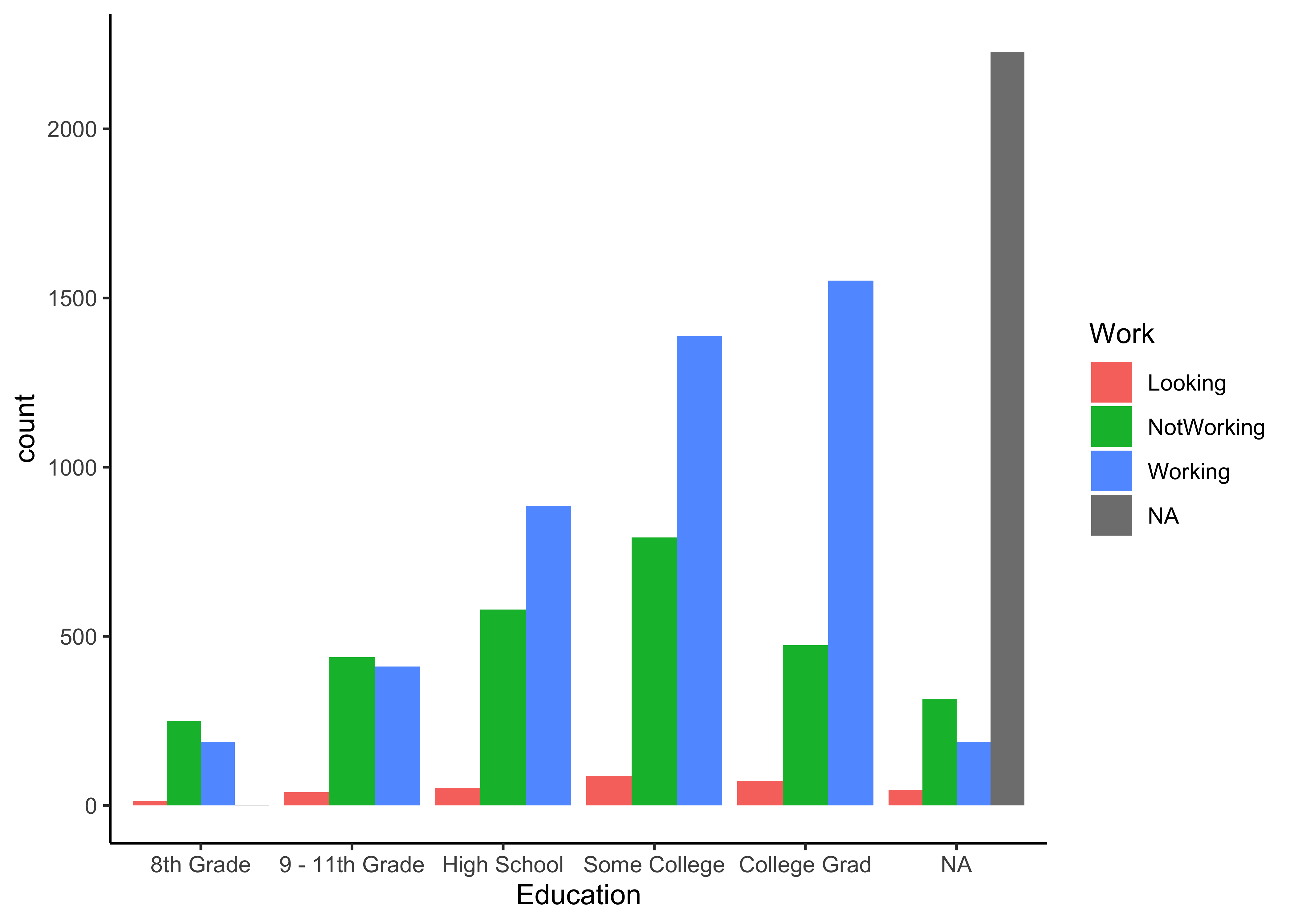
Insight: Clear increase in the number of Working people as Education goes from 8th Grade to College. No surprise. Are the NotWorking counts a surprise?
Question
Q.3. What is the distribution of Physical Activity Days, across Gender? Across Education?
NHANES %>%
  gf_histogram(~ PhysActiveDays | Gender, fill = ~ Gender) %>%
  gf_theme(theme_classic())
NHANES %>%
  gf_histogram(~ PhysActiveDays | Education, fill = ~ Education) %>%
  gf_theme(theme_classic())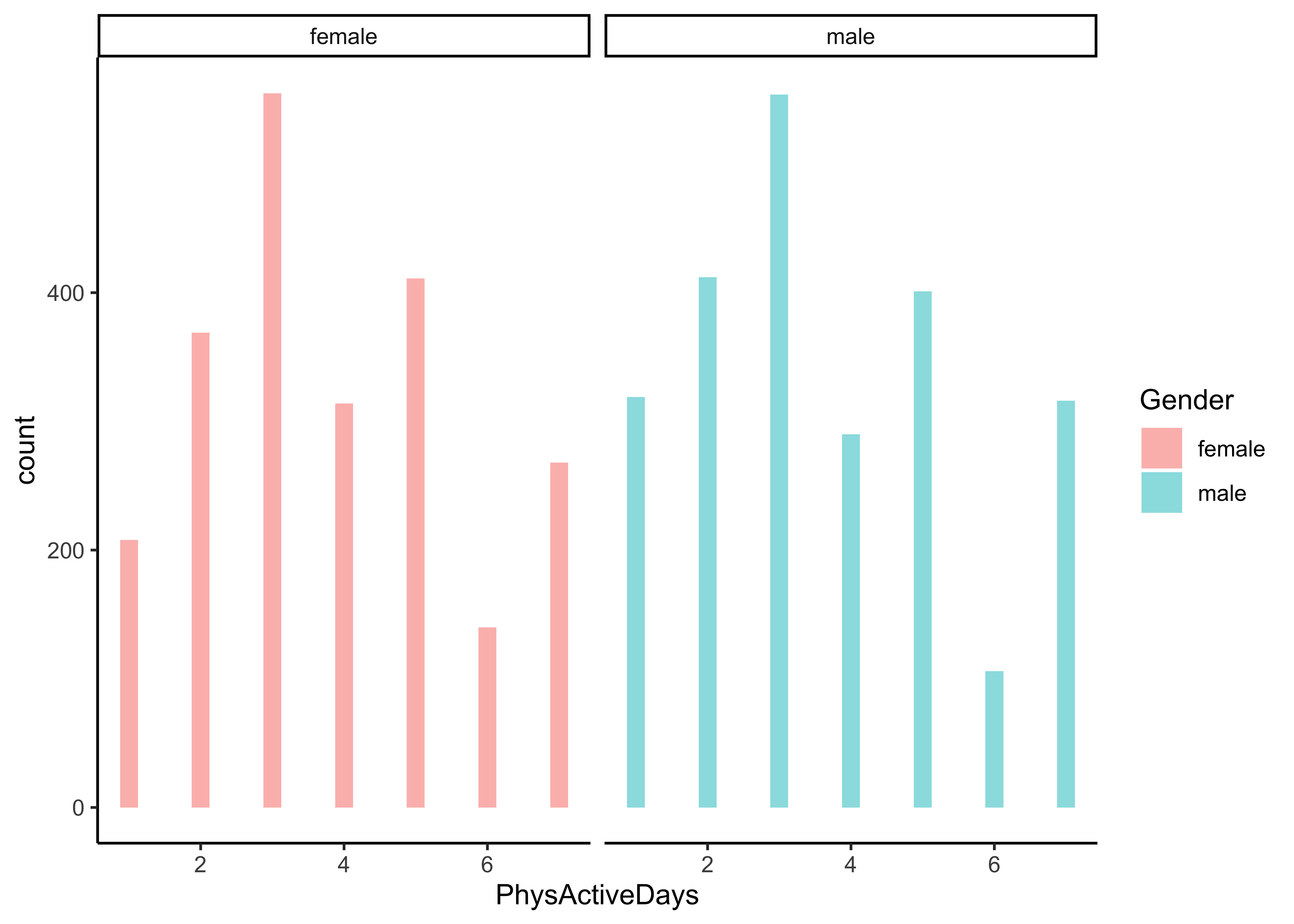
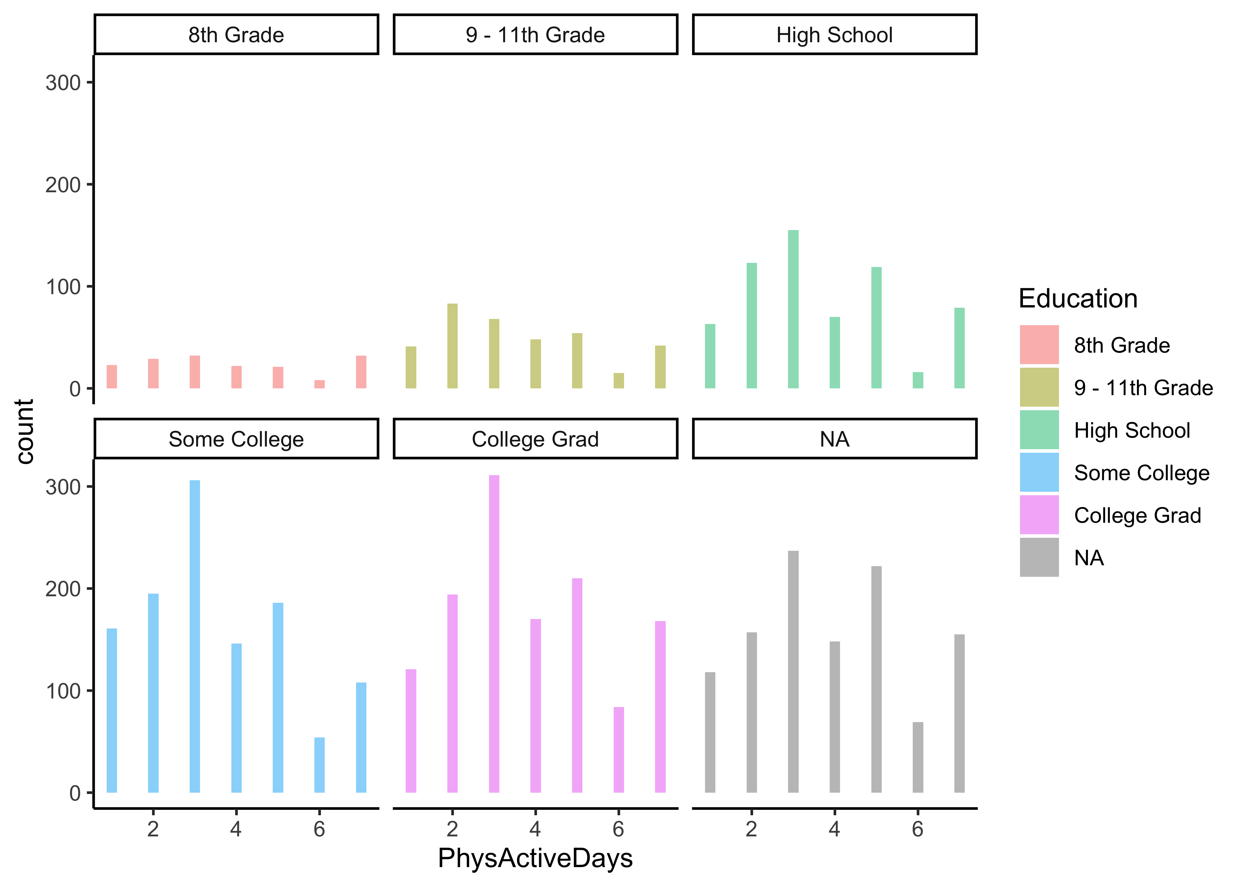
Insight: Can we conclude anything here? The populations in each category are different, as indicated by the different heights of the bars, so what do we need to do? Take percentages or ratios of course, per-capita! How would one do that?
Question
Q.3a. What is the distribution of Physical Activity Days, across Education and Sex, per capita?
NHANES %>%
  group_by(Gender) %>%
  summarize(mean_active = mean(PhysActiveDays,na.rm = TRUE))
NHANES %>%
  group_by(Education, Work) %>%
summarize(mean_active = mean(PhysActiveDays,na.rm = TRUE))Insight: Hmm..no great differences in per-capita physical activity. Females are marginally more active than males. No need to even plot this.
Question
Q.4. How are people’s Ages distributed across levels of Education?
# Recall there are missing data
gf_boxplot(Age ~ Education,
           fill = ~ Education, # Always a good idea to fill boxes
           data = NHANES) %>%
  gf_theme(theme_classic()) %>%

  # And to turn this into an interactive plot
plotly::ggplotly()Insight: Older age groups are somewhat more heavily represented in groups with lower educational status. College Graduates also have slightly narrow age….That is a nice Question for some Inferential Modelling. And how to interpret the NA group?
Question
Q.5. How is Education distributed over Race?
NHANES_by_Race1 <- NHANES %>%
  group_by(Race1) %>%
  summarize(population = n())
NHANES_by_Race1
NHANES %>% group_by(Education, Race1) %>%
  summarize( n = n()) %>%
  left_join(NHANES_by_Race1, by = c("Race1" = "Race1")) %>%
  mutate(percapita_educated = (n/population)*100) %>%
  ungroup() %>%
  group_by(Race1) %>%
  gf_col(percapita_educated ~ Education | Race1, fill = ~ Race1) %>%
  gf_refine(coord_flip()) %>%
  gf_theme(theme_classic()) %>%

  # And to turn this into an interactive plot
plotly::ggplotly()Insight: Blacks, Hispanics, and Mexicans tend to have fewer people with college degrees, as a percentage of their population. Asians and other immigrants have a significant tendency towards higher education!
Question
Q.6. What is the distribution of people’s BMI, split by Gender? By Race1?
# One can also plot both histograms and densities in an overlay fashion,

NHANES %>%
  group_by(Gender) %>%
  gf_density(~ BMI | Gender,fill = ~ Gender , alpha = 0.4) %>%
  gf_fitdistr(dist = "dnorm",color =  ~ Gender) %>%
  gf_theme(theme_classic()) %>%

  # And to turn this into an interactive plot
  plotly::ggplotly()
NHANES %>% group_by(Race1) %>%
  gf_density(~ BMI | Race1, fill = ~ Race1) %>%
  gf_fitdistr(dist = "dnorm") %>%
  gf_theme(theme_classic()) %>%

  # And to turn this into an interactive plot
plotly::ggplotly()Insight: Blacks tend to have larger portions of their populations with larger BMI. So these races perhaps tend to obesity. By and large BMI distributions are normal.
Question
Q.7. What is the distribution of people’s Testosterone level vs BMI? Split By Race1?
NHANES %>%
  gf_density_2d(Testosterone ~ BMI | Race1) %>%
  gf_theme(theme_classic()) %>%
plotly::ggplotly()Insight: Low testosterone levels exist across all BMI values, but healthy levels of T exists only over a smaller range of BMI.
Here is a dataset from Jeremy Singer-Vine’s blog, Data Is Plural. This is a list of all books banned in schools across the US.
banned <- readxl::read_xlsx(path = "../data/banned.xlsx",
                            sheet = "Sorted by Author & Title")
bannednames(banned) [1] "Author" "Title"
[3] "Type of Ban" "Secondary Author(s)"
[5] "Illustrator(s)" "Translator(s)"
[7] "State" "District"
[9] "Date of Challenge/Removal" "Origin of Challenge" Clearly the variables are all Qualitative, except perhaps for Date of Challenge/Removal, (which in this case has been badly mangled by Excel) So we need to make counts based on the levels* of the Qual variables and plot Bar/Column charts.
Let us quickly make some Stat Summaries ( using inspect)
mosaic::inspect(banned)
categorical variables:
                        name     class levels    n missing
1                     Author character    797 1586       0
2                      Title character   1145 1586       0
3                Type of Ban character      4 1586       0
4        Secondary Author(s) character     61   98    1488
5             Illustrator(s) character    192  364    1222
6              Translator(s) character      9   10    1576
7                      State character     26 1586       0
8                   District character     86 1586       0
9  Date of Challenge/Removal character     15 1586       0
10       Origin of Challenge character      2 1586       0
                                    distribution
1  Kobabe, Maia (1.9%) ...
2  Gender Queer: A Memoir (1.9%) ...
3  Banned Pending Investigation (46.1%) ...
4  Cast, Kristin (12.2%) ...
5  Aly, Hatem (4.7%) ...
6  Mlawer, Teresa (20%) ...
7  Texas (45%), Pennsylvania (28.8%) ...
8  Central York (27.8%) ...
9  44440 (28.8%), 44531 (28.3%) ...
10 Administrator (95.6%) ... Insight: Clearly the variables are all Qualitative, except perhaps for Date of Challenge/Removal, (which in this case has been badly mangled by Excel). So we need to make counts based on the* levels* of the Qual variables and plot Bar/Column charts. We will not find much use for histograms or densities.
Let us try to answer this question:
Question
Q.1.What is the count of banned books by type? By US state?
Insight: There are four types of book bans, and Banned Pending Investigation is the most frequent, but other types of bans are frequent too. Texas is the leader in book bans!
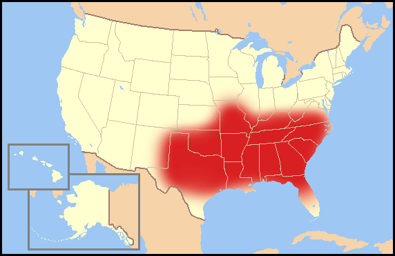
From: https://en.wikipedia.org/wiki/Bible_Belt
The Bible Belt is a region of the Southern United States in which socially conservative Protestant Christianity plays a strong role in society. Church attendance across the denominations is generally higher than the nation’s average. The region contrasts with the religiously diverse Midwest and Great Lakes, and the Mormon corridor in Utah and southern Idaho.
Question
Q.2. What is the count of banned books by type and by US state?*
banned %>% group_by(State, `Type of Ban`) %>%
  count(State, sort = TRUE) %>%
  slice_max(n = 10, order_by = n, with_ties = TRUE) %>%
  gf_col(reorder(State, n) ~ n, fill = ~`Type of Ban`,
         xlab = "No of Banned Books", ylab = "State") %>%
  gf_refine(scale_fill_brewer(palette = "Set2")) %>%
  gf_theme(theme_classic())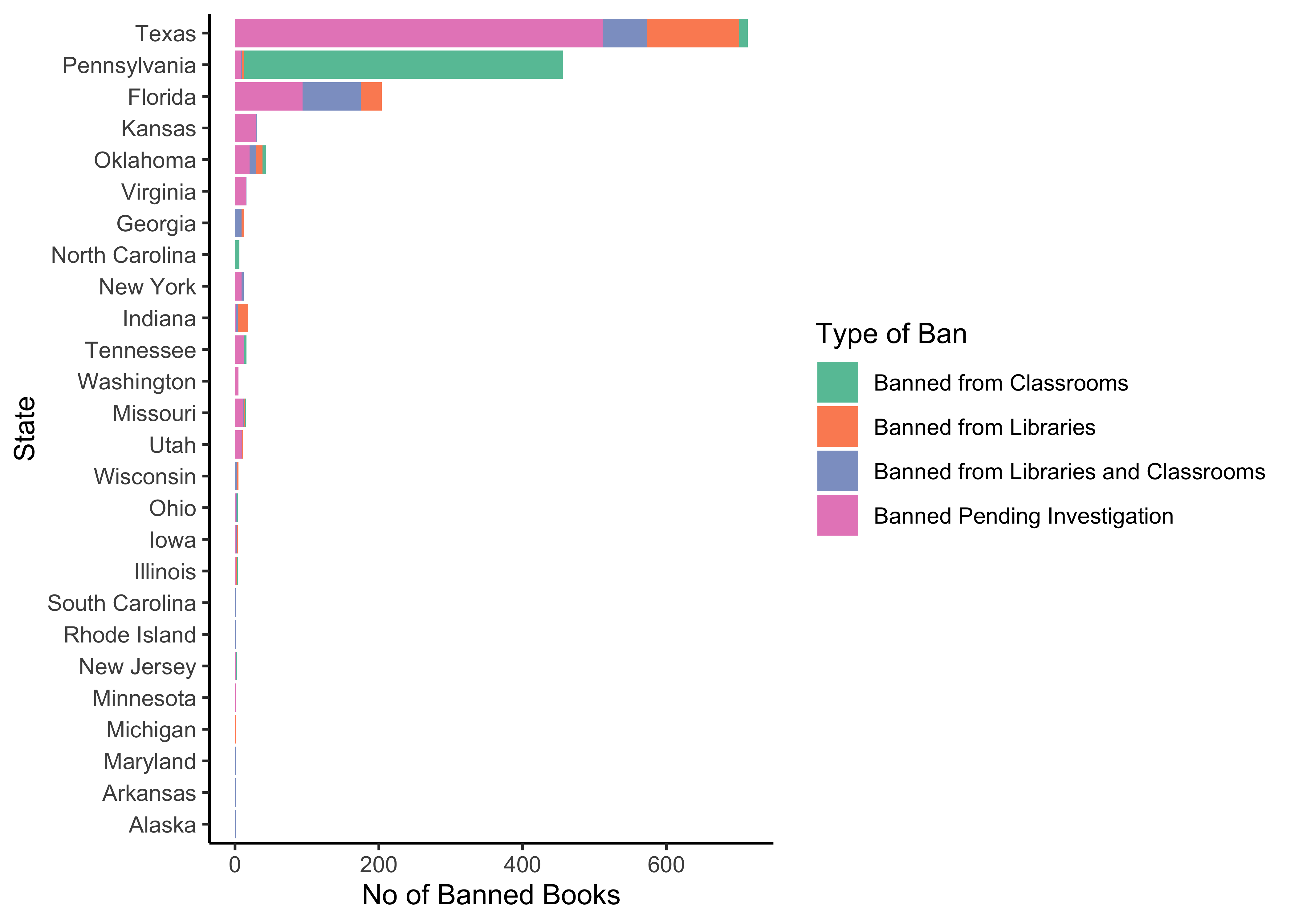
Insight: Clearly Texas is the leading state in book bans in schools. California clearly doesn’t bother itself with these things!!
And that is a wrap!! Try to work with this procedure:
- Inspect the data using
skimorinspect - Identify Qualitative and Quantitative variables
- Notice variables that have missing data and decide if that matters
- Develop Counts of Observations for combinations of Qualitative variables (factors)
- Develop Histograms and Densities, and slice them by Qualitative variables to develop faceted plots as needed
- Continue with other Descriptive Graphs as needed
- At each step record the insight and additional questions!!
- Onwards with Correlations and other visuals…
- And then on the inference and modelling!!
- A detailed analysis of the NHANES dataset, https://awagaman.people.amherst.edu/stat230/Stat230CodeCompilationExampleCodeUsingNHANES.pdf
Footnotes
Fundamentals of Data Visualization (clauswilke.com)↩︎