library(tidyverse)
library(mosaic) # package for stats, simulations, and basic plots
library(mosaicData) # package containing datasets
library(ggformula) # package for professional looking plots, that use the formula interface from mosaic
library(NHANES) # survey data collected by the US National Center for Health Statistics (NCHS)
library(corrplot) # For Correlogram plots
library(plotly)
library(echarts4r)EDA: Interactive Correlation Graphs in R
Abstract
Tests, Tables, and Graphs for Correlations in R
Introduction
We will create Tables for Correlations, and graphs for Correlations in R. As always, we will consistently use the Project Mosaic ecosystem of packages in R (mosaic, mosaicData and ggformula).
Interactive Graphs with
echarts4r
We will also start using echarts4r side by side for interactive graphs.
- Every function in the package starts with
e_. - You start coding a visualization by creating an echarts object with the
e_charts()function. That takes yourdata frameandx-axis columnas arguments. - Next, you add a function for the type of chart (
e_line(),e_bar(), etc.) with they-axis series column nameas an argument. - The rest is mostly customization!
echarts4rtakes some effort in getting used to, but it totally worth it!
mosaicData
Let us inspect what datasets are available in the package mosaicData.
Run this command in your Console: data(package = “mosaicData”)
The popup tab shows a lot of datasets we could use. Let us continue to use the famous Galton dataset and inspect it: (We will save the inspect output as an R object for use later)
name <chr> | class <chr> | levels <int> | n <int> | missing <int> | distribution <chr> |
|---|---|---|---|---|---|
| family | factor | 197 | 898 | 0 | 185 (1.7%), 166 (1.2%), 66 (1.2%) ... |
| sex | factor | 2 | 898 | 0 | M (51.8%), F (48.2%) |
galton_describe$quantitativename <chr> | class <chr> | min <dbl> | Q1 <dbl> | median <dbl> | Q3 <dbl> | max <dbl> | mean <dbl> | sd <dbl> | ||
|---|---|---|---|---|---|---|---|---|---|---|
| 1 | father | numeric | 62 | 68 | 69.0 | 71.0 | 78.5 | 69.232851 | 2.470256 | |
| 2 | mother | numeric | 58 | 63 | 64.0 | 65.5 | 70.5 | 64.084410 | 2.307025 | |
| 3 | height | numeric | 56 | 64 | 66.5 | 69.7 | 79.0 | 66.760690 | 3.582918 | |
| 4 | nkids | integer | 1 | 4 | 6.0 | 8.0 | 15.0 | 6.135857 | 2.685156 |
The inspect command already gives us a series of statistical measures of different variables of interest. As discussed previously, we can retain the output of inspect and use it in our reports: (there are ways of dressing up these tables too)
The dataset is described as:
Try
help("Galton") in your Console.A data frame with 898 observations on the following variables.
-familya factor with levels for each family
-fatherthe father’s height (in inches)
-motherthe mother’s height (in inches)
-sexthe child’s sex: F or M
-heightthe child’s height as an adult (in inches)
-nkidsthe number of adult children in the family, or, at least, the number whose heights Galton recorded.
There is a lot of Description generated by the mosaic::inspect() command ! What can we say about the dataset and its variables? How big is the dataset? How many variables? What types are they, Quant or Qual? If they are Qual, what are the levels? Are they ordered levels? Discuss!
What Questions might we have, that we could answer with a Statistical Measure, or Correlation chart?
Pair-wise Correlation Plot
Q.1 Which are the variables that have significant pair-wise correlations? What polarity are these correlations?
# Pulling out the list of Quant variables from NHANES
galton_quant <- galton_describe$quantitative
galton_quant$name
[1] "father" "mother" "height" "nkids" GGally::ggpairs(
Galton,
columns = c("father", "mother", "height", "nkids"),
diag = list("densityDiag"),
title = "Galton Data Correlations Plot"
) %>%
plotly::ggplotly()Insight: There are significant, but low value correlations in the Galton dataset. height is best correlated with father (
We cannot have too many variables in this kind of plot. We will shortly see how to plot correlations when there are a large number of variables.
Heatmap
echarts4r does not have a comprehensive combination plot like what GGally offers. However, we can plot a Correlation Heatmap using echarts4r:
Galton %>%
  select(where(is.numeric)) %>%
  mosaic::cor() %>%
  e_charts(height = 300) %>%
  e_correlations(order = "hclust", visual_map = TRUE) %>%
e_title("Galton Correlations Heatmap")Insight: Moving the cursor over the heatmap gives us the an indication of the correlation scores between variables. The visual map slider moves automatically to indicate the scores. We can also move the slider ourselves to “filter” the heatmap!
Question
Q.2: Can we plot a Correlogram for this dataset?
# library(corrplot)

galton_num_var <- Galton %>% select(father, mother, height, nkids)
galton_cor <- cor(galton_num_var)
galton_cor %>%
  corrplot(
    method = "ellipse",
    type = "lower",
    main = "Correlogram for Galton dataset"
  )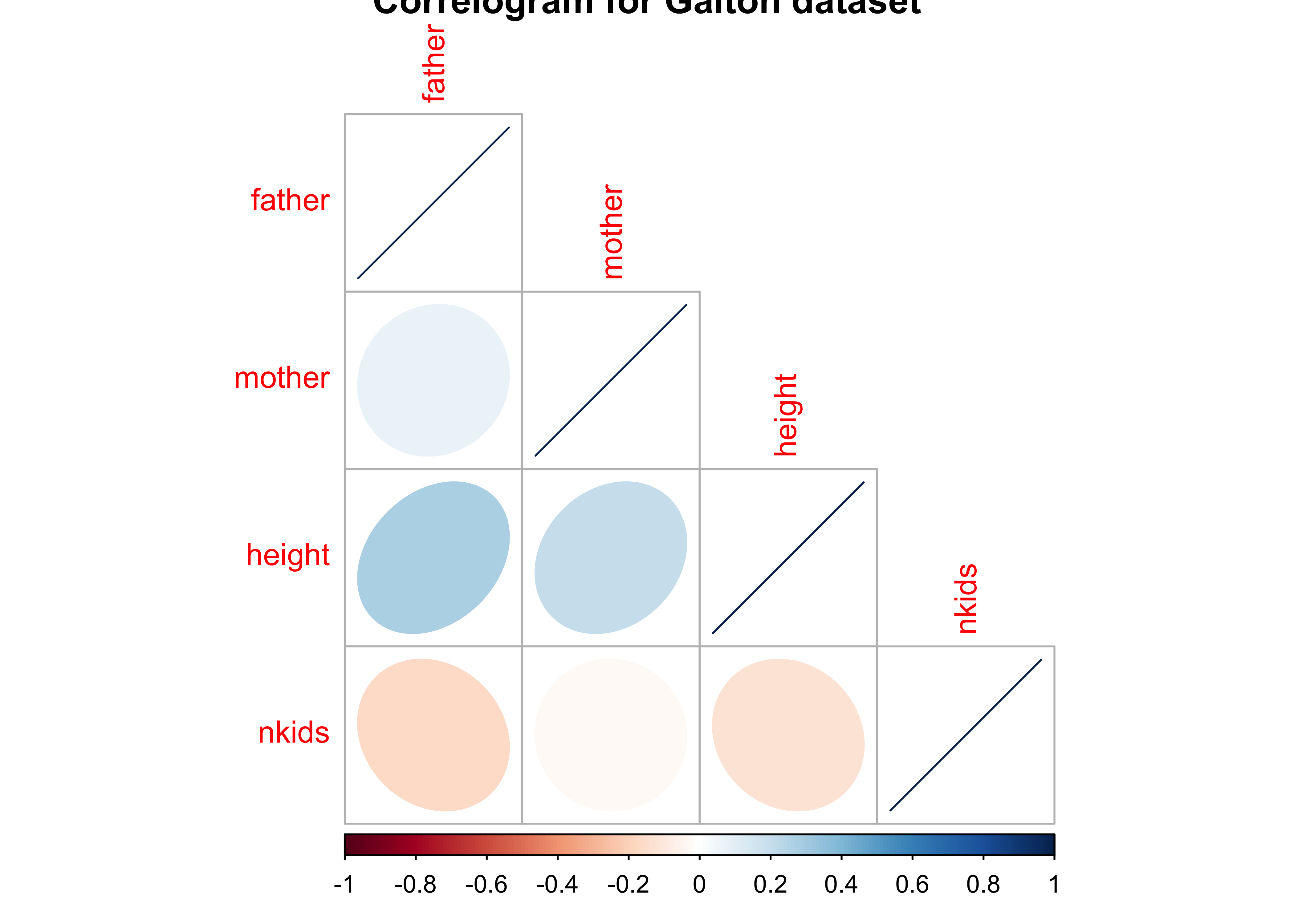
Insight: Again, height is positively correlated to father and mother as depicted by the rightward-sloping blue ellipses. And height is negatively correlated (very slightly) with nkids, with leftward-sloping reddish ellipses. (See the color palette + legend below the figure).
Question
Q.3: What do the correlation tests tell us?
    Pearson's product-moment correlation

data:  height and father
t = 8.5737, df = 896, p-value < 2.2e-16
alternative hypothesis: true correlation is not equal to 0
95 percent confidence interval:
 0.2137851 0.3347455
sample estimates:
      cor
0.2753548
    Pearson's product-moment correlation

data:  height and mother
t = 6.1628, df = 896, p-value = 1.079e-09
alternative hypothesis: true correlation is not equal to 0
95 percent confidence interval:
 0.1380554 0.2635982
sample estimates:
      cor
0.2016549 Insight: The tests give us the same values seen before, along with the confidence intervals for the correlation estimate. These represent the uncertainty that exists in our estimates.
Question
Q.4: What does this correlation look when split by sex of Child?
We will use the mosaic function cor_test to get these results:
# For the sons
mosaic::cor_test(height ~ father,
  data = Galton %>% filter(sex == "M")
)
cor_test(height ~ mother, data = Galton %>%
  filter(sex == "M"))
    Pearson's product-moment correlation

data:  height and father
t = 9.1498, df = 463, p-value < 2.2e-16
alternative hypothesis: true correlation is not equal to 0
95 percent confidence interval:
 0.3114667 0.4656805
sample estimates:
      cor
0.3913174
    Pearson's product-moment correlation

data:  height and mother
t = 7.628, df = 463, p-value = 1.367e-13
alternative hypothesis: true correlation is not equal to 0
95 percent confidence interval:
 0.2508178 0.4125305
sample estimates:
      cor
0.3341309
# For the daughters
cor_test(height ~ father,
data = Galton %>% filter(sex == "F")
)
cor_test(height ~ mother,
data = Galton %>% filter(sex == "F")
)
    Pearson's product-moment correlation

data:  height and father
t = 10.719, df = 431, p-value < 2.2e-16
alternative hypothesis: true correlation is not equal to 0
95 percent confidence interval:
 0.3809944 0.5300812
sample estimates:
      cor
0.4587605
    Pearson's product-moment correlation

data:  height and mother
t = 6.8588, df = 431, p-value = 2.421e-11
alternative hypothesis: true correlation is not equal to 0
95 percent confidence interval:
 0.2261463 0.3962226
sample estimates:
      cor
0.3136984 Insight: Son’s heights are correlated more with father than with mother. This trend is even more so for daughters! Hmmm…mother’s influence on children is clearly not with height.
Correlation Tests and Uncertainty
Correlation Tests and Uncertainty
Note how the cor.test reports a correlation score and the p-value for the same. There is also a confidence interval reported for the correlation score, an interval within which we are 95% sure that the true correlation value is to be found. Note that GGally too reports the significance of the correlation scores using *** or **. This indicates the p-value in the scores obtained by GGally; Presumably, there is an internal cor.test that is run for each pair of variables and the p-value and confidence levels are also computed internally.
We can also visualise this uncertainty and the confidence levels in a plot too, using gf_errorbar and a handy set of functions within purrr which is part of the tidyverse: Assuming heights is the target variable we want to correlate every other (quantitative) variable against, we can proceed very quickly as follows:
all_corrs <- Galton %>%
  select(where(is.numeric)) %>%
  # leave off height to get all the remaining ones
  select(-height) %>%
  # perform a cor.test for all variables against height
  purrr::map(
    .x = .,
    .f = \(x) cor.test(x, Galton$height)
  ) %>%
  # tidy up the cor.test outputs into a tidy data frame
  map_dfr(broom::tidy, .id = "predictor")

all_corrspredictor <chr> | estimate <dbl> | statistic <dbl> | p.value <dbl> | parameter <int> | conf.low <dbl> | conf.high <dbl> | method <chr> | alternative <chr> |
|---|---|---|---|---|---|---|---|---|
| father | 0.2753548 | 8.573704 | 4.354588e-17 | 896 | 0.2137851 | 0.33474554 | Pearson's product-moment correlation | two.sided |
| mother | 0.2016549 | 6.162793 | 1.079105e-09 | 896 | 0.1380554 | 0.26359819 | Pearson's product-moment correlation | two.sided |
| nkids | -0.1269101 | -3.829800 | 1.371780e-04 | 896 | -0.1907472 | -0.06200411 | Pearson's product-moment correlation | two.sided |
all_corrs %>%
  e_charts(predictor) %>%
  e_bar(estimate, colorBy = "data", legend = FALSE) %>%
  e_error_bar(lower = conf.low, upper = conf.high) %>%
  e_y_axis(
    name = "Correlation with `height`",
    nameLocation = "middle", nameGap = 35
  ) %>%
  e_x_axis(
    name = "Parameter", nameLocation = "center",
    nameGap = 35, type = "category"
  ) %>%
  e_tooltip()
all_corrs %>%
mutate(sd = (conf.high - conf.low) / 2) %>%
plot_ly() %>%
add_bars(
y = ~estimate, x = ~predictor,
error_y = ~ list(array = sd, color = "black")
)Insight: We can clearly see the size of the correlations and the confidence intervals marked in this plot. father has somewhat greater correlation with children’s height, as compared to mother. nkids seems to matter very slightly, in a negative way.
This kind of plot will be very useful when we pursue linear regression models.
Question
Q.5. How can we show this correlation in a set of Scatter Plots + Regression Lines? Can we recreate Galton’s famous diagram?
# For the father
Galton %>%
  group_by(sex) %>%
  e_charts(father, height = 300) %>%
  e_scatter(height, symbol_size = 8) %>%
  e_lm(height ~ father, legend = FALSE) %>%
  e_x_axis(
    name = "father", nameLocation = "middle", nameGap = 35,
    min = 60, max = 80
  ) %>%
  e_y_axis(
    name = "height", nameLocation = "middle", nameGap = 35,
    min = 50, max = 80
  ) %>%
  e_tooltip()
# for the mother
Galton %>%
  group_by(sex) %>%
  e_charts(mother, height = 300) %>%
  e_scatter(height, symbol_size = 8) %>%
  e_lm(height ~ mother, legend = FALSE) %>%
  e_x_axis(
    name = "mother", nameLocation = "middle", nameGap = 35,
    min = 55, max = 75
  ) %>%
  e_y_axis(
    name = "height", nameLocation = "middle", nameGap = 35,
    min = 50, max = 80
  ) %>%
e_tooltip()Insight: Visibly the scatter plots are slightly tilted upward to the right, showing a positive correlation for both sons’ and daughters’ heights with that of the father and mother.
Galton’s Plot
An approximation to Galton’s famous plot (see Wikipedia):
gf_point(height ~ (father + mother) / 2, data = Galton) %>%
  gf_smooth(method = "lm") %>%
  gf_density_2d(n = 8) %>%
  gf_abline(slope = 1) %>%
  gf_theme(theme_minimal())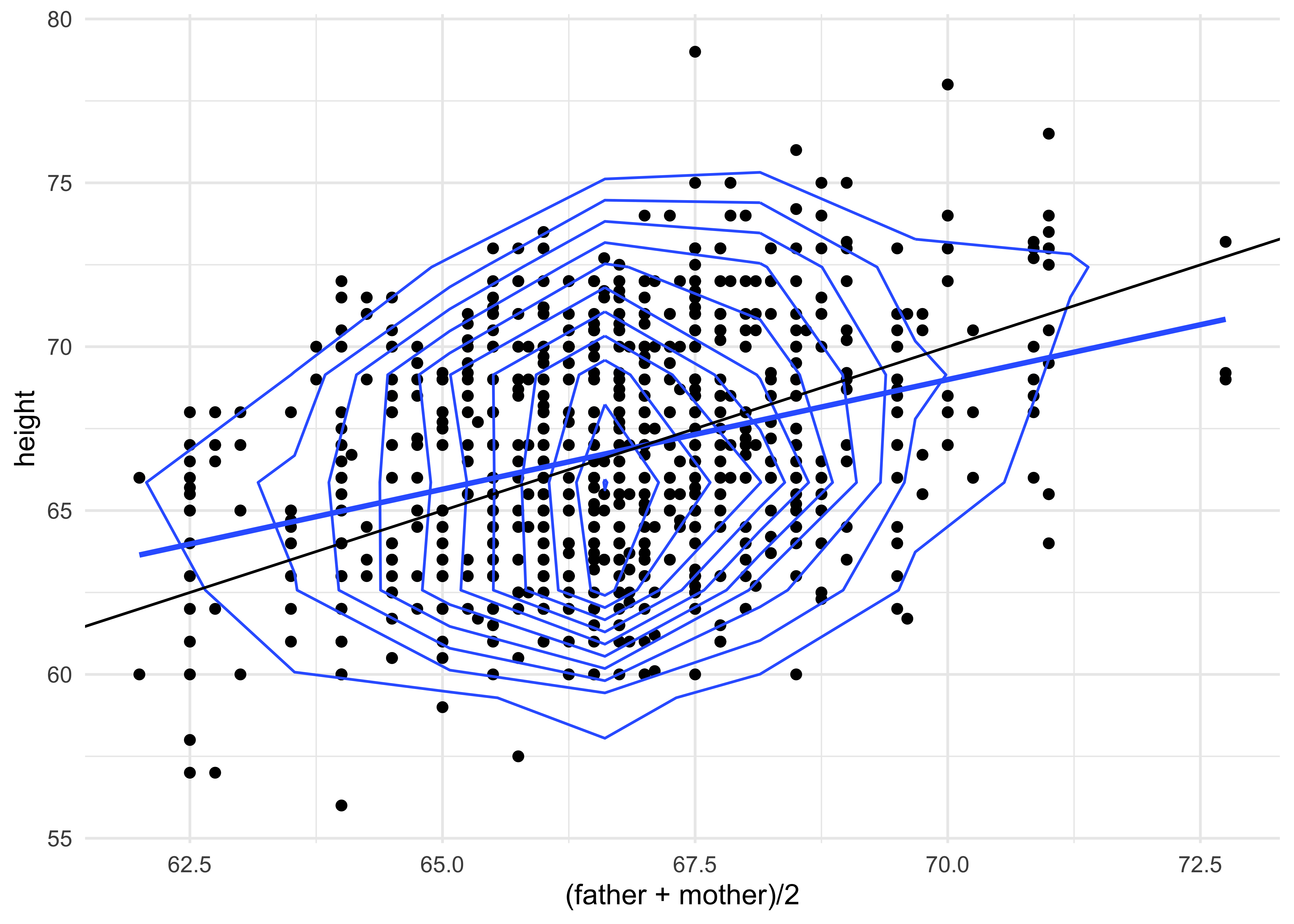
Insight: How would you interpret this plot1? As yet we are not able to reproduce this with charts4r.
NHANES
We will “live code” this in class!
We have a decent Correlations related workflow in R:
- load the dataset
- inspect the dataset, identify Quant and Qual variables
- Develop Pair-Wise plots + Correlations using GGally::ggpairs()
- Develop Correlogram corrplot::corrplot
- Check everything with a cor_test
- Use purrr + cor.test to plot correlations and confidence intervals for multiple Quant variables
- Plot scatter plots using gf_point.
- Add extra lines using gf_abline() to compare hypotheses that you may have.
Footnotes
https://www.researchgate.net/figure/Galtons-smoothed-correlation-diagram-for-the-data-on-heights-of-parents-and-children_fig15_226400313↩︎