library(vcd) # Michael Friendly's package, Visualizing Categorical Data
library(vcdExtra) # Categorical Data Sets

library(resampledata) # More datasets

library(GGally) # Correlation Plots
library(visStatistics) # Comprehensive all-in-one stats viz/test package
library(ca) # Correspondence Analysis, for use some day

library(ggmosaic) # Mosaic Plots
library(ggpubr) # Colours, Themes and new geometries in ggplot
##
library(tidyplots) # Easily Produced Publication-Ready Plots
library(tinyplot) # Plots with Base R
library(tinytable) # Elegant Tables for our data
#

library(mosaic) # Our trusted friend
library(skimr)
library(tidyverse)
Proportions
Frequency Tables
Contingency Tables
Numerical Data in Groups
Margins
Likert Scale data
Bar Plots (for Contingency Tables)
Mosaic Plots
Balloon Plots
Pie Charts
Correspondence Analysis
Abstract
Types, Categories, and Counts
…“Thinking is difficult, that’s why most people judge.”
— C.G. Jung
Plot Fonts and Theme
Show the Code
library(systemfonts)
library(showtext)
## Clean the slate
systemfonts::clear_local_fonts()
systemfonts::clear_registry()
##
showtext_opts(dpi = 96) # set DPI for showtext
gfonts::use_font("alegreya", "../../../../../../fonts/css/alegreya.css")
Show the Code
use_font("roboto-condensed", "../../../../../../fonts/css/roboto-condensed.css")Error in use_font("roboto-condensed", "../../../../../../fonts/css/roboto-condensed.css"): could not find function "use_font"Show the Code
# sysfonts::font_add(family = "Alegreya",
#   regular = "../../../../../../fonts/Alegreya-Regular.ttf",
#   bold = "../../../../../../fonts/Alegreya-Bold.ttf",
#   italic = "../../../../../../fonts/Alegreya-Italic.ttf",
#   bolditalic = "../../../../../../fonts/Alegreya-BoldItalic.ttf")
#
# sysfonts::font_add(family = "Roboto Condensed",
#   regular = "../../../../../../fonts/RobotoCondensed-Regular.ttf",
#   bold = "../../../../../../fonts/RobotoCondensed-Bold.ttf",
#   italic = "../../../../../../fonts/RobotoCondensed-Italic.ttf",
#   bolditalic = "../../../../../../fonts/RobotoCondensed-BoldItalic.ttf")
# showtext_auto(enable = TRUE) #enable showtext
##
theme_custom <- function() {
  font <- "Alegreya" # assign font family up front

  theme_classic(base_size = 14, base_family = font) %+replace% # replace elements we want to change

    theme(
      text = element_text(family = font), # set base font family

      # text elements
      plot.title = element_text( # title
        family = font, # set font family
        size = 24, # set font size
        face = "bold", # bold typeface
        hjust = 0, # left align
        margin = margin(t = 5, r = 0, b = 5, l = 0)
      ), # margin
      plot.title.position = "plot",
      plot.subtitle = element_text( # subtitle
        family = font, # font family
        size = 14, # font size
        hjust = 0, # left align
        margin = margin(t = 5, r = 0, b = 10, l = 0)
      ), # margin

      plot.caption = element_text( # caption
        family = font, # font family
        size = 9, # font size
        hjust = 1
      ), # right align

      plot.caption.position = "plot", # right align

      axis.title = element_text( # axis titles
        family = "Roboto Condensed", # font family
        size = 12
      ), # font size

      axis.text = element_text( # axis text
        family = "Roboto Condensed", # font family
        size = 9
      ), # font size

      axis.text.x = element_text( # margin for axis text
        margin = margin(5, b = 10)
      )

      # since the legend often requires manual tweaking
      # based on plot content, don't define it here
    )
}
Show the Code
```{r}
#| cache: false
#| code-fold: true
## Set the theme
theme_set(new = theme_custom())
```
Error in theme_set(new = theme_custom()): could not find function "theme_set"Show the Code
```{r}
#| cache: false
#| code-fold: true
## Use available fonts in ggplot text geoms too!
update_geom_defaults(geom = "text", new = list(
  family = "Roboto Condensed",
  face = "plain",
  size = 3.5,
  color = "#2b2b2b"
))
```
Error in update_geom_defaults(geom = "text", new = list(family = "Roboto Condensed", : could not find function "update_geom_defaults"
| Variable #1 | Variable #2 | Chart Names | Chart Shape |
|---|---|---|---|
| Qual | Qual | Pies, and Mosaic Charts |
|
| No | Pronoun | Answer | Variable/Scale | Example | What Operations? |
|---|---|---|---|---|---|
| 3 | How, What Kind, What Sort | A Manner / Method, Type or Attribute from a list, with list items in some " order" ( e.g. good, better, improved, best..) | Qualitative/Ordinal | Socioeconomic status (Low income, Middle income, High income),Education level (HighSchool, BS, MS, PhD),Satisfaction rating(Very much Dislike, Dislike, Neutral, Like, Very Much Like) | Median,Percentile |
To recall, a categorical variable is one for which the possible measured or assigned values consist of a discrete set of categories, which may be ordered or unordered. Some typical examples are:
- Gender, with categories “Male,” “Female.”
- Marital status, with categories “Never married,” “Married,” “Separated,” “Divorced,” “Widowed.”
- Fielding position (in
baseballcricket), with categories “Slips,”Cover “,”Mid-off “Deep Fine Leg”, “Close-in”, “Deep”… - Side effects (in a pharmacological study), with categories “None,” “Skin rash,” “Sleep disorder,” “Anxiety,” . . ..
- Political attitude, with categories “Left,” “Center,” “Right.”
- Party preference (in India), with categories “BJP” “Congress,” “AAP,” “TMC”…
- Treatment outcome, with categories “no improvement,” “some improvement,” or “marked improvement.”
- Age, with categories “0–9,” “10–19,” “20–29,” “30–39,” . . . .
- Number of children, with categories 0, 1, 2, . . . .
As these examples suggest, categorical variables differ in the number of categories: we often distinguish binary variables (or dichotomous variables) such as Gender from those with more than two categories (called polytomous variables).
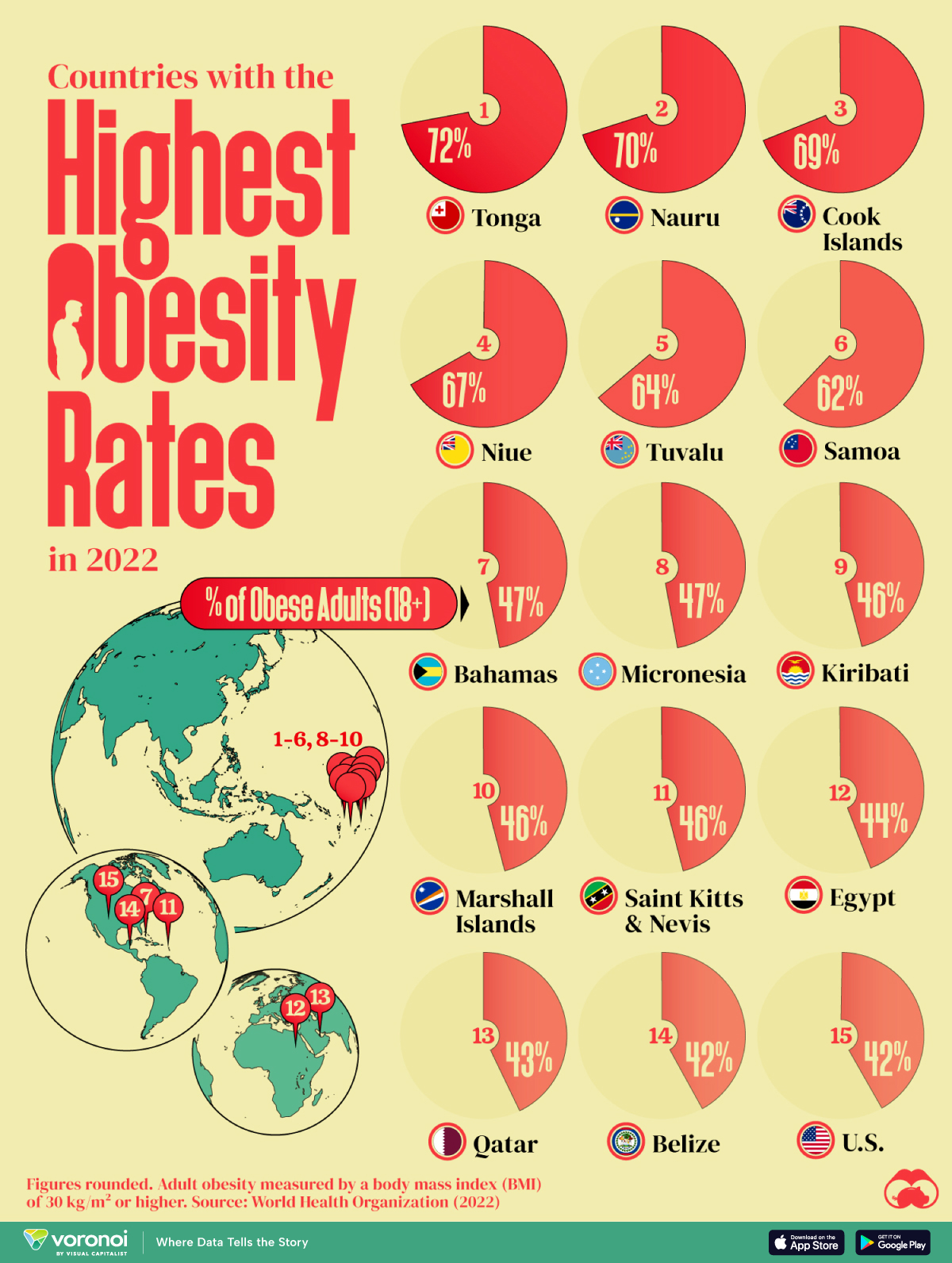
From Figure 1 (a), it is seen that Egypt, Qatar, and the United States are the only countries with a population greater than 1 million on this list. Poor food habits are once again a factor, with some cultural differences. In Egypt, high food inflation has pushed residents to low-cost high-calorie meals. To combat food insecurity, the government subsidizes bread, wheat flour, sugar and cooking oil, many of which are the ingredients linked to weight gain. In Qatar, a country with one of the highest per capita GDPs in the world, a genetic predisposition towards obesity and sedentary lifestyles worsen the impact of rich diets. And in the U.S., bigger portions are one of the many reasons cited for rampant adult and child obesity. For example, Americans ate 20% more calories in the year 2000 than they did in 1983. They consume 195 lbs of meat annually compared to 138 lbs in 1953. And their grain intake has increased 45% since 1970.
It’s worth noting however that this dataset is based on BMI values, which do not fully account for body types with larger bone and muscle mass.
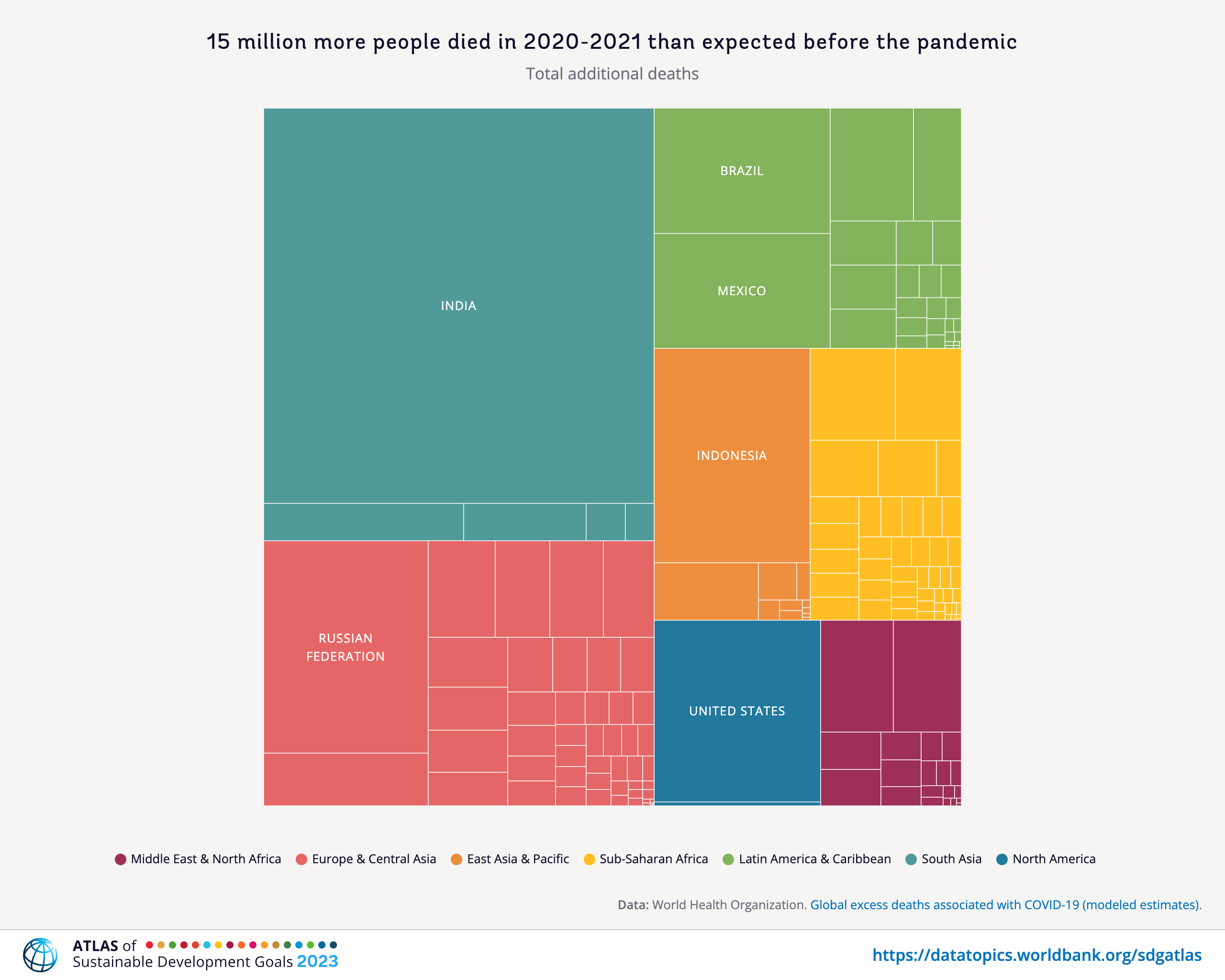
From Figure 1 (b), according to World Bank, six countries (India, Russia, Indonesia, United States, Brazil, and Mexico) accounted for over 60 percent of the total additional deaths in the first two years of the pandemic.
We saw with Bar Charts that when we deal with single Qual variables, we perform counts for each level of the variable. For a single Qual variable, even with multiple levels ( e.g. Education Status: High school, College, Post-Graduate, PhD), we can count the observations as with Bar Charts and plot Pies.
We can also plot Pie Charts when the number of levels in a single Qual variable are not too many. Almost always, a Bar chart is preferred. The problem is that humans are pretty bad at reading angles. This ubiquitous chart is much vilified in the industry and bar charts that we have seen earlier, are viewed as better options. On the other hand, pie charts are ubiquitous in design and business circles, and are very much accepted! Do also read this spirited defense of pie charts here. https://speakingppt.com/why-tufte-is-flat-out-wrong-about-pie-charts/
What if there are two Quals? Or even more? The answer is to take them pair-wise, make all combinations of levels for both and calculate counts for these. This is called a Contingency Table. Then we plot that table. We’ll see.
From the {vcd package} vignette:
The first thing you need to know is that categorical data can be represented in three different forms in R, and it is sometimes necessary to convert from one form to another, for carrying out statistical tests, fitting models or visualizing the results.
- Case Data
- Frequency Data
- Cross-Tabular Count Data
Let us first see examples of each.
From Michael Friendly Discrete Data Analysis and Visualization :
In many circumstances, data is recorded on each individual or experimental unit. Data in this form is called case data, or data in case form. Containing individual observations with one or more categorical factors, used as classifying variables. The total number of observations is
nrow(X), and the number of variables isncol(X).
class(Arthritis)[1] "data.frame"# Tibble as HTML for presentation
Arthritis %>%
head(10) %>%
tt(theme = "striped", caption = "Arthritis Treatments and Effects<br> First 10 Observations", centering = TRUE)| ID | Treatment | Sex | Age | Improved |
|---|---|---|---|---|
| 57 | Treated | Male | 27 | Some |
| 46 | Treated | Male | 29 | None |
| 77 | Treated | Male | 30 | None |
| 17 | Treated | Male | 32 | Marked |
| 36 | Treated | Male | 46 | Marked |
| 23 | Treated | Male | 58 | Marked |
| 75 | Treated | Male | 59 | None |
| 39 | Treated | Male | 59 | Marked |
| 33 | Treated | Male | 63 | None |
| 55 | Treated | Male | 63 | None |
The Arthritis data set has three factors and two integer variables. One of the three factors Improved is an ordered factor.
- ID
- Treatment: a factor; Placebo or Treated
- Sex: a factor, M / F
- Age: integer
- Improved: Ordinal factor; None < Some < Marked
Each row in the Arthritis dataset is a separate case or observation.
Data in frequency form has already been tabulated and aggregated by counting over the (combinations of) categories of the table variables. When the data are in case form, we can always trace any observation back to its individual identifier or data record, since each row is a unique observation or case; the reverse, with the Frequency Form is rarely possible.
Frequency Data is usually a data frame, with columns of categorical variables and at least one column containing frequency or count information.
'data.frame':   6 obs. of  3 variables:
 $ sex  : Factor w/ 2 levels "female","male": 1 2 1 2 1 2
 $ party: Factor w/ 3 levels "dem","indep",..: 1 1 2 2 3 3
$ count: num 279 165 73 47 225 191| sex | party | count |
|---|---|---|
| female | dem | 279 |
| male | dem | 165 |
| female | indep | 73 |
| male | indep | 47 |
| female | rep | 225 |
| male | rep | 191 |
Respondents in the GSS survey were classified by sex and party identification. As can be seen, there is a count for every combination of the two categorical variables, sex and party.
Table Form Data can be a matrix, array or table object, whose elements are the frequencies in an n-way table. The variable names (factors) and their levels are given by dimnames(X).
HairEyeColor
class(HairEyeColor)
, , Sex = Male
Eye
Hair Brown Blue Hazel Green
Black 32 11 10 3
Brown 53 50 25 15
Red 10 10 7 7
Blond 3 30 5 8
, , Sex = Female
Eye
Hair Brown Blue Hazel Green
Black 36 9 5 2
Brown 66 34 29 14
Red 16 7 7 7
Blond 4 64 5 8[1] "table"HairEyeColor is a “two-way” table, consisting of two tables, one for Sex = Female and the other for Sex = Male. The total number of observations is sum(X). The number of dimensions of the table is length(dimnames(X)), and the table sizes are given by sapply(dimnames(X), length). The data looks like a n-dimensional cube and needs n-way tables to represent.
sum(HairEyeColor)[1] 592dimnames(HairEyeColor)$Hair
[1] "Black" "Brown" "Red" "Blond"
$Eye
[1] "Brown" "Blue" "Hazel" "Green"
$Sex
[1] "Male" "Female"Hair Eye Sex
4 4 2 A good way to think of tabular data is to think of a Rubik’s Cube.

Rubik’s Cube and Categorical Data Tables
Each of the edges is an Ordinal Variable, each segment represents a level in the variable. So each face of the Cube represents two ordinal variables. Any segment is at the intersection of two (independent) levels of two variables, and the colour may be visualized as a count. This array of counts on a face is a 2D or 2-Way Table. ( More on this later )
Since we can only print 2D tables, we hold one face in front and the image we see is a 2-Way Table. Turning the Cube by 90 degrees gives us another face with 2 variables, with one variable in common with the previous face. If we consider two faces together, we get two 2-way tables, effectively allowing us to contemplate 3 categorical variables.
Multiple 2-Way tables can be flattened into a single long table that contains all counts for all combinations of categorical variables. This can be visualized as “opening up” and laying flat the Rubik’s cube, as with a cardboard model of it.
ftable(HairEyeColor) Sex Male Female
Hair Eye
Black Brown 32 36
Blue 11 9
Hazel 10 5
Green 3 2
Brown Brown 53 66
Blue 50 34
Hazel 25 29
Green 15 14
Red Brown 10 16
Blue 10 7
Hazel 7 7
Green 7 7
Blond Brown 3 4
Blue 30 64
Hazel 5 5
Green 8 8Finally, we may need to convert the (multiple) tables into a data frame or tibble:
## Convert the two tables into a data frame
HairEyeColor %>%
  as_tibble()
# Tibble as HTML for presentation
HairEyeColor %>%
  as_tibble() %>% # Convert
  tt(
    theme = "striped", caption = "Hair Eye and Color<br> as a Data Frame",
    centering = TRUE
)Hair <chr> | Eye <chr> | Sex <chr> | |
|---|---|---|---|
| Black | Brown | Male | |
| Brown | Brown | Male | |
| Red | Brown | Male | |
| Blond | Brown | Male | |
| Black | Blue | Male | |
| Brown | Blue | Male | |
| Red | Blue | Male | |
| Blond | Blue | Male | |
| Black | Hazel | Male | |
| Brown | Hazel | Male |
| Hair | Eye | Sex | n |
|---|---|---|---|
| Black | Brown | Male | 32 |
| Brown | Brown | Male | 53 |
| Red | Brown | Male | 10 |
| Blond | Brown | Male | 3 |
| Black | Blue | Male | 11 |
| Brown | Blue | Male | 50 |
| Red | Blue | Male | 10 |
| Blond | Blue | Male | 30 |
| Black | Hazel | Male | 10 |
| Brown | Hazel | Male | 25 |
| Red | Hazel | Male | 7 |
| Blond | Hazel | Male | 5 |
| Black | Green | Male | 3 |
| Brown | Green | Male | 15 |
| Red | Green | Male | 7 |
| Blond | Green | Male | 8 |
| Black | Brown | Female | 36 |
| Brown | Brown | Female | 66 |
| Red | Brown | Female | 16 |
| Blond | Brown | Female | 4 |
| Black | Blue | Female | 9 |
| Brown | Blue | Female | 34 |
| Red | Blue | Female | 7 |
| Blond | Blue | Female | 64 |
| Black | Hazel | Female | 5 |
| Brown | Hazel | Female | 29 |
| Red | Hazel | Female | 7 |
| Blond | Hazel | Female | 5 |
| Black | Green | Female | 2 |
| Brown | Green | Female | 14 |
| Red | Green | Female | 7 |
| Blond | Green | Female | 8 |
We have already examined Bar Charts.
Pie Charts are discussed here.
These are both good for single Qual variables. Bars are more suited when there are many levels and/or when there is more than one Qual variable, as discussed earlier.
When we want to visualize proportions based on Multiple Qual variables, we are looking at what Claus Wilke calls nested proportions: groups within groups. Making counts with combinations of levels for two Qual variables gives us a data structure called a Contingency Table, which we will use to build our plot for nested proportions. The Statistical tests for Proportions ( the
From Wolfram Alpha:
A contingency table, sometimes called a two-way frequency table, is a tabular mechanism with at least two rows and two columns used in statistics to present categorical data in terms of frequency counts. More precisely, an
contingency table shows the observed frequency of two variables the observed frequencies of which are arranged into rows and columns. The intersection of a row and a column of a contingency table is called a cell.
In this section we understand how to make Contingency Tables from each of the three forms. We will use vcd, mosaic and the tidyverse packages for our purposes. Then we will see how they can be visualized.
I think this is the simplest and most elegant way of obtaining Contingency Tables:
data("GSS2002", package = "resampledata")
gss2002 <- GSS2002 %>%
dplyr::select(Education, DeathPenalty) %>%
tidyr::drop_na(., c(Education, DeathPenalty))
##
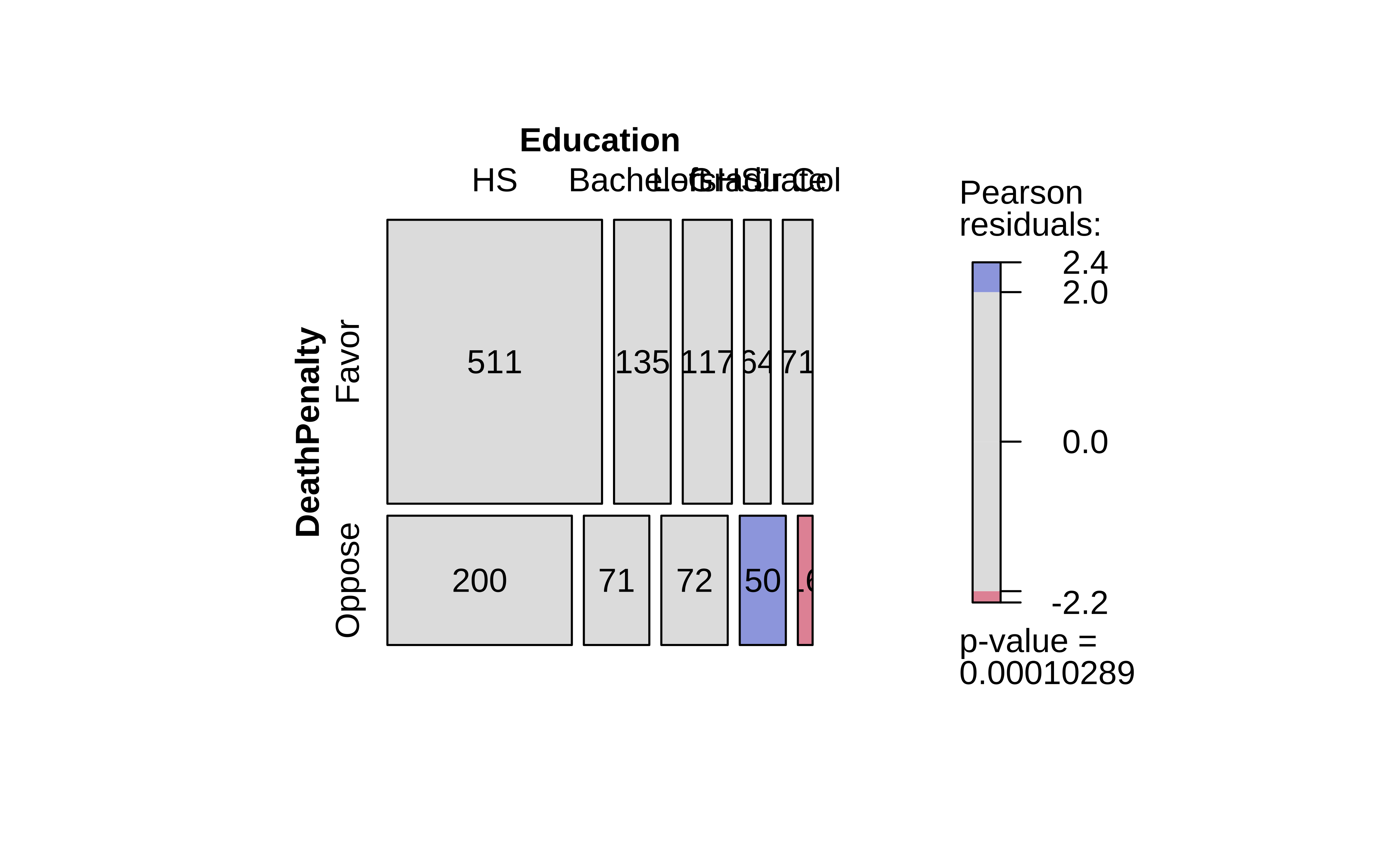
mosaic::tally(DeathPenalty ~ Education, data = gss2002) %>%
addmargins() Education
DeathPenalty Left HS HS Jr Col Bachelors Graduate Sum
Favor 117 511 71 135 64 898
Oppose 72 200 16 71 50 409
Sum 189 711 87 206 114 1307Plotting this as an HTML table, we get:
How was this computed?
So Left HS and Favor the death penalty, and Bachelors who Oppose the death penalty. And so on.
# One Way Table ( one variable )
table(Arthritis$Treatment) # Contingency Table
Placebo Treated
     43      41
# 1-way Contingency Table
table(Arthritis$Treatment) %>% addmargins() # Contingency Table with margins
Placebo Treated     Sum
     43      41      84
# 2-Way Contingency Tables
# Choosing Treatment and Improved
table(Arthritis$Treatment, Arthritis$Improved) %>% addmargins()
          None Some Marked Sum
  Placebo   29    7      7  43
  Treated   13    7     21  41
  Sum       42   14     28  84
# Choosing Treatment and Sex
table(Arthritis$Sex, Arthritis$Improved) %>% addmargins()
         None Some Marked Sum
  Female   25   12     22  59
  Male     17    2      6  25
  Sum      42   14     28  84
We can use table() ( and also xtabs() ) to generate multi-dimensional tables too (More than 2-way) These will be printed out as a series of 2D tables, one for each value/level of the “third” parameter. We can then flatten this set of tables using ftable() and add margins to convert into a Contingency Table:
my_arth_table <- table(Arthritis$Treatment, Arthritis$Sex, Arthritis$Improved)
my_arth_table
, , = None
Female Male
Placebo 19 10
Treated 6 7
, , = Some
Female Male
Placebo 7 0
Treated 5 2
, , = Marked
Female Male
Placebo 6 1
Treated 16 5# Now flatten
ftable(my_arth_table) None Some Marked
Placebo Female 19 7 6
Male 10 0 1
Treated Female 6 5 16
Male 7 2 5ftable(my_arth_table) %>% addmargins() Sum
19 7 6 32
10 0 1 11
6 5 16 27
7 2 5 14
Sum 42 14 28 84A bit strange that the column labels disappear in the ftable when margins are added…maybe need to investigate the FUN argument to add_margins().
The vcd ( Visualize Categorical Data ) package by Michael Friendly has a convenient function to create Contingency Tables: structable(); this function produces a ‘flat’ representation of a high-dimensional contingency table constructed by recursive splits (similar to the construction of mosaic charts/graphs). structable tends to render flat tables, of the kind that can be thought of as a “text representation” of the vcd::mosaic plot:
The arguments of structable are:
- a formula
- a
dataargument, which can indicate adata framefrom where the variables are drawn.
arth_vcd <- vcd::structable(data = Arthritis, Treatment ~ Improved)
arth_vcd
class(arth_vcd)
arth_vcd %>% addmargins()
Treatment Placebo Treated
Improved
None 29 13
Some 7 7
Marked 7 21
[1] "structable" "ftable"
        Treatment
Improved Placebo Treated Sum
  None        29      13  42
  Some         7       7  14
  Marked       7      21  28
  Sum         43      41  84
# With Margins
arth_vcd %>%
as.matrix() %>%
addmargins() Treatment
Improved Placebo Treated Sum
None 29 13 42
Some 7 7 14
Marked 7 21 28
Sum 43 41 84# HairEyeColor is in multiple table form
HairEyeColor
# structable flattens these into one, as for a mosaic chart
vcd::structable(HairEyeColor)
# As tibble
vcd::structable(HairEyeColor) %>% as_tibble(), , Sex = Male
Eye
Hair Brown Blue Hazel Green
Black 32 11 10 3
Brown 53 50 25 15
Red 10 10 7 7
Blond 3 30 5 8
, , Sex = Female
Eye
Hair Brown Blue Hazel Green
Black 36 9 5 2
Brown 66 34 29 14
Red 16 7 7 7
Blond 4 64 5 8 Eye Brown Blue Hazel Green
Hair Sex
Black Male 32 11 10 3
Female 36 9 5 2
Brown Male 53 50 25 15
Female 66 34 29 14
Red Male 10 10 7 7
Female 16 7 7 7
Blond Male 3 30 5 8
Female 4 64 5 8Hair <fct> | Eye <fct> | Sex <fct> | Freq <dbl> | |
|---|---|---|---|---|
| Black | Brown | Male | 32 | |
| Brown | Brown | Male | 53 | |
| Red | Brown | Male | 10 | |
| Blond | Brown | Male | 3 | |
| Black | Blue | Male | 11 | |
| Brown | Blue | Male | 50 | |
| Red | Blue | Male | 10 | |
| Blond | Blue | Male | 30 | |
| Black | Hazel | Male | 10 | |
| Brown | Hazel | Male | 25 |
UCBAdmissions is already in Frequency Form i.e. a Contingency Table. But it is a set of (two-way) Contingency Tables:
UCBAdmissions
###
vcd::structable(UCBAdmissions)
###
structable(UCBAdmissions) %>%
  as.matrix() %>%
  addmargins()
, , Dept = A
Gender
Admit Male Female
Admitted 512 89
Rejected 313 19
, , Dept = B
Gender
Admit Male Female
Admitted 353 17
Rejected 207 8
, , Dept = C
Gender
Admit Male Female
Admitted 120 202
Rejected 205 391
, , Dept = D
Gender
Admit Male Female
Admitted 138 131
Rejected 279 244
, , Dept = E
Gender
Admit Male Female
Admitted 53 94
Rejected 138 299
, , Dept = F
Gender
Admit Male Female
Admitted 22 24
Rejected 351 317 Gender Male Female
Admit Dept
Admitted A 512 89
B 353 17
C 120 202
D 138 131
E 53 94
F 22 24
Rejected A 313 19
B 207 8
C 205 391
D 279 244
E 138 299
F 351 317 Gender
Admit_Dept Male Female Sum
Admitted_A 512 89 601
Admitted_B 353 17 370
Admitted_C 120 202 322
Admitted_D 138 131 269
Admitted_E 53 94 147
Admitted_F 22 24 46
Rejected_A 313 19 332
Rejected_B 207 8 215
Rejected_C 205 391 596
Rejected_D 279 244 523
Rejected_E 138 299 437
Rejected_F 351 317 668
Sum 2691 1835 4526
Important
Note that structable does not permit the adding of margins directly; it needs to be converted to a matrix for addmargins() to do its work.
So far these packages give Contingency Tables that are easy to see for humans; some of these structures are also capable being passed directly to commands such as stats::chisq.test() or janitor::chisq.test().
Often we need Contingency Tables that are in tibble form, and we need to perform some data processing using dplyr to get there. Doing this with the tidyverse set of packages may seem counter-intuitive and long-winded, but the workflow is easily understandable.
First we develop the counts:
diamonds %>% count(cut)
diamonds %>% count(clarity)
diamonds %>%
  group_by(cut, clarity) %>%
dplyr::summarise(count = n())cut <ord> | n <int> | |||
|---|---|---|---|---|
| Fair | 1610 | |||
| Good | 4906 | |||
| Very Good | 12082 | |||
| Premium | 13791 | |||
| Ideal | 21551 |
clarity <ord> | n <int> | |||
|---|---|---|---|---|
| I1 | 741 | |||
| SI2 | 9194 | |||
| SI1 | 13065 | |||
| VS2 | 12258 | |||
| VS1 | 8171 | |||
| VVS2 | 5066 | |||
| VVS1 | 3655 | |||
| IF | 1790 |
cut <ord> | clarity <ord> | count <int> | ||
|---|---|---|---|---|
| Fair | I1 | 210 | ||
| Fair | SI2 | 466 | ||
| Fair | SI1 | 408 | ||
| Fair | VS2 | 261 | ||
| Fair | VS1 | 170 | ||
| Fair | VVS2 | 69 | ||
| Fair | VVS1 | 17 | ||
| Fair | IF | 9 | ||
| Good | I1 | 96 | ||
| Good | SI2 | 1081 |
We need to have the individual levels of cut as rows and the individual levels of clarity as columns. This means that we need to pivot this from “long to wide”1 to obtain a Contingency Table:
diamonds %>%
  group_by(cut, clarity) %>%
  dplyr::summarise(count = n()) %>%
  pivot_wider(
    id_cols = cut,
    names_from = clarity,
    values_from = count
  ) %>%
  # Now add the row and column totals using the `janitor` package
  janitor::adorn_totals(where = c("row", "col")) %>%
  # Recover to tibble since janitor gives a "tabyl" format
  # ( which can be useful too !)
  as_tibble() -> diamonds_ct
diamonds_ctcut <ord> | I1 <int> | SI2 <int> | SI1 <int> | VS2 <int> | VS1 <int> | VVS2 <int> | VVS1 <int> | IF <int> | Total <dbl> |
|---|---|---|---|---|---|---|---|---|---|
| Fair | 210 | 466 | 408 | 261 | 170 | 69 | 17 | 9 | 1610 |
| Good | 96 | 1081 | 1560 | 978 | 648 | 286 | 186 | 71 | 4906 |
| Very Good | 84 | 2100 | 3240 | 2591 | 1775 | 1235 | 789 | 268 | 12082 |
| Premium | 205 | 2949 | 3575 | 3357 | 1989 | 870 | 616 | 230 | 13791 |
| Ideal | 146 | 2598 | 4282 | 5071 | 3589 | 2606 | 2047 | 1212 | 21551 |
| Total | 741 | 9194 | 13065 | 12258 | 8171 | 5066 | 3655 | 1790 | 53940 |
### Another Way
diamonds %>%
  group_by(cut, clarity) %>%
  dplyr::summarise(count = n()) %>%
  pivot_wider(
    id_cols = cut,
    names_from = clarity,
    values_from = count
  ) %>%
  # Now add the row and column totals using the `dplyr` package
  # From: https://stackoverflow.com/a/67885521
  mutate("row_totals" = sum(across(where(is.integer)))) %>%
  ungroup() %>%
add_row(cut = "col_total", summarize(., across(where(is.integer), sum)))cut <chr> | I1 <int> | SI2 <int> | SI1 <int> | VS2 <int> | VS1 <int> | VVS2 <int> | VVS1 <int> | IF <int> | row_totals <int> |
|---|---|---|---|---|---|---|---|---|---|
| Fair | 210 | 466 | 408 | 261 | 170 | 69 | 17 | 9 | 1610 |
| Good | 96 | 1081 | 1560 | 978 | 648 | 286 | 186 | 71 | 4906 |
| Very Good | 84 | 2100 | 3240 | 2591 | 1775 | 1235 | 789 | 268 | 12082 |
| Premium | 205 | 2949 | 3575 | 3357 | 1989 | 870 | 616 | 230 | 13791 |
| Ideal | 146 | 2598 | 4282 | 5071 | 3589 | 2606 | 2047 | 1212 | 21551 |
| col_total | 741 | 9194 | 13065 | 12258 | 8171 | 5066 | 3655 | 1790 | 53940 |
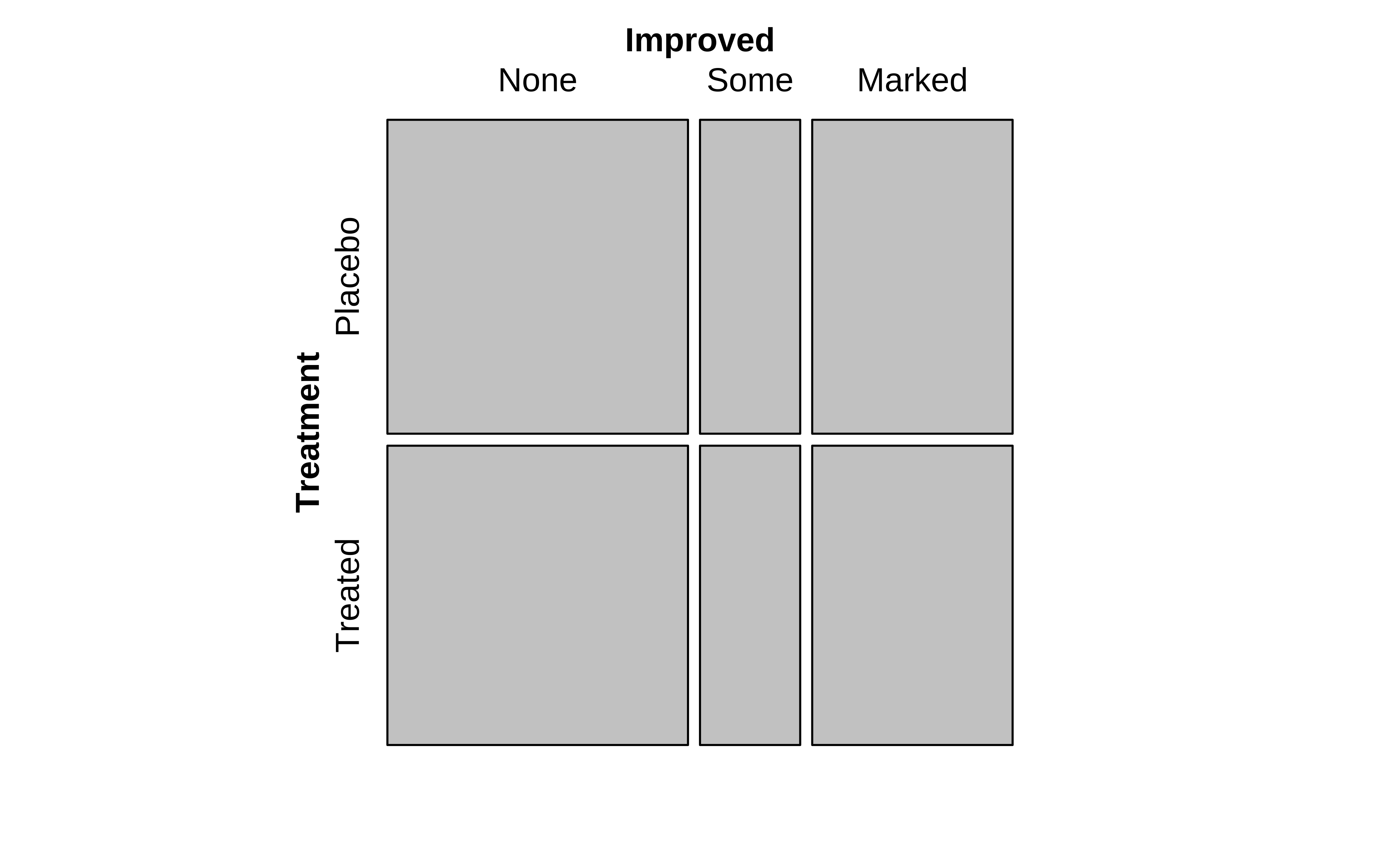
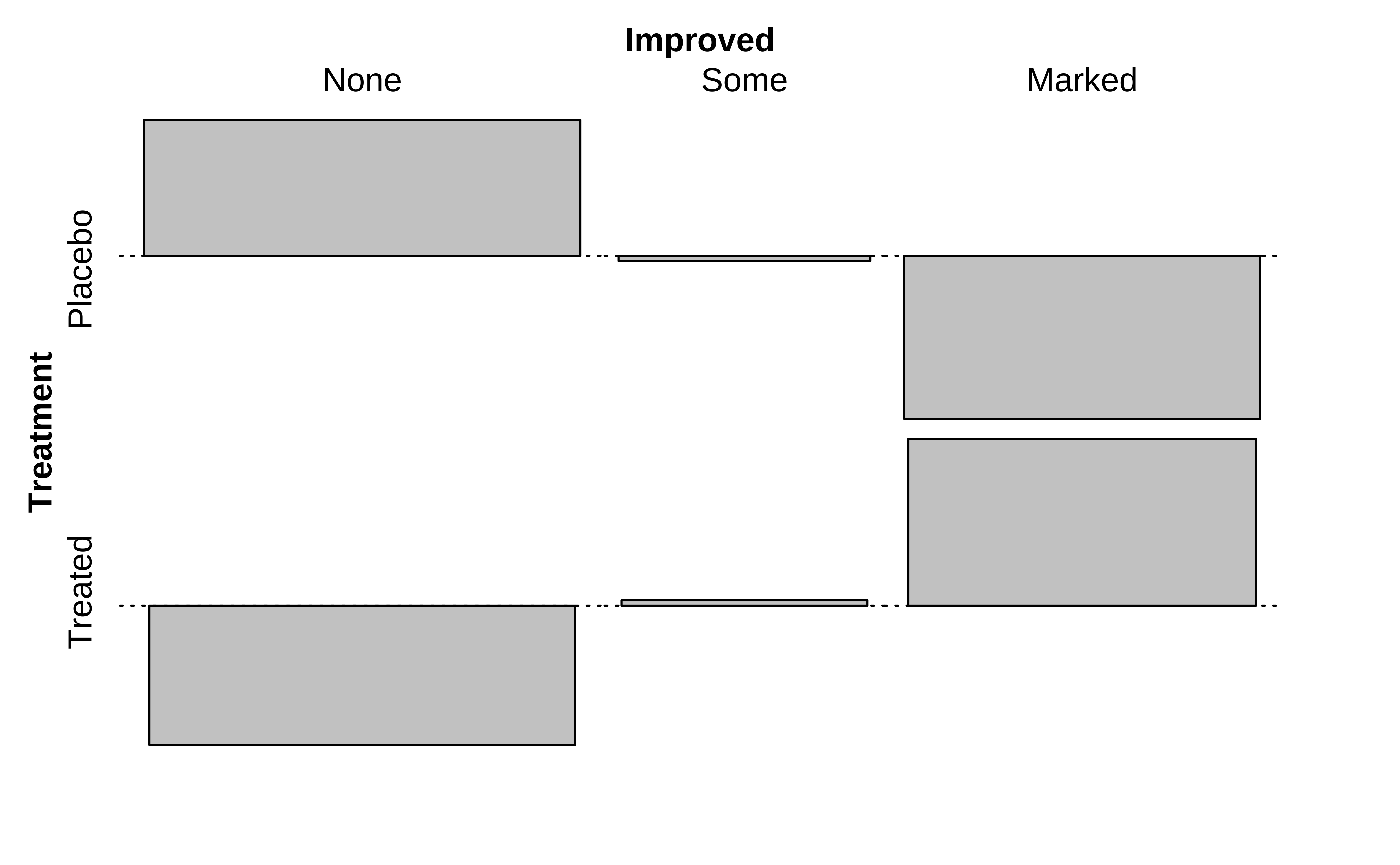
Now then, how does one plot a set of data that looks like this, a matrix? No column is a single variable, nor is each row a single observation, which is what we understand with the idea of tidy data.
The answer is provided in the very shape of the data: we plot this as a set of tiles, where
- Take the bottom row of per-column totals and create vertical rectangles with these widths
- Take the individual counts in the rows and partition each rectangle based in the counts in these rows.
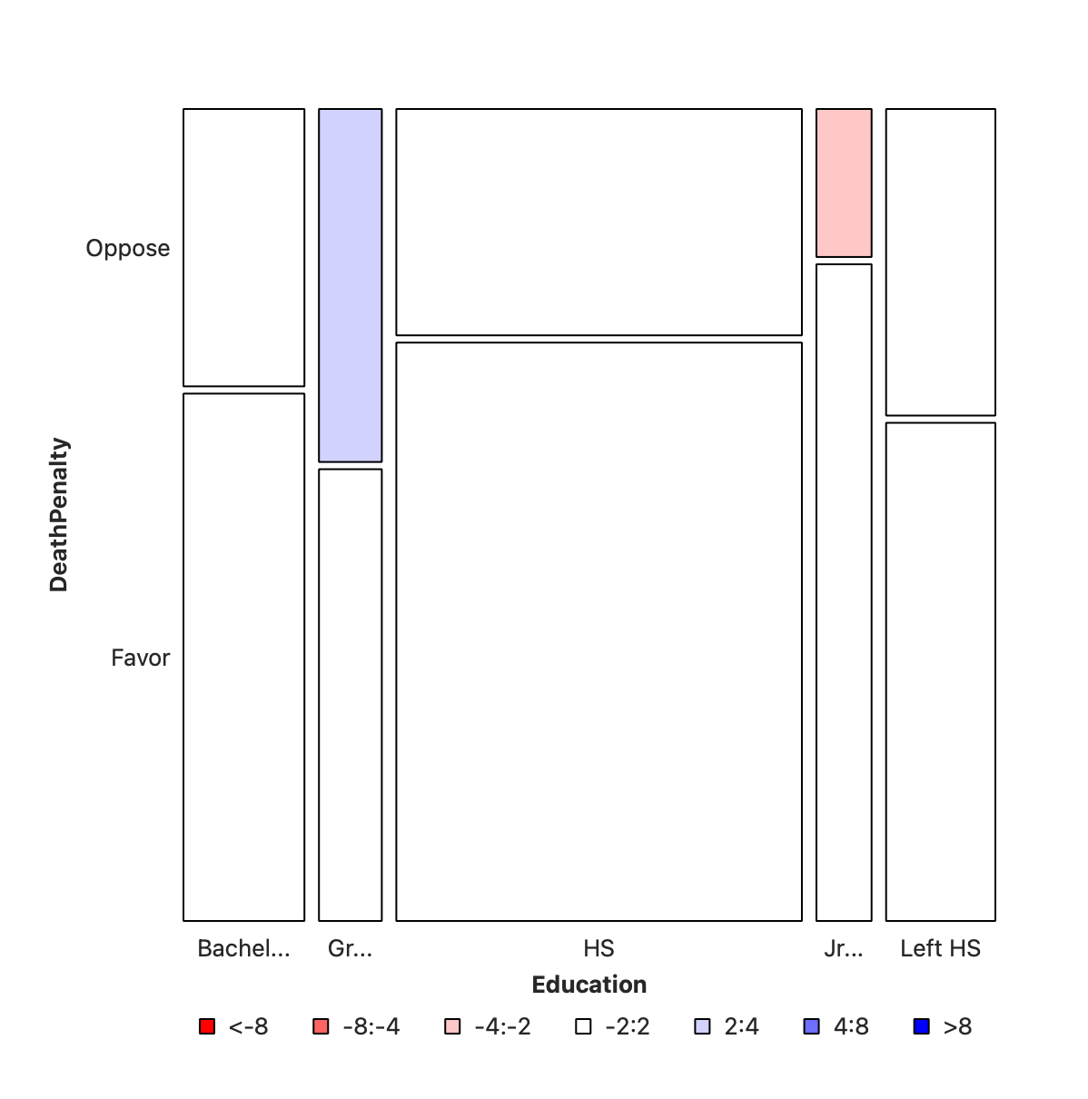
The first split shows the various levels of Education and their counts as widths. Order is alphabetical! This splitting corresponds to the bottom ROW of the Figure 2. HS is clearly the largest subgroup in Education.
In the second step, the columns from Figure 3 (a) are sliced horizontally into tiles, in proportion to the number of people in each Education category/level who support/do not support DeathPenalty. This is done in proportion to all the entries in each COLUMN, giving us Figure 3 (b).
Let us now make this plot with a variety of approaches.
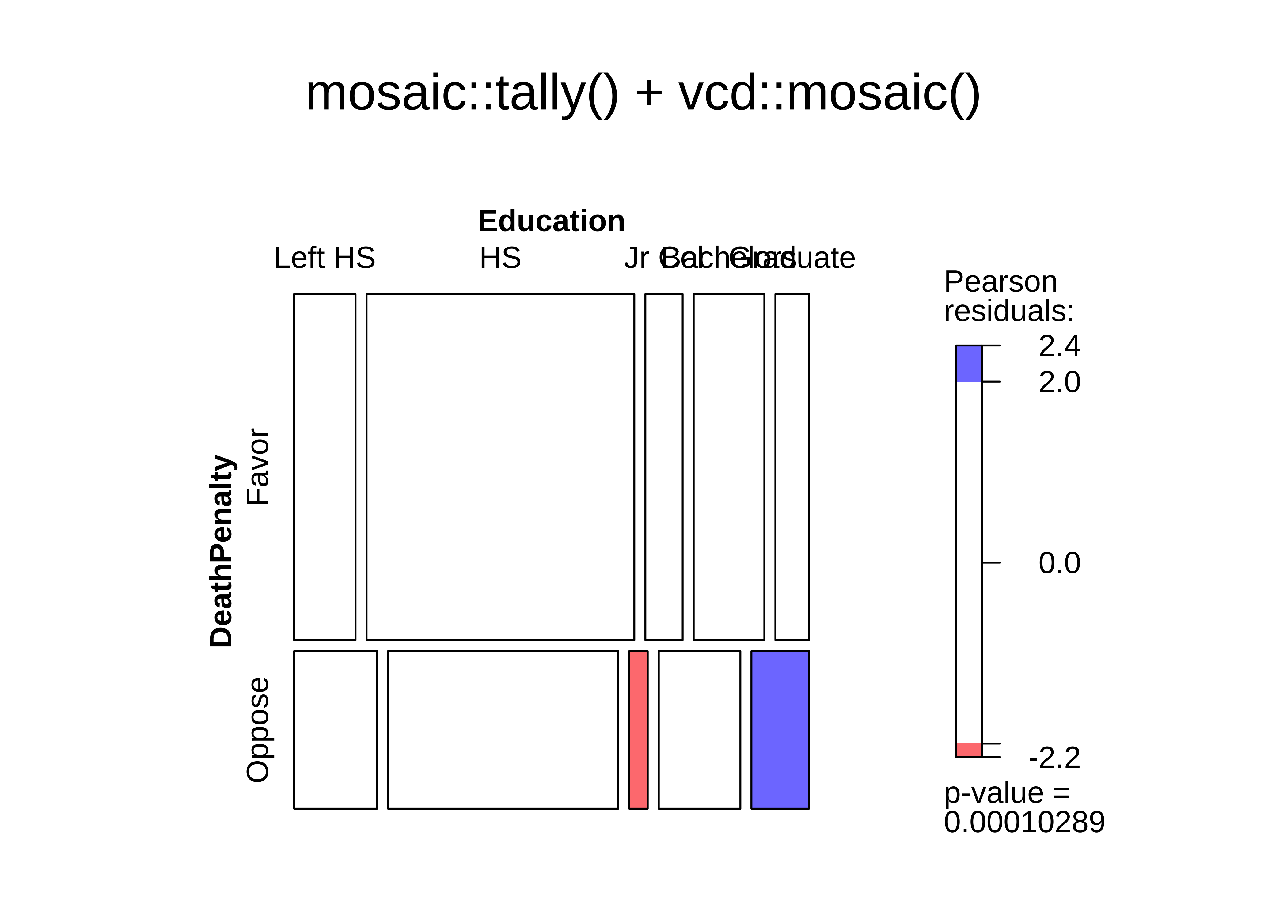
The vcd::mosaic() function needs the data in contingency table form. We already built one using mosaic::tally() and that is easily plotted:
# Code used earlier
data("GSS2002", package = "resampledata")
gss2002 <- GSS2002 %>%
  # select two categorical variables from the dataset
  dplyr::select(Education, DeathPenalty) %>%
  drop_na(Education, DeathPenalty)
gss2002Education <fct> | DeathPenalty <fct> | |||
|---|---|---|---|---|
| HS | Favor | |||
| Bachelors | Favor | |||
| HS | Favor | |||
| HS | Favor | |||
| HS | Favor | |||
| HS | Favor | |||
| HS | Favor | |||
| Jr Col | Favor | |||
| HS | Oppose | |||
| Bachelors | Favor |
# make a tally table
gss_table <- mosaic::tally(DeathPenalty ~ Education, data = gss2002)
gss_table %>% addmargins()
Education
DeathPenalty Left HS HS Jr Col Bachelors Graduate Sum
Favor 117 511 71 135 64 898
Oppose 72 200 16 71 50 409
Sum 189 711 87 206 114 1307# gss_table is *not* a tibble, but a *table* object.
vcd::mosaic(gss_table,
gp = shading_hsv,
main = "mosaic::tally() + vcd::mosaic()"
)
There is also a command within vcd itself to create a Contingency Table, vcd::structable():
arthritis_table <- vcd::structable(~ Treatment + Improved,
  data = Arthritis
)
arthritis_table
vcd::mosaic(arthritis_table,
  gp = shading_max,
  main = "Arthritis Treatment Dataset"
)
Improved None Some Marked
Treatment
Placebo 29 7 7
Treated 13 7 21
ggmosaic takes a tibble with Qualitative variables, internally computes the counts/table, and plots the mosaic plot:
gss2002Education <fct> | DeathPenalty <fct> | |||
|---|---|---|---|---|
| HS | Favor | |||
| Bachelors | Favor | |||
| HS | Favor | |||
| HS | Favor | |||
| HS | Favor | |||
| HS | Favor | |||
| HS | Favor | |||
| Jr Col | Favor | |||
| HS | Oppose | |||
| Bachelors | Favor |
# library(ggmosaic)
#
# ggplot2::theme_set(new = theme_classic(base_family = "Roboto Condensed")) # Set consistent graph theme
##
ggplot(data = gss2002) +
  ggmosaic::geom_mosaic(
    aes(
      x = product(DeathPenalty, Education),
      fill = DeathPenalty
    )
  ) +
  theme(legend.position = "top") +
  scale_fill_brewer(palette = "Set1")
Warning: The `scale_name` argument of `continuous_scale()` is deprecated as of ggplot2
3.5.0.Warning: The `trans` argument of `continuous_scale()` is deprecated as of ggplot2 3.5.0.
ℹ Please use the `transform` argument instead.Warning: `unite_()` was deprecated in tidyr 1.2.0.
ℹ Please use `unite()` instead.
ℹ The deprecated feature was likely used in the ggmosaic package.
Please report the issue at <https://github.com/haleyjeppson/ggmosaic>.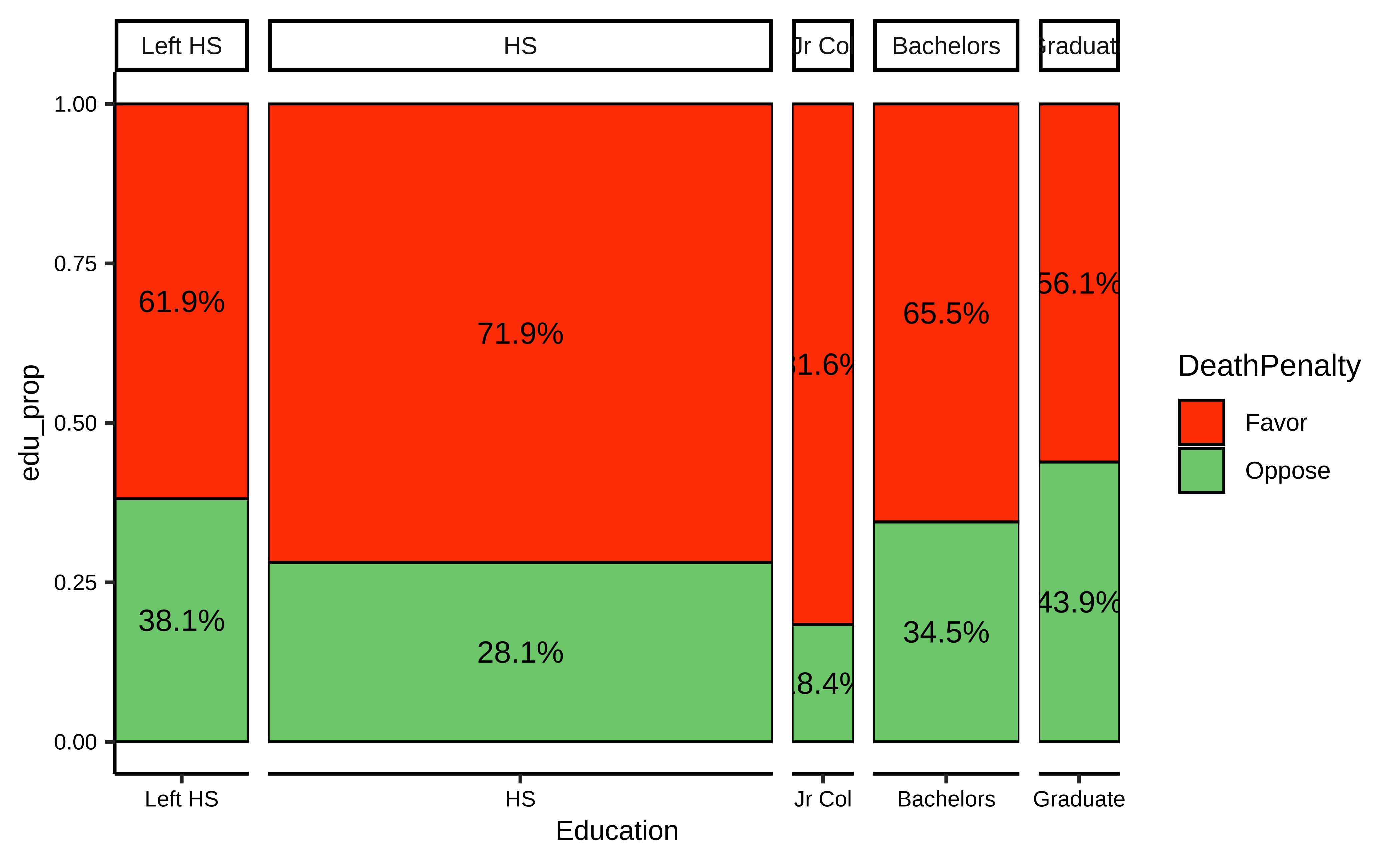
This needs quite some work, to convert the Contingency Table into a mosaic plot; perhaps not the most intuitive of methods either. This code has been developed using this Stackoverflow post.
# Reference
# https://stackoverflow.com/questions/19233365/how-to-create-a-marimekko-mosaic-plot-in-ggplot2

gss_summary <- gss2002 %>%
  dplyr::group_by(Education, DeathPenalty) %>%
  dplyr::summarise(count = n()) %>% # This is good for a chisq test

  # Data is still grouped by `Education`
  # Add two more columns to facilitate mosaic Plot
  # These two columns are quite unusual...
  mutate(
    edu_count = sum(count),
    edu_prop = count / sum(count)
  ) %>%
  ungroup()
gss_summaryEducation <fct> | DeathPenalty <fct> | count <int> | edu_count <int> | edu_prop <dbl> |
|---|---|---|---|---|
| Left HS | Favor | 117 | 189 | 0.6190476 |
| Left HS | Oppose | 72 | 189 | 0.3809524 |
| HS | Favor | 511 | 711 | 0.7187060 |
| HS | Oppose | 200 | 711 | 0.2812940 |
| Jr Col | Favor | 71 | 87 | 0.8160920 |
| Jr Col | Oppose | 16 | 87 | 0.1839080 |
| Bachelors | Favor | 135 | 206 | 0.6553398 |
| Bachelors | Oppose | 71 | 206 | 0.3446602 |
| Graduate | Favor | 64 | 114 | 0.5614035 |
| Graduate | Oppose | 50 | 114 | 0.4385965 |
# This works but is not very intuitive...

gf_col(edu_prop ~ Education,
  data = gss_summary,
  width = ~edu_count, # Not typically used in a column chart
  fill = ~DeathPenalty,
  stat = "identity",
  position = "fill",
  color = "black"
) %>%
  gf_text(edu_prop ~ Education,
    label = ~ scales::percent(edu_prop),
    position = position_stack(vjust = 0.5)
  ) %>%
  gf_facet_grid(~Education,
    scales = "free_x",
    space = "free_x"
  ) %>%
  gf_theme(scale_fill_brewer(palette = "Set1"))
Warning: Ignoring unknown aesthetics: width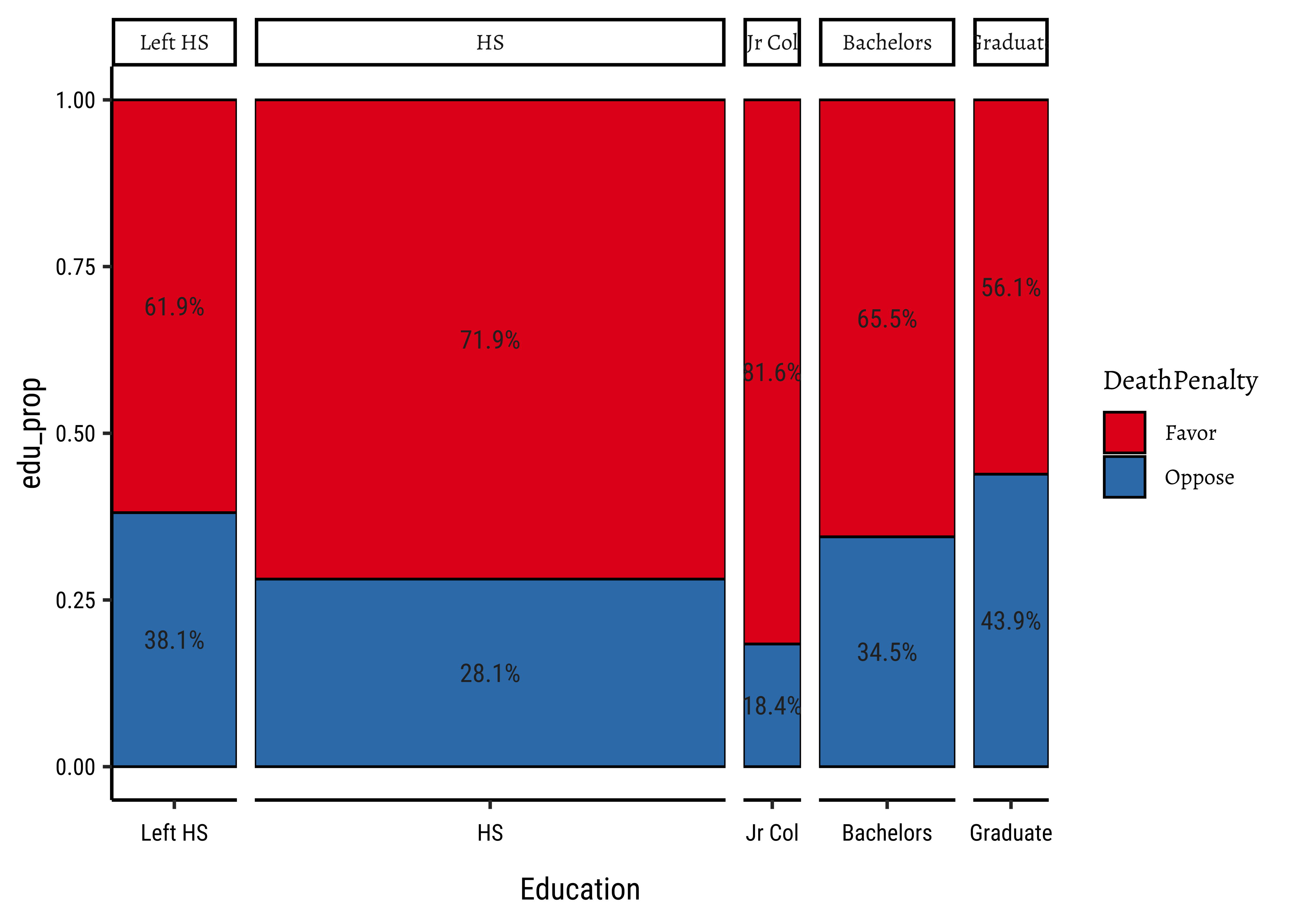
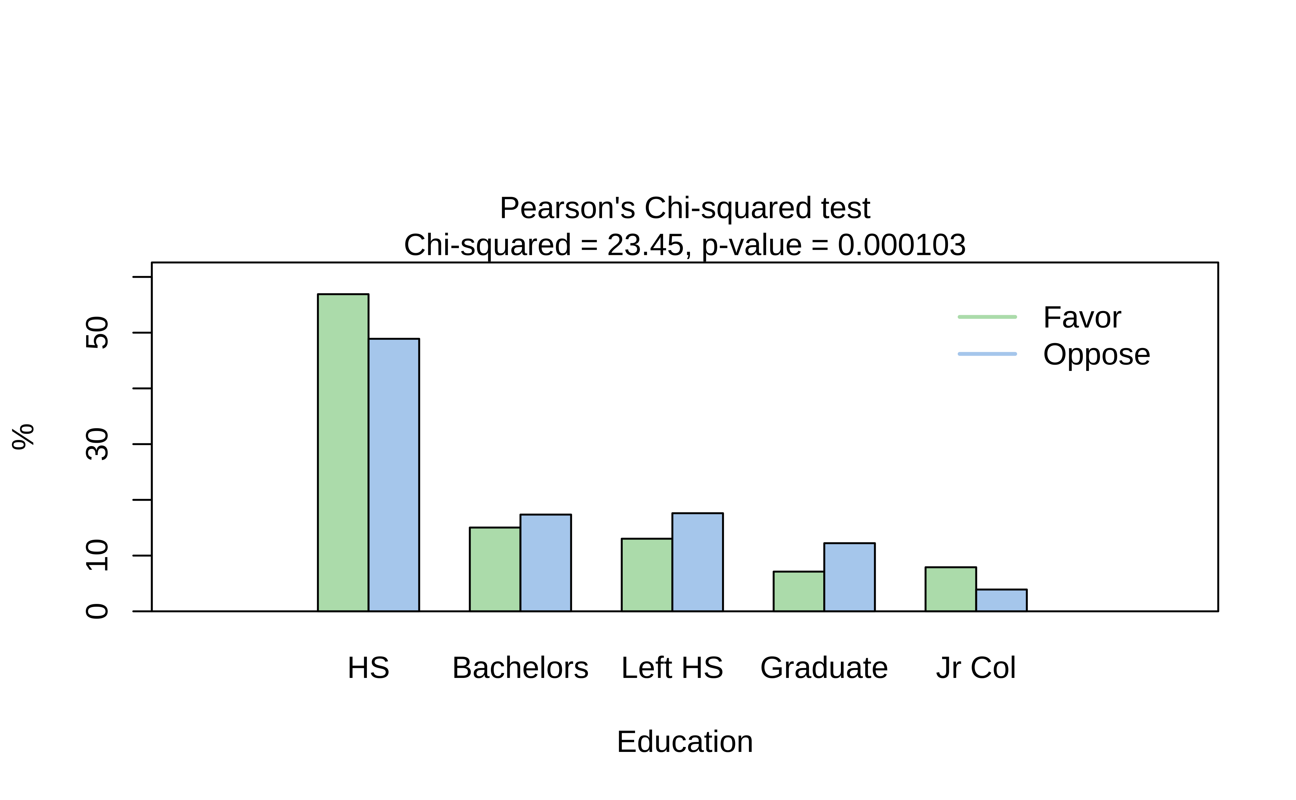
visStatistics is a recent package that allows a very wide variety of statistical charts to be created automagically based on the variables chosen. Let us plot a mosaic chart directly with this package
Coloured Tiles: Actual and Expected Contingency Tables
We notice that the mosaic plots has coloured some tiles blue and some red. Why was this done? Consider the set of mosaic plots below:
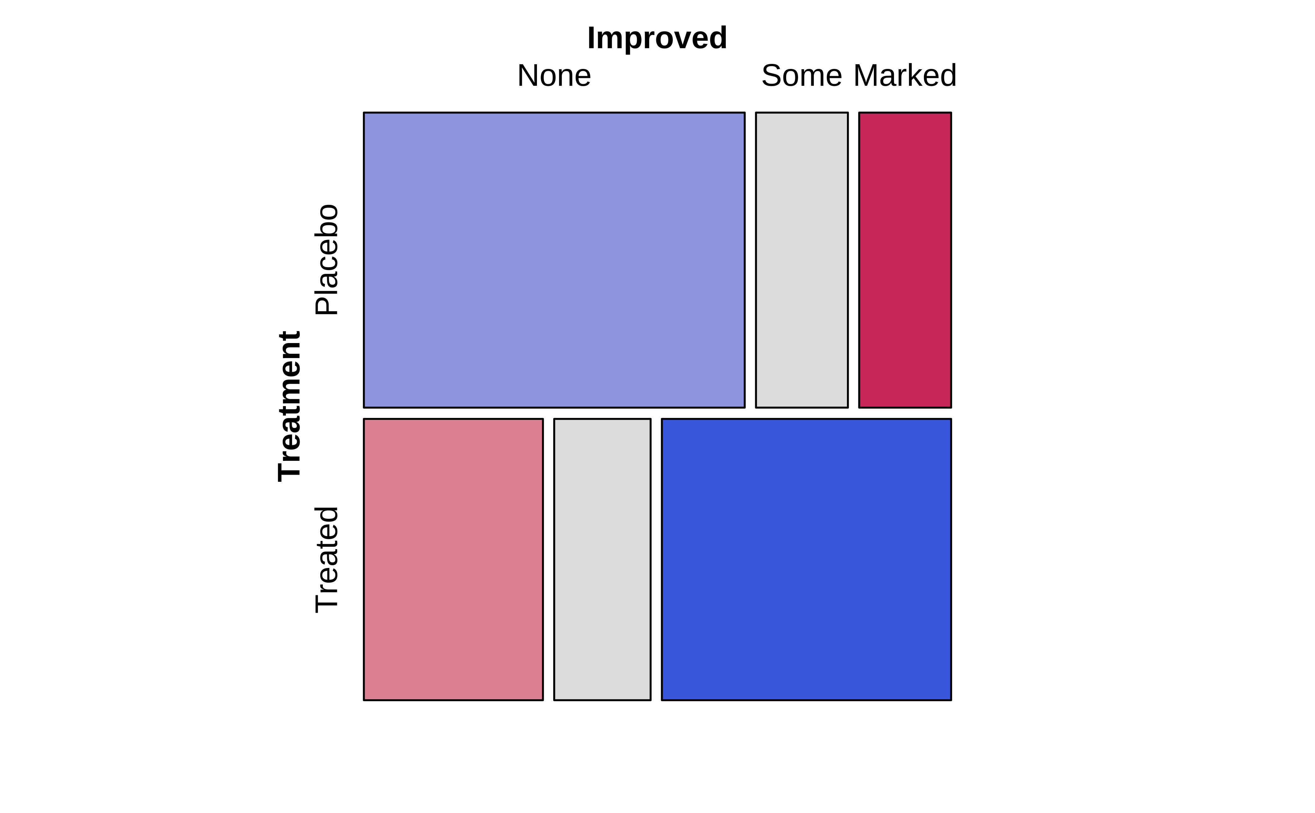
From an inspection of these plots, we see the (tile-wise) difference between situations when Qualitative variables are related to that when they not related.
The graph on the left show the mosaic plot of the actual Contingency Table.
The graph in the middle shows a similar but fictitious plot but with the cuts neatly horizontal or vertical. This mosaic would be what we would expect, if Education and the opinion on Death Penalty were independent!!
Clearly, there are differences in area of the corresponding tiles in the two mosaics, actual and expected, as shown in the graph on the right. Some differences are positive, and some negative. In the actual mosaic, Figure 4, tiles with large positive differences are coloured blue, and those with large negative differences are coloured red.
The higher the absolute values of these differences, the greater the effect of one Qual on the other. More when we get into Inference for Two Proportions.
Banzai!!! That was quite some journey! Let us end it by quickly looking at a sadly famous dataset:
data("titanic", package = "ggmosaic")
titanicClass <fct> | Sex <fct> | Age <fct> | Survived <fct> | |
|---|---|---|---|---|
| 3rd | Male | Child | No | |
| 3rd | Male | Child | No | |
| 3rd | Male | Child | No | |
| 3rd | Male | Child | No | |
| 3rd | Male | Child | No | |
| 3rd | Male | Child | No | |
| 3rd | Male | Child | No | |
| 3rd | Male | Child | No | |
| 3rd | Male | Child | No | |
| 3rd | Male | Child | No |
There were 2201 passengers, as per this dataset.
Quantitative Data
None.
Qualitative Data
-
Survived: (chr) yes or no -
Class: (chr) Class of Travel, else “crew” -
Age: (chr) Adult, Child -
Sex: (chr) Male / Female.
Q.1. What is the dependence of
survived upon sex?
vcd::structable(Survived ~ Sex, data = titanic) %>%
  vcd::mosaic(gp = shading_max)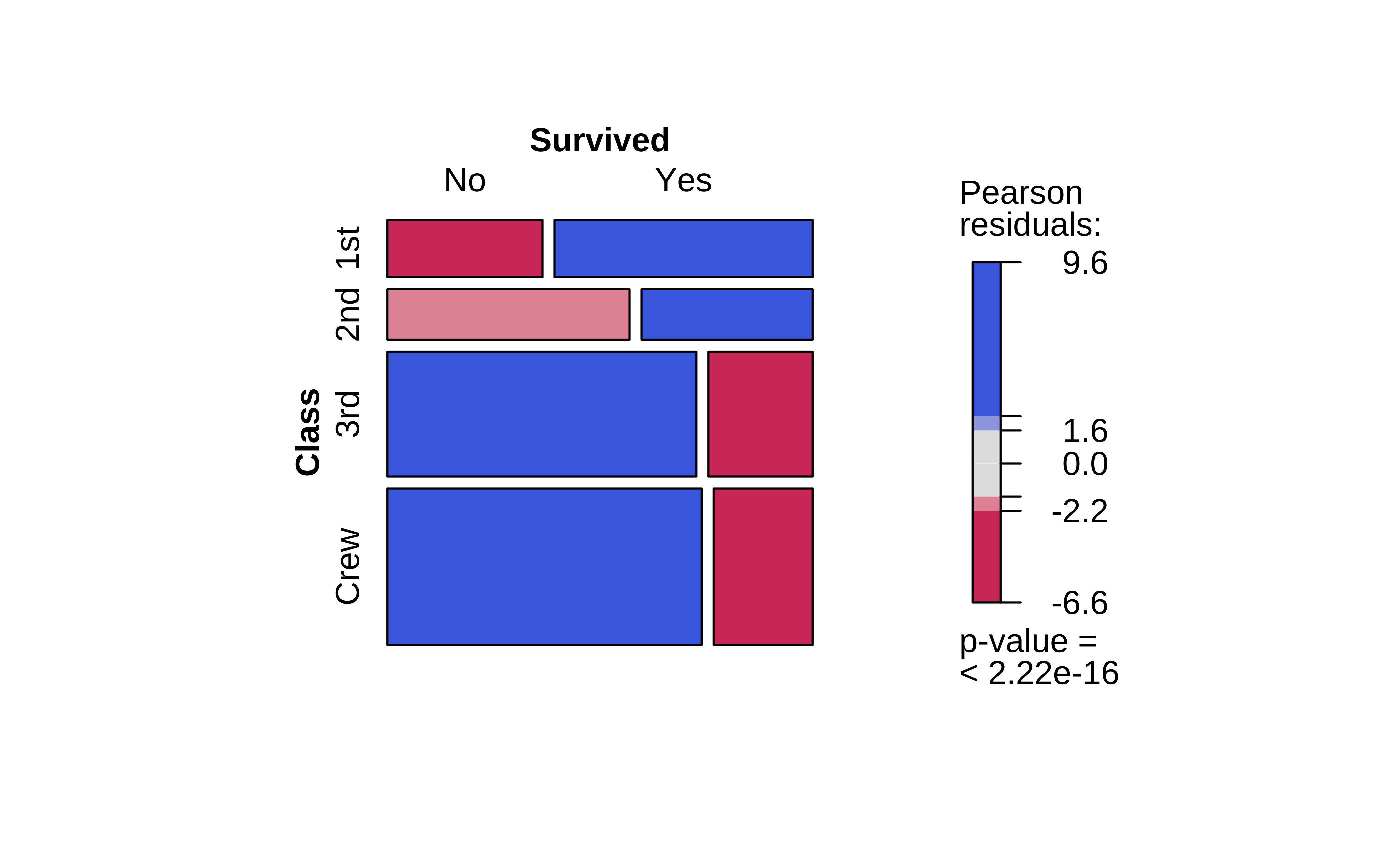
Note the huge imbalance in survived with sex: men have clearly perished in larger numbers than women. Which is why the colouring by the Pearson Residuals show large positive residuals for men who died, and large negative residuals for women who died.
So sadly Jack is far more likely to have died than Rose.
Q.2. How does
Survived depend upon Class?
vcd::structable(Survived ~ Class, data = titanic) %>%
  vcd::mosaic(gp = shading_max)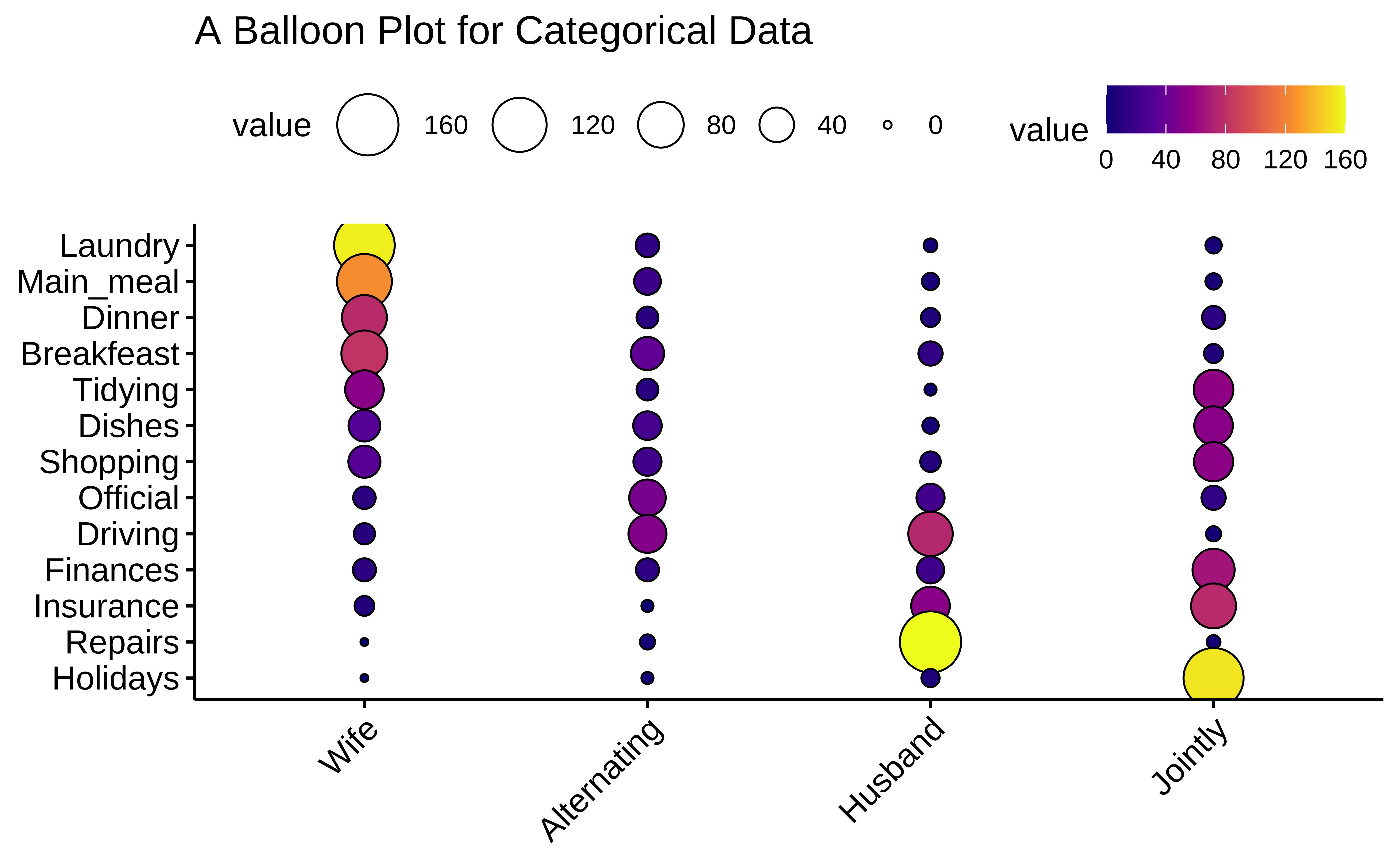
Crew has seen deaths in large numbers, as seen by the large negative residual for crew-survivals. First Class passengers have had speedy access to the boats and have survived in larger proportions than say second or third class. There is a large positive residual for first-class survivals.
Rose travelled first class and Jack was third class. So again the odds are stacked against him.
There is another visualization of Categorical Data, called a Balloon Plot. We will use the housetasks dataset from the package ggpubr.
housetasks <- read.delim(
  system.file("demo-data/housetasks.txt",
    package = "ggpubr"
  ),
  row.names = 1
)
housetasksWife <int> | Alternating <int> | Husband <int> | Jointly <int> | |
|---|---|---|---|---|
| Laundry | 156 | 14 | 2 | 4 |
| Main_meal | 124 | 20 | 5 | 4 |
| Dinner | 77 | 11 | 7 | 13 |
| Breakfeast | 82 | 36 | 15 | 7 |
| Tidying | 53 | 11 | 1 | 57 |
| Dishes | 32 | 24 | 4 | 53 |
| Shopping | 33 | 23 | 9 | 55 |
| Official | 12 | 46 | 23 | 15 |
| Driving | 10 | 51 | 75 | 3 |
| Finances | 13 | 13 | 21 | 66 |
inspect(housetasks)
quantitative variables:
         name   class min Q1 median Q3 max     mean       sd  n missing
1        Wife integer   0 10     32 77 156 46.15385 50.05971 13       0
2 Alternating integer   1 11     14 24  51 19.53846 16.26149 13       0
3     Husband integer   1  5      9 23 160 29.30769 44.97663 13       0
4     Jointly integer   2  4     15 57 153 39.15385 44.09808 13       0
We see that we have 13 observations.
Important
This data is already in Contingency Table form (without the margin totals)!
Quantitative Data
-
Freq: (int) No of times a task was carried out by specific people
Qualitative Data
-
Who: (chr) Who carried out the task? -
Task: (chr) Task? Which task? Can’t you see I’m tired?
ggpubr::ggballoonplot(housetasks,
  fill = "value",
  ggtheme = theme_pubr(base_family = "Alegreya")
) +
  scale_fill_viridis_c(option = "C") +
  labs(title = "A Balloon Plot for Categorical Data")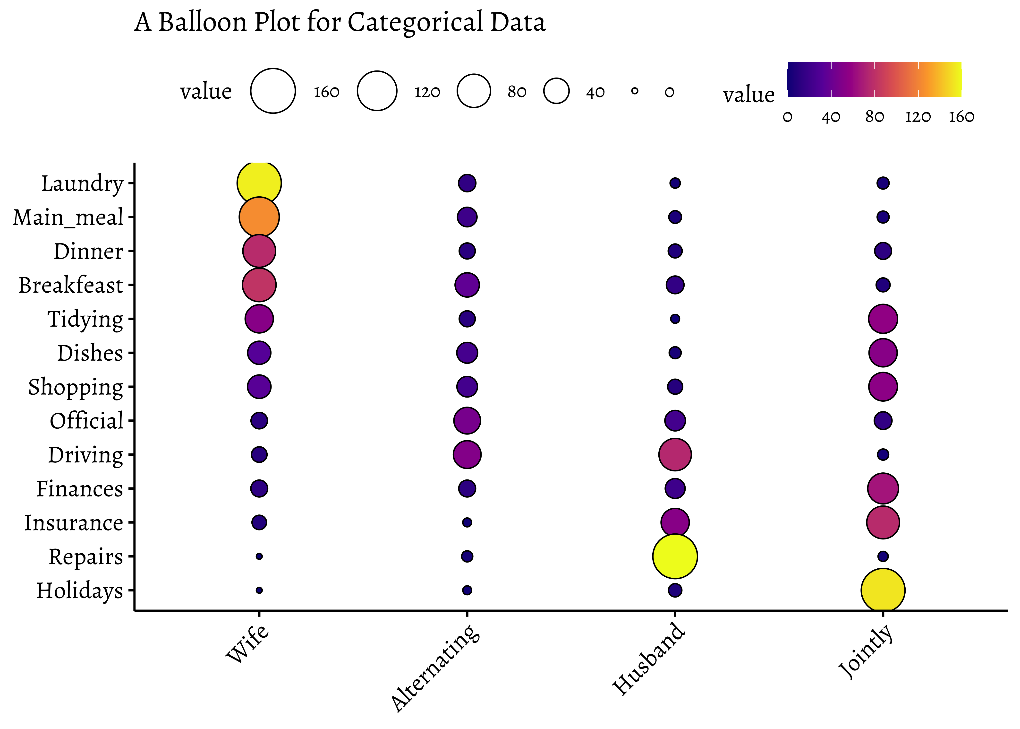
And repeat with the familiar HairEyeColor dataset:
df <- as_tibble(HairEyeColor)
dfHair <chr> | Eye <chr> | Sex <chr> | n <dbl> | |
|---|---|---|---|---|
| Black | Brown | Male | 32 | |
| Brown | Brown | Male | 53 | |
| Red | Brown | Male | 10 | |
| Blond | Brown | Male | 3 | |
| Black | Blue | Male | 11 | |
| Brown | Blue | Male | 50 | |
| Red | Blue | Male | 10 | |
| Blond | Blue | Male | 30 | |
| Black | Hazel | Male | 10 | |
| Brown | Hazel | Male | 25 |
ggballoonplot(df,
  x = "Hair",
  y = "Eye", size = "n",
  fill = "n",
  ggtheme = theme_pubr(base_family = "Alegreya")
) +
  scale_fill_viridis_c(option = "C") +
  labs(title = "Balloon Plot")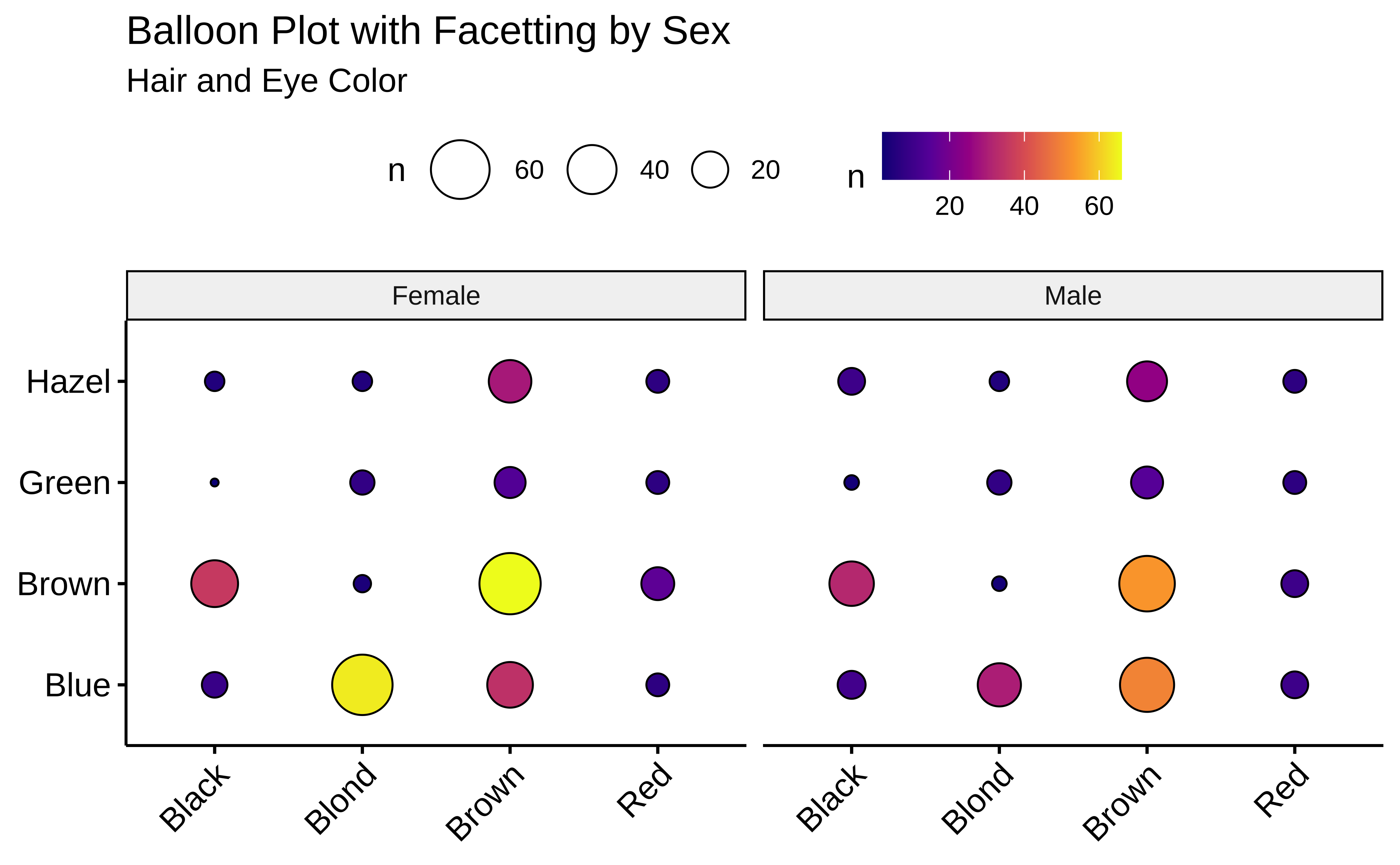
# Balloon Plot with facetting
ggballoonplot(df,
  x = "Hair",
  y = "Eye", size = "n",
  fill = "n",
  facet.by = "Sex",
  ggtheme = theme_pubr(base_family = "Alegreya")
) +
  scale_fill_viridis_c(option = "C") +
  labs(
    title = "Balloon Plot with Facetting by Sex",
    subtitle = "Hair and Eye Color"
  )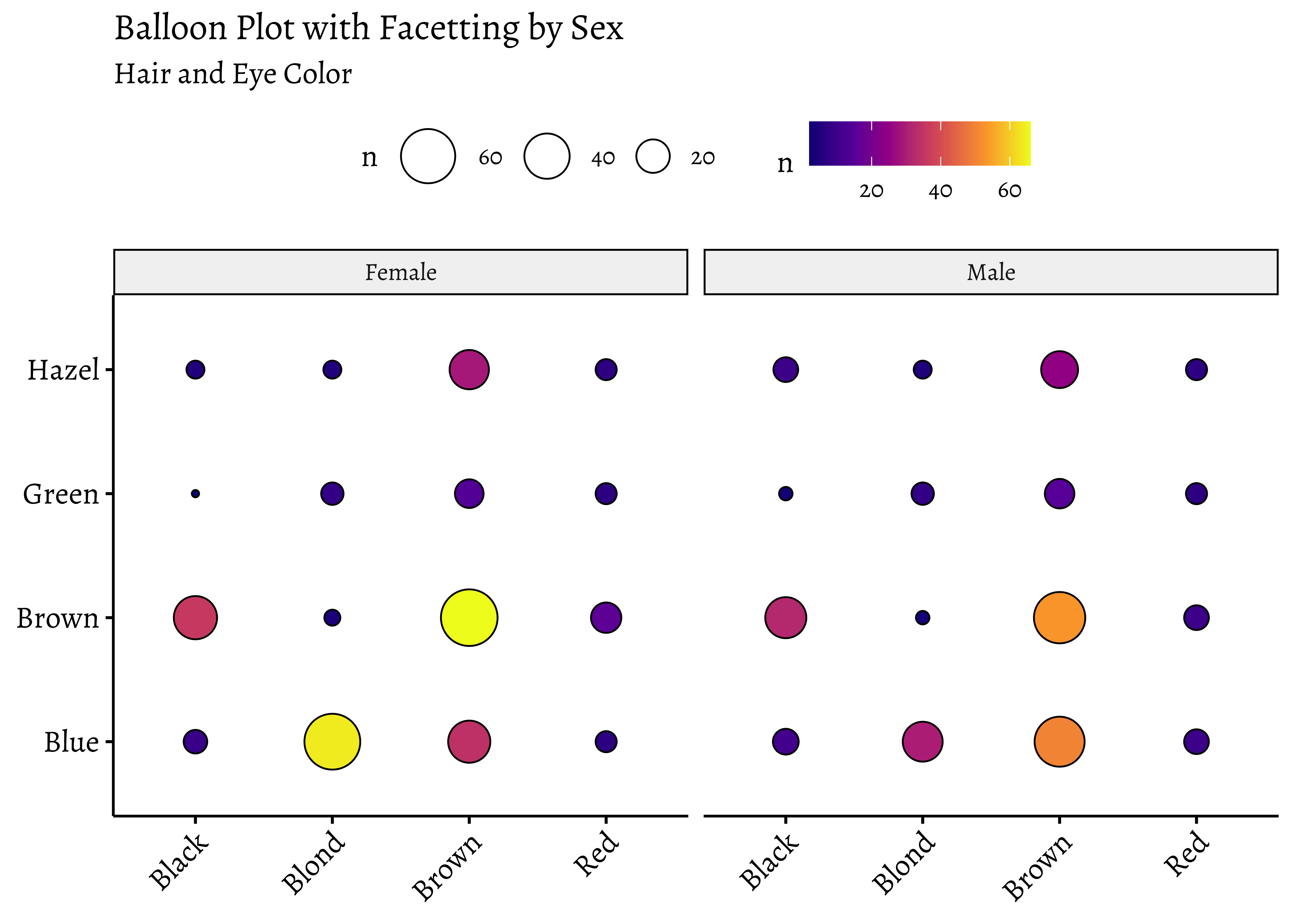
Note the somewhat different syntax with ggballoonplot: the variable names are enclosed in quotes.
Balloon Plots work because they use color and size aesthetics to represent categories and counts respectively.
- We can detect correlation between Quant variables using the scatter plots and regression lines
- And we can detect association between Qual variables using mosaics, sieves (which we did not see here, but is possible in R), and with balloon plots.
- Your project primary research data may be pure Qualitative too, as with a Questionnaire / Survey instrument.
- One such Qual variable therein will be your target variable
- You will need to justify whether the target variable is dependent upon the other Quals, and then to decide what to do about that.
This excerpt from a course on Data Analysis using Metaphors focuses on the importance of understanding and visualizing categorical data. It discusses different ways to represent categorical data in R, including case data, frequency data, and cross-tabular count data. The text also explores various visualization techniques like bar plots, pie charts, mosaic plots, and balloon plots. It emphasizes the use of contingency tables for analyzing relationships between categorical variables, illustrating how to create them and visualize them using R packages. Additionally, the text delves into the concept of Pearson residuals, which help to identify associations between categorical variables and highlight deviations from independence.
How are the bar plots for categorical data different from histograms? Why don’t “regular” scatter plots simply work for Categorical data? Discuss!
There are quite a few things we can do with Qualitative/Categorical data:
- Make simple bar charts with colours and facetting
- Make Contingency Tables for a
- Make Mosaic Plots to show how the categories stack up
- Make Balloon Charts as an alternative
- Then, draw your inferences and tell the story!
Take some of the categorical datasets from the
vcdandvcdExtrapackages and recreate the plots from this module. Go to https://vincentarelbundock.github.io/Rdatasets/articles/data.html and type “vcd” in thesearchbox. You can directly load CSV files from there, usingread_csv("url-to-csv").Try the
housetasksdataset that we used for Balloon Plots, to create a mosaic plot with Pearson Residuals.
Are first names a basis for racial discrimination, in the US?
This dataset was generated as part of a landmark research study done by Marianne Bertrand and Senthil Mullainathan. Read the description therein to really understand how you can prove causality with a well-crafted research experiment.
This module focuses on the importance of understanding and visualizing categorical data. It discusses different ways to represent categorical data in R, including case data, frequency data, and cross-tabular count data. The text also explores various visualization techniques like bar plots, pie charts, mosaic plots, and balloon plots. It emphasizes the use of contingency tables for analyzing relationships between categorical variables, illustrating how to create them and visualize them using R packages. Additionally, the text delves into the concept of Pearson residuals, which help to identify associations between categorical variables and highlight deviations from independence.
- Winston Chang (2024). R Graphics Cookbook. https://r-graphics.org
- Nice Chi-square interactive story at https://statisticalstories.xyz/chi-square
- Chittaranjan Andrade(July 22, 2015). Understanding Relative Risk, Odds Ratio, and Related Terms: As Simple as It Can Get. https://www.psychiatrist.com/jcp/understanding-relative-risk-odds-ratio-related-terms/
- Mine Cetinkaya-Rundel and Johanna Hardin. An Introduction to Modern Statistics, Chapter 4. https://openintro-ims.netlify.app/explore-categorical.html
- Using the
strcplotcommand fromvcd, https://cran.r-project.org/web/packages/vcd/vignettes/strucplot.pdf
- Creating Frequency Tables with
vcd, https://cran.r-project.org/web/packages/vcdExtra/vignettes/A_creating.html
- Creating mosaic plots with
vcd, https://cran.r-project.org/web/packages/vcdExtra/vignettes/D_mosaics.html
- Michael Friendly, Corrgrams: Exploratory displays for correlation matrices. The American Statistician August 19, 2002 (v1.5). https://www.datavis.ca/papers/corrgram.pdf
-
Visualizing Categorical Data in R
- H. Riedwyl & M. Schüpbach (1994), Parquet diagram to plot contingency tables. In F. Faulbaum (ed.), Softstat ’93: Advances in Statistical Software, 293–299. Gustav Fischer, New York.
| Package | Version | Citation |
|---|---|---|
| ggmosaic | 0.3.3 | Jeppson, Hofmann, and Cook (2021) |
| ggpubr | 0.6.1 | Kassambara (2025) |
| tidyplots | 0.3.1 | Engler (2025) |
| tinyplot | 0.4.1 | McDermott, Arel-Bundock, and Zeileis (2025) |
| tinytable | 0.10.0 | Arel-Bundock (2025) |
| vcd | 1.4.13 | Meyer, Zeileis, and Hornik (2006); Zeileis, Meyer, and Hornik (2007); Meyer et al. (2024) |
| vcdExtra | 0.8.5 | Friendly (2023) |
| visStatistics | 0.1.7 | Schilling (2025) |
Arel-Bundock, Vincent. 2025. tinytable: Simple and Configurable Tables in “HTML,” “LaTeX,” “Markdown,” “Word,” “PNG,” “PDF,” and “Typst” Formats. https://doi.org/10.32614/CRAN.package.tinytable.
Engler, Jan Broder. 2025. “Tidyplots Empowers Life Scientists with Easy Code-Based Data Visualization.” iMeta, e70018. https://doi.org/10.1002/imt2.70018.
Friendly, Michael. 2023. vcdExtra: “vcd” Extensions and Additions. https://doi.org/10.32614/CRAN.package.vcdExtra.
Jeppson, Haley, Heike Hofmann, and Di Cook. 2021. ggmosaic: Mosaic Plots in the “ggplot2” Framework. https://doi.org/10.32614/CRAN.package.ggmosaic.
Kassambara, Alboukadel. 2025. ggpubr: “ggplot2” Based Publication Ready Plots. https://doi.org/10.32614/CRAN.package.ggpubr.
McDermott, Grant, Vincent Arel-Bundock, and Achim Zeileis. 2025. tinyplot: Lightweight Extension of the Base r Graphics System. https://doi.org/10.32614/CRAN.package.tinyplot.
Meyer, David, Achim Zeileis, and Kurt Hornik. 2006. “The Strucplot Framework: Visualizing Multi-Way Contingency Tables with Vcd.” Journal of Statistical Software 17 (3): 1–48. https://doi.org/10.18637/jss.v017.i03.
Meyer, David, Achim Zeileis, Kurt Hornik, and Michael Friendly. 2024. vcd: Visualizing Categorical Data. https://doi.org/10.32614/CRAN.package.vcd.
Schilling, Sabine. 2025. visStatistics: Automated Selection and Visualisation of Statistical Hypothesis Tests. https://doi.org/10.32614/CRAN.package.visStatistics.
Zeileis, Achim, David Meyer, and Kurt Hornik. 2007. “Residual-Based Shadings for Visualizing (Conditional) Independence.” Journal of Computational and Graphical Statistics 16 (3): 507–25. https://doi.org/10.1198/106186007X237856.
Footnotes
Citation
BibTeX citation:
@online{v.2022,
  author = {V., Arvind},
  title = {\textless Iconify-Icon
    Icon=“icon-Park-Outline:proportional-Scaling”\textgreater\textless/Iconify-Icon\textgreater{}
    {Proportions}},
  date = {2022-12-27},
  url = {https://av-quarto.netlify.app/content/courses/Analytics/Descriptive/Modules/40-CatData/},
  langid = {en},
  abstract = {Types, Categories, and Counts}
}
For attribution, please cite this work as:
V., Arvind. 2022. “<Iconify-Icon
Icon=‘icon-Park-Outline:proportional-Scaling’></Iconify-Icon>
Proportions.” December 27, 2022. https://av-quarto.netlify.app/content/courses/Analytics/Descriptive/Modules/40-CatData/.