library(ggstream)
library(ggformula)
# remotes::install_github("corybrunson/ggalluvial@main", build_vignettes = TRUE)
library(ggalluvial)
library(ggsankeyfier)
# install.packages("devtools")
# devtools::install_github("davidsjoberg/ggsankey")
library(ggsankey)
library(networkD3)
library(echarts4r) # Interactive graphs

##
library(tidyplots) # Easily Produced Publication-Ready Plots
library(tinyplot) # Plots with Base R
library(tinytable) # Elegant Tables for our data

library(tidyverse)
Line and Area Plots
Dumbbell Plots
Parallel Set Plots
Alluvial Plots
Sankey Diagrams
Chord Diagrams
Bump Charts
Abstract
Changes in Information over Space and Time
Slides and Tutorials
| R Tutorial |
“My stories run up and bite me in the leg – I respond by writing them down – everything that goes on during the bite. When I finish, the idea lets go and runs off.”
— Ray Bradbury, science-fiction writer (22 Aug 1920-2012)
Plot Fonts and Theme
Show the Code
library(systemfonts)
library(showtext)
## Clean the slate
systemfonts::clear_local_fonts()
systemfonts::clear_registry()
##
showtext_opts(dpi = 96) # set DPI for showtext
sysfonts::font_add(
  family = "Alegreya",
  regular = "../../../../../../fonts/Alegreya-Regular.ttf",
  bold = "../../../../../../fonts/Alegreya-Bold.ttf",
  italic = "../../../../../../fonts/Alegreya-Italic.ttf",
  bolditalic = "../../../../../../fonts/Alegreya-BoldItalic.ttf"
)
Error in check_font_path(bold, "bold"): font file not found for 'bold' typeShow the Code
sysfonts::font_add(
  family = "Roboto Condensed",
  regular = "../../../../../../fonts/RobotoCondensed-Regular.ttf",
  bold = "../../../../../../fonts/RobotoCondensed-Bold.ttf",
  italic = "../../../../../../fonts/RobotoCondensed-Italic.ttf",
  bolditalic = "../../../../../../fonts/RobotoCondensed-BoldItalic.ttf"
)
showtext_auto(enable = TRUE) # enable showtext
##
theme_custom <- function() {
  font <- "Alegreya" # assign font family up front

  theme_classic(base_size = 14, base_family = font) %+replace% # replace elements we want to change

    theme(
      text = element_text(family = font), # set base font family

      # text elements
      plot.title = element_text( # title
        family = font, # set font family
        size = 24, # set font size
        face = "bold", # bold typeface
        hjust = 0, # left align
        margin = margin(t = 5, r = 0, b = 5, l = 0)
      ), # margin
      plot.title.position = "plot",
      plot.subtitle = element_text( # subtitle
        family = font, # font family
        size = 14, # font size
        hjust = 0, # left align
        margin = margin(t = 5, r = 0, b = 10, l = 0)
      ), # margin

      plot.caption = element_text( # caption
        family = font, # font family
        size = 9, # font size
        hjust = 1
      ), # right align

      plot.caption.position = "plot", # right align

      axis.title = element_text( # axis titles
        family = "Roboto Condensed", # font family
        size = 12
      ), # font size

      axis.text = element_text( # axis text
        family = "Roboto Condensed", # font family
        size = 9
      ), # font size

      axis.text.x = element_text( # margin for axis text
        margin = margin(5, b = 10)
      )

      # since the legend often requires manual tweaking
      # based on plot content, don't define it here
    )
}
Show the Code
```{r}
#| cache: false
#| code-fold: true
## Set the theme
theme_set(new = theme_custom())

## Use available fonts in ggplot text geoms too!
update_geom_defaults(geom = "text", new = list(
  family = "Roboto Condensed",
  face = "plain",
  size = 3.5,
  color = "#2b2b2b"
))
```
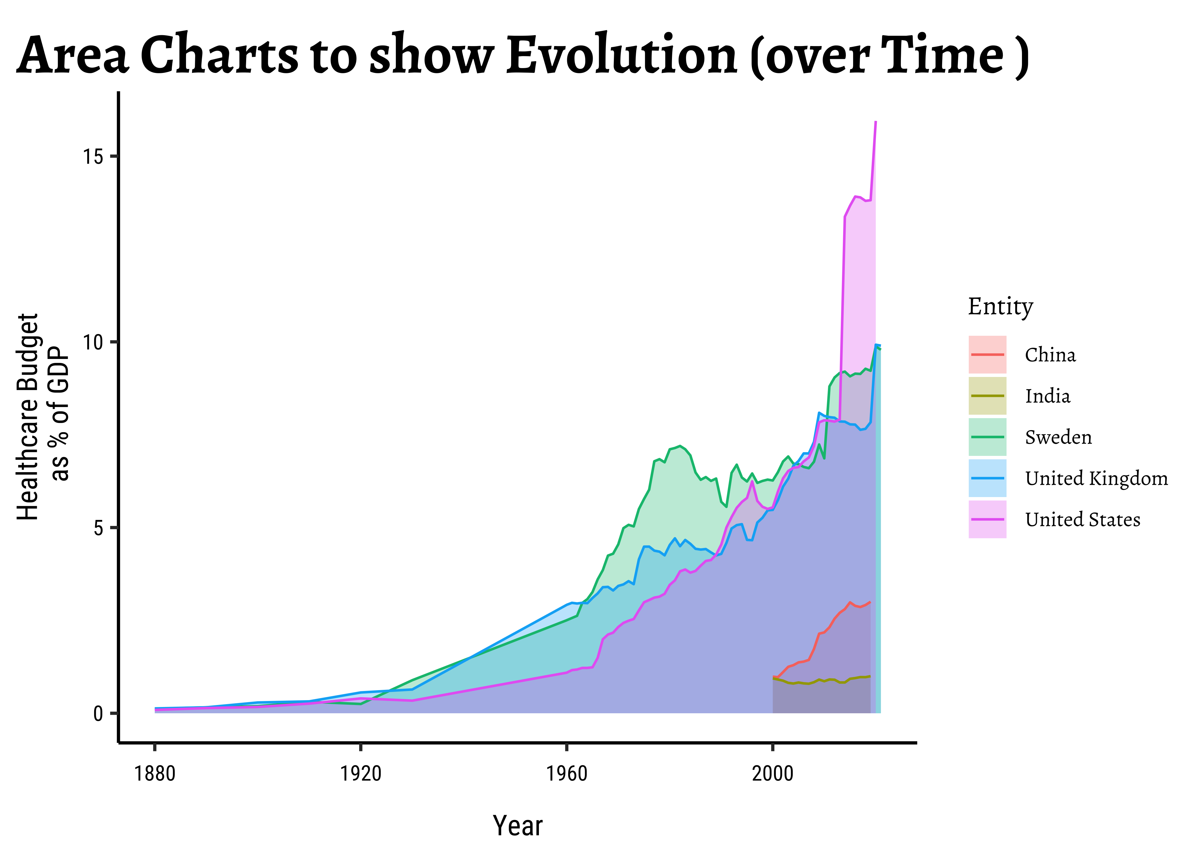
In these cases, the x-axis is typically time…and we chart the variable of another Quant variable with respect to time, using a line geometry.
Let is take a healthcare budget dataset from Our World in Data: We will plot graphs for 5 countries (India, China, Brazil, Russia, Canada ).
And Introducting
echarts4r
We will also build interactive versions of these charts using echarts4r!
Download this data by clicking on the button below:
gf_point(
  data = health_filtered,
  public_health_expenditure_pc_gdp ~ Year,
  colour = ~Entity,
  ylab = "Healthcare Budget\n as % of GDP",
  title = "Line Charts to show Evolution (over Time )"
) %>%
  gf_line()
###
gf_area(
  data = health_filtered,
  public_health_expenditure_pc_gdp ~ Year,
  fill = ~Entity, alpha = 0.3,
  ylab = "Healthcare Budget\n as % of GDP",
  title = "Area Charts to show Evolution (over Time )"
) %>%
  gf_line(colour = ~Entity)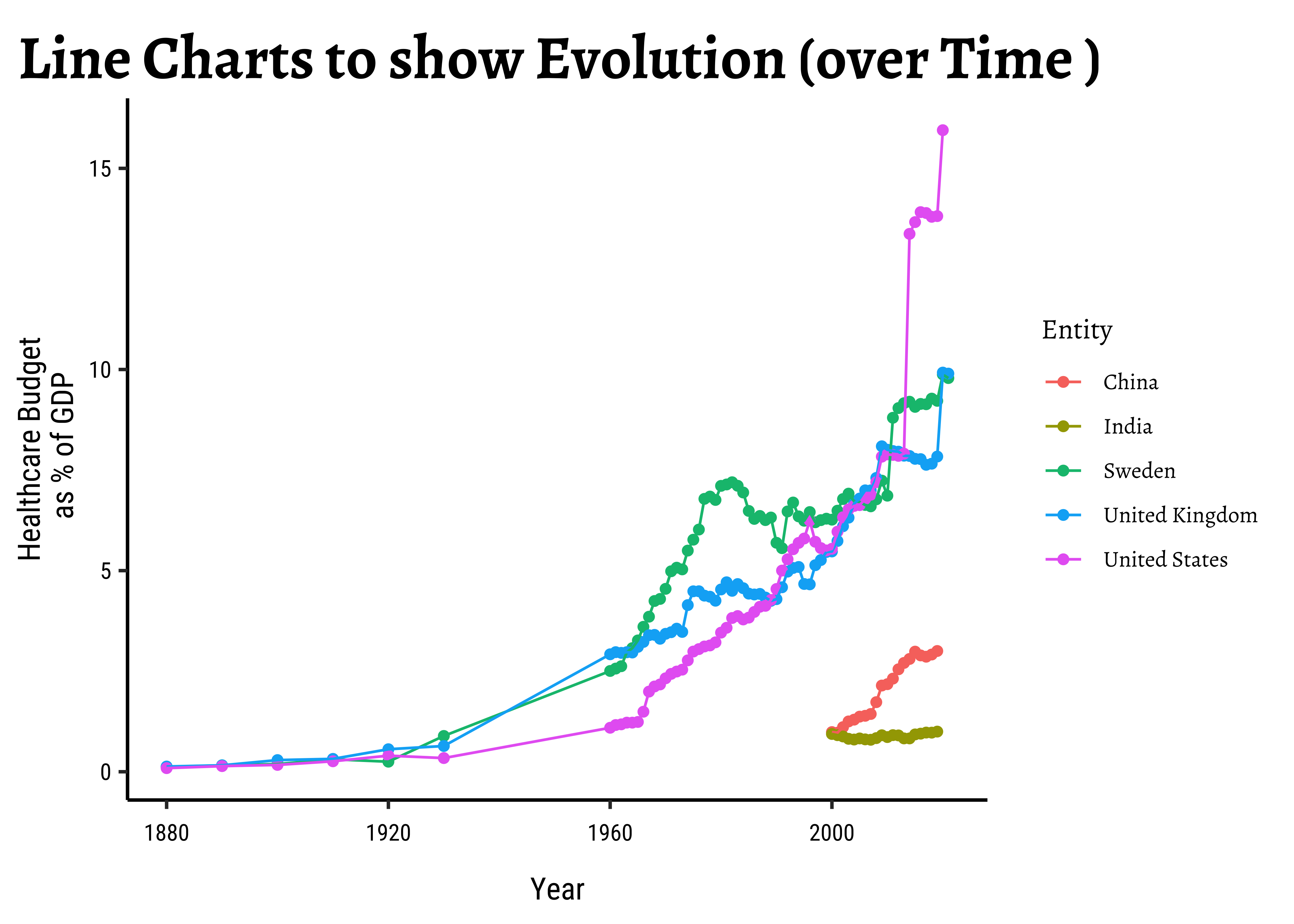
health_filtered %>%
  group_by(Entity) %>%
  e_charts(Year) %>%
  e_scatter(public_health_expenditure_pc_gdp) %>%
  e_line(public_health_expenditure_pc_gdp) %>%
  e_x_axis(name = "Year", min = 1850, max = 2050) %>%
  e_y_axis(
    name = "Public Health Expenditure",
    nameLocation = "middle", nameGap = 25
  ) %>%
  e_tooltip()
###
health_filtered %>%
  group_by(Entity) %>%
  e_charts(Year) %>%
  e_scatter(public_health_expenditure_pc_gdp) %>%
  e_area(public_health_expenditure_pc_gdp) %>%
  e_x_axis(name = "Year", min = 1850, max = 2050) %>%
  e_y_axis(
    name = "Public Health Expenditure",
    nameLocation = "middle", nameGap = 25
  ) %>%
  e_tooltip()
Here, the space can be any Qual variable, and we can chart another Quant or Qual variable move across levels of the first chosen Qual variable.
For instance we can contemplate enrollment at a University, and show how students move from course to course in a University. Or how customers drift from one category of products or brands to another….or the movement of cricket players from one IPL Team to another !!
Here is what Thomas Lin Pedersen says:
A parallel sets diagram is a type of visualisation showing the interaction between multiple categorical variables. If the variables have an intrinsic order the representation can be thought of as a Sankey Diagram. If each variable is a point in time it will resemble an Alluvial diagram.

- The Qualitative variables being connected are mapped to
stages/axes - Each level within a Qual variable is mapped to
nodes / strata / lodes; - And the connections between the
strataof theaxesare calledflows / edges / links / alluvia.
Such diagrams are best used when you want to show a many-to-many mapping between two domains or multiple paths through a set of stages E.g Students pursruing different degrees going through multiple courses with multiple departments during a semester of study. Here students, degrees, courses, departments would be some variables we would plot and we would visualize the number of students moving across courses and deparments based on their degree etc.
Here is an example of a Sankey Diagram: This diagram show how energy is converted or transmitted before being consumed or lost: supplies are on the left, and demands are on the right. (Data: Department of Energy & Climate Change via Tom Counsell)1:
Switching to ggplot here
For the next few charts, there are (as yet) no equivalents in ggformula. Hence we will use ggplot.
Class <chr> | Sex <chr> | Age <chr> | Survived <chr> | n <dbl> |
|---|---|---|---|---|
| 1st | Male | Child | No | 0 |
| 2nd | Male | Child | No | 0 |
| 3rd | Male | Child | No | 35 |
| Crew | Male | Child | No | 0 |
| 1st | Female | Child | No | 0 |
| 2nd | Female | Child | No | 0 |
| 3rd | Female | Child | No | 17 |
| Crew | Female | Child | No | 0 |
| 1st | Male | Adult | No | 118 |
| 2nd | Male | Adult | No | 154 |
Table Form Data
Note that this data is in tidy wide / table form, with separate columns for each Qualitative variable and a separate count column, which we saw when we examined Categorical Data. This is, in my opinion, intuitively the best form of data to plot a Sankey plot with. Each variable gives us “one part in the flow”. But there are other forms such as the tidy long form which we have been using practically all this while. You will find examples of on the ggalluvial website using tidy long form data. https://corybrunson.github.io/ggalluvial/
##
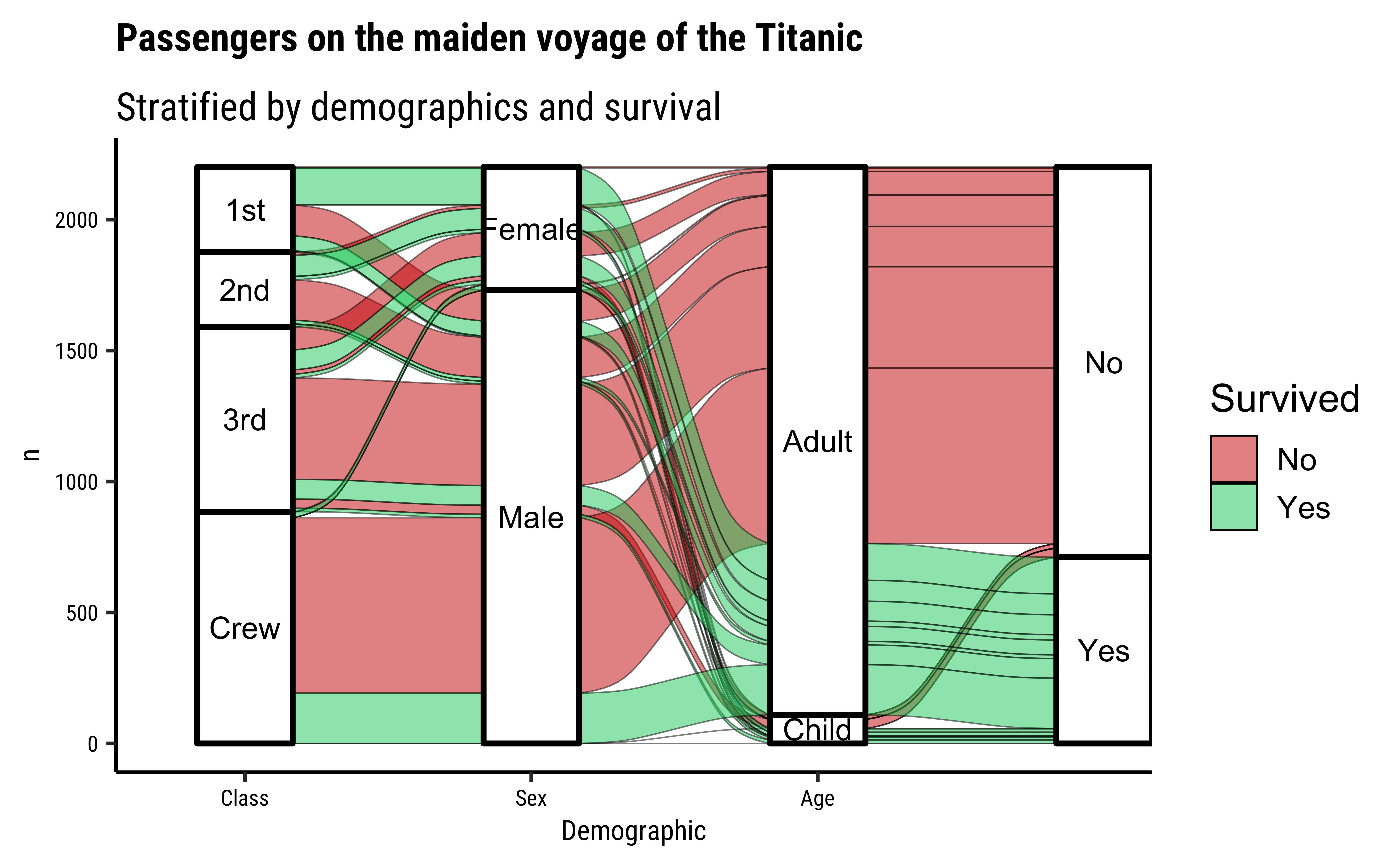
Titanic %>% ggplot(
data = .,
# Select the Categorical Variables for the vertical Axes / Stages
aes(
axis1 = Class,
axis2 = Sex,
axis3 = Age,
axis4 = Survived,
y = n
), fill = "white"
) +
# Alluvials between Categorical Axes
geom_alluvium(aes(fill = Survived),
colour = "black",
linewidth = 0.25
) +
# Vertical segments for each Categorical Variable2
geom_stratum(
colour = "black",
linewidth = 1,
fill = "white"
) +
# Labels for each "level" of the Categorical Axes
geom_text(
stat = "stratum", size = 3,
aes(label = after_stat(stratum))
) +
# Scales and Colours
scale_x_discrete(
limits = c("Class", "Sex", "Age", "Survived"),
expand = c(0.1, 0.1)
) +
scale_fill_brewer(palette = "Set1") +
xlab("Demographic") +
ggtitle(
"Passengers on the maiden voyage of the Titanic",
"Stratified by demographics and survival"
)
Here is how the package
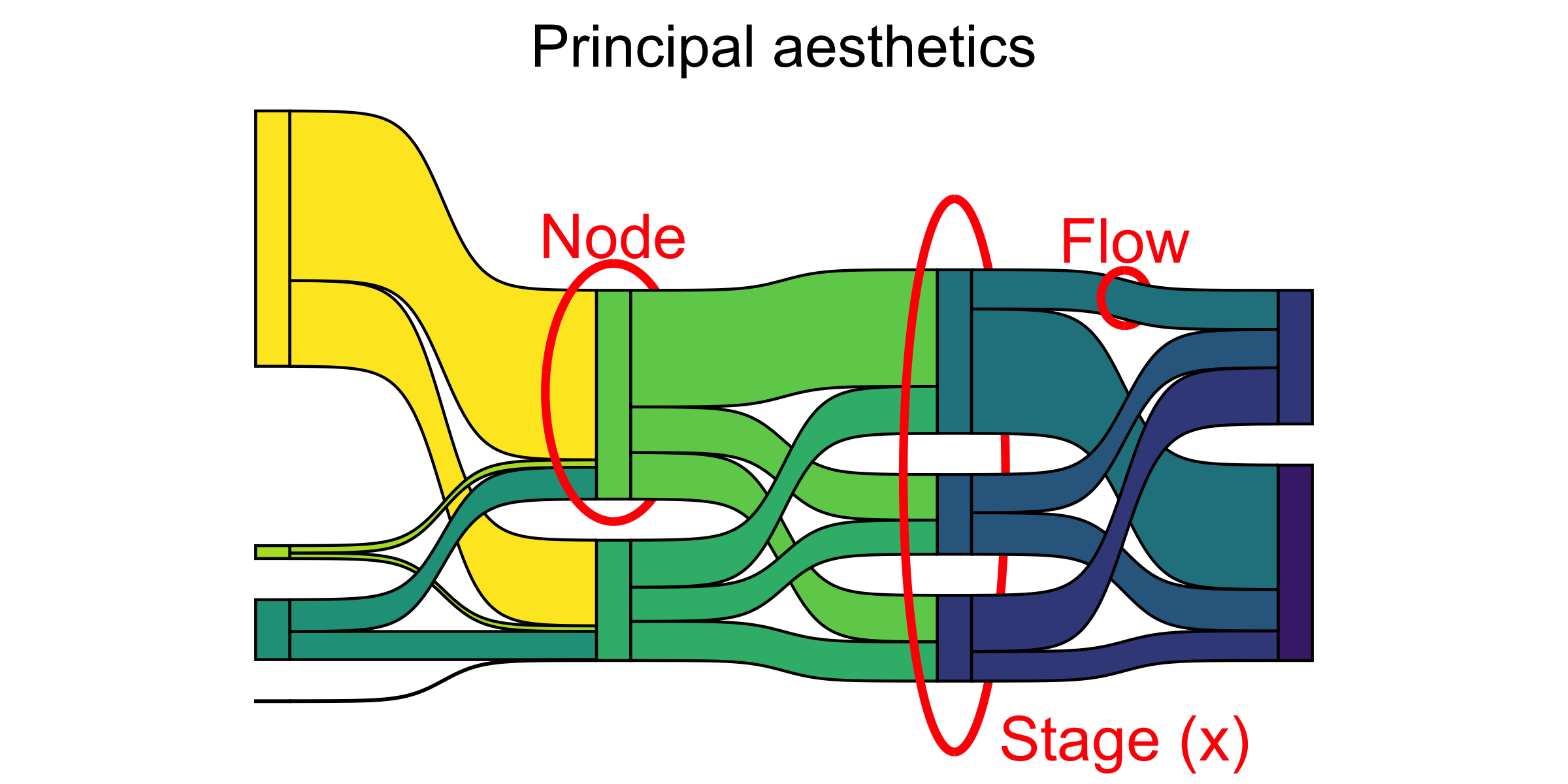
ggalluvialdefines the elements of a typical alluvial plot:
- An axis is a dimension (variable) along which the data are vertically arranged at a fixed horizontal position. The plot above uses three categorical axes: Class, Sex, and Age.
- The groups at each axis are depicted as opaque blocks called strata. For example, the Class axis contains four strata: 1st, 2nd, 3rd, and Crew.
- Horizontal (x-) splines called alluvia span the entire width of the plot. In this plot, each alluvium corresponds to a fixed strata value of each axis variable, indicated by its vertical position at the axis, as well as of the Survived variable, indicated by its fill color.
- The segments of the alluvia between pairs of adjacent axes are flows.
- The alluvia intersect the strata at lodes. The lodes are not visualized in the above plot, but they can be inferred as filled rectangles extending the flows through the strata at each end of the plot or connecting the flows on either side of the center stratum.
The ggsankeyfier also plots alluvial and sankey diagrams. This package takes data in long-form. See this article.. ggsankeyfier has builtin commands to convert data from wide to long:
Titanic %>%
  as_tibble() %>%
  ggsankeyfier::pivot_stages_longer(
    data = .,
    stages_from = c("Class", "Sex", "Age", "Survived"),
    values_from = "n",
    additional_aes_from = "Survived"
  ) -> Titanic_long
Titanic_longSurvived <fct> | n <dbl> | edge_id <int> | connector <chr> | node <fct> | stage <fct> |
|---|---|---|---|---|---|
| No | 118 | 1 | from | 1st | Class |
| No | 118 | 1 | to | Male | Sex |
| Yes | 62 | 2 | from | 1st | Class |
| Yes | 62 | 2 | to | Male | Sex |
| No | 4 | 3 | from | 1st | Class |
| No | 4 | 3 | to | Female | Sex |
| Yes | 141 | 4 | from | 1st | Class |
| Yes | 141 | 4 | to | Female | Sex |
| No | 154 | 5 | from | 2nd | Class |
| No | 154 | 5 | to | Male | Sex |
This data is in long form, with stages defining the axes in the graph, and the node variable giving us levels within each (Qualitative) axis. The edge_id labels both ends (from and to) of each connector or edge/flow/alluvium.
Let us plot this now:
Titanic_long %>%
  ggplot(aes(
    x = stage, y = n,
    group = node, connector = connector,
    edge_id = edge_id
  )) +
  geom_sankeynode(v_space = "auto") +
  geom_sankeyedge(aes(fill = Survived), v_space = "auto") +
  scale_fill_brewer(palette = "Set1") +
  labs(x = "", title = "Titanic Survival")
Let us make an interactive graph for this dataset using echarts4.
ClassSex <-
  Titanic %>%
  group_by(Class, Sex) %>%
  summarise(cs = sum(n)) %>%
  ungroup() %>%
  rename("source" = Class, "target" = Sex, "value" = cs)

SexAge <-
  Titanic %>%
  group_by(Sex, Age) %>%
  summarise(sa = sum(n)) %>%
  ungroup() %>%
  rename("source" = Sex, "target" = Age, "value" = sa)

AgeSurvived <-
  Titanic %>%
  group_by(Age, Survived) %>%
  summarise(as = sum(n)) %>%
  ungroup() %>%
  rename("source" = Age, "target" = Survived, "value" = as)

Combo <- rbind(ClassSex, SexAge, AgeSurvived)
Combosource <chr> | target <chr> | value <dbl> | ||
|---|---|---|---|---|
| 1st | Female | 145 | ||
| 1st | Male | 180 | ||
| 2nd | Female | 106 | ||
| 2nd | Male | 179 | ||
| 3rd | Female | 196 | ||
| 3rd | Male | 510 | ||
| Crew | Female | 23 | ||
| Crew | Male | 862 | ||
| Female | Adult | 425 | ||
| Female | Child | 45 |
Combo %>%
  e_charts() %>%
  e_sankey(source, target, value) %>%
  e_title("Titanic: Who lived, and who didn't?") %>%
  e_tooltip()
The process with echarts4r is quite different, since the data structure used by this package is different:
- The
echarts4rpackage needs to havesourceandtargetcolumns for axes, along with avalueto determine the width of the alluvium. - The names in the source and target can repeat, and can appear in both source and target columns in order to create a multi-axis diagram. Hence the data needs to be inherently in long form.
- However, for the values, we need to manually calculate the aggregate totals for alluvia between each consecutive pairs of axes (i.e Qual variables). This is not done automatically in
echarts4r, but it is withggalluvial. - So we create grouped aggregate summaries for each pair of Qualitative variables that we wish to plot consecutively ( i.e as axis1, axis2…)
- Stack these pair-wise alluvia totals into one combo data frame using
rbind(), after renaming the variables to “source”, “target” and “value”.
Phew! seems like too much work to do…I wonder if good, old-fashioned pivot-longer will get us here…
We will explore this diagram when we explore network graphs with the tidygraph and ggraph packages.
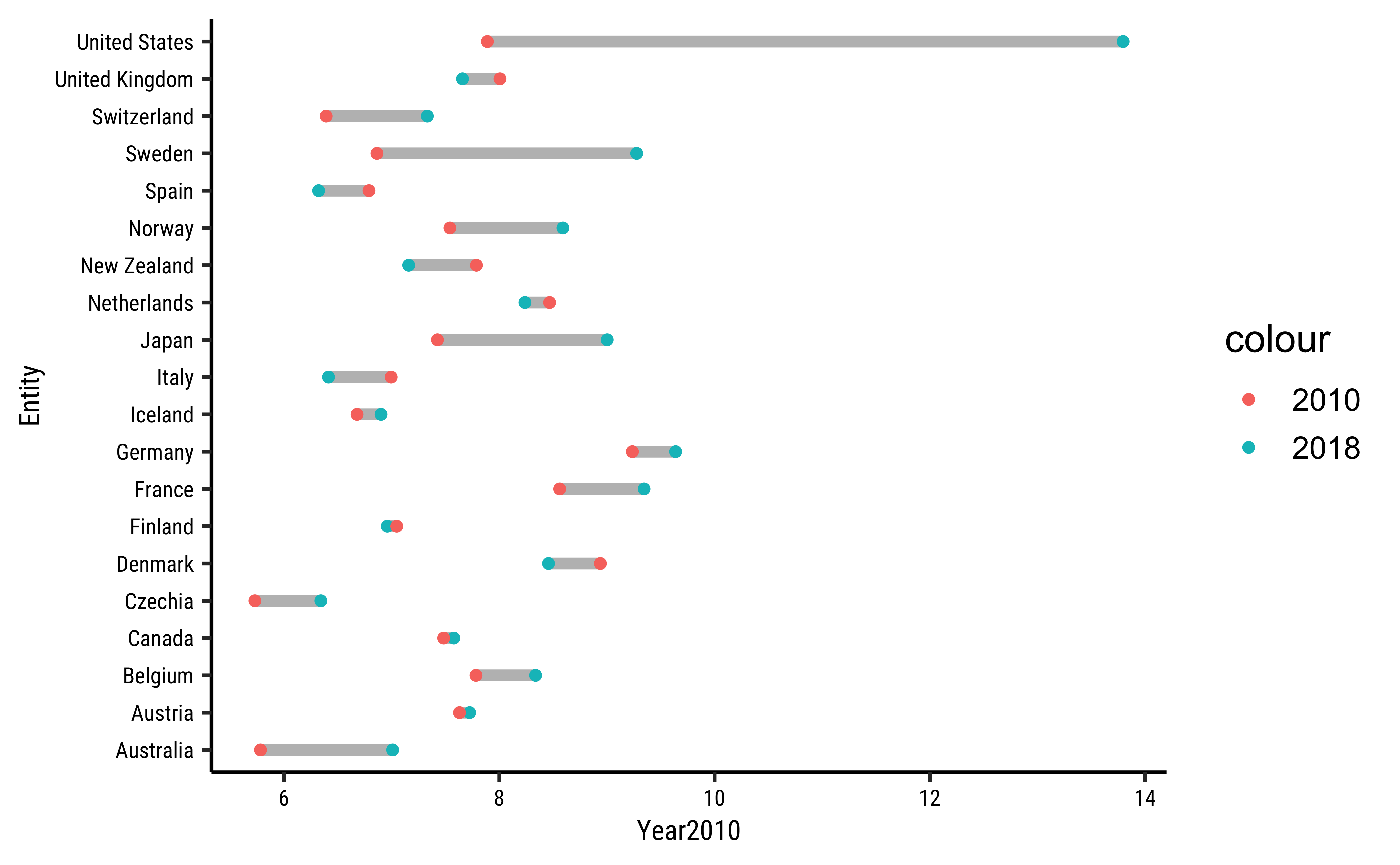
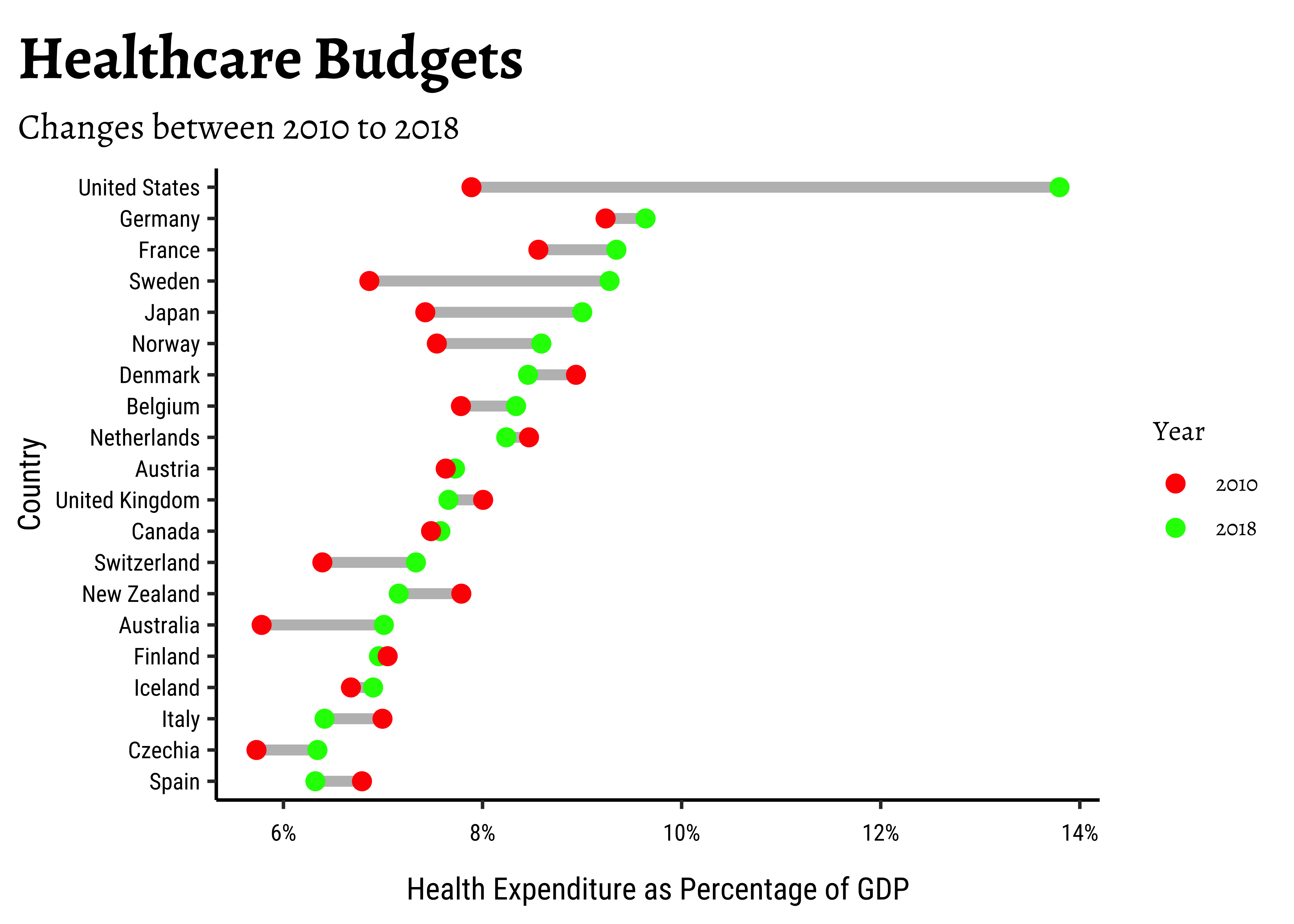
A simple plot that can quickly indicate changes in multiple variables/aspects over either a time or a space variable is a dumbbell plot. This is a combination of scatter plot + a segment plot. Let us take our previously loaded health dataset and plot just the change in expenditure for multiple countries, across a time span of 8 years (2010 - 2018)
health_2010_2018 <- health %>%
  # select Years 2010 and 2018
  filter(Year %in% c(2010, 2018)) %>%
  # Make separate columns for each year, easier that way
  # Though not essential
  pivot_wider(
    id_cols = c(Entity, Code),
    names_from = Year,
    names_prefix = "Year",
    values_from = public_health_expenditure_pc_gdp
  )
health_2010_2018Entity <chr> | Code <chr> | Year2010 <dbl> | Year2018 <dbl> | |
|---|---|---|---|---|
| Albania | ALB | 2.442 | 2.878 | |
| Argentina | ARG | 5.572 | 5.965 | |
| Australia | AUS | 5.781 | 7.009 | |
| Austria | AUT | 7.630 | 7.724 | |
| Belgium | BEL | 7.783 | 8.337 | |
| Brazil | BRA | 3.577 | 3.897 | |
| Bulgaria | BGR | 3.932 | 4.330 | |
| Canada | CAN | 7.483 | 7.577 | |
| Chile | CHL | 3.999 | 5.524 | |
| China | CHN | 2.177 | 2.914 |
health_2010_2018 %>%
  # remove NA data across the data set
  drop_na() %>%
  # take the top 20 countries based on 2018 allocation
  slice_max(n = 20, order_by = Year2018) %>%
  gf_segment(Entity + Entity ~ Year2010 + Year2018,
    colour = "grey",
    linewidth = 2
  ) %>%
  gf_point(Entity ~ Year2018,
    colour = ~"2018"
  ) %>%
  gf_point(Entity ~ Year2010,
    colour = ~"2010"
  )
## Can we do better? Sort the bars, improve axis ticks, title..

health_2010_2018 %>%
  # remove NA data across the data set
  drop_na() %>%
  # take the top 20 countries based on 2018 allocation
  slice_max(n = 20, order_by = Year2018) %>%
  # plot segments first
  gf_segment(
    reorder(Entity, Year2018) + reorder(Entity, Year2018) ~
      Year2010 + Year2018,
    colour = "grey",
    linewidth = 2
  ) %>%
  # Then plot points
  gf_point(reorder(Entity, Year2018) ~ Year2018,
    colour = ~"2018",
    size = 3
  ) %>%
  gf_point(
    reorder(Entity, Year2018) ~ Year2010,
    colour = ~"2010", size = 3,
    xlab = "Health Expenditure as Percentage of GDP",
    ylab = "Country",
    title = "Healthcare Budgets Changes between 2010 to 2018",
    subtitle = "Bars are Sorted",
    caption = "And the X-Axis is in percentage"
  ) %>%
  gf_refine(
    scale_x_continuous(
      breaks = scales::breaks_width(2),
      labels = scales::label_percent(suffix = "%", scale = 1)
    ),
    scale_colour_manual(name = "Year", values = c("red", "green"))
  )
health_2010_2018 <- health %>%
  # select Years 2010 and 2018
  filter(Year %in% c(2010, 2018)) %>%
  # Make separate columns for each year, easier that way
  # Though not essential
  pivot_wider(
    id_cols = c(Entity, Code),
    names_from = Year,
    names_prefix = "Year",
    values_from = public_health_expenditure_pc_gdp
  )

health_2010_2018 %>%
  # remove NA data across the data set
  drop_na() %>%
  # take the top 20 countries based on 2018 allocation
  slice_max(n = 20, order_by = Year2018) %>%
  ggplot() +
  geom_segment(
    aes(
      y = Entity, yend = Entity,
      x = Year2010, xend = Year2018
    ),
    colour = "grey",
    linewidth = 2
  ) +
  geom_point(aes(y = Entity, x = Year2018, colour = "2018")) +
  geom_point(aes(y = Entity, x = Year2010, colour = "2010"))
## Can we do better?

health_2010_2018 %>%
  # remove NA data across the data set
  drop_na() %>%
  # take the top 20 countries based on 2018 allocation
  slice_max(n = 20, order_by = Year2018) %>%
  ggplot() +
  # plot segments first
  geom_segment(
    aes(
      y = reorder(Entity, Year2018), yend = reorder(Entity, Year2018),
      x = Year2010, xend = Year2018
    ),
    colour = "grey",
    linewidth = 2
  ) +

  # Then plot points
  geom_point(aes(
    y = reorder(Entity, Year2018), x = Year2018,
    colour = "2018"
  ), size = 3) +
  geom_point(aes(
    y = reorder(Entity, Year2018), x = Year2010,
    colour = "2010"
  ), size = 3) +
  labs(
    x = "Health Expenditure as Percentage of GDP",
    y = "Country", title = "Healthcare Budgets",
    subtitle = "Changes between 2010 to 2018"
  ) +
  scale_x_continuous(
    breaks = scales::breaks_width(2),
    labels = scales::label_percent(suffix = "%", scale = 1)
  ) +
  scale_colour_manual(name = "Year", values = c("red", "green"))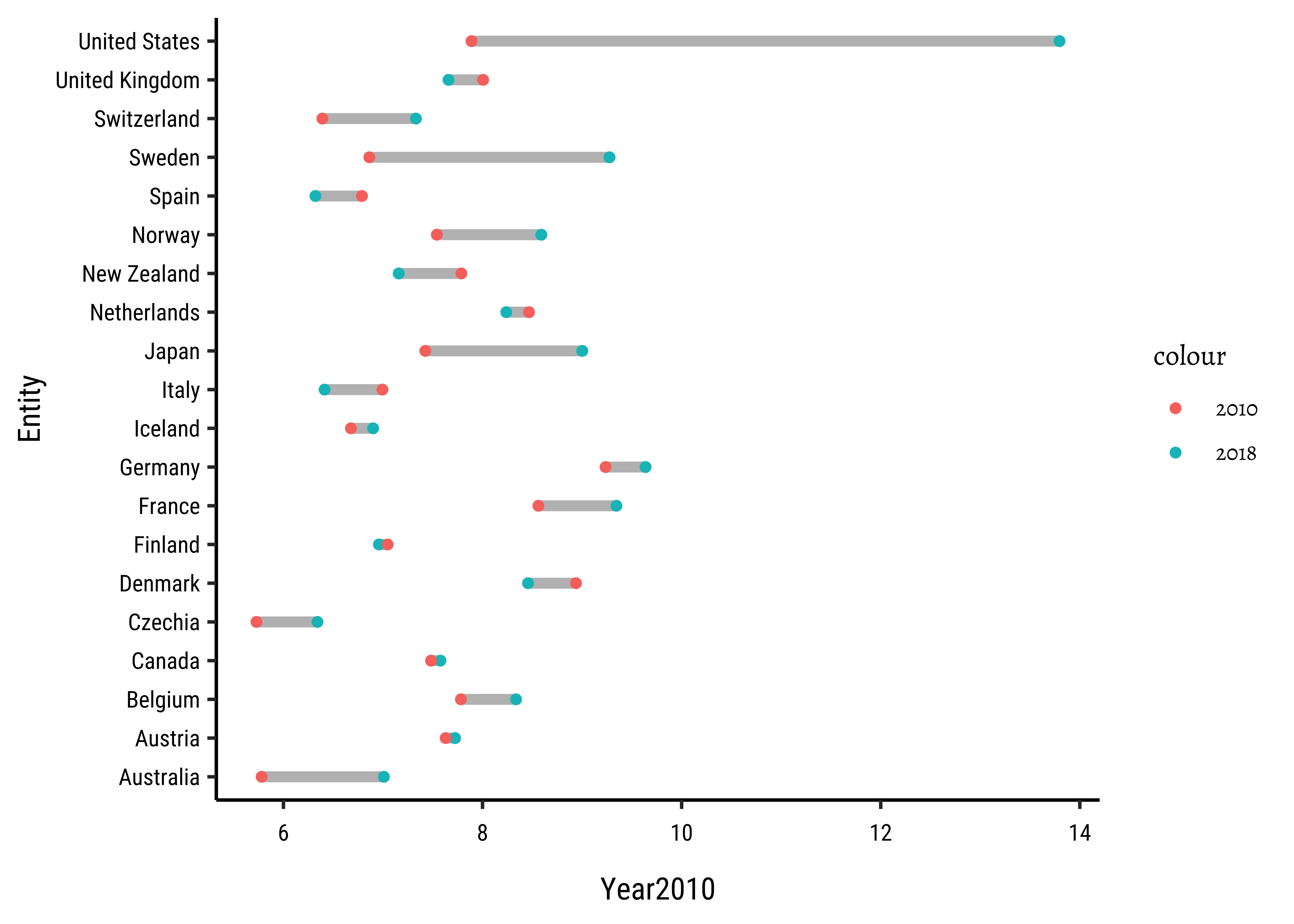
- Changes can be over
time, or over “space” - In the latter case, we can think of some Quantity changing over (multiple levels of) multiple Qualitative variables. E.g.
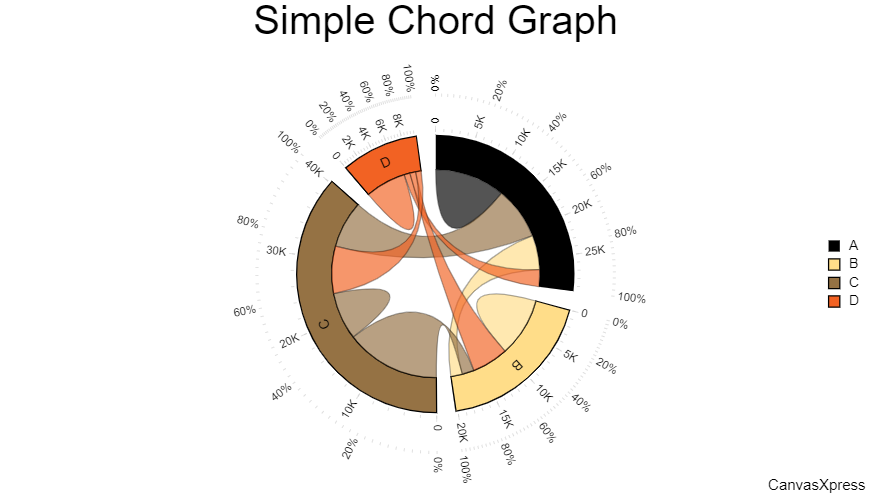
SalesoverProduct TypeoverShowroom LocationoverFestival Season… - When a single Quant varies over a single multi-level Qual, the Chord Diagram may be simpler than the Sankey/Alluvial. E.g
Birdmigration acrossMultiple Locations. This can even show bidirectional changes. ( Sankeys with loops are also possible, however) - When you have a Quant that changes over only one two-level Qual variable, the Dumbbell plot becomes an option.
We see that we can visualize “evolutions” over time and space. The evolutions can represent changes in the quantities of things, or their categorical affiliations or groups.
What business/design data would you depict in this way? Revenue streams? Employment? Expenditures over time and market? Migration? App usage patterns? There are many possibilities!
Note also that the Bump Charts are a special case of Alluvial/Sankey charts where each node connects/flows to only one other node.
- Within the
ggalluvialpackage are two datasets,majorsandvaccinations. Plot alluvial charts for both of these. - Go to the American Life Panel Website where you will find many public datasets. Try to take one and make charts from it that we have learned in this Module.
- Global Migration, https://download.gsb.bund.de/BIB/global_flow/ A good example of the use of a Chord Diagram.
-
ggalluvialcheatsheet,https://cheatography.com/seleven/cheat-sheets/ggalluvial/
- John Coene, Sankey plots with
echarts4r, https://echarts4r.john-coene.com/articles/chart_types.html#sankey
- Other packages: Sankey plot | the R Graph Gallery (r-graph-gallery.com)
- Another package: Sankey diagrams in ggplot2 with ggsankey | RCHARTS (r-charts.com)
- Sankey Charts using
networkD3: http://christophergandrud.github.io/networkD3
Allaire, J. J., Christopher Gandrud, Kenton Russell, and CJ Yetman. 2025. networkD3: D3 JavaScript Network Graphs from r. https://doi.org/10.32614/CRAN.package.networkD3.
Brunson, Jason Cory. 2020. “ggalluvial: Layered Grammar for Alluvial Plots.” Journal of Open Source Software 5 (49): 2017. https://doi.org/10.21105/joss.02017.
Brunson, Jason Cory, and Quentin D. Read. 2023. “ggalluvial: Alluvial Plots in ‘ggplot2’.” http://corybrunson.github.io/ggalluvial/.
Coene, John. 2023. Echarts4r: Create Interactive Graphs with “Echarts JavaScript” Version 5. https://doi.org/10.32614/CRAN.package.echarts4r.
de Vries, Pepijn. 2024. ggsankeyfier: Create Sankey and Alluvial Diagrams Using “ggplot2”. https://doi.org/10.32614/CRAN.package.ggsankeyfier.
Sjoberg, David. 2021. ggstream: Create Streamplots in “ggplot2”. https://doi.org/10.32614/CRAN.package.ggstream.
———. 2025. ggsankey: Sankey, Alluvial and Sankey Bump Plots. https://github.com/davidsjoberg/ggsankey.
Wickham, Hadley, Thomas Lin Pedersen, and Dana Seidel. 2025. scales: Scale Functions for Visualization. https://doi.org/10.32614/CRAN.package.scales.
Footnotes
D3 JavaScript Network Graphs from R: christophergandrud.github.io/networkD3/↩︎
Citation
BibTeX citation:
@online{v.2022,
  author = {V., Arvind},
  title = {\textless Iconify-Icon
    Icon=“carbon:sankey-Diagram”\textgreater\textless/Iconify-Icon\textgreater{}
    {Evolution} and {Flow}},
  date = {2022-11-22},
  url = {https://av-quarto.netlify.app/content/courses/Analytics/Descriptive/Modules/70-EvolutionFlow/},
  langid = {en},
  abstract = {Changes in Information over Space and Time}
}
For attribution, please cite this work as:
V., Arvind. 2022. “<Iconify-Icon
Icon=‘carbon:sankey-Diagram’></Iconify-Icon>
Evolution and Flow.” November 22, 2022. https://av-quarto.netlify.app/content/courses/Analytics/Descriptive/Modules/70-EvolutionFlow/.