library(tidyverse)
library(mosaic)
library(ggformula)
library(ggridges)
library(skimr)
##
library(GGally)
library(corrplot)
library(corrgram)
library(crosstable) # Summary stats tables
library(kableExtra)
##
library(paletteer) # Colour Palettes for Peasants
##
## Add other packages here as needed, e.g.:
## scales/ggprism;
## ggstats/correlation;
## vcd/vcdExtra/ggalluvial/ggpubr;
## sf/tmap/osmplotr/rnaturalearth;
## igraph/tidygraph/ggraph/graphlayouts;
EDA
Workflow
Descriptive
Abstract
A complete EDA Workflow
A Data Analytics Process
So you have your shiny new R skills and you’ve successfully loaded a cool dataframe into R… Now what?
The best charts come from understanding your data, asking good questions from it, and displaying the answers to those questions as clearly as possible.
NoteDownload this document as a Work Template
Hit the </>Code button at upper right to copy/save this very document as a Quarto Markdown template for your work. Delete the text that you don’t need, but keep most of the Sections as they are!
- Install packages using
install.packages()in your Console. - Load up your libraries in a so-labelled
setupchunk:
Use Namespace based Code
Warning
Try always to name your code-command with the package from whence it came! So use dplyr::filter() / dplyr::summarize() and not just filter() or summarize(), since these commands could exist across multiple packages, which you may have loaded last.
(One can also use the conflicted package to set this up, but this is simpler for beginners like us. )
- Use
readr::read_csv(). Do not useread.csv().
- Use
dplyr::glimpse() - Use
mosaic::inspect()orskimr::skim()
- Use
dplyr::summarise()and/orcrosstable::crosstable() - Highlight any interesting summary stats, missing data, or data imbalances
- A table containing the variable names, their interpretation, and their nature(Qual/Quant/Ord…)
- If there are wrongly coded variables in the original data, state them in their correct form, so you can munge the data in the next step
- Declare what might be target and predictor variables, based on available information of the experiment, or a description of the data.
- Convert variables to factors as needed
- Reformat / Rename other variables as needed
- Clean badly formatted columns (e.g. text + numbers) using
tidyr::separate_**_**() - Save the data as a modified file
- Do not mess up the original data file
Question-1
- State the Question or Hypothesis.
- (Temporarily) Drop variables using
dplyr::select() - Create new variables if needed with
dplyr::mutate() - Filter the data set using
dplyr::filter() - Reformat data to wide/long if needed with
tidyr::pivot_longer()ortidyr::pivot_wider() - Answer the Question with a Table, a Chart, a Test, using an appropriate Model for Statistical Inference
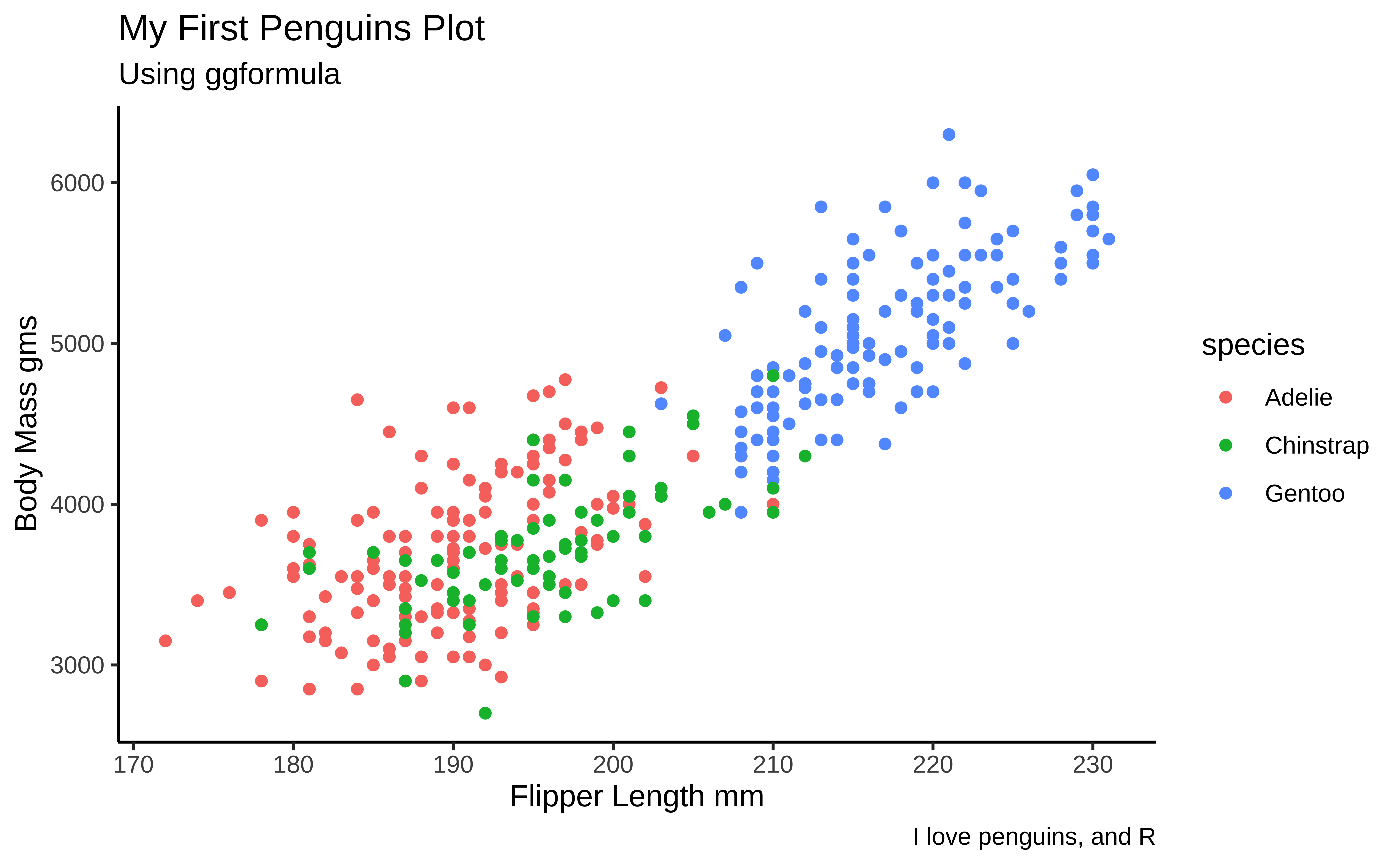
- For Charts:
- Use
title,subtitle,legendandscalesappropriately in your chart - Use a colour palette from the
paletteerpackage that suits your message and taste. See references and commands at the end of this document. - Prefer
ggformulaunless you are using a chart that is not yet supported therein (eg.ggbump::geom_bump,vcd::mosaicorggstats::gglikert) - Use
gf_facet_***as appropriate to show small multiple graphs for clarity
- Use
- For Tables:
- Use
crosstable::crosstable(...) %>% as_flextable()to create HTML tables of summaries - Use
df_print: pagedin your YAML header to make nice paged tables for your data frames - Use
kableExtra::kable() %>% kable_paper(c("hover", "striped", "responsive"), full_width = F)or similar to make HTML tables of intermediate results/data where you think appropriate
- Use
- For Statistical Tests:
- Use
mosaic::....to run your statistical tests(t, wilcox, prop, chi.square…), since it has a formula interface similar toggformula - Use
broom::tidy()and/orbroom::augment()to check your stat test results, and to convert them into tibbles for presentation and plotting. - You could convert the output of
broom:...into an HTML table using thekableExtracode shown above. - Use
supernova::supernova()to create friendly and clear ANOVA tables if needed:
- Use
Call:
   aov(formula = body_mass_g ~ species, data = penguins)

Terms:
                  species Residuals
Sum of Squares  145190219  70069447
Deg. of Freedom         2       330

Residual standard error: 460.7946
Estimated effects may be unbalanced
Analysis of Variance Table (Type III SS)
Model: body_mass_g ~ species
SS df MS F PRE p
----- --------------- | ------------- --- ------------ ------- ----- -----
Model (error reduced) | 145190219.113 2 72595109.557 341.895 .6745 .0000
Error (from model) | 70069446.803 330 212331.657
----- --------------- | ------------- --- ------------ ------- ----- -----
Total (empty model) | 215259665.916 332 648372.488 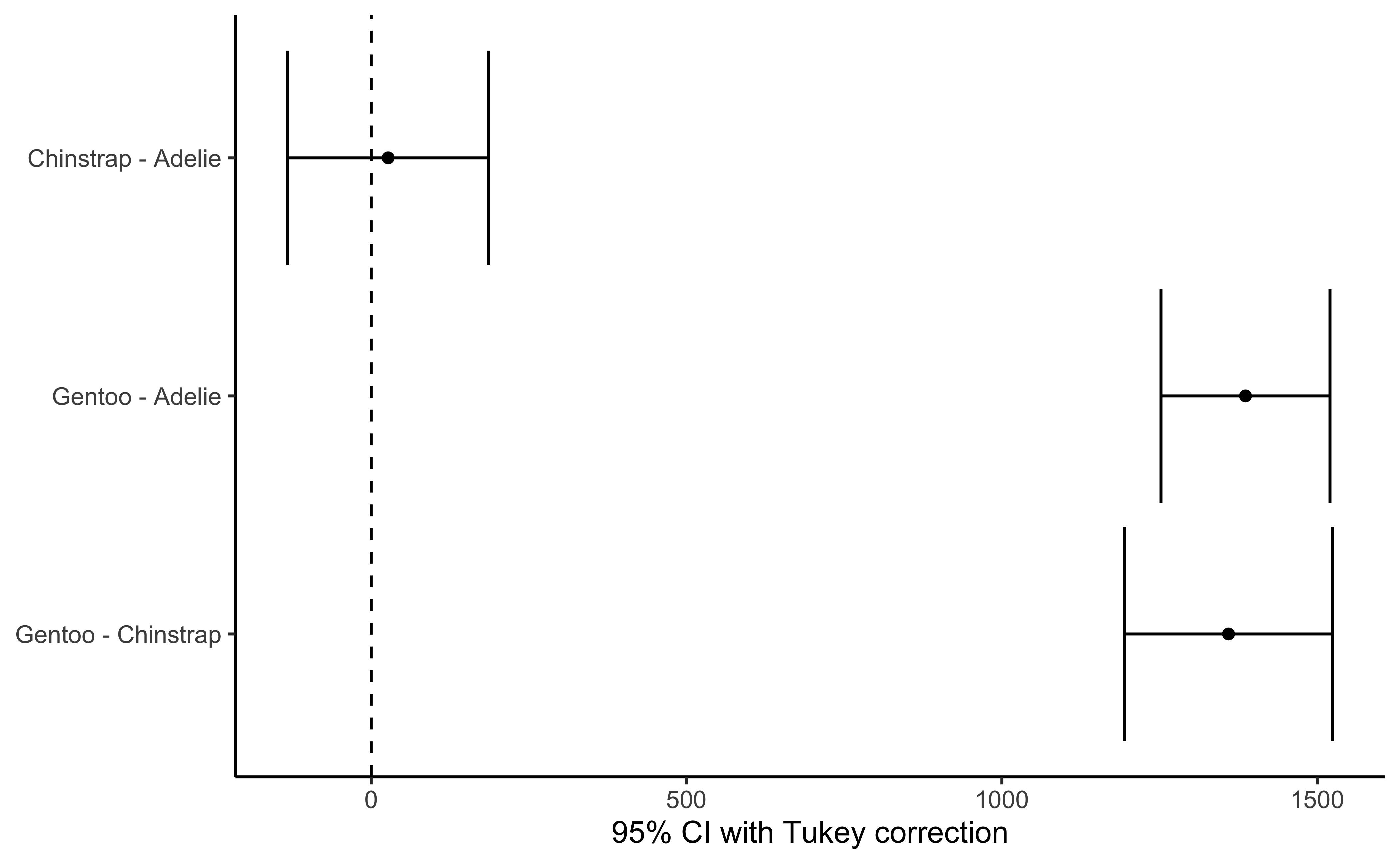
  group_1   group_2       diff pooled_se      q    df    lower    upper p_adj
  <chr>     <chr>        <dbl>     <dbl>  <dbl> <int>    <dbl>    <dbl> <dbl>
1 Chinstrap Adelie      26.924    47.837  0.563   330 -132.353  186.201 .9164
2 Gentoo    Adelie    1386.273    40.241 34.450   330 1252.290 1520.255 .0000
3 Gentoo Chinstrap 1359.349 49.532 27.444 330 1194.430 1524.267 .0000- Use
mosaic::do(n) * stat-test(...)or use theinferpackage to run Permutation or Bootstrap Tests
Inference-1
- Present the final Inference clearly in text, with clear reference to your chart, and perhaps
p.values,confidence intervalsfrom stats tests. . . . .
Question-n
….
Inference-n
….
Describe what you have done, what the graph(s) and test(s) shows and why it all so interesting. What could be done next?
Over 2500 colour palettes are available in the paletteer package. Can you find tayloRswift? wesanderson? harrypotter? timburton? You could also find/define palettes that are in line with your Company’s logo / colour schemes.
Here are the Qualitative Palettes: (searchable)
And the Quantitative/Continuous palettes: (searchable)
Use the commands:
## For Qual variable-> colour/fill:
scale_colour_paletteer_d(
  name = "Legend Name",
  palette = "package::palette",
  dynamic = TRUE / FALSE
)

## For Quant variable-> colour/fill:
scale_colour_paletteer_c(
  name = "Legend Name",
  palette = "package::palette",
  dynamic = TRUE / FALSE
)