| Year | Below Level #1 | Level #1 | Level #2 | Level #3 | Levels #4 and #5 |
|---|---|---|---|---|---|
| Number in millions (2012/2014) | 8.35 | 26.49 | 65.10 | 71.41 | 26.57 |
| Number in millions (2017) | 7.59 | 29.23 | 66.07 | 68.81 | 26.75 |
| Note: | |||||
| SOURCE: U.S. Department of Education, National Center for Education Statistics, Program for the International Assessment of Adult Competencies (PIAAC), U.S. PIAAC 2017, U.S. PIAAC 2012/2014. |
Throwing away data to grasp it
Summary Stats
Favourite Stats
Quant Variables
Qual Variables
Abstract
Bill Gates walked into a bar, and everyone’s salary went up on average.
First, some baseball:
And then, an example from a more sombre story:
This ghastly-looking Table 1 examines U.S. adults with low English literacy and numeracy skills—or low-skilled adults—at two points in the 2010s, in the years 2012/20141 and 2017, using data from the Program for the International Assessment of Adult Competencies (PIAAC). As can be seen the summary table is quite surprising in absolute terms, for a developed country like the US, and the numbers have increased from 2012/2014 to 2017!
So why do we need to summarise data? Summarization is an act of throwing away data to make more sense, as stated by (Stigler 2016) and also in the movie by Brad Pitt aka Billy Beane. To summarize is to understand. Add to that the fact that our Working Memories can hold maybe 7 items, so it means information retention too.
And if we don’t summarise? Jorge Luis Borges, in a fantasy short story published in 1942, titled “Funes the Memorious,” he described a man, Ireneo Funes, who found after an accident that he could remember absolutely everything. He could reconstruct every day in the smallest detail, and he could even later reconstruct the reconstruction, but he was incapable of understanding. Borges wrote, “To think is to forget details, generalize, make abstractions. In the teeming world of Funes, there were only details.” (emphasis mine)
Aggregation can yield great gains above the individual components in data. Funes was big data without Statistics.
| Variable #1 | Variable #2 | Chart Names | “Chart Shape” |
|---|---|---|---|
| All | All | Tables and Stat Measures |
|
Before we plot a single chart, it is wise to take a look at several numbers that summarize the dataset under consideration. What might these be? Some obviously useful numbers are:
- Dataset length: How many rows/observations?
- Dataset breadth: How many columns/variables?
- How many Quant variables?
- How many Qual variables?
- Quant variables: min, max, mean, median, sd
- Qual variables: levels, counts per level
- Both: means, medians for each level of a Qual variable…
| No | Pronoun | Answer | Variable/Scale | Example | What Operations? |
|---|---|---|---|---|---|
| 1 | How Many / Much / Heavy? Few? Seldom? Often? When? | Quantities, with Scale and a Zero Value.Differences and Ratios /Products are meaningful. | Quantitative/Ratio | Length,Height,Temperature in Kelvin,Activity,Dose Amount,Reaction Rate,Flow Rate,Concentration,Pulse,Survival Rate | Correlation |
| 2 | How Many / Much / Heavy? Few? Seldom? Often? When? | Quantities with Scale. Differences are meaningful, but not products or ratios | Quantitative/Interval | pH,SAT score(200-800),Credit score(300-850),SAT score(200-800),Year of Starting College | Mean,Standard Deviation |
| 3 | How, What Kind, What Sort | A Manner / Method, Type or Attribute from a list, with list items in some " order" ( e.g. good, better, improved, best..) | Qualitative/Ordinal | Socioeconomic status (Low income, Middle income, High income),Education level (HighSchool, BS, MS, PhD),Satisfaction rating(Very much Dislike, Dislike, Neutral, Like, Very Much Like) | Median,Percentile |
| 4 | What, Who, Where, Whom, Which | Name, Place, Animal, Thing | Qualitative/Nominal | Name | Count no. of cases,Mode |
We will obviously choose all variables in the dataset, unless they are unrelated ones such as row number or ID which (we think) may not contribute any information and we can disregard.
Quant variables: Inspecting the min, max,mean, median and sd of each of the Quant variables tells us straightaway what the ranges of the variables are, and if there are some outliers, which could be normal, or maybe due to data entry error! Comparing two Quant variables for their ranges also tells us that we may have to
Qual variables: With Qual variables, we understand the levels within each, and understand the total number of combinations of the levels across these. Counts across levels, and across combinations of levels tells us whether the data has sufficient readings for graphing, inference, and decision-making, of if certain levels/classes of data are under or over represented.
Together?: We can use Quant and Qual together, to develop the above summaries (min, max,mean, median and sd) for Quant variables, again across levels, and across combinations of levels of single or multiple Quals, along with counts if we are interested in that.
For both types of variables, we need to keep an eye open for data entries that are missing! This may point to data gathering errors, which may be fixable. Or we will have to take a decision to let go of that entire observation (i.e. a row). Or even do what is called imputation to fill in values that are based on the other values in the same column, which sounds like we are making up data, but isn’t so really.
And this may also tell us if we are witnessing a Simpson’s Paradox situation. You may have to decide on what to do with this data sparseness, or just check your biases!
Let us examine a healthcare-related dataset in Orange, on heart disease. Download the Orange workflow by clicking on the icon below, and open it in Orange.
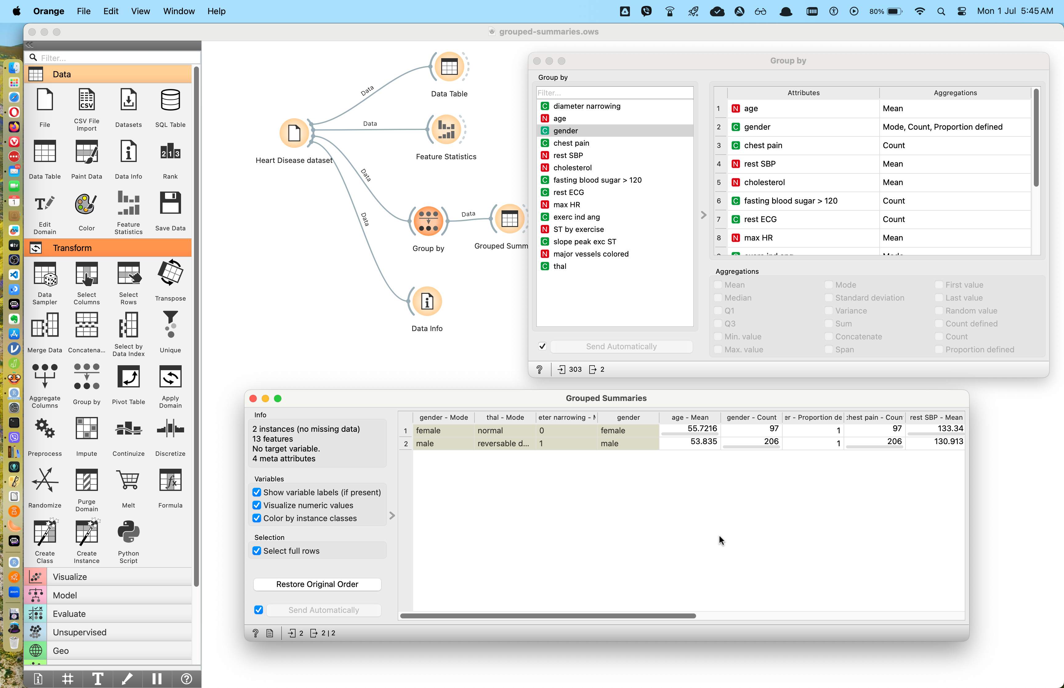
In Figure 1, we see two sub-windows: on the upper right, we see the output of “Group By” where we have selected gender. We can also in the window choose what summary statistics we wish to see for each of the other variables in the dataset. To the lower left, we see the output of the Grouped Summaries Data Table, which shows just two rows: one for gender::female, and another for gender::male. All other variables have been summarised as desired.
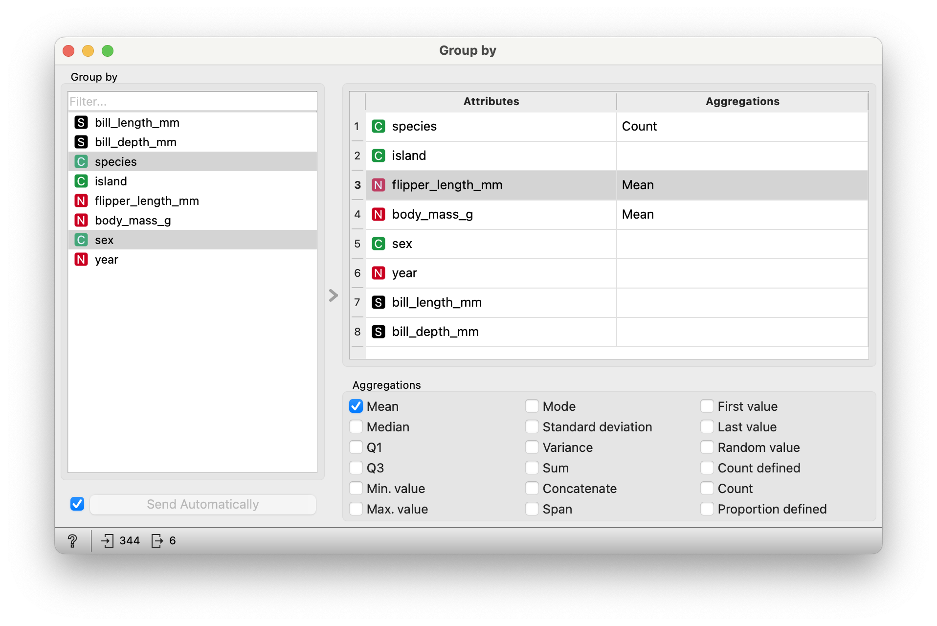
Play with the summary output settings, and also with choosing which variable to Group By. Can you Group By more than one Qual variable?
Note
Does Group By with a Quant variable make sense?
Grouping By Multiple Variables
There does not appear to be a way in which one can choose to Group By multiple variables as an input to summary…which does not seem possible in Orange, but is a breeze with R or Python or…stuff which you peasants will not touch. Use CMD and the Windows key respectively to select two or more Group By variables. Hmph!
Let us use a (now) well-known data set on penguins. Data were collected and made available by Dr. Kristen Gorman and the Palmer Station, Antarctica LTER, a member of the Long Term Ecological Research Network.
Download this data into your Orange work folder and then use it in Orange.
Here is the Data Table for the penguins data:
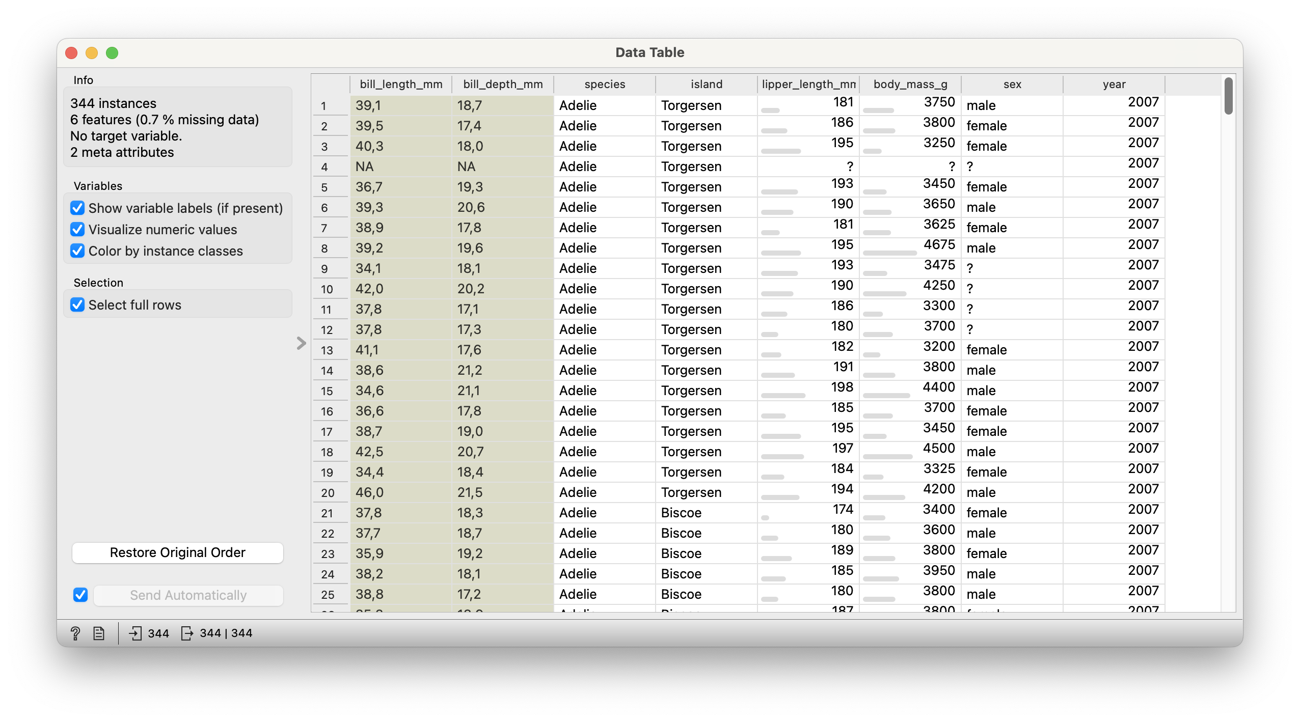
We see from Figure 2 that there are 344 observations (i.e. individual penguins) and 6 variables. There is some missing data but not too much!
Qualitative Data
-
sex: male and female penguins -
island: they have islands to themselves!! -
species: Three adorable types!

Quantitative Data
-
bill_length_mm: The length of the penguins’ bills -
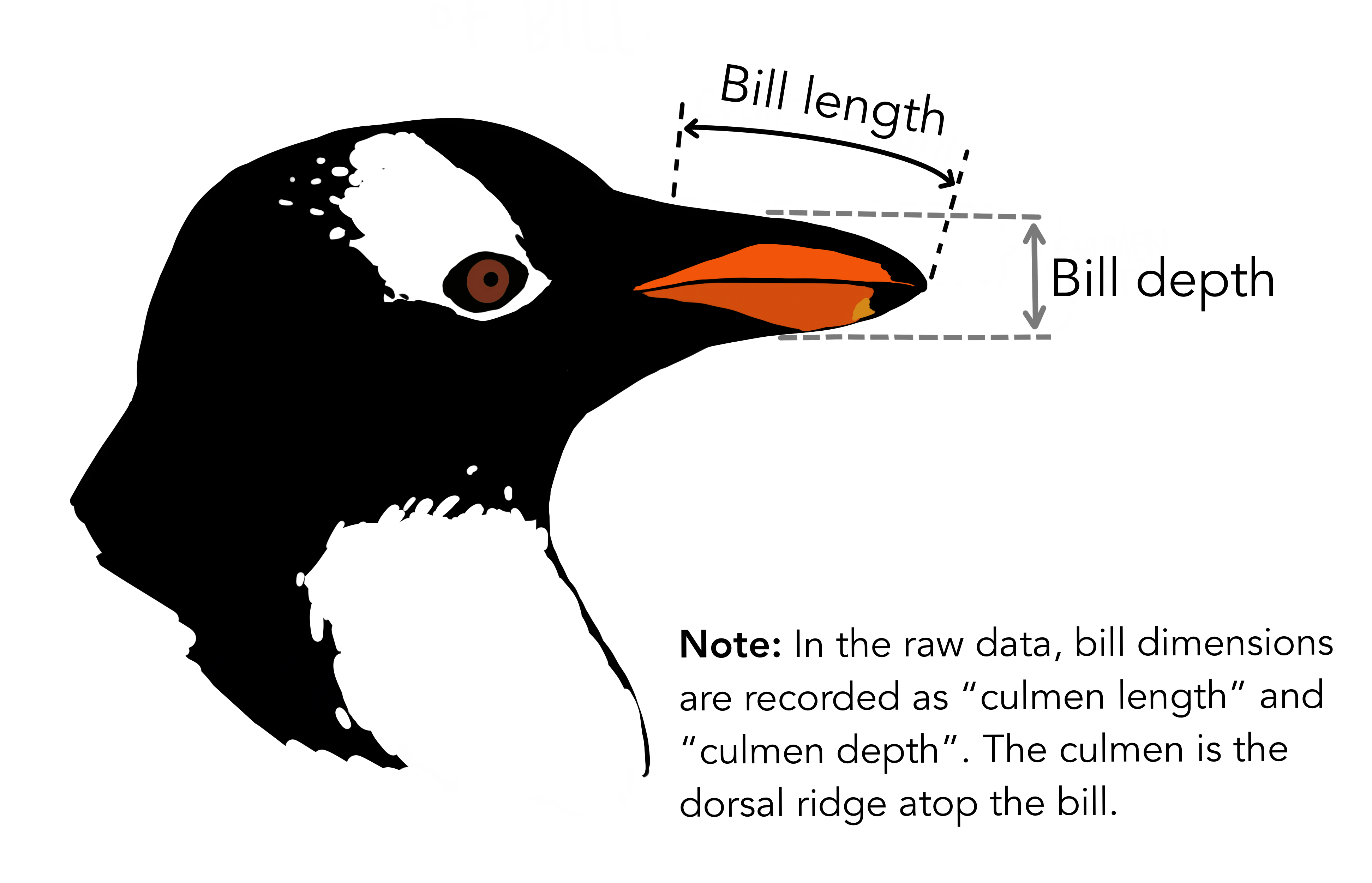
bill_depth_mm: See the picture!! -
flipper_length_mm: Flippers! Penguins have “hands”!! -
body_mass_gm: Grams? Grams??? Why, these penguins are like human babies!!❤️
Let’s try a few questions and see if they are answerable with Summary Figures and Tables.
Note
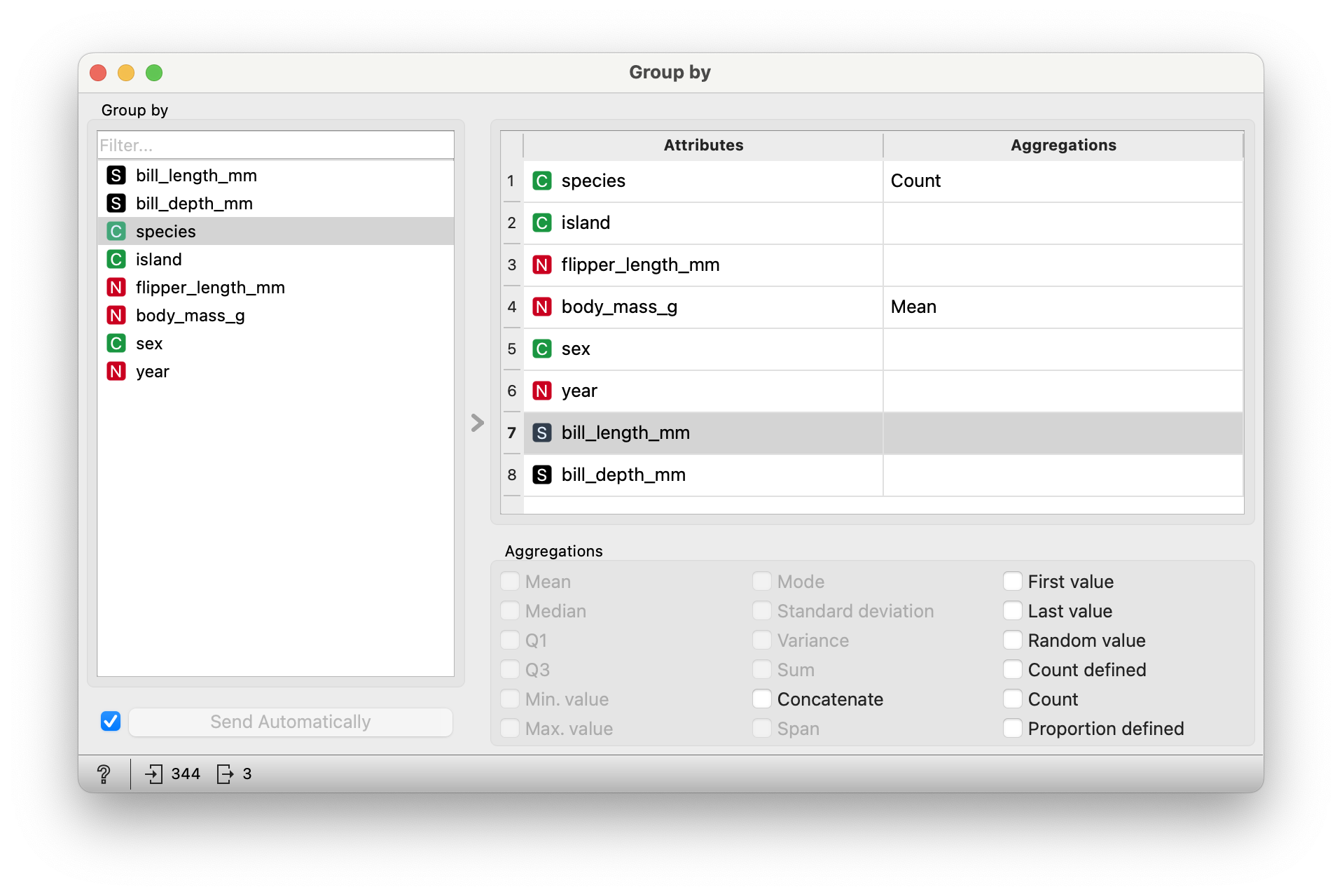
Q1. What are the mean weights of the penguins, for each species? In Orange, we do a Group By with the species variable, and select mean for the summary function for the variable `body_mass_gm.
Note
For now, disable summaries for everything else to avoid clutter!
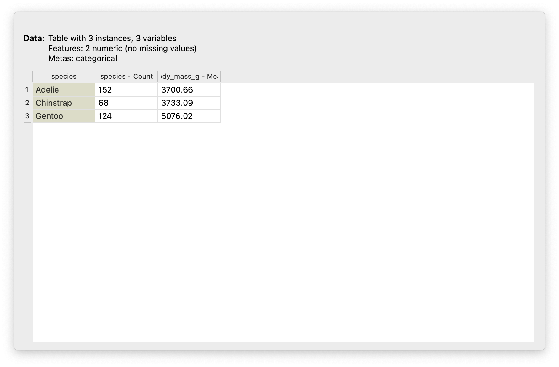
From Figure 5, clearly
Gentoopenguins are the big brothers/sisters here, with a mean body mass higher by around 1250 grams!!🤣-
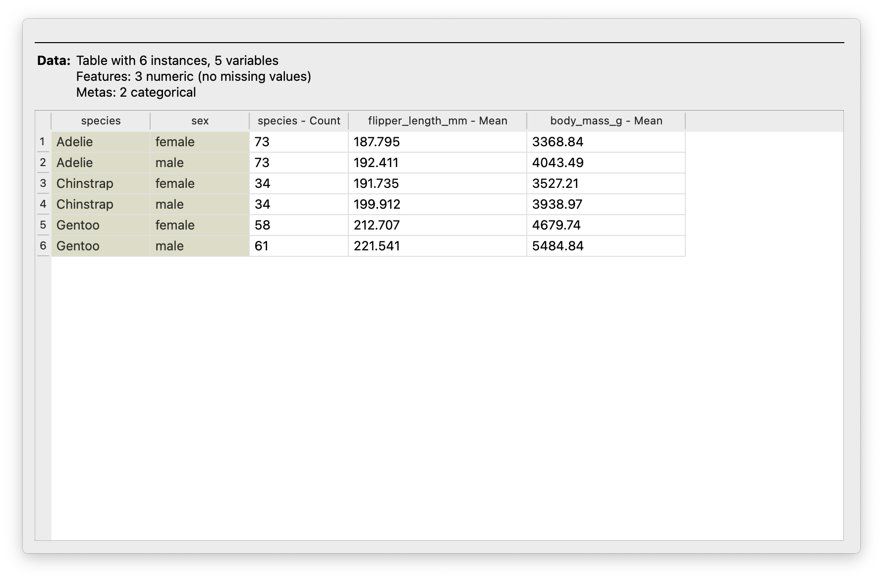
From Figure 6:
- Hmm..Chinstrap penguins are fewer in number, compared to the other two species.
-
flipper_lengths_mmare pretty much ballpark same across allspeciesandsexcombinations;Gentoostill dominates thebody_mass_gmacross both. -
femaleGentooare heavier (on average) than othermale-s even!!💪 (Not necessarily on individual basis!!).
Try adding more summary functions to the summary table? Which might you choose? Why?
Try your hand at these datasets. Look at the data table, state the data dictionary, contemplate a few Research Questions and answer them with Summaries and Tables in Orange!
Star Trek Books
Which would be the Group By variables here? And what would you summarize? With which function?
Math Anxiety! Hah!
- Data Summaries give you the essentials, without getting bogged down in the details(just yet).
- Summaries help you “live with your data”; this is an important step in understanding it, and deciding what to do with it.
- Summaries help evoke Questions and Hypotheses, which may lead to inquiries, analysis, and insights
References
Stigler, Stephen M. 2016. “The Seven Pillars of Statistical Wisdom,” March. https://doi.org/10.4159/9780674970199.