| No | Pronoun | Answer | Variable/Scale | Example | What Operations? |
|---|---|---|---|---|---|
| 1 | How Many / Much / Heavy? Few? Seldom? Often? When? | Quantities, with Scale and a Zero Value.Differences and Ratios /Products are meaningful. | Quantitative/Ratio | Length,Height,Temperature in Kelvin,Activity,Dose Amount,Reaction Rate,Flow Rate,Concentration,Pulse,Survival Rate | Correlation |
Ups and Downs, Rhymes and Reasons, Tides and Ebbs, Seasons and Rhythms
Correlations
Line Plots
| Variable #1 | Variable #2 | Chart Names | Chart Shape |
|---|---|---|---|
| Quant | Quant | Line Plot |
|
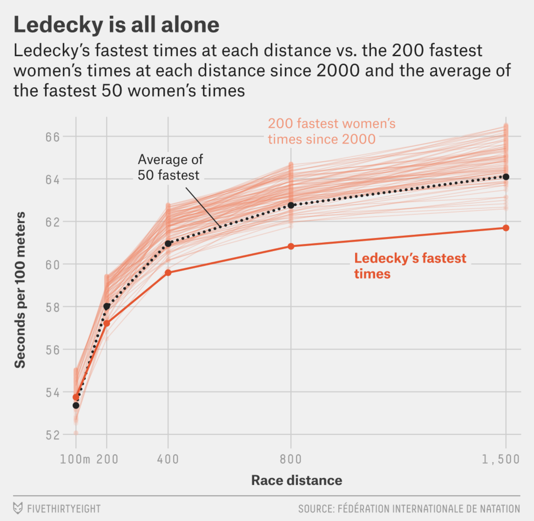
Ek Ledecky bheegi-bhaagi si, is it? Yeh Ledecky hai, ya jal-pari?
In Figure 2 (a), the black line is the average of the 50 best times at each distance since 2000. The top 200 times for each distance since 2000 are also plotted, with light orange lines each representing one swimmer. Her races and her career essentially follow the same pattern — the more she swims, the more she separates from the field. Her 1500 metres record timing is better than the best time for 800m!!😱 (Update July 2024: Ledecky won the bronze at Paris 2024)
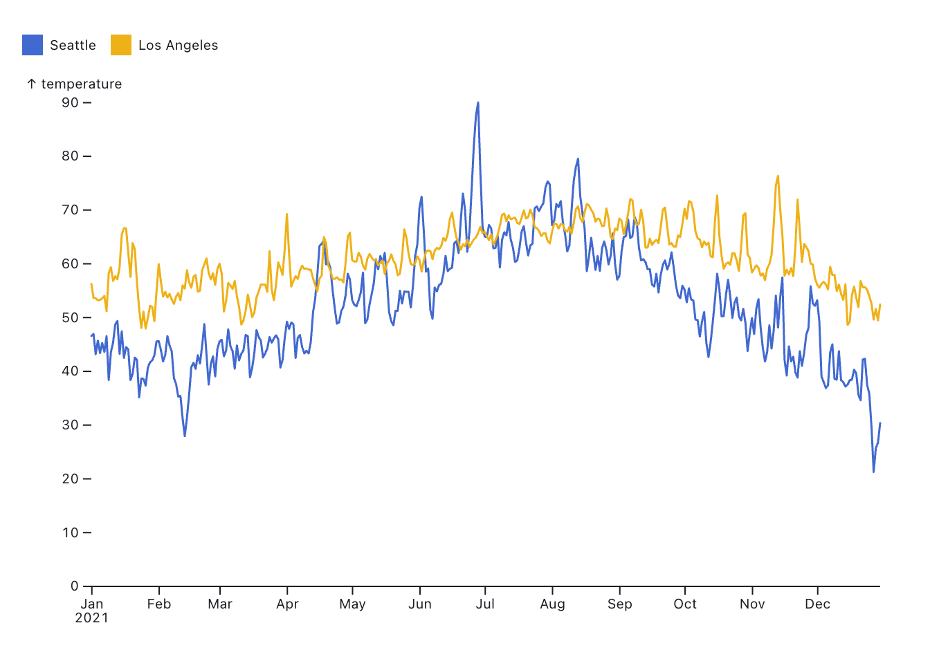
And LA? The weather in California…ahh. But Seattle has more variation, and sudden changes too!
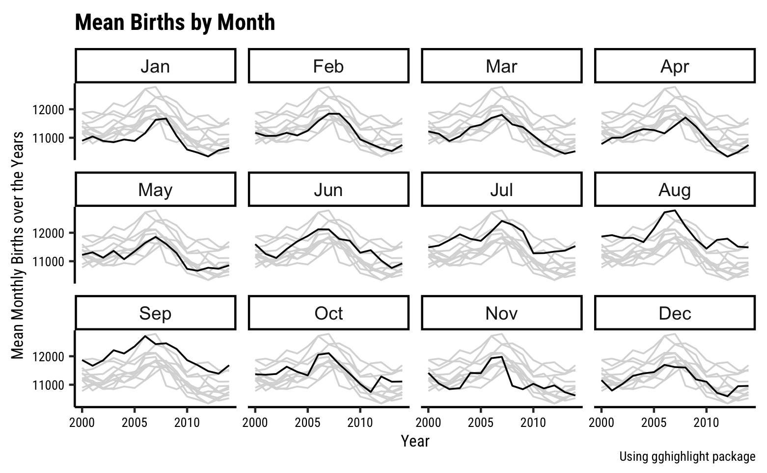
Why are fewer babies born on weekends? And more in September?
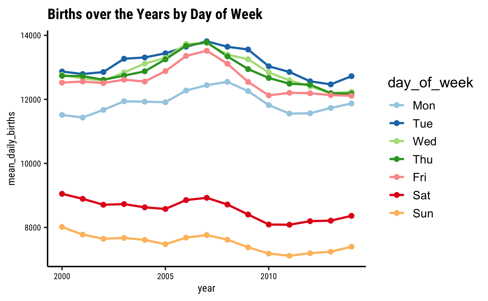
Looks like an interesting story here…there are significantly fewer births on average on Sat and Sun, over the years! Why? Should we watch Grey’s Anatomy ?
And why more births in September? That should be a no-brainer!! 😄
Line Plots take two separate Quant variables as inputs. Each of the variables is mapped to a position, or coordinate: one for the X-axis, and the other for the Y-axis. Each pair of observations from the two Quant variables ( which would be in one row!) give us a point. All this much is identical with the Scatter Plot.
And here, the points are connected together and sometimes thrown away altogether, leaving just the line.
Looking at the lines, we get a very function-al sense of the variation: is it upward or downward? Is it linear or nonlinear? Is it periodic or seasonal…all these questions can be answered with Line Charts.
When one variable is Time?
Line charts often have one variable as a time variable. In such case the data is said to be a time series.
Any metric that is measured over regular time intervals forms a time series. Analysis of Time Series is commercially important because of industrial need and relevance, especially with respect to Forecasting (Weather data, sports scores, population growth figures, stock prices, demand, sales, supply…). For example, in the graph shown below are the temperatures over time in two US cities:
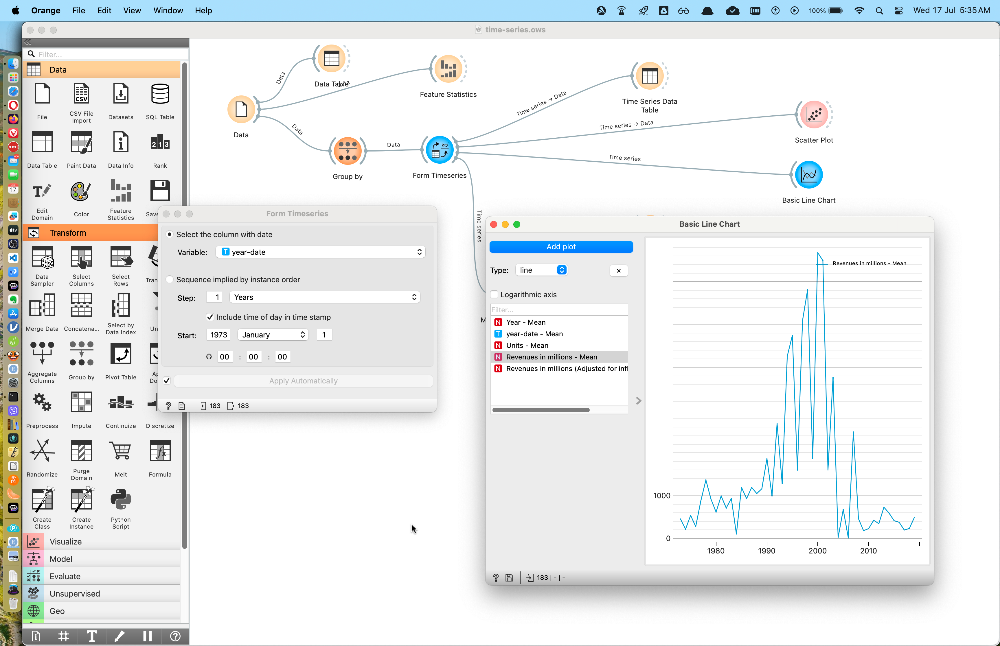
Let us at least look at this data in Orange, and import it into this rather elaborate Orange Workflow:
Import this into Orange and see…
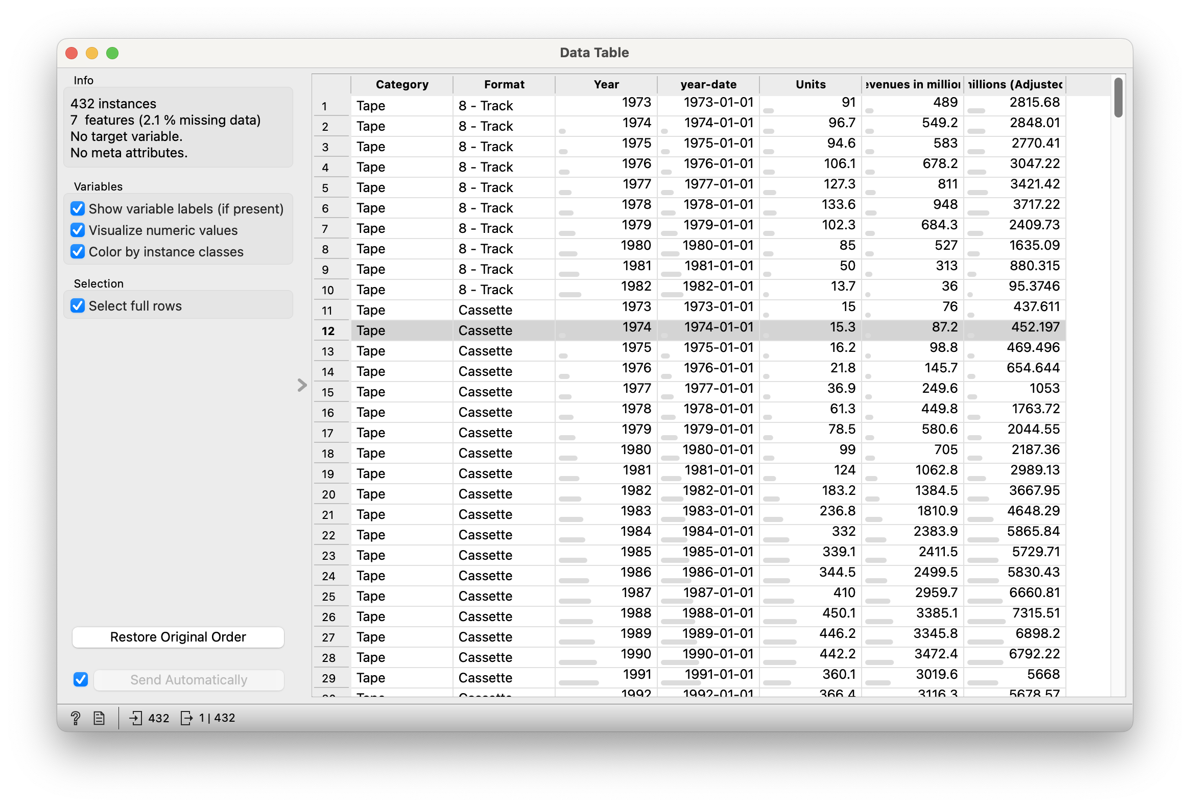
Figure 3 states that there are 432 data points, with 7 variables in the dataset; some missing data.
For now, the variables we need are :
Quantitative Data
-
Year: (int) Year in which RIAA revenue was logged -
Value (For Charting): (int) Revenue in million USD We can ignore the rest for now, unless we plan to work more with this data, and need to know more. The other numerical data showing billions of USD are not easily decipherable, an example of data that is not documented well…
Qualitative Data
-
Category: (chr) Form of the Music released ( CD etc..)
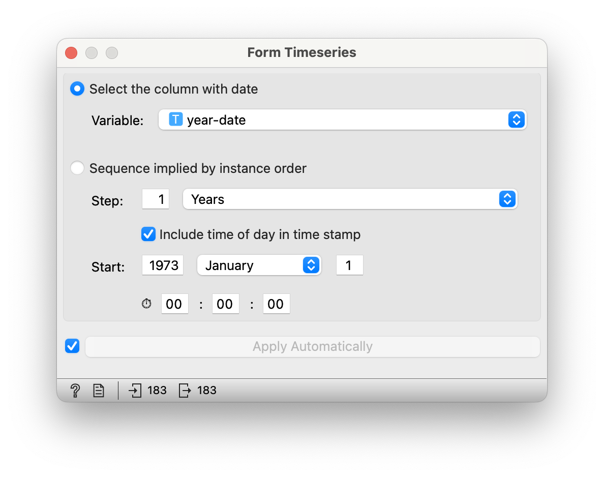
We need to first form time series from the dataset: we will choose the year-date variable, and indicate that it starts on Jan 1, 1973:
Upload this RAWgraphs project tutorial file into https://app.rawgraphs.io/ and play! Here is something we can create there:
https://academy.datawrapper.de/article/23-how-to-create-a-line-chart
Here be dragons: DataWrapper wants the data in wide format: each Format of music needs to have its figures in a separate column! 🤦. And this is not a data transformation that we can achieve within DataWrapper. Bah.
We are probably better off plotting a regular scatter plot. Here too there seem to be limitations because we are not able to colour the series based on type of music Format.
The Shape of You Data
Never mind that silly song now.
As mentioned above, data can be in wide or long form. How does one imagine this shape-shifting that seems needed now and then? Let’s see.
Long Form and Wide Form Data
Several tools such as DataWrapper (and others, yes, I agree, even with code, as we will see) need data transformed to a specific shape. this is usually mandated by the “shape or geometry” we intend to use in the visualization. We should now look at this idea of shape in data. Consider the data tables below:
| Product | Power | Cost | Harmony | Style | Size | Manufacturability | Durability | Universality |
|---|---|---|---|---|---|---|---|---|
| G1 | 0.5858003 | 0.2773750 | 0.7244059 | 0.0731445 | 0.1000535 | 0.4551024 | 0.9622046 | 0.9966129 |
| G2 | 0.0089458 | 0.8135742 | 0.9060922 | 0.7546750 | 0.9540688 | 0.9710557 | 0.7617024 | 0.5062709 |
| G3 | 0.2937396 | 0.2604278 | 0.9490402 | 0.2860006 | 0.4156071 | 0.5839880 | 0.7145085 | 0.4899432 |
| Product | Parameter | Rating |
|---|---|---|
| G1 | Power | 0.5858003 |
| G1 | Cost | 0.2773750 |
| G1 | Harmony | 0.7244059 |
| G1 | Style | 0.0731445 |
| G1 | Size | 0.1000535 |
| G1 | Manufacturability | 0.4551024 |
| G1 | Durability | 0.9622046 |
| G1 | Universality | 0.9966129 |
| G2 | Power | 0.0089458 |
| G2 | Cost | 0.8135742 |
| G2 | Harmony | 0.9060922 |
| G2 | Style | 0.7546750 |
| G2 | Size | 0.9540688 |
| G2 | Manufacturability | 0.9710557 |
| G2 | Durability | 0.7617024 |
| G2 | Universality | 0.5062709 |
| G3 | Power | 0.2937396 |
| G3 | Cost | 0.2604278 |
| G3 | Harmony | 0.9490402 |
| G3 | Style | 0.2860006 |
| G3 | Size | 0.4156071 |
| G3 | Manufacturability | 0.5839880 |
| G3 | Durability | 0.7145085 |
| G3 | Universality | 0.4899432 |
What we have done is:
- convert all the variable names into a stacked column
Parameter
- Put all the numbers into another column
Rating
- Repeated the
Productcolumn values as many times as needed to cover allParameters (8 times).
See the gif below to get an idea of how this transformation can be worked reversibly. (Yeah, never mind the code also.)


So how can we actually do this? Two Ways.
Turns out there are some nice people at U. San Diego who have built an R-oriented app called Radiant for Business Analytics that can do this pretty much click-and-point style, though it is nowhere as much fun as Orange. Head off there:
https://vnijs.shinyapps.io/radiant
We upload our original data, pivot it, and download the pivotted data. Now the pivotted wide-form data should work in DataWrapper.
And RAWgraphs also has a stack on column option that does pretty much the same thing. See here: https://www.rawgraphs.io/learning/how-to-stack-your-unstacked-data-or-meet-the-unpivoter
Whatever, peasants.
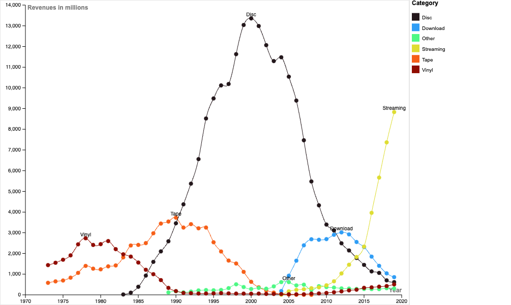
What is the Story here?
- Over the years different music formats have had their place in the sun
- All physical forms are on the wane; streaming music is the current mode of music consumption.
To get an idea of seasons, trends and to try our hand at time-series forecasting, let us look at a data set pertaining to the weather at New York city airports.
Included below is a PDF report from Orange, summarizing the data, generated from the Feature Summary widget::
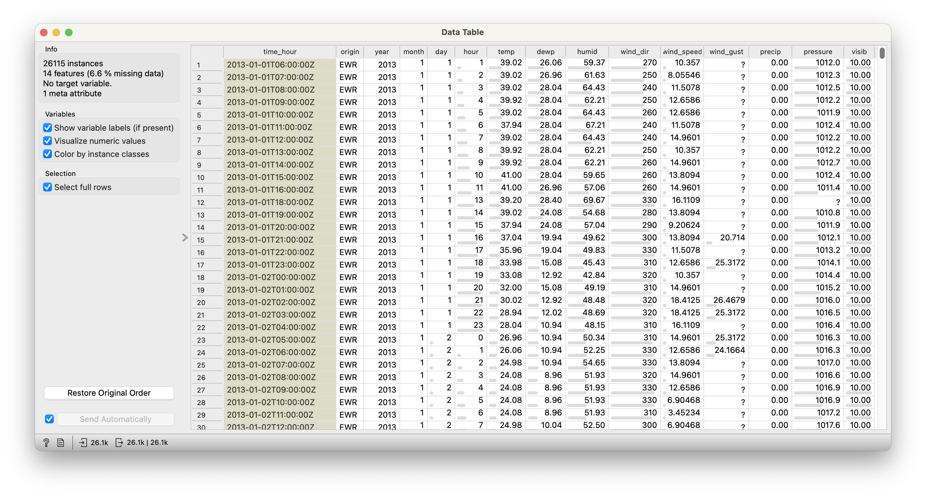
We should take the first column time_hour and see if we can use that as our time variable. All the weather related numerical data columns are individual time series which we can plot and analyse.
Quantitative Data
-
time_hour(num): Numeric date-time variable. Does Orange spot this? -
year(num): Just 2013. -
month,day,hour(num): components of the exact time of measurement of weather parameters -
humid,temp,wind_dir,wind_speed,wind_gust,precip,pressure,visib(num): all numeric weather parameters
Qualitative Data
-
origin(text): airport (JKF/EWR/LGR)
Let us build an Orange workflow step-by-step for this dataset and its Research Questions.
There are a lot of parameters to play with and investigate here.
Question
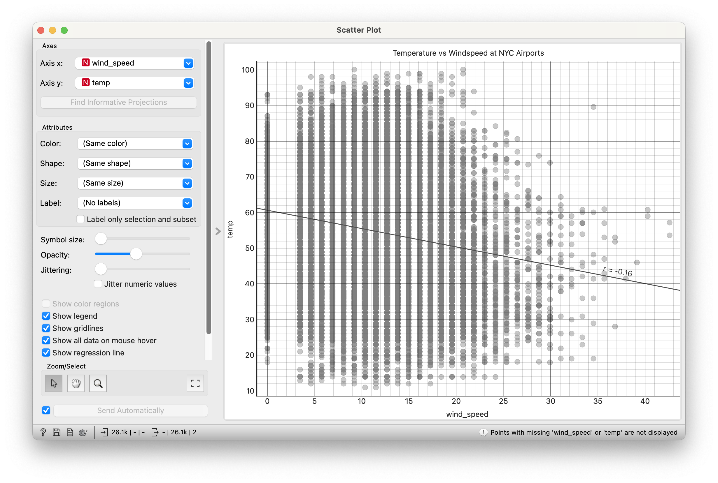
Q1. What is Temperature temp over time at each of three airports? 
This is a Scatter Plot of course.
It seems the Line Chart widget in Orange cannot colour individual time series by colour using another Qualitative variable. 😢. Is there a better way? (You know the answer.)
Also note the utter busy-ness of this chart. This is a chart of 26K points, well beyond what we can digest at one time. We need to summarize/average etc.
Question
Question
Q3. How do averaged plots look like, for temp, humid, and dewpoint?
We can use the Moving Transform widget in Orange to calculate monthly averages for these quantities, after converting the data into a time series.
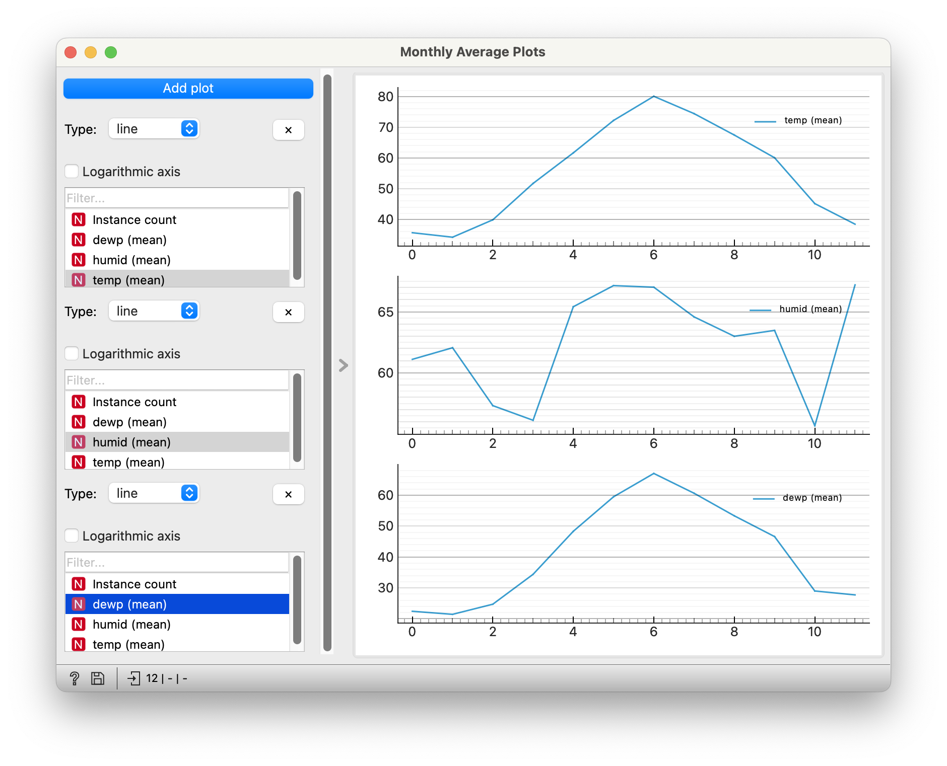
- There is a strong natural seasonal trend over the period of one year in the temperature at all three airports
- If we plot
temperatureagainstwindspeed, we see a fair negative slope/correlation, as we would expect. - Humidity is high most times, except during some very dry winter months?
Note
Did you notice the serious outlier in the temp vs windspeed graph? Try to remove the Select Rows widget and see if you can spot it. Do you understand why that egregious reading had to be be filtered?
Such readings are called outliers.
Tourist: Any famous people born around here?
Guide: No sir, best we can do is babies.
The Time Series Line Chart widget in Orange is described here. https://orangedatamining.com/widget-catalog/time-series/line_chart/
Let us take some Births related data and plot it in Orange.
And download the Line Chart workflow file for this data:
Note how we have two widgets for the Line Charts. More shortly.


Quantitative Data
-
year,month,date_of_month: (int) Columns giving time information -
day-of_week: (int) Additional Time information -
births: (int) Total live births across the USA that day
Qualitative Data
None. Though we might covert day_of_week and month into Qual variables later.
Evenly spread year, month, date_of_month and day_of_week variables…the bumps are curious though, no? day_of_week is of course neat. births are numerical data and have a good spread with a bimodal distribution distribution. Some numbers in the mid-range hardly occur at all… So a premonition of some two-valued phenomenon here already.
Q1. What does the
births data look like over the years?
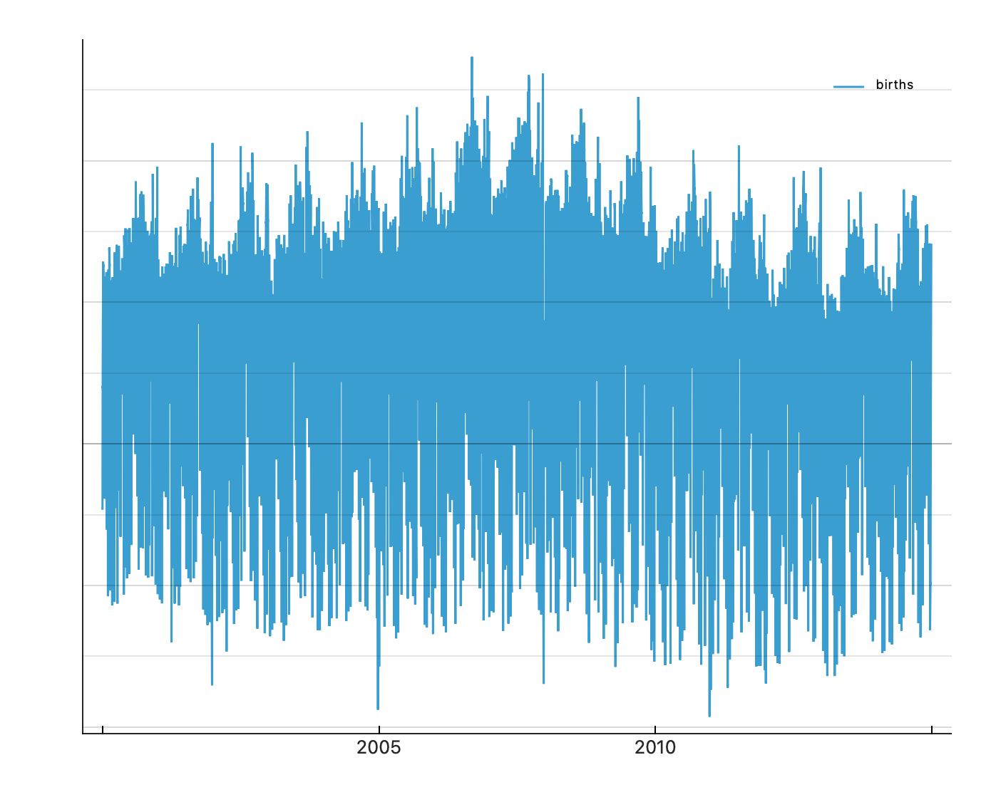
Hmmm…very busy graph. The overall trend is a slight bump in births around 2007 and then a slow reduction in births. Large variations otherwise, which we need to see in finer detail on a magnified scale, a folded scale, or by averaging.
Converting . We will be able to average over month, day_of_week to see what happens.month or day_of_week to categorical in the File Menu does not provide us with a way of separating the time series by month or weekday…sad.
Q2. What do births look like averaged over
month?
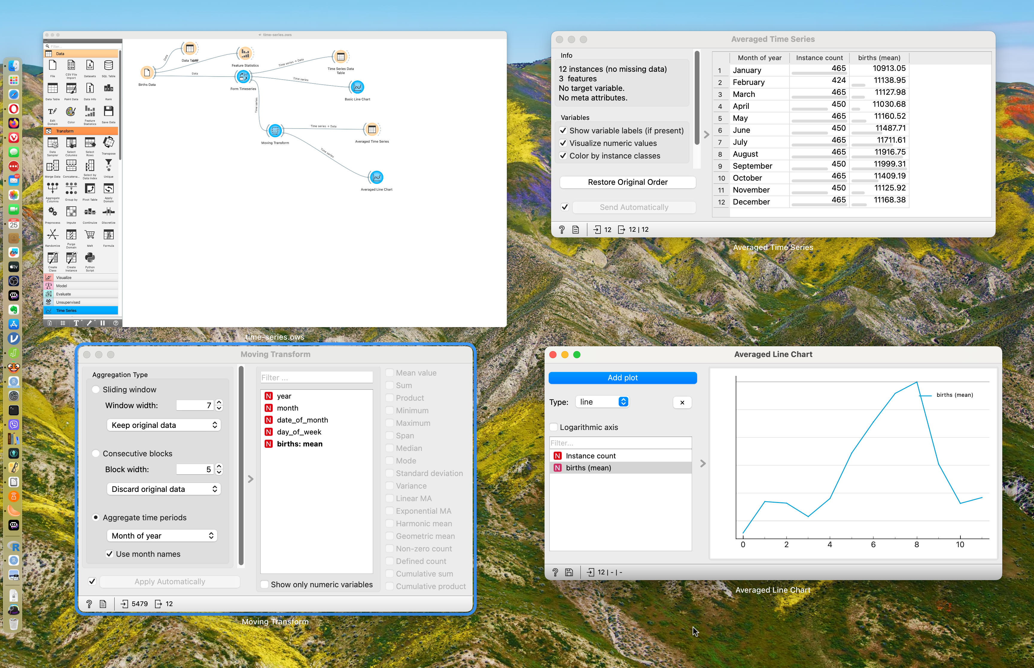
This is good! We have converted the dataset to a timeseries, of course, and then added a moving transform widget, that allows us to take averages of births over weeks, months, or years. Play with this setting in the moving transform widget.
We see that averaging i.e.
Q3. What do births look like averaged over
day_of_week?
Here too with the moving transform widget, choosing Day of Week as the aggregating parameter, we see a dip in births over weekends. Try!!
Folded Scale?
Look at the figure below.
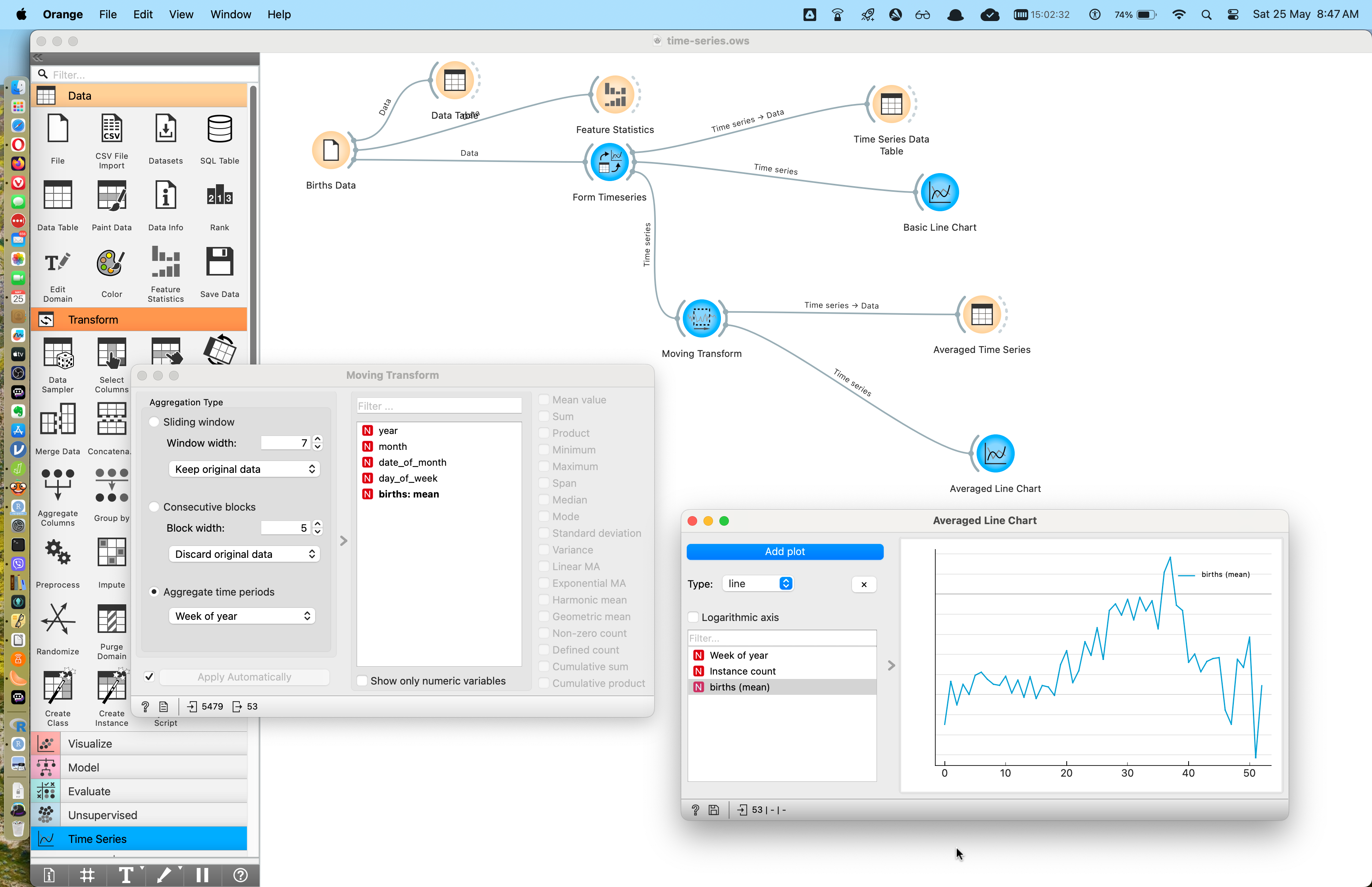
It should be apparent that the line chart shows averages based on “Week of Year”. What does that mean?
Imagine a carpenter’s folding footruler: 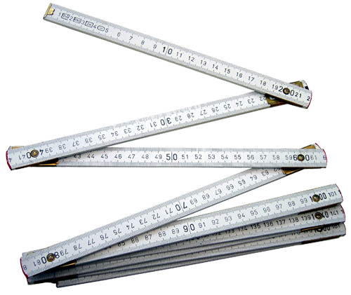
Imagine the entire time series stretched out and then folded over itself at intervals of a week. There will of course be overlapping data that represent data points for the same week year after year. THAT is what goes into the averaging!
So we see that the weeks in September show the highest average birth numbers, which seems right!
Imagine that we follow this overlap routine and get the data by same-week-of-year, as before. We need not necessarily average that data; we can simply plot each (repeated) week’s worth of data as a box plot. This results in an array of boxplots, one per week, and is called a candlestick plot. Clearly we can do this for months, weeks, and even days of the week. Here is what it looks like; it does not seem possible to create these with any of the tools we are currently using.
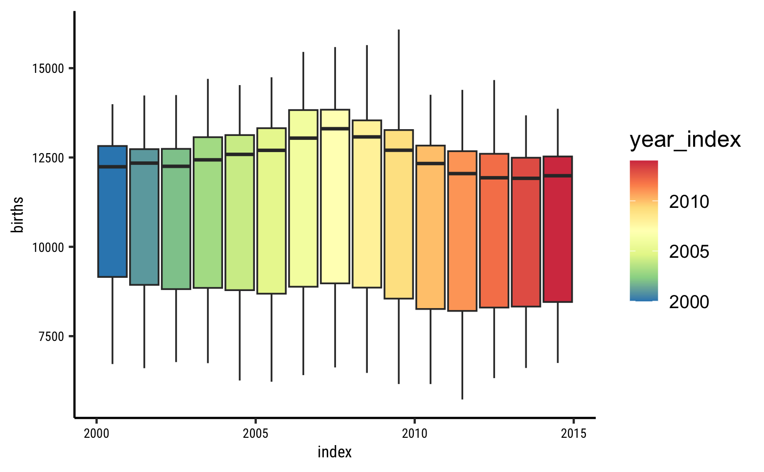
As before, the medians are the black lines across each boxplot, which is one for each month. Note that since the medians are towards the upper end of the boxplots, we can guess that the per-month distribution must be skewed to the left (lower than median values are less frequent).
If the Quantities that vary over time are not continuous but discrete values such as high, medium, and low,, a time-series heatmap is also a possibility.
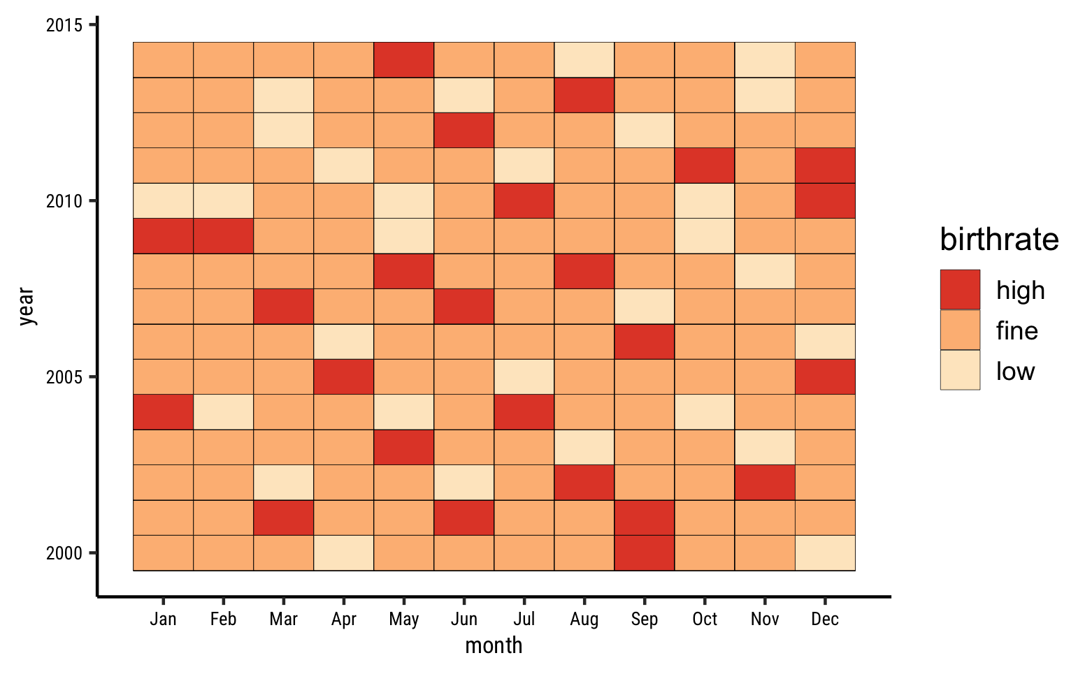
Very arbitrarily slicing the birth numbers into three bins titled high, fine, and low, we can plot a heatmap like this. Orange does have a heatmap widget, however it seems suited to Machine Learning methods such as Clustering.
Valentine’s Day Spending by Age
A regular line plot, not a time series.
William Farr’s Data on Cholera in London, 1849
Arctic and Antarctic Sea Ice coverage over time.
Purple Air
In the Air Tonight: Head over to Purple Rain Purple Air and download air quality data from community based air quality sensors. Plot these as time series, and try getting historical data, or data on festivals or important occasions in specific cities.
- Line Charts show up functional relationships or overall trends in the data.
- They can be made less cluttered than the corresponding scatter plots, especially with averaging.
- Seasonal cycles can also be spotted very easily.
- The X-axis need not necessarily be time: it can often be other (independent) variables, and the Y-axis plots the target/dependent variable.
- However, we do encounter many things that vary over time: weather, wealth, No. of users or downloads of an app, hits to a webpage, customers at a supermarket, or population of animals or plants in a region.
- These are best represented by Line Charts
- As humans, we are also deeply interested in patterns of recurrence over time, and in forecasting for the future, using tech, and using say Oracles.
- Both these purposes are amply served by Line Charts.
- Charles Chambliss (1989). The Mundanity of Excellence: An ethnographical report on Stratification and Olympic Swimmers.
- Nijs V (2023). radiant: Business Analytics using R and Shiny. R package version 1.6.0, https://github.com/radiant-rstats/radiant.
- Robert Hyndman, Forecasting: Principles and Practice (Third Edition).available online
-
Time Series Analysis at Our Coding Club
-
The Nuclear Threat—The Shadow Peace, part 1
-
11 Ways to Visualize Changes Over Time – A Guide