| No | Pronoun | Answer | Variable/Scale | Example | What Operations? |
|---|---|---|---|---|---|
| 2 | How Many / Much / Heavy? Few? Seldom? Often? When? | Quantities with Scale. Differences are meaningful, but not products or ratios | Quantitative/Interval | pH,SAT score(200-800),Credit score(300-850),SAT score(200-800),Year of Starting College | Mean,Standard Deviation |
Time is a Him!
Time Variables
Time Series
Line Chart
Candlestick Plot
Heatmap
Abstract
Visualizing Time Series
| Variable #1 | Variable #2 | Chart Names | Chart Shape |
|---|---|---|---|
| Quant | None | Time Series Line Chart |
Why are fewer babies born on weekends?
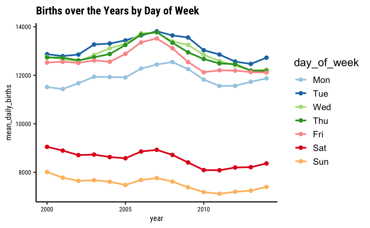
Looks like an interesting story here…there are significantly fewer births on average on Sat and Sun, over the years! Why? Should we watch Grey’s Anatomy ?
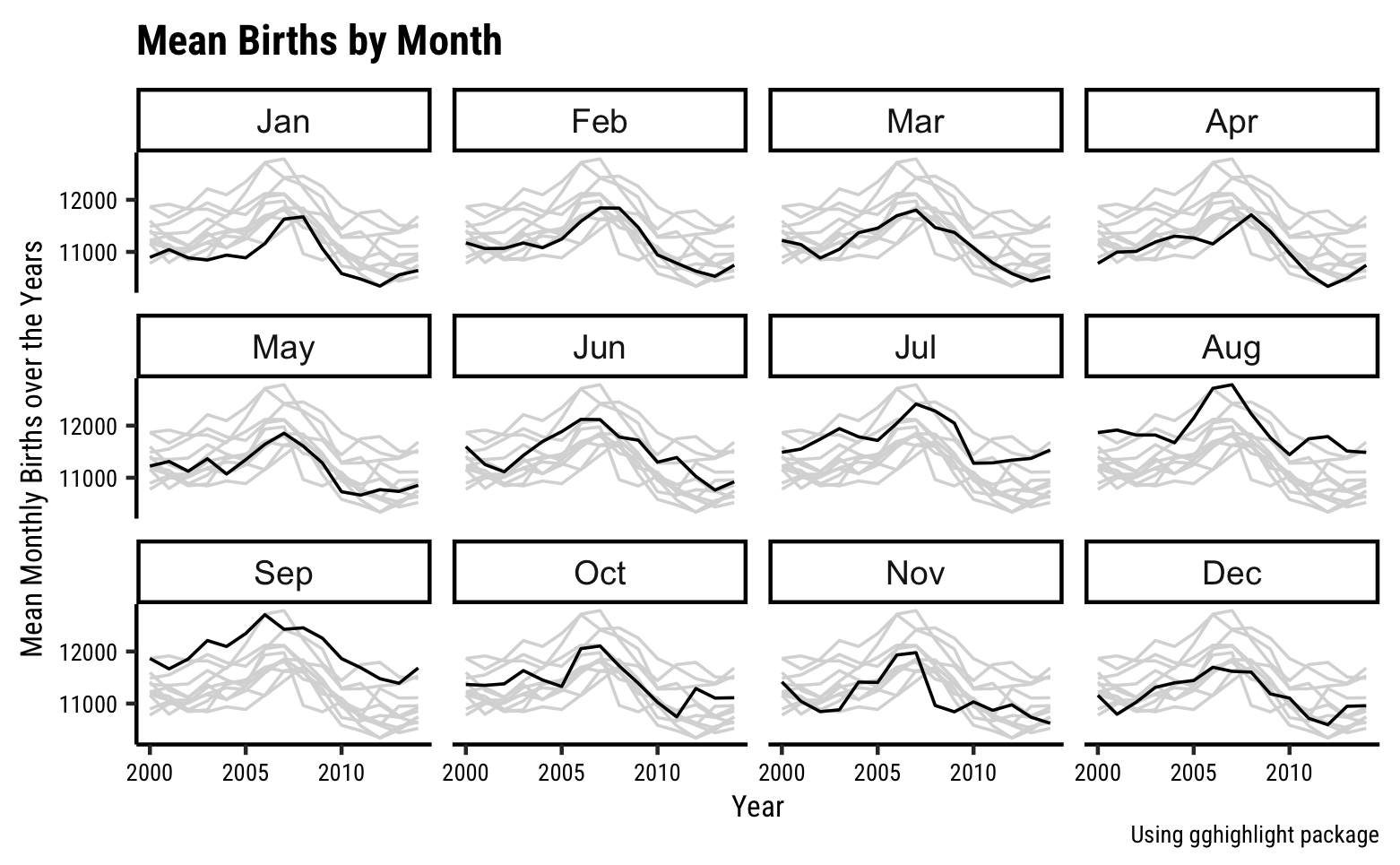
And why more births in September? That should be a no-brainer!! 😀
Any metric that is measured over regular time intervals forms a time series. Analysis of Time Series is commercially important because of industrial need and relevance, especially with respect to Forecasting (Weather data, sports scores, population growth figures, stock prices, demand, sales, supply…).
The X-axis is mapped to a temporal variable (i.e. representing time). The Y-axis is mapped to one or more Quant variables. We can easily get a sense of rhythm, season, cyclical variations, peaks, troughs….and whether something is getting seriously out of hand over time. Sadly
We can also take averages of the Y-axis Quant variable, over periods of X-axis variable; e.g. weekly or monthly averages. This is called smoothing of the data.
The Time Series Line Chart widget in Orange is described here. https://orangedatamining.com/widget-catalog/time-series/line_chart/
Let us take some Births related data and plot it in Orange.
And download the Line Chart workflow file for this data:
Note how we have two widgets for the Line Charts. More shortly.
We can use a built-in dataset to create a line chart for browser usage: 
Note that DataWrapper again requires/uses data in wide format to create its Line Charts!!
Tourist: Any famous people born around here?
Guide: No sir, best we can do is babies.


Quantitative Data
-
year,month,date_of_month: (int) Columns giving time information -
day-of_week: (int) Additional Time information -
births: (int) Total live births across the USA that day
Qualitative Data
None. Though we might covert day_of_week and month into Qual variables later.
Evenly spread year, month, date_of_month and day_of_week variables…the bumps are curious though, no? day_of_week is of course neat. births are numerical data and have a good spread with a bimodal distribution distribution. Some numbers in the mid-range hardly occur at all… So a premonition of some two-valued phenomenon here already.
Note
Q1. What does the births data look like over the years?
 Hmmm…very busy graph. The overall trend is a slight bump in births around 2007 and then a slow reduction in births. Large variations otherwise, which we need to see in finer detail on a magnified scale, a folded scale, or by averaging.
Converting . We will be able to average over month, day_of_week to see what happens.month or day_of_week to categorical in the File Menu does not provide us with a way of separating the time series by month or weekday…sad.
Note
Q2. What do births look like averaged over month?
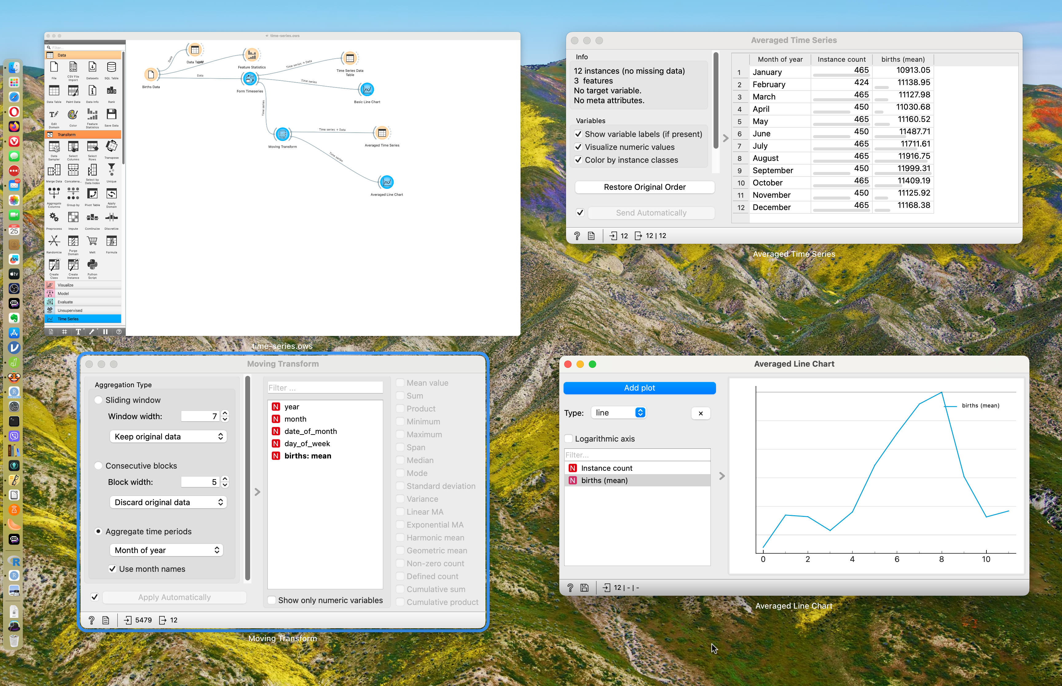
This is good! We have converted the dataset to a timeseries, of course, and then added a moving transform widget, that allows us to take averages of births over weeks, months, or years. Play with this setting in the moving transform widget.
We see that averaging i.e.
Note
Q2. What do births look like averaged over day_of_week?
Here too with the moving transform widget, choosing Day of Week as the aggregating parameter, we see a dip in births over weekends.
Folded Scale?
Look at the figure below.
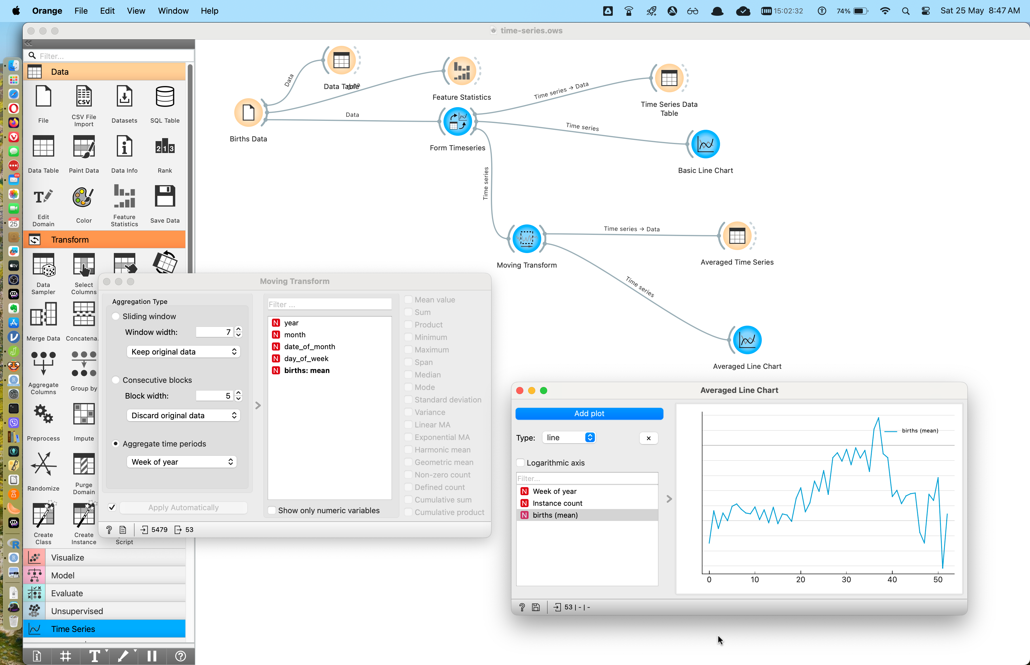
It should be apparent that the line chart shows averages based on “Week of Year”. What does that mean?
Imagine a carpenter’s folding footrule: 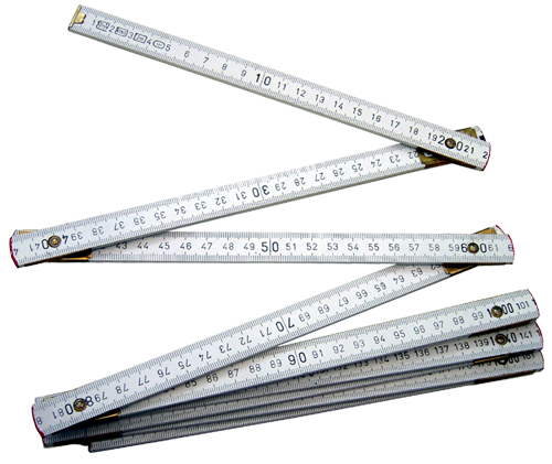
Imagine the entire time series stretched out and then folded over itself at intervals of a week. There will of course be overlapping data that represent data points for the same week year after year. THAT is what goes into the averaging!
So we see that the weeks in September show the highest average birth numbers, which seems right!
Imagine that we follow this overlap routine and get the data by same-week-of-year, as before. We need not necessarily average that data; we can simply plot each (repeated) week’s worth of data as a box plot. This results in an array of boxplots, one per week, and is called a candlestick plot. Clearly we can do this for months, weeks, and even days of the week. Here is what it looks like; it does not seem possible to create these with any of the tools we are currently using.
 As before, the medians are the black lines across each boxplot, which is one for each month. Note that since the medians are towards the upper end of the boxplots, we can guess that the per-month distribution must be skewed to the left (lower than median values are less frequent).
If the Quantities that vary over time are not continuous but discrete values such as high, medium, and low,, a time-series heatmap is also a possibility.
 Very arbitrarily slicing the birth numbers into three bins titled
 high, fine, and low, we can plot a heatmap like this. Orange does have a heatmap widget, however it seems suited to Machine Learning methods such as Clustering. We need to investigate its possibilities for time series.
- Arctic and Antarctic Sea Ice coverage over time. Is global warming affecting ice coverage at the poles?
This data is in wide form, and you may have to massage it into long form before pulling it into Orange!
-
In the Air Tonight: Head over to
Purple RainPurple Air and download air quality data from community based air quality sensors. Plot these as time series, and try getting historical data, or data on festivals or important occasions in specific cities.
- We encounter many things that vary over time: weather, wealth, No. of users or downloads of an app, hits to a webpage, customers at a supermarket, or population of animals or plants in a region.
- These are best represented by Line Charts
- As humans, we are also deeply interested in patterns of recurrence over time, and in forecasting for the future, using tech, and using say Oracles.
- Both these purposes are amply served by Line Charts.
- Robert Hyndman, Forecasting: Principles and Practice (Third Edition).available online
-
Time Series Analysis at Our Coding Club
-
The Nuclear Threat—The Shadow Peace, part 1
-
11 Ways to Visualize Changes Over Time – A Guide