library(tidyverse)
library(mosaic)
library(ggformula)

# install.packages("remotes")
# library(remotes)
# remotes::install_github("wilkelab/ggridges")
library(ggridges)
library(skimr)
library(palmerpenguins) # Our new favourite dataset
##
library(tidyplots) # Easily Produced Publication-Ready Plots
library(tinyplot) # Plots with Base R
library(tinytable) # Elegant Tables for our data
The Hills are Shadows, said Tennyson
Quant Variables
Qual Variables
Density Plots
Ridge Plots
Abstract
Quant and Qual Variable Graphs and their Siblings
Slides and Tutorials
| R (Static Viz) | Radiant Tutorial | Datasets |
“Never let the future disturb you. You will meet it, if you have to, with the same weapons of reason which today arm you against the present.”
— Marcus Aurelius
Plot Fonts and Theme
Show the Code
library(systemfonts)
library(showtext)
## Clean the slate
systemfonts::clear_local_fonts()
systemfonts::clear_registry()
##
showtext_opts(dpi = 96) # set DPI for showtext
sysfonts::font_add(
  family = "Alegreya",
  regular = "../../../../../../fonts/Alegreya-Regular.ttf",
  bold = "../../../../../../fonts/Alegreya-Bold.ttf",
  italic = "../../../../../../fonts/Alegreya-Italic.ttf",
  bolditalic = "../../../../../../fonts/Alegreya-BoldItalic.ttf"
)

sysfonts::font_add(
  family = "Roboto Condensed",
  regular = "../../../../../../fonts/RobotoCondensed-Regular.ttf",
  bold = "../../../../../../fonts/RobotoCondensed-Bold.ttf",
  italic = "../../../../../../fonts/RobotoCondensed-Italic.ttf",
  bolditalic = "../../../../../../fonts/RobotoCondensed-BoldItalic.ttf"
)
showtext_auto(enable = TRUE) # enable showtext
##
theme_custom <- function() {
  font <- "Alegreya" # assign font family up front

  theme_classic(base_size = 14, base_family = font) %+replace% # replace elements we want to change

    theme(
      text = element_text(family = font), # set base font family

      # text elements
      plot.title = element_text( # title
        family = font, # set font family
        size = 24, # set font size
        face = "bold", # bold typeface
        hjust = 0, # left align
        margin = margin(t = 5, r = 0, b = 5, l = 0)
      ), # margin
      plot.title.position = "plot",
      plot.subtitle = element_text( # subtitle
        family = font, # font family
        size = 14, # font size
        hjust = 0, # left align
        margin = margin(t = 5, r = 0, b = 10, l = 0)
      ), # margin

      plot.caption = element_text( # caption
        family = font, # font family
        size = 9, # font size
        hjust = 1
      ), # right align

      plot.caption.position = "plot", # right align

      axis.title = element_text( # axis titles
        family = "Roboto Condensed", # font family
        size = 12
      ), # font size

      axis.text = element_text( # axis text
        family = "Roboto Condensed", # font family
        size = 9
      ), # font size

      axis.text.x = element_text( # margin for axis text
        margin = margin(5, b = 10)
      )

      # since the legend often requires manual tweaking
      # based on plot content, don't define it here
    )
}
Show the Code
```{r}
#| cache: false
#| code-fold: true
## Set the theme
theme_set(new = theme_custom())
```
Error in theme_set(new = theme_custom()): could not find function "theme_set"Show the Code
```{r}
#| cache: false
#| code-fold: true
## Use available fonts in ggplot text geoms too!
update_geom_defaults(geom = "text", new = list(
  family = "Roboto Condensed",
  face = "plain",
  size = 3.5,
  color = "#2b2b2b"
))
```
Error in update_geom_defaults(geom = "text", new = list(family = "Roboto Condensed", : could not find function "update_geom_defaults"
| Variable #1 | Variable #2 | Chart Names | Chart Shape | |
|---|---|---|---|---|
| Quant | None | Density plot, Ridge Density Plot |
| No | Pronoun | Answer | Variable/Scale | Example | What Operations? |
|---|---|---|---|---|---|
| 1 | How Many / Much / Heavy? Few? Seldom? Often? When? | Quantities, with Scale and a Zero Value.Differences and Ratios /Products are meaningful. | Quantitative/Ratio | Length,Height,Temperature in Kelvin,Activity,Dose Amount,Reaction Rate,Flow Rate,Concentration,Pulse,Survival Rate | Correlation |
April is the cruelest month, said T.S Eliot. But December in Nebraska must be tough.
As we saw earlier, Histograms are best to show the distribution of raw Quantitative data, by displaying the number of values that fall within defined ranges, often called buckets or bins.
Sometimes it is useful to consider a chart where the bucket width shrinks to zero!
You might imagine a density chart as a histogram where the buckets are infinitesimally small, i.e. zero width. Think of the frequency density as a differentiation (as in calculus) of the histogram. By taking the smallest of steps
penguins dataset
We will first look at at a dataset that is directly available in R, the penguins dataset. Data were collected and made available by Dr. Kristen Gorman and the Palmer Station, Antarctica LTER, a member of the Long Term Ecological Research Network.
As per our Workflow, we will look at the data using all the three methods we have seen.
glimpse(penguins)Rows: 344
Columns: 8
$ species <fct> Adelie, Adelie, Adelie, Adelie, Adelie, Adelie, Adel…
$ island <fct> Torgersen, Torgersen, Torgersen, Torgersen, Torgerse…
$ bill_length_mm <dbl> 39.1, 39.5, 40.3, NA, 36.7, 39.3, 38.9, 39.2, 34.1, …
$ bill_depth_mm <dbl> 18.7, 17.4, 18.0, NA, 19.3, 20.6, 17.8, 19.6, 18.1, …
$ flipper_length_mm <int> 181, 186, 195, NA, 193, 190, 181, 195, 193, 190, 186…
$ body_mass_g <int> 3750, 3800, 3250, NA, 3450, 3650, 3625, 4675, 3475, …
$ sex <fct> male, female, female, NA, female, male, female, male…
$ year <int> 2007, 2007, 2007, 2007, 2007, 2007, 2007, 2007, 2007…skim(penguins)| Name | penguins |
| Number of rows | 344 |
| Number of columns | 8 |
| _______________________ | |
| Column type frequency: | |
| factor | 3 |
| numeric | 5 |
| ________________________ | |
| Group variables | None |
Variable type: factor
| skim_variable | n_missing | complete_rate | ordered | n_unique | top_counts |
|---|---|---|---|---|---|
| species | 0 | 1.00 | FALSE | 3 | Ade: 152, Gen: 124, Chi: 68 |
| island | 0 | 1.00 | FALSE | 3 | Bis: 168, Dre: 124, Tor: 52 |
| sex | 11 | 0.97 | FALSE | 2 | mal: 168, fem: 165 |
Variable type: numeric
| skim_variable | n_missing | complete_rate | mean | sd | p0 | p25 | p50 | p75 | p100 | hist |
|---|---|---|---|---|---|---|---|---|---|---|
| bill_length_mm | 2 | 0.99 | 43.92 | 5.46 | 32.1 | 39.23 | 44.45 | 48.5 | 59.6 | ▃▇▇▆▁ |
| bill_depth_mm | 2 | 0.99 | 17.15 | 1.97 | 13.1 | 15.60 | 17.30 | 18.7 | 21.5 | ▅▅▇▇▂ |
| flipper_length_mm | 2 | 0.99 | 200.92 | 14.06 | 172.0 | 190.00 | 197.00 | 213.0 | 231.0 | ▂▇▃▅▂ |
| body_mass_g | 2 | 0.99 | 4201.75 | 801.95 | 2700.0 | 3550.00 | 4050.00 | 4750.0 | 6300.0 | ▃▇▆▃▂ |
| year | 0 | 1.00 | 2008.03 | 0.82 | 2007.0 | 2007.00 | 2008.00 | 2009.0 | 2009.0 | ▇▁▇▁▇ |
inspect(penguins)
categorical variables:
     name  class levels   n missing
1 species factor      3 344       0
2  island factor      3 344       0
3     sex factor      2 333      11
                                   distribution
1 Adelie (44.2%), Gentoo (36%) ...
2 Biscoe (48.8%), Dream (36%) ...
3 male (50.5%), female (49.5%)

quantitative variables:
               name   class    min       Q1  median     Q3    max       mean
1    bill_length_mm numeric   32.1   39.225   44.45   48.5   59.6   43.92193
2     bill_depth_mm numeric   13.1   15.600   17.30   18.7   21.5   17.15117
3 flipper_length_mm integer  172.0  190.000  197.00  213.0  231.0  200.91520
4       body_mass_g integer 2700.0 3550.000 4050.00 4750.0 6300.0 4201.75439
5              year integer 2007.0 2007.000 2008.00 2009.0 2009.0 2008.02907
           sd   n missing
1   5.4595837 342       2
2   1.9747932 342       2
3  14.0617137 342       2
4 801.9545357 342       2
5   0.8183559 344       0
Qualitative Data
-
sex: male and female penguins -
island: they have islands to themselves!! -
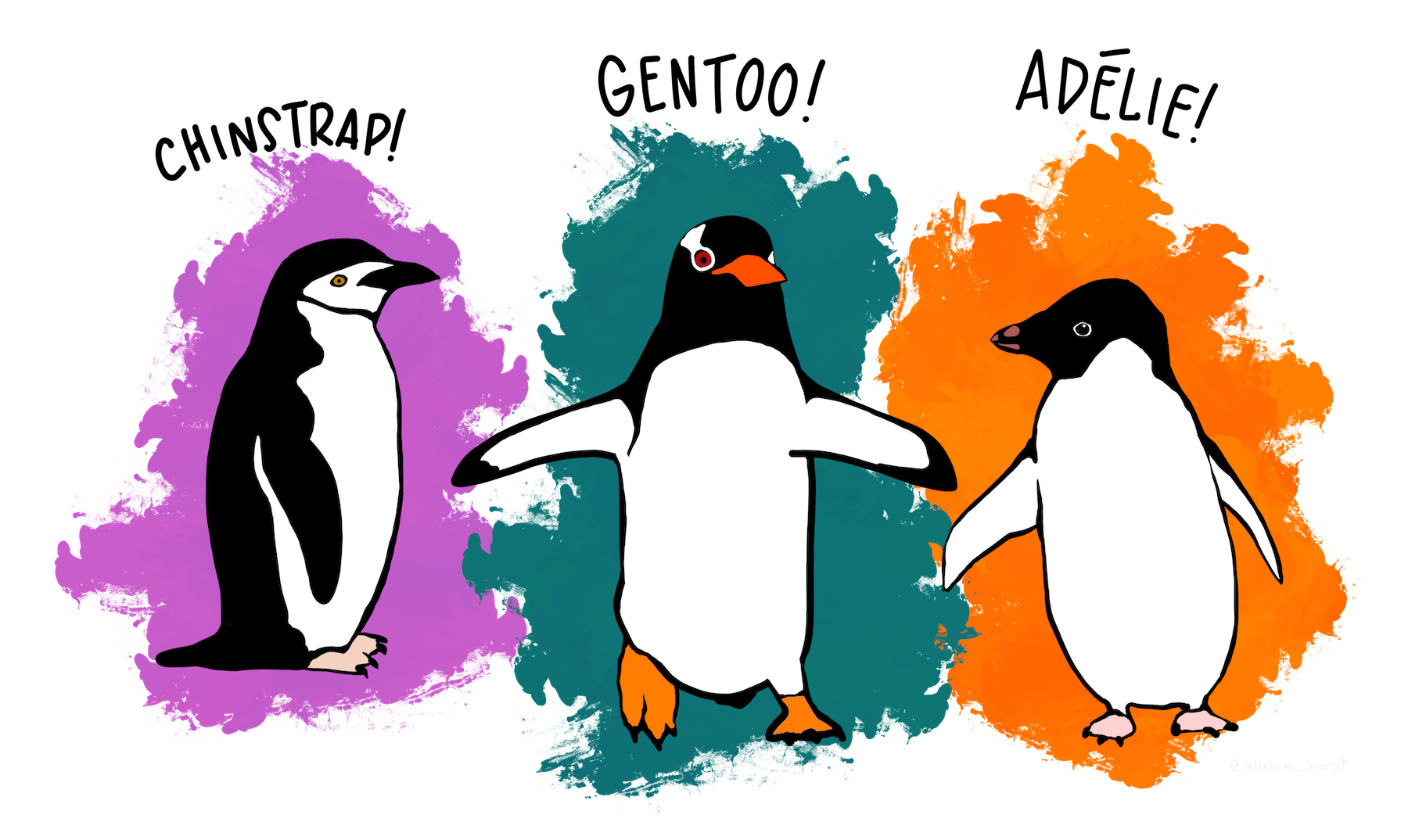
species: Three adorable types!
Quantitative Data
-
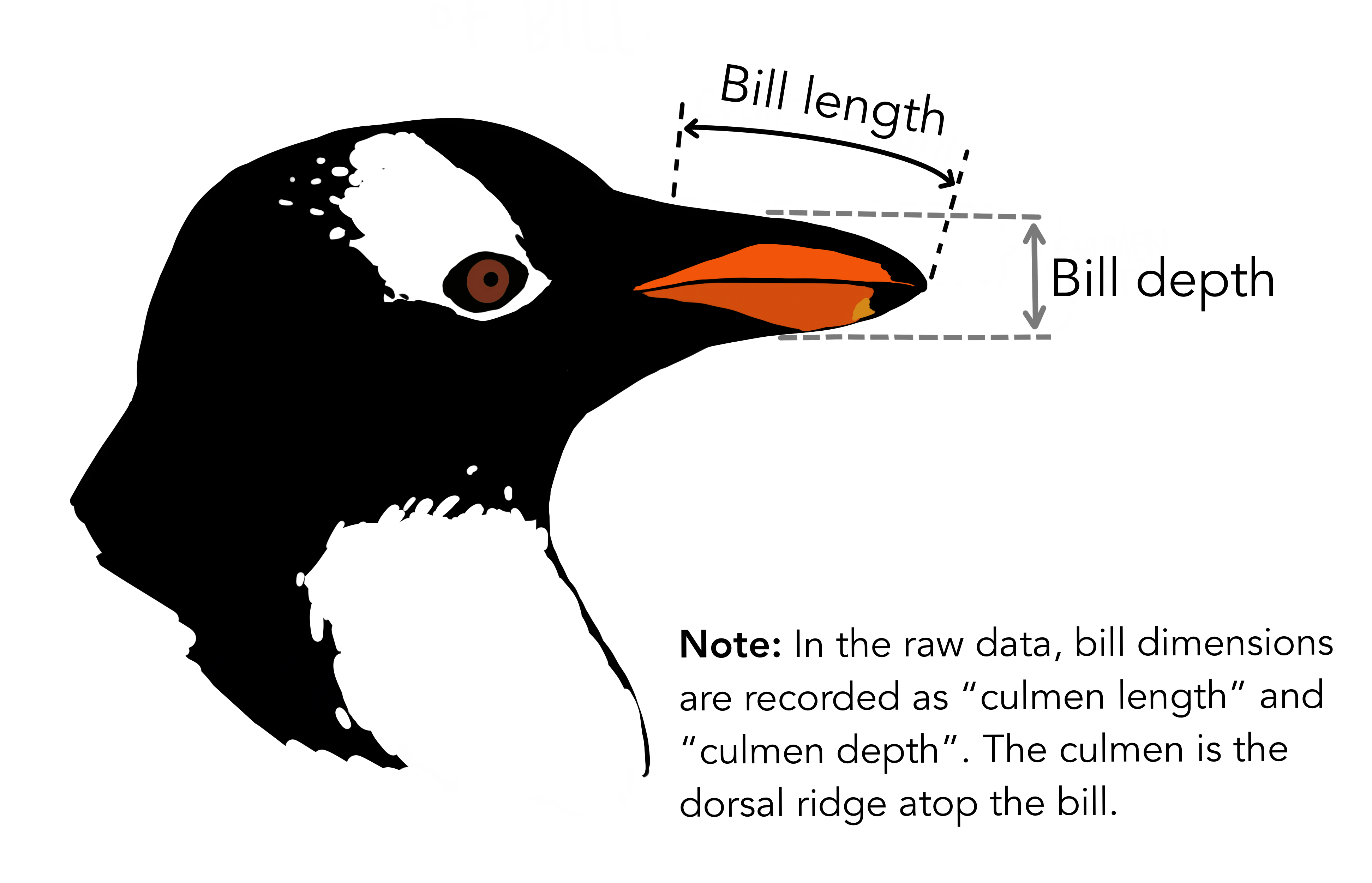
bill_length_mm: The length of the penguins’ bills -
bill_depth_mm: See the picture!! -
flipper_length_mm: Flippers! Penguins have “hands”!! -
body_mass_gm: Grams? Grams??? Why, these penguins are like human babies!!❤️
Business Insights on Examining the
penguins dataset
- This is a smallish dataset (344 rows, 8 columns).
- There are a few missing values in
sex(11 missing entries) and all the Quant variables (2 missing entries each).
penguins <- penguins %>% drop_na()
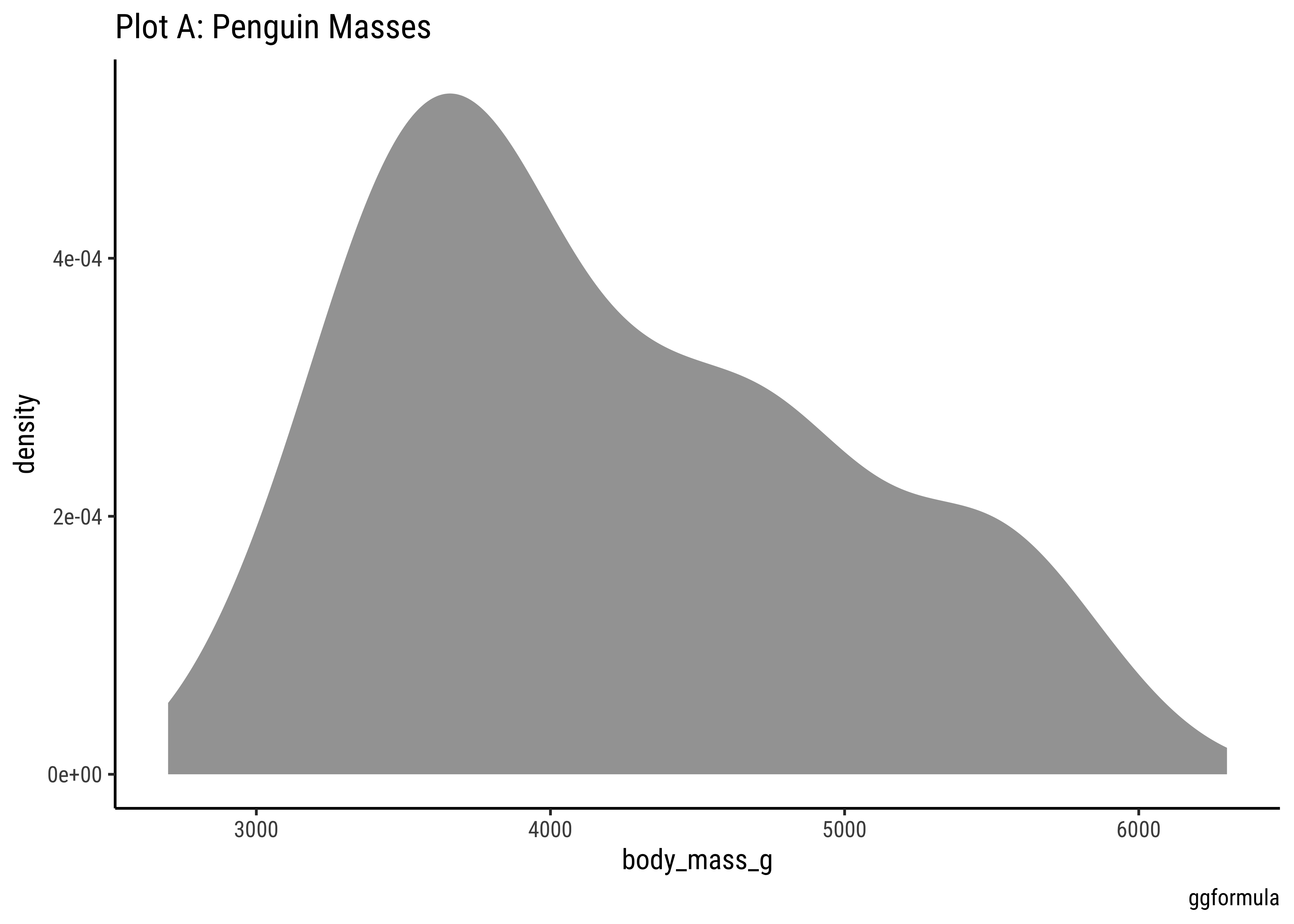
gf_density(~body_mass_g, data = penguins) %>%
gf_labs(title = "Plot A: Penguin Masses", caption = "ggformula")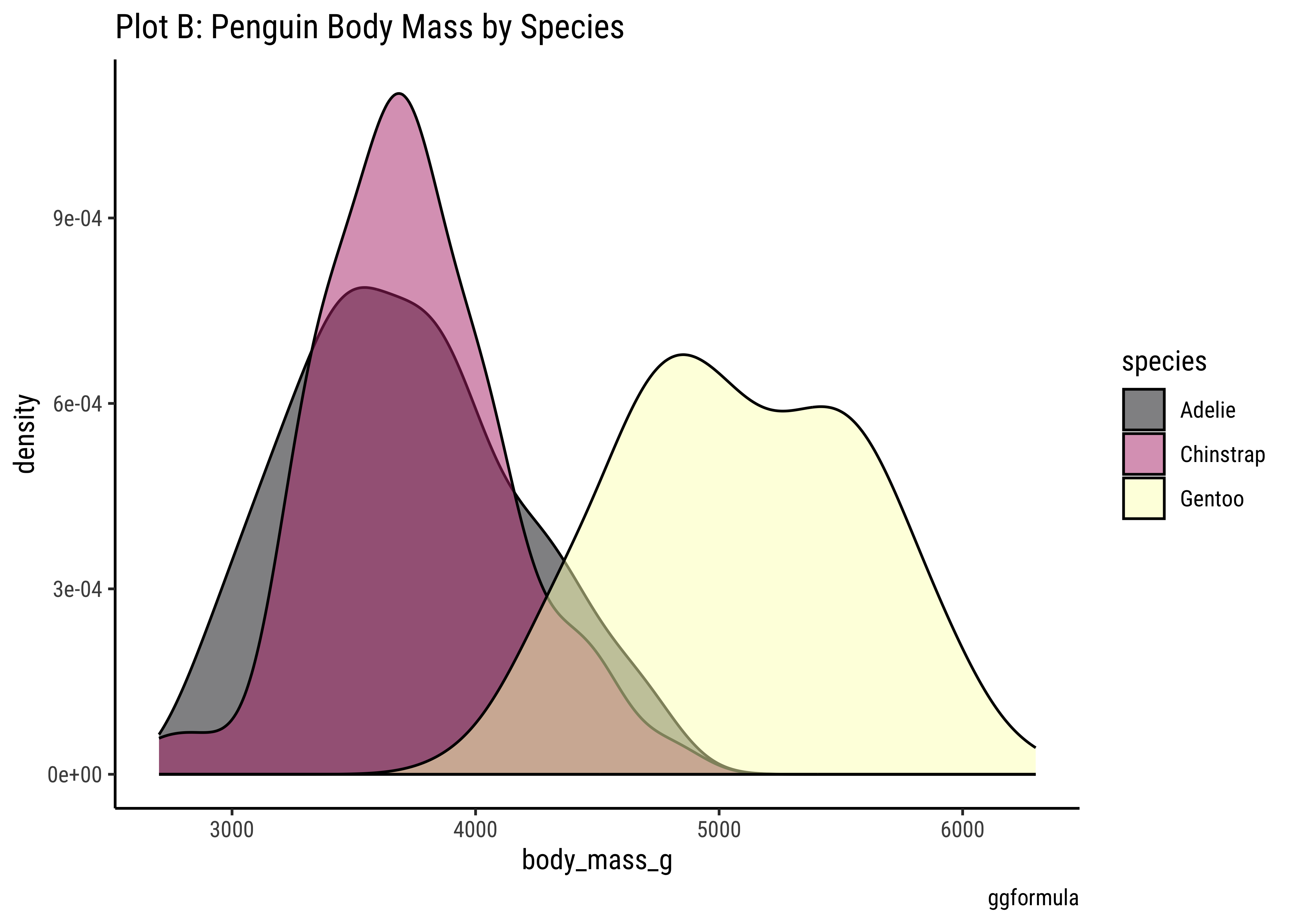
# ggplot2::theme_set(new = theme_classic(base_family = "Roboto Condensed")) # Set consistent graph theme
penguins %>%
  gf_density(~body_mass_g,
    fill = ~species,
    color = "black"
  ) %>%
  gf_refine(scale_color_viridis_d(
    option = "magma",
    aesthetics = c("colour", "fill")
  )) %>%
  gf_labs(
    title = "Plot B: Penguin Body Mass by Species",
    caption = "ggformula"
  )
penguins %>%
  gf_density(
    ~body_mass_g,
    fill = ~species,
    color = "black",
    alpha = 0.3
  ) %>%
  gf_facet_wrap(vars(sex)) %>%
  gf_labs(title = "Plot C: Penguin Body Mass by Species and facetted by Sex", caption = "ggformula")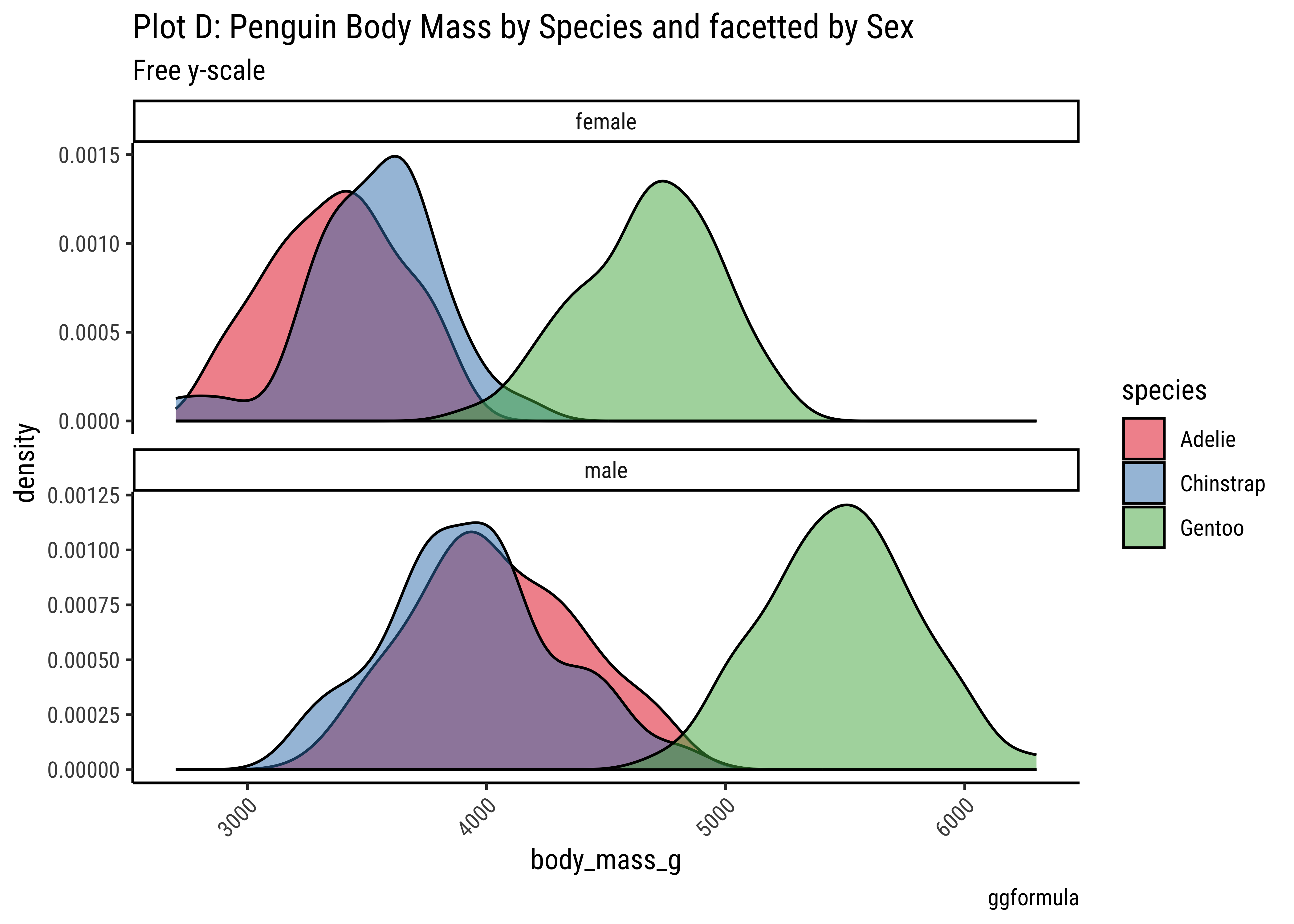
penguins %>%
  gf_density(~body_mass_g, fill = ~species, color = "black") %>%
  gf_facet_wrap(vars(sex), scales = "free_y", nrow = 2) %>%
  gf_labs(
    title = "Plot D: Penguin Body Mass by Species and facetted by Sex",
    subtitle = "Free y-scale",
    caption = "ggformula"
  ) %>%
  gf_refine(scale_fill_brewer(palette = "Set1")) %>%
  gf_theme(theme(axis.text.x = element_text(
    angle = 45,
    hjust = 1
  )))
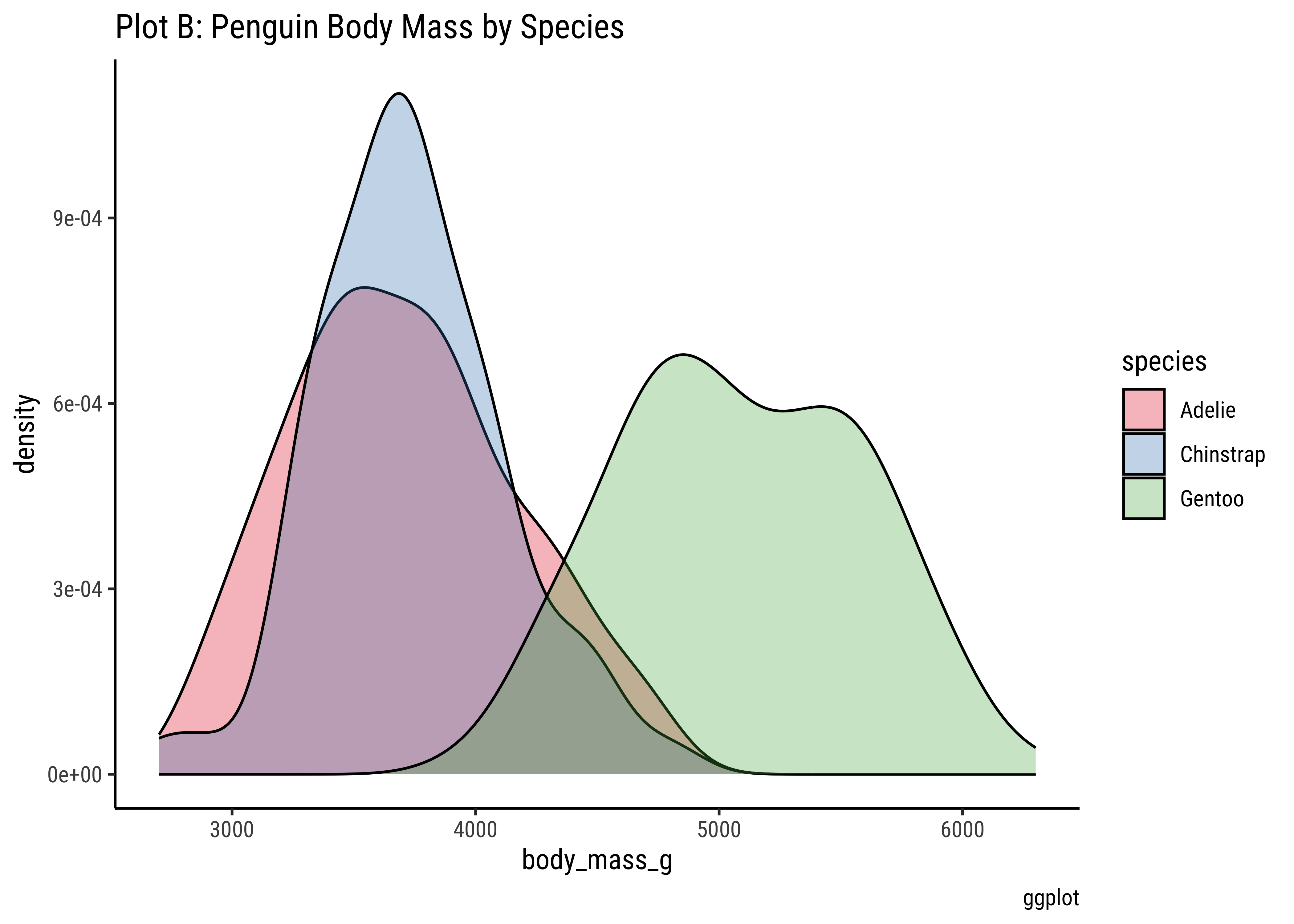
penguins %>%
  ggplot() +
  geom_density(aes(x = body_mass_g, fill = species),
    alpha = 0.3,
    color = "black"
  ) +
  scale_color_brewer(
    palette = "Set1",
    aesthetics = c("colour", "fill")
  ) +
  labs(
    title = "Plot B: Penguin Body Mass by Species",
    caption = "ggplot"
  )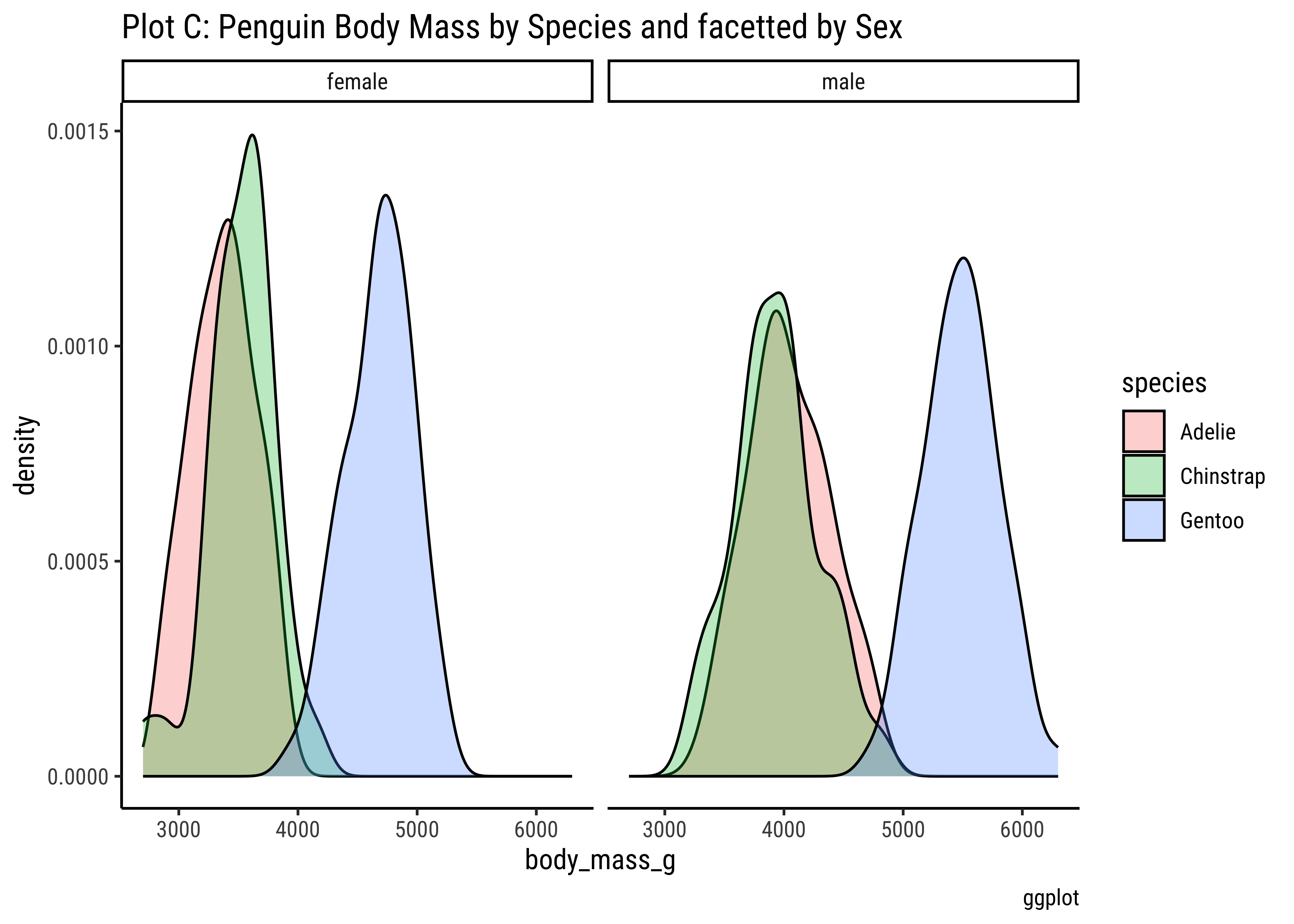
penguins %>% ggplot() +
  geom_density(aes(x = body_mass_g, fill = species),
    color = "black",
    alpha = 0.3
  ) +
  facet_wrap(vars(sex)) +
  labs(title = "Plot C: Penguin Body Mass by Species and facetted by Sex", caption = "ggplot")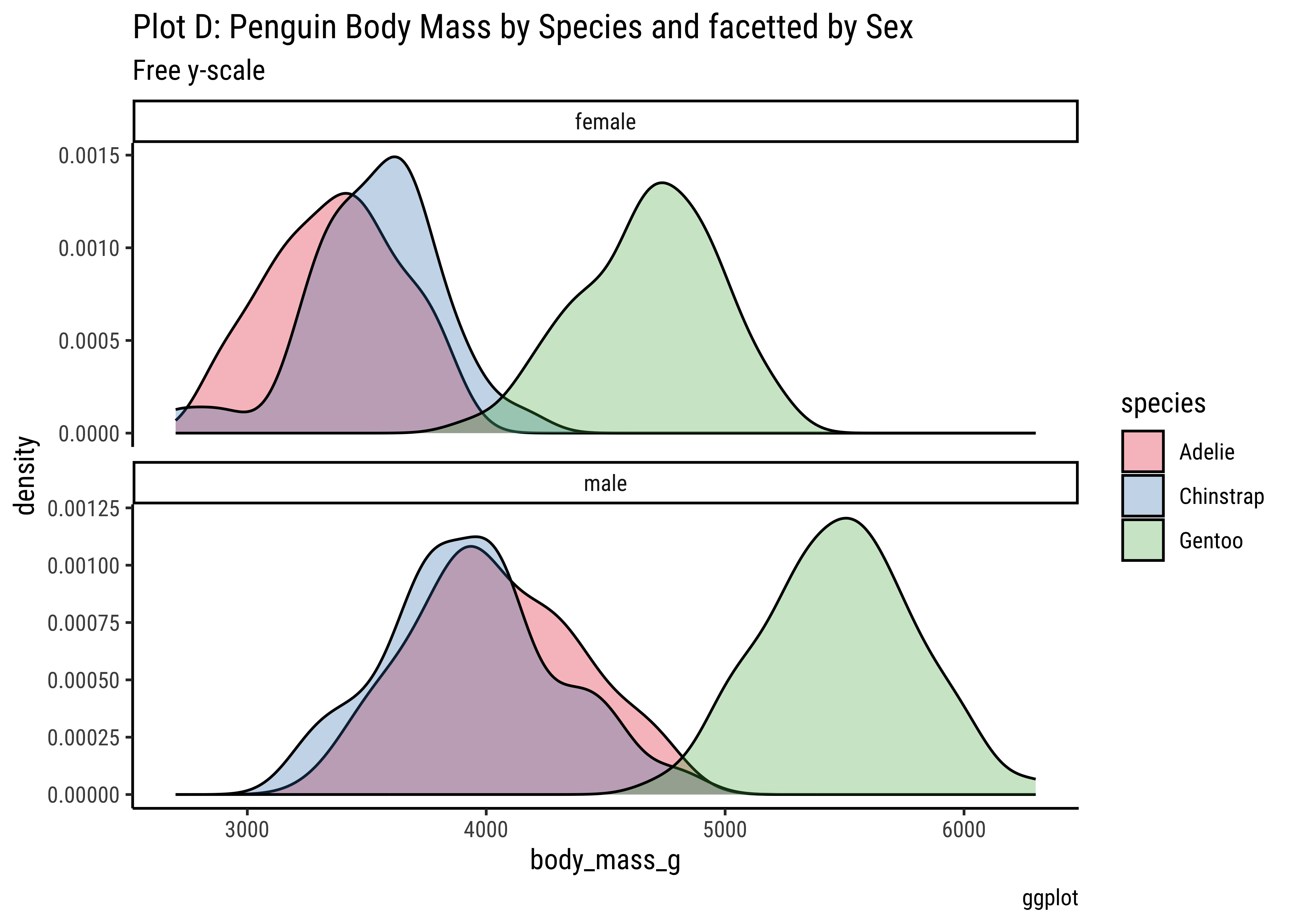
penguins %>% ggplot() +
  geom_density(aes(x = body_mass_g, fill = species),
    alpha = 0.3,
    color = "black"
  ) +
  facet_wrap(vars(sex), scales = "free_y", nrow = 2) +
  labs(
    title = "Plot D: Penguin Body Mass by Species and facetted by Sex",
    subtitle = "Free y-scale", caption = "ggplot"
  ) +
  scale_fill_brewer(palette = "Set1") +
  theme(theme(axis.text.x = element_text(angle = 45, hjust = 1)))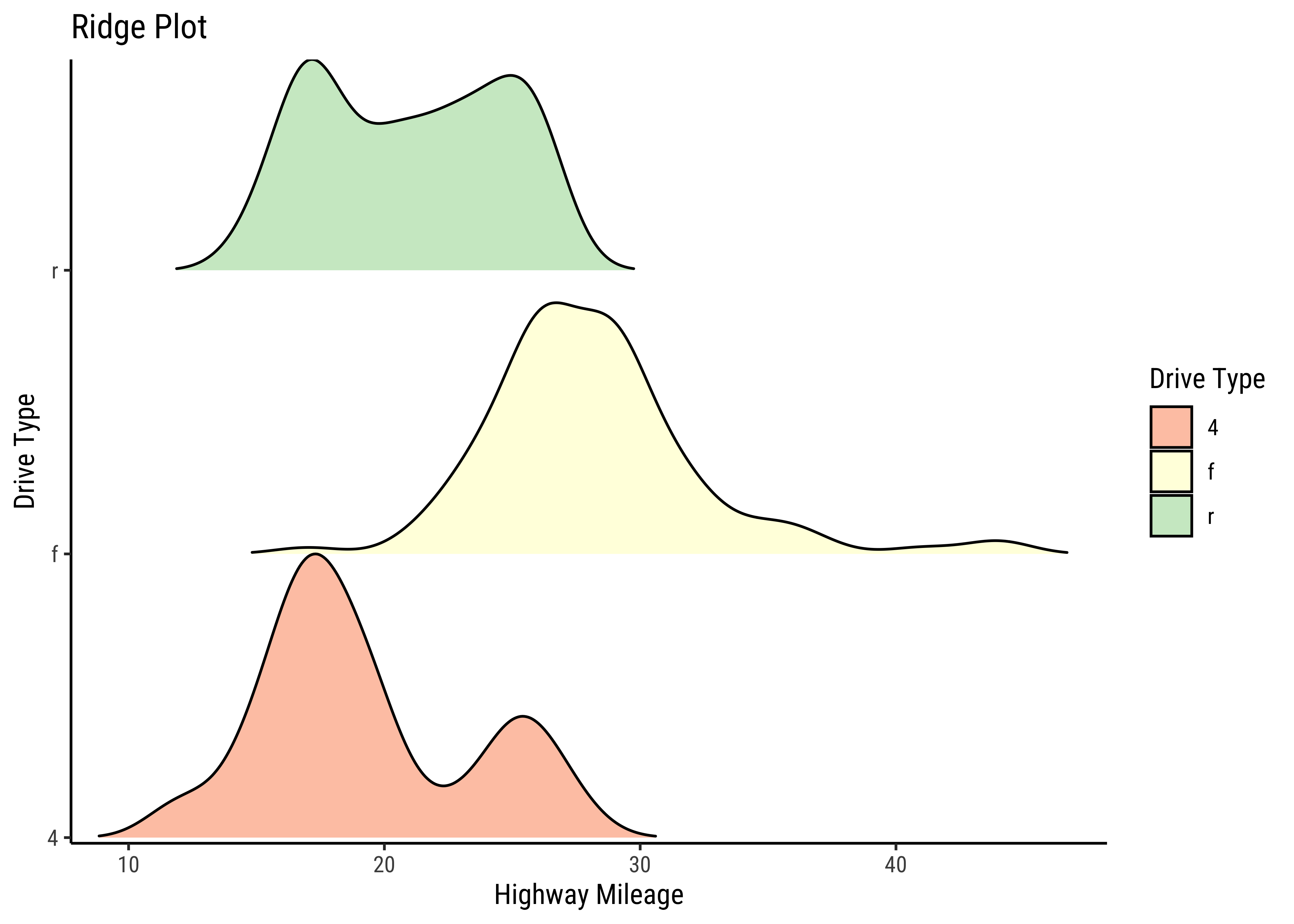
Business Insights from
penguin Densities
Pretty much similar conclusions as with histograms. Although densities may not be used much in business contexts, they are better than histograms when comparing multiple distributions! So you should use thems!
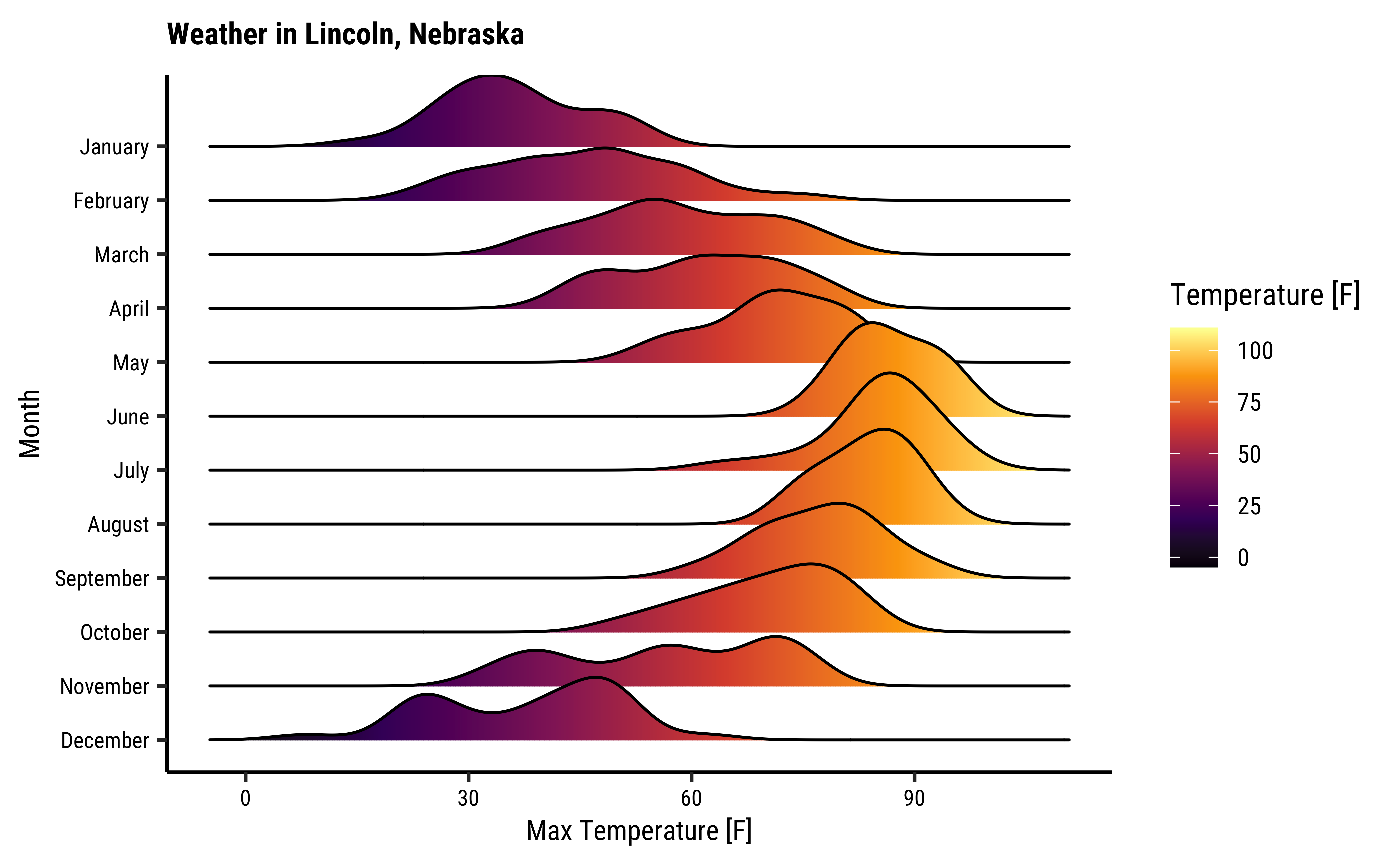
Sometimes we may wish to show the distribution/density of a Quant variable, against several levels of a Qual variable. For instance, the prices of different items of furniture, based on the furniture “style” variable. Or the sales of a particular line of products, across different shops or cities. We did this with both histograms and densities, by colouring based on a Qual variable, and by facetting using a Qual variable. There is a third way, using what is called a ridge plot. ggformula support this plot by importing/depending upon the ggridges package. ggridges provides direct support for ridge plots, and can be used as an extension to # ggplot2 and ggformula.
gf_density_ridges(drv ~ hwy,
  fill = ~drv,
  alpha = 0.5, # colour saturation
  rel_min_height = 0.005, # separation between plots
  data = mpg
) %>%
  gf_refine(
    scale_y_discrete(expand = c(0.01, 0)),
    scale_x_continuous(expand = c(0.01, 0)),
    scale_fill_brewer(
      name = "Drive Type",
      palette = "Spectral"
    )
  ) %>%
  gf_labs(
    title = "Ridge Plot", x = "Highway Mileage",
    y = "Drive Type"
  )
gf_density_ridges(drv ~ hwy,
  fill = ~drv,
  alpha = 0.5, # colour saturation
  rel_min_height = 0.005, data = mpg
) %>%
  gf_refine(
    scale_y_discrete(expand = c(0.01, 0)),
    scale_x_continuous(expand = c(0.01, 0)),
    scale_fill_brewer(
      name = "Drive Type",
      palette = "Spectral"
    )
  ) %>%
  gf_labs(
    title = "Ridge Plot", x = "Highway Mileage",
    y = "Drive Type"
  )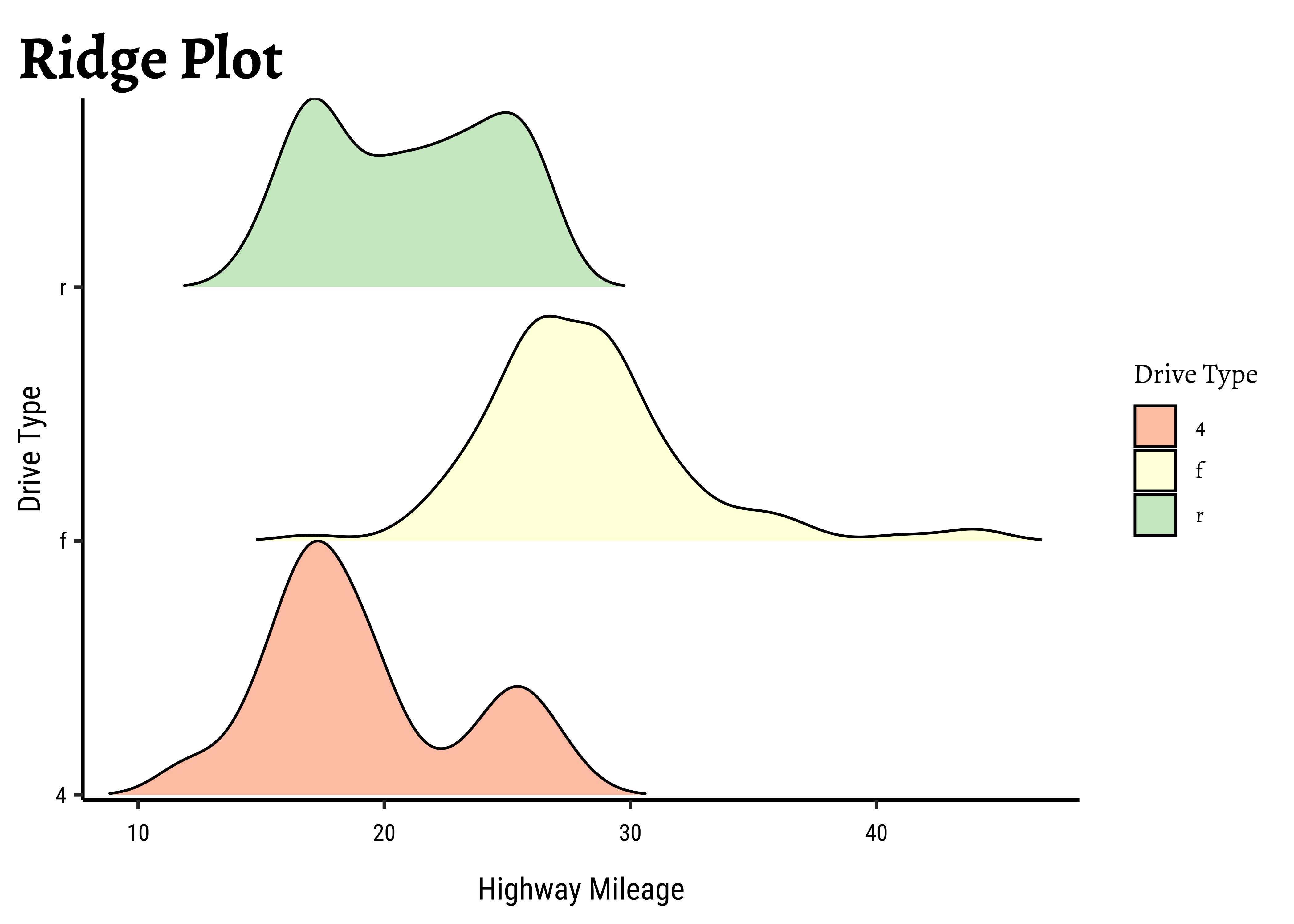
Business Insights from
mpg Ridge Plots
This is another way of visualizing multiple distributions, of a Quant variable at different levels of a Qual variable. We see that the distribution of hwy mileage varies substantially with drv type.
- Densities are sometimes easier to compare side by side. That is what Claus Wilke says, at least. Perhaps because they look less “busy” than histograms.
- Ridge Density Plots are very cool when it comes to comparing the density of a Quant variable as it varies against the levels of a Qual variable, without having to
facetorgroup. - It is possible to plot 2D-densities too, for two Quant variables, which give very evocative contour-like plots. Try to do this with the
faithfuldataset in R.
- Histograms and Frequency Distributions are both used for Quantitative data variables
- Whereas Histograms “dwell upon” counts, ranges, means and standard deviations
- Frequency Density plots “dwell upon” probabilities and densities
- Ridge Plots are density plots used for describing one Quant and one Qual variable (by inherent splitting)
- We can split all these plots on the basis of another Qualitative variable.(Ridge Plots are already split)
- Long tailed distributions need care in visualization and in inference making!
Star Trek Books
Which would be the Group By variables here? And what would you summarize? With which function?
Math Anxiety! Hah! Peasants.
- Winston Chang (2024). R Graphics Cookbook. https://r-graphics.org
- See the scrolly animation for a histogram at this website: Exploring Histograms, an essay by Aran Lunzer and Amelia McNamara https://tinlizzie.org/histograms/?s=09
- Minimal R using
mosaic.https://cran.r-project.org/web/packages/mosaic/vignettes/MinimalRgg.pdf
- Sebastian Sauer, Plotting multiple plots using purrr::map and ggplot
| Package | Version | Citation |
|---|---|---|
| ggridges | 0.5.6 | Wilke (2024) |
| NHANES | 2.1.0 | Pruim (2015) |
| resampledata3 | 1.0 | Chihara and Hesterberg (2022) |
| rtrek | 0.5.2 | Leonawicz (2025) |
| TeachHist | 0.2.1 | Lange (2023) |
| TeachingDemos | 2.13 | Snow (2024) |
| tidyplots | 0.3.1 | Engler (2025) |
| tinyplot | 0.4.1 | McDermott, Arel-Bundock, and Zeileis (2025) |
| tinytable | 0.10.0 | Arel-Bundock (2025) |
| visualize | 4.5.0 | Balamuta (2023) |
Arel-Bundock, Vincent. 2025. tinytable: Simple and Configurable Tables in “HTML,” “LaTeX,” “Markdown,” “Word,” “PNG,” “PDF,” and “Typst” Formats. https://doi.org/10.32614/CRAN.package.tinytable.
Balamuta, James. 2023. visualize: Graph Probability Distributions with User Supplied Parameters and Statistics. https://doi.org/10.32614/CRAN.package.visualize.
Chihara, Laura, and Tim Hesterberg. 2022. Resampledata3: Data Sets for “Mathematical Statistics with Resampling and R” (3rd Ed). https://doi.org/10.32614/CRAN.package.resampledata3.
Engler, Jan Broder. 2025. “Tidyplots Empowers Life Scientists with Easy Code-Based Data Visualization.” iMeta, e70018. https://doi.org/10.1002/imt2.70018.
Lange, Carsten. 2023. TeachHist: A Collection of Amended Histograms Designed for Teaching Statistics. https://doi.org/10.32614/CRAN.package.TeachHist.
Leonawicz, Matthew. 2025. rtrek: Data Analysis Relating to Star Trek. https://doi.org/10.32614/CRAN.package.rtrek.
McDermott, Grant, Vincent Arel-Bundock, and Achim Zeileis. 2025. tinyplot: Lightweight Extension of the Base r Graphics System. https://doi.org/10.32614/CRAN.package.tinyplot.
Pruim, Randall. 2015. NHANES: Data from the US National Health and Nutrition Examination Study. https://doi.org/10.32614/CRAN.package.NHANES.
Snow, Greg. 2024. TeachingDemos: Demonstrations for Teaching and Learning. https://doi.org/10.32614/CRAN.package.TeachingDemos.
Wilke, Claus O. 2024. ggridges: Ridgeline Plots in “ggplot2”. https://doi.org/10.32614/CRAN.package.ggridges.
Citation
BibTeX citation:
@online{v.2024,
  author = {V., Arvind},
  title = {\textless Iconify-Icon Icon=“clarity:bell-Curve-Line”
    Width=“1.2em”
    Height=“1.2em”\textgreater\textless/Iconify-Icon\textgreater{}
    {Densities}},
  date = {2024-06-22},
  url = {https://av-quarto.netlify.app/content/courses/Analytics/Descriptive/Modules/26-Densities/},
  langid = {en},
  abstract = {Quant and Qual Variable Graphs and their Siblings}
}
For attribution, please cite this work as:
V., Arvind. 2024. “<Iconify-Icon
Icon=‘clarity:bell-Curve-Line’ Width=‘1.2em’
Height=‘1.2em’></Iconify-Icon> Densities.”
June 22, 2024. https://av-quarto.netlify.app/content/courses/Analytics/Descriptive/Modules/26-Densities/.