library(tidyverse)
library(mosaic) # package for stats, simulations, and basic plots
library(ggformula) # package for professional looking plots, that use the formula interface from mosaic
library(skimr)
library(GGally)
library(corrplot) # For Correlogram plots
library(broom) # to properly format stat test results
library(mosaicData) # package containing datasets
library(NHANES) # survey data collected by the US National Center for Health Statistics (NCHS)Tutorial on Correlations in R
Abstract
Tests, Tables, and Graphs for Correlations in R
We will create Tables for Correlations, and graphs for Correlations in R. As always, we will consistently use the Project Mosaic ecosystem of packages in R (mosaic, mosaicData and ggformula).
All R functions seen in the code are clickable links that take you to online documentation about the function. Try!
The Formula interface
Note the standard method for all commands from the mosaic package:
goal( y ~ x | z, data = mydata, …)
With ggformula, one can create any graph/chart using:
gf_geometry(y ~ x | z, data = mydata)
OR
mydata %>% gf_geometry( y ~ x | z )
The second method may be preferable, especially if you have done some data manipulation first! More about this later!
mosaicData
Let us inspect what datasets are available in the package mosaicData. Run this command in your Console:
# Run in Console
data(package = "mosaicData")The popup tab shows a lot of datasets we could use. Let us continue to use the famous Galton dataset and inspect it:
data("Galton")
The inspect command already gives us a series of statistical measures of different variables of interest. As discussed previously, we can retain the output of inspect and use it in our reports: (there are ways of dressing up these tables too)
galton_describe <- inspect(Galton)
galton_describe$categoricalname <chr> | class <chr> | levels <int> | n <int> | missing <int> | distribution <chr> |
|---|---|---|---|---|---|
| family | factor | 197 | 898 | 0 | 185 (1.7%), 166 (1.2%), 66 (1.2%) ... |
| sex | factor | 2 | 898 | 0 | M (51.8%), F (48.2%) |
galton_describe$quantitativename <chr> | class <chr> | min <dbl> | Q1 <dbl> | median <dbl> | Q3 <dbl> | max <dbl> | mean <dbl> | sd <dbl> | ||
|---|---|---|---|---|---|---|---|---|---|---|
| 1 | father | numeric | 62 | 68 | 69.0 | 71.0 | 78.5 | 69.232851 | 2.470256 | |
| 2 | mother | numeric | 58 | 63 | 64.0 | 65.5 | 70.5 | 64.084410 | 2.307025 | |
| 3 | height | numeric | 56 | 64 | 66.5 | 69.7 | 79.0 | 66.760690 | 3.582918 | |
| 4 | nkids | integer | 1 | 4 | 6.0 | 8.0 | 15.0 | 6.135857 | 2.685156 |
Try help("Galton") in your Console. The dataset is described as:
A data frame with 898 observations on the following variables.
-familya factor with levels for each family
-fatherthe father’s height (in inches)
-motherthe mother’s height (in inches)
-sexthe child’s sex: F or M
-heightthe child’s height as an adult (in inches)
-nkidsthe number of adult children in the family, or, at least, the number whose heights Galton recorded.
There is a lot of Description generated by the mosaic::inspect() command ! Let us also look at the output of skim:
skimr::skim(Galton)| Name | Galton |
| Number of rows | 898 |
| Number of columns | 6 |
| _______________________ | |
| Column type frequency: | |
| factor | 2 |
| numeric | 4 |
| ________________________ | |
| Group variables | None |
Variable type: factor
| skim_variable | n_missing | complete_rate | ordered | n_unique | top_counts |
|---|---|---|---|---|---|
| family | 0 | 1 | FALSE | 197 | 185: 15, 166: 11, 66: 11, 130: 10 |
| sex | 0 | 1 | FALSE | 2 | M: 465, F: 433 |
Variable type: numeric
| skim_variable | n_missing | complete_rate | mean | sd | p0 | p25 | p50 | p75 | p100 | hist |
|---|---|---|---|---|---|---|---|---|---|---|
| father | 0 | 1 | 69.23 | 2.47 | 62 | 68 | 69.0 | 71.0 | 78.5 | ▁▅▇▂▁ |
| mother | 0 | 1 | 64.08 | 2.31 | 58 | 63 | 64.0 | 65.5 | 70.5 | ▂▅▇▃▁ |
| height | 0 | 1 | 66.76 | 3.58 | 56 | 64 | 66.5 | 69.7 | 79.0 | ▁▇▇▅▁ |
| nkids | 0 | 1 | 6.14 | 2.69 | 1 | 4 | 6.0 | 8.0 | 15.0 | ▃▇▆▂▁ |
What can we say about the dataset and its variables? How big is the dataset? How many variables? What types are they, Quant or Qual? If they are Qual, what are the levels? Are they ordered levels? Which variables could have relationships with others? Why? Write down these Questions!
What Questions might we have, that we could answer with a Statistical Measure, or Correlation chart?
Questions
How does children’s height correlate with that of father and mother? Is this relationship also affected by sex of the child?
With this question, height becomes our target variable, which we should always plot on the dependent y-axis.
# Pulling out the list of Quant variables from NHANES
galton_quant <- galton_describe$quantitative
galton_quant$name[1] "father" "mother" "height" "nkids" GGally::ggpairs(
Galton,
# Choose the variables we want to plot for
columns = c("father", "mother", "height", "nkids"),
switch = "both", # axis labels in more traditional locations
progress = FALSE, # no compute progress messages needed
# Choose the diagonal graphs (always single variable! Think!)
diag = list(continuous = "barDiag"), # choosing histogram,not density
# Choose lower triangle graphs, two-variable graphs
lower = list(continuous = wrap("smooth", alpha = 0.1)),
title = "Galton Data Correlations Plot"
) +
theme_bw()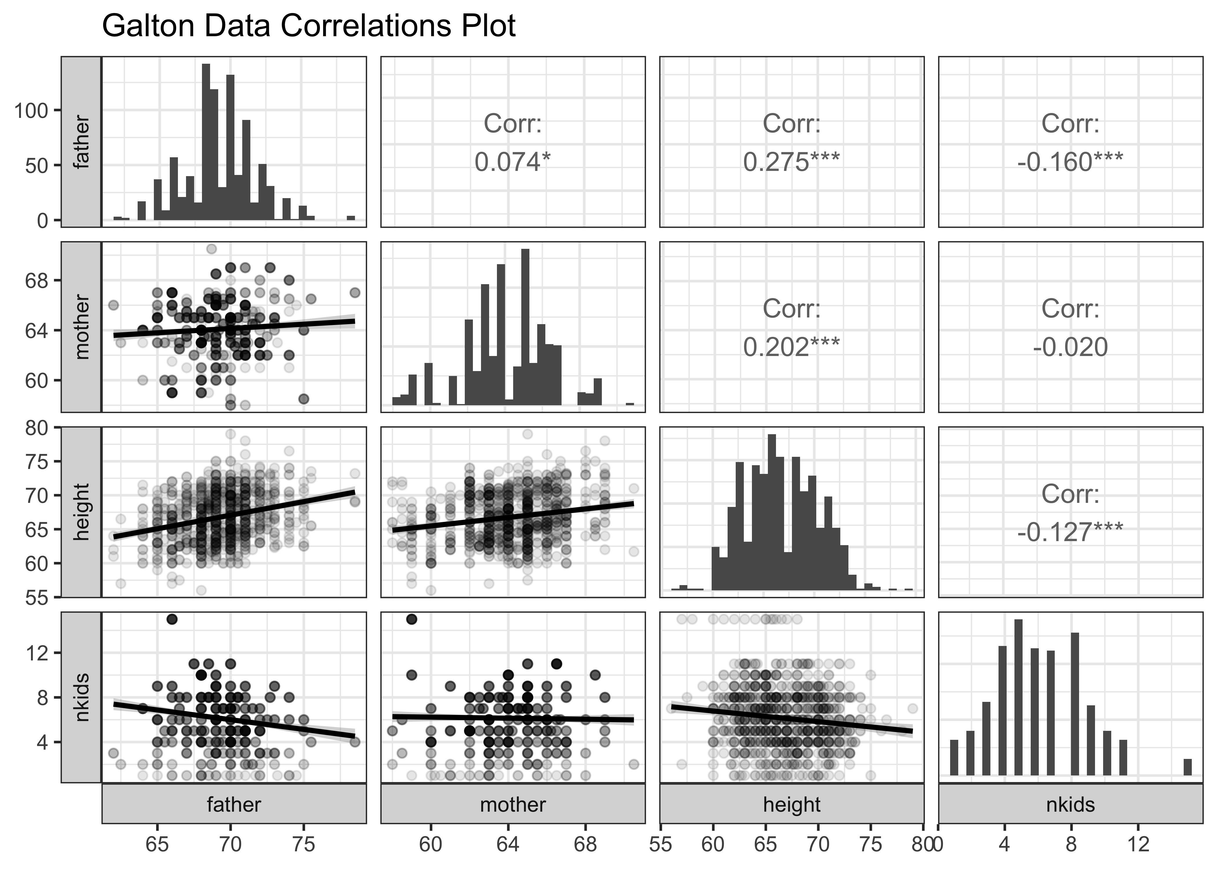
We note that children’s height is correlated with that of father and mother. The correlations are both positive, and that with father seems to be the larger of the two. ( Look at the slopes of the lines and the values of the correlation scores. )
Question
What if we group the Quant variables based on a Qual variable, like sex of the child?
# Pulling out the list of Quant variables from NHANES
galton_quant <- galton_describe$quantitative
galton_quant$name[1] "father" "mother" "height" "nkids" GGally::ggpairs(
Galton,
mapping = aes(colour = sex), # Colour by `sex`
# Choose the variables we want to plot for
columns = c("father", "mother", "height", "nkids"),
switch = "both", # axis labels in more traditional locations
progress = FALSE, # no compute progress messages needed
diag = list(continuous = "barDiag"),
# Choose lower triangle graphs, two-variable graphs
lower = list(continuous = wrap("smooth", alpha = 0.1)),
title = "Galton Data Correlations Plot"
) +
theme_bw()
The split scatter plots are useful, as is the split histogram for height: Clearly the correlation of children’s height with father and mother is positive for both sex-es. The other plots, and even some of the correlations scores are not all useful! Just shows everything we can compute is not necessarily useful immediately.
In later modules we will see how to plot correlations when the number of variables is larger still.
Question
Can we plot a Correlogram for this dataset?
# library(corrplot)
galton_num_var <- Galton %>% select(father, mother, height, nkids)
galton_cor <- cor(galton_num_var)
galton_cor %>%
corrplot(
method = "ellipse",
type = "lower",
main = "Correlogram for Galton dataset"
)
Clearly height is positively correlated to father and mother; interestingly, height is negatively correlated ( slightly) with nkids.
Question
Let us confirm with a correlation test:
We will use the mosaic function cor_test to get these results:
mosaic::cor_test(height ~ father, data = Galton) %>%
broom::tidy() %>%
knitr::kable(
digits = 2,
caption = "Children vs Fathers"
)| estimate | statistic | p.value | parameter | conf.low | conf.high | method | alternative |
|---|---|---|---|---|---|---|---|
| 0.28 | 8.57 | 0 | 896 | 0.21 | 0.33 | Pearson’s product-moment correlation | two.sided |
mosaic::cor_test(height ~ mother, data = Galton) %>%
broom::tidy() %>%
knitr::kable(
digits = 2,
caption = "Children vs Mothers"
)| estimate | statistic | p.value | parameter | conf.low | conf.high | method | alternative |
|---|---|---|---|---|---|---|---|
| 0.2 | 6.16 | 0 | 896 | 0.14 | 0.26 | Pearson’s product-moment correlation | two.sided |
Correlation Scores and Uncertainty
Note how the mosaic::cor_test() reports a correlation score estimate and the p-value for the same. There is also a confidence interval reported for the correlation score, an interval within which we are 95% sure that the true correlation value is to be found.
Note that GGally::ggpairs() too reports the significance of the correlation scores estimates using *** or **. This indicates the p-value in the scores obtained by GGally; Presumably, there is an internal cor_test that is run for each pair of variables and the p-value and confidence levels are also computed internally.
In both cases, we used the formula height being the dependent, target variable..
We also see the p.value for the estimateed correlation is negligible, and the conf.low/conf.high interval does not straddle
Question
What does this correlation look when split by sex of Child?
# For the sons
mosaic::cor_test(height ~ father,
data = Galton %>% filter(sex == "M")
) %>%
broom::tidy() %>%
knitr::kable(
digits = 2,
caption = "Sons vs Fathers"
)
cor_test(height ~ mother,
data = Galton %>% filter(sex == "M")
) %>%
broom::tidy() %>%
knitr::kable(
digits = 2,
caption = "Sons vs Mothers"
)
# For the daughters
cor_test(height ~ father,
data = Galton %>% filter(sex == "F")
) %>%
broom::tidy() %>%
knitr::kable(
digits = 2,
caption = "Daughters vs Fathers"
)
cor_test(height ~ mother,
data = Galton %>% filter(sex == "F")
) %>%
broom::tidy() %>%
knitr::kable(
digits = 2,
caption = "Daughters vs Mothers"
)| estimate | statistic | p.value | parameter | conf.low | conf.high | method | alternative |
|---|---|---|---|---|---|---|---|
| 0.39 | 9.15 | 0 | 463 | 0.31 | 0.47 | Pearson’s product-moment correlation | two.sided |
| estimate | statistic | p.value | parameter | conf.low | conf.high | method | alternative |
|---|---|---|---|---|---|---|---|
| 0.33 | 7.63 | 0 | 463 | 0.25 | 0.41 | Pearson’s product-moment correlation | two.sided |
| estimate | statistic | p.value | parameter | conf.low | conf.high | method | alternative |
|---|---|---|---|---|---|---|---|
| 0.46 | 10.72 | 0 | 431 | 0.38 | 0.53 | Pearson’s product-moment correlation | two.sided |
| estimate | statistic | p.value | parameter | conf.low | conf.high | method | alternative |
|---|---|---|---|---|---|---|---|
| 0.31 | 6.86 | 0 | 431 | 0.23 | 0.4 | Pearson’s product-moment correlation | two.sided |
The same observation as made above ( p.value and confidence intervals) applies here too and tells us that the estimated correlations are significant.
Visualizing Uncertainty in Correlation Estimates
We can also visualize this uncertainty and the confidence levels in a plot too, using gf_errorbar and a handy set of functions within purrr which is part of the tidyverse. Assuming heights is the target variable we want to correlate every other (quantitative) variable against, we can proceed very quickly as follows: we will first plot correlation uncertainty for one pair of variables to develop the intuition, and then for all variables against the one target variable:
mosaic::cor_test(height ~ mother, data = Galton) %>%
broom::tidy() %>%
# We need a graph not a table
# So comment out this line from the earlier code
# knitr::kable(digits = 2,caption = "Children vs Mothers")
rowid_to_column(var = "index") %>% # Need an index to plot with
# Uncertainty as error-bars
gf_errorbar(conf.high + conf.low ~ index, linewidth = 2) %>%
# Estimate as a point
gf_point(estimate ~ index, color = "red", size = 6) %>%
# Labels
gf_text(estimate ~ index - 0.2,
label = "Correlation Score = estimate"
) %>%
gf_text(conf.high * 0.98 ~ index - 0.25,
label = "Upper Limit = estimate + conf.high"
) %>%
gf_text(conf.low * 1.04 ~ index - 0.25,
label = "Lower Limit = estimate - conf.low"
) %>%
gf_theme(theme_bw())
We can now do this for all variables against the target variable height, which we identified in our research question. We will use the iteration capabilities offered by the tidyverse package, purrr:
all_corrs <- Galton %>%
select(where(is.numeric)) %>%
# leave off height to get all the remaining ones
select(-height) %>%
# perform a cor.test for all variables against height
purrr::map(
.x = .,
.f = \(x) cor.test(x, Galton$height)
) %>%
# tidy up the cor.test outputs into a tidy data frame
map_dfr(broom::tidy, .id = "predictor")
all_corrspredictor <chr> | estimate <dbl> | statistic <dbl> | p.value <dbl> | parameter <int> | conf.low <dbl> | conf.high <dbl> | method <chr> | alternative <chr> |
|---|---|---|---|---|---|---|---|---|
| father | 0.2753548 | 8.573704 | 4.354588e-17 | 896 | 0.2137851 | 0.33474554 | Pearson's product-moment correlation | two.sided |
| mother | 0.2016549 | 6.162793 | 1.079105e-09 | 896 | 0.1380554 | 0.26359819 | Pearson's product-moment correlation | two.sided |
| nkids | -0.1269101 | -3.829800 | 1.371780e-04 | 896 | -0.1907472 | -0.06200411 | Pearson's product-moment correlation | two.sided |
all_corrs %>%
# arrange the predictors in order of their correlation scores
# with the target variable (`height`)
# Add errorbars to show uncertainty ranges / confidence intervals
# Use errorbar width and linewidth fo emphasis
gf_errorbar(conf.high + conf.low ~ reorder(predictor, estimate),
color = ~estimate,
width = 0.2,
linewidth = ~ -log10(p.value)
) %>%
# All correlation estimates as points
gf_point(estimate ~ reorder(predictor, estimate),
color = "black"
) %>%
# Reference line at zero correlation score
gf_hline(yintercept = 0, color = "grey", linewidth = 2) %>%
# Themes,Titles, and Scales
gf_labs(
x = NULL, y = "Correlation with height in Galton",
caption = "Significance = - log10(p.value)"
) %>%
gf_refine(
# Scale for colour
scale_colour_distiller("Correlation", type = "div", palette = "RdBu"),
# Scale for dumbbells!!
scale_linewidth_continuous("significance",
range = c(0.5, 4)
)
) %>%
gf_refine(guides(linewidth = guide_legend(reverse = TRUE))) %>%
gf_theme(theme_classic())
We can clearly see the size of the correlations and the confidence intervals marked in this plot. father has somewhat greater correlation with children’s height, as compared to mother. nkids seems to matter very little. This kind of plot will be very useful when we pursue linear regression models.
Question
How can we show this correlation in a set of Scatter Plots + Regression Lines? Can we recreate Galton’s famous diagram?
# For the sons
gf_point(height ~ father,
data = Galton %>% filter(sex == "M"),
title = "Soms and Fathers"
) %>%
gf_smooth(method = "lm") %>%
gf_theme(theme_minimal())
gf_point(height ~ mother,
data = Galton %>% filter(sex == "M"),
title = "Sons and Mothers"
) %>%
gf_smooth(method = "lm") %>%
gf_theme(theme_minimal())
# For the daughters
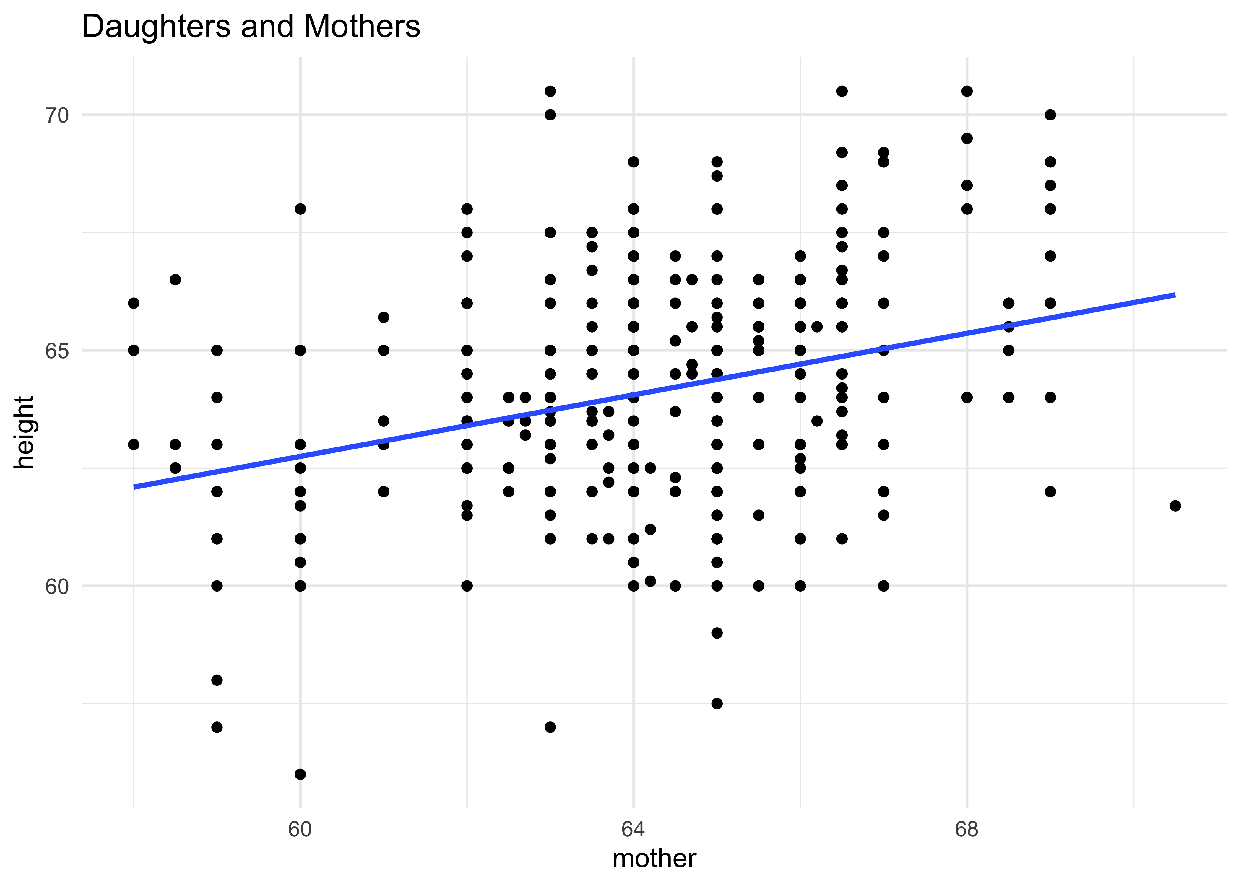
gf_point(height ~ father,
data = Galton %>% filter(sex == "F"),
title = "Daughters and Fathers"
) %>%
gf_smooth(method = "lm") %>%
gf_theme(theme_minimal())
gf_point(height ~ mother,
data = Galton %>% filter(sex == "F"),
title = "Daughters and Mothers"
) %>%
gf_smooth(method = "lm") %>%
gf_theme(theme_minimal())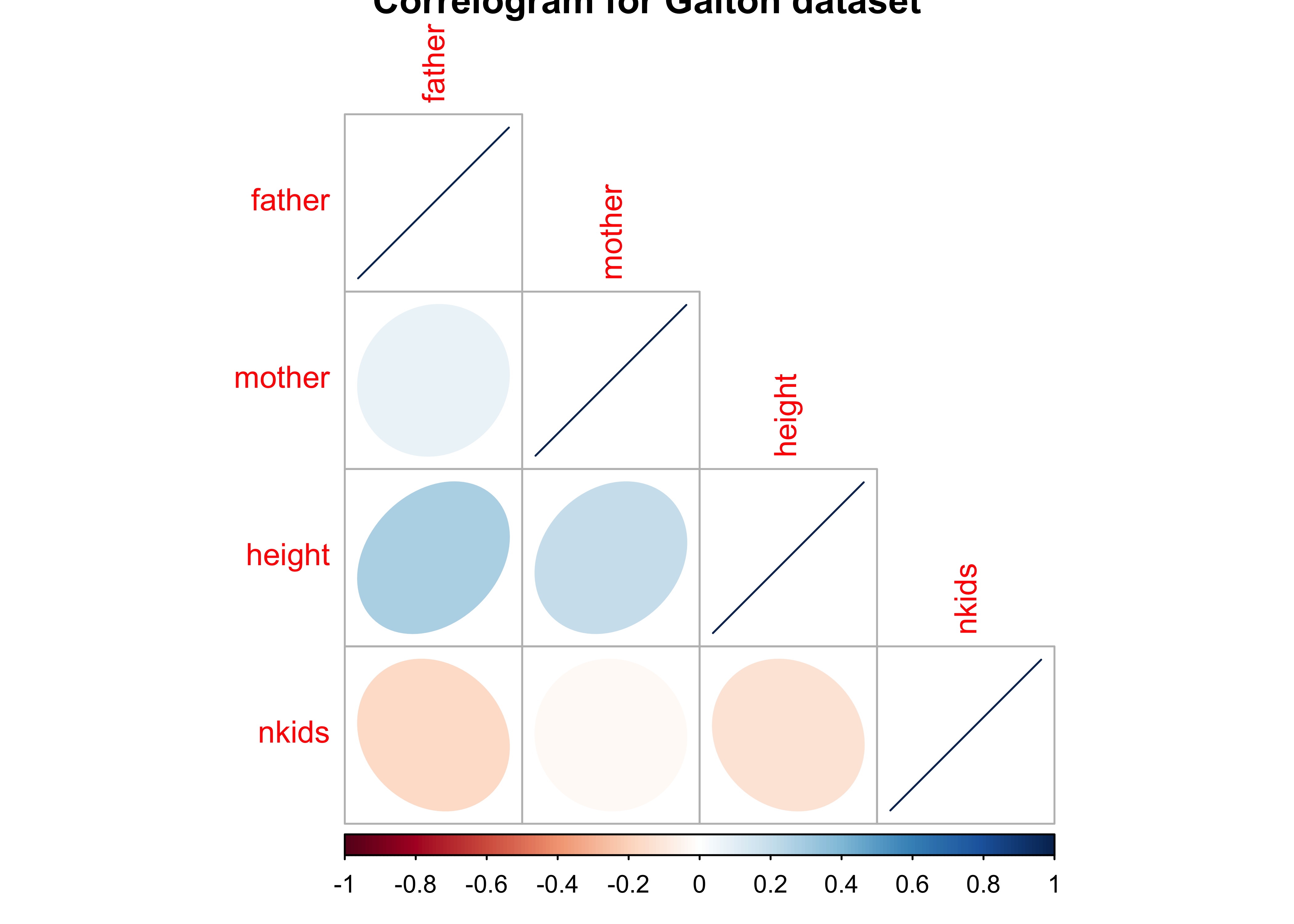
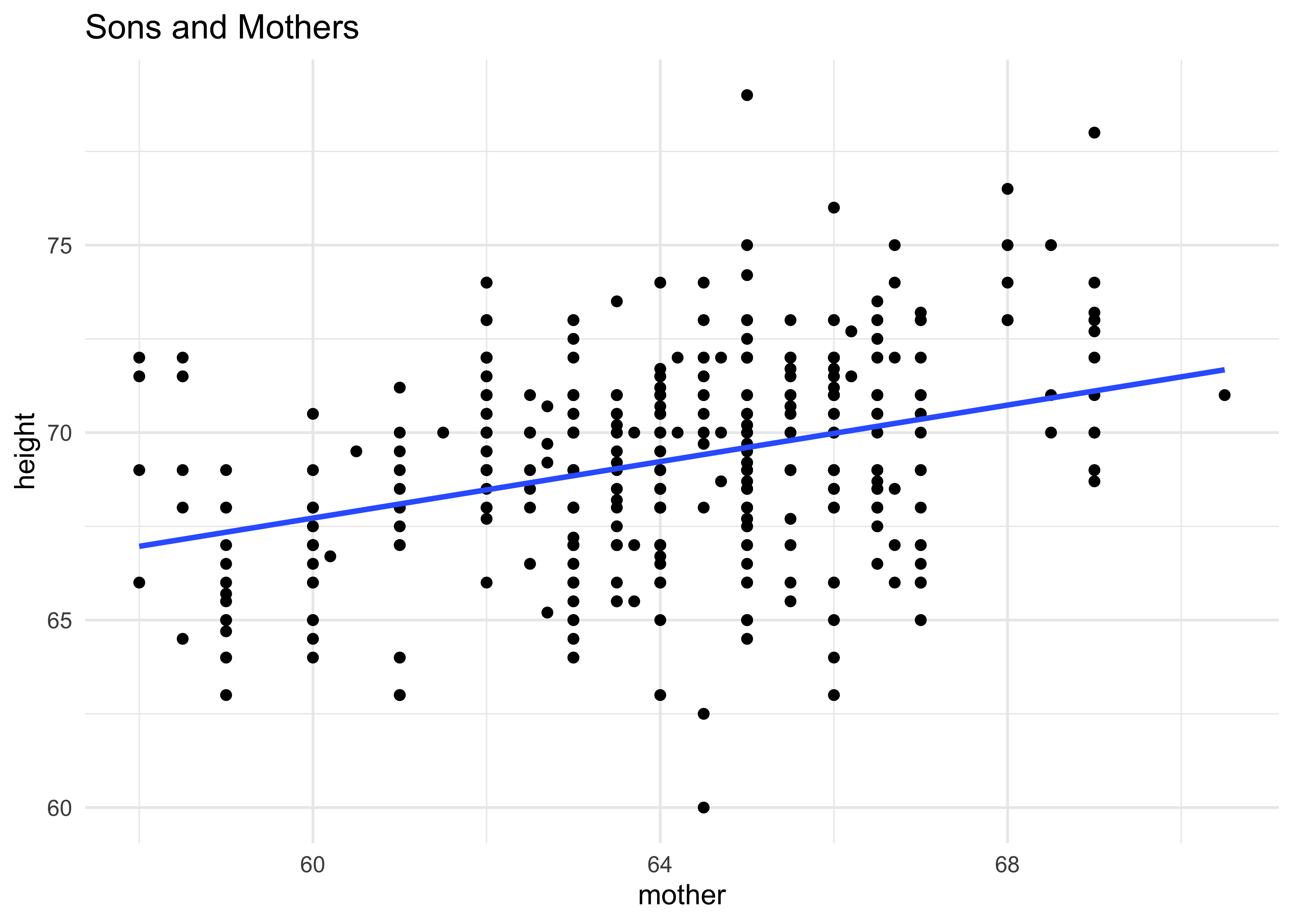
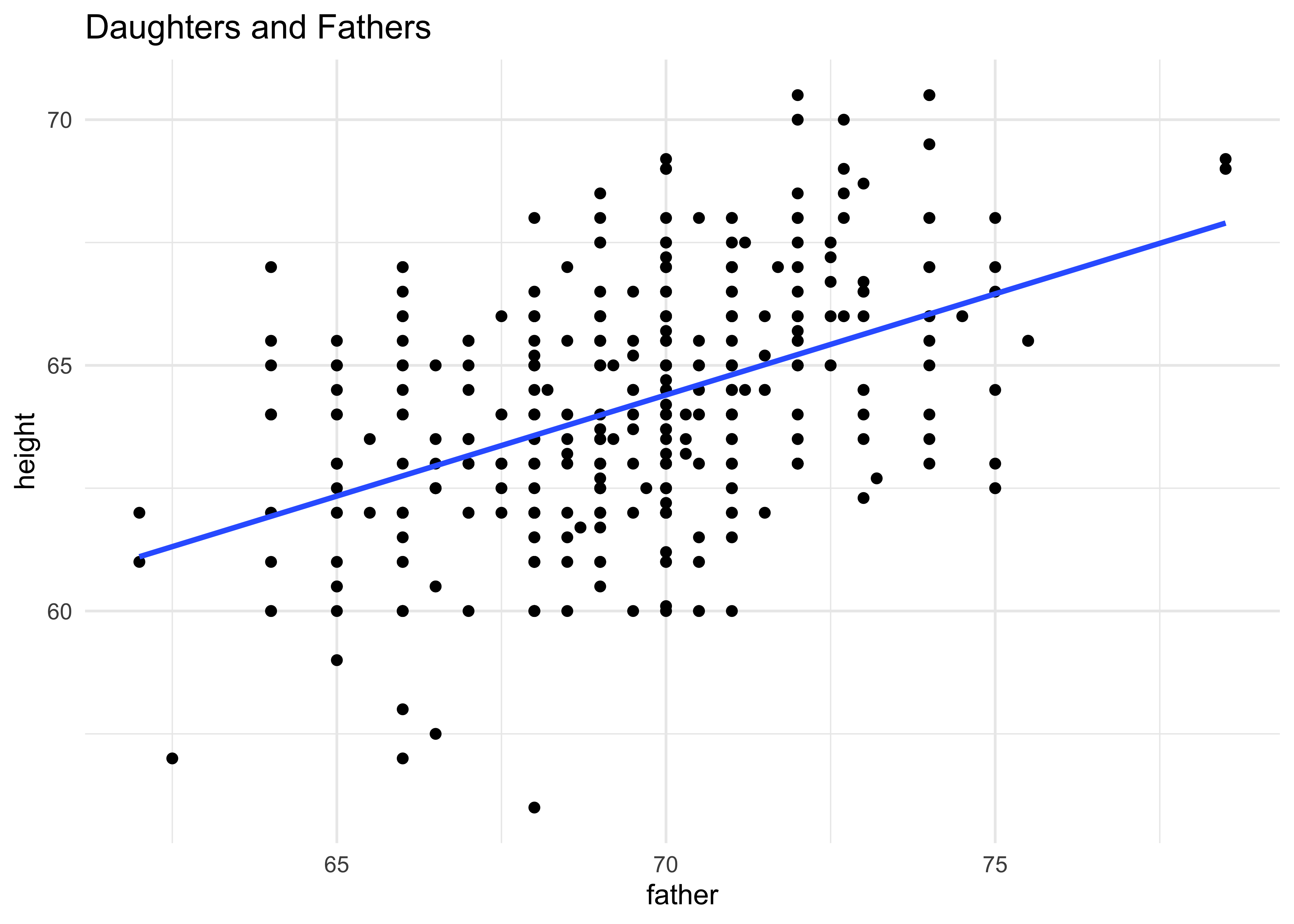
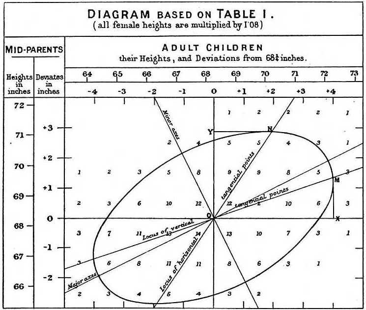
An approximation to Galton’s famous plot1 (see Wikipedia):
gf_point(height ~ (father + mother) / 2, data = Galton) %>%
gf_smooth(method = "lm") %>%
gf_density_2d(n = 8) %>%
gf_abline(slope = 1) %>%
gf_theme(theme_minimal())
gf_point(height ~ (father + mother) / 2, data = Galton) %>%
gf_smooth(method = "lm") %>%
gf_ellipse(level = 0.95, color = "red") %>%
gf_ellipse(level = 0.75, color = "blue") %>%
gf_ellipse(level = 0.5, color = "green") %>%
gf_abline(slope = 1) %>%
gf_theme(theme_minimal())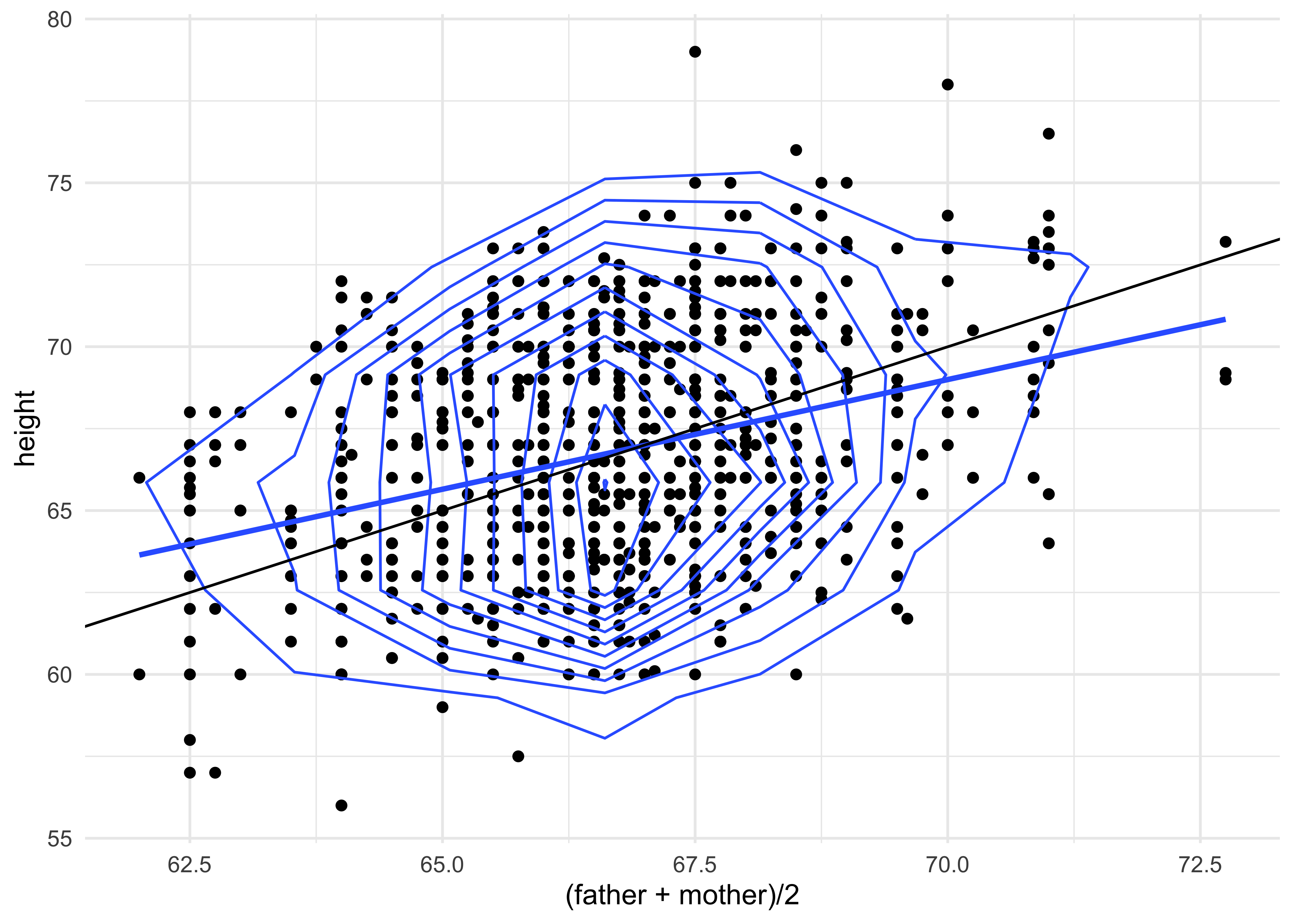
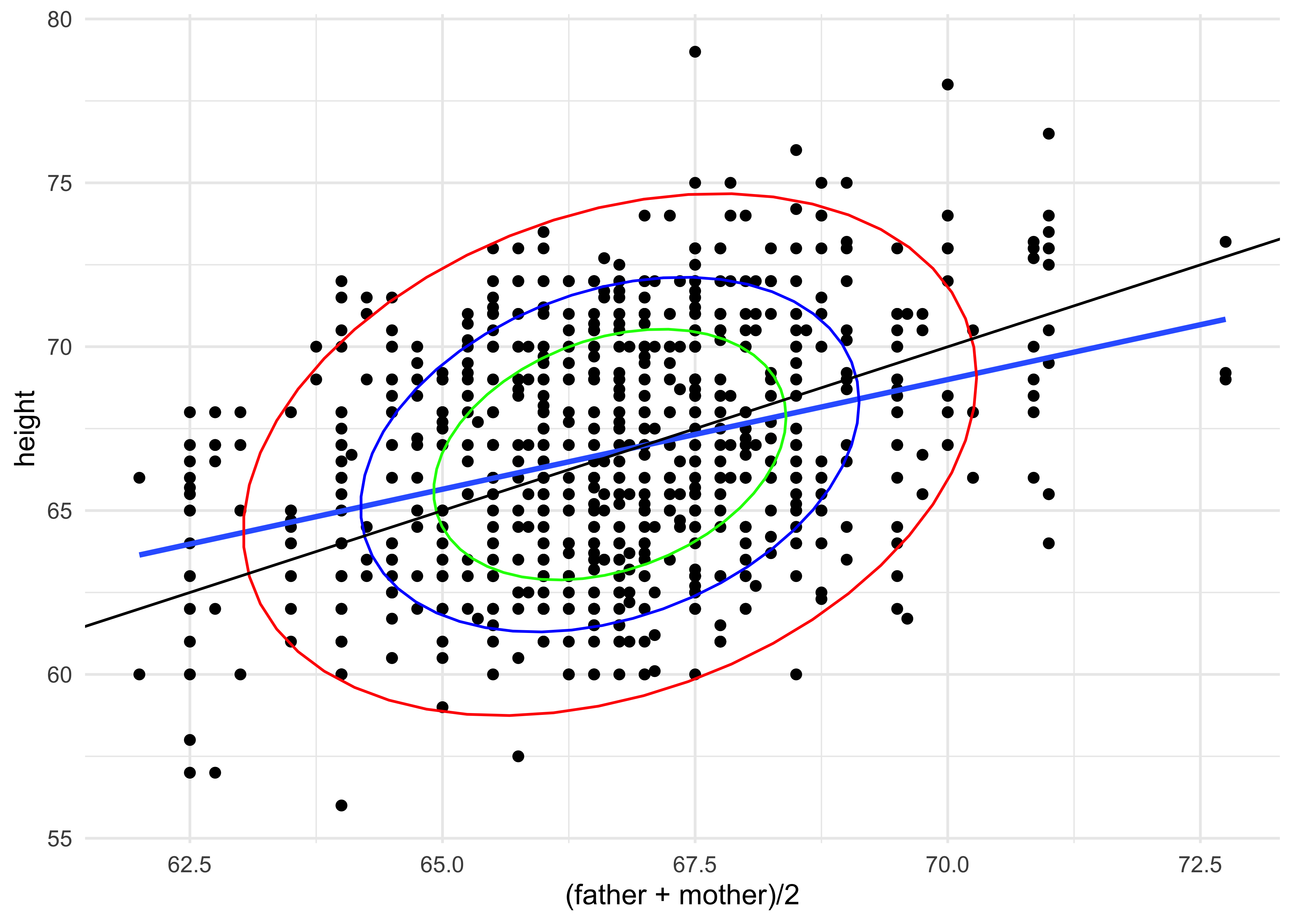
How would you interpret this plot2?
NHANES
Let us look at the NHANES dataset from the package NHANES:
data("NHANES")
NHANES_describe <- inspect(NHANES)
NHANES_describe$categorical
NHANES_describe$quantitative
NHANES
skimr::skim(NHANES)name <chr> | class <chr> | levels <int> | n <int> | missing <int> | distribution <chr> |
|---|---|---|---|---|---|
| SurveyYr | factor | 2 | 10000 | 0 | 2009_10 (50%), 2011_12 (50%) |
| Gender | factor | 2 | 10000 | 0 | female (50.2%), male (49.8%) |
| AgeDecade | factor | 8 | 9667 | 333 | 40-49 (14.5%), 0-9 (14.4%) ... |
| Race1 | factor | 5 | 10000 | 0 | White (63.7%), Black (12%) ... |
| Race3 | factor | 6 | 5000 | 5000 | White (62.7%), Black (11.8%) ... |
| Education | factor | 5 | 7221 | 2779 | Some College (31.4%) ... |
| MaritalStatus | factor | 6 | 7231 | 2769 | Married (54.6%), NeverMarried (19.1%) ... |
| HHIncome | factor | 12 | 9189 | 811 | more 99999 (24.2%) ... |
| HomeOwn | factor | 3 | 9937 | 63 | Own (64.7%), Rent (33.1%) ... |
| Work | factor | 3 | 7771 | 2229 | Working (59.4%), NotWorking (36.6%) ... |
name <chr> | class <chr> | min <dbl> | Q1 <dbl> | median <dbl> | Q3 <dbl> | max <dbl> | mean <dbl> | sd <dbl> | ||
|---|---|---|---|---|---|---|---|---|---|---|
| 1 | ID | integer | 51624.00 | 56904.500 | 62159.500 | 67039.000 | 71915.000 | 6.194464e+04 | 5.871167e+03 | |
| 2 | Age | integer | 0.00 | 17.000 | 36.000 | 54.000 | 80.000 | 3.674210e+01 | 2.239757e+01 | |
| 3 | AgeMonths | integer | 0.00 | 199.000 | 418.000 | 624.000 | 959.000 | 4.201239e+02 | 2.590431e+02 | |
| 4 | HHIncomeMid | integer | 2500.00 | 30000.000 | 50000.000 | 87500.000 | 100000.000 | 5.720617e+04 | 3.302028e+04 | |
| 5 | Poverty | numeric | 0.00 | 1.240 | 2.700 | 4.710 | 5.000 | 2.801844e+00 | 1.677909e+00 | |
| 6 | HomeRooms | integer | 1.00 | 5.000 | 6.000 | 8.000 | 13.000 | 6.248918e+00 | 2.277538e+00 | |
| 7 | Weight | numeric | 2.80 | 56.100 | 72.700 | 88.900 | 230.700 | 7.098180e+01 | 2.912536e+01 | |
| 8 | Length | numeric | 47.10 | 75.700 | 87.000 | 96.100 | 112.200 | 8.501602e+01 | 1.370503e+01 | |
| 9 | HeadCirc | numeric | 34.20 | 39.575 | 41.450 | 42.925 | 45.400 | 4.118068e+01 | 2.311483e+00 | |
| 10 | Height | numeric | 83.60 | 156.800 | 166.000 | 174.500 | 200.400 | 1.618778e+02 | 2.018657e+01 |
ID <int> | SurveyYr <fct> | Gender <fct> | Age <int> | AgeDecade <fct> | AgeMonths <int> | Race1 <fct> | Race3 <fct> | Education <fct> | MaritalStatus <fct> | |
|---|---|---|---|---|---|---|---|---|---|---|
| 51624 | 2009_10 | male | 34 | 30-39 | 409 | White | NA | High School | Married | |
| 51624 | 2009_10 | male | 34 | 30-39 | 409 | White | NA | High School | Married | |
| 51624 | 2009_10 | male | 34 | 30-39 | 409 | White | NA | High School | Married | |
| 51625 | 2009_10 | male | 4 | 0-9 | 49 | Other | NA | NA | NA | |
| 51630 | 2009_10 | female | 49 | 40-49 | 596 | White | NA | Some College | LivePartner | |
| 51638 | 2009_10 | male | 9 | 0-9 | 115 | White | NA | NA | NA | |
| 51646 | 2009_10 | male | 8 | 0-9 | 101 | White | NA | NA | NA | |
| 51647 | 2009_10 | female | 45 | 40-49 | 541 | White | NA | College Grad | Married | |
| 51647 | 2009_10 | female | 45 | 40-49 | 541 | White | NA | College Grad | Married | |
| 51647 | 2009_10 | female | 45 | 40-49 | 541 | White | NA | College Grad | Married |
| Name | NHANES |
| Number of rows | 10000 |
| Number of columns | 76 |
| _______________________ | |
| Column type frequency: | |
| factor | 31 |
| numeric | 45 |
| ________________________ | |
| Group variables | None |
Variable type: factor
| skim_variable | n_missing | complete_rate | ordered | n_unique | top_counts |
|---|---|---|---|---|---|
| SurveyYr | 0 | 1.00 | FALSE | 2 | 200: 5000, 201: 5000 |
| Gender | 0 | 1.00 | FALSE | 2 | fem: 5020, mal: 4980 |
| AgeDecade | 333 | 0.97 | FALSE | 8 | 40: 1398, 0-: 1391, 10: 1374, 20: 1356 |
| Race1 | 0 | 1.00 | FALSE | 5 | Whi: 6372, Bla: 1197, Mex: 1015, Oth: 806 |
| Race3 | 5000 | 0.50 | FALSE | 6 | Whi: 3135, Bla: 589, Mex: 480, His: 350 |
| Education | 2779 | 0.72 | FALSE | 5 | Som: 2267, Col: 2098, Hig: 1517, 9 -: 888 |
| MaritalStatus | 2769 | 0.72 | FALSE | 6 | Mar: 3945, Nev: 1380, Div: 707, Liv: 560 |
| HHIncome | 811 | 0.92 | FALSE | 12 | mor: 2220, 750: 1084, 250: 958, 350: 863 |
| HomeOwn | 63 | 0.99 | FALSE | 3 | Own: 6425, Ren: 3287, Oth: 225 |
| Work | 2229 | 0.78 | FALSE | 3 | Wor: 4613, Not: 2847, Loo: 311 |
| BMICatUnder20yrs | 8726 | 0.13 | FALSE | 4 | Nor: 805, Obe: 221, Ove: 193, Und: 55 |
| BMI_WHO | 397 | 0.96 | FALSE | 4 | 18.: 2911, 30.: 2751, 25.: 2664, 12.: 1277 |
| Diabetes | 142 | 0.99 | FALSE | 2 | No: 9098, Yes: 760 |
| HealthGen | 2461 | 0.75 | FALSE | 5 | Goo: 2956, Vgo: 2508, Fai: 1010, Exc: 878 |
| LittleInterest | 3333 | 0.67 | FALSE | 3 | Non: 5103, Sev: 1130, Mos: 434 |
| Depressed | 3327 | 0.67 | FALSE | 3 | Non: 5246, Sev: 1009, Mos: 418 |
| SleepTrouble | 2228 | 0.78 | FALSE | 2 | No: 5799, Yes: 1973 |
| PhysActive | 1674 | 0.83 | FALSE | 2 | Yes: 4649, No: 3677 |
| TVHrsDay | 5141 | 0.49 | FALSE | 7 | 2_h: 1275, 1_h: 884, 3_h: 836, 0_t: 638 |
| CompHrsDay | 5137 | 0.49 | FALSE | 7 | 0_t: 1409, 0_h: 1073, 1_h: 1030, 2_h: 589 |
| Alcohol12PlusYr | 3420 | 0.66 | FALSE | 2 | Yes: 5212, No: 1368 |
| SmokeNow | 6789 | 0.32 | FALSE | 2 | No: 1745, Yes: 1466 |
| Smoke100 | 2765 | 0.72 | FALSE | 2 | No: 4024, Yes: 3211 |
| Smoke100n | 2765 | 0.72 | FALSE | 2 | Non: 4024, Smo: 3211 |
| Marijuana | 5059 | 0.49 | FALSE | 2 | Yes: 2892, No: 2049 |
| RegularMarij | 5059 | 0.49 | FALSE | 2 | No: 3575, Yes: 1366 |
| HardDrugs | 4235 | 0.58 | FALSE | 2 | No: 4700, Yes: 1065 |
| SexEver | 4233 | 0.58 | FALSE | 2 | Yes: 5544, No: 223 |
| SameSex | 4232 | 0.58 | FALSE | 2 | No: 5353, Yes: 415 |
| SexOrientation | 5158 | 0.48 | FALSE | 3 | Het: 4638, Bis: 119, Hom: 85 |
| PregnantNow | 8304 | 0.17 | FALSE | 3 | No: 1573, Yes: 72, Unk: 51 |
Variable type: numeric
| skim_variable | n_missing | complete_rate | mean | sd | p0 | p25 | p50 | p75 | p100 | hist |
|---|---|---|---|---|---|---|---|---|---|---|
| ID | 0 | 1.00 | 61944.64 | 5871.17 | 51624.00 | 56904.50 | 62159.50 | 67039.00 | 71915.00 | ▇▇▇▇▇ |
| Age | 0 | 1.00 | 36.74 | 22.40 | 0.00 | 17.00 | 36.00 | 54.00 | 80.00 | ▇▇▇▆▅ |
| AgeMonths | 5038 | 0.50 | 420.12 | 259.04 | 0.00 | 199.00 | 418.00 | 624.00 | 959.00 | ▇▇▇▆▃ |
| HHIncomeMid | 811 | 0.92 | 57206.17 | 33020.28 | 2500.00 | 30000.00 | 50000.00 | 87500.00 | 100000.00 | ▃▆▃▁▇ |
| Poverty | 726 | 0.93 | 2.80 | 1.68 | 0.00 | 1.24 | 2.70 | 4.71 | 5.00 | ▅▅▃▃▇ |
| HomeRooms | 69 | 0.99 | 6.25 | 2.28 | 1.00 | 5.00 | 6.00 | 8.00 | 13.00 | ▂▆▇▂▁ |
| Weight | 78 | 0.99 | 70.98 | 29.13 | 2.80 | 56.10 | 72.70 | 88.90 | 230.70 | ▂▇▂▁▁ |
| Length | 9457 | 0.05 | 85.02 | 13.71 | 47.10 | 75.70 | 87.00 | 96.10 | 112.20 | ▁▃▆▇▃ |
| HeadCirc | 9912 | 0.01 | 41.18 | 2.31 | 34.20 | 39.58 | 41.45 | 42.92 | 45.40 | ▁▂▇▇▅ |
| Height | 353 | 0.96 | 161.88 | 20.19 | 83.60 | 156.80 | 166.00 | 174.50 | 200.40 | ▁▁▁▇▂ |
| BMI | 366 | 0.96 | 26.66 | 7.38 | 12.88 | 21.58 | 25.98 | 30.89 | 81.25 | ▇▆▁▁▁ |
| Pulse | 1437 | 0.86 | 73.56 | 12.16 | 40.00 | 64.00 | 72.00 | 82.00 | 136.00 | ▂▇▃▁▁ |
| BPSysAve | 1449 | 0.86 | 118.15 | 17.25 | 76.00 | 106.00 | 116.00 | 127.00 | 226.00 | ▃▇▂▁▁ |
| BPDiaAve | 1449 | 0.86 | 67.48 | 14.35 | 0.00 | 61.00 | 69.00 | 76.00 | 116.00 | ▁▁▇▇▁ |
| BPSys1 | 1763 | 0.82 | 119.09 | 17.50 | 72.00 | 106.00 | 116.00 | 128.00 | 232.00 | ▂▇▂▁▁ |
| BPDia1 | 1763 | 0.82 | 68.28 | 13.78 | 0.00 | 62.00 | 70.00 | 76.00 | 118.00 | ▁▁▇▆▁ |
| BPSys2 | 1647 | 0.84 | 118.48 | 17.49 | 76.00 | 106.00 | 116.00 | 128.00 | 226.00 | ▃▇▂▁▁ |
| BPDia2 | 1647 | 0.84 | 67.66 | 14.42 | 0.00 | 60.00 | 68.00 | 76.00 | 118.00 | ▁▁▇▆▁ |
| BPSys3 | 1635 | 0.84 | 117.93 | 17.18 | 76.00 | 106.00 | 116.00 | 126.00 | 226.00 | ▃▇▂▁▁ |
| BPDia3 | 1635 | 0.84 | 67.30 | 14.96 | 0.00 | 60.00 | 68.00 | 76.00 | 116.00 | ▁▁▇▇▁ |
| Testosterone | 5874 | 0.41 | 197.90 | 226.50 | 0.25 | 17.70 | 43.82 | 362.41 | 1795.60 | ▇▂▁▁▁ |
| DirectChol | 1526 | 0.85 | 1.36 | 0.40 | 0.39 | 1.09 | 1.29 | 1.58 | 4.03 | ▅▇▂▁▁ |
| TotChol | 1526 | 0.85 | 4.88 | 1.08 | 1.53 | 4.11 | 4.78 | 5.53 | 13.65 | ▂▇▁▁▁ |
| UrineVol1 | 987 | 0.90 | 118.52 | 90.34 | 0.00 | 50.00 | 94.00 | 164.00 | 510.00 | ▇▅▂▁▁ |
| UrineFlow1 | 1603 | 0.84 | 0.98 | 0.95 | 0.00 | 0.40 | 0.70 | 1.22 | 17.17 | ▇▁▁▁▁ |
| UrineVol2 | 8522 | 0.15 | 119.68 | 90.16 | 0.00 | 52.00 | 95.00 | 171.75 | 409.00 | ▇▆▃▂▁ |
| UrineFlow2 | 8524 | 0.15 | 1.15 | 1.07 | 0.00 | 0.48 | 0.76 | 1.51 | 13.69 | ▇▁▁▁▁ |
| DiabetesAge | 9371 | 0.06 | 48.42 | 15.68 | 1.00 | 40.00 | 50.00 | 58.00 | 80.00 | ▁▂▆▇▂ |
| DaysPhysHlthBad | 2468 | 0.75 | 3.33 | 7.40 | 0.00 | 0.00 | 0.00 | 3.00 | 30.00 | ▇▁▁▁▁ |
| DaysMentHlthBad | 2466 | 0.75 | 4.13 | 7.83 | 0.00 | 0.00 | 0.00 | 4.00 | 30.00 | ▇▁▁▁▁ |
| nPregnancies | 7396 | 0.26 | 3.03 | 1.80 | 1.00 | 2.00 | 3.00 | 4.00 | 32.00 | ▇▁▁▁▁ |
| nBabies | 7584 | 0.24 | 2.46 | 1.32 | 0.00 | 2.00 | 2.00 | 3.00 | 12.00 | ▇▅▁▁▁ |
| Age1stBaby | 8116 | 0.19 | 22.65 | 4.77 | 14.00 | 19.00 | 22.00 | 26.00 | 39.00 | ▆▇▅▂▁ |
| SleepHrsNight | 2245 | 0.78 | 6.93 | 1.35 | 2.00 | 6.00 | 7.00 | 8.00 | 12.00 | ▁▅▇▁▁ |
| PhysActiveDays | 5337 | 0.47 | 3.74 | 1.84 | 1.00 | 2.00 | 3.00 | 5.00 | 7.00 | ▇▇▃▅▅ |
| TVHrsDayChild | 9347 | 0.07 | 1.94 | 1.43 | 0.00 | 1.00 | 2.00 | 3.00 | 6.00 | ▇▆▂▂▂ |
| CompHrsDayChild | 9347 | 0.07 | 2.20 | 2.52 | 0.00 | 0.00 | 1.00 | 6.00 | 6.00 | ▇▁▁▁▃ |
| AlcoholDay | 5086 | 0.49 | 2.91 | 3.18 | 1.00 | 1.00 | 2.00 | 3.00 | 82.00 | ▇▁▁▁▁ |
| AlcoholYear | 4078 | 0.59 | 75.10 | 103.03 | 0.00 | 3.00 | 24.00 | 104.00 | 364.00 | ▇▁▁▁▁ |
| SmokeAge | 6920 | 0.31 | 17.83 | 5.33 | 6.00 | 15.00 | 17.00 | 19.00 | 72.00 | ▇▂▁▁▁ |
| AgeFirstMarij | 7109 | 0.29 | 17.02 | 3.90 | 1.00 | 15.00 | 16.00 | 19.00 | 48.00 | ▁▇▂▁▁ |
| AgeRegMarij | 8634 | 0.14 | 17.69 | 4.81 | 5.00 | 15.00 | 17.00 | 19.00 | 52.00 | ▂▇▁▁▁ |
| SexAge | 4460 | 0.55 | 17.43 | 3.72 | 9.00 | 15.00 | 17.00 | 19.00 | 50.00 | ▇▅▁▁▁ |
| SexNumPartnLife | 4275 | 0.57 | 15.09 | 57.85 | 0.00 | 2.00 | 5.00 | 12.00 | 2000.00 | ▇▁▁▁▁ |
| SexNumPartYear | 5072 | 0.49 | 1.34 | 2.78 | 0.00 | 1.00 | 1.00 | 1.00 | 69.00 | ▇▁▁▁▁ |
Try
help("NHANES") in your Console.This is survey data collected by the US National Center for Health Statistics (NCHS) which has conducted a series of health and nutrition surveys since the early 1960’s. Since 1999 approximately 5,000 individuals of all ages are interviewed in their homes every year and complete the health examination component of the survey. The health examination is conducted in a mobile examination centre (MEC).
The dataset is described as: A data frame with 100000 observations on 76 variables. Some of these are:
- Race1 and Race2: factors with 5 and 6 levels respectively
- Education a factor with 5 levels
- HHIncomeMid Total annual gross income for the household in US dollars.
- Age
- BMI: Body mass index (weight/height2 in kg/m2)
- Height: Standing height in cm.
- Weight: Weight in kg > > - Testosterone: Testosterone total (ng/dL) - PhysActiveDays: Number of days in a typical week that participant does moderate or vigorous-intensity activity.
- CompHrsDay: Number of hours per day on average participant used a computer or gaming device over the past 30 days.
Missing Data
Why do so many of the variables have missing entries? What could be your guess about the Experiment/Survey`?
Let us make some counts of the data, since we have so many factors:
Gender <fct> | n <int> | |||
|---|---|---|---|---|
| female | 5020 | |||
| male | 4980 |
Race1 <fct> | n <int> | |||
|---|---|---|---|---|
| Black | 1197 | |||
| Hispanic | 610 | |||
| Mexican | 1015 | |||
| White | 6372 | |||
| Other | 806 |
Race3 <fct> | n <int> | |||
|---|---|---|---|---|
| Asian | 288 | |||
| Black | 589 | |||
| Hispanic | 350 | |||
| Mexican | 480 | |||
| White | 3135 | |||
| Other | 158 | |||
| NA | 5000 |
Education <fct> | n <int> | |||
|---|---|---|---|---|
| 8th Grade | 451 | |||
| 9 - 11th Grade | 888 | |||
| High School | 1517 | |||
| Some College | 2267 | |||
| College Grad | 2098 | |||
| NA | 2779 |
MaritalStatus <fct> | n <int> | |||
|---|---|---|---|---|
| Divorced | 707 | |||
| LivePartner | 560 | |||
| Married | 3945 | |||
| NeverMarried | 1380 | |||
| Separated | 183 | |||
| Widowed | 456 | |||
| NA | 2769 |
There is a good mix of factors and counts.
Now we articulate our Research Questions:
Research Questions
Does
Testosteronehave a relationship with parameters such asBMI,Weight,Height,PhysActiveDaysCompHrsDayandAge?Does
HHIncomeMidhave a relationship with these same parameters? And withGender?Are there any other pairwise correlations that we should note? (This is especially useful in choosing independent variables for multiple regression)
( Yes we are concerned with men more than with the women, sadly.)
GGally::ggpairs(NHANES,
# Choose the variables we want to plot for
columns = c(
"HHIncomeMid", "Weight", "Height",
"BMI", "Gender"
),
# LISTs of graphs needed at different locations
# For different combinations of variables
diag = list(continuous = "barDiag"),
lower = list(continuous = wrap("smooth", alpha = 0.01)),
upper = list(continuous = "cor"),
switch = "both", # axis labels in more traditional locations
progress = FALSE
) + # No compute progress bars needed
theme_bw()
We see that HHIncomeMid is Quantitative, discrete valued variable, since it is based on a set of median incomes for different ranges of income. BMI, Weight, Height are continuous Quant variables.
HHIncomeMid also seems to be relatively unaffected by Weight; And is only mildly correlated with Height and BMI, as seen both by the correlation score magnitudes and the slopes of the trend lines.
There is a difference in the median income by Gender, but we will defer that kind of test for later, when we do Statistical Inference.
Unsurprisingly, BMI and Weight have a strong relationship, as do Height and Weight; the latter is of course non-linear, since the Height levels off at a point.
GGally::ggpairs(NHANES,
columns = c("Testosterone", "Weight", "Height", "BMI"),
diag = list(continuous = "barDiag"),
lower = list(continuous = wrap("smooth", alpha = 0.01)),
upper = list(continuous = "cor"),
switch = "both",
progress = FALSE
) +
theme_bw()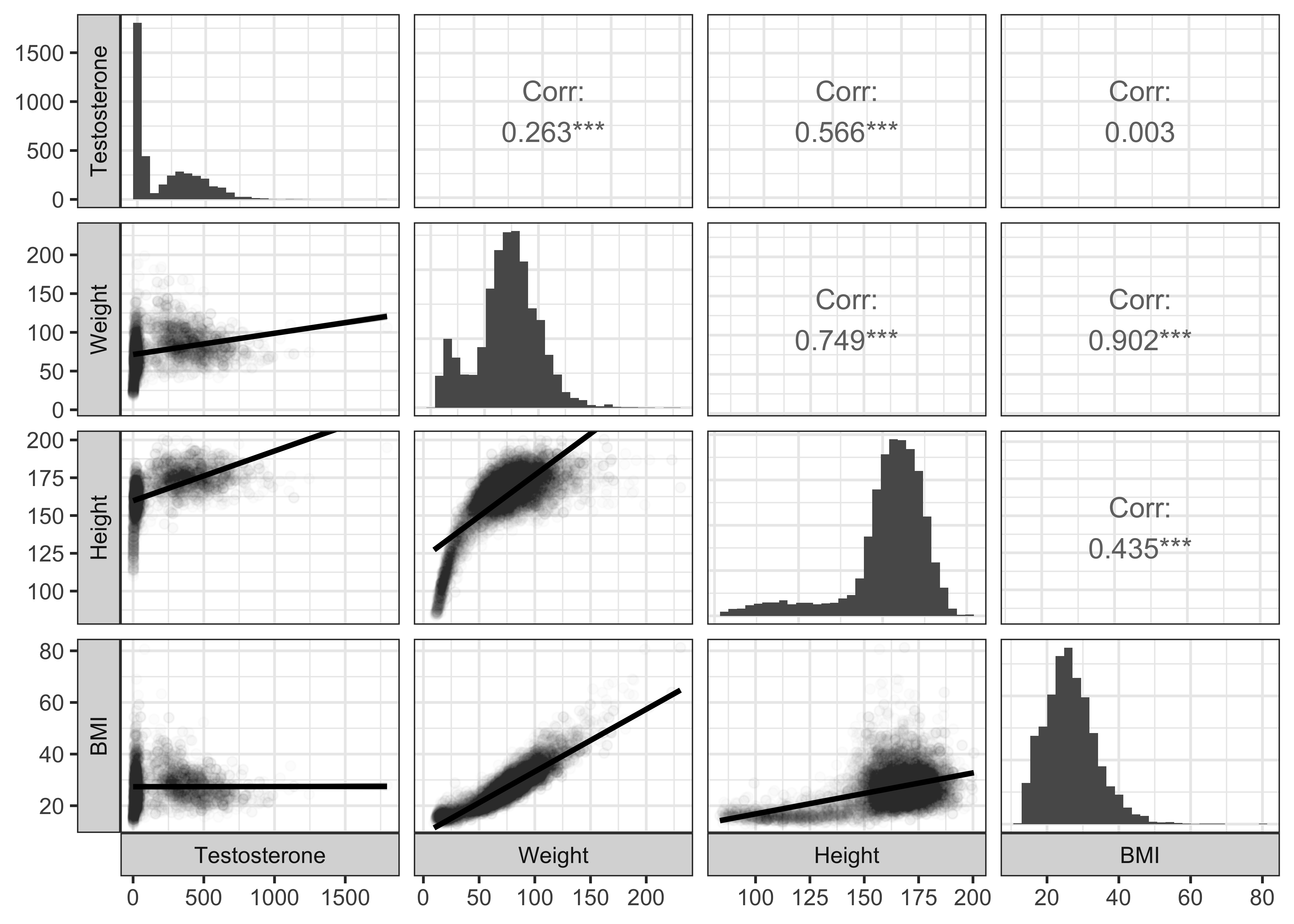
It is clear that Testosterone has strong relationships with Height and Weight but not so much with BMI.
Since the pairs plot is fairly clear for both target variables, let us head to visualizing the significance and uncertainty in the correlation estimates.
HHIncome_corrs <- NHANES %>%
select(where(is.numeric)) %>%
# leave off height to get all the remaining ones
select(-HHIncomeMid) %>%
# perform a cor.test for all variables against height
purrr::map(
.x = .,
.f = \(x) cor.test(x, NHANES$HHIncomeMid)
) %>%
# tidy up the cor.test outputs into a tidy data frame
map_dfr(broom::tidy, .id = "predictor")
HHIncome_corrspredictor <chr> | estimate <dbl> | statistic <dbl> | p.value <dbl> | parameter <int> | conf.low <dbl> | conf.high <dbl> | method <chr> | alternative <chr> |
|---|---|---|---|---|---|---|---|---|
| ID | -0.001803175 | -0.17283253 | 8.627869e-01 | 9187 | -2.224911e-02 | 0.018644265 | Pearson's product-moment correlation | two.sided |
| Age | 0.020381745 | 1.95397248 | 5.073477e-02 | 9187 | -6.503467e-05 | 0.040811489 | Pearson's product-moment correlation | two.sided |
| AgeMonths | 0.059212540 | 3.99232121 | 6.646547e-05 | 4530 | 3.014902e-02 | 0.088176019 | Pearson's product-moment correlation | two.sided |
| Poverty | 0.895687490 | 192.89158662 | 0.000000e+00 | 9171 | 8.915652e-01 | 0.899661395 | Pearson's product-moment correlation | two.sided |
| HomeRooms | 0.452118084 | 48.57089131 | 0.000000e+00 | 9182 | 4.356946e-01 | 0.468240645 | Pearson's product-moment correlation | two.sided |
| Weight | 0.032259894 | 3.08204398 | 2.061977e-03 | 9118 | 1.174371e-02 | 0.052748927 | Pearson's product-moment correlation | two.sided |
| Length | -0.002611812 | -0.05857705 | 9.533123e-01 | 503 | -8.984636e-02 | 0.084662501 | Pearson's product-moment correlation | two.sided |
| HeadCirc | 0.040561659 | 0.36081685 | 7.191994e-01 | 79 | -1.793764e-01 | 0.256638118 | Pearson's product-moment correlation | two.sided |
| Height | 0.116781182 | 11.06806055 | 2.745490e-28 | 8860 | 9.619449e-02 | 0.137268008 | Pearson's product-moment correlation | two.sided |
| BMI | -0.063549377 | -5.99048053 | 2.173863e-09 | 8850 | -8.427016e-02 | -0.042773659 | Pearson's product-moment correlation | two.sided |
HHIncome_corrs %>%
# Reference line at zero correlation score
gf_hline(yintercept = 0, color = "grey", linewidth = 2) %>%
# arrange the predictors in order of their correlation scores
# with the target variable (`height`)
# Add errorbars to show uncertainty ranges / confidence intervals
# Use errorbar width and linewidth fo emphasis
gf_errorbar(conf.high + conf.low ~ reorder(predictor, estimate),
color = ~estimate,
width = 0.2,
linewidth = ~ -log10(p.value + 0.001)
) %>%
# All correlation estimates as points
gf_point(estimate ~ reorder(predictor, estimate),
color = "black"
) %>%
# Themes,Titles, and Scales
gf_labs(
x = NULL, y = "Correlations with HouseHold Median Income",
caption = "Significance = - log10(p.value)"
) %>%
gf_theme(theme_classic()) %>%
# Scale for colour
gf_refine(
guides(linewidth = guide_legend(reverse = TRUE)),
scale_colour_distiller("Correlation",
type = "div",
palette = "RdBu"
),
# Scale for dumbbells!!
scale_linewidth_continuous("Significance", range = c(0.05, 2)),
theme(axis.text.y = element_text(size = 6, hjust = 1)),
coord_flip()
)
If we select just the variables from our Research Question:
HHIncome_corrs_select <- NHANES %>%
select(Height, Weight, BMI) %>% # Only change is here!
# leave off height to get all the remaining ones
# select(- HHIncomeMid) %>%
# perform a cor.test for all variables against height
purrr::map(
.x = .,
.f = \(x) cor.test(x, NHANES$HHIncomeMid)
) %>%
# tidy up the cor.test outputs into a tidy data frame
map_dfr(broom::tidy, .id = "predictor")
HHIncome_corrs_selectpredictor <chr> | estimate <dbl> | statistic <dbl> | p.value <dbl> | parameter <int> | conf.low <dbl> | conf.high <dbl> | method <chr> | alternative <chr> |
|---|---|---|---|---|---|---|---|---|
| Height | 0.11678118 | 11.068061 | 2.745490e-28 | 8860 | 0.09619449 | 0.13726801 | Pearson's product-moment correlation | two.sided |
| Weight | 0.03225989 | 3.082044 | 2.061977e-03 | 9118 | 0.01174371 | 0.05274893 | Pearson's product-moment correlation | two.sided |
| BMI | -0.06354938 | -5.990481 | 2.173863e-09 | 8850 | -0.08427016 | -0.04277366 | Pearson's product-moment correlation | two.sided |
HHIncome_corrs_select %>%
# arrange the predictors in order of their correlation scores
# with the target variable (`height`)
# Add errorbars to show uncertainty ranges / confidence intervals
# Use errorbar width and linewidth fo emphasis
gf_errorbar(conf.high + conf.low ~ reorder(predictor, estimate),
color = ~estimate,
width = 0.2,
linewidth = ~ -log10(p.value + 0.000001)
) %>%
# All correlation estimates as points
gf_point(estimate ~ reorder(predictor, estimate),
color = "black"
) %>%
# Reference line at zero correlation score
gf_hline(yintercept = 0, color = "grey", linewidth = 2) %>%
# Themes,Titles, and Scales
gf_labs(
x = NULL, y = "Correlations with HouseHold Median Income",
caption = "Significance = - log10(p.value + 0.000001)"
) %>%
gf_theme(theme_classic()) %>%
# Scale for colour
gf_refine(
guides(linewidth = guide_legend(reverse = TRUE)),
scale_colour_distiller("Correlation",
type = "div",
palette = "RdBu"
),
# Scale for dumbbells!!
scale_linewidth_continuous("Significance", range = c(0.05, 2)),
theme(axis.text.y = element_text(size = 8, hjust = 1)),
coord_flip()
)
So we might say taller people make more money? And fatter people make slightly less money? Well, the magnitude of the correlations (aka effect size) are low so we would not imagine this to be a hypothesis that we can defend.
Let us look at the Testosterone variable: trying all variables shows some paucity of observations ( due to missing data), so we will stick with our chosen variables:
Testosterone_corrs <- NHANES %>%
select(Height, Weight, BMI) %>%
# leave off height to get all the remaining ones
# select(- Testosterone) %>%
# perform a cor.test for all variables against height
purrr::map(
.x = .,
.f = \(x) cor.test(x, NHANES$Testosterone)
) %>%
# tidy up the cor.test outputs into a tidy data frame
map_dfr(broom::tidy, .id = "predictor")
Testosterone_corrspredictor <chr> | estimate <dbl> | statistic <dbl> | p.value <dbl> | parameter <int> | conf.low <dbl> | conf.high <dbl> | method <chr> | alternative <chr> |
|---|---|---|---|---|---|---|---|---|
| Height | 0.566387816 | 44.0160781 | 0.000000e+00 | 4102 | 0.54524025 | 0.5868149 | Pearson's product-moment correlation | two.sided |
| Weight | 0.263033283 | 17.4528094 | 7.478487e-66 | 4098 | 0.23430874 | 0.2912990 | Pearson's product-moment correlation | two.sided |
| BMI | 0.002570577 | 0.1644974 | 8.693477e-01 | 4095 | -0.02805397 | 0.0331903 | Pearson's product-moment correlation | two.sided |
Testosterone_corrs %>%
# Reference line at zero correlation score
gf_hline(
yintercept = 0,
color = "grey",
linewidth = 2
) %>%
# arrange the predictors in order of their correlation scores
# with the target variable (`height`)
# Add errorbars to show uncertainty ranges / confidence intervals
# Use errorbar width and linewidth fo emphasis
gf_errorbar(
conf.high + conf.low ~ reorder(predictor, estimate),
color = ~estimate,
width = 0.2,
linewidth = ~ -log10(p.value + 0.000001)
) %>%
# All correlation estimates as points
gf_point(estimate ~ reorder(predictor, estimate),
color = "black"
) %>%
# Themes,Titles, and Scales
gf_labs(
x = NULL, y = "Correlations with Testosterone Levels",
caption = "Significance = - log10(p.value + 0.000001)"
) %>%
gf_theme(theme_classic()) %>%
# Scale for colour
gf_refine(
guides(linewidth = guide_legend(reverse = TRUE)),
scale_colour_distiller("Correlation",
type = "div",
palette = "RdBu"
),
# Scale for dumbbells!!
scale_linewidth_continuous("Significance", range = c(0.05, 2)),
theme(axis.text.y = element_text(size = 8, hjust = 1)),
coord_flip()
)
We have a decent Correlations related workflow in R:
- Load the dataset
-
inspect/skim/glimpsethe dataset, identify Quant and Qual variables - Identify a target variable based on your knowledge of the data, how it was gathered, who gathered it and what was their intent
- Develop Pair-Wise plots + Correlations using
GGally::ggpairs() - Develop Correlogram
corrplot::corrplot - Check everything with a
cor_test: effect size,significance, confidence intervals - Use
purrr+cor.testto plot correlations and confidence intervals for multiple Quant predictor variables against the target variable - Plot scatter plots using
gf_point. - Add extra lines using
gf_abline()to compare hypotheses that you may have.
| Package | Version | Citation |
|---|---|---|
| corrplot | 0.95 | Wei and Simko (2024) |
| GGally | 2.2.1 | Schloerke et al. (2024) |
| ggformula | 0.12.0 | Kaplan and Pruim (2023) |
| mosaic | 1.9.1 | Pruim, Kaplan, and Horton (2017) |
| mosaicData | 0.20.4 | Pruim, Kaplan, and Horton (2023) |
| NHANES | 2.1.0 | Pruim (2015) |
| TeachHist | 0.2.1 | Lange (2023) |
| TeachingDemos | 2.13 | Snow (2024) |
Kaplan, Daniel, and Randall Pruim. 2023. ggformula: Formula Interface to the Grammar of Graphics. https://doi.org/10.32614/CRAN.package.ggformula.
Lange, Carsten. 2023. TeachHist: A Collection of Amended Histograms Designed for Teaching Statistics. https://doi.org/10.32614/CRAN.package.TeachHist.
Pruim, Randall. 2015. NHANES: Data from the US National Health and Nutrition Examination Study. https://doi.org/10.32614/CRAN.package.NHANES.
Pruim, Randall, Daniel T Kaplan, and Nicholas J Horton. 2017. “The Mosaic Package: Helping Students to ‘Think with Data’ Using r.” The R Journal 9 (1): 77–102. https://journal.r-project.org/archive/2017/RJ-2017-024/index.html.
Pruim, Randall, Daniel Kaplan, and Nicholas Horton. 2023. mosaicData: Project MOSAIC Data Sets. https://doi.org/10.32614/CRAN.package.mosaicData.
Schloerke, Barret, Di Cook, Joseph Larmarange, Francois Briatte, Moritz Marbach, Edwin Thoen, Amos Elberg, and Jason Crowley. 2024. GGally: Extension to “ggplot2”. https://doi.org/10.32614/CRAN.package.GGally.
Snow, Greg. 2024. TeachingDemos: Demonstrations for Teaching and Learning. https://doi.org/10.32614/CRAN.package.TeachingDemos.
Wei, Taiyun, and Viliam Simko. 2024. R Package “corrplot”: Visualization of a Correlation Matrix. https://github.com/taiyun/corrplot.
Footnotes
Citation
BibTeX citation:
@online{venkatadri2022,
author = {Venkatadri, Arvind},
title = {Tutorial on {Correlations} in {R}},
date = {2022-11-22},
url = {https://av-quarto.netlify.app/content/courses/Analytics/Descriptive/Modules/30-Correlations/files/correlations.html},
langid = {en},
abstract = {Tests, Tables, and Graphs for Correlations in R}
}
For attribution, please cite this work as:
Venkatadri, Arvind. 2022. “Tutorial on Correlations in R.”
November 22, 2022. https://av-quarto.netlify.app/content/courses/Analytics/Descriptive/Modules/30-Correlations/files/correlations.html.