library(GGally) # Corr plots
library(corrplot) # More corrplots
library(ggExtra) # Making Combination Plots

# library(devetools)
# devtools::install_github("rpruim/Lock5withR")
library(Lock5withR) # Datasets
library(palmerpenguins) # A famous dataset

library(easystats) # Easy Statistical Analysis and Charts
library(correlation) # Different Types of Correlations
# From the easystats collection of packages
##
library(tidyplots) # Easily Produced Publication-Ready Plots
library(tinyplot) # Plots with Base R
library(tinytable) # Elegant Tables for our data


library(ggformula) # Formula based plots
library(mosaic) # Our go-to package
library(skimr) # Another Data inspection package
library(tidyverse) # Tidy data processing and plotting
Correlations
Correlations
Scatter Plots
Bubble Plots
Errorbar Plot
Heatmaps
Regression Lines
Abstract
How one variable changes with another
Slides and Tutorials
| Tutorial | R (Interactive Graphs |
“The world says: ‘You have needs – satisfy them. You have as much right as the rich and the mighty. Don’t hesitate to satisfy your needs; indeed, expand your needs and demand more.’ This is the worldly doctrine of today. And they believe that this is freedom. The result for the rich is isolation and suicide, for the poor, envy and murder.”
— Fyodor Dostoevsky
Plot Fonts and Theme
Show the Code
library(systemfonts)
library(showtext)
## Clean the slate
systemfonts::clear_local_fonts()
systemfonts::clear_registry()
##
showtext_opts(dpi = 96) # set DPI for showtext
sysfonts::font_add(
  family = "Alegreya",
  regular = "../../../../../../fonts/Alegreya-Regular.ttf",
  bold = "../../../../../../fonts/Alegreya-Bold.ttf",
  italic = "../../../../../../fonts/Alegreya-Italic.ttf",
  bolditalic = "../../../../../../fonts/Alegreya-BoldItalic.ttf"
)

sysfonts::font_add(
  family = "Roboto Condensed",
  regular = "../../../../../../fonts/RobotoCondensed-Regular.ttf",
  bold = "../../../../../../fonts/RobotoCondensed-Bold.ttf",
  italic = "../../../../../../fonts/RobotoCondensed-Italic.ttf",
  bolditalic = "../../../../../../fonts/RobotoCondensed-BoldItalic.ttf"
)
showtext_auto(enable = TRUE) # enable showtext
##
theme_custom <- function() {
  font <- "Alegreya" # assign font family up front

  theme_classic(base_size = 14, base_family = font) %+replace% # replace elements we want to change

    theme(
      text = element_text(family = font), # set base font family

      # text elements
      plot.title = element_text( # title
        family = font, # set font family
        size = 24, # set font size
        face = "bold", # bold typeface
        hjust = 0, # left align
        margin = margin(t = 5, r = 0, b = 5, l = 0)
      ), # margin
      plot.title.position = "plot",
      plot.subtitle = element_text( # subtitle
        family = font, # font family
        size = 14, # font size
        hjust = 0, # left align
        margin = margin(t = 5, r = 0, b = 10, l = 0)
      ), # margin

      plot.caption = element_text( # caption
        family = font, # font family
        size = 9, # font size
        hjust = 1
      ), # right align

      plot.caption.position = "plot", # right align

      axis.title = element_text( # axis titles
        family = "Roboto Condensed", # font family
        size = 12
      ), # font size

      axis.text = element_text( # axis text
        family = "Roboto Condensed", # font family
        size = 9
      ), # font size

      axis.text.x = element_text( # margin for axis text
        margin = margin(5, b = 10)
      )

      # since the legend often requires manual tweaking
      # based on plot content, don't define it here
    )
}
Show the Code
```{r}
#| cache: false
#| code-fold: true
## Set the theme
theme_set(new = theme_custom())
```
Error in theme_set(new = theme_custom()): could not find function "theme_set"Show the Code
```{r}
#| cache: false
#| code-fold: true
## Use available fonts in ggplot text geoms too!
update_geom_defaults(geom = "text", new = list(
  family = "Roboto Condensed",
  face = "plain",
  size = 3.5,
  color = "#2b2b2b"
))
```
Error in update_geom_defaults(geom = "text", new = list(family = "Roboto Condensed", : could not find function "update_geom_defaults"
| Variable #1 | Variable #2 | Chart Names | Chart Shape |
|---|---|---|---|
| Quant | Quant | Scatter Plot |
|
Some of the very basic and commonly used plots for data are:
- Scatter Plot for two variables
Contour PlotScatter Plot with Confidence Ellipses- Pairwise Correlation Plots for multiple variables
- Correlogram for multiple variables
- Heatmap for multiple variables
- Errorbar chart for multiple variables
- Combination chart with marginal densities
| No | Pronoun | Answer | Variable/Scale | Example | What Operations? |
|---|---|---|---|---|---|
| 1 | How Many / Much / Heavy? Few? Seldom? Often? When? | Quantities, with Scale and a Zero Value.Differences and Ratios /Products are meaningful. | Quantitative/Ratio | Length,Height,Temperature in Kelvin,Activity,Dose Amount,Reaction Rate,Flow Rate,Concentration,Pulse,Survival Rate | Correlation |
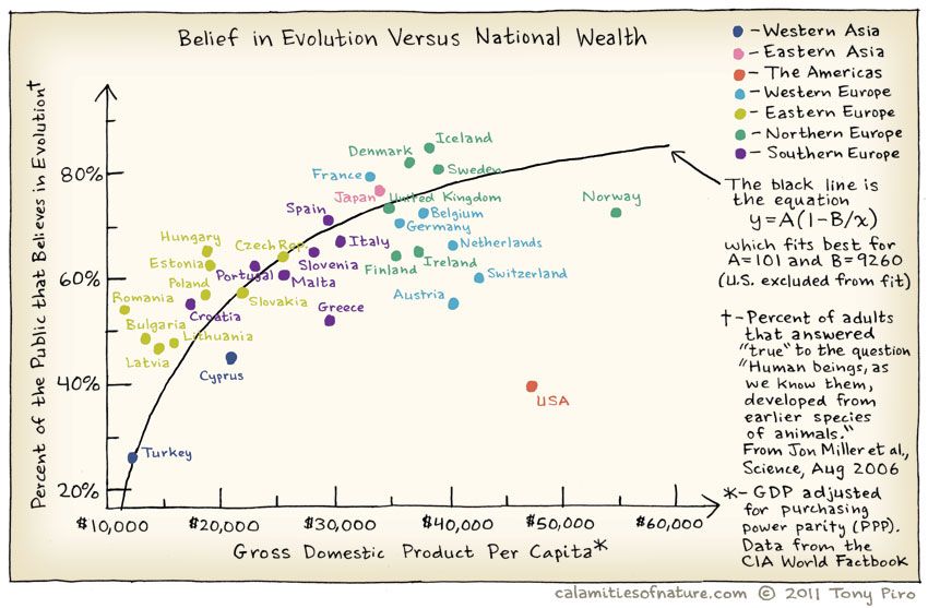
Does belief in Evolution depend upon the GSP of of the country? Where is the US in all of this? Does the Bible Belt tip the scales here?
And India?
One of the basic Questions we would have of our data is: Does some variable depend upon another in some way? Does
The word correlation is used in everyday life to denote some form of association. We might say that we have noticed a correlation between rainy days and reduced sales at supermarkets. However, in statistical terms we use correlation to denote association between two quantitative variables. We also assume that the association is linear, that one variable increases or decreases a fixed amount for a unit increase or decrease in the other. The other technique that is often used in these circumstances is regression, which involves estimating the best straight line to summarise the association.
The degree of association is measured by a correlation coefficient, denoted by r. It is sometimes called Pearson’s correlation coefficient after its originator and is a measure of linear association. (If a curved line is needed to express the relationship, other and more complicated measures of the correlation must be used.)
The correlation coefficient is measured on a scale that varies from + 1 through 0 to – 1. Complete correlation between two variables is expressed by either + 1 or -1. When one variable increases as the other increases the correlation is positive; when one decreases as the other increases it is negative.
In formal terms, the correlation between two variables
where
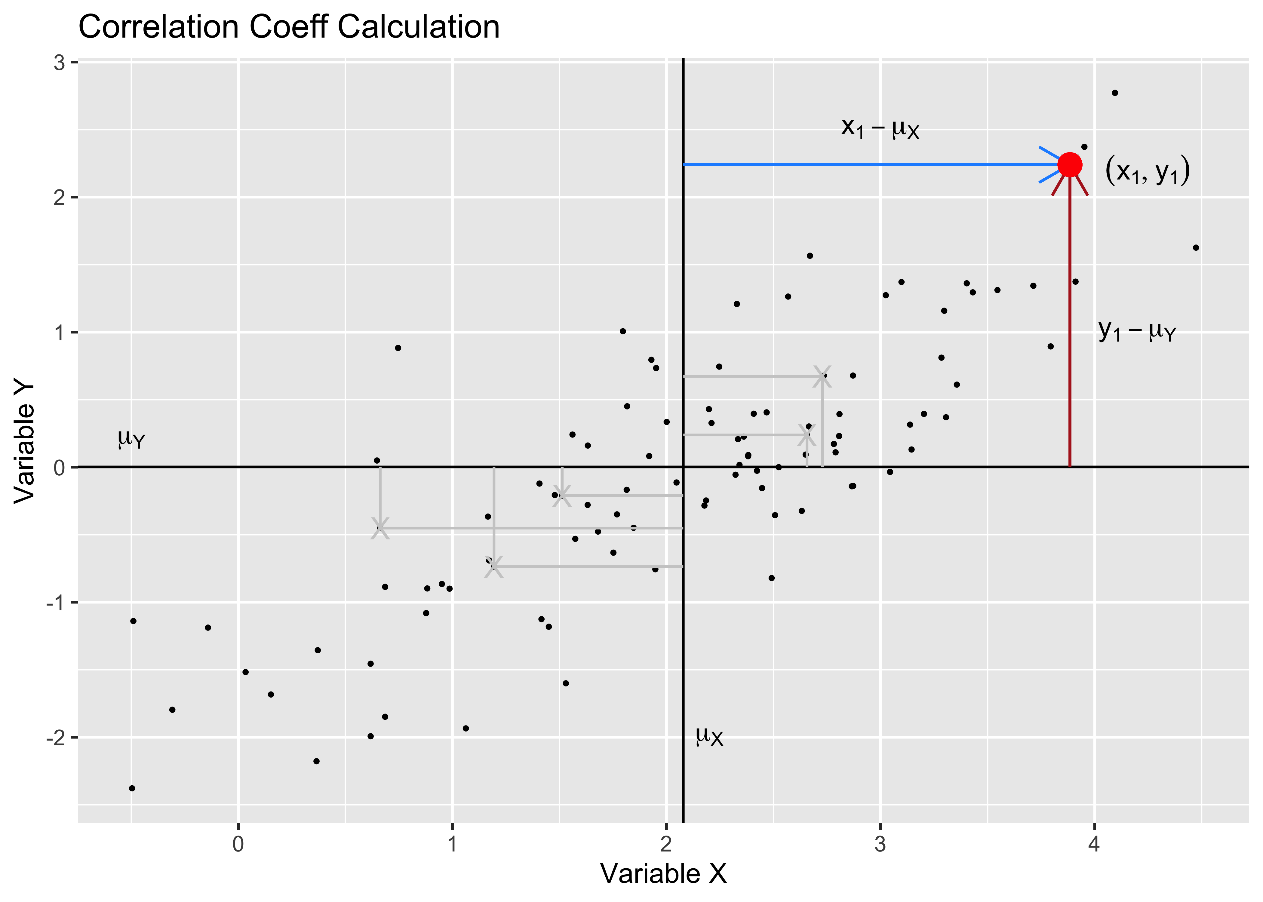
Pearson Correlation uses z-scores
We can see z-score of x.
Pearson correlation assumes that the relationship between the two variables is linear. There are of course many other types of correlation measures: some which work when this is not so. Type vignette("types", package = "correlation") in your Console to see the vignette from the correlation package that discusses various types of correlation measures.
HollywoodMovies2011 dataset
Let us look at the HollywoodMovies2011 dataset from the Lock5withR package. The dataset is also available by clicking the icon below ( in case you are not able to install Lock5withR):
HollywoodMovies2011 -> movies
glimpse(movies)
Rows: 136
Columns: 14
$ Movie <fct> "Insidious", "Paranormal Activity 3", "Bad Teacher",…
$ LeadStudio <fct> Sony, Independent, Independent, Warner Bros, Relativ…
$ RottenTomatoes <int> 67, 68, 44, 96, 90, 93, 75, 35, 63, 69, 69, 49, 26, …
$ AudienceScore <int> 65, 58, 38, 92, 77, 84, 91, 58, 74, 73, 72, 57, 68, …
$ Story <fct> Monster Force, Monster Force, Comedy, Rivalry, Rival…
$ Genre <fct> Horror, Horror, Comedy, Fantasy, Comedy, Romance, Dr…
$ TheatersOpenWeek <int> 2408, 3321, 3049, 4375, 2918, 944, 2534, 3615, NA, 2…
$ BOAverageOpenWeek <int> 5511, 15829, 10365, 38672, 8995, 6177, 10278, 23775,…
$ DomesticGross <dbl> 54.01, 103.66, 100.29, 381.01, 169.11, 56.18, 169.22…
$ ForeignGross <dbl> 43.00, 98.24, 115.90, 947.10, 119.28, 83.00, 30.10, …
$ WorldGross <dbl> 97.009, 201.897, 216.196, 1328.111, 288.382, 139.177…
$ Budget <dbl> 1.5, 5.0, 20.0, 125.0, 32.5, 17.0, 25.0, 80.0, 0.2, …
$ Profitability <dbl> 64.672667, 40.379400, 10.809800, 10.624888, 8.873292…
$ OpeningWeekend <dbl> 13.27, 52.57, 31.60, 169.19, 26.25, 5.83, 26.04, 85.…
Business Insights from Data Inspection
movies has 136 observations on the following 14 variables.
-
Moviea factor with many levels -
LeadStudioa factor with many levels -
RottenTomatoesa numeric vector -
AudienceScorea numeric vector -
Storya factor with many levels -
Genrea factor with levelsAction, Adventure, Animation, Comedy, Drama, Fantasy, Horror, Romance, Thriller. -
TheatersOpenWeeka numeric vector. No. of theatres. -
BOAverageOpenWeeka numeric vector. -
DomesticGrossa numeric vector. In million USD. -
ForeignGrossa numeric vector. In million USD. -
WorldGrossa numeric vector. In million USD. -
Budgeta numeric vector. In million USD. -
Profitabilitya numeric vector. A ratio -
OpeningWeekenda numeric vector. In million USD.
There are no missing values in the Qual variables; but some entries in the Quant variables are missing. skim throws a warning that we may need to examine later.
Let us look at the Quant variables: are these related in anyway? Could the relationship between any two Quant variables also depend upon the level of a Qual variable?
Which are the numeric variables in movies?
RottenTomatoes <int> | AudienceScore <int> | TheatersOpenWeek <int> | BOAverageOpenWeek <int> | DomesticGross <dbl> | ForeignGross <dbl> | WorldGross <dbl> | Budget <dbl> | Profitability <dbl> | OpeningWeekend <dbl> |
|---|---|---|---|---|---|---|---|---|---|
| 67 | 65 | 2408 | 5511 | 54.01 | 43.00 | 97.009 | 1.5 | 64.6726667 | 13.27 |
| 68 | 58 | 3321 | 15829 | 103.66 | 98.24 | 201.897 | 5.0 | 40.3794000 | 52.57 |
| 44 | 38 | 3049 | 10365 | 100.29 | 115.90 | 216.196 | 20.0 | 10.8098000 | 31.60 |
| 96 | 92 | 4375 | 38672 | 381.01 | 947.10 | 1328.111 | 125.0 | 10.6248880 | 169.19 |
| 90 | 77 | 2918 | 8995 | 169.11 | 119.28 | 288.382 | 32.5 | 8.8732923 | 26.25 |
| 93 | 84 | 944 | 6177 | 56.18 | 83.00 | 139.177 | 17.0 | 8.1868824 | 5.83 |
| 75 | 91 | 2534 | 10278 | 169.22 | 30.10 | 199.324 | 25.0 | 7.9729600 | 26.04 |
| 35 | 58 | 3615 | 23775 | 254.46 | 327.00 | 581.464 | 80.0 | 7.2683000 | 85.95 |
| 69 | 73 | 2756 | 6860 | 79.25 | 82.60 | 161.849 | 27.0 | 5.9944074 | 18.91 |
| 69 | 72 | 3040 | 9310 | 117.54 | 92.10 | 209.638 | 35.0 | 5.9896571 | 28.30 |
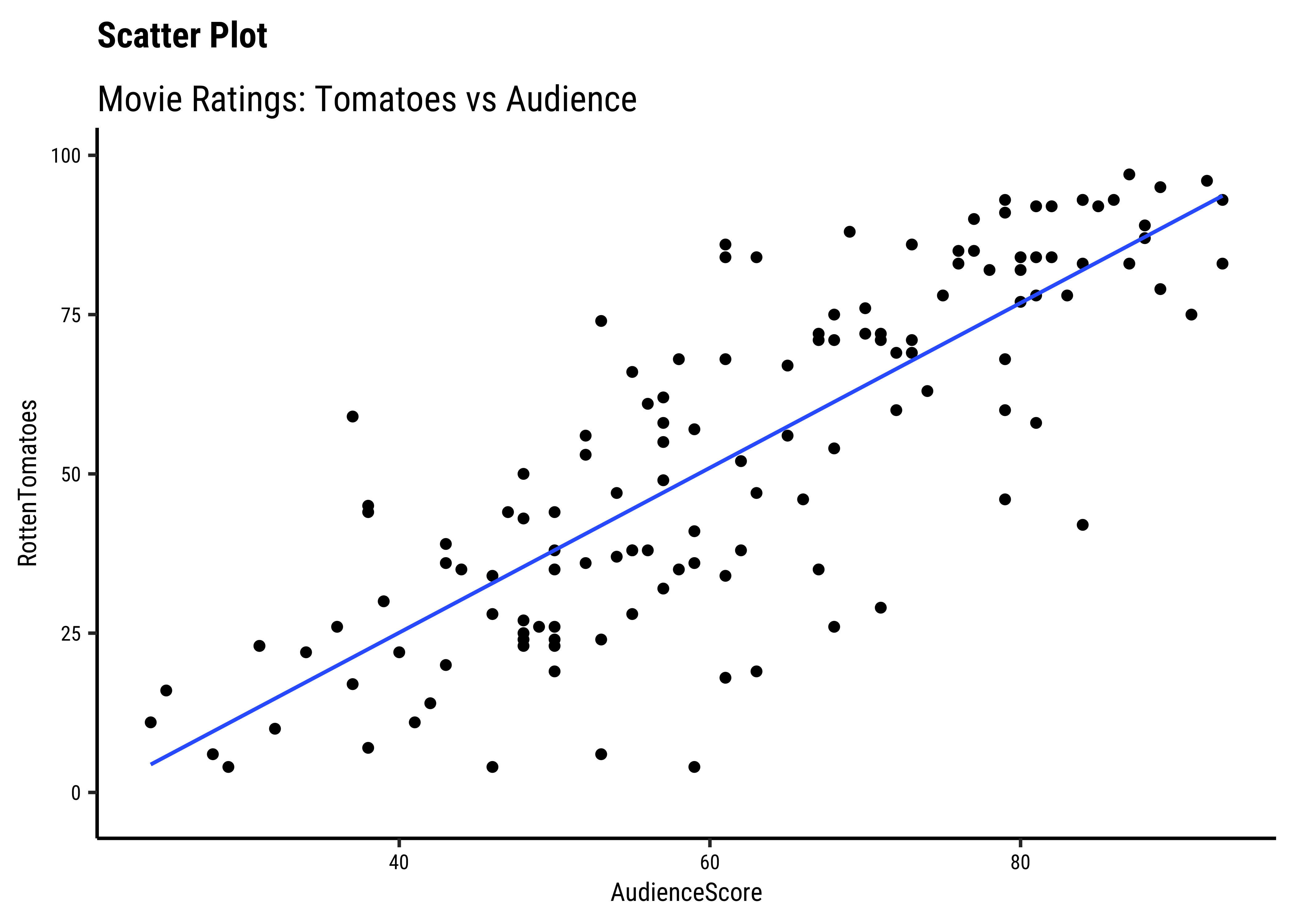
Now let us plot their relationships.
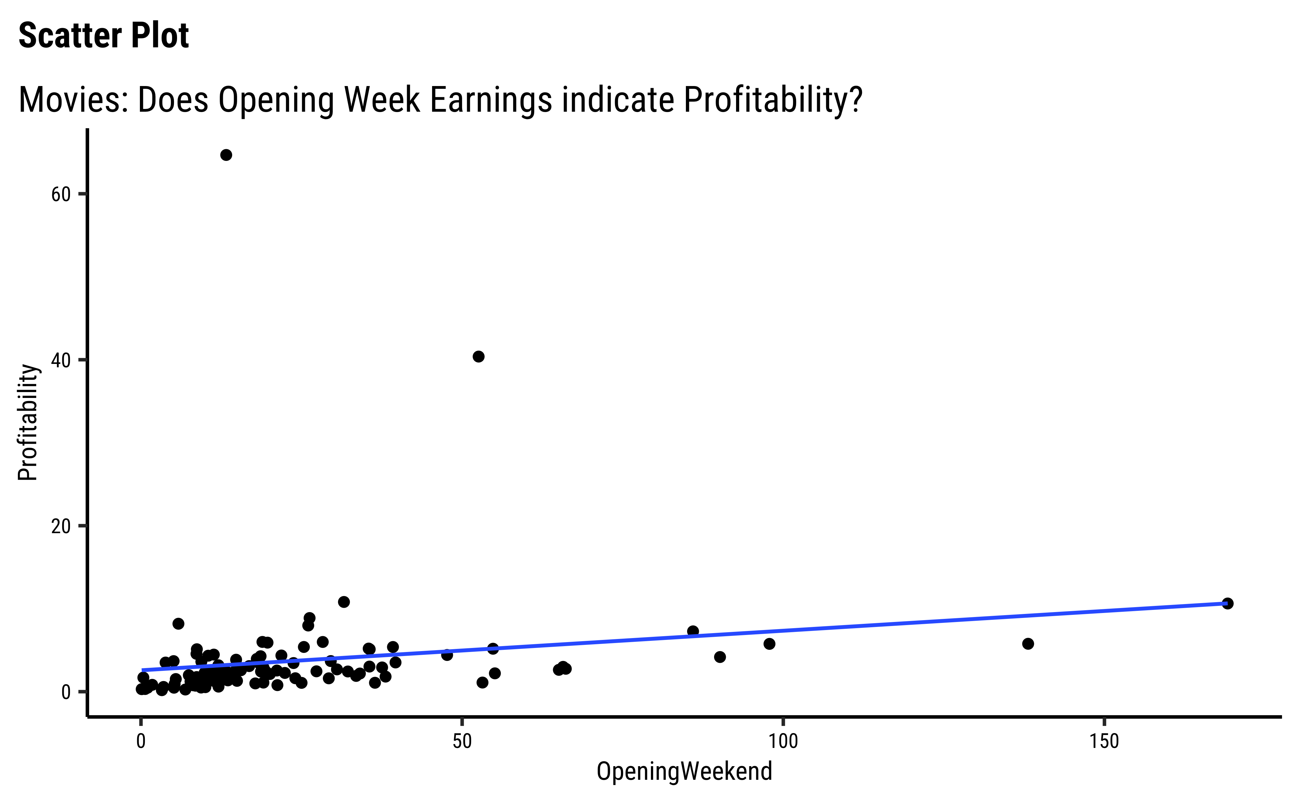

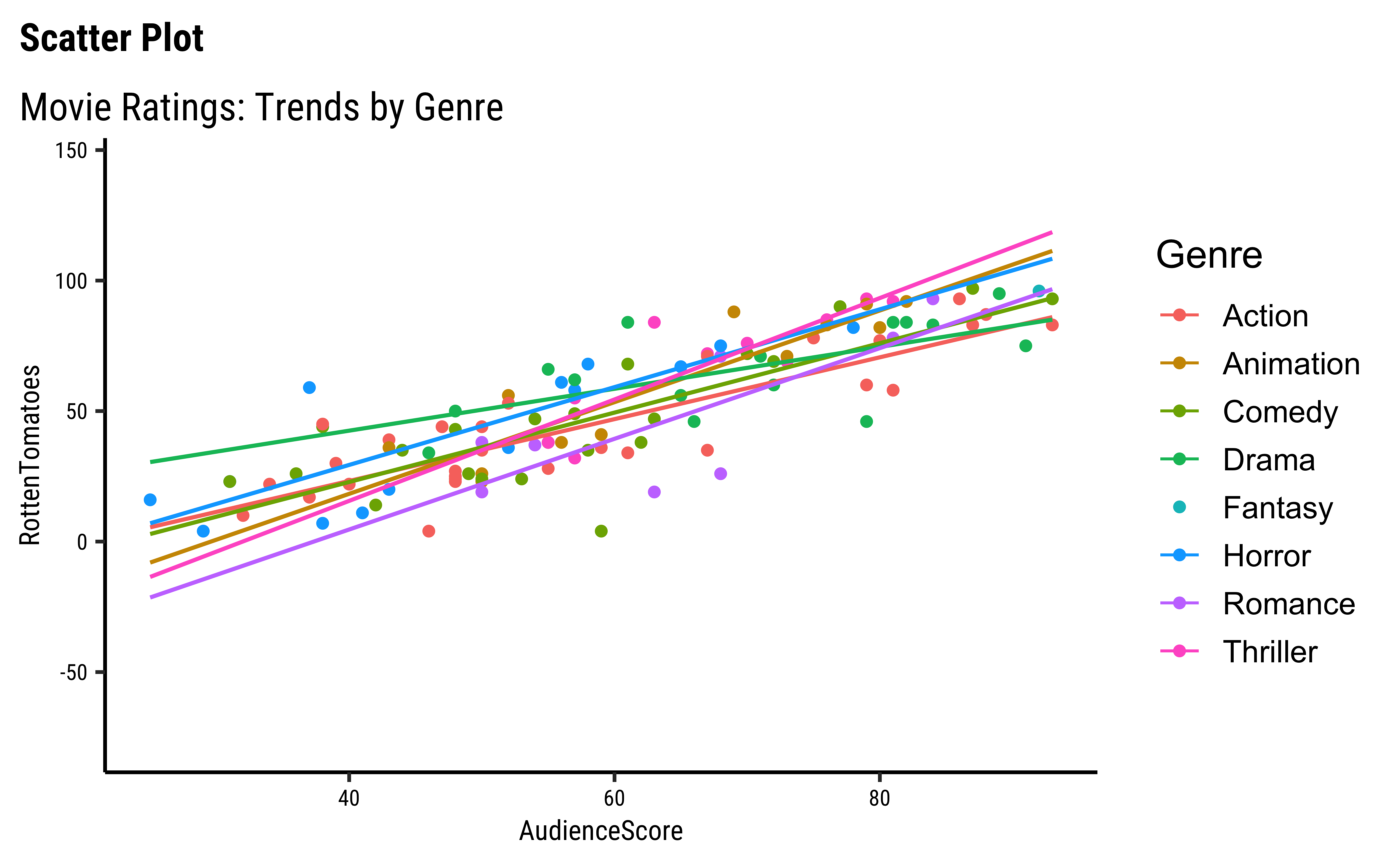
We can split some of the scatter plots using one or other of the Qual variables. For instance, is the relationship between the two ratings the same, regardless of movie genre?
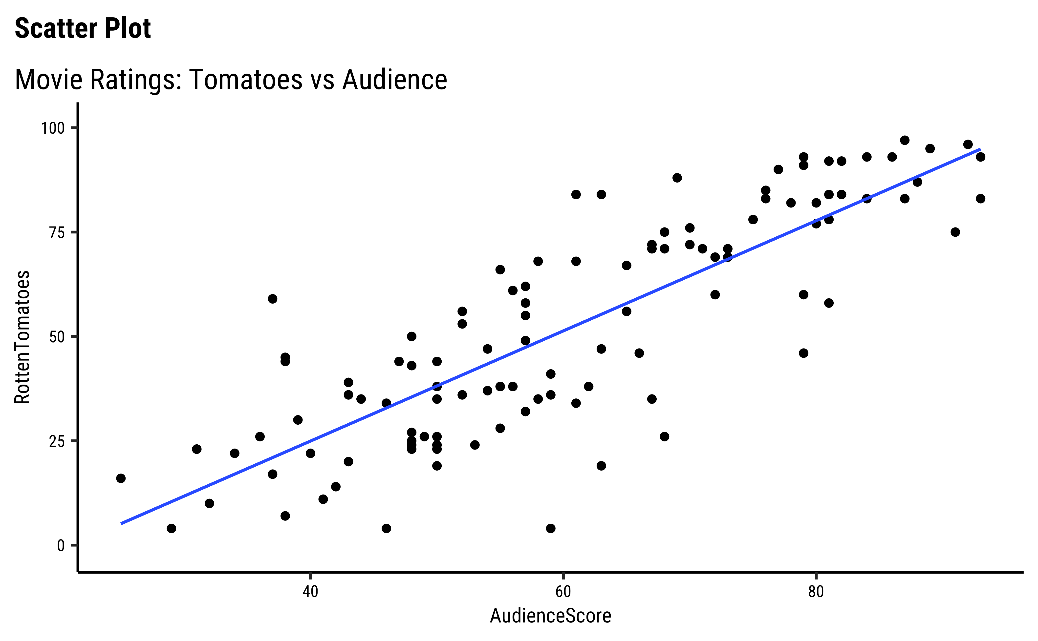
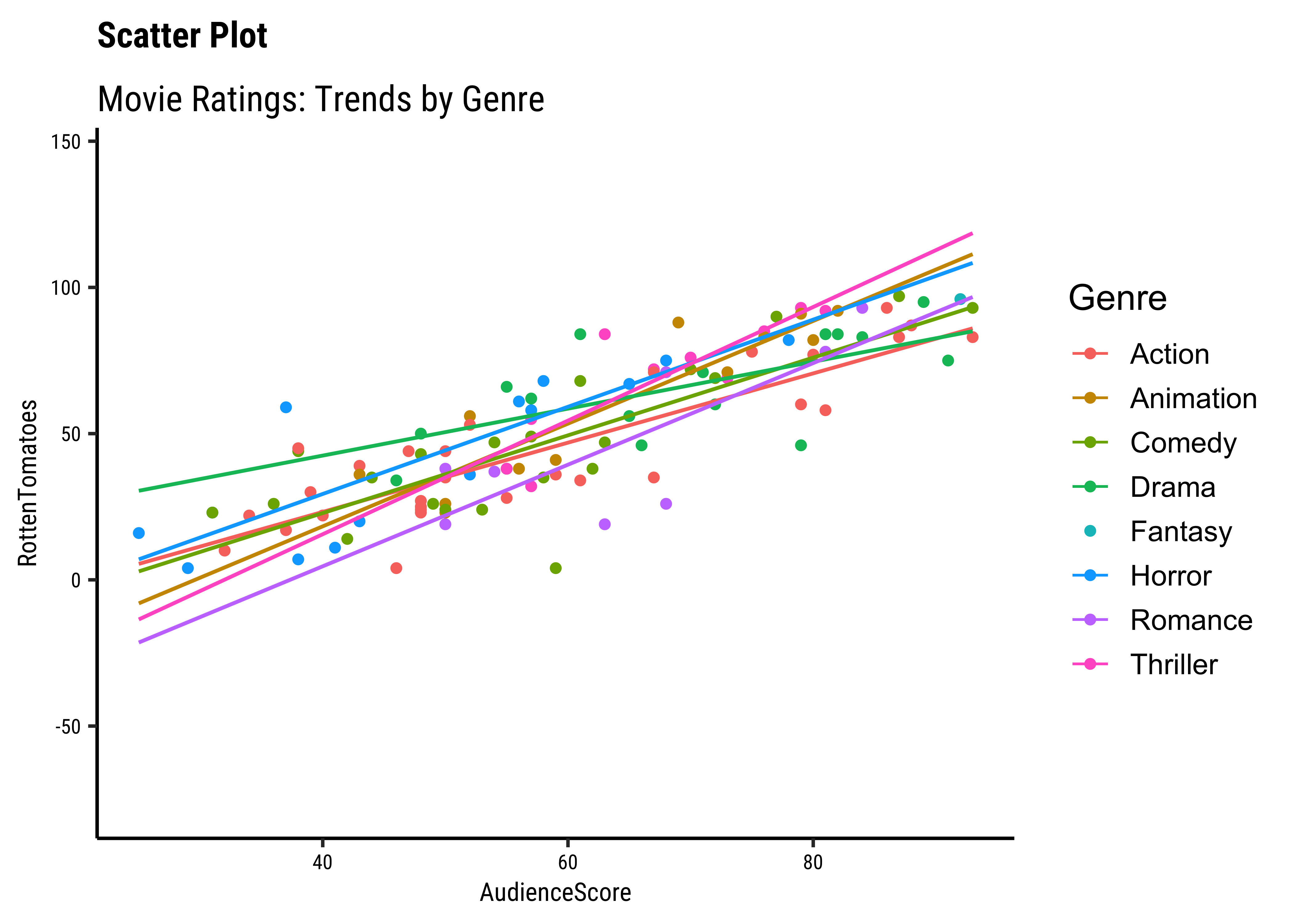
movies %>%
  drop_na() %>%
  ggplot(aes(RottenTomatoes, AudienceScore, color = Genre)) +
  geom_point() +
  geom_smooth(method = "lm", se = FALSE) +
  labs(
    title = "Scatter Plot",
    subtitle = "Movie Ratings: Trends by Genre"
  )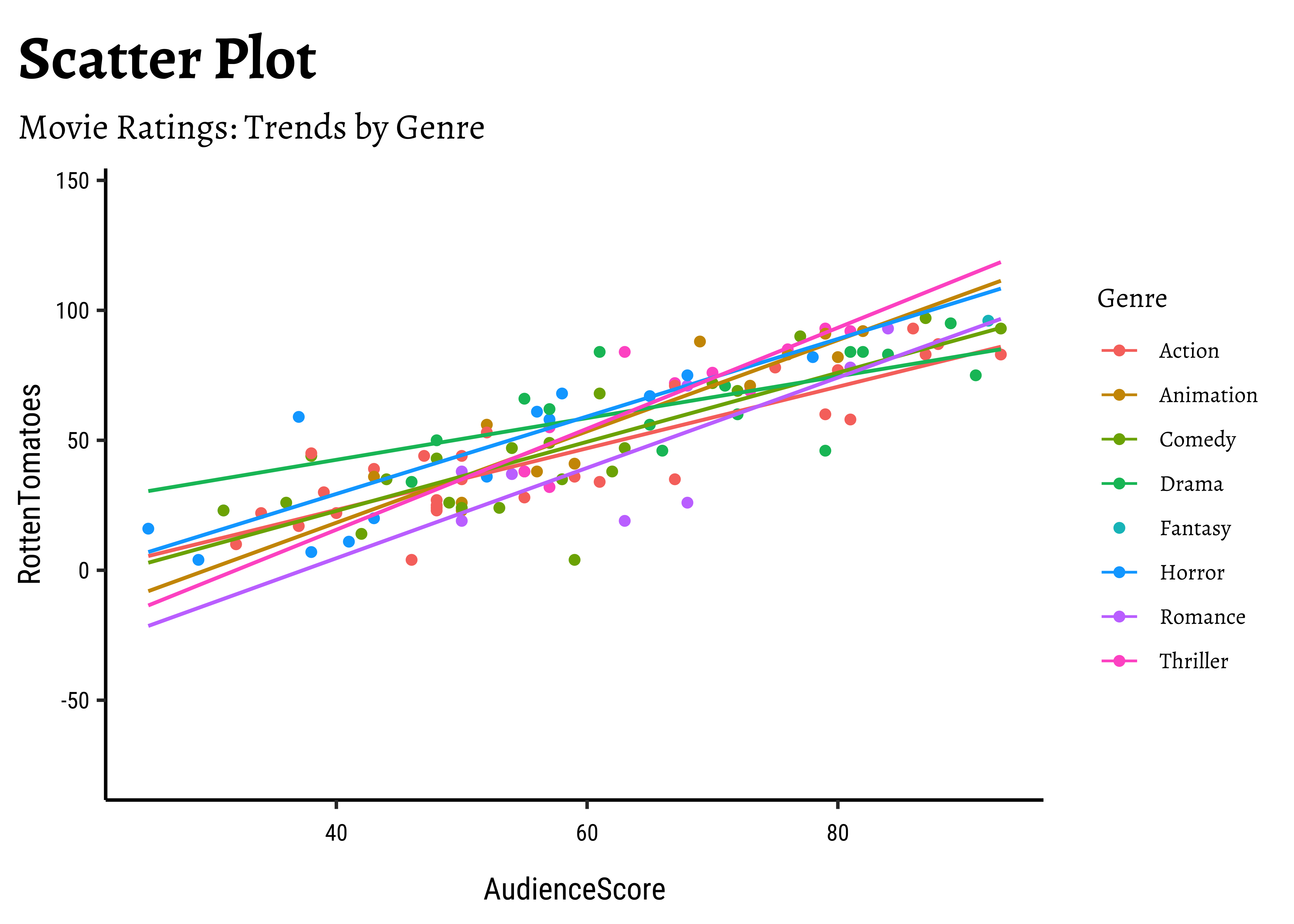
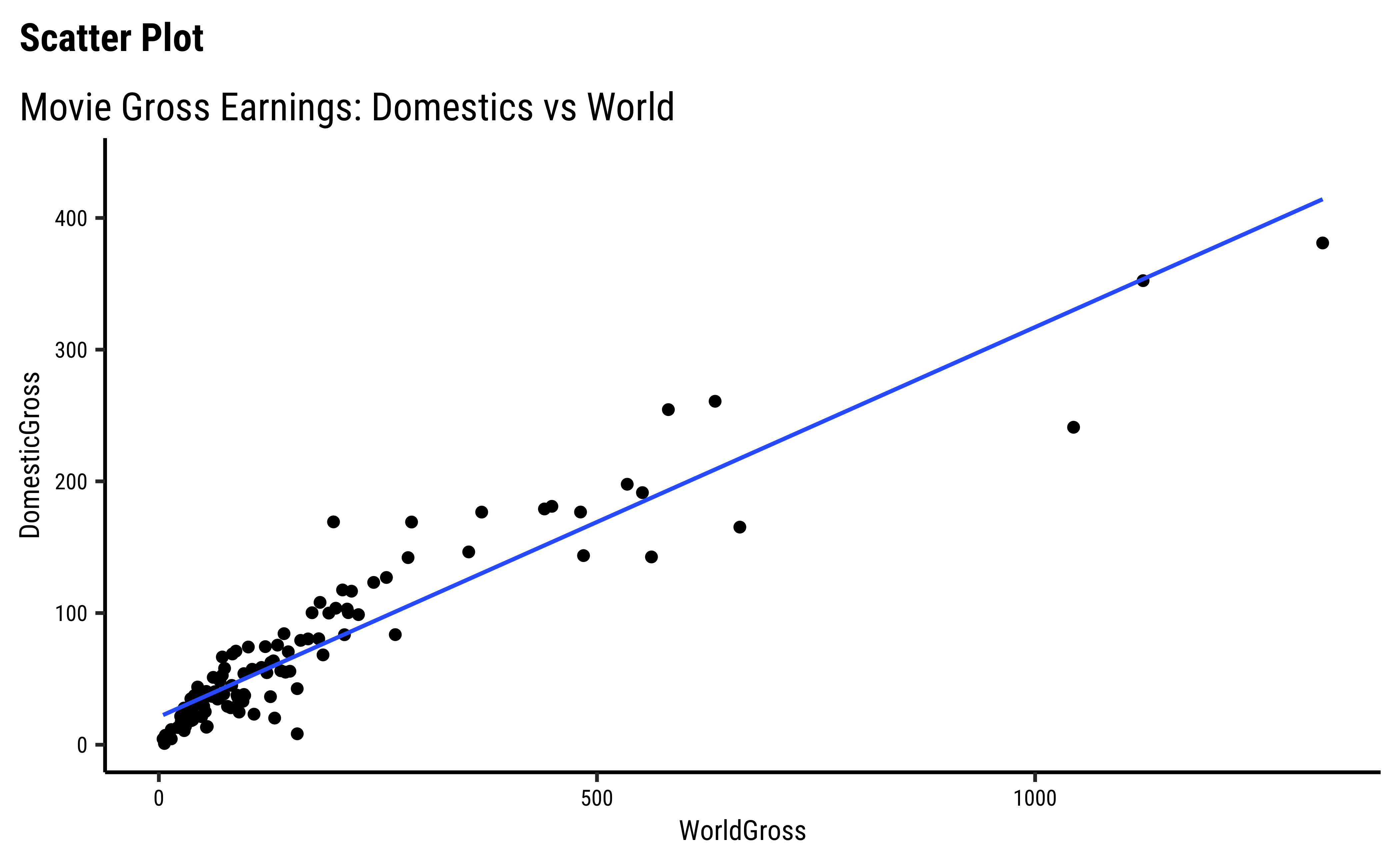
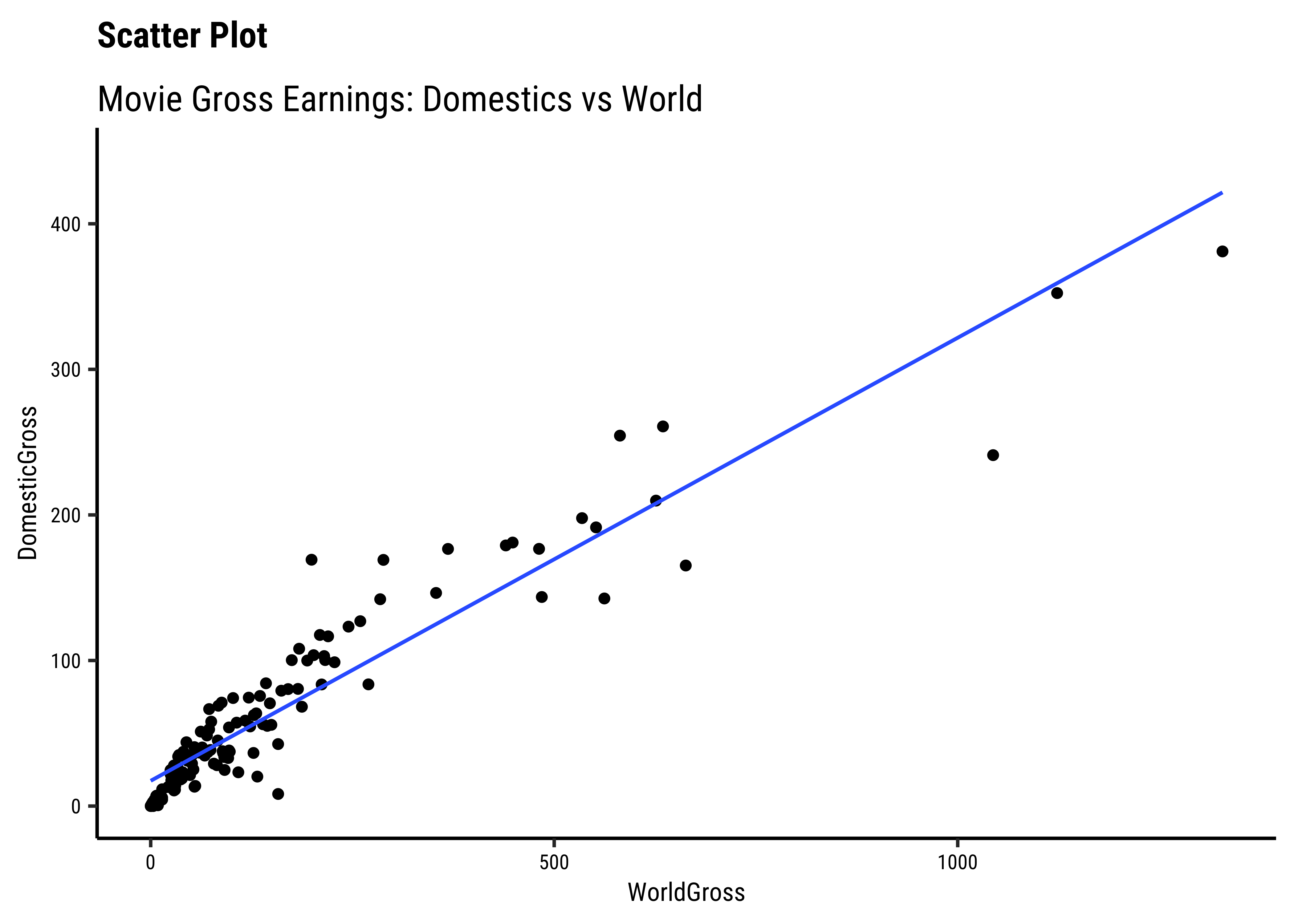
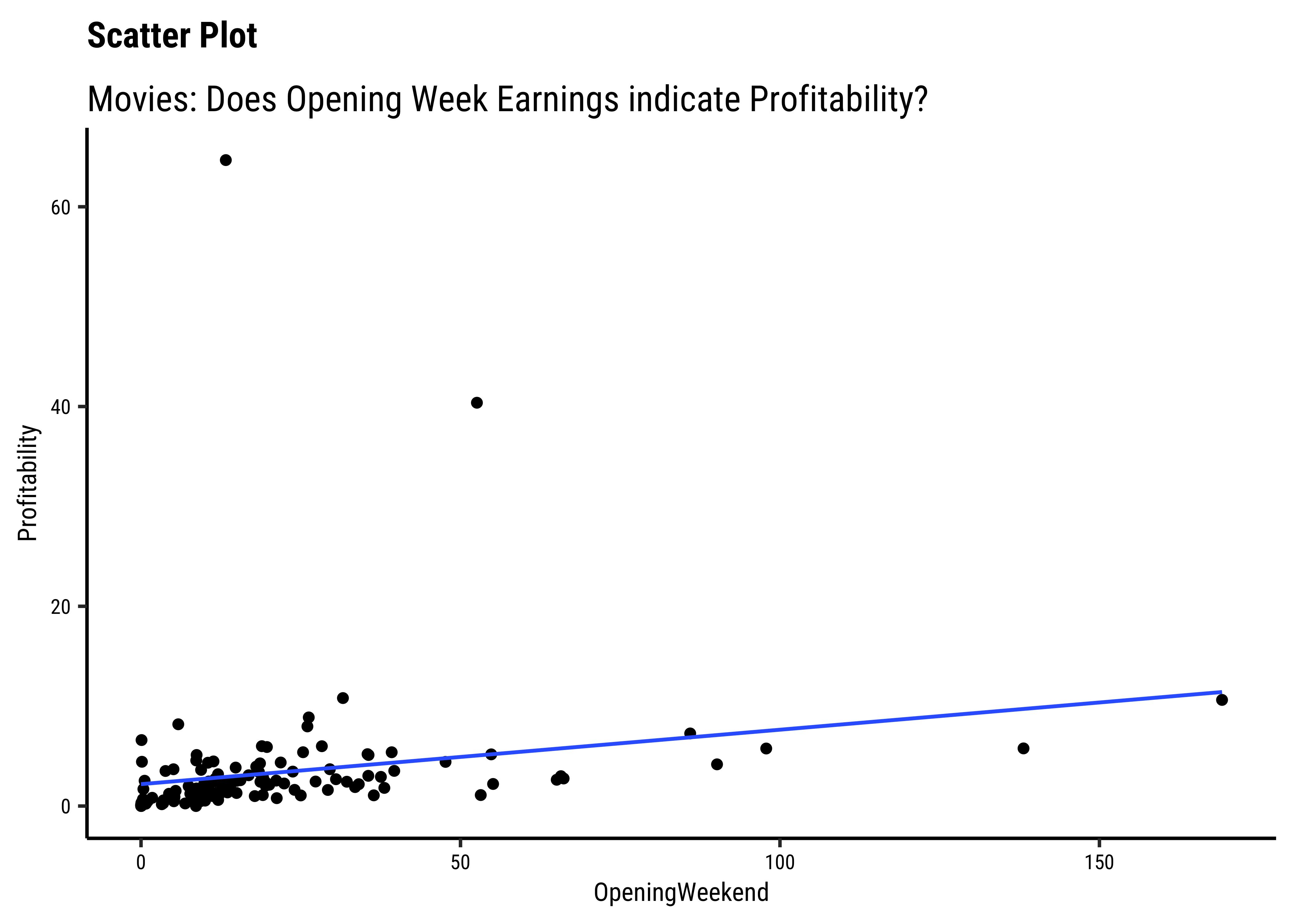
Business Insight from
movies scatter plots
We have fitted a trend line to each of the scatter plots.
-
DomesticGrossandWorld Grossare related, though there are fewer movies at the high end ofDomesticGross… -
AudienceScoreandRottenTomatoesseem clearly related…both increase together. -
OpeningWeekandProfitabilityare also related in a linear way. There are just two movies which have been extremely profitable..but they do not influence the slope of the trend line too much, because of their location midway in the range ofOpeningWeek. Influence is something that is a key concept in Linear Regression. - By and large, there are only small variations in slope across
Genres.
Independent and Dependent Variables
Note that we have rather arbitrarily taken AudienceScore as the independent variable, to be plotted on the x-axis, and RottenTomatoes on the y-axis. It could easily have been the other way around, based on our Research Question. Datasets are gathered with specific Research Hypotheses in mind, so check the help file and also with the person who gathered the data about what variable they are interested in!
So we see that there are visible relationships between Quant variables. How do we quantize this relationship, into a correlation score?
There are two ways: using the GGally and corplot packages, and doing a formal correlation test with the mosaic package.
By default, GGally::ggpairs() provides:
- two different comparisons of each pair of columns
- displays either the density or count of the respective variable along the diagonal.
- With different parameter settings, the diagonal can be replaced with the axis values and variable labels.
GGally::ggpairs(
  movies %>% drop_na(),
  # Select Quant variables only for now
  columns = c(
    "RottenTomatoes", "AudienceScore", "DomesticGross", "ForeignGross"
  ),
  switch = "both",
  # axis labels in more traditional locations(left and bottom)

  progress = FALSE,
  # no compute progress messages needed

  # Choose the diagonal graphs (always single variable! Think!)
  diag = list(continuous = "barDiag"),
  # choosing histogram,not density

  # Choose lower triangle graphs, two-variable graphs
  lower = list(continuous = wrap("smooth", alpha = 0.3, se = FALSE)),
  title = "Movies Data Correlations Plot #1"
)
Business Insight from Pairs Plot#1
- As we saw earlier from the Scatter Plot,
AudienceScoreandRottenTomatoesare well correlated, with a correlation score of -
DomesticGrossandForeignGrossare also extremely well correlated, with a score of - Both these correlation scores are highly significant, with three stars. (We will speak of significance in a while.)
- None of the other pairs of variables have good correlation scores.
- Note in passing that both the “Gross” related variables have highly skewed distributions. That is the nature of the movie business!
Let us also try a few other variables, related to budget and profits. For instance, it would be interesting to see the relationship between Budget and Profitability and even either of the “gross” earnings and Profitability.
GGally::ggpairs(
  movies %>% drop_na(),
  # Select Quant variables only for now
  columns = c(
    "Budget", "Profitability", "DomesticGross", "ForeignGross"
  ),
  switch = "both",
  # axis labels in more traditional locations(left and bottom)

  progress = FALSE,
  # no compute progress messages needed

  # Choose the diagonal graphs (always single variable! Think!)
  diag = list(continuous = "barDiag"),
  # choosing histogram,not density

  # Choose lower triangle graphs, two-variable graphs
  lower = list(continuous = wrap("smooth", alpha = 0.3, se = FALSE)),
  title = "Movies Data Correlations Plot #2"
)
Business Insight from Pairs Plot #2
- The
Budgetvariable has good correlation scores withDomesticGrossandForeignGross -
ProfitabilityandBudgetseem to have a very slight negative correlation, but this does not appear to be significant.
In this chart, the correlation between pairs of variables is shown symbolically as coloured shapes or colours. Circles, Squares, and Ellipse for example.
- The size, colour, and “orientation” of the shapes in question symbolically represent the strength and polarity of the correlation scores.
- The direction of the semi-major axis + the colour of the ellipse indicate whether the correlation score is positive or negative;
- And the more eccentric the ellipse, the higher is the correlation score in value.
Note
Whereas GGally computes the correlation scores, corplot “merely” displays them in an evocative way. We need to compute the correlations a priori.
Note also:
Tip
R package corrplot provides a visual exploratory tool on correlation matrix that supports automatic variable reordering to help detect hidden patterns among variables. corrplot is very easy to use and provides a rich array of plotting options in visualization method, graphic layout, color, legend, text labels, etc. It also provides p-values and confidence intervals to help users determine the statistical significance of the correlations.
# library(corrplot)
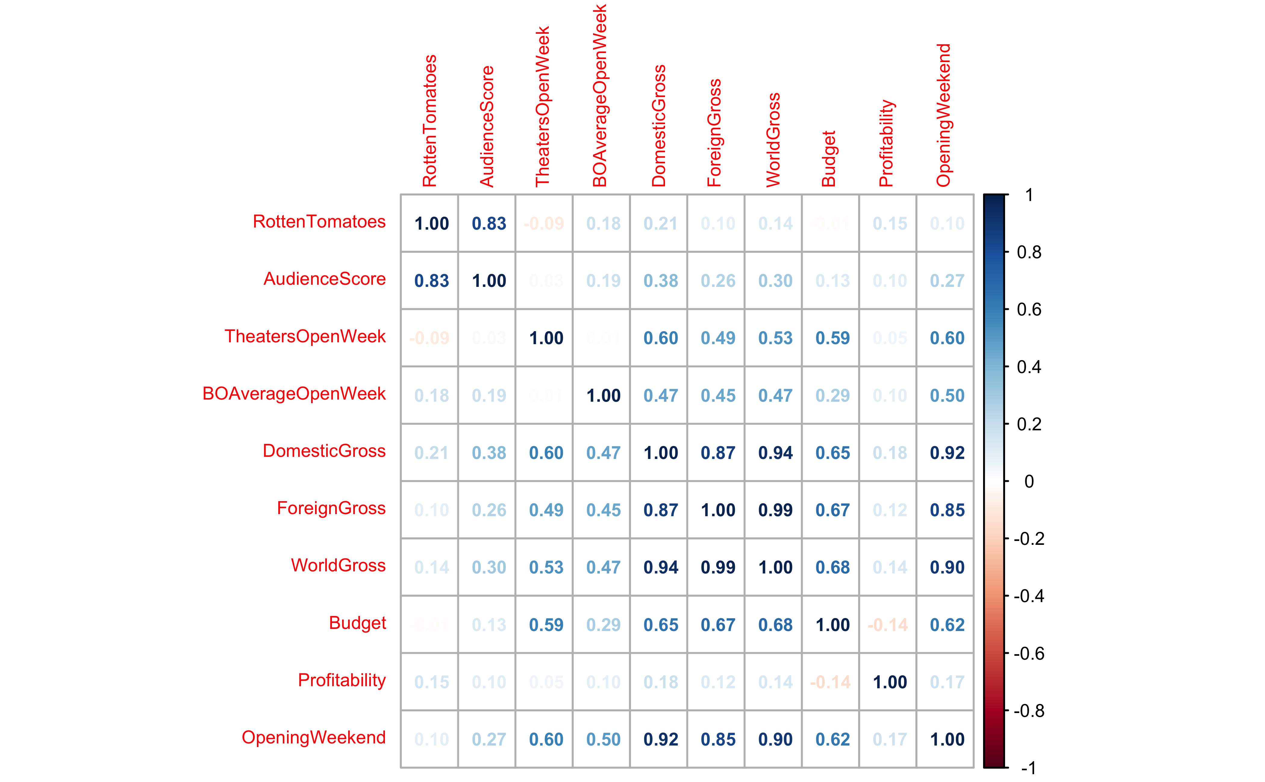
mydata_cor <- cor(movies_quant)
mydata_cor %>%
knitr::kable(caption = "Correlation Scores Matrix")| RottenTomatoes | AudienceScore | TheatersOpenWeek | BOAverageOpenWeek | DomesticGross | ForeignGross | WorldGross | Budget | Profitability | OpeningWeekend | |
|---|---|---|---|---|---|---|---|---|---|---|
| RottenTomatoes | 1.0000000 | 0.8329740 | -0.0873543 | 0.1823480 | 0.2085935 | 0.0979132 | 0.1356232 | -0.0147887 | 0.1502764 | 0.0986304 |
| AudienceScore | 0.8329740 | 1.0000000 | 0.0259118 | 0.1851768 | 0.3849406 | 0.2557891 | 0.3037927 | 0.1268649 | 0.1047582 | 0.2695132 |
| TheatersOpenWeek | -0.0873543 | 0.0259118 | 1.0000000 | 0.0117674 | 0.5981162 | 0.4850569 | 0.5344582 | 0.5924941 | 0.0547807 | 0.5977724 |
| BOAverageOpenWeek | 0.1823480 | 0.1851768 | 0.0117674 | 1.0000000 | 0.4713164 | 0.4522253 | 0.4710352 | 0.2880262 | 0.0964176 | 0.5043684 |
| DomesticGross | 0.2085935 | 0.3849406 | 0.5981162 | 0.4713164 | 1.0000000 | 0.8725927 | 0.9374780 | 0.6497274 | 0.1812387 | 0.9232259 |
| ForeignGross | 0.0979132 | 0.2557891 | 0.4850569 | 0.4522253 | 0.8725927 | 1.0000000 | 0.9880383 | 0.6707613 | 0.1230330 | 0.8487202 |
| WorldGross | 0.1356232 | 0.3037927 | 0.5344582 | 0.4710352 | 0.9374780 | 0.9880383 | 1.0000000 | 0.6830783 | 0.1448857 | 0.8962294 |
| Budget | -0.0147887 | 0.1268649 | 0.5924941 | 0.2880262 | 0.6497274 | 0.6707613 | 0.6830783 | 1.0000000 | -0.1437862 | 0.6228180 |
| Profitability | 0.1502764 | 0.1047582 | 0.0547807 | 0.0964176 | 0.1812387 | 0.1230330 | 0.1448857 | -0.1437862 | 1.0000000 | 0.1713962 |
| OpeningWeekend | 0.0986304 | 0.2695132 | 0.5977724 | 0.5043684 | 0.9232259 | 0.8487202 | 0.8962294 | 0.6228180 | 0.1713962 | 1.0000000 |
## View the matrix
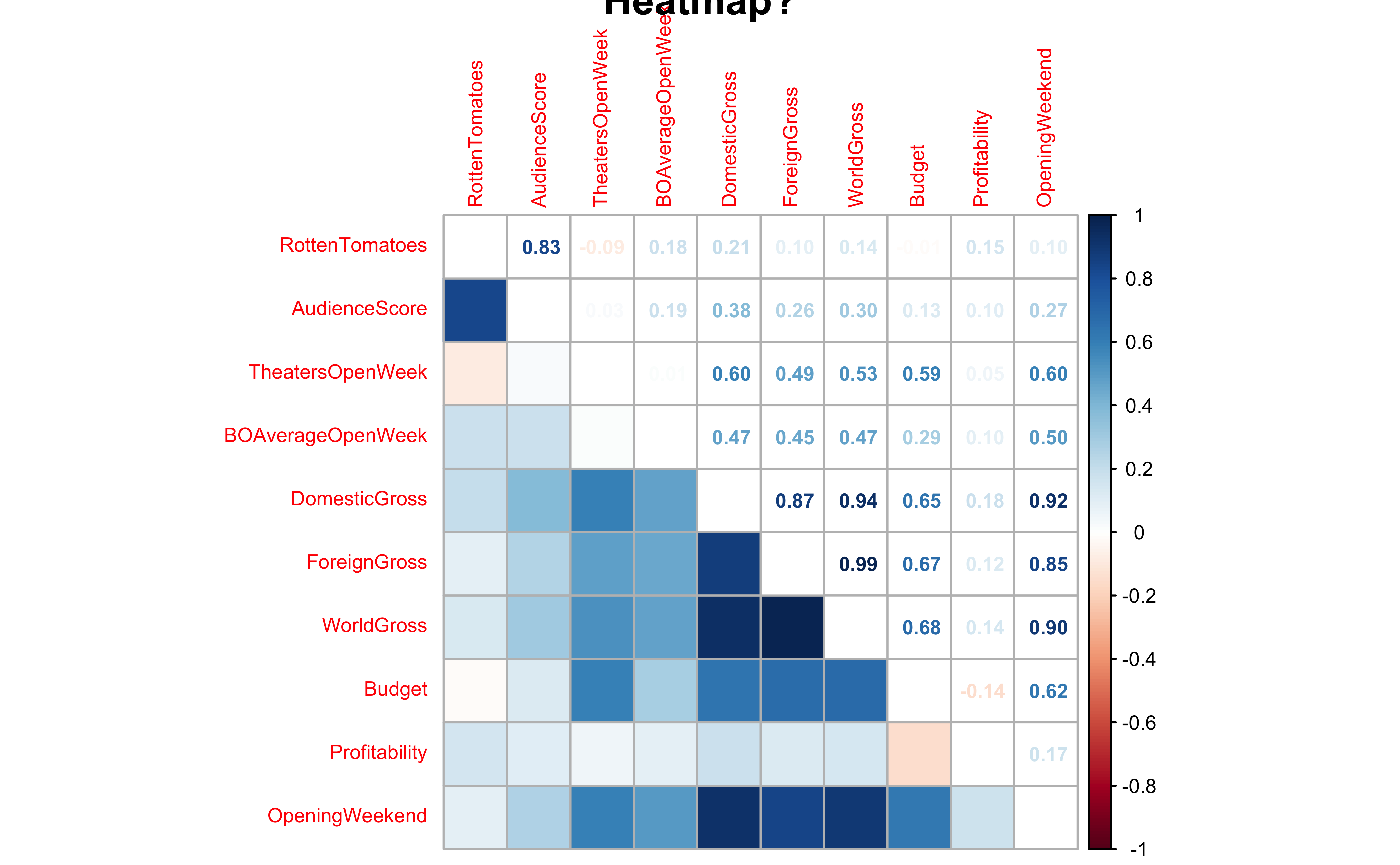
corrplot::corrplot(mydata_cor,
method = "number",
number.cex = 0.6,
cl.cex = 0.6, tl.cex = 0.6
)
# Default plot with circles
corrplot(mydata_cor,
  method = "circle",
  main = "Correlogram with Circles"
)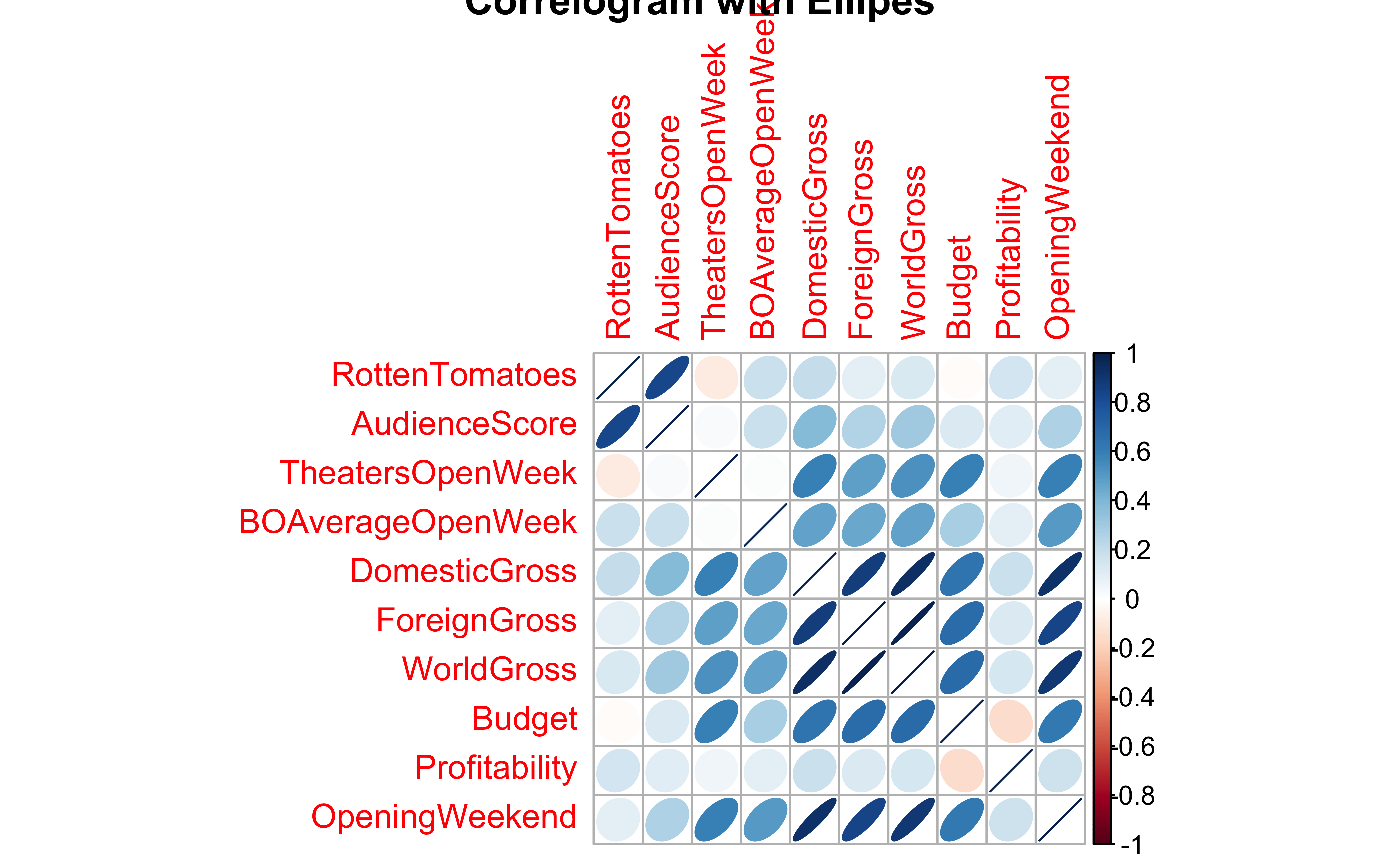
# Ellipse plot
corrplot(mydata_cor,
  method = "ellipse",
  main = "Correlogram with Ellipes"
)
# Heatmap
corrplot(mydata_cor,
  method = "color", ## US Spelling only
  main = "Correlogram"
)
# Heatmap with numbers
corrplot.mixed(mydata_cor,
  lower = "color", number.cex = 0.6,
  cl.cex = 0.6, tl.cex = 0.6,
  upper = "number",
  tl.pos = "l",
  main = "Heatmap?"
)
Business Insights from corplots
- Most of the variables here have positive correlations, many of them are significant
Doing a Correlation Test
Correlations scores can be obtained by conducting a formal test in R. We will use the mosaic function cor_test to get these results:
mosaic::cor_test(Profitability ~ Budget, data = movies) %>%
  broom::tidy() %>%
  knitr::kable(
    digits = 2,
    caption = "Movie Profitability vs Budget"
)| estimate | statistic | p.value | parameter | conf.low | conf.high | method | alternative |
|---|---|---|---|---|---|---|---|
| -0.08 | -0.96 | 0.34 | 132 | -0.25 | 0.09 | Pearson’s product-moment correlation | two.sided |
mosaic::cor_test(DomesticGross ~ Budget, data = movies) %>%
  broom::tidy() %>%
  knitr::kable(
    digits = 2,
    caption = "Movie Domestic Gross vs Budget"
)| estimate | statistic | p.value | parameter | conf.low | conf.high | method | alternative |
|---|---|---|---|---|---|---|---|
| 0.7 | 11.06 | 0 | 131 | 0.6 | 0.77 | Pearson’s product-moment correlation | two.sided |
mosaic::cor_test(ForeignGross ~ Budget, data = movies) %>%
  broom::tidy() %>%
  knitr::kable(
    digits = 2,
    caption = "Movie Foreign Gross vs Budget"
)| estimate | statistic | p.value | parameter | conf.low | conf.high | method | alternative |
|---|---|---|---|---|---|---|---|
| 0.69 | 10.22 | 0 | 118 | 0.58 | 0.77 | Pearson’s product-moment correlation | two.sided |
Business Insights from Correlation Tests
The budget and profitability are not well correlated, sadly. We see this from the p.value which is estimate which also cover
However, both DomesticGross and ForeignGross are well correlated with Budget. Look at the p.value (=0) and the confidence intervals which are unipolar.
As stated earlier, in our dataset we have a specific dependent or target variable, which represents the outcome of our experiment or our business situation. The remaining variables are usually independent or predictor variables. A very useful thing to know, and to view, would be the correlations of all independent variables. Using the correlation package from the easystats family of R packages, this can be very easily achieved. Let us quickly do this for the familiar mtcars dataset: we will quickly glimpse it, identify the target variable, and plot the correlations:
glimpse(mtcars)Rows: 32
Columns: 11
$ mpg <dbl> 21.0, 21.0, 22.8, 21.4, 18.7, 18.1, 14.3, 24.4, 22.8, 19.2, 17.8,…
$ cyl <dbl> 6, 6, 4, 6, 8, 6, 8, 4, 4, 6, 6, 8, 8, 8, 8, 8, 8, 4, 4, 4, 4, 8,…
$ disp <dbl> 160.0, 160.0, 108.0, 258.0, 360.0, 225.0, 360.0, 146.7, 140.8, 16…
$ hp <dbl> 110, 110, 93, 110, 175, 105, 245, 62, 95, 123, 123, 180, 180, 180…
$ drat <dbl> 3.90, 3.90, 3.85, 3.08, 3.15, 2.76, 3.21, 3.69, 3.92, 3.92, 3.92,…
$ wt <dbl> 2.620, 2.875, 2.320, 3.215, 3.440, 3.460, 3.570, 3.190, 3.150, 3.…
$ qsec <dbl> 16.46, 17.02, 18.61, 19.44, 17.02, 20.22, 15.84, 20.00, 22.90, 18…
$ vs <dbl> 0, 0, 1, 1, 0, 1, 0, 1, 1, 1, 1, 0, 0, 0, 0, 0, 0, 1, 1, 1, 1, 0,…
$ am <dbl> 1, 1, 1, 0, 0, 0, 0, 0, 0, 0, 0, 0, 0, 0, 0, 0, 0, 1, 1, 1, 0, 0,…
$ gear <dbl> 4, 4, 4, 3, 3, 3, 3, 4, 4, 4, 4, 3, 3, 3, 3, 3, 3, 4, 4, 4, 3, 3,…
$ carb <dbl> 4, 4, 1, 1, 2, 1, 4, 2, 2, 4, 4, 3, 3, 3, 4, 4, 4, 1, 2, 1, 1, 2,…## Target variable: mpg
## Calculate all correlations
cor <- correlation::correlation(mtcars)
corParameter1 <chr> | Parameter2 <chr> | r <dbl> | CI <dbl> | CI_low <dbl> | CI_high <dbl> | t <dbl> | df_error <int> | p <dbl> | ||
|---|---|---|---|---|---|---|---|---|---|---|
| 1 | mpg | cyl | -0.85216196 | 0.95 | -0.92576936 | -0.7163171 | -8.9196988 | 30 | 3.178597e-08 | |
| 2 | mpg | disp | -0.84755138 | 0.95 | -0.92335937 | -0.7081376 | -8.7471515 | 30 | 4.783967e-08 | |
| 3 | mpg | hp | -0.77616837 | 0.95 | -0.88526861 | -0.5860994 | -6.7423885 | 30 | 8.045259e-06 | |
| 4 | mpg | drat | 0.68117191 | 0.95 | 0.43604838 | 0.8322010 | 5.0960421 | 30 | 5.861592e-04 | |
| 5 | mpg | wt | -0.86765938 | 0.95 | -0.93382641 | -0.7440872 | -9.5590441 | 30 | 6.857981e-09 | |
| 6 | mpg | qsec | 0.41868403 | 0.95 | 0.08195487 | 0.6696186 | 2.5252133 | 30 | 2.220659e-01 | |
| 7 | mpg | vs | 0.66403892 | 0.95 | 0.41036301 | 0.8223262 | 4.8643850 | 30 | 1.093100e-03 | |
| 8 | mpg | am | 0.59983243 | 0.95 | 0.31755830 | 0.7844520 | 4.1061270 | 30 | 8.265602e-03 | |
| 9 | mpg | gear | 0.48028476 | 0.95 | 0.15806177 | 0.7100628 | 2.9991906 | 30 | 9.721707e-02 | |
| 10 | mpg | carb | -0.55092507 | 0.95 | -0.75464796 | -0.2503183 | -3.6157497 | 30 | 2.385782e-02 |
We see correlation between all pairs of variables. We need to choose just those with target variable mpg:
cor %>%
  # Filter for target variable `mpg` and plot
  filter(Parameter1 == "mpg") %>%
  gf_point(r ~ reorder(Parameter2, r), size = 4) %>%
  gf_errorbar(CI_low + CI_high ~ reorder(Parameter2, r),
    width = 0.5
  ) %>%
  gf_hline(yintercept = 0, color = "grey", linewidth = 2) %>%
  gf_labs(
    title = "Correlation Errorbar Chart",
    subtitle = "Target variable: mpg",
    x = "Predictor Variable",
    y = "Correlation Score with mpg"
  )
Business Insights from ErrorBar Plot
- Several variables are negatively correlated and some are positively correlated with ’mpg`. (The grey line shows “zero correlation”)
- Since none of the error bars straddle zero, the correlations are mostly significant.
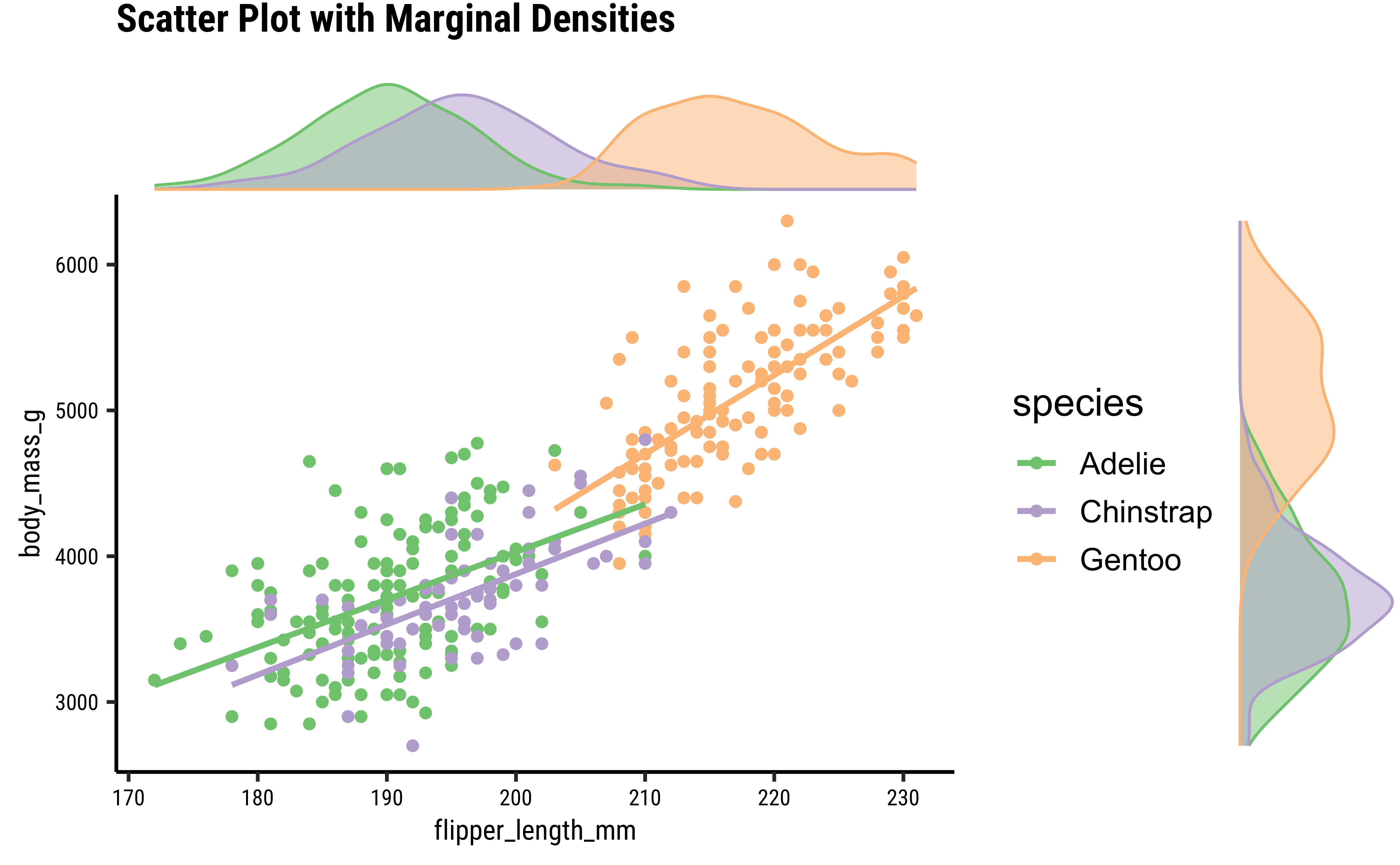
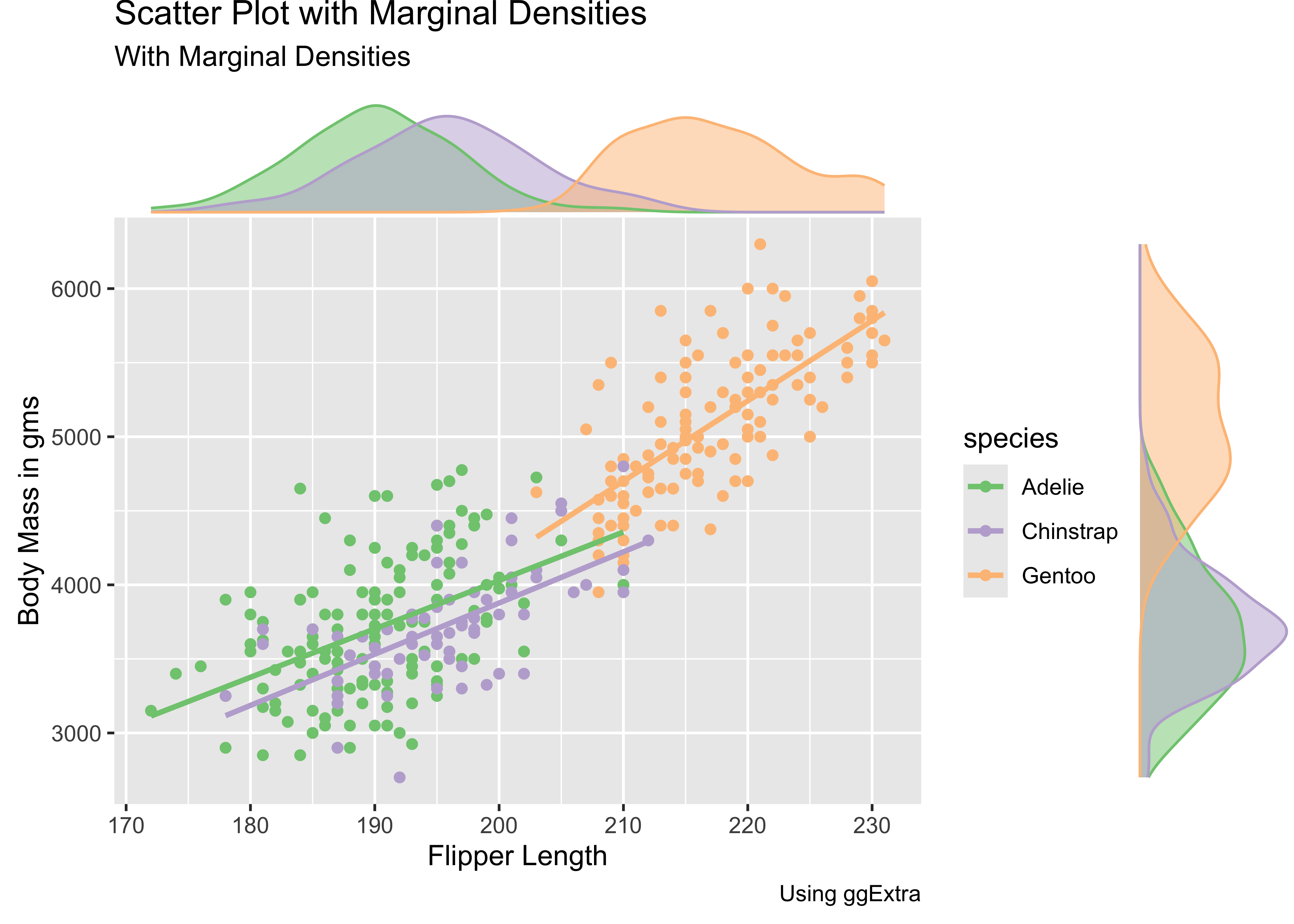
Sometimes, a simple scatter, or density alone, or viewed next to one another is not adequate to develop, or convey, our insight. We might just need a combination density + scatter plot. Such a plot can be be constructed from the ground up using ggformula or ggplot; however, there is a nice package called ggExtra that allows the creation of a powerful combination plot:
penguins %>%
  drop_na() %>%
  gf_point(body_mass_g ~ flipper_length_mm, colour = ~species) %>%
  gf_smooth(method = "lm") %>%
  gf_labs(x = "Flipper Length", y = "Body Mass in gms", title = "Penguins Scatter Plot", subtitle = "With Marginal Densities", caption = "Using ggExtra") %>%
  gf_refine(scale_colour_brewer(palette = "Accent")) %>%
  gf_labs(title = "Scatter Plot with Marginal Densities") %>%
  ggExtra::ggMarginal(
    type = "density", groupColour = TRUE,
    groupFill = TRUE, margins = "both"
  )
An Interactive Correlation Game
Head off to this interactive game website where you can play with correlations!
Simpson’s Paradox
See how the overall correlation/regression line slopes upward, whereas that for the individual groups slopes downward!! This is an example of Simpson’s Paradox!
- Try to play this online Correlation Game.
3. Gas Prices and Consumption
As described here. Note the log-transformed Quant data…why do you reckon this was done in the data set itself?
4. Horror Movies (Bah.You awful people..)
- Scatter Plots, when they show “linear” clouds, tell us that there is some relationship between two Quant variables we have just plotted
- If so, then if one is the target variable you are trying to design for, then the other independent, or controllable, variable is something you might want to design with.
Important
Target variables are usually plotted on the Y-axis, while Predictor variables are on the X-Axis, in a Scatter Plot. Why? Because
- Correlation scores are good indicators of things that are, well, related. While one variable may not necessarily cause another, a good correlation score may indicate how to chose a good predictor.
- That is something we will see when we examine Linear Regression
- Always, always, plot and test your data! Both numerical summaries as tables, and graphical summaries as charts, are necessary! See below!!
And How about these datasets?
| dataset | mean_x | mean_y | std_dev_x | std_dev_y | corr_x_y |
|---|---|---|---|---|---|
| away | 54.26610 | 47.83472 | 16.76982 | 26.93974 | -0.06412835 |
| bullseye | 54.26873 | 47.83082 | 16.76924 | 26.93573 | -0.06858639 |
| circle | 54.26732 | 47.83772 | 16.76001 | 26.93004 | -0.06834336 |
| dino | 54.26327 | 47.83225 | 16.76514 | 26.93540 | -0.06447185 |
| dots | 54.26030 | 47.83983 | 16.76774 | 26.93019 | -0.06034144 |
| h_lines | 54.26144 | 47.83025 | 16.76590 | 26.93988 | -0.06171484 |
| high_lines | 54.26881 | 47.83545 | 16.76670 | 26.94000 | -0.06850422 |
| slant_down | 54.26785 | 47.83590 | 16.76676 | 26.93610 | -0.06897974 |
| slant_up | 54.26588 | 47.83150 | 16.76885 | 26.93861 | -0.06860921 |
| star | 54.26734 | 47.83955 | 16.76896 | 26.93027 | -0.06296110 |
| v_lines | 54.26993 | 47.83699 | 16.76996 | 26.93768 | -0.06944557 |
| wide_lines | 54.26692 | 47.83160 | 16.77000 | 26.93790 | -0.06657523 |
| x_shape | 54.26015 | 47.83972 | 16.76996 | 26.93000 | -0.06558334 |
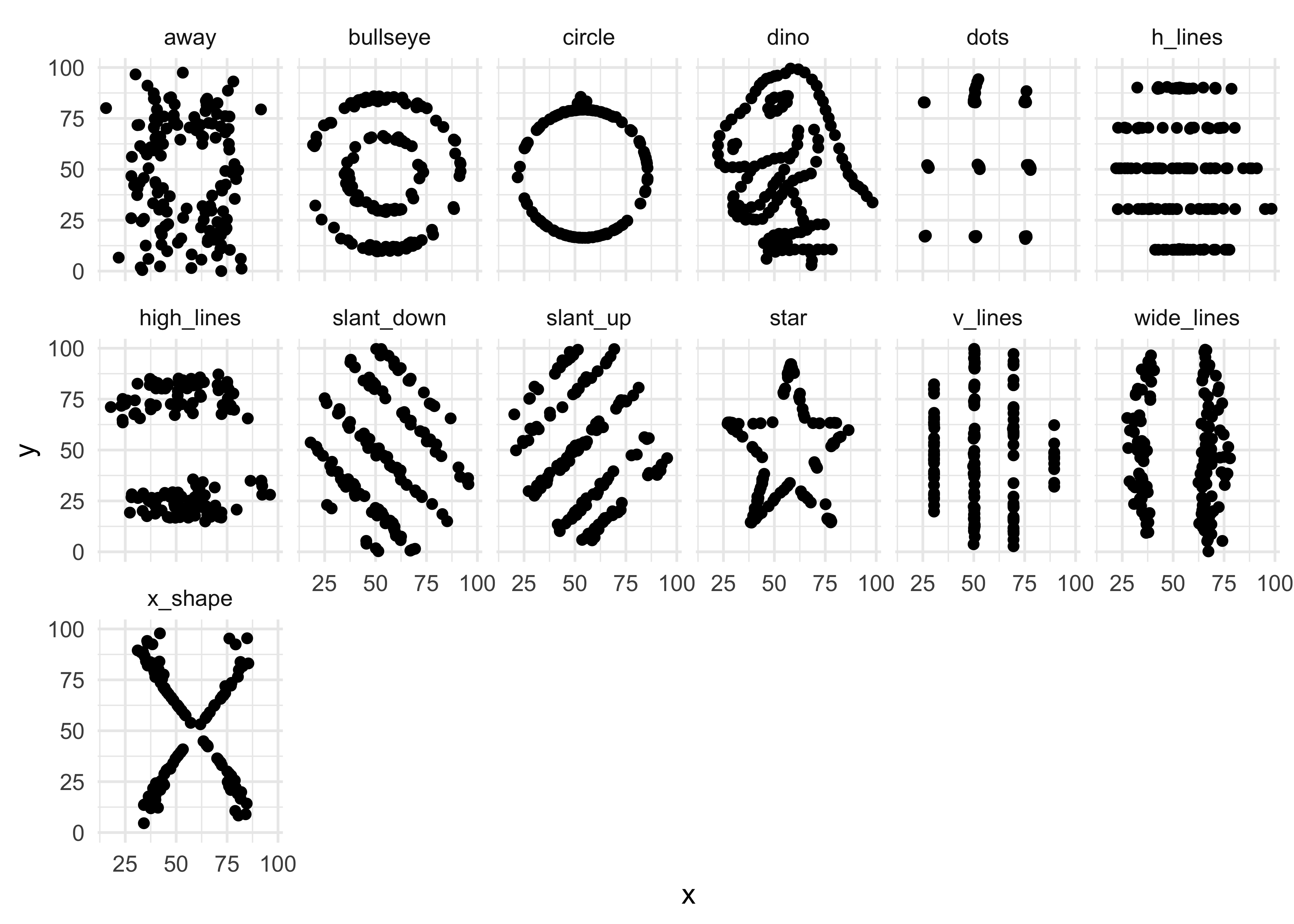
Yes, you did want to plot that cute T-Rex, didn’t you? Here is the data then!!
Warning
- Can selling more ice-cream make people drown?
- Use your head about pairs of variables. Do not fall into this trap)
Scatter Plots give a us sense of change; whether it is linear or non-linear. We can get an idea of correlation between variables with a scatter plot. Our workflow for evaluating correlations between target variable and several other predictor variables uses several packages such as GGally, corrplot, correlation, and of course mosaic for correlation tests.
This document focusses on correlation between quantitative variables. It examines different ways to visualize correlations, including scatter plots and correlograms. The document provides examples of how to use R packages like GGally and corrplot to create these visualizations and correlation tests to assess the strength and significance of relationships between variables. The tutorial uses the HollywoodMovies2011 and mtcars datasets as examples to demonstrate these concepts.
- Winston Chang (2024). R Graphics Cookbook. https://r-graphics.org
- Minimal R using
mosaic. https://cran.r-project.org/web/packages/mosaic/vignettes/MinimalRgg.pdf
- Antoine Soetewey. Pearson, Spearman and Kendall correlation coefficients by hand https://www.r-bloggers.com/2023/09/pearson-spearman-and-kendall-correlation-coefficients-by-hand/
- Taiyun Wei, Viliam Simko. An Introduction to corrplot Package. https://cran.r-project.org/web/packages/corrplot/vignettes/corrplot-intro.html
Attali, Dean, and Christopher Baker. 2023. ggExtra: Add Marginal Histograms to “ggplot2,” and More “ggplot2” Enhancements. https://doi.org/10.32614/CRAN.package.ggExtra.
Gillespie, Colin, Steph Locke, Rhian Davies, and Lucy D’Agostino McGowan. 2025. datasauRus: Datasets from the Datasaurus Dozen. https://doi.org/10.32614/CRAN.package.datasauRus.
Meschiari, Stefano. 2022. Latex2exp: Use LaTeX Expressions in Plots. https://doi.org/10.32614/CRAN.package.latex2exp.
Schloerke, Barret, Di Cook, Joseph Larmarange, Francois Briatte, Moritz Marbach, Edwin Thoen, Amos Elberg, and Jason Crowley. 2024. GGally: Extension to “ggplot2”. https://doi.org/10.32614/CRAN.package.GGally.
Wei, Taiyun, and Viliam Simko. 2024. R Package “corrplot”: Visualization of a Correlation Matrix. https://github.com/taiyun/corrplot.
Citation
BibTeX citation:
@online{v.2022,
  author = {V., Arvind},
  title = {\textless Iconify-Icon Icon=“icon-Park-Outline:change”
    Width=“1.2em”
    Height=“1.2em”\textgreater\textless/Iconify-Icon\textgreater{}
    {Change}},
  date = {2022-11-22},
  url = {https://av-quarto.netlify.app/content/courses/Analytics/Descriptive/Modules/30-Correlations/},
  langid = {en},
  abstract = {How one variable changes with another}
}
For attribution, please cite this work as:
V., Arvind. 2022. “<Iconify-Icon
Icon=‘icon-Park-Outline:change’ Width=‘1.2em’
Height=‘1.2em’></Iconify-Icon> Change.”
November 22, 2022. https://av-quarto.netlify.app/content/courses/Analytics/Descriptive/Modules/30-Correlations/.