Modelling with Linear Regression
Slides and Tutorials
| Multiple Regression - Forward Selection | Multiple Regression - Backward Selection | Permutation Test for Regression |
Plot Fonts and Theme
Show the Code
library(systemfonts)
library(showtext)
## Clean the slate
systemfonts::clear_local_fonts()
systemfonts::clear_registry()
##
showtext_opts(dpi = 96) # set DPI for showtext
sysfonts::font_add(
  family = "Alegreya",
  regular = "../../../../../../fonts/Alegreya-Regular.ttf",
  bold = "../../../../../../fonts/Alegreya-Bold.ttf",
  italic = "../../../../../../fonts/Alegreya-Italic.ttf",
  bolditalic = "../../../../../../fonts/Alegreya-BoldItalic.ttf"
)
Error in check_font_path(bold, "bold"): font file not found for 'bold' typeShow the Code
sysfonts::font_add(
  family = "Roboto Condensed",
  regular = "../../../../../../fonts/RobotoCondensed-Regular.ttf",
  bold = "../../../../../../fonts/RobotoCondensed-Bold.ttf",
  italic = "../../../../../../fonts/RobotoCondensed-Italic.ttf",
  bolditalic = "../../../../../../fonts/RobotoCondensed-BoldItalic.ttf"
)
showtext_auto(enable = TRUE) # enable showtext
##
theme_custom <- function() {
  font <- "Alegreya" # assign font family up front

  theme_classic(base_size = 14, base_family = font) %+replace% # replace elements we want to change

    theme(
      text = element_text(family = font), # set base font family

      # text elements
      plot.title = element_text( # title
        family = font, # set font family
        size = 24, # set font size
        face = "bold", # bold typeface
        hjust = 0, # left align
        margin = margin(t = 5, r = 0, b = 5, l = 0)
      ), # margin
      plot.title.position = "plot",
      plot.subtitle = element_text( # subtitle
        family = font, # font family
        size = 14, # font size
        hjust = 0, # left align
        margin = margin(t = 5, r = 0, b = 10, l = 0)
      ), # margin

      plot.caption = element_text( # caption
        family = font, # font family
        size = 9, # font size
        hjust = 1
      ), # right align

      plot.caption.position = "plot", # right align

      axis.title = element_text( # axis titles
        family = "Roboto Condensed", # font family
        size = 12
      ), # font size

      axis.text = element_text( # axis text
        family = "Roboto Condensed", # font family
        size = 9
      ), # font size

      axis.text.x = element_text( # margin for axis text
        margin = margin(5, b = 10)
      )

      # since the legend often requires manual tweaking
      # based on plot content, don't define it here
    )
}
Show the Code
```{r}
#| cache: false
#| code-fold: true
## Set the theme
theme_set(new = theme_custom())

## Use available fonts in ggplot text geoms too!
update_geom_defaults(geom = "text", new = list(
  family = "Roboto Condensed",
  face = "plain",
  size = 3.5,
  color = "#2b2b2b"
))
```
One of the most common problems in Prediction Analytics is that of predicting a Quantitative response variable, based on one or more Quantitative predictor variables or features. This is called Linear Regression. We will use the intuitions built up during our study of ANOVA to develop our ideas about Linear Regression.
Suppose we have data on salaries in a Company, with years of study and previous experience. Would we be able to predict the prospective salary of a new candidate, based on their years of study and experience? Or based on the mileage done, could we predict the resale price of a used car? These are typical problems in Linear Regression.
In this tutorial, we will use the Boston housing dataset. Our research question is:
How do we predict the price of a house in Boston, based on other parameters Quantitative parameters such as area, location, rooms, and crime-rate in the neighbourhood?
The premise here is that many common statistical tests are special cases of the linear model.
A linear model estimates the relationship between one continuous or ordinal variable (dependent variable or “response”) and one or more other variables (explanatory variable or “predictors”). It is assumed that the relationship is linear:1
or
but not:
or
In Equation 1,
The net area of all the shaded squares is minimized in the calculation of t-tests to two-way ANOVA, are special cases of this system. Also see Jeffrey Walker “A linear-model-can-be-fit-to-data-with-continuous-discrete-or-categorical-x-variables”.
Using linear models is based on the idea of Testing of Hypotheses. The Hypothesis Testing method typically defines a NULL Hypothesis where the statements read as “there is no relationship” between the variables at hand, explanatory and responses. The Alternative Hypothesis typically states that there is a relationship between the variables.
Accordingly, in fitting a linear model, we follow the process as follows:
With
- Make the following hypotheses:
- We “assume” that
- We calculate
- We then find probability p(
- However, if p<= 0.05 can we reject the NULL hypothesis, and say that there could be a significant linear relationship, because the probability p that
When does a Linear Model work? We can write the assumptions in Linear Regression Models as an acronym, LINE:
1. L:
3. N:
4. E:
Hence a very concise way of expressing the Linear Model is:
The target variable
OK, on with the computation!
Let us now read in the data and check for these assumptions as part of our Workflow.
categorical variables:
  name  class levels   n missing                                  distribution
1 town factor     92 506       0 Cambridge (5.9%) ...
2 chas factor      2 506       0 0 (93.1%), 1 (6.9%)

quantitative variables:
      name   class       min          Q1     median          Q3       max
1    tract integer   1.00000 1303.250000 3393.50000 3739.750000 5082.0000
2      lon numeric -71.28950  -71.093225  -71.05290  -71.019625  -70.8100
3      lat numeric  42.03000   42.180775   42.21810   42.252250   42.3810
4     medv numeric   5.00000   17.025000   21.20000   25.000000   50.0000
5    cmedv numeric   5.00000   17.025000   21.20000   25.000000   50.0000
6     crim numeric   0.00632    0.082045    0.25651    3.677083   88.9762
7       zn numeric   0.00000    0.000000    0.00000   12.500000  100.0000
8    indus numeric   0.46000    5.190000    9.69000   18.100000   27.7400
9      nox numeric   0.38500    0.449000    0.53800    0.624000    0.8710
10      rm numeric   3.56100    5.885500    6.20850    6.623500    8.7800
11     age numeric   2.90000   45.025000   77.50000   94.075000  100.0000
12     dis numeric   1.12960    2.100175    3.20745    5.188425   12.1265
13     rad integer   1.00000    4.000000    5.00000   24.000000   24.0000
14     tax integer 187.00000  279.000000  330.00000  666.000000  711.0000
15 ptratio numeric  12.60000   17.400000   19.05000   20.200000   22.0000
16       b numeric   0.32000  375.377500  391.44000  396.225000  396.9000
17   lstat numeric   1.73000    6.950000   11.36000   16.955000   37.9700
           mean           sd   n missing
1  2700.3557312 1.380037e+03 506       0
2   -71.0563887 7.540535e-02 506       0
3    42.2164403 6.177718e-02 506       0
4    22.5328063 9.197104e+00 506       0
5    22.5288538 9.182176e+00 506       0
6     3.6135236 8.601545e+00 506       0
7    11.3636364 2.332245e+01 506       0
8    11.1367787 6.860353e+00 506       0
9     0.5546951 1.158777e-01 506       0
10    6.2846344 7.026171e-01 506       0
11   68.5749012 2.814886e+01 506       0
12    3.7950427 2.105710e+00 506       0
13    9.5494071 8.707259e+00 506       0
14  408.2371542 1.685371e+02 506       0
15   18.4555336 2.164946e+00 506       0
16  356.6740316 9.129486e+01 506       0
17   12.6530632 7.141062e+00 506       0
The original data are 506 observations on 14 variables, medv being the target variable:
| crim | per capita crime rate by town |
| zn | proportion of residential land zoned for lots over 25,000 sq.ft |
| indus | proportion of non-retail business acres per town |
| chas | Charles River dummy variable (= 1 if tract bounds river; 0 otherwise) |
| nox | nitric oxides concentration (parts per 10 million) |
| rm | average number of rooms per dwelling |
| age | proportion of owner-occupied units built prior to 1940 |
| dis | weighted distances to five Boston employment centres |
| rad | index of accessibility to radial highways |
| tax | full-value property-tax rate per USD 10,000 |
| ptratio | pupil-teacher ratio by town |
| b |
|
| lstat | percentage of lower status of the population |
| medv | median value of owner-occupied homes in USD 1000’s |
The corrected data set has the following additional columns:
| cmedv | corrected median value of owner-occupied homes in USD 1000’s |
| town | name of town |
| tract | census tract |
| lon | longitude of census tract |
| lat | latitude of census tract |
Our response variable is cmedv, the corrected median value of owner-occupied homes in USD 1000’s. Their are many Quantitative feature variables that we can use to predict cmedv. And there are two Qualitative features, chas and tax.
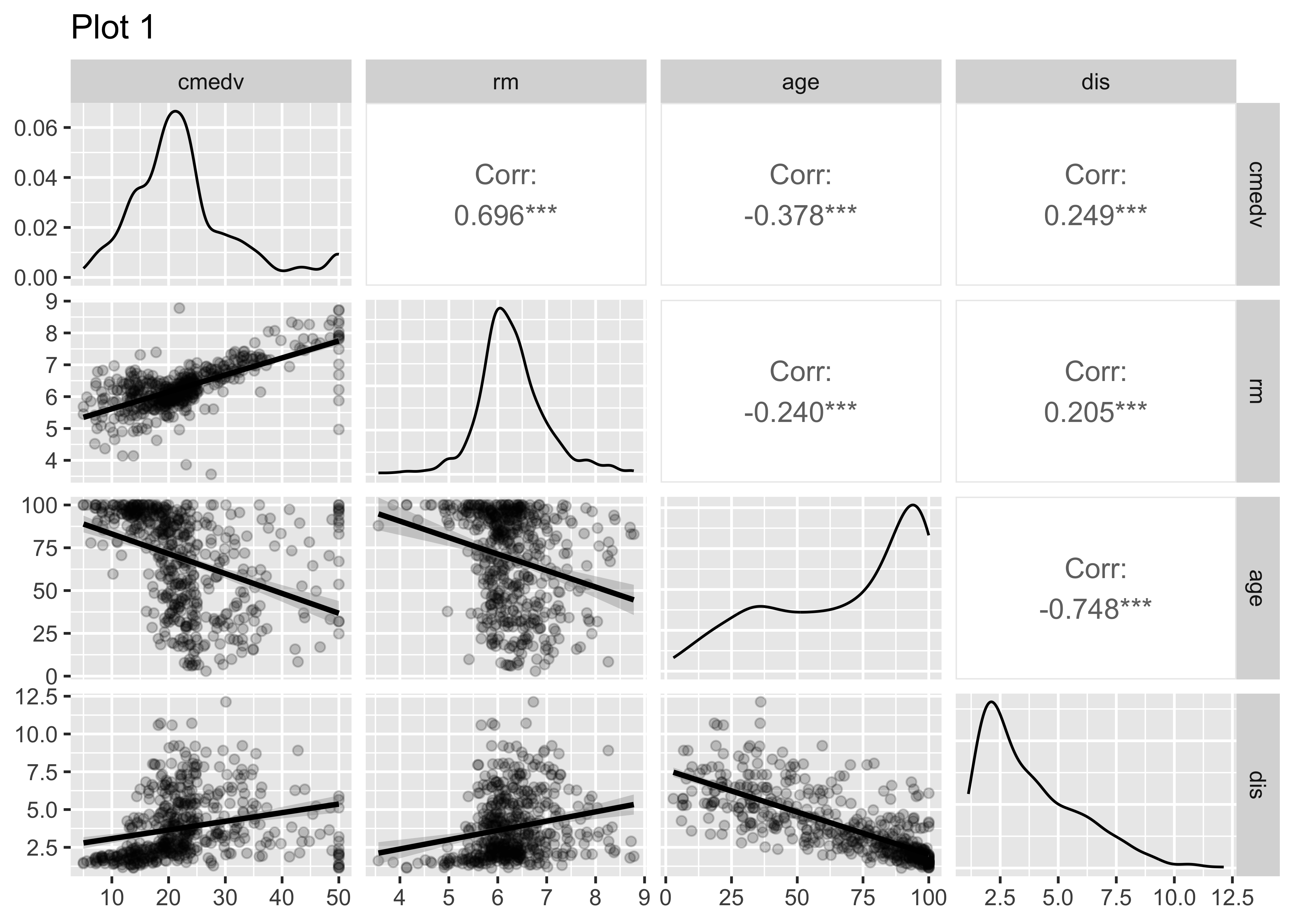
In order to fit the linear model, we need to choose predictor variables that have strong correlations with the target variable. We will first do this with GGally, and then with the tidyverse itself. Both give us a very unique view into the correlations that exist within this dataset.
Let us select a few sets of Quantitative and Qualitative features, along with the target variable cmedv and do a pairs-plots with them:
# Set graph theme
theme_set(new = theme_custom())
#

housing %>%
  # Target variable cmedv
  # Predictors Rooms / Age / Distance to City Centres / Radial Highway Access
  select(cmedv, rm, age, dis) %>%
  GGally::ggpairs(
    title = "Plot 1",
    progress = FALSE,
    lower = list(continuous = wrap("smooth",
      alpha = 0.2
    ))
  )
##
housing %>%
  # Target variable cmedv
  # Predictors: Access to Radial Highways, / Resid. Land Proportion / proportion of non-retail business acres / full-value property-tax rate per USD 10,000
  select(cmedv, rad, zn, indus, tax) %>%
  GGally::ggpairs(
    title = "Plot 2",
    progress = FALSE,
    lower = list(continuous = wrap("smooth",
      alpha = 0.2
    ))
  )
##
housing %>%
  # Target variable cmedv
  # Predictors Crime Rate / Nitrous Oxide / Black Population / Lower Status Population
  select(cmedv, crim, nox, rad, b, lstat) %>%
  GGally::ggpairs(
    title = "Plot 3",
    progress = FALSE,
    lower = list(continuous = wrap("smooth",
      alpha = 0.2
    ))
  )
See the top row of the pairs plots. Clearly, rm (avg. number of rooms) is a big determining feature for median price cmedv. This we infer based on the large correlation of rm withcmedv, age (proportion of owner-occupied units built prior to 1940) may also be a significant influence on cmedv, with a correlation of
None of the Quant variables rad, zn, indus, tax have a overly strong correlation with cmedv. .
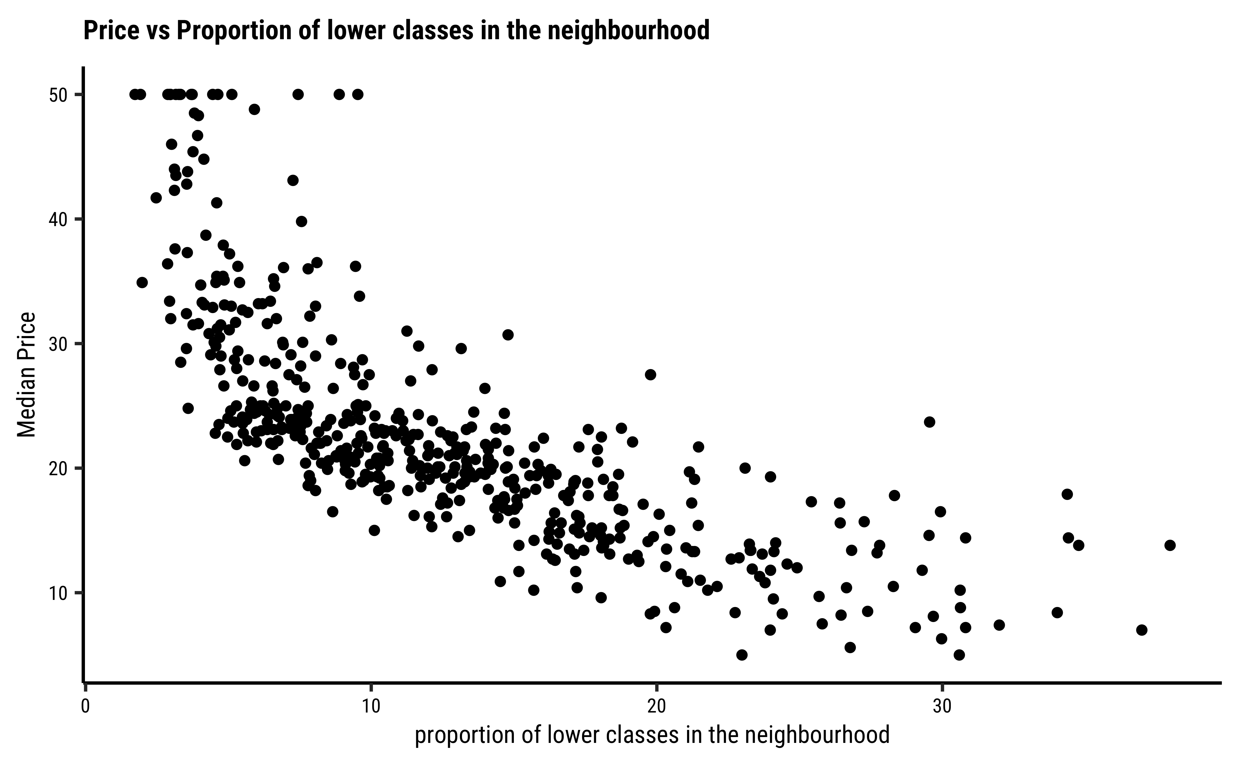
The variable lstat (proportion of lower classes in the neighbourhood) as expected, has a strong (negative) correlation with cmedv; rad(index of accessibility to radial highways), nox(nitrous oxide) and crim(crime rate) also have fairly large correlations with cmedv, as seen from the pairs plots.
Recall that cor.test reports a correlation score and the p-value for the same. There is also a confidence interval reported for the correlation score, an interval within which we are 95% sure that the true correlation value is to be found.
Note that GGally too reports the significance of the correlation scores using stars, *** or **. This indicates the p-value in the scores obtained by GGally; Presumably, there is an internal cor.test that is run for each pair of variables and the p-value and confidence levels are also computed internally.
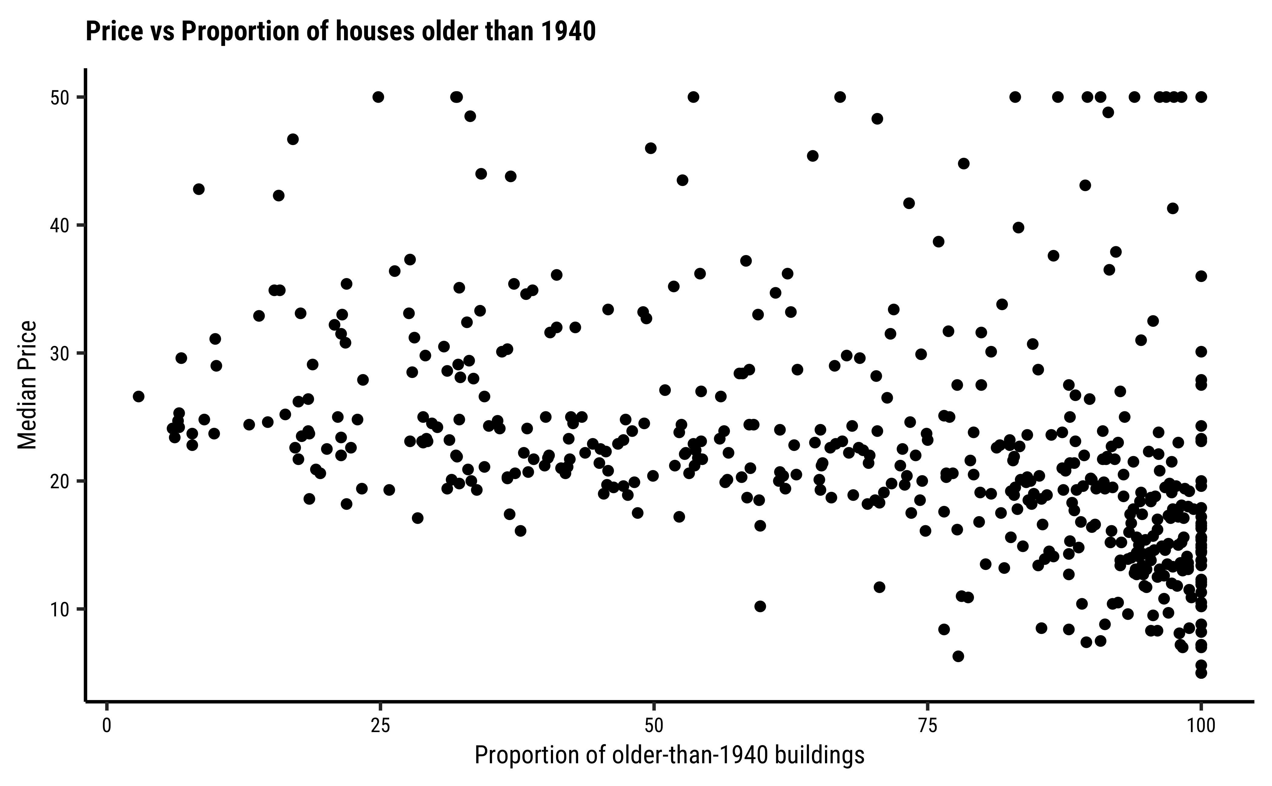
Let us plot (again) scatter plots of Quant Variables that have strong correlation with cmedv:
# Set graph theme
theme_set(new = theme_custom())
#
gf_point(
data = housing,
cmedv ~ age,
title = "Price vs Proportion of houses older than 1940",
ylab = "Median Price",
xlab = "Proportion of older-than-1940 buildings")
##
gf_point(
data = housing,
cmedv ~ lstat,
title = "Price vs Proportion of lower classes..."
subtitle = "...In the neighbourhood",
ylab = "Median Price",
xlab = "proportion of lower classes in the neighbourhood")
##
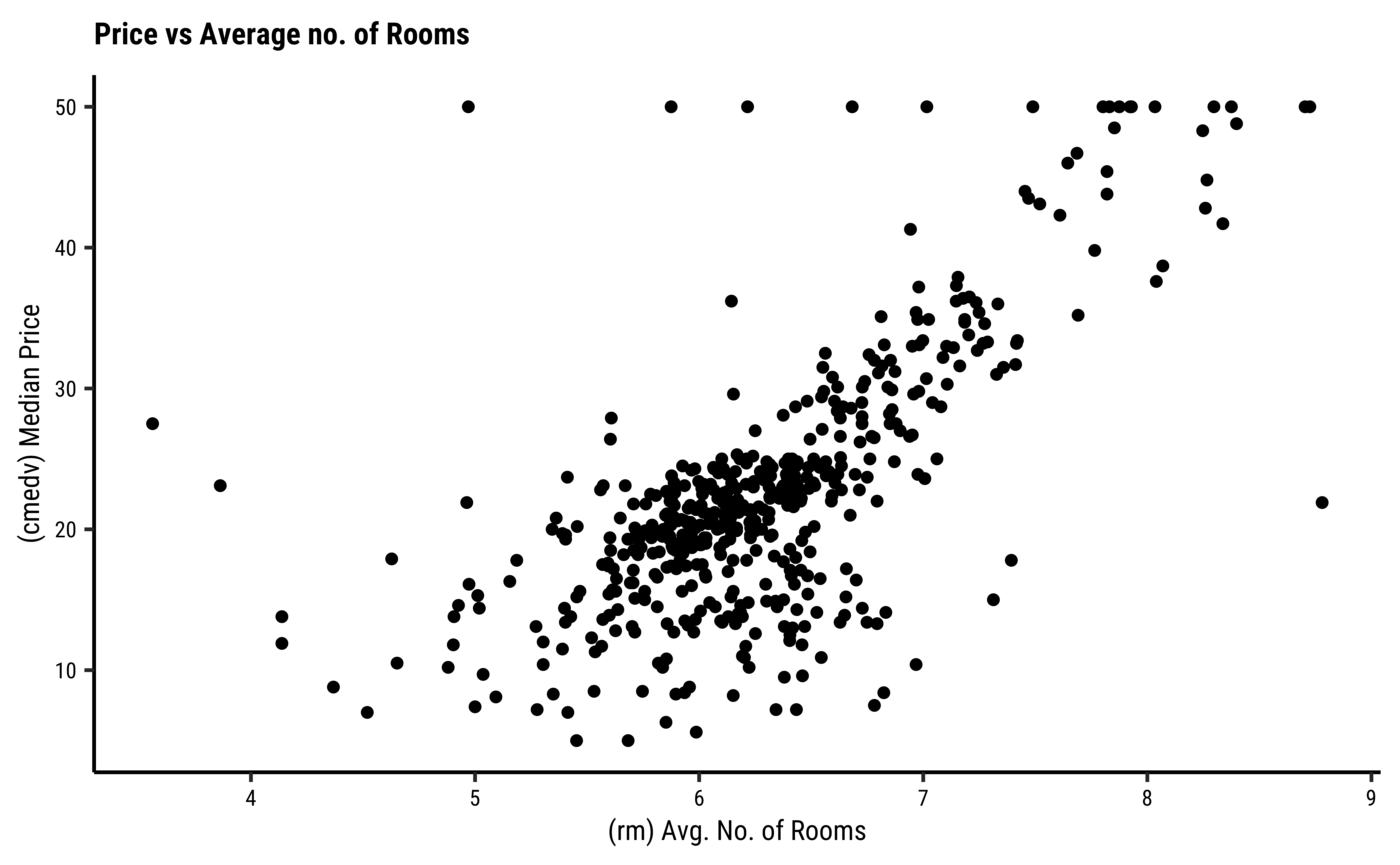
gf_point(
data = housing,
cmedv ~ rm,
title = "Price vs Average no. of Rooms",
ylab = "(cmedv) Median Price",
xlab = "(rm) Avg. No. of Rooms")Error in parse(text = input): <text>:16:3: unexpected symbol
15: title = "Price vs Proportion of lower classes..."
16: subtitle
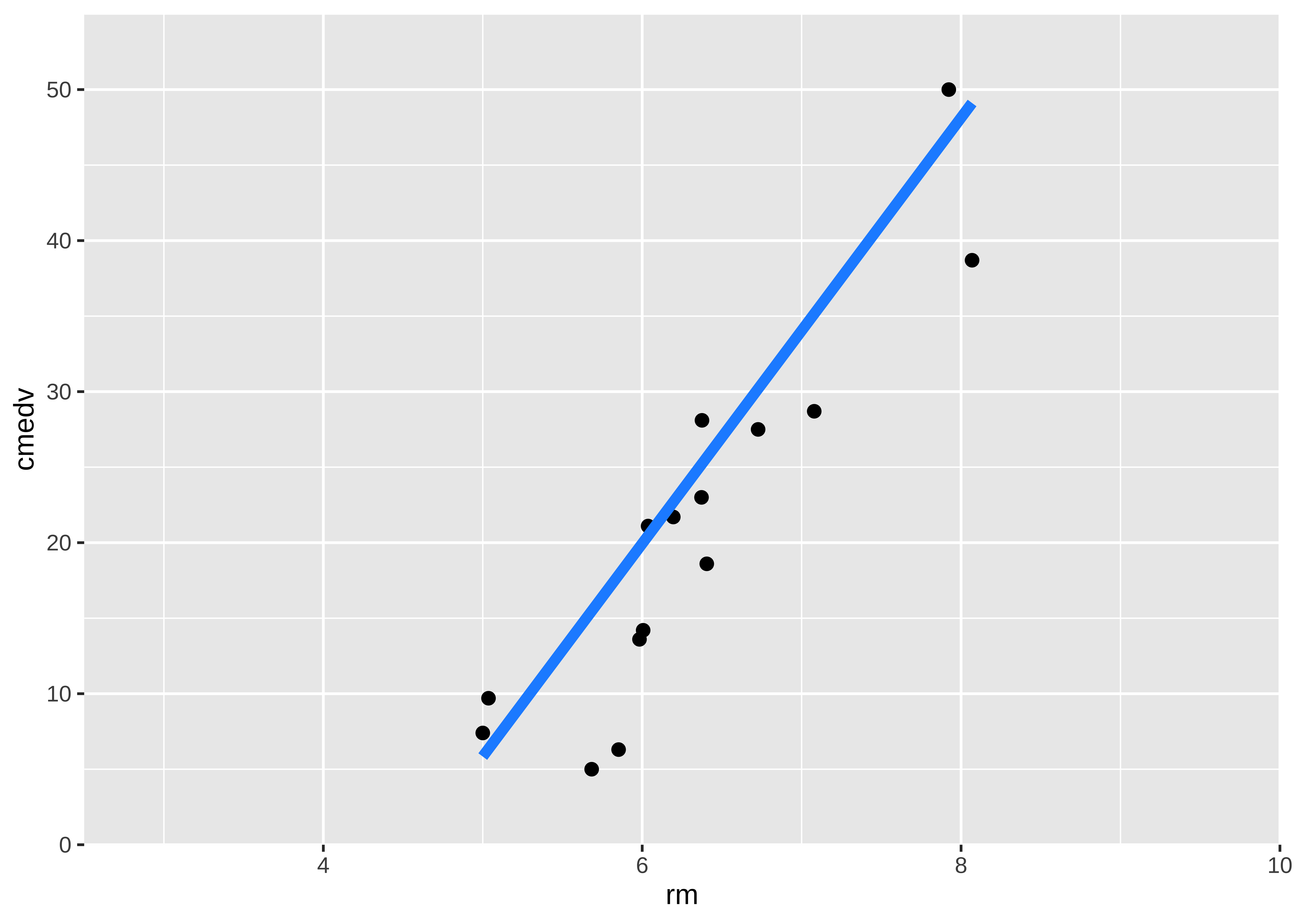
^So, rm does have a positive effect on cmedv, and age may have a (mild?) negative effect on cmedv; lstat seems to have a pronounced negative effet on cmedv. We have now managed to get a decent idea which Quant predictor variables might be useful in modelling cmedv: rm, lstat for starters, then perhapsage.
Let us also check the Qualitative predictor variables: Access to the Charles river (chas) does seem to affect the prices somewhat.
# Set graph theme
theme_set(new = theme_custom())
#
housing %>%
  # Target variable cmedv
  # Predictor Access to Charles River
  select(cmedv, chas) %>%
  GGally::ggpairs(
    title = "Plot 4",
    progress = FALSE,
    lower = list(continuous = wrap("smooth",
      alpha = 0.2
    ))
  )
Look at the bar plot above. While not too many properties can be near the Charles River (for obvious reasons) the box plots do seem to show some dependency of cmedv on chas.
Qualitative predictors for a Quantitative target can be included in the model using what is called dummy variables, where each level of the Qualitative variable is given a one-hot kind of encoding. See for example https://www.statology.org/dummy-variables-regression/
This is somewhat advanced material: We will use the purrr package to develop all correlations with respect to our target variable in one shot and also plot these correlation test scores in an error-bar plot. See Tidy Modelling with R. This has the advantage of being able to depict all correlations in one plot. (We will use this approach again here when we trim our linear models down from the maximal one to a workable one of lesser complexity.). Let us do this.
We develop a list object containing all correlation test results with respect to cmedv, tidy these up using broom::tidy, and then plot these:
# Set graph theme
theme_set(new = theme_custom())
#

all_corrs <- housing %>%
  select(where(is.numeric)) %>%
  # leave off target variable cmedv and IDs
  # get all the remaining ones
  select(-cmedv, -medv) %>%
  purrr::map(
    .x = ., # All numeric variables selected in the previous step
    .f = \(.x) cor.test(.x, housing$cmedv)
  ) %>% # Apply the cor.test with `cmedv`

  # Tidy up the cor.test outputs into neat columns
  # Need ".id" column to keep track of predictor variable name
  map_dfr(broom::tidy, .id = "predictor")

all_corrspredictor <chr> | estimate <dbl> | statistic <dbl> | p.value <dbl> | parameter <int> | conf.low <dbl> | conf.high <dbl> | method <chr> | alternative <chr> |
|---|---|---|---|---|---|---|---|---|
| tract | 0.428251535 | 10.6392091 | 5.514616e-24 | 504 | 0.35430926 | 0.49687193 | Pearson's product-moment correlation | two.sided |
| lon | -0.322946685 | -7.6606125 | 9.548359e-14 | 504 | -0.39888638 | -0.24260761 | Pearson's product-moment correlation | two.sided |
| lat | 0.006825792 | 0.1532422 | 8.782686e-01 | 504 | -0.08039072 | 0.09393858 | Pearson's product-moment correlation | two.sided |
| crim | -0.389582441 | -9.4963995 | 8.711542e-20 | 504 | -0.46109270 | -0.31304456 | Pearson's product-moment correlation | two.sided |
| zn | 0.360386177 | 8.6734797 | 5.785518e-17 | 504 | 0.28207883 | 0.43392342 | Pearson's product-moment correlation | two.sided |
| indus | -0.484754379 | -12.4423538 | 3.522132e-31 | 504 | -0.54873600 | -0.41512706 | Pearson's product-moment correlation | two.sided |
| nox | -0.429300219 | -10.6711394 | 4.167568e-24 | 504 | -0.49783900 | -0.35543236 | Pearson's product-moment correlation | two.sided |
| rm | 0.696303794 | 21.7792304 | 1.307493e-74 | 504 | 0.64849616 | 0.73864006 | Pearson's product-moment correlation | two.sided |
| age | -0.377998896 | -9.1661252 | 1.241939e-18 | 504 | -0.45032938 | -0.30073948 | Pearson's product-moment correlation | two.sided |
| dis | 0.249314834 | 5.7796099 | 1.313250e-08 | 504 | 0.16574827 | 0.32932645 | Pearson's product-moment correlation | two.sided |
all_corrs %>%
  gf_hline(
    yintercept = 0,
    color = "grey",
    linewidth = 2,
    title = "Correlations: Target Variable vs All Predictors",
    subtitle = "Boston Housing Dataset"
  ) %>%
  gf_errorbar(
    conf.high + conf.low ~ reorder(predictor, estimate),
    colour = ~estimate,
    width = 0.5,
    linewidth = ~ -log10(p.value),
    caption = "Significance = -log10(p.value)"
  ) %>%
  # Plot points(smallest geom) last!
  gf_point(estimate ~ reorder(predictor, estimate)) %>%
  gf_labs(x = "Predictors", y = "Correlation with cmedv") %>%
  # gf_theme(theme_minimal()) %>%

  # tilt the x-axis labels for readability
  gf_theme(theme(axis.text.x = element_text(angle = 45, hjust = 1))) %>%
  # Colour and linewidth scales + legends
  gf_refine(
    scale_colour_distiller("Correlation", type = "div", palette = "RdBu"),
    scale_linewidth_continuous("Significance",
      range = c(0.25, 3),

      # guide_legend(reverse = TRUE): Fat Lines mean higher significance
    )
  ) %>%
  gf_refine(guides(linewidth = guide_legend(reverse = TRUE)))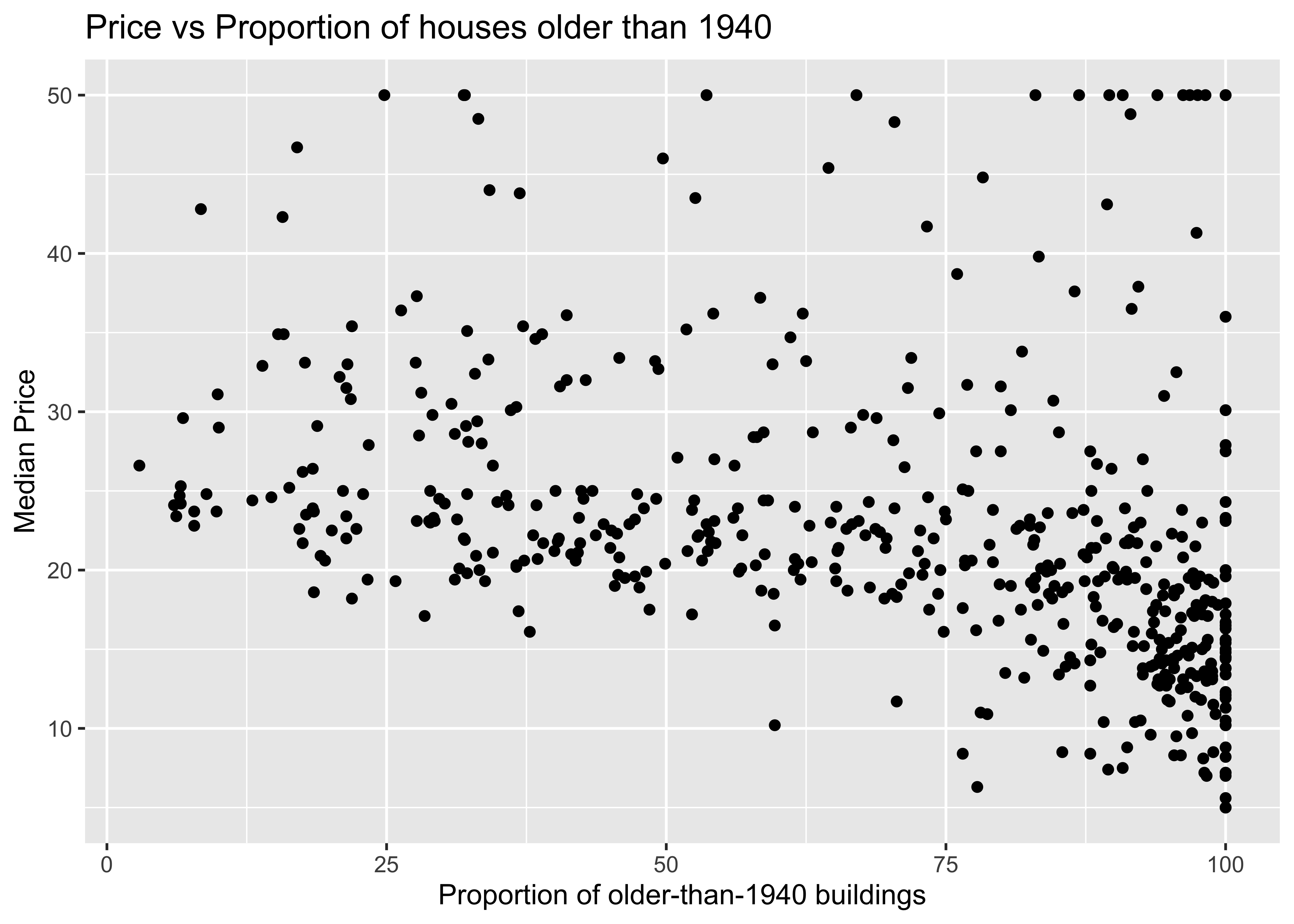
We can clearly see that rm and lstat have strong correlations with cmedv and should make good choices for setting up a minimal linear regression model. (medv is the older errored version of cmedv)
We will first execute the lm test with code and evaluate the results. Then we will do an intuitive walk through of the process and finally, hand-calculate entire analysis for clear understanding.
R offers a very simple command lm to execute an Linear Model: Note the familiar formula of stating the variables: (
Call:
lm(formula = cmedv ~ rm, data = housing)

Residuals:
    Min      1Q  Median      3Q     Max
-23.336  -2.425   0.093   2.918  39.434

Coefficients:
            Estimate Std. Error t value Pr(>|t|)
(Intercept) -34.6592     2.6421  -13.12   <2e-16 ***
rm            9.0997     0.4178   21.78   <2e-16 ***
---
Signif. codes:  0 '***' 0.001 '**' 0.01 '*' 0.05 '.' 0.1 ' ' 1

Residual standard error: 6.597 on 504 degrees of freedom
Multiple R-squared:  0.4848,    Adjusted R-squared:  0.4838
F-statistic: 474.3 on 1 and 504 DF,  p-value: < 2.2e-16
The model for cmedvcan be written in the form of
- The effect size of
rmon predictingcmedva (slope) value ofrm, we have acmedv. - The F-statistic for the Linear Model is given by
- The
R-squaredvalue isrmis able to explain about half of the trend incmedv; there is substantial variation incmedvthat is still left to explain, an indication that we should perhaps use a richer model, with more predictors. These aspects are explored in the Tutorials.
We can plot the scatter plot of these two variables with the model also over-plotted.
#| layout-ncol: 3
#| fig-width: 5
#| fig-height: 4

# Set graph theme
theme_set(new = theme_custom())
#
# Tidy Data frame for the model using `broom`
housing_lm_tidy <-
  housing_lm %>%
  broom::tidy(
    conf.int = TRUE,
    conf.level = 0.95
  )
housing_lm_tidyterm <chr> | estimate <dbl> | std.error <dbl> | statistic <dbl> | p.value <dbl> | conf.low <dbl> | conf.high <dbl> |
|---|---|---|---|---|---|---|
| (Intercept) | -34.65924 | 2.6421358 | -13.11789 | 4.992332e-34 | -39.850200 | -29.468287 |
| rm | 9.09967 | 0.4178141 | 21.77923 | 1.307493e-74 | 8.278798 | 9.920542 |
##
housing_lm_augment <-
  housing_lm %>%
  broom::augment(
    se_fit = TRUE,
    interval = "confidence"
  )
housing_lm_augmentcmedv <dbl> | rm <dbl> | .fitted <dbl> | .lower <dbl> | .upper <dbl> | .se.fit <dbl> | .resid <dbl> | .hat <dbl> | .sigma <dbl> | .cooksd <dbl> | |
|---|---|---|---|---|---|---|---|---|---|---|
| 24.0 | 6.575 | 25.1710849 | 24.547542 | 25.79462741 | 0.3173758 | -1.17108491 | 0.002314475 | 6.603363 | 3.663675e-05 | |
| 21.6 | 6.421 | 23.7697358 | 23.182775 | 24.35669693 | 0.2987563 | -2.16973578 | 0.002050875 | 6.602860 | 1.113810e-04 | |
| 34.7 | 7.185 | 30.7218834 | 29.784739 | 31.65902770 | 0.4769954 | 3.97811659 | 0.005227973 | 6.601175 | 9.605416e-04 | |
| 33.4 | 6.998 | 29.0202452 | 28.198723 | 29.84176761 | 0.4181452 | 4.37975482 | 0.004017531 | 6.600670 | 8.925456e-04 | |
| 36.2 | 7.147 | 30.3760960 | 29.463351 | 31.28884111 | 0.4645765 | 5.82390404 | 0.004959290 | 6.598437 | 1.951826e-03 | |
| 28.7 | 6.430 | 23.8516328 | 23.263218 | 24.44004757 | 0.2994962 | 4.84836719 | 0.002061045 | 6.600024 | 5.589147e-04 | |
| 22.9 | 6.012 | 20.0479709 | 19.429846 | 20.66609597 | 0.3146184 | 2.85202911 | 0.002274433 | 6.602343 | 2.135177e-04 | |
| 22.1 | 6.172 | 21.5039180 | 20.920359 | 22.08747752 | 0.2970249 | 0.59608196 | 0.002027172 | 6.603517 | 8.308835e-06 | |
| 16.5 | 5.631 | 16.5809967 | 15.793673 | 17.36832076 | 0.4007386 | -0.08099675 | 0.003690009 | 6.603569 | 2.801874e-07 | |
| 18.9 | 6.004 | 19.9751735 | 19.354641 | 20.59570644 | 0.3158439 | -1.07517353 | 0.002292187 | 6.603396 | 3.058267e-05 |
##
intercept <-
  housing_lm_tidy %>%
  filter(term == "(Intercept)") %>%
  select(estimate) %>%
  as.numeric()
##
slope <-
  housing_lm_tidy %>%
  filter(term == "rm") %>%
  select(estimate) %>%
  as.numeric()
##
housing %>%
  drop_na() %>%
  gf_point(
    cmedv ~ rm,
    title = "Price vs Average no. of Rooms",
    ylab = "Median Price",
    xlab = "Avg. No. of Rooms",
    alpha = 0.2
  ) %>%
  # Plot the model equation
  gf_abline(
    slope = slope, intercept = intercept,
    colour = "lightcoral",
    linewidth = 2
  ) %>%
  # Plot the model prediction points on the line
  gf_smooth(
    method = "lm", geom = "point",
    color = "grey30",
    size = 0.5
  ) %>%
  gf_refine(
    annotate(
      geom = "segment",
      y = 0, yend = 29, x = 7, xend = 7, # manually calculated
      linetype = "dashed",
      color = "dodgerblue",
      arrow = arrow(
        angle = 30,
        length = unit(0.25, "inches"),
        ends = "last",
        type = "closed"
      )
    ),
    annotate(
      geom = "segment",
      y = 29, yend = 29, x = 2.5, xend = 7, # manually calculated
      linetype = "dashed",
      arrow = arrow(
        angle = 30,
        length = unit(0.25, "inches"),
        ends = "first",
        type = "closed"
      ),
      color = "dodgerblue"
    )
  ) %>%
  gf_refine(
    scale_x_continuous(
      limits = c(2.5, 10),
      expand = c(0, 0)
    ),
    # removes plot panel margins
    scale_y_continuous(
      limits = c(0, 55),
      expand = c(0, 0)
    )
  ) %>%
  gf_theme(theme = theme_custom())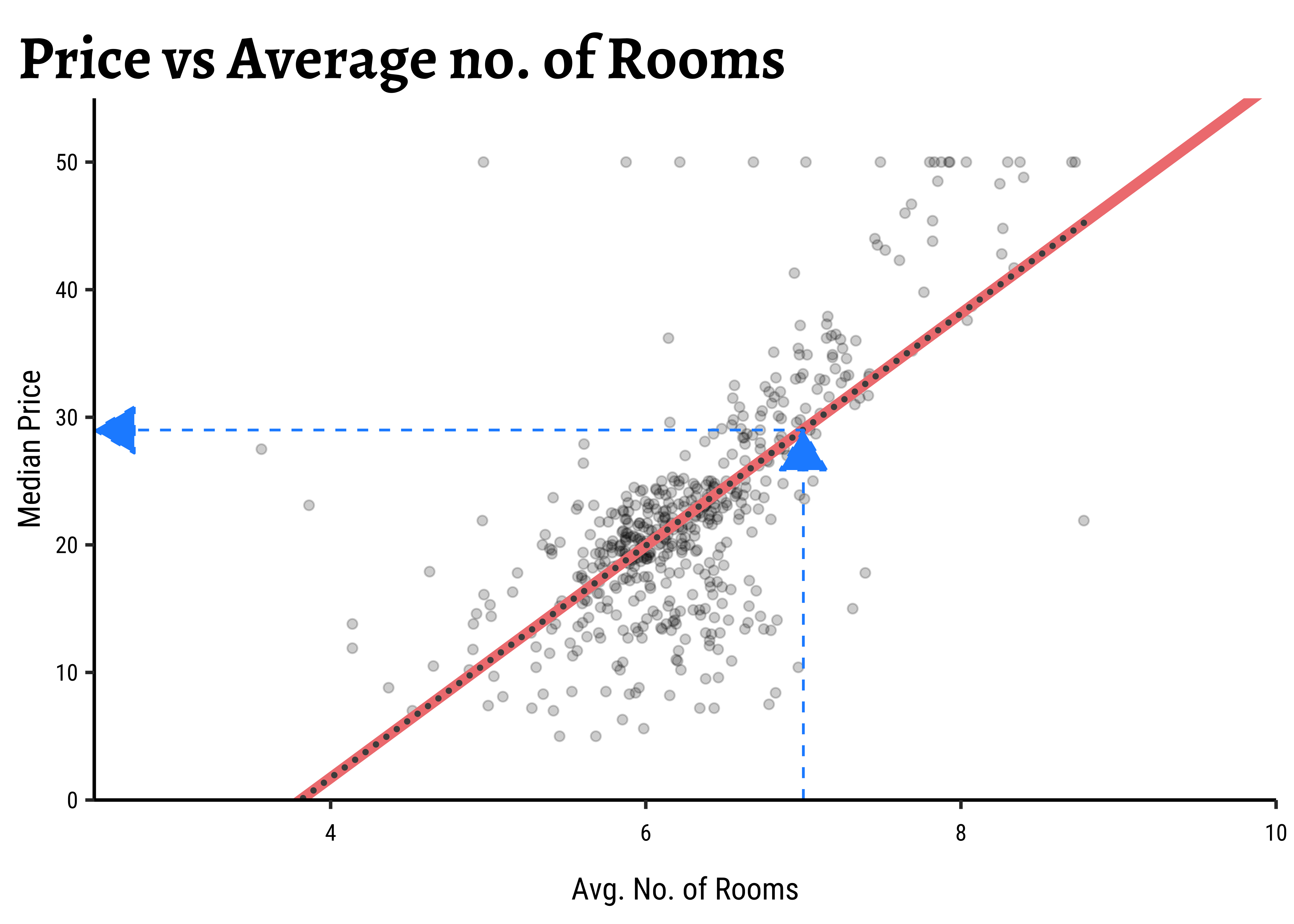
For any new value of rm, we go up to the vertical blue line and read off the predicted median price by following the horizontal blue line. That is how the model is used (by hand).
In practice, we use the broom package functions (tidy, glance and augment) to obtain a clear view of the model parameters and predictions of cmedv for all existing values of rm. We see estimates for the intercept and slope (rm) for the linear model, along with the standard errors and p.values for these estimated parameters. And we see the fitted values of cmedv for the existing rm; these values will naturally lie on the straight-line depicting the model. We will examine this augment-ed data more the section on Diagnostics.
To predict cmedv with new values of rm, we use predict. Let us now try to make predictions with some new data:
new <- tibble(rm = seq(3, 10)) # must be named "rm"
new %>% mutate(
  predictions =
    stats::predict(
      object = housing_lm,
      newdata = .,
      se.fit = FALSE
    )
)rm <int> | predictions <dbl> | |||
|---|---|---|---|---|
| 3 | -7.360234 | |||
| 4 | 1.739436 | |||
| 5 | 10.839105 | |||
| 6 | 19.938775 | |||
| 7 | 29.038445 | |||
| 8 | 38.138114 | |||
| 9 | 47.237784 | |||
| 10 | 56.337454 |
Note that “negative values” for predicted cmedv would have no meaning!
All that is very well, but what is happening under the hood of the lm command? Consider the cmedv (target) variable and the rm feature/predictor variable. What we do is:
- Plot a scatter plot
gf_point(cmedv ~ rm, housing) - Find a line that, in some way, gives us some prediction of
cmedvfor any givenrm - Calculate the errors in prediction and use those to find the “best” line.
- Use that “best” line henceforth as a model for prediction.
How does one fit the “best” line? Consider a choice of “lines” that we can use to fit to the data. Here are 6 lines of varying slopes (and intercepts ) that we can try as candidates for the best fit line:
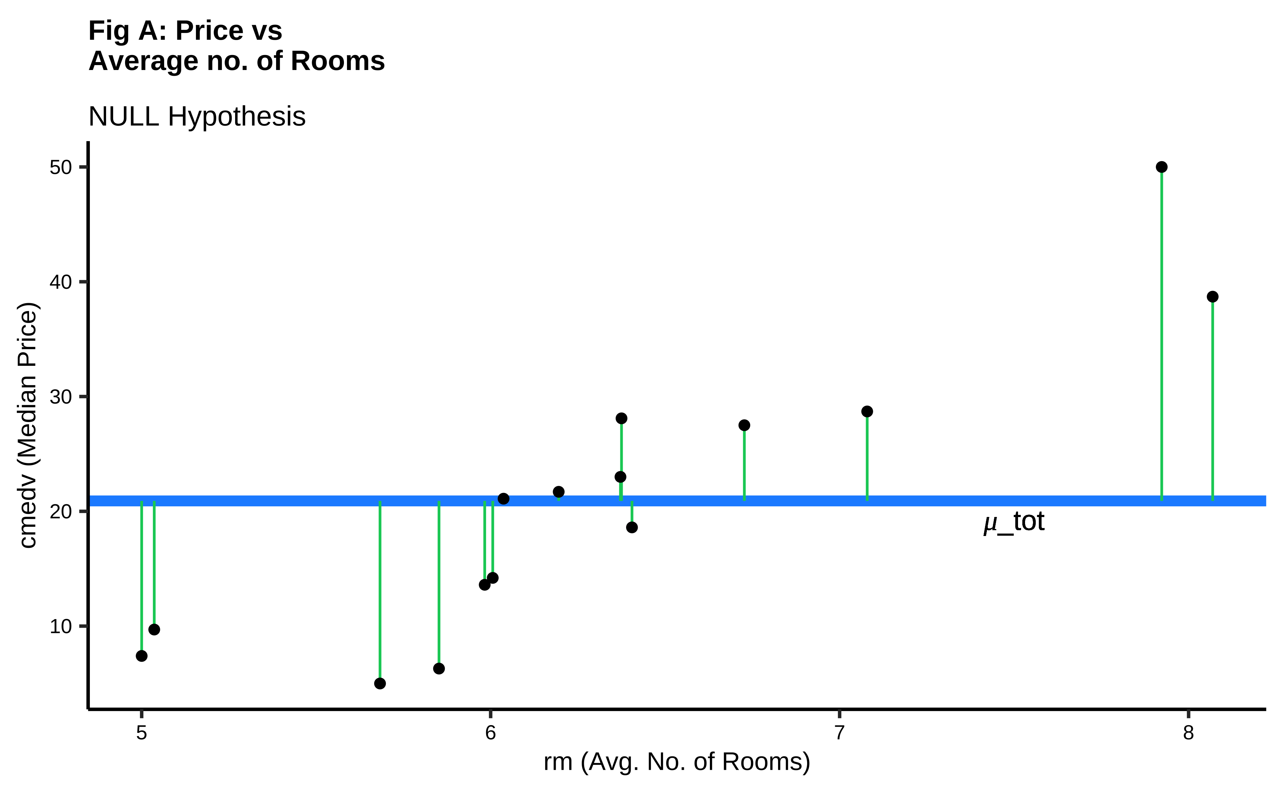
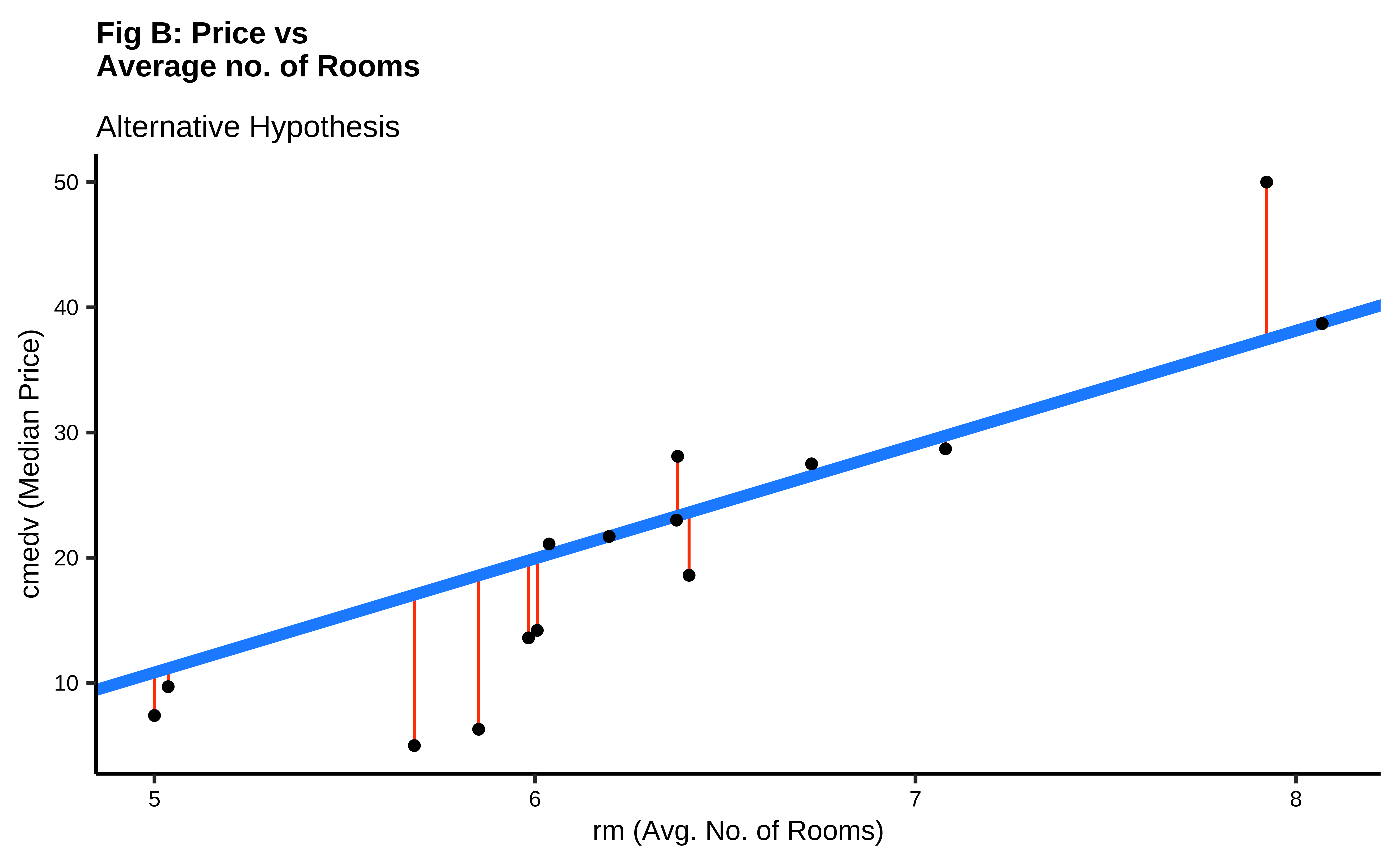
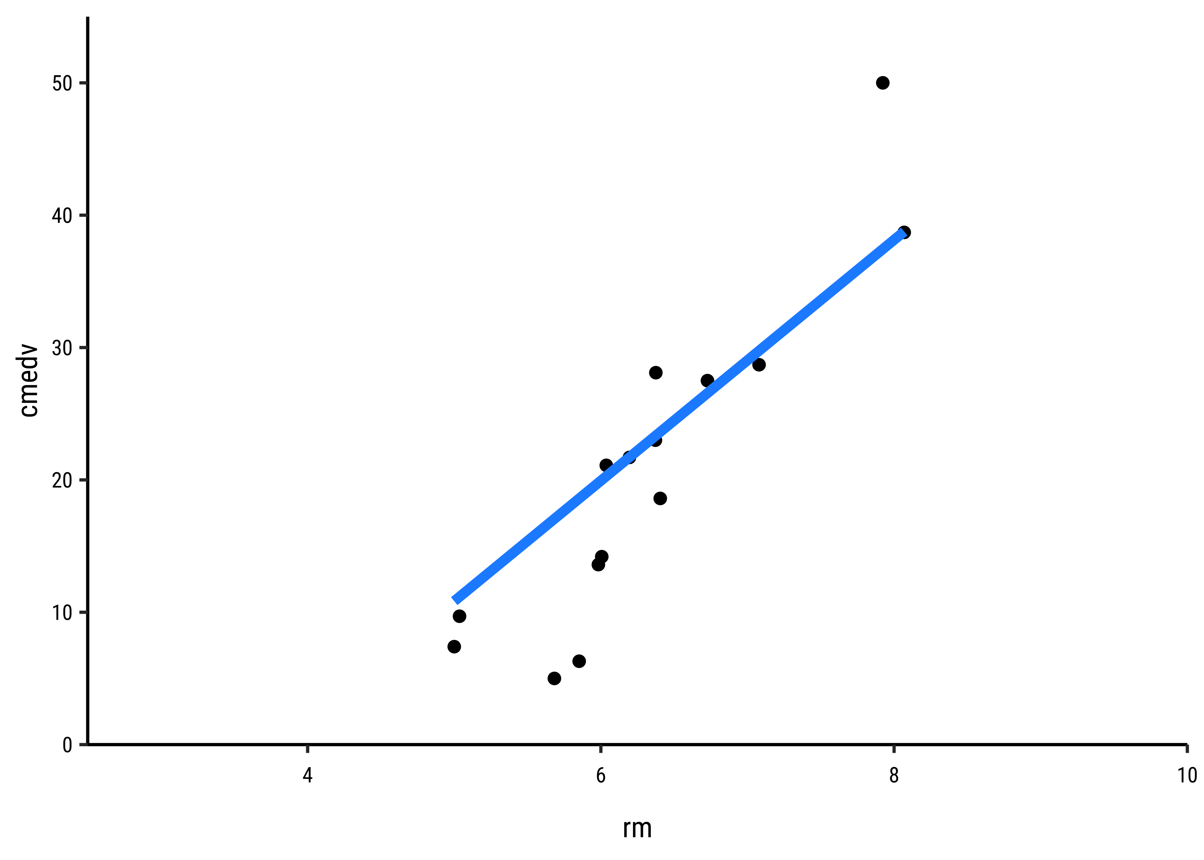
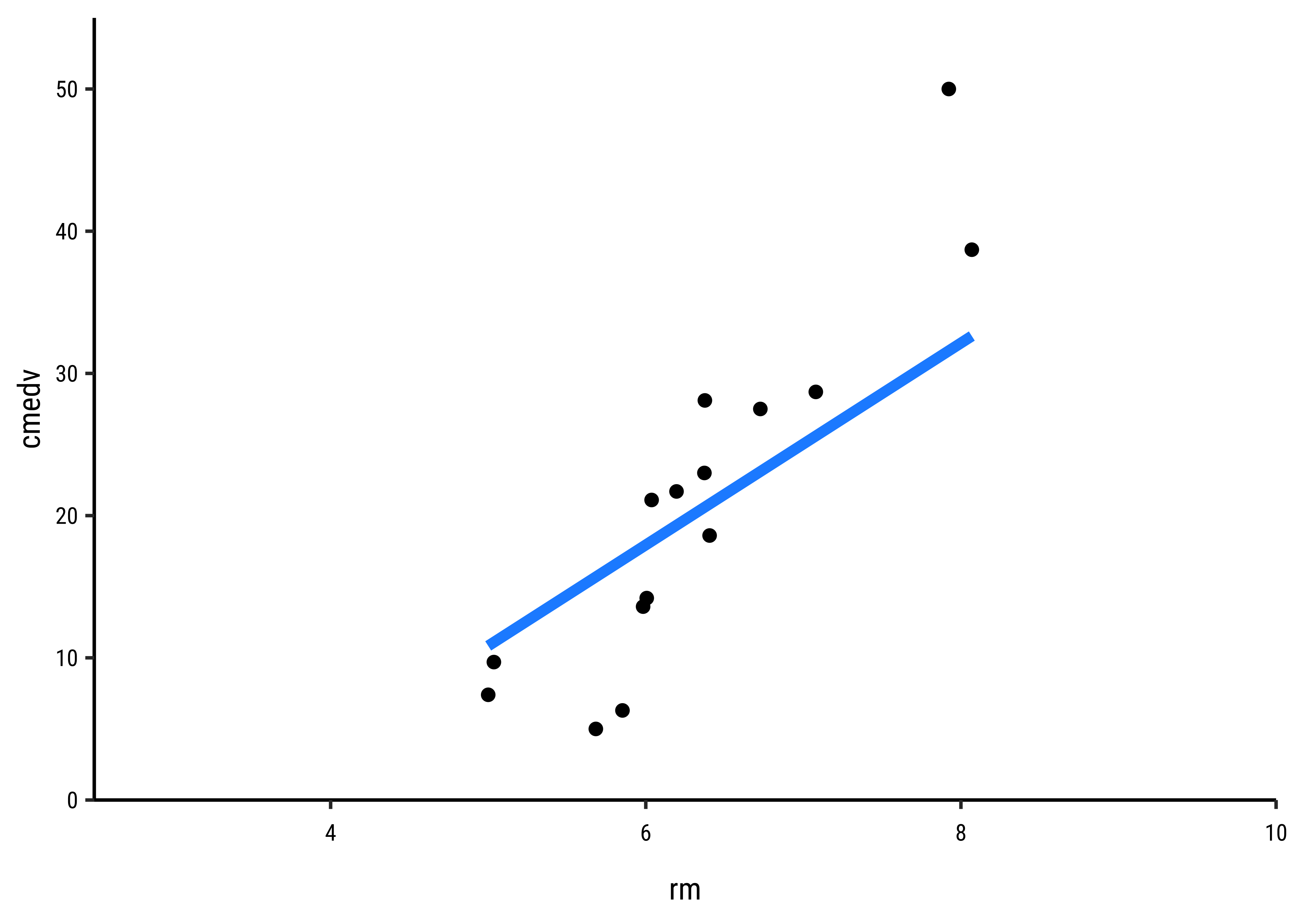
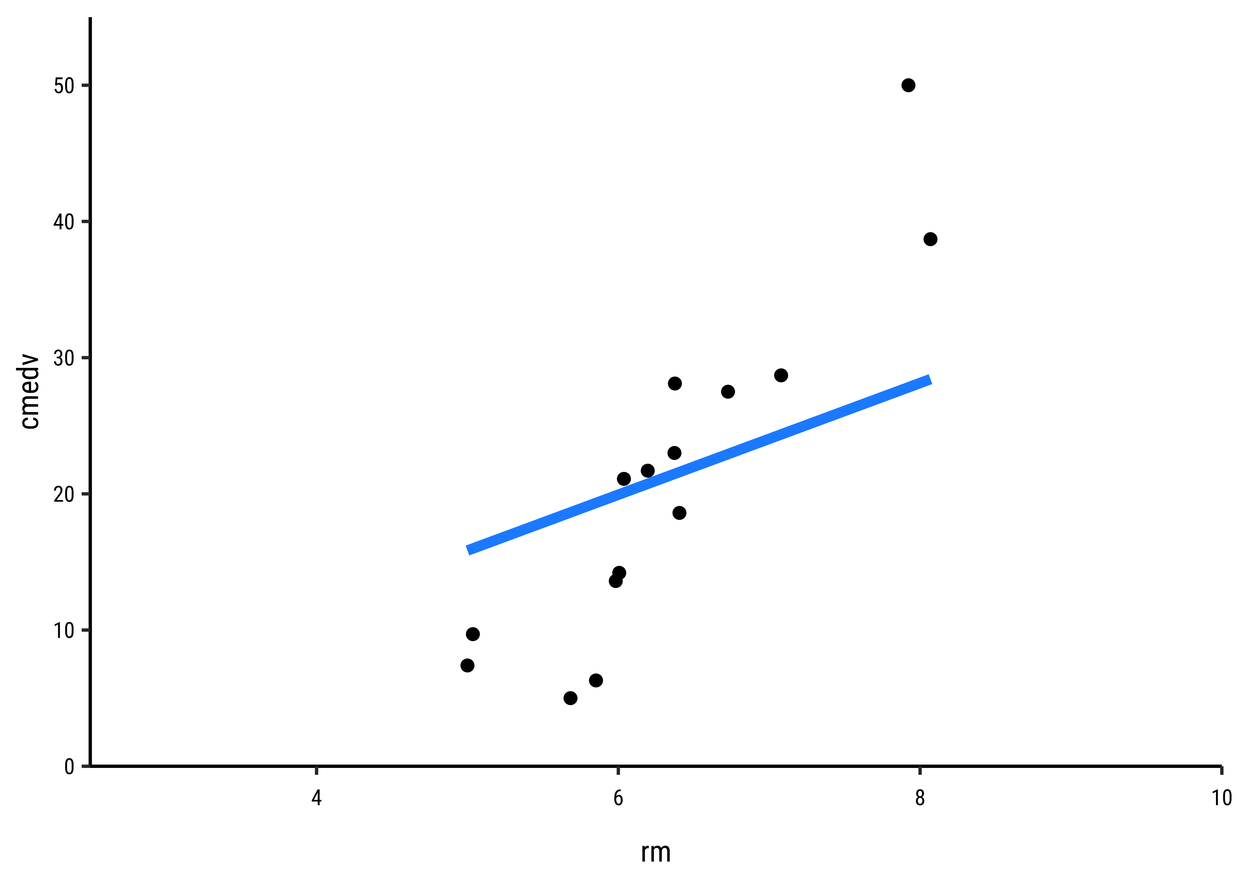
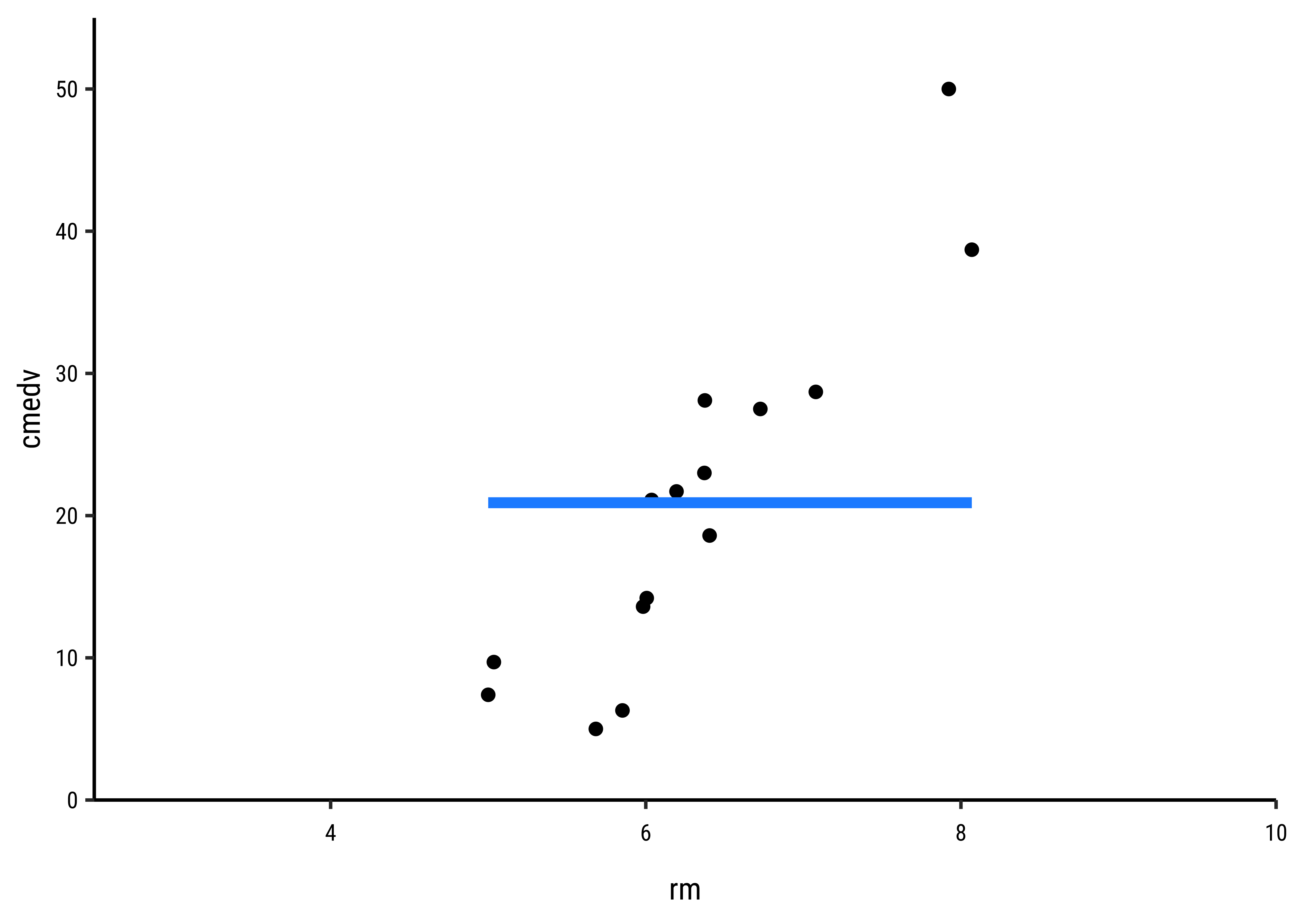
It should be apparent that while we cannot determine which line may be the best, the worst line seems to be the one in the final plot, which ignores the x-variable rm altogether. This corresponds to the NULL Hypothesis, that there is no relationship between the two variables. Any of the other lines could be a decent candidate, so how do we decide?
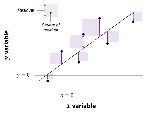
In Fig A, the horizontal blue line is the overall mean of cmedv, denoted as
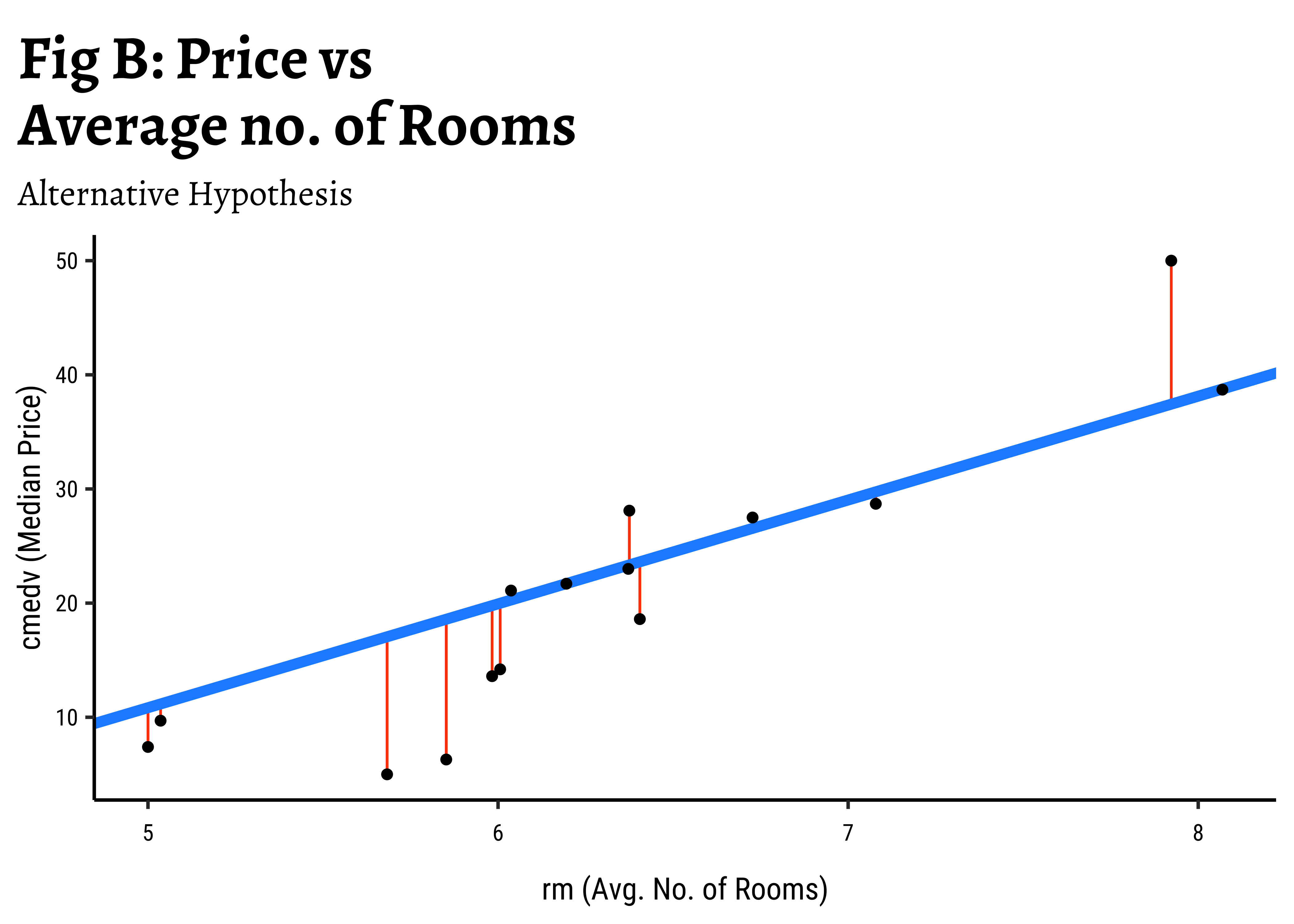
In Fig B, the vertical red lines are the residuals of each point from the potential line of fit. The sum of the squares of these lines is called the Total Error Sum of Squares (SSE).
It should be apparent that if there is any positive linear relationship between cmedv and rm,then
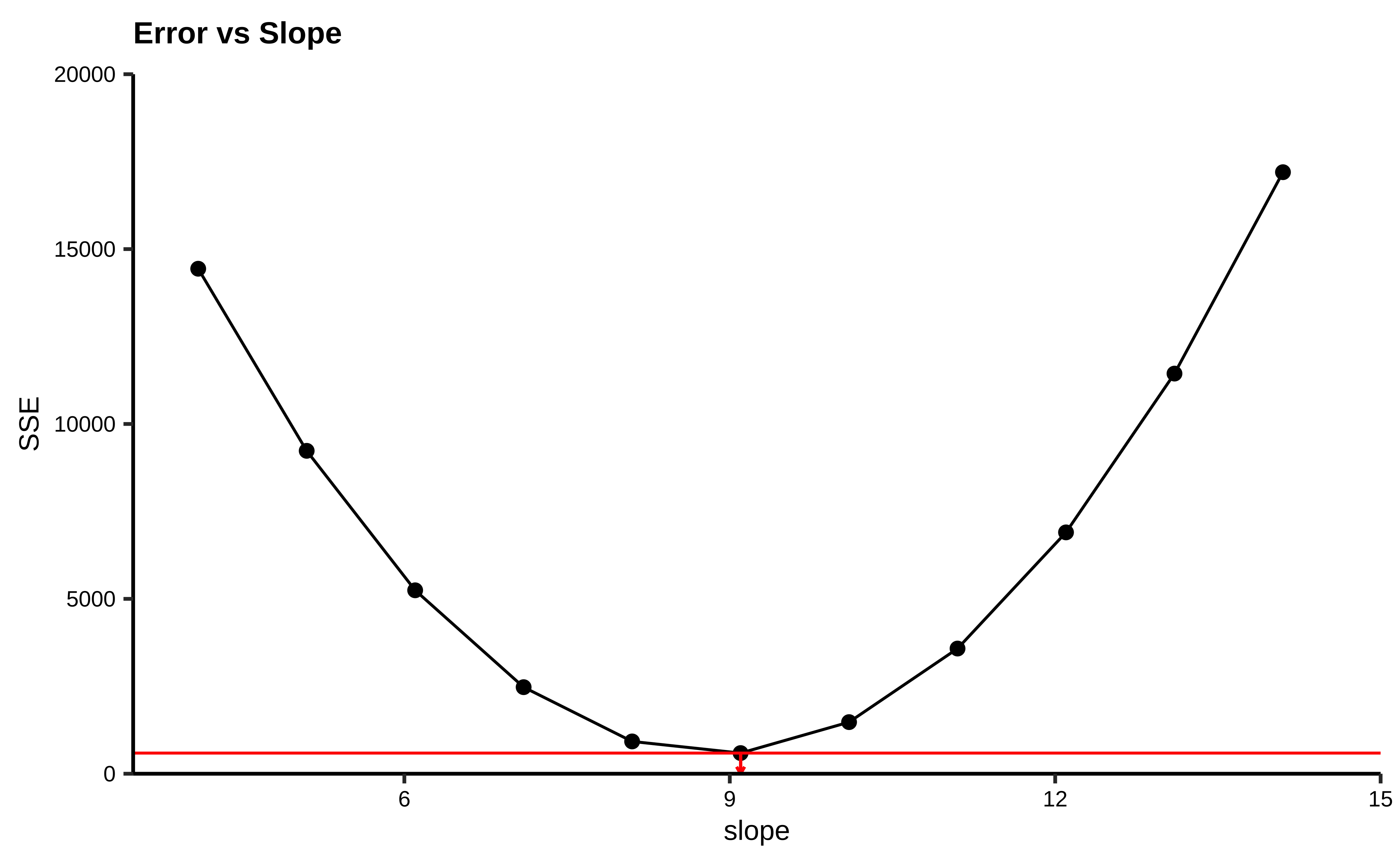
How do we get the optimum slope + intercept? If we plot the
#| echo: false
sim_model <- tibble(
  b = slope + seq(-5, 5),
  a = intercept,
  dat = list(tibble(
    cmedv = housing_sample$cmedv,
    rm = housing_sample$rm
  ))
) %>%
  mutate(r_squared = pmap_dbl(
    .l = list(a, b, dat),
    .f = \(a, b, dat) sum((dat$cmedv - (b * dat$rm + a))^2)
  ))
min_r_squared <- sim_model %>%
  select(r_squared) %>%
  min()
min_slope <- sim_model %>%
  filter(r_squared == min_r_squared) %>%
  select(b) %>%
  as.numeric()
sim_model %>%
  gf_point(r_squared ~ b, data = ., size = 2) %>%
  gf_line(ylab = "SSE", xlab = "slope", title = "Error vs Slope") %>%
  gf_hline(yintercept = min_r_squared, color = "red") %>%
  gf_segment(min_r_squared + 0 ~ min_slope + min_slope,
    colour = "red",
    arrow = arrow(ends = "last", length = unit(1, "mm"))
  ) %>%
  gf_refine(
    coord_cartesian(expand = FALSE),
    expand_limits(y = c(0, 20000), x = c(3.5, 15))
  )
We see that there is a quadratic minimum lm does.
Let us hand-calculate the numbers so we know what the test is doing. Here is the SST: we pretend that there is no relationship between cmedv ans rm and compute a NULL model:
And here is the SSE:
SSE <- deviance(housing_lm)
SSE
[1] 21934.39Given that the model leaves unexplained variations in cmedv to the extent of cmedv that the linear model does explain:
SSR <- SST - SSE
SSR
[1] 20643.35We have
In order to calculate the F-Statistic, we need to compute the variances, using these sum of squares. We obtain variances by dividing by their Degrees of Freedom:
where
Let us calculate these Degrees of Freedom. If we have
-
-
- And therefore
Now we are ready to compute the F-statistic:
n <- housing %>%
  count() %>%
  as.numeric()
df_SSR <- 1
df_SSE <- n - 2
F_stat <- (SSR / df_SSR) / (SSE / df_SSE)
F_stat
[1] 474.3349The F-stat is compared with a critical value of the F-statistic, which is computed using the formula for the f-distribution in R. As with our hypothesis tests, we set the significance level to 0.95, and quote the two relevant degrees of freedom as parameters to qf() which computes the critical F value as a quartile:
F_crit <- qf(
  p = 0.95, # Significance level is 5%
  df1 = df_SSR, # Numerator degrees of freedom
  df2 = df_SSE
) # Denominator degrees of freedom
F_crit
[1] 3.859975F_stat[1] 474.3349The F_crit value can also be seen in a plot2:
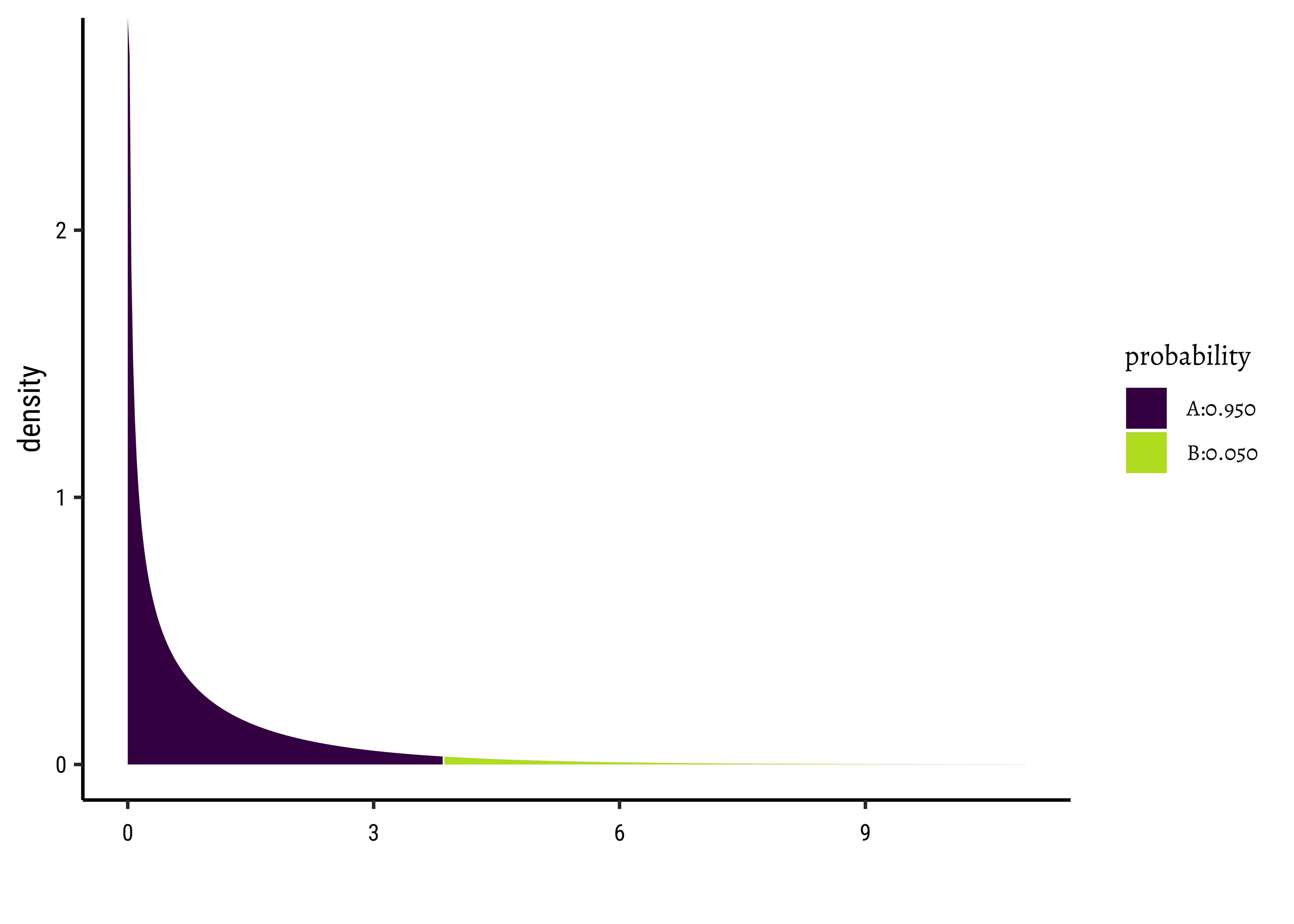
Any value of F more than the rm has a significant effect on cmedv.
The value of R.squared is also calculated from the previously computed sums of squares:
r_squared <- (SST - SSE) / SST
r_squared
[1] 0.484839# Also computable by
# mosaic::rsquared(housing_lm)So R.squared = 0.484839
The value of Slope and Intercept are computed using a maximum likelihood derivation and the knowledge that the means square error is a minimum at the optimum slope: for a linear model
Note that the slope is equal to the ratio of the covariance of x and y to the variance of x.
and
[1] 9.09967##
intercept <- mosaic::mean(~cmedv, data = housing) - slope * mosaic::mean(~rm, data = housing)
intercept[1] -34.65924So, there we are! All of this is done for us by one simple formula, lm()!
There is a very neat package called ggstatsplot3 that allows us to plot very comprehensive statistical graphs. Let us quickly do this:
library(ggstatsplot)
housing_lm %>%
  ggstatsplot::ggcoefstats(
    title = "Linear Model for Boston Housing",
    subtitle = "Using ggstatsplot"
  )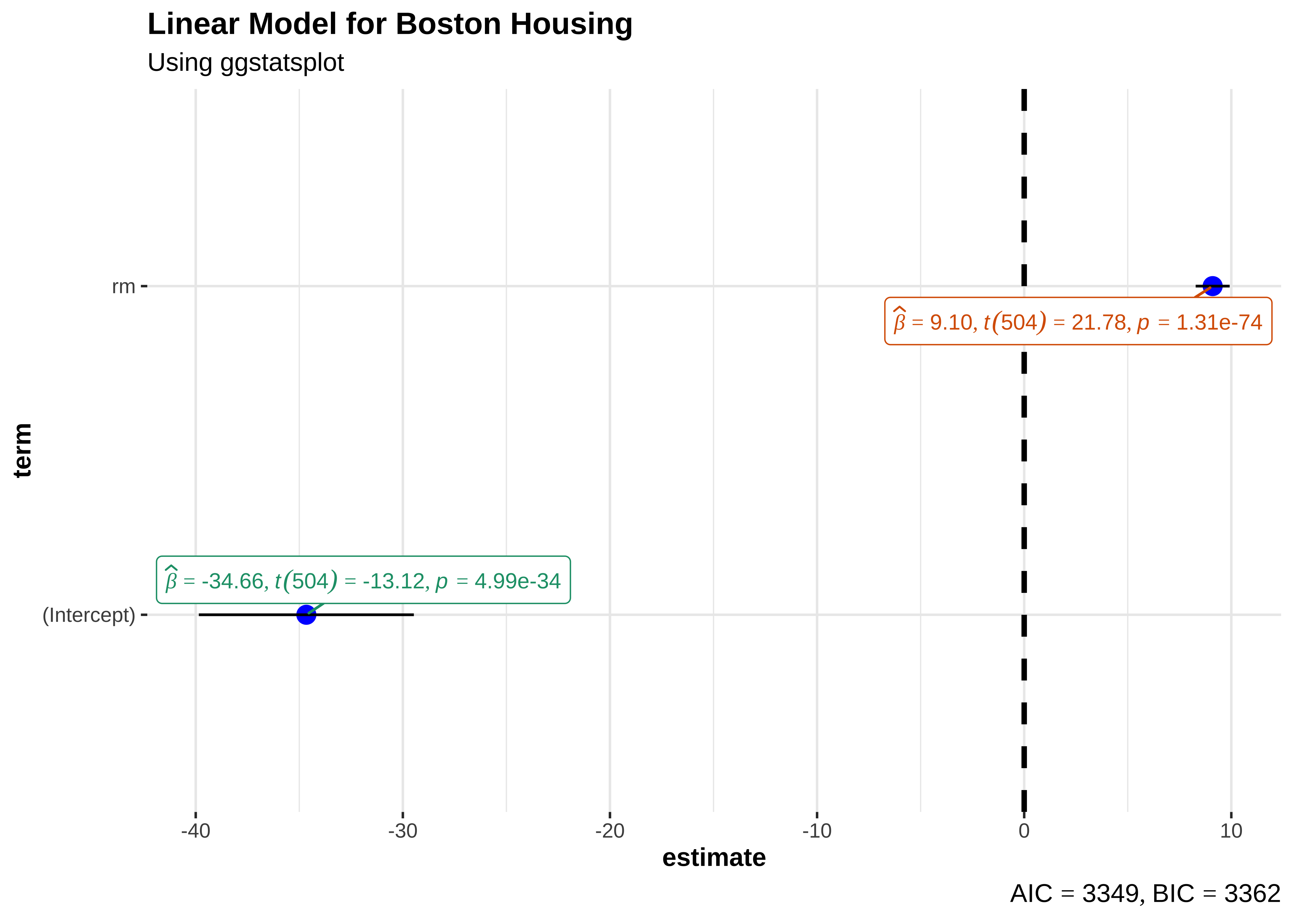
This chart shows the estimates for the intercept and rm along with their error bars, the t-statistic, degrees of freedom, and the p-value.
We can also obtain crisp-looking model tables from the new supernova package 4, which is based on the methods discussed in Judd et al.
 Analysis of Variance Table (Type III SS)
 Model: cmedv ~ rm

                                SS  df        MS       F   PRE     p
 ----- --------------- | --------- --- --------- ------- ----- -----
 Model (error reduced) | 20643.347   1 20643.347 474.335 .4848 .0000
 Error (from model)    | 21934.392 504    43.521
 ----- --------------- | --------- --- --------- ------- ----- -----
 Total (empty model)   | 42577.739 505    84.312
This table is very neat in that it gives the Sums of Squares for both the NULL (empty) model, and the current model for comparison. The PRE entry is the Proportional Reduction in Error, a measure that is identical with r.squared, which shows how much the model reduces the error compared to the NULL model(48%). The PRE idea is nicely discussed in Judd et al Section 10.
We will follow much of the treatment on Linear Model diagnostics, given here on the STHDA website.
A first step of this regression diagnostic is to inspect the significance of the regression beta coefficients, as well as, the R.square that tells us how well the linear regression model fits to the data.
For example, the linear regression model makes the assumption that the relationship between the predictors (x) and the outcome variable is linear. This might not be true. The relationship could be polynomial or logarithmic.
Additionally, the data might contain some influential observations, such as outliers (or extreme values), that can affect the result of the regression.
Therefore, the regression model must be closely diagnosed in order to detect potential problems and to check whether the assumptions made by the linear regression model are met or not. To do so, we generally examine the distribution of residuals errors, that can tell us more about our data.
Let us first look at the uncertainties in the estimates of slope and intercept. These are most easily read off from the broom::tidy-ed model:
# housing_lm_tidy <-  housing_lm %>% broom::tidy()
housing_lm_tidyterm <chr> | estimate <dbl> | std.error <dbl> | statistic <dbl> | p.value <dbl> | conf.low <dbl> | conf.high <dbl> |
|---|---|---|---|---|---|---|
| (Intercept) | -34.65924 | 2.6421358 | -13.11789 | 4.992332e-34 | -39.850200 | -29.468287 |
| rm | 9.09967 | 0.4178141 | 21.77923 | 1.307493e-74 | 8.278798 | 9.920542 |
Plotting this is simple too:
# Set graph theme
theme_set(new = theme_custom())
#
housing_lm_tidy %>%
  gf_col(estimate ~ term, fill = ~term, width = 0.25) %>%
  gf_hline(yintercept = 0) %>%
  gf_errorbar(conf.low + conf.high ~ term,
    width = 0.1,
    title = "Model Bar Plot for Estimates with Confidence Intervals"
  ) %>%
  gf_theme(theme = theme_custom())
##
housing_lm_tidy %>%
  gf_pointrange(estimate + conf.low + conf.high ~ term,
    title = "Model Point-Range Plot for Estimates with Confidence Intervals"
  ) %>%
  gf_hline(yintercept = 0) %>%
  gf_theme(theme = theme_custom())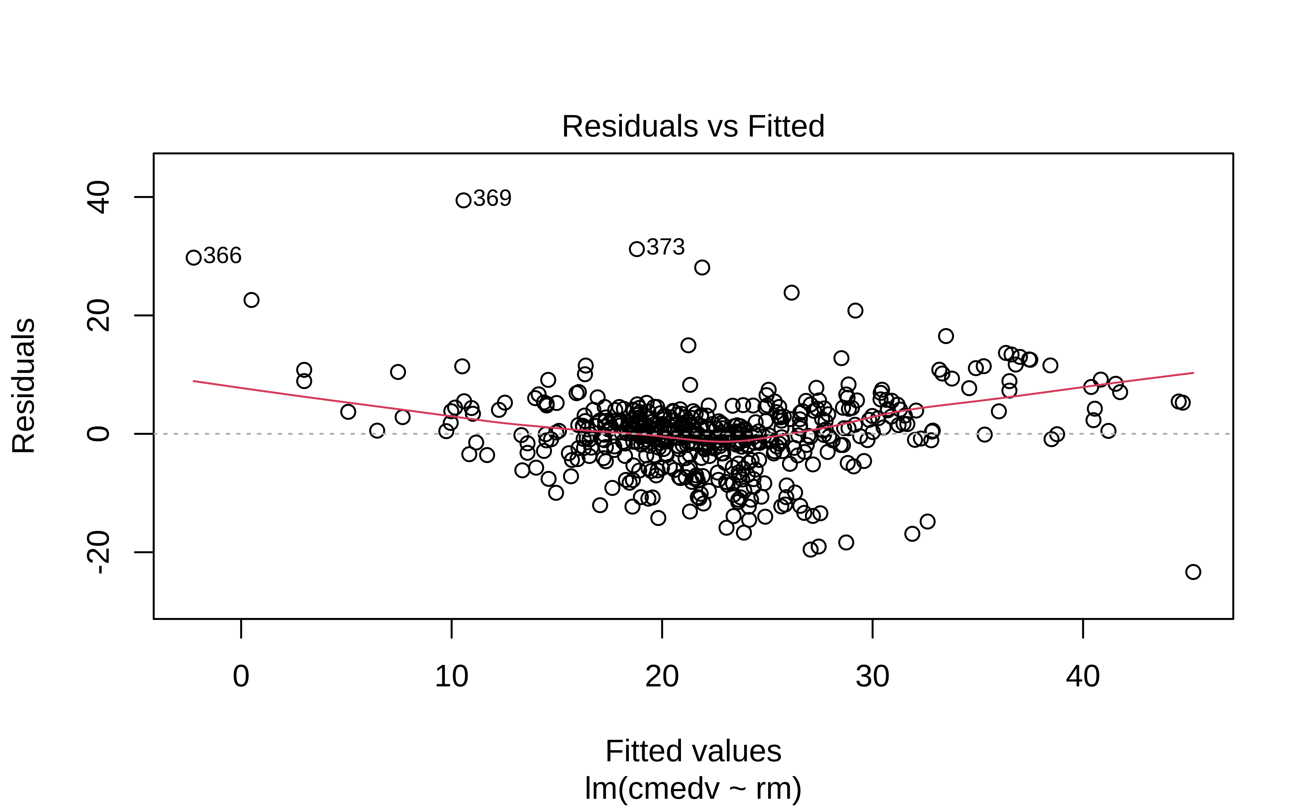
The point-range plot helps to avoid what has been called “within-the-bar bias”. The estimate is just a value, which we might plot as a bar or as a point, with uncertainty error-bars.
Values within the bar are not more likely!! This is the bias that the point-range plot avoids.
Linear Modelling makes 4 fundamental assumptions:(“LINE”)
- Linear relationship between y and x
- Observations are independent.
- Residuals are normally distributed
- Variance of the
yvariable is equal at all values ofx.
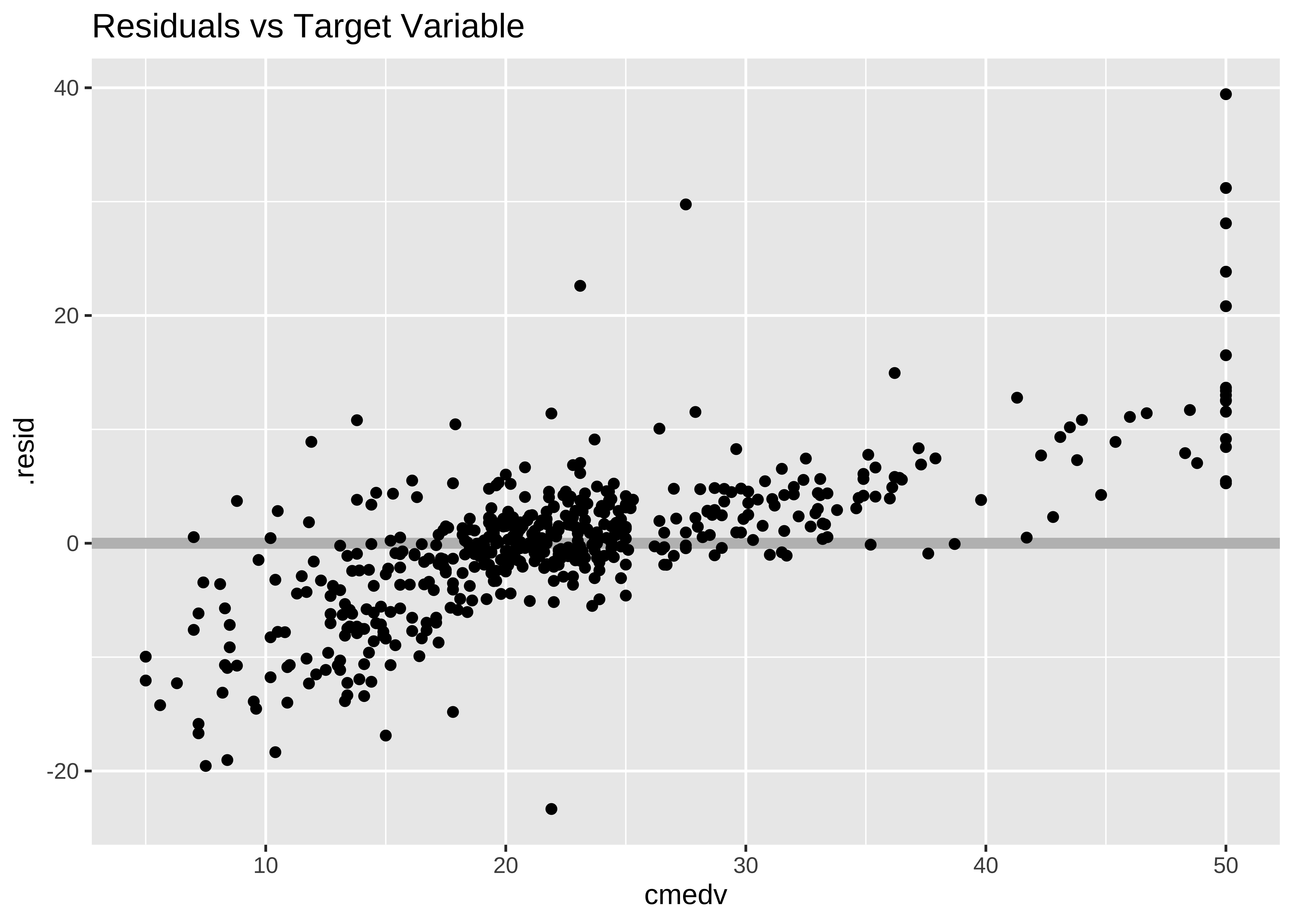
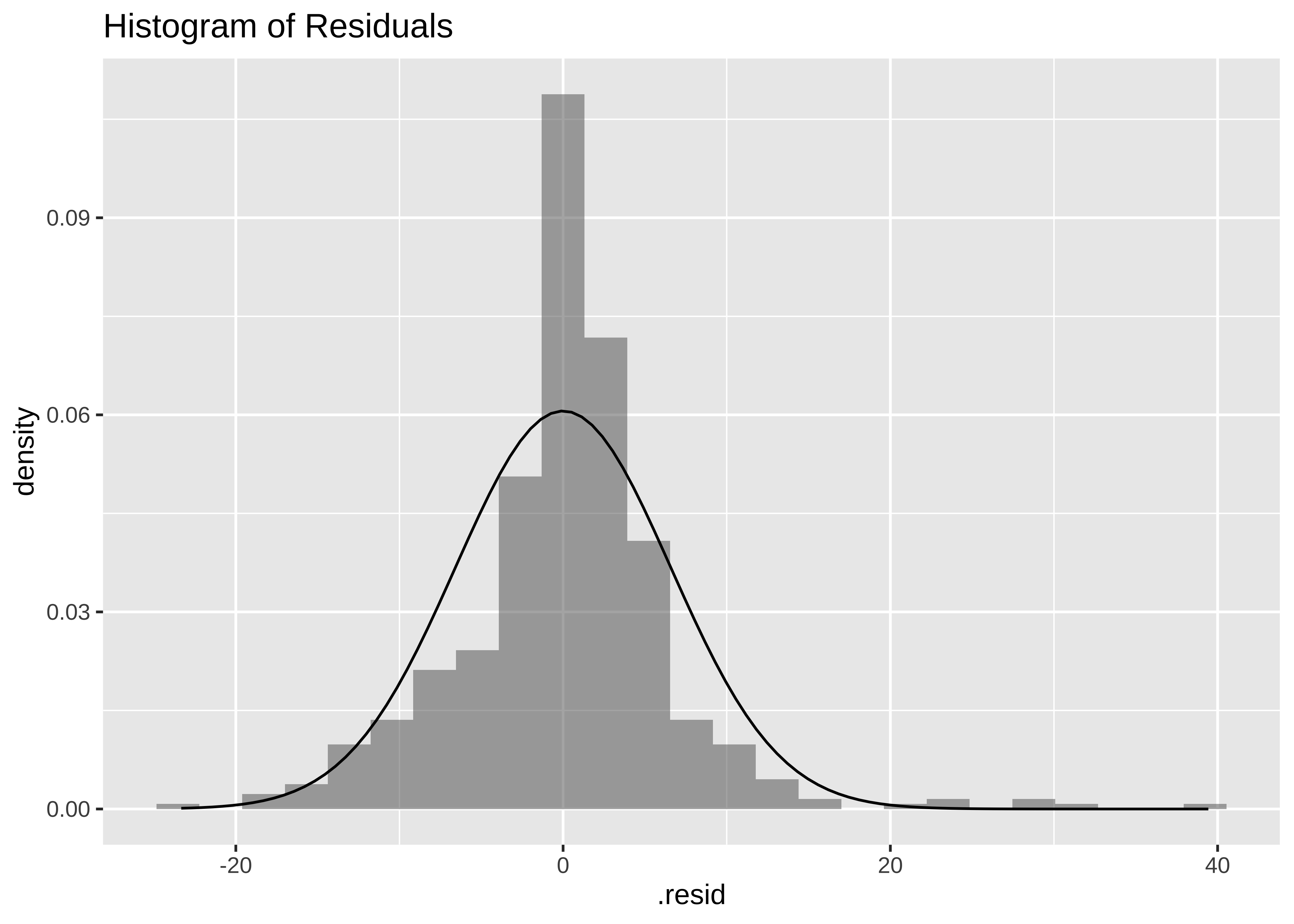
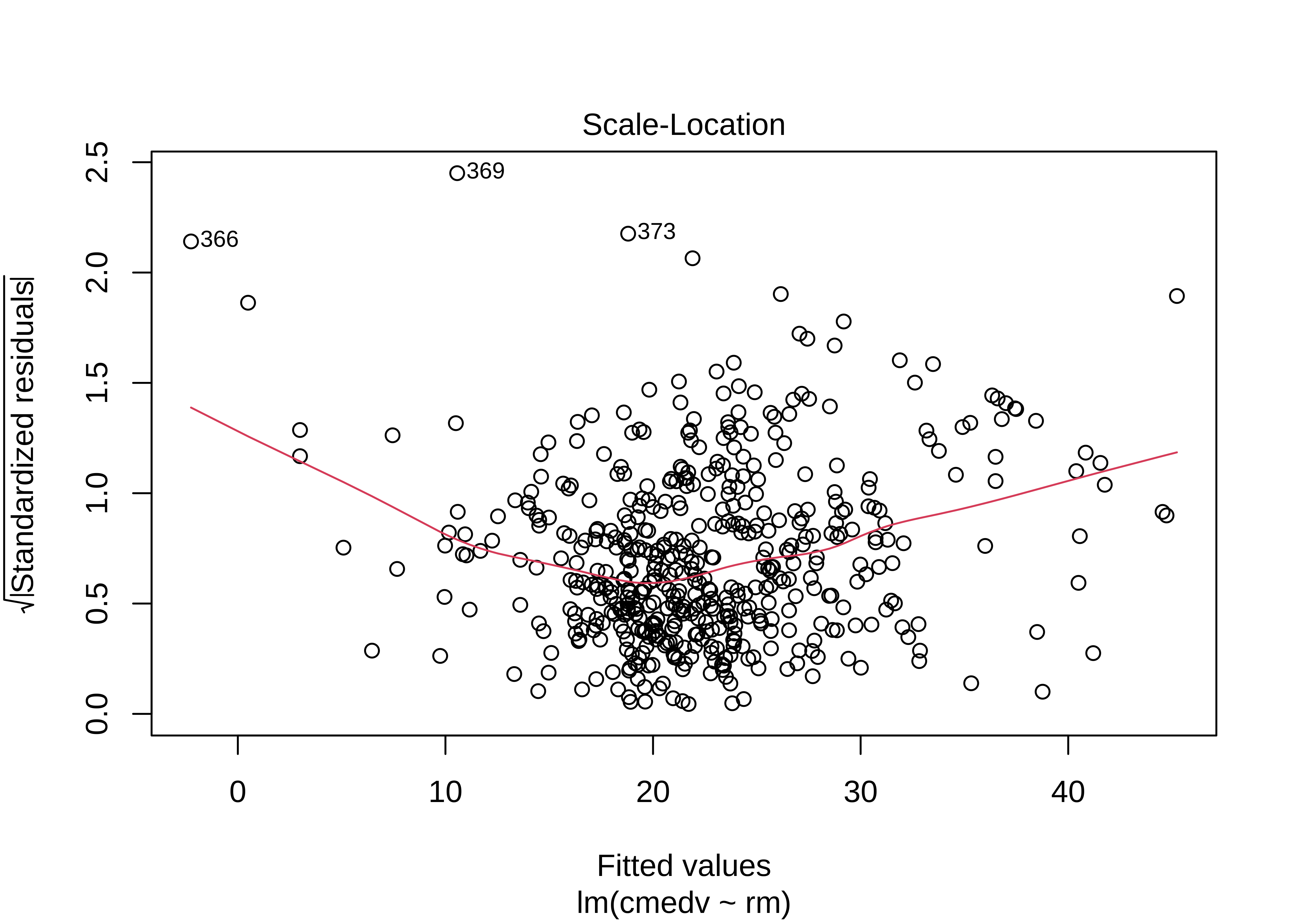
We can check these using checks and graphs: Here we plot the residuals against the independent/feature variable and see if there is a gross variation in their range
housing_lm_augment %>%
gf_point(.resid ~ .fitted, title = "Residuals vs Fitted") %>%
gf_smooth(method = "loess")
housing_lm_augment %>%
gf_hline(yintercept = 0, colour = "grey", linewidth = 2) %>%
gf_point(.resid ~ cmedv, title = "Residuals vs Target Variable")
housing_lm_augment %>%
gf_dhistogram(~.resid, title = "Histogram of Residuals") %>%
gf_fitdistr()
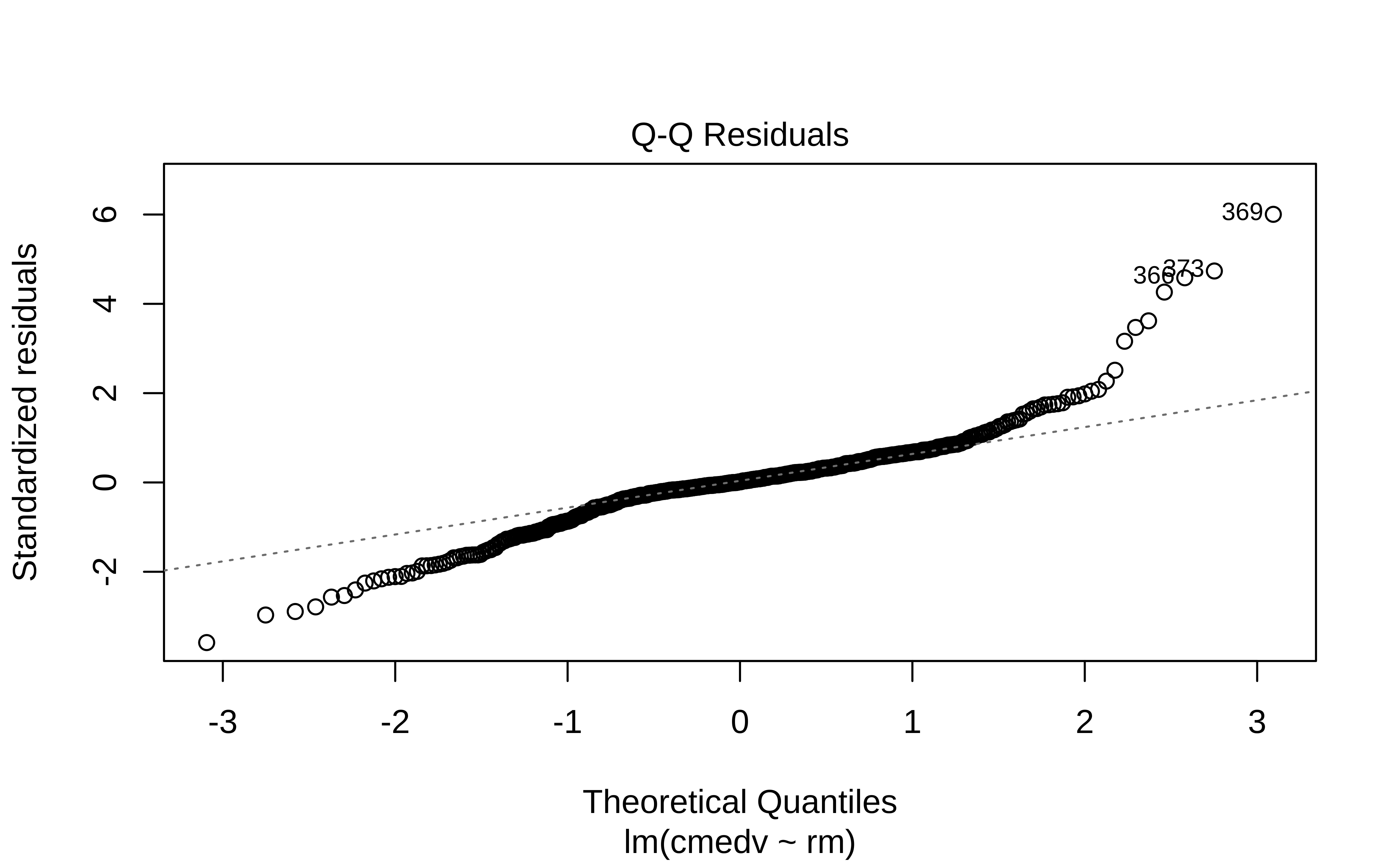
housing_lm_augment %>%
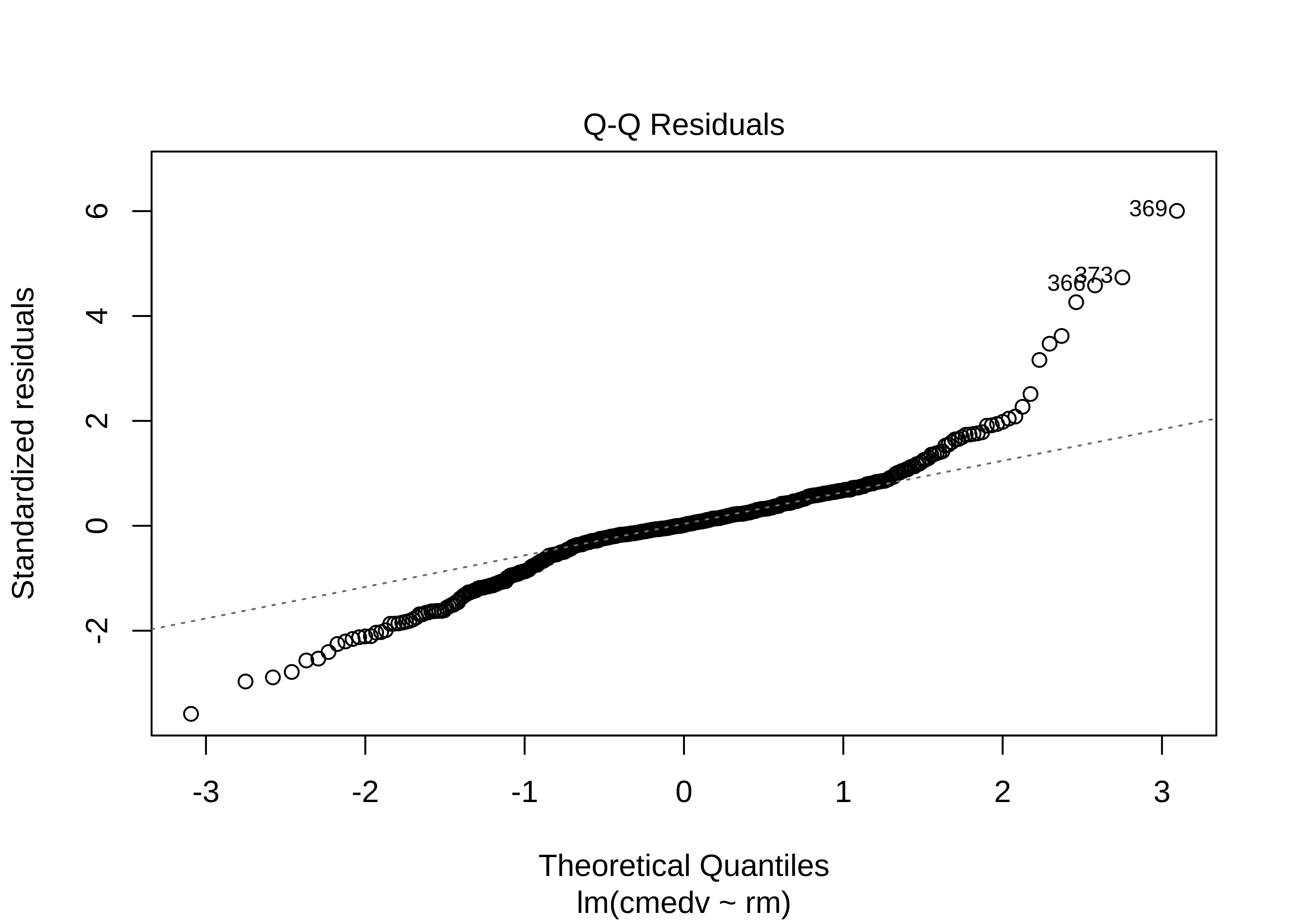
gf_qq(~.resid, title = "Q-Q Residuals") %>%
gf_qqline()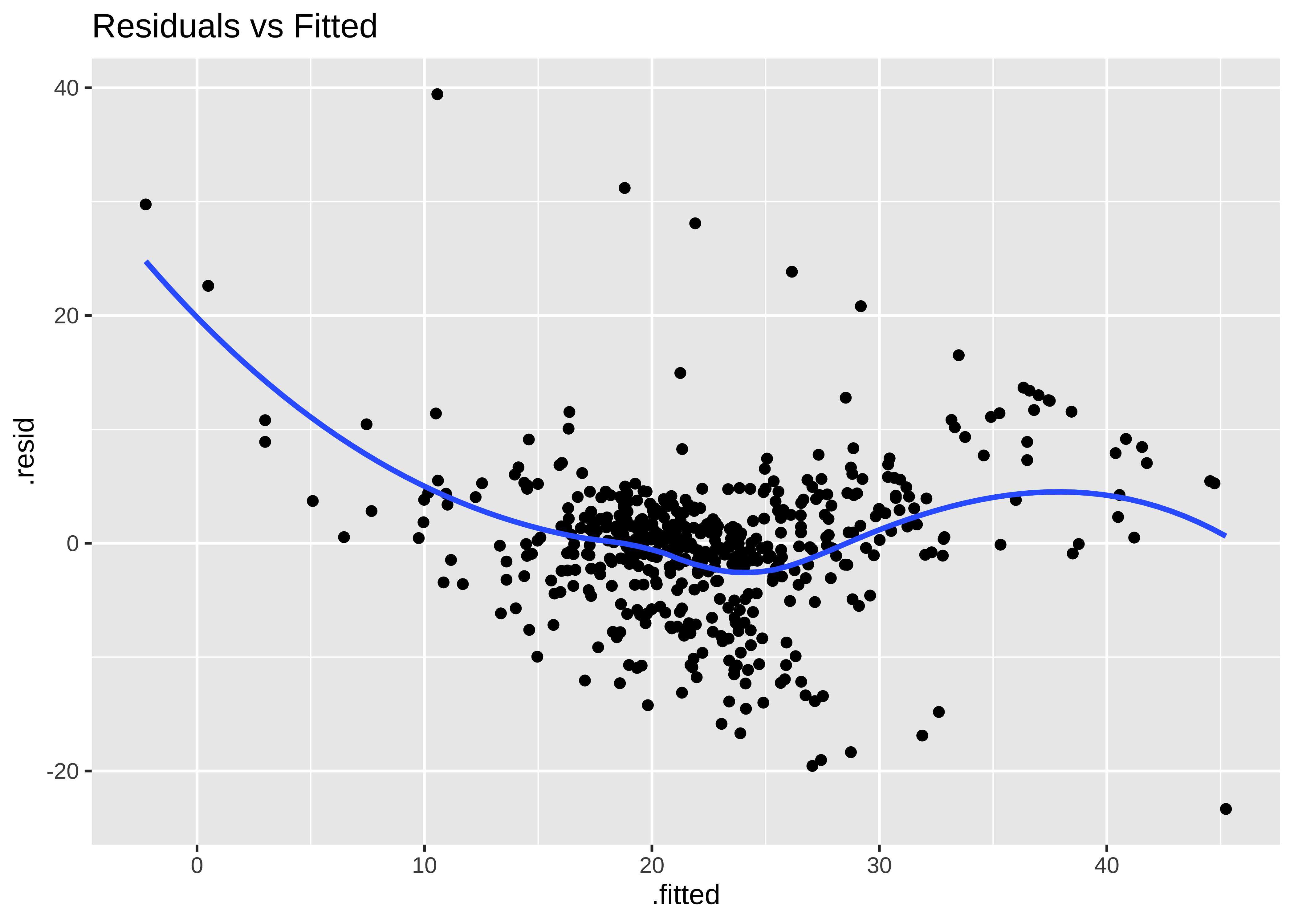
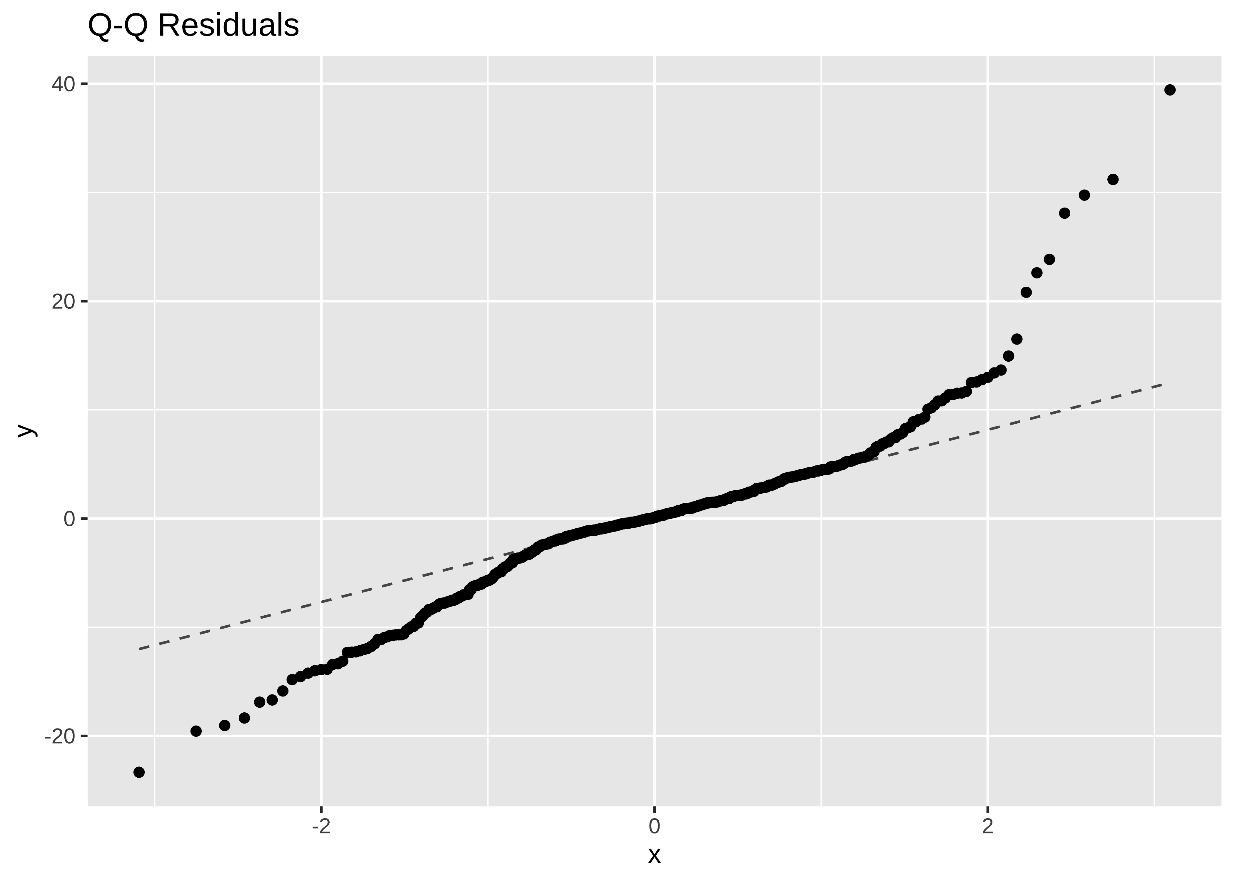
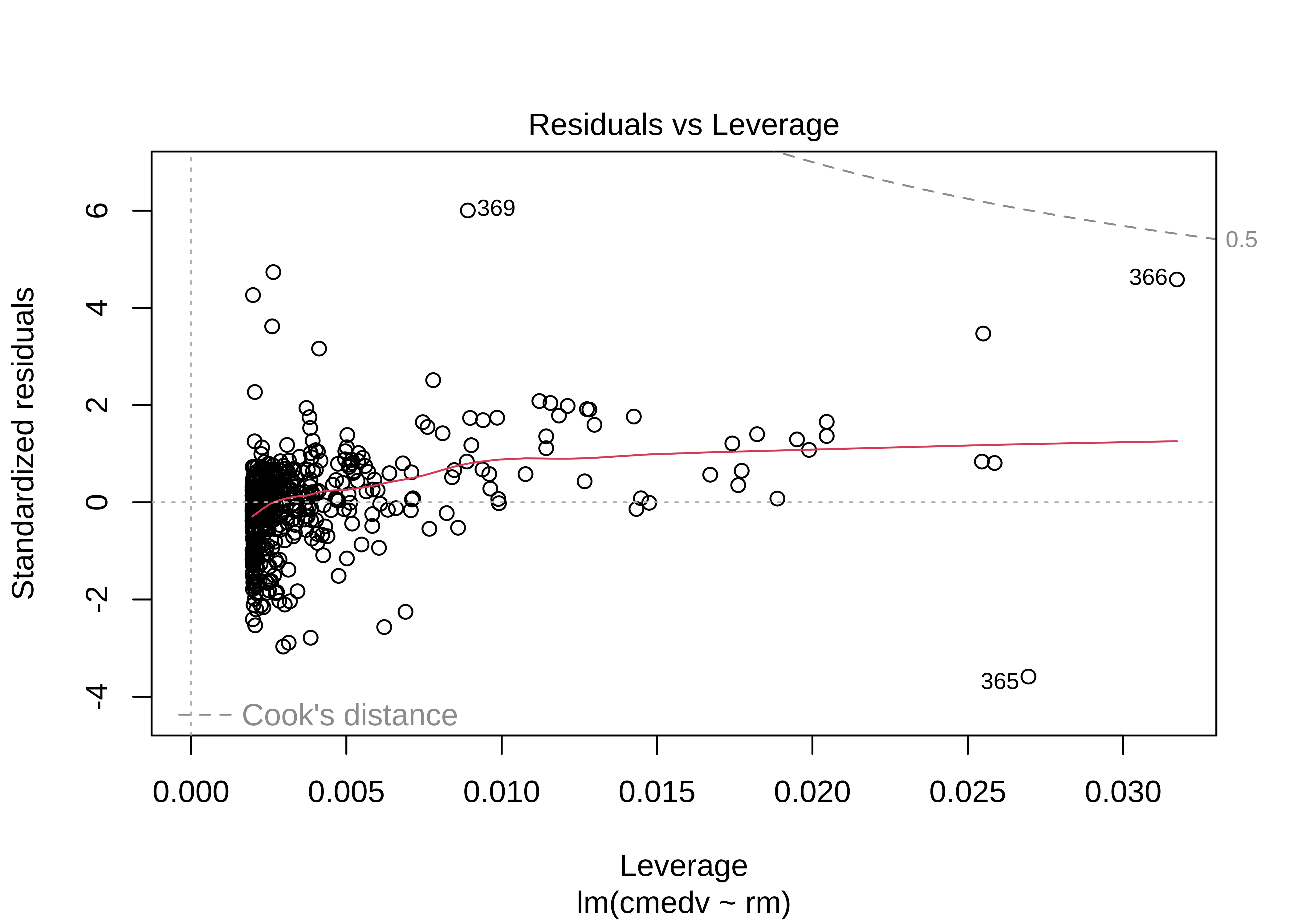
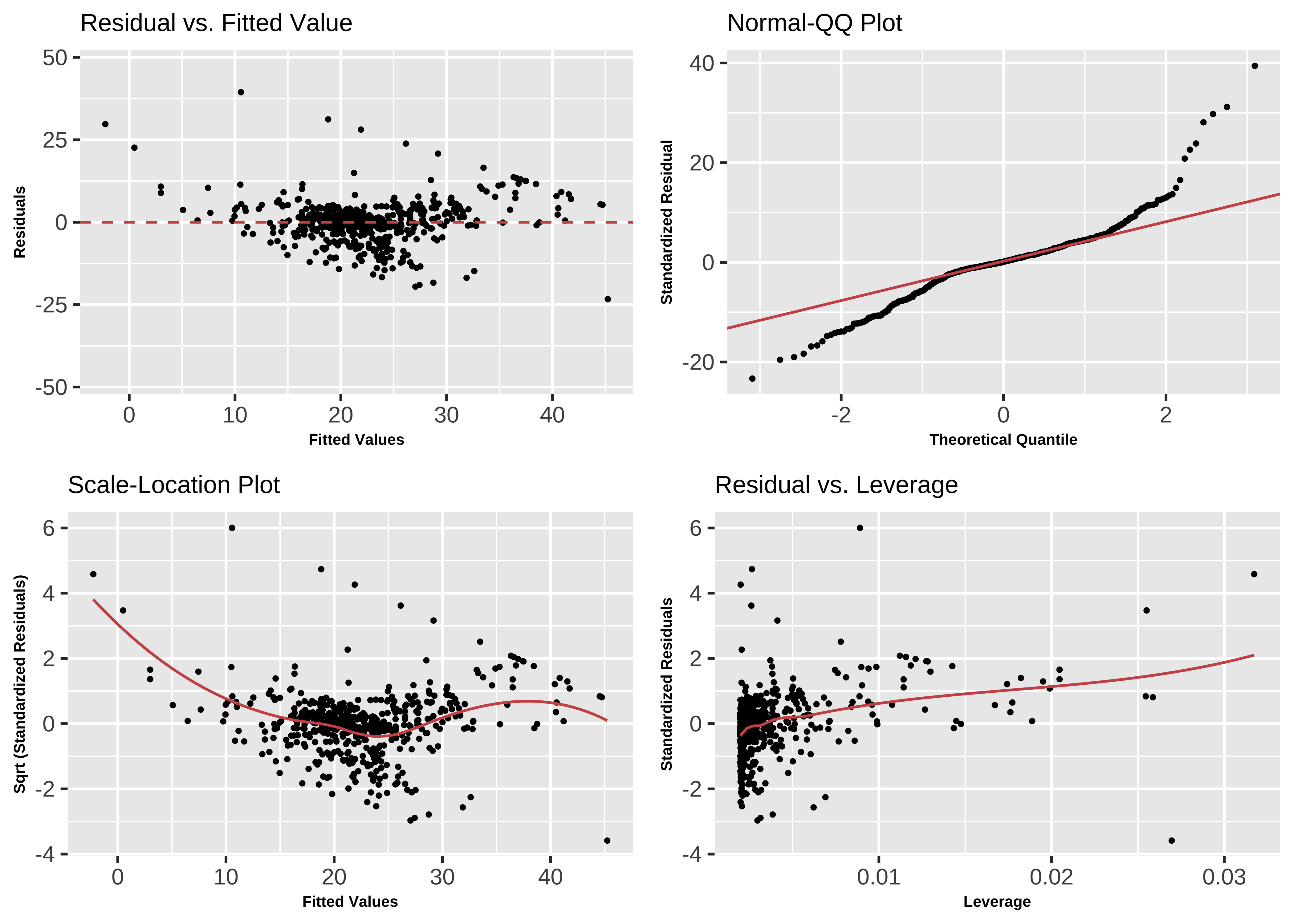
The Q-Q plot of residuals also has significant deviations from the normal quartiles. The residuals are not quite “like the night sky”, i.e. random enough. These point to the need for a richer model, with more predictors. The “trend line” of residuals vs predictors show a U-shaped pattern, indicating significant nonlinearity: there is a curved relationship in the graph. The solution can be a nonlinear transformation of the predictor variables, such as cmedv using rm as we have done. This will still be a linear model!
Base R has a crisp command to plot these diagnostic graphs. But we will continue to use ggformula.
plot(housing_lm)
One of the ggplot extension packages named lindia also has a crisp command to plot these diagnostic graphs.
# Set graph theme
theme_set(new = theme_custom())
#
library(lindia)
gg_diagnose(housing_lm,
  mode = "base_r", # plots like those with base-r
  theme = theme(
    axis.title = element_text(size = 6, face = "bold"),
    title = element_text(size = 8)
  )
)
The r-squared for a model lm(cmedv ~ rm^2) shows some improvement:
[1] 0.5501221Extras
It is also possible that there is more than one explanatory variable: this is multiple regression.
where each of the
but not, for example, these:
There are three ways5 to include more predictors:
- Backward Selection: We would typically start with a maximal model6 and progressively simplify the model by knocking off predictors that have the least impact on model accuracy.
- Forward Selection: Start with no predictors and systematically add them one by one to increase the quality of the model
- Mixed Selection: Wherein we start with no predictors and add them to gain improvement, or remove them at as their significance changes based on other predictors that have been added.
The first two are covered in the other tutorials above; Mixed Selection we will leave for a more advanced course. But for now we will first use just one predictor rm(Avg. no. of Rooms) to model housing prices.
We have seen how starting from a basic EDA of the data, we have been able to choose a single Quantitative predictor variable to model a Quantitative target variable, using Linear Regression. As stated earlier, we may have wish to use more than one predictor variables, to build more sophisticated models with improved prediction capability. And there is more than one way of selecting these predictor variables, which we will examine in the Tutorials.
Secondly, sometimes it may be necessary to mathematically transform the variables in the dataset to enable the construction of better models, something that was not needed here.
We may also encounter cases where the predictor variables seem to work together; one predictor may influence “how well” another predictor works, something called an interaction effect or a synergy effect. We might then have to modify our formula to include interaction terms that look like
So our Linear Modelling workflow might look like this: we have not seen all stages yet, but that is for another course module or tutorial!
-
https://mlu-explain.github.io/linear-regression/
- The Boston Housing Dataset, corrected version. StatLib @ CMU, lib.stat.cmu.edu/datasets/boston_corrected.txt
-
https://feliperego.github.io/blog/2015/10/23/Interpreting-Model-Output-In-R
- Andrew Gelman, Jennifer Hill, Aki Vehtari. Regression and Other Stories, Cambridge University Press, 2023.Available Online
- Michael Crawley.(2013). The R Book,second edition. Chapter 11.
- Gareth James, Daniela Witten, Trevor Hastie, Robert Tibshirani, Introduction to Statistical Learning, Springer, 2021. Chapter 3. https://www.statlearning.com/
- David C Howell, Permutation Tests for Factorial ANOVA Designs
- Marti Anderson, Permutation tests for univariate or multivariate analysis of variance and regression
-
http://r-statistics.co/Assumptions-of-Linear-Regression.html
- Judd, Charles M., Gary H. McClelland, and Carey S. Ryan. 2017. “Introduction to Data Analysis.” In, 1–9. Routledge. https://doi.org/10.4324/9781315744131-1. Also see http://www.dataanalysisbook.com/index.html
- Patil, I. (2021). Visualizations with statistical details: The ‘ggstatsplot’ approach. Journal of Open Source Software, 6(61), 3167,https://doi:10.21105/joss.03167
| Package | Version | Citation |
|---|---|---|
| broom | 1.0.8 | Robinson, Hayes, and Couch (2025) |
| corrgram | 1.14 | Wright (2021) |
| corrplot | 0.95 | Wei and Simko (2024) |
| geomtextpath | 0.1.5 | Cameron and van den Brand (2025) |
| GGally | 2.2.1 | Schloerke et al. (2024) |
| ggstatsplot | 0.13.1 | Patil (2021) |
| ISLR | 1.4 | James et al. (2021) |
| janitor | 2.2.1 | Firke (2024) |
| lindia | 0.10 | Lee and Ventura (2023) |
| reghelper | 1.1.2 | Hughes and Beiner (2023) |
| supernova | 3.0.0 | Blake et al. (2024) |
Footnotes
The model is linear in the parameters
Michael Crawley, The R Book, Third Edition 2023. Chapter 9. Statistical Modelling↩︎
https://indrajeetpatil.github.io/ggstatsplot/reference/ggcoefstats.html↩︎
Gareth James, Daniela Witten, Trevor Hastie, Robert Tibshirani, Introduction to Statistical Learning, Springer, 2021. Chapter 3. Linear Regression. Available Online↩︎
Michael Crawley, The R Book, Third Edition 2023. Chapter 9. Statistical Modelling↩︎
Citation
@online{v.2023,
  author = {V., Arvind},
  title = {Modelling with {Linear} {Regression}},
  date = {2023-04-13},
  url = {https://av-quarto.netlify.app/content/courses/Analytics/Modelling/Modules/LinReg/},
  langid = {en},
  abstract = {Predicting Quantitative Target Variables}
}